A Daily History of Holes, Dots, Lines, Science, History, Math, Physics, Art, the Unintentional Absurd, Architecture, Maps, Data Visualization, Blank and Missing Things, and so on. |1.6 million words, 7500 images, 4.9 million hits| Press & appearances in The Times, Le Figaro, Mensa, The Economist, The Guardian, Discovery News, Slate, Le Monde, Sci American Blogs, Le Pont, and many other places… 5000+ total posts since 2008.

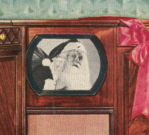
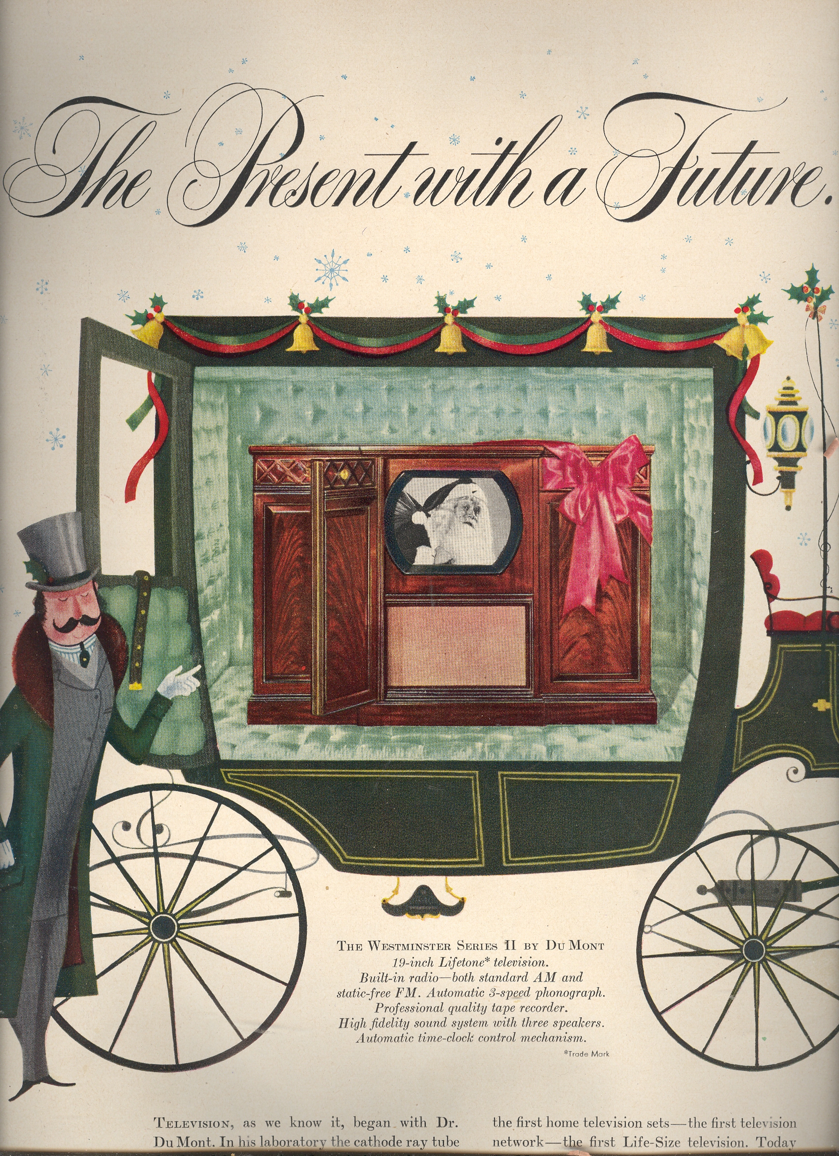
  • States of Perfection: Television Advertisement Images within Television Images, 1950

    JF Ptak Science Books  Post 618–expanded 26 Nov 2011   

    See also States of Perfection, the Archaeology of Refrigerated Meat, 1954. 

    Blog--tv future

    The concept of the television started pushing its way obliquely into the literature as far back as the 1880’s (with Paul Nipkow’s 18-line resolution “electric telephone”), bumping up again with Arthur Korn in Germany around the turn of the century, and making its way through the ‘teens and early ‘twenties until  hit it big in 1927 with Phil Farnsworth’s “image dissector”. (Baird promised a hope with a mechanical version of the television, complete with a 30-line vi ewer, but it would very soon be replaced with electronic boxes with ten times the resolution.)  There were little or no stations available for viewing even though sets were manufactured and sold.  It wasn’t until the end of WWII  that the television industry took off—the increase in home-ownership of tvs exploded, beginning in 1950.*(A decent timeline of the development of tv is here.)

    Blog--tv future 001


    While looking through a year’s worth of LIFE magazine for 1950 I was struck by the number of ads and the number of different companies selling televisions in the major print market.  But the creeping surprise for me were the images that were used in the tv sets that were pictured in the ads—images within images.  The pictures in the tubes were meant to be enticing, imaginative, imagery of the possible, displaying the possibility of entertainment–the possibility of losing yourself in the new medium.  It was an idea of fabulousness, of great expectations, of the promise of being swept away by the new convenience—and all of that rolled up in the pictures used in the ads. 

    Blog--tv 003

    Blog--tv 001

    To me, sitting here 59 years in the future, it is hard to imagine getting excited by any of these images—except Santa.  Even with the benefit of having looked at millions of images and having an historian’s occasional perspective on stuff, I just can’t appreciate these pictures in the ways that the advertiser meant them to be savored—and they were meant to be savored, as they were the libidinous bait to make the reader jump into the Hudson and buy the advertised set. 

    There are vocabularies for defining the breadth of fabulousness across difficult genres, like describing the fineness of a wine or the scent of a good desert rain.  Difficult perceptions to quantify and describe, but it is done and successfully so.  I can’t find the words fort these pictures. 

    Their fabulousness to the viewer in 1950 must not have been very long lasting—the images seem so contrary to being interesting, as they seem to project almost nothing at all.  I do get the overall effect of polite culture and a race at the occasional arts, but by and large the pictures were vanilla headshots of women.  

  • Prehistories of Famous Things series: the Cat in the Hat

    JF Ptak Science Books   Quick Post, expanded

    Ebay 12 3 seuss 1 closeup

     (One in a series on the preihistories of famous things, one of which is: Mandelbrot and the Pre-History of the Fractal, 1967-1975.)

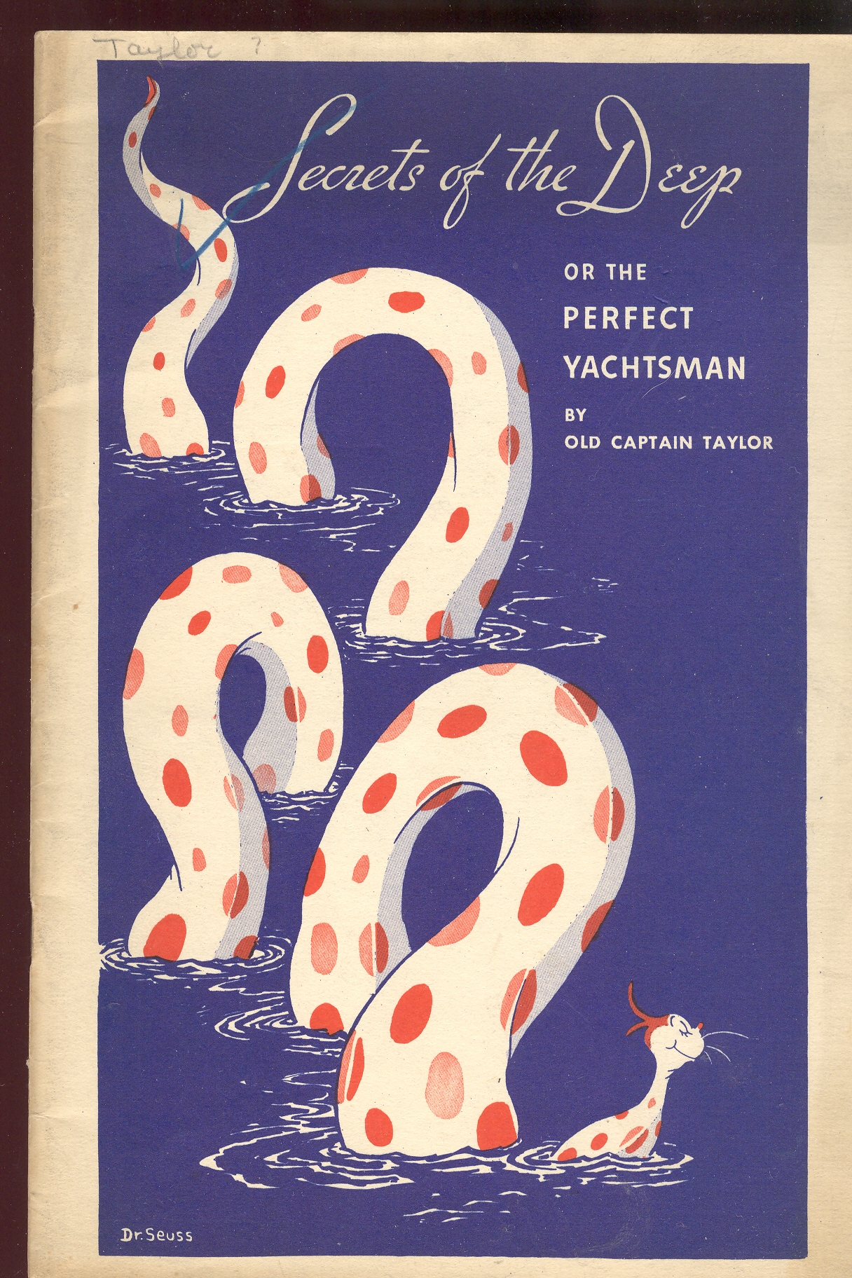
     I’ve written here earlier on the 236 different words used to create The Cat in the Hat (Dr. Seuss and the 236 Words That Changed reading Forever), a book which I found to be a major accomplishment, a very difficult undertaking with superb outcome. [The  detail above is picked from the cover, below.]

    That is why I was struck seeing the cover of volume 1 of this rare two-volume set illustrated by the not-yet-famous Dr. Seuss (Theodor Seuss Geisel, 1904-1991, and son and grandson of brewmasters).  There is no question in my mind that the small head on the large-bodied serpent is that of The Cat in the Hat (TCITH, which sounds like an Egyptian deity). 

    Ebay 12 3 seuss 1

    TCITH might very well make its first forensic appearance here.  Seuss busily illustrated these two slim pamphlets for Esso Oil and Grease—they presented the rules of the water, and Seuss responded with funny inset illustrations and delightful chapter-ending slugs.  He also provided a number of Seussian/Rube-Goldbergian machines which mechanically overcomplicated (or “too-complexified” in Bushisms, (true)), which are both complex and simple, delightful.  

  • Aeroplanes & Airships: Artistic Displays of Quantitative Data, 1914

    JF Ptak Science Books 

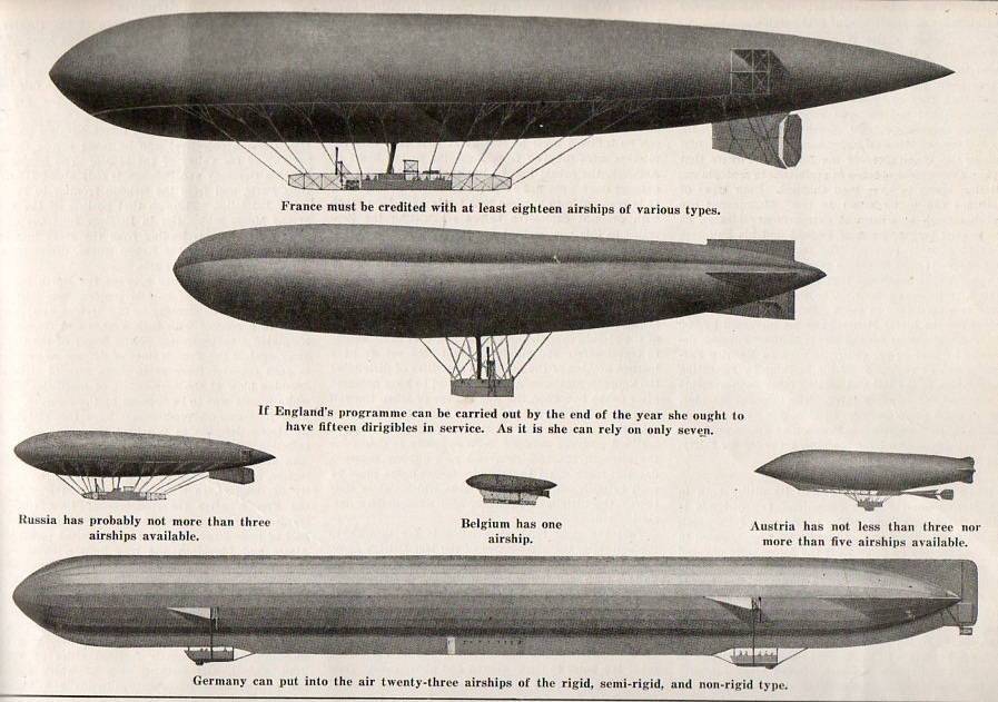
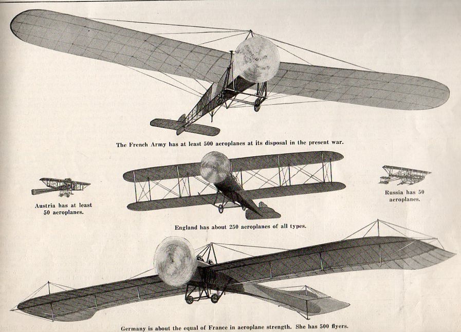
    In another adventure in infographics and the artistic display of quantitative data we find this pair of very distinctive images that seems to work, a little:

    Infographic  airship002

    Infographic  airplane003

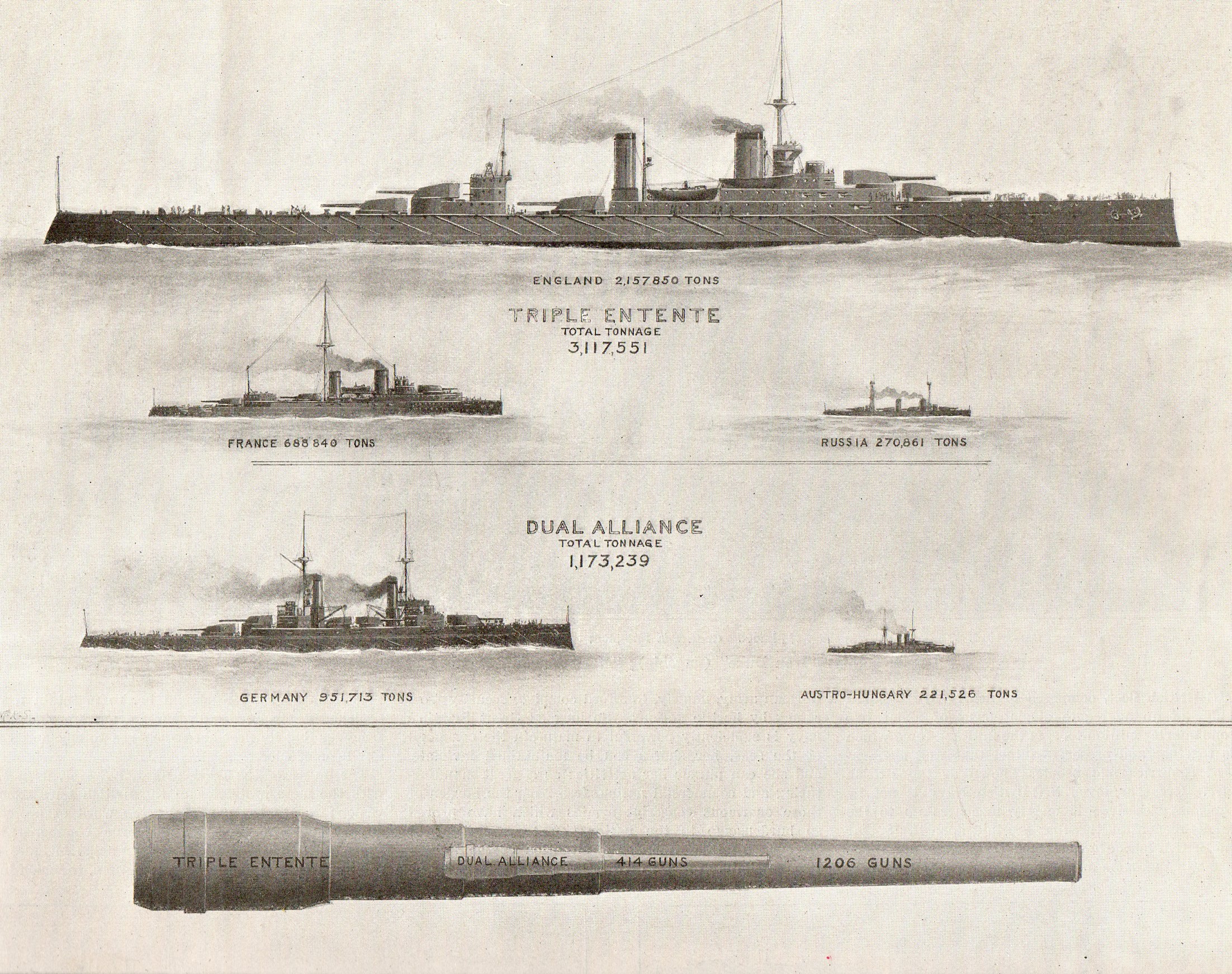
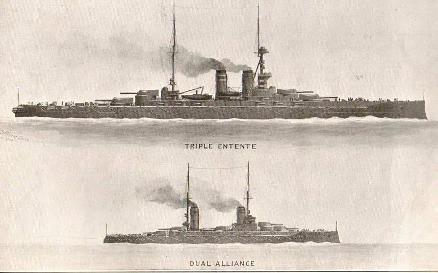
    [Image source:  5 September 1914, vol 112, #10,  Scientific American.]

    The graphics are mostly good if not a little clunky–they can be viewed as “scary”.  Mostly, though, these images are reproduced today because I find it hard to pass up an interesting airship illustration, though they do present their case more clearly than a slightly earlier attempt at data display seen last week on this blog.

    The images for the distribution of naval power are very defined:

    Inographic ships018
    (I especially enjoyed the comparison of naval guns, with the cannon-within-a-cannon.)

    Inographic ships020

  • Extra-Earths Department #4: Brueghel Dips into the Late Renaissance Allegorical Sky

    JF Ptak Science Books LLC  Post 1664

    See the other Extra-Earth posts:  Mondo Bizarro, Science Afflictions and the Dubious Mind—Bad Science, Part 1. NYC in Space (?!) here and Extra-Earth Humano-Alien Souls From Outer Space Repopulate Earth-Hell!!(??) here.

    0 blog feb 17 brug597

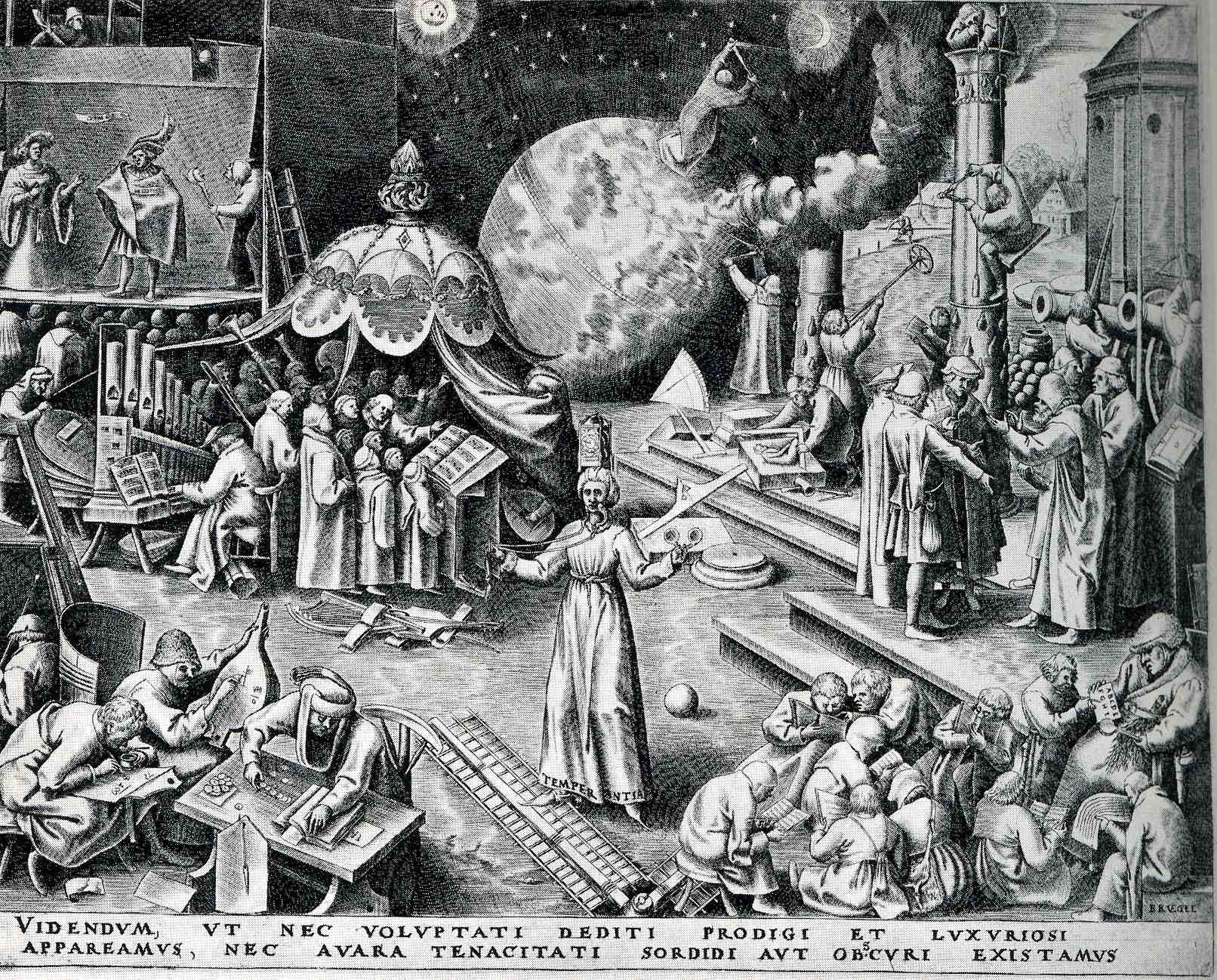
    Peter Brueghel (the elder, born ca. 1525 and dying in 1569), was the Dutch semi-discoverer and king of “normality” of Renaissance art–and by “normality” I mean that he depicted non-royal things that were generally off the palette for almost everyone else, finding subjects in peasants and small life (hunting, meals, working at agriculture, festivals, dances, and so on).  Brueghel was also perhaps the first painter to depict a landscape for  the sake of its own beauty, without being a backdrop for a religious study or building or historical scene. He was extraordinarily prolific in his skimpy 45 years, fully populating his scenes with suites of busy and evolving life.

    Browsing through some of his work, I came across the print called “Temerpance”, which in general I think was supposed to warn us against excessive pleasure, but which really just confused me a little.

      (TEMPERANTIA; and then, VIDENDVM, VT NEC VOLVPTATI DEDITI PRODIGI ET SVXVRIOSI//APPAREAMVS, NEC AVARA TENACITATI SORDIDI AVT OBSCVRI EXISTAMVS. “We must look to it that, in the devotion to sensual pleasures, we do not become wasteful and luxuriant, but also that we do not, because of miserly greed, live in filth and ignorance”.)  

    To me, it looks like people here are pretty industrious, mostly engaged in scientific or musical pursuits:  lots of books, musical instruments, people writing and reading.  But I guess that these were sensual pleasures, pleasures of the mind and heart, and not a pleasure devolved from the godhead.  Perhaps the complete opposite is true:  the print showing the triumph of the pursuit of the mind over sensual graft, lifting mankind above the filth and ignorance of the body.  Sheesh. 

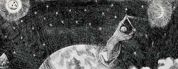
    0 blog feb 17 brug man earthBut the real grit of my interest is the action lurking in the background, the man, the astronomer, making measurements in the sky, triangulating the Moon and the Sun (perhaps).  What on earth is he standing on?  He does seem to be standing on earth in the background of the earth on which thee people in the foreground are standing–which means, with a stretch, we have the fourth entry in this blog’s short “Extra Earths” category.

    0 blog feb 17 brug man math

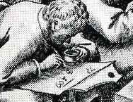
    The more I think about it, and the more closely I look at the print, this confusion must be my own–this must be Brueghel’s way of showing the possible worlds that exist outside the sensual and self indulgent. He shows children (and adults) learning their ABC’s at the feet of teh schoolmaster at bottom right, a theatre scene at upper left, a large musical ensemble (complete with choir).  An industrious man measures his fields, while builders to his right measure their progress and trueness on a column; at bottom right we see an “accountant” of the times working his tables and figures, while another to his right works on a math problem, clutching his pot of ink.  The figure in the middle (with “temperance” written in the hem of his garment), reminds us of our mortality, with a sword in one hand and a clock on his head.  All in all, it is a delightful scene of industry and invention–and it has an extra earth. 

    Of course the extra-earth is allegorical, but, still, it is an unusal thing to see.


  • Extra-Earth Department #5–Primordial Pre-Cretaceous-Paleogene-Industrial Bubble-Earth

    JF Ptak Science Books     Quick Post Addition to the Extra-Earth Series

    http://3.bp.blogspot.com/_ZaTCJM8RRD0/SHWWZuUV0VI/AAAAAAAAAZM/0BfSUS0FsrA/s1600/wonderful.world.cover.jpg

    Today a reader of this blog forwarded a lovely image for the series on Extra-Earths that appears here–one installment of which (with links to the others) appeared just this morning. 

    The Wonderful World–the Adventure of the Earth We Live On (by James Fisher, and with  art editor F.H.K. Henrion, and published by Hanover in 1954) is a clunky title even for expressing its idea to juvenile audiences. And speaking of which, if the intended reader was eight years old, the cover art might be a little confusing: what is that bubble-Earth doing there, and why is there a T-Rexy thing standing there on a mountaintop overlooking a city and observing the whole Earth-emergent process? 

    But when we look inside the book (at the images provided by our reader, Kevin, from his own 2006 blog (“The Balloonist”) entry on this book, we can see the elements of the cover’s montage, and which would I guess alleviate a young reader’s consternation with the confusing image:

    And we can see that it is actually an interesting book for what it is, and at least could give kids a sense of time and depth:
    Needless to say my only interest here was the appearance of the miniature Earth bubbling up through the missing industrial-dinosaur goo.  The addition of an Earth on or within sight of the existing Earth seems a very odd way of making your point, even if that point was being made allegorically in a high-Renaissance work on scientific instruments–the use of Extra-earth imagery is to my experience very uncommon, and I don’t wonder why. 

    ·Posted by :

    ·in:

  • An Episode in the History of Anticipation: Death at Archimedes’ Door

    JF Ptak Science Books   Post 1665

    Archimedes021

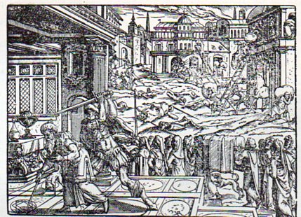
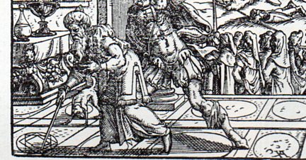
    Earlier in this blog there appeared an entry on the death of Archimedes–actually, it was a piece on an image depicting the killing of the great mathematician.  It is a pretty gruesome affair, even by the very early 18th century standards under which the engraving was made–gruesome still by today’s standards, what with the man’s head being cleaved laterally in two by the summoned Roman Centurion. I’m not an historian of these images of Archimedes, but I can say that for whatever I am, I have not seen anything quite so graphic dealing with the man’s death.

    The usual images of Archimedes coming to his end show him working a problem in his dust/sand/earth “chalkboard”, absorbed to such an extent in his thinking that he doesn’t hear the chaos outside his rooms, and doesn’t sense the approach of the soldier who finds Archimedes unresponsive to his calls and therefore a threat, and so kills him.

    Archimedes022[Image source:  Titus Livius, Romanae historiae principia, libri omnes.  Printed in Frankfurt by Feyerabend, 1578.]

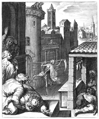
    Looking at this image (above) brought to mind another in the history of anticipation–not knock knock knocking on Heaven’s door, but the opposite, and the opposite of that, the opposite of  knocking on Death’s door, or at Death’s door:  Death knocking at our door. 

    The title of this emblem–Cunctos mors una manet/death is all that remains–is meant to remind us

    va1612099pict

    of our common foe.  It is the work of  one of the great engravers of his time, Otto van Veen (teacher of Rubens),  and appears (along with next image and 100 others) in his Q. Horati Flacci emblemata.  Imaginibus in acs incisis notisque illustrata, printed in Amsterdam in 1607 by H. Verduss.

    –All images and most translations courtesy of the splendid work at The Emblem Project/Utrecht, here.–

    Part of the legend (which appeared in four languages) of the image leaves us with the following reminders, choice bits on the folly of forgetting our common end:

    La terre embrasse tout comme mere commune –Mother Earth embraces us all

    Moritur sutor eodem modo ac Rex.–The King died the same as the shoemaker

    Death is the thing that sucks the rivers of lives, “Del rico al pobre, del soldado al Papa”, From rich to poor, soldier of the Pope.

    and so in image and word telling us that death will seek us out, whether king or shoemaker, rich or poor–and that in the coming end the Earth will take us all.  Archimedes didn’t hear that one coming; nor did he care, I think. 

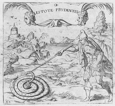
    THis last image brings to mind Archimedes’ work in the dust, though the intent of teh emblem (“Estote prudentes” //Be ye therefore wise // Be Cautious) wouold have been completely lost on him.

    The legend translates (Thanks to the Emblem Project for this):

    When the serpent sees that it is going to be attacked with,
    Lethal wound, it protects its head with artful care.
    Here lie the dwellings of the soul, the sanctuary of the truth.
    Hence comes life that is to be hoped for by every body.

    Surely Archimedes could relate to his lines and the expressions of his thought as the dwellings of his soul (if he actually believed in a soul), though I guess you could say that the artful deception of the serpent’s head finally wound up killing him via the Roman soldier.

    Letali serpens cùm se videt esse petendum
    Vulnere, sollicita contegit arte caput.
    Hîc animæ sedes positæ, verique recessus: (here placed the seat of the soul, in artful covering…)
    Hinc spiranda omni corpore vita venit

    av1615040pict

  • Buckets of Missing Smiles–an Incredibly Brief Anthropology of an Expression in the Face of the Sun

    JF Ptak Science Books Post 1666

    The depiction of the anthropomorphic Sun featured with a broad toothy smile seems a commonplace fixture in modern times–at least in the very popular media–but it seems to me that the Sun was an impressively dour character in the most misty and moldy past. Its a much harder issue for me to locate a happy Sun than a phlegmatic one, as we can in the coming examples.  Here, for instance, the Sun is actually disappointed, and dark:
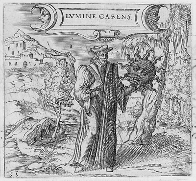
    av1615055pict

    [Georgette de Montenay/Anna Roemer Visscher, Cent emblemes chrestiens (c. 1615)] 

    The Sun (representative in this case of the Christian god) disavows the heavily robbed false philosopher, finding nothing but fault in the erroneous thinking and pronouncements, so much so in fact that it distances itself from the phonylogian by turning itself black and devoid of light, absenting the light that was supposed to be shone via the heretic’s teaching. 

    Feigning to be a philosopher with your long cloak
    You bring forward all false theories about the pure Sun.
    First learn to recognize what is the true light.
    The balmy day does not shine in obscure night

    Conversely, the sun would also shine to dispel the false teaching of other philosophers, as so, though this time without any face at all:
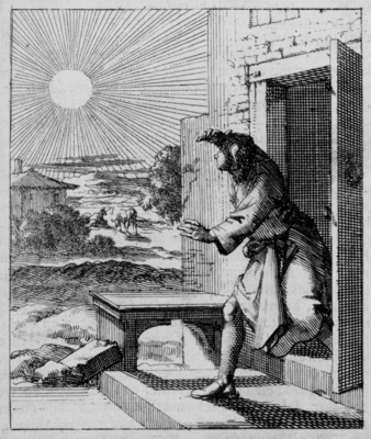
    hu1689024pict[Source: Pieter Huygen, Beginselen van Gods Koninkrijk (1689)]

    But mostly it seems the Sun appears to those who came before with a mostly blank expression:
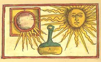
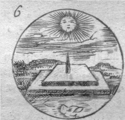
    Blogsunfacescolor Where was the smilign Sun hundreds of years ago?  Anthropomorphic images of the Sun have appeared in books in the West for several hundred years, and in almost every case where the Sun has a face, it is usually expressionless, its mouth drawn into a mid-Western farmer/Abe Lincoln horizontal, a tightly drawn nothing.  Two thin lips, firmly repulsing all emotion.  The face of the Sun was insurmountable, a tabula rasa, showing perhaps that there was nothing there at all inhabiting this iconographic image of The Creator to give the poor observer a glimpse into the depths of the future.

    Blogsunfacesdetailtwo

    This observation  seems to stand for Sun Gods and Goddesses as well, even the ones who are being tugged or pulled or charioted a cross the vaults of the heavens—the Nordic Sól, Greek  Helios , Roman Sol Invictus, Vedic Surya and of course Elijah ascending to Heaven in a Chariot of Fire, all seem pretty intractable.  But in general images that we see of Sun deities like Apollo, Greece and Rome; Freyr, Norse; Garuda, Hindu; Huitzilopochtli (Uitzilopochtli), Aztec; Inti, Inca; Liza,West African; Lugh, Celtic and Re (Ra) and Isis, and on and on, show a small, set pair of lips, if they have a mouth at all, and this going back beyond the Sumerians (Shamash). 
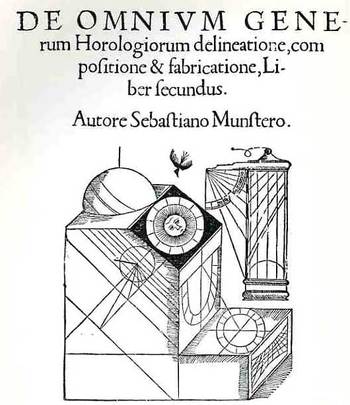
    Blogsunfaces2048

    When the Sun really loses its human personae in the 17th century (the scientific sun and stars beginning much earlier, as in for example Allessandro Piccolomini’s Della Sfera del Mondo, 1552, with simple star maps unadorned by icons and written in the vernacular), it is replaced with starry images which seem to somehow have more emotional authority than the sun images with faces.  Perhaps the sun was meant to have this Delphic, blank-mirroring quality, given its importance as a giver (and taker) of things,
    Blogsunfacedetailone
     
    and that it was not within human capacity to understand it as an emotive entity, especially during bad times.  But in those times of Good and Bad it wasn’t necessary to see a frown or a smile on an image of the Sun, I guess because of the complaints of redundancy.
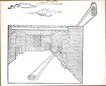
    Blogsunfaces047

     No matter, though, as the modern astronomical text took care of the Sun and its missing buckets of smiles in due course—until more modern times, when the Sun is made to have a matching disposition, a result of kinder modern artists. 
    Blogsunfacedetailthree  

    f16914406

    This Sun seems to rule with an ennui  Daniel de la Feuille, Devises et emblemes (1691); and then again, in the following superbly engraved work by Jacob Cats, Sinne- en minnebeelden (1627):
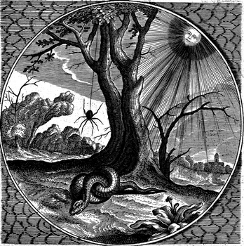
    beeld037

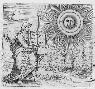
    The Sun here seems to have a knowledge-worn expression, a sense of having-seen-it-all, in this beautiful work by Georgette de Montenay/Anna Roemer Visscher, in Cent emblemes chrestiens (c. 1615)
    av1615036pict

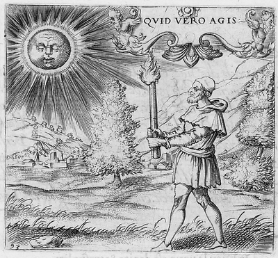
    And again from the Montenay we see a smirking Sun (definitely not a smiling one) judging the efforts of humans once again, and finding them coming up far to short:
    av1615093pict

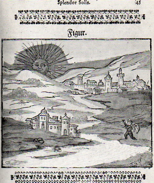
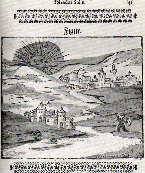
    I guess you could make a case for an “amused” Sun in the Montenay, though in a third-person sort of Royal way of being removedly amused.  Here–in a rare and very important work in the history of alchemy–we see a rising Sun in an amused state, welcoming the book’s author, on his alchemical pilgrimage. 
    Sun--splender solis029
    In another illustration from this book (by Salomon Trismosin, Auretum Velius oder Guldin Schatz und Kunsthkammer, printed by Georg Straub at Lake Constance in 1598/9, and also known as “Splendor Solis”) we find the following expected facial posture:

    [trismosin, salomon (?pseud., fl. 1473?). <i>aureum vellus, oder guldin schatz und kunstkammer.</i> rorschach: 'gedruckt in des f. gottshausz s. gallen reichshoff' leonhard straub, 1598-99.]

    And so on and on this continues, this presentation of the Sun as both removed and judging, until–in some cases–the business of representing the Sun anthropomorphically disappears altogether, even in allegorical representation, like so: 

    The Man in the Moon will just have to wait his turn, though I can’t resist the following couple of images, the first of which shows the Moon in a phase of nothingness and a nil expression:
    f16914302

    [Source:  Daniel de la Feuille, Devises et emblemes (1691)]

    And then this classic image from an iconic and early science fiction film:

    http://data.whicdn.com/images/17391911/moon,vintage,jules,verne,le,voyage,dans,la,lune-d0ec6d7f016fe54cb3a634c84919da1d_h_thumb.jpg

    And from the 1905 motion picture version of Jules Vernes From the Earth to the Moon called A Trip to the Moon–upon the approach, the Moon’s surface was blank, but quickly developed a face, which was sort of smiling–until struck in the eye by the Verne capsule. 

    Offhand, though, my memory doesn’t offer too many smiling-Moon expressions. 
  • Half-Missing People of the Renaissance

    JF Ptak Science Books   Post 1621     Blank, Empty and Missing Things series

    The thread on blank, empty and missing things becomes more interesting to me when it approaches the subject of humans and art.  And perspective.  It is a curious thing how over the course of 400 years–beginning say with the adoption of perspective in the work of Paolo Uccello–that the human form (and clothing and surroundings) was more and more realistically portrayed until it was not so, the “undoing” of perspective and realism coming with the Romantics and Impressionists, until realism and the portrayal of the very essence of a recognizable “thing” disappeared as a requirement in art in 1911. 

    But there are interesting forebears to the disappearing human, and some of them are found in the Renaissance.  Of course they’re mostly instructional on how to construct objects in proper perspective and such, but sometimes, well, sometimes they’re not, and the artist is purely suggesting human form.

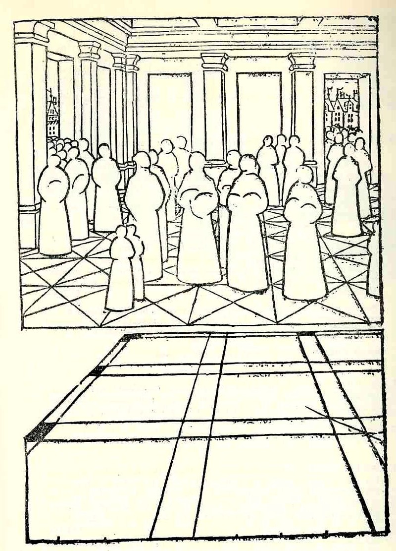
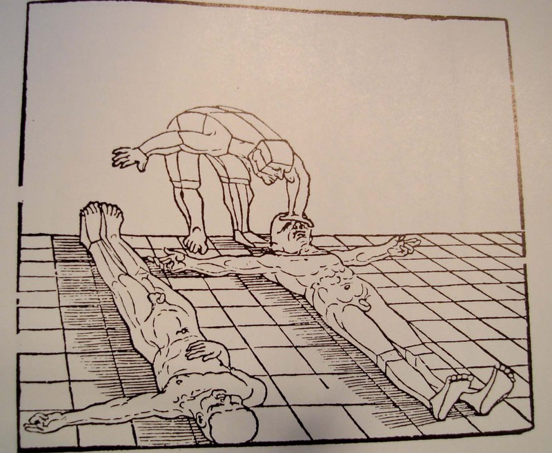
    Take for example the extraordinary work of Jean Pelerin (also called “Viator”) in his De artificiali perpectiva, a very rare woodcut-illustrated book printed n Nurenberg in 1509. In illustrating what he referred to as his “three point perspective” Pelerin removed much of the gothic-tradition bric-a-brac that is so heavily favored in these early books and replaced them with outlines from his rather astonishingly expressive notebooks, and replacing people, individual humans, with what may be the first “almost-entirely-absent” human forms. These roundish, ghost-like figures are just meant to hold the outlines of space, meant to function in the role of a simple comparative unit. This works quite well as an artistic technique—a solicitation tool which I think gives his reduced, “empty” humans an incredible, ethereal look unlike any other in the history of the first 60 or so years of printing.  It is difficult to imagine what the observer of these images back there in 1509 was thinking when they looked at these figures, and perhaps removed them from their textural context—it  would have been a unique visual experience for them

    Photo

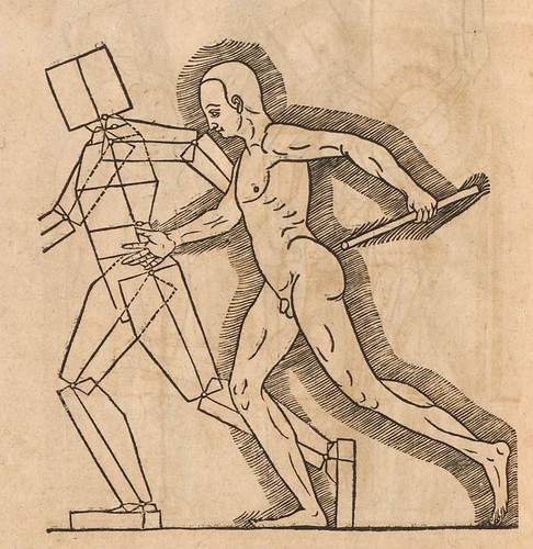
     Albrecht Durer’s (1471-1528) drawing of a geometrical man was an amazing–startling, even–object to the early 16th century consciousness. His …Symmetria partium…humanorum corporum (1537) was a masterpiece, and a key piece of revolutionary visionary thinking.

    Photo


    His Underwysung der Messung (“Treatise on Measuring”) written about 500 years ago (in 1525) set the stage for this next work–it is here that we find some of the most recognizable of Durer’s illustrations of the instruments that he employed to do his perspective work.  Durer–so far as I can tell–created an orthographically rotating human figures in three-dimensional trapezoids, creating incredibly human-like non-human forms.  Supra-human, perhaps; mechanized, calculated, structural. His use of stereometry, the science of measuring volume, was adapted to this study of human form and the relationship between that and movement. 

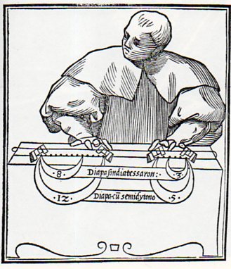
    Lodovico Fogliani, Musica Theoretica (Venice, 1529) which is somewhat reminiscent of a more -blank figure, though when you look at the images in teh book, most of the human figures are more detailed and refined.  This one seems only abotu half-done, with only the suggestion of a face and but little refinement in the clothing.  The subject’s fingers are also pre-robotic, like those fingers on a wooden manikin model if one had existed then.  Of course the figure is just there to depict scales and that’s about it, with just enough of a figure to stand as background to the transmitted info. 

    Blank ogliani878

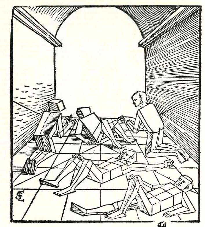
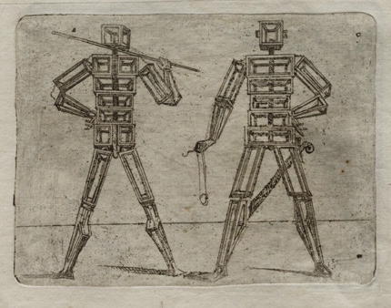
    Just a little while latter Erhard Schoen, in his Unnderweissung der proportzion und stellung der posssen liegent und dtehent, printed in Nurenberg  in 1538, presented another unique way of representing the human form in studying perspective.  He used simplified geometric form to stand in for the curvy humans, replacing them with proportional stacks of boxes which would more easily explain to the younger reader how to represent the human body n space and in proportion to other things.

    Photo

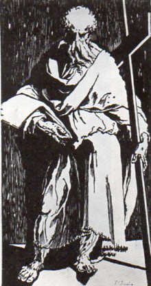
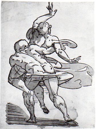
    In the next decade we see  in this woodcut of St. Andrew (or St. Philip) by Domenico Beccafumi (1486-1551) another suggestion of human form, this one though mostly shrouded in deliberate contrast and a had light, removing most of teh detail. 
    Blank domenico879

    While at about the same time Luca Cambiaso (d. 1585) produced this  woodcut,  “The  Rape of the Sabines”, which is mostly light with bare shadow, depicting motion and emotion more than detail. This again is hundreds of years before its more modern 19th & 20th century descendants. 

    Blank  cambiasi877

    And also this figure, again by Cambiaso, and recalling the efforts of Durer and Schoen:

    007cambiaso1
    And in 1564 comes this fantastic effort by Heinrich Lautensack, Des Circkels und Richtscheyts, auch der Perspectiva und Proportion der Menscher, which is beautifully described at the Bibliodyssey site, here.  
    Perspectiva (Lautensack) 1564 f

    Coming outside the confines of the Renaissance but just too fantastic to not include (although I could just simply change the title of this post to accommodate all)  is Giovanni Battista Braccelli’s fabu-landscapes of the human condition, published in his Bizzarie di Varie Figure in 1624. 

    (My thanks again to Bibliodyssey for surfacing Braccelli for me, and also to The Rare Book Room for posting all of the images in that rare work, and of course to the Library of Congress/Lessing J. Rosenwald pages, who made the images available for downloading, here.)

    Braccelli 5
    And a little later after this last–and again well outside of the Renaissance–the idea of the missing man, an image I just couldn’t resist:

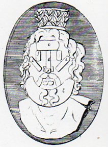
    Blank stafford882 which is a detail from

    Blank stafford881
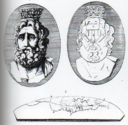
    which is from the instructional by Laurent Natter, Traite de la methode antique (1754).  The engraving is one of a series that shows the technical process of a antique method of constructing antique cameos and coins, and in this case how the gem would be produced by modern methods. 


  • Imago Frammeni: Boulle, the Dogon, Jouffret, the Simple and the Complex

    JF Ptak Science Books   Post 1623 

    Changing the Mind’s View of Simple and Complex Ideas via Different Image Perspectives

    Photo

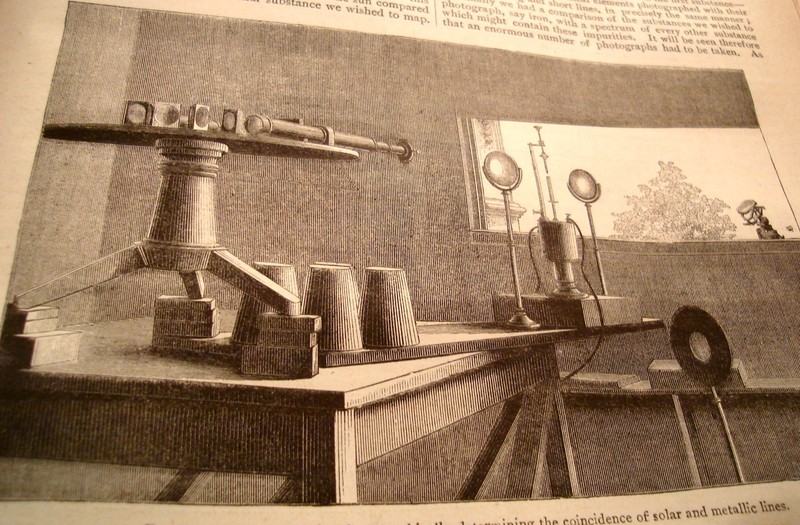
    I’m always very interested in curious things, or standard, “average” things pictured in non-standard ways, as the change in perspective can lead to entirely new observations and discovery.  Seeing this illustration in an article by J. Norman Lockyer (Nature 1881) I was shocked by its clarity and usefulness—Lockyer was simply showing the arrangement of his apparatus for his solar spectrum experiments but the angle of observation (being at such an oblique angle as is normally found) was just, so, well, “correct”.  The image I thought was perfect for the reader—not only that, it was designed artistically and with grace, and one can see exactly what Lockyer was up to.  Diagrams would’ve worked almost as well, but there is just something so extraordinary here that you could just about work from the image if there was no description. 

     
    Looking at things differently is hard work—that’s why I think it is always good to refresh the neuronal sap and look at great examples of unusual , insightful imagery.

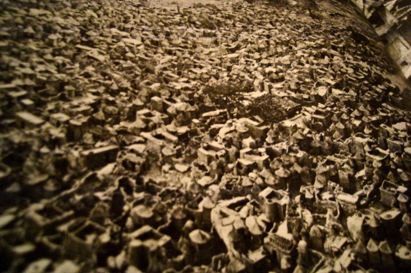
    Sometimes it works to read the description of what the image is before actually viewing it to see the differences of the image that you form in your brain before seeing the thing itself.  For example, when reading about the Dogon, a cliff-dwelling people of the plateau of Bandiagara, south of Tombouctou, and how they would make houses and then towns out of the rocks fallen from cliffs, you get what is probably a pretty benign image.  When you see photographs of these structures it seems as though the brain just simply isn’t ready for their impossible nature, though you quickly, instantly, recover (once you convince yourself the photo is real) and—voila—your mind has been expanded.  (This photo is from an expansive work by Bernard Rudofsky, Architectures without Architects, Doubleday, 1964.) 

    Photo

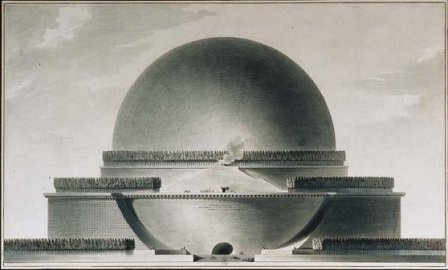
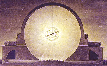
    The (internally) spectacular Etienne Boullee can greet us in the same way with some of his eye-popping architectural creations (unbuilt architecture by an architect, in this case, compared to the built architecture of the non-architects above).  Boullee’s “Plan du Cenotaphe de Newton”, a gigantic memorial to Newton  that was dancing with necessary privacy in Boullee’s brain during the French Revolution (and also during a particularly

    Photo

    un-Newtonesque time in on-your-knees-to-Cartesian-principles France)  is another superior example.  Reading the description of the structure just doesn’t quite do, and it seems whatever grand comes of that is tarnished and stripped away  by the obesely florid sentiment of none other than Ledoux’s poetic sentiments “…O Newton!  Sublime Mind!  Vast and profound genius!  I conceived the idea of surrounding thee with thy discovery…”.  Oy.   Boulle adds to this inspirational atrocity by saying of the sphere:  “…we must speak of a grace that owes its being to an outline that is as soft and flowing as it is  possible to imagine…”   And once the demand of “oh  dear god just please show me the picture” is met, we are left with a turned-around brain and another heavenly exaltation, or profanity.  The Cenotaph is just Grand-Canyon-Spectacular. 

    Photo

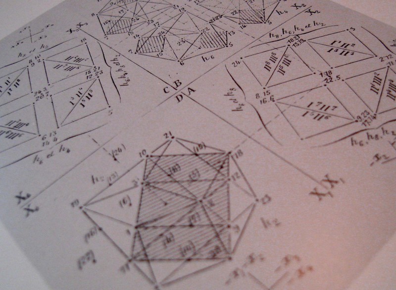
    Complex can turn on the simple in this way, where we can have those “a-ha” moments from, say, early efforts at picturing the fourth dimension or non-Euclidean geometry to a new perspective of looking at Roman ruins.  The arrival on the non-Euclidean geometries  in the 19th century posed new issues, not the least of which was representing the ideas.  Our saintly Hermann von Helmholtz believed –contrary to most elevated opinions—that the human mind could indeed intuit complex space and figures of these geometries.  (The difficulty not only from the obvious intellectual hardships in picturing the concepts but also because the geometry of Lobachevsky http://www-groups.dcs.st-and.ac.uk/~history/Mathematicians/Lobachevsky.html was called somewhat into doubt when some of its results were cast in doubt by contemporary astronomical observations.—and this even though so far as the great Gauss was concerned there was no deviation in Euclidean values.)   Helmholtz did this by employing the three-dimensional pseudosphere model of Beltrami.  (Reluctance to these ideas would end soon enough, for, as Linda Dalrymple Henderson points out with such sotto voce, “the convenience of Euclidean geometry would prove inadequate once Einstein” hit in 1905.)

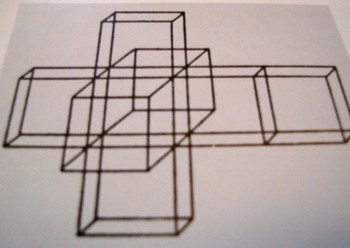
     The work of Beltrami  and H.P. Manning  (Geometry of Four Dimensions, 1914), and Jouffret  (Traite elementaire de geometrie a quarte dimensions, Paris 1903) in illustrating these complex ideas (the titles of which were in themselves daunting as with Jouffret’s “plane projections of the sixteen fundamental octahedrons of an ikosatettrhroid”) would in themselves prove to be entirely irresistible to the world of the arts. 

    Photo

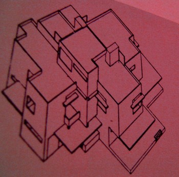
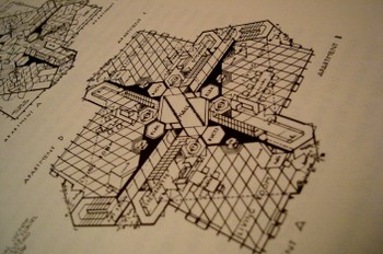
    Charles Howard and Maurice Princet I think had as much to do with  the creation of cubism and abstract art and the imaging of time than anyone, including the painter (I shudder to say his name) of Les Demoiselles (1907) or the lovely Georges Braque (Houses at Estaque, 1908) or Jean Metzinger or even the sublime comedian Duchamp’s Nude DescendingDsc04584 (1914).  The hypercube starts to show up a lot in some Bauhaus genres and even into the palette of Frank Lloyd (“Stinky”) Wright (with his St.Dsc04589 Mark’s Tower plan, NYC, 1929).  I can only imagine the shock to the brains of these creative geniuses in seeing the display of such a novel idea.  (For the ultimate treatise on this see Linda Dalrymple Henderson’s The Fourth Dimension and Non Euclidean Geometry in Modern Art, Princeton  1983).  And no the art didn’t come first. 
    Dsc04578
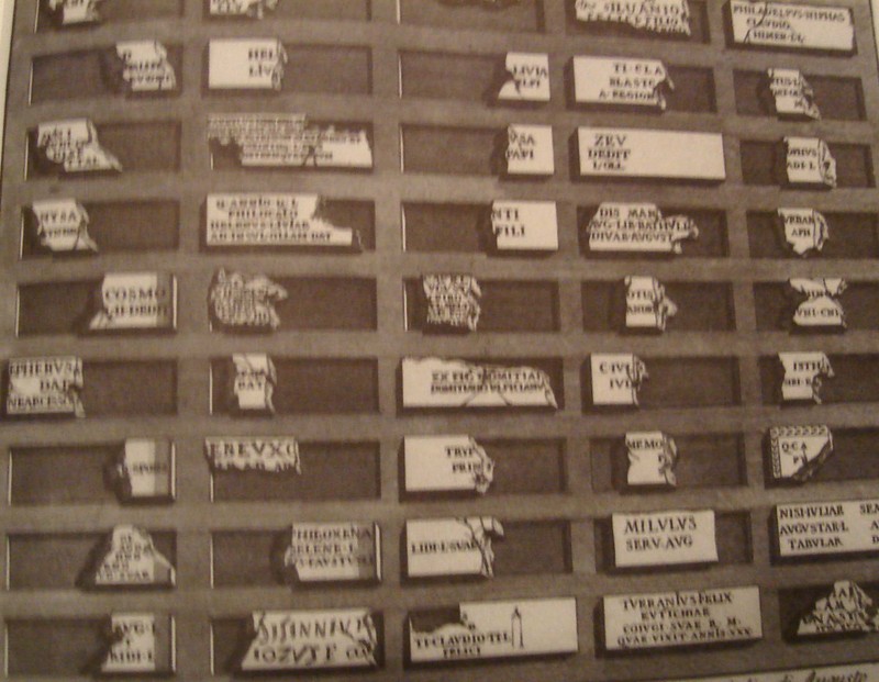
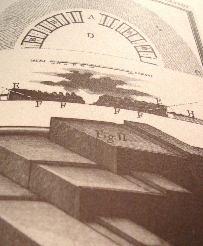
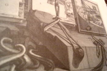
    But coming back to the simple, and in the same frame as the first example that we mentioned in Lockyer, we have the unlikely find of Giovanni Piranesi.  In my opinion his most spectacular work is found in his frammeni (the diverse bits and pieces of architectural and sculptural bric-a-brac found objects that are collected together on one stage) and in his archaeological detail.   His attention to new perspective in showing the crucial aspects of structure and building in Rome is tremendous and

    Photo

    unexpected—as an example we see here the child’s-eye-height view of three steps of the reconstruction of the theatre of Pompey.  I must say that I’ve seen a lot of architectural images in my time but nothing quite comes to me so surprisingly as this step-level view of the reconstruction of a Roman theatre,  This happens throughout the lesser-known Piranesi, with great details of tools, and cross sections of the very deep footings of bridges, and so on.  It is really refreshing, lovely, unexpected work. 

    Photo

    We’ll return to this subject from time to time as I have hundreds of interesting examples to draw from—for example, the remarkable Emily Vanderpoel’s Colour Problems which is ostensibly an undecipherable attempt to quantify color arrangement in art but through the lovely examples displaying this attempt pre-date the modern re-invention of non-representational art by at least a dozen years.  Stay tuned! Dsc04592

  • The History of Blank, Empty & Missing Things–When Everything was Missing

    JF Ptak Science Books   Post 1624   (Part of the series on the History of Blank, Empty and Missing Things.)

    Koberger bw884

    Perhaps “everything” wasn’t missing, but almost everything was.  Certainly the ancients and even the more-moderns, even the scientists of the 16th and into the 17th centuries (until von Guericke in 1672), could not abide the idea of the existence of nothing.  The vacuum, a space in which there was nothing at all, was seen to be an anathema to the creations of the great creator, that the vacuum was antithetical to what was understood to be the nature of nature. (I wrote a post here earlier on when nothing was almost something.)

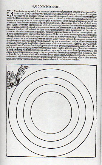
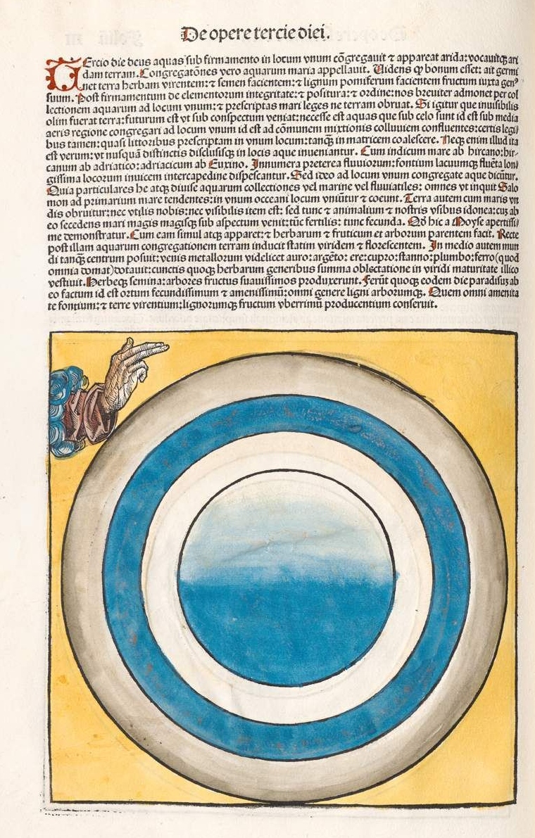
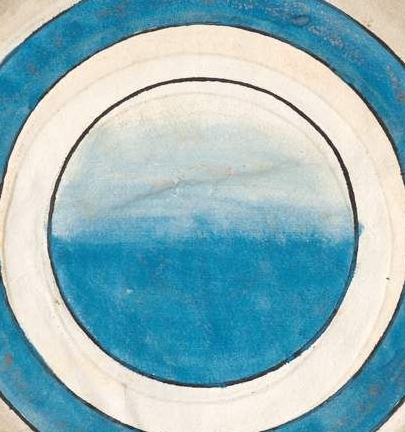
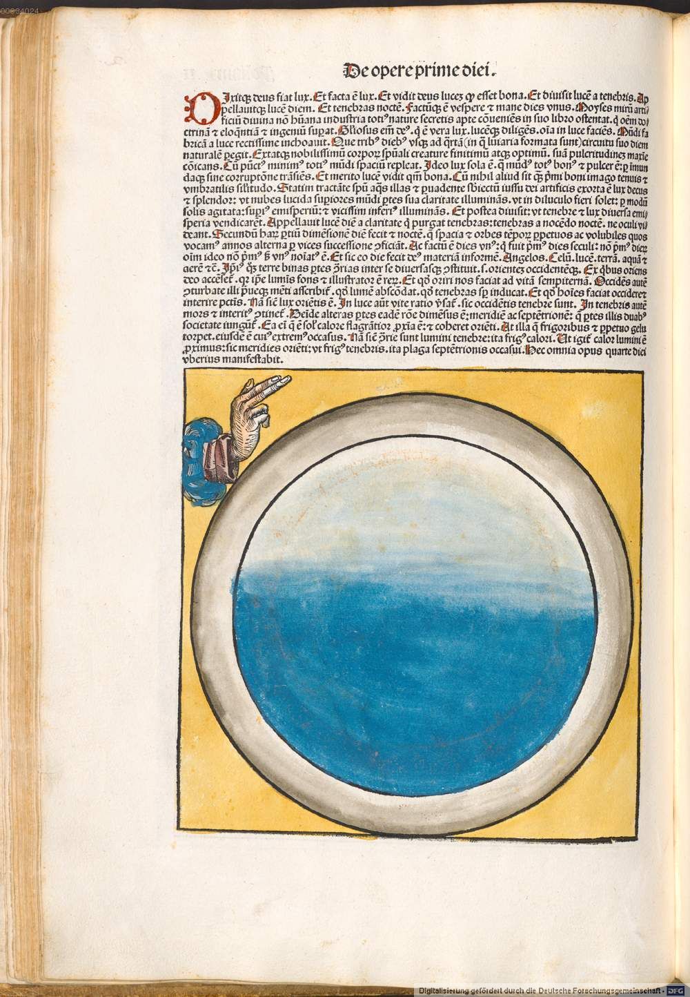
    But what we see here, above, is the third day of creation as presented in one of the most significant books printed in the 15th century, and it is somewhat problematic, because it depicts almost-northing.  That, or almost-everything. 

    The book was written in Latin by Hartmann Schedel (1444-1514, with the German translation by Georg Alt) , with the illustrations under the control of Michael Wohlgemut (1434-1519) and his stepson Wilhelm Pleydenwurff (c. 1450-1494), .and was published in Nuremberg in 1493 by Anton Koberger as Liber Chronicarum–known best to English-pseaking readers as the Nuremberg Chronicles (and to Germans as Die Schedelsche Weltchronik).  It is perhaps one of the greatest illustrated works in the first half-century of movable type printing, using more than 1800 woodcuts to tell the story of the world–according to the Bible, mostly.  (The book deals with the history of world in its seven ages–the first five of which deal with cumuulative history to the birth of Jesus Christ, while the sixth ages handles the history from Christ to the present day, and teh seventh carries along the future history of the world to the Last Judgment.  Not much then is devoted to the 1500 years preceding the publication of Koberger’s book. The author, Schedel, was a very religious man, and considered the work of teh Bible to come from the hand of god and therefore was infallible; on the other hand (so to speak), everything written outside of the Bible was that of humans, and so fallible, and therefore open to interpretation.)

    Here is a colored version of the third day in the creation cycle mythology, which opens itself to much more visual congruence. (“On the third day God gathered together unto one place the waters under the firmament; and the dry land appeared. And God called the dry land Earth; and the gathering together of the waters he called Seas; and God saw that it was good, and said, Let the earth bring forth the green grass, the herb yielding seed, and the fruit trees yielding fruit after their kind.[Genesis 1:9-13.]”)

    Koberger color

    Koberger color b

    And the uncolored version, third day:

    Koberger bw det

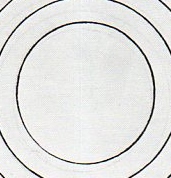
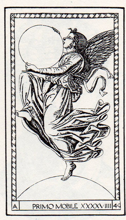
    This sort of “nothingness” is not unique, as we can see in this example from the Mantegna Tarocchi, showing the creator as Primum Mobile, the First Mover, holding what may well be our universe in its hands (and standing on another sphere of nothing, god knows what that might be):


    https://historyofideasblog.com/a/6a00d83542d51e69e20133f47ca205970b-piPerhaps I’m missing the larger picture, and that the circles/spheres are the things created, and that they are contained in the square surrounding them; and that the boundaries marked by the circular lines are not necessarily empty, and that it is the suggested of the circles that is the stuff created, placeholders, contained within the square of the creator’s domain.  Or maybe not. Perhaps the circles are signifiers for the elements–earth at the center, surrounded by water/air/fire. Perhaps the woodcut was just waiting for some color. 

    Notes:

    The English translation of the Nuremberg chronicle used here is from Beloit College (here) which also has a very lovely scholarly treatment of their copy of the Nuremberg Chronicle (here).

    Here’s the rest of the cycle, in color:

    “For he spoke and they were made: He commanded and they were created”  (Psalm 33)., so says the legend (IPSE DIXIT ET FACTA SUNT; IPSE MANDAVIT ET CREATA SUNT Psalm 32) which floats above god enthroned–but it is difficult to see the progress in the un-colored version of day three.  

    http://www.beloit.edu/nuremberg/graphics/Layout%20and%20Design-Full%20Page_lg.jpg

    The first day:

    Korberger 1st day real

  • On the Geography of the N-Word

    JF Ptak Science Books   Post 1625

    There are 5601geographic names in this country starting with the word “Negro”.  Since “Negro” wasn’t really recognized widely as having a capital “N”–that a whole race of people weren’t deserving of a capital letter–until the late 1930’s, these place names didn’t start out this way, using the word “Negro”.  They used something else.  And I think that it is a safe bet that in 1962, when offensive names were removed from designating geographical places in the U.S., that almost all of these “Negro” places had been changed from “Nigger”.  And that wasn’t all of them, either.

    I think that this is just a small percentage of the changed titles.  For example, I own a very large (30 sq ft) map of the place I live, Buncombe County (NC), that contains at least 25 place names using the word “Nigger”.  Today in the state there are 12 names using the word “Negro”.  It is possible that at one time then there could have been hundreds of place names printed on county maps for the state of North Carolina designated “Nigger” that have simply been replaced or erased or changed in some way.

    Among many other things, language is a bomb, a land mine, a virus, a means to an end–and sometimes it is just not pretty as a signifier, or classifier.  Sometimes it is an oppressive thing, an offensive weapon, a prison. We are reminded of that today as we see with the recent business with presidential candidate Rick Perry’s family hunting patch near Paint Creek, Texas.  The place was called “Niggerhead”, the name painted on a rock at one of the place’s gates, and had been there for years–it may have been there as recently as 2008, though Gov. Perry says the word was painted over in 1983 or ’84.  When the name was painted over seems to be open for discussion. It shouldn’t be. 

    The fact of the matter is that the word “Nigger’ was used in thousands of geographic designations in printed maps, and still used in large numbers up to 1962. 

    As I pointed out, the capitalization of the word “Negro” was hotly debated up until the late 1930’s, when most anti-capital forces gave in.  Even though “Negro” had not been recognized as being worthy of a capital “N”, “Nigger” was, and appeared so on countless maps and other published and official (and federally printed) documents.  In this instance the use of the offensive word along with using the small “n” in “negro” proved to be another very effective means of controlling a people by controlling the language in which they were discussed. Using words as weapons like this has come with an incalculable cost, and the Rick Perry episode of slowly dealing with one of those words is a good reminder of this long and indoctrinated legacy of repression and hate, and how not-far away it all is.

    Notes:

    There are places today called “Negro Jim”, and Andy, and Bob, Bill, Jake, Jack, James, Joe and so on, and you know for certain that “Negro James Landing” wasn’t named so 50 years ago.  Squint your eyes and you can well imagine the original name:  Negro Ditch, Cut, Island, Jump, Canyon, Branch, Lake, Head, Heads, River, Hollow, Knob, Hill, Prong and of course “Negro Jumpoff” could hardly have started out their lives using “Negro”.

    Currently, of the 560 place names using “Negro”, 8 are in New England and 54 are in the Middle Atlantic states.  The distribution is as follows:  AL, 17; AK, 7; AZ, 21;  AR, 18; CA, 55; CO, 19; CT, 2; DE, 1; DC, 0; FL, 13; GA, 7; HI, 0; ID, 11; IL, 12; IN, 3; IA, 1; KS, 7; LA, 10; KY, 22; ME, 1; MD, 6; MA, 2; MI,1; MN, 1; MS, 1; MO, 18; MT, 10; NE, 3; NV, 14; NH, 0; NJ, 2; NM, 44; NY, 22; NC, 12; ND, 0; OH, 6; OK, 19; OR, 29; PA, 15; RI, 1; SC, 7; SD, 9; TN, 37; TX, 30; UT, 7; VT, 2; VA, 17; WA, 6; WVa, 6; WI, 3; WY 15. 

    I should note that there are still 10 places in the U.S. using the name “Redskin”.  Not including a football team for the Nation’s Capital.


    ·Posted by :

    ·in:

Recent Posts

Archives

Categories