A Daily History of Holes, Dots, Lines, Science, History, Math, Physics, Art, the Unintentional Absurd, Architecture, Maps, Data Visualization, Blank and Missing Things, and so on. |1.6 million words, 7500 images, 4.9 million hits| Press & appearances in The Times, Le Figaro, Mensa, The Economist, The Guardian, Discovery News, Slate, Le Monde, Sci American Blogs, Le Pont, and many other places… 5000+ total posts since 2008.

Category: Beautiful books

  • Unexpected Beauty in Antiquarian Homemade Bindings

    JF Ptak Science Books   Quick Post 

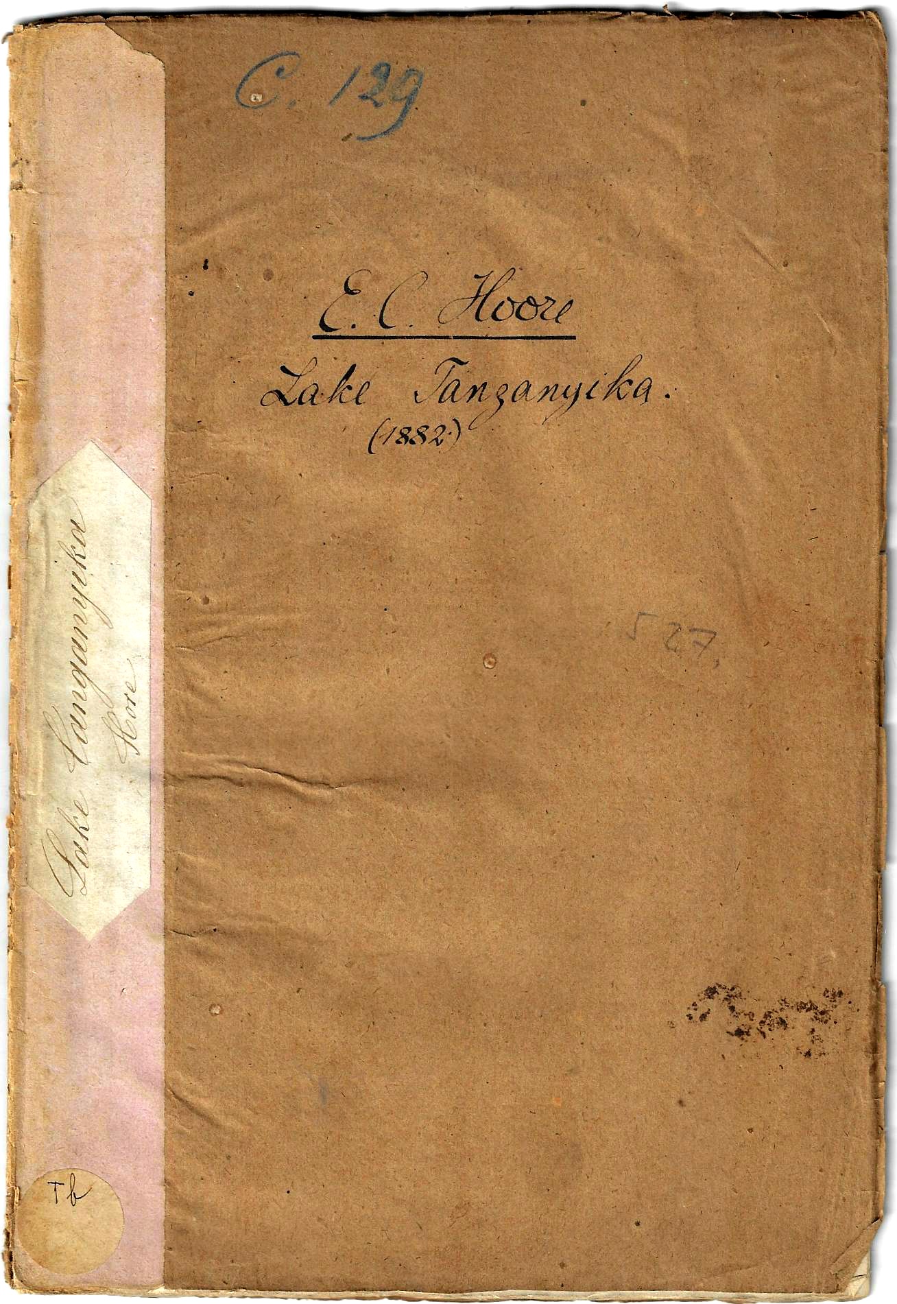
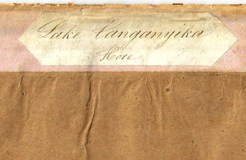
    There is a special beauty that comes with the imperfection and homemade qualities of an antiquarian bound-at-home book or pamphlet. I think that much of the time–in my experience–these bindings were made of whatever was available. Their irregularities can be charming, lovely even, the more imperfect but working/workable their attempts present an admiration for that amateur’s work so long ago. And so tonight I’m just going to quickly share one of these examples that just bobbed up–a homemade for a report from the Royal Geographical Society (1881) on Lake Tanganyika:

    Books covers Lake Tanganyeka detail


    And the full frontal:Books covers Lake Tanganyeka


  • Punctuation and its Elimination: Spongebobian Sentence-Enhancers and a Pickle for the Knowing Ones (1847)

    JF Ptak Science Books 

    (This is an expanded version of an earlier post from 2008, more than 4000 posts ago. I’m reposting it here on the top of the heap today because no doubt the only person who would see the revised version left under the burden of a million other words would be me, so here it is, new-ish and fresh.)

    I’ve made several posts about Blank and Missing People which seem to me—having had long exposure to images over the last 30 years—to be quite unusual in the history of popular-published prints.  This may actually be a simple corollary to a wider category of Blank Things, or Missing Things.  Like Dark Matter.  Or white, open, blank spaces on early, honest, maps. (And this may be part of another larger story on The  Spaces in Between, (a concept in German known as Zwischenraum), but that’s another story, identifying where the missing stuff might actually “be”. 

    Right now though I’d like to address blank spaces in literature.  It is surprising to me that in Google searches that “blank books” and “blank literature” and “books without words” (once you remove all of the hits for new diaries and new artists’ notepads and such) direct you to graphic novels.  This category hardly strikes me as being “blank” as the art and action more than accommodate the absence of written words.  (And by the way the graphic novel seems to be a fairly new invention—perhaps the work of Frans Masereel and Rockwell Kent in producing sequential, worldess books were among the first of their genre when they were published in the mid-1920’s?)

    Blank literature doesn’t mean hollow literature.  In one skinny example James Fenimore Cooper’s writings may be a little translucent and a little empty, but they aren’t blank. (Twain ripped Cooper on this point, cursing Cooper for using a bagful of woodsy woodsmen tricks to drive his story when he should’ve been writing, and not waiting for them to fill up the spaces of his missing narrative: “in his little box of stage properties he kept six or eight cunning devices, tricks, artifices for his savages and woodsmen to deceive and circumvent each other with, and he was never so happy as when he was working these innocent things and seeing them go…(another) favorite stage property that he pulled out of his box pretty frequently was his broken twig.  He prized his broken twig above all the rest of hi effects, and worked it hardest…”

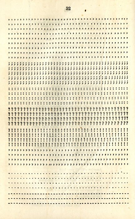
    An excruciatingly direct example of the worldess book  is a remarkable, hoaxing or perhaps just simply demented set (!) of books by Timothy Dexter (Newburyport, Massachusetts).   Dexter wrote a semi-incompressible work called A Pickle for the Knowing Ones, which followed his own logic, sentence structure, vocabulary and spelling. It was also printed and published without punctuation.  In one sentence. (A sample is found below in the continued reading section.)  I think that it is interesting in that someone did it and that it exists and that it was printed in 1802, but aside from that I find little comfort or twisty inspiration from it.  His second edition of that work though is much more interesting, not so much in that it continued ((?), I use that word loosely) the shredded intellectual threads laid out in the first edition; it also contains one page of what I think of as a blank book:  the missing punctuation marks from the first edition.   

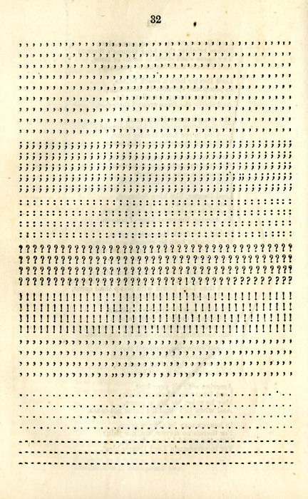
    Well, not ALL of the missing punctuation, but enough, in the mind of Dexter, to silence some of the complaints of the more faint-hearted readers of his one-sentence, non-punctuated, made-up vocabulary of the first edition.  He at least provides the punctuation–separately–in case a weak reader needed some: 
    Pickle for knowing ones

    [Image from a good treatment of Dexter at http://northofboston.org/north-of-boston-historical-figures-a-pickle-for-your-thoughts/]

    He writes “Fourder mister printer the Nowing ones complane of my book the fust edition had no stops I put A nuf here and that may peper and solt as they please.”

    That’s much in the spirit of Spongebob Squarepants and Patrick Star when they “discovered” the use of swear words and curses, which they figured had no meaning except as a sort of comfrot food to be sprinkled in conversation for flavoring–“sentence enhancers” they called them, without knowing (of course!) that their sounds were more than simple garnishes and intellectual punctuation.  

    As follows (please consult http://www.lordtimothydexter.com/the_holl_pickle.htm for a full transcription of the Dexter work–the author of the site also transcribes the Dexterian-speak into plain English, which was no doubt a labor of love): 


    ,,,,,,,,,,,,,,,, ,,,,,,,,,,,,,,,,, ,,,,,,,,,,,,,,,,, ,,,,,,,,,,,,,,,,,,, ,,,,,,,,,,,,,,,,,

    ,,,,,,,,,,,,,,,, ,,,,,,,,,,,,,,,,, ,,,,,,,,,,,,,,,,, ,,,,,,,,,,,,,,,,,,, ,,,,,,,,,,,,,,,,,

    ……………. ……………. …………….. ………………. ……………..

    ,,,,,,,,,,,,,,,, ,,,,,,,,,,,,,,,,, ,,,,,,,,,,,,,,,,, ,,,,,,,,,,,,,,,,,,, ,,,,,,,,,,,,,,,,,

    . . . . . . . . . . . . . . . . . . . . . . . . . . . . . . . . . . . . . . . . . . . . . . . . . . . . . . . . . . . .

    . . . . . . . . . . . . . . . . . . . . . . . . . . . . . . . . . . . . . . . . . . . . . . . . . . . . . . . . . . . .

    …………………………! ! ! ! ! ! ! ! ! ! ! ! ! ! ! !………………………..

    …………………………….. ! ! ! ! ! ! ! ! ! ! ! …………………………..

    …………………………………. ! ! ! ! ! ! ……………………………….

    ………………………………………!……………………………………..

    . . . . . . . . . . . . . . . . . . . . . . . . . . . . . . . . . . . . . . . . . . . . . . . . . . . . . . . . . . . .

    , , , , , , , , , , , , , , , , , , , , , , , , , , , , , , , , , , , , , , , , , , , , , , , , , , , , , , , , , , , ,

    ……………????????????????????????……………

    And on page 32 more of the “missing” punctuation is provided:

    ,,,,,,,,,,,,,,,,,,,,,,,,,,,,,,,,,,,,,, ,,,,,,,,,,,,,,,,,,,,,,,,,,,,,,,,,,,,,, ,,,,,,,,,,,,,,,,,,,,,,,,,,,,,,,,,,,,,, ,,,,,,,,,,,,,,,,,,,,,,,,,,,,,,,,,,,,,, ,,,,,,,,,,,,,,,,,,,,,,,,,,,,,,,,,,,,,, ,,,,,,,,,,,,,,,,,,,,,,,,,,,,,,,,,,,,,, ,,,,,,,,,,,,,,,,,,,,,,,,,,,,,,,,,,,,,, ,,,,,,,,,,,,,,,,,,,,,,,,,,,,,,,,,,,,,, ,,,,,,,,,,,,,,,,,,,,,,,,,,,,,,,,,,,,,, ;;;;;;;;;;;;;;;;;;;;;;;;;;;;;;;;;;;;;; ;;;;;;;;;;;;;;;;;;;;;;;;;;;;;;;;;;;;;; ;;;;;;;;;;;;;;;;;;;;;;;;;;;;;;;;;;;;;; ;;;;;;;;;;;;;;;;;;;;;;;;;;;;;;;;;;;;;; ;;;;;;;;;;;;;;;;;;;;;;;;;;;;;;;;;;;;;; :::::::::::::::::::::::::::::::::::::: :::::::::::::::::::::::::::::::::::::: :::::::::::::::::::::::::::::::::::::: :::::::::::::::::::::::::::::::::::::: ?????????????????????????????????????? ?????????????????????????????????????? ?????????????????????????????????????? ??????????????????????!??????????????? !!!!!!!!!!!!!!!!!!!!!!!!!!!!!!!!!!!!!! !!!!!!!!!!!!!!!!!!!!!!!!!!!!!!!!!!!!!! !!!!!!!!!!!!!!!!!!!!!!!!!!!!!!!!!!!!!! !!!!!!!!!!!!!!!!!!!!!!!!!!!!!!!!!!!!!! ””””””””””””””””””” ””””””””””””””””””” ””””””””””””””””””” ””””””””””””””””””” ……………………………….. ……………………………….. ……………………………….. ……………………………….. ————————————– ————————————– ————————————–


    It is a brilliantly empty book, all of the characterization present and waiting for the last bit that would make this a book:  the words.

    The depths or shallownesses of Dexter’s private insight is a mystery to me, if that mystery extended beyond an elaborate and peculiar (and deep) sense of humor.  The man was a successful if not very odd businessman, after all, so he did have some sort of regulating principle in his life–its just that this sort of dark, removed humor is so incredibly pre-modern that I’ve gotten stuck thinking about Dexter being a little deranged rather than be prescient. 

  • One of the Most Beautiful Scientific Books of the 19th Century

    JF Ptak Science Books  Quick Post

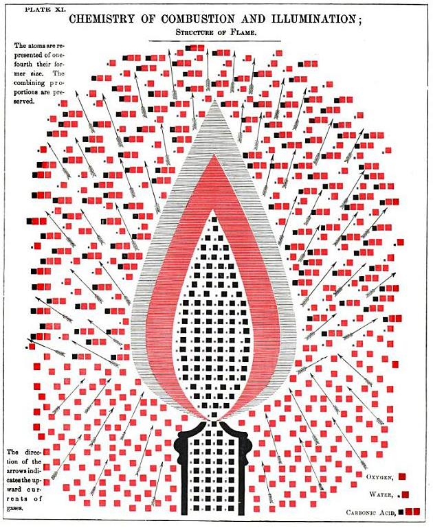
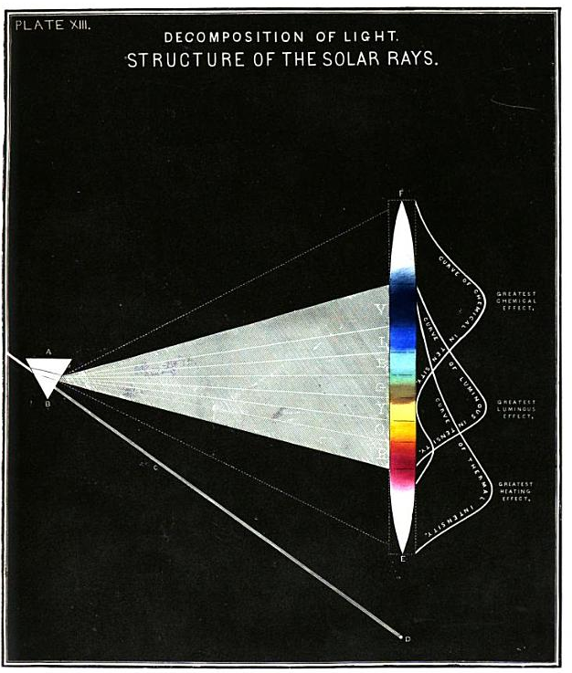
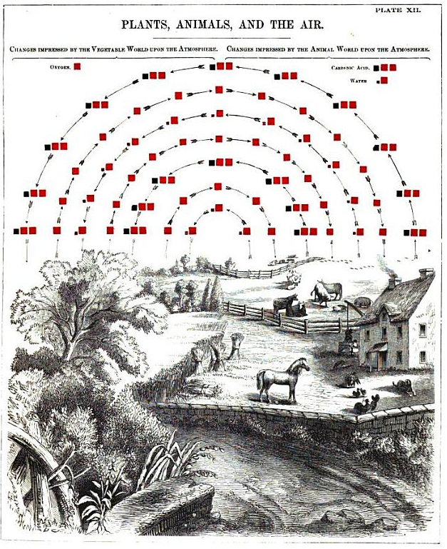
    I no longer own a copy of this book, but at least I did find a version of it at Google Books–the rather walk-about title completely conceals the fabulous stuff within it. The  Chemical atlas: or, the chemistry of familiar objects, by Edward Livingston Youmans, published in New York City by Appleton in 1856 is the sort of title that you could easily skip by if you weren’t familiar with it or its author. Youmans is certainly a man worthy of high respect, and I like him a lot: in his career as an author and editor, he was (in addition to much else) the founder of two significant scientific publications that I have long enjoyed: the International Scientific Series (1871), which was a rapid/cheap reprint of important contemporary science which also sought to fairly compensate its authors (at a time where they were even more ripped-off than they can be today); and the great Popular Science Monthly (1872), which was a very meaty sci-tech instrument before it got to be more ‘popular” than “scientific” decades after Youman’s death in 1887. 

    Youmans candle


    But it is his thin and lovely chemistry-of-stuff book from 1856 that I’d like to share right now. I do not know who was responsible for the design and the illustration of the book, which is I think exemplary and unusual for the time. Even if Youmans did not design the images, he did have the very good sense to include them in his book.  It would be nice to have this book back at some time, along with a few of the other gorgeous works of the 19th c,  like Oliver Byrne’s Elements of Euclid (1847) and Ernst Haeckel’s impossible Kunsformen der Natur (1904, but started in 1899 so it still classifies as a 19th c work), to name a pair.

    • Some good, concise, biographical info on Youmans:   https://en.wikisource.org/wiki/Appletons%27_Cyclop%C3%A6dia_of_American_Biography/Youmans,_Edward_Livingston

      Youmans light


    Youmans field


    • Source:  Google Books  https://books.google.com/books?id=SrJXAAAAYAAJ&dq=Chemistry%20of%20Combustion%20and%20Illumination&pg=PA81#v=onepage&q&f=false

  • The Madonna in Stone, Again (1665)

    JF Ptak Science Books   Quick Post

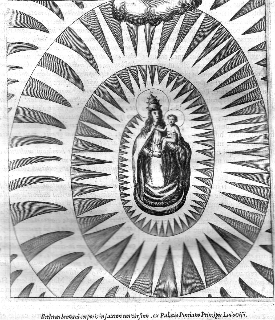
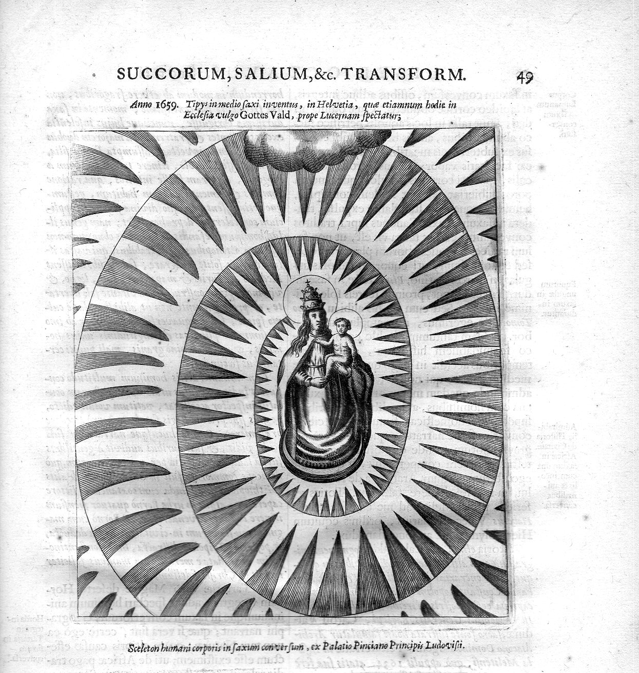
    Continuing this blog’s occasional thread on the great, idiosyncratic, and troublesome Fr. Athanasius Kircher, I report on this spectacular image. It is supposed to be an engraving of a found-image in a piece of agate or some such, showing the Virgin Mary and baby Jesus, surrounded by s curiously radiating display of “light”.  According to one reference the image first appears with Ulisse Aldrovandi (1522-1605) who must have included it with one of the natural histories before it founds its way into Kircher’s Mundus1.  

    The partial description above the print references the Church Grottes Vald (in Lucerne), where this relic was to be found.  

    Kircher 49b059

    And the full sheet, in two parts:

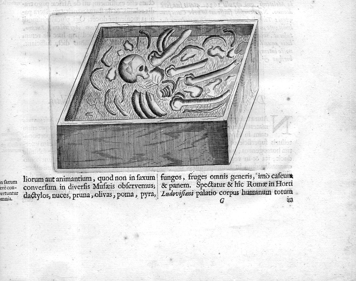
    Kircher 49057And the bottom half that wouldn’t fit on the scanner:

    Kircher 49b058In reality these are simply on the same sheet, uninterrupted.

    The second image is identified so: “Sceleton humani corporis in saxum conversum…”2, and refers to what was supposed to be fossilized human remains covered by some sort of fossil -something.  The remains weren’t fossilized, of course, but in 1657, that was the difficult leap that was make. 

    Notes:

    1.  The full title by Kircher (1602-1680): Mundus subterraneus, in XII libros digestus : qvo divinum subterrestris mundi opificium, mira ergasteriorum naturae in eo distributio, verbo [pantamorphon] Protei regnum, universae denique naturae majestas & divitiae summa rerum varietate exponuntur, abditorum effectuum causae acri indagine inquistae demonstrantur, cognitae per artis & naturae conjugium ad humanae vitae necessarium usum vario experimentorum apparata, necnon novo modo & ratione applicantur. Ad Alexandrum VII. pont. opt. max, 1665. 

    2. This image can be seen in full text in a somewhat later edition of the Mundus of 1678 at Heidelburg http://digi.ub.uni-heidelberg.de/diglit/kircher1678bd2/0062 and another series of images at University of Oklahoma, http://hos.ou.edu/galleries//17thCentury/Kircher/1665-det-composites/. 


  • Beautiful and Practical Perspective, 1596

    JF Ptak Science Books  Post 2531

    Sirigatti forms _4.5_

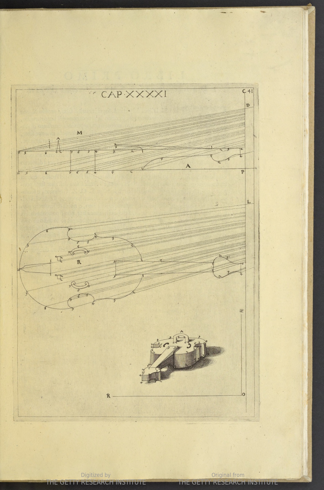
    One of the most highly valued of disciplines to the Renaissance painter and architect and engineer was perspective, and at the end of the 16th century Lorenzo Sirigatti produced a superior example of the field.  La pratica di prospettiva del cavaliere Lorenzo Sirigatti was printed in Venice in 1596 and proved to be a valuable source of inspiration and possibility. 

    The full text is located at the Getty Museum (here) from which came the five images I’ve used in this post.  Part of the acclaim of the Sirigatti work was its fine elegance and non-nonsense line, and the general exclusion of a background brought a particular clarity to the designs. The images themselves follow a development from the introduction of the basic elements of perspective to an increasing complexity in their use, flowing from fundamentals to forms to architectural standards. They are lovely things, works of art in themselves even removed from their context.  

    One of the principal attractions to me was the quietness of the design, leaving everything outside of the subject to blankness–many other works of this type included scenes into which perspective studies appeared, but this was hardly the case with Sirigatti. For example, a perspective with violin:

    Sirigatti perspective violin

    Source: Getty Museum

    ·Posted by :

    ·in:

    — —

  • Squares and Squares within Squares in Book Design

    JF Ptak Science Books  Quick Post

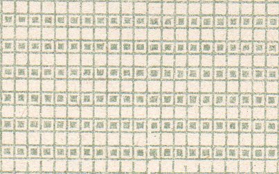
    I picked up  Bayard Tuckerman’s History of English Prose Fiction (printed in New York City in 1886) part of my Borgesian-Eccoian anti-Library, and found this fantastic design on the free endpaper and pastedown:

    Book design endpapers833

     And a close-up, which is about one square inch:

    Book design endpapers834

    There are about 5000 of these on a 10×6″ space, some 15,000 lines.  That’s a lot of work in a small space, about 289 squares per square inch.  Tiny.  Impressive.  

    Q:  Oh: how many squares and rectangles are there here?  A: a lot.

    ·Posted by :

    ·in:


  • A Dominance of Observations from our Future Skeleton (1635)

    JF Ptak Science Books    Post 2413

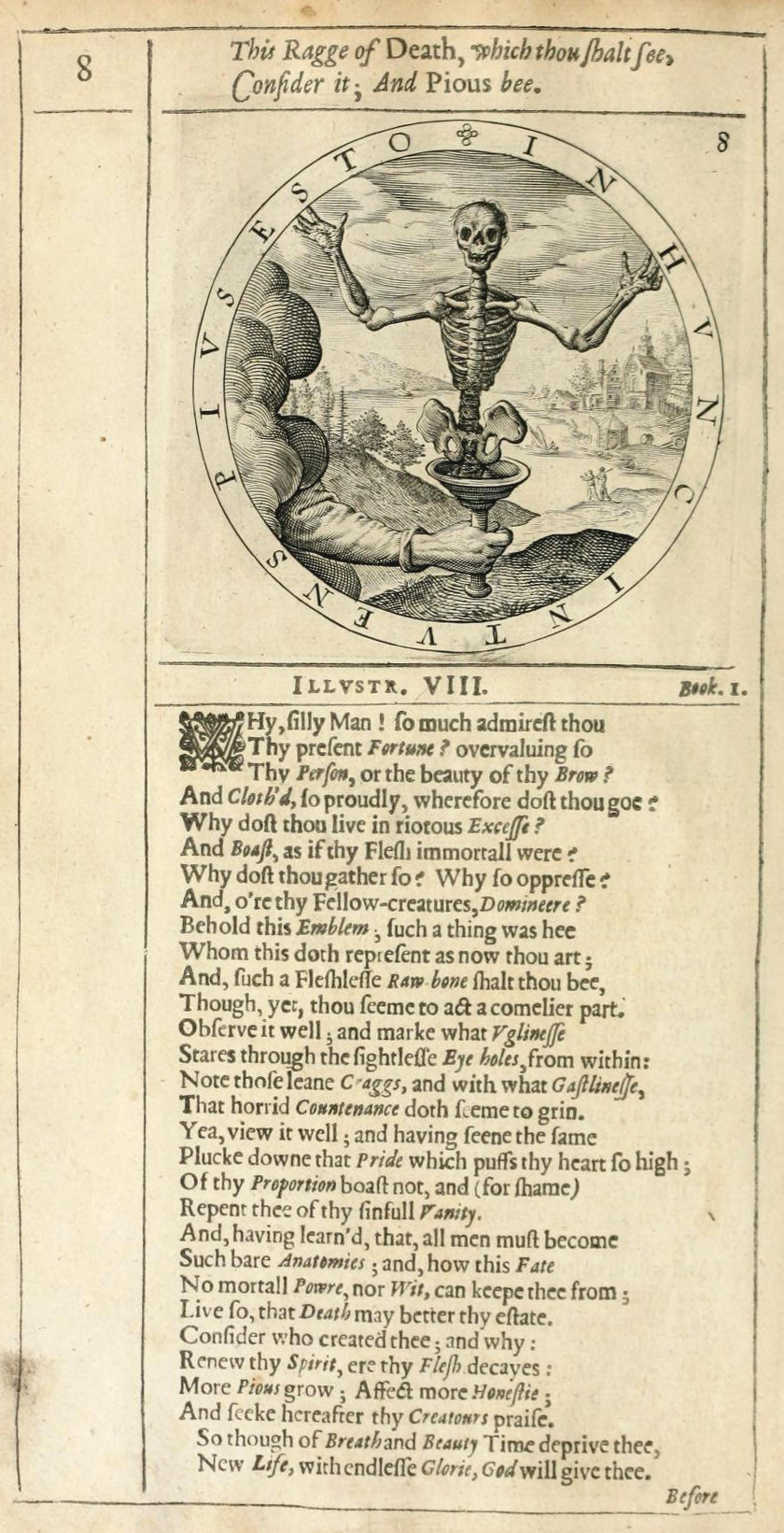
    Emblem skeleton detail

    The poem asks some good and thoughtful questions that could lead a person to re-evaluate their self-centered existence, all the while mentioning “God” and the everlasting only  twice (though it does invoke the concept of “piety” up at  the very beginning and again at the end), so to me this strikes me as being a half-way morality-of-consumption consideration on the one hand and a plea for repentance for “new life, with endless glorie” on the other.   

    This fine emblem book was found for me this morning by the wonderful Public Domain Review site. George Wither (1588-1667) published his book  A Collection of Emblemes, Ancient and Moderne, Quickened with Metricall Illustrations, both Morall and Divine, and Disposed into Lotteries…. in 1635 in London by Henry Taunton, and engraved by William Marshall (1617-1650).  It is a lovely and surprising book, filled with sprinkled gems, not the least of which is the lottery-maker (referred to in the title), which we will come to below.  

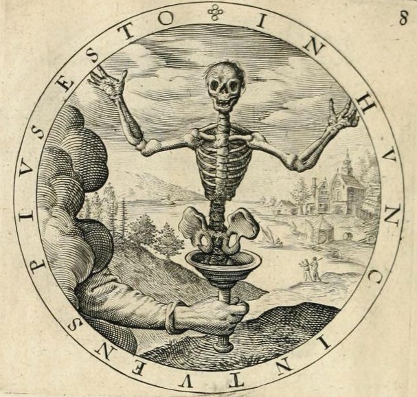
    The emblems were meant to be  striking metaphorical/allegorical images to spark ideas and reflection, and illustrated with a poem to make that process longer and deeper.  For example, consider the aspect of the death that awaits us all and how we live our lives:

    Emblem skeleton


    In an odd occurrence of the word “overvaluing”, the writer (and skeleton) asks us right away if we are “overvaluing so thy person, or the beauty of thy brow?” and “Why dost thou live in riotous excesse?” There are a few other provocative questions from and for the future (“Why so oppresse, and o’er thy fellow-Creatures, dominere?”) delivered to us from us from our “fleshless raw bone thou shalt bee”–our skeleton seeing things clearly though its “sightlesse eye holes from within”.  Mostly though what remains for us in the poem are admonitions/suggestions about what we might do with our time before we have none. For example, “of thy Proportion boast not and (for shame) repent thee of thy sinful vanity”, and “renew thy spirit ere thy flesh decays”.  There’s a lot going on in the 36 lines of this poem, more so than you’d expect, and it certainly gives the reader something to think about as they slink towards their own exposed anatomies.  

    The poem asks some good and thoughtful questions that could lead a person to re-evaluate their self-centered existence, all the while mentioning “God” and the everlasting only  twice (though it does invoke the concept of “piety” up at  the very beginning and again at the end), so to me this strikes me as being a half-way morality-of-consumption consideration on the one hand and a plea for repentance for “new life, with endless glorie” on the other.    

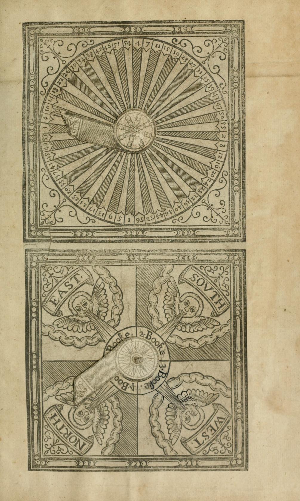
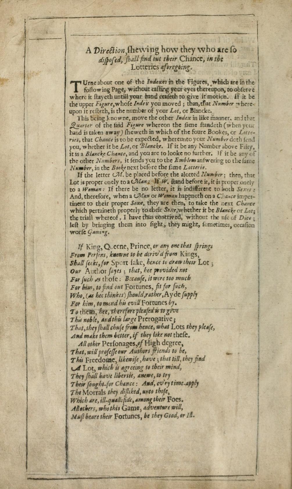
    Now to one aspect of the “Lotteries” referred to in the title:  the book comes with its own chance-maker.  That is, at the very end there are two movable-paper circular calculators (volvelles, actually), paper disks made to turn one on top of the other, that the reader would move to select an emblem to read by chance:

    Emblem volvelleand he text:

    Embleme volvelle explanationThe book is segmented into four parts, with each section having about 50 emblems each, so the reader would determine which book they would go to by the direction of the wind or some other whimsy, and then choose the numbered emblem by turning the pointer on the larger dial, which would send them off to the found/appropriate emblem.  

    Overall the book grows its own comparative form of “curious”, and is an enjoyable read, and an uncommon one.  As the Public Domain Review points out, “Of Wither’s mostly forgotten literary talents the Scottish author and poet George Gilfillan wrote that “Wither was a man of real genius, but seems to have been partially insane”.  It happens.   


  • An Enormous Bookplate and Some Found Book Art (1856)

    JF Ptak Science Books   Quick Post

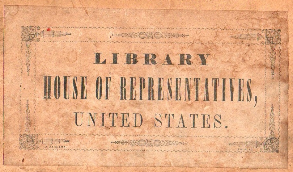
    I purchased this volume of House of Representatives reports from 1856 a number of years ago, mostly for the extraordinary bookplate that appears on the front cover of the double-brick-sized volume.  It is about as big a bookplate as I’ve bumped into or seen in 30+ years of bookselling (though admittedly the folks in the sciences seem overall to have less interest in bookplates for their library as non-science readers/collectors, so my viewpoint may be problematic).  Still, it is a big bookplate, about 5×7 inches, and as I said is on the outside of the volume rather than on the front inside cover.  There was no mistaking to whom the volume belonged, until now, when it belongs to the non-House-of-Representatives-me–anyway it is quite an object.

    Bokplates546


  • A Library of One Book

    JF Ptak Science Books  Post 2234

    + card factory det

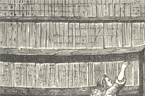
    Is this an image of a  librarian carefully reaching for a carefully placed book, carefully arranged in a carefully-odd Borgesian-style library housing only books of the same height and thickness?  Or is this a librarian in a Library of the Same Book, housing thousands of copies of copies of the same book, climbing the ladder to make sure that he had a copy of just the copy that was requested (“a copy held at least 5 feet from the ground, near a side window though not touching a vertical piece of wood”)? 

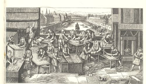
    + card factory

    Neither.  These are shelves filled with nothing but uncut sheets of playing cards, housed for the playing card factory somewhere in Paris (?) “during the reign of Louis XIV”.  Playing cards, which were introduced to Europe via Marco Polo from China or traders coming from the Middle East or etc., are much older in Europe than one would think, I think, and by the time this print was made, playing cards were already quite popular there for two centuries. 

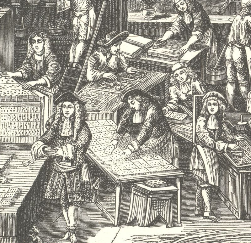
    I can’t identify all of the activities of all of the twelve tables of card preparation here, though some seem pretty obvious:  the trimmer working near the pressman, the sorters and assemblers of decks of cards at the lower left corner, the paper preparer (?) just to the right of the man on the ladder, the pair of men preparing the type trays at middle-bottom, and that’s about it.  I’m not sure what everyone else was doing.  I’m not even so sure what’s going on with the sheets of cards on the bookshelves, the target of this post—it can’t be for drying purposes, as the sheets are too close together…perhaps it is just for storage of different sheets of cards for different decks.  

    In any event I’m right or I’m wrong on this guess, about the same odds as being dealt “nothing” in a game of five-card poker (almost 1:1 odds), but that’s fine:  I just like the composition of the print.

    + card factory det 2

    ·Posted by :

    ·in:


  • Batman’s Possible Influence on Shakespeare

    JF Ptak Science Books  Post 2102

    Crock702
    Well, it’s not really the Batman as culture currently knows the name, but Stephen Batman (d. 1584) whose published work heavily incorporating a Medieval natural history text was probably one read/consulted by Shakespeare.  The earlier work was the beautifully-named book by Bartholomaeus Anglicus, All the Properytees of Thyings, which was published in Westminster in 1495 (and also known as De proprietatibus rerum, also translated as On the nature of things, or On the properties of things), which was originally written around 1225.  The book was a
    bestiary, a marvelous encyclopedia, a collection of all things as known
    in the 13th century–it would be interesting to represent all that is
    know today and compact it into a workable, logical, usable (printed !)
    book of a thousand pages.  The question of organization of knowledge
    would be the key, of course, and how to make one flow to another
    complimentarily as practicable…it would be an interesting project (for
    someone else) to try and arrange the basis of human knowledge in a
    finite space like that.

    Batman produced his own version of the book incorporating the 400-year-old information with some of his own, and found the book a printer in 1572–Batman uppon Bartholome, His Booke De Proprietatibus Rerum; newly
    corrected, enlarged, & amended, with such Additions as are
    requisite, unto every severall Booke. Taken foorth of the most approved
    Authors, the like heretofore not translated in English. Profitable for
    all Estates, as well for the benefite of the Mind as the Bodie
    was a storehouse of knowledge, right and wrong.  

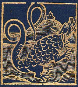
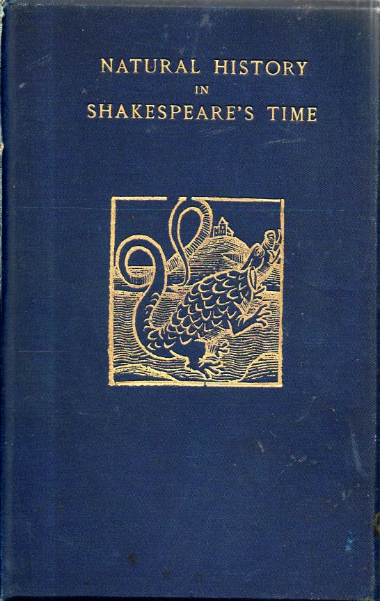
    I came upon the book today because one of its images is on the front cover of a book that I just unpacked.  H.W. Seager, author of Natural History in Shakespeare’s Time, being Extracts illustrative of he Subject as he knew it…. (“printed for Elliot Stock” of London in 1896) must’ve found the image compelling enough to reproduce it in gold leaf.  Batman’s image was of a crocodile, which now being told what it is probably looks more like itself than a dragon–Batman himself took issue with the current London practice of buying the skins, which he found to be a laughable thing (“we know not how to bestow our money”), establishing that people had too much money and not enough sense on what to do with it.  In any event, I like the image. 

    Crock701

    ·Posted by :

    ·in: