A Daily History of Holes, Dots, Lines, Science, History, Math, Physics, Art, the Unintentional Absurd, Architecture, Maps, Data Visualization, Blank and Missing Things, and so on. |1.6 million words, 7500 images, 4.9 million hits| Press & appearances in The Times, Le Figaro, Mensa, The Economist, The Guardian, Discovery News, Slate, Le Monde, Sci American Blogs, Le Pont, and many other places… 5000+ total posts since 2008.

Category: Information, Quantitative Display of

  • A Plate Full of Eyes (1851)

    JF Ptak Science Books   Quick Post   Overall Post  2529

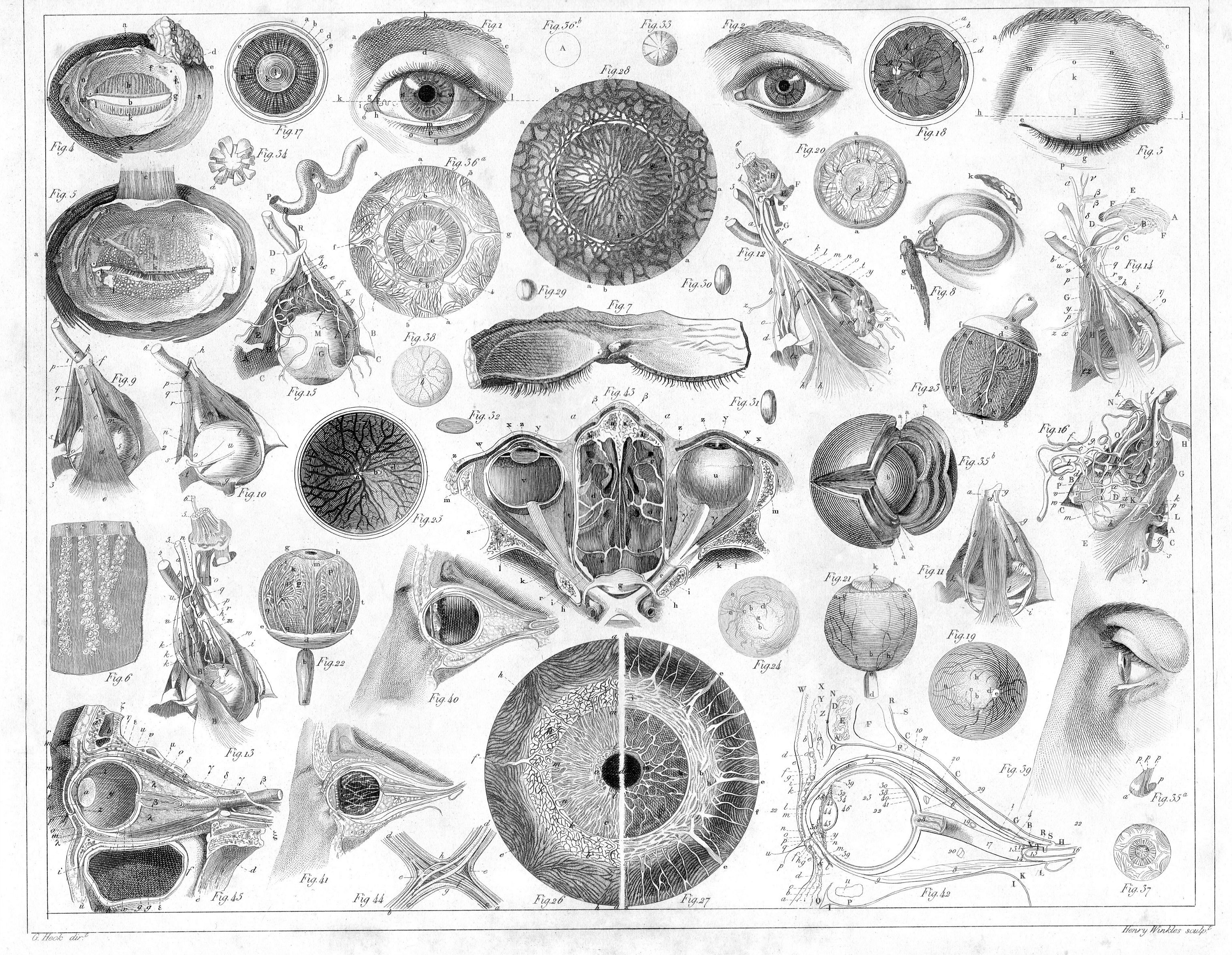
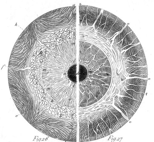
    J.G. Heck wrote and compiled a fascinating and complex work entitled The Iconographic Encyclopedia of Science, Literature and Art, which was published in the U.S. for the first time in 1851 in Spencer Baird’s translation from the German.

    EYEs _1_

    [Detail–60mm in the original.]

    The key to his work is the amount of data displayed on each of the 500 engraved plates illustrating this work and the way in which it is arranged.  The design and layout of the 30,000 items on these 500 plates was a work of genius, and for my money it is easily the best-presented complex means of the display of data and objects that was published in the 19th century.  

    The image above is from one engraved plate featuring 43 aspects of the human eye–beautifully arranged, and somehow fitting perfectly on the 9×11″ sheet of paper.  It is a work of real design engineering.  

    The image above is a detail from:

    EYe_2_


  • “Euphonium”: Found-Poetry of Recorded Soundwaves (1897)

    JF Ptak Science Books  Quick Post –Overall Post 5122 (Part of the History of Lines series)

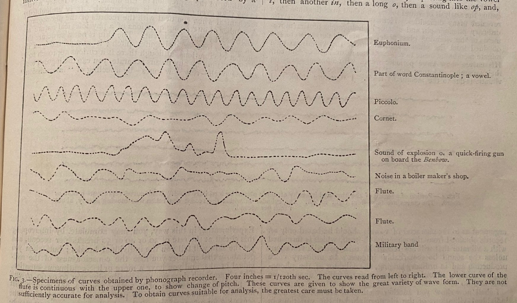
    IMG_4854John McKendrick had a long scientific career, with a  lot of very widely-spaced interests on which he wrote well and often.  What caught my eye on this piece (“The Analysis of Phonograph Records”, in Nature, a Weekly Illustrated Journal of Science, volume 56 no. 1444, 1 July 1897, pp 209-213 in the issue of pp 193-216)–I mean, aside form its wonderful content–was a bit of found poetry in one of the paper’s illustrations.  McKendrick’s—professor of physiology at Glasgow—effort here is one of the early attempt studying graphic records of soundwaves specifically prepared on phonographic cylinders, looking for variations in the graphics of pitch and the meaning they convey. Fascinating results.  

    EUPHONIUM (1897)

    Euphonium,

    Part of a word Constantinople, a vowel,

    Piccolo

    Cornet

    Sound of explosion or a quick-firing onboard the Benbow.

    Noise in a boiler makers group.

    Flute.

    Flute.

    Military band.


  • 1.8 Million Planes and 2 Million Tanks (1918)

    JF Ptak Science Books  Quick Post

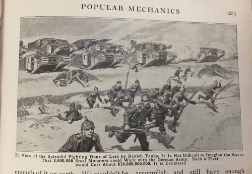
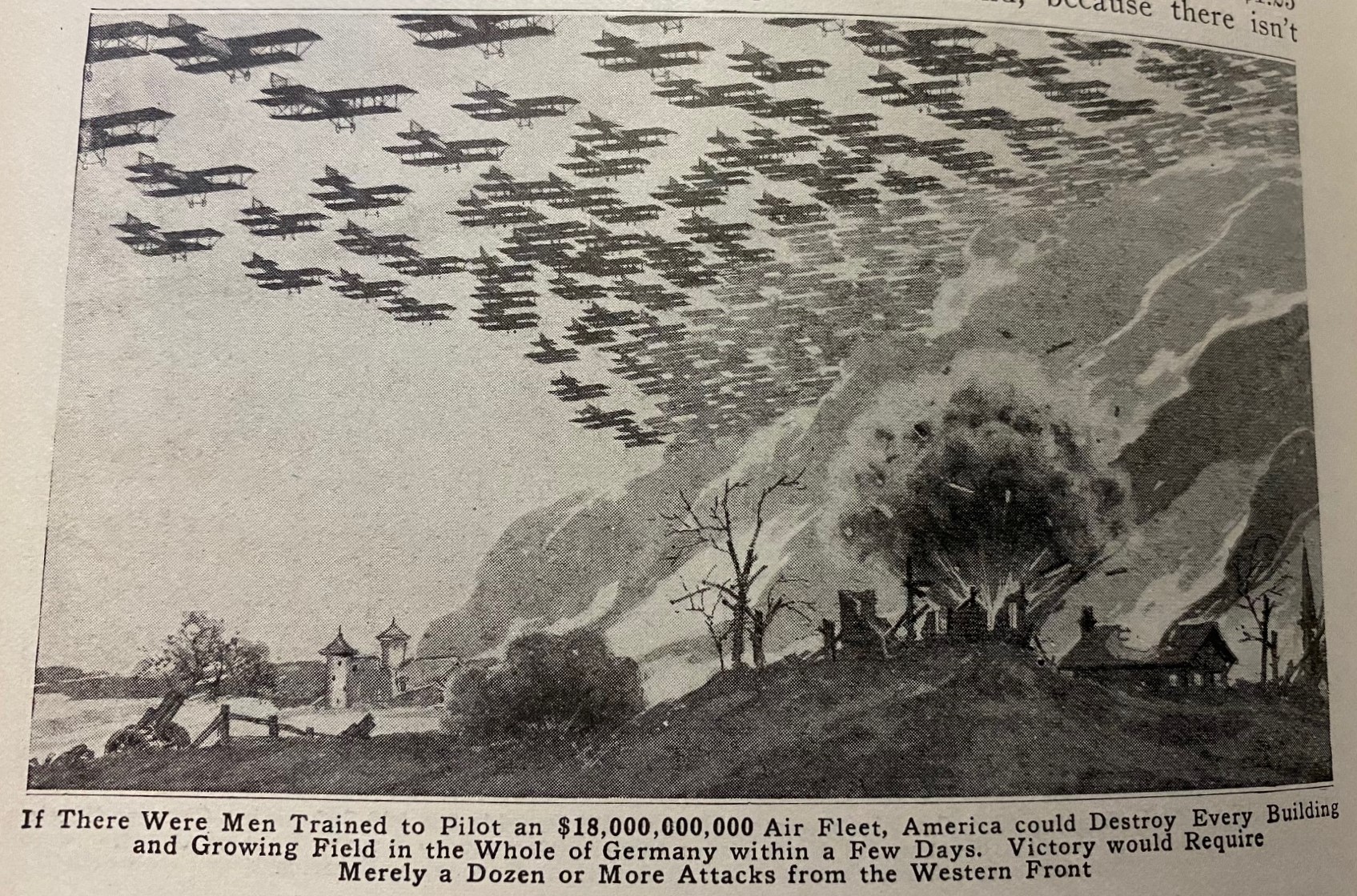
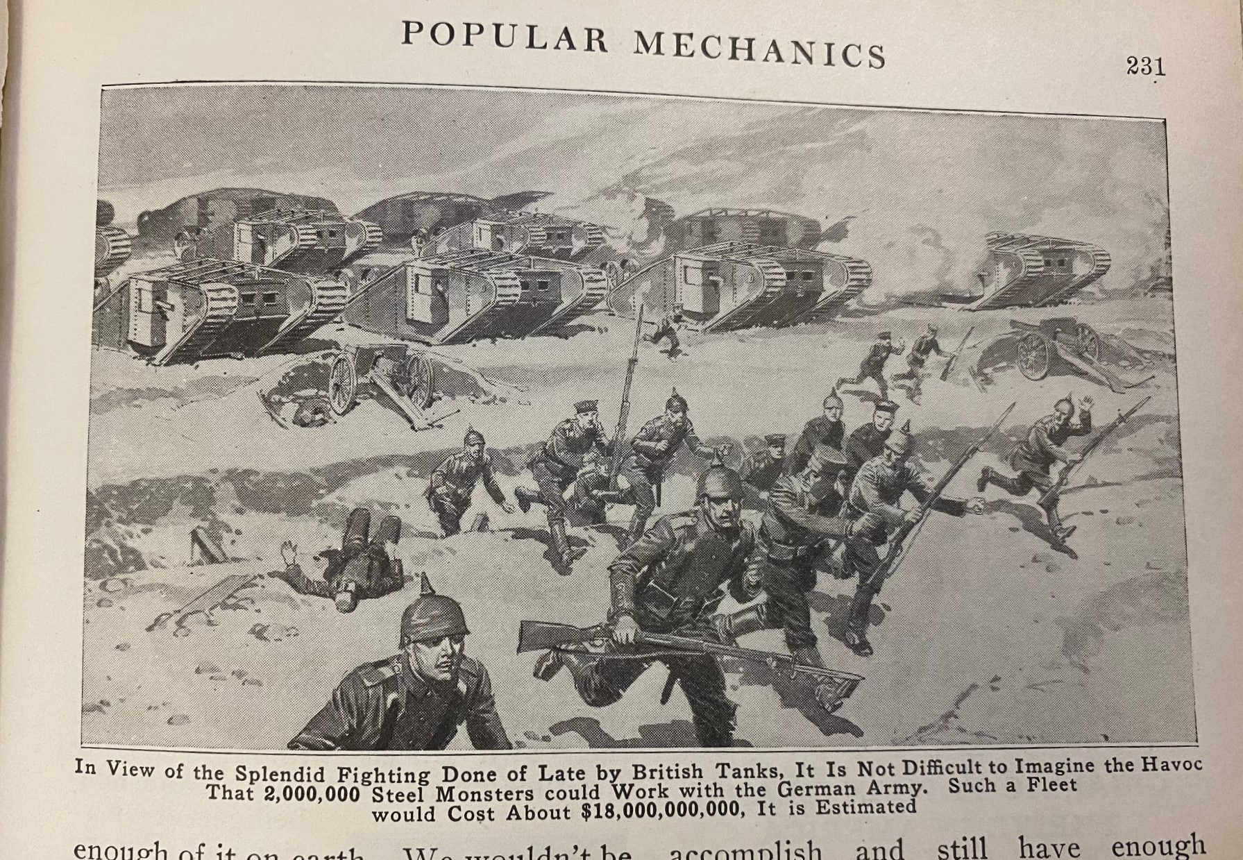
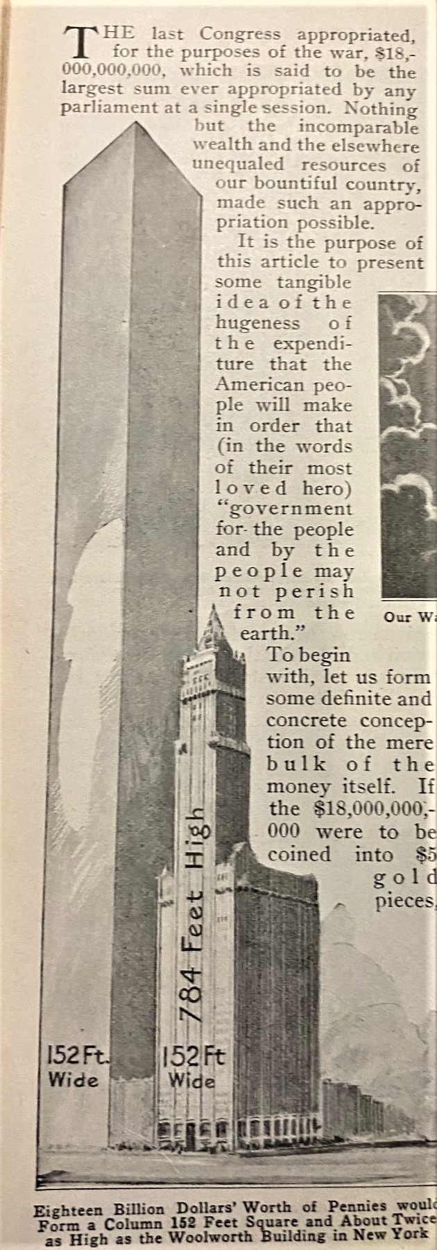
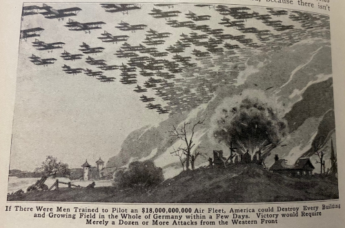
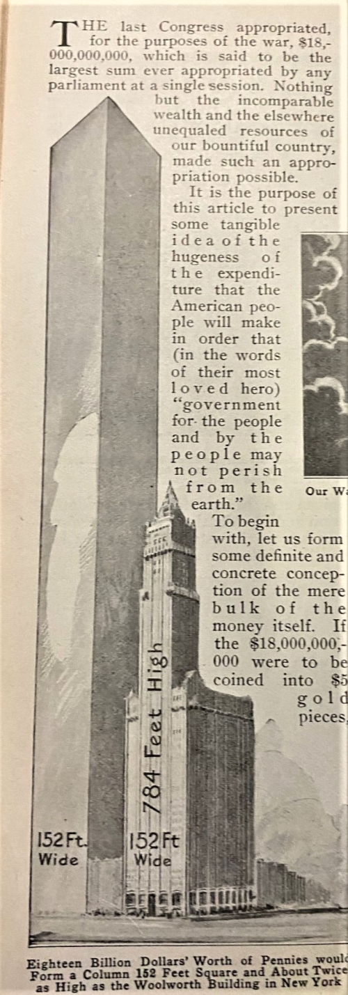
    Here’s a fine and somewhat misleading representation of the U.S. Congressional war allocation of 1918 for what was then the staggering figure of $18,000,000,000 (or about $387 billion in 2020 according to the BLS), found in the pages of Popular Mechanics for May 1918. To visualize the 18-billion, the editors displayed the amount in terms of something somewhat familiar to most readers.  For example, if the appropriation could be laid directly and only into the manufacture of airplanes (and bombs I guess) the editors guessed that the force would lay waste to all of Germany in about two days.  Guessing that each aircraft cost about $10,000 in 1918 that would mean there would be an attack force of 1.8 million planes.  Granting each a capacity of 500 pounds carriage, their entire force could deliver about 20% of the total tonnage dropped on Germany by the US and UK during WWII for each 1.8 million plane sortie.  (I’m guessing at some of the figures but I think that this is about correct.) Given that the “bomber plane” was still in its cradle, this could not have painted a very clear picture of what $18 billion dollars could buy.  Further guessing here is that there were fewer than 50,000 aircraft in existence in 1918, so imaging the 1.8 million figure would have been staggering. 
     IMG_3001

    IMG_3002Another example from the same article involves envisioning $18,000,000,000 worth of tanks, which in 1918 would cover fielding 2,000,000 of them. This of course is an enormous number, particularly having in mind that about 50,000 U.S. Sherman tanks were constructed between 1942 and 1945, which is about 3.5% of the total talked about in the article, and the largest tank battle in history at Kursk in July and August 1943 involved about 6,000 tanks between German and Soviet forces. Given too that the tank is only a few years on the battlefield at this point there was really no way that a person could visualize 2 million tanks–I suppose no commander in 1945 could have envisioned it, either.  

    And another example from the same article: using pennies and the Woolworth Building as comparables.  The Woolworth structure has found itself in a number of similar articles in the ‘teens, though I don’t recall seeing it compared to a 1.8 trillion penny mound, as we see below.  

    I think that the editors were just out and beyond their capacity in trying to visualize war funds in these comparative ways.
    IMG_2999


  • Surfacing Underwater Work–the Ambrose Canal Dredging Measured in Woolworth Buildings (1913)

    JF Ptak Science Books  Quick Post

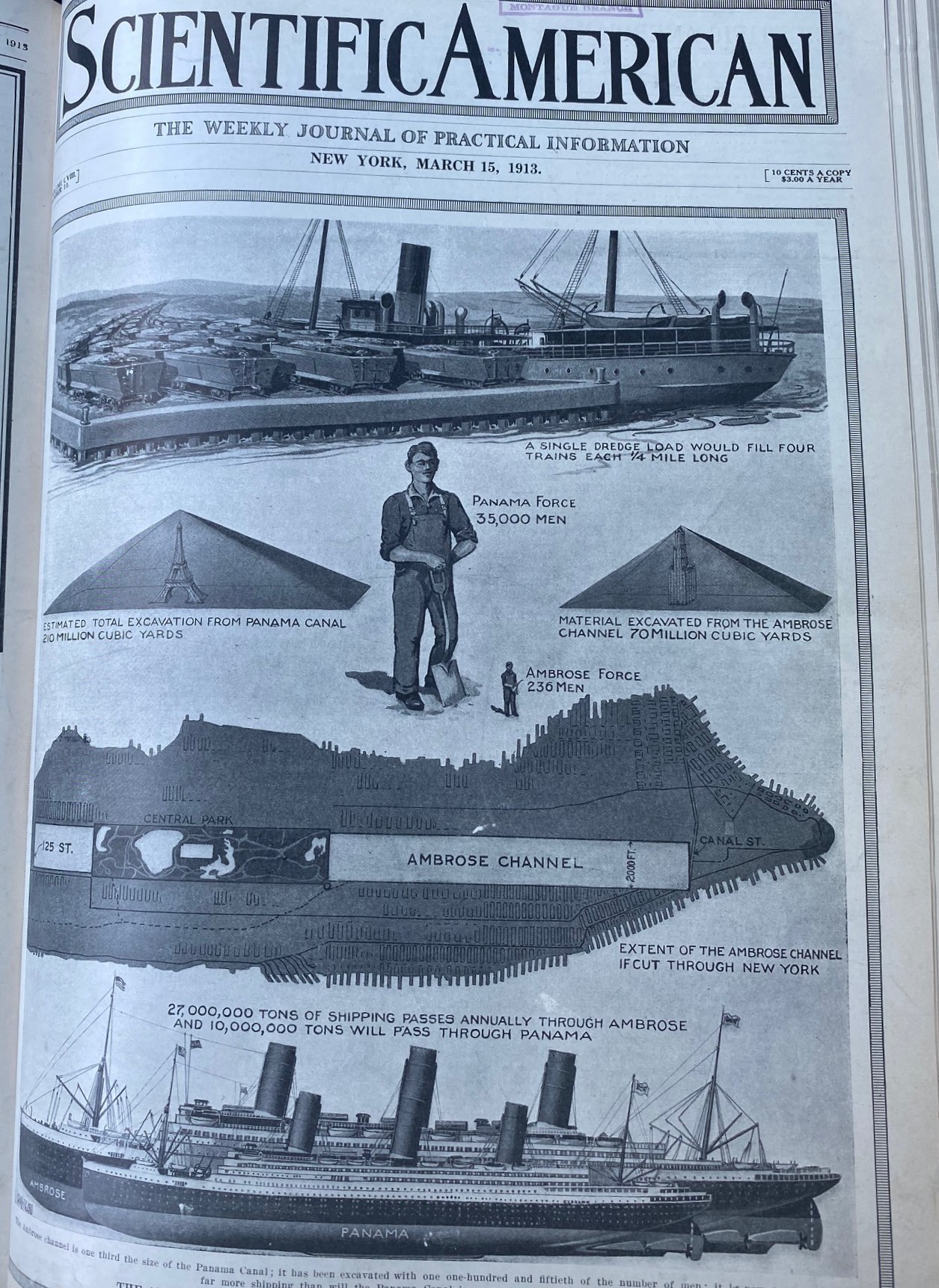
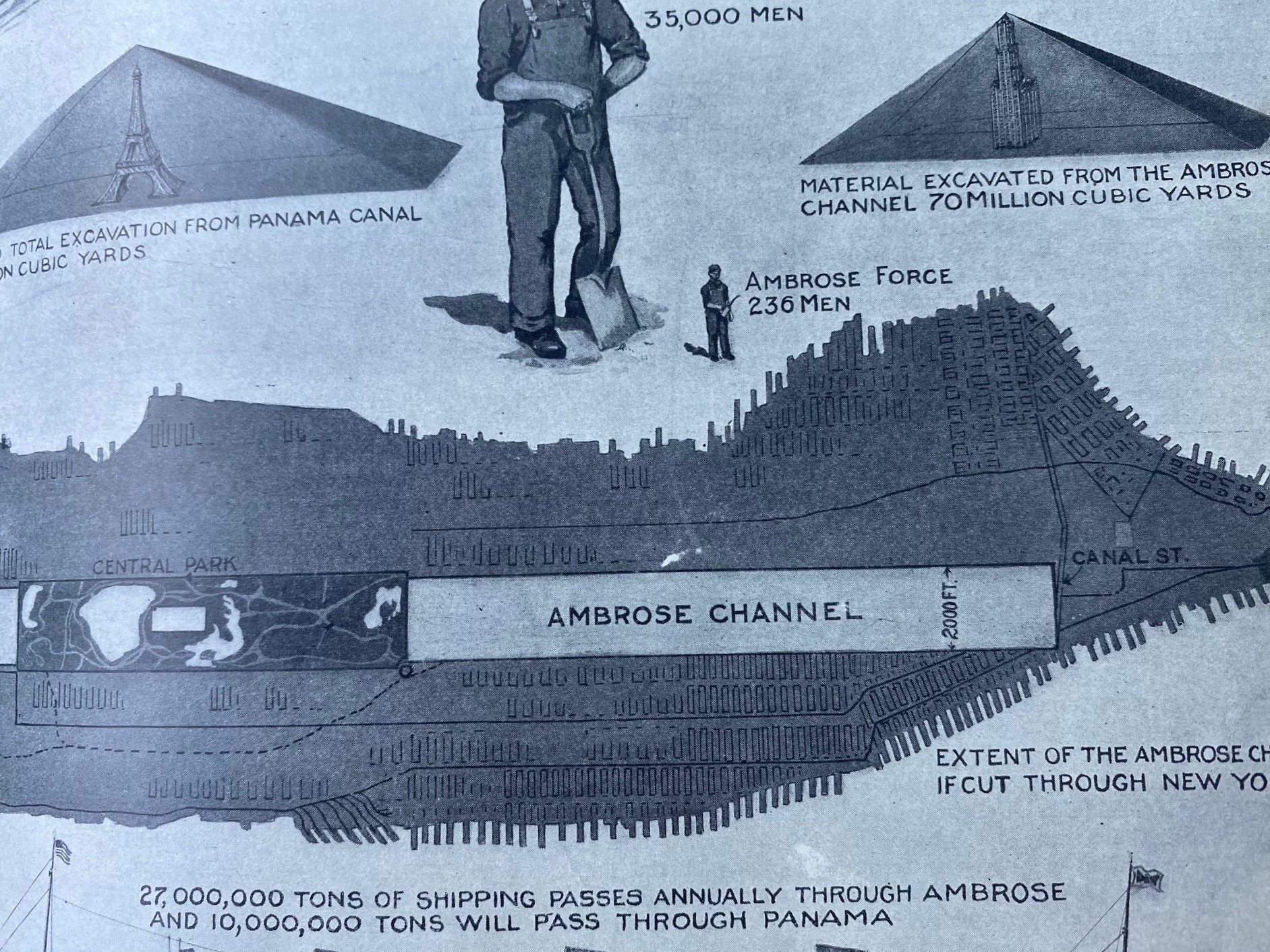
    IMG_2334 (1)Another great example of the artistic display of information using alternative comparison, and this just hours after finding/writing  about another example in this area.  This morning’s find uses several different types of comparisons, the first of which–like last night’s—is using a comparable entity to value the expression of quantity. And again, like last night’s, this short article (from Scientific American for 15 March 1913) uses the newly crowned Woolworth Building to illustrate how much dirt was removed in the dredging of the Ambrose Channel in NYC.  (The Ambrose Channel is in the entrance to NYC harbor, and it seems as though the dredging the author is talking about lies in the lower NYC harbor out past the Narrows.1)

    What was weighing on the mind of the writer was that this project removed  a very considerable amount of soil and was in some high fraction a comparable to the excavation of the Panama Canal, except that you couldn’t see any of the Ambrose project given that it was all taking place underwater. This effort in the SciAm was made to give some surfaceable form to the work going on  under the water in the Narrows. 

    There was a very considerable amount of earth removed, no doubt–difficult work, but not exactly an engineering feat like the Panama Canal that it was being compared to. Nevertheless the interesting minds of SciAm showed what the invisible channel would look like if it was dredging a 40’x15′ by multi-mile section of Manhattan, which is an excavation that would stretch from downtown to north of Central Park.  

    In any event, this reporting job must have been a good bit of fun (and it shows), and was a fairly elegant and memorable means of communicating some big numbers of an invisible project. 

    IMG_2335 (2)

    Notes:

    1. “Ambrose Channel is the only shipping channel in and out of the Port of New York and New Jersey. The channel is considered to be part of Lower New York Bay and is located several miles off the coasts of Sandy Hook, New Jersey, and Breezy Point, New York. Ambrose Channel terminates at Ambrose Anchorage, just south of the Verrazano Narrows Bridge, the gateway to New York Harbor, where it becomes known as the Anchorage Channel.”–Wikipedia


  • Measuring Things with the Woolworth Building–Inverted

    JF Ptak Science Books   Quick Post

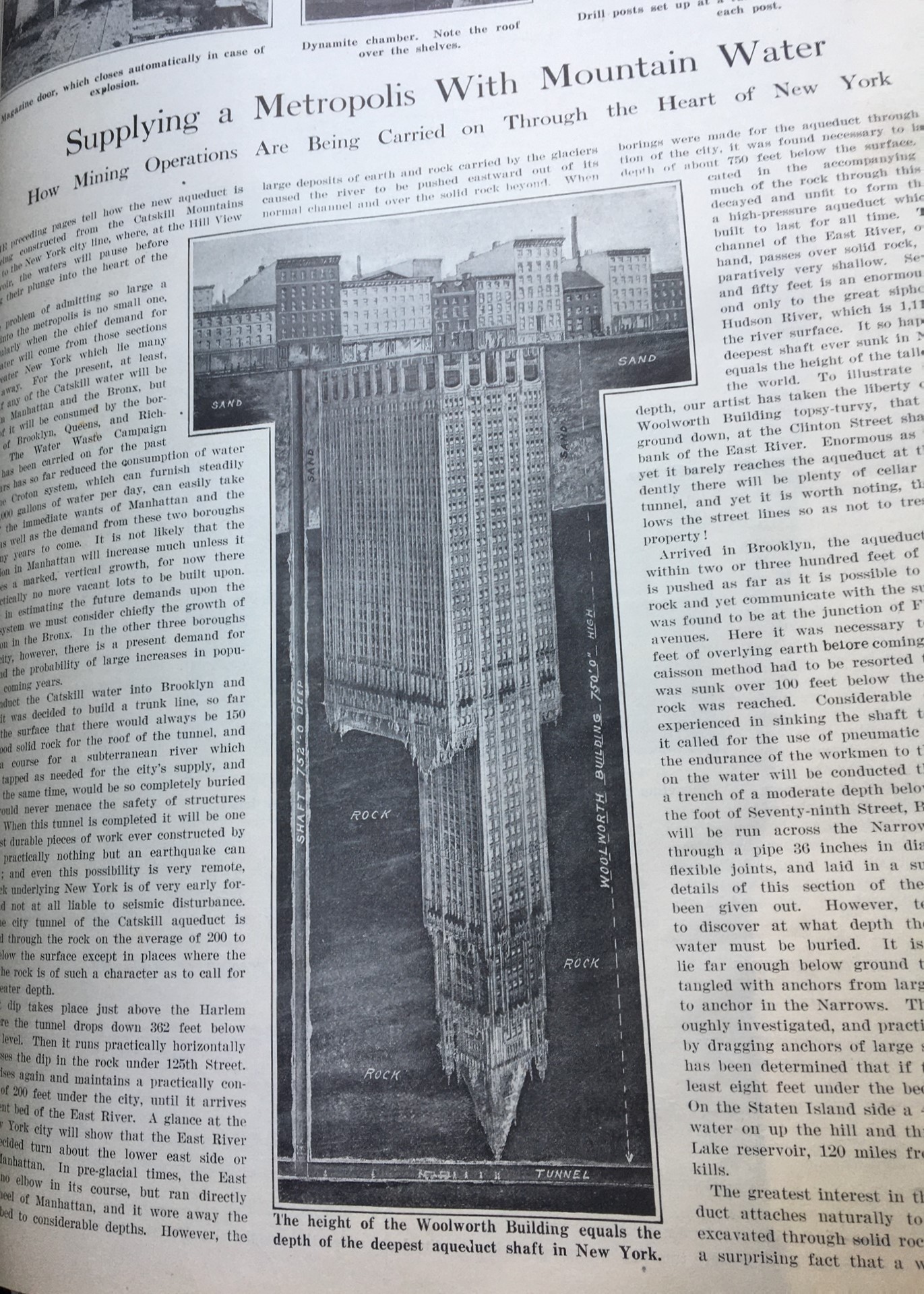
    I’ve made a dozen (or two?) posts on this website on measuring things with other thigs. And by that I mean instead referring to something in terms of measurement units like miles or tons or other standards, the item in question is measured against some well-know object for a side-by-side comparison. These units of measurement do seem a little odd, but they really have a capacity to humanize inescapably difficult numbers by putting them in context with a known entity, like Trinity Church. In the past I’ve seen graphical/comparative displays of information the Eiffel Tower, gargantuanly-oversized bread, enormous nails, collections of beef, miles of soldiers, Hoover Dams, Eiffel Towers, mountains, 400′-tall cars, train gangs, and such. Today’s new entry is the newly-built Woolworth Building in NYC from a 1913 issue of Scientific American.  The Woolworth Building got quite a bit of ink as it was the world’s tallest structure (for a few months, anyway) so it was a pretty well-known phenomenon by the summer of 1913.  This entry is a little more unusual in that it used the Woolworth upside down to show the great depth of tunnels being built under Manhattan:

    IMG_2314

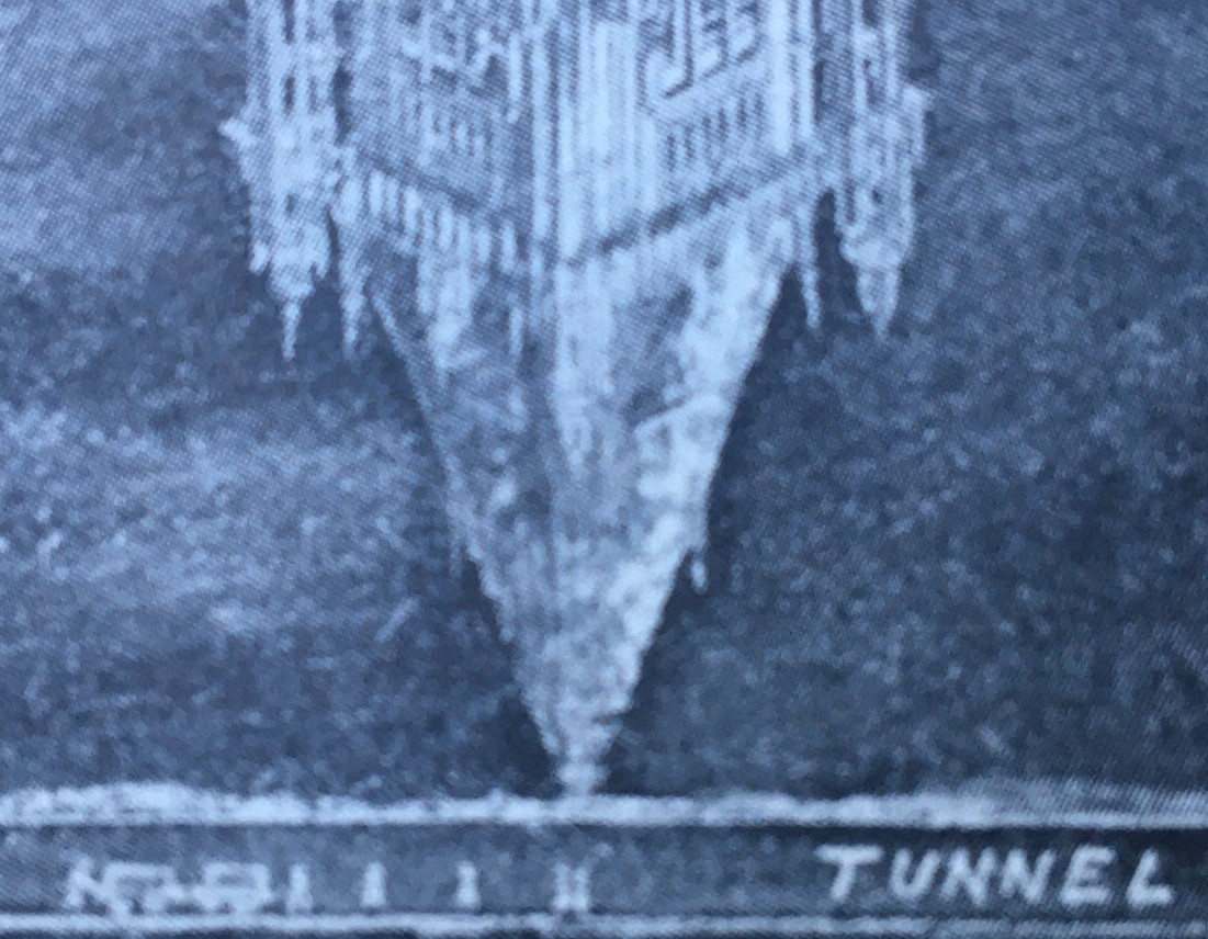
    And a closeup of the figures at the bottom/top of the building, showing human workers and a cart:

    IMG_2315

    This is a striking image that really does gets its message across.  


  • Great Cross Section: HMS Revenge of 1577 (1912)

    JF Ptak Science Books  Quick Post

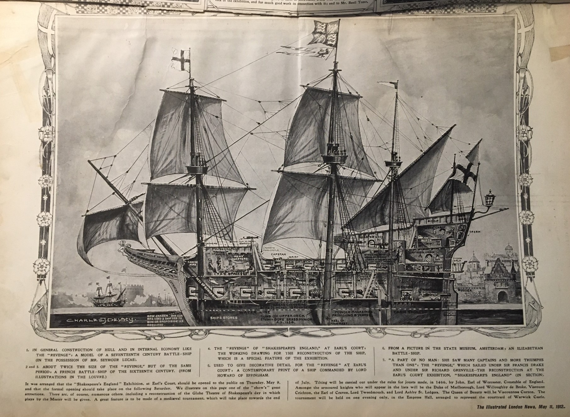
    ILN 1912 Cutaway cross section REVENGE _2_

    [Image source: Illustrated London News, 11 May, 1912.]

    I’ve made dozens of posts on this site on cross sections, exploded views, and cutaways–today’s installment is another of the high-artistic variety and depicts the first (of fourteen?) of the HMS Revenge ships, laid down in 1577. 

    [Detail below.]

    “On July 20 the day on which the London Devonians celebrated the 324th anniversary the defeat of the Spanish Armada the King and Queen paid a visit to the England Exhibition at Earl’s Court. Amongst other things they inspected the model of the Revenge famous not only as the one of the one and the fifty three whose great fight Tennyson tells so dramatically in The Revenge, A Ballad of the Fleet but as the flag ship of Drake beyond doubt the greatest man who ever set foot aboard her. The ship as reconstructed at Earl’s Court is 104 feet long from stem to stern with a height of 127 feet from water line to top of mainmast and a breadth of beam of 28 feet…” Illustrated London News, 10 August 1912.


  • Complicating and Simplifying the Threat of Communism: Nazi Propaganda, 1936

    JF Ptak Science Books  Quick Post

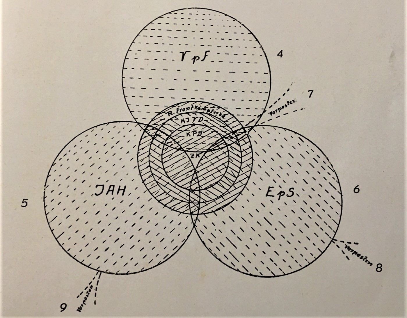
    Here are two renderings of what Nazis envisioned to be the structure of the Communist Party,  the first being for Germany, and the second for found orchestrated Communism worldwide. They are located in a half-grubby if not heavy book by the propagandist Adolf Ehrt’s  called Die Weltbolshewismus, which was published in 1936. 

    Key for the first diagram: IAH=Internationzle Arbeiter Hilfe; Vpf=Verband Prolestarischer Freidenker Deutschlands; KPO= Kommunist Partei Deutschlands; ZK= Zentral Kommintern; KJVD=Kommunistischen Jugendverband Deutschlands. I don’t know what the EpS is yet.  

    IMG_2128


  • Silhouettes of Soon-to-be-Ghosts: Representation of the Vichy Fleet, November 1942

    JF Ptak Science Books  Quick Post

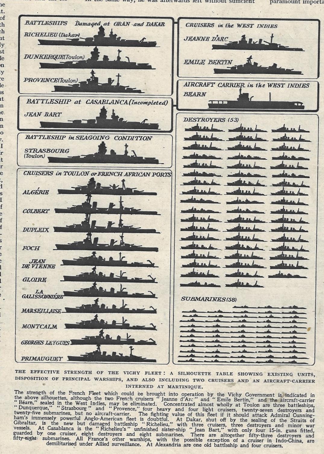
    The resistance of France to Nazi domination and rule and to the French collaborationists in Vichy began with the fall of France. Following the 10 May-21 June 1940 Battle of France, and the 22 June 1940 Armistice which effectively gave Marshal Petain control of the southern regions of France (the Nazis keeping all of northern and western France that bordered the Channel and the Atlantic) the battle for retaking France began. One of the large moments in this struggle came on 27 November 1942 when much of the remaining French/Vichy fleet was scuttled at  Toulon (east of Marseilles).  Rather than have the navy be taken by the Germans, 77 vessels were destroyed at anchor. 

    This graphic is found in the Illustrated London News for 14 November 1942 and depicts the Vichy fleet just two weeks before the scuttling action. The great majority of what is depicted here in silhouette (excepting those shown to not be at Toulon) were destroyed–silhouettes against their immediate future, the shadows of a ghost fleet. 

    ILN 1942 Vichy fleeet


  • Delightful Maps of the IRT, NYC, 1923.

    JF Ptak Science Books   Quick Post

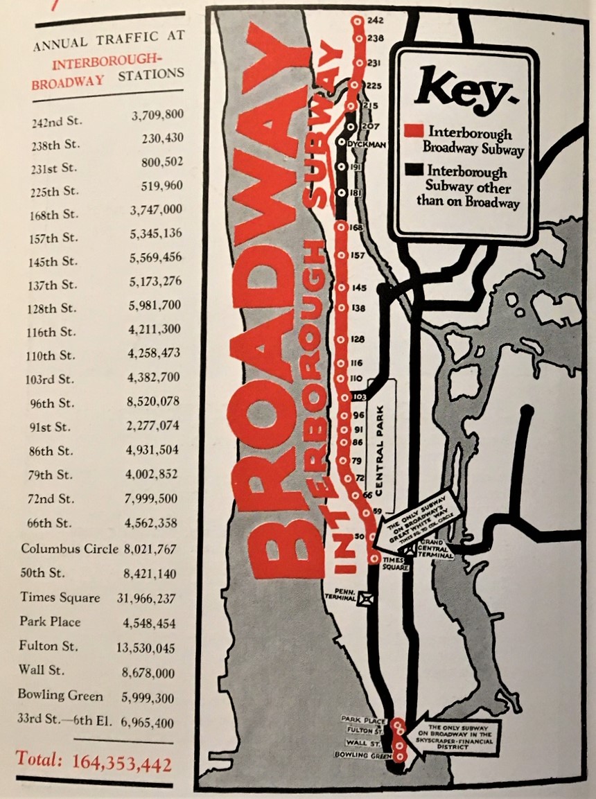
    I’ve just found this delightful little publication beautifully extolling the possible advertising advantages of the Interborough Subway and Elevated Lines of New York City, Artemas Ward’s New York’s Rapid Transit Traffic in the Graphic, from 1923. It really does present the numbers and highlights them with some unusual and bright maps of the subway system. This was the IRT (the Interborough Rapid Transit system), which was a private concern that operated from 1903 until 1940, when it was purchased by NYC.  This subway system in general was, well, entirely different from the one that I traveled 1968-1974 or so, back when you could barely see through the car windows because they were so heavily coated with graffiti…Anyway, I’ve  reproduced  most  of  it  below as there are no copies of the pamphlet in any library according to WorldCat.    The design of the first one–with the giant “Broadway”–is terrific.                                                              IMG_2100 (1)


  • Color, in Living Color! Occasional and Segmented Brutalist Design in Data Visualization. (1944)

    JF Ptak Science Books  Quick Post        

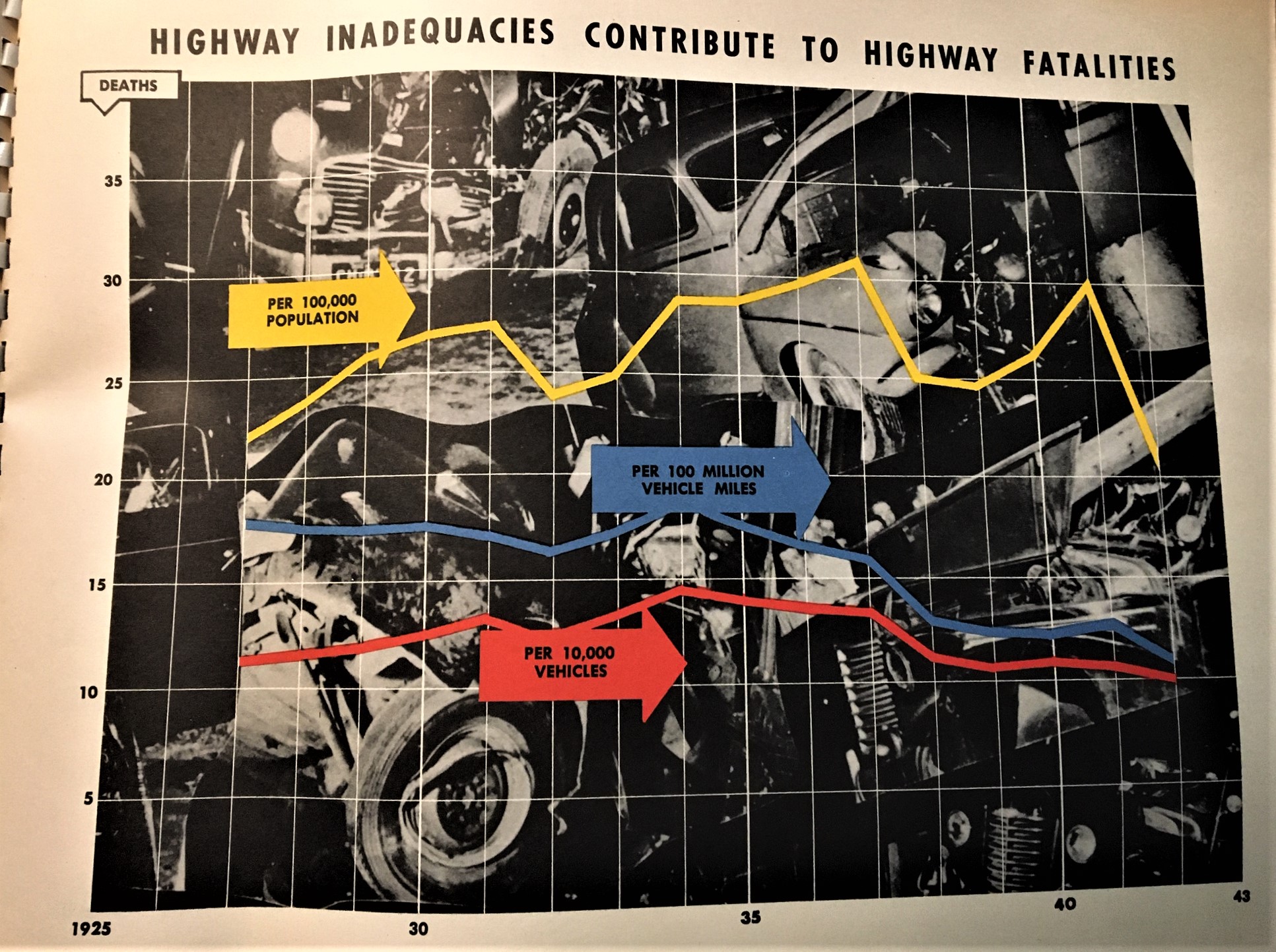
    I’ve made a number of posts to this blog on color and the lack of it (for example, see the series on “Color and its Advanced Abuses”) mostly concentrating on MONUMENTAL color or the lack of it when it could have been there (this, for example, exemplified in a beginner book on color theory with illustrations in glorious black and white). Today’s example comes from a oversize pamphlet called The Story of Highways, which I think was a vehicle used to deliver highway stats to crowds of congressional interest. The 16″-wide pamphlet contains 26 graphs/charts that reproduce 30″x 40″ posters used in a presentation somewhere to justify federal money spent on highways during WWII.  Some of them are unexpectedly colorful, very flat, and as I said in the title of this post, somewhat Brutalist in design. It isn’t quite Soviet Style or Brut Soviet, but there are those elements that I think are pretty noticeable. And if not, they’re interesting to see.

    IMG_1912