A Daily History of Holes, Dots, Lines, Science, History, Math, Physics, Art, the Unintentional Absurd, Architecture, Maps, Data Visualization, Blank and Missing Things, and so on. |1.6 million words, 7500 images, 4.9 million hits| Press & appearances in The Times, Le Figaro, Mensa, The Economist, The Guardian, Discovery News, Slate, Le Monde, Sci American Blogs, Le Pont, and many other places… 5000+ total posts since 2008.

Category: Information, Quantitative Display of

  • Artistic Display of Quantitative Data: the German Navy, 1912

    JF Ptak Science Books, LLC  Post #126
    Bloggermanwarships_2
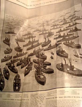
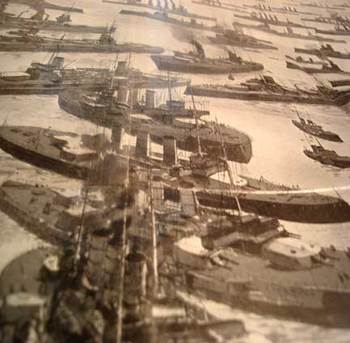
    This lovely and invented panorama (40×28 inches, published 21 September 1912 in The Illustrated London News) was intended, I think, to display the extent and power of the German Navy in an easily digested view, reminding the viewer to be ever-vigilant, and not be afraid to have the British government spend more money on its own navy. 

    The print was titled “Instantly and Constantly Ready for War:  the Striking Force of the German Navy as it will be in the Near Future”.  It was drawn by Norman Wilkinson (1878-1971), a ubiquitous and very accomplished, quick-working artist (whose association with the ILN began in 1898 and would last past the Second World War), who also made a huge military contribution during WWI with his invention of dazzle camouflage (a sort of camo that used contrasting color in strong geometrical shapes on ships).  In any event Wilkinson hammered the message home with tremendous effectiveness, filling up this imaginary harbor with Britain-bombing German warships—this was far more understandable in human terms to actually see the threatening ships beyond their stark numbers.

    It is interesting to quote from Prime Minister Hon. R.L. Borden’s speech of 5 December 1912, responding to the German threat, in which he moved for leave to introduce Bill (No. 21) to authorize measures for increasing the effective naval forces of the Empire. 
    Bloggermanwarshipsdetai_2

    As follows:

    “Whereas in 1898 the German fleet consisted of:
    9 battleships (excluding coast defence vessels),
    3 large cruisers,
    28 small cruisers,
    113 torpedo boats, and
    25,000 men.
    maintained at an annual cost of £6,000,000,

    the full fleet of 1920 will consist of:
    41 battleships,
    20 large cruisers,
    40 small cruisers,
    144 torpedo boats,
    72 submarines, and
    101,500 men,
    estimated to be maintained at an annual cost of £23,000,000.

  • Measuring and Comparing: Feeding the London Zoo in Terms of 1944 Telephone Operators

    JF Ptak Science Books LLC   Post #113

    Zoo_story149_2
    I’ve put together a relatively large collection of images from 1850-1940 which are graphic comparisons of data and graphical displays of quantitative information..  In general they display the basic concepts of one idea in terms of something else, or they simply exhibit the idea or concept in cold hard one-to-one images.  The two images below are good interesting, standard representations of these categories.

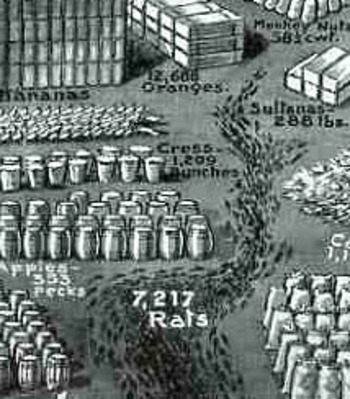
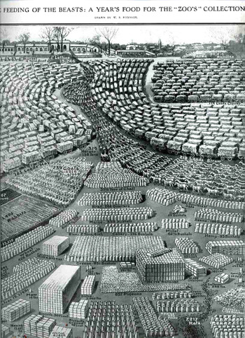
    The first is a very neat and complex display of the food eaten by animals in the London Zoo and was published in the Illustrated London News on May 17, 1913.   The data, found in the report of the Zoological Society of London (for the year 1912) is entitled “The Feeding of the Beasts:  a Year’s Food fore the “Zoo’s” Collection.  The real story though is in the subtitle:  “from shrimps to rats; from onions to oil cakes and mice, the food consumed by the animals at the “zoo” during 1912.    (I’m assuming that the word “zoo” is in quotations as it is a diminutive of “Zoological”, ad was seen as slangish.)  As you can see the language of the undoubtedly stiff report is beautifully brought to life (but not for long) in this work by W.B. Robinson.
    Zoo_story_rats_2
       
    We see 15,000 pounds of lettuce in a lump and a pile of 4,220 bunches of carrots, along with a serpentine 185 wagons of hay and a snaking 219 wagons of straw; there are giant cubes of biscuits and milk tins, and an even larger cube of 183,000 bananas in boxes; there are orderly armies of goats and rabbits, and a very neat ordering of 19,000 pounds of potatoes in stiff white sacks.  At bottom we see comparatively lonely contingent of 28 ducks (undoubtedly hoping that something else besides what was happening was happening); and of course an antlike column of 7,217 rats. There were also masses of clover, boxes of sparrows, 857 pigeons, 123 pounds of figs, 2 tons of dates, 93 bushels of hemp, 4500 pounds of grapes, 500 pounds of sugar (?), 34,000 eggs, and a slithering line of 25,000 mice.  Most disturbing though is the central figure of a long, quiet column of 318 horses.  I can’t help but feel sorry for them.  It is a remarkable and successful effort to put the data into a form that was somewhat more understandable, if less digestible, and a little more heinous.
    Telephone_ops150

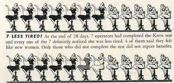
    The second image is a simple but somewhat bizarre rendering, changing counting units of numerals and replacing them with telephone operators—I can honestly say that I haven’t seen this before.  It is quietly bizarre, but still quite effective in making the sales pitch for the noxious element.
    Telephone_ops150_detail


  • Nails and Screws: Beautiful and Well-Designed Simplicity

    JF Ptak Science Books  Post #148

    Here we have two glorious, lovely examples of craftsmanship of simple things. The first is The Republic Steel Corporation (Chicago) manufacturer’s catalog for their production of nails and other wire goods.  It is about fifty pages long, and a third or so of it is devoted to the history of nail and nail-making as well as the history of the company.  The rest is all about the product.  And mostly about nails.  All sorts.  It is just fantastic!  I must say in all the years of my own nail consumption I didn’t know that there were so many different sorts of nail POINTS (diamond, blunt, chisel, needle, duck bill, side, and so on) ion addition to the various widths and lengths and special uses.  The points just never entered into the equation to me, but, of course, it is very important. 

    Blognails_cover225

    And speaking of special uses, there are a number of interesting specified nails in this catalog that, I think, are long gone from modern hardware store  shelves, as the needs they addressed are gone:  beer case strap nails (oh my god I love the sound of that) AND beer case hinge/lock/latch nails AND beer case cleat nails, basket nails, shade roller pins, pole marking and dating (!) nails, barbed berry box nails, and egg case fasteners are among what I imagine to be extinct nails. 

    Blognails_barre227

    Then there’s the beautifully designed Southington Hardware Manufacturing Company’s screw catalog, called, wonderfully, Screws, (Wood, Sheet Metal, Phillips Head, Slotted Head), catalog 41 (with prices) for 1935.  There’s page after page (actually, forty-five pages) of very detailed specifications (dimensions of heads, diameter, thread and tolerance, each description accompanied by two (or more) engineering drawings of the screw itself. 
    Now THIS is a way to describe a product.

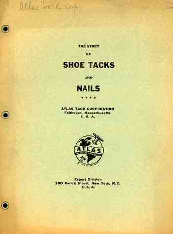
    This is followed up by a concise, nine-page (3,500 word) pamphlet published by the Atlas Tack Company (Varick St, NYC) on the history of shoe tacks and nails, bound, I’m happy to say, with metallic eyelets.  It contains pretty much all you need to  know on the history of shoe tacks, and I’m 100% behind the publication of odd-obscure histories such as this.  (I own perhaps a hundred “different” histories like this, including the massive non-classic “The History of Refrigerated Nuts”.) 

    Blognails_screws231


  • Graphical Display of Data—Picturing BIG Numbers, U.S. Aircraft Production in World War II

    JF Ptak Science Books  LLCBlogwwiiplanes

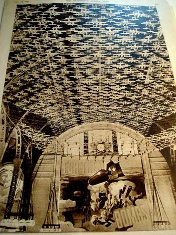
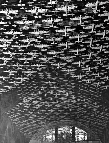
    This widely circulated and published photo appeared in 1942 (particularly in LIFE Magazine in 17 September 1942 and the Illustrated London News in the next month), and showed 4,500 aircraft models suspended from the ceiling of Chicago’s Union Station   It is the result of an inspiration derived from President Franklin Roosevelt’s assertion that America would produce 185,000 war-focused aircraft in 1942 and 1943. 

    The planes in this photo were hanging 60-feet above the floor of the station, with wing spans between one foot and four feet (for the bombers).  It was a fantastic, blustery, iconic effort to show what it meant to look at 4500 planes—and these paled in comparison to a drawing (which I unfortunately do not have) that appeared in the Illustrated London News on 21 February 1941, showing the entire production fleet of 185,000 aircraft—a column of planes one mile wide and 117 miles long.

    Blogworld_war_ii_airplanes_delano

    Using this photo then to interpolate that full production figure of 185k, you’d have to piece 48 of these photos together to show full production, or a version of this photo that was 8 inches wide and 32 feet long.  (The second image of Union Station and the planes is by FSA photographer Jack Delano.)


  • Graphical Representation of Data: Slavery in the U.S. 1854

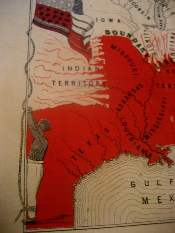
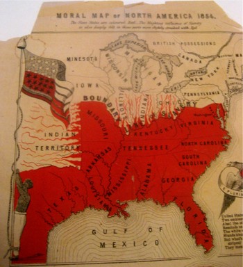
    Blogslavery_detailThis incredible, indelible image is another from our collection of graphical representations of data and ideas.  This map, is entitled Moral Map of North America, 1854; the Slave States are coloued Red, the blighted influence of Slavery is also deeply felt in those parts more slightly streaked with Red€.  I can find no record of this map, printed obviously by our Bretheren across the ocean–€”that and the fact that it was printed in 1854 is all the publishing data that I can find. 
    The poem at bottom reads:
    United States! Your banner wears
    Two Emblem €”one of Fame;
    Alas! The other it bars
    Reminds us of your shame.
    The white man’s liberty in types
    Stands blazoned by your stars;
    But what’s the meaning of your stripes;
    They mean your Negro-scars.

    Blogslavery

    Reciting this poem by Thomas Campbell before an abolitionist convention in 6 March 1851, William Wells Brown continued (as was reported in the National Anti-Slavery Standard) “The name of the United States is becoming a hissing and bye-word in the mouths of the inhabitants of every clime. My country is indeed the land of oppression. There is not a rood of territory over which the Stars and Stripes€ fly, on which William and Ellen Craft or myself could be protected by law. Wherever the American flag is seen flying on the continent of the New World it points us out as slaves; and we enjoy to-night a degree of freedom in your town that we could not if we were in the land of our birth. I often speak of America as my country, but in point of fact I have no country. In the language of one of the noblest of the Negro’s champions in the United States.  €œMy country is the wide, wide world; My countrymen are all mankind.”€

    Brown should know:  his mother was a slave and his father the plantation owner who later granted him his freedom.  Brown then worked the underground railroad and much, much more, working with William Lloyd Garrison and Wendell Phillips.  Among his published works included the incredible  Clotel, (1853), which was one of the first novels published by an African-American in the U.S.,  and which discusses in great detail the relationship between Thomas Jefferson and his slave/lover/mistress Sally Hemings.

    The map is definitely a tale of morality, showing a definite margin of slavery but also depicting slavery leeching its way through the border states. It is interesting to note that Washington D.C. is represented in red as it was indeed a slave-holding district, with a slave pen right on the Mall in the 1830’s. 

    The most striking feature to me of course is the slave who is lashed hand-and-foot to the flagpole on which the American flag is flying—this is the only time that I have seen the slave and the flag portrayed as a unit, together, the slave being tortured by the standard of our country. 


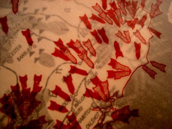
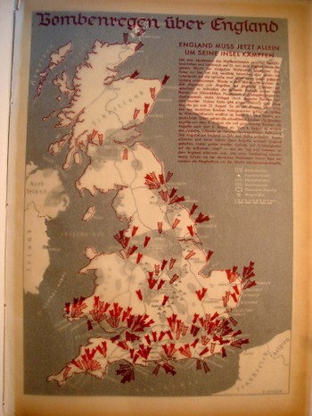
  • Bombing Britain, 1940–a View of the Battle of Britain from Germany

    JF Ptak Science Books  (an earlier post edited and expanded)

    Dsc04742_2
    It is essential to look at objects from alternative angles, especially in science, in order to determine the correctness, or fitness, of a finding, or opinion.  Even when consolidating data or evidence regarding the confirmation of an established bit,  you may very well find other strands of loose data that could help illuminate even a well established or iconic societal “given”.

    That the war was not going well for the Allies in September 1940 is an understatement—and the chief allies at this point excluded the United States, happily now recovering from the Depression, and still a full 14 months away from entering the war. 

    Dsc04739

    What is very weird to me is that after having looked at every issue of LIFE magazine at least three times  from the start to the end of World War II, that there are more advertisements using war images than there are images of the war itself.  This actually continues into the spring of 1942, when LIFE got really busy, the war got really messy, and people started really dying.  And frankly even the coverage of Pearl Harbor in no way lived up to what I thought the coverage of a photo-magazine like LIFE would be. This is not a scientific study.  It just strikes me as odd, or propagandizing, that there should be such relatively scant, or undervalued, coverage of the fighting when sanitized images of that same fighting were being used to sell socks and shaving cream and cigarettes and such.  I understand the power of hearts-and-minds campaigns, but this seemed so amateurish, boorish even, that it just didn’t approach the level of a psychological ploy to pacify an American public that had virtually no interest in attending the European Theatre. 


  • Things That Almost Were But Weren’t–Photography in 1839 and Television 1924

    JF Ptak Science Books  

    Here are two examples of Things That Almost Were But Weren’t:  Photography (1839) and Television (1928). The first item contains a woodcut of a heliotype (being the first image of a photograph produced by non-photographic means); the second displays the method for receiving images of radio shows but is not a television. 

    First:  The first published non-photographic image of a non-photograph or “sunpicture”) from a collection of papers on the basics of photography, published early in the birth-year of photography, 1839.  


    .

    Golding Bird’s  (1814-1854) “A Treatise on Photogenic Drawing”, published in  The Mirrour,  London, 1839, contains five1 significant and extremely early papers on the photographic process (appearing in The Mirrour numbers  945, 946, 947, 949 & 950, April 20-May 25, 1839). [A much larger, more detailed image is available here; I didn’t want to lay the book flat on the scanner to get a more detailed image of the copy here at hand.]

    Bird photograph148_edited-1

    It is page 241 (issue no. 945, Saturday April 20) that really peaked my imagination–it contains the first facsimile woodcut of a photogenic drawing, which is essentially the first publication of an image produced by any sort of photographic process. (The image is referred to as “iconic”2 by the Metropolitan Museum of Art, this via the wonder Luminous Lint blog for historical and contemporary photography, here.  The process here is the ‘sun picture”, and while not exactly considered a photograph per se, it is a photographic process, making this the first image of a non-photographic photograph.  It predates the first mass-published photograph by four years and the first (entirely) photographically illustrated book (The Pencil of Nature) by six years.  The sun picture, or heliotype, was first described in print in 1801 by both Thomas Wedgewood and Humphrey Davy, and although the process was at least 39 years old at this time there are no recorded published images produced by that process. (The woodcut is much larger than usual for The Mirrour, and is also of a unique brown/red color, and of a different hue than any other woodcut that we have seen in any of the issues of the first 45 years of this publication. I was concerned at one time that this image was a photographic process of some sort, but it isn’t, and I’m convinced that it is a woodcut–a very unusual species of woodcut for this publication, but a woodcut nevertheless.)


  • The First American Map Showing Elevations at Which Trees are Found

    JF Ptak Science Books LLC  Post 7

    U.S. Western Botanical Profile of Forest Tress, 1854. 

    U.S. Pacific Rail Road Explorations and Survey, War Department.  Botanical Profile Representing the Forest Trees along the Route Explored by A.W. Whipple…From Fort Smith to San Pedro….

    Published in Washington, D.C.:  1854.  Prepared by J.M. Bigelow (botanist of the Expedition), and printed by Wagner and McGuigan by lithograph in Philadelphia.  47”x21”, printed in many colors.

    (Here we see a detail of a 2×3″ section for the map for the San Francisco Mountains range.) 
    Dsc04524

    This spectacular map presents the forest trees encountered by Whipple on his expedition for the USPRR from Fort Smith (Arkansas) to San Pedro ( actually Los Angeles, California).  The profile shows the trees and their leaves at the elevations encountered—actually the trees are graphically represented by either their shape or their leaves, each of which stand no more than ¼ inch tall.   There is a key explanation to the tree symbols at bottom left identifying 42 different trees—including the Cereus Giganteus, which first identified only a few years earlier.  There are three levels of graphical representation depicting the route containing more than 250 small images of trees.  This is a charming and informative graphical display of data, and is one of the first published efforts to share this information–it certainly seems to me that this is the first representation of the elevation at which trees in the United States and territories might be found.  Humboldt’s map is certainly earlier, and there are occasional mentions of tree regions (worldwide and in general) that can be found in the atlas to accompany von Humboldt’s Kosmos, but there is certainly nothing this large and detailed and exactly.  This is just a very cool map.