A Daily History of Holes, Dots, Lines, Science, History, Math, Physics, Art, the Unintentional Absurd, Architecture, Maps, Data Visualization, Blank and Missing Things, and so on. |1.6 million words, 7500 images, 4.9 million hits| Press & appearances in The Times, Le Figaro, Mensa, The Economist, The Guardian, Discovery News, Slate, Le Monde, Sci American Blogs, Le Pont, and many othr places… 5000+ total posts since 2008.

Category: Iconography

  • On the Early Imagery and Definition of the “Cowboy”

    JF Ptak Science Books   Post 3836

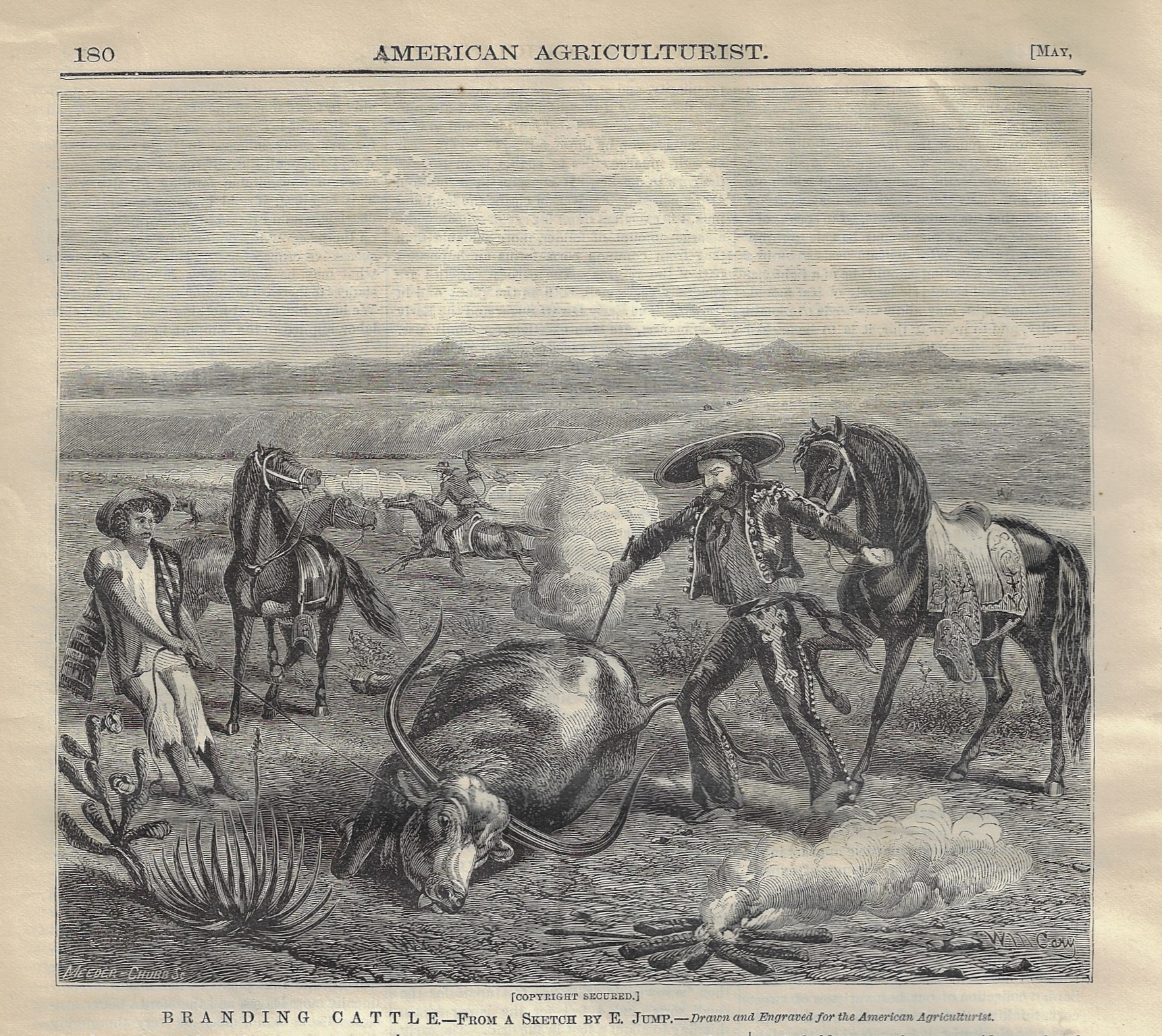
    I just came upon a very early image of a cowboy, finding it in an unusual publication, American Agriculturalist. It is vacquero in a branding scene, and even though the word “cow boy”/”cowboy” has a longish history and easily researched, finding the earliest image of the cowboy is a more complicated matter.  Images of cowboys begin to appear commonly by the late 1880’s, but once you get before 1880, the cowboy in art/representation gets more and more difficult to locate. It seems as though the among the earliest images is “El lazo”, showing a gaucho chasing a cow, which was illustrated by “J.D.” and printed in 1841. An image of cowboys branding cattle in Texas appears 26 June 1867 in Frank Leslie’s Illustrated Newspaper, and then I’m not coming up with much else in the pre-1870 era. Which takes us to the work illustrated below by the Frenchman Edward Jump (1832-1883) and his vacquero. (I’m sharing this hoping that someone will have some references for a timeline of the depiction of the cowboy…if that is you, please let me know).

    Cowboy 1870

    In the meantime, I’ve done the easier task in looking at the history of the word “cowboy”, as follows. 

    The word “cowboy” (“cow-boy”, “cow boy”) was little seen in the U.S. in the decades before the great surge in cattle drives—prior to the 1870s. The word most commonly associated with America’s greatest folk heroes actually got its beginning in Ireland, and was commonly used in Britain from 1820-1850 where its meaning was quite literal, applying to the young boys tending the cows owned by a family or community. An earlier use by Jonathan Swift in 1725 also refers to nothing more than a boy tending cows. 

    The word “cowboy” is first seen in the U.S. in the New Orleans Picayune, not referring to a man, but to a race horse instead. The word—referring to humans—breaks into printed use in the U.S. at about the same time the great drives were ending. Perhaps the first mention in print of the human cowboy comes hyphenated in Wilkes’ Spirit of the Times magazine in 1866. By 1877, only 11 years later, the great national character, Texas Jack (a scout brought along by Buffalo Bill Cody to his Wild West shows whose real name was John Burwell Omohundro, Jr.), laments the passing of the long drive and the cowboy in the same journal:

    “The cow-boy…how often spoken of, how falsely imagined, how greatly despised, how little understood!”

    ·Posted by :

    ·in:

    —

  • From Children’s Games to the Lake of Fire: Fun and Hell by Mr. Bruegel (Alpha & Omega, Part II)

    JF Ptak Science Books  Post 2834b

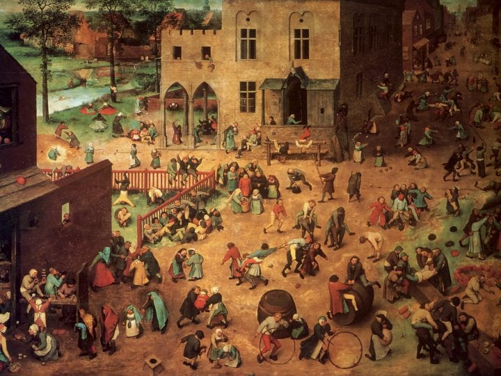
    Being quite filled up with Bruegel’s orderly disaster of death’s chaos control, I went to the other end of his work, to the Alpha of his death Omega: Children’s Games (1560). It is the opposite of The Triumph of Death painting (the preceding post), showing some 200 kids at play, involved in at least 80 different games—it is a visual dictionary of fun and hope. The viewer goes from one game or kid cluster to the next, experiencing a fun slow climb to the mountaintop—and in the other, with death being death and all that, it leads the other way along a road of broken glass.

    Bruegel children

    for a good and expandable view of the painting, see: https://artsandculture.google.com/asset/children%E2%80%99s-games-pieter-bruegel-the-elder/CQEeZWQPOI2Yjg?hl=en

    I’m sure these kids at play were thinking “ars longa, vita brevis” as they lost themselves in the easy complexity of whatever it was they were doing—well, no, they didn’t think that because they didn’t need to, as they were alive in it.

    The game clusters seem to be distributed evenly, and in spite of all of the divergent action, everything seems to be orderly in spite of the sweaty irregularities of the kids. The composition reminds me of the ultra careful construction of engraved illustrations in 18th and 19th century encyclopedias—like those of Abraham Rees Cyclopedia… and J.G. Heck’s Iconographic Encyclopedia—where the pages are filled to the edges with related and unrelated objects though by their arrangement there seems to be plenty of unused space.

    I can only recognize a game here and there—there are a number of experts who have gone through the painting and identified every aspect of every game, as the painting really is a social geology as much as it is anything else.

    For interesting reading see:

    In closing this short share I’d like to mention another fantastic Renaissance work featuring children’s games: the games played by Gargantua in Rabelais’ 1534 work Gargantua and Pantagruel, as there are at least 145 of them (217 in the revised edition), and they appear in a list! Again, there’s only a few here that I recognize straightaway, though they all can be found and explained.

    From the text (being nearly all of chapter 22):

    “Then blockishly mumbling with a set on countenance a piece of scurvy grace, he washed his hands in fresh wine, picked his teeth with the foot of a hog,
    and talked jovially with his attendants. Then the carpet being spread, they brought plenty of cards, many dice, with great store and abundance of
    chequers and chessboards…”

    “There he played.
    At flush.

    At love.
    At primero.

    At the chess.
    At the beast.

    At Reynard the fox.
    At the rifle.

    ·Posted by :

    ·in:

    —

  • From Children’s Games to the Lake of Fire: Fun and Hell by Mr. Bruegel (Alpha & Omega, Part I)

    JF Ptak Science Books  Post 2834a

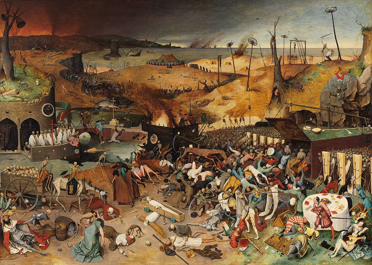
    Somehow I was drawn to take a close look at Pieter Bruegel (the elder’s) massively complex painting, The Triumph of Death (painted ca 1562), in which people were skeletonized by skeletons, killed in fantastic grotesqueries. No doubt I found my way there thinking about COVID-19, and the 1918 Influenza Pandemic, and naturally to the time of the London plague and then the Black Death, winding up on Bruegel’s bitterblack doorstep. In the painting’s many nooks and crannies and its deep minutiae, there is no regard for hope to be found, no possibility of god’s grace to comfort and possibly save the doomed, nothing by the delivery of myster-horrories leading to the lake of fire.

    Bruegel triumph of death

    There is just so much going on in this painting, so many scenes that you’d expect to see an overall narrative, except that there is none, just hundreds of people being taken by Death and its skeleton minions, led off to the gate of Hell. There are dozens of individual passions being crushed and morals observances being made, but they all seem to stand apart and clear.

    I did a quick survey to see if there was an overall census of this apocalypse, but I didn’t find one, surprisingly, which probably means I didn’t look hard enough. That said I thought it would be quicker to make my own scan of what is going on in the painting, starting in the near-center, where we see the spiked opening of the cave of Hell, surrounded by the armies of the dead. In the foreground is a very bad litany of very bad things, people being hanged and burned and drowned and stabbed and knifed and strangled broken on the wheel, those looking out to a deeper field of burning houses and a burning armada, everything burning or set to burn—everything was on fire, leading to the place where the fire was on fire.

    Continuing the survey in the image’s far left-bottom, we see a king in his finery being shown an empty hour glass; to his left a skeleton in armor poking around in bags of gold and silver coins, while just nearby is a cardinal being led to eternity by a skeleton wearing a cardinal’s hat. Further on we see a very strong denial of the absence of mercy, in this case a starving dog nibbling on the face of a dead baby still in its dead mother’s arms, and this right next to someone being overpowered and having his throat slit.

    Behind the king there is a skeleton crew operating a wagon full of the dead—one of the skeletons plays a hurdy gurdy while the other sits daintily astride the starving horse pulling the dead crate. Nearby people are being gathered in a net—like, well, people being led of to hell in a net—which seems a better end than what is going on around them, a diatribe of death by hackings and assorted other nastiness.

    On the opposite side of the painting from the king, on the far right corner, is a pair of, what, friends or something singing and playing, completely oblivious to the larger scene and even to the lute-playing skeleton leering and hovering over them. To their left is particularly disturbing figure—a skeleton wearing a human face with no eyes is tipping over a brazer filled with flasks, this taking place next to an upset backgammon board and a fallen deck of cards.

    Rounding it all out, in the center of the painting, we finally see Death itself, riding a red horse, horse of war, the symbol of fire, of blood, and one of the four horses of the apocalypse. Death charges on, and in this horrible commotion leads his hundreds of skeletons into what was probably a generic scene of generic people doing generic things appropriate to their generic-icity, the great an overwhelming triumph over mortals seeming abandoned by their god.

    So, there it is—I just ran out of steam in thinking of a census of what was happening in the painting, settling for a summary. Its just a little too nasty for right now.

    The cure for this painting is to have a look at Bruegel’s superb painting of children’s games, which comes up next.

    ·Posted by :

    ·in:

    — —

  • An Infinity of Suns and Planets (1798)

    JF Ptak Science Books   Post 2695

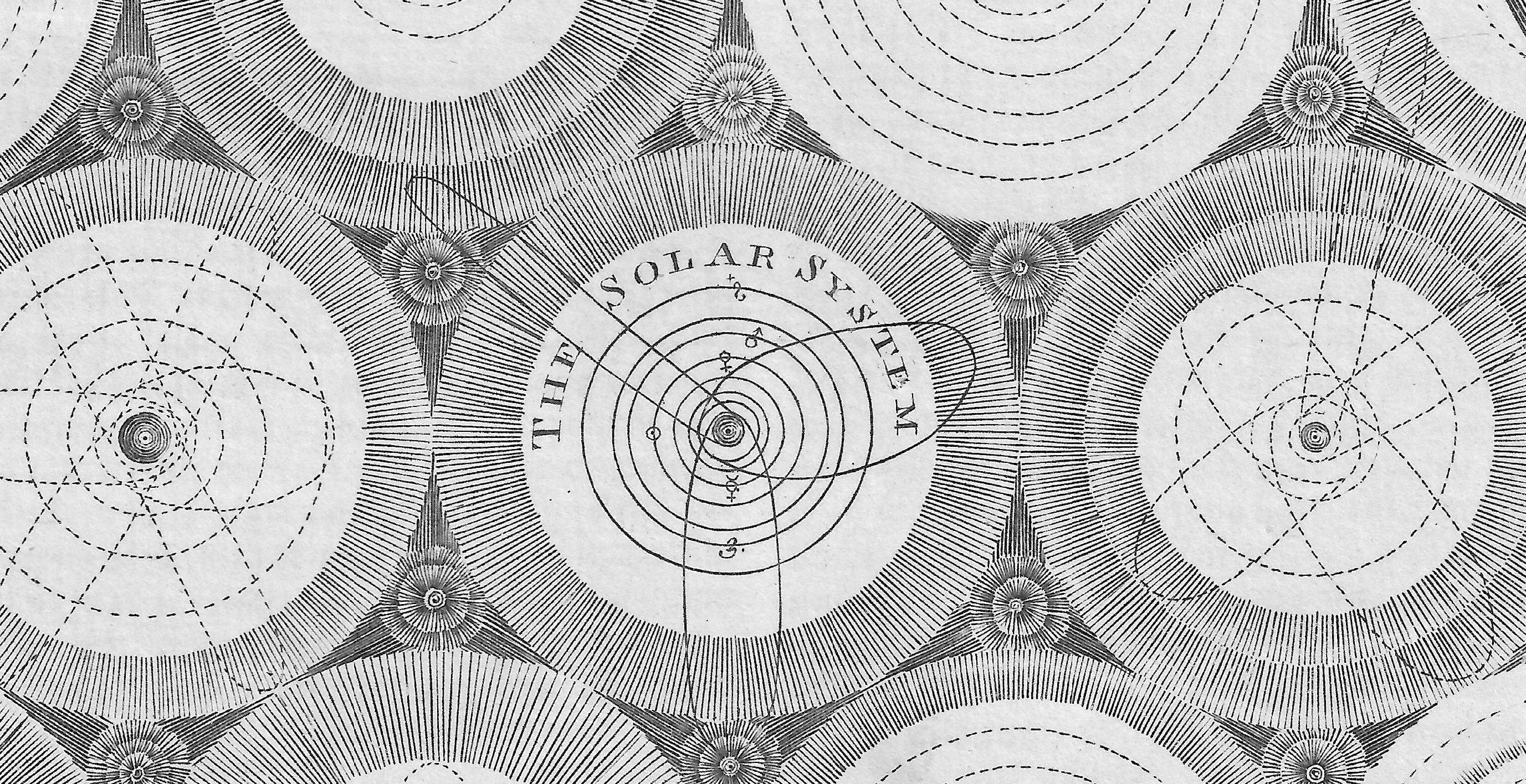
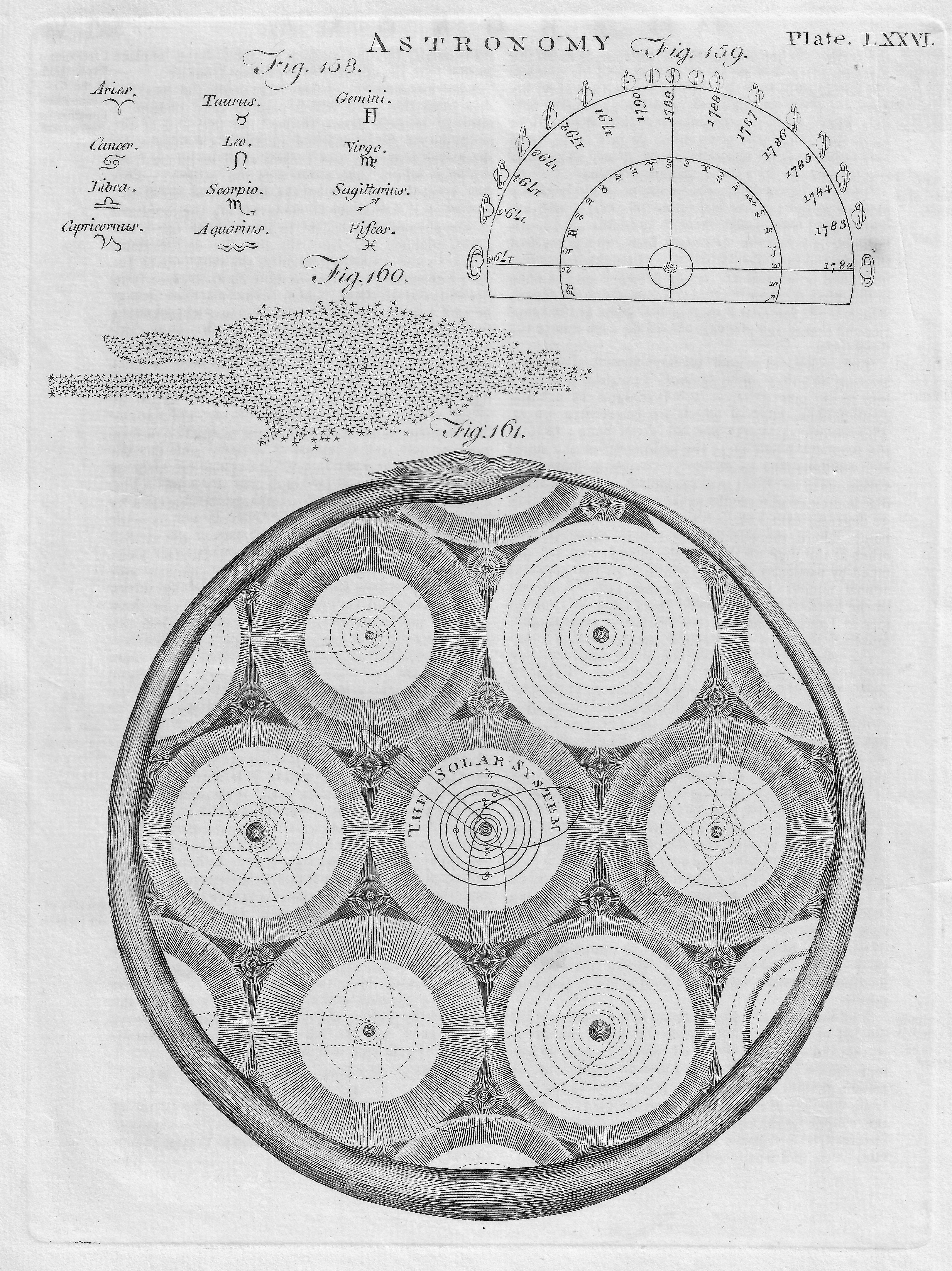
    This is a relatively early engraving showing infinite numbers of solar systems ranged within an infinite universe. It is found as plate LXXVI from the first American edition of the Encyclopaedia published at Philadephia in 1798.The concept of multi-solar systems was not a terribly common theory, and to see them here, arranged as part of a structured and logical system was very striking–particularly since there is an inference that our own solar system is positively not unique, and located in a cluster of others, all of which are contained within an Ouroboros, an ancient Egyptian symbol signifying an endless universe of expanding possibility.

    Astronomy ourobus detail

     [Detail of engraving below]  

    The idea of expansive collections of suns and planets varied quite widely from the images of other astronomical observers and theorists such as Thomas Wright (1711-1786), who in his book An Original Theory of the Universe (1750) gives the Milky Way a friendlier, homogenous manner, overruling his earlier theory that the stars were “promiscuously distributed through mundane space” and delivering a theory of the stars organized in a regular pattern based upon a hierarchical center of some sort around which everything else was positioned.  He also provided a fabulous image of the centers of galaxies as an immutable, transcendent force, with the eye of the creator at the center of each, rather than the simple, positive dot.

    This idea was picked up by Immanuel  Kant (1724-1804) who in his own work, The Theory of the Heavens (1755), expanded on the multiple centers of creation(s) (an “endless immensity in an unlimited plenum of creations”) of cascading and separate galaxies, and detailed a vast system of disk-shaped galaxies which revolved around centers which in turn revolved around other centers, becoming far vaster, though all were centered on a dominant, universal center.

    Above that image is one showing the phases of Saturn from 1782 through 1796, while to the left of that is a small display of the signs of the Zodiac.

    Towards the middle of the page is a very famous image made by William Herschel (1738-1822), who tackled the issue of what Everything looked like back in the 1780s.  

    Lucretius (95-55 BCE), in his Nature of the Universe, stated that  since there is nothing outside the universe, it must be infinite: “the universe stretches away…just the same in all directions without limit”;  it stretches far and wide into immeasurable depths.  All that is in it, he reasons, is distributed equally and in the same way.  But this is not the case, even in light of Edward Milne’s cosmological principle (1933),  stating that all  places in the universe is alike—which is true, except that there are vast disturbances in very large local areas that distinguish themselves from other places.  The work of Gamow/Alpher/Herman  (1939) and Penzias/Wilson in establishing the cosmic microwave radiation  (CMB)  shows that the observable universe to be very close to homogeneous and isotropic, and of course accelerating. (Suffice to say for this short post that there are models– Friedmann-Lemaître-Robertson-Walker (FLRW) model for example– which show the observable universe to be  “weakly” inhomogeneous and anisotropic; but generally and on average the isotropic models stand.) 

    Perhaps the earliest published “bump” in the calm waters of the equal-distribution universe occurs with this image by Herschel who in 1785 published a revolutionary image of the “Stellar System” (the Milky Way), showing its irregular pattern and the off-center placement of our sun amidst a panoply of other stars.(His image was remarkably and substantially correct, with the most grievous error being the placement of the sun too close to the center of the galaxy.) It was an image which bought the idea of a not-so-humano-centric idea into popular philosophy. This galacto-centric view remained until the work of Harlow Shapley’s globular clusters in 1918.


    Astronomy ourobus

    In all, it is just a beautiful image that tells a long story-without-words of the Shape of Stuff.  

    ·Posted by :

    ·in:

    —

  • Can You Find the Ancient Death Ray of Death? Symbolism in the Garden of Mathematical Sciences (ca. 1670)

    JF Ptak Science Books   Post 2689

    Mathematical Garden Curti[Image: Metropolitan Museum of Art, http://www.metmuseum.org/collection/the-collection-online/search/359981?rpp=30&pg=1&ft=mathematics&pos=15]

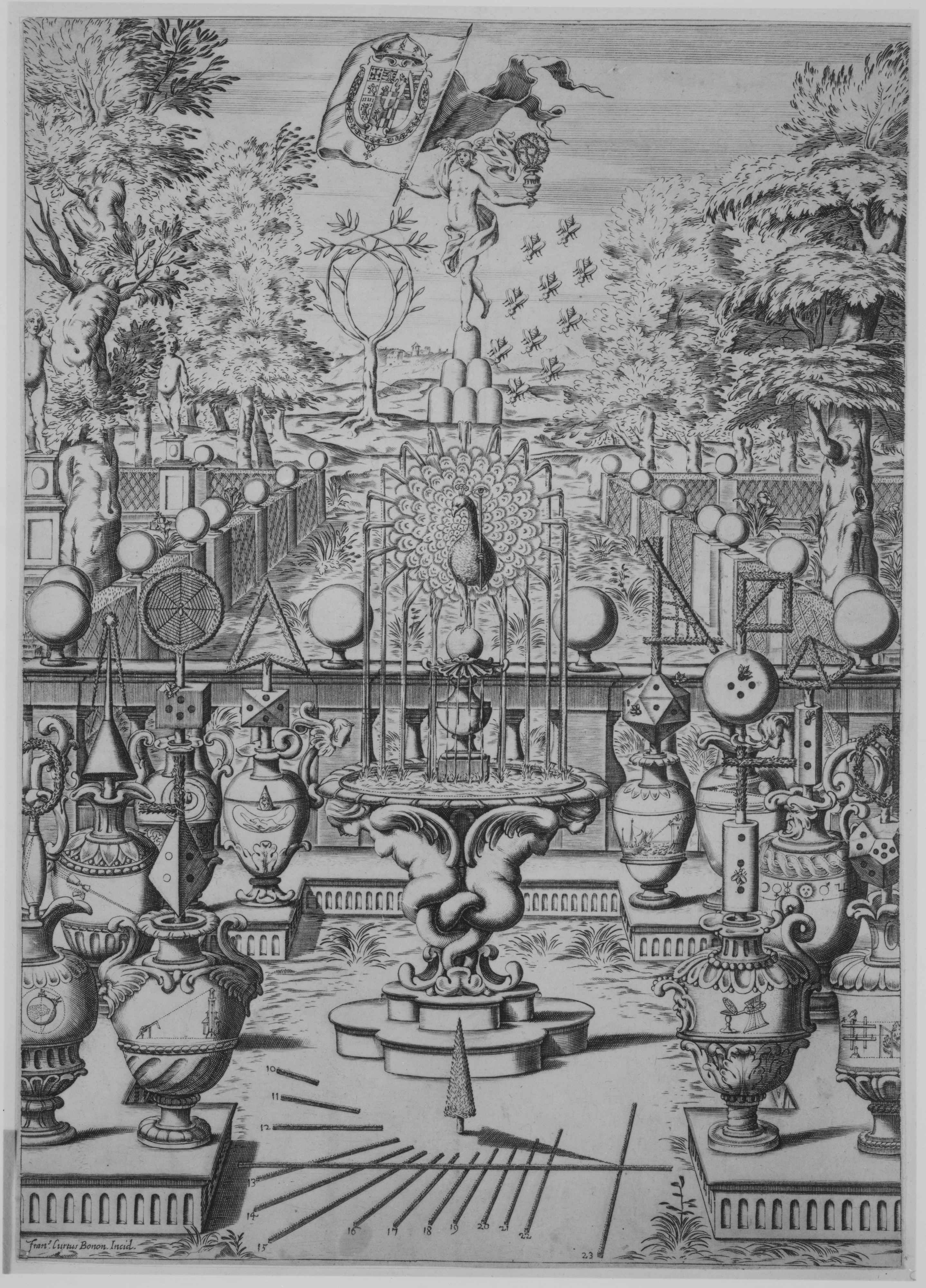
    This fine allegorical image is the creation of Francesco Curti (1603-1670), and according to the Metropolitan Museum of Art it is called “The Garden of Mathematical Sciences”, and was printed ca. 1660.  There’s a lot of objects in this print, and it seems that perhaps most of them have a scientific application.  It is an interesting exercise to identify them–I’ve found quite a few, though not all, how many can you identify? 

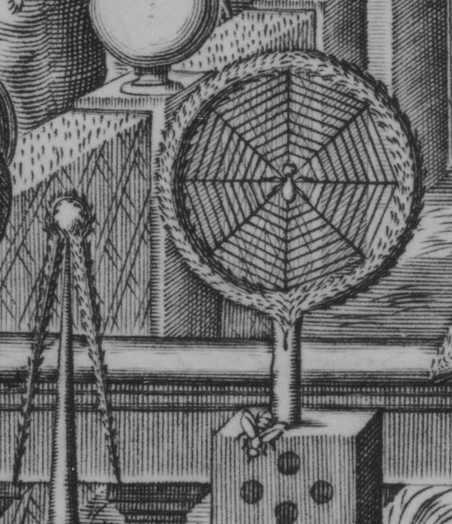
    In the garden there are a geometrical spider, bees, proportional dividers, sundials, anamorphic images, the eye of god in a peacock display, Mercury, Archimedes’ death-ray mirror, navigational instruments, and no doubt much more, displayed and semi-hidden. For example, I think this is the well-known “geometrical spider” (middle far left), as seen in Mario Bettino’s Apiarium philosophiae mathematicae (Bologna, 1645):

    MATHEMATICAL garden spider

    Then there’s this classic image of the peacock, which through the history of Christian art has come to represent the concept of activity, resurrection, immortality–it has been used as a representation of Christ (in paintings like Fra Angelico’s great circular nativity painting, for example).  In the Curti print, the peacock is holding a staff with an eye in it, which is probably that of god; the peacock stands on one leg, balanced with the eye staff, while the rest of the symbolism is filled by having an ever-flowing fountain flow from its feathers. 

    There are no doubt more to be found–there’s the timepiece in the foreground, numerous outlines of scientific instruments as garden plants, a demonstration of the optics of convex and concave lenses, and others.  Have a look!  Follow the link to the Metropolitan and open the very expandable image. (SOme answers, below)


  • Outsider Emblemata, 1889

    JF Ptak Science Books  Quick Post

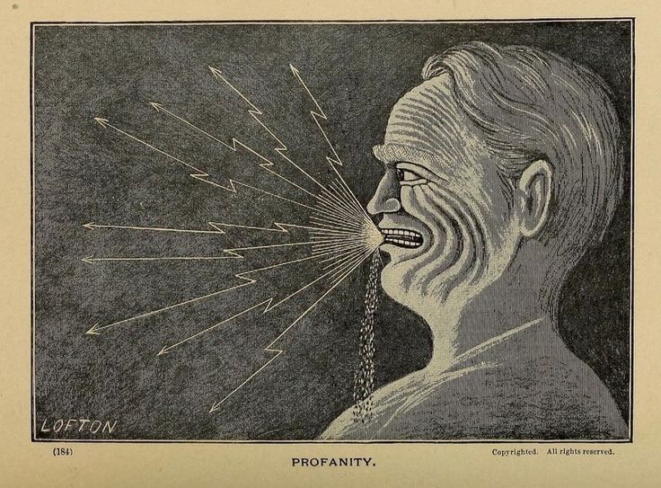
    Character Sketches or the Blackboard Mirror, a Series of Illustrated Discussions, Depicting Those Peculiarities of Character…Subjects Illustrated With Over Fifty Engravings, by George Augustus Lofton (1839-1914), is a peculiar but not necessarily transcendental religico-social-morality screed in the vein of more antiquarian emblem books.  The major attraction to the work were the very unusual, half-edgy, unschooled illustrations for the morals investigations made by the author–which do approach a sort of transcendental nature, all on their own. The text I’m afraid pulls the drawings down some, as I’d rather work the stuff out with just the image and a title, the descriptions becoming very quickly a preachy jaundice of judgment more so than insightful observation–though the descriptions of the images do have their moments from time to time. 

    Blackboard mirror profanity[Source for all images, plus the text and rest of the images, located at Internet Archive, https://archive.org/stream/charactersketche00loft#page/n11/mode/2up   ]

    I think the drawings by Lofton are remarkable for their  (probably unschooled) expansively unusual possibilities, all of which are very outre for the close of the 19th century.  The human figures are certainly very stylized, but the background and foreground bits are generally very oddly aggressive, and off-putting.  


  • A Magnificent “F” (1919)

    JF Ptak Science Books   Quick Post

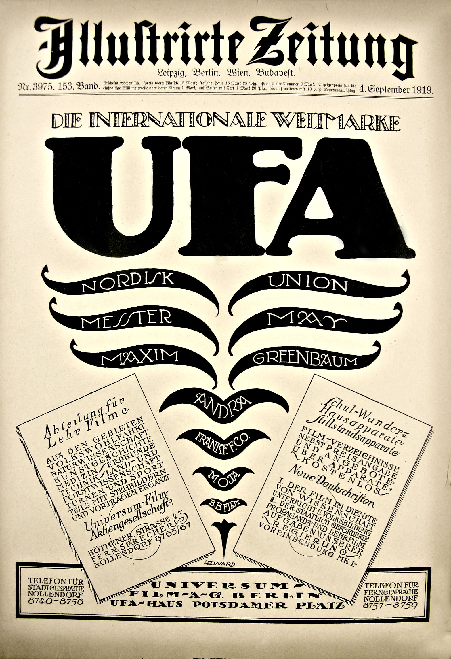
     I came upon this cover advertisement for the Illustrirte Zeitung (Leipzig) for September 1919 and was excited by this typeface–especially the fantastic “f”. The ad was for the German film production company UFA (Universum Film AG, today known as UFA GmbH) which was started a little less than two years earlier.  There’s not much I want to say about the company–I really just wanted to share the typography.  

    German design 1919 UFA

    ·Posted by :

    ·in:


  • Fine 17th century Etching of a Scholar at Work

    JF Ptak Science Books   Post 2476

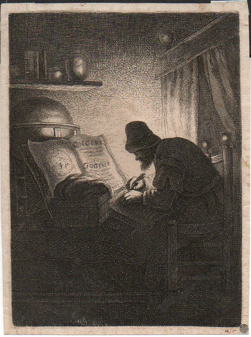
    Etching man in study110

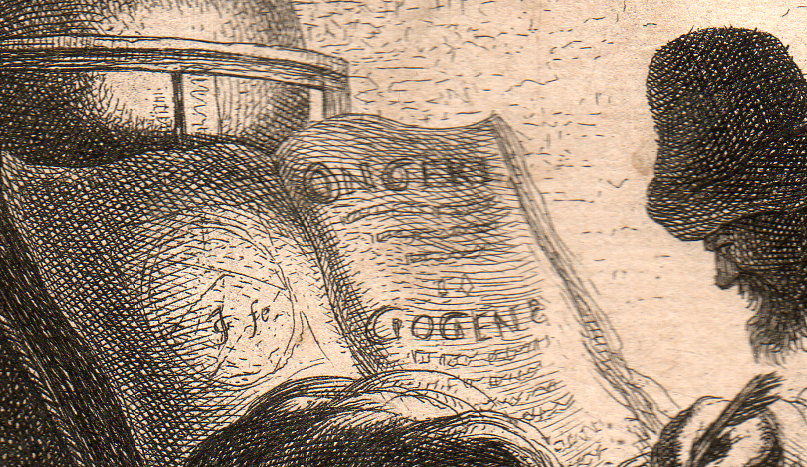
    I’ve long thought that this (ca. 17th century) etching of a scholar in his study was alchemical in nature–that just for the the appearance and sound of the two words printed int he large open book on the table. As it turns out, I cannot find those words, anywhere–at least with meanings that could be related to the book or the scene. 

    • The original print is available for purchase via the blog’s bookstore, here. 

    That said it is still an interesting and very personal scene–one man, still heavily clothed in the dark (and what seems to be late at night, though there is no evidence for that, that is just how it feels t me), working away at something with the benefit of only a single semi-weak light source

    The artist/etcher looks to be “JG”, or “IG” or “GT”, and other permutations and possibilities.  I have not been able to identify who the artist is, having scoured the Big Book of Initials and Monograms: Francois Brulliot’s Dictionnaire des Monogrammes, Marques Figurees, Lettres Initiales, Nom Abreges, etc., avec lesquels les Peintres, Dessinaeurs…. The book is a masterpiece of a type, sorting out the difficult and twisted means by which the originators of artworks identified themselves. It was published in Munich in 1832 in two volumes, and runs an easy 1200pp, though there is probably a half-inch of very thin paper that is unpaginated for various appendices.  (For some reason the letter “T” is represented in only one page in the monogram section. Odd.)

    The artist’s monogram followed by a “fe”, which is an abbreviation of “fecit”, or “faciebat”, which is also abbreivated as “f”, “fac”, and “fect”, which seems to be a kind of ambiguous term, referring to “JG” as being the maker, as either the artist or etcher/engraver, or both.  (This is less seldom scene than the more common indicators like “del” and “delin”, which abbreviates the Latin word for draw/drew, and so indicating the artist; “eng” and “engd” would stand for “engraved”, for the person who prepared and executed the plate made from the artist’s work.)

    Here’s the detail of the open book, as well as the initials of the artist (located on the left-hand page):

    Etching man in study111

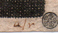
    And an early (and tiny, 2mm)  collector’s mark, stamped in the extreme right bottom corner:

    Etching man in study112I think that we’ll just have to appreciate this print at this point for what it makes us feel–though I am sorry not to have more detail on what it is/where it came from/who made it. 

    ·Posted by :

    ·in:

    —

  • An Annotated Poetry of Clouds

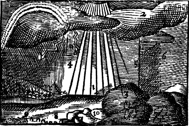
      JF Ptak Science Books  Quick Post

    Clouds cromenius

    [Image from John Comenius,  Orbis Senfualium Piélus: Omnium Principalium in Mundo Rerun/ Vita Аllопит,  translated as Pictura et Nomenclatur, the Visible World, or A Nomenclature, and Pictures of all Chief Things that are int he World, translated into English by Charles Hoof…1726.  See an earlier post here for more on Comenius. Image Source:  PROJECT GUTENBERG.]


    Clouds

    A Vapour, (1). ascendeth
    from the Water.

    From it a Cloud, (2).
    is made, and a white Mist, (3).
    near the Earth.

    Rain, (4).
    and a small Shower
    distilleth out of a Cloud,
    drop by drop.

    Which being frozen, is Hail, (5).
    half frozen is Snow, (6).
    being warm is Mel-dew.

    In a rainy Cloud,
    set over against the Sun
    the Rainbow, (7). appeareth.

    A drop falling into the water
    maketh a Bubble, (8).
    many Bubbles make
    froth, (9).

    Frozen Water
    is called Ice, (10).
    Dew congealed,
    (13) is called a white Frost

    Thunder is made of
    a brimstone-like vapour,
    which breaking out of a Cloud,
    with Lightning, (11).
    thundereth and
    striketh with lightning


  • Gin Lane, the Moral Thermometer, and Booze Crazes

                    JF Ptak Science Books  Post 2332

     “…the Distillers have found out a way to hit the palate of the Poor, by their new fashion’d compound Waters called Geneva, so that the common People seem not to value the French-brandy as usual, and even not to desire it”. –Daniel Defoe The Complete English Tradesman, 1727, volume 2, page 91.
    Hogarth gin lane

    [Source: the British Museum, here.]

    I was moved to this post after reading a wonderful piece by Rebecca Onion at Slate Vault on an infographic/metaphorical social thermometer of drinking and temperance, a beautiful engraving published in 17971. (See here.) [Another, illustrated, version can be found at the College of Physicians, London, site, here.]

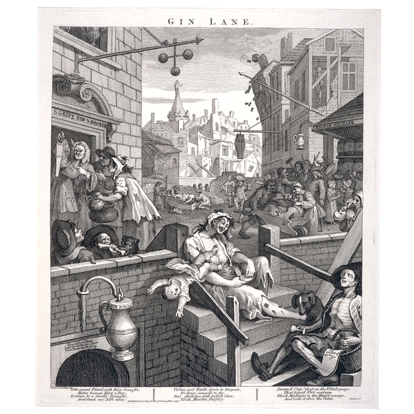
    It reminded me of another great and iconic image regarding the evil of drink—it appeared earlier in the century, at a more difficult time in the history of London drunkenness. It is the William Hogarth’s Gin Lane, published in 1751. I’m not sure what drove Hogarth to the subject matter—except of course he was a societal reporter, making art of what he saw, turning him observations of everyday street and cultural life in to parables. Certainly he needed go far to find subject material like this.

    As we can see he only had to go as far as Bloomsbury (in the background and the tower of St. George towering) to find the location of his stage. The characters are well established, showing us in this unfolding tragedy a scene of drunken depravity and wantonness, of lechery, and forgetfulness, illness, crime, and death, all brought on by the continuing increase in gin and other alcohol consumption. But mainly gin. Gin was cheap, was sold everywhere, and was very effective. It was a disease, really, that affected London deeply throughout much of the 18th century, though the greatest part of the gin craze took place earlier in the century. Some of the problem was ameliorated by several governmental acts that interested with the sale of gin, though the major part of it occurred in the Gin Act of 1751, which was created to restructure the distribution of gin and make I more difficult (and expensive) to purchase—the logic of the move wasn’t so much to convince the public not to drink gin, but to make it more difficult to buy the drink.

    So gin was in the air, for sure—literally, and figuratively.

    Hogarth attacked it. The most arresting figure for me is the scabbied drunken (syphalitic ?) mother in the middle foreground, passing out or wasting away, completely unconscious to the plight of her baby, falling, desperately, to certain major injury or death into a stairwell, without the attention of the mother, a vignette that is horrible and striking. At her feet is a starving skeleton, asleep or dead, dead or asleep, in a miserable state, although he does have a nice wicker basket with a bottle in it. This may be an allusion to Death from the Renaissance (and earlier) illustrations and depictions of Death coming to people at their play or profession—the Dance of Death, only this Death isn’t dancing, it is only dying.

    There’s no relief in this print—an almost-calming scene at mid-left midground is Gripe’s pawnbroker, the jaw-thrusting and disapproving proprietor assaying the tools of a man (a carpenter?) while a woman waits her turn, her pots in hand, waiting to pawn the stuff of existence or work. The three balls of the pawnshop’s sign form a sort of upside down crucifix, which via a perspective tick hangs just above the steeple of St. George’s. Under this cross all sorts of hellish behavior takes place.

    At mid-right we find the distiller, with a big, ruddy, rheumy and raucous crowd in front of it, swinging chairs and crutches, close set, and depicted in such a way that you know everyone reeks.

    In the upper right, forgotten, a man is seen hanging by the neck, a probable suicide, dead. Next door to his ruin house is a stable one, an undertaker’s shop, with a sample of wares hanging as a sign—no doubt doing a decent business, though it seems as though any money left for coffins in these folks would’ve been drunk up a long time ago. To complete this architectural scene the house on the corner is collapsing, much like everything else.

    Then in the gentle mist we see the coffin and body, and the men either putting the body in or taking it out—I think the viewer can choose for themselves which.

    This image is the opposite of subtle, though you need to look for the messages a little; once found, they are forever present. Mr. Hogarth got his point across. 

    NOTES:

    1.  Lettsom, John Coakley, 1744-1815.History of some of the effects of hard drinking: The sixth edition. By J. C. Lettsom, …  The illustrations in question is “A MORAL AND PHYSICAL THERMOMETER; OR, A SCALE of the Progress of TEMPERANCE and INTEMPERANCE. LIQUORS, with their EFFECTS, in their usual Order”.  Summarizing, some drinking led to good health and tolerance; other sorts, not. The “Vices” perpetrated by the Bad Drink included the following: Idleness; Peevishness; Quarrelling; Fighting; Lying; Swearing; Obscenity; Swindling; Perjury; Burglary; Murder; Suicide. And the “Illnesses” associated with Bad Drink”: Sickness; Puking, and Tremors of the Hands in the Morning; Bloatedness; Inflamed Eyes; Red Nose & Face; Sore and swelled Legs; Jaundice; Pains in the Limbs, and burning in the Palms of the Hands, & Soles of the Feet; Dropsy; Epilepsy; Melancholy; Madness; Palsy; Apoplexy;Death. The social and economic onsequences: Debt; Black-Eyes; Rags; Hunger; Hospital; Poor-house; Jail; Whipping; The Hulks; Botany Bay; Gallows.