JF Ptak Science Books Post 269
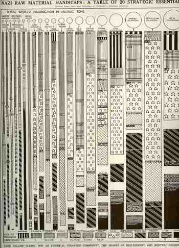 This dense, complicated table showing the distribution of strategic raw materials (published in The Illustrated London News 3 August 1940) I is a decent example of how not to display data. Perhaps there’s just too many variables to try to control here in one visual display: it tracks twenty raw materials by percentage of access for thirteen different countries, with the entire graph being displayed in a sort-of progression according to metric tons of material. Maybe it’s the varying widths of the bars representing the material, maybe it’s the complex designs distinguishing the countries, and maybe its just too many lines. The only time this really works for relatively-offhand use is when you’re looking for one country in particular, and then the eye allows it self to just concentrate on the solid black (Germany) or the stars in a bar (U.S.) When the graph is used in this manner it displays rather quickly that Nazi Germany doesn’t control a whole lot of the combined tonnage of the twenty strategic materials, which was a particularly good thing for the general reading population in the Allied world to see, because the war was not going so well at this early stage. (At this point in the war—less than a year old now in Europe—the Battle of Britain had begun though it was still weeks away from when the massive Blitz begins, and Hitler had just toured Paris…it was not a good time for Britain, and a worse time for France. The Soviet Union is listed still with the Axis as it was still 10 months away from being attacked, Hitler turning on his allies in Operation Barbarosa in June 1941.)
A little further effort would show that the Allied countries are mainly lighter, with the “belligerent” or neutral countries are darker, showing the lighter is on top with darker beneath, and that in general the Allies control more of these materials than the Axis. It is also interesting to not ethe relative smallness of control by Great Britain, though when you throw in the rest of the British and then the French empires the possession summary changes dramatically.
So the data is there, and there’s allot of it, and its fairly nimble—its just that the visual display is not pretty or easy to use .
 (Click to enlarge to readable size.)

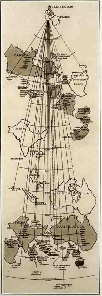 This map comes to us from The Illustrated London News, 3 August 1940, which reproduced it from an article in Fortune Magazine. Though it looks oddly wrong from the outset, it really is pretty lucid–elegant, even–once you understand its purpose. And the purpose of this map was to show the distances that the goods and raw materials from the British Empire (and from the possessions of France) had to travel via the then-closed Suez Canal route versus the new routes “not open to enemy interference” to Great Britain. Countries depicted in outline show the distance via Suez while the same country depicted in shade show the new, longer, non-Suez route. Ever stiff lipped, the Brits announced that even though some of their major natural resources are coming from these vastly removed areas, “even with the fall of France, the British Empire and its allies remain an economically self-contained and immensely powerful war unit, and still control the great part of the world production of some vital commodities…” I’m not sure why, exactly, that it was necessary to display this map to the public eye, what with England under assault in the Battle of Britain (the Nazis extending their aerial assault in preparation for Operation Sealion), the loss of France, and the nearly-there Nazi blockade of English waters. Perhaps it was drawn to show that even though the material was coming from the same places that were now further away, they were still getting there.