A Daily History of Holes, Dots, Lines, Science, History, Math, Physics, Art, the Unintentional Absurd, Architecture, Maps, Data Visualization, Blank and Missing Things, and so on. |1.6 million words, 7500 images, 4.9 million hits| Press & appearances in The Times, Le Figaro, Mensa, The Economist, The Guardian, Discovery News, Slate, Le Monde, Sci American Blogs, Le Pont, and many other places… 5000+ total posts since 2008.

Category: Information, Quantitative Display of

  • The Anatomy of Comparison Department: HMS Ships Firing On London, 1909

    JF Ptak Science Books LLC  Post 596    Blog Bookstore

    HMS Ships Firing On  London,
    1909, Old vs. New  Comparing Shipboard
    Firepower:  a Compelling Comparative Graphic Display from the Illustrated London News for 24 July 1909
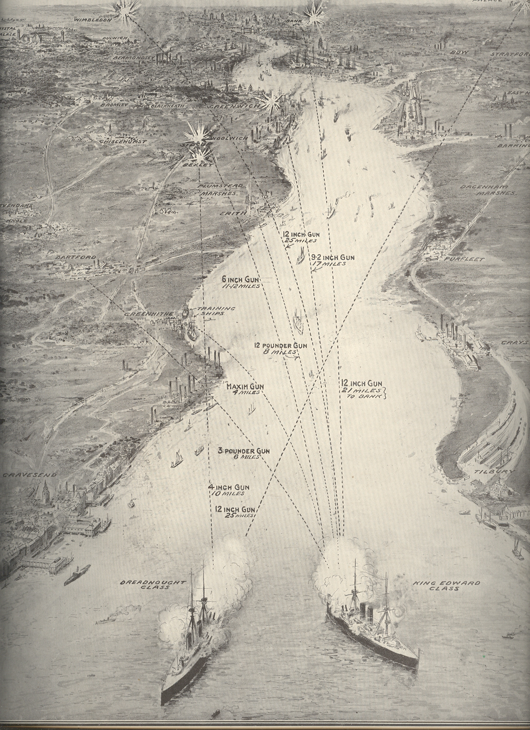
    Blog--april 26--london bombed Without looking at the sub-title and explanation of this of this print (“Firing
    from Thames Mouth to the Edge of Greater
    London”) its purpose might be a fair mystery, given the ships and the targets
    and all. The two large ships at bottom are a Dreadnaught Class battleship and a
    (smaller) King Edward Class ship, and, yes, they are firing towards London—but they
    are doing so to illustrate a point on modern weaponry and the vast, new
    superiorities of British advances in the death/protection arts.

    In June 1667 during the Second Anglo-Dutch War the British were set upon by
    an running attack by the Dutch Admiral Michiel de Ruyter, who had advanced as
    far up and into the coast as the mouth of the Thames.  The Dutch advance up the Thames was repulsed,
    though their secondary targets (so to speak) at Gravesend
    and the River Medway proved a scorching defeat for the British, and propelled
    the rocky war to a quick peace favorable to the Dutch. 

    This image shows what could’ve been the results of that engagement at
    Gravesend had the Dutch fleet been outfitted with the HMS’ new 12-inch guns—de Ruyter
    would’ve been able to reach the outskirts of London from that position, and
    could’ve b=done so from a distance of 25 miles or so. Of course the artist and
    editor aren’t really suggesting a “what if” scenario to the course of events of
    the Second Dutch War—they were merely creating a very compelling, highly
    illustrative comparison from old to new firepower, and to perhaps quite some fears
    about the strength of the Navy as the unstable and rickety international system
    limped its way into WWI, just five years in the future. 

  • Unusual Collections Department: a Collection of Roads

    JF Ptak Science Books LLC  Post 573

    Road samples
    In my time I’ve encountered interesting people with advanced, iconic and unusual collections:  there’s one fellow with a superb collection of (better than 20,000) cds with basically nothing to play them on (but of course he knew all  of the music, and listening was almost but not quite secondary); there’s another with an audio outfit worth better than a quarter million with literally almost nothing to play on it.  Then there was the delightful fellow in the salvage business who collected cornerstones (!) and giant iron puddlers.  And of course the bee collector with dozens of thousands of specimens.  Oh yes!  And there was that time when I had a meeting with a man on something (on the day the Challenger exploded) unrelated to the spectacular collection he showed to me:  the world’s largest, privately-owned 19th century mechanical toys.  It was really just unbelievable.  So was the man, who in the course of the day, as we sat watching the Challenger story unfold, performed on of the most amazing feats I’ve ever seen in my life. 

    My friend Marty Weil chronicles the wants and needs of collectors of all manner of things, from bus passes to matchbooks to god-knows-what, in his excellent ephemera blog.  I collect dirt and antiquarian artwork by children, among other things.   Also, once upon a time I owned a very large collection of lower gastrointestinal dissections as well as gorgeously prepared wet dissections of salivary glands. 

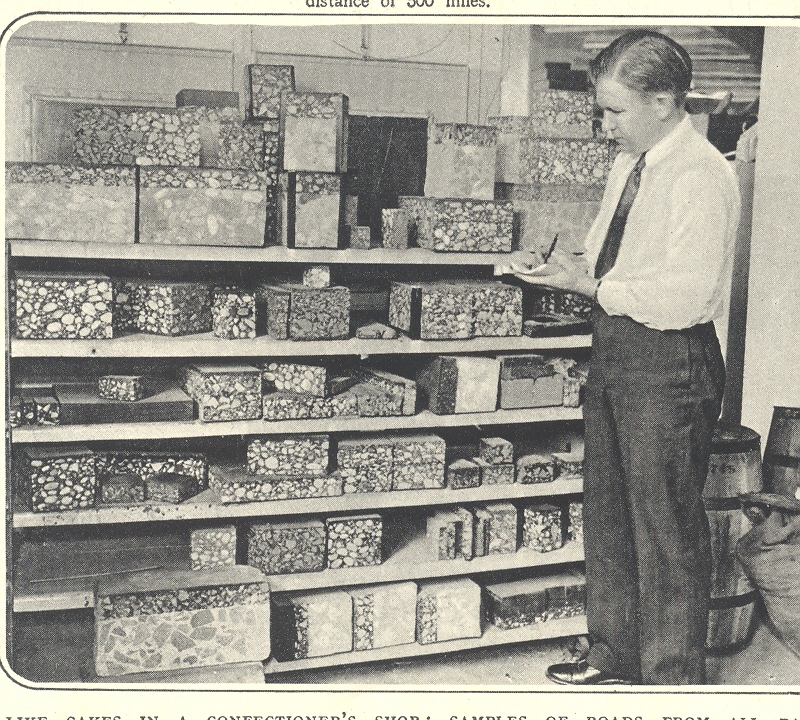
    And so it was that when I came upon this unusual image in The Illustrated London News for 21 May 1932 I felt a certain tenderness.  This is a pictre of a road collection, located somewhere in the U.S.,  and includes shelf upon shelf of cross sections of roads.  They happen to look like cubes of fat to me.  (We’ll leave the bags of eyes story for another time.)  I understand the need  for  such a collection for engineering purposes; I just happened to like the idea (and the picture) of A Road Collection, and have it undisturbed by any explanation or insight.  Just a collection of roads. 


  • A Map of The Office, 1942 -&- On the Cusp of Color: Bringing Color to Packaging

    JF Ptak Science Books LLC  Post 564

    Color 001


    An Occasion An Appreciation,
    a badly-titled but butterly-produced and broadly-illustrated work is a shiny, slippery and slick celebration of gummed paper.  It may well be the Gutenberg Bible of gummed paper celebration books. 

    The book is a silver anniversary (1917-1942) of the Mid-States Gummed Paper Company of Chicago, makers of gummed,.flat, non-curling special gum gummed papers.  It was a company started by box makers, the logical extension of that business. (“Gummed cloth tapes completed the manufactured joint of corrugated boxes, and gummed kraft sealing tape close the box,” Indeed. Also its a nicely-written Color 003
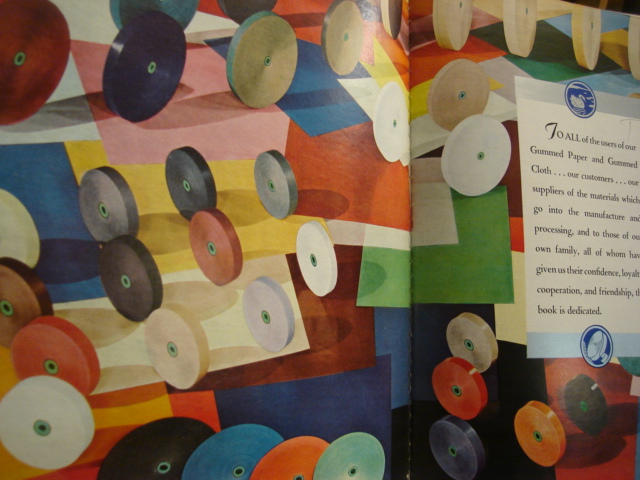
    sentence, and a well-written book.)  There is a continuous reference throughout the book to “flat, really flat” gummed tape, something that is lost on me if I don’t think about it–the use of splashy color throughout the work, though, isn’t. 

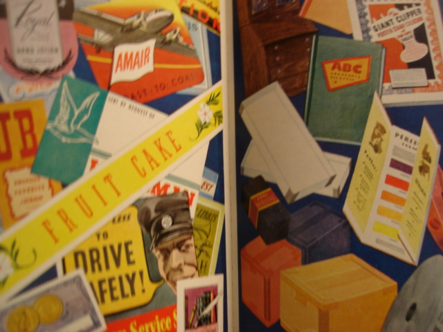
    The company’s color tapes washed over a wide spectrum, adding an artistic touch to a packaging world which was largely black and white. It also produced color gummed labels for  packaging and advertising, which made all the difference. (To appreciate this all you have to do is wind your way through a year or two of LIFE magazine from 1939/1940 and see the vanilla- and blandly-colored boxes of cereals and cans of  such and so spread across the issues.  People Color 004are much more convinced to buy something that has a colorful, pictorial image on the box than one that is a white box with black lettering. )*

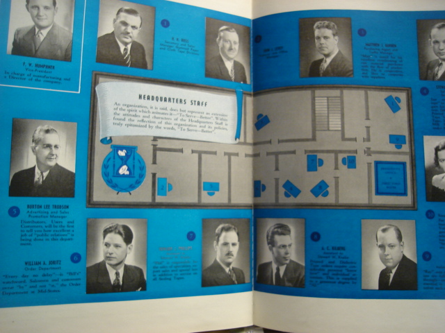
    Another very interesting bit about this book is that it published an indexed map of the offices of the headquarters staff–which is a very unusual map to my experience, very.  I’ve got a small collection of office layouts/maps from the 1900-1940 period, mainly because it belongs to a period long ago and far away, even though the tail end of office design like this creeps its way into my own life, showing up at places like “computer headquarters” in tv shows like the Rockford Files in 1980. It is a wonderful insight into the way business was done, and I can just about see the polished red linoleum floors, open Color 002transoms and abundant oak everything, all swirling in cigarette smoke, populated with people wearing real clothing.

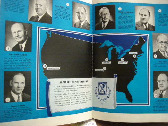
    Yet another oddity is the map of the locations of the company–it definitely belongs to the Blank and Empty Things category of this blog–showing the five cities where it  had offices.  The resulting map though is quite unusual, as it shows just the five point and leaves the rest of the country jet black in a deep blue background, everything else missing. 

    I know I’ve had some fun with this book, but I’ve got to say that it was very well done, very well written, and about as interesting as its topic could allow. 

    * I believe that the first mass-produced book illustrated with color photos was by Leica for its labs, published in Berlin in 1938 (?).  color printing in photography had been around by a laborious process since at least the 1890’s, but that’s a different story


  • Imaging Mass Casualties: the Big Crowd series, continued.

    JF Ptak Science Books LLC  Post 562

    Crowds 001

    Few
    things capture the attention of the general reader quicker than a comparative
    display of what mass casualties looks like. 
    Putting an organized, recognizable face to concepts that are vastly
    removed from the common experience is very compelling, and demands
    thought.  (I’ve made a small number of
    posts on the display of quantitative data via the use of crowds and masses of
    people “The Department of What Things Look Like: the
    Casualties of the Somme, Visualized
    “,
    as well as the general confusion in images of enormous crowds “Crowds and the
    Press of Humanity: WWI German Prisoners, November, 1918″
      ,
    and also as the history of crowds in art  “Clarity and Confusion in Displays of Human
    Masses 
    “
    .)

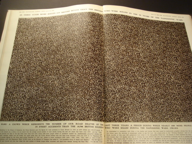
    Today’s post (from the Illustrated London News for September 1932)  follows the line of the Somme Casualties  post, showing in two very striking images what
    large-scale death looks like
    .  The first, montaged,  photographic  image depicts the number of people killed (20,169)  in Britain over a three year period in automobile and other traffic/roadway accidents.  This does not include the number of people injured, which would be ten times greater than this image.  (I’ve included a magnified view of a small section just to show that this was not a picture of dots, but actually a lot of people, men mainly, wearing hats.)  In contrast, the caption-writer points out that this three-years period produced more deaths among the British than all years of the Napoleonic Wars (1793-1815) combined.  This comparison was made in a plea for safety on the roads. Crowds 002

    And as a matter of fact, deaths on the roads in the U.K. significantly decreased over the years:  from about 7,000 a year in 1932 to 2,900 or so in 2007.  In 2006 in the United  States, on the other hand, more than 13,000 people were killed  in alcohol-impaired traffic accidents alone; that represents about 30% of all traffic fatalities, which  numbered about 52,000.  A year.  This is also nearly the same number of all American service people killed in the Vietnam War.  For the same period of time,  driving deaths in the U.K numbered 2,900 people in a population of 61 million and for 230,000 miles of roadway;  there were 52,000  deaths in the U.S. in a  total population of about 300,000  driving on 4 million miles of roads.  When you look at the deaths per miles of roadways, the two country’s statistics are very similar

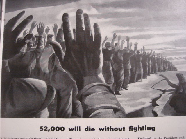
    Crowds 003 The second image comes from an ad for American Locomotive in LIFE magazine for 11 January 1943.I t was a plea for industrial safety during a period of war, stating that in 1940 there were 52,000 people killed on the job (!) in the United States, with more than 2 million injured.  American Locomotive pointed out that this was equal to the loss of some 500 million man-hours (sic), which was not affordable to the country while fighting a two-front war.  It is a striking image, and must’ve commanded a fair amount of thought to anyone seeing it. The 52k figure sounds very big and too-strong to me, given that the American population was  132 million, meaning the work force was around half of that.  

    A “Safety First” motto was developed from this effort.  (Say it and it’s so (?))


  • Baroque X-Ray of the Soul: Jacob Boehme’s “Psychologia”, 1632

    JF Ptak Science Books LLC  Post 546

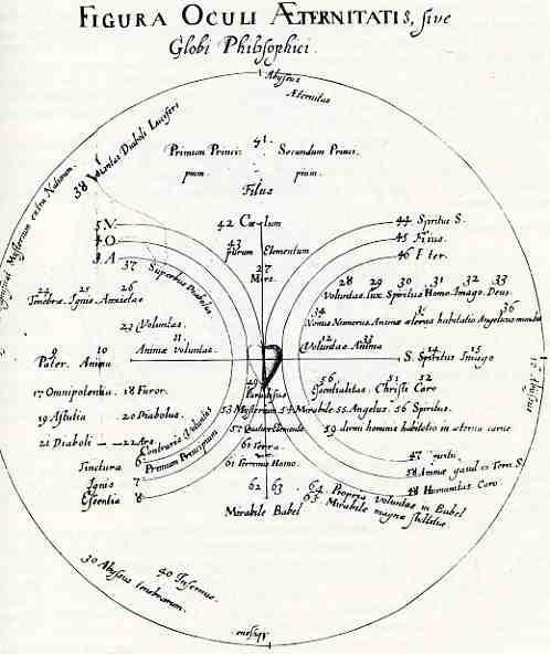
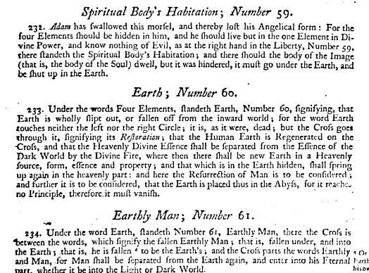
    0 abay feb 23 boehme622This solar-systemesque plan of the human soul appeared in Johannes Werdenhagen’s translation of  the expansive Jakob Boehme’s Psychologia [graece] vera I[oanni] B[oemi] T[eutonici] XL quaestionibus explicata, printed in Amsterdam in 1632.  Boehme’s (1575-1624)  original work waited for 8 years following his death to appear in print in any form, fearing during his lifetime that perhaps some retribution for his barrier bending work might find him–and it turns out to have been true, as this book (and the only one of Boehme’s subsequently published works) made its way onto the Roman Index in 1633.  Boehme was a mystical panthesist and psychic who blended the Kabbbalah,  Valentin Weigel, Paracelsus and the Bible in doses wide and narrow, finding his own advanced-Lutheran voice in works concerned with sin, evil and redemption, populated with angels and grace and on and on, in a world view far-reaching and way to complex to go into here. 

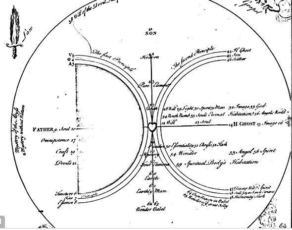
    Part of that philosophy is displayed in this map of the soul, found in Psychologia–it would’ve been fairly impenetrable to me had I not found an English translation (below) of the image, published in Forty Questions Concerning the Soule in 1655. 

    I thought that I was going to try to make a summary of the map, but, honestly, it is too just involved and intertwined and complex to do this quickly, so I’ll just let whoever cares to have a go at it under their own steam.  I will point out that the major geographical feature here is the cross at center, which is actually Christ’s crucifix and the great delineator of the system of the soul. But this is a gross simplification of the work of an unschooled man who rose to be a cobbler before compiling his remarkable set of ideas.  I’ve included a few explanations of the 63 items incorporated in the map–it is a difficult go, particularly since this was part of only the first of the forty questions addressed in the book. 

    Zzz--boehme

    Zzz--boehme xray
     

    *Another example of Boehme’s style of writing:
    “For he that will say, I have a Will, and would willingly do Good,
    but the earthly Flesh which I carry about me, keepeth me back, so that
    I cannot; yet I shall be saved by Grace, for the Merits of Christ. I
    comfort myself with his Merit and Sufferings; who will receive me of
    mere Grace, without any Merits of my own, and forgive me my Sins
    .
    Such a one, I say, is like a Man that knoweth what Food is good for his
    Health, yet will not eat of it, but eateth Poison instead thereof, from
    whence Sickness and Death, will certainly follow


  • Word Balloons (continued): an Early Version in a Printed Book, 1523

    JF Ptak Science Books  Post 527

    0 blog feb 18 balloon599


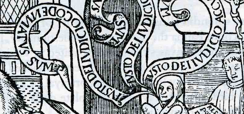
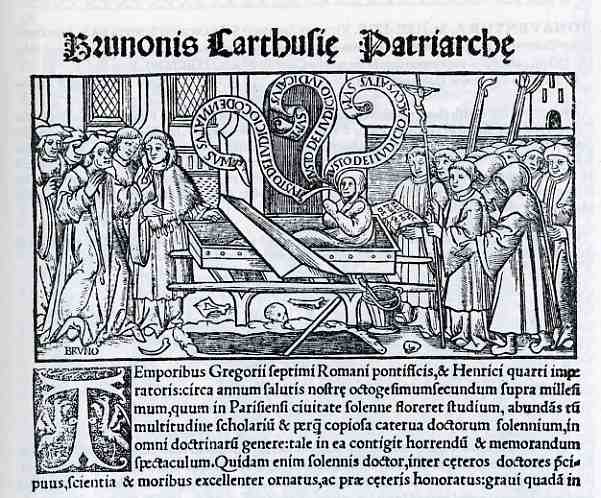
    Earlier in this blog I’ve touched on the history of the thought and/or speech balloon  (The X-Ray of the Imagination 2: Phrenology, Chinese Hell Scrolls, and the Beauty of the Thought Balloon–Internal Dialog, Demons, Humors, and Picturing the Stuff of Thought…) and I thought for sure that I had included some Renaissance examples of this very expressive additive to the medium, though it seems that I didn’t.  Everyone seems to be familiar with the idea, though perhaps it is a minority who know how old the idea is:  and it is old, the idea stretching back at least into Medieval times.  I know of at least one example from the 12th century:  an Evangeilstary from Lower Saxony, executed ca. 1190 (though the influences are Byzantine), where the Gospel texts are introduced with an illuminated page, at least two of which are further illuminated with speech banners.  (This was on display in the monumental exhibit called “1200”, shown at the Metropolitan Museum of Art in NYC in 1970 and pictured in the exhibition catalog.)

    0 blog feb 18 balloon598

    The idea must’ve been groundbreaking, though I wonder—as in the case of simultaneous sound-on-film talkies almost instantly replacing the silent film—if there were detractors who raised the issue of the device being a “cheat”, claiming that the art itself should be enough to convey the very thoughts or speech of it subject, which was now displayed in words right on the canvas. (Perhaps there was an implied threat to art itself?)    Is this the case with all new or different or revolutionary breakthroughs?  Were the minstrels threatened by the new professional theater?  Was the production of manuscripts put in jeopardy by movable type presses?  Was the Parisian water carrier, the purveyor of the coolest and freshest water threatened by municipal water systems? Radio by television; family cohesion by television; private thought by constant communication devices; symphony by recordings; telegraph by telephone; considered correspondence by email, and so on?  (I don’t think there was a “no” response to the above.) It seems as though the response is a time-compressed myoptically-evolutionary response.

    This example, printed in Paris in 1523, is an illustration for the work of Bruno Carthisienni. St. Bruno (who lived ca. 1030 to 1101) born in Cologne and educated in Rheims, was an influential academic with a wide accumulation of knowledge and a wandering spirit he used to establish monasteries.  This woodcut is one of the earliest examples of word balloons in a printed book, while the book itself is a monument to typography and illustration.  The word balloons in this case are really quite lovely, and seem to almost life their speaker from his casket. 


  • Bad Ideas: Advertisers in Your House and in Your Head, 1939

    JF Ptak Science Books LLC  Post 508

    Scan0006
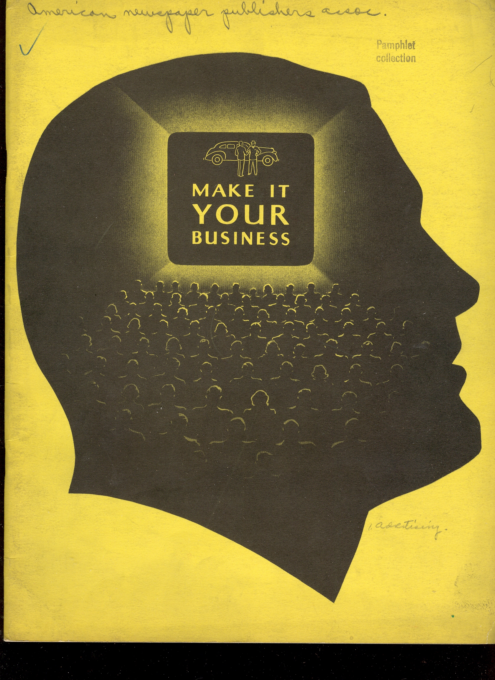
    I have little doubt that in the near future we will be deluged with advertisement at any time and in any place, the ads made exactly for you, found for you by little crevices occupied by digicams with facial recognition software powered by the next 50 years of programming research, perhaps reaching into what has been defined as your genetic soul….and there will probably be no escaping it, unless you’re able to pay somehow for the privilege of obscurity or silence.  The genre of force-feeding and creating need in the buying public for various bric-a-brac started was for real in the 1920’s (this being in no small part the shrinkological efforts of the “father” of American behavioral psychology, John B. Watson) and cranked up considerably and with major dollars in the 1930’s, when it was absolutely determined that ‘proper” advertising could sell anything.  (Watson showed this with great effect when he determined that people didn’t buy a “type” of cigarette more than they purchased the cigarette’s image–and to determine the image what was improved was the walk-away catchphrase that purchasers could quickly identify with the product.  And so a lowly and failed cigarette brand structured for women was renamed and given a catchy sales tag–the cig was Marlboro and the phrase was of course “I’d Walk a Mile for a Camel”.  Watson’s contention was of course that people didn’t buy the thing as much as they bought its promise, and the promise had to be delivered and reiterated to them endlessly, for years.) 

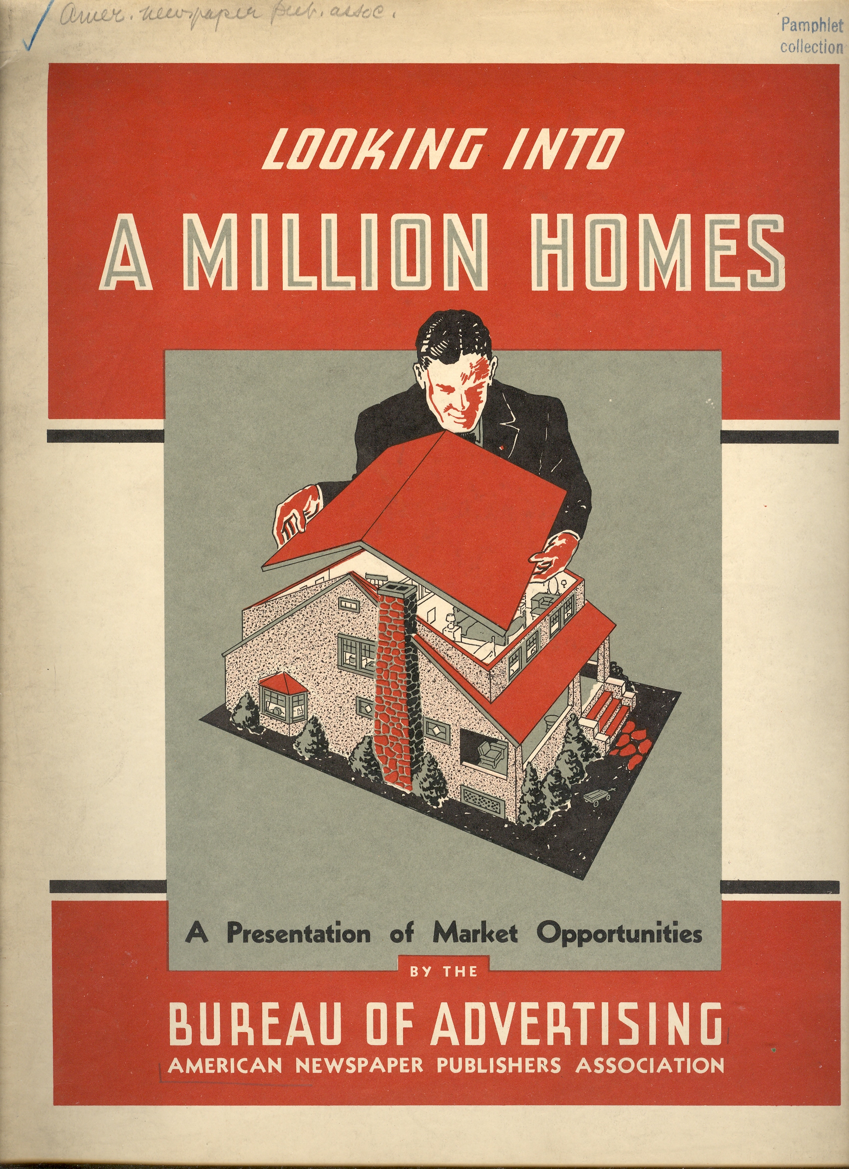
    These two pamphlets naively displayed what the advertisers were really after, the continual search for the GoldenScan0007
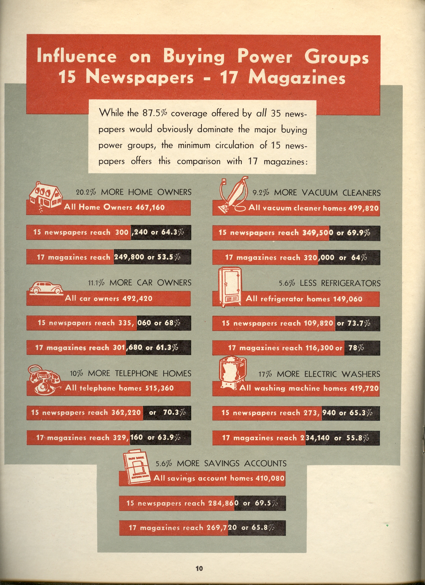
    Chalice–and that is to be in the head of the consumer, and then to be in their house, from initiating the desire to facilitating the purchase.  Both pamphlets were published in 1939 by the American Newspaper Publishers Association, and were a sales presentation for making sales presentations, an advertisement for the advertisers.  And they really did want to get into the mind of the public and insinuate them selves within the home. And both rate VERY high on the Creepy Scale.  

    I should point out that the graphical representation of the statistical data in the second pamphlet is quite terrible–these efforts aren’t in the top-99th percentile-bad category, but certainly are in the top 90%.  Easy. 

    Scan0008


  • The Bombing of Britain, 1942: Visual Display of Quantitative Data

    JF Ptak Science Books  Post 424

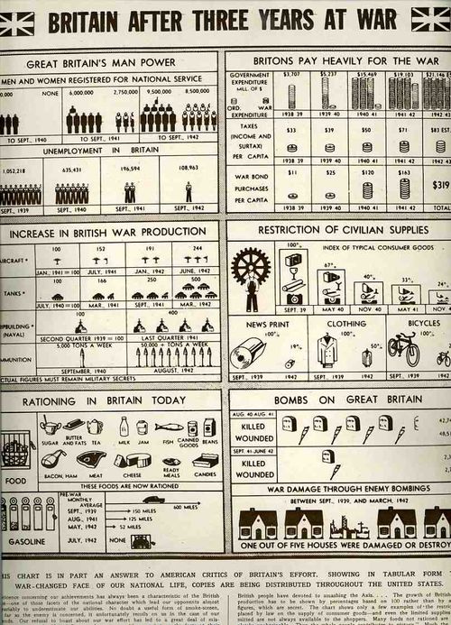
    This chart, appearing in The Illustrated London News for 19 December 1942 is in part a righteous propaganda effort, a response to a criticism evidently boiling in the United States about a “failing” in the British effort to prosecute the war.  Honestly, I was not aware of this sentiment being hosted in the U.S. in the winter of ’42.  The text accompanying this chart explains that the misunderstanding of perception is partly due to British “reticence” concerning their achievements and “an [American] opinion based on ignorance of the true situation”. 
    00-blog-Oct 27Britain 1942 graphic934

    This chart was actually a publication that was distributed “throughout the United States” to alter the public opinion there and to show “in tabular form something of the achievements–and sufferings–of Britain during three years of war.  “Those cold figures barely hint at the three years of fighting sacrifice which the British people have devoted to smashing the Axis.”

    There are some truly extraordinary figures here:  for example, in September 1940 there were 4.2 million men (and no women)  registered for national service; by September 1942 the number of men more than doubled, and there were 8.5 million women now registered. Unemployment sunk to 108k  in Sept ’42 from 1 million in Sept ’39. War damage (which I’m guessing was in the London area) is listed at 20% of all houses (!?); war deaths from the Battle of Britain and the V-1 raids fell from 42k killed and 48k wounded in the year ending Aug ’41 to 2k killed and wounded in the year  ending June ’42 (showing extreme hardship, sacrifice and progress). 

    Overall the rest of the stats speak for themselves, and I was a little surprised that the British government found it necessary to launch a propaganda effort in the U.S. a year after Pearl Harbor.  Eleanor Roosevelt said just before this brochure was issued, Britain has given ten times what we have given, because people there know what it means to be without.  There is much more equality of sacrifice in Britain than in this country”.  The article finishes: “A more forceful propaganda directed from Britain to the United States and a few more Americans speaking their minds as Mrs. Roosevelt spoke hers, would go a long way–perhaps the whole way–towards removing a possible cause of misunderstanding between the two great nations”. 


  • Trenching Out in Downtown London

    JF Ptak Science Books LLC  Post 384

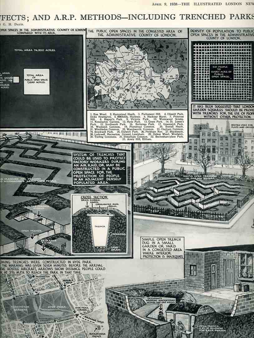
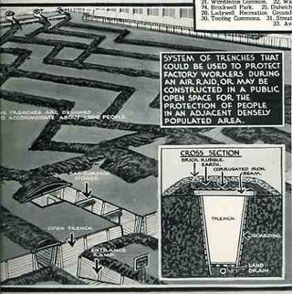
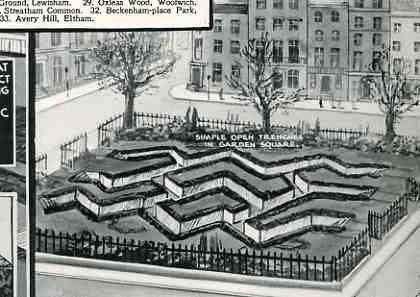
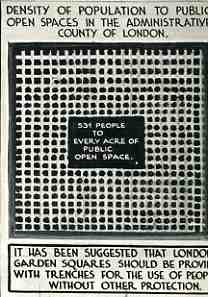
    This set of drawings displaying a plan for the protection of the people of London is simple, elegant and brilliant–accessible without speaking down to the readership, complimentary from one image to the next, cohesive, and pretty.  The series was put together for The Illustrated London News for 9 April 1938 in anticipation of bombing that was sure to come, the war clear and visible on the horizon.  (Hitler was in his fifth histrionic year in power,The Berlin Agreement that sacrificed the  Seudetanland to the Nazis would come in September, Hermann Goering calling the Czechs a “miserable pygmy race” who are “harassing the human race.” , Kristallnacht was not far behind.) So.  The wonderful G.H. Davies, the prolific graphic designer (for decades) at the ILN, produced this work, showing the available acreage for digging trenches in and around London.  There wasn’t much outdoor space, as he takes great pains to show, but there was enough to hide and protect tens of thousands of citizens for bombs that would come in 18 months.  Davies also points out the relevant parts of the protective structures–issues that could be found and understood by anyone should the average person decide to build a shelter for themselves.

    000-ebay--Nov 8 london trenches026


    000-ebay--Nov 8 london trenches027

    000-ebay--Nov 8 london trenches028

    000-ebay--Nov 8 london trenches029


  • Getting Hurt in the Streets of Paris and London: Visual Display of Data that is Pretty than it Deserves to Be…1911

    JF Ptak Science Books LLC  Post 383

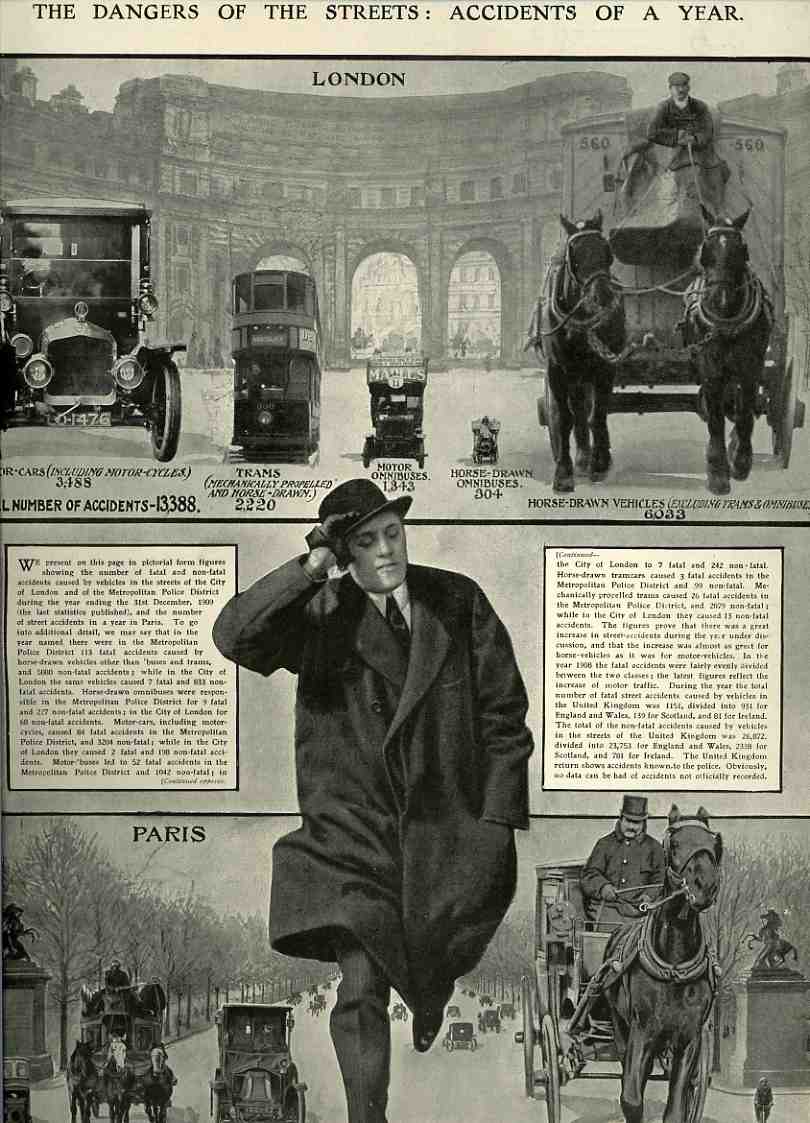
    Aside from looking allot like something that Max  Ernst could’ve produced (at about the same time), this graphic from The Illustrated London News for 11 March 1911 simply but powerfully portrays street accidents (for the year 1910) in london and Paris.  Beautiful and compelling, it is somewhat an empty gesutre, because as much as it describes the various types of accidents it fails to give us the total number of vehicles in use for each category; so, we can compare gross figures only, which is a little vacant.  We learn that the majority of accidents were caused by horse-drawn vehicles; in London, the number of “accidents” for this category was 6,033; for the same period the motor-car (“including motor-cycles”) was 3,488–we have no idea about how many of these were actually on the streets not involved in accidents, or the amount of usage, and the like.  My guess is that there must’ve been–still–many multiples of horse-drawns vs. cars.  So, if there were ten times the number of horse-drawns on the street, these figures would tell you how dangerous the cars actually were  (producing half the number of accidents with one-tenth the number of vehicles); also, the horse-drawns were probably logging more street-time per unit in general, so the “danger” aspect of the motorized vehicle grows further still.

    The other bothersome apples vs. oranges bit is the comparison of Paris and London; again, we don’t have the total number of vehicles, or the populations in general, or pedestrian populations in particular, or the area of the cities, or the miles of raoa, etc. etc.  We do see though that Paris had four times the number of accidents than London, though this seems a pretty meaningless stat.  Nevertheless, I still like the design quality of the set of images even if the statistical quality is weak.  What can I say?  It is pretty, and I like the running man…

    00-blog-Oct 27 Londons dangerous street936