A Daily History of Holes, Dots, Lines, Science, History, Math, Physics, Art, the Unintentional Absurd, Architecture, Maps, Data Visualization, Blank and Missing Things, and so on. |1.6 million words, 7500 images, 4.9 million hits| Press & appearances in The Times, Le Figaro, Mensa, The Economist, The Guardian, Discovery News, Slate, Le Monde, Sci American Blogs, Le Pont, and many other places… 5000+ total posts since 2008.

Category: Information, Quantitative Display of

  • Achievements in European Flight: Excellent Visual Display, 1913

    JF Ptak Science Books LLC  Post 340     

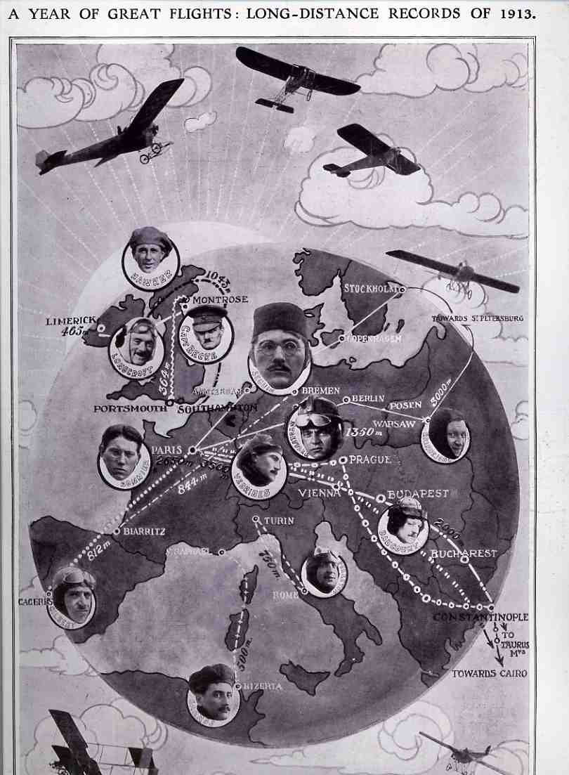
    This excellent (and slightly bizarre-looking) display of quantitative data comes to us from The Illustrated London News for 17 January 1914.  IT shows the great range and capacity of endurance and long-range flight taking place in Europe in 1913.  This portrayal is extraordinary if you keep in mind that (as I wrote about in a post last week) the Wright Brothers had only arrived in Europe in the middle of 1908 to begin their revolutionary re-introduction of the concept of heavier than air flight to the Europeans. Just prior to the Wright’s arrival the combined forces in Europe had barely been able to muster a sustained flight of two minutes, even as late as 1907.  The exhibition of the Wright flyers made an instant and profound impression on all concerned, and the lessons of the Wrights imemdiately put into practice.  Which brings us to this graphic, showing that flight in Europe had advanced enormously, with flights now routinely lasting many hours and taking place over a course of hundreds of miles–all of these changes taking place in five short years.  World War I would be the next gigantic influence on the development of flight theory, airplane construction and the use of the skies, and that would all start taking place in less than a year from now. 
    00-blog-Oct 27aviation flight records 1913931


  • What Victory Looks Like: the Battle of the Somme and the Thin Line Between Winning and Losing

    JF Ptak Science Books  Post 317

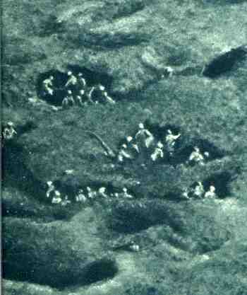
    In a play on the concept of the Powers of Ten, I had a look at a photograph depicting the French victory at the Somme; or was it a British victory?  Or German, via the lure of the others to a semi-victory?  Its hard to say who won, or if there really was a winner.  The Battle, which looks to me to be a sub-war within the war, occurred over the period of July through November 1916.  When the smoke settled, there were some 1.5 million casualties on both sides.It has long been held that the battle really was won by someone, the British, the French; but there was so little that was accomplished by the action that there probably wasn’t a winner, just losers. 

    00blogoct_14somme850_2

    And big losers, at that: Great Britain, Canada, Australia, New Zealand, Ireland, South Africa and Newfoundland lost 419,654 casualties, with 95,000 killed; the French lost 204,000 casualties and 50,000 killed.  That made a total of 623,000 casualties and 146,000 killed for the allies; Germany lost 465,000 casualties and 164,000 dead.  The advances made along the battle front went a few miles one way and then the other along a 12-mile stretch of battlefield, which four lives were traded for every inch gained along that porous front.

    The first image here (above)  is a very sharp detail from the overall picture published in The Illustrated London News for 6 January 1917, representing about 1% of the entire photo

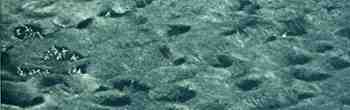
    The next image places the micro-detail in more context; this detail is itself about 5% of the main image, which is found just below this one.

    00blogoct_14somme849_2

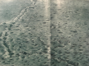
    The overall image from which these two details are removed is below. In turn, this large image is but a small detail of the greater overview of the battlefield, making up perhaps a few percent of the field of operations. 

    I’m trying to get a feel for the enormity of the battle, but I really can’t, not even via powers of ten, manipulating the idea of orders of magnitude.

    In one last try, I hypothesize that the 1.5 million casualties could not be displayed in 10 of these large images.  .

    That wouldn’t look like victory at all. 


    Ballistics_123


  • The Color Blind Geometer and the Color-Coded Euclid

    JF Ptak Science Books Post  315

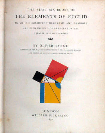
    Here’s a bit of a reach, a very-long-distanced connection, between to unrelated items sharing a similar design and operating at the zenith and nadir of color theory.  The first work is the great and nearly unusable work by Oliver Byrne on the first six books of Euclid (The First Six Books of Euclid in which coloured diagrams and symbols are used instead of letters for the greater ease of readers…, printed at the Chiswick Press by C. Whittingham for WIlliam Pickering in 1847).  The book is, well, unusual and probably not at all useful.  Bryne replaced all of the algebraic notation, identifying letters and almost all of the descriptive text with color and color codes, leaving Euclid mysterious, hidden, awkward, impervious, and, yes, beautiful.  as a matter of fact this work presages the cubists (and especially Piet Mondrian) by 60 years, and all by accident. 

    1blog_oc_t10_euclid_color_blindness Blogeuclide_byrne_2

    Augustus De Morgan, mathematician and logician, wrote a very highly critical book A Budget of Paradoxes in which he describes hubbub, fakirs, frauds, perpetual motion machines, squaring the circle efforts, millstones and other useless books in the maths, and in here he sniffily dismisses Byrne’s work. At best, to De Morgan, the Byrne book is “curious”. But useless and curious, as I have seen many thousands of times, does not mean that it can’t be attractive and beautiful, and the Byrne book is probably the leading candidate in the Bad & Beautiful category..In Victorian Book Design McLean calls the Byrne book “…one of the oddest and most beautiful books of the whole century…a decided complication of Euclid, but a triumph for Charles Whittingham [the printer]”.  (I should point out that the Chiswick press returned to Euclid again in 1893, publishing Gilbert Redgrave’s address on Erhard Ratdolt, who was the first scientific printer in history and also the first publisher of Euclid in 1482. See HERE for the digital record of Redgrave.)

    Curiously the Pythagorian theorem illustrated on the title page of Byrne’s book seems at a fast glance to appear on the front cover of Phillip S. Newton’s Color Blindness, Suggested Aids for Correcting 1946.  It really isn’t all that close except by fleeting recognition, but close enough to stop me in my tracks, to make me think of where my copy of Byrne was and put them side by side.  Curious doubly because in Byrne’s case color is used exclusively in place of numbers and words and is totally and completely dependent upon it. In Newton (who also has the same name as Sir Isaac, author not only of the Principia but also the second-best book of the 18th century, Opticks) we find the confusion of color and plans to correct the color vision, and in a twisty way, on the opposite end of the interests of Byrne. 


  • Ships in the Skyline, Part V: Cities INSIDE of Ships

    JF Ptak Science Books  Post 308       

    1blog_oc_t10_ship_in_skyline_deta_2

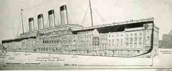
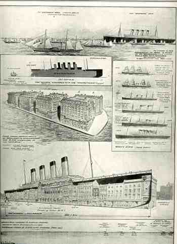
    In trailing some loose associative memories of ships being compared to skylines, and seeing he ships placed in the skylines, I was able to find four good samples.  This one is, in a way, the negative version of that, showing cities placed inside of the ships, the ship in this case being the White Star triple-screw Olympic–which at the time was the largest ship ever launched at 882′–and the image found in The Illustrated London News for 22 October 1910.  It was done in celebration of the launch of the ship from Belfast, which was also the heaviest transference of weight (27,000 tons) from land to water in history.   To illustrate the ship’s massiveness the picture editor placed a row of hotels and buildings bounded by the eastern end of Burlington House to the very edge of Piccadilly Circus, with the Piccadilly Hotel (height 77′ 6″) right there in the middle under the first three smoke stacks. 

    1blog_oc_t10_ship_in_skyline_deta_3

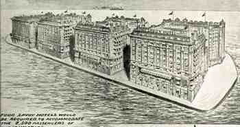
    The second image relates the passenger capacity of the Olympic to the Savoy Hotel, showing a floating platform with four of these massive hotels.  The Illustrated London News was making a real point about the Olympic and the Savoy, because at around this time smaller ships were referred to as “floating hotels”; the Olympic, on the other hand, was much more than that–it was four floating hotels, and big ones, at that, and the image captures that perfectly. 

    Truth be told, I really like the image of the floating hotels out of context and without a caption–it really makes the case for the idea of a Floating City in a Floating World. 

    1blog_oc_t10_ship_in_skyline803

    [CLick for a larger, clearer image]


  • What Things Are Not Department: Life, Cityscapes, and the Virgin Mary in Stone.

    JF Ptak Science Books   Post 305
     1blog_oc_t_9_not_here791

    Stone has preserved the evidences of much of the life on Earth—in the fossil record (which happens to stretch some number of years back before 4004 BCE contrary to what one of the vice presidential candidate believes), or an arrested day in Pompeii; indeed the entire landscape shows the way life looked by filling in the negative of what you see today., a negative landscape in a way of what has come before. The City of Rocks, New   Mexico, for example, out there near  Silver City, is a wonderful example of trying to employ your imagination to render in your mind the massive volcano that once stood there, the “City” being the last remnant of its existence. Better yet is the great Ship Rock (hello Officer Jim Chee!), a massive 1,800 foot tall fractured volcanic breccia spire in Navajo Land (Tsé Bit’a’í, in Navaho, “rock with wings”), the internal remnant of yet another massive volcano, though in this case the enormous radiating dykes (igneous rock called “minette“.) exploding away from its base gives you a better idea of the footprint of the missing mountain. You can see this magnificent mountain from a great distance, and it is only when you start to get closer and drive through one of the dikes (that has been separated for the road) that is 20’ tall and still a long way from the base of the mountain that you get a =good appreciation of just how massive it all is. 1blog_oc_t_9_not_here792
     

    I cannot imagine the gargantuan profundity felt by the person who first realized that the Grand Canyon was formed by erosive forces over previously unimaginable long periods of time, its awesome and enormous silence a negative punctuation to the enormity of the idea.

    Prior to the major discoveries in geology in the 19th century, say from the mid-18th century and earlier, there were many “discoveries” of life in stone—they weren’t very useful and most often were very misleading, but they were, in two words, pretty and unusual.

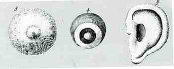
    The people who made and recorded these discoveries were often more circumspect about what they were finding than their readers; sometimes not. Jean-Baptise Robinet (1735–1820) was a French naturalist, Jesuit-philosopher and encyclopediaist (best  known for his five-volume work De la nature (1761-8)) who found all manner of interesting and scientifically-divergent items in stone—eyes, ears, skulls and occasionally an entire body. Antoine J.D. d’Argenville at about the same time in the 1750’s also uncovered silhouettes of dressed human,  birds, cityscapes, trees and the like in stones, which seeped its recordings of the animate into receptive fantasies.
    1blog_oc_t_9_not_here_kircher_793
    But these durable micro- explorations in agate go back thousands of years, expounded by Pliny and some of the other ancients, who followed the origins of humanity back into the rocks. This was a popular idea for the origin of animate beings, propounding itself for centuries, even winding up in the bony lap of Leibniz of all people, who wrote that “men derive from animals, animals from plants, plants from fossils, which in turn derive from bodies that the senses and imagination represent to us as being totally dead and formless”. Stoners therefore held the seeds of the formation of the world; all things living, breathing, and not.

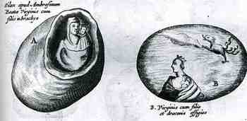
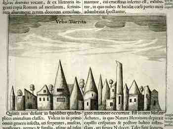
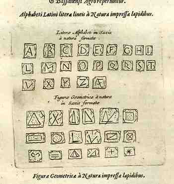
    Our own Athanasius Kircher, the definition of Polymathic ability and superior imagination was responsible for many such observations and discoveries. It seems to me that as much as Kircher gave, he took away, keeping ahead of his critics and the rest of the scientific community with tremendous output…people I think just couldn’t keep up with him. He found all sorts of things in stone: as early as 1619  he exhibited an image of   St. Jerome (in no less a place than the cave of the Nativity in Bethlehem!) that he found in agate. His Munduis Subterraneus (1661) is ahome to a wide range of these objects: quadrupeds of all shapes and descriptions, human full-length portraits, hands with jewels, and even the Virgin Mary and child. AS spectacular as these are there is always more: the magnificent cityscape (reproduced here) and the sublime discoveries of a full set of the alphabet and a series of 15 geometrical drawings, all naturally impressed in stone.
    1blog_oc_t_9_not_here_kircher_alpha

    Perhaps these men gave little more regard to the details in this stone than was necessitated by accepted theory; perhaps they added details to suit their observational needs, as they images were, after all, drawings of the susceptible and the fantastic, and were not photographs. Recording their record was as much open to interpretation as were the theories. I have no doubt that if you look hard enough at things you will at some point find what you are seeking. Only here it is by chance that these figures appeared, and not by the will of a divine creator placing a seed of potential in the stone.

    My five-year-old daughter, Tessie, asked me just the other day about where numbers and letters “came from”. She wanted to know “why are they here?”, which is a fabulous question with a long difficult answer. I do know though that they didn’t come to us from agate. 

  • Ships in the Skyline Part III

    JF Ptak Science Books LLC   Post 291

    1ebay_sept_30cunard_skyline_detail6
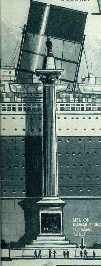
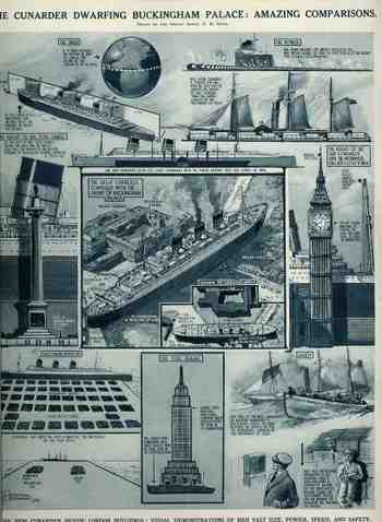
    In another unlikely-to-be-added-to category, Ships in the Skyline, I’ve found, surprisingly, a third installment. (I guess that there are many more as I’ve found these guys without actually looking for them, though perhaps that is the trick to finding things (that you don’t need).)  The comparisons that we see here for the ship The Cunarder, appeared in The Illustrated London News for 29 September 1934, and the skyline that it  is favored against is  London’s Big Ben.  Interestingly, the graphic goes on to compare the powertrain of the ship to 100 “Cock o’ the North type locomotives” to generate its 200,000 horsepower; also, the amount of steel frame found in the ship  (32,000 tons) is comparable to the steel framing of the brand-new Empire State Building (58,000 tons in the steel framework).  Of further interest is the relief of a human set against the Nelson Column in Trafalgar Square and the top of the ship’s fore funnel (reaching 170′).  This is just fantastic design and some good thinking about how to make the dimensions of the ship more understandable in everyday terms, and thus compares it in size and capacity to stuff that people see most every day, or at least know.

    1ebay_sept_30cunard_skyline_detai_3
       

    1ebay_sept_30cunard_skyline690


  • Visual Display of Quantitative Data: German Losses in the Battle of Britain

    JF Ptak Science Books Post 346  (This continues a thread on The Battle of Britain and also a post on “What 185,000 Planes Looks Like”). 

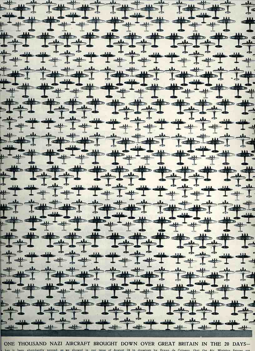
    This tremendous display is half of a double-page spread that appeared in The Illustrated London News for 7 September 1940.  It was meant to bolster the civilian population of Britain during the time of the German attacks, stating that “Over one thousand Nazi aircraft (were) brought down over Great Britain in …20 Days…” The artwork, drawn by Bryan de Grineau, actually depicts 1000 planes, and accurately-depicted ones at that.   What the graphic doesn’t tally though are the airmen losses, which would be considerably more than the 1000 aircraft:  for example, of the aircraft involved in the sustain air-invasion of England, the  Dornier 215’s had a crew of four, Dornier 17’s three, Heinkel 111’s four, Messerschmitt 110’s two, and Junkers 88’s three.  Thus  there were thousands more airmen lost, a commodity that the Nazis could little afford, more so as time went on.  
    00-blog--Oct 29 battle britain Nazi planes952 The results of the battle (and if you take a look at this earlier post for the full narrative), in terms of aircraft and humans,
    were,  for England: 1,023 fighters, 376 bombers, 148 coastal command aircraft  for a total of 1,547 aircraft and  544 pilots and aircrew killed.  During this time there were 27,450
    civilians killed and 32,138 wounded.  The Nazis lost 873 fighters and 1,014
    bombers for a total of 1,887 aircraft, with  2,500 aircrew killed.

    I find this visual display of quantitative data beautiful and compelling–and overwhelming in its way.

    The Battle of Britain was fought primarily from 10 July to 31 October 1940, so by the time this image was published the Brits had been able to withstand the tide of Hitler’s plans.  (The air strikes wouldn’t really end until the Nazis turned their attention to the Soviet Union in Operation Barbarossa in May 1941.)  One of those plans, named Luftschlacht um England, was to overtake and destroy the British capacity in the air, for as long as the English had command of the airspace there would be no way that the Nazis could force an invasion by sea/land (at least in the minds of the Oberkommando der Wehrmacht and Hitler.  With no air cover Britannia’s rule of the waves could be much more effectively challenged; and should that occur, what was seen as a not very probable invasion of Great Britain by a not very substantial Nazi naval force/transports might actually come to being. 

    This was a victory for HMG, though the rising tide for the Nazis would continue to do so through about November 1942, when after integral victories had been had that Churchill could declare at the Mayor’s Luncheon (10 November 1942): “Now this is not the end. It is not even the beginning of the end. but it is, perhaps, the end of the beginning”. 


  • A 117×1 Mile Blanket of Planes: What 185,000 Planes Looks Like

    JF Ptak Science Books  Post 289

    1ebay_sept_30185000_planes695

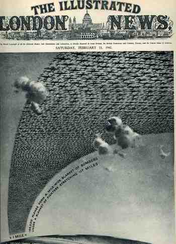
    This arresting cover image for The Illustrated London News of 21 February 1942 illustrates the (new) American production program for planes and tanks for 1942 and 1943 (It reminds me too of an earlier post I did with a similar cover for LIFE magazine here.) The caption reads: “185,000 planes form a mile-wide blanket of bombers under a blanket of fighters stretching 117 miles” which is actually a double blanket of planes–if they were thinned out to form one layer it would stretch one mile wide from Washington D.C. to New York City, which is quite an unimaginable ribbon.

    1ebay_sept_30185000_planes_detail69

    The reality of the situation was greater than this:  by 1945 over 300,000 planes were produced, 275,000 of them after Pearl Harbor.  And this from a combined aviation industry which before 1939 had produced fewer than 6,000 planes a year.  The war effort increased this by orders of magnitude, and by war’s end there were 81 production facilities with a combined area of 175 million feet, all bumped up within four years.   I’ve never read about it, but I have no doubt that one of the key ingredients to this sort of hyper-successful undertaking was organization–the oversight and control for this process must’ve been fast and decisive, with little room for mid-level anything.  I think that this is the only way the whole thing could’ve worked so well. 


  • Comparative Display of Quantitative Data: Ships in the Skyline

    JF Ptak Science Books LLC  Post 261

    This wonderful display (appearing in The Illustrated London News for 26 March 1927, page 518) of quantitative data isn’t quite as whimsical as it appears in detail, though I can think of onlyBlog1sept_16_ship_skyline_detail5_2
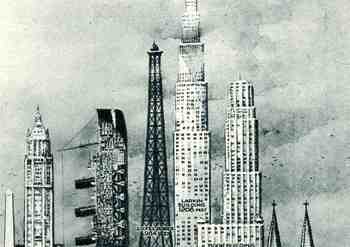
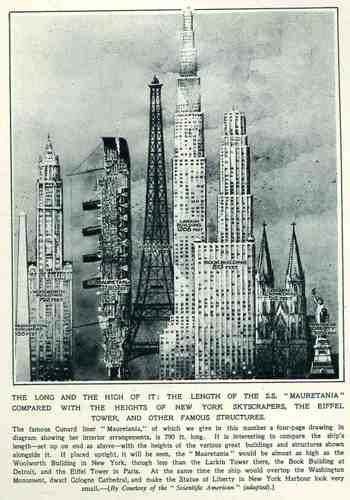
    a few (antiquarian) times that I have seen a ship made part of a cosmopolitan vertical cityscape.  It is a great way of comparing two disparate, out-of-place equals, and certainly can get the idea of the size of something as stand-alone and solitary as a great ship to children (and adults, too) by comparing it to something as obvious as a tall building.,  This time its really just comparing the length of the SS Mauretania with the heights of some famous and notable buildings. (The Mauretania, 1906-1935, was a fabled, luxurious and fast ocean liner of the Cunard line; it was refitted for a resurgent oceanic service at about this time.)   In the larger, expanded second image we see the Mauretania stacked up against (from left to right) the Washington Monument (555′), the Woolworth Building (792′), the Mauretania  (790′), the Eiffel Tower (984′), the Larkin Building (proposed at 1208′), the Book Building (873′), the Koln Cathedral (512′) and the Statue of Liberty (305′).  The Larkin Building (not the F.L. Wright structure of the same name) was a proposed super-tall of 110 floors for 330 W. 42nd Street that was proposed in 1926 and not canceled until 1930, and which would’ve been the tallest building in the world. (For an interesting site on the cancellation of tall buildings, see HERE.)   In any event, this was a big ship–the largest in the world when it was launched as a matter of fact–and the drawing is wonderful.   Upon closer inspection, there is a terrific amount of detail in the cross section of teh ship.)                                                   

    Blog1sept_16_ship_skyline564


  • National Socialists Take Control, 1933: Diagram Presentation of German Elections 1919-1933

    JF Ptak Science Books LLC    Post 250

    Blog1sept_8_nazi_election522

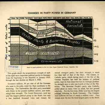
    This diagrammatic presentation of the German elections from
    the end of the First World War to the 1933 elections clearly shows the rapid
    and sustained growth of the National Socialist German Workers’ Party, called
    for short, the Nazi Party (or NSDAP).

    It is really the chronicle of the rise of the unemployed sergeant
    Adolf Hitler’s rise from total obscurity to the chancellorship of Germany in just
    fourteen years. This is accomplished
    through a thick and murky collaboration of some of the stupid aspects of the Treaty
    of Versailles, the failure of the great base of the German economic enterprise,
    the worldwide depression, and the abject and miserable condition of post-war
    German society—and of course the rip-tide undercurrent of anti-Semitism, which
    was healthiest in Germany but still achieving newish heights in Hungary, Poland
    and of course the Soviet Union. Through a
    wicked and unrelenting propaganda campaign which fed on fear and retribution
    and rage in defeat, Hitler secured a rising power base among disparate
    populations: university students,
    veterans, farmers, the working lower classes, and a huge dollop of political investment
    from a number of different industrial sources. When his part almost wins control of the country outright against the
    creakingly old Hindenburg, and others, in 1933, it is Hitler who outmaneuvers
    his political rivals to secure the chancellorship and controlling power in the Reichstag. It was all downhill from there, to the ring
    of fire.

    I’ve seldom seen the rise of the Nazi party presented this way in the year
    of their ascendency—this pamphlet was printed in 1933 by the Foreign Policy
    Association (founded in 1918 and still in existence) , and written by its
    chair, James G. .McDonald (who served 1919-1933 as it turns out) for a radio
    broadcast for 11 March 1933. It is
    interesting to note that McDonald was the first U.S.ambassador to Israel
    (1949-1951).

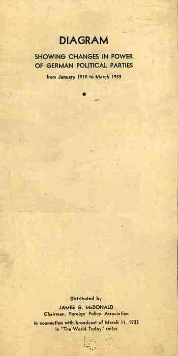
    The front cover of the diagram:

    Blog1sept_8_nazi_election523