A Daily History of Holes, Dots, Lines, Science, History, Math, Physics, Art, the Unintentional Absurd, Architecture, Maps, Data Visualization, Blank and Missing Things, and so on. |1.6 million words, 7500 images, 4.9 million hits| Press & appearances in The Times, Le Figaro, Mensa, The Economist, The Guardian, Discovery News, Slate, Le Monde, Sci American Blogs, Le Pont, and many other places… 5000+ total posts since 2008.

Category: Color Theory

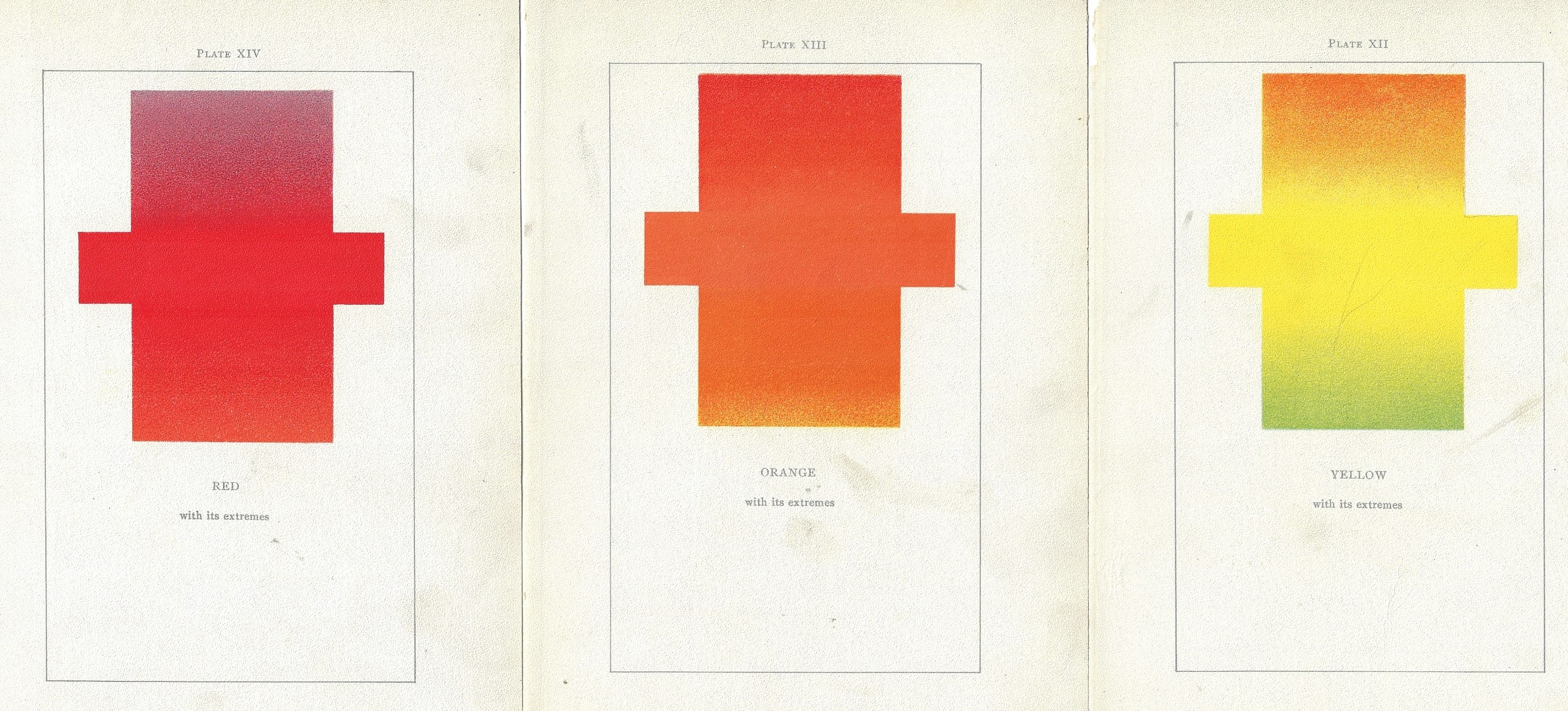
  • ROYGBV Redux via Emily Vanderpoel’s “Color Problems” (1903)

    JF Ptak Science Books  Quick Post

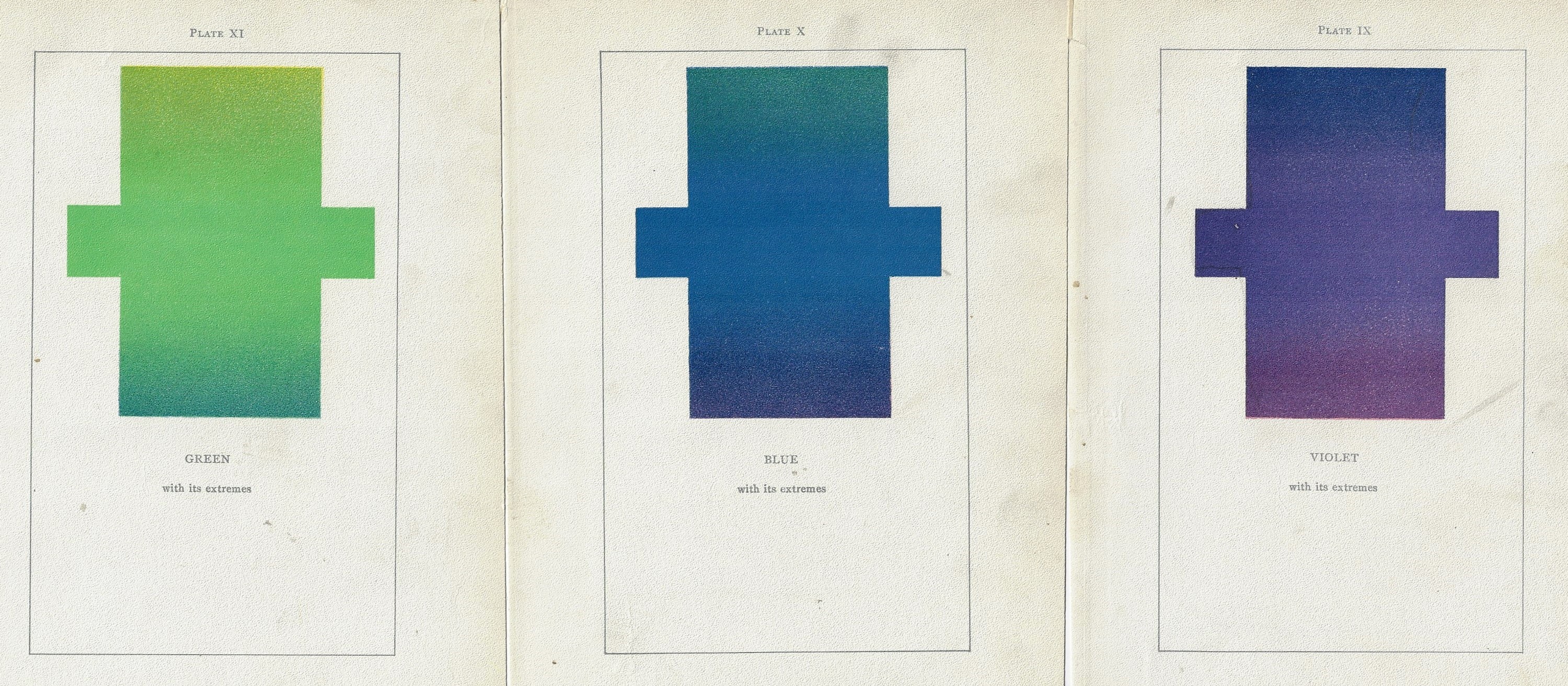
    Just on the heels of yesterday’s post of RIYBBV vs. ROYGBIV comes this lovely discovery in the highly unusual and original work by Emily Vanderpoel, Color Problems of the Layman, printed in 1903, a gorgeous but mysterious book in which she sought not so much to analyze the components of color itself, but rather to quantify the overall interpretative effect of color on the imagination.  I know this sounds begging and vague, but I really haven’t been able to make much headway in her theory.  Ms. Vanderpoel looked deeply and arithmetically into art—she also produced a numerical grid of the artwork that she analyzed, going a step further to re-order the reality of the painting into a representative 10×10 square, distributing the color sense according to a secret algebra that I cannot identify.

    Color vanderpoel roygbv _1_ Color vanderpoel roygbv _2_


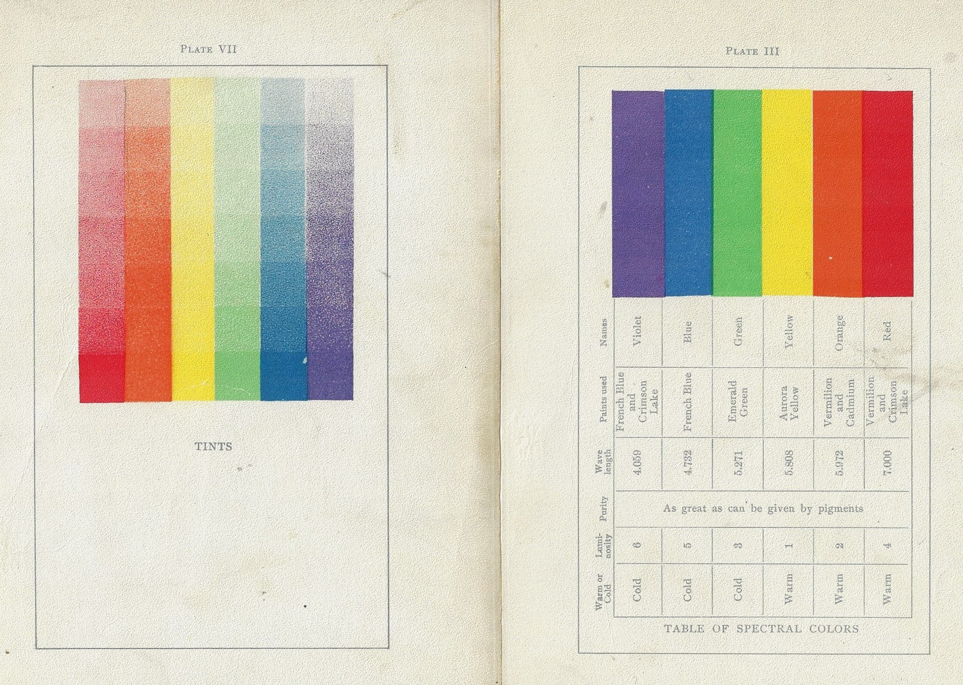
    The series is preceded by a further presentation of the colors side-by-side (and reversed) as well as another plates of the colors side-by-side presnting their gradient tints:

    Color vanderpoel roygbv _3_And lastly, those lovely plates, larger:


  • ROYGBV, ROYGBIV, and Waiting for Josef Albers

    JF Ptak Science Books  (Really) Quick Post

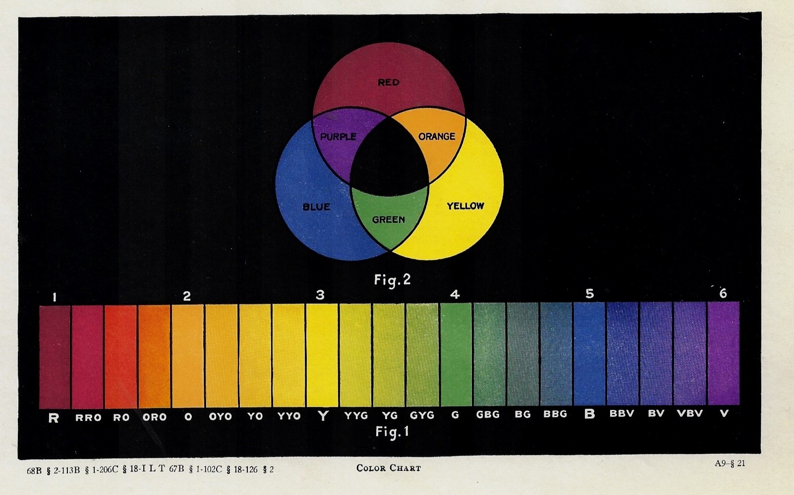
    What’s the dealing with indigo—the missing “I” in ROYGBV—anyway? And what about cyan? And what about those blocks of colors at the bottom, at this time in print history waiting for the appearance of Josef Albers to put them to artistic use in contradistinction? There’s so much is so relatively little in this tiny part of the em spectrum, sandwiched there between UV and IR, and that sandwiched by X- and microwaves, and then gamma and radio waves?

    Color Chart ROYGBV

    I guess this print calls out for a little bit on color and music and the piano, but not tonight. 

    Source: unknown, though I’d guess this to be printed ca. 1900.  


  • Vanderpoel’s Futuristic Designs and a Color Tile Catalog

    JF Ptak Science Books  Quick Post 

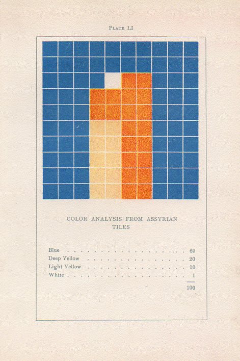
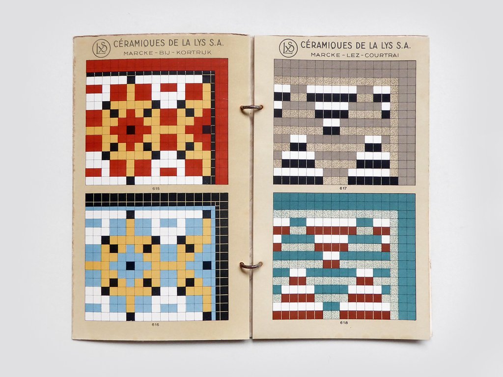
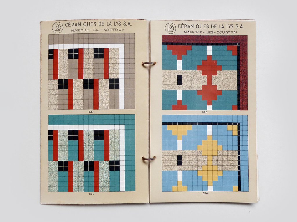
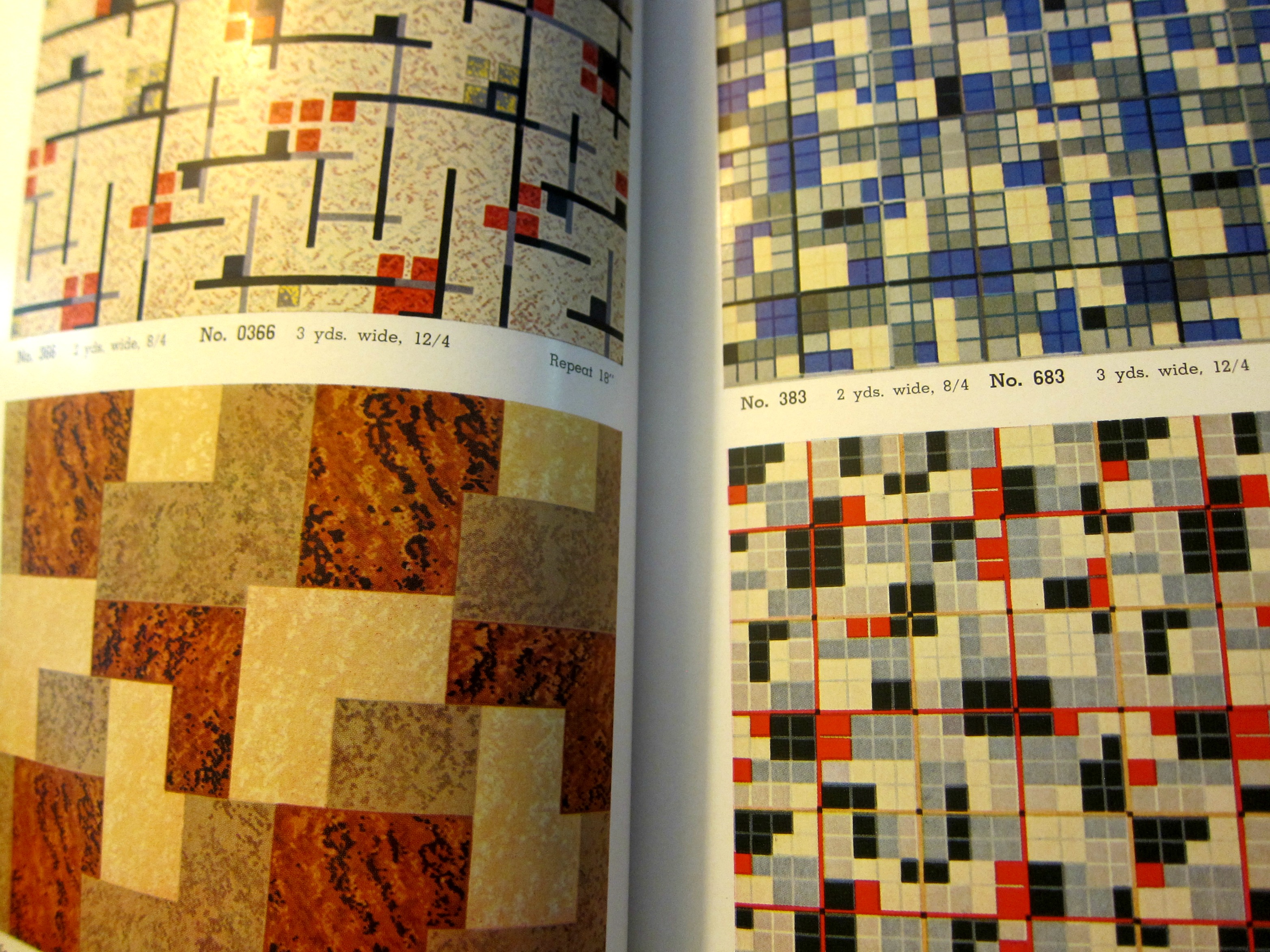
    Vanderpoel assyrian tilesWhile looking through a London stationer’s website for Blackwing pencils I found on their site a catalog for a floor tile maker that strongly reminded me of a gorgeous turn-of -the-century art book.

    I’ve written several times1 on this blog about the non-pre-discovery and non-pre-discovery-recognition of nonrepresentational art by the fabulous art theoretician Emily Vanderpoel. She wrote a a lovely and mysterious book in 1901 (a second edition appearing two years later)  called Color Problems for the Layman, in which she sought not so much to analyze the components of color itself, but rather to quantify the overall interpretative effect of color on the imagination–I think.  I know this sounds begging and vague, but I really haven’t been able to make much headway in the work, though it seems to display the occurrence and frequency of general colors in 100-block distributions. Vanderpoel seems to take the overall sense of the colors of, say, a Greek vase or mummy cloth or a teacup and saucer, and display the overall effect in her grid. As I said the procedure escapes me but the net result is beautiful. 

    The 1940’s tile maker’s illustrations of samples of their work are also quite strong, and as you can see bear some similarities with the Vanderpoel:

    Tile catalog Belgian _1_

    Tile catalog Belgian _2_
    [Tile image source: from the store perfectly-named Present and Correct https://www.presentandcorrect.com/collections/ephemera/products/tile-catalogue-1940s]

    Offhand I guess you could say that any of cubist/block/tile/mosaic designs could remind you of Vanderpoel–but not so, and in ways I can’t fully explain. It is something about the distribution and very involved nature of these tiles that pull it towards Vanderpoel…and perhaps it is the color selection. I’m not sure.  I have perhaps a dozen tile manufacturer catalogs from about this period (1930’s/1940’s) and none have struck me as strongly as this one does in its “relation” to Vanderpoel. In any event, there seems to be a “there” there. 

    Notes:

    1. Here are some links to the posts on Vanderpoel:

    • https://historyofideasblog.com/thesciencebookstore/2010/12/what-color-is-an-unintentional-modernist-masterpiece-of-book-illustration.html
    • https://historyofideasblog.com/thesciencebookstore/2008/04/shaping-space-a.html
    • https://historyofideasblog.com/thesciencebookstore/2015/02/mummyii.html

  • The Effigies of Sidney Greenstreet, The Beaver, and Raymond Loewy: from B+W to Color (1944)

    JF Ptak Science Books  Post 2723

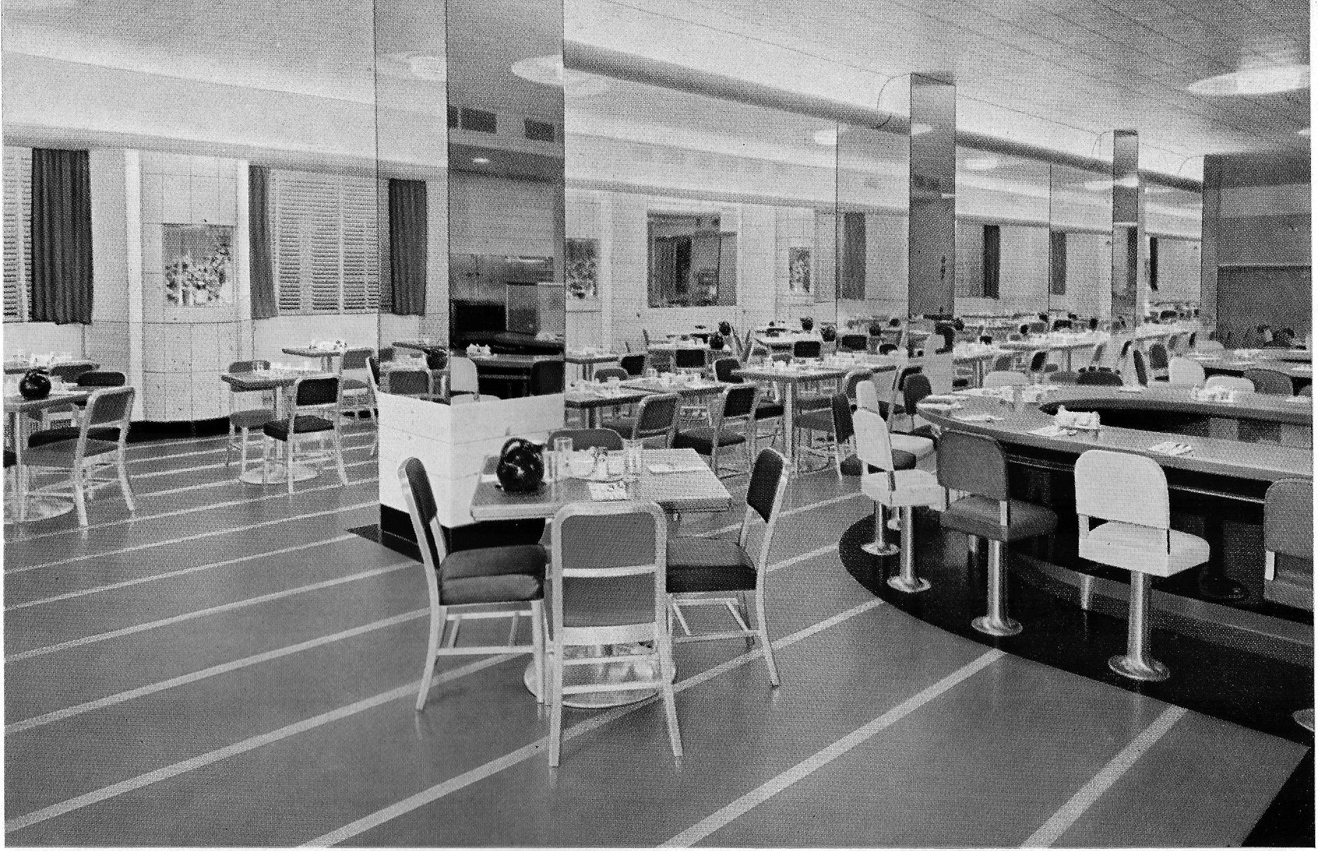
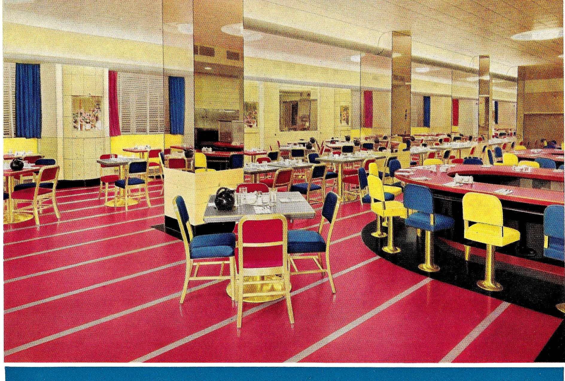
    Here’s another in this series of fabulous color in 1930’s and mid-1940’s designs, and the third from the Armstrong Cork Company and their sales pamphlets for their linoleum flooring (Better Floors for Better Business, printed in Lancaster, Pa.).  As I’ve said earlier, it is somewhat jarring to see these designs in color when we’re so trained from the pre-color movies to see them in all of their tremendous facets of black & white mixes. It is hard to think of Sidney Greenstreet gliding across a room or through a restaurant that is bathed in nothing but shades of gray, when in fact he could’ve been wearing a brilliant plum-colored suit and moving across a flaming red floor. And in this case, with Armstrong, they did indeed make flaming red flooring–and in stark contrasts with yellows and blue designs.

    So I decided this time to take five examples of these designs and contrast them in color and then in black and white–it is an interesting little exercise in expectation and what our heads have been trained to see in old films. (All of the color images are as found in the Armstrong catalog–no enhancement.)

    So, for example, the Hotel Pennsylvania coffee shop, NYC (a Raymond Loewy design!), as expected:
    Color armstrong _1_ bw_0001

    And then, the shock of non-recognition (apologies to Edmund Wilson and William Gaddis):

    Color armstrong _1_ color_0001

    Unexpected, no?  It reminds me of seeing a b+w episode of Leave it to Beaver, where the Beaver buys himself a suit and his parents are completely done-in by its color, which of course on the tv looked like pretty much everything else. 

    Here’s four more, including Postman’s Specialty Shop, 5th Ave, NYC:


  • Black & White in Color, Part V

    JF Ptak Science Books  Quick Post

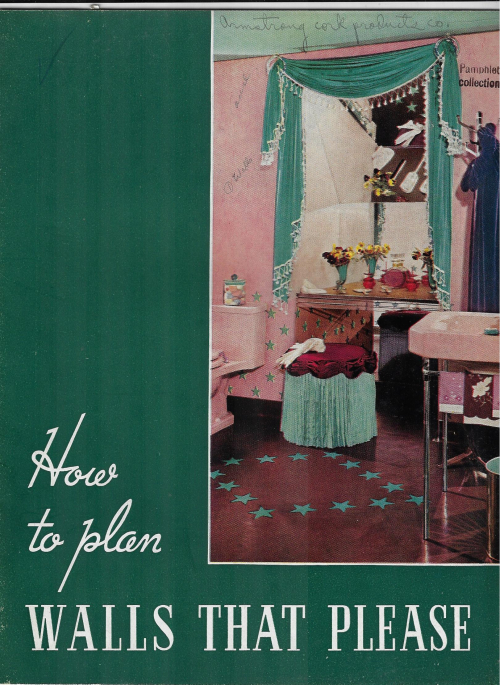
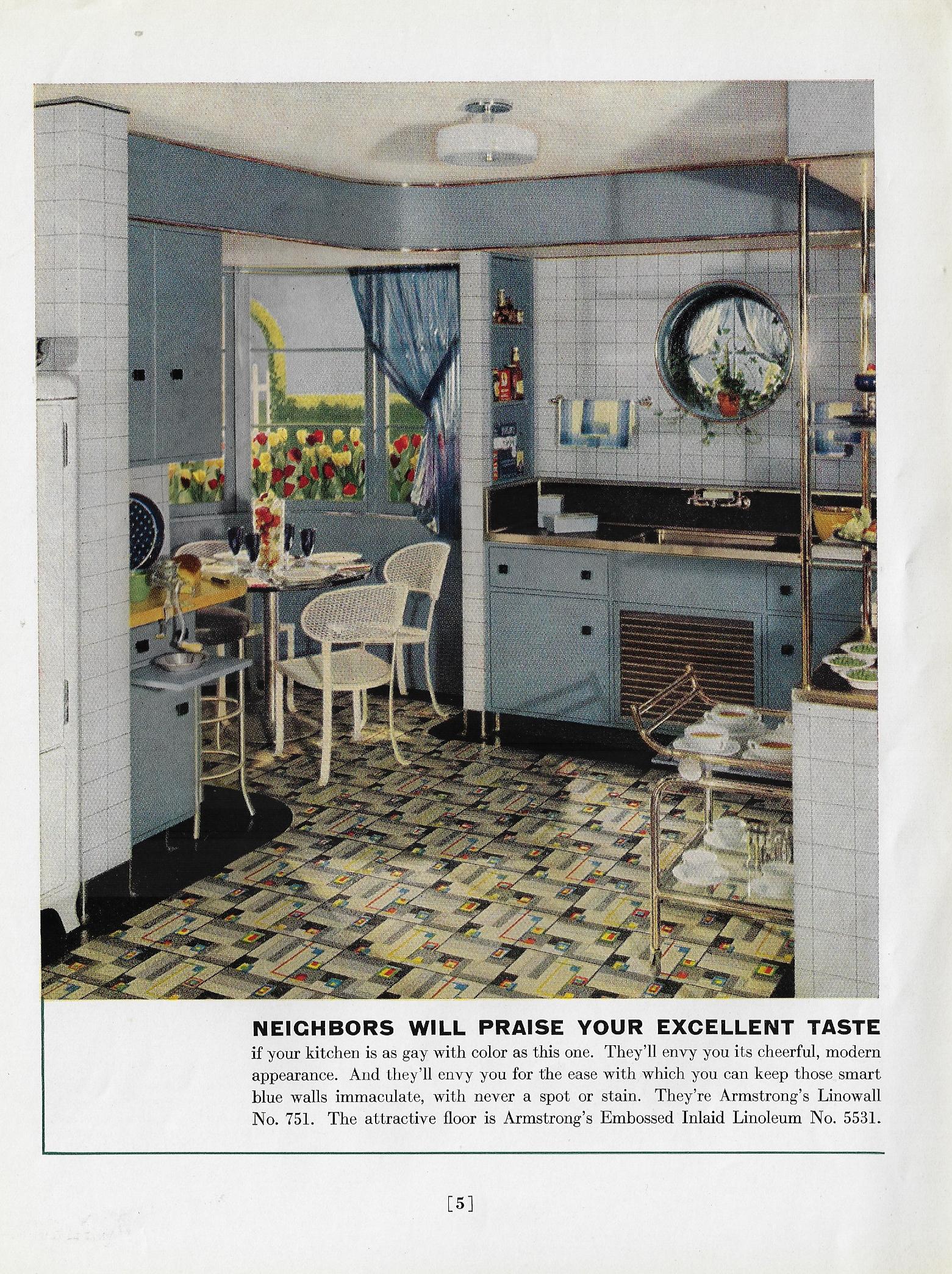
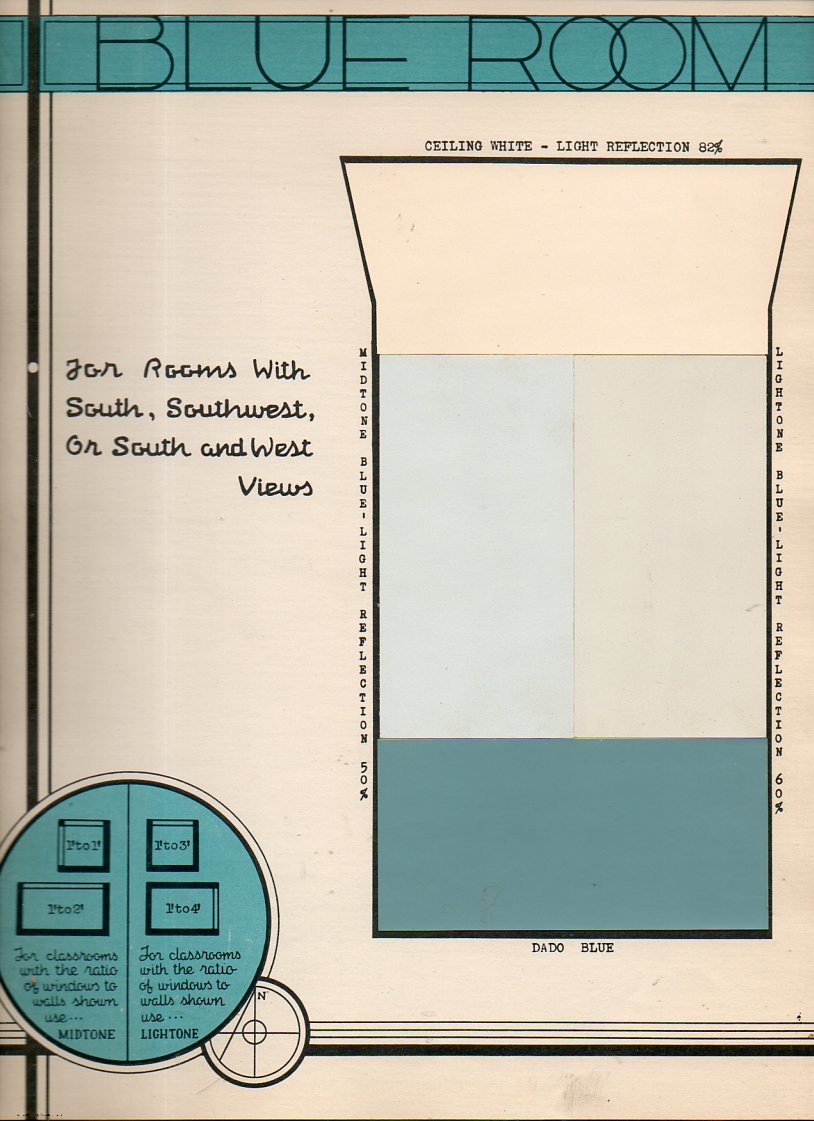
    This is another installment in a series on putting color into what we normally would think of in terms of black and white photos (and movies)–the results are sometimes surprising and unusual. (There are posts here on the color schemes on 1930’s schoolrooms in Cleveland, air recon in color, color dissonance in 1940’s bathrooms, colorless color charts, and other such bits, all findable by entering “color black and white” int he Google search box.)  The pamphlet below would sound like a simple and badly-titled publication (How to Plan Walls that Please, by Armstrong Cork Products, 1938) if you were just reading about it in a catalog, but in real life, it is a symphony of exploding and unexpected color. At first the color combinations had a somewhat claustrophobic effect, but I think it was mostly because the rooms were small and densely packed–once that is accounted for, the colors seemed to take on a welcoming attitude…especially in the kitchens, where you’d expect to sit down at one of those small tables and wait for Grandma to serve you some fresh pie.  

    In any event, here are some examples for the pamphlet:

    How to Plan Walls that Please _5_

    How to Plan Walls that Please _5_


  • Oddly Adjectival Color Plumpness, continued (1938)

    JF Ptak Science Books   Quick Post    Part of the Series on Color, Its Uses and Abuses

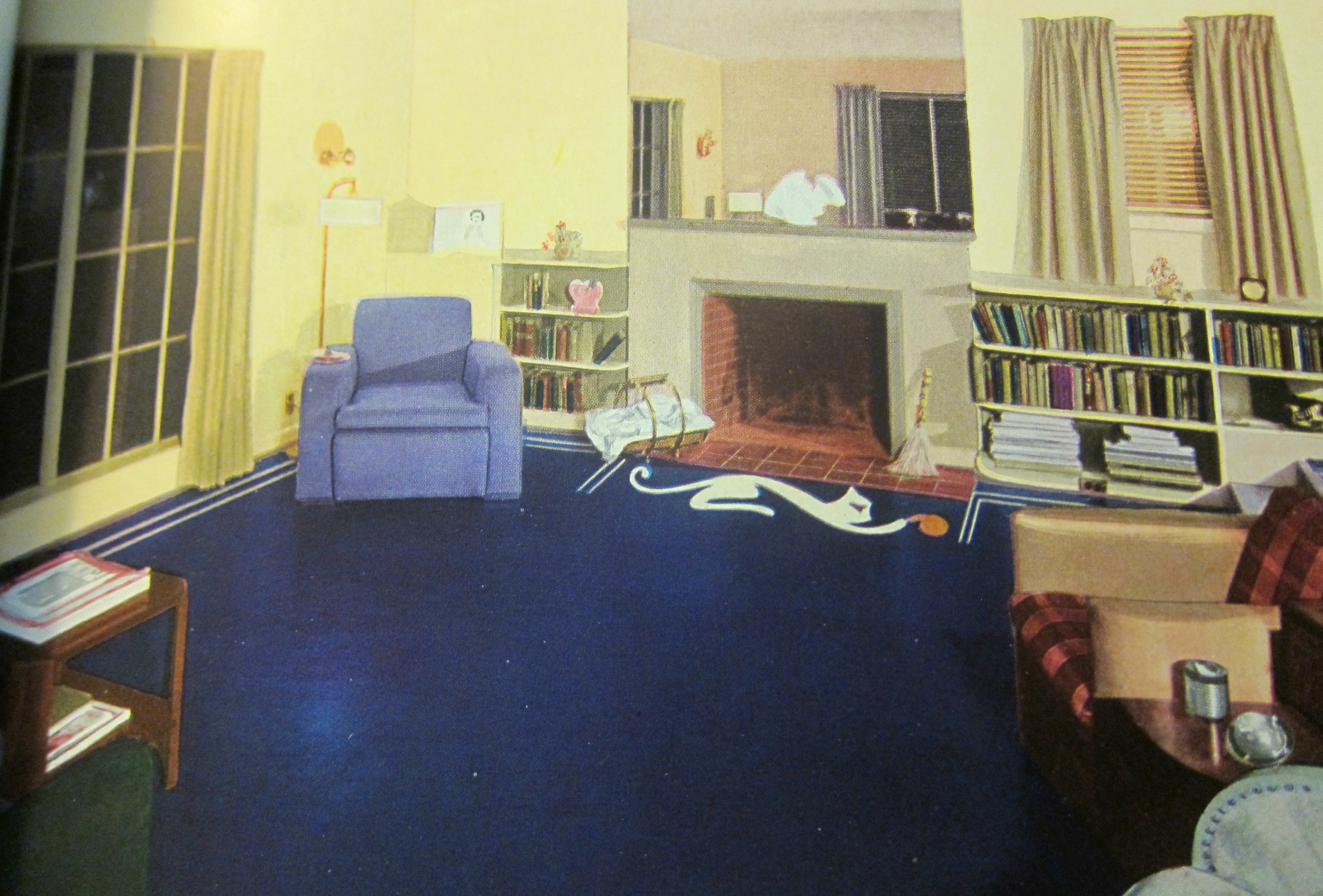
    I’ve written a number of times on what seems to be “extreme” color in the 1930’s  (as in “Oddly Adjectival Opposites: Color Plumpness and Color-in-Black-and-White, 1941” https://historyofideasblog.com/books/2011/02/odd.html) and come to it again today via the weirdly sublime color contrasts of rugs and floor coverings offered in the Bird Rug Catalog for 1938. I’ve thought about and seen so many of these images in luscious grays and stark blacks that it is difficult to think of these same images in gigantic color. It is just hard to picture Mr. Bogart’s eyes and his accusing/weary glance being framed by that blue chair and all of the colors bombarding it. There should I guess be a diacritical of some sort to attach to the vocabulary of colors to express “surprise”, as I could surely employ it in describing that blue linoleum floor:

    Bird catalog _7_

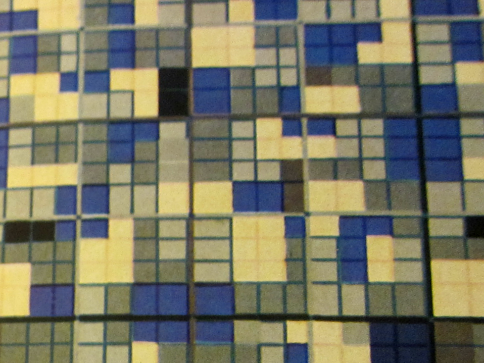
    Deep closeup of flooring:

    Bird catalog _10 detail_


    Flooring details

    Bird catalog _9_


  • A History of Black & White in Color (continued)

    Putting Black-and-White Back into Color: 1930’s Schoolrooms

    ref:  JF Ptak Science Books    Post 1840, expanded.

    Its easy to assume a modern prejudice regarding the interior decoration of 1910-1940 school rooms, allowing a certain conceit and picturing them in shades of gray, the images formed being “colored” by the images of those things that we have seen, almost all of which have turned up in black-and-white photographs or movies. But of course we know that this can’t be true, and that Humphrey Bogart didn’t always wear a gray worsted in his movies, and didn’t move that gray suit through gray rooms. Its just that the image-formation is influenced by what we’ve seen, and since what we’ve seen of these rooms is mostly without color, then our images are difficult to assemble outside black-and-white.  This applies to just about everything from that era, which explains why it is such a glorious shock to see motion pictures or photographs of (say) New York City street scenes from 1944. (And why is it such a jolt to the visual system to learn that police cars in Chicago during the 1933 World’s Fair were orange?)

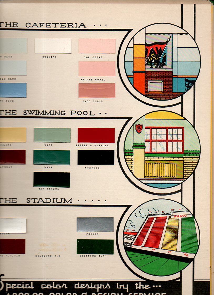
    This thinking came to the surface again this morning when I uncovered the Paint Specifications for the Model School, prepared for the East Cleveland Board of Education under supervision of the Foremost Authorities, and published by ARCO in 19391.  It reminds us that the only thing that lived in black-and-white in those days are in our memories.  (I’ve written about unexpected color in Lost German Color of 1927,  The Very Describale Macro Color of 1937, The Color Green in the History of Squares, and of course the non-immortal 200,000,000 Pounds of Buttocks-or-Putting the Black-and-White back into Color, and others.

    Color school587

    Color school592


  • The Coloring Book of Hell–Hell in Black & White (ca. 1600)

    JF Ptak Science Books   Post 2676

    If you were to wish a foul curse upon the soul of the dead in Hell, then it is Prosperine/Persephone who would carry it out. The Hitman of Hades had the capacity to inflict damage upon the already damaged, what with being the Queen of the Underworld and wife of Hades. She is also the daughter of Zeus and the harvest goddess Demeter, so there is also that life/death struggle bit going on in the background. 
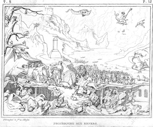
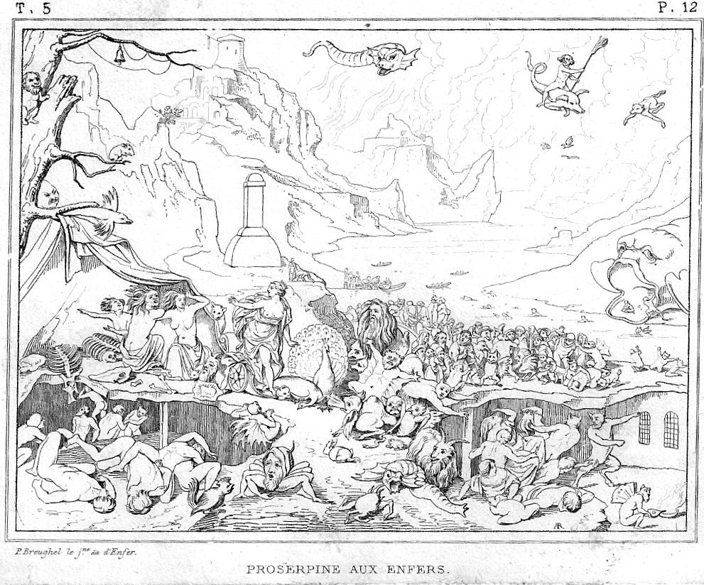
    Brueghel hell

    This image is made from the painting by Pieter Brughel the Younger (1564-1638), son of Pieter Bruegel  and part of the dynastic family of painters. (They spelled their surname differently, depending upon the time and the user.) The legend of the engraving tells us that “P. Breughel [sic] le jne, dit l’Enfer” was also known as the “Hell Brueghel” for his interest in depicting that place, and he certainly does live up to the nickname.  Even though the engraving is pretty small (about 3×5″) it does communicate at least the sense of what the painting delivered, which was a very detailed and massive account of the underworld.  Even though the engraving is only a shadow skeleton of the original, we do get a sense of Mr. Cash’s lake of fire, and though we see the torments of the damned we generally do not see what it is they are suffering from.  Prosperine is at center left, having just arrived in Hell (according to the description1 of the plate found in Museé de peinture et de sculpture, ou, Recueil des principaux ..., volume 12, 18312, and behind her we see a river with boats dispensing new arrivals; at right, background, we see a gaping Hell Mouth though without fangs/teeth, which has at least one newly-damned trying to climb his way back into the mouth to perhaps retrace his steps to the surface of the regular world.  The image is creepy enough without the color and great detail of the original, what with the dozens of horrified dead falling about and a floating pig-snake flying above.  

    The imagination ran high on the imaging of Hell, mostly for ever and ever–Dante, Botticelli, Japanese Hell Scrolls, Bosch, and on and on, though the flavor of it slacks off a bit when most of the image is white.  So, if you were of a mind to do so, here’s your chance to color in one version of Hell as you please.  

    Notes:

    1.  “PROSERPINE AUX ENFERS. Le peintre Pierre Breughel le jeune est souvent désignésous le nom de Breughel d’Enfer parce qu’il aimait à traiter des incendies et des sujetsdiabcliques. On en voit un exempledans ce petit tableau où il a représenté Proserpine à l instant où elle arrive aux enfers tandis que tous les autres artistes anciens et modernes se sont pliis à retracer le moment où Pluton enlève la jeune déesse des riantes plaines de la Sicile. La fille de Cérès descend de son char et parait vouloir s’éloigner de l’ endroit où sont assises les trois furies, Alecto, Mégère et Tisiphone. Mais en détournant la vue de dessus les impitoyables déesses elle trouve partout des figures monstrueuses qui Iourmentent les mortels. Le lointain offre la vue de bautes montagnes d où sort un grand fleuve sur lequel on aperçoit plusieurs barques remplies des âmes des mortels qui viennent de quitter la terre. Ce charmant tableau peint sur cuivre fait partie delà galerie de Dresde. Il n avait jamais été gravé.”

    2.  I have the full set of 22 volumes for sale elsewhere on this blog–if anyone is interested in owning it, send me an email.  


  • Color and Its Abuses–the New York World’s Fair, 1939

    JF Ptak Science Books   Post 2569

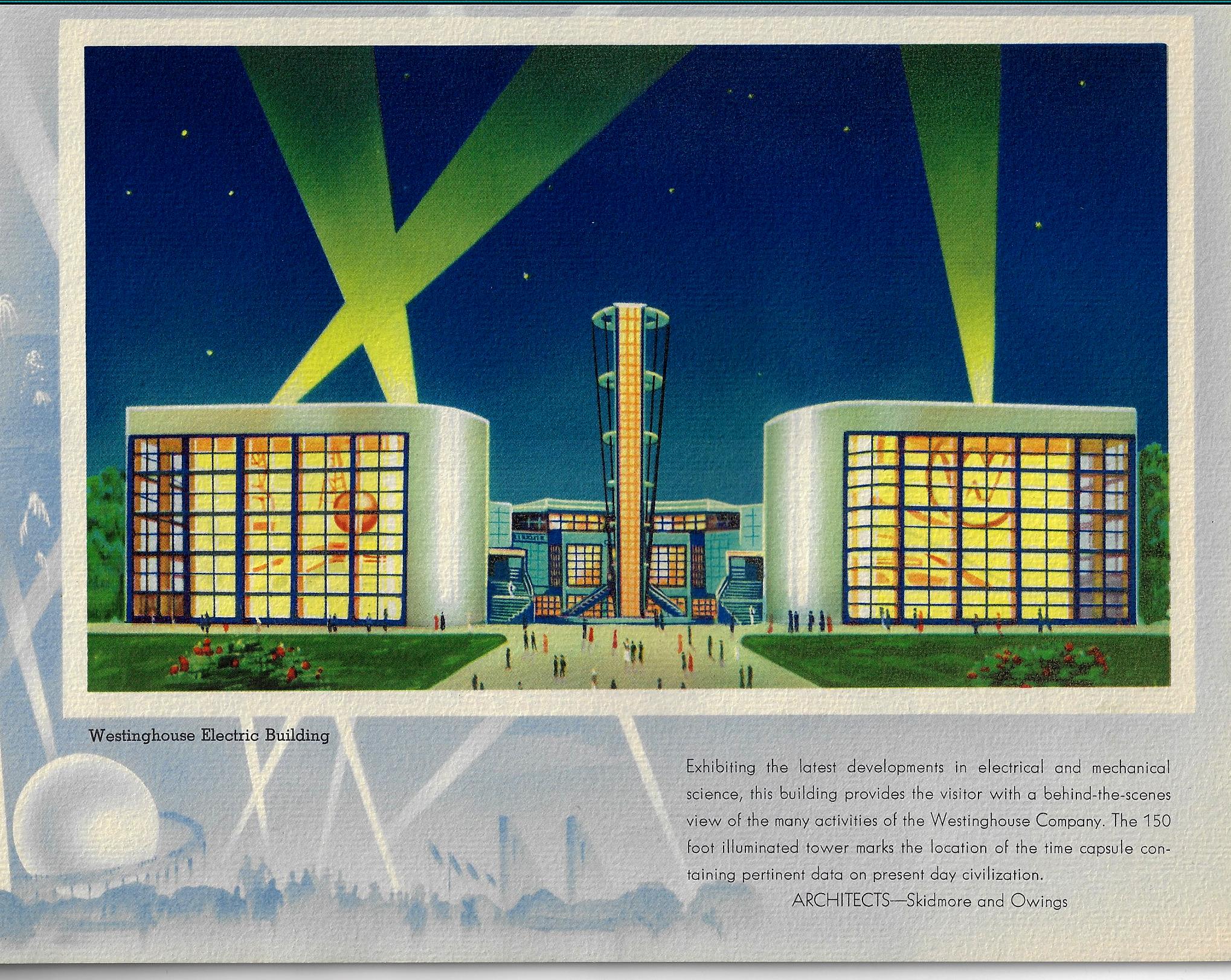
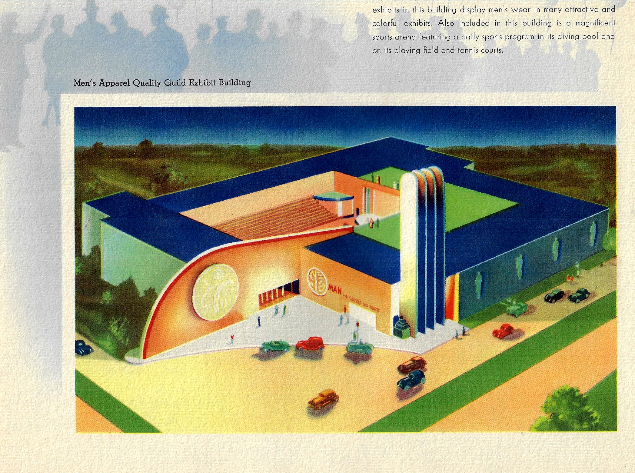
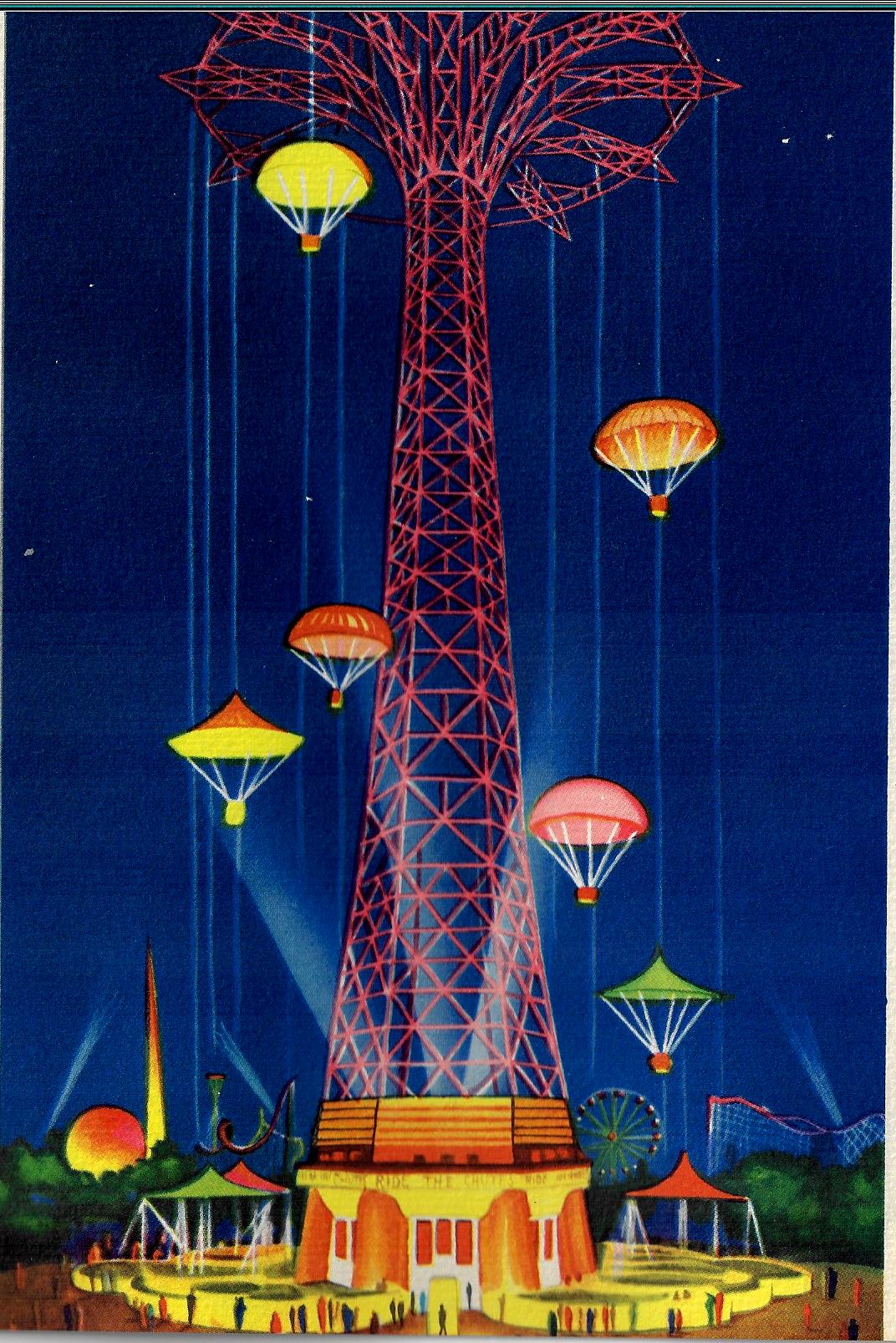
    Color and its use and abuse is a very personal thing—especially the “abuse” part. The pamphlet below (Views of the New York World’s Fair, 1939, and published that year) to me is certainly one of those entries in the history of the abuse of color, not so much that the colors used in it are odd together, but the saturation of color across the board leads to something like Splendorama hyper color. I’m not sure why the colors are like this–they remind me of a color equivalent of a laboriously and not-very-good translation of a tech manual. It isn’t as though color printing was new in the publishing industry, as books had been printed in different colors besides black for at least 300 years by this time;  even full-color printing had been around for 120+ years, so it isn’t as though they were experimenting with the color equivalent of newly-available typefaces in a 1985 word program. Color photography in books is brand new at this point, the wide-scale use taking place this year, but these images are not photos, so I doubt that this had much of an effect on the creativity of the designer. 

    COlor NYC Worlds Fair 1939 _1_

    Since a few of these images are quasi-sci-fi, I even wondered about the color influence in speculative novels and movies.  Color was very adventurously used int he early sci fi pulps and monthlies, but that stuff was already being employed for two decades by this point so their newness in regard to publishing experimentation is not an issue.  And so far as sci fi and color in the movies goes, that also wasn’t an issue because it didn’t exist yet, as the first color film1 in that genre didn’t appear until Lesley Selander’s awful Flight to Mars (1951).

    Color NYC Worlds Fair airport

    In short, I don’t know what is going on here, color-wise.  

    Color NYC Worlds Fair _3_

    Notes:

    1.  Flight to Mars, from Monogram Studios, was about a manned flight to Mars in 2000,  There was another unusual film, I think it was Destination Moon at about the same time, where the spaceship overshot the Moon and went to Mars instead. This note though is in regard to the Georges Melies film, Le Voyage dans la Lune (1902), which did have some color, though that was tediously applied by hand in post production.  (Invaders from Mars (1953), by the director William Cameron Menzies, was the next sci fi flic made in color.  

      Color World fari 1939 _4_


  • When Things ARE Better in Glorious Black & White: Color Detonation and the Invention of *More* Primary Colors, 1942

    JF Ptak Science Books   Post 3286

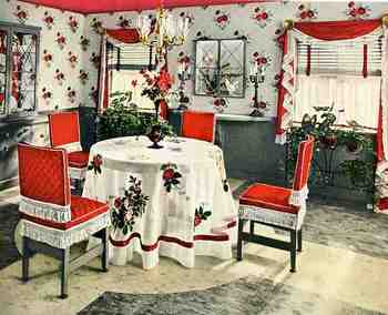
    00blogoct_14color848Well: this is a variation of yesterday’s post on the two opposite edges of color in oddly-applied scientific/technical manners. In unwittingly responding to the question “when is color-use bad?”, the answers were found in these room decorations from 1942, all of which come from a pamphlet entitled Ideas for Old Rooms and New, extracted from the mind of  Hapel (?) Dell Brown.  It is a tidy book with ideas that are anything but tidy;and  as you scroll down you’ll see that the room solutions suggested by Hapel Del are anti-tidy; clutterous (no, not a word but could be).  Everything about these creations speaks to the annihilation of visual resting places; everything seems to be an affront to the concept of causal emptiness.  The weird thing is that there aren’t very many objects in these rooms at all (at least comparing these rooms from where I’m sitting)–the visual complaints seem all rocketing from the abuse of colors found in the fabric of the furniture and walls and floors and window treatments.  The eye gets no rest–and as a matter of fact, the cones of the eyeball are impaled on the rods as a result of the author/decorator  desperate attempts to invent three more primary colors. 

    Believe it or not we don’t really get the full flavor of the color cacophony because the floors in these picture look sort of benign, fading away into themselves–which they are not, according to  the description in the text, because they are all high-gloss linoleum rolls or tiles (“efused [sic] with deep wondrous color”.  And that means not only are these floors adding sheen and color to the rest of the incredibly colorful–an effect fairly lost in these photos–they are also cold.

    One thing that I haven’t pointed out in this peon to syrupy/pastel-y/techno-gelatinous-chromodrama is that they were all done in response to a re-decoration of a perfectly nice-looking house, with all of the former “bland” colonial-style rooms presented in glorious black and white.  I’d rather live in Maison Noir than in this happy nightmare.