JF Ptak Science Books Post 2569
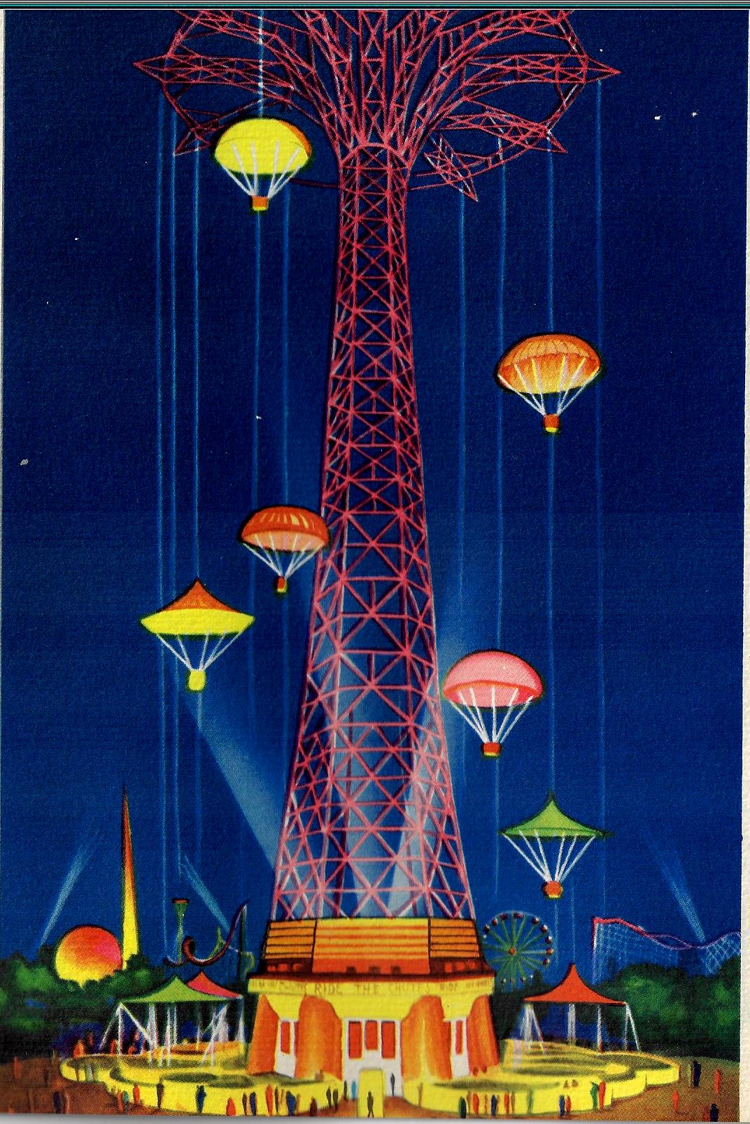
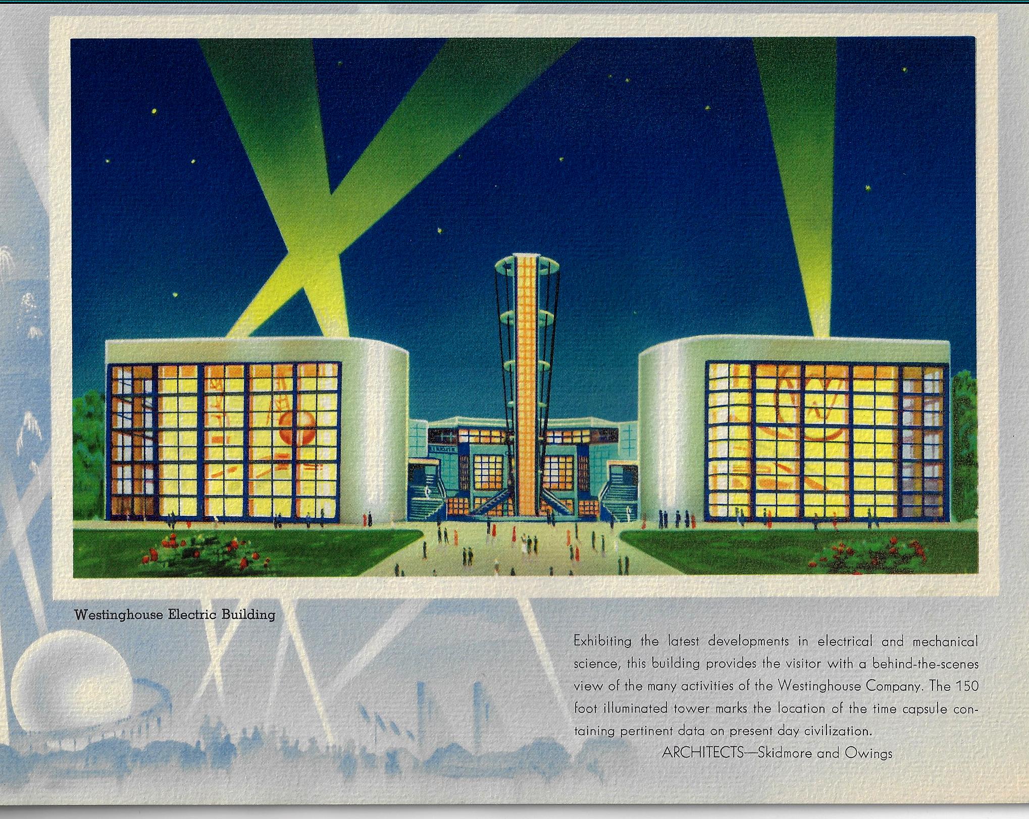
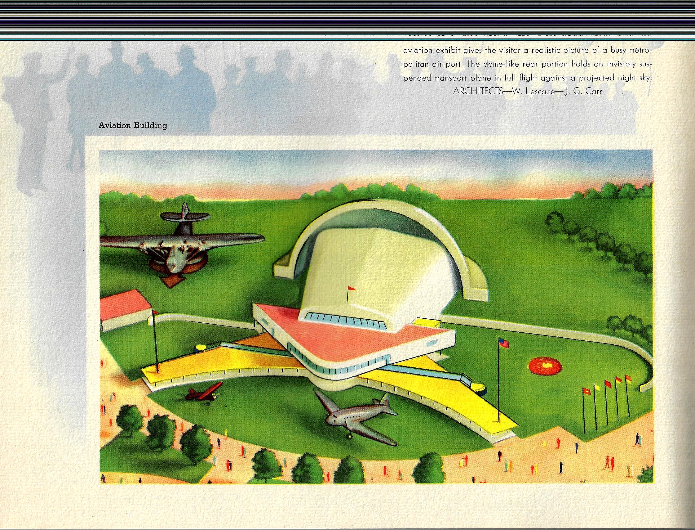
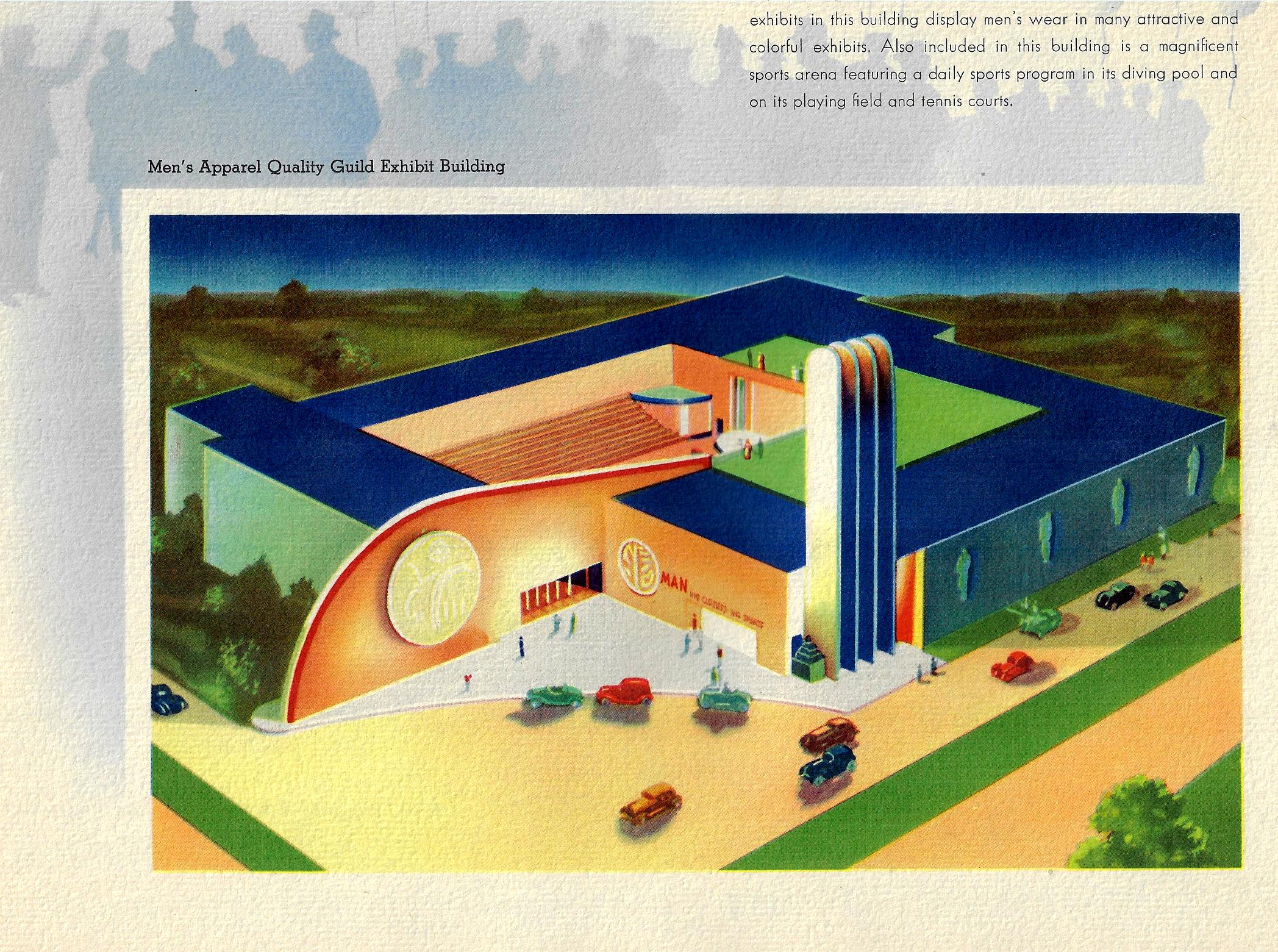
Color and its use and abuse is a very personal thing—especially the “abuse” part. The pamphlet below (Views of the New York World’s Fair, 1939, and published that year) to me is certainly one of those entries in the history of the abuse of color, not so much that the colors used in it are odd together, but the saturation of color across the board leads to something like Splendorama hyper color. I’m not sure why the colors are like this–they remind me of a color equivalent of a laboriously and not-very-good translation of a tech manual. It isn’t as though color printing was new in the publishing industry, as books had been printed in different colors besides black for at least 300 years by this time; even full-color printing had been around for 120+ years, so it isn’t as though they were experimenting with the color equivalent of newly-available typefaces in a 1985 word program. Color photography in books is brand new at this point, the wide-scale use taking place this year, but these images are not photos, so I doubt that this had much of an effect on the creativity of the designer.
Since a few of these images are quasi-sci-fi, I even wondered about the color influence in speculative novels and movies. Color was very adventurously used int he early sci fi pulps and monthlies, but that stuff was already being employed for two decades by this point so their newness in regard to publishing experimentation is not an issue. And so far as sci fi and color in the movies goes, that also wasn’t an issue because it didn’t exist yet, as the first color film1 in that genre didn’t appear until Lesley Selander’s awful Flight to Mars (1951).
In short, I don’t know what is going on here, color-wise.
Notes:
1. Flight to Mars, from Monogram Studios, was about a manned flight to Mars in 2000, There was another unusual film, I think it was Destination Moon at about the same time, where the spaceship overshot the Moon and went to Mars instead. This note though is in regard to the Georges Melies film, Le Voyage dans la Lune (1902), which did have some color, though that was tediously applied by hand in post production. (Invaders from Mars (1953), by the director William Cameron Menzies, was the next sci fi flic made in color.