A Daily History of Holes, Dots, Lines, Science, History, Math, Physics, Art, the Unintentional Absurd, Architecture, Maps, Data Visualization, Blank and Missing Things, and so on. |1.6 million words, 7500 images, 4.9 million hits| Press & appearances in The Times, Le Figaro, Mensa, The Economist, The Guardian, Discovery News, Slate, Le Monde, Sci American Blogs, Le Pont, and many othr places… 5000+ total posts since 2008.

Category: Maps/Diagrams of Imagination & Ideas

  • A Sociological Map Made for and by Hoboes (1870)

    JF Ptak Science Books   (An earlier post, expanded)
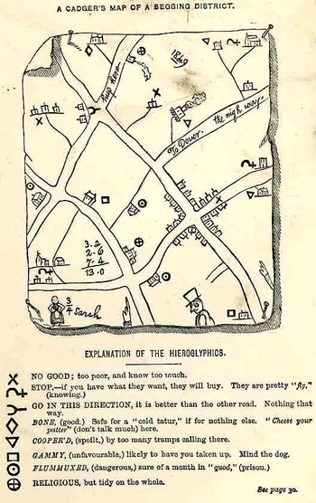
    Hobo mapThis is the frontispiece to the delightful work with the luscious title of The Slang Dictionary; or, the Vulgar Words, Street Phrases and Fast Expression of High and Low Society… printed in London by John Camden Hotten, in 1870.  It is a hobo or “cadger” (“a  mean or vulgar fellow who would rather live on other people than work for himself”)  map (or the map of “a tribe of vagabonds”) of Maidstone, in Kent, drawn by a “screever” (a sidewalk chalk artist who normally would draw religious images for money), and showing the various chalked and etched signs that the hoboes (“and other mendicant marks”)  would leave for one another, being a key to the town, for what was practicable, safe, dangerous, and the like.

    Recorded antiquarian hobo and tramp symbols like these are really quite rare, given their ephemeral nature to begin with; of course the need to record these obscure signs by polite society was not on a high order.  There are many indications that signs such as these existed, but not many illustrations.  For example in the book The Triumph of Wit; or, Ingenuity Display’d in its Perfection, edited by John Shirley. (1724), as well as works by Holyland and Borrow there is a description of English gypsies and their travels, and a short description of their use of boughs and sticks, set out for each other, so that a duplication of effort by different bands or families would not occur.

    (The figure of the woman, wonderfully named “3/4 Sarah”, probably connects this Sarah to a sort of popular dance.)Bloghobo_a199_2
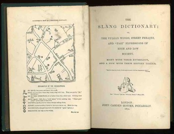
    Hotten also published the following interesting and title-bending work in 1874:  THE ORIGINAL LISTS OF PERSONS OF QUALITY;  EMIGRANTS; RELIGIOUS EXILES; POLITICAL REBELS; SERVING MEN SOLD FOR A TERM OF YEARS; APPRENTICES; CHILDREN STOLEN; MAIDES PRESSED; AND OTHERS WHO WENT FROM GREAT BRITAIN TO THE  AMERICAN PLANTATIONS 1600-1700, WITH THEIR AGES, THE LOCALITIES WHERE THEY FORMERLY LIVED IN THE MOTHER COUNTRY, THE NAMES OF THE SHIPS IN WHICH THEY EMBARKED, AND OTHER INTERESTING PARTICULARS.
  • A Chinese Kingdom in North America (1753)

    JF Ptak Science Books  Quick Post

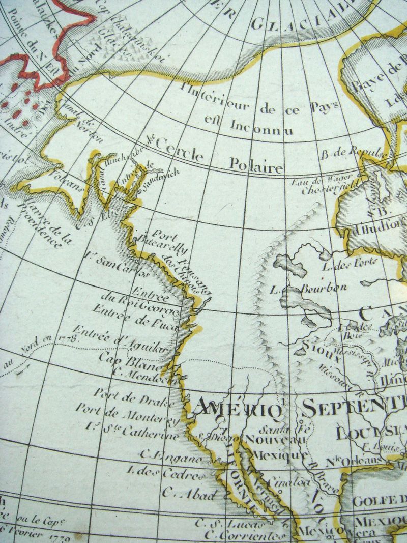
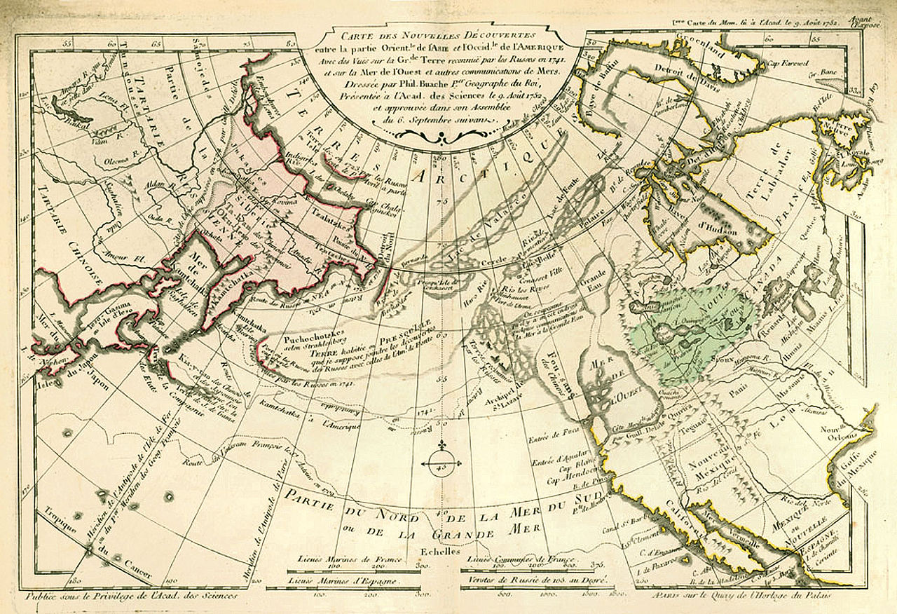
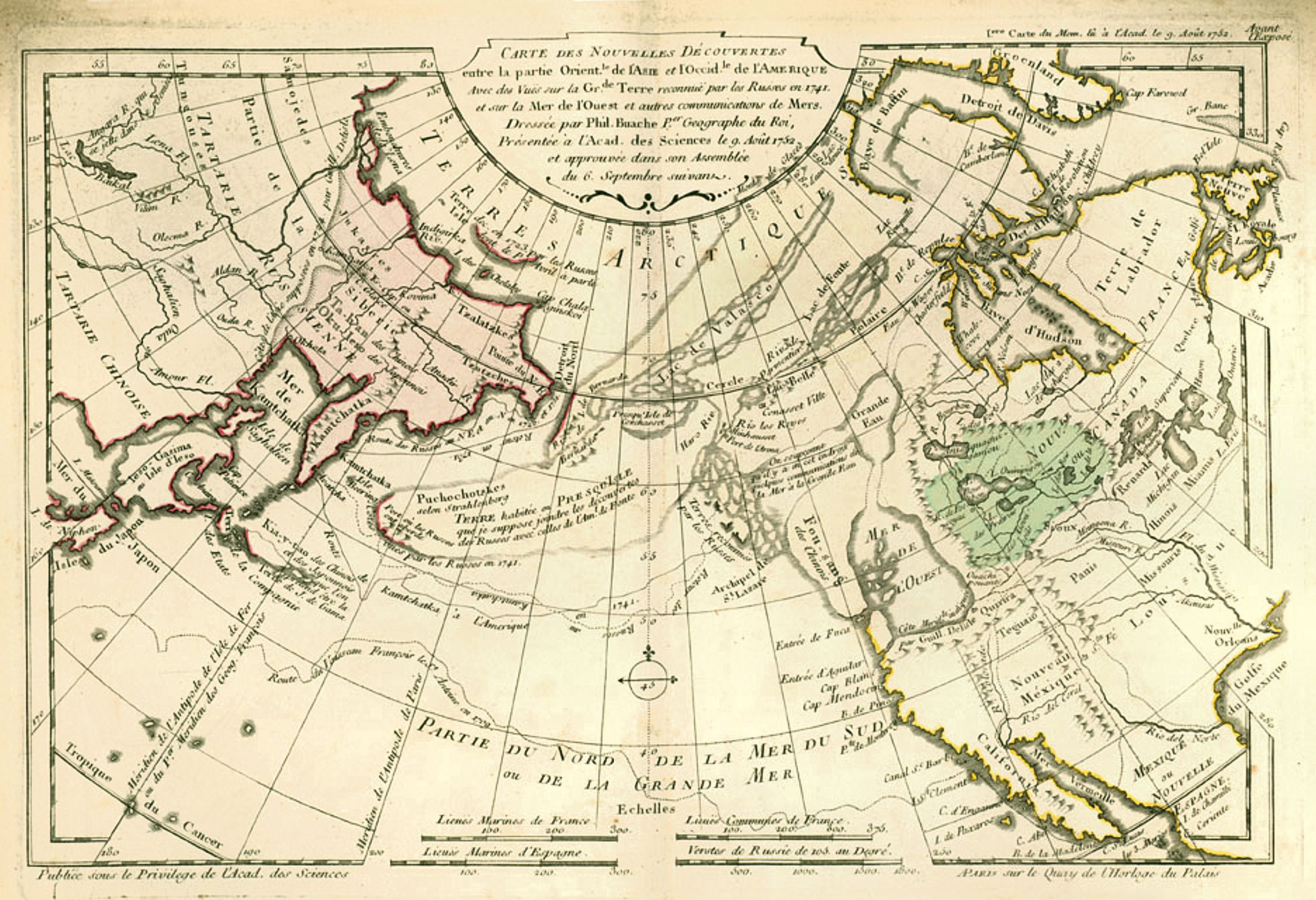
    Here’s a good example of the mapping of a non-existent entity: the Kingdom of Fusang, or the Chinese/Fusang people, located in British Columbia/Washington state, appearing in the considerable Philippe Buache’s map, Carte des Nouvelles Decouvertes…(1753).  It is a wonderful map that also has a lot of suggested possibilities of realities in the not-much explored Pacific Northwest of North America.  What we see appearing above the huge landmass of “Californie” (mostly the entire west coast of the present-day U.S.) is the island-like “Fou-sang des Chinois”.  This area stretches from about the 47th to the 59th parallels, and is contiguous to another hypothesized entity, the “Mer de l’Ouest”, which is an enormous body of water about the size of Hudson Bay. This is also connected to another very large body of water, the “Grande Eau”, which in turn has connections leading to the Atlantic ocean, thus forming the much-hoped-for and dreamed-of Northwest Passage.

    Fusang three

    • Click to clarify and enlarge

    Source  https://en.wikipedia.org/wiki/Fusang#/media/File:Buache1753Map.jpg

    I’m not faulting M. Buache whatsoever in telling this little tale of prospective Geography–he produced (for his time) an excellent map of not very well understood and distant places. 


  • The Epicenter of Visualized Geography: School! (1889)

    JF Ptak Science Books  Quick Post

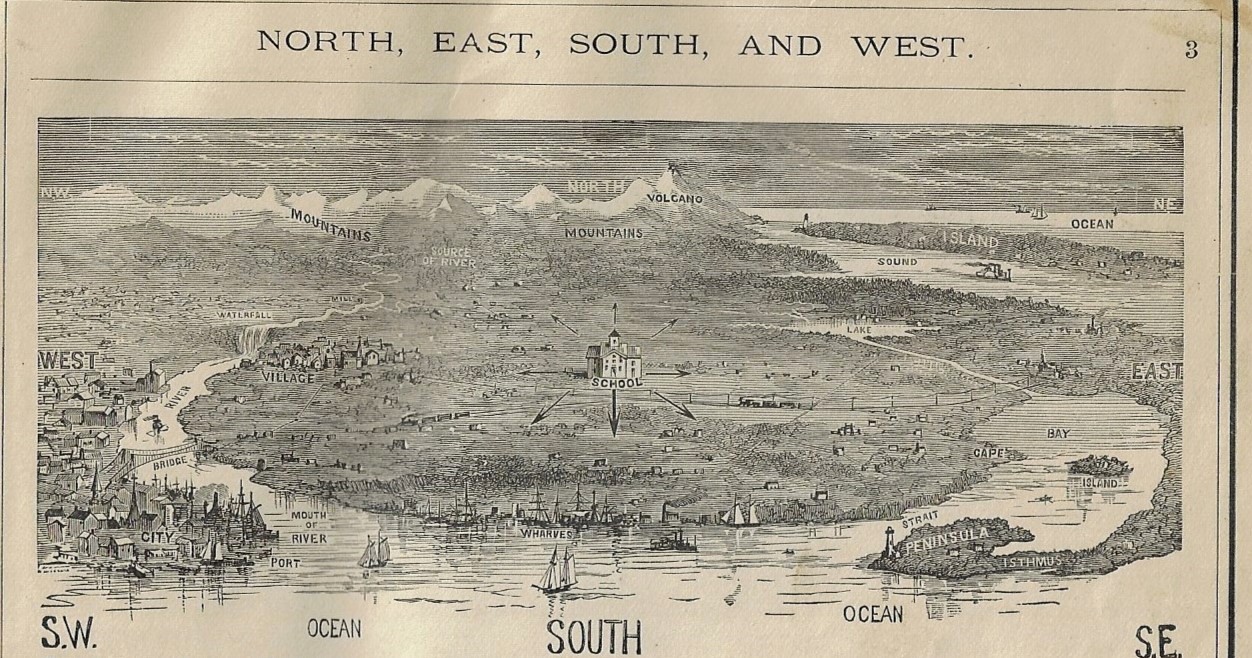
    At the center _2_Knowing of my interest in antiquarian children’s art, a new friend sent me a 19th century school geography which sports several tattoos of artistic efforts made by small hands. The canvas is the book, and the artwork (and annotations) were occasional scribbles and doodles that speak to the overall essence of kid art, and which have more or less looked the same-ish for centuries. (The subjects will change, but the manner seems to me to remain constant.) In this case the child chose James Moneith’s Elementary Geography (1889) to work in and on, and it is here in the opening pages that we see the exacting placement of “school”. As much as I am interested in the Found Art in this book, I’ve gotta say that this printed image was nearly as surprising–it is also one that I do not recall seeing, even in these popular multi-editioned geography textbooks.  The image graphically displays a dozen or two of the central words in the study of geography, and at the center of it all, with directional arrows point all the way around, was “School”. You can’t really argue much with that. 

    At the Center of Geography School


  • What to Do When the Bombs (and Gas) Come(s)–Austria, 1935.

    JF Ptak Science Books  (Earlier post corrected).

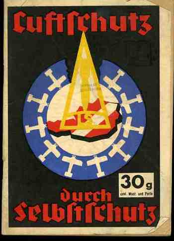
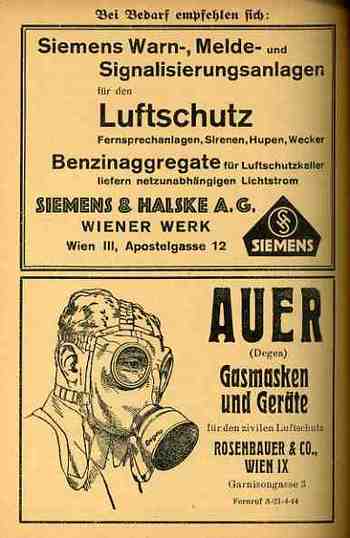
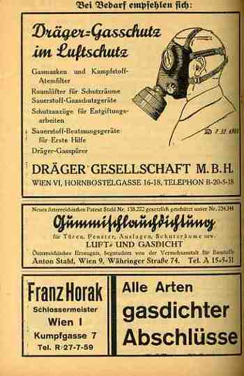
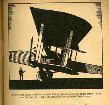
    1ebay_oct_4nazi_prop747 This is another in a series of posts about the use of maps and images in propaganda, principally concentrating in the 1930’s and 1940’s.  This pamphlet, Luftschutz durch Selbstschutz Schtz fuer jedermann bei Fliegerangrissen), was published by the Luftschutzbund and written by Hugo Noll in Vienna in 1935.  The title page claims that this is the 4th (augmented) edition, with the print run already above 30,000 (which you can either believe or not (is there anyone who starts their program out as version 1.0?)) 
    1ebay_oct_4nazi_prop745

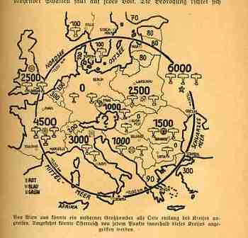
    The pamphlet begins right at the beginning–the cover shows Austria in red, surrounded by airplanes of its enemies, with a bomb coming down into the heart of the country in a yellow triangle (which resembles a flame).  The striking design begs to be picked up by anyone who sees it–as I did, as a person here in its future; I’m sure that it must’ve been very provocative to its target audience.  It gets immediately into the idea of Austria being surrounded by nations who wish do it harm by air.  Another map in the text is more detailed and shows exactly where the threat was coming from–as you can see the threat was coming perhaps from everywhere, except Germany, which as the map indicates had no aircraft in its air force. Austria of course would be annexed in the Anschluss of 12 March 1938, just three years later.   

    1ebay_oct_4nazi_mask748_2
    The main body of the text is a series of warnings about what to do when the bombs come; the rest of it has to do with preparing yourself and your household from attack, which means that there’s allot of digging and canning and putting away water and fire retardant.  In general the population was getting very stirred up about the sure-to-arrive but survivable Apocalypse.  
    .
    1ebay_oct_4nazi_mask750_3

    1ebay_oct_4nazi_prop746_2


  • A Nasty Piece of Propaganda from French Collaborationists (1943)

    JF Ptak Science Books   Quick Post

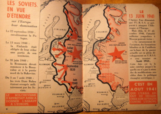
    The offending pamphlet here is a celebration of the invasion of the Soviet Union by Germany, a “two year anniversary” of the beginning of “Operation Barbarossa”. The author(s) presented the new front in WWII as a “joined” effort on the part of European nations to rid the world of the Bolshevik threat. (The title of the work: Toute l’Europe contre le Bolchevisme, 2eme Anniversaire which was published by CEA, the Centre d’Etude Antibolchéviquethe (Anti-Bolshevik Studies organization), a French organization running with Nazi funding.)

    The pamphlet of course fails to mention the turning of the tide against the Germans, especially with the defeat and destruction of von Paulus and the 6th Army at Stalingrad in January/February 1943, the failure of the Caucasus push, and so on. Then again, this is a piece of propaganda, and facts can be conveniently excluded whenever necessary.  A few pages later by the way there is the introduction of Bolshevism being the invention of “International Judaism” and other anti-Semitic lies that was an attempt to perpetuate the fiction of the Nazis and the Allies working together to defeat Stalin and his Jewish co-conspirators in quest of world domination.. Besides the text supporting this stab-in-the-heart thinking is a horrible caricature of “international Jewry” combining with Bolshevism and Freemasonry (?) as a force out to capture the world. 

    Events antithetical to this propaganda were excluded–I did check out some of the numbers for the battle represented below (like Smolensk and Vizma (Moscow) and those are correct…these battles were mainly fought in 1941/early 1942 at which point the Nazi offensive was still going forward, so there’s not much from 1943. So numbers and events that supported the crucially insane claims of the pamphlet were used; everything else was ignored or re-packaged with false data and employed. 

    Maps Propaganda Barbarossa _2_


  • A Political Map of Future Possibilities (ca. 1932-5)

    JF Ptak Science Books  Quick Post

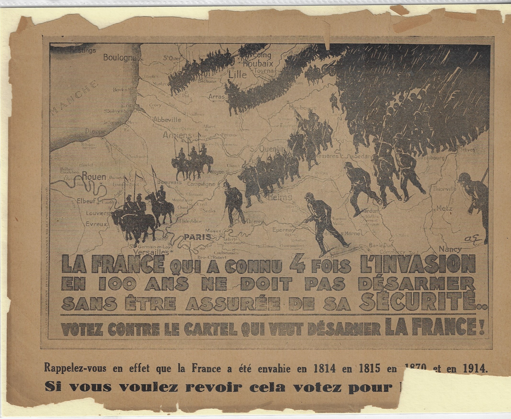
    This is certainly a successful design in describing fear and possibility for the near future and the security  (or lack of it) for France. Nothing quite conveys temporal disruption than a consolidated mass of dark and sharp objects advancing on the home front. 


    Maps propaganda France detail

    • “La France qui a connu 4 fois l’invasion en 100 ans ne droit pas desarmer sans entre assuree de sa securite. Votz contre le cartel qui vent desarmer la France!” (“France, which has been invaded four times in 100 years, should not disarm with being assured of its security! Vote against the cartel that will disarm France!”)
    • Maps propaganda France detail

    The image is a moderate Right Wing political propaganda piece extolling people not to vote for a political group (unnamed but Left Wing) that would “disarm France” by referencing the four times that France has been invaded in the last 100 years (1814, 1815, 1870, and 1914). Design by Andre Galland and printed 1932-1936. The fifth invasion was already on its way, coming in 1940, when Germany simply did an end-run around the ill-conceived modern antique of the Maginot Line, after which the very large French army was slow to respond, with France surrendering 46 days later on 25 May 1940.

    • In a tiny scroll script in the left margin reads: (translated) Propaganda Center of the National Republicans (Republicains Nationaux).

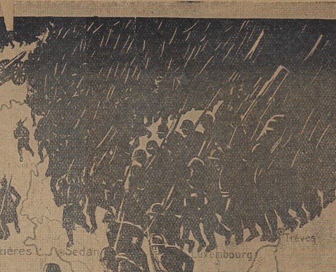
    This is an effective design for sure, showing a mass of infantry and cavalry crossing the northern French border…so massive in fact that most figures blend into an almost-solid black mass save for the white streaks of rifles/bayonets.

    I’m not sure what the intended use was for my copy of this image, which was originally produced as a poster, though this copy measures only 27x21cm. I don’t know if it was meant as a flyer, or small poster, or if it was simply an illustration in a larger book. It is interesting, regardless. (This image is available on the bookstore side of this blog.) It is certainly worth sharing, though. 


  • A Fine Map from Alexander von Humboldt (1851)

    JF Ptak Science Books   Post 2793

    Before the Neil deGrasse Tyson version and update of Carl Sagan’s landmark television series, Cosmos, there was Alexander von Humboldt, and his enormously influential book of the same title, printed in 1845-1862.  Well, von Humboldt’s (1769-1859) book was actually Kosmos when published in German, which is where it started its life (and which von Humboldt suffered mightily for in it English translation).  Von Humboldt was enormously studied and educated and of a high scientific mind over many subjects, one of those 19th century figures who seemed as though they could know everything, a polymath of high order (along the lines of Goethe and von Helmholtz and Thomas Young and others).  He was a meteorologist and biogeographer before those sciences existed; a naturalist, geographer, archaeologist, and explorer, a natural philosopher of magnitudes.

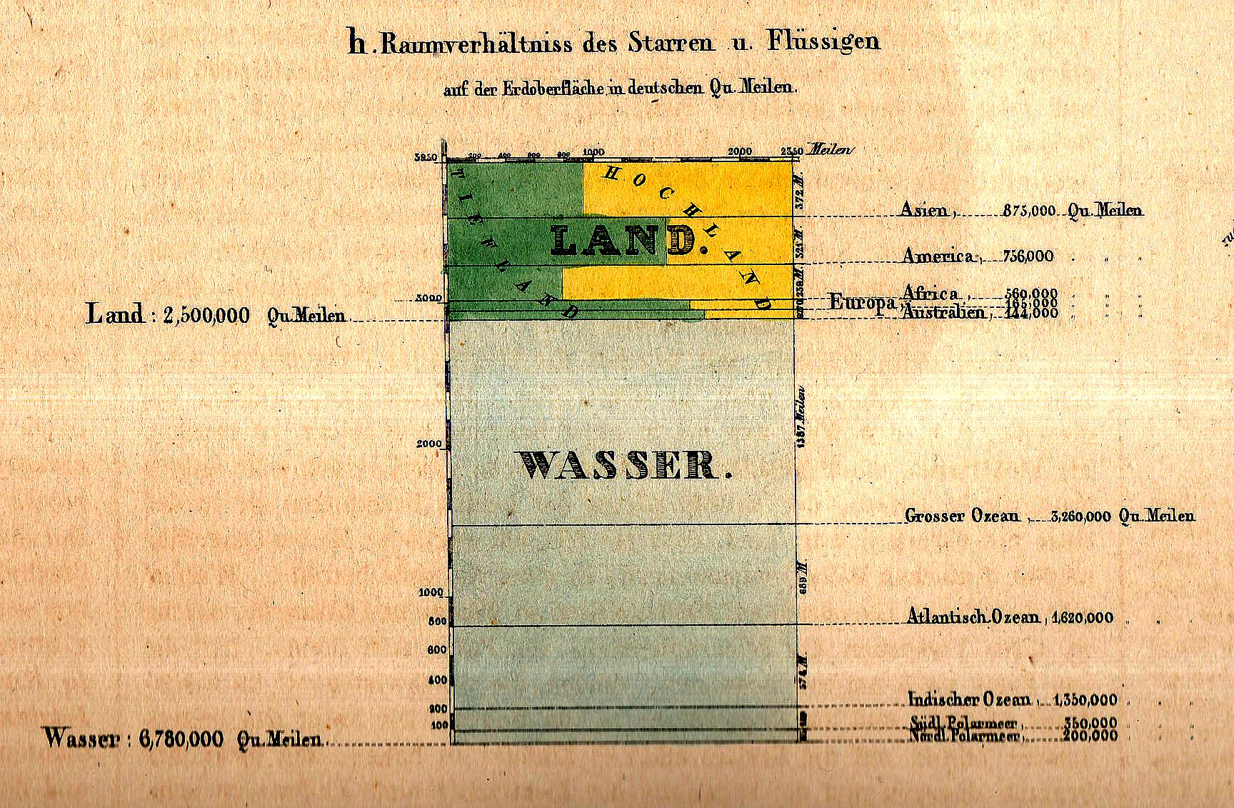
    Maps dataviz land wasser156

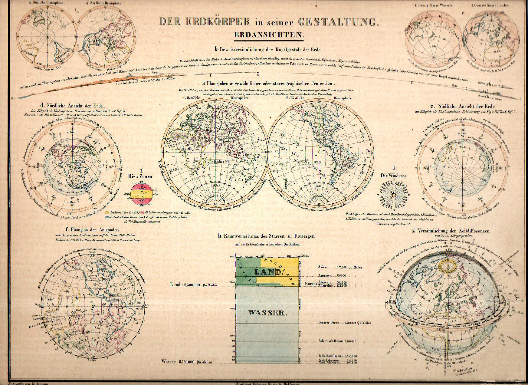
    • “Der Erdkorper in seiner Gestaltung. Erdansichten. Entworfen von Tr. Bromme. Ausgefuhrt v. E. Winckelmann”, published in Stuttgart, by Verlag von Krais & Hoffman.  This map appeared in  the atlas of Alexander von Humboldt’s Kosmos, 1851.  8.5×11.5″ image on 11×13″ sheet, with original hand coloring.

    And this fabulous small detail from the overall map:

    Maps dataviz land wasser detail

    Kosmos reflected his lifelong interest in order, and what he did was astonishing–he attempted to unifying the complexities of nature in one book (of five volumes), binding the various branches of science together in a cohesive whole, attempting to show how the laws of the universe acted here on Earth.  It was a very influential work, very progressive, a masterwork of scientific method.  

    Sagan (and Tyson, soon) tried to explain what the universe was all about; 160+ years ago, so did von Humboldt, and for his time he came damned close to doing so, or as close as anyone could possibly come. 

    The fine little inset above (1×1.5 inches in real life) is an excellent display of water/land mass of the Earth, and is but one of eleven such images on this beautiful image.


  • A Suggestion for Another Genre of Boundary: the Nothing Frontier, 1900.

    JF Ptak Science Books   Post 2792  Part of the History of Nothing series

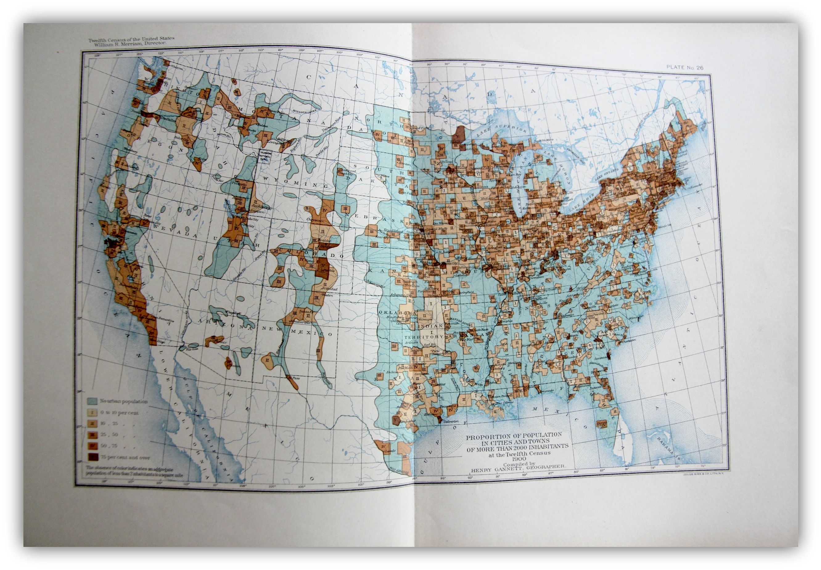
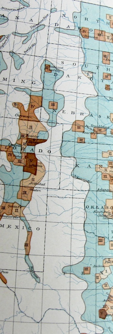
    The “frontier” in the history of the U.S. West is a pretty big deal, and old, the academic concept of  the frontier pressing its way back 13 decades, when for the most part once it was introduced it was pronounced to be “closed” by the man who reinterpreted it, Frederick Jackson Turner1.   On my shelves alone there are books on the mining frontier, the mineral frontier, the transportation frontier, the Indian frontier, the military frontier,the farming frontier, and so on, divisions allotted by wealth, nationality, numerous geographical attributes, and the like. One thing I think that I have not seen was the Nothing Frontier, where there are divisions divided by, well, sort of “nothing”. This is mostly a prosaic statement, slightly poetical, dependent on visual clues. And of course there isn’t “nothing” there because there is always “something”–there just isn’t very much of it.  And when things get colored-coded on map depending upon percentage distributions, and that object of measurement is left to a null color or no color at all, then it appears that the divisions one left to nothing.

    Maps--Census 1900 Urban

    [The image above is very expandable.]

    This can be seen if you squint somewhat you can see an example of it in plate 26, “Proportion of Population in Cities and Towns of More than 2000 Inhabitants…” Statistical Atlas, prepared under the Supervision of Henry Gannett (Geographer of the the Twelfth Census), printed in Washington by the U.S. Census Bureau, 1903. This map–which is part of an historic series of atlases published with U.S. census data–shows the distribution of urban population in five shades of brown (as seen in the legend) plus a blueish color for “no urban population” as well as no color (“The allowance of color indicates an aggregate population of less than 2 inhabitants to a square mile”).

    Maps Census 1900 Urban detail

    It is that absence of color that makes it a frontier-ish sort of frontier, a part of the Made Up Frontier, this one being very straightforward north/south, Big Bend to Montana, pretty much the Lonesome Dove trail from the rough Big Bend Texas to nearly Canada.  

    I know it is just a thing I made up just now looking at the map, but given some effort, maybe the idea actually has some legs.  

    Notes

    1. Turner, Frederick Jackson. The Frontier in American History, Harvard University, 1920, full text via Project Gutenberg,  http://www.gutenberg.org/files/22994/22994-h/22994-h.htm


  • History of Lines Department: Weather Lines (1851)

    JF Ptak Science Books   Post 2794

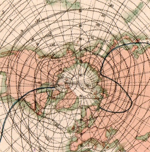
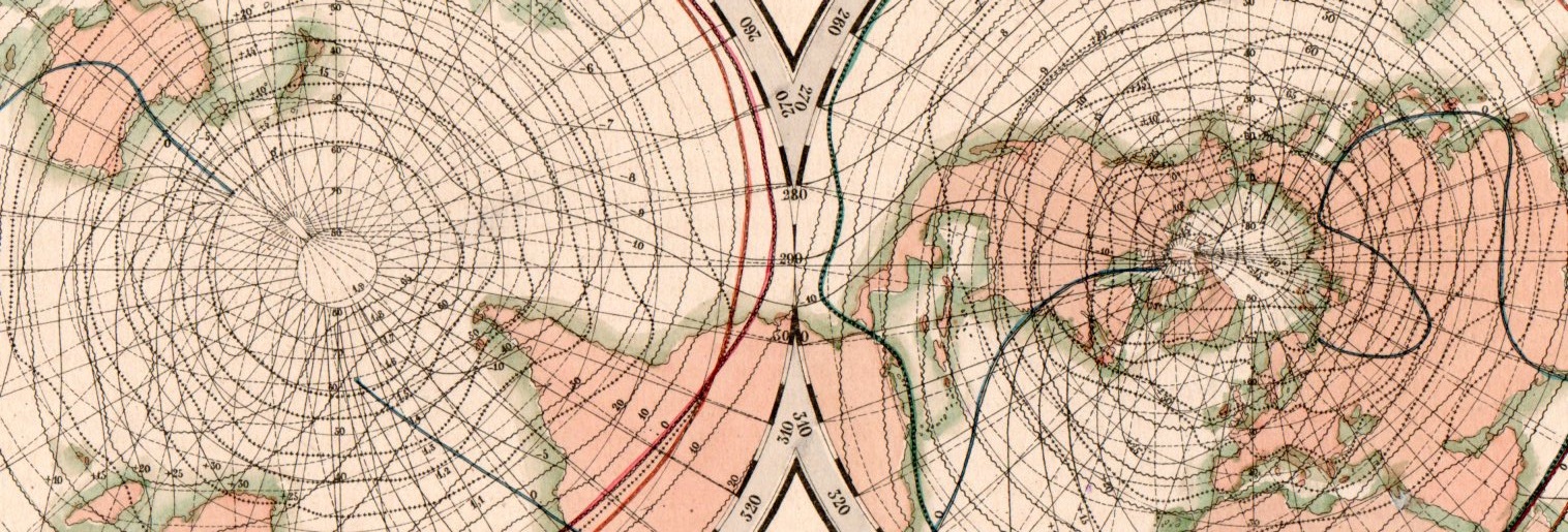
    This beautiful network of lines tells the early story of weather in cartographic form. They appear on Karte der Isothermen, Isoklinen, Isogonen und Isodynamen mit der Magnetischen Meridianen, and was published in the atlas to accompany the best-selling encyclopedic presentation of the natural history knowledge of the world to that time, Baron Alexander von Humboldt’s Kosmos, which was published over a period of several from 1845-1862. The map demonstrates and visualizes climatic information showing isothermes, isoclines, isogones and isodynamics, with the magnetic meridian.

    Map visualization isotherm653

    [This is a detail of the Northern Hemisphere section of the double-hemisphere map, which is reproduced below.]

    Map visualization isotherm654

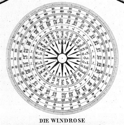
    At bottom there is also a beautiful 32-point wind rose:

    Map visualization isotherm651


  • Comparative Mapping of the Great Fires of the U.S. (1932)

    JF Ptak Science Books  Quick Post

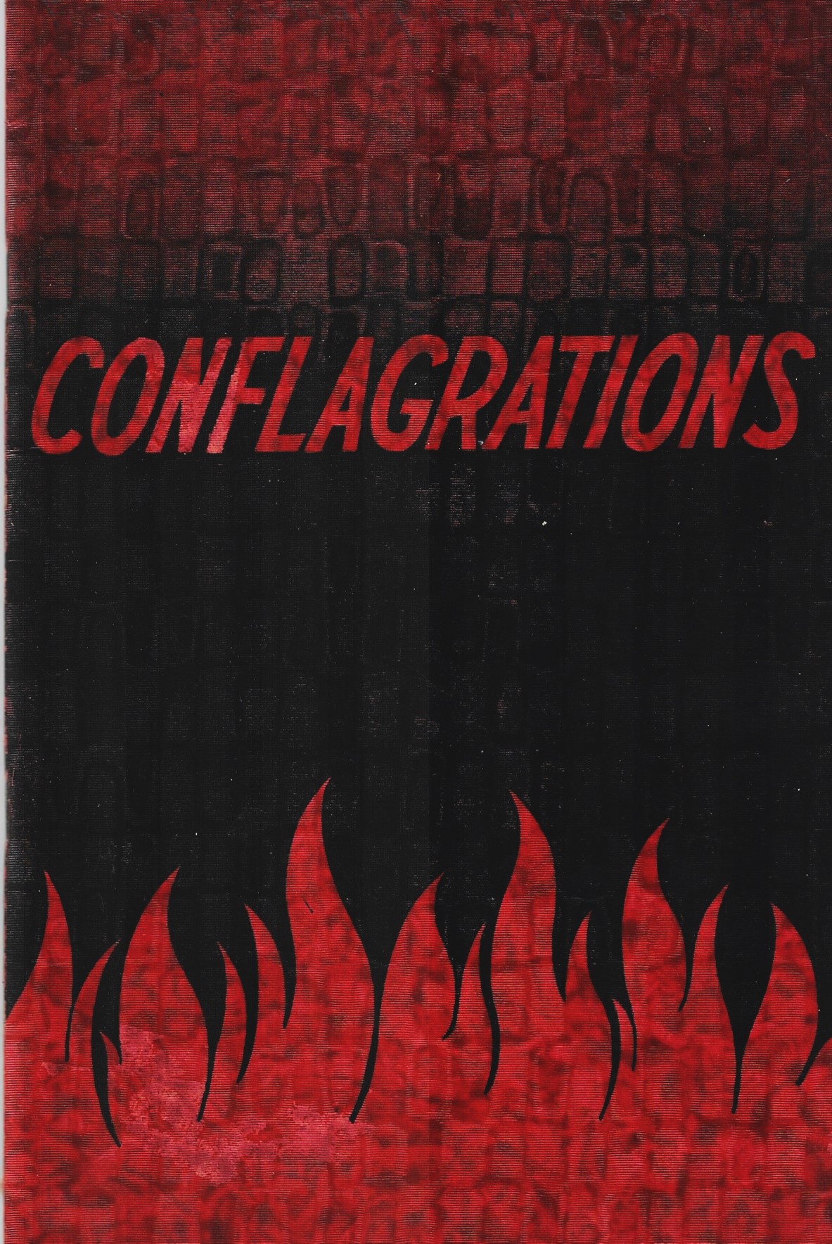
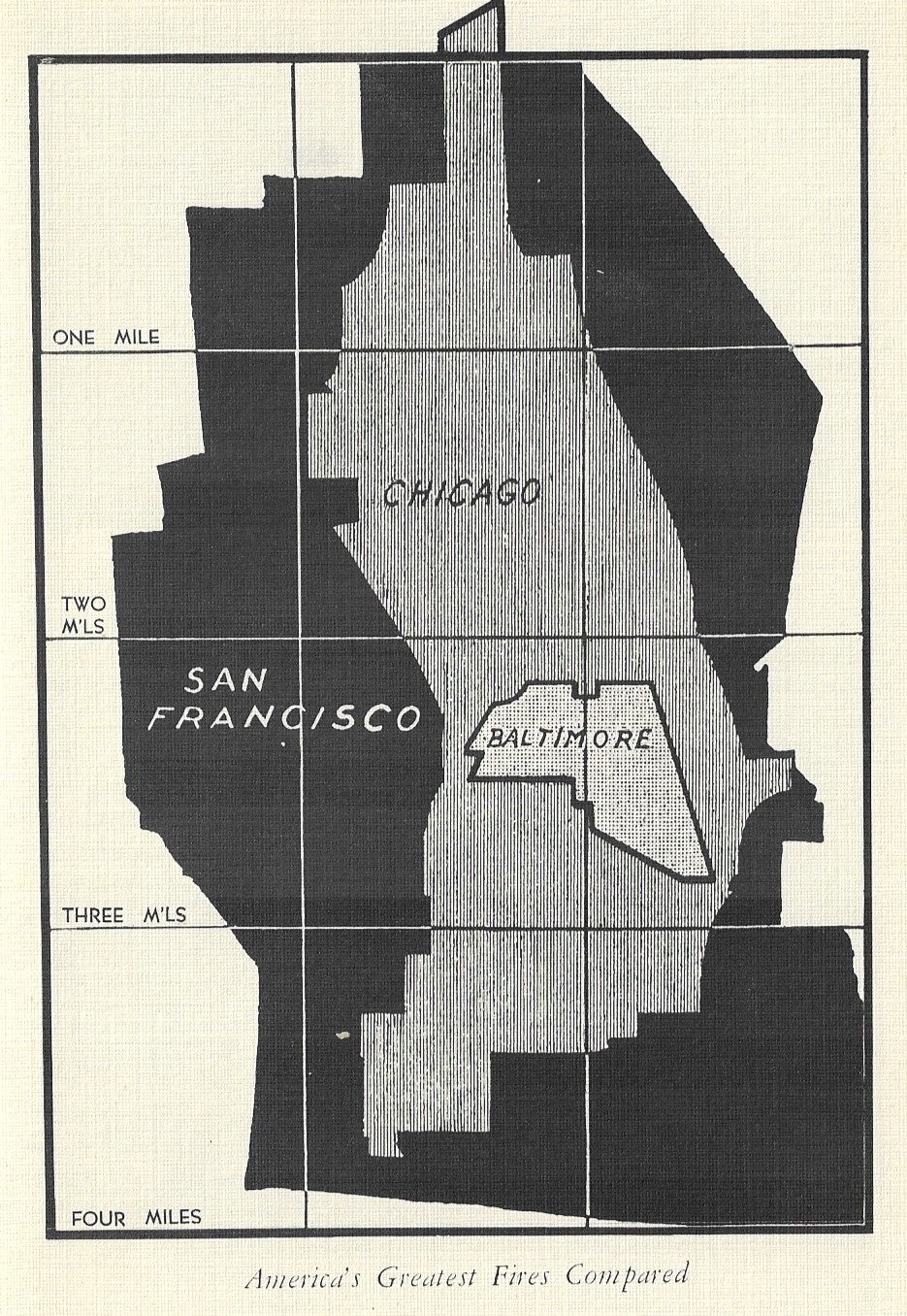
    Yes, this is a great cover, and it belongs to the designers for the National Fire Protection Association, who I guess were trying to, um, emphasize the terrible nature of The Big Fire in the course of its mission to sell fire insurance, which of course is a good and necessary thing. The pamphlet (printed in 1936) details some of the biggest fires in U.S. history, Salem, Ma.; Paris, Tx. (two); Nashua, N.H.; Coney Island, Brooklyn; Crisfield, Md.; New Straitsville, Oh.; and of course the big ones in Boston, Atlanta, Chicago, Baltimore, and San Francisco. Of particular interest in this pamphlet is the comparative sizes of the three greatest fires, reproduced below. 

    Books covers conflagrations _2_

    Books covers conflagration