A Daily History of Holes, Dots, Lines, Science, History, Math, Physics, Art, the Unintentional Absurd, Architecture, Maps, Data Visualization, Blank and Missing Things, and so on. |1.6 million words, 7500 images, 4.9 million hits| Press & appearances in The Times, Le Figaro, Mensa, The Economist, The Guardian, Discovery News, Slate, Le Monde, Sci American Blogs, Le Pont, and many other places… 5000+ total posts since 2008.

Category: Maps/Diagrams of Imagination & Ideas

  • Circles Great and Small, 1892

    JF Ptak Science Books   Quick Post

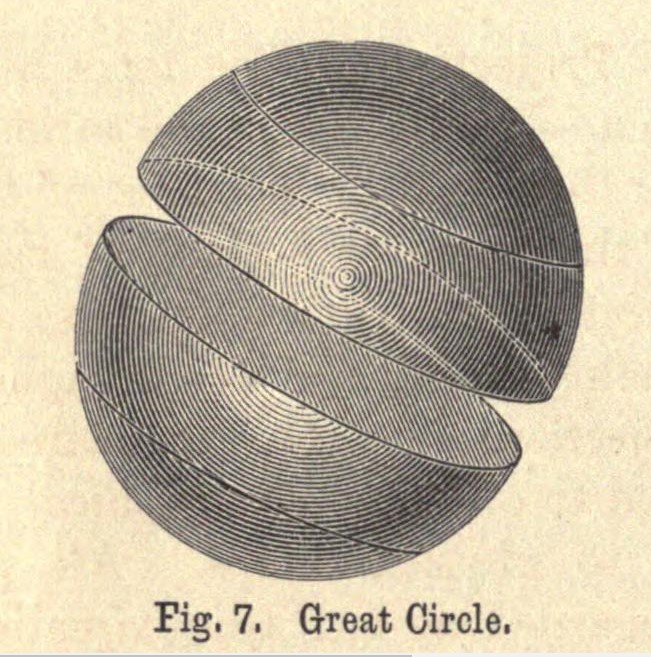
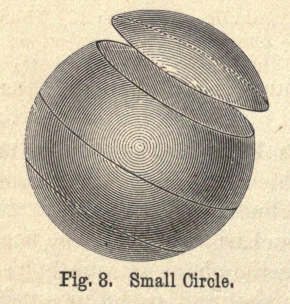
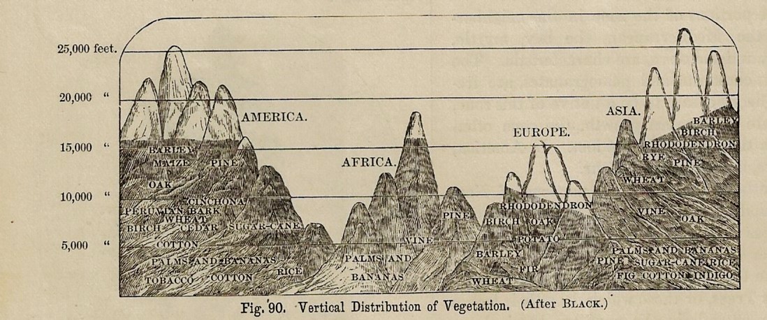
    I found these lovely illustrations in a grade-school books by Edwin James Houston, The Elements of Physical Geography, for the Use of Schools, Academies, and Colleges, printed in 1892. The first  two images are found-Abstracts and appear in the section on globe construction; the other two are cross sections showing the relative heights at which vegetation is found, followed by another cross section showing the heights of mountains. All are quite small in the original, no larger than 2″ x 4″–they are lovely when enlarged, especially the “Great Circle”.  

    Mountains great circle Houston 1892


    Circle small


    Mountain cross section Houston _2_


    Mountain cross section Houston _2_


  • A Glorious Issue of Scientific American featuring NYC (1908)

    JF Ptak Science Books   Quick Post  

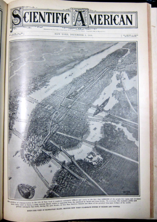
    I don’t have that much to say about the series of images that I found in the 5 December 1908 issue of Scientific American–except for “Wow!” Sometimes that is about all I can manage, and that’s fine. (Richard Feynman, on witnessing the Alamogordo test shot in the desert in 1945, simply said “hot dog!”, which was quite a distance away from Oppenheimer’s reaction, and one which I like more.) Anyway, opening up the volume and by chance opening to this full-pager was very pleasantly surprising, and this from a journal which was very successful in achieving their constant goal of being “surprising”. 

    And as you can well see, “wow” can be shared:


    NYC Sci Am map 3d detail

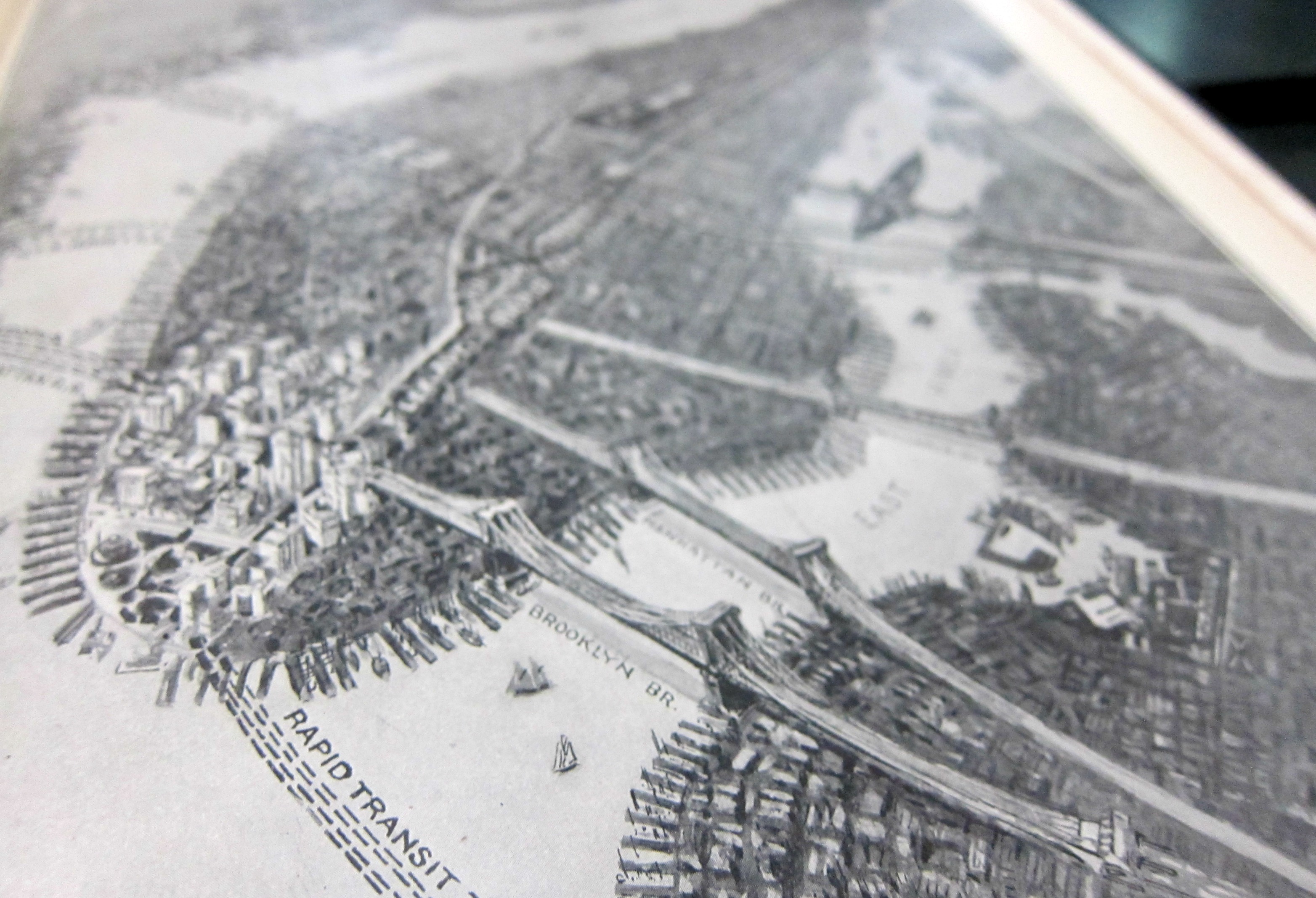
    The bird’s-eye view has a peculiar 3D sense to it–you could make any of the bridges pop to life by changing your angle of perspective, like so:


    NYC Sci Am map 3d detail


  • The Long Range Guns at Calais Take Aim at England (1929)

    JF Ptak Science Books   Post 2734

    I have posted numerous times on German propaganda pamphlets illustrated with maps showing Germany besieged (1925-1935): hordes of planes, hundreds of thousands of troops, legions of tanks, mountains of artillery pieces, and so on, all graphically displayed quite well enough to strike some fear into the heart of a reader even with just  a casual glance seeing their red-hot rolling menace to the Fatherland. (To see some of those posts, just search “German propaganda” in the google box at right.) 

    It seems to me that I have seen dozens of such illustrations of maps showing Germany surrounded, graphs of military capacity, data visualizations of naval strength, men under arms, and so forth, showing the imminent demise of the spent, Versailled, and used-up but potentially recovering Germany.

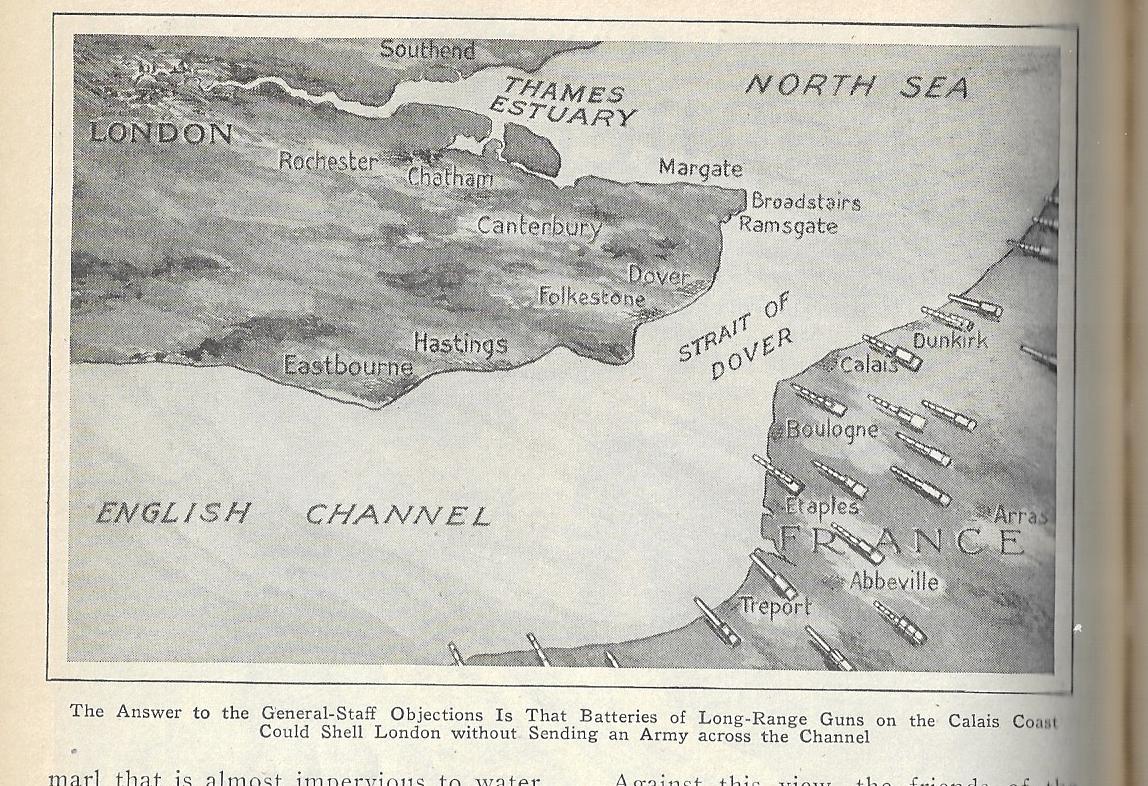
    During that time I’m hard pressed to recall one example of these displays for Great Britain, though I think there was a map in the mid-1930’s in the Illustrated London News that showed the history and possible future invasion routes the island.  Perhaps I’ve just missed these displays, as I don’t actually pursue this as an interest though because of my work I have a lot of exposure to such stuff and am well situated to take advantage of a chance find–and this is what happened today, with the following map happily appeared in my hands as if by magic:

    Pop Mech 1929 England attacked

    The map appears in the May 1929 issue of Popular Mechanics, tailing out an article on the possibilities and the complaints of constructing a channel tunnel. For some reason this bird’s-eye view is included with the article though appears to be utterly unrelated except that it does involve the English Channel. (The article points out another sort of invasion, the tunnel having the potential to admit any number of “more or less undesirable people, who would introduce foreign customs,. deface the countryside and otherwise corrupt English habits of living”.)

    And so, behold! The potential enemies of Great Britain, 1929. It might be conceivable that it is France and France alone setting up those “long-range guns”, what with the long history between the two countries and all, though it seems as recent allies this would not be the case. The enemy could be the feared invasion of visitors from the Continent coming through a tunnel that was far from being an actual project.  Or it could he someone else advancing through France to the coast to threaten the Brits, Calais being the closest point bewtween he two countries across the channel, and the spot where much of the German high command (excluding Rommel) thought that the D-Day invasion would come, even after the invasion had begun. Unfortunately we don’t know what the purpose of this drawing was…except that it would come close to being true in another 11 years.  


  • An Unusual Bird’s-Eye View of NYC from a Rare Source

    JF Ptak Science Books  Post 2728

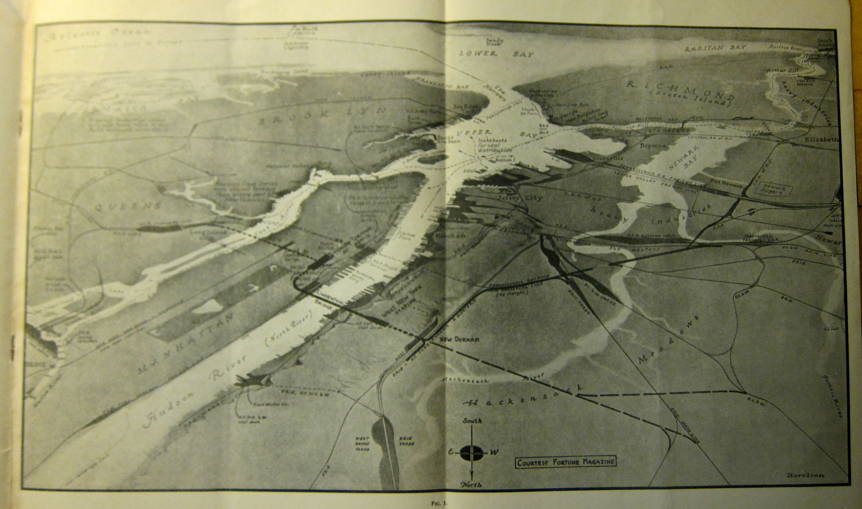
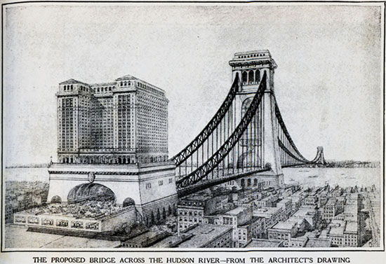
    This bird’s-eye view of the NYC/East Jersey area was found in a rare pamphlet produced by the old North River Bridge Company in 1937. The image–which is widely expandable and found in a pamphlet for a project entitled The Lindenthal Bridge and Terminals, Condensed Statement1—shows the city from a considerable height with a long and oblique view, hovering north of Hoboken on the Jersey side with a view extending to all of Staten Island, which covers a distance of about 18 miles. Heading east (left) in this southerly view we see most of Manhattan, then about all of Brooklyn, highlighting at Coney Island. It is a curious and delightful view. 


    Lindenthal birds eye _4_

    The “Lindenthal” in the title here is the successful engineer/aesthetician Gustav Lindenthal (of Brno, 1850-1935), who today is most remembered for his wonderful Hell’s Gate bridge (“longest and heaviest steel bridge in the world” according to Wiki), the structure as interesting as its name.  

    An earlier (1895) plan by Lindenthal would have created a perfectly massive structure–as the blog Untapped Cities points out, the 6,000 foot long bridge would have been twice as long as the GW Bridge and its towers would have been the tallest structures in the world at 825′. The bridge would have spanned the Hudson at about Hoboken across to 57th Street, and no doubt would have been monumental if not un-beautiful:

    Lindenthalsbridgesm[1895 bridge image source: http://untappedcities.com/2013/07/25/nyc-that-never-was-hudson-river-bridge-dwarf-woolworth-building/]

    Notes:


  • A Fine and Seldom Seen Map from “PM” Newspaper: 1944

    JF Ptak Science Books   Quick Post

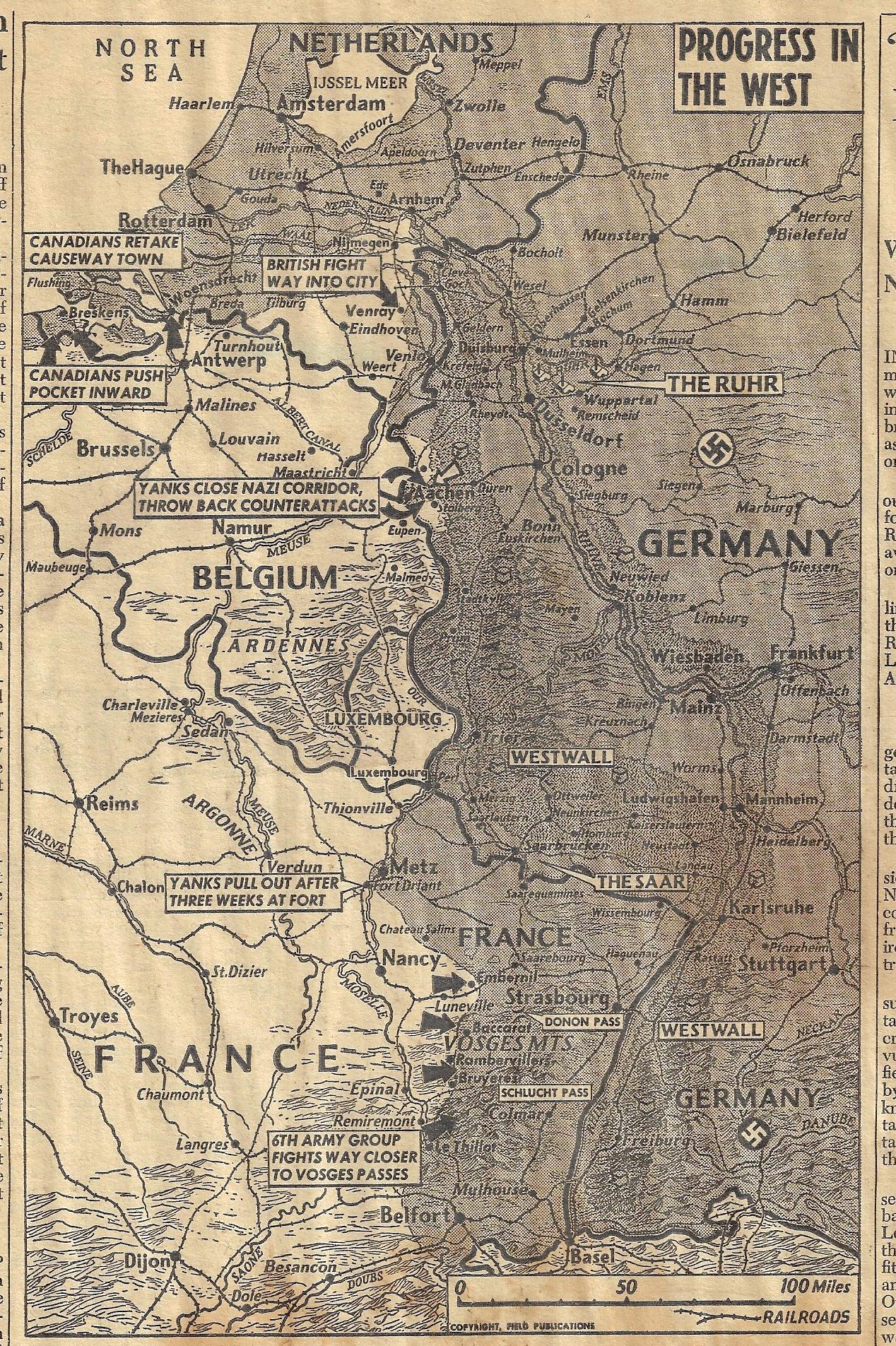
    Maps PM Aachen 1944 Oct

    Here’s a fine, nearly full-page (12″ tall) map that appeared in the great and now elusive newspaper, PM, showing the Allied advance into Germany , October 17, 1944. (I have written numerous times here about this newspaper–just search “PM” in the Google box at right for a number of other posts and a short history of the paper.)  The Allied forces here are nearly into Germany, nearly at the end of their victorious battle at Aachen (Oct 2-21), and pushing up against what was about the last line of defense for Germany, the Westwall (the older Siegfied Line). The Ardennes sits in the middle of this map, waiting for its own major action at the end of the year, which was the final German counter offensive, and the beginning of the end of the European war. 

    We’re going to hang out the washing on the Siegfried Line.
    Have you any dirty washing, mother dear?
    We’re gonna hang out the washing on the Siegfried Line
    ‘Cause the washing day is here.
    Whether the weather may be wet or fine
    We’ll just rub along without a care.
    We’re going to hang out the washing on the Siegfried Line
    If the Siegfried Line’s still there …

    ((Kennedy/Carr) Peter Maurice Music Co Ltd 1939)


  • A Map of an Early Electronic Brain (1948)

    JF Ptak Science Books   Quick Post

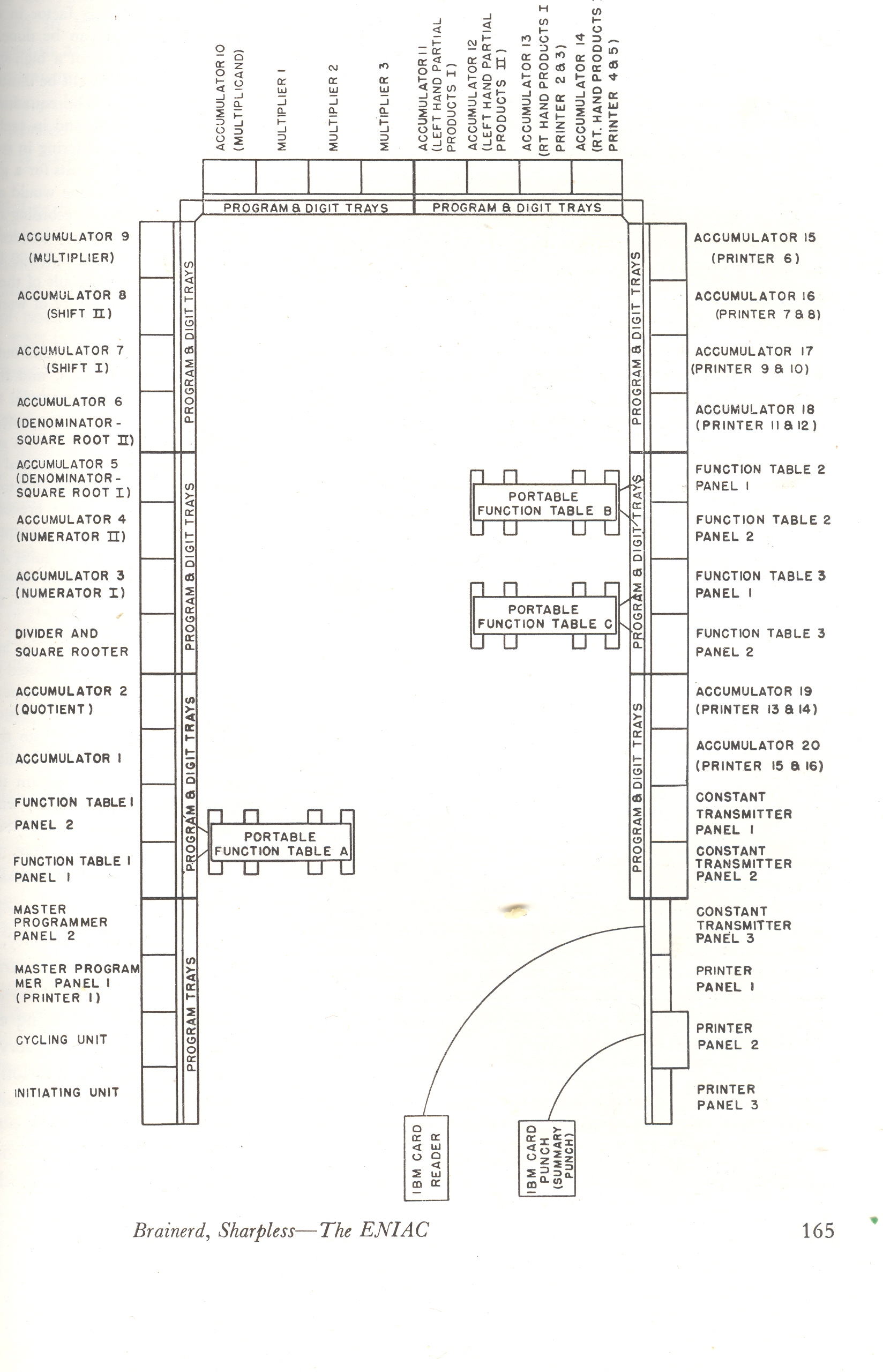
    Eniac

     This is the floor plan for the ENIAC (Electronic Numerical Integrator And Computer, b. 1943-45) which was, basically, the world’s first operational, high-speed digital computer, and (about) marked the beginning of the next stage of technological revolution.  What we see above is the floor plan for the computer-with-no-monitor—I know to most people working today with a computer that the idea of a “floor plan” for anything that is not in a dark place at NSA is not easily conceivable.  The 30-ton, 18,000 tube, 125 KHz ENIAC’s space was about 1800 square feet, where it was able to add about 5000 numbers/second, which was vastly faster than anything else in existence. It operated with 70,000 resistors, 10,000 capacitors, 5 million hand-soldered joints and 6,000 manual switches. It was a magnificent achievement.

    [Source: J.G. Brainerd & T.K. Sharpless. “The ENIAC.”  Article occupying pp 163-172 of the February 1948 issue of Electrical Engineering. ]


  • Unusual Maps Department: (1) Map of Brunetness and (2) Heights of the British Isles (1897)

    JF Ptak Science Books   Quick Post

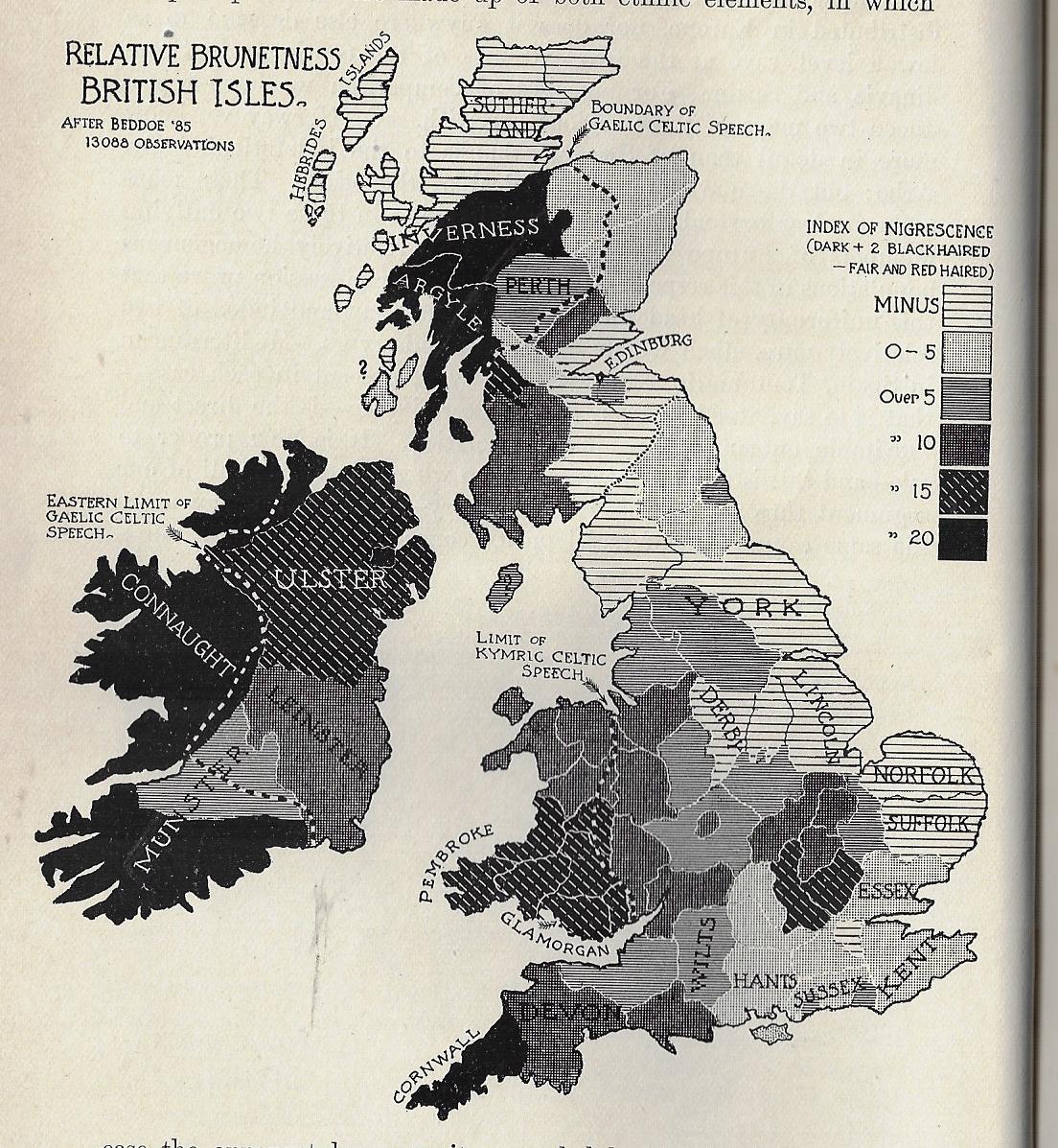
    I must say that I’ve never seen a map of “Relative Brunetness” before finding this one, today. It occurs in a little bit of a wincing article by William Ripley (Ph.D., and assistant prof of sociology at (surprisingly) M.I.T) called “The Racial Geography of Europe”, and appearing in Appleton’s Popular Science Monthly for December 1897.  Here we see the “Index of Nigrescence”, which I take is a measure of blackness of the hair (in this case), with light to dark meaning, well, light-to-dark measures of hair, this taken from 13,000 observations.  A few pages away comes a map of the stature of adult males in the British Isles, locating the averages between the gross average of 5’6.5″ to 5’10” and over. 

    I don’t have anything to say about the maps, but I thought that it was worth reproducing them.  

    Maps of Brunetness of British Isles


  • Moving the Atlantic Inland

    JF Ptak Science Books   Quick Post

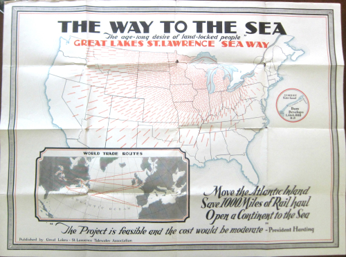
    Here’s an arresting image: the arrows of transportation interests directing themselves inward, inland, to the Great Lakes, ca. 1923.  The map is a bit of advertisement–a “convincer”–to send more economic traffic through the Great Lakes and of course the Great Lakes–St. Lawrence Seaway. Somehow it was making more sense to the writers of the copy for this idea to send freight from Virginia and Pennsylvania and New York away from the coast and up to the lakes, even though that would triple or quadruple the shipping times for those goods. Some of this makes sense, some doesn’t. Anyway, the resulting map is quite a piece of work–but I do think they should’ve let the Atlantic coast stay where it is.  

    Maps Move Atlantic Inwards


  • On Not-Missing the Not-Unhidden Darwin and his “Masterpiece” Map (1845)

    JF Ptak Science Books   Post 2680

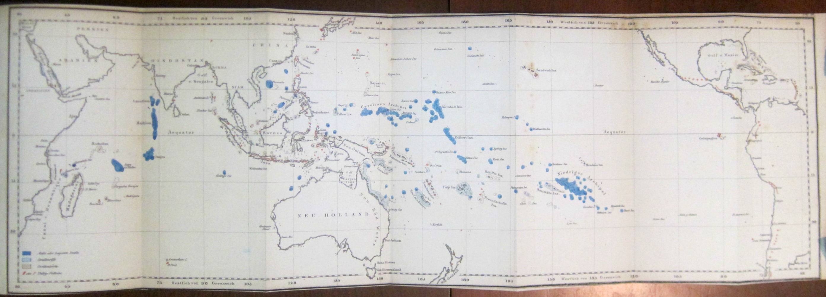
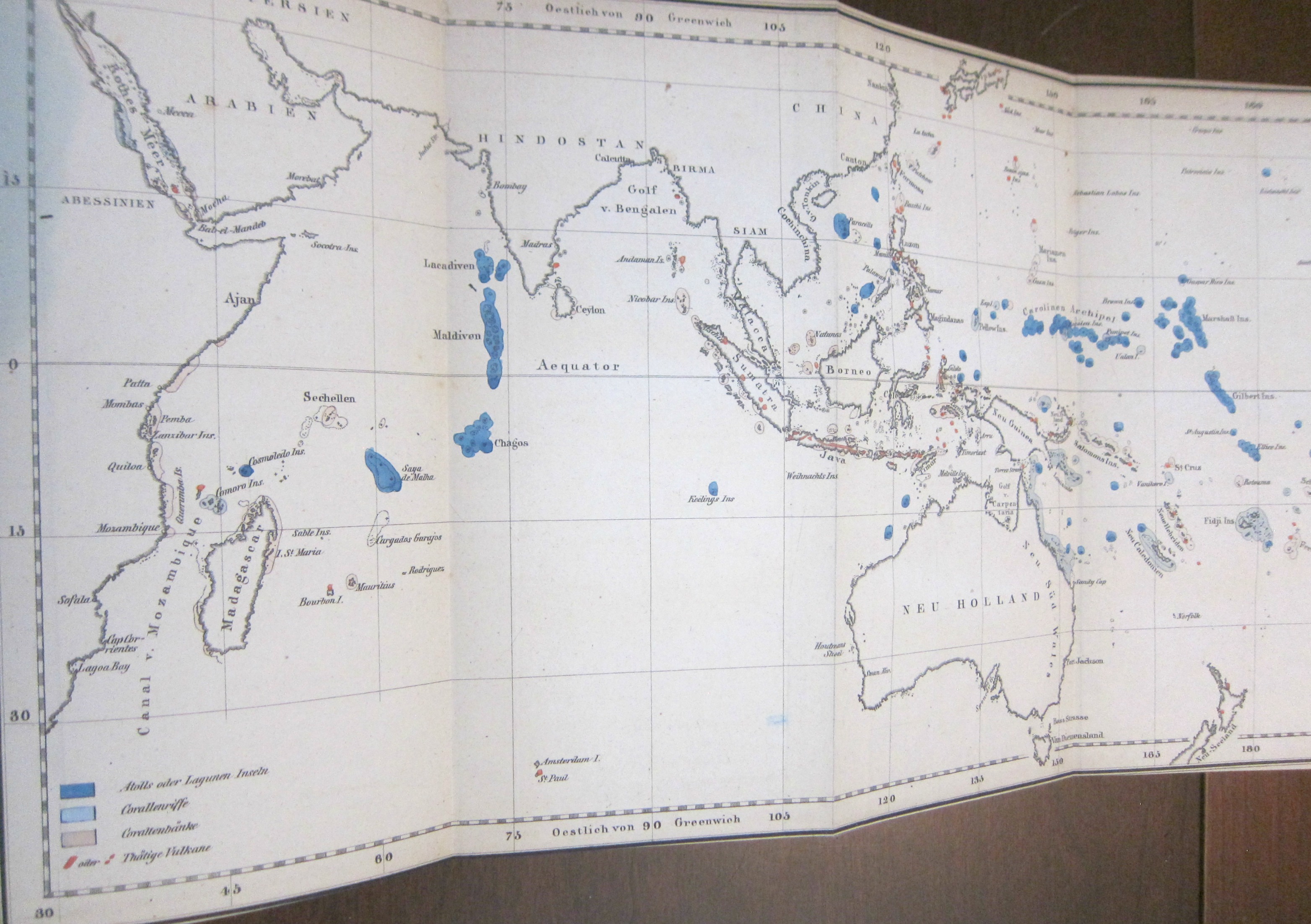
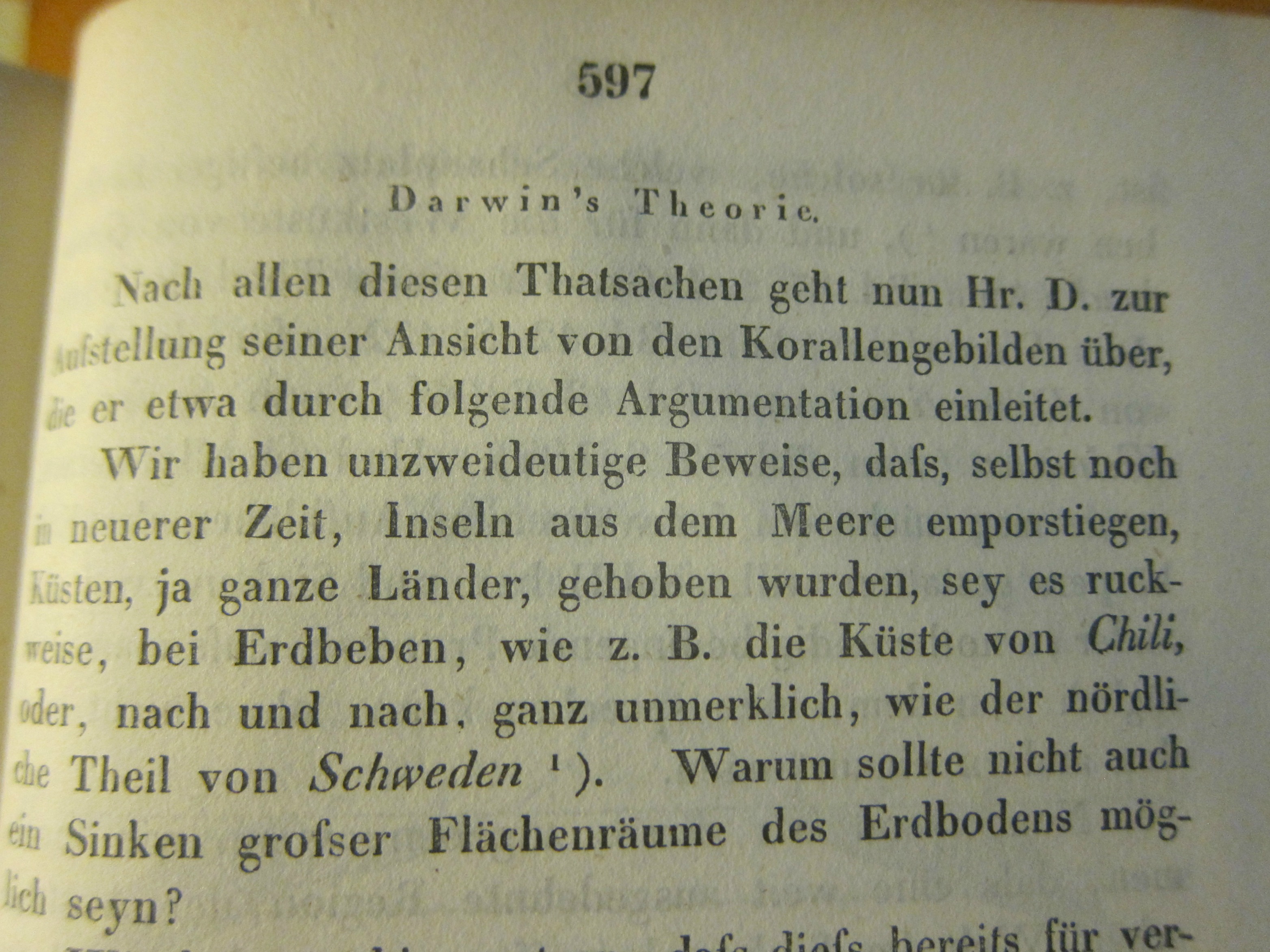
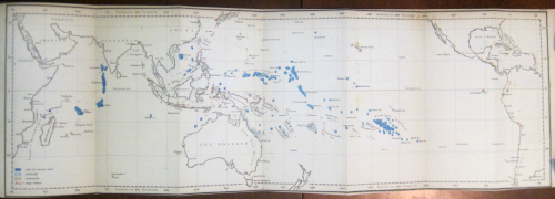
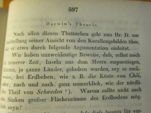
    I was surprised to find this long and early (1845) contribution1 on Darwin and his ambitious work on coral reefs in the generally physical-sciences-heavy Annalen der Physik2. The surprise was ever more so because of the illustration for the article–a German version of the coral islands/reefs map that appears as the frontispiece to Darwin’s The Structure and Distribution of Coral Reefs3…  that appeared three years earlier in 1842.  (Darwin’s Journal of Researches...,  today more commonly known as the Voyage of the Beagle, which was the third volume of Narrative of the Surveying Voyage of His Majesty’s Ships Adventure and Beagle…… was published in 1839, and his first publication of any kind appeared ten years earlier in 1829; the first German translation of the Narrative appeared in 1845 as  Naturwissenschaftliche Reise. As John van Wyhe–the founder and curator of the fantastic resource Darwin Online–points out the German translations were significant because “It was in German…that Darwin influenced the founder of genetics Gregor Mendel, and the pioneering evolutionists August Weismann and Ernst Haeckel”4.)

    When I was thumbing through the volume I noticed the folding map tucked away at the back of the book, nestled with a number of other folding engravings–and I very nearly missed it (that being easy to do in this case).
    Darwin annalen _4_

    • [For a full description of the map consult Darwin Online, Structure and Distribution of Coral Reefs, chapter VI, pp 119-126 http://darwin-online.org.uk/content/frameset?viewtype=side&itemID=F271&pageseq=8]

    Having worked with the Annalen for many years (principally the Annalen from 1799 to the early 1930’s which numbered in the low hundreds of volumes) it was my overall impression that the appearance of contributions in the natural sciences were not at all common in the early years and had become less so by the time of the Darwin-related article. In any event, there it was–I felt a little groggy for not recognizing the map straight away–I slowly pieced it together from the clues, and then pinned the thing down in the test (the Annalen is not generally very user-friendly in placing images with text, though if I had bothered to look for the usually missing image index it would have made life easier). And then, there it was–right where it should be.
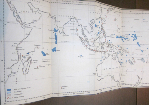
    Darwin annalen _2_

    So tonight I’m just sharing a few images of the map from this happy little adventure of not-missing the not-attributed-in-the-table-of-contents Darwin.  I guess I should’ve recognized the map right at the outset, but didn’t. Ah, well. 

    Here’s an appreciation of the map from the University of Maryland’s Integration and Application Network, “Ten Classic Maps” (http://ian.umces.edu/blog/2013/12/27/ten-classic-scientific-maps/): 

    “Coral reefs: The map of coral reefs throughout the Pacific Ocean created by Charles Darwin in 1842 as part of his first science book, The Structure and Distribution of Coral Reefs is a masterpiece. Although Darwin’s subsequent books about natural selection eclipsed his insights into coral reefs, this coral reef map is part of the theory that Darwin had about the formation of coral reefs. Darwin correctly hypothesized that coral reefs were formed by the limestone accumulation by corals and that extinct volcanos were buried beneath modern coral atolls. It was over one hundred years before drilling associated with the nuclear testing on Bikini atoll that Darwin’s theory was confirmed. Darwin did a couple of important things with this map: he color coded the reefs that were subsiding (blue) and uplifting (red) and he produced a large foldout to cover the entire tropical Pacific Ocean in a single contiguous map. In this manner, viewing the map instantly reveals the “magnificent and harmonious picture” of the broad patterns that Darwin observed. I am convinced that this is the first important piece of evidence supporting plate tectonics and the Pacific ‘Ring of Fire‘, and that if Darwin had a bit more information available at the time, that he would have actually come up with the theory of plate tectonics.”
     

    Darwin annalen


    Notes

    1. (Darwin, Charles.) “Ueber Verbreitung, Beschaffenheit und Entstehung der Korllen-Inseln” [nach Darwin], in Annalen der Physik und Chemie, 1845, series II volume 64, pp 563-614 (about 15,000 words).  (“The distribution, character, and origin of the coral islands.”, “after Darwin”.)

    2.  The Annalen would become one of the most important scientific journals in physics beginning in the 1830’s. 

    3. The Structure and Distribution of Coral Reefs. Being the First Part of the Geology of the Voyage of the Beagle, under the Command of Capt. Fitzroy, R.N. during the Years 1832 to 1836. The work included three folding maps in total (two of which were hand colored). 

    4. John van Wyhe, “Darwin in Translation”,https://www.amphilsoc.org/library/valentinedarwin/vanwyhe
  • The Beauty of Contour Lines and on Missing Importance (1893)

    JF Ptak Science Books   Quick Post

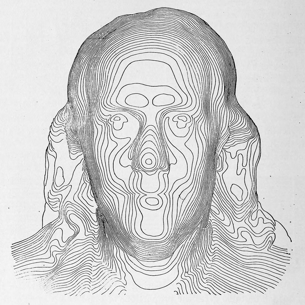
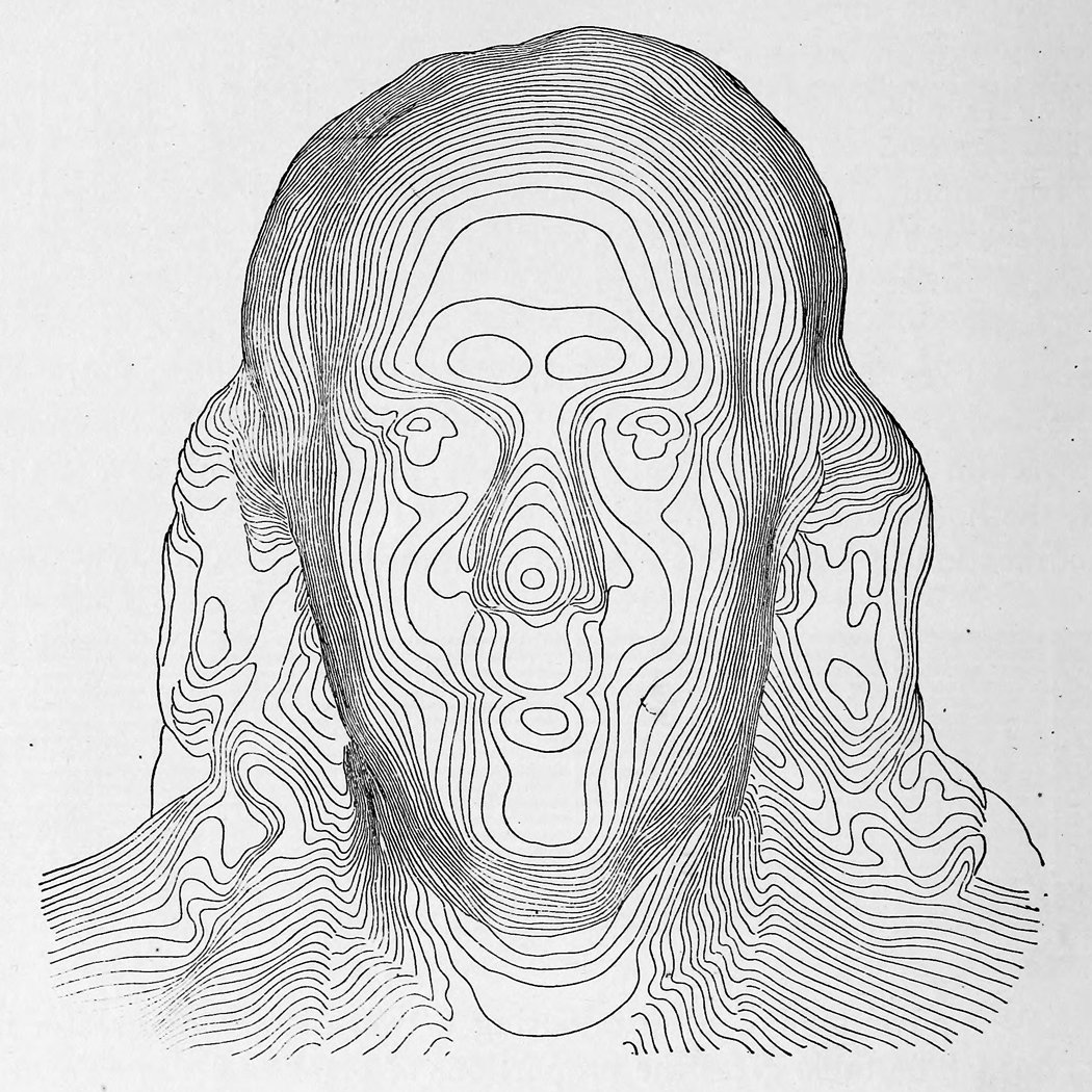
    Contour franklinI found magnificent and early contour image of Ben Franklin in a tweet from Tim Wallace (@wallaectim) who found it in Appleton’s Cyclopedia of Technical Drawing (1893). (The full text of Appleton’s is here: https://archive.org/stream/appletonscyclopd01wort#page/100/mode/2up/search/franklin and a larger image of Franklin is located below.)

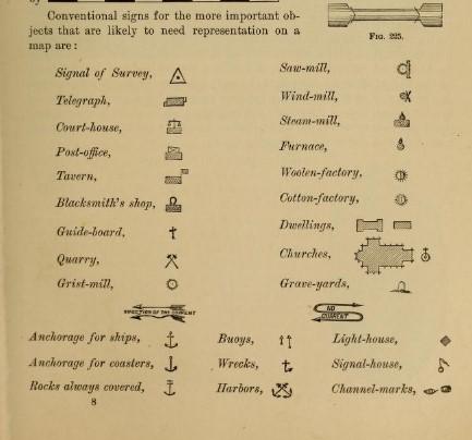
    While checking out the fascinating Franklin in the text, I found an interesting graphic that locates a certain History of Importance in one tidy display. The graphic is in the section on topological drawing, and contains “conventional signs for the more important objects that are likely to be represented on a map”, at least for 1893:


    Contour important objects

    All of this makes sense, of course, except perhaps for the surprise of locating taverns, which I think I’ve not noticed before in 19th map legends–it does make sense though, especially for more regional maps, as the tavern would be a central force for a small town, as well as operating as a possible hotel.  Many of the rest of the important things for a late 19th century map have slipped into obstructed memory, if not further. 

    Contour franklin