A Daily History of Holes, Dots, Lines, Science, History, Math, Physics, Art, the Unintentional Absurd, Architecture, Maps, Data Visualization, Blank and Missing Things, and so on. |1.6 million words, 7500 images, 4.9 million hits| Press & appearances in The Times, Le Figaro, Mensa, The Economist, The Guardian, Discovery News, Slate, Le Monde, Sci American Blogs, Le Pont, and many other places… 5000+ total posts since 2008.

Category: Maps/Diagrams of Imagination & Ideas

  • Tinian, the Manhattan Project, and Manhattan (1944/5)

    JF Ptak Science Books   Quick Post 

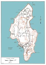
    As we all know Tinian Island was of a vast strategic importance to Allied War effort against Japan.  It sits just a few miles away from Saipan, and is situated close enough to Japan (1500 miles) to make the place an integral part of the advance on Japan as an airstrip.  The battle fought to control the island–in August 1944–resulted in it being taken by U.S. forces, the Japanese losing all but 300 or so of a garrisoned force there of 8500. Tinian became home to (among others) the 509th Composite Group, which was the home base for the bombing of Hiroshima and Nagasaki. It was the penultimate step of the fulfillment of the Manhattan Project–the last being the dropping of the bombs–and it struck me only very recently that after all of this time, it seems to me that Tinian bears a resemblance to Manhattan Island, which  makes for a peculiar irony. 

    Now that I have for the first time looked at a map of Tinian with street names, I see that this irony was deeply incised into the very earth of the place by Seabees, because when the plan of the city was laid out in the fall of 1944, the place received a gridwork of streets similar to Manhattan–and as a matter of fact, a number of the streets were named with Manhattan in mind: Broadway, Riverside Drive, Canal Street, 42nd Street, Wall Street, Canal were there and named, and even for the north end of the island, the major road leading out was named Saw Mill River Parkway, which is what I would drive leaving the city for Great Barrington, Ma. I don’t know why I am so very late to this party, but I am.  If you’ve not noticed this before, join the club, and enjoy.  (See here for a clearer map of the Tinian street names: http://www.pacificwrecks.com/provinces/marianas/maps/tinian.html#axzz4HjqvMu1w )

    Tinian Tnian manhattan


  • Infographic on the Invasions of Great Britain and Ireland (1914)

    JF Ptak Science Books  Quick Post

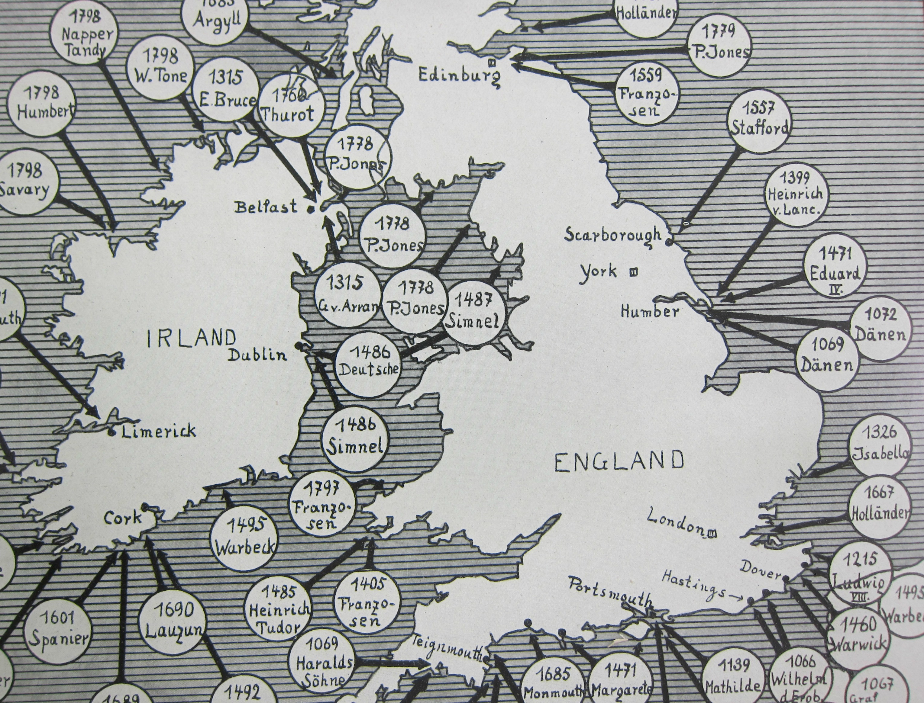
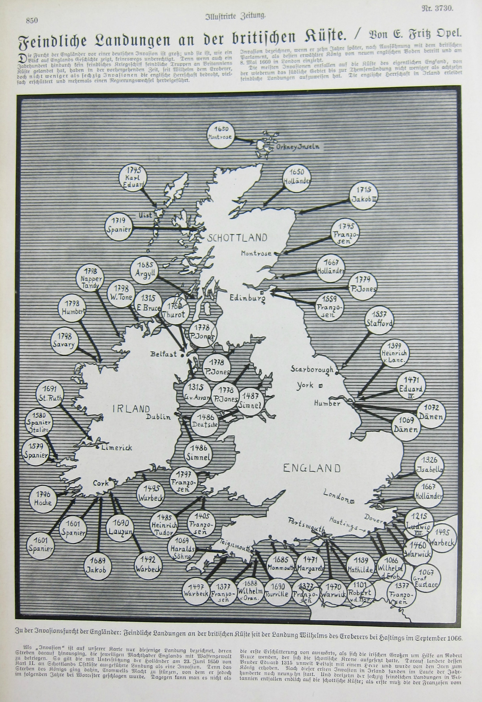
    This piece of cartographic propaganda appeared in the fifth month of the war in the Illustrirte Zeitung (Leipzig) on Christmas Eve, 1914–it was in its way a vision of hope for the popular audience that this German equivalent of Life magazine reached. Perhaps it was a comfort to read that Great Britain and Ireland had been invaded before–many times–and that it might happen yet again; perhaps it was a comfort at a time when  the realization dawning on tens of millions of people that This War would be over by Christmas, but it had really just only begun.  Not much comfort though can be had in a piece of paper. 

    A detail:

    Map Invasions England detail

     And the full image:

    Map Invasions England


  • “Two Disastrous Failures” for the German Army, January 1945

    JF Ptak Science Books   Quick Post

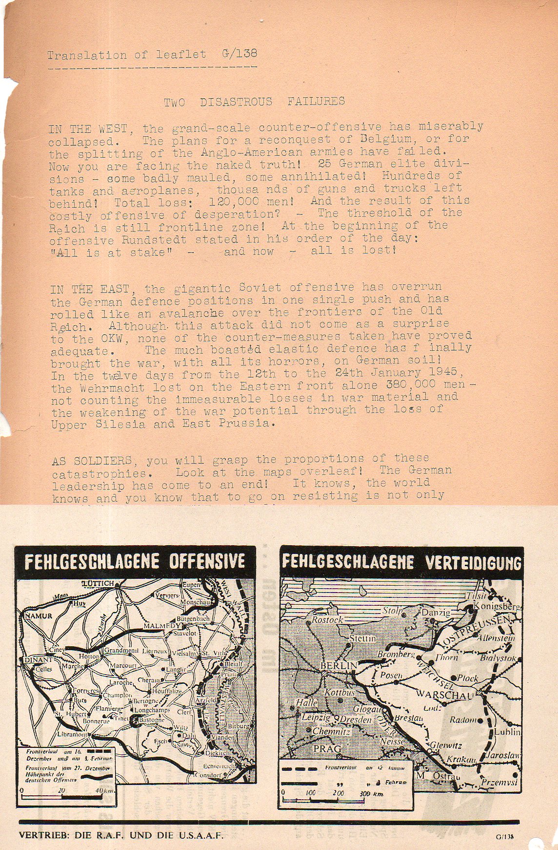
    This leaflet was dropped on German forces by the R.A.F. and the U.S.A.A.F. soon after the breakout of the Battle of the Bulge/Ardennes in the end of January 1945, which is one of the two failures that this propaganda sheet screamed about. It is a little odd though that in the map it would show the German offensive at its worst for the U.S. troops, with the bulge extending far west and Bastogne being surrounded. Yet the leaflet told of the German losses of its failed offensive (“Operation Watch on the Rhine”) though it did not show the progress of the month-long battle on the map, which should have shown the battle line back to its more-or-less original position by 25 January.  In describing the catastrophe of the German position in the east (leading with the loss of “380,000 soldiers”) the date of 24 January is mentioned, which supports the late January estimate for a printing date. This was of course the Vistula-Oder Offensive. which saw the Soviet Army advance more than 300 miles in a month, right to the Oder, only 40-odd miles from Berlin.  In that campaign the German Army Group A was just about killed–of the 450,000 soldiers in retreat along this long and disastrous front during the month of January, the overwhelming majority were casualties, including nearly 300,000 killed. The wounded and other survivors became POWs.  The bottom line of course was that the winter of 1945 for the German soldier was bitter and deadly, and was leading nowhere except defeat–there was no doubt what lay ahead after seeing that map of the Eastern Front. 

    Leaflet two disasterous failures468


  • Visualizing Data: the Texas Newspaper Frontier in 1880

    JF Ptak Science Books 

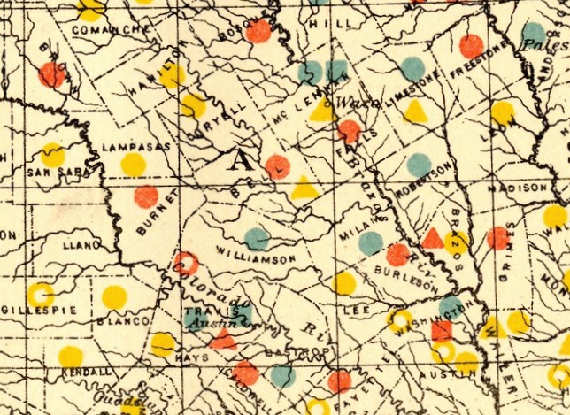
    Dataviz texas newspaper  detail


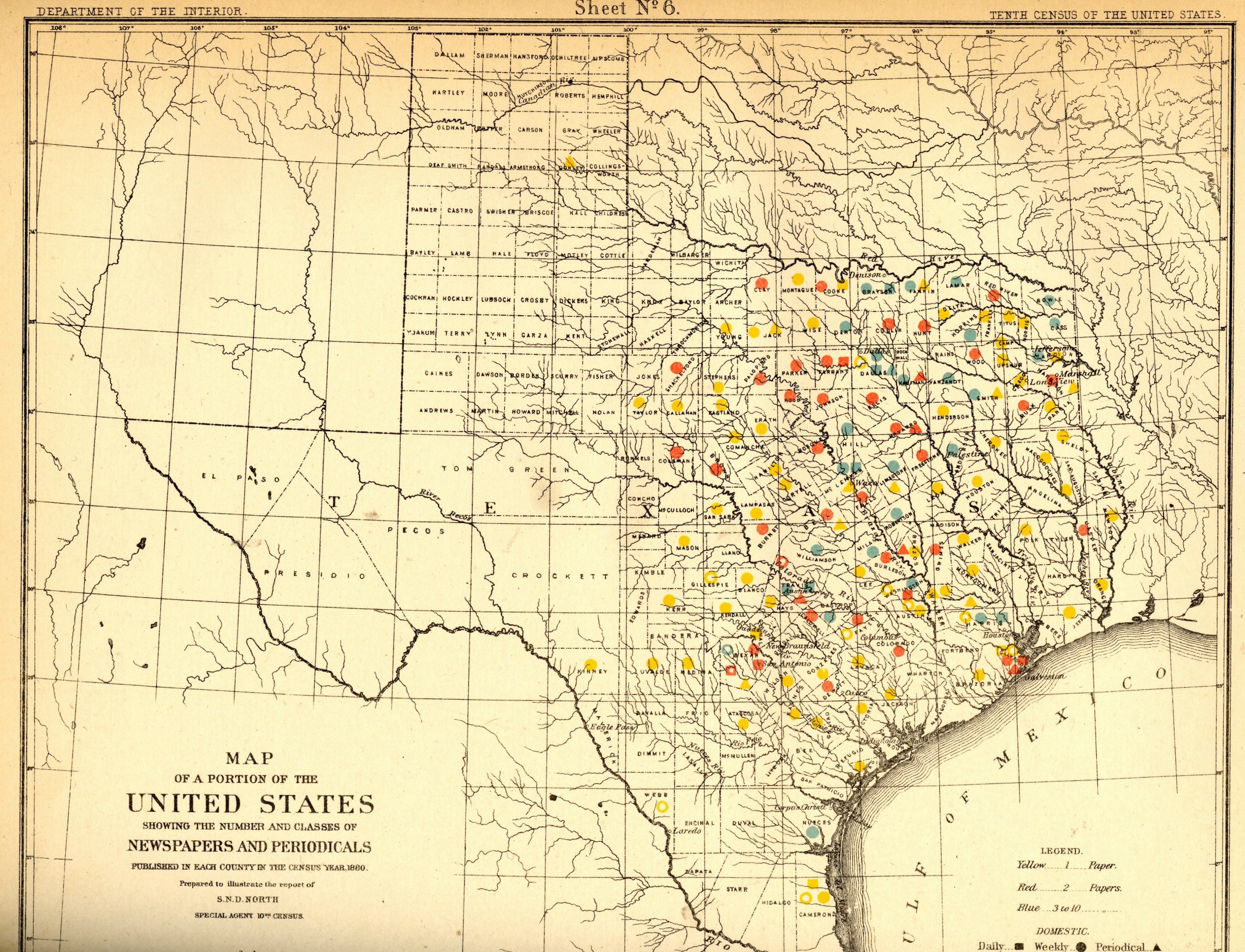
    Dataviz texas newspaper  tail

    [This expandable image is from the blog’s copy of the publication–full text can be found at the Internet Archive, here: https://archive.org/details/cu31924083814453]

    The idea of the frontier in American history has been around for quite some time, made famous and mostly-invented (and closed) by Frederick Jackson Turner in 1893, and expanded, imagined, enticed, magnified, micro-analyzed, and  generally messed with ever since.  There have been all sorts of frontiers introduced into the study of the birth, expansion and filling-up of this country, from the very earliest colonial periods of Indian frontiers, “far-western” river frontiers of the Connecticut, Delaware, Hudson (!) and Susquehanna, to the Appalachian frontier of the early western reaches of the colonies, to the transportation frontier, the slavery frontier, the gold and mining frontier, the gun frontier, and so on.  

    Here’s another bit to add:  the newspaper frontier.  

    I just happened upon a volume of the US Census of 1880, with a special report by S.N.D. North entitled History and Present Condition of the Newspaper and Periodical Press of the United States…and published in 1882.  What provoked me was the map of Texas newspapers for 1880.  It very clearly, and like no other map of its kind, delineates a fantastic line/frontier between the Texas with newspapers and the Texas without newspapers. We see very clearly that the frontier of the newspaper stops fairly abruptly (and wonderfully) at the 100th meridian, with only two newspapers in all of the rest of Texas found beyond that point (and those just barely beyond the 100th.  And it’s the 100th meridian that mostly marks the vertical middle of the country, running through North and South Dakota, Kansas, Nebraska, the Texas/Oklahoma borders, and so into Texas—if you folded this map vertically in half it folds virtually on the 100th meridian.  An odd bit, it is, half of the country and then approaching half of Texas. 

    I should report that the newspapers west of the 100th meridian were in Kinney County (population 4,440) with the Fort Clark News (established in 1880, at exactly the year of census) and Donley County (population 160, with the monthlyClarendon News and a 50-cent annual subscription rate).  The newspaper development also sort of followed the frontier fort development, almos tall of which (but four) were east of the 100th. 

    Of course the population and easier-natural-resources are located east of this point, I know, but it is still quite a jolt to see the line of newspapers get drawn in the sand so vividly.  There isn’t anything else quite like this so far as the newspapers go, except, a little, for Florida, where the line gets drawn north and south, splitting the peninsula roughly in half, the southern part holding only five counties at this point..  But it is a much more robust image for Texas given the number of newspapers that were being published—280 periodicals and newspapers for Texas versus 45 for Florida, with 11,374 in the entire country*—so that the difference between the have-newspapers and haven’t-newspapers in Texas is that much more vivid. 

    Texas needed more papers:  there were 1.5 million people living in the massive state in 1880, almost twice as many as there were in 1870, and almost half of what there would be there in 1900. That was another story, entirely—even in 1880, which is only 130 years ago, there were only 270,000 people living in the entire state, not even close to half of the county population of Pinelas today.I’m just enjoying the surprise of the straight-edge frontier in Texas. 

    The deal too was that Texas wasn’t at the top of the lisst for average area for each publication per square mile, with each periodical providing coverage for 936 miles. But that again is for Texas east of the 100th meridian–throw in the rest of the state, and that number skyrockets. (There were 13 states with a higher mileage distribution than Texas, topped by Indian Territory,m with basically nothing, with each paper servicing an area of 21,000 square miles.  

    Also, Texas’ 225 counties had 119 counties publishing newspapers and/or peridoicals, compared to the national figures, which were 2,605 counties and 2,073 publishing papers.  

     *Just for the sake of comparison, the number of newspapers and periodicals per state for 1880 was as follows: Illinois, 1017; New York, 1411; Pennsylvania, 973; Ohio,  774; New Jersey 215.  Also, oddly, the average circulation of the Florida and Texaspapers was roughly the same: 1,282 for Texas and 1306 for Florida (with an average for the country at 4137). 

  • Maps Showing Rates of Travel

    JF Ptak Science Books  Quick Post

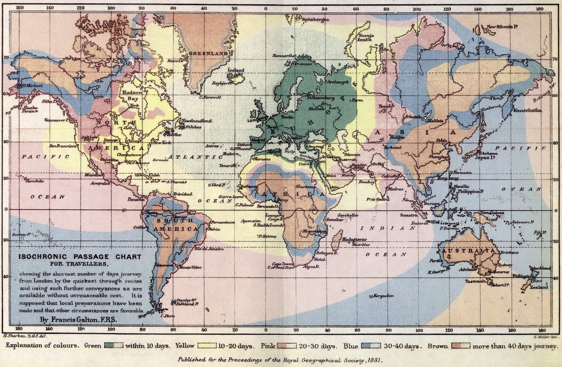
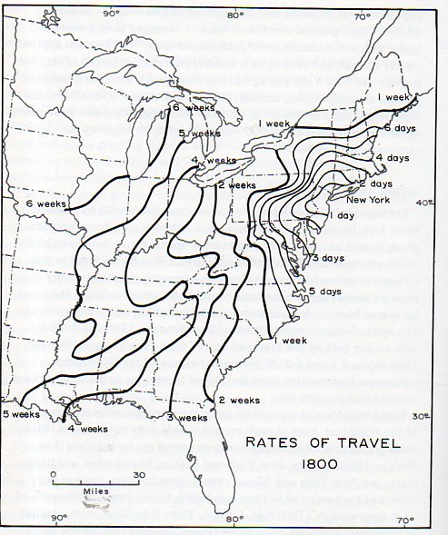
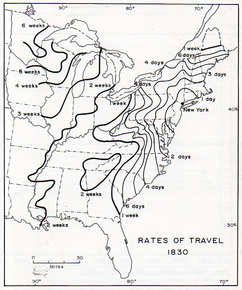
    This morning the writer Clifton Wiens alerted me to his friend’s blog Fevered Mutterings where I found the article “How Fast Do You Want to Get There?” which was illustrated with two fine early isochrone maps. The isochrone/isochronic map is a map of time travel, depicting how long it would take to reach different places from a central point, the variants detailed in colors. (For the record they all seem to assume good or normal or scheduled arrivals and departures, good weather, no impudent problems…so you probably would have to calculate for longer times, given the nature of the beast in the 19th/early 20th century.) In any event, I wanted to reproduce them here along with others that I find. 

    The first of the maps is probably the first of the isochrones, made by the very-multiply-talented Francis Galton. It appeared in 1881(and then again in 1882) in “On the Construction of Isochronic Passage Charts” in the  Proceedings of the Royal Geographical Society (Royal Geographical Society) page 657.


    Maps isochronic galton 1881[Source: http://feveredmutterings.com/fast-travel]


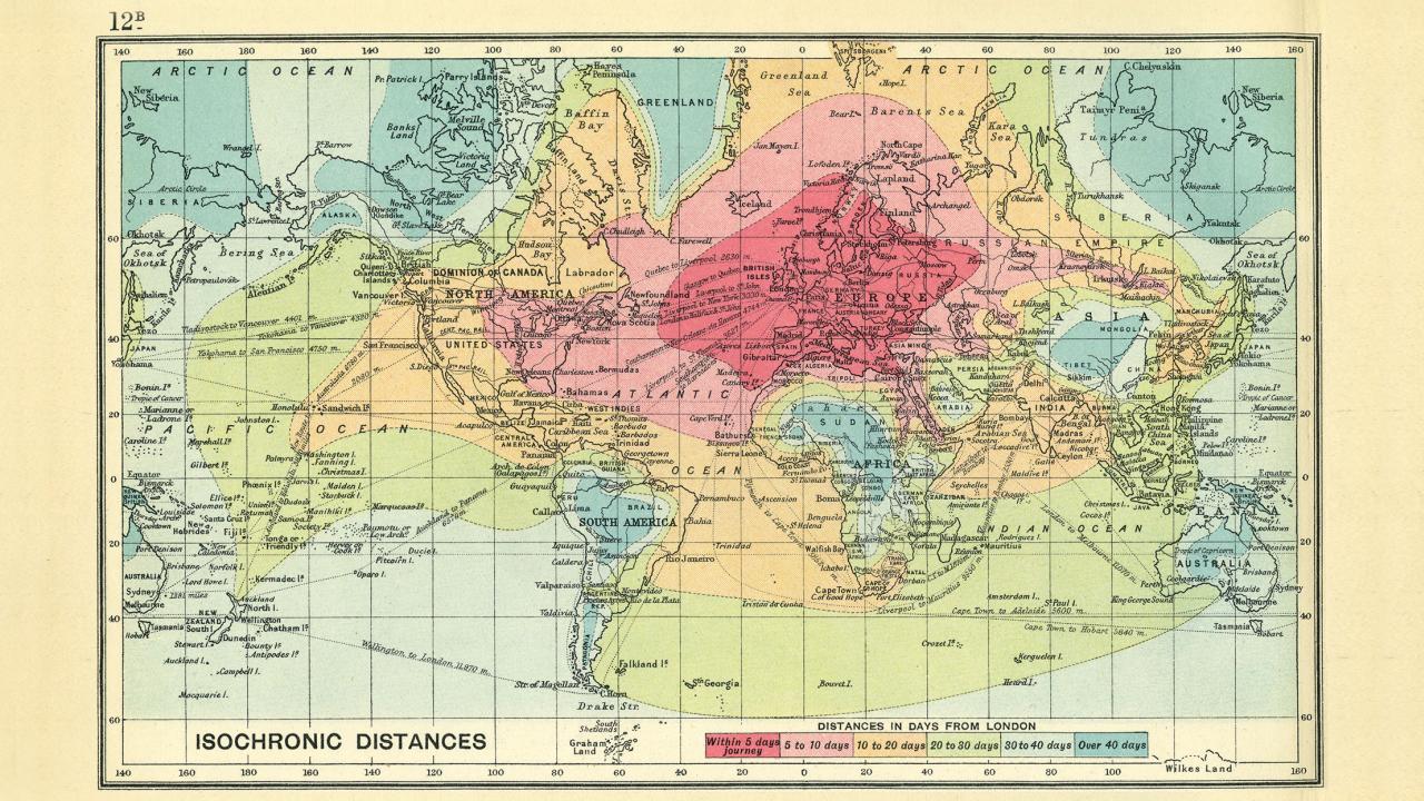
    The next example is by John G. Batholomew with his Isochronic Distance Map and Chart which was first published 1889 (and then again in 1914) in his  Atlas of Commercial Geography  or earlier

    Maps isochronic 1914

    [http://feveredmutterings.com/fast-travel]

    The following maps are not quite the same, being historical and retroactive, and show rates of travel in the U.S. over certain decades (and seen earlier in this blog in the post “Time Travel in the Early U.S., 1800-1857” https://historyofideasblog.com/thesciencebookstore/2012/02/travel-time-in-the-young-republic-1800-1830.html: 

    Travel time 1317

    [Source: Allan R. Pred Urban Growth and the Circulation of Information, 1790-1840 (Harvard, 1973)]

    Travel time 2316


    [Source: Allan R. Pred Urban Growth and the Circulation of Information, 1790-1840 (Harvard, 1973)]

    Sources and Notes

    Another good collection of modern isochrones can be found here: http://www.citymetric.com/transport/its-christmas-so-here-are-11-beautiful-isochrone-maps-showing-travel-times-different

    Another view of the Allan Pred maps can be found here: Michael Graham Richaard,  “How fast could you travel across the U.S. in the 1800s?” http://www.mnn.com/green-tech/transportation/stories/how-fast-could-you-travel-across-the-us-in-the-1800s

    Also, another older map is by Albrecht Penk’s  “Isochronenkarte” first published 1887  “Isochronenkarte der österreichisch-ungarischen Monarchie”. Deutsche Rundschau für Geographie und Statistik: 337

    https://www.1843magazine.com/places/cartophilia/time-travel   1914 map

    The Galton map is also found here: https://upload.wikimedia.org/wikipedia/commons/8/86/Isochronic_Passage_Chart_Francis_Galton_1881.jpg


  • Odd Maps: Earth as a Workplace for Trucks (1939)

    JF Ptak Science Books   Quick Post

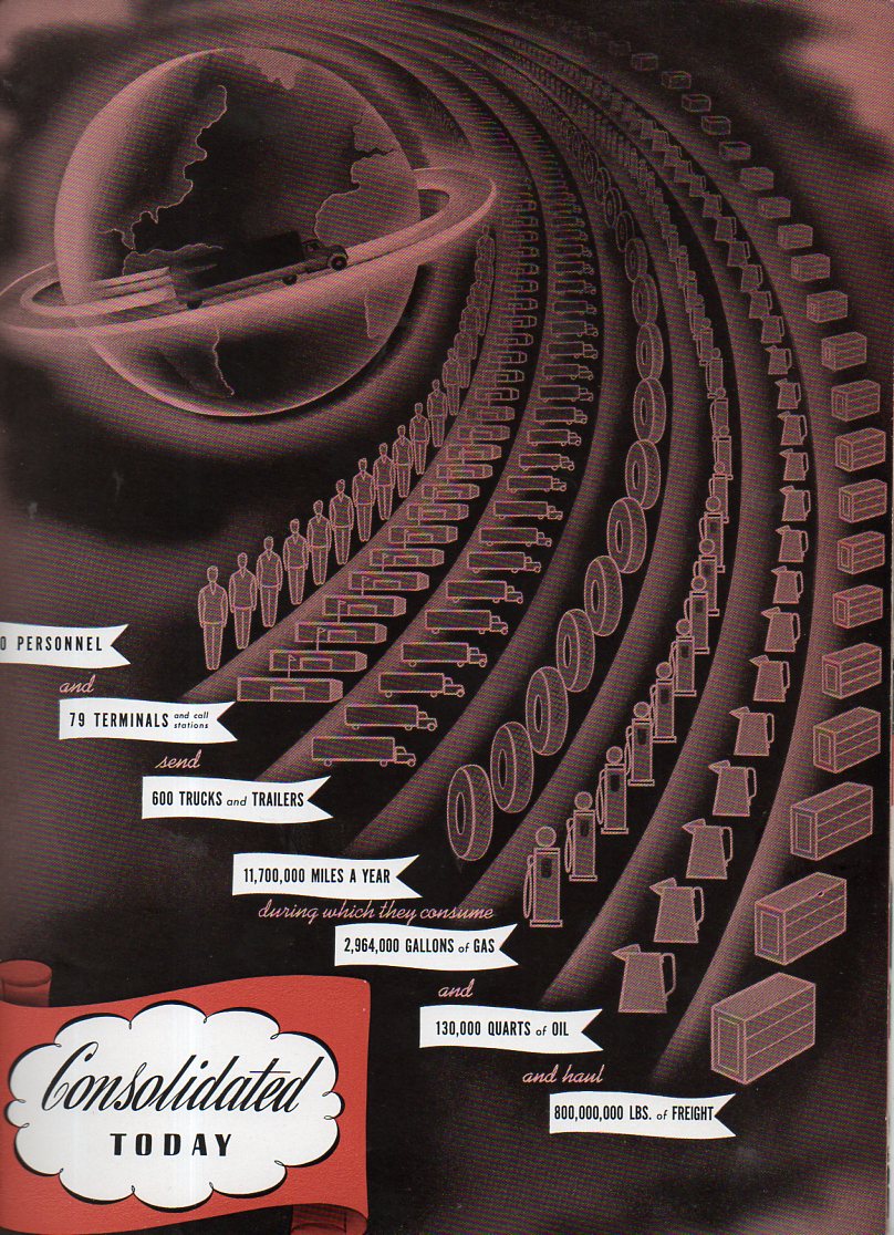
    You wouldn’t know about the highly-designed images in the work Highway Transportation by its title (“published in the interests of the shipping public”) by Consolidated Motor Lines Inc (1939). Nor would you assume how dry the interior was by the pamphlet’s cover. In any event the Earth  (with the poorly-drawn North America and the trunk-running ring around it)seems to be well under control by trucks, standing by in deference to the enormous quantities of oil consumed by trucks and other truck-related truck things, sweeping past it like the tail of a comet.  It is just an odd map, and that’s pretty much that. The sharp and streamlined plastic cover must’ve been shiny enough for everyone to think of it as an advanced work.   

    Map world truck346


    And the equally odd and slightly disturbing streamline-y cover:


  • Hitler as Leviathan of the German People; a Map of the Threat to Germany (1936)

    JF Ptak Science Books   Post 2613

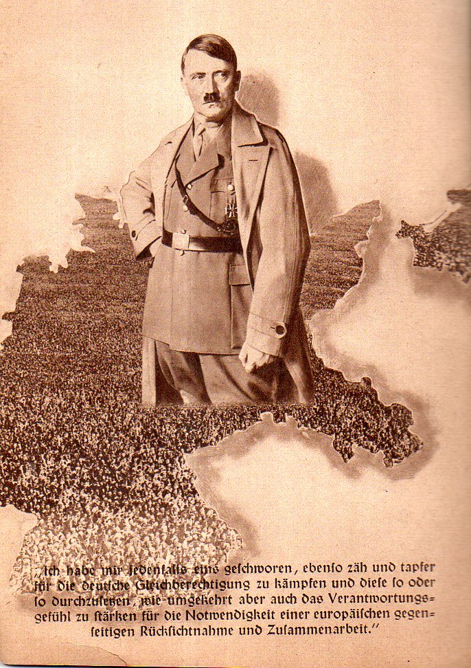
    the following two images are found in a small pamphlet on the general election and single-question referendum held in Germany on March 29, 1936 (Des Deutschen Volkes Schicksalswende am 29. Marx). as it turns out the small pamphlet accordion-folded oput to about 2.5 feet, which was printed on both sides.  Anyway the single question was whether the voter wanted a single-party representation by the NSDAP in the Reichstag–not surprisingly whatsoever the German population voted/”voted” 99% in favor of the proposal.  The pamphlet was a gross propaganda instrument, as was the “election/referendum”, and it contained a number of striking images, though perhaps none so as near-unforgettable as that showing Hitler arising from a living-person map of Germany:

    Hitler map of people303


    Hitler came to power via a number of elections–he didn’t just take it, or at least not until 1933; 44 million people voted in March 1933 (an 88% turnout), and 17 million voted for the NSDAP and Hitler giving him the popular vote and the most seats in the Reichstag. In the November 1933 (“Ein Volk, Ein Fuhrer, Ein Ja”) elections, 39 million/92% voted for Hitler, which was another story.  And here he is, rising from a sea of Germans, three years later, a leader restrictive of enemies and opposition, the whole thing looking horrible. 

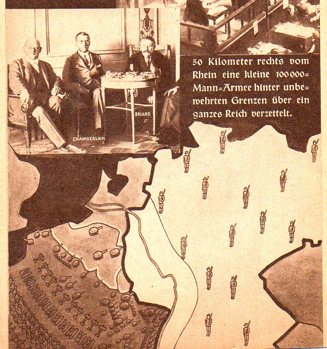
    Here’s another bit from the same 12-panel accordion-fold pamphlet, a propaganda map showing the possibly-invasive weaknesses of the Versailles-dictated German army.  AS in the case of several other maps posted to this blog on this 1934-1939 geographic creation of risk and threat, this one depicts a heavily-armed and populated French army looking at Germany, while the relatively-meagre 100,000-man German army quietly protects itself on the borders 50km away from the Rhine.  I guess it might have been effective if people were actually voting in this election, for scared people to vote their scared conscience for the man who scared them. The writing however was on the proverbial wall, and the only thing left to do with the Versailles treaty at that point would be to scrap it.  About four years later the Nazis would come sweeping down on France and by June 22 the French would be signing a humiliating surrender instrument.

    Hitler map of people304


  • Map of the Communist Threat to Germany, 1933.

    JF Ptak Science Books   Quick Post

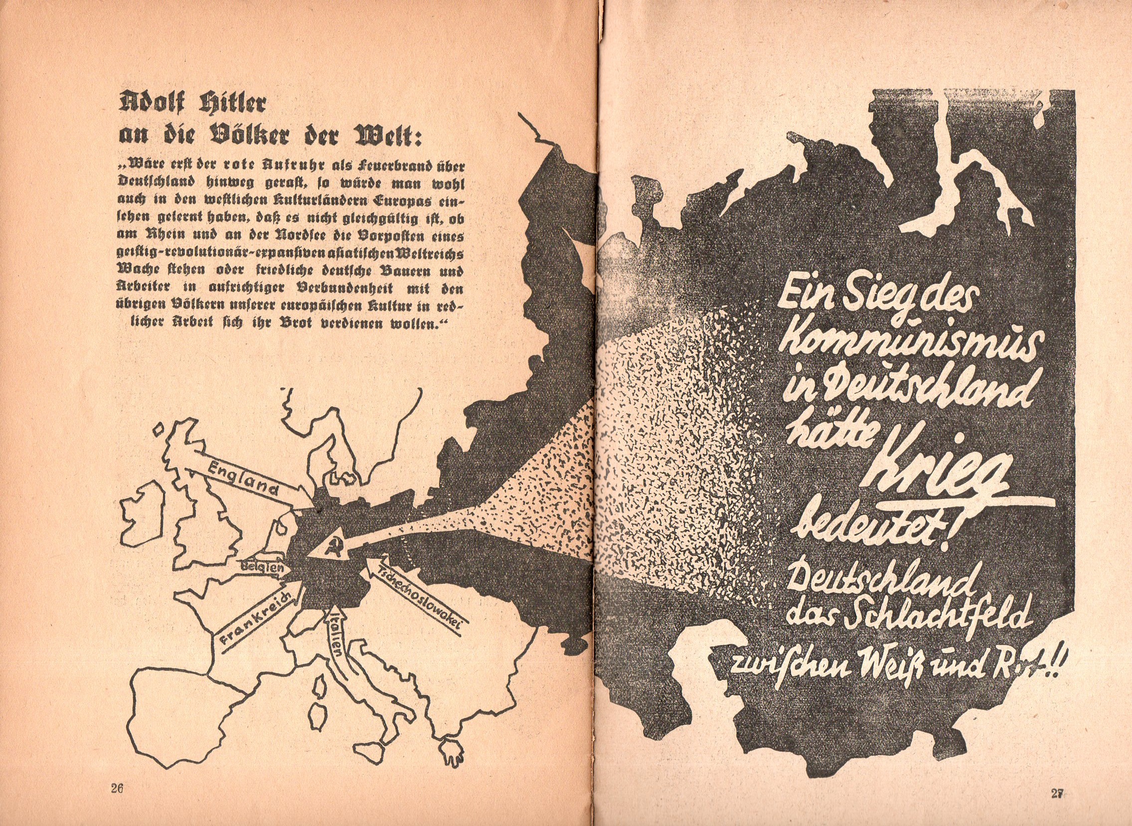
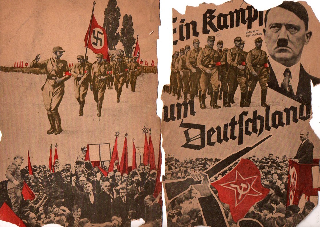
    Not long after Hitler’s election in 1933 this curious pamphlet appeared: Ein Kampf um Deutschland (1933), short and thin, is a  work filled with anti-Communist photos and images portraying them in as harsh a bad light as you could muster in 32 pages.One of the images is this map showing in no uncertain terms threats to Germany from the west, but most importantly a gigantic threat coming from the Communist east, the arrow striking right through the heart of Germany, with the hammer and sickle (the symbol only about 16 years old at the time) coming to rest just about on top of Berlin.  

    Nazi map communiast762

    For all of this Hitler would sign a Non-Aggression Pact with the Soviet Union six years later (22 August 1939) with the plan of dividing some Eastern conquests with the Russians.  Less than two years later came Operation Barbarossa, with Hitler launching a massive surprise invasion of the Soviet Union on 22 June 1941. Dozens of millions of lives later, it would all be over in four years.  

    And the opened cover for the pamphlet, or what is left of it:

    Nazi map communiast763


  • Maps of the Progress of the Nazi Occupation, 1936-1943

    JF Ptak Science Books  Quick Post

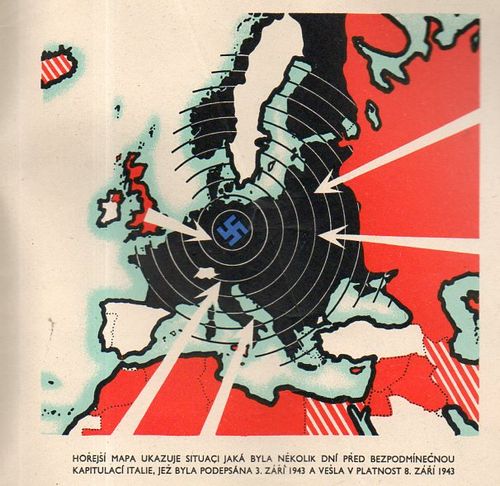
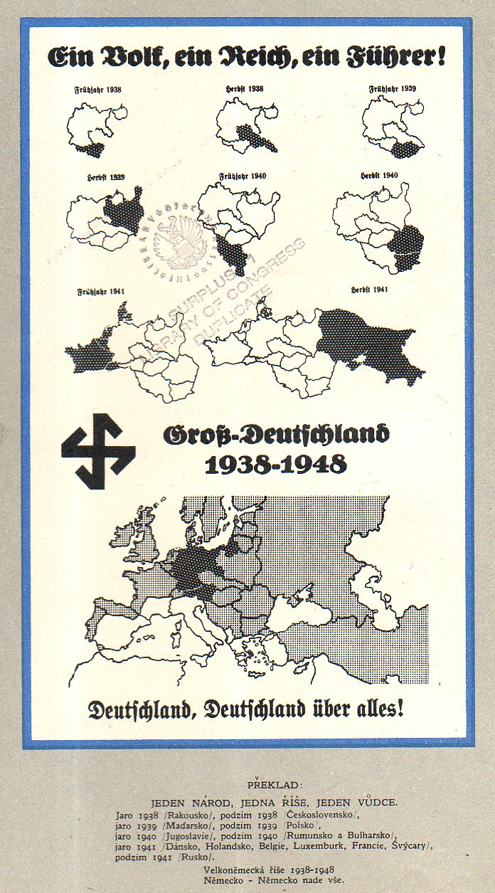
    Čtyři léta války v mapách (“Four Years of War…in Maps”), published in London, ca. 1943, is a Czech-exile publication showing the development of the war in a number of very striking maps. The maps end at the publication of the pamphlet–except of course, for the 1948 map. The culminating interest though shows the Nazis surrounded, and put to the final test–it is the first map I list, below, even though it was about the last map in the pamphlet.  It is a rare thing, this pamphlet, and it does not show up in the usual places. There are only seven copies located in the WorldCat/OCLC, all in top-notch libraries: NYPL, Yale, Harvard, Harvard Law, UC Berkeley, Oxford, and Nanterre. 

    Maps Germany 1942183


    An overall view of the progress of German war conquests:

    Maps Germany 1938-1948175


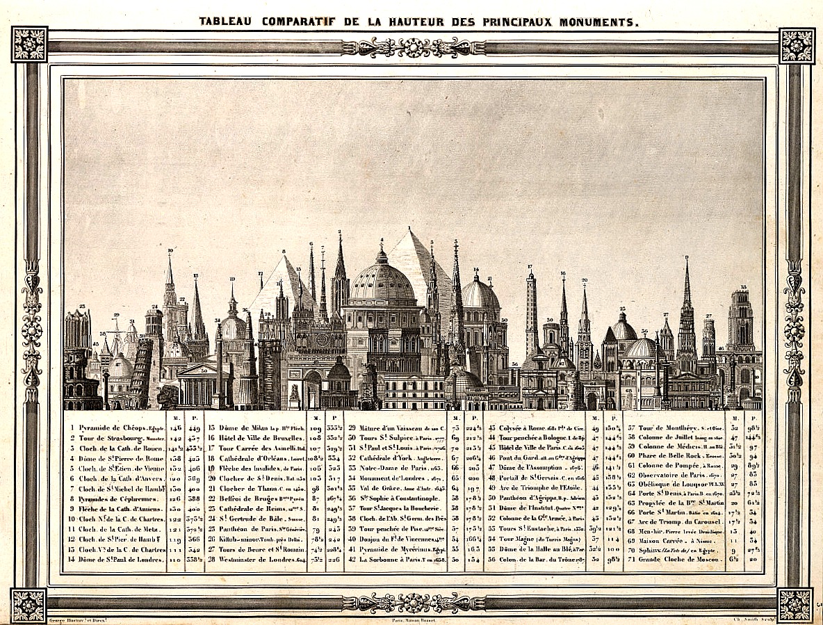
  • An Imaginary Skyline: Comparative Chart of the World’s Tallest Structures, 1852

    JF Ptak Science Books  Quick Post

    I came upon this table of the heights of structures while looking for another chart showing the heights of mountains and the lengths of rivers, with the lengths of rivers nestled between the mountains in an upside-down pyramidal mountain form in the sky–yes, it is a striking design. In the attempt of not finding a good copy that could be downloaded and shared there was however success in the serendipitous find of the following print:  

      Comparative building heights

    SOURCE: I was happy to find this at the tumblr account of Atlas of Affinities:  http://atlasofaffinities.tumblr.com/image/76306197926  Barbie du Bocage, “Tableau Comparatif de la Hauteur des Principaux Monuments”, 1852.

    The color isn’t quite right but that came as a result of manipulating the sharpness and clarity (and contrast) to make the legend somewhat more legible than in the original, which wasn’t a very chunky scan. In any event there is a clearer image if you click on this, and I’m pretty sure that all of the numbers and structures are reasonably legible.