JF Ptak Science Books Quick Post
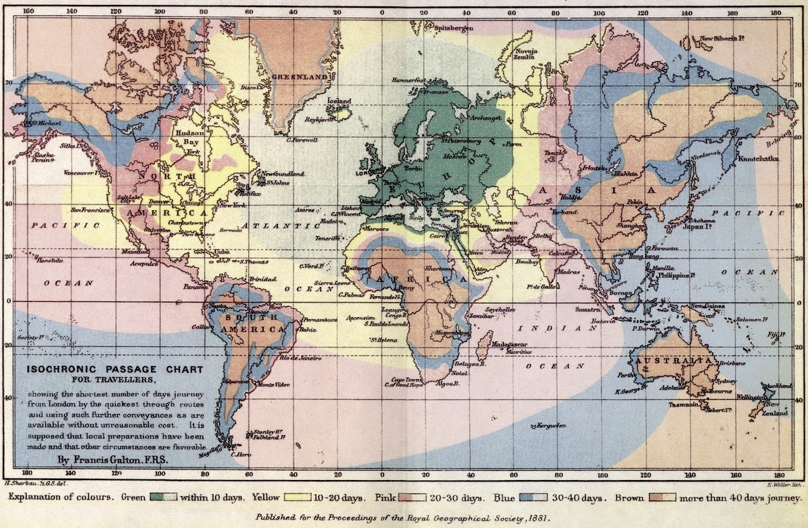
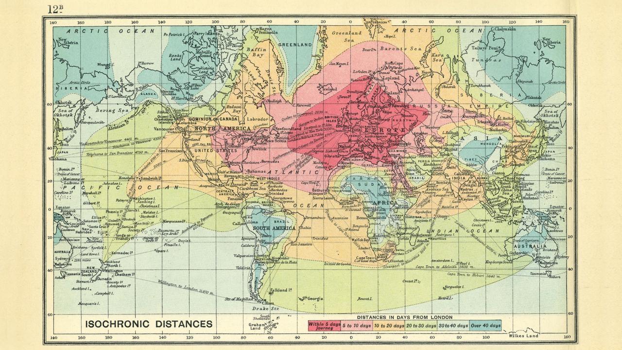
This morning the writer Clifton Wiens alerted me to his friend’s blog Fevered Mutterings where I found the article “How Fast Do You Want to Get There?” which was illustrated with two fine early isochrone maps. The isochrone/isochronic map is a map of time travel, depicting how long it would take to reach different places from a central point, the variants detailed in colors. (For the record they all seem to assume good or normal or scheduled arrivals and departures, good weather, no impudent problems…so you probably would have to calculate for longer times, given the nature of the beast in the 19th/early 20th century.) In any event, I wanted to reproduce them here along with others that I find.
The first of the maps is probably the first of the isochrones, made by the very-multiply-talented Francis Galton. It appeared in 1881(and then again in 1882) in “On the Construction of Isochronic Passage Charts” in the Proceedings of the Royal Geographical Society (Royal Geographical Society) page 657.
 [Source: http://feveredmutterings.com/fast-travel]
The next example is by John G. Batholomew with his Isochronic Distance Map and Chart which was first published 1889 (and then again in 1914) in his Atlas of Commercial Geography or earlier
[http://feveredmutterings.com/fast-travel]
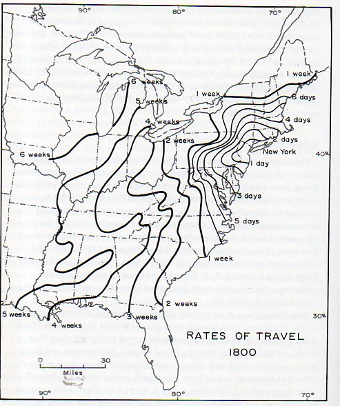
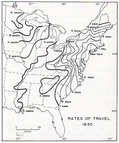
The following maps are not quite the same, being historical and retroactive, and show rates of travel in the U.S. over certain decades (and seen earlier in this blog in the post “Time Travel in the Early U.S., 1800-1857” https://historyofideasblog.com/thesciencebookstore/2012/02/travel-time-in-the-young-republic-1800-1830.html:
[Source: Allan R. Pred Urban Growth and the Circulation of Information, 1790-1840 (Harvard, 1973)]
[Source: Allan R. Pred Urban Growth and the Circulation of Information, 1790-1840 (Harvard, 1973)]
Sources and Notes
Another good collection of modern isochrones can be found here: http://www.citymetric.com/transport/its-christmas-so-here-are-11-beautiful-isochrone-maps-showing-travel-times-different
Another view of the Allan Pred maps can be found here: Michael Graham Richaard, “How fast could you travel across the U.S. in the 1800s?” http://www.mnn.com/green-tech/transportation/stories/how-fast-could-you-travel-across-the-us-in-the-1800s
Also, another older map is by Albrecht Penk’s “Isochronenkarte” first published 1887 “Isochronenkarte der österreichisch-ungarischen Monarchie”. Deutsche Rundschau für Geographie und Statistik: 337
https://www.1843magazine.com/places/cartophilia/time-travel 1914 map
The Galton map is also found here: https://upload.wikimedia.org/wikipedia/commons/8/86/Isochronic_Passage_Chart_Francis_Galton_1881.jpg