A Daily History of Holes, Dots, Lines, Science, History, Math, Physics, Art, the Unintentional Absurd, Architecture, Maps, Data Visualization, Blank and Missing Things, and so on. |1.6 million words, 7500 images, 4.9 million hits| Press & appearances in The Times, Le Figaro, Mensa, The Economist, The Guardian, Discovery News, Slate, Le Monde, Sci American Blogs, Le Pont, and many other places… 5000+ total posts since 2008.

Category: Color & its advanced Abuses

  • A Killer Green…Literally. (1877)

    JF Ptak Science Books  Quick Post

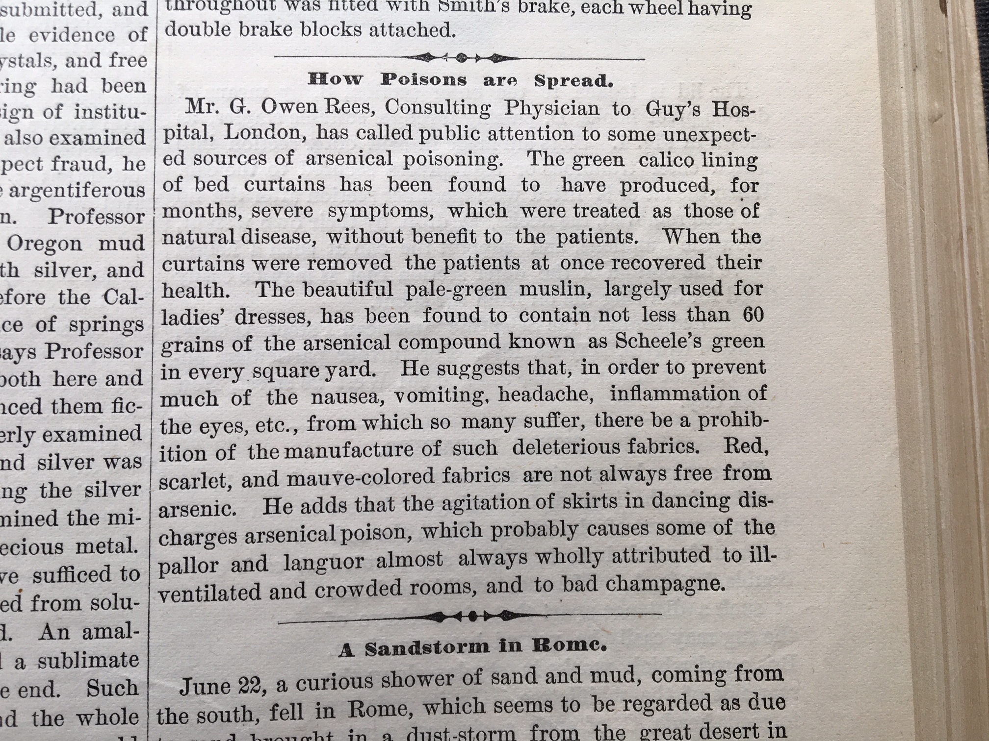
    IMG_2083This is a short Sherlockian episode found in the pages of the 1877 volume of Scientific American. It seems that people were becoming ill for unknown reasons (and not further specified in the short note) that soon was found to be: the color green. Green pigment. Green pigment in the fabric of the patients’ bedroom curtains.

    It was found that once the curtains were removed, the patients recovered.

    The green in this case was called Scheele’s Green, named for its inventor, the German/Swedish chemist Carl Wilhelm Scheele, who brought it into the world in 1775. Unfortunately it was found that this green was particularly toxic, as it employed a large quantity of arsenic, which proved to be unstable and became a noxious chemical pollutant.

    It was replaced in the late 19th century by other greens (such as cobalt green), though it did have a short rebirth in the 1930’s when it was used as an insecticide. This was in marked contrast to its earlier use as a food dye for candies.


  • Color, in Living Color! Occasional and Segmented Brutalist Design in Data Visualization. (1944)

    JF Ptak Science Books  Quick Post        

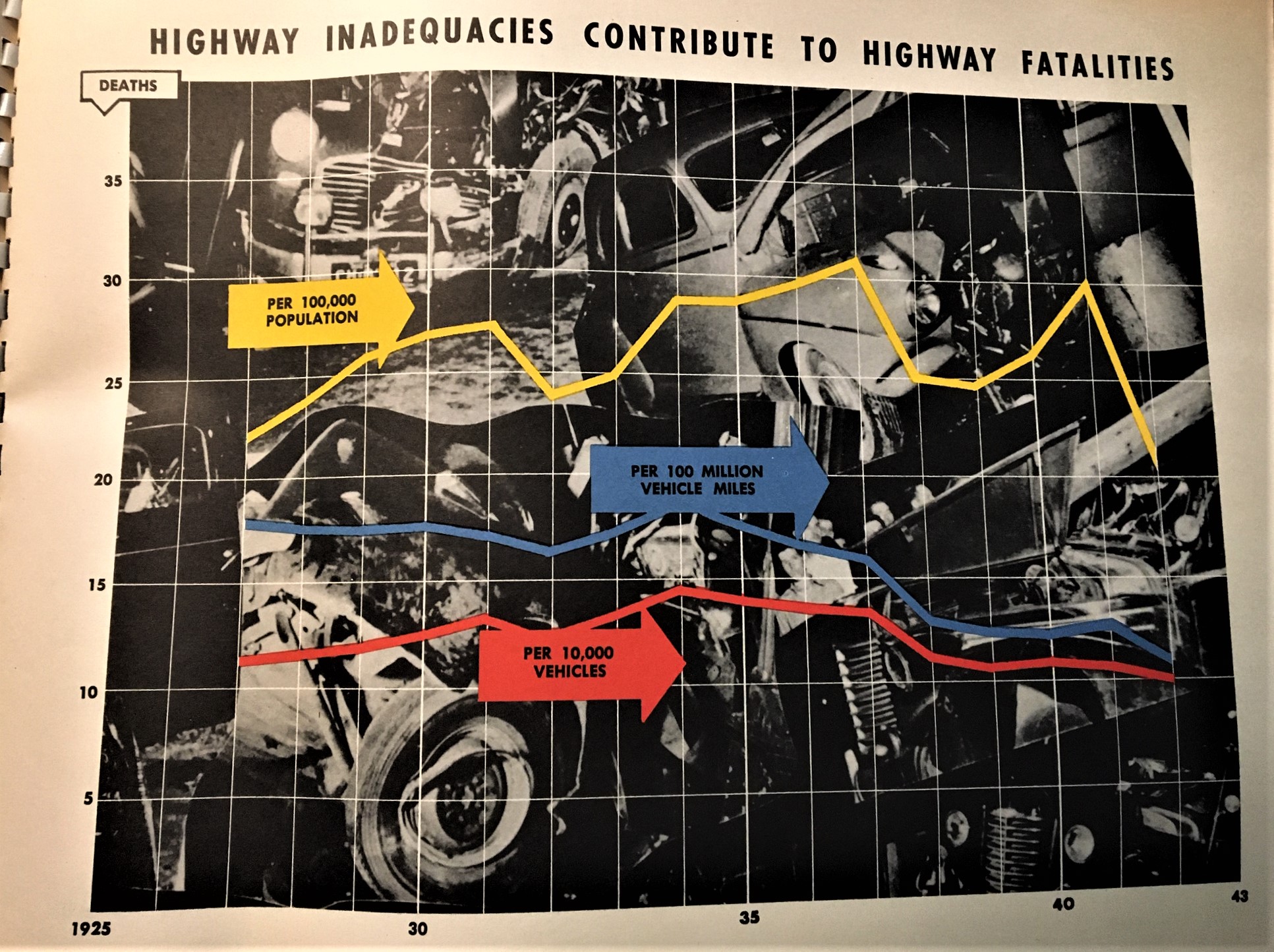
    I’ve made a number of posts to this blog on color and the lack of it (for example, see the series on “Color and its Advanced Abuses”) mostly concentrating on MONUMENTAL color or the lack of it when it could have been there (this, for example, exemplified in a beginner book on color theory with illustrations in glorious black and white). Today’s example comes from a oversize pamphlet called The Story of Highways, which I think was a vehicle used to deliver highway stats to crowds of congressional interest. The 16″-wide pamphlet contains 26 graphs/charts that reproduce 30″x 40″ posters used in a presentation somewhere to justify federal money spent on highways during WWII.  Some of them are unexpectedly colorful, very flat, and as I said in the title of this post, somewhat Brutalist in design. It isn’t quite Soviet Style or Brut Soviet, but there are those elements that I think are pretty noticeable. And if not, they’re interesting to see.

    IMG_1912


  • ROYGBV Redux via Emily Vanderpoel’s “Color Problems” (1903)

    JF Ptak Science Books  Quick Post

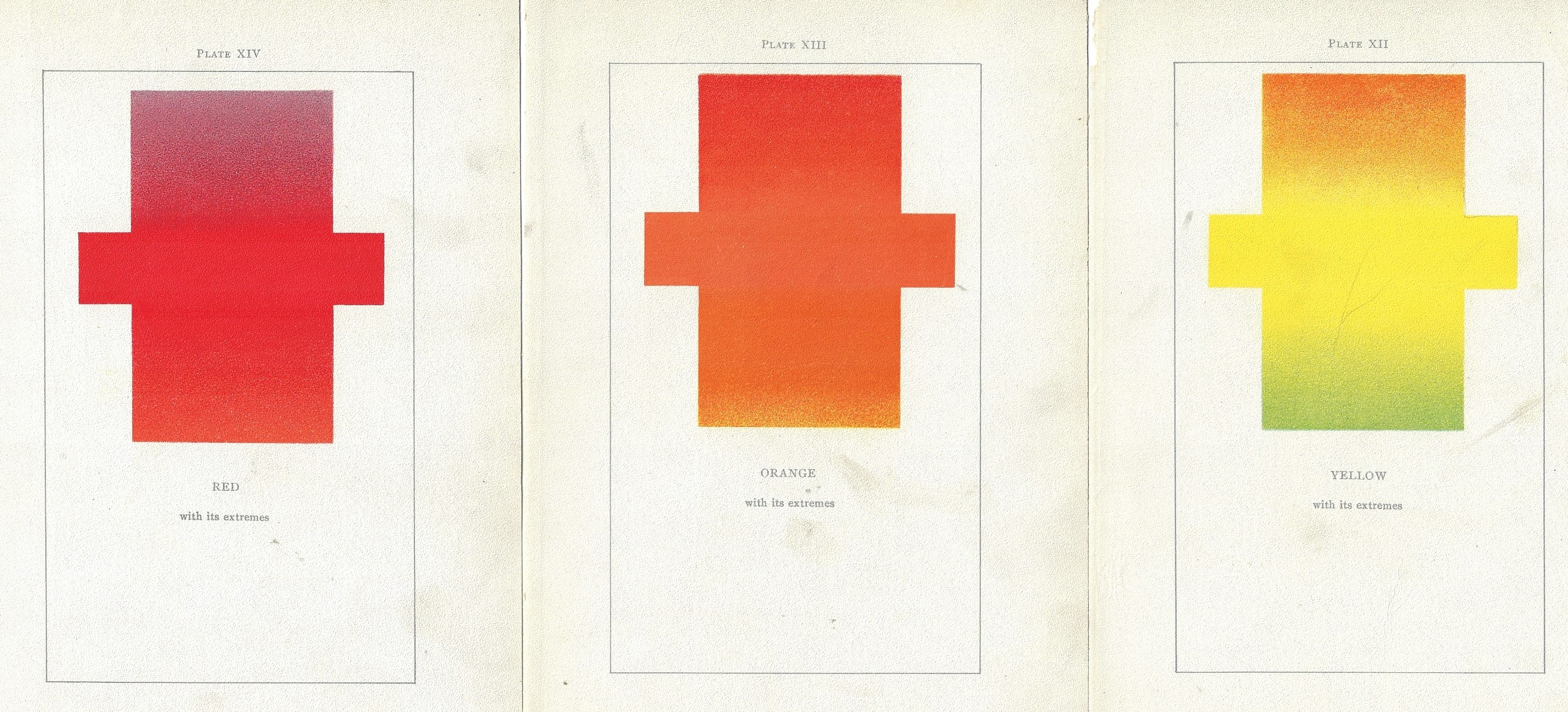
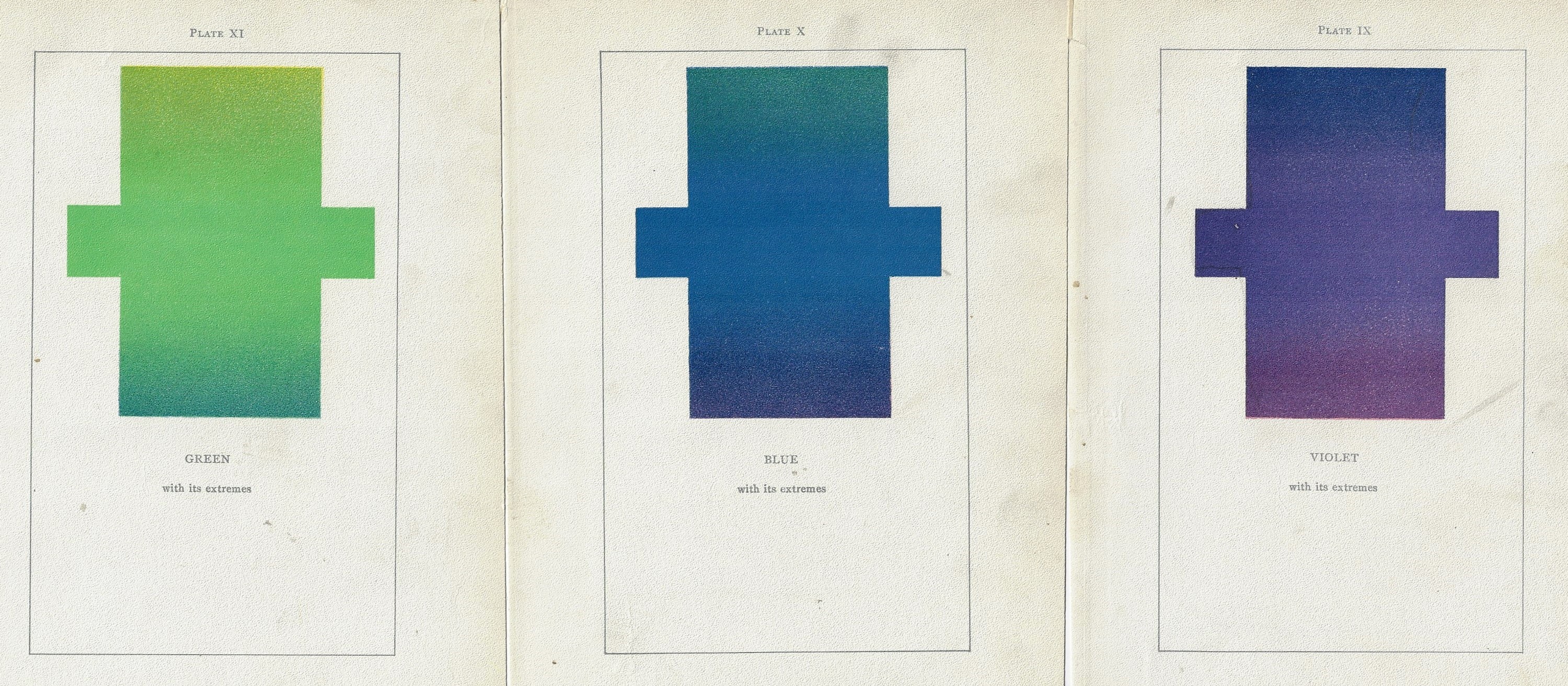
    Just on the heels of yesterday’s post of RIYBBV vs. ROYGBIV comes this lovely discovery in the highly unusual and original work by Emily Vanderpoel, Color Problems of the Layman, printed in 1903, a gorgeous but mysterious book in which she sought not so much to analyze the components of color itself, but rather to quantify the overall interpretative effect of color on the imagination.  I know this sounds begging and vague, but I really haven’t been able to make much headway in her theory.  Ms. Vanderpoel looked deeply and arithmetically into art—she also produced a numerical grid of the artwork that she analyzed, going a step further to re-order the reality of the painting into a representative 10×10 square, distributing the color sense according to a secret algebra that I cannot identify.

    Color vanderpoel roygbv _1_ Color vanderpoel roygbv _2_


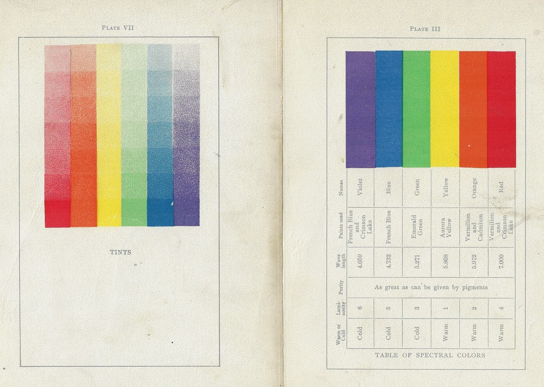
    The series is preceded by a further presentation of the colors side-by-side (and reversed) as well as another plates of the colors side-by-side presnting their gradient tints:

    Color vanderpoel roygbv _3_And lastly, those lovely plates, larger:


  • ROYGBV, ROYGBIV, and Waiting for Josef Albers

    JF Ptak Science Books  (Really) Quick Post

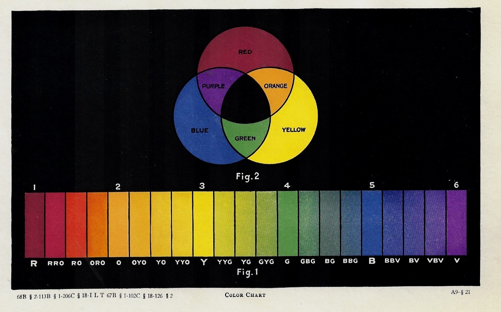
    What’s the dealing with indigo—the missing “I” in ROYGBV—anyway? And what about cyan? And what about those blocks of colors at the bottom, at this time in print history waiting for the appearance of Josef Albers to put them to artistic use in contradistinction? There’s so much is so relatively little in this tiny part of the em spectrum, sandwiched there between UV and IR, and that sandwiched by X- and microwaves, and then gamma and radio waves?

    Color Chart ROYGBV

    I guess this print calls out for a little bit on color and music and the piano, but not tonight. 

    Source: unknown, though I’d guess this to be printed ca. 1900.  


  • The Effigies of Sidney Greenstreet, The Beaver, and Raymond Loewy: from B+W to Color (1944)

    JF Ptak Science Books  Post 2723

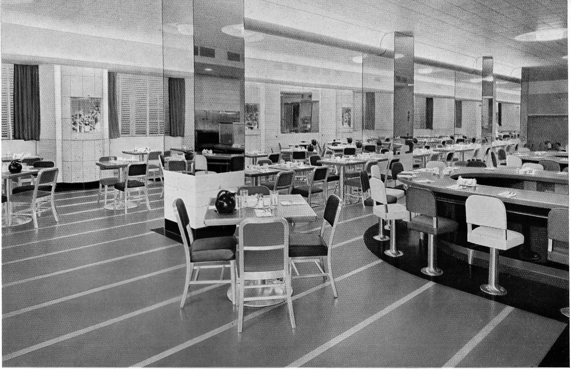
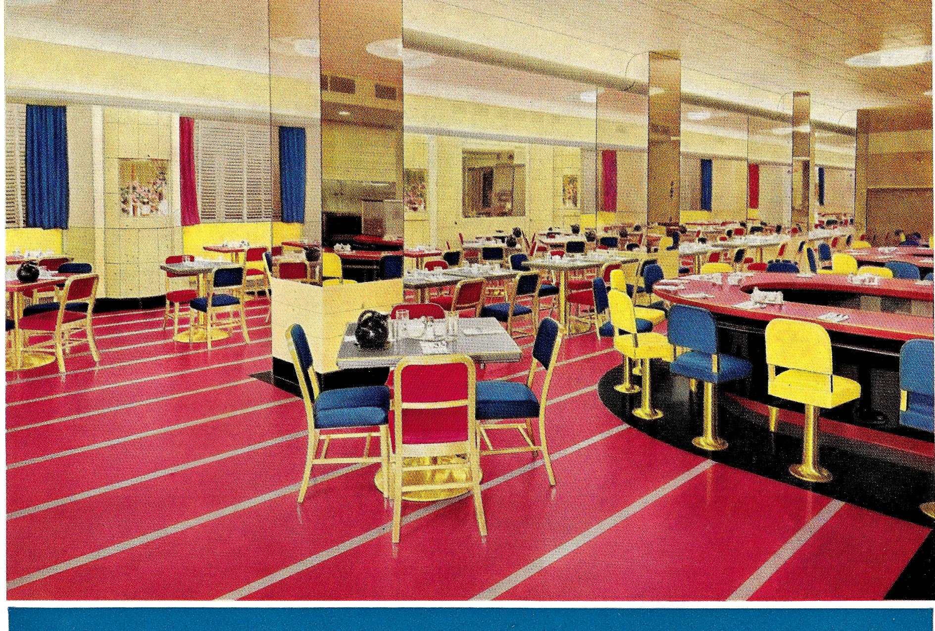
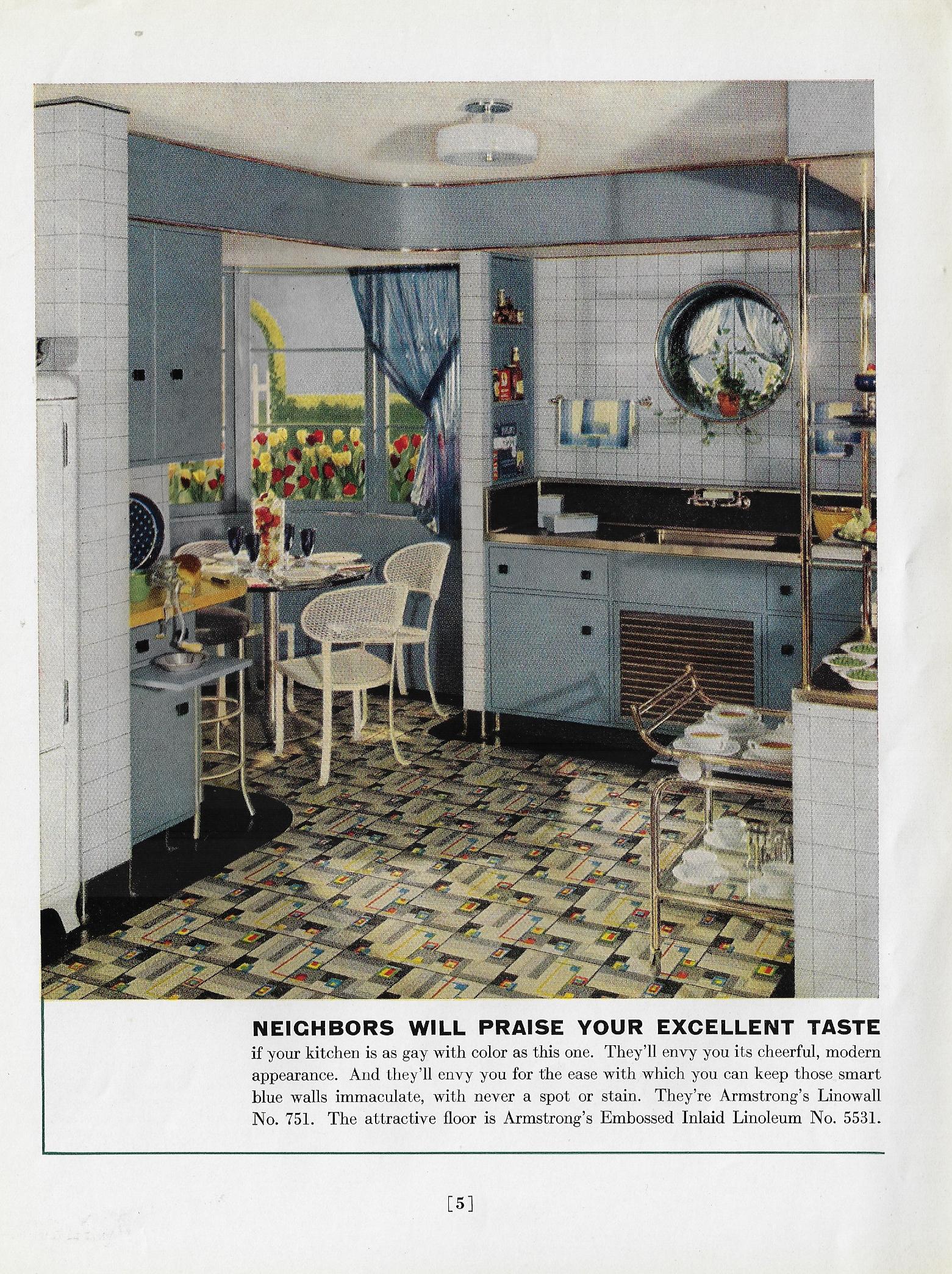
    Here’s another in this series of fabulous color in 1930’s and mid-1940’s designs, and the third from the Armstrong Cork Company and their sales pamphlets for their linoleum flooring (Better Floors for Better Business, printed in Lancaster, Pa.).  As I’ve said earlier, it is somewhat jarring to see these designs in color when we’re so trained from the pre-color movies to see them in all of their tremendous facets of black & white mixes. It is hard to think of Sidney Greenstreet gliding across a room or through a restaurant that is bathed in nothing but shades of gray, when in fact he could’ve been wearing a brilliant plum-colored suit and moving across a flaming red floor. And in this case, with Armstrong, they did indeed make flaming red flooring–and in stark contrasts with yellows and blue designs.

    So I decided this time to take five examples of these designs and contrast them in color and then in black and white–it is an interesting little exercise in expectation and what our heads have been trained to see in old films. (All of the color images are as found in the Armstrong catalog–no enhancement.)

    So, for example, the Hotel Pennsylvania coffee shop, NYC (a Raymond Loewy design!), as expected:
    Color armstrong _1_ bw_0001

    And then, the shock of non-recognition (apologies to Edmund Wilson and William Gaddis):

    Color armstrong _1_ color_0001

    Unexpected, no?  It reminds me of seeing a b+w episode of Leave it to Beaver, where the Beaver buys himself a suit and his parents are completely done-in by its color, which of course on the tv looked like pretty much everything else. 

    Here’s four more, including Postman’s Specialty Shop, 5th Ave, NYC:


  • Black & White in Color, Part V

    JF Ptak Science Books  Quick Post

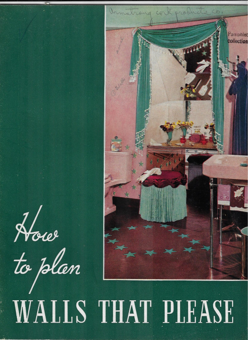
    This is another installment in a series on putting color into what we normally would think of in terms of black and white photos (and movies)–the results are sometimes surprising and unusual. (There are posts here on the color schemes on 1930’s schoolrooms in Cleveland, air recon in color, color dissonance in 1940’s bathrooms, colorless color charts, and other such bits, all findable by entering “color black and white” int he Google search box.)  The pamphlet below would sound like a simple and badly-titled publication (How to Plan Walls that Please, by Armstrong Cork Products, 1938) if you were just reading about it in a catalog, but in real life, it is a symphony of exploding and unexpected color. At first the color combinations had a somewhat claustrophobic effect, but I think it was mostly because the rooms were small and densely packed–once that is accounted for, the colors seemed to take on a welcoming attitude…especially in the kitchens, where you’d expect to sit down at one of those small tables and wait for Grandma to serve you some fresh pie.  

    In any event, here are some examples for the pamphlet:

    How to Plan Walls that Please _5_

    How to Plan Walls that Please _5_


  • Oddly Adjectival Color Plumpness, continued (1938)

    JF Ptak Science Books   Quick Post    Part of the Series on Color, Its Uses and Abuses

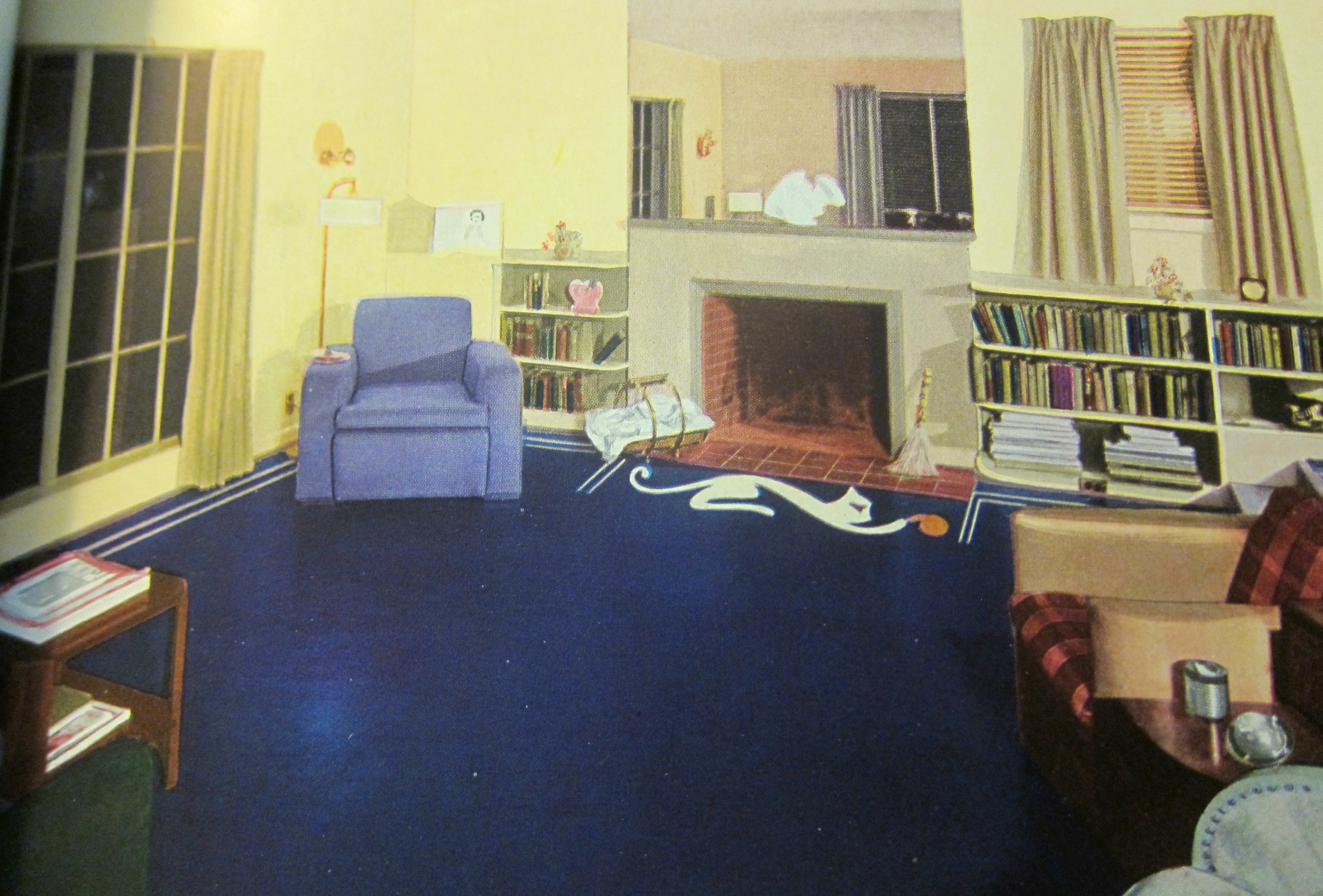
    I’ve written a number of times on what seems to be “extreme” color in the 1930’s  (as in “Oddly Adjectival Opposites: Color Plumpness and Color-in-Black-and-White, 1941” https://historyofideasblog.com/books/2011/02/odd.html) and come to it again today via the weirdly sublime color contrasts of rugs and floor coverings offered in the Bird Rug Catalog for 1938. I’ve thought about and seen so many of these images in luscious grays and stark blacks that it is difficult to think of these same images in gigantic color. It is just hard to picture Mr. Bogart’s eyes and his accusing/weary glance being framed by that blue chair and all of the colors bombarding it. There should I guess be a diacritical of some sort to attach to the vocabulary of colors to express “surprise”, as I could surely employ it in describing that blue linoleum floor:

    Bird catalog _7_

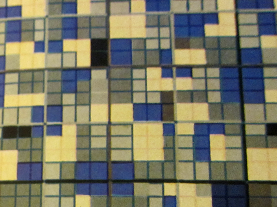
    Deep closeup of flooring:

    Bird catalog _10 detail_


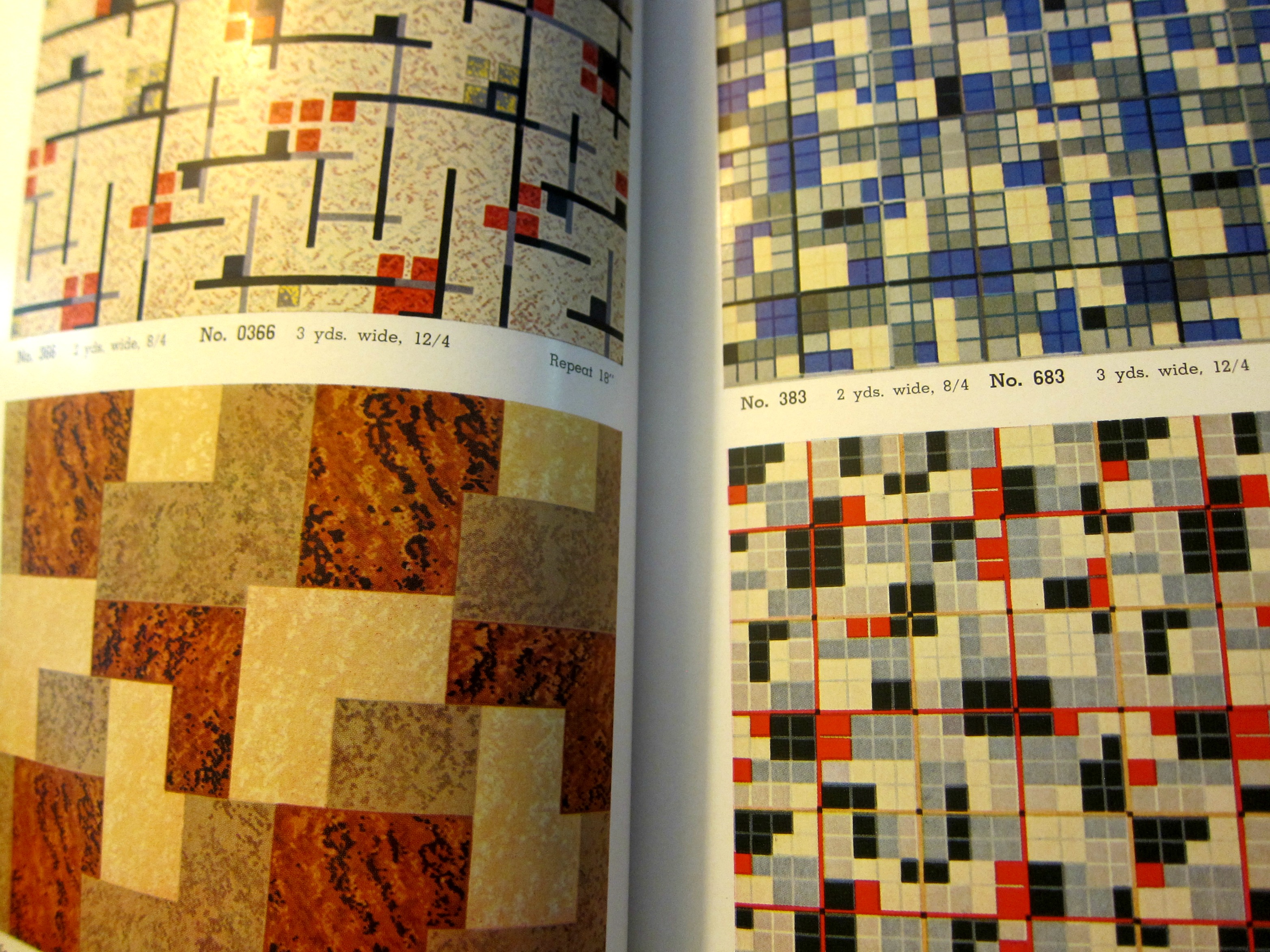
    Flooring details

    Bird catalog _9_


  • Missing the Colors that Are Not There (1835)

    JF Ptak Science Books   Post 2704

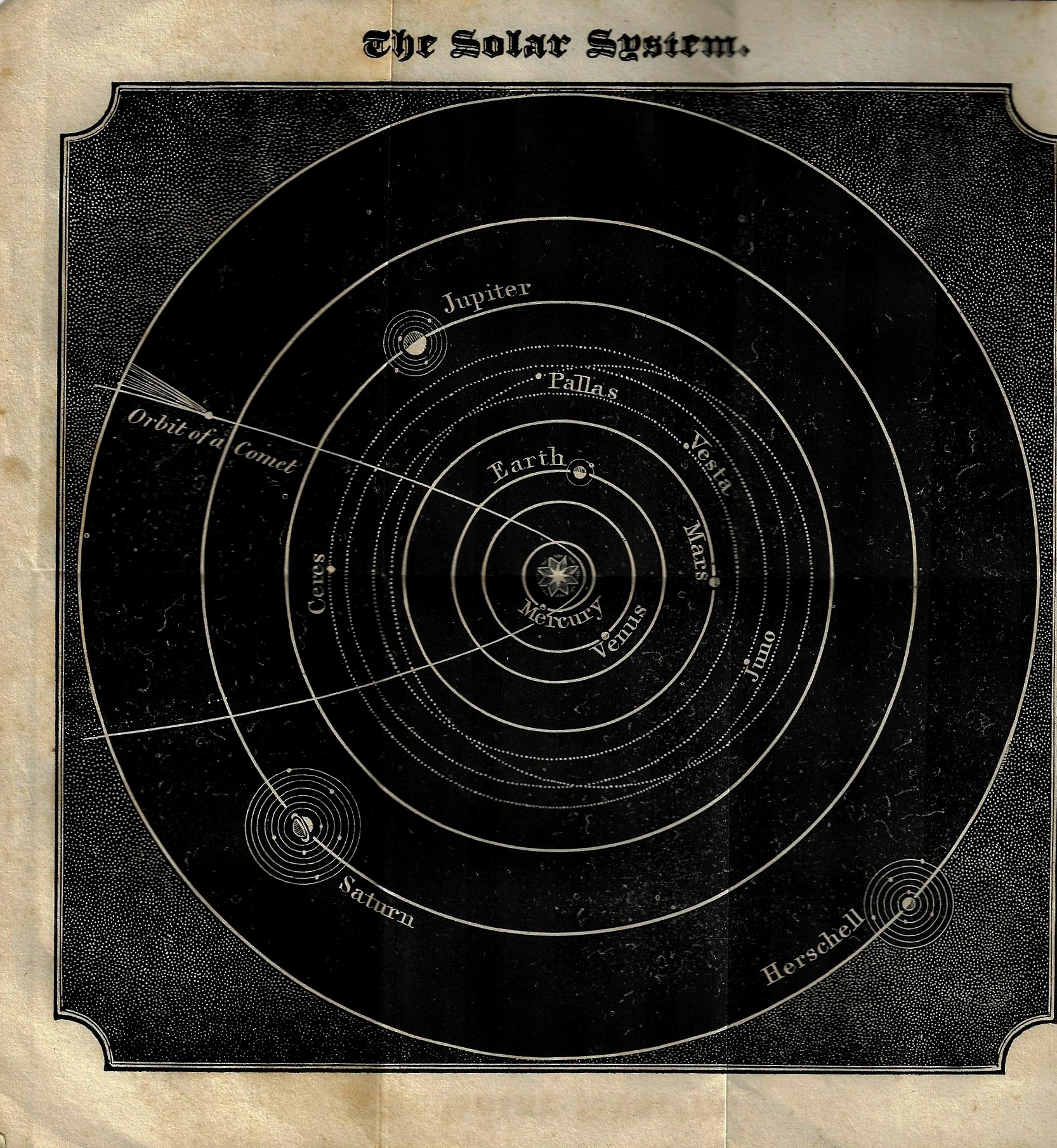
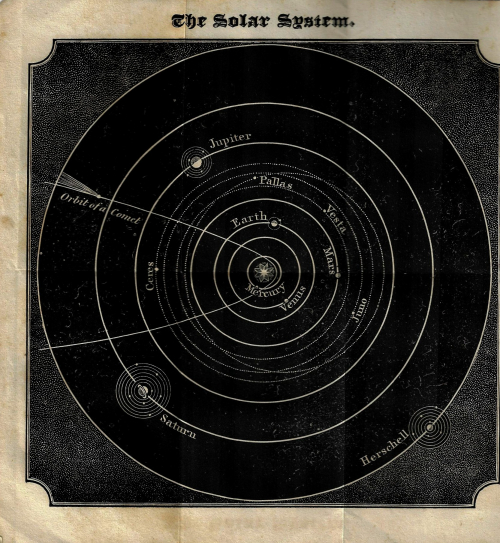
    I don’t know what there is in this engraving that speaks “color” to me when it should probably be just concerning itself with the blackness of its deep black (which for me is usually the case). Neither the blackness nor the dimensionality of the thing–it seems to give itself some height and depth at the same time–say anything louder than the representation of its missing colors, which we are clearly seeing nothing of in these wavelengths except that there really aren’t any colors here outside of the beautiful black & white.  The contrast is certainly there (“There are dark shadows on the earth, but its lights are stronger in the contrast.” Charles Dickens, The Pickwick Papers), especially in the corner bits, where on closer inspection the blackness is really more white than black. In any event, the print suggests “color” to me for no good reason, except perhaps that it looks very cold, and cold is suggestive of ice blue, and the good contrast for that is yellow. “The sound of colors is so definite that it would be hard to find anyone who would express bright yellow with base notes, or dark lake with the treble.” so wrote Mr. Kandinsky, who saw colors in his sound, and who in the midst of things wrote four experimental pieces of theater based upon this observation, the first and perhaps most prominent of which was called “Yellow” (1909).  And that is why this old engraving seems “yellow” to me (and this without any benefit of synesthesia).

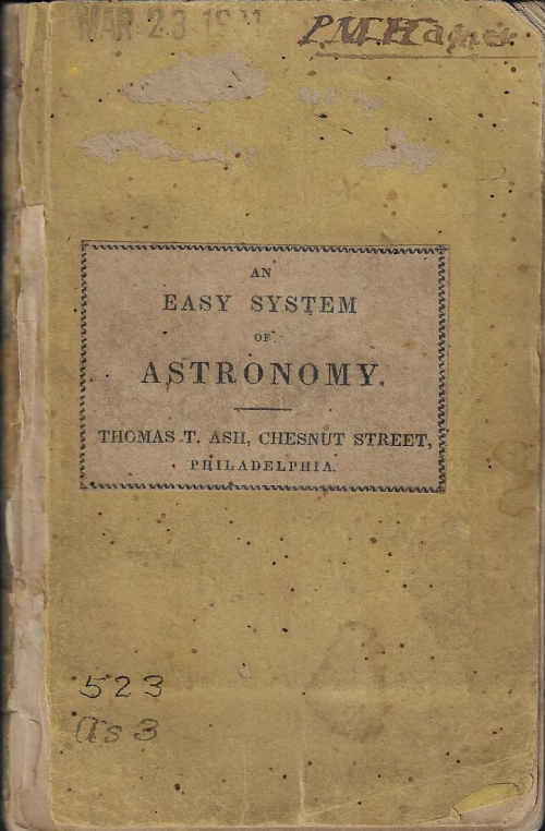
    The image in question, from An Easy System of Astronomy, containing an explanation of the Moveable Planisphere, together with a selection of problems, maps &c, intended to either accompany the planisphere or may be used separately in schools. This little guy (14cm) was published in Philadelphia in 1835 and unfortunately does not make mention of any detail of the “planisphere” other than that there was one that could be used. (This is evidently relatively rare, with only two copies located in WorldCat/OCLC–Columbia and the National Observatory.) 
    Astronomy easy system

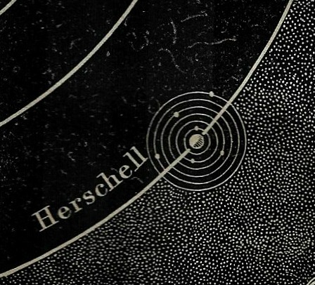
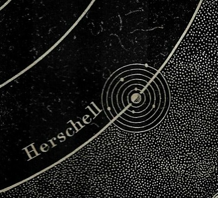
    If there was an equal weight assigned to white and black, the white in the corner sections may well outweigh the black, which also happens to show the planet “Herschell”. This was the first planet discovered since antiquity, and was done so by the Hannoverian Brit Friedrich Herschel, who found it in 1781 and who lived with its immediate fame for another 41 years until his death in 1822. Herschel, an enormous astronomical talent who also played and composed, proposed the planet be named  in fidelity “Georgium Sidus” after George III, though that name didn’t stay on the planet longer than a quick shadow. The French astronomer Lalande (who could probably not for genetic /national reasons use the name for George) suggested the planet be named for the discoverer, “Herschell1“, which really wasn’t that terribly popular though it did last for five or six decades, succumbing finally to Bode’s suggestion of “Uranus”. 
    Astronomy easy system detail

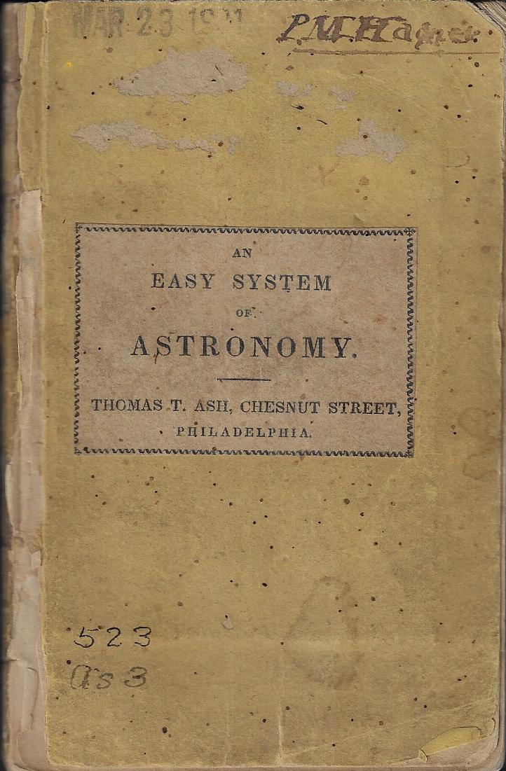
    This is a folding illustration for the following, which here appears much larger than the thing is in its real life, standing as it does only about 5″ (130mm) tall:
    Astronomy easy system cover


    Notes

    1.  From the entry “Uranus” from the Oxford English Dictionary:

    1783   New Rev. Apr. 325   Notwithstanding Mr. Herschel’s having named his planet the Georgium Sidus, Mr. Lalande persists in calling it the Herschel, Mr. Bode proposes Uranus, Mr. Sivry Cybele, and Mr. Prosperin, Neptune.

    1802   O. G. Gregory Treat. Astron. 128   By some astronomers it is called Herschel, in honour of the discoverer; though among almost all foreigners, it has acquired the name of uranius, which it is likely to retain.

    1830   Encycl. Metrop. III. 498/1   Both these appellations are, however, now nearly become extinct, that of Uranus being almost universally adopted

    1860   D. Olmsted Mech. Heavens 267   Uranus was the remotest known planet..until the discovery of..Neptune.

    1902   N. Amer. Rev. Aug. 225   Jupiter, Saturn, Uranus and Neptune are in too primal a state of fluidity and gaseousness to support life.

  • Color and Its Abuses–the New York World’s Fair, 1939

    JF Ptak Science Books   Post 2569

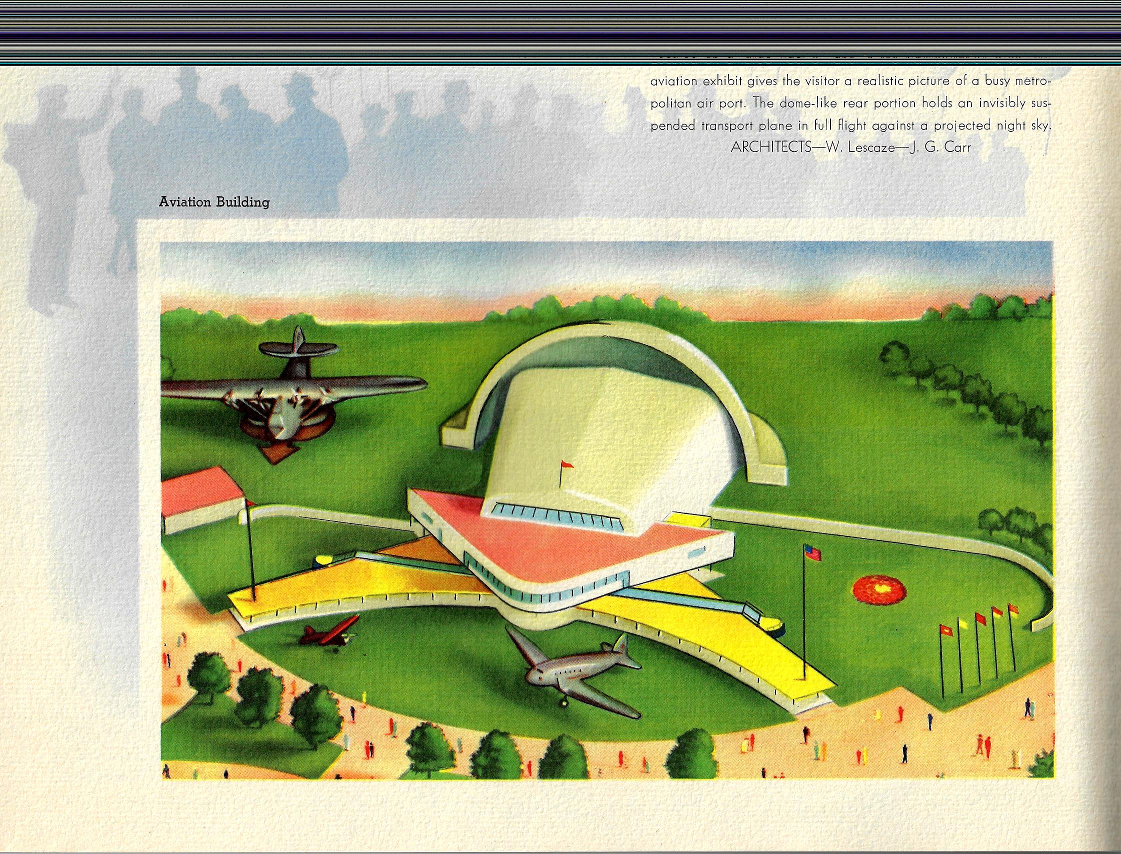
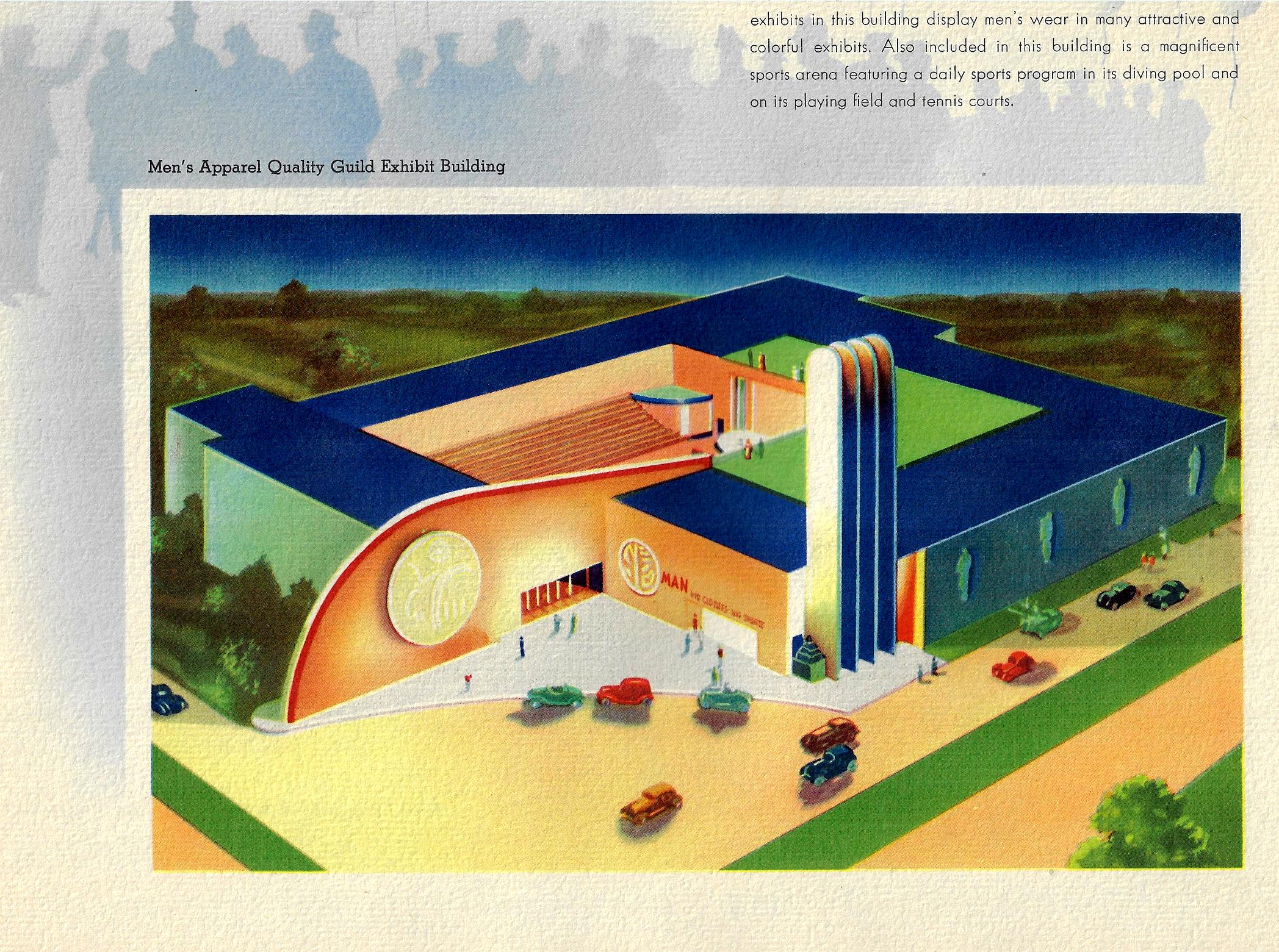
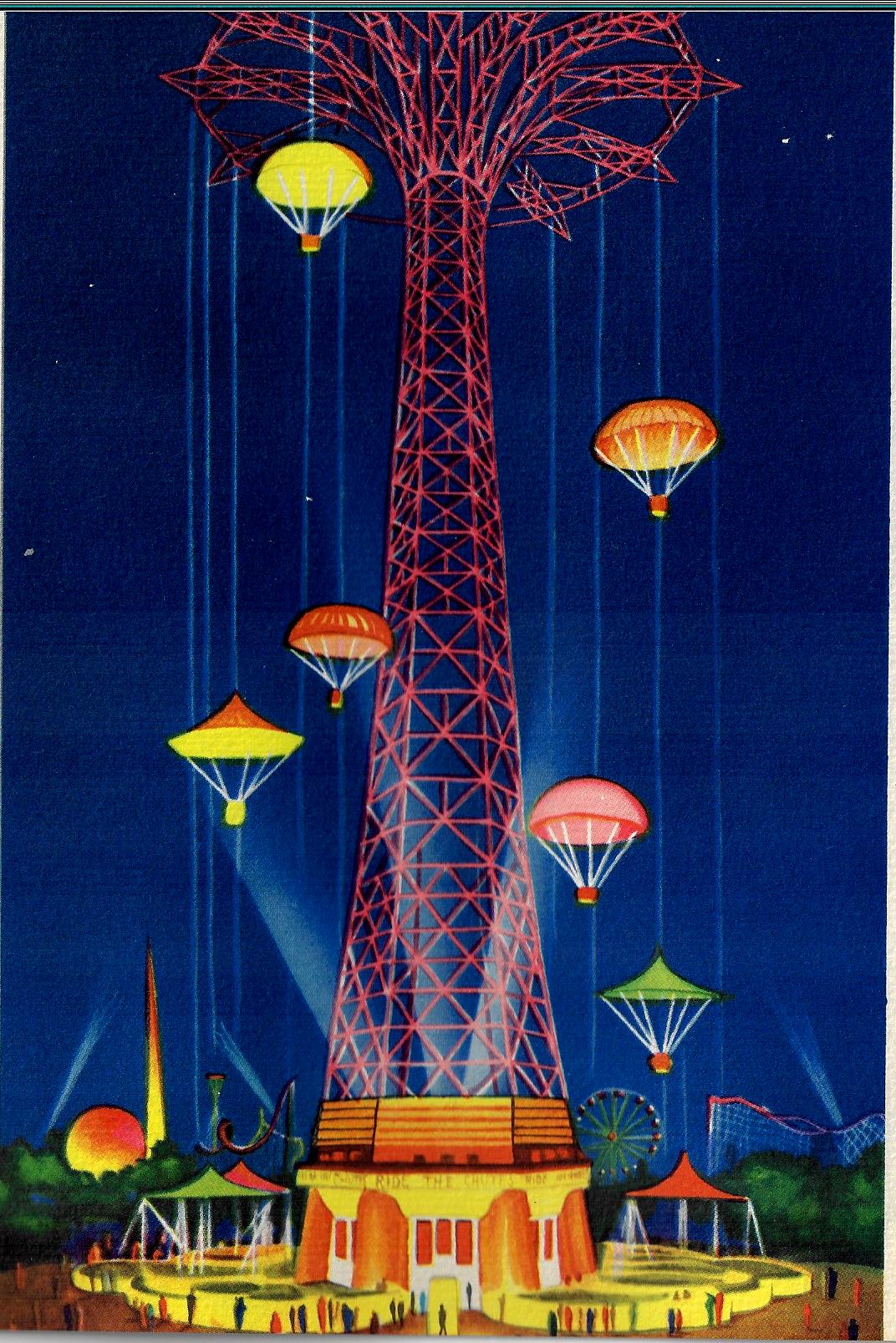
    Color and its use and abuse is a very personal thing—especially the “abuse” part. The pamphlet below (Views of the New York World’s Fair, 1939, and published that year) to me is certainly one of those entries in the history of the abuse of color, not so much that the colors used in it are odd together, but the saturation of color across the board leads to something like Splendorama hyper color. I’m not sure why the colors are like this–they remind me of a color equivalent of a laboriously and not-very-good translation of a tech manual. It isn’t as though color printing was new in the publishing industry, as books had been printed in different colors besides black for at least 300 years by this time;  even full-color printing had been around for 120+ years, so it isn’t as though they were experimenting with the color equivalent of newly-available typefaces in a 1985 word program. Color photography in books is brand new at this point, the wide-scale use taking place this year, but these images are not photos, so I doubt that this had much of an effect on the creativity of the designer. 

    COlor NYC Worlds Fair 1939 _1_

    Since a few of these images are quasi-sci-fi, I even wondered about the color influence in speculative novels and movies.  Color was very adventurously used int he early sci fi pulps and monthlies, but that stuff was already being employed for two decades by this point so their newness in regard to publishing experimentation is not an issue.  And so far as sci fi and color in the movies goes, that also wasn’t an issue because it didn’t exist yet, as the first color film1 in that genre didn’t appear until Lesley Selander’s awful Flight to Mars (1951).

    Color NYC Worlds Fair airport

    In short, I don’t know what is going on here, color-wise.  

    Color NYC Worlds Fair _3_

    Notes:

    1.  Flight to Mars, from Monogram Studios, was about a manned flight to Mars in 2000,  There was another unusual film, I think it was Destination Moon at about the same time, where the spaceship overshot the Moon and went to Mars instead. This note though is in regard to the Georges Melies film, Le Voyage dans la Lune (1902), which did have some color, though that was tediously applied by hand in post production.  (Invaders from Mars (1953), by the director William Cameron Menzies, was the next sci fi flic made in color.  

      Color World fari 1939 _4_


  • Sleeping in Suave-opolis: Vacationing in a Rediscovered Blue (1945)

    JF Ptak Science Books   Post 2612

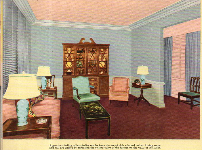
    There’s just something very simple and calming in the arrangement of the colors in these photos–and of course something very different from what one comes to expect in interior design. This is so much so that I think it would be possible to take an entire two-day vacation in a house that is decorated in just this fashion. Your brain would be relieved of the expected and introduced to the soft exceptional with a color palette equivalent of an all-white-food carbo breakfast that one could slide under a bathroom door. I think you would take a seat with a good book, and then fall immediately to sleep–not from boredom, but from the unexpected luxury of color-unusualness and perhaps a little whiff of the grandparent’s house, the colors surrounding you having the optical qualities of the heat from a good fire. If we were seeing movies of folks gathered around the radio and listening to the end-of-the-war stories in 1945 in a set like the images below, we wouldn’t picture the black-and-whiteness to purge itself into this allotment of soft color. 

    The images come from an innocent-sounding pamphlet published by Pittsburgh Paints: Pittsburgh Color Dynamics for Offices, Hotels and Restaurants and published in Pug in 1945.  The cover gives it all away, and then once inside you are immediately invited to the design equivalent of a happy version of Nemo in Slumberland. For example, a living room, begging for someone to sit in and enjoy a cup of coffee while wondering when Joe DiMaggio would be back in pinstripes, and where the smokes were, and what happened to all of the missing artwork: 

    Color indeed a252

    Of course if you spilled coffee on the rug (the color of Ronald Reagan’s shoes) no one would ever notice.

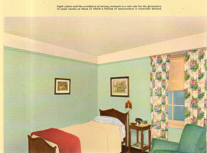
    You could retire for the night after waking up from your color overdose/withdrawal here, a bedroom whdreams are dreamt and things are thunk, and sleep is the biggest thing made: 

    Color indeed b253[The image cropping is at is appears in the original.]

     This all just seems so terribly suave, so above distinction and yet below it.  The “rediscovered” blue (“cascade blue”) that I forced into the title is found here, in one of the pages of color swatches: