A Daily History of Holes, Dots, Lines, Science, History, Math, Physics, Art, the Unintentional Absurd, Architecture, Maps, Data Visualization, Blank and Missing Things, and so on. |1.6 million words, 7500 images, 4.9 million hits| Press & appearances in The Times, Le Figaro, Mensa, The Economist, The Guardian, Discovery News, Slate, Le Monde, Sci American Blogs, Le Pont, and many other places… 5000+ total posts since 2008.

Category: Color & its advanced Abuses

  • Color Blindness and Color Correction

    JF Ptak Science Books  Quick Post  

    “For this condition, I will prescribe, for your information, a marvelous cure, the result of my experience in such cases. Take a precious stone we call sapphire. Powder it most thoroughly in a metal mortar and store it in a golden vase. Put a little into the patient’s eye every day and he will soon be cured “– from the Medieval medical text De Oculis, by Benevenutus Grassus, Stanford University Press, 1929, page 58. 

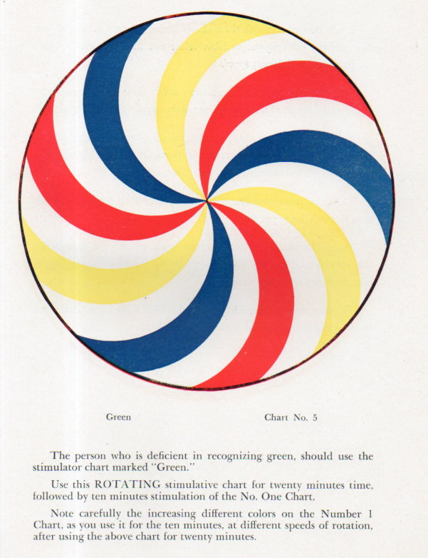
    Color wheels106

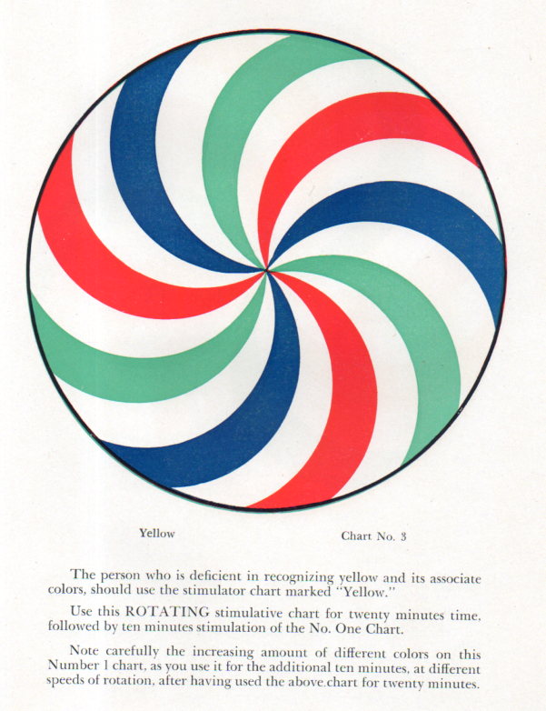
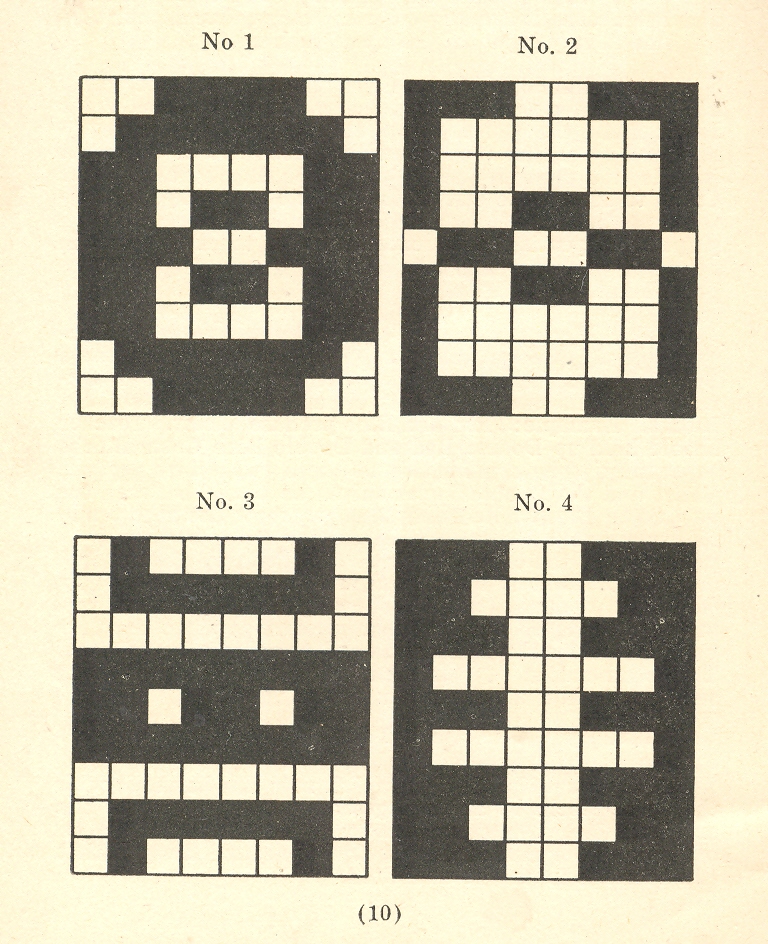
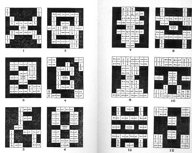
    Admittedly I was more interested in the illustrations in this work1 than the text, mainly (and obviously) because the images are so striking. The text is in its way a pre-scientific attempt at ‘curing” color blindness, which is a genetic disorder.  The color wheels (“variable speed rotary color vision stimulator”) were intended to be rotated to produce different color senses for “color vision stimulation”–it could be used to determine whether or not color vision was being “improved”.

    Most of the work was a sales vehicle for Dr. Newton’s color blindness color regenerators, or whatever, all of which could be obtained from his office in Oakland.  I guess Dr. Newton was trying, but…


    Color wheels103


  • Color in Black & White, and Black in Black & Black

    JF Ptak Science Books   Post 2481

    Earlier in this blog appeared a happy little post of odd uses of color to illustrate color, black and white to illustrate color, and nothing to illustrate something called “Three Map Fits: a Color Map with Color and No Map, a Color Map in Black & White; AND a Black & White Map in White (only)” here. There was an appearance there of a small pamphlet by Albert Coble  (Games of Colors, Kindergarten and Primary Exercises). on the uses of color in kindergartens in which color exercises were presented though no color was actually employed in the illustration, though the general arrangement is clear enough:

        Color--b+w 001

    It is a happy thing that there is a second Coble pamphlet on hand (!, Color Exercises (The Coble Color Tests) Instructions for Primary and Kindergarten Work, 1923 ) and this one though still in black and white now has color designations:

    COlor coble127

    The idea that Coble is writing about (color and kids and the education of young children in the different forms/varieties of color and how colors are produced) is very interesting, and no doubt that the set of color blocks used in the exercises would have been lovely in themselves, but I think the author would have made more headway had he had at least one color illustration. 

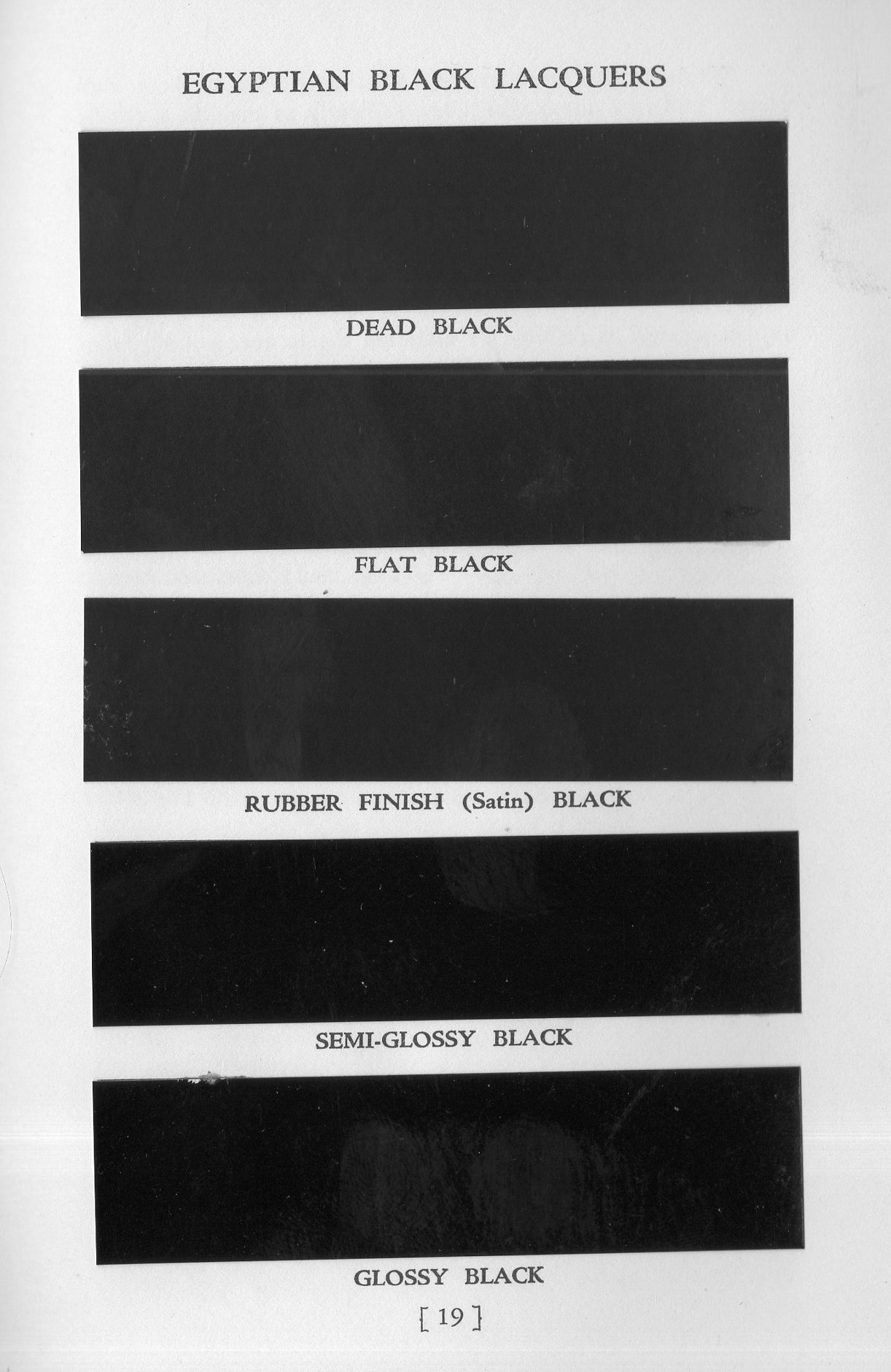
    That said, the world of black & white and grays is a lovely one, and as long as we’re talking about black & white in color, let’s look at a pamphlet that is all about black & black.  Egyptian Lacquer  Manufacturing Company (“Rockefeller Center, NY, NY”) specialized in heavy industrial paints and published some small but fine catalogs to sell their services and products.  One of them, Egyptian Black Lacquer for Industrial Products (1938) contains a paint chip plate to compare its various blacks.  There is nothing finer, really, than a really black black, an all-out black, a midnight-and-no-light-source black, a B-1 stealth bomber black, a Sommerfeld black.  And Egyptian comes really close to a good solid black black, what they called their “dead black”.  I can’t reproduce it here and give this black any justice, as it is hard to reproduce a black with no lustre that isn’t that lacquer/paint itself–but trust this writer, these blacks in real life are as differentiated as their names imply:

    Black black128

    And that dead black?  They mean it.  Or meant it.


  • Dissonance of Color *and* Black & White, 1941

    JF Ptak Science Books  Post 2434    Color and Advanced Color-Abuse series

    Color kill889

    Dr. Benway lining up his colors before weighing them…

    Jarring experiences are good as displacers of the stuff that you’ve come to know without knowing and without explanation because they make you think about these things–along with thinking about why you haven’t though about thinking about them. For example, color: on the low end there is seeing Cary Grant in color (which is half-expected) and then seeing Humphrey Bogart (which is less so). Seeing Star Trek in color for the first time in 1967 at my grandparents’ house (a small miracle in that they only could receive a few stations with a good antenna given the mountains and such in that beautiful and then two-season Great Barrington MA). 

    Color kill886

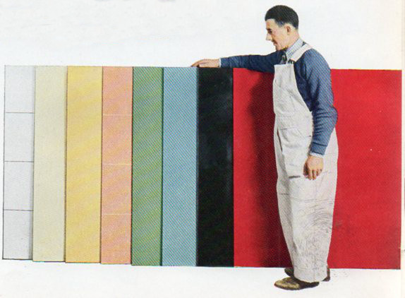
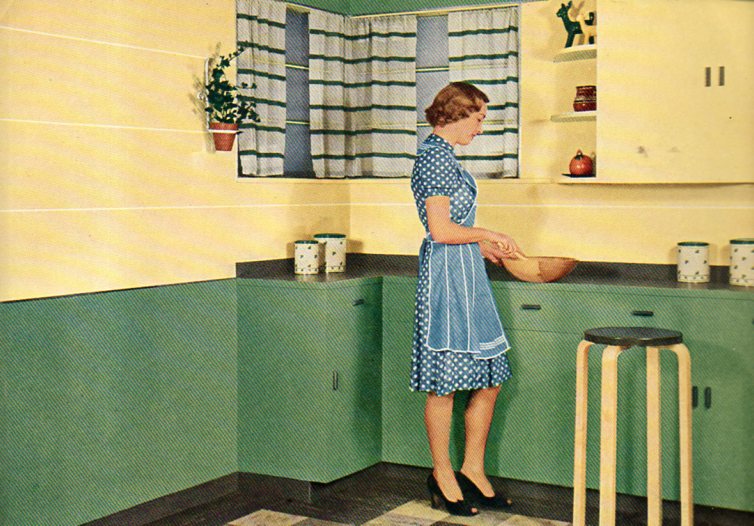
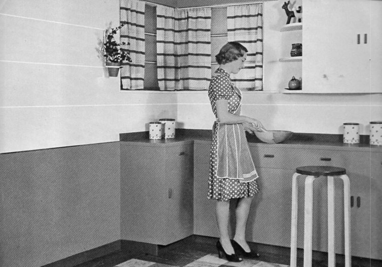
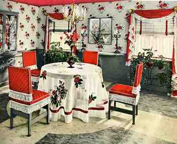
    Color kill887I’m reminded of this today while looking through a decorating pamphlet by Johns-Manville from 1941. The images of the interiors of the Standard American Home started out in the pamphlet in black and white, and then, suddenly, came the appearance of color–and a lot of it, and in unexpected combinations. And then: unexpected colors in the unexpected color.  And in this case, perhaps the new color scheme is not one that is today seen as a beautiful thing.  

    Color in magazines and journals and newspaper was of great rarity before 1939, as color roll film was really introduced until the mid-20’s, and then the first book illustrated with color photographs didn’t appear until I think 1938 (was it an Agfa catalog, or Zeiss?).  In any event, the book/pamphlet illustrated with color photos was still a very newish thing when these photos appeared in the Johns-Manville The Home Idea Book 1of 1941

    Color kill888

    It is an unusual exercise–for me, anyway, a mostly b+w guy–to imagine these colors, together.  It is also surprising because my experience with so many of these catalogs is from an earlier period and the majority of them were illustrated with black and white photos or color drawings, or colorized photos. To see the color of the real walls and doors and tiles and carpeting is jarring.  


  • Lost German Color of 1927

    JF Ptak Science Books    Post 2387

    [Part of the series on Color and its Abuses, as with an example of “When Color is Best in Black-and-White”, here.]

    German color375
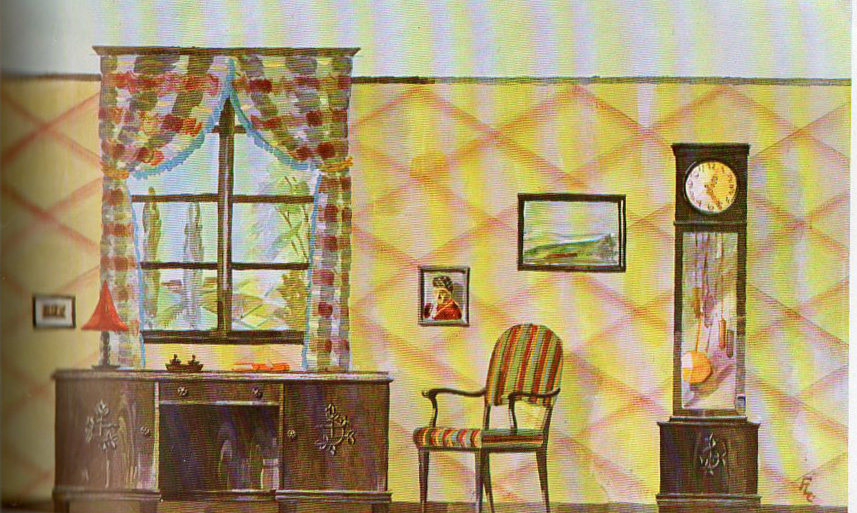
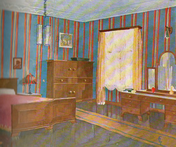
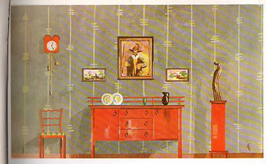
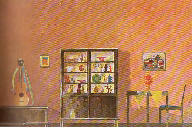
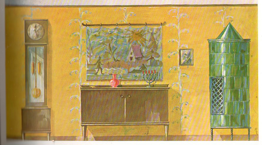
    Nothing quite says no-color as German deep noir of the mid- and late-1920’s.  These movies can be so deep and contrasted, so very black-and-white, with such stark Moon-like shadows, no dawn or dusk just night and day, that it can make you forget that outside of the photographs and movies that people were moving around in great swirls of color.  And nothing quite helps you to remember this than by having a look at a book like one below, a DIY piece printed in Berlin in 1927, the Farbige Wohraume1.

    German color377
    It is of interest here because in addition to blueprints and sections of the furniture to be built, there are associated illustrations showing the completed work placed in a decorated room.  And it just so happens that these rooms are highly, colorfully decorated–not that there’s so much in the room, per se, but there is definitely a lot of color. 

    German color371

    German color372

    Notes:

    1. Farbige Wohnräume, 24 Tafeln farbig dargestellter neuzeitlicher Räume (5 Wohn-, 6 Speise-, 6 Herren-und 7 Schlafzimmer) mit den einzelnen Nöbeln im Masstab 1:20. Dazu weitere 24 Tafeln mit den zur Anfertigung erforderlichen Grund- und Aufrissen und Detailschnitten einschliessich der Sitzmöbel.  Berlin,  Verlagsanstalt Deutschen Holzbeiter Verbanes GMBH. Rebound in library cloth, very nice, workable copy.  37x26cc, 24 color plates of room designs, followed by 24 heavy leaves of associated blueprints printed front and back, these showing a profile of the furniture to be constructed on recto and some cutting instructions on verso.  The color illustrations of the furniture in a room setting is correlated with the blueprints in rear, each of the color plates with a corresponding sheet of blueprints.  Only four copies located in WorldCat: Yale, University of Illinois, Grand Rapids Public Library, and Cornell. 

    German color373


  • When Things ARE Better in Glorious Black & White: Color Detonation and the Invention of *More* Primary Colors, 1942

    JF Ptak Science Books   Post 3286

    00blogoct_14color848Well: this is a variation of yesterday’s post on the two opposite edges of color in oddly-applied scientific/technical manners. In unwittingly responding to the question “when is color-use bad?”, the answers were found in these room decorations from 1942, all of which come from a pamphlet entitled Ideas for Old Rooms and New, extracted from the mind of  Hapel (?) Dell Brown.  It is a tidy book with ideas that are anything but tidy;and  as you scroll down you’ll see that the room solutions suggested by Hapel Del are anti-tidy; clutterous (no, not a word but could be).  Everything about these creations speaks to the annihilation of visual resting places; everything seems to be an affront to the concept of causal emptiness.  The weird thing is that there aren’t very many objects in these rooms at all (at least comparing these rooms from where I’m sitting)–the visual complaints seem all rocketing from the abuse of colors found in the fabric of the furniture and walls and floors and window treatments.  The eye gets no rest–and as a matter of fact, the cones of the eyeball are impaled on the rods as a result of the author/decorator  desperate attempts to invent three more primary colors. 

    Believe it or not we don’t really get the full flavor of the color cacophony because the floors in these picture look sort of benign, fading away into themselves–which they are not, according to  the description in the text, because they are all high-gloss linoleum rolls or tiles (“efused [sic] with deep wondrous color”.  And that means not only are these floors adding sheen and color to the rest of the incredibly colorful–an effect fairly lost in these photos–they are also cold.

    One thing that I haven’t pointed out in this peon to syrupy/pastel-y/techno-gelatinous-chromodrama is that they were all done in response to a re-decoration of a perfectly nice-looking house, with all of the former “bland” colonial-style rooms presented in glorious black and white.  I’d rather live in Maison Noir than in this happy nightmare.


  • Putting Black-and-White Back into Color: 1930’s Schoolrooms

    JF Ptak Science Books    

    Color school592

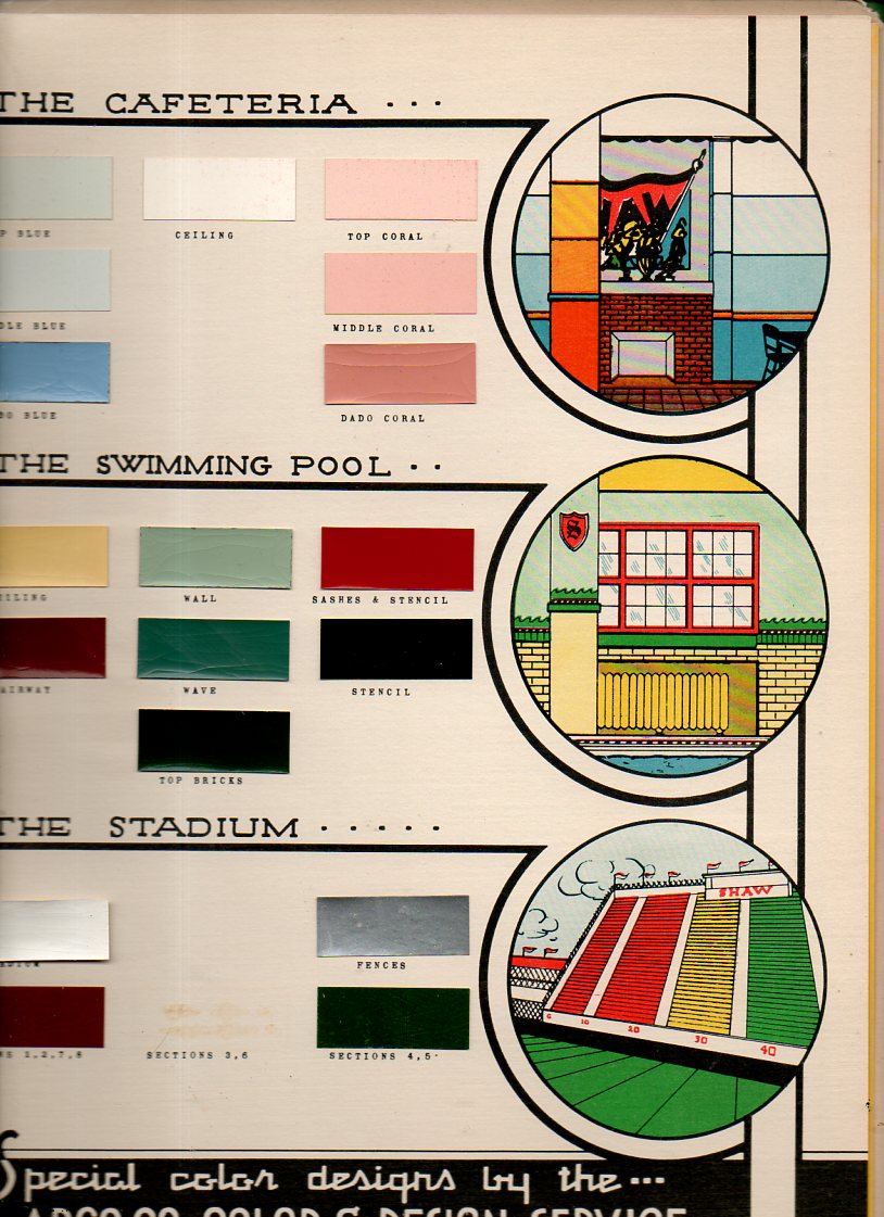
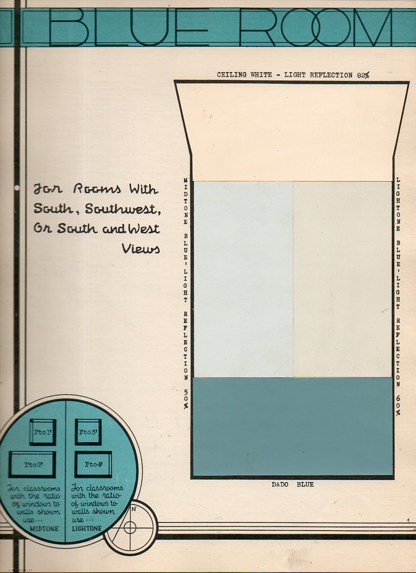
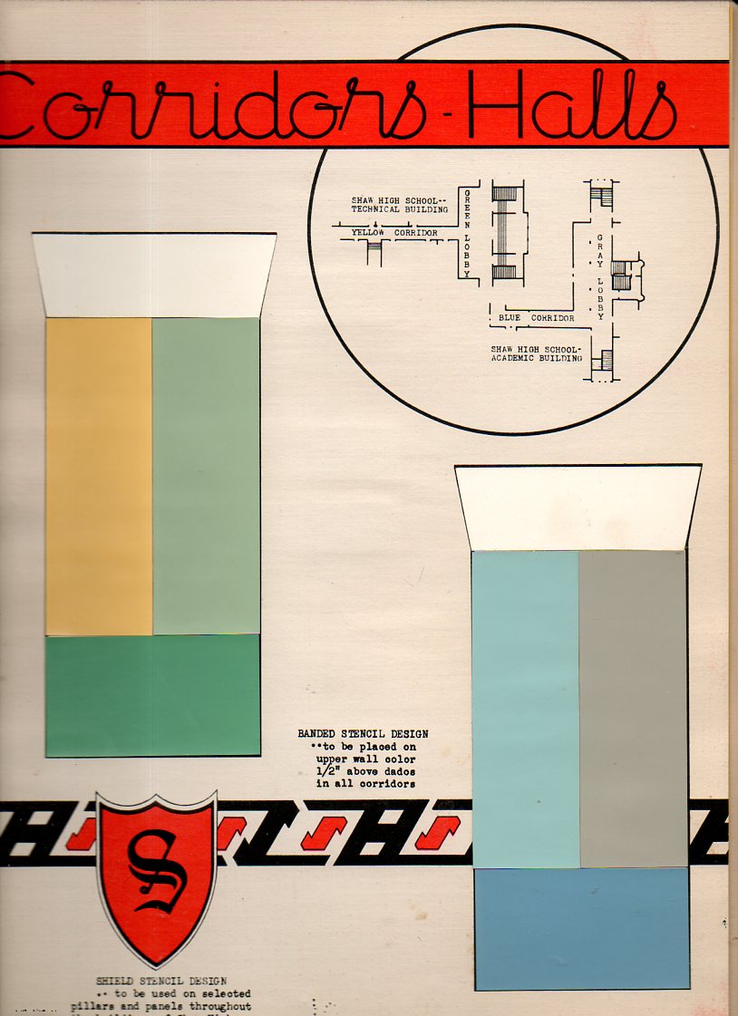
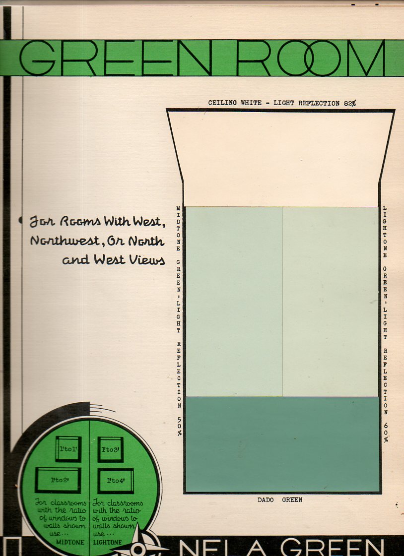
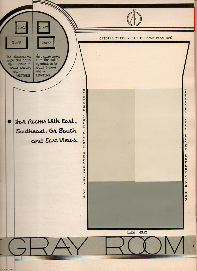
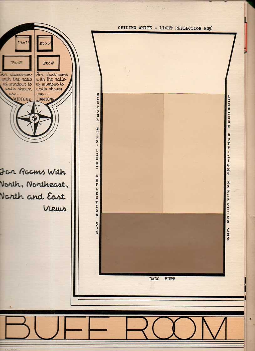
    Its easy to assume a modern prejudice regarding the interior decoration of 1910-1940 school rooms, allowing a certain conceit and picturing them in shades of gray, the images formed being “colored” by the images of those things that we have seen, almost all of which have turned up in black-and-white photographs or movies. But of course we know that this can’t be true, and that Humphrey Bogart didn’t always wear a gray worsted in his movies, and didn’t move that gray suit through gray rooms. Its just that the image-formation is influenced by what we’ve seen, and since what we’ve seen of these rooms is mostly without color, then our images are difficult to assemble outside black-and-white.  This applies to just about everything from that era, which explains why it is such a glorious shock to see motion pictures or photographs of (say) New York City street scenes from 1944. (And why is it such a jolt to the visual system to learn that police cars in Chicago during the 1933 World’s Fair were orange?)

    This thinking came to the surface again this morning when I uncovered the Paint Specifications for the Model School, prepared for the East Cleveland Board of Education under supervision of the Foremost Authorities, and published by ARCO in 1939.  It reminds us that the only thing that lived in black-and-white in those days are in our memories.  (I’ve written about unexpected color in Lost German Color of 1927,  The Very Describale Macro Color of 1937, The Color Green in the History of Squares, and of course the non-immortal 200,000,000 Pounds of Buttocks-or-Putting the Black-and-White back into Color, and others.

    Color school587


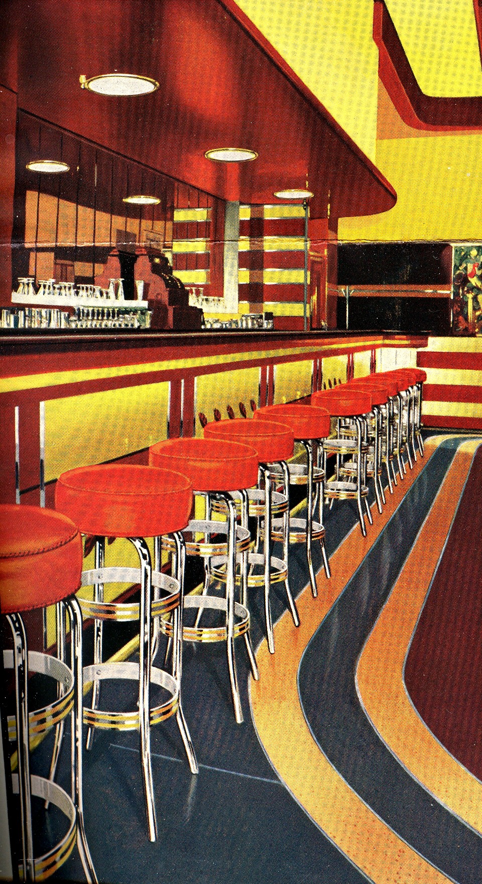
    The rest of the ARCO catalog is below; but first, here’s a sample from the 200,000,000 Pounds of Butts post, showing the 1938 barroom in color:

    Mar 14 7th red bar

    Color school591

    Color school588

    Color school590

    Color school589


  • Richmond’s Libby Prison in Chicago

    JF Ptak Science Books   Post 2082
     
    Follow Me on Pinterest

    Confectionary connections to interesting bumps in history wind their ways along many unusual paths.  One such story is that of physician/scientist/collector Hans Sloane (1660-1753) and his introduction of chocolate into England (as a result of a field expedition he took to Jamaica)–his involvement with chocolate was minor compared to everything else he did in his life, but the introduction of chocolate to coffee houses in London was not.  In any event it was his massive and superior collection of natural history samples, archaeological artifacts, and much else, that became the basis for the British Museum–the collections purchased from his estate for 20,000 pounds at the time of his death. 

    Another example of a weirder candyland adventure is that of Charles Gunther (1837-1920), who was the driving force of moving the infamous Confederate Libby Prison to Chicago in 1893 to house his own collections of Civil War memorabilia and other interesting and Mondo Bizarro things. (He claimed to have–on exhibition–the original skin of the serpent from the Garden of Eden, complete in some sort of original frame decked out in Egyptian gibberishglyphics.) Here’s an ad that appeared in the Confederate Veteran‘s first year of publication in 1893:

    Libby436

    I wouldn’t use the term “great” here–and I’m pretty sure that the word is being misused here in 1893 as well.

    The prison was actually a converted tobacco factory, the buildings of which were constructed from 1845-1852, and located in central Richmond at Main and 25th Streets. Poor Luther Libby–a Mainer–came into possessions of the buildings for his business, which was subsequently seized by the Confederate government at the beginning of the war and converted into a hospital/officer’s prison before it became the symbol of mistreatment and deprivation and harshness.  (Mr. Libby had nothing to do with the prison per se–he was just the last person with his name on the buildings.  He outlived the prison-with-his-name-on-it by 15 years–12 years if you count the use of the building to house Confederate leadership after the end of the war.)

    Gunther collected big stuff, the biggest being the prison. He purchased it and had it dismantled, shipped up to Chicago, and then reassembled (with the help and advice of the prestigious architecture/design firm of Burnham and Root) where it operated as a museum from 1889-1895. Sensing a brighter future for the property, Gunther dismantled the building selling off chunks of it as souvenirs, and built a convention center on the site, filling the need for meeting space from the burning of the Chicago Coliseum in 1897.

    This post could have gone another way very easily, winding up in the Things Out of Place Department–Libby in Chicago, the Statue of Liberty in Paris, London Bridge in Arizona, a duplicate Earth in the sky above the Earth,and so on–perhaps this on another day. 

    On the Libby Prison relics from Chicagohistory.org 


  • The Visual Genetics of Color and an Unintentional Pre-Modernist Masterpiece

    JF Ptak Science Books Post 1282–continued, & now with the Full Text book!

    Follow Me on Pinterest

    [Earlier in this blog, about 1200 posts ago, a million words ago, I wrote about an extraordinary book by an aesthetician named Emily Vanderpoel.  It is “extraordinary” in a narrower sense, and that “extraordinary” might not actually be positive for its original intent.  The extra-intent of the book, what has come out of it for me, was something that was unintentionally accomplished by the author.  The images that she used to illustrate her color theory ideas–the basis of which are not really comprehensible to me–turn out to be artwork in themselves, a found art, the artistry of the images taking over the original intention for the arrangement of their color.  I’ve found the book now at the Internet Archive in all of its glory, and downloaded only 150 times.  I’m still at a loss to know why this work hasn’t received more attention

    The idea of how we put parameters to something like the visual field is a gargantuan topic—it is something that architects and geometers and physicists and mathematicians (in general) have dealt with forever.

    The full text is available HERE via Internet Archive.
    Blogcolorvander_2poel_063
      Mapmakers have perhaps the most visualized aspect of this on paper, performing the semi-miracle of translating three dimensions into two; physicists have a more difficult time, taking the opposite approach, sort of , and translating two or three dimensional space into x-number of dimensions.  Anatomists had a difficult time of their subject until relatively recently in human history, what with the sublime religious curfews on messy knowledge and all coming into play, poking around into the heart and such as though it was an affront to the sanctity of the creator (M Servetus’ ideas on the circulation of the blood via the heart, making the heart a tool and not the brain or some odd conjunction of creative divine power, cost him his life, burning slowly alive at the stake…how mysterious the whole world of RNA Genotype-Phenotype Mapping and such would seem to him if he could have a peek into the future/present from wherever he is.)
    Blogcolorvanderpoel_062

    Color theory is old and pretty—as a matter of fact there is a very attractive gathering of color theory models (in black and white, though) displaying some two dozen or more color models from the last 400 years.  People like Della Porta (1593), our old friend and resident oddball polymath crank Kircher (1646), the smarter-than-you-could-imagine Newton (1660), Waller (1686), Lambert (1772), the wide ranging and again polymathic Goethe (1792), Herschel (1817, who also ushered in our understanding of the other light-sensitive shape spacing medium of photography in 1840), the semi-forgotten Chevreul (1835), the beautiful Maxwell (1857), Wundt (1874, the early experimental psychologist who also looked for spirits/spiritmus and ghosts), von Bezold (1878), Rood (1879), Munsell (1918) Kandinsky (1914 and not decipherable by me) and Klee (1924), and so on towards the present, all tried to analyze the prospects of color.

    Not in this list is the very highly problematic Emily Vanderpoel, who in 1901 and 1903 produced (in two editions) a lovely but mysterious book called Color Problems for the Layman, in which she sought not so much to analyze the components of color itself, but rather to quantify the overall interpretative effect of color on the imagination.  I know this sounds begging and vague, but I really haven’t been able to make much headway in the work.
    Blogvanderpoel_1057
    I’m attracted to this effort because of its attempt at quantifying such abstract thoughts.

    By virtue of this effort, though, Vanderpoel had produced a strikingly illustrated book, with 118 color plates, all very intense, and beautiful, and in its way exceptional—unique for it time perhaps.  Had the book been written thirty years or so hence we’d call it some sort of constructivist/constructionist artform.  But since the artwork in the book comes a decade before the first non-representational artwork in human history (or so), I don’t know exactly what to call it. 
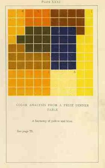
    Blogvanderpoel_2058

    I really don’t know what it is, but I know that it is not entirely accidental, this pre-non-representational artform, because controlled geometrical color art is not accidental. 

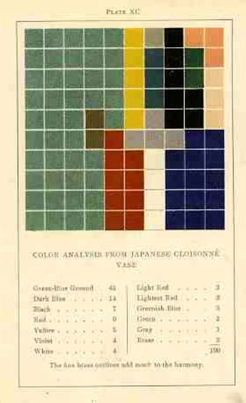
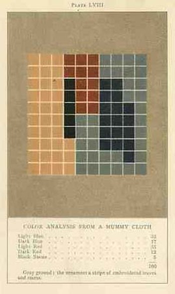
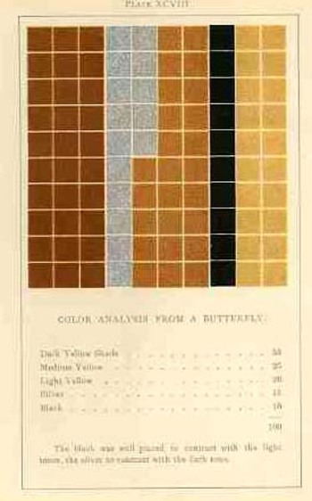
    In trying to quantify the color images of the objects in her study, Vanderpoel establishes a 10×10 square grid, dividing all of the color in that object into individual units numbering to 100.  Then, somehow, she identifies the major colors and places them according to a system that I cannot understand within the grid.
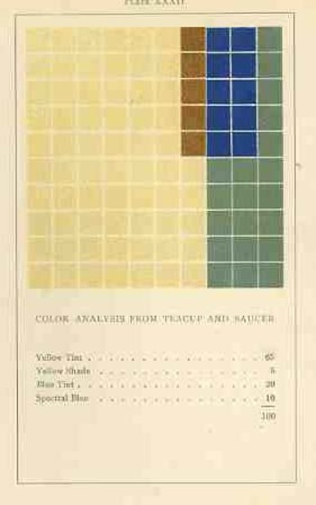
    Blogvanderpoel_3059

    The net effect is glorious.  I just don’t know how she got there—which isn’t normally a consideration in art, except that this work is an instructional on how to understand color in art and nature, and the explanation of the procedure is ethereal.  Vanderpoel was and remains a respected author on porcelains and other applied and plastic arts.  In this work she looked at her fair share of porcelain, limogues, clay pots, burial urns, glass shards, and the like; she also analyzed clouds, mummy cloths (and casings), dew on morning grass, brocade, the eye of a blue jay, feathers, and another hundred or so poetic arragenments of the stuff of teh world.  I still do not know what this book is trying to tell me, but I do know that it is remarkable.   

  • Was Homer Color Blind? (1878)

    JF Ptak Science Books  Quick Post

    “Colour Blindess in Relation to the Homeric Expressions for Colour”, from Nature Magazine, volume 18, p. 676, 1878.

    “In an article on “The Colour Sense” in the Number of the Nineteenth Century for October last, Mr. Gladstone points out certain peculiarities…in the expressions of colour used by Homer. “Although” he says “this writer has used light in various forms for his purposes with perhaps greater splendor and effect than any other poet, yet the colour adjectives and colour descriptions of the poems are not only imperfect but highly ambiguous and confused”. And again-“we find that his sense of colour was not only narrow, but also vague, and wanting in description”.


  • Lost German Color of 1927

    JF Ptak Science Books    Quick Post

    German color375[Part of the series on Color and its Abuses, as with an example of “When Color is Best in Black-and-White”, here.]
    Nothing quite says no-color as German deep noir of the mid- and late-1920’s.  These movies can be so deep and contrasted, so very black-and-white, with such stark Moon-like shadows, no dawn or dusk just night and day, that it can make you forget that outside of the photographs and movies that people were moving around in great swirls of color.  And nothing quite helps you to remember this than by having a look at a book like one below, a DIY piece printed in Berlin in 1927, the Farbige Wohraume1.

    German color377
    It is of interest here because in addition to blueprints and sections of the furniture to be built, there are associated illustrations showing the completed work placed in a decorated room.  And it just so happens that these rooms are highly, colorfully decorated–not that there’s so much in the room, per se, but there is definitely a lot of color. [This book is available from our blog bookstore, here.]

    German color371