JF Ptak Science Books Post 3286
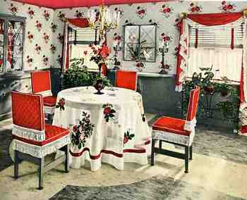 Well: this is a variation of yesterday’s post on the two opposite edges of color in oddly-applied scientific/technical manners. In unwittingly responding to the question “when is color-use bad?”, the answers were found in these room decorations from 1942, all of which come from a pamphlet entitled Ideas for Old Rooms and New, extracted from the mind of Hapel (?) Dell Brown. It is a tidy book with ideas that are anything but tidy;and as you scroll down you’ll see that the room solutions suggested by Hapel Del are anti-tidy; clutterous (no, not a word but could be). Everything about these creations speaks to the annihilation of visual resting places; everything seems to be an affront to the concept of causal emptiness. The weird thing is that there aren’t very many objects in these rooms at all (at least comparing these rooms from where I’m sitting)–the visual complaints seem all rocketing from the abuse of colors found in the fabric of the furniture and walls and floors and window treatments. The eye gets no rest–and as a matter of fact, the cones of the eyeball are impaled on the rods as a result of the author/decorator desperate attempts to invent three more primary colors.
Believe it or not we don’t really get the full flavor of the color cacophony because the floors in these picture look sort of benign, fading away into themselves–which they are not, according to the description in the text, because they are all high-gloss linoleum rolls or tiles (“efused [sic] with deep wondrous color”. And that means not only are these floors adding sheen and color to the rest of the incredibly colorful–an effect fairly lost in these photos–they are also cold.
One thing that I haven’t pointed out in this peon to syrupy/pastel-y/techno-gelatinous-chromodrama is that they were all done in response to a re-decoration of a perfectly nice-looking house, with all of the former “bland” colonial-style rooms presented in glorious black and white. I’d rather live in Maison Noir than in this happy nightmare.