A Daily History of Holes, Dots, Lines, Science, History, Math, Physics, Art, the Unintentional Absurd, Architecture, Maps, Data Visualization, Blank and Missing Things, and so on. |1.6 million words, 7500 images, 4.9 million hits| Press & appearances in The Times, Le Figaro, Mensa, The Economist, The Guardian, Discovery News, Slate, Le Monde, Sci American Blogs, Le Pont, and many othr places… 5000+ total posts since 2008. Contact johnfptak at gmail dot com

Category: Lines, History of

  • The Loneliness of Linoleum and the Psycho-Weaponization of Polygons (1924)

    JF Ptak Science Books   Quick Post   Overall Post 5137

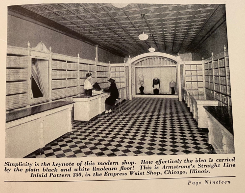
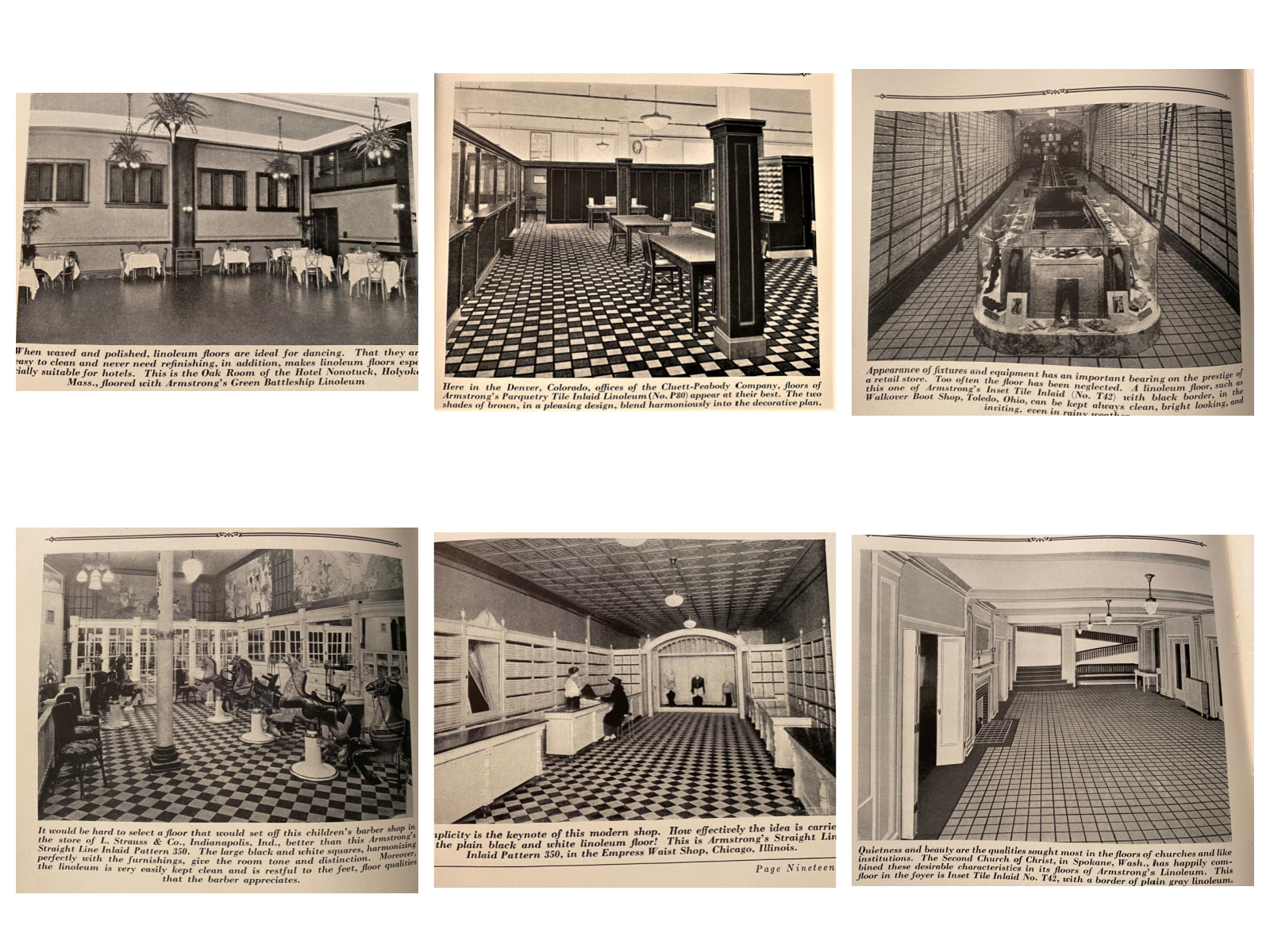
    This is a pretty unassuming pamphlet, judging from outward appearances (see below)1. It is an advertising promotional published in 1924 for Armstrong Cork Company of Lancaster (PA) pushing their extensive selection of linoleum flooring. (Linoleum, by the way, was created in the 1850s and was a constant source for durable and inexpensive floor covering for about 100 years…the first linoleum factory established in the U.S. was on Staten Island, NYC, with the company settled into a town they called Linoleumville, which was later renamed “Travis”. Anyway, I digress…)  I’m drawing attention to the publication because of the illustrations, which are no doubt standard for the time and made to be complimentary, though they look a lot different from their intentions looking at them today–at least to me.  There’s a LOT of distortion in the perspective, some of it from the camera angle and some of it, well, from the highly repetitious designs in the flooring, as you can see here:

    As you can see below in the montage (larger images follow) the rooms seem to be distant, cool/cold, removed, surgical.  Neat and clean, of course, but elegantly perfunctory.  And then there’s the polygons, the advancing retreating squares and rectangles that number in the hundreds and thousands, and are headache-invoking.  I can’t tell if these images would be more or less of what they are if the photos were in color.  (Keep in mind some of those colors were bright red, bright yellow, shout-out-loud blue…)                    Facebook ShopIMG_6065

  • “Children Who Work on the Nation’s Crops” (1942)

    JF Ptak Science Books  Quick Post   Overall Post 5128

    IMG_5329

    This is a substantial indictment and attack on the loose laws (where they actually existed) regarding child labor in the United States, specifically regarding kids working in the fields.  If you scroll down you can see what laws were applicable to what states, and there were plenty of states that had virtually no regulations on children laboring in the fields, being part of a migratory family.  I’ve reproduced here some of the most significant bits from the pamphlet as well as all of teh photos–the photo images aren’t exactly Jacob Riis, but they’re getting there. In any event Ms. Zimand was making a very strong case and presenting an embarrassing expose on the use of child labor in the U.S. just at the beginning of the U.S. overt military involvement in WWII.  


    [Source: ZIMAND, Gertrude Folks. Children who work on the nation’s crops. New York City, National Child Labor Committee [1942] [National Child Labor Committee. Publication no. 384., 9″x 6″, 19pp. Photo illustrations.]


    IMG_5331


  • Crystallograhic Found Art in the Annalen (1915)

    JF Ptak Science Books  Quick Post

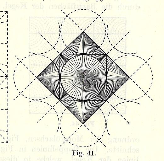
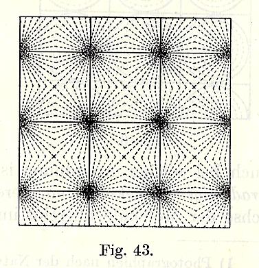
    There is much that goes on in the pre-eminent German physics journal Annalen der Physik  (begun in 1799 and still going strong) beyond the consideration of “Found Art”–actually, everything that goes on there is beyond that consideration. Unless of course you happen to be flipping through the thing and find something that attracts your attention for its pure artistic inventiveness, which of course is almost entirely out of context.  The article in question is Otto Lehmann’s “Die Struktur schleimig-kristallinscher Flussigeiten”, and appeared in the journal in October 1915. (It would be in the Annalen months later that Einstein would publish his great paper on General Relativity theory and also there where he set the world afire in 1905.) Lehmann’s 45-page paper is illustrated with 92 figures, some of which are out-of-context stand-alone beauties:

    Art in the Annalen 1915 _1_


    Art in the Annalen 1915 _2_

    ·Posted by :

    ·in:

    —

  • The Beauty of Contour Lines and on Missing Importance (1893)

    JF Ptak Science Books   Quick Post

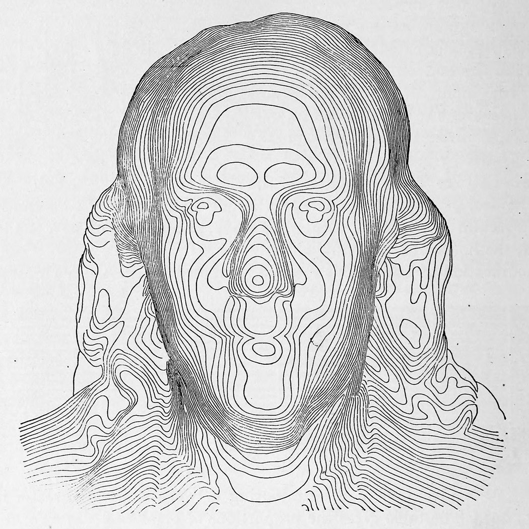
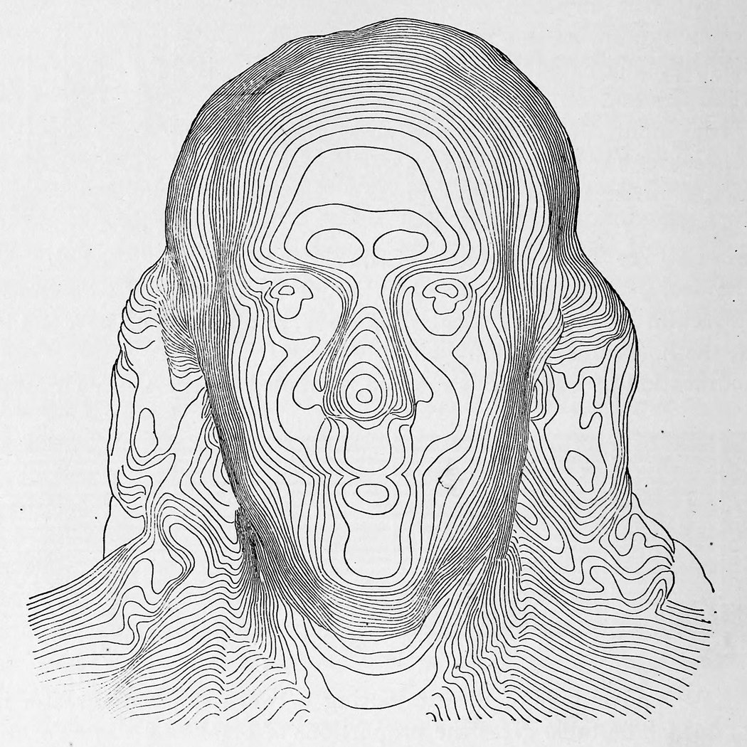
    Contour franklinI found magnificent and early contour image of Ben Franklin in a tweet from Tim Wallace (@wallaectim) who found it in Appleton’s Cyclopedia of Technical Drawing (1893). (The full text of Appleton’s is here: https://archive.org/stream/appletonscyclopd01wort#page/100/mode/2up/search/franklin and a larger image of Franklin is located below.)

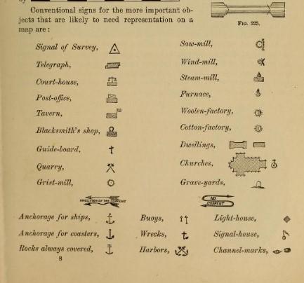
    While checking out the fascinating Franklin in the text, I found an interesting graphic that locates a certain History of Importance in one tidy display. The graphic is in the section on topological drawing, and contains “conventional signs for the more important objects that are likely to be represented on a map”, at least for 1893:


    Contour important objects

    All of this makes sense, of course, except perhaps for the surprise of locating taverns, which I think I’ve not noticed before in 19th map legends–it does make sense though, especially for more regional maps, as the tavern would be a central force for a small town, as well as operating as a possible hotel.  Many of the rest of the important things for a late 19th century map have slipped into obstructed memory, if not further. 

    Contour franklin


  • A True “Severance of the Sea”–the “Perpendicular Barrier of Ice”

    JF Ptak Science Books  Post 2689

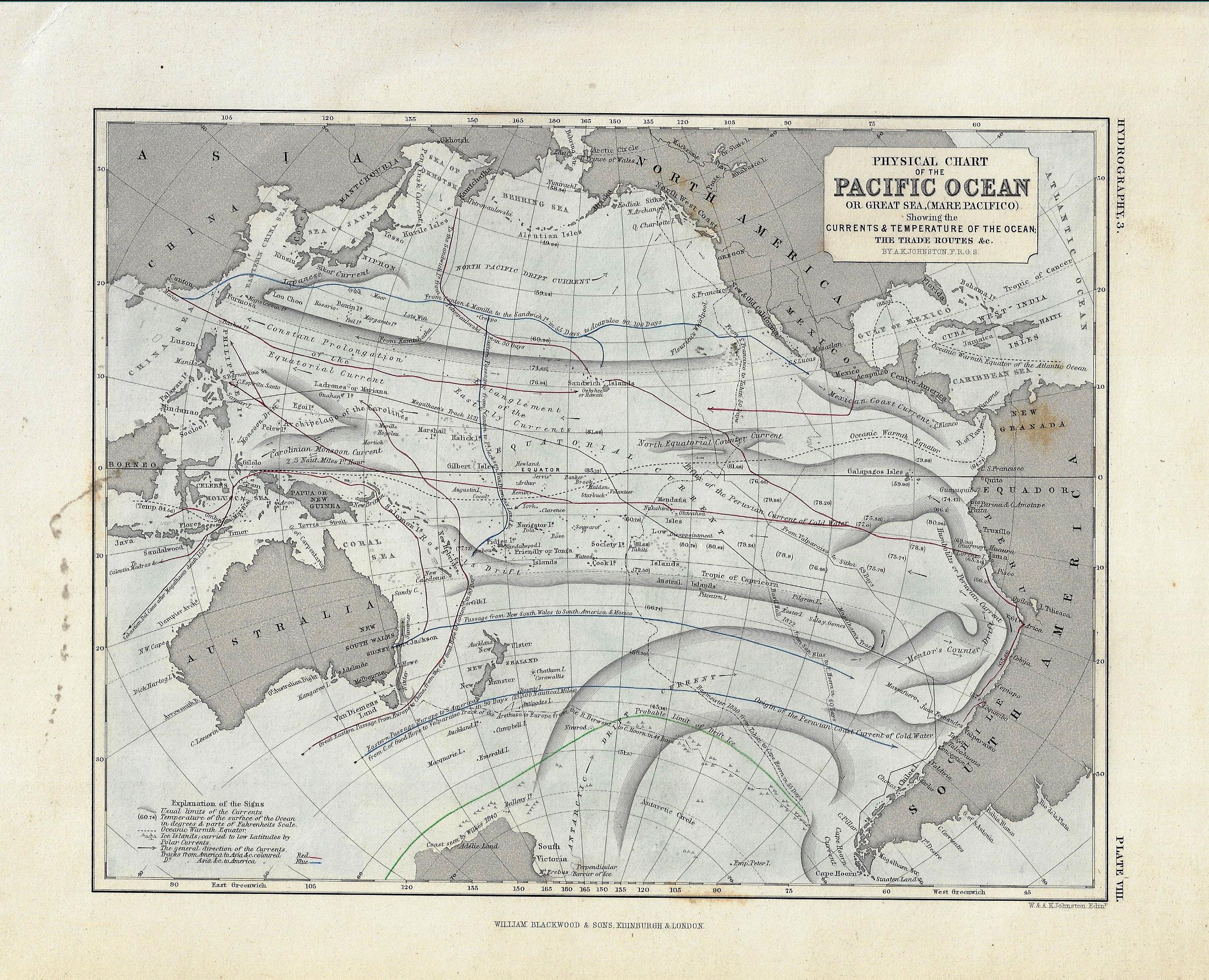
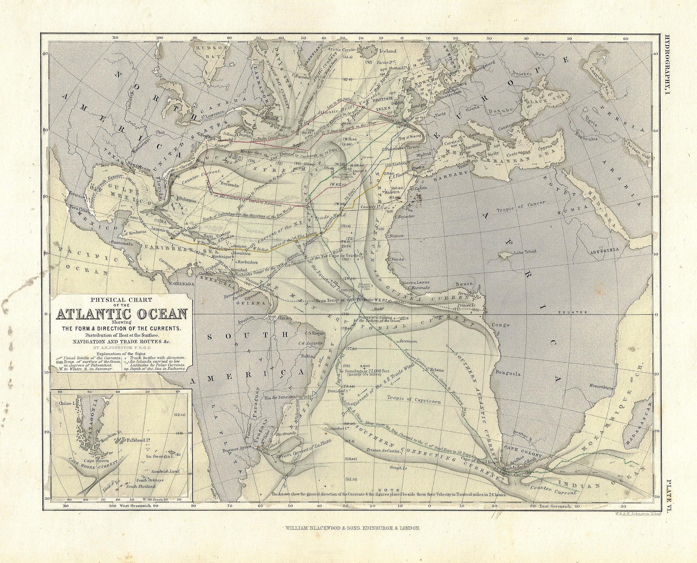
    These maps seems both simple and complex, orderly and chaotic. The truth of the matter is that there’s very little black ink on these sheets for as much information as they are sharing, and yet still look to be pretty deep in the data department.  They are maps1 of ocean currents of the Atlantic and Pacific Oceans, and show water temperatures, charts of historic voyages, lines of transportation along with how long the voyage would last, and other pieces of information. 

    Maps ocean currents pacific detail

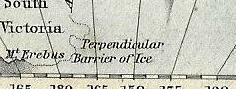
    I’ve scanned these in some detail so that they can be enlarged so that the tiny text can be read. While I was looking over these beautiful lines, I found the following lines at the extreme south edge of the Pacific Ocean map, in Antarctica, under the wide “Antarctic Drift Currents”, just barely on the map next to South Victoria: “perpendicular barrier of ice”.  ANd no doubt they meant it. The phrase is cold and barren striking, so I went looking for it online, to see how often it may have been used–and according to google, it hasn’t been used very much at all. One result from the Geographical Journal, which reads:

    “The result of these two seasons exploration was the discovery of a pool of more or less open water some 600 miles in diameter between latitudes 68 and 78 bounded on the west by a stupendous range of ice clad mountains on the south by a perpendicular barrier of ice and on the east and north east and for the most part on the north by the main pack.”2

    This was in response to the approach of reaching the magnetic South Pole, but in addition to everything else, there was this perpendicular wall of ice that stretched for miles and miles, an unapproachable mass hundreds of feet high, after which stood mountain, which were much higher. 

    There are many pieces of data like this on these maps–take your time and enjoy them

    Notes:

    1. The maps are from Johnston’s Physical Atlas, printed by William Blackwood & SOns in London, ca. 1860-1870. (There were earlier editions of this map, beginning in 1852 it looks like, that were considerably larger. The present maps are 20x26cm.)

    2. “Renewal of Antarctic Discovery”, by John Murray, in The Geographical Journal, 1904, volume 3, page 28.

      Maps ocean currents pacific


    Maps ocena currents atlantic


  • A Fine Diagram Controlling Time: Rail Schedules, 1874.

    JF Ptak Science Books  Quick Post

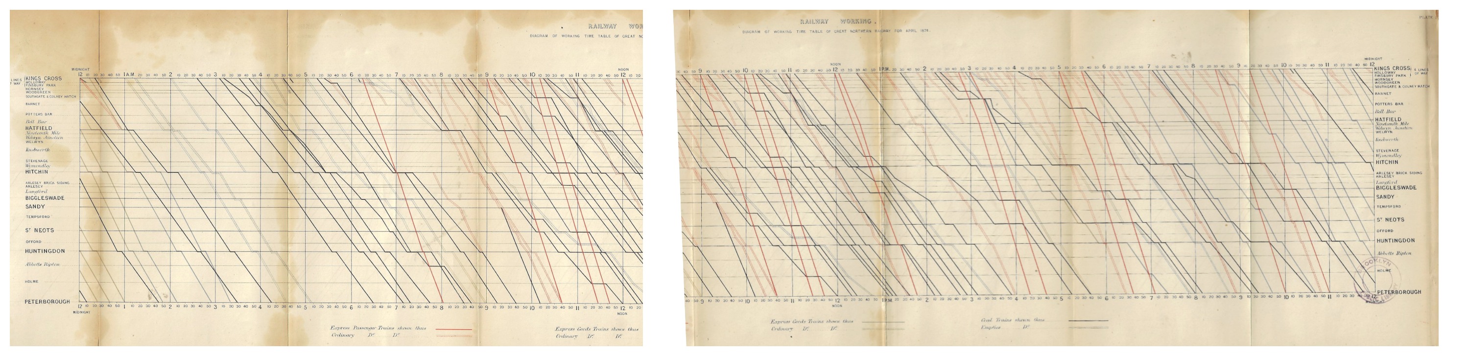
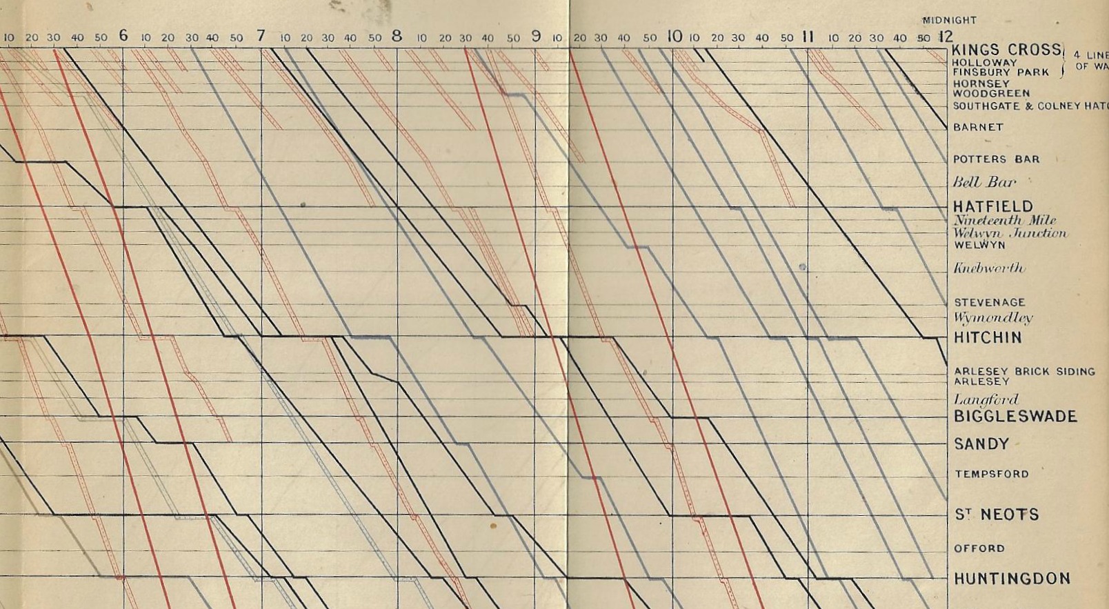
    Railway Working, Diagram of Working Time Table of Great Northern Railway from April 1874, drawn by R. Price Williams and printed by lithography by Thomas Keith, 400 King street, Covent Garden. There is a 24-hour table at top and bottom (each hour divided into 10-minute units), and a division of express and ordinary passenger and freight trains in the legend at bottom.  This lovely image of time and lines measures 7×30″, and is an illustrative chart in Minutes of Proceedings of the Institution of Civil Engineers...volume XXXVIII, Session 1873-4, part II, edited by James Forrest, and printed in London by the Institution in 1874.  Such was the way a country was run. 

    Maps subway _1_ and _2_ together

    And a detail:

    Maps subway 1874 detail

    I found an explanation of this diagram in Engineering, September 24, 1875, page 249:

    “This represents a portion namely between the hours 9 am and 2 pm of a diagrammatic time table for April 1874 of that part of the Great Northern Railway lies between King’s Cross and Peterborough the between the vertical lines indicate time, those between horizontal lines the distance between the stations while diagonal lines show the passage of the trains and by different colours the nature the trains. At 9 o clock will be seen a train leaves King’s Cross and arrives Peterborough at 10.40. The diagonal representing train is not quite continuous there is a small part drawn upon the Hitchin station line this shows the 9 o clock train reaches Hitchin at 9.45 and that it there for about three minutes. At 9.5 an train leaves King’s Cross but goes no further than Green while at 9.8 another train leaves Cross and proceeds as far as Hatfield. At 9 10 a coal leaves King’s Cross and reaches Peterborough at 1.20.  10 o clock an express train leaves King’s Cross Peterborough at 11.30 and at 10.10 another express King’s Cross reaching Peterborough at 11.45.

    And larger, for effect, but vertical:


  • Early Data Visualization (1817)


    JF Ptak Science Books   Post 2677

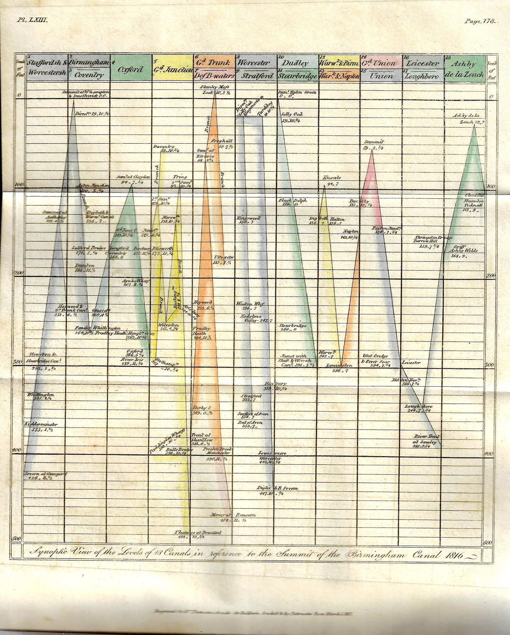
    There have been perhaps 150 posts on this blog relating to data visualization and the elegant display of information–this one, found by chance yesterday while browsing, is really pretty early for its type of accomplishment. The image relates heights of canals in the Midlands, and is one of three illustrations for Samuel Galton’s “On Canal Levels” which appeared in Thomas Thomson’s Annals of Philosophy; or, Magazine of Chemistry, Mineralogy, Mechanics, Natural History, Agriculture, and the Arts1 in the first half of 1817.  The article is illustrated with three plates, including a curiously interesting graph of canal lengths, a cross section of “the line of canal from the river Mersey at Runcorn Gap  to the River Thames at Brenford, with the Branch to Paddington Wharfs”, and finally a glorious hand-colored plate (“Synoptic View of 18 Canals in reference to the summit of the Birmingham Canal, 1816”).

    Galton (1753-1832, of Birmingham) was Quaker arms manufacturer (a not-uncommon occurrence in my experience) and the grandfather of the polymath Francis Galton, a successful industrial who was active in the Lunar Society. This short paper is basically a collection of data, and he presents it in an interesting and provocative way–this in relation to the cross section and graph, which are early means for the time in expressing quantitative data in a more easily-managed and comparable form.  (Galton wrote: “It occurred to me several years ago that the lockage of canals and their plans and sections would afford the means of ascertaining with a considerable degree of comparative precision the relative height or level of all the places immediately situated upon those canals which communicate with one another and that in consequence a number of fixed points would be obtained from which the relative level of any objects in the vicinity of those canals might be more conveniently measured…”)

    • (Apologies for the unevenness in clarity of the sans–the book in which they appear is tightly bound, and I didn’t risk opening the book beyond necessary for fear of damaging it. That said, if you click and expand the images are a lot sharper….)


    Dataviz Canal heights 1817


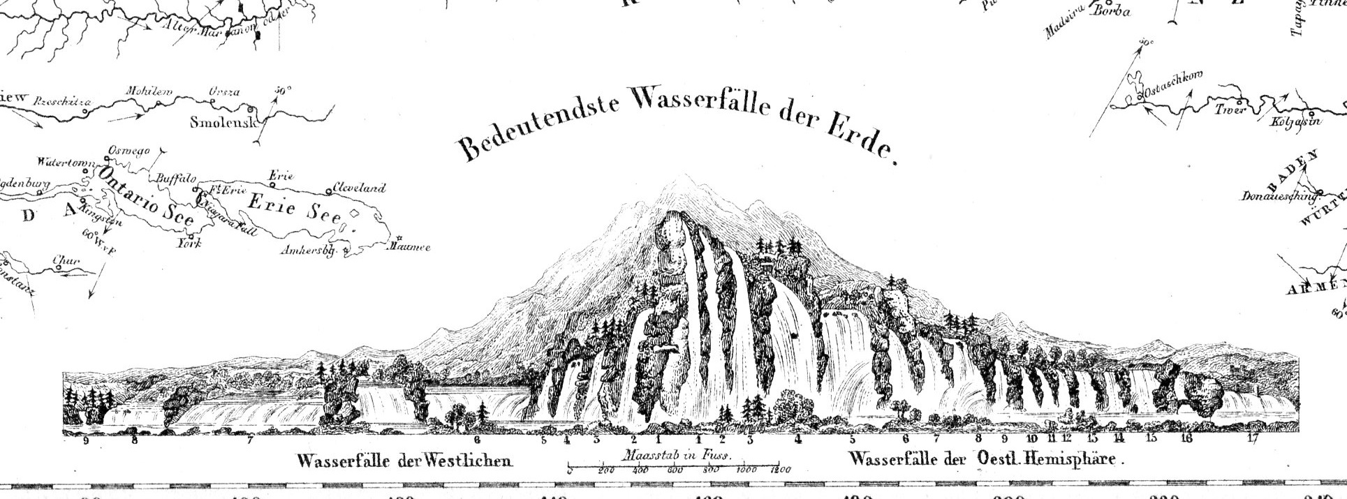
  • Map of Rivers and Waterfalls, 1851

    JF Ptak Science Books  

    Maps Rivers Waterfalls981

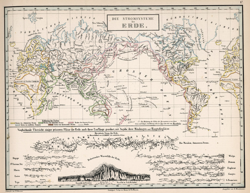
    • “Die Stromsysteme der Erde.”  In von Humboldt, Kosmos, 1851. 

    Before the Neil deGrasse Tyson version and update of Carl Sagan’s landmark television series, Cosmos, there was Alexander von Humboldt and his enormously influential book of the same title, printed in 1845-1862.  Well, von Humboldt’s (1769-18591) book was actually Kosmos when published in German, which is where it started its life (and which von Humboldt suffered mightily for in it English translation), and in which this map appears.  Von Humboldt was enormously studied and educated and of a high scientific mind over many subjects, one of those 19th century figures who seemed as though they could know everything, a polymath of high order (along the lines of Goethe and von Helmholtz and Thomas Young and others).  He was a meteorologist and biogeographer before those sciences existed; a naturalist, geographer, archaeologist, and explorer, a natural philosopher of magnitudes.

    Kosmos reflected his lifelong interest in order, and what he did was astonishing–he attempted to unifying the complexities of nature in one book (of five volumes), binding the various branches of science together in a cohesive whole, attempting to show how the laws of the universe acted here on Earth.  It was a very influential work, very progressive, a masterwork of scientific method.  Kosmos.

     Maps--River system


  • Mosaic Micrographia (1840)

    JF Ptak Science Books   Quick Post  in the History of Lines series

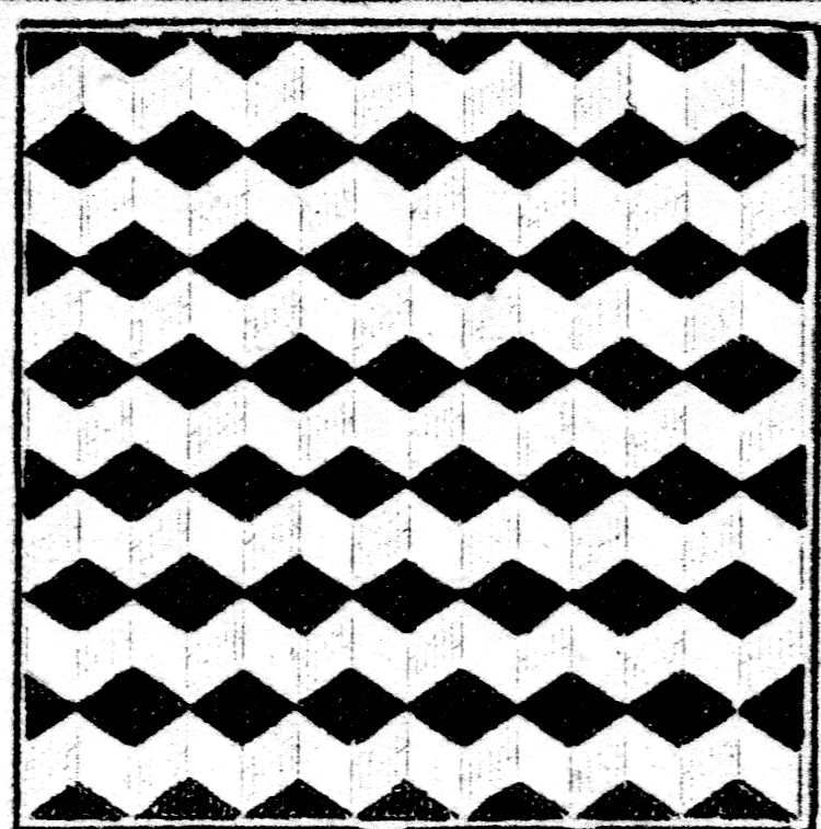
    Mosaic Cornish805

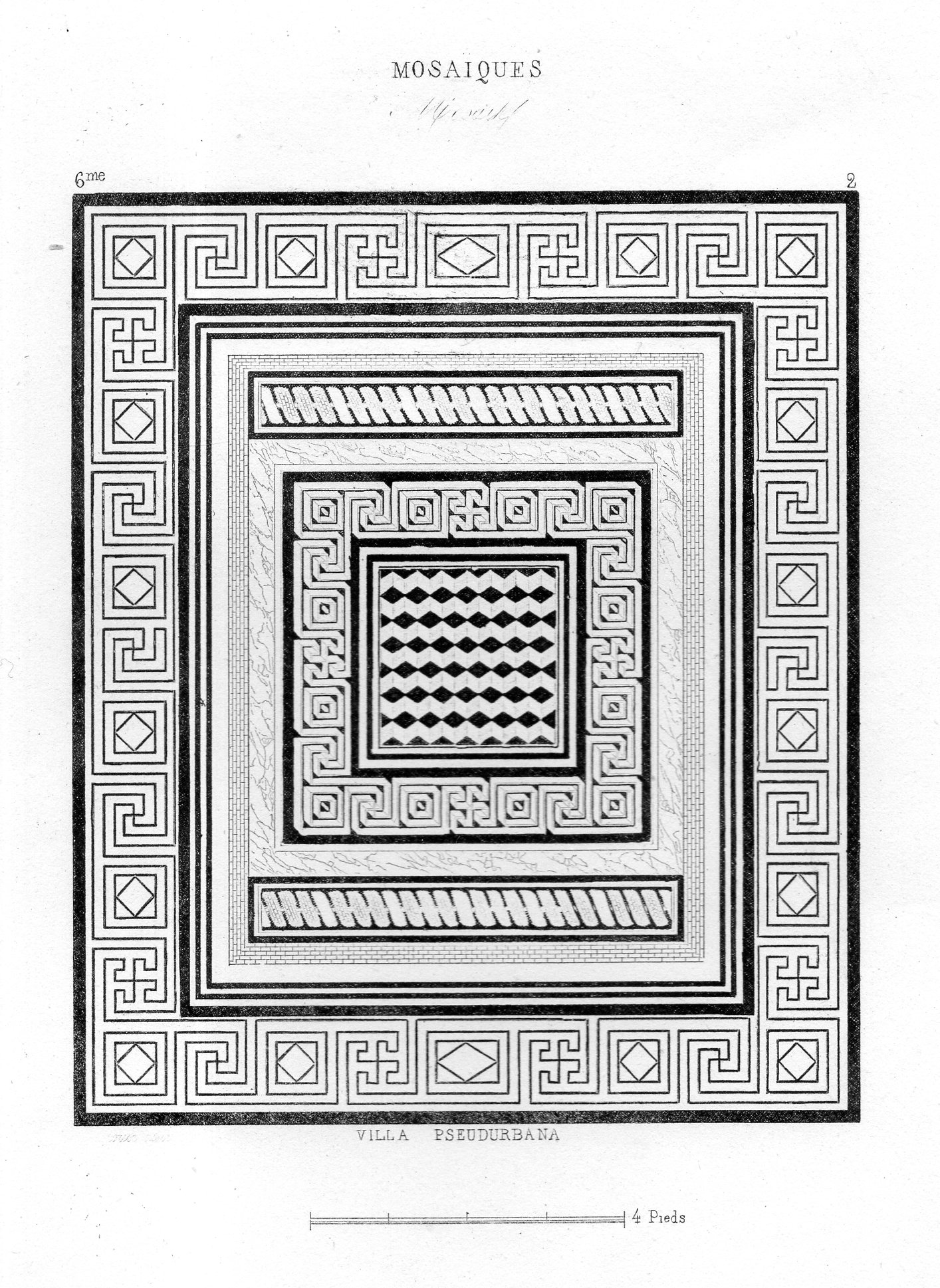
    This is a one square inch detail of an engraving of a mosaic (published ca. 1840) from the “Pseudurbana” at Herculaneum.  Evidently it was excavated in the very early 19th c (ca. 1807) and was known as “villa pseudurbana of M. Arrius Diomedes, or the villa of Aufidies” according to Eugene Dwyer in Pompeii’s Living Statues…(2010, pg 14). This wasn’t intended to be inspected so closely, but it mostly withstands the high magnification. 

    Here’s the full image:

    Mosaic Cornish804

    ·Posted by :

    ·in:


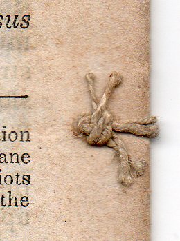
  • Another Piece of Found Book Knot Art, from Another Dorothy Dix Pamphlet (1850)

    JF Ptak Science Books  

    This is a quick follow-up to an earlier Found Book Art found in another pamphlet by Dorothy Dix. (Dorothea L(ynde) Dix (1802-1887) was an nurse and ultratrian, a very-much-practiced humanitarian who for years fought for the stabilized and just treatment of people with disabilities, mainly and for extended periods of time and travel for those suffering from mental diseases and development. Read more here https://historyofideasblog.com/thesciencebookstore/2014/07/dorothea-dixs-report-on-the-state-of-the-indigent-insane-in-the-us-1848.html) 

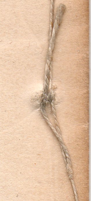
    The present Dix pamphlet has another perfect little in the string used to bind the pamphlet together tie:

    :Dix _2_ 530

     [Source: DIX, Dorothy L.Fifth Letter to Convicts in State Prisons and Houses of Correction, or County Penitentiaries. “Printed but not published”, November 1950. 18.5×12 cm, 24pp. Provenance: Smithsonian Institution (with their small oval rubberstamp), and the Library of Congress (with their surplus duplicate stamp on back page).]


    DIx130