A Daily History of Holes, Dots, Lines, Science, History, Math, Physics, Art, the Unintentional Absurd, Architecture, Maps, Data Visualization, Blank and Missing Things, and so on. |1.6 million words, 7500 images, 4.9 million hits| Press & appearances in The Times, Le Figaro, Mensa, The Economist, The Guardian, Discovery News, Slate, Le Monde, Sci American Blogs, Le Pont, and many othr places… 5000+ total posts since 2008.

Category: Lines, History of

  • Exercise in Irony: the Usually-Invisible Chinese Rail Worker and the Highly Visible Photographer, 1869

    JF Ptak Science Books   Post 1903   Part of the series on the History of Blank, Empty and Missing Things:  Chinese Rail Workers, 1869. 
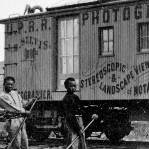
    Chinese promontory

    One thing that you seldom see so juxtaposed in the photographic history of the American West are the people who were so important to it placed in proximity to those who were no well disposed to recording their existence. 

    For example:  this image by J.B. Silvis, “China Section Gang Promontory”, a photograph published as a stereocard between  1869 and 1870, shows a small group of Chinese workers setting two rails in Utah–they are the ubiquitously missing elements in historical images of transcontinental railroad construction. There were many thousands of these workers who were set to notoriously difficult tasks in bad situations and under time constraints with little liberty or pay (and not well-afforded much protection under the law), and in the history of documenting the expansion of the railroad across the West these workers are very seldom seen.

    They are set incongruously in front of a photography car that so often saw through or around them.   The  car was labeled  “U.P.R.R. Photograph J.B. Silvis Stereoscopic & Landscape Views of Notable Points on line of Pacific R.R. Always on Hand”, and I found it tempting to try to see in the photograph that it was made solely for the photographer’s advertisement, but the central placement of the workers makes a good argument against this.  On the other hand, when you look at some of the other work of Silvis documenting his railway car (see here), there are a number of group images where he gathers cowboys or Indians  or makes a photo with his car in an unusual place, he is definitely using those people and locales to establish the idea of remoteness and wildness of the places in which he was working. It seems to me that in the end, he was using the Chinese laborers as a piece of his advertising ensemble more than documenting them. Again, this is very speculative.

    It is a very unusual image which I think is knee-deep in irony. 

    I should also like to point out that most of the workers have taken care to sew  large leather patches on their breeches–that to help their thighs when pulling that heavy metal lever across their bodies while setting and moving track. 

    [All images via Denver Public Library, here.]

  • Vernacular Found-Polygonism 2: Walker Evans on the Roof

    JF Ptak Science Books  Quick Post

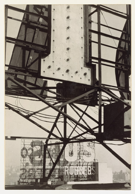
    Evans polygons

    How many polygons can you find? 

    “Walker Evans climbed to the roof of the Fisk Building on Central Park South to  photograph the web of steel struts and electric signs that were rapidly filling the skies over Manhattan. The electric signs in this photograph alternately  flashed the company’s name and the names of its two principal products. As there  were approximately a hundred million wheels rolling over America’s roads in  1928, the sale of tires quickly overtook that of rubber galoshes. The image  expresses Evans’ conviction that modern art could be timeless yet topical when  perfectly wrought of vernacular materials.”–Metropolitan Museum of Art

    This is one in a series of posts made on found geometries–here are a few others:

    Found Alphabets and Geometry in Stone.(here)

    Magritte-Like Disorienting Geometry in Found-Art Urban Design, 1925 (here)

    Sierpinski Triangles & the Empire State Building (here)


  • Images of Shadows in Storytelling

    JF Ptak Science Books   Post 1836

    ‘There is seldom in shadow a mystery less hidden”–Ombra Nichts Schatten, The Non-Mystery of the Shadow, London, 1842

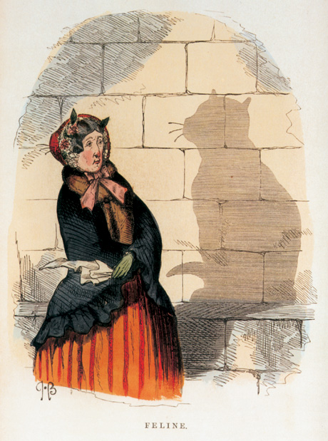
    Shadows have long played havoc in the imagination, for good and for evil, for elucidation and of mystery–they have hidden nothing and everything, and displayed as little as possible and as much as can be imagined. A simple shadow in a hole had proved the circumference of the Earth twenty centuries ago, and before that the Earth’s shadow on the face of the Moon showed us to be a sphere; the shadow allowed us to measure the heights of mountains on the Moon before we could do so (accurately) on Earth; we measure shadows in X-rays, and follow the trails of subatomic particles, and on and on.  Shadows are particularly interesting in story telling, whether they be suggested  aurally or in text, or of course in illustration: 

    Chalres H. Bennet, Shadow and Substance, London 1860.

    A superior example of shadow-art is seen in Indonesian shadow puppet theatre, “Wayang Kulit”, where the shadows of Javanese-Indonesian characters are projected onto a cloth screen by a strong light from behind.

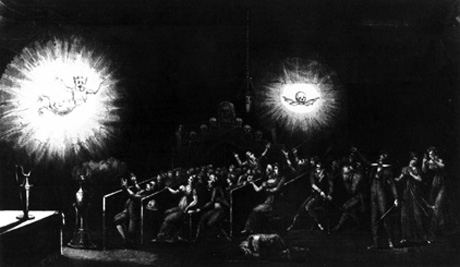
    Audiences were bathed in direct and brilliant light while being swamped in shadow in the early 19th century as part of an early form of non-cinema cinema, as we see here in the frontispiece from Robertson’s Mémoires récréatifs, which depicts a phantasmagoria of lantern projections:


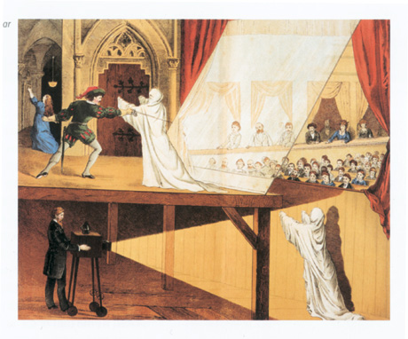
    And more forthright illusions as seen in this engraving showing the spectre “Dr. Pepper’s Ghost,” from Theodor Eckardt, Die Physik in Bildern Eßlingen, 1881:


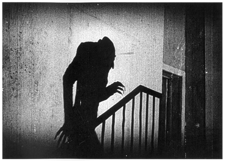
    The shadow may have been invented in cinema by the German Expressionists, with  Friedrich Wilhelm Murnau’s Nosferatu (1919) as a shining example:

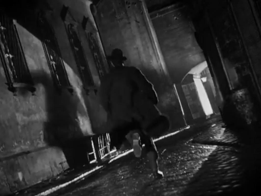
    And of course the shadow is used with great effect in the  very black-and-white and no-gray-tones Film Noir world, particularly in the hands of a master like Mr. Welles in films like The Third Man:

    And in Fritz Lang’s diabolically-bad M, earlier, in 1931 (featuring an impossible shadow in the movie still below):

    Thank heaven for little girls... or would that be hell?


    Shadow has been used to given questionable dimensionality in addition to giving perspective to dimensions that we are familiar with:


    And the artificial shadow made for the geographical clock dial to tell the story of passing time:

    And also for shadow puzzle toys:


    And on and on, deep into the night…


  • An Episode in the History of Anticipation: Death at Archimedes’ Door

    JF Ptak Science Books   Post 1665

    Archimedes021

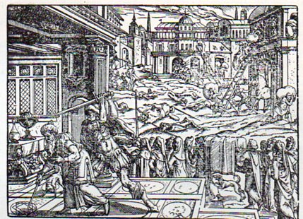
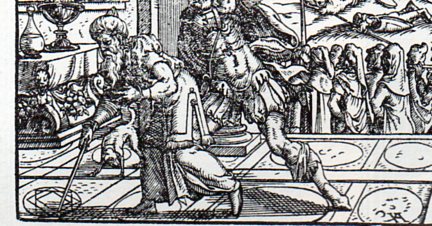
    Earlier in this blog there appeared an entry on the death of Archimedes–actually, it was a piece on an image depicting the killing of the great mathematician.  It is a pretty gruesome affair, even by the very early 18th century standards under which the engraving was made–gruesome still by today’s standards, what with the man’s head being cleaved laterally in two by the summoned Roman Centurion. I’m not an historian of these images of Archimedes, but I can say that for whatever I am, I have not seen anything quite so graphic dealing with the man’s death.

    The usual images of Archimedes coming to his end show him working a problem in his dust/sand/earth “chalkboard”, absorbed to such an extent in his thinking that he doesn’t hear the chaos outside his rooms, and doesn’t sense the approach of the soldier who finds Archimedes unresponsive to his calls and therefore a threat, and so kills him.

    Archimedes022[Image source:  Titus Livius, Romanae historiae principia, libri omnes.  Printed in Frankfurt by Feyerabend, 1578.]

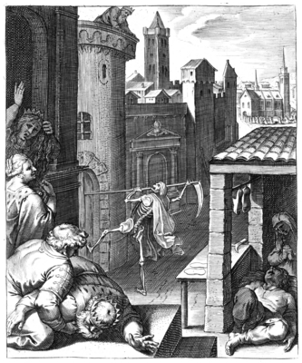
    Looking at this image (above) brought to mind another in the history of anticipation–not knock knock knocking on Heaven’s door, but the opposite, and the opposite of that, the opposite of  knocking on Death’s door, or at Death’s door:  Death knocking at our door. 

    The title of this emblem–Cunctos mors una manet/death is all that remains–is meant to remind us

    va1612099pict

    of our common foe.  It is the work of  one of the great engravers of his time, Otto van Veen (teacher of Rubens),  and appears (along with next image and 100 others) in his Q. Horati Flacci emblemata.  Imaginibus in acs incisis notisque illustrata, printed in Amsterdam in 1607 by H. Verduss.

    –All images and most translations courtesy of the splendid work at The Emblem Project/Utrecht, here.–

    Part of the legend (which appeared in four languages) of the image leaves us with the following reminders, choice bits on the folly of forgetting our common end:

    La terre embrasse tout comme mere commune –Mother Earth embraces us all

    Moritur sutor eodem modo ac Rex.–The King died the same as the shoemaker

    Death is the thing that sucks the rivers of lives, “Del rico al pobre, del soldado al Papa”, From rich to poor, soldier of the Pope.

    and so in image and word telling us that death will seek us out, whether king or shoemaker, rich or poor–and that in the coming end the Earth will take us all.  Archimedes didn’t hear that one coming; nor did he care, I think. 

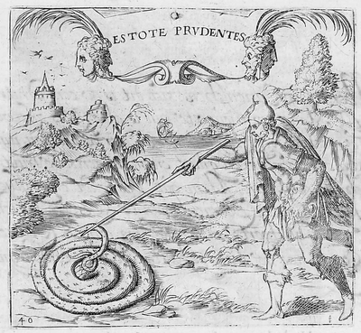
    THis last image brings to mind Archimedes’ work in the dust, though the intent of teh emblem (“Estote prudentes” //Be ye therefore wise // Be Cautious) wouold have been completely lost on him.

    The legend translates (Thanks to the Emblem Project for this):

    When the serpent sees that it is going to be attacked with,
    Lethal wound, it protects its head with artful care.
    Here lie the dwellings of the soul, the sanctuary of the truth.
    Hence comes life that is to be hoped for by every body.

    Surely Archimedes could relate to his lines and the expressions of his thought as the dwellings of his soul (if he actually believed in a soul), though I guess you could say that the artful deception of the serpent’s head finally wound up killing him via the Roman soldier.

    Letali serpens cùm se videt esse petendum
    Vulnere, sollicita contegit arte caput.
    Hîc animæ sedes positæ, verique recessus: (here placed the seat of the soul, in artful covering…)
    Hinc spiranda omni corpore vita venit

    av1615040pict


  • History of Lines: Clouds

     JF Ptak Science Books  Post 1629  (On Clouds and Not-Clouds, Part I)

    “…and they drew all manner if things–everything that begins with an M—‘

        ‘Why with an M?’ said Alice

       ‘Why not?’, said the March Hare.” –Lewis Carroll,  from “A Mad Tea Party”, in Alice’s Adventures in   Wonderland.

    Why not, indeed?  I’ve long had an interest in clouds, and since this blog is ostensibly on the surfacing or definition of Cloud Bones, I though to spend a little time on the origins of the depictions of printed clouds in art. Not being an expert by any means on the history of art, it just seems to me that after long exposure clouds are not well-represented in woodcuts, wood engravings and other early engravings, or at least not so well depicted as their landsmen in paintings.  There seems to be no shortage of effort to reveal gorgeous clouds  through the early Renaissance–but the doesn’t seem to apply very often to their representation in prints.

    And that of course is when the detail of the sky is depicted at all. It seems that more often than not, in woodcuts printed from say 1460 through 1550, that the sky is left blank, like this image from Ovid (Accipe Studiose Lector P. Ouidij Metamorphosin...printed in Venice in 1509:

    Clouds no couds livy913

    “You could not see a cloud, because
    No cloud was in the sky:
    No birds were flying overhead —
    There were no birds to fly”.–Lewis Carroll, Through the Looking Glass. 

    I could go on with many examples of the blank sky–the white, blank, settled nothingness–but exhibiting variations of nothing at this point isn’t necessary.  But illustrating clouds is.

    And for the most part, clouds don’t look very much like themselves in prints, not really, not for more than a hundred years.  For example, Martin Schoengauer‘s spectacular  The Temptation of St. Anthony, which was printed in 1470/5, has a beautiful, fluid circularity to it, full of an earthy roundness even as the saint is pursued by demons.  But the sky in the background is populated with nothing but dashes to suggest clouds. 

    http://thewholegardenwillbow.files.wordpress.com/2008/11/schongauer-martin-anthony103.jpg

    Perhaps clouds would have taken away from the moment; but if that were the case, why bother with the dashes?

    There are considerable exceptions to this practice, with Durer and Altdorfer coming quickly to mind–but in my experience, the oddly-formed cloud seems to be the majority rule in the woodcut.  

    At this time there were of course many depictions of skies with no clouds in paintings, bare suggestions of themselves, even in some of the most famous works–Botticelli’s Birth of Venus and Michelangelo’s Fall of Man in the Sistine Chapel are fair examples.  But once you move away from the golden Sienese skies of the14th century1, clouds are given full and beautiful shapes from early periods. (Giotto’s Christ’s Entering Jerusalem, 1305/6; Simone Martin The Road to Calvary, 1340; Duccio’s Christ Entering Jerusalem, 1308-1311; Fra Angelico’s The Dposition, 1436; Masaccio’s The Tribute Money, 1424; Lippi’s Annunciation, a perfect cloud treatise, 1442, and on and on. Other examples are found in continued reading below.)

    Clouds in prints are a different matter–I’m not sure if it was just too technically difficult to create clouds in wood, or if there was some sort of languishing Byzantine sensibility inherent in woodblocks that was not so in oil. I’m really not so sure about this, and as much as anything else I’m thinking out loud about this lack of cloud definition.  I don’t have an answer for it.  But I do want to share the beginning of a timeline for undefined clouds as they appeared (or not) over the course of about one hundred years,  from 1485 to about the end of the 16th century.   As I mentioned clouds appeared beautifully in paintings from earlier periods, and there doesn’t really seem to be a substandard-cloud complement in the painting world as there was in the print world.  Of course, in western philosophy and science, clouds were pretty much left alone from inquiry, even by a series of the great natural history classifiers–they wouldn’t really be given a fully taxonomic appreciation until 1803 by Luke Howard (which I wrote about in this blog earlier, here).

    A Timeline of Clouds in Prints, 1485-1596

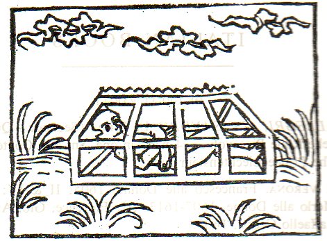
    Franciscus de Retza, De Generatione Christi, sive Defensorium Castiatis Beatae Virginis Mariae, a beautiful work in Gothic type–a picture book, really, with two illustrations of magnets.  Printed in 1485, this image depicts Isidorus in a magnetic coffin which is floating in the air:

    Clouds 1485908

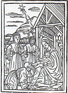
    “The Adoration of the Magi”, from Legenda Sanctorum Trium Regum, printed in Modena in 1490:

    Clouds 1490 adoration magi912
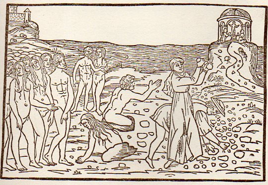
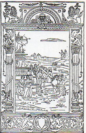
    The Triumph of Love, 1492/3:

    Clouds 1492 triumph love911


  • History of Lines–Where is “there”? The Medieval T-O World Map

    JF Ptak Science Books   Quick Post  

    Lines--t map639

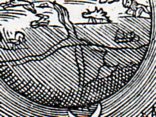
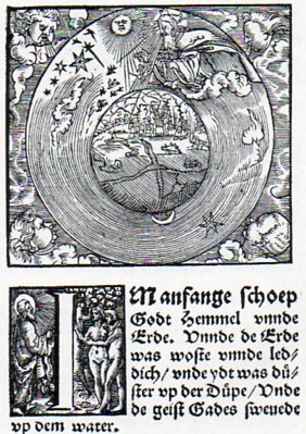
    This woodcut cosmological illustration from a 1526 Bible is a subtle and very late printed rendition of a great and classic Medieval idea.  At the center(or thereabouts)  of the globe of the Earth there is a seeming confluence of two great rivers, but what it reminds me more of is the T-O map, the orbis  terrarum, the direct descendant of the

    Lines--t map638

    Greco-Roman map making.  The T-O map makes distant and deep calls into the past, finding a home in Macrobius (around 400 CE) and Orosius (5th century )and more famously with Isidore of Seville (ca.  600), a work known to most folks today because of its appearance in Seville’s Etymologarum of 1472, which is also the first map printed in Europe (pictured below). (Why is took almost 20 years after Gutenberg to print a map is mysterious to me.)

    Generally Jerusalem would appear at the center of this sort of map, which would have appealed to the necessary people that the publication needed to have the appeal of.  The Mediterranean would separate Europe and Africa from Asia, while all of the land masses (the stuff outside of the “T” structure” were surrounded by the great “O”, the ocean(s).

    Sixteen years later a remarkable map of the world would appear in Ptolemy’s Geographia, an Ulm-printed masterpiece that appeared in 1486. 

    . Ptolemy's world map (around 140 CE);copy Ulm edition of 1486.
    But I think that the crossed lines from the Luther Bible of 1526 was really just a suggestion of the past, not meaning to lean on the Medieval world at all.  Still, though there they are. 

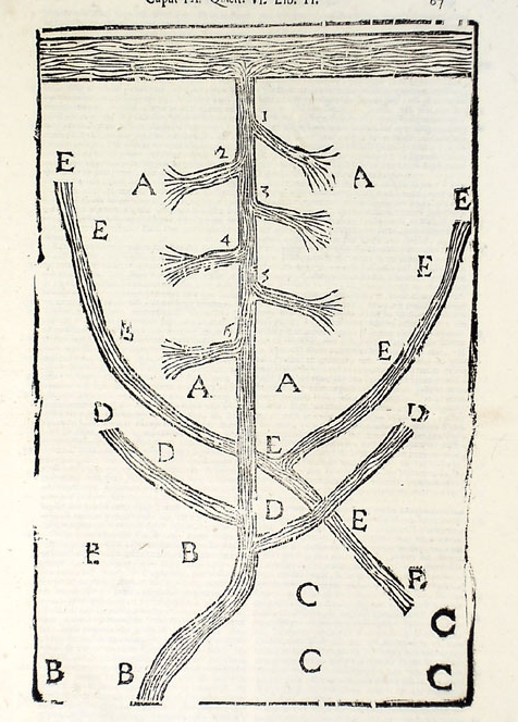
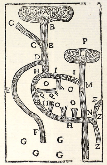
  • History of Lines–the Heart, Arteries and the Circulation of the Blood, 1628 (1639)

    JF Ptak Science Books     Post 1570

    Harvey635
    I think that if I had a sense for design and some artistic talent that I could perhaps make something interesting out of bits and pieces of the details of a hundred famous lines.  Or two hundred.  Unfortunately, I don’t possess those talents, so I’ll just have to write about it as though it has been done, already.  If we could whisk ourselves away 50 years into the past to the great world of early broadcast television, back into the days of glorious black and white, it would be interesting to present the details singly and first on a game show like the lovable “What’s My Line” show. (Another guest, another one of the hundred or two that could appear, can be seen below*, though I think this one is a dead giveaway.)

    http://vintage45.files.wordpress.com/2011/04/whats-my-line.jpg

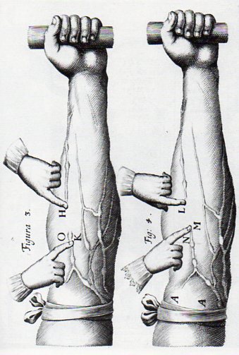
    Today’s line section from this blog’s History of Lines series comes to us from William Harvey, being an illustration in his epochal Exercitatio anatomica de motu cordis et sanguinis in animalibus (or On the Movement of the Heart and Blood in Animals).  It was in this book that Harvey published his experimental results on how blood moved through its course in the body, showing that the 1400-year-old Galenic idea concerning the movement of blood was all wrong. 

    Harvey634
    Harvey had conducted experiments via the scientific method–and was among the earliest to do so–and established early on, by 1615 or thereabouts, that the Galen theory regarding the movement of the blood was incorrect. He found that contrary to long-established belief the liver did not convert food into blood, and that the lungs did not push the blood through the  body, and that blood was not continuously generated.  Why wait until 1628 to publish his results?  I suspect that he was not looking forward to the problem and notoriety of publishing results that went against the medical grain–actually some of which were the exact opposite of the accepted practice–which in fact was the case for decades after the first edition appeared.  But Harvey presented his results in his short book in a concise way, explaining how it was that the heart and arterial systems functioned, and then in a second section of the work displayed how the blood was circulated rather than produced. (He was able to establish that if Galen’s theory was correct that the liver would have to produce 540 pounds of blood every day–a simple impossibility.)

    Harvey’s work had a revolutionary effect on the study of physiology and medicine at the same sort of level as Copernicus or the use of the telescope by Galileo–I think that there is little doubt in that.  Harvey was able to produce his results through experimentation and without the benefit of the microscope, which would have helped him enormously had he been able to identify capillaries–something that would have to wait for Marcello Malpighi and his publication in 1673, sixteen years after Harvey’s death. 

    Notes:

    Lines copernicus b

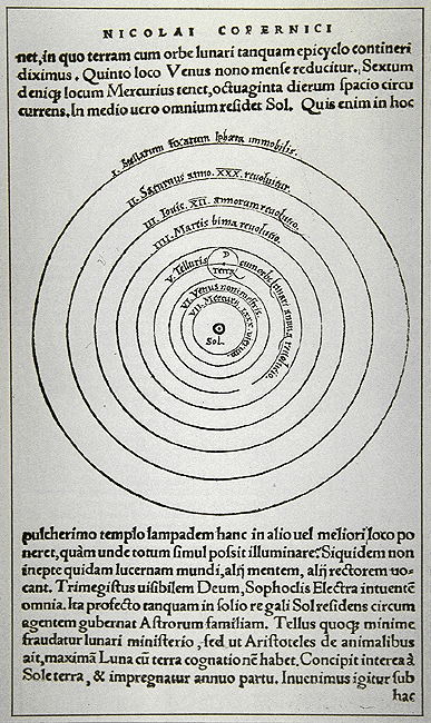
    The detail from the big image in Copernicus’ De revolutionibus orbium coelestium (On the Revolutions of the Heavenly Spheres), 1543.

    Lines copernicus


  • History of Lines–Naive Rivers and Trees, 1670

    JF Ptak Science Books   Quick Post in the History of LInes series.

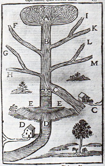
    River629 This lovely river/tree appeared as a woodcut in Franciscus Maria Pecchius’ Tractatus de Aquaeductus, which was printed in 1670-1673.  It actually is nothing of the sort, as it depicts the construction of a dam in a busy river and forms part of a four volume work on the building of aqueducts–ranging from the selection of sites, to financial considerations and of course engineering and materials studies.  Pecchius’ work was the standard of its day, and it also was the cornerstone work on the (Roman) law of such things, presenting a jurisprudence that stretched back a thousand years.

    But the way that the flow of the river is represented makes the image look very much like a tree, in a lovely, naive way.  It might seem a horrible sleight to a work of this importance, but, well, sop it goes–the images, removed from their appropriate context, take on a life of their own…

    River aquaduct 2
    River aquaduct 3


  • A Forty-Year Precursor to Modernism–Found Cubism in 1870

    JF Ptak Science Books  Quick Post     [History of Lines #18]

    I was very surprised to come across this illustration while browsing the (3 April)  1870  volume of Punch, or the London Charivari .

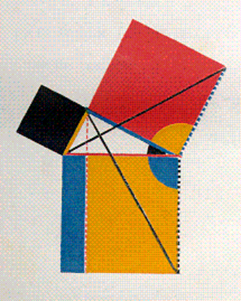
    I cannot think of any particular peculiar or unusual edition of Euclid that was published at about this time to demand such an unusual illustration. (The only newish edition that comes into any possible play here is Oliver Byrne’s semi-insane First Six Books of Euclid, published by the Chiswick Press in 1849 and one of the most unusual and beautiful books of any sort printed in the 19th century–but then again that was 21 years before this volume of Punch.) And by “unusual” what I really mean to say is “highly unexpected” , as this all-angular depiction of a woman appears for all the world to be a Cubist- or Expressionist-like image, predating those movements by four decades. 

    But the Angular Woman just seems to be happenstance, a happy precursor to a revolution-in-the-making, an accident forty+ years too early.  She is extraordinary–and for some reason she is smoking a cigarette. 

    [Below–an illustration from Oliver Byrne, illustrating the propositions of Euclid via the use of color rather than words, a beautiful but non-functioning work.]

    Blogrealbyrne


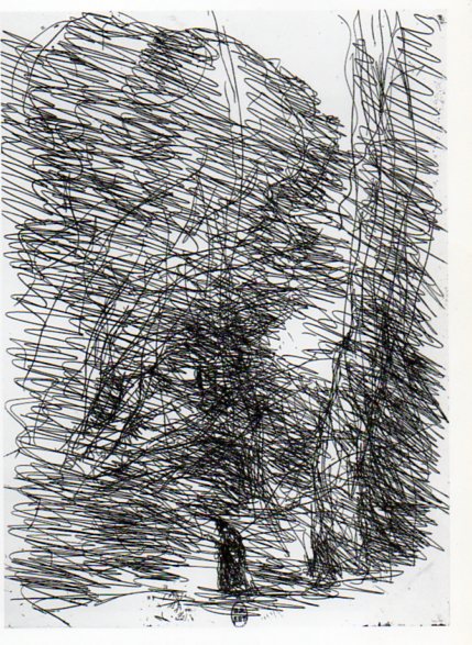
  • History of Lines, #17: the Artist Painting the Negative, Camille Corot, 1874

    JF Ptak Science Books   Post 1584   [Part of the History of Lines series]

    Corot657 An interesting appearance of lines in art that seemingly crosses several disciplines and chronological development is Jean-Baptiste Camille Corot’s The Dreamer and the Large Trees (1874).  It is vivid artwork full of motion, expressing itself in an impressionistic sense that seems almost more abstract expressionist than mid-early Impressionist. (As an Impressionistic work it would be well into the second decade of the movement; if Abstract Expressionist, it is three decades early.)  It is a brusque, almost savage portrayal of a somber person in a deep wood, though the lines that is is composed of say anything but that. 

    The print was made via the cliche verre process1–Corot used a semi-photographic medium in which there was no camera, as it was the artist who drew the negative, who created the image from nature without a lens and without a camera body (thus eliminating lensless photography like pinhole), drawing directly on the medium (which in this case is glass, insinuated by the cliche) and then exposed/printed onto a photo-sensitive paper (the verre).  The artist is in a sense making a photograph directly of the image in their mind, recording it on the medium, and then printing it from there. 

    Of course there are other important lines in the history of art: Vincent Van Gogh Starry Night (1889), Giacomo Balla, Street Light (1909), Umberto Boccioni States of Mind (1911), Michael Larionov’s Rayonist Painting (1913),   Robert Delaunay Windows, (1912), Roberto Crippa (1921-1972), Jackson Pollock (1912-1956, particularly Number 1, 1948), and any numbers of works by Barnet Newman.  And of course the Cubists: Braque, Gris, Picasso, and the rest; the Constructivists like Malevich, and on and on into the sunset.  But the reason I’ve chosen Corot is because of the unexpected, wildish impressionist qualities that seem so far out of place, even with the movement. 

    Notes:

    1.  Cliche Verre was quite popular with French artists of this period, used by Theodore Rousseau, Charles Daubigny, Charles Jacques, Francois Millet and others.  The process itself appeared very early on in the history of photography, being described in Robert Hunt’s technical manual on artistic photography as early as 1841, two years after photography’s beginning.

    The images:

    ·Posted by :

    ·in:

    — — —