A Daily History of Holes, Dots, Lines, Science, History, Math, Physics, Art, the Unintentional Absurd, Architecture, Maps, Data Visualization, Blank and Missing Things, and so on. |1.6 million words, 7500 images, 4.9 million hits| Press & appearances in The Times, Le Figaro, Mensa, The Economist, The Guardian, Discovery News, Slate, Le Monde, Sci American Blogs, Le Pont, and many othr places… 5000+ total posts since 2008.

Category: German Design

  • History of Heavy: German Graphical Design, 1925

    JF Ptak Science Books   Quick Post

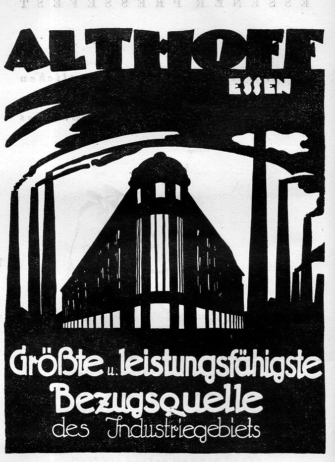
    I’ve posted before under this title (just scout under “German design” in the google box) and decided to add this one because of its heavy-obviousness, and also because of a heavy-missing element.  The image in question is from an ad in an odd publication celebrating/promoting Essen businesses, Essener Pressefest, 1925–at least that is what I think it is. The pamphlet has a lot of advertising from what looks to be small firms, but there is nothing there whatsoever regarding Krupp, which had been established in Essen for two centuries at least. Nor were there any other ads for anything else in the heavy department or what could have led to the city being called the Armament Maker of the Reich, and which would ultimately lead to Essen being mainly totally razed after 270-odd Allied bombing raids on the city during WWII.  So, no Krupp, but there was a two-page illustrated something-or-other on marionette theaters–marionettes, puppets, paper theater all have their place in the world, but I wonder what the place was when Krupp et alia are nowhere to be found?  No doubt I’m missing something, or everything–perhaps it had to do with Versailles and the focus was beyond iron works? I don’t know. Anyway, here’s the ad:

    Althoff324


    ·Posted by :

    ·in:


  • Striking Anti-Nazi Work on the Subjugation of Women, 1931

    JF Ptak Science Books  Quick Post

    German design frau in reich031

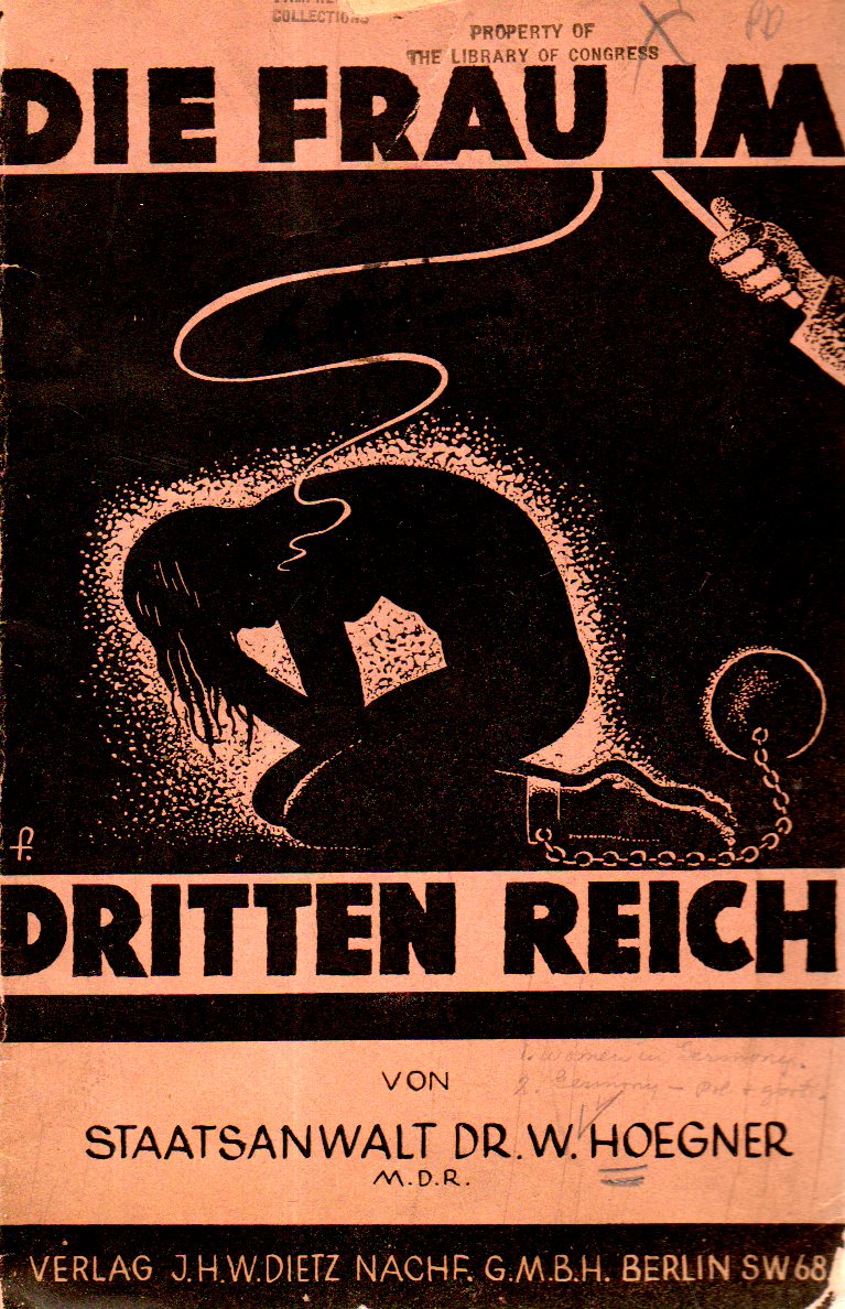
    Wilhelm Hoegner was an early and influential opponent of Adolf Hitler and the NSDAP–a very early opponent, having been involved in the investigation of Hitler’s Beer Hall Putsch in 1923.  He maintained his strong opposition as a member of the Reichstag from 1930-1933; after the elections and after Hitler consolidated his power in 1933, Hoegner’s position became “untenable” in Germany and he left for Austria, and by 1934 he was situated as a journalist in Switzerland.  He played a prominent role in German postwar politics, and died in 1980. 

    Hoegner wrote Die Frau im Dritten Reich  in 1931 as a warning to all about the totalitarian possibilities of the Nazis, and in particular of the tyranny against women–the result is pretty much evident on the very striking cover of his pamphlet.


  • The Swastika as a Rising Sun–Linz, ca. 1935

    JF Ptak Science Books   Quick Post

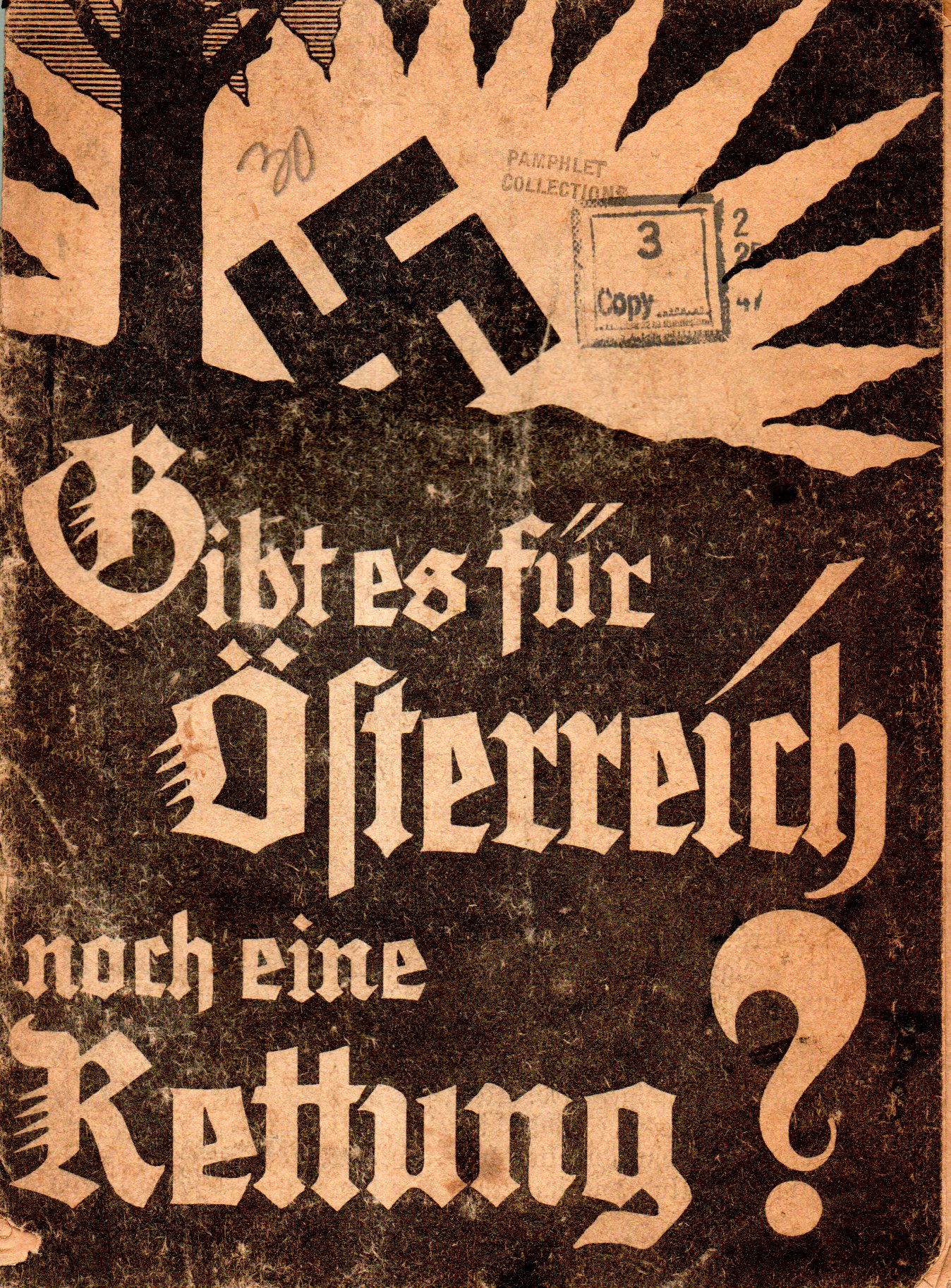
    Judging from the cover art it is not necessarily clear what is going on with that swastika. But given the question in the title (“Can Austria Still Be Saved?”) and the publisher, the NSDAP’s Volkstimme (Linz) leaves little doubt that the swastika is a rising sun rather than setting.  I can’t find another title in the OCLC/WorldCat–which makes this piece of propaganda rare–and which means that I can’t date it precisely, though I would say it was printed prior to the annexation in 1938 (though the design definitely has an earlier touch to it…)  There is a mention of the Gauleitung der N.S.D.A.P. and the Hitlerbewegung located at Goethestrasse 7 in Linz–and since the Nazis were suppressed under Dollfuss from 1932-1934, which means this document may have been printed in the mid/late 1930’s.  

    German design salvation Austria032


  • Dreamy Typewriter Ads–Berlin, 1914

    JF Ptak Science Books  Quick Post

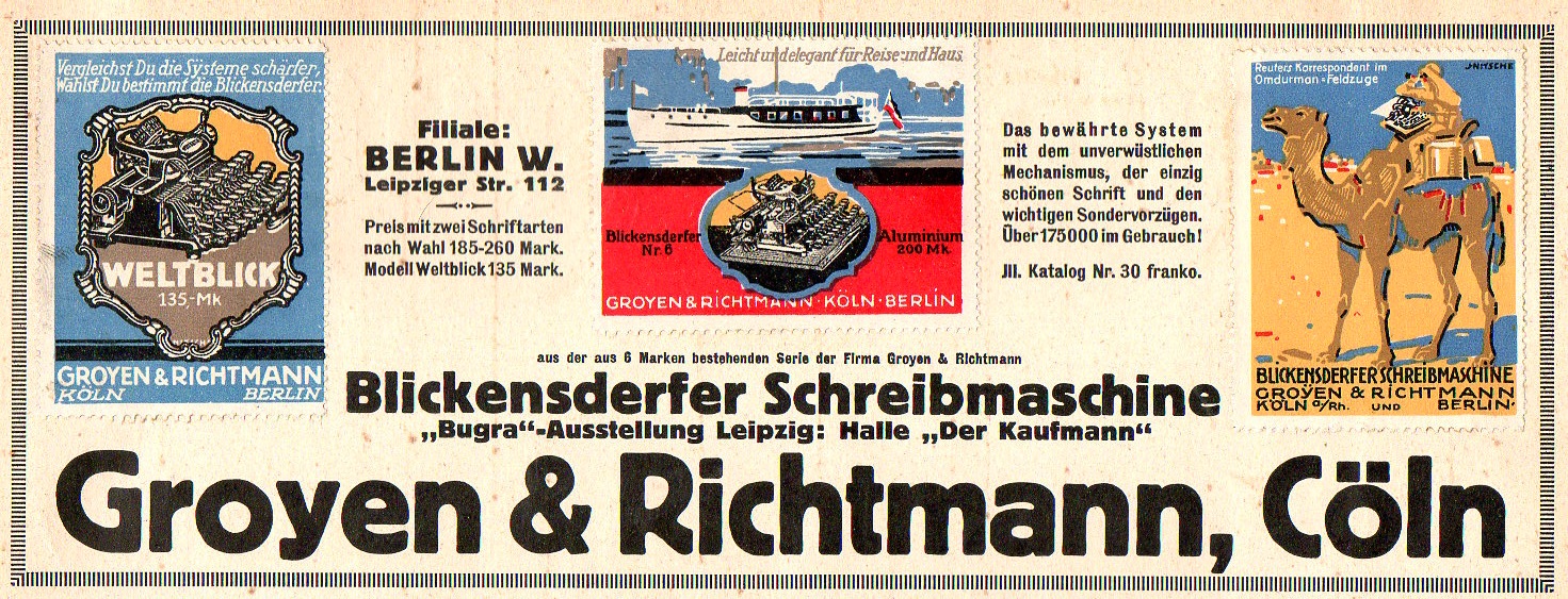
    This ad appeared at the top-quarter of a page in Illustrirte Zeitung for July 1914, a month before the beginning of the war–these creative and colorful stamps (each only about one inch tall) were made to attract readers of the weekly magazine to the fine typewriters produced by Groyen & Richtmann of Cologne and Berlin.

    Typewrriter ad Groyen920

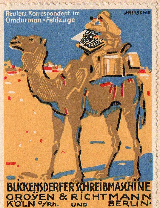
    And the details (the first showing a Reuters reporter on a camel somewhere in the Sudan):

    Typewrriter ad Groyen922

    ·Posted by :

    ·in:


  • Before the Storm Comes the Chocolate (1923)

    JF Ptak Science Books  Post 2508

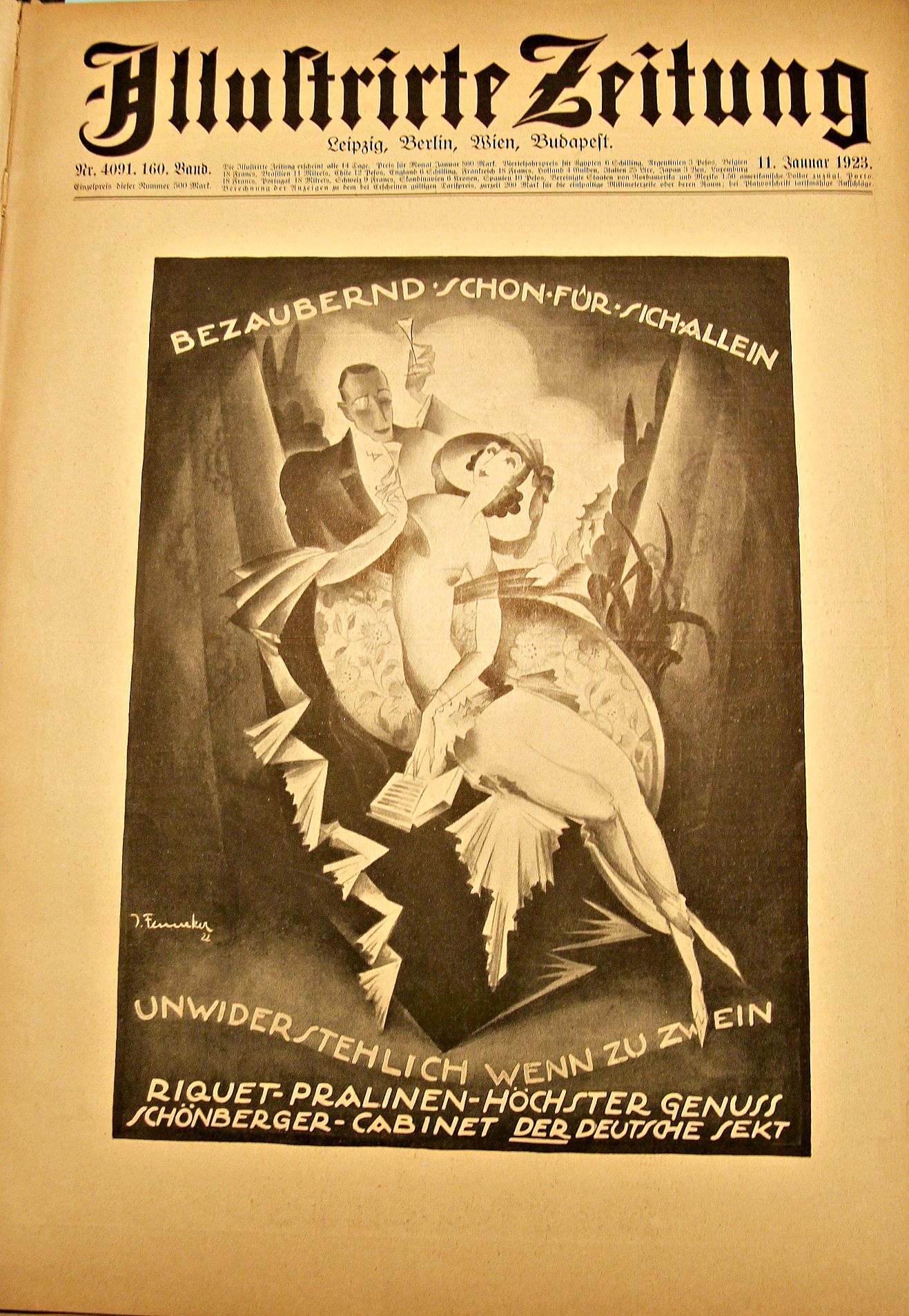
    1923 was a tough year for most Germans so far as chocolate was concerned, though Riquet (the advertiser in the striking graphic, below) was promoting their (“enchanting” and “irresistible”) goods very prominently, so I guess there was still some good demand for it no matter what happened to the fabric of social/economic Germany.  But it was in January–when this ad was published in Illustrirte Zeitung–that things started to go very badly for Germany.  By the end of 1922 it was apparent in Germany that they could make their next reparations installment payment (in January, 1923); the French and Belgians, among others, didn’t believe it and got very quickly pissed, and within days responded very aggressively, militarily occupying the Ruhr district. The Ruhr was home to German industry and electrical production, and manufactures in general, and the government-led response to the invading force was peaceful though it did  call on the workers to go on a general strike. And so it came to pass that no production to speak of was happening, and the tight-cashed German government, which was still under obligation to pay the strikers, did so, but created the money out of nothing,  just printing it as necessary.  This would be the start of  a disaster that would lead to a greatly debilitating and damaging hyper-inflation, which helped pave the way to a failure of the Weimar government, and finally helping to give rise to Adolf Hitler–it was all downhill from there.  

    Chocolate of course had been around for a long time by this point–especially in Central and South America, where it reaches back about 3700 years to to Olmecs, and carried forward to the Aztecs. Christopher Columbus bumped into it during his fourth voyage, but chocolate as “chocolate” really didn’t make it to high society consumption until the late 16th century; then some more years, until in the early 17th century came the chocolate craze, eventually winding its way to anyone with a little disposable income, to the modern day when some chocolates (like Hershey Kisses) are hardly chocolate anymore, but have the near-scent of it.

    At this point in 1923, five years after the war, and more years than that into a crippled economy, it would have been a luxury for most people in Germany to be able to afford some of this Riquet chocolate.  It was certainly not uncommon to see advertisements for luxury goods during hard times, though.  Having looked at every page of the popular weekly magazines like the Illustrated London News, Illustrirte Zeitung, and Scientific American for the 1914-1918 period,  I can safely but not experimentally say that there was plenty of advertising revenue collected by these mags for the sale of luxury goods. This extends too to Life magazine for 1936-1945, where there was also “a lot” of advertisement for common and semi-luxurious goods that wrapped themselves up in patriotic war efforts (cigarettes are among the most conspicuous of these win-the-war/smoke-Lucky-Strikes ad campaigns).

    I’m not taking issue with Ricquet, not at all–I think that the ad was simply “standard”.  But it did strike me as being somewhat loaded with potential zeitgeist, like the ad I found for traveling to Czechoslovakia for “wintertime fun!” dated October 1, 1938.  

    German graphics riquet pralinen


  • EyePunk: Bare-Knuckle German Design, 1923

    JF Ptak Science Books  Quick Post         

    [Part of the series on German Design]

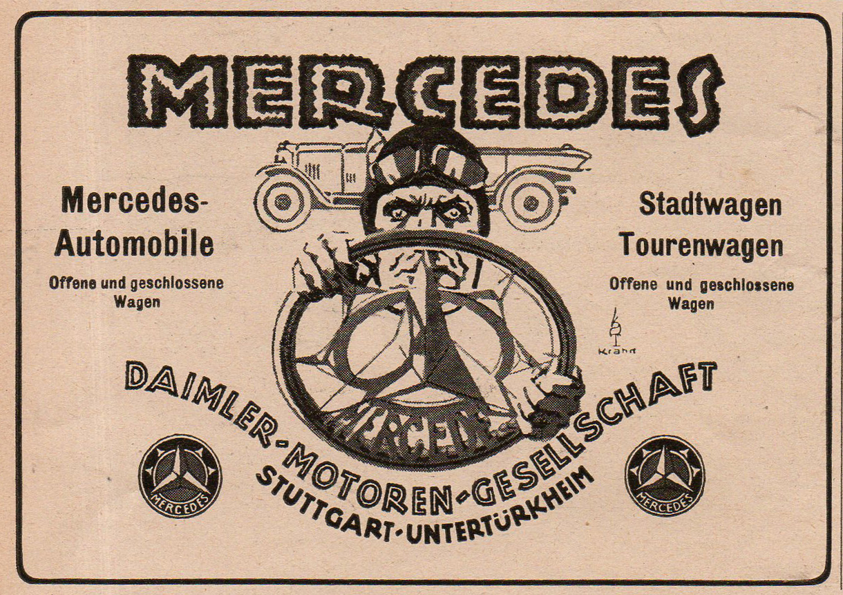
    Form my experience in looking at hundreds of thousands of images over the decades that I have semi-operated an antique image store, I can say that–especially with cartoon characters–the  main character of an image seldom looks directly and full-faced into the eyes of the viewer.  It is very uncommon.  That is one of the reasons why this ad for Mercedes motorcars (found in the pages of the Illustrirte Zeitung (Leipzig) for 1923) made such an impact–that, and the great and urgent/insisting design.  

    Car crazy detail2
    This is a detail from the 5×3″ original:

    Car crazy004
    Its a good piece of design. 

    ·Posted by :

    ·in:


  • GEAR-PUNK: German Technical Advertising Art, 1920’s

    JF Ptak Science Books    Quick Post  [Part of a series on German Design]

    German tech art715

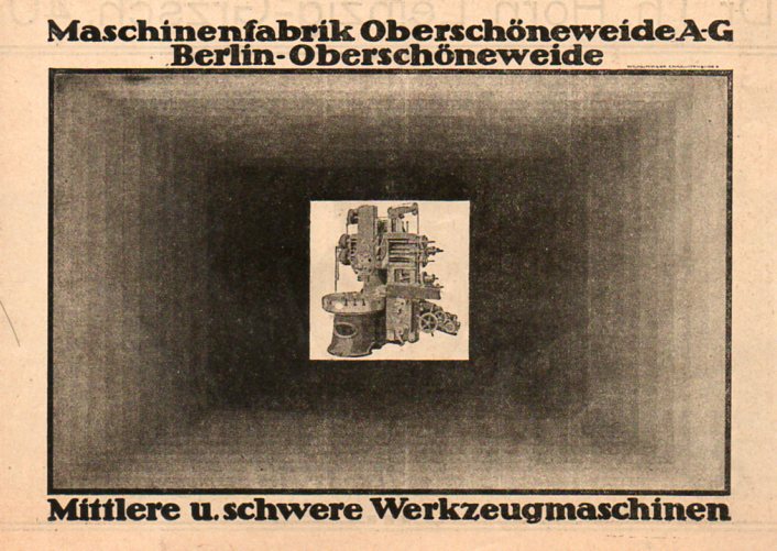
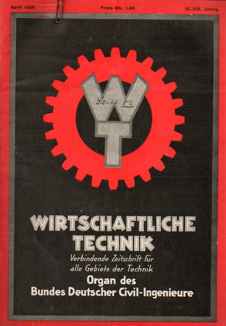
    Two odd pieces of German technical literature stared up at me from the bottom of a box of such things, both of which contained excellent examples of advertising technical art in addition to their technical content. But it just so happens that in this case the artwork that helped pay for the publication of the previously interesting and important technical and scientific information is of more interest now than the information wrapped around the ads. The sources of these images include the Festschrift zum Hundertjahringen Bestechen der Zeitschrift of the Dinglers polytechnisches Journal (1920), and Wirtschafliche Technik…Organ des Bundes Detscher Civil-Ingenieurre (1920).  Somehow the ads retain a certian light touch in the midst of their occasionally massive heaviness.  Or perhaps it is just robustness, solidity?  If nothing else there are an artistic anti-approach to what was going on in the world of art, the opposite of the disappearance of concrete or natural forms and replacing them with ideas and colors. 

    German tech art702Again, these are just two slim issues of rather obscure journals.  I’ll add to this collection in the German Design section as they come up. 

    German tech art706


  • German Weimar-era Advert Artwork, 1923


    JF Ptak Science Books  Post 1857

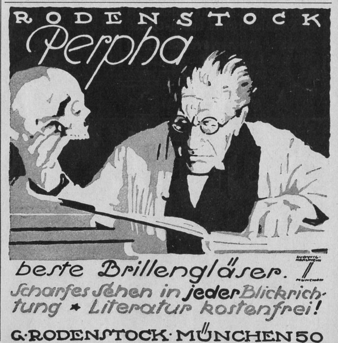
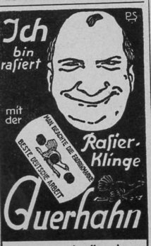
    The following ads appear in just three weekly issues of the LIFE-magazine-like Illustrirte Zeitung (Leipzig).  Generally the ads are crowded onto the 15-inch-tall pages–sometimes as many as 15 to a page.  Their design is remarkable, and artful, and effective.  Plus, they’re chock-a-block full of smaller design elements.  For example, this one is one of my favorites for this period:

    German B+W679

    I actually used it for the “Open” sign for my store back in Georgetown so many years ago oh my brothers.  That was before I discovered that it has a major problematic problem–it was designed by one of the greatest German designers of the time, Ludwig Hollwein, who also happened to be “a” (and then “the”) principle designer for propaganda/posters for the National Socialists, and that from the early period (1933) right on through the end of the war. 

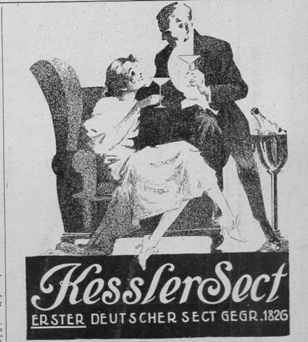
    There was more to worry about than simply selling Germany’s oldest champagne, but of course many were immune to worry.  When this ad ran for Kessler champagne, hyperinflation had struck very deeply into thew Weimar Republic, with the U.S. dollar trading at 1:27,000 Marks. Even in January 1919 inflation wasn’t bad, with the dollar at 1:9 Marks (up from 1:5 in January 1918), but the simple tale of a long story is that the Weimar Republic kept printing money, and things got completely out of control, with the dollar trading in December of 1923 at 1:1.2 trillion Marks, which was a fertile seeding bed for National Socialism. 

    German B+W663

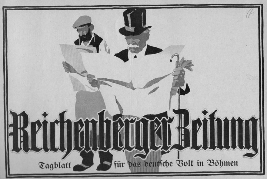
    This one is actually quite large, about a half-page, trying to sell the idea of the Reichenberger Zeitung to both the privileged and the working classes (the newspaper, which began in 1860, would not survive the Nazis, going belly-up in 1935):

    German B+W662

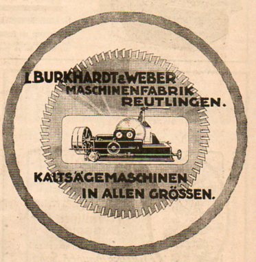
    Well, I don’t mean for this post to be very writer-y; I just wanted to post some of the images from these issues.  There’s really a lot to choose from, but these twenty or so will have to do for now: 

    This one is about an inch tall in the magazine:

    German B+W676

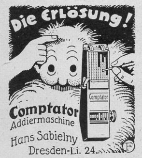
    Another tiny ad, this for a mechanical calculator:

    German B+W682

    ·Posted by :

    ·in:

    —

  • German Decorative Painting in Biedermeier and the New Style (or Jugendstil), 1907

    JF Ptak Science Books   Quick Post

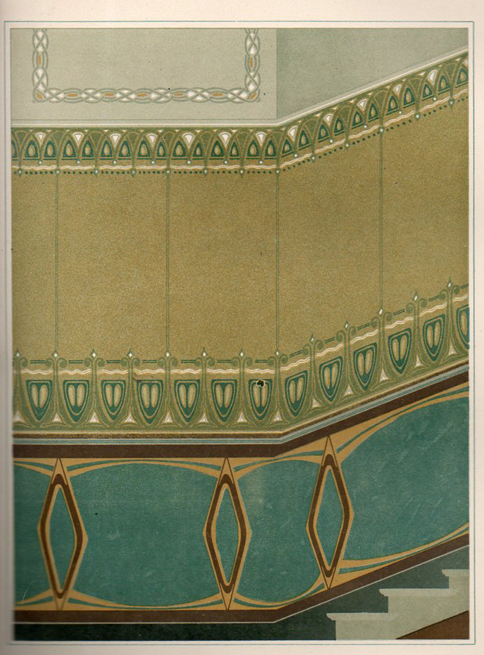
    This beautifully illustrated 1907 German book1 seems to me to be a sales catalog for a company selling flat-masks, or templates, through which desirable and somewhat complicated (or at last complex) painting may be produced.  A customer could leaf through this book of 60 designs which are arranged according to room type, and perhaps, if the fancy struck, could purchase the sheets and instructions necessary for the job to be done.  For example, plate #44 (Reggie Jackson’s number in the great summer of 1977), the “Pause mit Hilfsschablone” (its identifier in the “Preisliste” and offered at 10 Marks) is meant to decorate a wall for a stairway. 

    Jugendstihl361

    The great bulk of the designs are those for ceilings, and ceiling corners, as well as for wall designs and the small bits that run slightly above the floor and the wall (I’m sorry, but I don’t know the technical term for this).

    In any event it is a very surprising work to find–for me, at least–to see someone selling the possibilities of such advanced design motifs in a simple, order-it-from-our-catalog format.  [The catalog is available for purchase from the blog bookstore, here.]

    ·Posted by :

    ·in:

    —

  • German Design–Communist Election Material, 1932

    JF Ptak Science Books  Post 1561
    German design618

    There have been some fits and starts in dedicating an effort to posting some examples of German book illustration from the period between-the-wars.  There have been just a few thus far on this blog, though my intention is to place a hundred of the interesting bits in the collection here–most of these are pamphlets, and the vast majority do not make an appearance in the WorldCat database, which means that they are not catalogued/located in any library collection anywhere in the world.  Of course some folks say that pamphlets are a somewhat different category from books, and so don’t get catalogued as frequently, and therefore may actually exist in some number in these libraries–but if the library doesn’t know whether they have a particular title or not basically means that the book or pamphlet just isn’t there.  In the majority of circumstances, “we don’t know if we have it” = “its not here”, which pretty much means that for official purposes, the thing doesn’t exist.

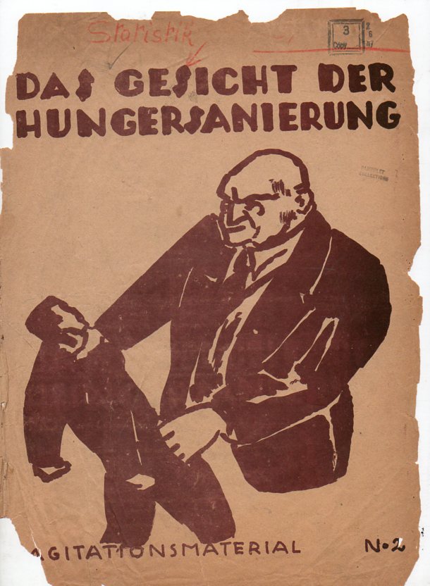
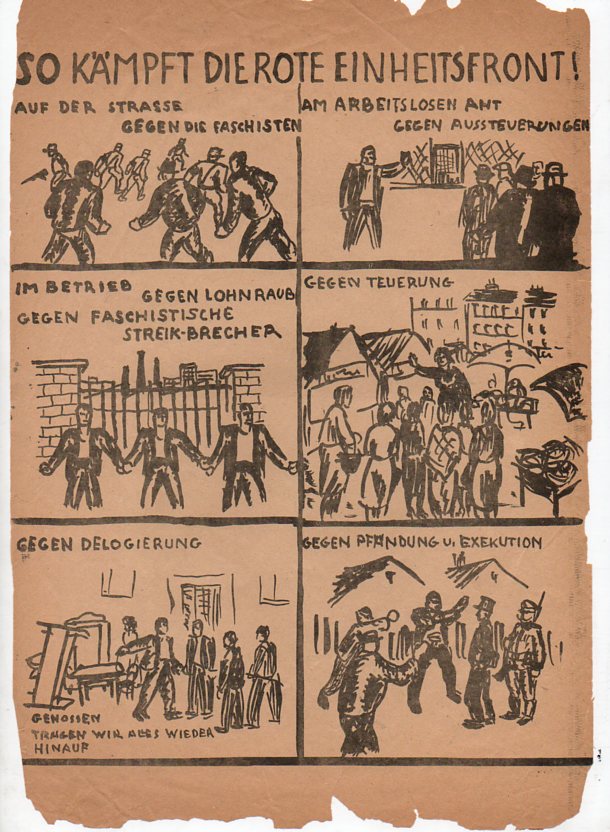
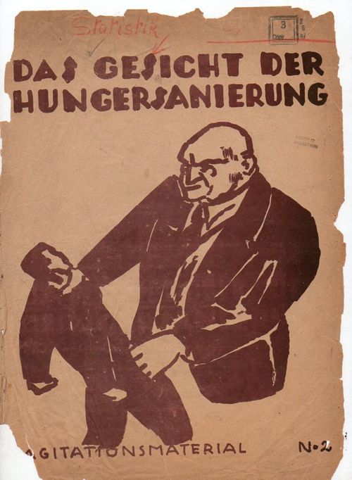
    And so to today’s installment:  Das Gesicht der Hungersanierung, Agitationsmaterial No.2, which seems to me to be a statistical handbook for a member of Germany’s Communist Party (KPD, the Kommunist Partei Deutschland), a very short primer on the status of the general working-poor laborer, inflation and unemployment –and how whoever published this pamphlet could help its redaer. 
    German design619

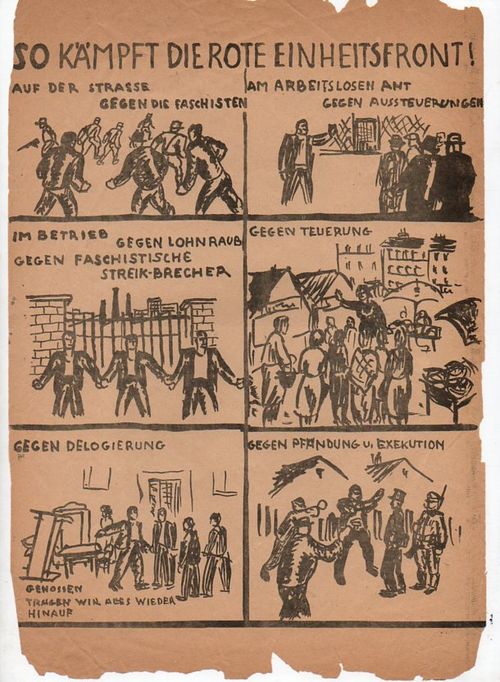
    The pamphlet does have a distinctive Communist Party taste to it, and certainly the title of one of the full-page illustrations seems to identify itself as such:  “So Kampft die Rote EInheitsfront!”.  Given the leaning of the rhetoric, and the assault on the controllers of industry, and its dislike for Fascists, it leads me to believe that this is KPD (though I hasten to add that I am hardly any sort of expert on Germany politics of the early 1930’s). 

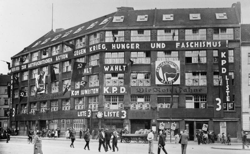
    There is some fair amount of the content of this pamphlet that appears on the facade of the KPD headquarters, painted right on the bricks of the Berlin building, as it stood in 1932.  THe party would have a very short life after that–Hitler and the Nazis would arrest the leaders of the party right there in that building in January, 1933, once Hitler had consolidated his power. On gaining the Chancellorship, Hitler took care to eliminate the KPD as much
    File:Bundesarchiv B 145 Bild-P046279, Berlin, Liebknecht-Haus am Bülowplatz.jpg

    as possible, imprisoning thousands of Party members in concentration camps as early as that same year, 1933. 

    The Communist Party did after all control some amount of the Parliament, finishing so (see tables below) in the 1932 elections; but the big loser of course was Hindenburg, and the rest of the world.

    This short, oversized pamphlet was no doubt constructed hurredly, emphasizing the control of the owners of the means of production over the worker, displayed on the cover by the giant “boss” with one hand around the worker’s neck and the other in his pocket, bolstered on the interior few pages with statistics.  But there was little, really, to say about the Nazis themselves, which makes me think that this was printed before that final vote in July. 
    ·Posted by :

    ·in: