A Daily History of Holes, Dots, Lines, Science, History, Math, Physics, Art, the Unintentional Absurd, Architecture, Maps, Data Visualization, Blank and Missing Things, and so on. |1.6 million words, 7500 images, 4.9 million hits| Press & appearances in The Times, Le Figaro, Mensa, The Economist, The Guardian, Discovery News, Slate, Le Monde, Sci American Blogs, Le Pont, and many other places… 5000+ total posts since 2008.

Category: Books–title pages, beautiful

  • On the Other Side of Things: Title Pages

    JF Ptak Science Books  Quick Post  Overall Post 5132

    There’s a certain beauty to be found in odd places in books and paintings.  

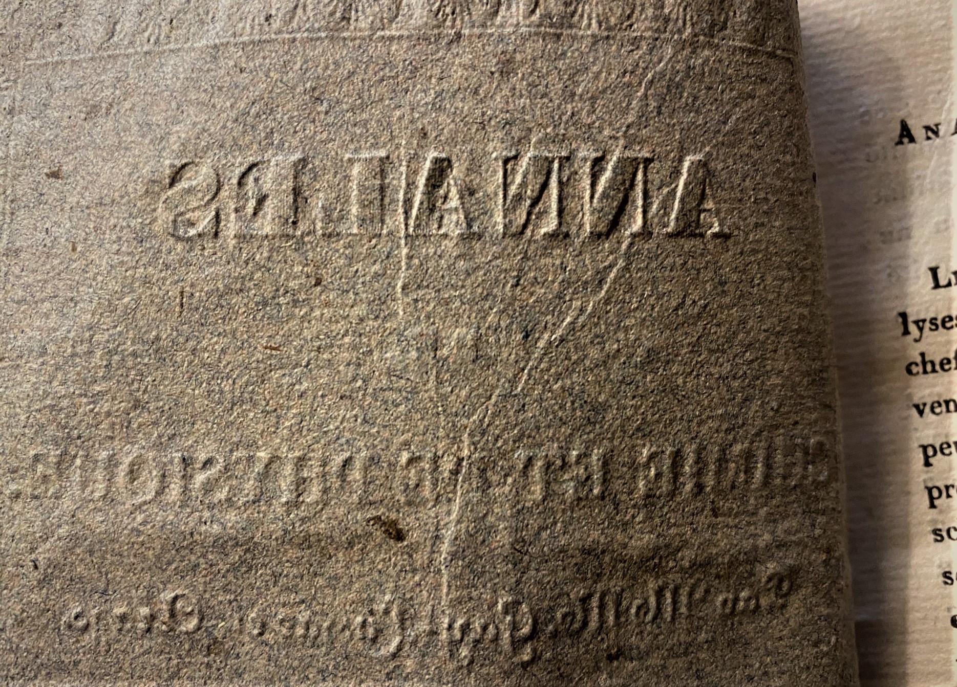
    This is not just looking at the reverse of a title page–this is about finding a little bit of 3-D relief on the back of a 2-D obverse.  Perhaps the printer got a little overly excited or was just starting the day when he compressed the sheet of paper over the set type back there in the late Parisian spring of 1825.  

    Whatever the case was, it didn’t last long, and there were very few other cases of this except here and there, spread throughout the issue–no doubt because he was printing four or 16 or whatever-number of pages per sheet which were then folded and gathered into order before their edges were cut. 

    Source: Annales de Chimie et de Physique, edited by Arago and Gay-Lussac (volume XXIX, June 1825), published in Paris by Crochard.  

    IMG_2921


  • A Lovely Printer’s Device Honoring the Sciences (1724)

    JF Ptak Science Books  Quick Post

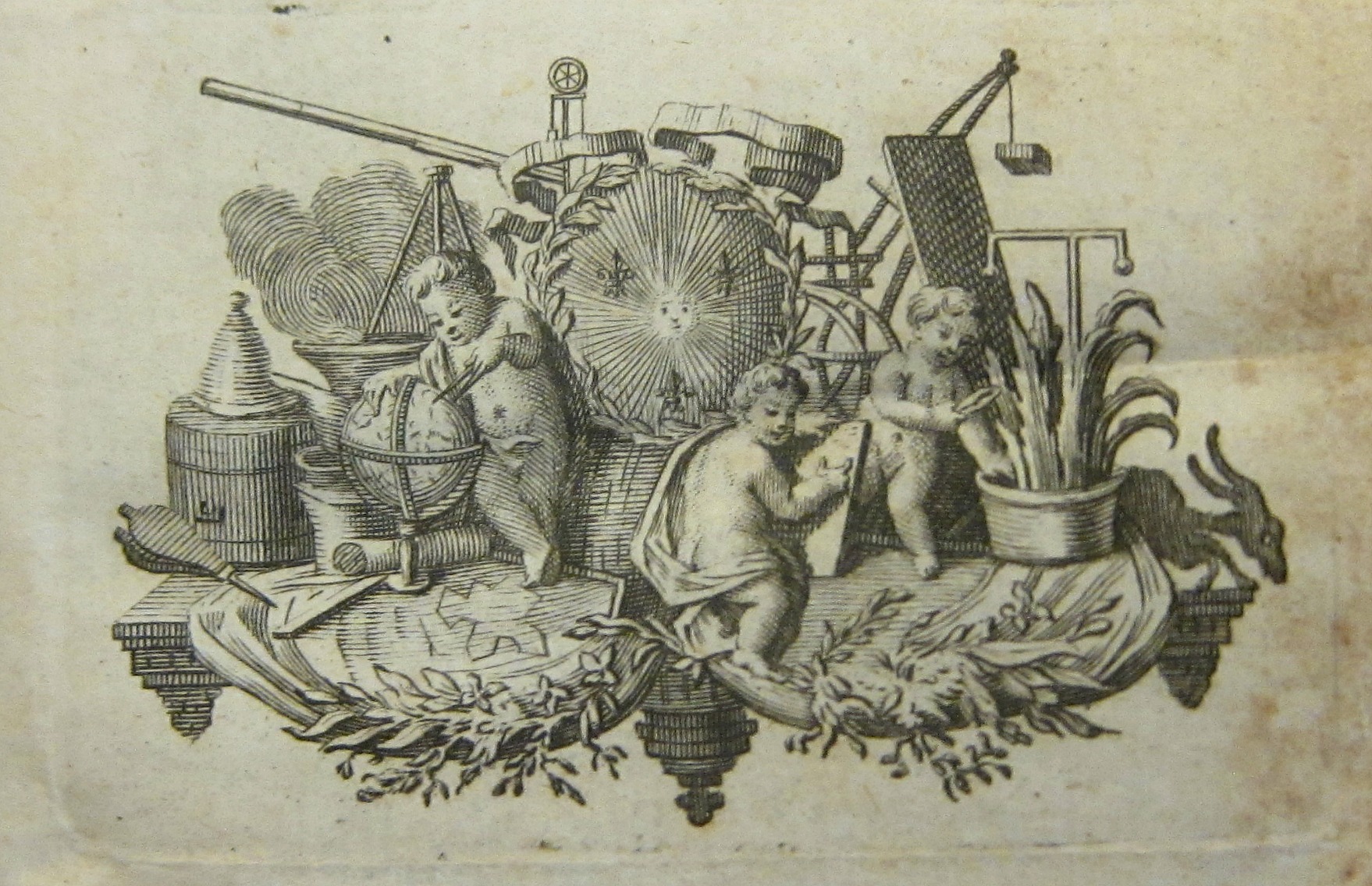
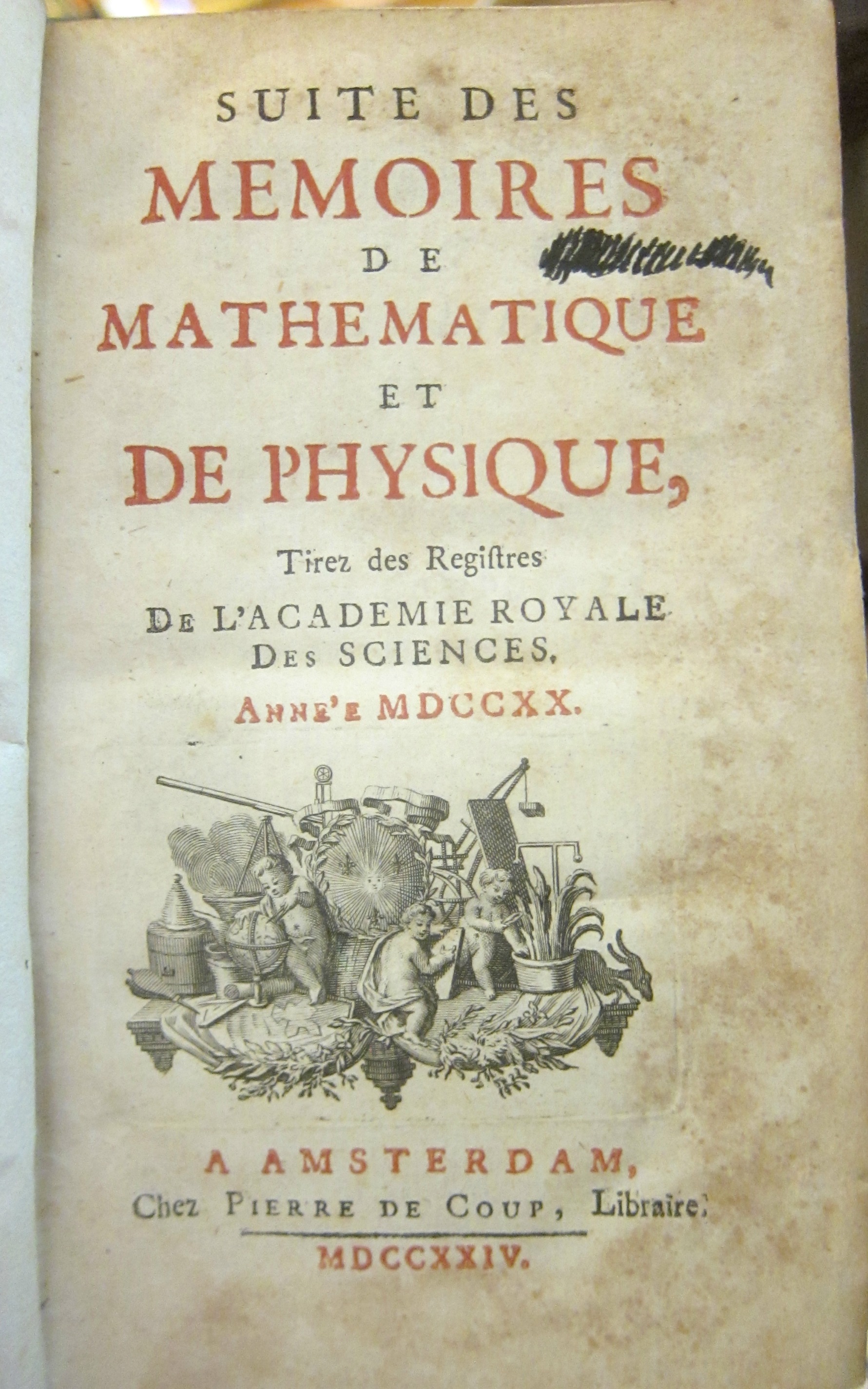
    Newly arrived here and new to my experience are some volumes of the journal Suite des Memoires de Mathematique et de Physique tirez des Registers d e l’Academie Royale des Sciences, a significant and beautifully-designed series of books which are small (only about 16cm) and very light, and their fine binding makes the book feel “correct” in your hands. I’ll be writing quite a bit about what I find in them over the next weeks and months, but the very first thing that stopped me was the scientific instrument-laden printer’s device on the title page–this the work of Pierre de Coup, of Amsterdam. The original is only about 3″ square (35x60mm), but it presents an abundant allegorical punch in a tiny space:

    Memoire de le Math


    And the full page:

     Memoire de le Math detail


    I can identify most of the instruments around the putti: right in the middle of it all is a crest with a blazing sun, no doubt indicating the reign of holy light on the impact of science and mathematics; to its rear and left is a telescope and to the right is a drawing table with a considerable balancing weight. One of the putti cuts a bit of the potted plant on the right, while another on the left works on a globe with a set of dividers (and may actually be standing on the plans of a fort).  The putto in the center (with an armillary sphere just behind him?) works on some sort of drawing, and looks down and away to the right. Additionally there are some bits an pieces: a right angle, a cauldron, perhaps an alembic, though I don’t know what that T-shaped instrument (on the right) is, or the clock-like-looking clock-like device at top-central…and I’m not sure why the bellows is figured so prominently (except for symbolic reasons). 

    For a full run of the journal see the Gallica site, here: http://gallica.bnf.fr/ark:/12148/cb32786820s/date


  • Poemsuicdramauraliterature–Outsider Literary Work (1947)

    JF Ptak Science Books   Quick Post    Outsider Logic series

    Here’s another remarkable find for the sub-category of this blog’s thread on Outsider Logic/odd books:

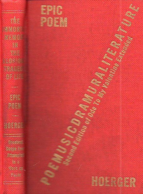
    Odd book371

    It is self-published, and tiny, and bound in a red cloth that surprisingly has the title stamped on its spine. The title begs attention, and then the text begs comprehension–and that’s okay, as this is someone’s proud work, and it is entirely possible that I have missed the object of the experience. That said, the construction, illustration, literary undertaking, and poetical wanderings are occasionally extremely surprising–and if “surprise” and revealing an insight that you’d never have had on your own is the point of writing, then I’d have to say that this experiment was successful.

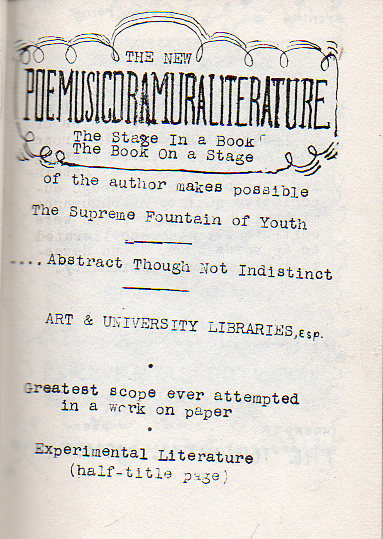
    I won’t go into the story line too much because it escapes me. As a sample though I will illustrate the title page, which is remarkable and small found-miracle even on its own, a shining element of shining elements in the history of odd title pages, and which will give some insight into the possibilities of what follows:

    Odd book372

    The author notes with no pomp and no modesty that his is the “greatest scope ever attempted in a work on paper”.  And what he meant was at least on little paper, because this book measures 3.5×2.5 inches, and one quarter of that is set aside for ample margins which flesh the work out to 88 pages.  The title and subtitle are mysterious, as with everything else–even the final parenthetic note at the bottom of what is actually the title page (“half-title page”) gets an eyebrow-raise. 

    But as the author says, this is “experimental literature”, and perhaps judgment of this work should be unresolved, as the experiment might still be underway. 


  • Glorious Book Cover Design

    JF Ptak Science Books   Quick Post

    Follow Me on Pinterest


    I’m introducing some of the images from my 3,500-item Pinteret collection.  The following is a subset of the Department of Book Cover Design. The original sources for the images can be found in the links in the Pinterests categories.  

    74e6956b8e877bab0ca65f8461df2185


    Ed66b32b61e17c28d118c520384c08bf


  • Iconography–the World on a Globe on a Title Page (1537)

    JF Ptak Science Books   Post 2235

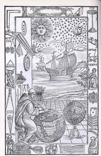
    This magnificent piece of tidy work (below) was executed for a new edition of Johannes de Sacrobosco’s (latinized for John Halifax or Holywood, a teacher of mathematics and astronomy at the University of Paris, a monk/scholar/astronomer ca. 1195-1256) Tractatus de Sphaera Mundi  by Fra Mauro Fiorentino (1492-1556), and gives us all a chance to have a bit of fun reading late Renaissance iconography. The work is entitled Sphaera volgare novamente tradotta con molte notande additoni di geometria, cosmographia, arte navicatoria et stereometria (and so on), published in Venice in 1537, and as stated in the title this is an augmented edition of Sacrobosco with Mauro adding segments on geometry, cosmography, navigation and perspective. (Full text of this classic here.)
    Blogtpamerica105

    The wood engraving is of particular interest because of the globe upon which Fra Mauro is writing—as you can more clearly see in the detail; shot (below) we can see a large continent labeled “America” just hundreds of miles off the coast of Africa.  The Americas still make only guest appearances on globes at this point, and seeing it here, as a bit of an afterthought, is a treat (considering how easy it is to overlook it).  There is another Fra Mauro, much more famous than our’s above, whose cartographic workshop produced a seminal, magnificent  map of the world in 1453, thus bringing the two Mauro’s together, if only slightly, via their maps (one great, the other incidental).

    From the Sphaera, chapter one:  

    THE FOUR ELEMENTS. — The machine of the universe is divided into two, the ethereal and the elementary region. The elementary region, existing subject to continual alteration, is divided into four For there is earth, placed, as it were, as the center in the middle of all, about which is water, about water air, about air fire, which is pure and not turbid there and reaches to the sphere of the moon, as Aristotle says in his book ofMeteorology. For so God, the glorious and sublime, disposed. And these are called the “four elements” which are in turn by themselves altered, corrupted and regenerated. The elements are also simple bodies which cannot be subdivided into parts of diverse forms and from whose commixture are produced various species of generated things. Three of them, in turn, surround the earth on all sides spherically, except in so far as the dry land stays the sea’s tide to protect the life of animate beings. All, too, are mobile except earth, which, as the center of the world, by its weight in every direction equally avoiding the great motion of the extremes, as a round body occupies the middle of the sphere.

    Looking a little more closely at the elements of this image we find a number of interesting bits.  Working from the upper right hand corner across and down we find a right angle (for the architectural and building parts of the book), then a sand clock, a decorative laurel wreath with a pocket sundial (!) right next to it, ending with an object that looks as though it might be a physical sciences demonstration tool (I’m guessing).  Working down from the “what is it” we see the first cut of a three-times-repeated constellation that I think has nothing to do with the word “Antar” beneath it. 

    Mauro_map

    “Antar” probably refers to the famous Arab warrior-poet, subject of lots of attention over the centuries including two works by Bach and Rimsky-Korsikov (and also the name of Apollo as worshiped at Actium) Below Antar is an armed and clothed (?!) Venus, major domo goddess of love and beauty and for whom existed innumerable cults (witnessed by just some of the famous Venuses as Venus de Milo ,Venus de’ Medici, Capitoline Venus, Esquiline Venus, Venus Felix, Venus of Arles, Venus Anadyomene (also here), Venus, Pan and Eros, Venus Genetrix, Venus of Capua, Venus Kallipygos, Venus Pudica, and so on into the sweaty  night.)


    Following Venus is, I think a complex compass rose, though it may also be a calendar—I can’t quite tell from the detail of the cut.  This is turn is followed by a heavily fortified book (actually this sort of bonding, meant for heavy use, was relatively common at this time)and a score of (5-line staff) music. 

    Returning to the right angle and moving down we se the same constellation under which hangs a very stable-appearing wagon, with a triangle beneath it , followed by a representation of Mercury, the messenger of the gods, who in turn is positioned over a large set of dividers.  On the wall over the head of Fra Mauro we see two precision instruments—a surveying tool and an astrolabe.  The two small tools near Mauro’s head seem to be a scale and a pair of scissors. 

    Blogtpamerica_detail

    The central panel shows two caravans (approximately 100-footers?), being driven by a favorable wind to hospitable shores beneath a starry and benign firmament. 

    The bottom tier is the most emblematic of the set of images, as we see the related Saturn-Jove-Mars all together.  Saturn is also Kronos, which is why we see the old horned man caring the scythe of time’s reckoning; he is also the father of Zeus, also known as Jupiter (Juppiter Optimus Maximus Soter (Jupiter Best, Greatest, Savior)), also known as Jove, who stands here crowned and warning us with a sword and dividers.  Jove in turn was the father of Mars, who here doesn’t look terribly war-like at all.  Punctuating the spaces between these three are a keyboard instrument, a lute and a score of music.  I’m not sure that these lyrical/musical devices had anything to do with the three generations of super gods, but there you have it. 

    The ending of the Sphaera: 

    ECLIPSE DURING THE PASSION MIRACULOUS. — From the aforesaid it is also evident that, when the sun was eclipsed during the Passion and the same Passion occurred at full moon, that eclipse was not natural — nay, it was miraculous and contrary to nature, since a solar eclipse ought to occur at new moon or thereabouts.

    On which account Dionysius the Areopagite is reported to have said during the same Passion, “Either the God of nature suffers, or the mechanism of the universe is dissolved.”
  • An Old Fear Updated

    JF Ptak Science Books  Quick Post    

    Destroyer045

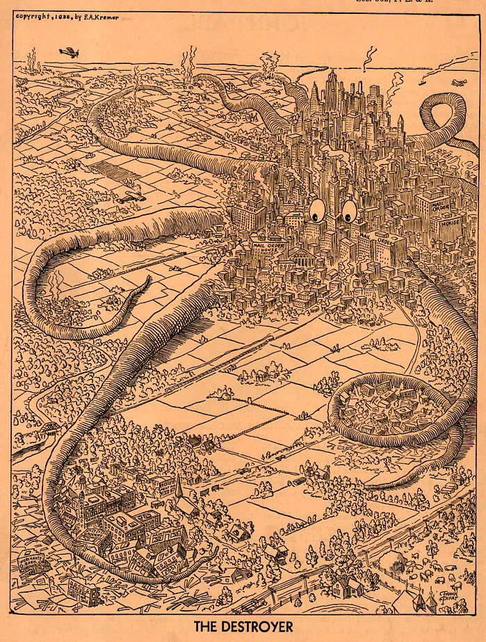
    The cover for this 1939 pamphlet I just found is pretty remarkable–very striking, strong, and capable of some sort of message which could’ve been helped along by another identifying agent.  Thomas Nast it isn’t, because it really doesn’t send the intended message by just visual means–you have to read the pamphlet to find out its meaning.  

    And as it turns out the octopus represents mail order companies.  Located in cities far-ish removed from small communities, the author (F.A. Kremer?, the man who at least copyrighted the thing) maintains in his morality tale that by ordering from far-away places a person causes the failure of local business. 

    He’s not far from the truth, especially if you update the language a bit and label the octopus “Amazon” or some such thing–even a megastore like “WalMart” would do. Or any large chain that has spelled the doom of a smaller/local business.  

    In any event I like the graphic, and I sincerely doubt that it has been published before, as there are no copies discernible on WorldCat/OCLC, and my copy (from the Library of Congress Pamphlet Collection) is also a copyright deposit copy.  So I suspect that Kremer’s effort didn’t make it out too far into the world.  


  • Anti-Nazi Cover Art, 1931

    JF Ptak Science Books   Post 2226

    German cover art044

    In a similar intellectual capacity (though not so much in the same genre) as the great John Heartfield, this cover illustration depicted what many were thinking about the Nazi Party in 1931. It appears as the illustration for Brechen die Nazis die Zinknechschaft?? Raffer und Schwatzer!, printed by the SPD (Sozialdemokratisch Partie Deutschland in 1931.  It also seems as though it was a response to the recent NSDAP victories in elections for the Reichstag on 14 September 1930.  That election was a major show of the Nazis and a semi-modern meet-and-greet campaign for Hitler, a political blitzkreig (in its way), a showing that had been unseen before in German politics, a production of short and repetitive phrasing, long promises and short details.  The result was an incredible win for the Nazis, going from fringe element with a comical leading figure to the second-most powerful party in the country, receiving more than 6 million votes and 107 seats in the Reichstag.  

    The SDP had a lot to worry about. In the last election the SDP had 153 seats with the Nazis 12; in September 1930 the SDP lost ten seats while the Nazis took 95, outpacing their new rival by over about 2 million popular votes.  In the March 1933 election the NSDAP took control of the Reichstag, ending with 288 seats, with the Social Democrats becoming the new second party with 120.  This was the beginning of the end–by the third week in March the Enabling Act was pushed through the NSDAP-Reichstag giving Hitler plenary powers with the ability to make laws without the input of the Reichstag.  The Act passed following the strong-handed rule-bending, with only the SDP members voting against it.  A new election was called in November 1933, with the Nazi Party being the only part to vote for–it received 92%  of the vote, consolidating Hitler’s control.  

    The pamphlet above was a slim 10-pfennig work, a diatribe against the Nazis.  The cover art warns the casual browser that once the Nazi mold/Facade (? of a relatively decent-looking Hitler-like face) was broken there was nothing underneath it but a snarling, puffy, monocled Brown Shirt.  (Unfortunately the cover art is unsigned. The pamphlet is pretty rare, with only one copy (NYPL) showing in the massive catalog of worldwide library holdings, the OCLC/WorldCat.)


  • On the Uncommon Black Sky in the Renaissance

    JF Ptak Science Books 
    Follow Me on Pinterest

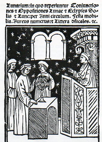
    A quick note here adding to a growing collection of “deep black” antiquarian images–this one, oddly enough, a simple black sky.  As it turns out, there are not that many old images of black skies, night skies…nor are there any great numbers showing dark room interiors, or inside of caves.  So when I come across an interesting old engraving/woodcut with a lot of black, it gains my attention.  And so with the following, which is the title page from the Spanish astronomer Bernardus de Granollachs, Lunarium: in quo reperiuntur Coniunctiones & Oppositiones Lunae…, which was a small pamphlet of 16 pages printed in Rome in 1516.  The booklet contained tables of conjunctions and oppositions of the Moon, as well as this gorgeous title page. 

    Lunarium811


  • Biblio-Morality on One Piece of Paper, 1688

    JF Ptak Science Books   Quick Post   Books with Unusual Title Pages seriesFollow Me on Pinterest

    Temporary_image_edited-1
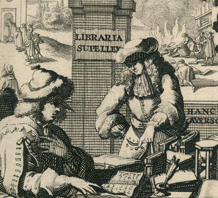
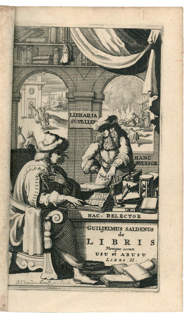
    The allegorical frontispiece of Gulielmus Saldenus’ De libris variorum usu & abuso, (printed in Amsterdam in 1688) is a good outline for what this (little) book is contains–about being good and being bad–and extending that to the treatment of books.  The main image is of a bookseller and a customer; through the windows we see the pious headed to chapel, on left; and at right, a good-sized book-burning, which is a fairly rare thing to see on a decorated beginning-of-a-book illustration.  The allegory is fairly complete, and seems as though it could not be less not-subtle than it is.

    [Source:  Bibliopolis website, for the history of the printing of the Dutch book, here.]


  • A Sharp Insight on Fascists, Union-Busters & other Armed Vigilantes, 1937

    JF Ptak Science Books  Quick Post 

    Follow Me on Pinterest


    Vigilante071

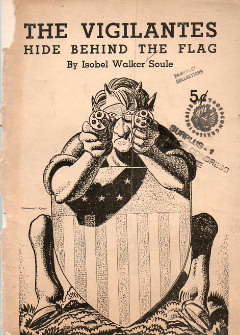
    The iconic, prodigiously-talented illustrator, old lefty and great inventive soul Rockwell Kent designed and drew this cover for Isobel Walker Soule’s The Vigilantes Hide Behind the Flag, a slim but powerful little pamphlet published by the National Committee for Defense of Political Prisoners in 1937.  Ms. Soule was a very present social worker and protagonist for the rights of workers–she and Kent would have shared this great passion–and published this work dealing with armed strike breakers (the “vigilantes”) as small targets and Fascists and the like as the larger–those, as well as the groups established by “the economic royalists (who) have given marching orders to their hordes and hope to trap the middle class into the vigilante net they’ve spread”.  

    {Soule could really spike a paragraph:  here’s an example of her addressing former Ashevillean William Dudley Pelley, founder of the lost-soul hate group the Silver Shirts:

    “…He was a YMCA representative with the AEF to Siberia in 1917. Returning to America he wrote for pulp magazines. he became a spiritualist. He had an inspiration and wrote  a story in which he claimed to have died,and spent seven minutes in eternity. On the basis of his fan mail he founded a magazine in North Carolina  with his clair-audient voices from the ether as assistant editors. Out of the magazine he founded the Silver Shirts”.)

    Soule fills up a stubby thirty pages like few others, addressing the very-present issues of thug-backed union-busting and the powerful growth of fascists at home and abroad.

    Vigilante070