A Daily History of Holes, Dots, Lines, Science, History, Math, Physics, Art, the Unintentional Absurd, Architecture, Maps, Data Visualization, Blank and Missing Things, and so on. |1.6 million words, 7500 images, 4.9 million hits| Press & appearances in The Times, Le Figaro, Mensa, The Economist, The Guardian, Discovery News, Slate, Le Monde, Sci American Blogs, Le Pont, and many othr places… 5000+ total posts since 2008. Contact johnfptak at gmail dot com

Category: Title Page Art, Beautiful

  • Target Earth Redux and the Surprise Appearance of the Evidently Rare Phrase, “Earth is My Target”.

    JF Ptak Science Books  Quick Post

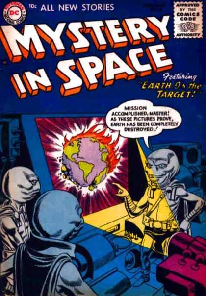
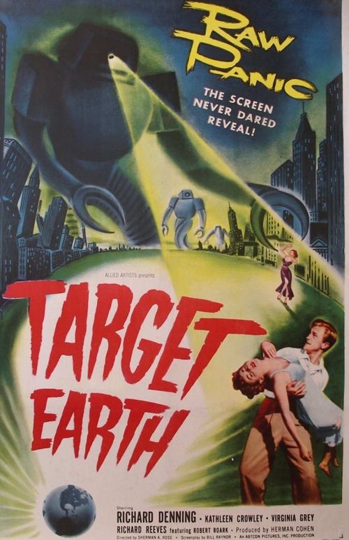
    Not too much to say on this pair, except to say that you don’t often find “Earth” and “Target” together like this. Surprisingly, “Earth is my target”, the cover story for the pictured Mystery in Space comic book,  has exactly one hit on Google. Somehow with all of the Outer Space Space Monsters from Outer Space appearing in movies and comics in the 1950’s that the phrase would’ve become a little second-hand, but apparently not.  This comic has the double-find of also showing the Earth being destroyed, which is a scene that you really don’t see until the end of the 19th century (excepting the raw canvas painted via Biblical gloom which has been around for a long time). The other image, which is a movie poster for an $85,000 sci fi film from 1954 named Target Earth, is about the evacuation of a Major City as an attack by Venusian Robots comes near. (I’ve just had a sneak peek at the movie and I can tell you that very little money was spent on the robotic visitors from Venus–those buggers were very slow, wobbly, and about 5’10” tall, not much inspiring “raw panic the screen never dared to reveal”. The film is only about 40 minutes long, which may be 40 minutes too long, or 40 minutes too short.)

    “Earth is My Target” (comic book) & “Target Earth” (movie):

    Earth destroyed

     Earth destroyed 2

     Image source for movie poster: http://www.monsterbashnews.com/Movie%20Night/Target%20Earth.html


  • Industrial Steampunk and the Menace of Corporate Reach

    JF Ptak Science Books   Quick Post–Poster Series #2

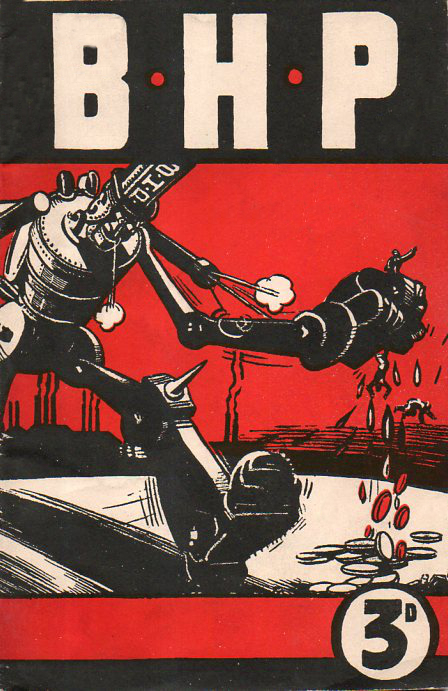
    This striking image is the cover of a pro-union pamphlet leveled at the Australian iron-producer, B.H.P. (Broken Hill Proprietary, a 150-year-old firm), and published in 1943 by the Federated Ironworkers’ Association of Australia. The great social observer and artist Thomas Nast was very aware that much of his “readership” couldn’t read, and so he made his work (which was usually text-heavy) completely understandable as a purely visual message.  So too for artists like the anonymous person who contributed this great cover–there is no question about what might be in the pages of the pamphlet.

    Poster Reprint BHP 96 dpi356

    It is also interesting to think about the “menacing” part of the title of this quick post–I would consider this still to be an early depiction of a robot (the term then still about a dozen years old) acting in a threatening manner towards humans–and in this case squeezing them until blood money is drawn.  

    This is a detail from the 600 dpi scan–click for an even larger image of this sample:

    Poster Reprint BHP 600 FINAL detail dpi357


    There is a very nice 13×19 inch 600 dpi poster being offered of this cover at the our POSTER Blog, here.  


  • Red Radio–Found & Manipulated Tech Art

    JF Ptak Science Books   Quick Post

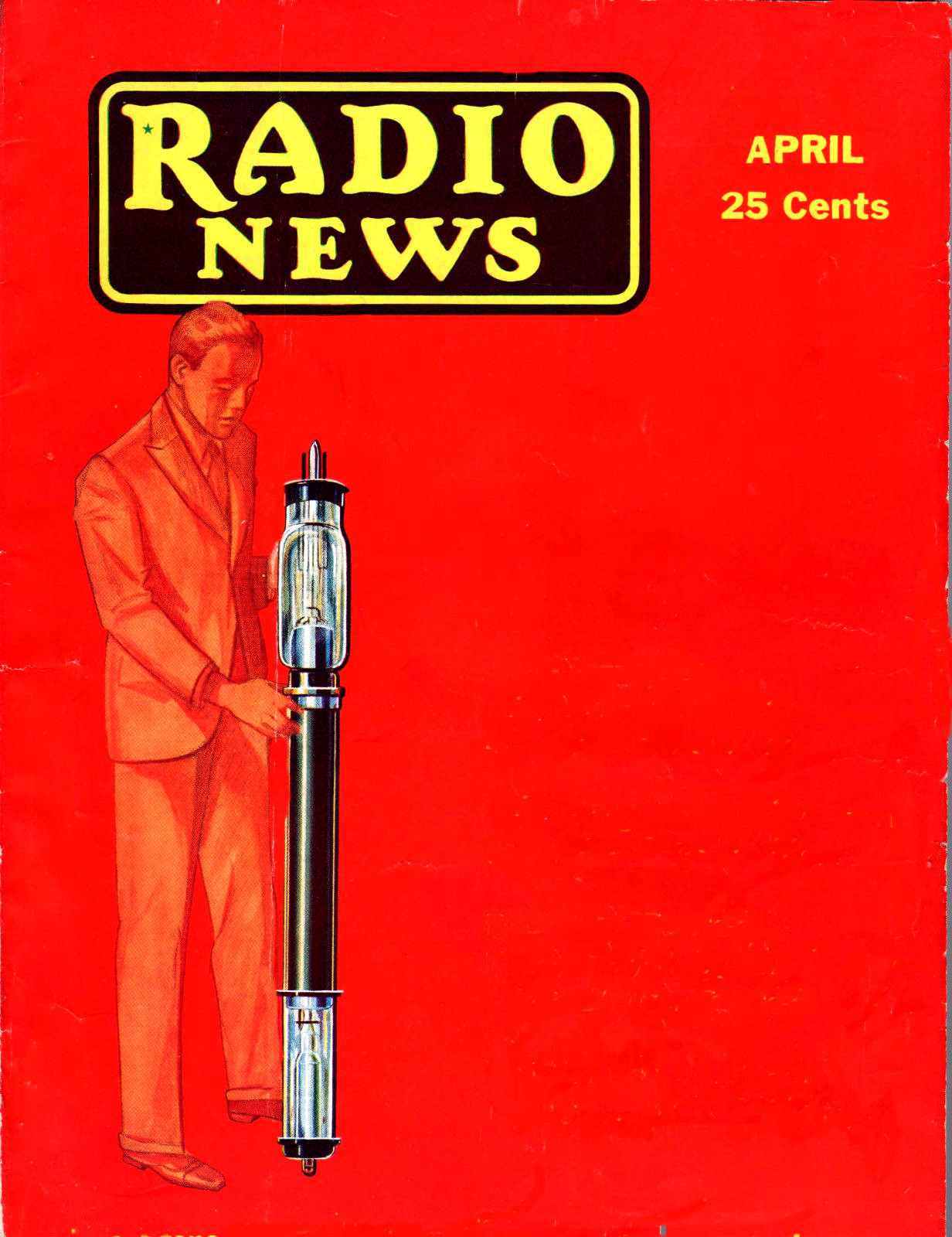
    I just like the cover art for Radio News. For at least the decade that I know about this journal published with very heavily red covers.  This one, for April 1931, was really red and also had some unusual design going on–especially after the cover text was removed. That fellow is standing there with the giant tube that helped the venerable KDKA (Pittsburgh, one of a few contenders for the title of “first commercial radio station” in the U.S.) reach millions of people, with a very powerful 400 kW signal–it basically made the station a local-national. (As it turns out the highest power ever authorized for AM radio was 500 kW to WLW (Cincinnati) in 1934, but which was modified down to 50 KW.)

      Radio News Red[The only manipulation was removing the text from the bottom right that displayed the issue’s contents–everything else is in situ.]


  • Portraits of Scientists & Philosophers on Baroque Title Pages

    JF Ptak Science Books    Post 1930

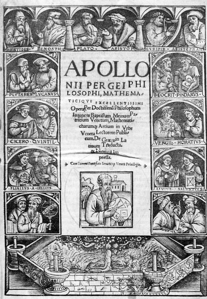
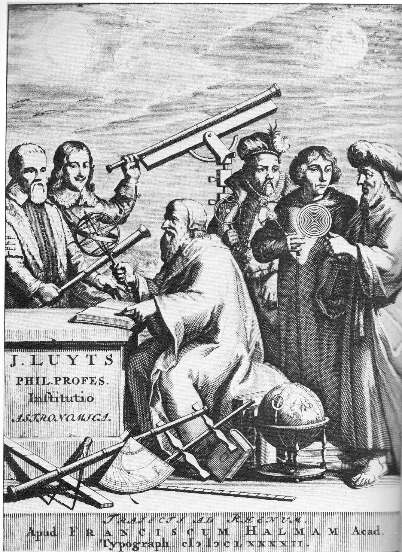
    In the 16th and 17th centuries it was not terribly uncommon to decorate a title page of a scientific/philosophical work with the portraits of standard-bearers and significant people in the field.  This is particularly true in the Baroque era, when so much more of the title page seems to be decorated.  I should have kept closer memory of examples of these works, but for right now two will suffice–they are rather good. The first is the work of Pergaeus Apllonius (ca. 260-200 bce) in the Opera, per doctissimum philosopphm Iohannem Memum, printed in Venice in 1537, which contains the first appearance in print of Apollonius’ Conics.
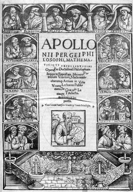
    Ortraits scientisits apollonius882Around the title of the book we find the half-length portraits of Pliny, Cicero, Quintiliius, Plutarch, Lucan, Aristotle, Demosthenes, Plato, Aristides, Euripedes, Aristophanes, Pindar, Theocritus, Vergil, Horace, Livy, Sallustius/Sallust and Apollonius–a big cast with differing shadows.

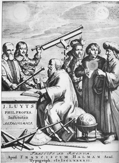
    A great example of a title page dedicated to astronomers is that for Jan Luyts’ (1655-1721, an instructor in maths and physics at Utrecht), text Astronomica Institutio, in qua Doctrina Sphaericaa atque Theorica… printed in Utrecht in 1692. It features a “action shot” of five major figures in astronomy:  (from left to right) Galileo (who is rarely seen actually holding a telescope and here is brandishing one like a club, holding the instrument very weirdly), a ham-handed Hevelius looking slyly over Galileo’s shoulder (though it sort of looks like Kepler in a way, I’m pretty sure that Galileo is Galileo), with  Brahe, Copernicus and Ptolemy each holding elegant demonstration devices for their own particular model of the solar system.  I’m not sure who the central figure is–perhaps just a generic philosophe.
    Ortraits scientisits luyts887

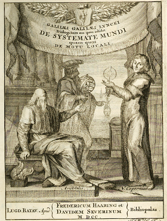
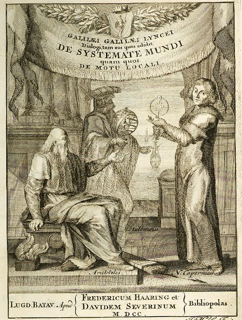
    Here’s the frontispiece to Galileo’s   which features Copernicus at right and the seated figure as Aristotle, which bears some fleeting resemblance to the figure above.
    Galileo two world systems[Image source University of Sydney]

    In this 1641 edition there are some slight alterations:

    [Image source and full text here.]

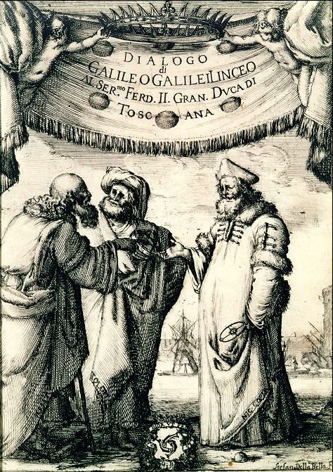
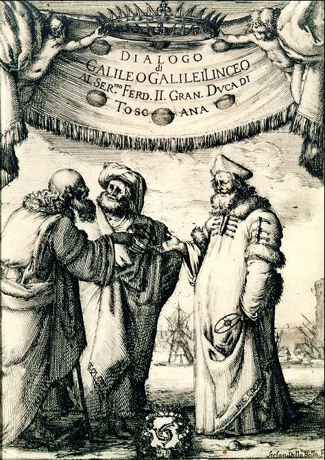
    Galileo’s Dialogo (1632) was the open invitation to trouble that Galileo no doubt expected and then famously received, the work being a defense of the Copernican system which at the time of regressive church wisdom posed a direct threat to Catholic belief systems.  In the frontis to this work we again see some old friends, finding Aristotle, Copernicus and Ptolemy beautifully (and with realistic old-man slumpiness) portrayed by Stefan della Bella. 
    Galileo dialogo SYdney
    (The full title of the Dialogo: Dialogue Concerning the Two Chief World Systems (Dialogo
    sopra i due massimi sistemi del
    mondo
    ), in which the Copernican and Ptolemaic systems are described and
    compared.  Galileo almost worked within the Vatican’s matrix necessitating a balanced
    presentation between the different systems, and evidently did so enough for the book to become a best seller, but
    its ride on the list of the Vatican’s
    banned (“Prohibited”) books lasted until 1835.

    Details of the portraits in “continued reading” section below.

  • Blankness and Design in the Title Pages of Great Scientific Works (Part 1)

    JF Ptak Science Books   Post 1900

    As I’ve written about on this blog before, Blank, Empty, Blank and Missing Things can be of great importance.  For example, if human conversation wasn’t mostly filled with nothing, it would be difficult for us to process anything, everyone sounding like several mockingbirds calling away at once, all of the time.  Music would be difficult if there were no silent interludes. And of course since existence is made up vastly of nothingness, to have it be filled would present a, um, problem.  It also might be interesting to invent an 18th century board game based on the discovery of nothing through the ages…or maybe 16th century, when the idea of zero in mathematics was first coming into widespread use.

    My interest in Nothing today comes along with design and epochal scientific publications–or at least highly significant appearances of great ideas.  Sometimes the typography and design of the title pages of Great Works turn out to be very surprising–and sometimes that surprise in blankness is an unintentional result.  

    Also we’ll just discuss relatively recent works of the past 150 years or so. Design changes quite a bit from the 18th to the 19th century so far as scientific and technical title pages go–the earlier design (and particularly the illustrated versions) are another matter.

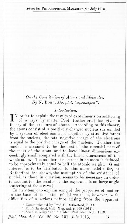
    First, the intentional bits, like this fine example of Niels Bohr’s superb introduction to the rest of the world of modern atomic theory (based upon the Rutherford model and Planck’s quantum theory),  “On the Constitution of Atoms and Molecules” (in the Philosophical Magazine for July 1913).  In this case (which actually is a three-part paper), the offprint to the publication has an upper part that is blank because it excludes the closing paragraphs of the preceding article–offprints being the separately-published and bound author’s article that were meant to be distributed privately and prior to publication of the appearance of the contribtution in the journal.  

    Blank title bohr790
    Before I proceed though perhaps it would be interesting to see an attempt at anti-nothingness in design, which in many cases can be a work of high design art in themselves. For example, even though most of the white page is filled up, 

    Blank title hahn788
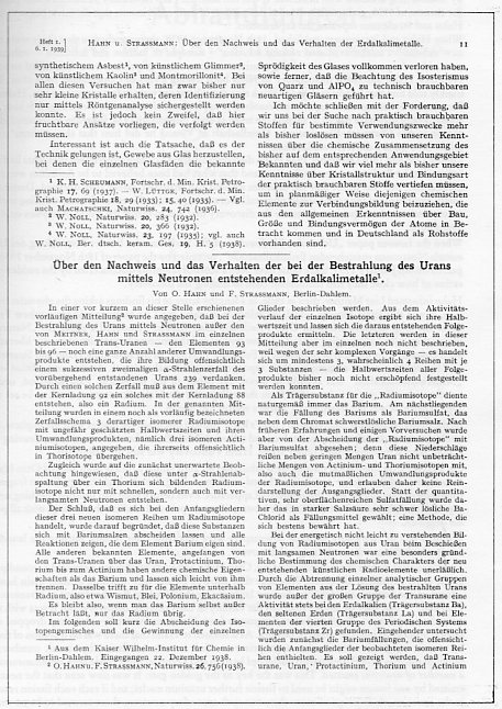
    this is still somehow quite balanced and pleasing. (Otto Hahn and Fritz Strassmann delivered a series of eleven seminal papers from 1933 to 1939, this being one of the most important, signaling the discovery of nuclear fission, an event that started its own sort of chain reaction in physicists who awoke with the sudden realization of how very doable all of this was, and how close so many other scientists were to having discovered this themselves.)


  • Opening the Doors to Trigonometric Heaven

    JF Ptak Science Books   Quick Post  

    Cavalieri767
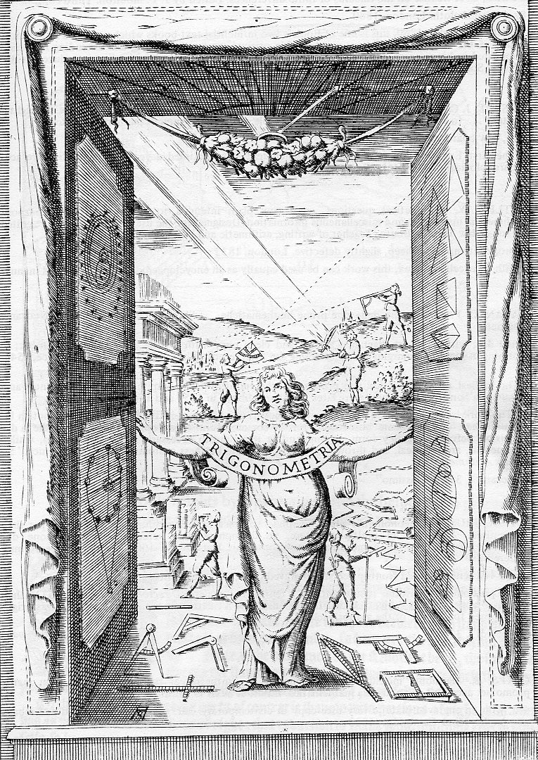
    There aren’t many other title pages in the history of mathematics that swing the doors of beauty and heaven and opportunity and logic and thought than the (appropriately-named) Bonaventura Francesco Cavalieri/Cavalerius.  A Milanese (1598-1647) who taught at Pisa and who published eleven books and worked in wide fields in mathematics as well as astronomy and physics, published his Trigonometria… in Bologna in 1643, and sent a fabulous image to his new readers right there on his very illustrated and augmented title page. 

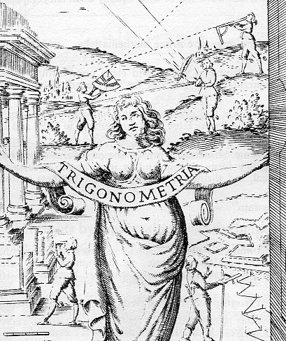
    Seldom have the doors of knwoledge been thrown open so wide and invitingly as this, with Trigonometria lightly awarding the reader with a new portal to fantastic opportunities–who wouldn’t want to walk on in?  The tools of trig are displayed on the ground at Trionometria’s feet (arranged and not by happenstance), while five figures employ these same tools in the background hills, which are being bathed in a pure holy light of some sort, an inspiration from the sky.  The doors are decorated with astronomical figures and light calculation, as well as polyons and geometrical drawings.  And just to make sure that the author meant what he intended, we can see above the full/thick wind-blown hair of Trigonometria (which in itself seems very unusual to me, such a carefree adn tossled attitude) a fruit-garland, a horn of plenty in its way.  Make no mistake–Cavalieri was making a king-sized offer to his reader to open their brains. 

    Cavalieri768

    I did leave out a major part of the title–the section dealing with logarithms, which is basically a reprint of Cavalieri’s early work (done in 1632), and which was the first work in Italian on that subject. 


  • Stylizing a Sameness in Early Flight Images

    JF Ptak Science Books  Post 1438

      Space flight379 Space flight378

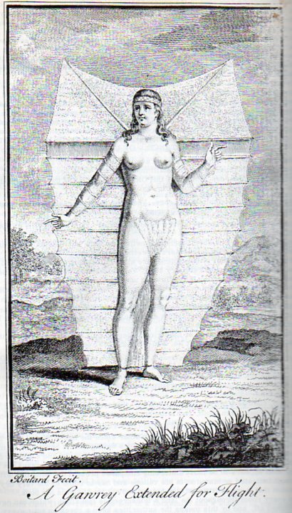
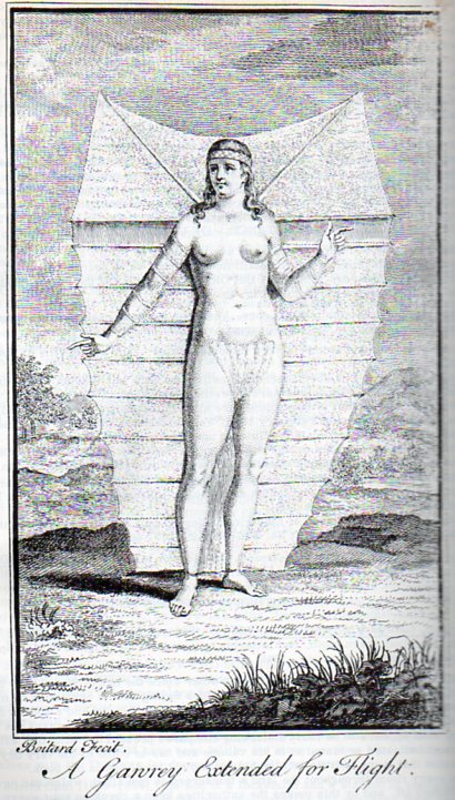
    I found these elements of sameness in design, spanning prehistoric flight and prehistoric space flight eras, separated by 170 years or so, and they just seemed fascinating.  The first, by Boitard for Robert Paltock’s (or Pultock, 1697–1767) The Life and Adventures of Peter Wilkins, a Cornish Man, Relating Particularly, His Shipwreck near the South Pole; his Wonderful Passage thro a Subterraneous Cavern into a kind of New World, his there Meeting with a Gawry or Flying Woman, was published in London in 1751 pictures the flying woman from the title (which also pretty much sums up the Robinson Crusoe-like story.  Wilkins does become shipwrecked and then has an extraordinary adventure underground at the South Pole–which is interesting in and off itself, to set the stage at the South Pole, since the exploration of Antarctica is really a 20th century endeavor.  (The first accurate summation of Antarctica as a continent isn’t made until Charles Wilkes’ expedition in 1839/40.)

    Space flight378

    The flying woman is striking, especially for the mid 18th century:  she is quite lovely, muscular, and tall, and has her limbs attached to a flying/gliding canopy which seems as though it would be operated in a way in which the people of that time thought birds to fly. 

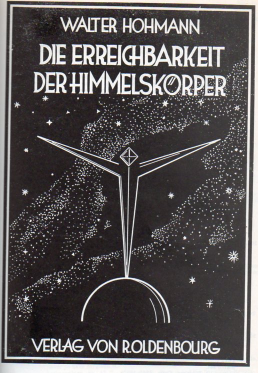
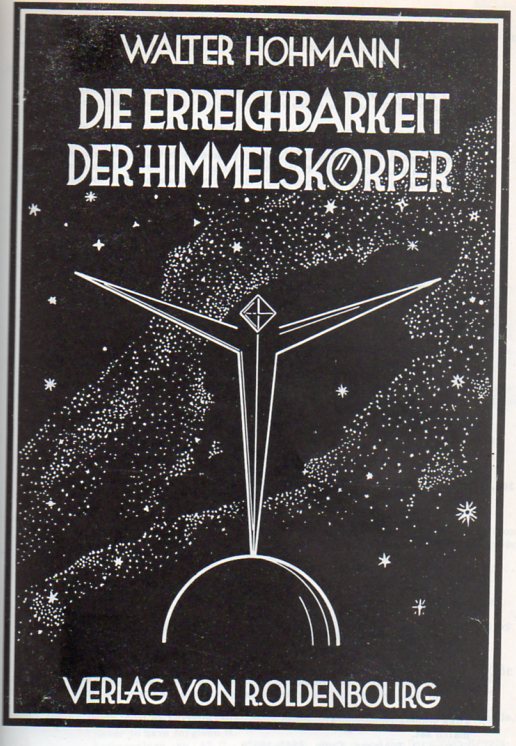
    The associated image is Walter Hohmann’s prescient work on rockets and rocket flight, Die Erreichbarkeit der Himmelskoerper, Untersuchungen ueber das Raumfahrtproblem, which was published in that great heyday of German flight engineering, in 1925.  It was published very soon after the important work of Hermann Oberth2, whose style, illustration and design are closely aligned. It is very interesting to note here that Hohmann (and Oberth) both suggested using teh Earth’s gravitational field to orbit the spacecraft and then slignshot it off into space, rather than to try to simply lift of from Earth and then go directly into space. 

    Space flight379

    Notes:

    1. Biographical Dictionary of English Literature was not impressed by it saying: “The description of Nosmnbdsgrutt, the country of the flying people, is a dull imitation of Swift, and much else in the book is tedious.

    2.  Oberth’s book, Die Rakete zu den Planetenraum was printed in 1923 by the same publisher as Hohmann, and was a cornerstone study of the issue of interplanetary space travel–the first of its kind, really, to address the full theoretical and practical aspects of rockets and space flight.  Oberth–who wrote this at age 28–could not submit the work for his thesis because of its advanced treatment of a little-known subject.


  • Protection from Aircraft, Part 3: the 1930’s and Anti-Aircraft Philosophy

    JF Ptak Science Books   Post 1281

    Bloglondonballoon

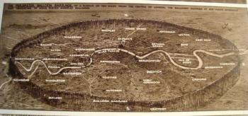
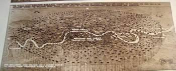
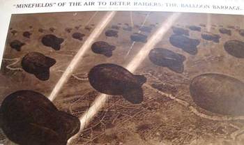
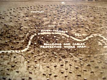
    This series of drawings, published in the Illustrated London News 16 July 1938,  by the incredibly prolific and detail-oriented G.H. Davies depicts one segment of the city defense program being formulated by the British government in the last year  or two leading up to the beginning of the European end of World War Two. (I own 150 or so of these images by Davies–he never fails to provide the detail where you need it.)   The overall plan for defending major British cities consisted of anti-aircraft guns, searchlights, R.A.F. fighter squadrons and interceptors, and the “Balloon Barrage”.  London and suburbs are featured here, all to be protected by a series of ten squadrons of fifty balloons each, handled by a crew of ten.  The thinking was that it would make low-level bombing by fighter aircraft (?!) impossible, and force any aircraft attempting such an approach to a higher altitude where they would be theoretically susceptible to the interceptor squadrons. 

    Bloglondonballoonbottom

    I’m not terribly sure why the thinking was against low altitude attack, but my best guess is that the planners were thinking about the He-111Bs and Ju52s or other such aircraft that the Nazis checked and tested out against the Spanish Republicans during the Civil War. Perhaps freshest of all memories of the German operation Feuerzauber (Magic Fire) was the Guernica raid, just a year or so before the publication of these images, where that militarily insignificant town was attacked from the air in twenty minute intervals over three hours, destroying it in a terror blitz.  If I was sitting around a big table at 10 Downing, I’d have that picture in my head.  .

    Bloglondonballoondetail

    Be that as it may, the “air mine field” looks terribly inefficient and vulnerable to me, sort of like an exposed Maginot Defense Line, but without the very deep misunderstandings that went along with the horrible French effort. 

    Explanation of the Images:

    a)    The first image shows the incredible perimeter defense network, which extended ten miles around St. Paul’s; the balloons were moored at 100 yard intervals, making for 1100 or so balloons to “fence” the perimeter.
    b) The second image shows  London center and immediate suburbs, with another 500 balloons in a smaller circle inscribed in the larger.
    c)  The third image Bloglondonballoonsbotto is a close-up of the balloons, looking down;  seems as though they were tethered at about 2000 feet or so

    d)  The last image is a close-up of London center.  .


  • Little Bizarredness: Bland Hyper-oddness in Published Works

    JF Ptak Science Books LLC  

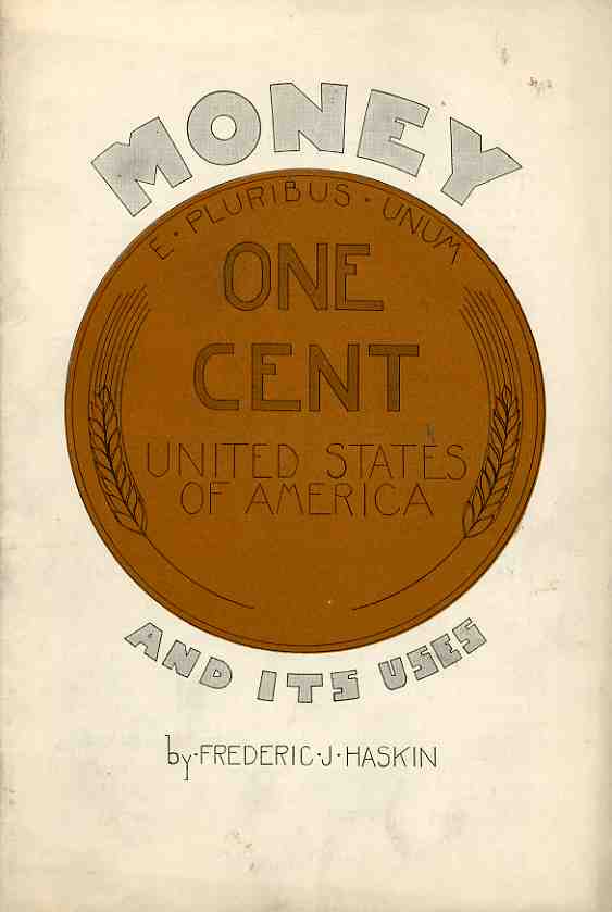
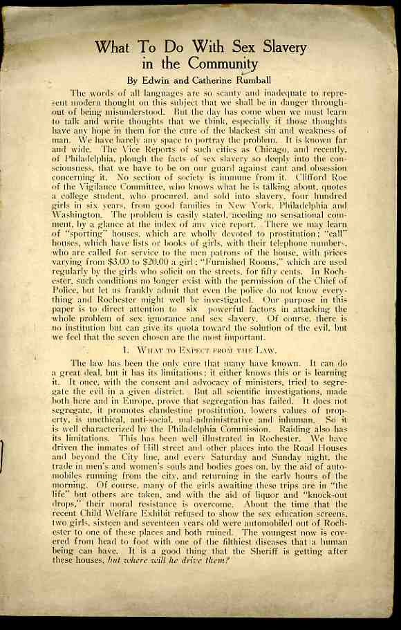
    These pamphlets are samples from a larger collection whose attention to the detail of boredom and blandness and relative inexplicability are extraordinary.  The titles intact, it mostly doesn’t matter what the contents have to say for themselves–everything, really, is right there on the front page, the meaning best left to the imagination. 

    0 blog march 9 titlitle that which661

    0 blog jan 30 substandard493
    0 blog jan 30 substandard492

    0 blog jan 02 keep man340

    Small history--penny465

    Small history--gum466

    0 blog march 9 titles making of things660

    0 blog dec 19 tnazi america302

    0 blog jan 02 keep man339


  • Polywog Airmail of the Future

    JF Ptak Science Books  Post 1042

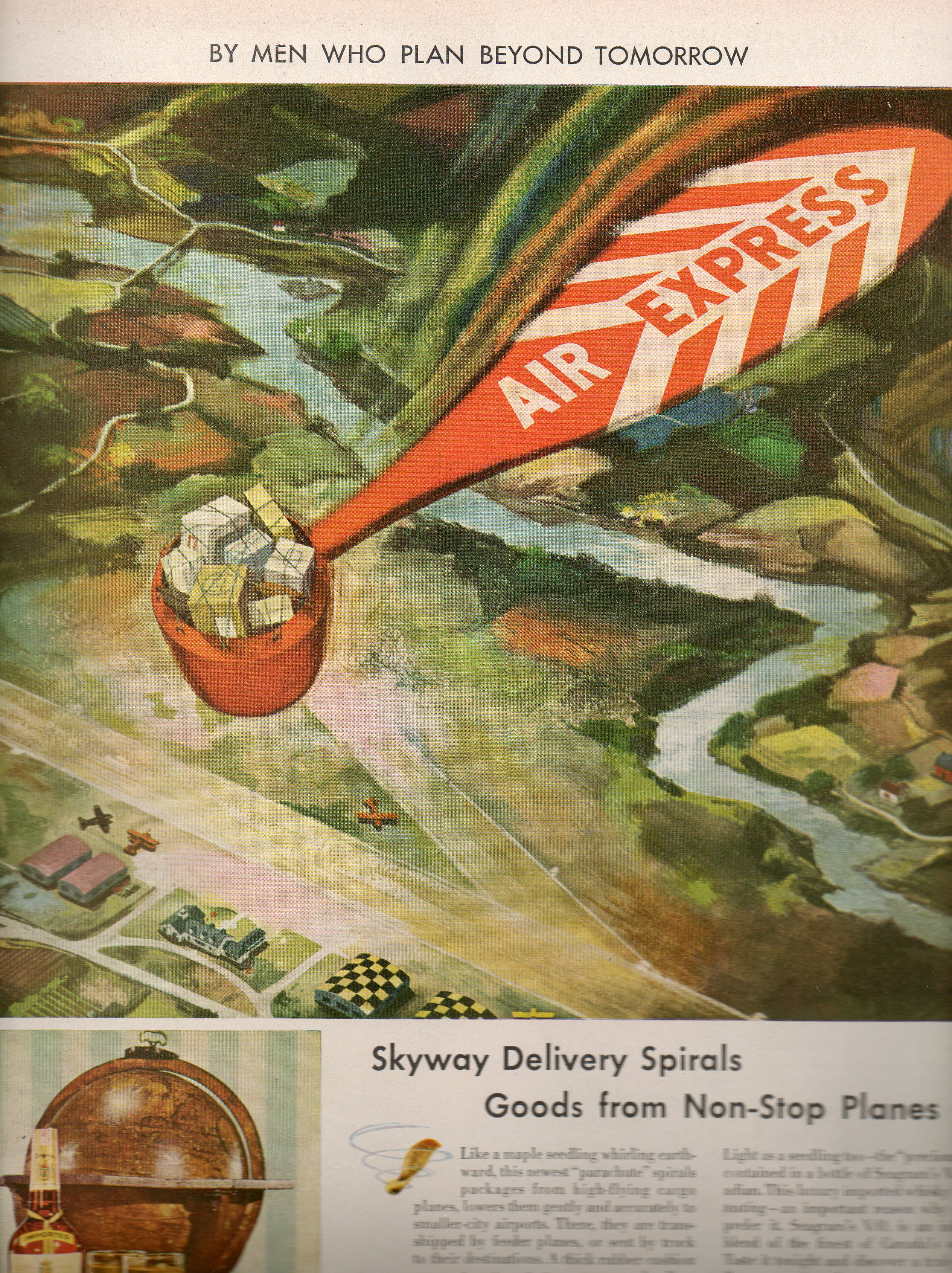
    000 sky mail015

    The booze-driven future as seen by Seagrams (written about earlier in this blog as Atomic-Powered Farms) that appeared in the pages of LIFE magazine from 1945 to 1947 were quixotically science fictiony in the waterproof-duck department brand of invention.  Most of Seagram’s visions were goofy even though they all seem to have been serious statements on the future.  This example, the polywog air mail delivery system, seems to be as bad as any of them–worse even since the technology that the artist/designer was trying to circumvent was already far more sophisticated/logical/beneficial than this weird parachute delivery system for  the mail.  Once all the effort of packaging the mail into this contraption, retrieving it and then setting it up all over again for the next go is calculated, one would’ve been far ahead at all levels by just landing the bloody plane and getting rid of the mail.  That, or of course, just pushing the mail out in a container with a standard parachute also would’ve been a better solution than the one pictured. here. 

    Obviously Seagrams didn’t have their heart in futurology, except that which calculated the shortest possible time it would take to convince people to replace their empty Seagrams bottles. 

    Overall, this is just simply a very bad idea, no matter where you are in the timeline.