A Daily History of Holes, Dots, Lines, Science, History, Math, Physics, Art, the Unintentional Absurd, Architecture, Maps, Data Visualization, Blank and Missing Things, and so on. |1.6 million words, 7500 images, 4.9 million hits| Press & appearances in The Times, Le Figaro, Mensa, The Economist, The Guardian, Discovery News, Slate, Le Monde, Sci American Blogs, Le Pont, and many other places… 5000+ total posts since 2008.

Category: Color & its advanced Abuses

  • The Very Describable Macro Color of 1930’s Floors–Well…Color, Symbolism and Swastikas in Floor

    JF Ptak Science Books   Post 1334    
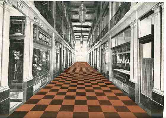
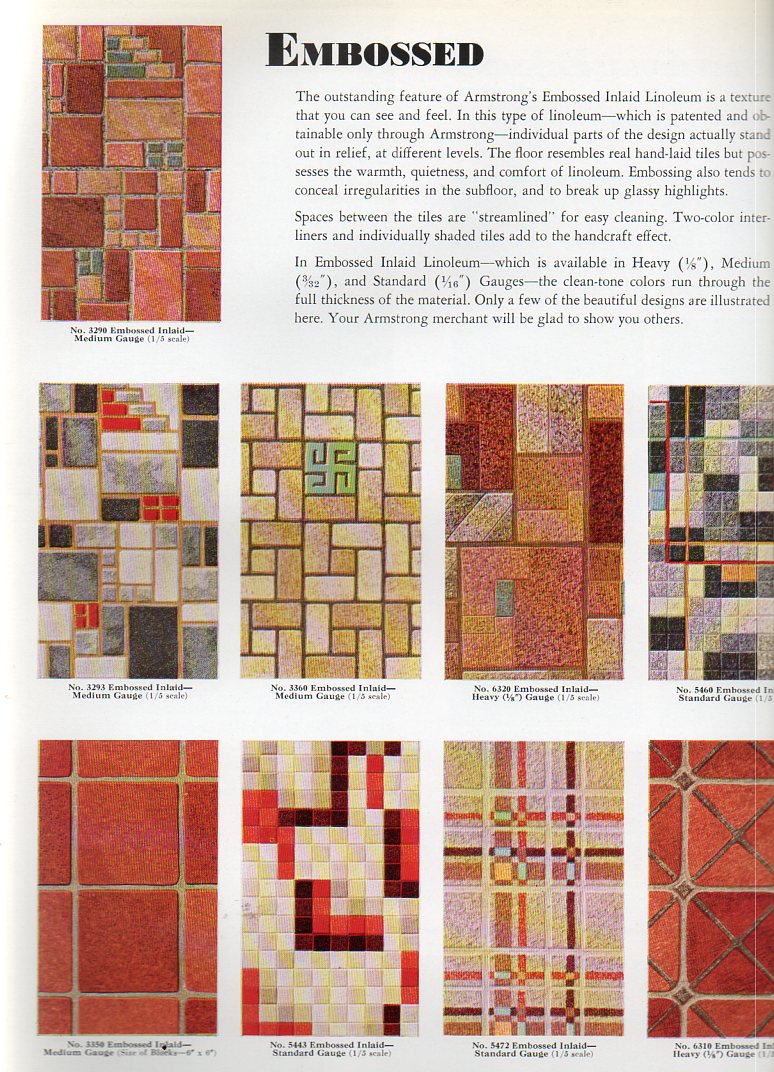
    Color floor--cvr382I remember that the floor of my grandmother’s beauty salon (in Great Barrington, Massachusetts) was a dark (gray on black?) rolled linoleum affair, not much different from the floors that you’d see (if you could see them) in black and white movies from the 1930’s.  Grandma’s floors were probably that old–my memory is from the early 1960’s and the salon was far older than that–and so they looked like you’d expect an old, shiny, kept floor to look.  Plus you’d never really see floors in those older films, anyway, so it was difficult to see even if there was a design, let alone imaging a color.

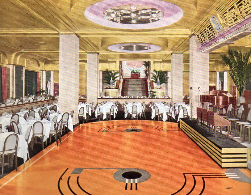
      That’s why it is so surprising to see magnificently-colored floors in catalogs such as Armstrong Cork Company’s  Better Floor for Better Business (1936) and Home Decorator’s Idea Book (1931). (Both of these booklets are available for purchase from our blog bookstore.) Color wasn’t invented after World War II–it just seems that way.  Color photographs, color home films and color motion pictures really didn’t get a popular start until then, so it might be natural to assume that the world was a bit more bland in shades of gray before then.
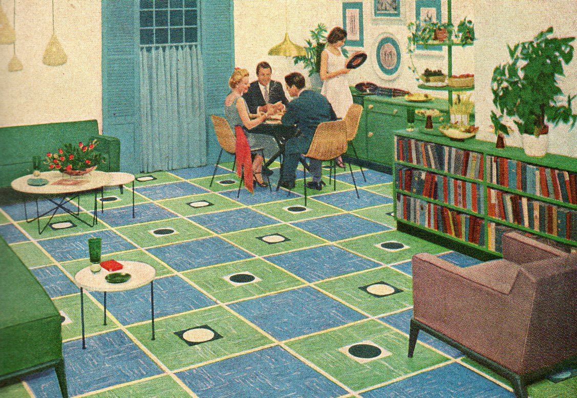
    Color floor--dining374
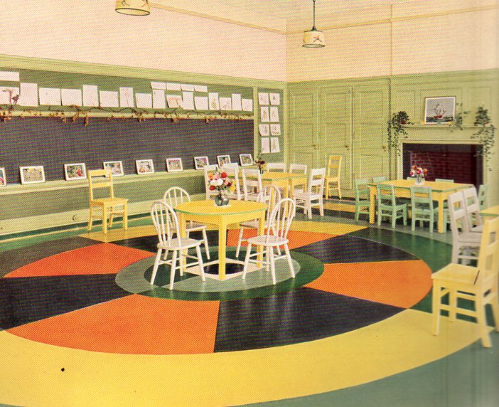
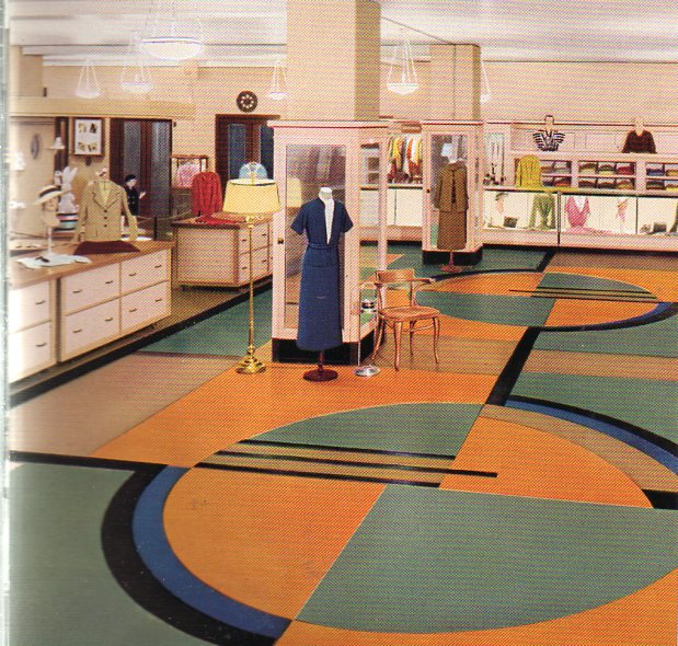
    All the same, these floors are so terrifically colorful that they look to me to be like a tiny design writ large–like a design for nightclub’s matchbook cover done on a 500 square foot canvas. 
    Color floor--kinder375
    [This is a kindergarten room, by the way.]
    Color floor--clothing store376

    000-ebay--Oct 30 rubber floor965See what I mean? These floors are beautiful in a way that escapes beauty.  I don’t particularly like them nor would I want to live on them, but they do have a certain inescapable loveliness to them that is just not beautiful.  Perhaps it is the odd juxtaposition of unexpected color. This is seen in sharper detail (left) in a post that a made (“There Was a Rubber Lady in a Rubber Room…) earlier in this blog.  Or maybe it is the unexpected combination of colors, or the unexpectedness of the colors themselves, that is the driver to this lusciousness.

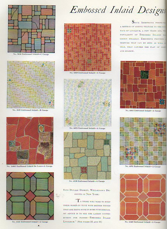
    And then there are the swastikas.

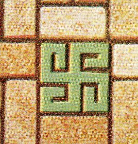
    Now the swastika is a very, very old symbol, thousands of years old, transcontinental, transoceanic, a transcendental image that was completely and forever corrupted by the National Socialist Party, a shameful symbol, a symbol turned into a hatefuil and horrible thing in just 20 years or so, overtaking two millenia of use.  And here we are, in the early- and mid-1930’s, during the time of the Nazis and Hitler and their free use of the swastika, here we are with this Armstrong firm from Lancaster, Pennsylvania, still using the swastika in design elements for their floors. 
    Color floor--swastika 377

    Color floor--swastika 378

    (Here’s one page of floor design elements from the Armstrong catalog at left; and the detail for design number three at right.)

    Armstrong was also in the heart of some country within the United States (Lancaster) that was very rich in symbolist design, but I think that this has nothing to do with anything.  I’m also not making th case for their being fascist leanings at Armstrong–I’m simply pointing out that even as late as 1938 (when another edition of this work appeared again with swastika design) that the image was still acceptable enough to have as part of a part of a floor.  It strikes me as deeply odd.

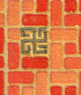
    Here’s another example from the 1936 catalog (and just to be perfectly clear I’m not highlighting the swastika part–it is offset in different colors in the originals):
    Color floor--swastika 379

    Color floor--swastika 380


    I’m not seeing Nazis in my porridge, though Madison Sqaure Garden was still getting filled up by American Nazis for their German Bund meeting in 1936–I’m just pointing out that it seems surpising that the symbol was still being used in popular design as late as it was. 


  • Scary Color-Steampunk Photos of Food, 1933

    JF Ptak Science Books   Post 1129

    In the earliest part of the printed history of picturing scary things everything left the printer in black and white.  The colorist added the necessary tinting and fright stuff, though it seems to me that the sheets that made it through to binding in black and white were the most disturbing of them all. Most of the time and for several centuries color was left to the desire of the individual, the purchaser of the book; the green of dragons or the reds of monster men or yellows of serpents were mostly given life by the buyer.  Color printing had to wait more than three hundred years
    Medieval monster after Gutenberg’s Bible–there was some multi-color printing for grammars and the like where words and phrases were printed in multiple colors, requiring numerous passes through the press, but by and large the color printing of artwork was more a 19th century thing more than anything else.         
    My own preference is for black and white images that let the mind fill in the beasts from outside in, allowing the imagination to run with the text and the description of the beast, rather than fast-forwarding to the completed images.  It is these images, the black and whites, which have retained some element of scary or creepy over the years; the colored images don’t make it quite so well. 
                                                   
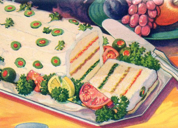
    Color does makes some unexpected contributions to scariness, and in uncommon places.  For example, this photo
    Blog--color--mea tloaf351 from a 1933 Chicago World’s Fair pamphlet for the exhibitor Durkee Famous Foods fits the ticket perfectly.  It is an image of a sandwich loaf that is made mainly with scrapings of ham and lots of Durkee products, which were things like mayonnaise, oleomargarine, cheese squeezings, tapioca, coconut oil, salad dressings and vegetable shortening.  The color of the object only heightens the creepiness of its contents, all of which was topped by a layering of mayonnaise and cream cheese studded with olives.

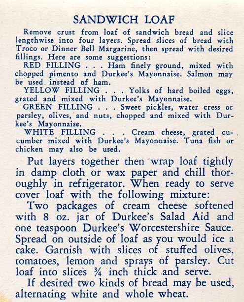
    Admittedly this color photograph comes at the earliest stages of the modern aspect of color photography, and perhaps the engineers were a little too anxious at spreading their food-color, it still just isn’t good. Here’s the recipe: 

    Blog--color--jmeatloaf rec354

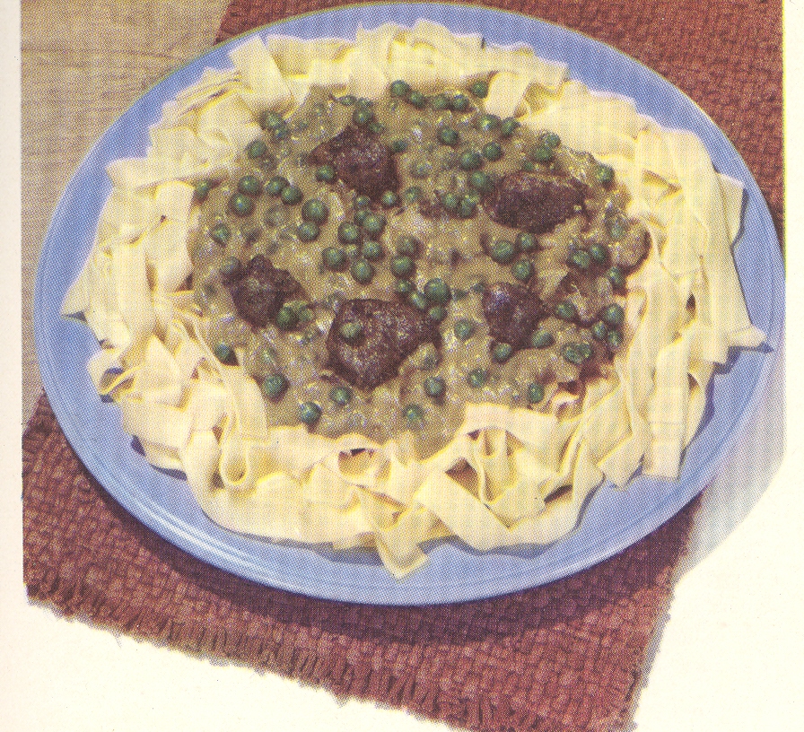
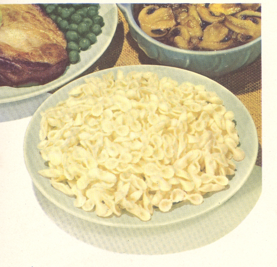
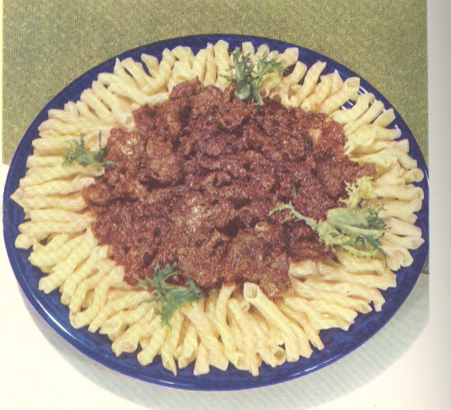
    There’s also this incredible plate (below), having some sort of internal color dialog with itself, though manifested externally–it must not be a pretty conversation.  House of La
    Rosa.  101 Ways to Prepare Macaroni seems
    about as benign and forgettable a title that one could write; that said, once
    opened, this little pamphlet poured its heart out to the Naïve Surreal in us
    all with the unforgettable (and accurate) color images of the promised linguine
    delicacies. 

    ===blog==aug 24=color--sauce green

    And of course there are innumerable examples of architectural bits:

    ++00++ 9.23 bathroom3 great

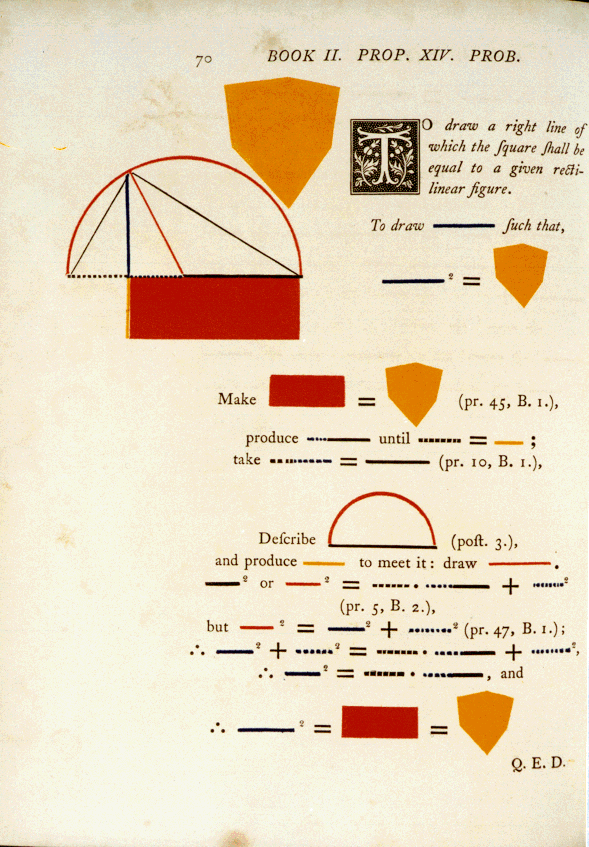
    And even when beautiful, color can be scary, as in the case of the very highly problematic Oliver Byrne, whose work restructuring the explanation of the first six books of Euclid is inversely useful to its great beauty.

    Byrnes II.14

    As unsettling as these color images may be, none come quite so close to being a truly visceral experience as does the Durkee sandwich loaf.  These other color examples are just simply wrong; but the Durkee food product, slathered in oil and leftover, is just so wrong it isn’t even wrong anymore. 


  • An Episode in the History of 20th Century Directional Art: Color-by-Number Noses.

    JF Ptak Science Books  Post 1056   (First post in our History of Noses series)

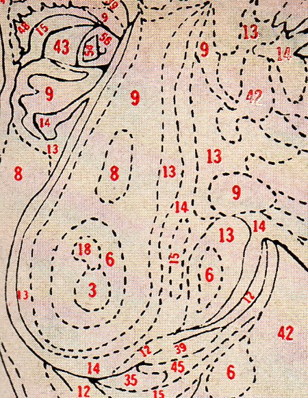
     There is an entire dictionary of explanations for this odd image (appearing in LIFE magazine for 14 September  1953). Here’s a candidate launched from this blog’s Museum of Impossible Things department:  the photograph accompanies  a newspaper clipping from the Library of Congress’ Newspaper Clippings Collections!, an above-the-fold front-page obituary for a man with an unusual obsession, as follows:

    Noses
    [Source: Obituary from the Stationary News, from At, Texas. ]
    <clip> “The Mystery of the Secret Painter of At, Solved!” <clip>

    “Gileless, Newton. After a long illness of undescribed origin and affect, Mr Newton Gileless, at home. Newton was born in Aint, Texas before moving to At in 1916 “to get away from the negativeness”.  He had few friends and distant neighbors, and was fond of keeping overturned muffin-stuffed cowboy boots on his fence posts. He donated hard pancakes to the bench-sitting old men down by the Rexall, and kept a large box at the Post Office.”
    “Mr. Gileless’ prime mover of community interest was his secretive painting practices. For decades Mr. Gileless could be seen scurrying around town, or at in the fields, or along the dusty roads, or at the stream near the peach trees, carrying a large easel with a canvas attached with yards of “paintin’ rope”..  He could be seen painting but only from a distance, as distance of quietness seemed the enabler for his painterly ambitions. The object of his interests was not known”
    “Mr. Gileless’ estate was left to Bo Tanger, the regional coroner, who administered the last wishes and who revealed the close secret. “I finally got to see what Newton was painting”, said Tanger, “and its odd, even for here, where people’s business is their own in private, and his was public-private”. 

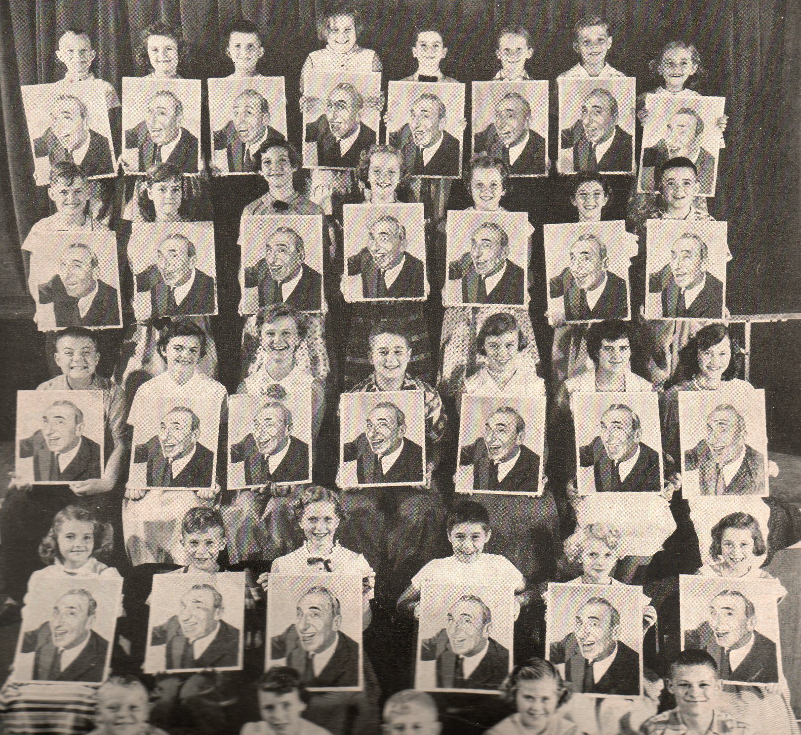
    Durante--big pic127

    [Photo:  2nd grade class with their happy bequest of Mr. Gileless’ artwork at At, Texas Primary School.]

    “Mr. Gileless’ continued artist pursuit was painting Color-by-Numbers portraits of Vaudevillean, comic and movie actor Jimmy Durante. There were more than 6,250 of these portraits found in Gileless’ barn.  His will instructs (and provides the funds for) their distribution to ‘as many good Texan second-graders as possible.  Yes.’  And so it was this that Mr. Gileless was painting in his secret painterly way, painting again and again, hoping for the colors to improve with exposure to different surroundings, especially and evidently en plein air.”

    “When overly prompted on the mysterious Durante muse, Mr. Tang responded: ‘Well sir, I don’t know.  But Durante has showbusiness’ biggest nose, and Mr Gilieless had but a scant smidgeon.  Maybe it was soulful envy.’ ” –Buck Smeal for the At Tattler Texas, 1 September 1953.

    Notes.
    1.  The Library of Congress decided in the midst of a space-saving fit to save only “necessary” bits from its newspaper collections and to discard the rest.  “We aren’t Mr. Borges”, one library staffer volunteered, “and we just thought that all of the other challenged stuff had to go”.  The Library’s reduction removed 92% of the newspaper collection “bulk”.  Another source said that “if you look at it in one way, what we dumped was mostly nothing, ‘cause the printed page is mostly white space and unused”.


  • The Color Green in the History of Squares

    JF Ptak Science Books

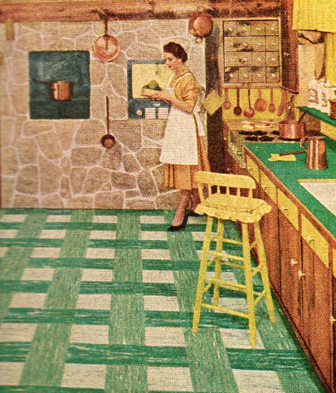
    Squares 1130 There is an invisible thread running through this blog on the history of squares, starting with Euclid and winding its way through Mondrian, Klee and Malevich and Boullee, atom bomb resistant countries, pixels, perfect, Times, magic, and so on.  I don’t think that I’ve ever touched on what might be my own solitary and perhaps-wrong observation on the preponderance of green squares in 1950’s linoleum flooring.  As I said, this might be because of my own faulty receptors–and even if I’m slightly correct the color I think doesn’t mean or imply anything in particular.  Perhaps the abundance of green comes from a left-over paint or dye that a manufacturer decided to bump into flooring; or perhaps green just looked better to the readers of LIFE magazine than other colors.  Be that as it may, there is some loose strand of memory that gets activated every time I see green squares in flooring of the 1950’s, and I just wanted to say that I noticed it. 

    Squares 2131


  • Unintentionally and Quietly Absurd Images: Twilight Zone Advertising for 7Up

    JF Ptak Science Books Post 1043

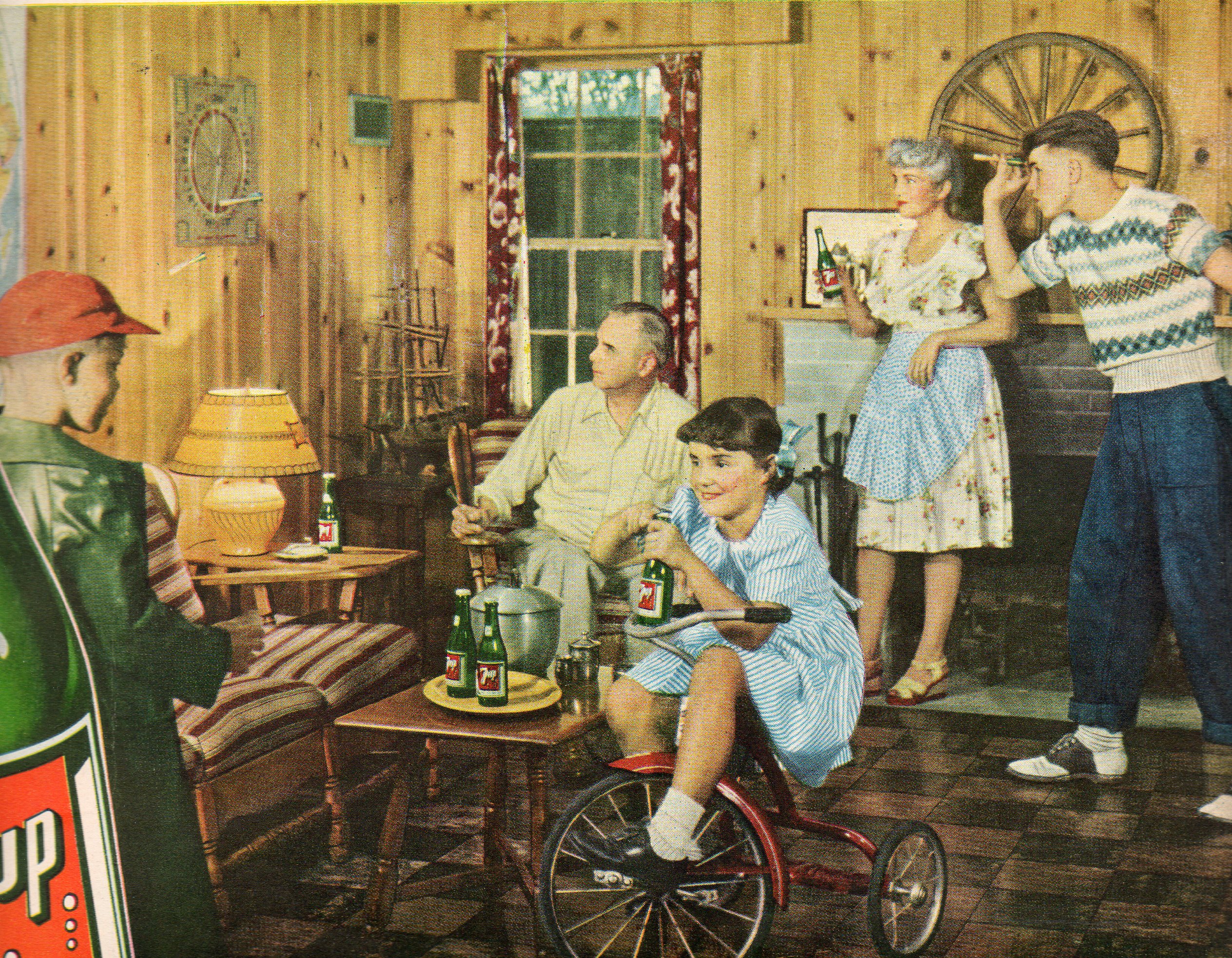
    What,exactly, is going on in this photo?  Yes they’re all helping to sell the delightful and refreshing pop soda called “7 Up”, but there’s something just off with each and every element.  

    000 7 up absurd017

    What is the story with the girl/woman on the trike, holding her bottle of pop as though it was the sudsy stuff?  She also must be at least 16 years old and looks a little possessed in having to wear those clothes in that pose.  She’s staring into the chest of the kid at left, who for some reason is wearing a heavy and shiny green coat there in the basement rumpus room.  Manchild Junior takes careful aim with his big dart as dad sits staring at the dartboard, waiting for his eyes to collect the darts as though they were magnetic dust in his eyeball magnet.  Mom seems to be plasticized and propped up against the fireplace, her bottle at an odd angle used only for toasting.  In All of this extends to the bottle, which hasn’t a single word on it, unless you cleave away the “up” from “7up”–there’s just truncated words and an incongruous woman in a bathing suit on the label.

    In short:  the photo has a low-suburban mid-creep distant-color affect, kind of like a human landscape version of a Joel Meyerowitz photograph.

    Meyerowitz07


  • Seeing Vision: Examples of Light and Sight, Personified

    JF Ptak Science Books LLC  Post 976


    (On seeing the morning’s rising sun): “Looks like light to
    me.” SpongeBob SquarePants


    “All the fifty years of conscious brooding have brought me
    no closer to answer the question, ‘What are light quanta?’ Of course today
    every rascal thinks he knows the answer, but he is deluding himself.”  A. Einstein

    “Are not gross bodies and light convertible into one
    another, and may not bodies receive much of their activity from the particles
    of light which enter into their composition?” I. Newton, Opticks,
    1704, Query 30.

    Mar 12 #51

    Depicting the capacity of sight and nature of light has been
    both an easy and a knotty problem in the history of science. Over the
    successive theories on the basis of light the artistic presentation of the
    phenomenon has been generalized (generally) in a very simple way:  by straight lines.  There’s certainly nothing wrong with that,
    the lines are just parenthetic place-holders suggesting direction, not actual
    descriptors of what light “looks” like.

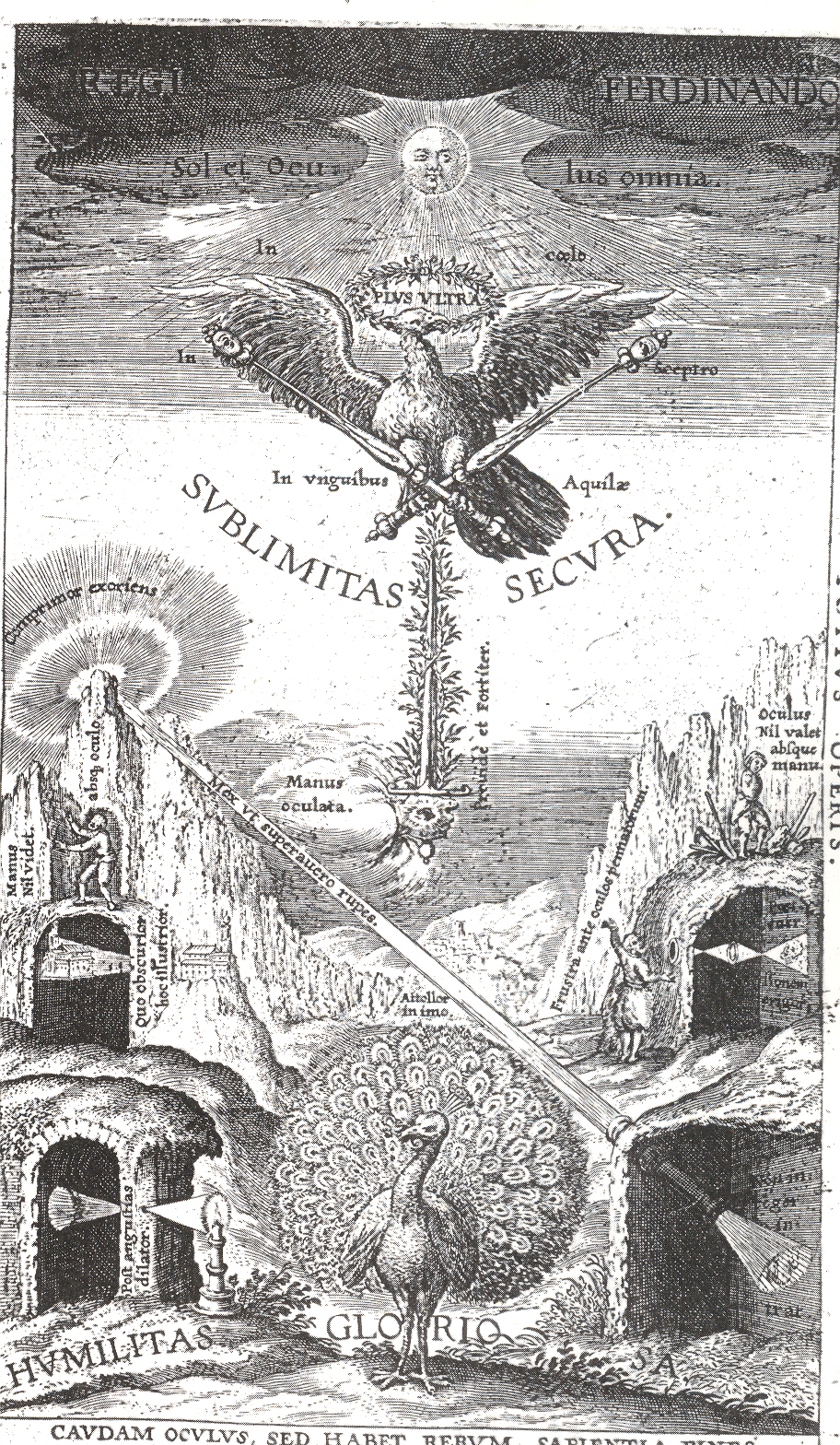
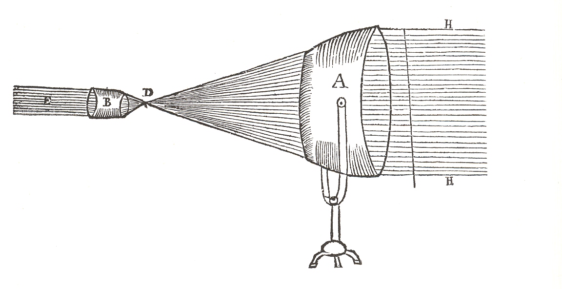
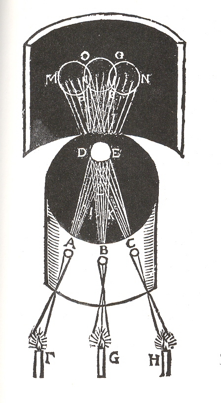
    There are literally hundreds if not thousands of images printed 1550-1850 to call upon to make this point, and I’ve selected but a few.  The first belongs to Jesuit astronomer Christoph Scheiner and which appeared in his  Oculusm hoc est: fundamentum opticum...,printed in Innsbruck in 1619. His work is an out-and-out landmark in the history of optics,  physiological optics and ophthahlmometry, and provided a springboard for two generations following him, not the least of whom was Rene Descartes. The illustration above is the book’s frontispiece, and features four camera obscuras demonstrating four principles of the eye, the middle ground of which is a beam of light 

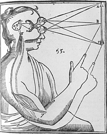
    Rene Descartes depicted the interpretation (in his  Principles of Philosophy of 1644) of light and its physiological reaction in the brain as follows:

    Cartesian_Vision

    the lines of sight depicting binocular vision, observed (and compressed) by the eye’s “particles” and processed by the pineal gland which in turn manipulate the “fluids” in the control of nerves and muscles. 

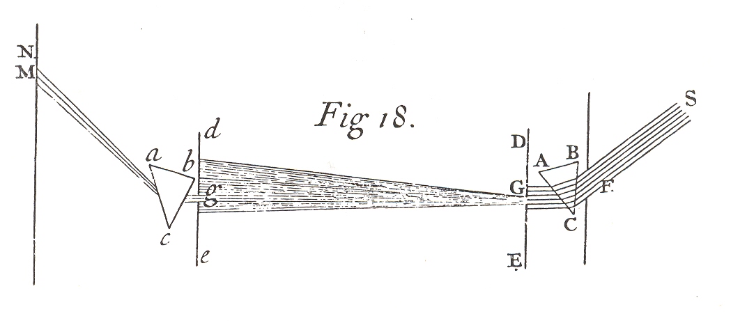
    Another example of even greater fame than the iconic image by Descartes is that of the diagram showing the connection between color and its reflective index by Isaac Newton, appearing in his Opticae of 1706.

    Mar 12 newton 

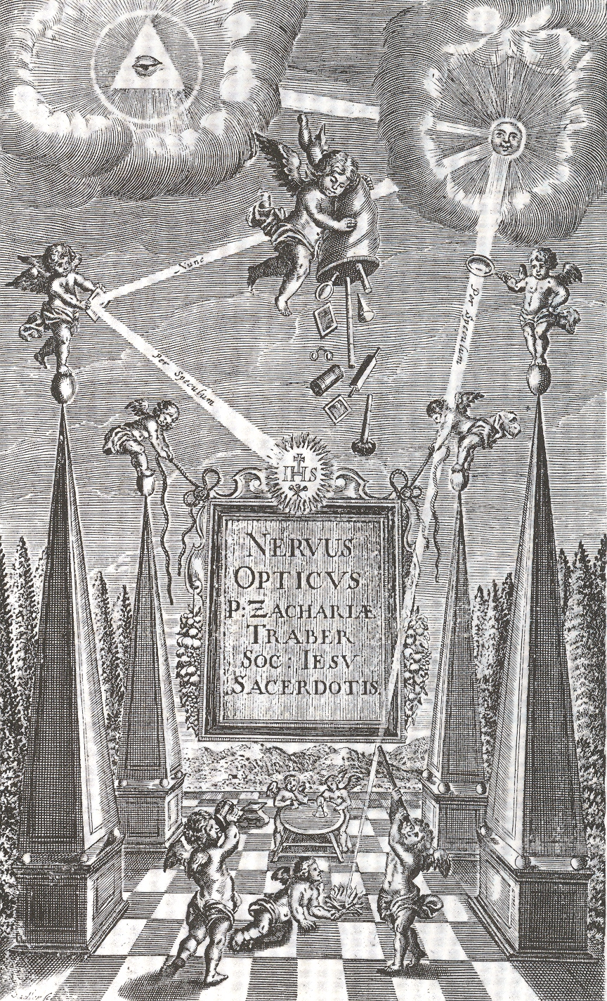
    Another fine example comes from Zacharias Traber’s (1611-1679) beautifully illustrated classic of optics (and physiological optics) , Nervus Opticus sive Tractatus Theoricus..., published in Vienna in 1690.  Traber is a great collector and synthesizer of the work done during and before his time, using the work of Descartes, Kepler, Schott, Kircher, Scheiner and Aguilon (for example), and then further implementing their ideas especially in the areas of color theory  and light refraction.  The image certainly reflects Jesuit Traber’s religious training, depicting the holy source of light (originating with the almighty force) which directs it to the sun; the light then is left to the inquisitive and playful hands of cherubs who reflect and magnify it, as well as use it to start a fire (from the condensing lens) and observe it through a telescope. The main cherub empties a sack containing a number of different optical tools, no doubt for the playful brethern beneath. 

    Mar 12 trauber 

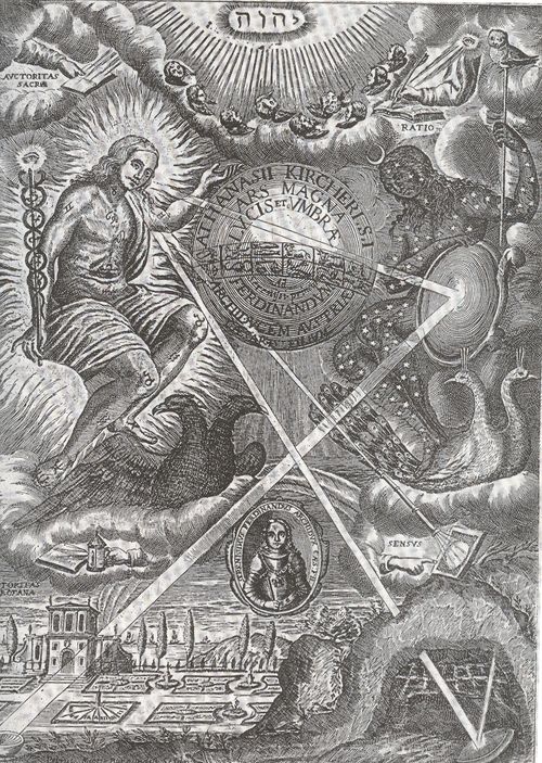
    And then of course there is the great, unstoppable, polymathic and sometimes incorrect Jesuit Athanasius Kircher.  This image appears in his masterwork Ars Magna lucis et umbrae, printed in Amsterdam in 1671, which deals with light and shadow, optical illusions, color, refraction, projection and distortion, sundials, mirrors, as well as astronomical subjects. Most of these subjects are clearly seen in the engraved frontispiece to the work (below), the source of all of the “rays” of light coming from the godhead, relayed through a telescope, reflected from a mirror, and gathered in a camera obscura. 

    Mar 12 kirch 

    Other interesting images from the Kircher include this spotlight.

    Mar 12 krirch detail long

    Mar 12 krirch black detail


  • Fantastic African Found Architecture vs. a Color Catastrophe in Fort Wayne

    JF Ptak Science Books  Post 765  Blog Bookstore

    • A  great job done with access to nothing, and a bad/period job done with access to everything.

    Part I:

    ++00++ 9.23 petrol town 005

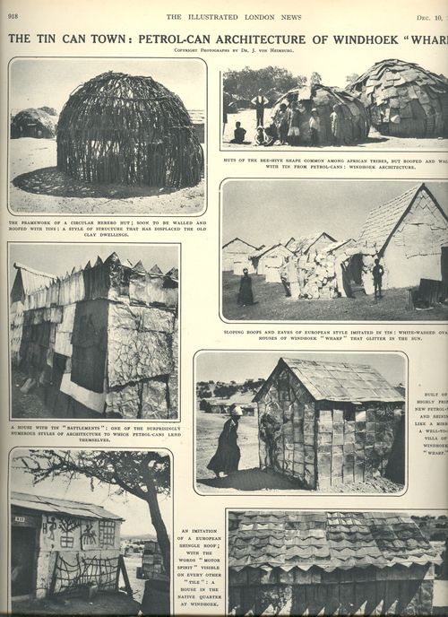
    The town of Windhoek (at least so-named by Imperial Germany, which moved in in 1884, claiming this part of Africa for themselves against British desires) was growing at the edge of the Namib desert–a mile high, 14 inches of rain a year, an situated between two rival tribes, and for 35 years under the control of Germany.  Barren, dry, and far from anywhere.  This report appears in the Illustrated London News for 10 December 1932, a story from a German traveler at Windhoeck 13 years after Germany was forced to give everything up after the terrible Great War. 

    ++00++ 9.23 petrol town 001

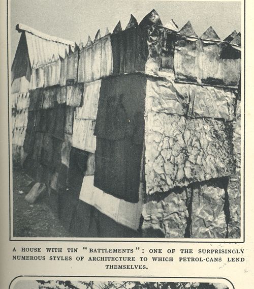
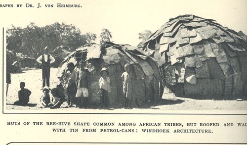
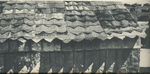
    And what this traveler sees is quite shocking, spectacular:  Windhoeck had become a town made of discarded tin petrol cans.  Thousands of cans flattened and battered and fashioned and fabricated to fit over wooden skeletons–and then whitewashed–all arranged around a city plan of roundabouts and looking vaguely like Washington DC in plan.  

    ++00++ 9.23 petrol town 004


    In a place with little resource the people living there were applying whatever they could that made sense to its fullest use–the found, discarded petrol tins were of exceptional utility, rewriting a certain amount of economic theory of value.  The vernacular landscape for this community was intelligent and lovely, making artful use of scarce commodities.  

    ++00++ 9.23 petrol town

    Part II:

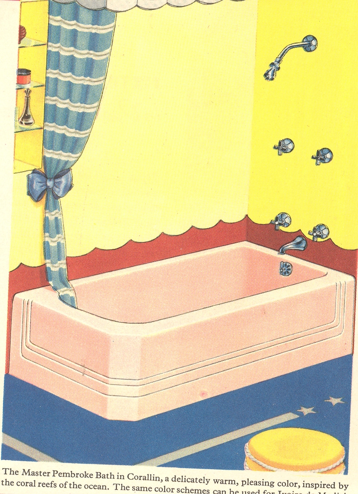
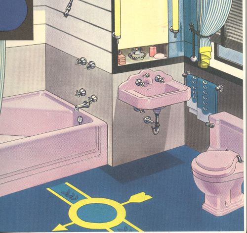
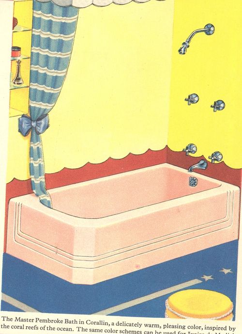
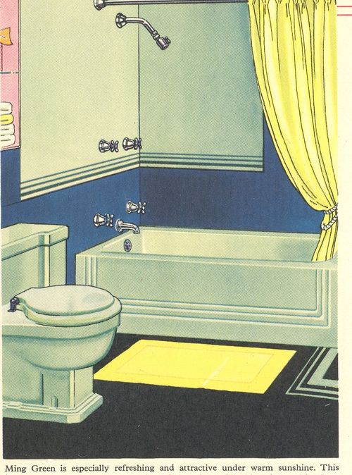
    The National Mills Company catalog—purveyor of bathroom and plumbing supplies to the trade of Fort Wayne, Indiana—of 1939 is like a trip back in time to grandma’s Great Barrington bathroom, comforting and sort of pleasing, until you get to the color illustrations.  It is there that the Turner colorized classic movies seem to have gone and speewingly bled their incredible neo-technicolor blood—colors not found in nature do battle amongst themselves in brilliantly chromo-deranged bathrooms and kitchens. 

    ++00++ 9.23 bath 002

    These things certainly seem benign enough in black and white (and gray tones), but in color we are left with “oh, wow!” reactions as the cones in our eyes plead for mercy, and anyone who ever lived with any ability of color sense goes a-spinning in the ethereal night, corkscrewing themselves into a-chromatic corners of the beyond.  

    ++00++ 9.23 bath 001

    Seeing these right on the heels of my post on beautiful, simple vernacular architecture of found objects makes these samples of bourgeoisie pre-war post-depression excess all the more awful, like that knowing lump in your throat when you know something is going to go badly.  The experimentation with extreme color for the middle class in the National Mills catalog seems to have survived itself, many of these colors were evidently sold In big enough numbers to warrant reappearances in the next few catalogs.  Go figure.

    ++00++ 9.23 bathroom3 great


    ++00++ 9.23 bath


  • A River of Odd Color: Unexpected Color Images of Food, 1949

    JF Ptak Science Books LLC  Post 728  Blog Bookstore

    What
    greatness had not floated on the ebb of that river into the mystery of an
    unknown earth
    ! Heart of Darkness

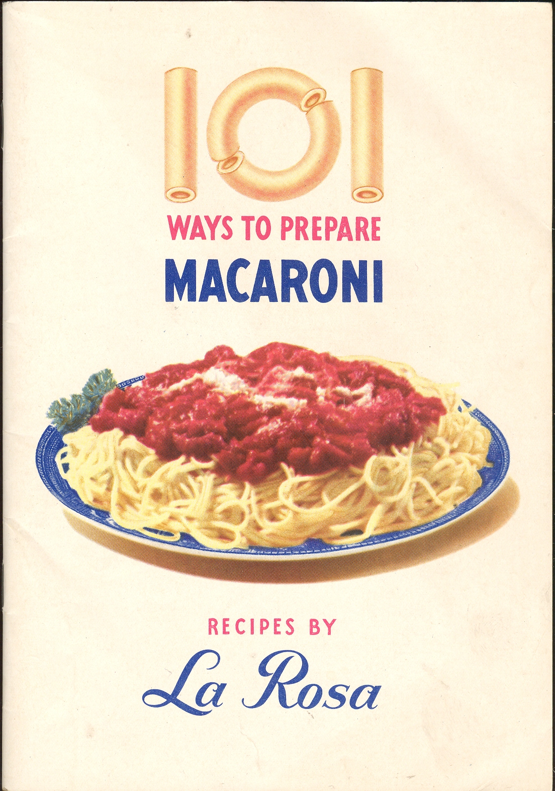
    ===blog==aug 24=cover Coming
    on the heels of yesterday’s post about (impossible) retinal memory and the
    comfort of unusual color comes this bit of oddness from the House of La
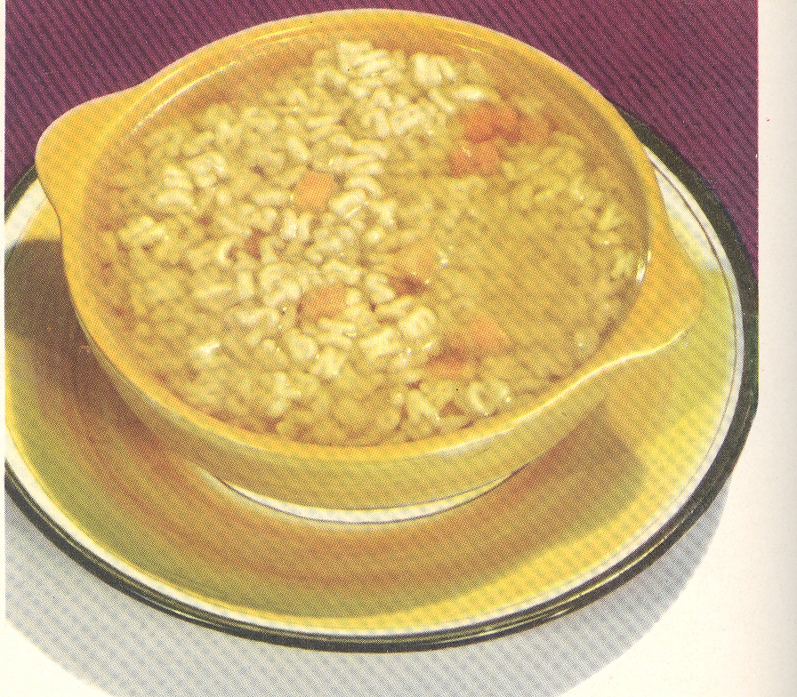
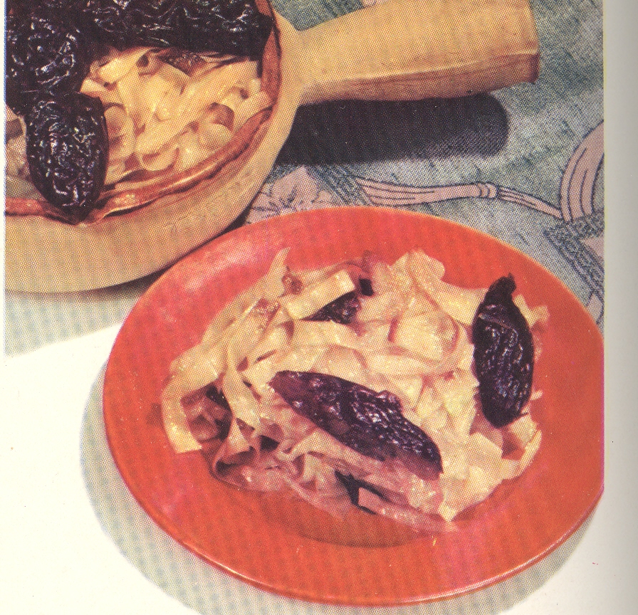
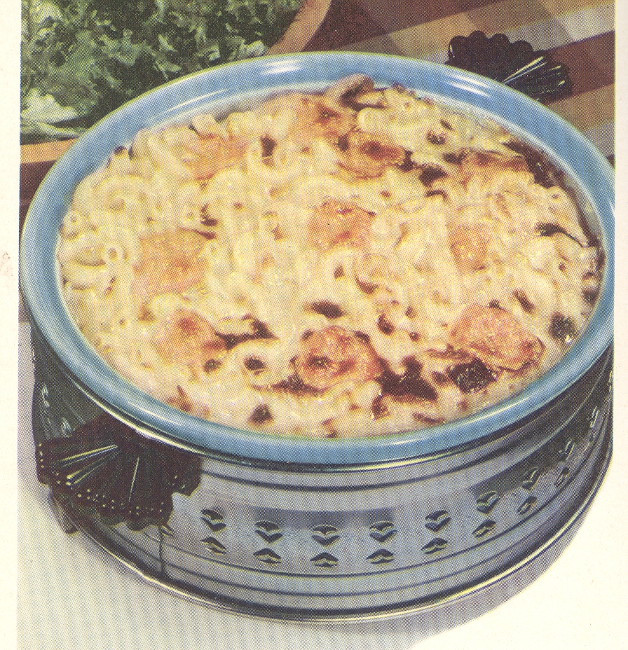
    Rosa.  101 Ways to Prepare Macaroni seems
    about as benign and forgettable a title that one could write; that said, once
    opened, this little pamphlet poured its heart out to the Naïve Surreal in us
    all with the unforgettable (and accurate) color images of the promised linguine
    delicacies.  Honestly, the cover is why I
    have the thing—it is kind of perfect, a spare design that gets the message
    across, and leaves plenty of white.  It
    also uses a macaroni typeface.  But once
    inside the imagination is left to wander quite a bit between the colors of
    these foods that you were supposed to cook. And eat. 

    ===blog==aug 24=color--sauce green

    I’ve
    long been a fan of taking a good close look at the foods on the  tabletops and dining tables of country homes,
    diners, and simple restaurants from the 1930’s—actually the Library of Congress
    is a wonderful source for this kind of image, having many thousands of them
    digitized from their monumental FSA collection. 
    The vast majority of these though are in black and white.  There seems to be not much more comforting
    than a checkered tablecloth on which a huge spread is laid for a farm family
    and their hired hands: giant bowls of mashed potatoes, big plates of corn, a
    huge pitcher of milk, and so on.  I could
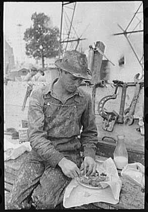
    dive right in.  (The image below–by FSA great Russell Lee, shows a Kilgore, Texas, roughneck stopping for lunch.  This is not exactly what I had in mind, but the man has a real plate, a beautiful bottle of milk, cutlery, and all wrapped up in heavy paper–this is what brought-from-home lunches should look like.  And it makes me hungry.)

    Eating--roughneck

    Then
    for some reason I started assembling a few hundred images of red photo ads of
    foods from LIFE magazine from the 1940’s—these are truly spectacular things,
    the reddest ads in the history of advertising. 
    (I’ll get to these in a week.)
     

     And
    then came this funny little pamphlet and its bizarre display of food coloring
    that is so contentious that it might be able to put folks off their food.  Have a look. I’m uncertain of what happened
    to color selection for food advertising at this time; I do know that it is
    confusing to our sensibilities. (Color
    reproduction is accurate.)

    ===blog==aug 24=color--consome 

    ===blog==aug 24=color-desert 

    ===blog==aug 24=color--meatless 

    ===blog==aug 24=color-side 

    ===blog==aug 24=color--spoultry


  • Things that Are and Aren’t Dept: the Names of Colors


    JF Ptak Science Books                                          Part of the series Naming Things

    GoetheFarbkreis

    (Almost) in the beginning were monsters.  The epic battle that Moses wages early on is not with Pharaohs, but with the dragon(s?) that the creator itself had fought on the opening whisper of creation (Book of Job 26:12, Psalms 89:10) and who would again meet at the very last bits of the closing days.  Behemoth, Leviathan, Rehab may all well have been monsters to these ancient folks, but they very well might look like rhinoceros or crocs or hippos to us.  Monster demons like Rehab (Psalm 87:4), a slaughtering beast who would be reintroduced to a different part of the world as Tiamar who would or could also be known as the Red Sea,  lifted straight from Mesopotamian mythology and placed directly into that of the Old Testament among the rest of the borrowed stories and beliefs, a problem by any other name.

    Following names and their cyclonic twists, and absences and sudden  re-emergence through the history of storytelling is dizzying—just consult your Robert Graves on myths  if you want to have  your memory plumbed (the great poet and writer doing not such a poetical or writerly job in this effort in my opinion though most people love it).  Keeping an eye on the mix and mash of gods and goddess and associated super beings from thousands of years ago, the god of the Old Testament makes it very clear and precise about just who he is in his self-introduction to Moses:  “I am the God thy Father, the God of  Abraham, the God of Isaac, and the God of Jacob” (Exodus 3:6)

    Equally almost in the beginning, again so far as the Bible is concerned, are colors—before that maybe everything was black and white, or just white, or maybe just black, depending on your epistemological concept of everythingness or nothingness.  (It looks like green may be the first color mentioned in the bible, (Gen 1:30 And to every beast of the earth, and to every fowl of the air, and to every thing that creepeth upon the earth, wherein there is life, I have given every green herb for meat: and it was so) though the mixing up of meat and veggie is a little confusing to me.))

    Over the years color names themselves have creepethed among themselves like a vocabularic ocean, a fluid dynamic of naming.  Names have flowed across their individual spectra, some names sticking, some not; the originator of the concept of the naming of “red”, the original namer of the color, lost to the earliest and deepest part f the collective human memory.

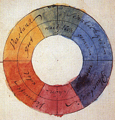
    I don’t know where many of the names of colors come from, or why.  Index to Color Names and Color Numbers of the Standard and Season Color Cards of America (published and created by the Textile Color Card Association), and published in 1923, is filled with color names whose meaning and origin are a mystery and whose necessity seem to hinge on sunspots.  Which is fine, though it might be interesting to have had color names more dependent on that which went before. Like the names of the streets on most of Connecticut Avenue in D.C. are alphabetical, and once the first 26 letters or so are monosyllabicly employed, the second set starts with two syllables, and then three.  It is a system that usefully indicates where long the long avenue you might be. It might be useful to employ such a method in color names; or not. 

    And I suspect it would be “or not”, unless the poetry and art and music inherent in these formulations would be imaginatively employed

    But on to the color names:  Ambulance, Basketball, Bosom,  Cowboy,  Squirrel, Chit, Old, Nymph, Old mephisto, Pelt, Racket are examples of some of the mystery colors.                             

    Some names which were part of institutionalized racism I’m sure are now gone:  Arab, Negro, African; Bagdahd (?), Bombay Brown,  Coolie Yellow, Coolie, Congo Brown, Egyptian Husk, Hankow (yellow), Kyoto Yellow, Korea Yellow, Mandarin Yellow, Punjab Brown, Kafir, Tar Baby.

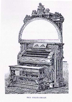
    Colororgan But I’ve got to say, even though the names may not have much to do with the colors, most of the names in the pamphlet sound quite lovely, and many are yummy: London Smoke, Log Cabin, Leadville, Madonna, Naked, Pitchpine, Pompeii, Prelate, Smoked Pearl, Swamp, Lucky Stone, to name a few. Overall I doubt that this is what Newton, Goethe, Chevreul, Rood, Maxwell and the rest had in mind when they were figuring out what color *is*, but I do think that all of them had large enough poetic natures (Newton the weakest and Goethe by far the strongest) to appreciate the occasional beauty of naming.  The unbelievable Shakespeare seems not to have spent that much time on color (so far as I know, and I don;’t much about the Bard), but (in a dear-sweet-god understatement) other people did:  people like Richard Feynman synesthesically thought in mathematical color terms, others created musical  instruments which would produce color from music while most of the rest of the world produced music which conveyed color, and on and on.  And then of course there’s the whole world of art.

    But I won’t go there now–I just wanted to follow this loose thread in what seemed to be a pretty inert pamphlet–in the end it opened itself to a lot of possibilities with just a little thinking. 


  • Oliver Byrne’s Euclid, (slightly) continued

    JF Ptak Science Books LLC

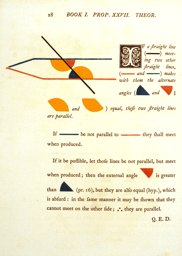
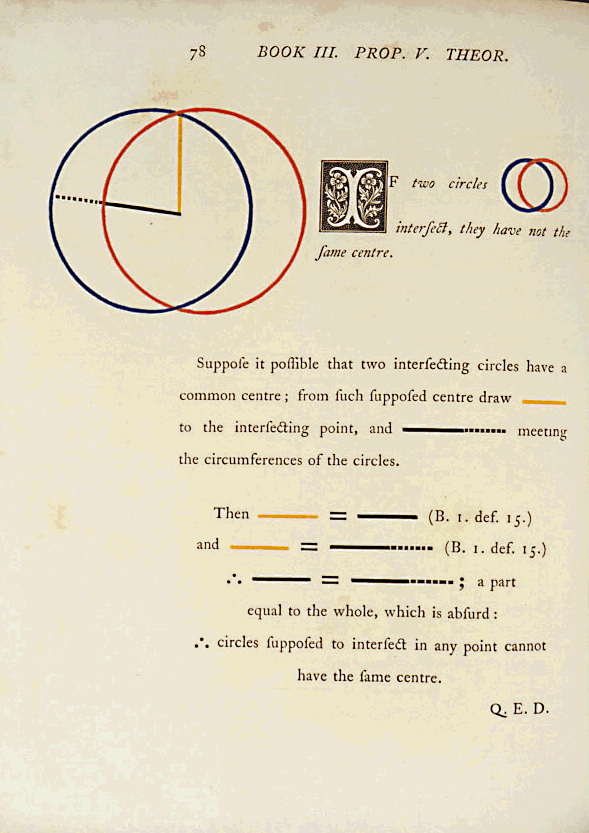
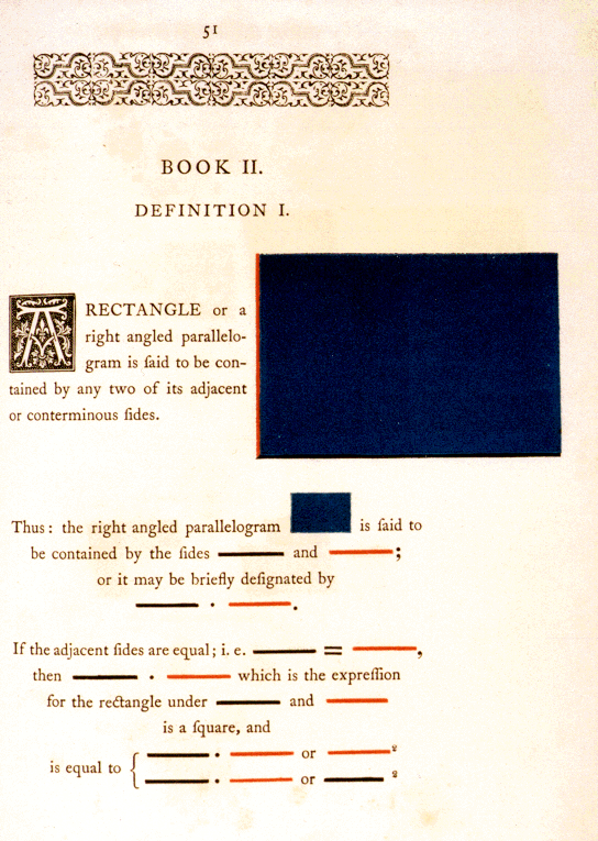
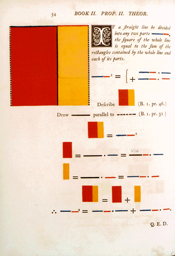
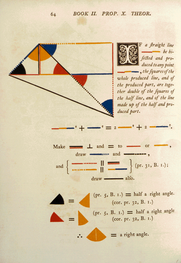
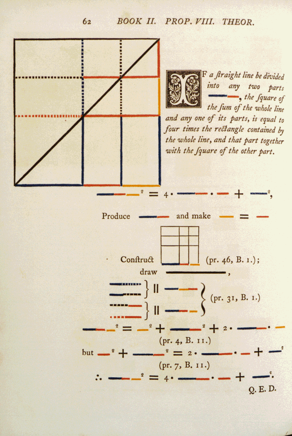
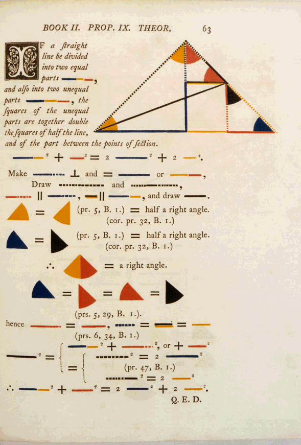
    Here’s a few more examples from Oliver Byrne’a unique attempt at transliterating the propositions of Euclid via color.  As I said in an earlier post  the attempt may not be a step in the right direction (and by “right” I mean “correct”) but it is, beyond doubt, beautiful–yet another example of Beautiful Wrongness.

    The entire work by Oliver Byrne’s may be found here

    Byrnews II.10

    Byrnes II.14

    Byrnes 11.8

    Byrnes II.9


    Bryne euclid i.27
     
    Byrne euclid iii.6

    Byrne euclid def