JF Ptak Science Books Quick Post
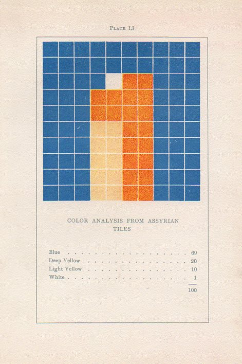 While looking through a London stationer’s website for Blackwing pencils I found on their site a catalog for a floor tile maker that strongly reminded me of a gorgeous turn-of -the-century art book.
I’ve written several times1 on this blog about the non-pre-discovery and non-pre-discovery-recognition of nonrepresentational art by the fabulous art theoretician Emily Vanderpoel. She wrote a a lovely and mysterious book in 1901 (a second edition appearing two years later) called Color Problems for the Layman, in which she sought not so much to analyze the components of color itself, but rather to quantify the overall interpretative effect of color on the imagination–I think. I know this sounds begging and vague, but I really haven’t been able to make much headway in the work, though it seems to display the occurrence and frequency of general colors in 100-block distributions. Vanderpoel seems to take the overall sense of the colors of, say, a Greek vase or mummy cloth or a teacup and saucer, and display the overall effect in her grid. As I said the procedure escapes me but the net result is beautiful.
The 1940’s tile maker’s illustrations of samples of their work are also quite strong, and as you can see bear some similarities with the Vanderpoel:
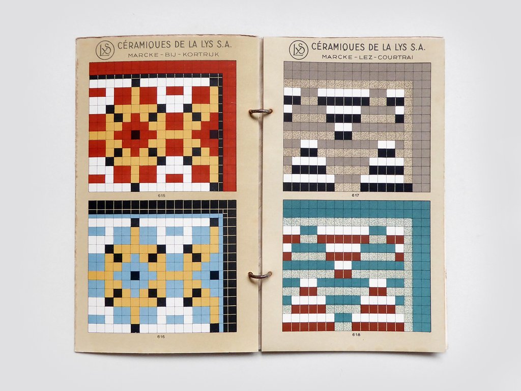
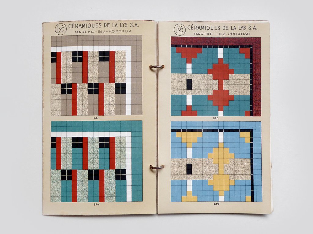
[Tile image source: from the store perfectly-named Present and Correct https://www.presentandcorrect.com/collections/ephemera/products/tile-catalogue-1940s]
Offhand I guess you could say that any of cubist/block/tile/mosaic designs could remind you of Vanderpoel–but not so, and in ways I can’t fully explain. It is something about the distribution and very involved nature of these tiles that pull it towards Vanderpoel…and perhaps it is the color selection. I’m not sure. I have perhaps a dozen tile manufacturer catalogs from about this period (1930’s/1940’s) and none have struck me as strongly as this one does in its “relation” to Vanderpoel. In any event, there seems to be a “there” there.
Notes:
1. Here are some links to the posts on Vanderpoel:
- https://historyofideasblog.com/thesciencebookstore/2010/12/what-color-is-an-unintentional-modernist-masterpiece-of-book-illustration.html
- https://historyofideasblog.com/thesciencebookstore/2008/04/shaping-space-a.html
- https://historyofideasblog.com/thesciencebookstore/2015/02/mummyii.html