A Daily History of Holes, Dots, Lines, Science, History, Math, Physics, Art, the Unintentional Absurd, Architecture, Maps, Data Visualization, Blank and Missing Things, and so on. |1.6 million words, 7500 images, 4.9 million hits| Press & appearances in The Times, Le Figaro, Mensa, The Economist, The Guardian, Discovery News, Slate, Le Monde, Sci American Blogs, Le Pont, and many other places… 5000+ total posts since 2008.

Category: Information, Quantitative Display of

  • A Big Sea of Planes: Quantitative Display of World War II Bombers

    JF Ptak Science Books  Post 748  Blog Bookstore

    (See also the new post on picturing massive numbers here.)

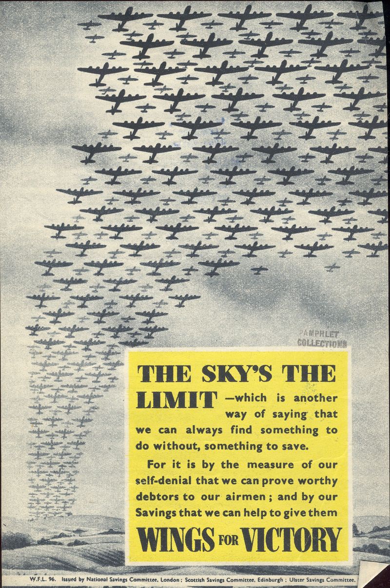
    I’ve written four or five posts on glorious quantitative visual displays of massive amounts of WWII bombers, most of which I’ve gathered together below. This subject came up today when I found another of these images in a small hand-out broadside published by the National Savings Committee of Great Britain, urging people to save money and be thrifty, keeping money in the banks, in an effort to control prices and have money available to the government for war production.  The legend states: “For it is by the measure of our self-denial that we can prove worthy debtors to our airmen; and by our Savings that we can help to give them wings for victory”.  The point is driven home by a now-familiar representation of hundreds of bombers rising from the horizon–a remarkable vision, especially if you tried to visualize the real thing. 
    +_+ planes WWII


    Here are a few other similar images:

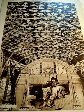
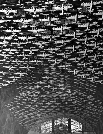
    (A) This widely circulated and published photo appeared in 1942 (particularly in LIFE Magazine in 17 September 1942 and the Illustrated London News in the next month), and showed 4,500 aircraft models suspended from the ceiling of Chicago’s Union Station   It is the result of an inspiration derived from President Franklin Roosevelt’s assertion that America would produce 185,000 war-focused aircraft in 1942 and 1943. 
    Blogwwiiplanes

    The planes in this photo were hanging 60-feet above the floor of the station, with wing spans between one foot and four feet (for the bombers).  It was a fantastic, blustery, iconic effort to show what it meant to look at 4500 planes—and these paled in comparison to a drawing (which I unfortunately do not have) that appeared in the Illustrated London News on 21 February 1941, showing the entire production fleet of 185,000 aircraft—a column of planes one mile wide and 117 miles long.
    1ebay_sept_30185000_planes695

    Blogworld_war_ii_airplanes_delano

    Using this photo then to interpolate that full production figure of 185k, you’d have to piece 48 of these photos together to show full production, or a version of this photo that was 8 inches wide and 32 feet long.  (The second image of Union Station and the planes is by FSA photographer Jack Delano.)

    1ebay_sept_30185000_planes_detail69

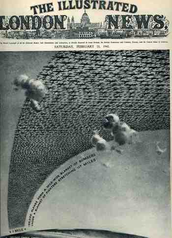
    (B) This arresting cover image for The Illustrated London News of 21 February 1942 illustrates the (new) American production program for planes and tanks for 1942 and 1943 (It reminds me too of an earlier post I did with a similar cover for LIFE magazine here.) The caption reads: “185,000 planes form a mile-wide blanket of bombers under a blanket of fighters stretching 117 miles” which is actually a double blanket of planes–if they were thinned out to form one layer it would stretch one mile wide from Washington D.C. to New York City, which is quite an unimaginable ribbon.


    The reality of the situation was greater than this:  by 1945 over 300,000 planes were produced, 275,000 of them after Pearl Harbor.  And this from a combined aviation industry which before 1939 had produced fewer than 6,000 planes a year.  The war effort increased this by orders of magnitude, and by war’s end there were 81 production facilities with a combined area of 175 million feet, all bumped up within four years.   I’ve never read about it, but I have no doubt that one of the key ingredients to this sort of hyper-successful undertaking was organization–the oversight and control for this process must’ve been fast and decisive, with little room for mid-level anything.  I think that this is the only way the whole thing could’ve worked so well.

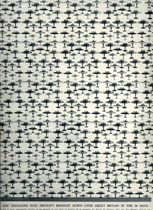
    (C)  This tremendous display is half of a double-page spread that appeared in The Illustrated London News for 7 September 1940.  It was meant to bolster the civilian population of Britain during the time of the German attacks, shoping that “Over one thousand Nazi aircraft (were) brought down over Great Britain in …20 Days…” The artwork, drawn by Bryan de Grineau, actually depicts 1000 planes, and accurately depicted ones at that.   What the graphic doesn’t tally though are the airmen losses, which would be considerably more thanb the 1000 aircraft:  for example, of the aircraft involved in the sustain air-invasion of England, the  Dornier 215’s had a crew of four, Dornier 17’s three, Heinkel 111’s four, Messerschmitt 110’s two, and Junkers 88’s three.  Thus  there were thousands more airmen lost, a commodity that the Nazis could little afford. 

      (This continues a thread on The Battle of Britain and also a post on “What 185,000 Planes Looks Like”).
     The results of the battle (and if you take a look at this earlier post for the full narrative), in terms of aircraft and humans,
    were,  for England: 1,023 fighters: 376 bombers, 148 coastal command aircraft  for a total of 1,547 aircraft and  544 pilots and aircrew killed.  There were also 27,450
    civilians killed and 32,138 wounded.  The Germans lost 873 fighters and 1,014
    bombers for a total of 1,887 aircraft and  2,500 pilots

    I find this visual display of quantitative data beautiful and compelling–and overwhelming in its way.

    The Battle of Britain was fought primarily from 10 July to 31 October 1940, so by the time this image was published the Brits had been able to turn the tide of Hitler’s plan.  (The air strikes wouldn’t really end until the Nazis turned their attention to the Soviet Union in Operation Barbarossa in May 1941.)  And that plan, named Luftschlacht um England, was to overtake and destroy the British capacity in the air, for as long as the English had command of the airspace there would be no way that the Nazis could force an invasion by land/sea (at least in the minds of the Oberkommando der Wehrmacht  and Hitler).  And so the Nazis failed–it was their first major defeat, and, especially, with the turning of attention east, it was a pivotal point of the war. 
    00-blog--Oct 29 battle britain Nazi planes952

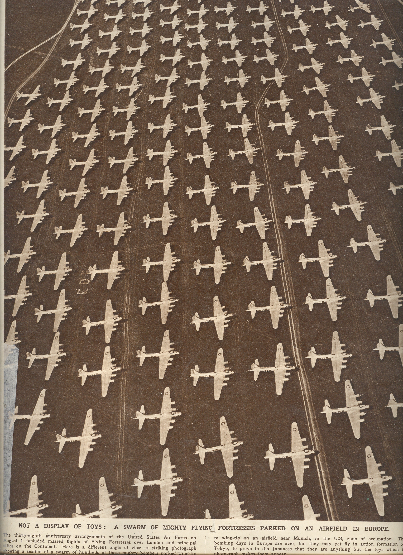
    (D) This last image is a “Not a Display of Toys”, shows only one section of a large airfield “in Europe” (actually in U.S.-administered Munich).  There’s about 300 B-17’s (e?) parked wingtip to wingtip, off duty now from the fight in Europe, but (as the caption says) prepared for a fight in Japan.  I don’t think anyone in high command had any doubt that these planes had seen their last action.  The atom bomb worked, and would work again (and again, and more so if necessary), and the fear that these planes would make their way East was not a real concern. This photo represents about 7% of the highest number of B-17’s in service in Europe at any given time.
     

    Blog--may 8--vrowds


  • Triumphantly Unusual Images of the Eiffel Tower

    JF Ptak Science Books LLC  Post 732  Blog Bookstore

    ===blog--aug 26==eiffel

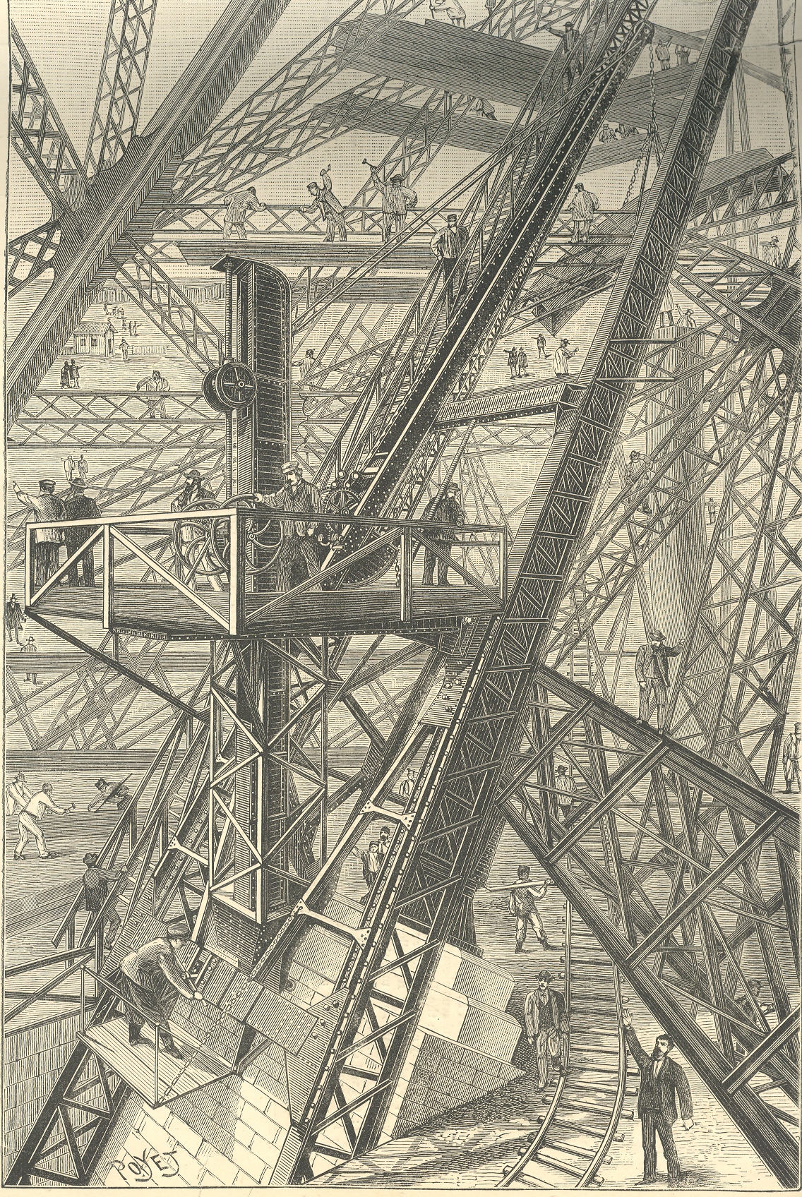
    This image of the building of the foundation of the Eiffel Tower, which appeared in the
    Scientific American in 1888, appears both orderly and chaotic, a dizzy miasma
    of activity and a confusion of right angles. 
    (My six-year-old Tess says that it looks “worky”.)  Part of the issue is the fine quality of the
    jumble, with 90-degree angles everywhere, which confuses the eye.  Another part is the perspective, which is odd
    in places, and which takes the whole of it and makes the print into a near
    Escher-like experience of impossibility. 
    IT is this spatial confusion which makes this print so uncomfortable to
    me. For instance it seems that the observer’s point of view may be in several
    different positions, depending

    Eiffel odd

    on where you resolve to fix our eye: if you choose
    the worker’s shed in the upper left corner as a reference point, the height of
    you viewpoint will be different than if you used, say the first pointing man in
    the foreground as reference.  Also that
    pointing man sands next to a little rail track that seems to hoist itself into
    the air before disappearing.  There’s
    much else, but these examples will do for present.

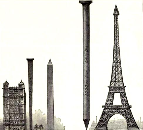
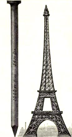
    These other images are the first nail & Eiffel Tower images I’ve ever seen.  The explanation is simple enough, though I think I’d much rather not know. 

    This image and data is from the generally useful data and
    interesting if not useless info Scientific
    American Reference Book. A Manual for the Office, Household and Shop
    ,
    by Albert A. Hopkins, and published in 1903. It gloriously depicts the annual American finish nail production in terms of Eiffel Towers:  there were evidently 10-million 100-pound kegs of these nails made in 1902; if they were made into one big nail, it would be this one–52′ in diameter and 1000 feet tall.  I guess another useful visual bit would be the representation of the number of new houses built/kegs of nails, which would make this image a little more meaningful; though, perhaps, we may not be going for meaning, here, necessarily.


    Eiffel odd det


  • Microcards and the Paper Internet

    JF Ptak Science Books LLC  Post 729  Blog Bookstore
    ===blog==aug 24==micro 2  

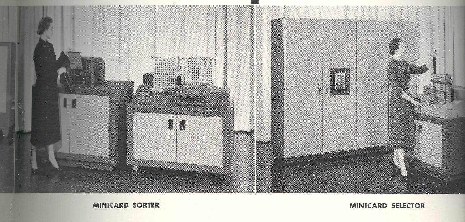
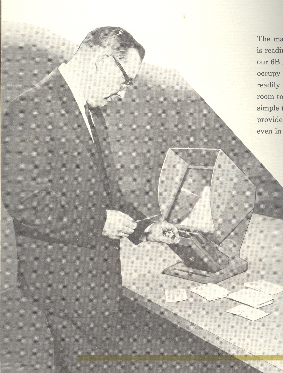
    For several decades, say in the 1930’s-1970’s, microforms, microfiche, microfilm
    and their related compatriots certainly looked as though they were next the
    direct and epochal inheritors of printing traditions that was limited to
    papyrus, paper, Gutenberg, and, well, micro-whatevers.  They weren’t too terribly wrong, and were
    actually getting a  little close to Vannevar
    Bush’s (1890-1974) Memex idea, as these processes of reproduction could reduce
    bookcases worth of bound material into a pile of cards a few inches high. It
    really was a sensational idea, and a major advancement in the distribution of
    knowledge.

    ===blog==aug 24==micro 3

    Out of all the important advancements in the history of printing, though,
    the mico- division of accomplishments lasted the shortest amount of time, being
    phenomenally replaced by the first real man-machine symbiosis (at least called
    so by the originator, JCR Licklider), the internet.

    (It is interesting to point out that at about the same time as the Memex
    concept was published in 1945, another man, Murray Leinster, whose dates are
    very similar to that of Bush (1890-1975) published a short story in Astounding Science Fiction magazine
    called ”A Logic Named  Joe”. The first sentence of the story reads: “It was on the third day of August that Joe come off the assembly line,
    and on the fifth Laurine come into town, an’ that afternoon I saved
    civilization.” Indeedy! Read the whole thing here.)

    ===blog==aug 24==micro 4

    Leinster foretold a future in which computers would be in every household and connected
    by an electrical grid.  The “logic” was
    the home node, or terminal; “Joe” was a logic that had developed a little past
    the machine stage,  gaining some human
    capacity.  It was an astonishing attempt,
    and actually perhaps a little more prescient than the genius technoid Bush’s
    idea. 


    ===blog==aug 24==micro 5


  • Telegraph “Fax”, 1895. Transmitting Images by Wire & 120-Year-Old Emoticons

    JF Ptak Science Books  Post 701     Blog Bookstore

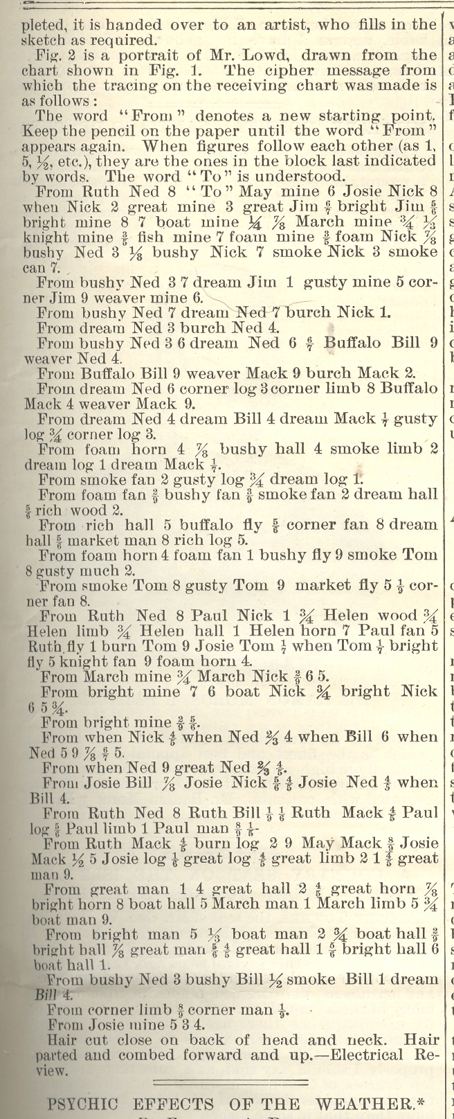
    ==Blog July 28=tele port 1This Scientific American article on the smart/odd/analog transmission of pictures via telegraph (14 September 1895) by W.H. Lowd, can make you say “ohhh, of course” out loud.  Mr. Lowd’s insight came fifty years after the Morse telegraph came into being, thirty years after it becomes the greatest means of communication, twenty after the first multiplex telegraph, and in the same year as Marconi’s first successful wireless transmission.   It was though an ingenious inspiration whose utility lasted for about 60 seconds—which is about how long it took to develop a smarter way of transmitting an image in its entirety.

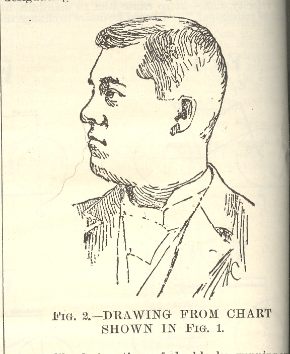
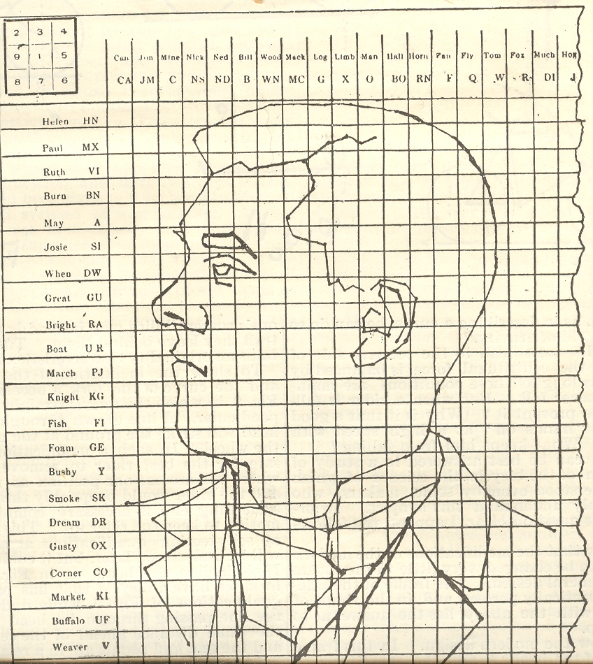
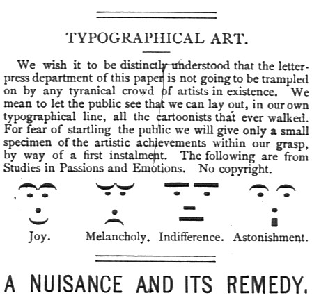
    Mr. Lowd recognized that he could transmit the outline of a picture by placing on opaque tracing of the picture on top of a telegraphic ciphering sheet and then transmitting the coordinates, which when received on the other end could be connected by short lines into the picture that was being transmitted from the sending end. ==Blog July 28=tele port 2 Images constructed of numbers and letters and such had been made for centuries before this; this however is a very early use of this idea that was employed to human-representational transmit the object electrically over distances by wire.  Emoticons—a more abstract version of this idea–such as we know them today are actually better than 150 years old.  They appear as early as 1857 in the telegraphers’ world, and somewhat earlier in the typesetter’s arsenal. (For example, a later attempt, taken from Puck Magazine No. 212, page 65, 30 March 1881, shows us something that we took to be “new” in the 1980’s as having roots that spread downwards into history by another 120 years.)

    ==blog==july 29=Puck

    But Mr. Loud’s idea was pretty, I must admit, even though it was far from being the answer to the question it addressed, with a more pleasing, technology-based solution appearing by 1899. 

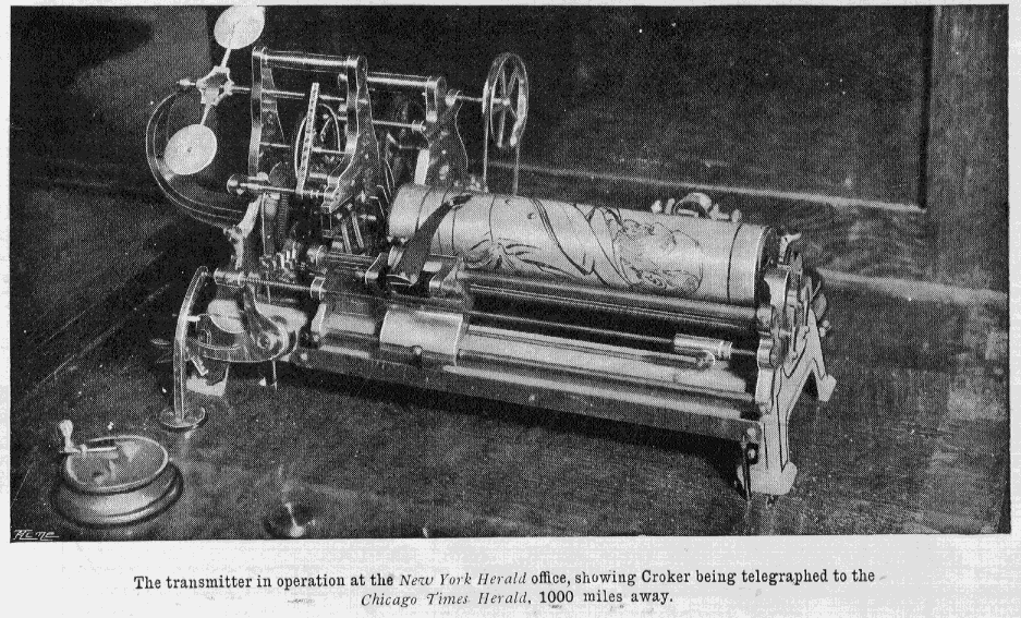
    (A successful apparatus for the true transmission of an image by wire is seen here, below, and was produced in 1899/1900.) ==blog==july 28==pics by wire

    The other bit that is interesting is that this transmission of an image necessitated an early Surrealist-like poem, dictated by the cipher/codes that were use by necessity to send the picture. 

    ==Blog July 28=tele port 3


  • Dreams of Mathematics

    JF Ptak Science Books LLC  Post 692  Blog Bookstore

    Thinking big thoughts in dreams is generally not a common thing, as anyone who has read their own semi-conscious half-awake memory notes of a dream-based inspiration could attest.  But it does happen: 
    ==Blog July 21=math dream
    Paul  McCartney1 dreamed the song Yesterday, Gandhi dreamed the source of non-violent resistance, Elias Howe
    dreamed of the construction of the first sewing machine, and Mary Shelley the creation of her novel Frankenstein…  For good or for ill, William Blake was evidently deeply influenced by his own dreams; on the other hand, Rene Magritte was deeply influenced by dreams but didn’t use any of his own for his paintings, or so it was said. Otto Loewi turned an old problem into not one in a dream, finding a solution to the prickish problem of whether nerve impulses were chemical or electrical (and resulting in the Nobel for medicine in 1935); the fabulous discovery of the benzene ring came to August Kekule in a dream as well.  Artists have been representing people in dreams and dreamscapes for many centuries: Durer depicted a dream in a 1525 watercolor, for example, and thousands of artists have depicted famous biblical dreams (Joseph of Pharo) for long expanses of time.

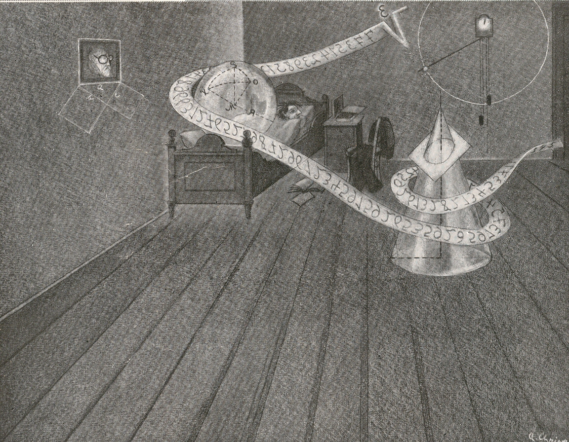
    What struck me, though, in this illustration found on the other side of the page of the Illustrirte Zeitung2 (for August 1932) that I used for yesterday’s post about damming Gibraltar and Shakespeare’s memories, was the depiction of someone dreaming mathematical thoughts…or at the very least, dreaming numbers.  People have undoubtedly dreamed much in mathematics, but I can not recall seeing illustrations of these dreams.

    I’m differentiating here from something like a Poincarean inspiration, or vision, or thunderstrike–I’m talking about drop-dead asleep sleep, dreaming sleep, REM and all that. Also I’m differentiating this from imaging mathematical thought, as in the work of Francis Galton in 1880 in which the subject of mentally seeing the process of mathematics is perhaps first addressed. I wrote a short piece on that here, way back in Post 9. )

    Photo

    The numerical sequence in this dream doesn’t look like anything to me:  the backwards radicand doesn’t strike anything common in my head.  The geometrical drawing under the portrait in the dreamer’s room though is the impossibly iconic Pythagorean theorem, and there is a nice picture of a conic section in the foreground; but the artist, who improbably signed the work “A. Christ”, doesn’t offer much of math in the dreamscape.  Still, it is a rare depiction of someone dreaming about math. 

    Notes
    1. “I woke up with a lovely tune in my head. I thought, ‘That’s great, I wonder what that is?’ There was an upright piano next to me, to the right of the bed by the window. I got out of bed, sat at the piano, found G, found F sharp minor 7th — and that leads you through then to B to E minor, and finally back to E. It all leads forward logically. I liked the melody a lot, but because I’d dreamed it, I couldn’t believe I’d written it. I thought, ‘No, I’ve never written anything like this before.’ But I had the tune, which was the most magic thing!” from Barry Miles (1997), Paul McCartney.
    2.  This is really a great sheet of paper, coming from issue 4492, pp 518-519.  Two pictures of dreams on one side, with three visionary images on the other (the Gibraltar dam, a sub-polar submarine, and a futuristic Indian railway/bridge.


  • Unusual-Classic Design: Carto-graph of Aachen, Germany, 1932

    JF Ptak Science Books LLC    Post 687    Blog Bookstore

    ==Blog July 16==aachen

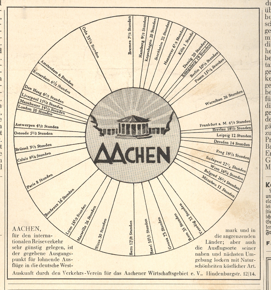
    This graphi-map isn’t so odd or unusual, and the data it presents isn’t deep or wide or complex,  but the image is still very compelling–its simplicity and design the basis for its eye-catching quality.  It takes up about a sixth of the
    next-to-the-last advertising page in the 1 April 1932 Illustrierte Zeitung (Leipzig), and it does,
    really, “pop”.  It is a very simple presentation
    establishing the centrality of Aachen,
    and that’s about it—simple.  And it
    works.  I’ve seen a number of other “all roads lead to” type of maps like this, but I’m a little stumped on locating them this moment. One of these,  a glorious world map of the port city of Wilmington, North Carolina, showing lines of transportation between it and the rest of the world, featuring the only-named-city Wilmington smack in the middle of the map Wilming-Center-of-the-World map.  (I think I can gurrantee that this is the only time WIlmington appears so on a world map.) 

    Peutinger


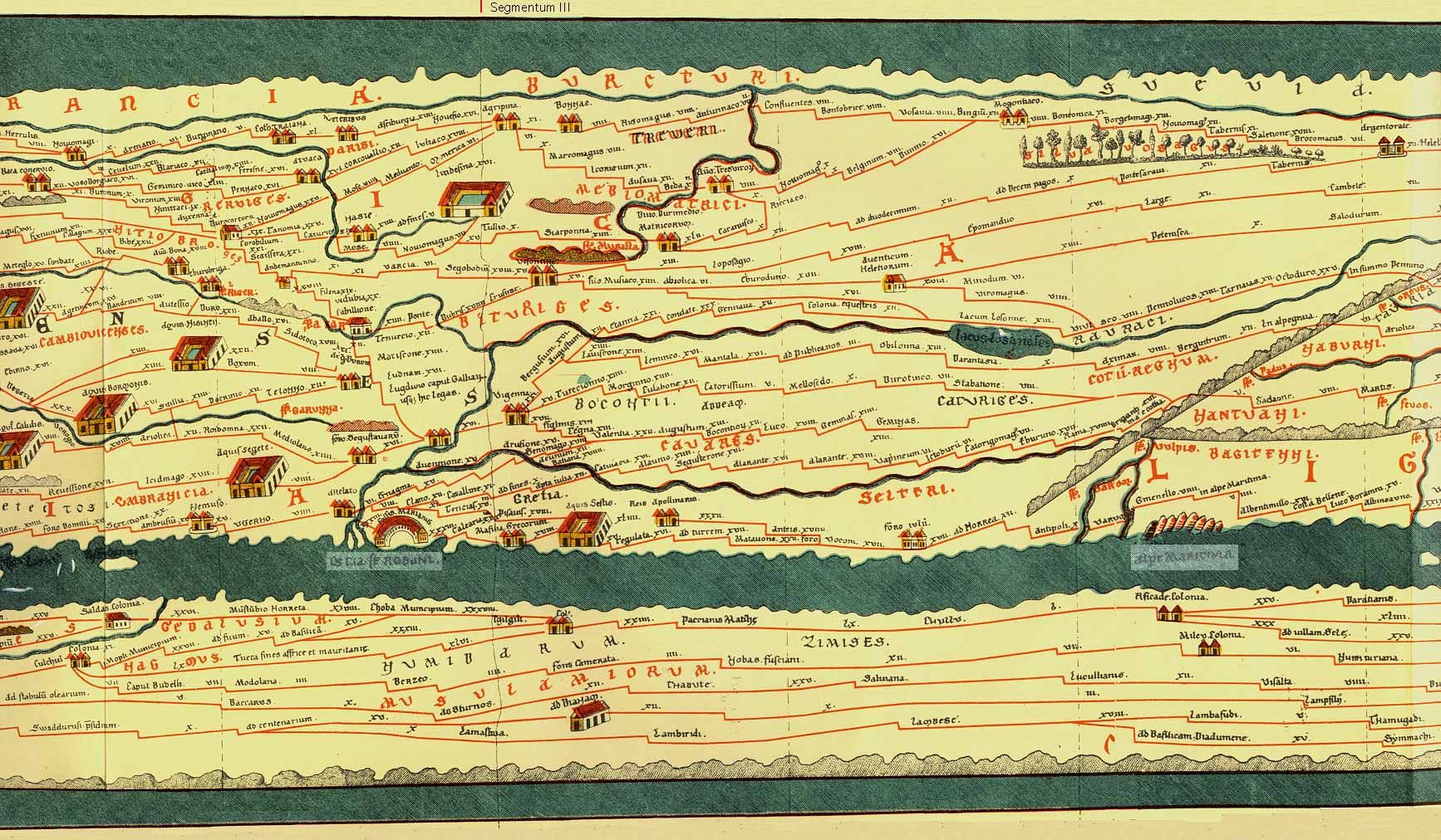
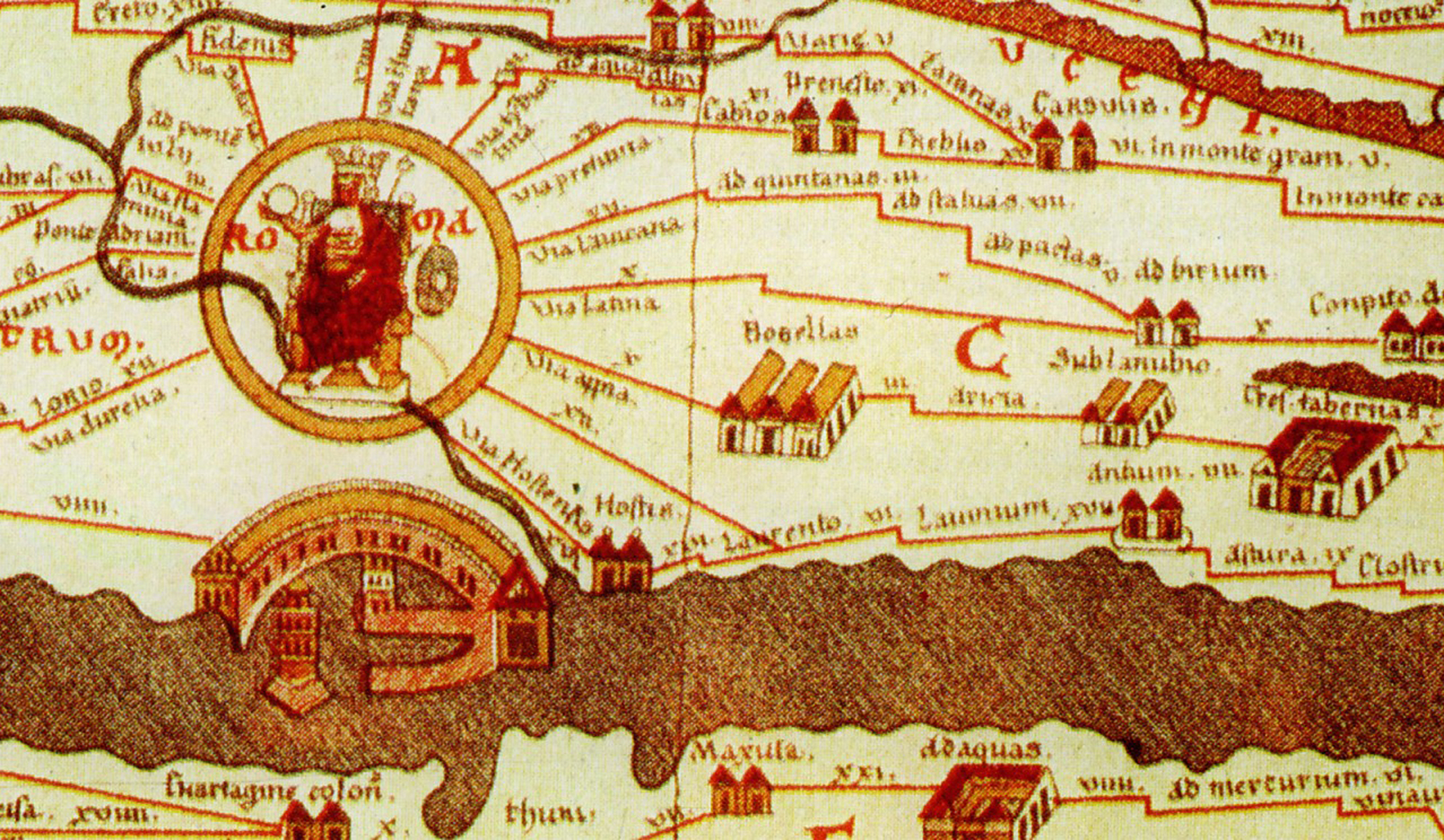
    Another example–more fantastic, much older, and far more important–is the Tabula Peutingaria, a 16th century low-Renaissance copy of a third century ACE Roman map of the known world.   Now this is a map:  it was a spectacular achievement, a road map for the Roman legions to get back and forth in the shortest amount of time, an index for the Italian Autobahn.  The map covers the world from Britain and all the way east to India (which was really India, China and all the rest).  And of course, we all know where all of the roads lead to. 

    Peutinger Table Rome & Portus


  • Vision: Looking Straight Up, Down, Across and Through–1525-1905

    JF Ptak Science Books LLC  Post 679  Blog Bookstore

    “Vision:  a device that belongs to those who have it. Far-reaching and fore-shortened, it is something that works best when used closely, loosely, finely and not at all. A gift-and-a-half and a half-a-bother.”  
    The imagined Devil’s Dictionary of Ambrose Bierce

    [See also my post Perspectives: Inside Looking Out, Outside Looking In]

     
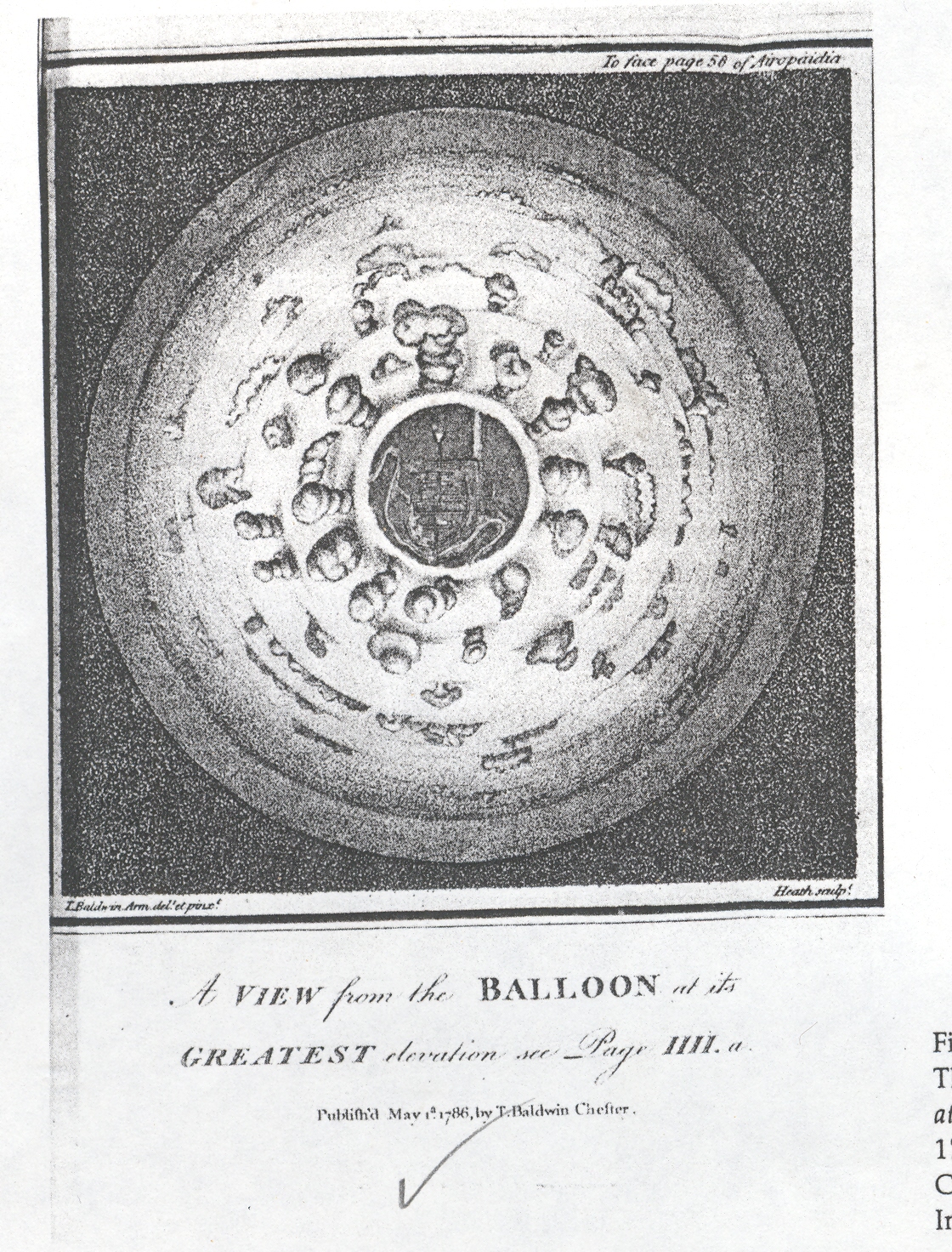
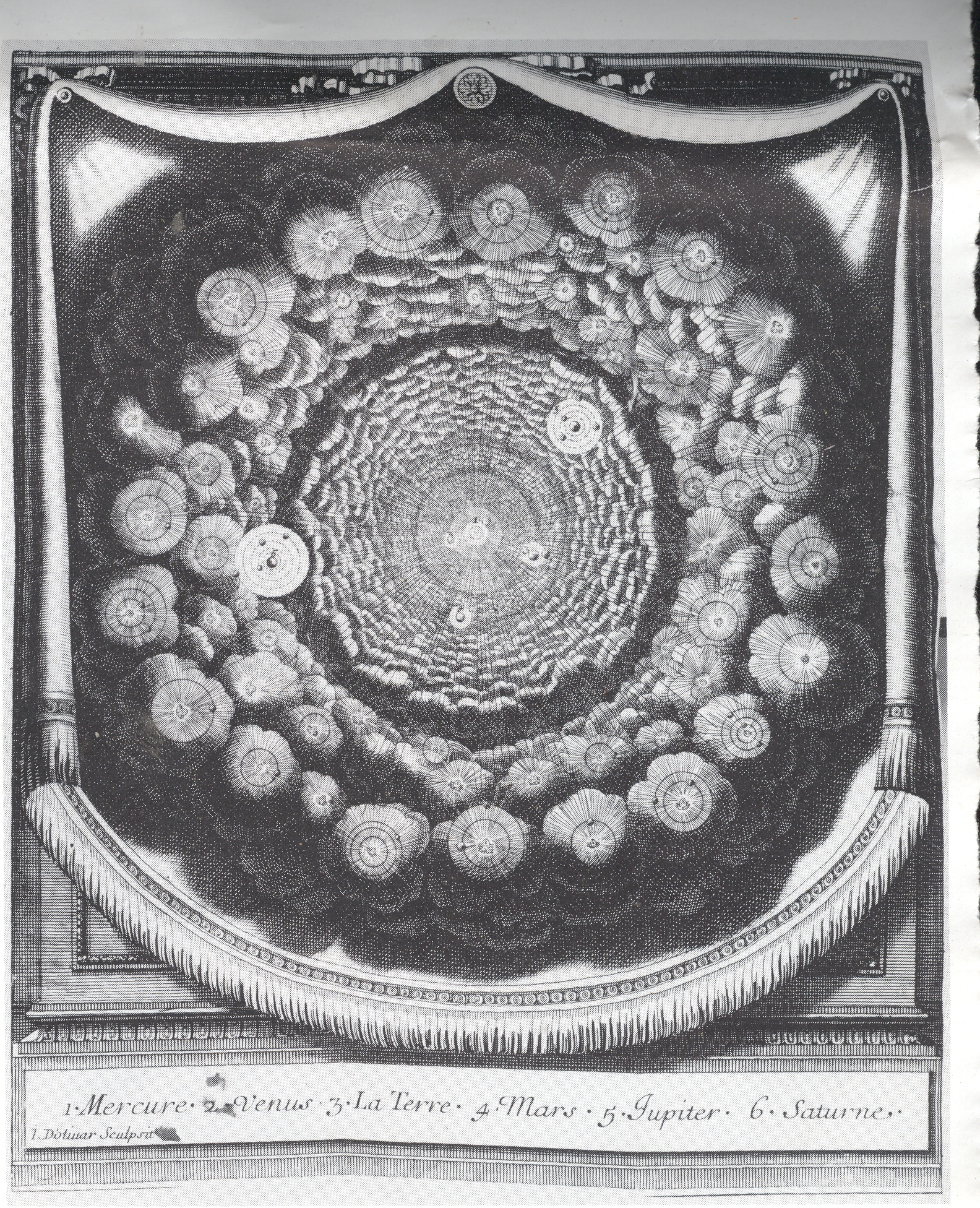
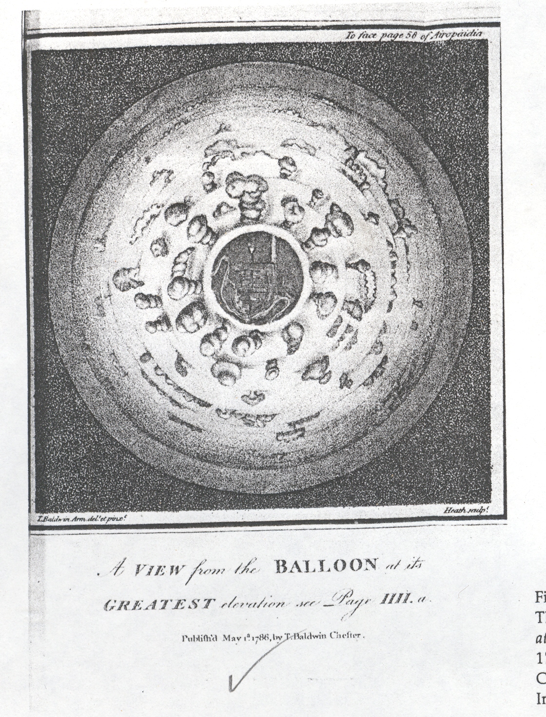
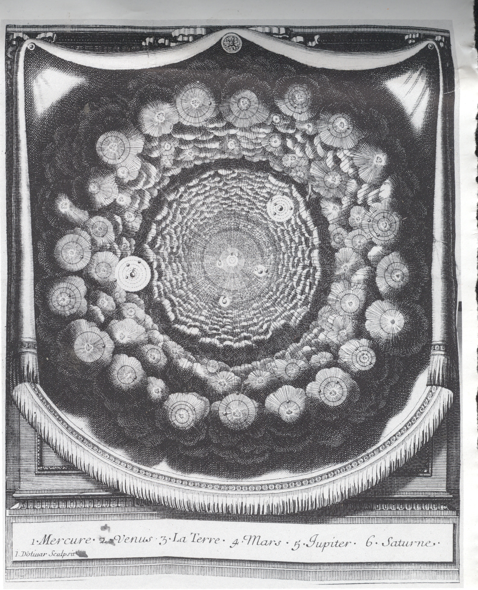
     There is a BLOG==july 9--perspective Downsmall series of posts on this blog that deal with the perspective of lookinBLOG==july 9--perspective upg at things straight-on:  straight up, straight down, straight across.  As it turns out, in my many years of looking at prints and images, view that look directly up and down are pretty uncommon.  Some of the earliest straight-on images actually offered a new vision to people who were so long accustomed to not looking at things in this way.

    BLOG==july 9--perspective Down

    And for a long time it was just not possible, not really, to look straight down at something from a height, or at least until the invention of flight at the hands of the Montgolfier brothers in 1783.  This first image offers a view looking straight down from a balloon through a bank of clouds and onto a town, and was drawn and published in 1786.  It must have been shocking to see this for the first time in that year, the image so unexpected and mostly not imaginable.  One of the other aspects here is that the viewer is looking obliquely down from the tops of clouds, the first time that this was ever done—so far as I can determine—with a scientific vantage point. 

    BLOG==july 9--perspective up

    The seeming complement to this image is from Entretiens sur la Pluralitie de Mondes (Conversations on the Plurality of Worlds), written by the great French philosophe Bernard le Bouvier de Fontenelle in 1686 (just a year before publication of perhaps the greatest work in the history of science, Newton’s Principia Mathematica). The Plurality was a best-seller by the best-selling Fontenelle. An excellent attempt by a rather restricted writer to engage the population-at-large, writing a high-pop book on what was basically the history of astronomy and cosmology of the preceding century. Copernicus was a major feature of his imaginary conversations with a muse as he wandered through a metaphorical garden of questions, with the observations of Galileo and Cassini also very prominently featured. But what interests me here is the great similarity between the two, the view from the balloon looking down, and the Fontenelle, looking up.  (Or what would pass for “up” in space.)  Except that the cloud-y looking things in Fonetenelle aren’t clouds at all, but solar systems.  This was a radical, church-pounding idea at the tiem, displacing the unique centrality of the human condition, offering the possibilities of other lives on other solar systems and other planets

    BLOG==july 9--perspective across . 

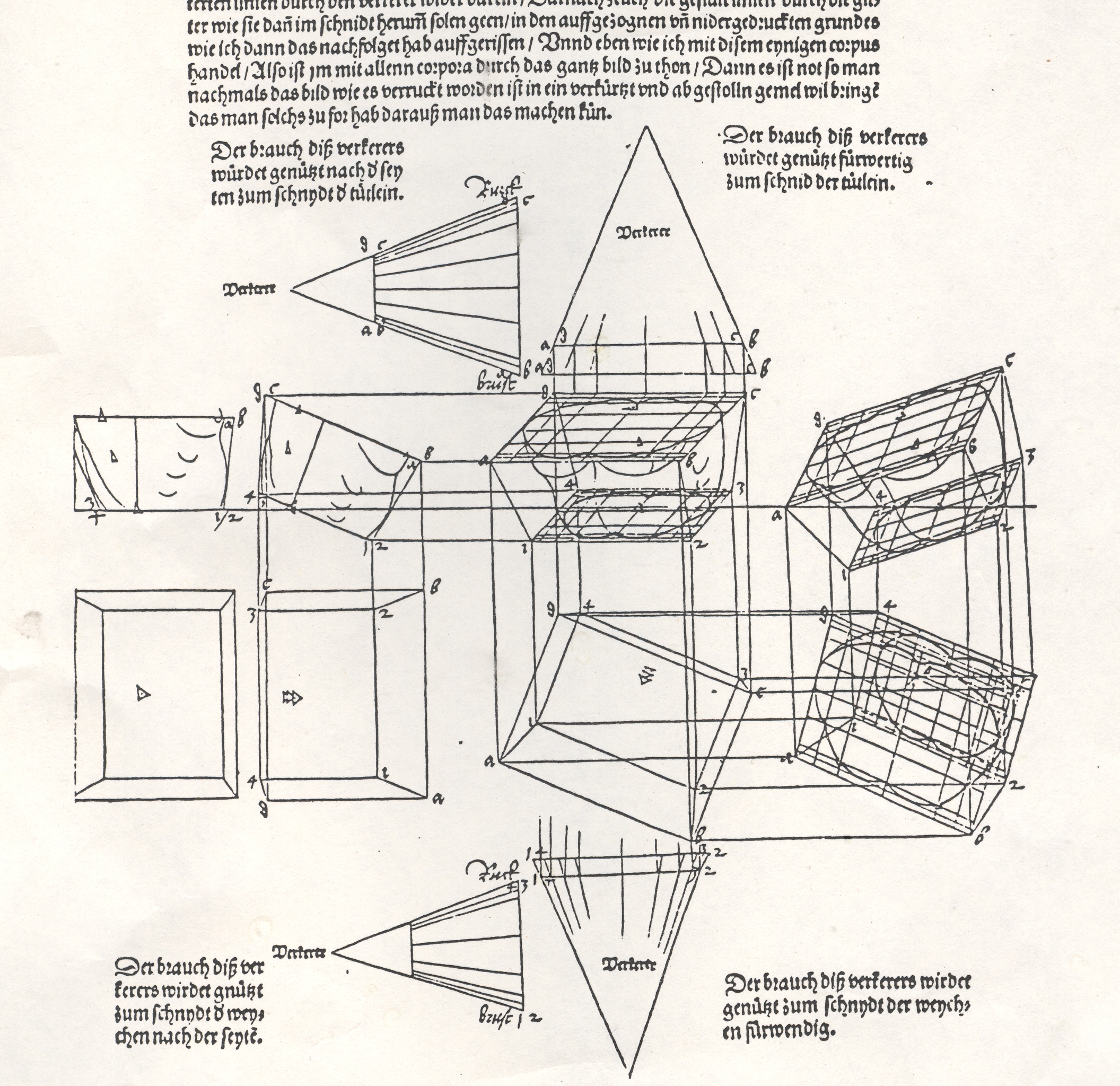
    Albrecht Durer’s (1471-1528) drawing of a geometrical man was an amazing–startling, even–object to the early 16th century consciousness. His Underwysung der Messung (“Treatise on Measuring”) written about 500 years ago (in 1525) set the stage for this next work–it is here that we find some of the most recognizable of Durer’s illustrations of the instruments that he employed to do his perspective work:   his …Symmetria partium…humanorum corporum (1537) was a masterpiece, and a key piece of revolutionary visionary thinking.  Durer–so far as I can tell–created an orthographically rotating human figures in three-dimensional trapezoids, creating incredibly human-like non-human forms.  Supra-human, perhaps; mechanized, calculated, structural. His use of stereometry, the science of measuring volume, was adapted to this study of human form and the relationship between that and movement.

    By doing this one could rotate the figures, pinch them, stretch them, and the proportions would remain exactly the same.

    They were in a sense a CAT scan.  And in this way the person in 1525, seeing this for the first time, would be experiencing something like the sensation of seeing an X-Ray for the first time in 1895 or a magnified flea in 1626.  It was a spectacular effort an a major key to understanding movement, and anatomy, and of course map making.

    This was a new way of thinking about the body, challenging the god-grace and ubiquitous church-inspired revelation of the body and how it worked.  This was not a necessarily easy time in which to picture humans in such a scientific way.  (In 1553 the physician and theological scholar Michael Severtus would be burned at the stake by John Calvin for his views on the Trinity, Nicean Creed and other related things, though his undeniably revolutionary idea of cardiopulmonary circulation was in itself a direct challenge to church teachings).

    Durer’s innovation accommodated empirical observation and allowed for proportional change.  Its importance in relational drawing, anatomical and  technical, cannot be understated, which I think trumped it as a subversive agent to orthodoxy.

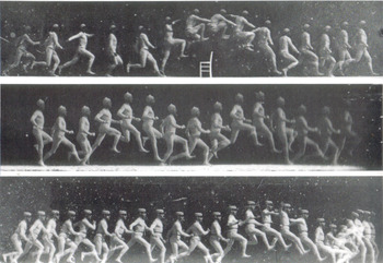
    Blog--july 9--marey Fast forwarding a bit there are the images of arrested time by Etienne Marey (who was a technoid and physician) and  who was able to capture motion of all sorts–he was able to develop a picture so to speak of the movement of blood in the body via his instrument to calculate blood pressure, and he also created a shotgun-style camera that made the world’s first high-speed photographs of movement.  And so it cane to pass that in the late 1870’s and early 1880’s people were instantly able to see what a horse looked like when it galloped or what the body did *exactly* when jumping over a chair.  When you couple this with fourth-dimension material one wonders why it took several more decades to bump into these images in the art world of the earliest part of the twentieth century.

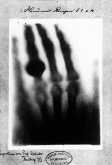
    Blog--july 9--roentgen In 1895 50-year-old Wilhelm Conrad Röntgen’s ephochal discovery was announced (“Ueber eine neue Art von Strahlen”. “On a New Type of Ray”), built upon the work of J. Plucker (1801-1868), J. W. Hittorf (1824-1914), C. F. Varley (1828-1883), E. Goldstein (1850-1931), Sir William Crookes (1832-1919), H. Hertz (1857-1894) and the horribly odious Phil Lenard (1862-1947 and who didn’t die soon enough). The experiment revealed as much to humans as did the experiments and inventions of Hooke and Leeuwenhoek on the invisible worlds revealed by their microscopes. Bertha, Roentgen’s wife, sat for 15 minutes while her husband passed his rays through her hand; she ran from the room once she saw the results, revealing her very bones and no doubt a strong sense of the fragility of life, and the strong presence of death.  Many had the a similar reaction to the Kandinsky’s shapes and Malevich’s white circles and red rectangles and Ibsen’s drama and Einstein’s dancing dust and the rogue syncopation of jazz—these newnesses were threatening to all of the established ways of looking at physics, and art, and theatre, and listening to jazz.  It was a new perspective which challenged the firmly established vision of these things, upsetting the nature of comfort and acceptance.    It is probably a very natural reaction to try and protect established memory—but memory is made all of the time, and so should be relatively flexible…at least it is mechanically healthier to allow a little bending than to be rigid and brittle. 


  • Cutting Texas Exactly in Half: the Newspaper Frontier, 1880

    JF Ptak Science Books LLC  Post 676  Blog Bookstore

    The idea of the frontier in American history
    has been around for quite some time, made famous and mostly-invented (and
    closed) by Frederick Jackson Turner in 1893, and expanded, imagined, enticed,
    magnified, micro-analyzed, and   generally messed with ever since.  There have been all sorts of frontiers
    introduced into the study of the birth, expansion and filling-up of this
    country, from the very earliest colonial periods of Indian frontiers, “far-western”
    river frontiers of the Connecticut, Delaware, Hudson (!) and Susquehanna, to
    the Appalachian frontier of the early western reaches of the colonies, to the
    transportation frontier, the slavery frontier, the gold and mining frontier,
    the gun frontier and so on.  

    Blog==July 6=texas

    I’ve got another bit to add:  the newspaper frontier. 

    I just happened upon a volume of the US
    Census of 1880, with a special report by S.N.D. North entitled History and Present Condition of the
    Newspaper and Periodical Press of the
    United States…and published in
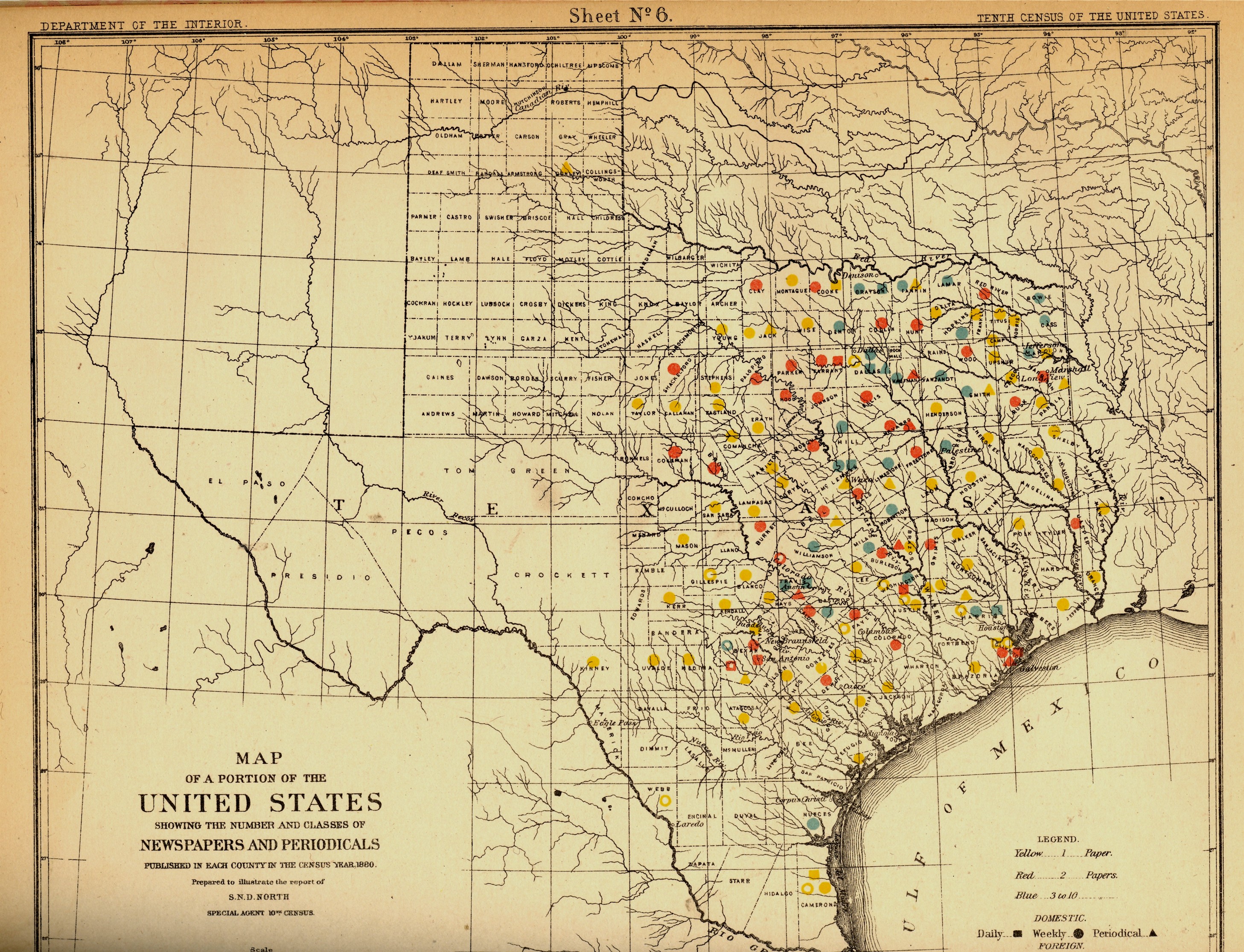
    1882.  What provoked me was the map of Texas newspapers for
    1880.  It very clearly, and like no other
    map of its kind, delineates a fantastic line/frontier between the
    Texas with newspapers and the Texas without newspapers. We see very
    clearly that the frontier of the newspaper stops fairly abruptly and
    wonderfully at the 100th meridian, with only two newspapers in all of
    the rest of Texas found beyond that point (and those just barely beyond the 100th.  And it’s the 100th meridian that
    mostly marks the vertical middle of the country, running through North and South
    Dakota, Kansas, Nebraska, the Texas/Oklahoma borders, and so into Texas—if you
    folded this map vertically in half it folds virtually on the 100th meridian.  An odd bit, it is, half of the country and
    then half of
    Texas. 

    Of course the population and easier-natural-resources
    are located east of this point, I know, but it is still quite a jolt to see the
    line of newspapers get drawn in the sand so vividly.  There isn’t anything else quite like this so
    far as the newspapers go, except, a little, for Florida, where the line gets
    drawn north and south, splitting the peninsula roughly in half, the southern
    part holding only five counties at this point.. 
    But it is a much more robust image for Texas given the number of
    newspapers that were being published—280 periodicals and newspapers for Texas
    versus 45 for Florida, with 11,374 in the entire country*—so that the
    difference between the have-newspapers and haven’t-newspapers in Texas is that
    much more vivid. 

    Texas needed more papers:  there were 1.5 million people living in the
    massive state in 1880, almost twice as many as there were in 1870, and almost
    half of what there would be there in 1900. 

    Florida was another story, entirely—even in 1880, which is only 130 years ago, there
    were only 270,000 people living in the entire state, not even close to half of
    the county population of Pinelas today.

    I’m just enjoying the surprise of the
    straight-edge frontier in Texas. 


    *Just for the sake of comparison, the number
    of periodicals per state for 1880 was as follows:
    Illinois,
    1017;
    New York, 1411; Pennsylvania,
    973;
    Ohio,  774; New
    Jersey
    215. 
    Also, oddly, the average circulation of the
    Florida and Texas papers was roughly the same: 1,282
    for
    Texas and 1306 for Florida (with an average for the country at
    4137). 


  • Graphical Display of Quantitative Data: Anti-Submarine Warfare, 1973

    JF Ptak Science Books LLC  Post 661

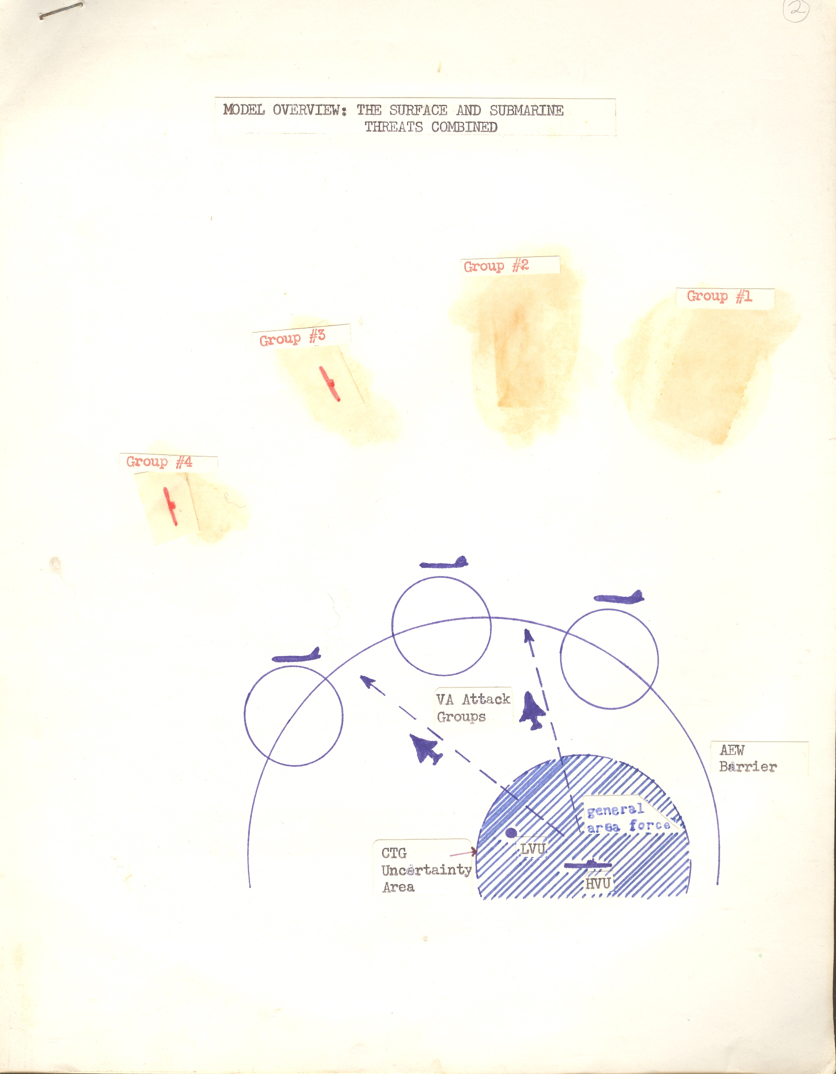
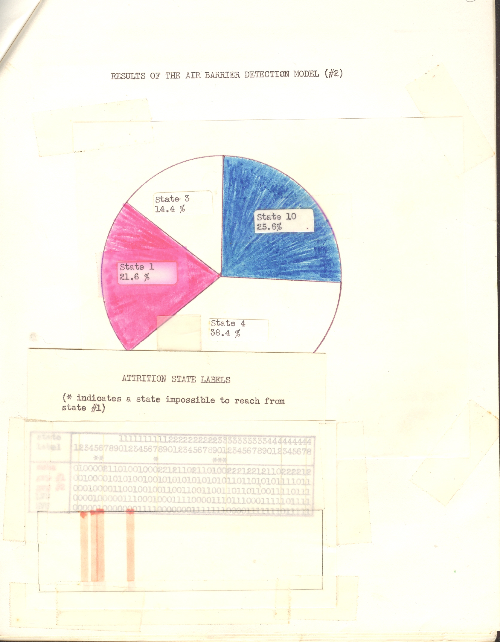
    These original sheets were, it seems, prepared for an illustrated (1973) talk on a statistical model for the detection of anti-submarine warfare threats—unfortunately I’m at a loss to distinguish much of importance here, though I’m sure that someone who is the least bit familiar with defense modeling and simulation would instantly and easily interpret theserelatively simple images.  I’m presenting them here because they are to me an example of excellent presentation, design and logic—a fine symbol for the presentation of graphical information in a pre-PowerPoint past.

    Blog--june 23 luster 1


    The work is that of [redacted], an analyst who seems to have worked in the 1960’s and 1970’s for the thinktank John D. Kettelle Corp of Alexandria, Virginia, a defense contracting firm.  (I’ve included titles  and abstracts of some of his published works in the “continued reading” section, below.)


    Blog--june 23 luster 3  

    These seem to comprise something like author/speaker’s notes for overhead illustrations for a presentation on a computerized system for the receipt and processing (and summarizing?) of tactical intelligence data on the enemy’s intent on locating and destroying submarines.

    What strikes me is the number of cut-outs and paste-ups and such that are part of each slide–every data point, and virtually every notation on each page has been pasted in.  There’s much more to this but these certainly give you a decent idea of the analyst/statistician/programmer/engineer bent over his desk doing surgery on his data. 


  • Nazi Propaganda and the Battle for Europe, 1941: the War at Sea

    JF Ptak Science Books  Post 624   Blog Bookstore 

    Propaganda Series #  14  (See listing below)
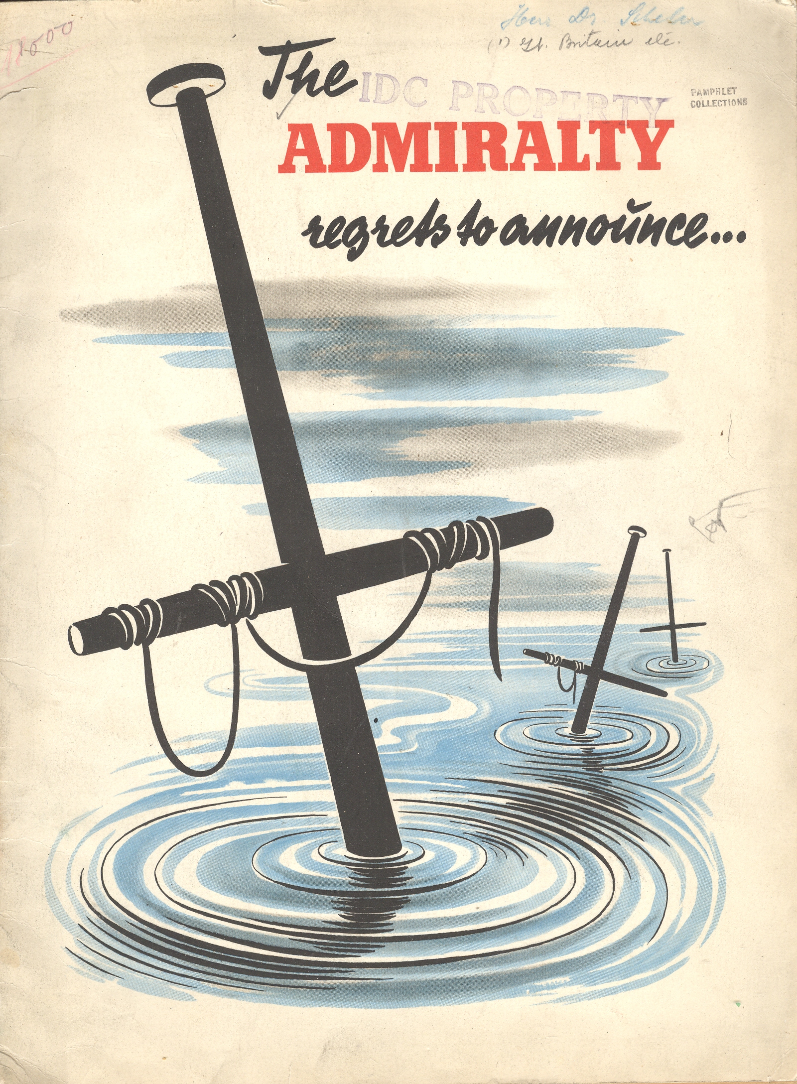
    Blog--May 24--regrets The Admiralty Regrets to Announce… was for years the standard beginning to an official British announcement concerning the loss of ships and sailors.  The phrase is used as the title to this work (by an unattributed writer known only as “an expert”) to immediately introduce the reader to the failings of the British navy.  It is of course a piece of Nazi propaganda, issued some time in 1941. (My copy is he U.S. copyright deposit copy and is stamped with a transfer date of September 1942; the pamphlets reads to me as though the U.S. had not yet entered the war.)  The great strengths of the German air force and navy are extolled and the failings of the British mercantile elaborated at great—and sometimes greatly imagined—lengths.  The booklet was published in French (except for the title) and answers its own repetitive question: “quelle est donc la situation relle de la marine commerciale anglais?”

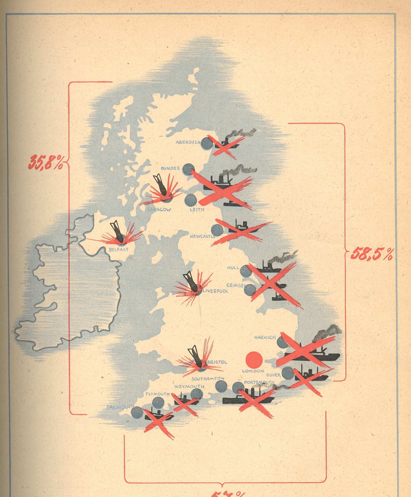
     The pamphlet’s 32 pages (illustrated with 2Blog--May 24--map14 photographs of various blow-ups and bombings, plus one graph and three maps) are dedicated to winning the French hearts and minds, trying to convince the conquered population that there really wasn’t any help coming, and that the British could not even supply themselves with the necessaries to run a country, let alone a war.

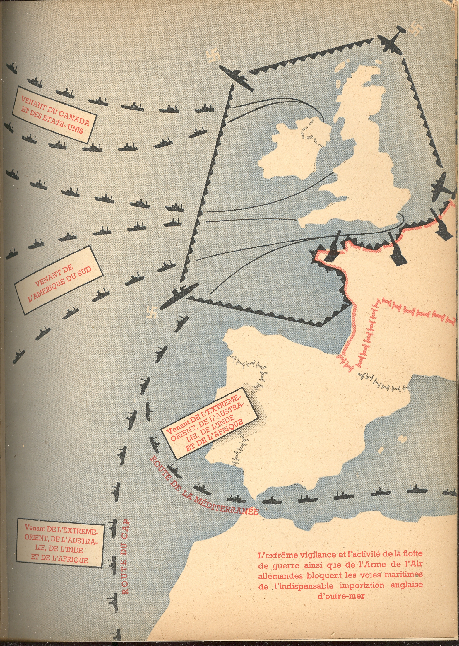
    In the map at right we see the  ports and shipping centers that were bombed by the Luftwaffe (with London located by a big red dot).  Another map shows the stockade-like presence of the Nazi navy securing its impregnable wall against the arrival of foreign trade and supplies to Britain.  

    Blog--May 24--map2

    This post is one of a series on propaganda maps which occasionally appear in this blog.   Like Thomas Nast political cartoons and war photography, a map can instantly and overwhelmingly display not only data but sentiment as well. The maps published in this pamphlet by the Nazis are were certainly immediately understandable to just about anyone, French-reading or not, literate or not–the images needed no words, especially when surrounded in the text by vicious images of German military might.  OvBlog--May 24--map2 001errun or not, Petain-ized as it was, France was still offering aid to its allies and resistance to the Germans–the more minds that could be won over with propaganda of this sort meant one less to have to worry about as an active enemy.

    A Listing of Some our the Propaganda-related posts in this Blog

    Nazi Propaganda: Scaring the Will-to-War, 1935

    Maps as Propaganda: the Nazi’s Use of Maps in the Hearts and Minds Campaign in Occupied and Holland and France, 1943


    The Propaganda of Restricting Infomration: Dorothea Lange’s Photos at the Japanese “Relocation” Camp, Manzanar, 1942

    Psychological Warfare--Aerial Propaganda Leaflets and Surrender Tickets, WWII.

    Maps as Propaganda: the Turning of the Tide, January 1943


    Humanitarian Propaganda–Hope for those at Home, September 1944.

    Nazi Propaganda: Scare Tactics in a Hearts and Minds Campaign, 1940

    A Propaganda Effort Equating the New Deal and Nazism, 1935: the Power of Willful Forgetting

    The Atomic Bomb: 6 August 1945. Propaganda Leaflet Dropped on Japanese Cities

    The Polish “Threat” to Germany, 1939:   Nazi Propaganda on the Perceived Polish “Invasion”


    Propaganda Maps #2: the Nazis. the Big Lie, and Cartography


    Graphical Display of Data: the R.A.F. and Luftwaffe Present Their Cases, 1938-1940