A Daily History of Holes, Dots, Lines, Science, History, Math, Physics, Art, the Unintentional Absurd, Architecture, Maps, Data Visualization, Blank and Missing Things, and so on. |1.6 million words, 7500 images, 4.9 million hits| Press & appearances in The Times, Le Figaro, Mensa, The Economist, The Guardian, Discovery News, Slate, Le Monde, Sci American Blogs, Le Pont, and many other places… 5000+ total posts since 2008.

Category: Information, Quantitative Display of

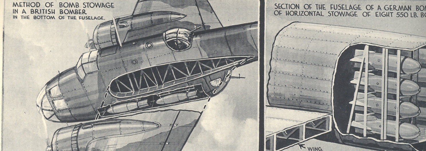
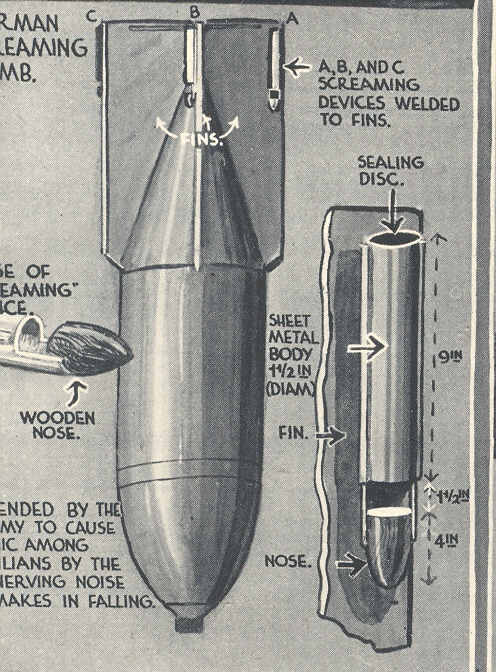
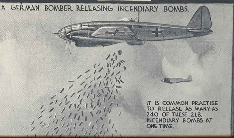
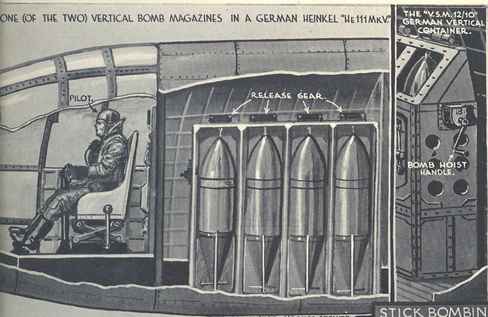
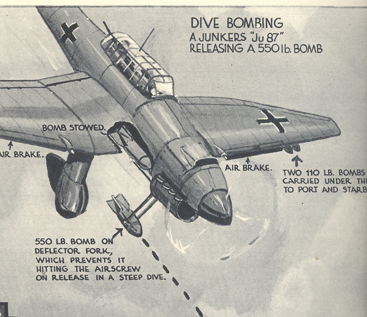
  • Primer for Londoners on being Bomber by Nazis, July 27, 1940.

    JF Ptak Science Books LLC  Post 990

    [Also see my The Bombing of Britain in the Illustreite Zeitung, July 1940 post; also here.]

    Mar 28 bo,bing london 4 cratewr

    The
    Battle of Britain was an air battle begun weeks after the surrender of France (22 June 1940) in preparation for the Nazi
    invasion of England.  Hitler and the High Command believed Britain to be
    vulnerable2, and surrenderable, or at the least could be convinced not to interfere
    in the rest of the war.  But plans were
    made for the invasion—an invasion which could only be successful (it was reasoned)
    if there was complete naval or aerial superiority. The naval part was out of
    the question, especially since the Nazis had suffered such losses in the
    Norwegian campaign. The Luftwaffe was another story, and so the operation began. 

    Mar 28 bo,bing london 1

    The Illustrated London News published
    this pictorial introduction to Nazi bombing on 27 July 1940, just weeks after
    the campaign began.  At this point in the
    war the Luftwaffe operations were delegated to coastal installations and
    aircraft industries.  Mar 28 bo,bing london 2

    The terror bombing
    against citizens in cities—which was an idea not born here but rather 20 odd
    years before—wouldn’t begin for some months. 
    In the meantime, and at this early part of the campaign against England, the
    British citizenry was introduced in a very proper way how the bombing was being
    carried out.  IT really does seem to be
    to be a very constructive, non-alarmist, cogent distribution of information to
    the general public about the potential for massive devastation.  

    Mar 28 bo,bing london 5  

    Notes:

    1.
    By the summer of 1941 the campaign was largely over, the Nazi effort doomed. England:
    1,023 fighters: 376 bombers, 148 coastal command aircraft for a total of
    1,547 aircraft and  544 pilots and aircrew killed.  There were also
    27,450 civilians killed and 32,138 wounded.  The Germans
    lost 873 fighters and 1,014 bombers for a total of 1,887 aircraft and 
    2,500 pilots

    2. The plan ‘Directive No. 16; On the Preparation of a Landing Operation
    against England’
    read, in part, as follows:

    Mar 28 bo,bing london 6

    “Since England, despite
    its militarily hopeless situation, still has not shown any signs of being
    prepared to negotiate, I have decided to prepare a landing operation against England and, if
    necessary, carry it out. The objective of this operation is to eliminate the
    English home country as a base for the continuation of the war against Germany…”

    “Included in these preparations is the bringing about of those preconditions
    which make a landing in England
    possible;”

    Mar 28 bo,bing london 7

    “a) The English air force must have been beaten down to such an extent
    morally and in fact that it can no longer muster any power of attack worth
    mentioning against the German crossing…”


  • Propaganda Maps: Potential Nazi Supporters, 1938

    JF Ptak Science Books LLC   Post 956

    In
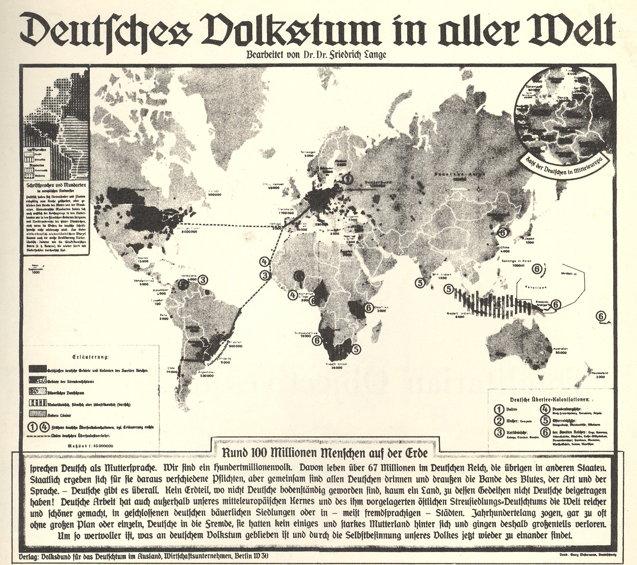
    an audacious move Adolf Hitler attempted to unite German-heritage people
    throughout the world to come to the aid of the Nazi Socialists; it was a
    vicious piece of propaganda attempting to inflate the number of possible-Nazis
    into the hundreds of millions, showing a sub rosa infiltration of Nazism
    throughout the world. 

    00=nazi america

    This
    map appeared originally in Deutsches
    Volkstum in aller Welt
    (Berlin,
    1938) and purported to document far-flung German descendants—the map alone was
    perhaps statement enough to many, striking a deep fear thinking about the
    20,000,000 Americans alone whose roots could be traced back to the
    Vaterland.  As a terror and influence
    tactic that cost little money, it must have caused the anti-propaganda folks a
    good deal of worry.  The German/Vaterland
    (German American Bund, or Deutsch-Amerikanischer Volksbund) movement never
    really gained much popular ground in the U.S., though there was some
    significant compliance in business and trade going on at higher levels of
    industry and banking. 

    (I’ve
    written about the Nazi-American connections in numerous posts on this blog; all
    you need to do is do a site google under “Nazi” and you’ll find plenty. For the
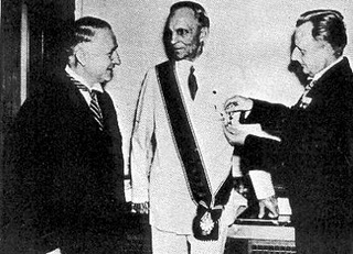
    moment I’ll just concentrate on the Henry Ford example.  The man was a monstrous moral figure without
    an ounce of historical understanding who blamed much of the world’s troubles on
    the “Jewish Dictatorship”, which Ford Henry Ford receives nazi medal somehow, in his mind, spawned WWI.  Long story short, Ford received the Grand
    Cross of the Supreme Order of the German Eagle for his friendship and services
    to the Nazi state—this friendship extended in form of money and many thousands
    of military vehicles, and so on.  His was
    a treacherous business, his Nazi interests folding very nicely in with his
    astounding anti-Semitism. Ford, by the way, received his medal months after the
    invasion of Austria,
    when he really should’ve known better. 
    I’m not sure if he gave the thing back or not after the war ended.)

    But
    among the masses, the sentiment never grew into strength, though it wasn’t for
    trying.  The movement had been present in
    the US
    since the 1920’s in the form of the National Socialist Party and the Teutonia
    Society, though the real start of the American Bund seems to have been with
    Friends of New Germany (1933). Right-Wing groups such as America First were
    strong sympathizers of Hitler, though they abandoned him once the war
    began.  (Not so true for Chase Bank, Ford
    and many others.)  The German American
    Bund never topped 100,000 members, though it did fill up Madison Square
    Garden
    for a meeting in
    1939. (One of the main speakers was Avery Brundage, International Olympic
    Committee Chair. Brundage survived in this role until Munich in ’72, when he ordered the Olympic
    games to continue, unabated, after the 11 Israeli athletes were murdered by
    elements of Yasser Arafat’s organizations.)

    Amyway,
    this map was more a propaganda tool than one of true expectation, and I’m sure
    it did its fair share of damage. 


  • Graphic Display of Quantitative Data: German Military Flatline in Persepctive, 1934

    JF Ptak Science Books LLC  Post 955

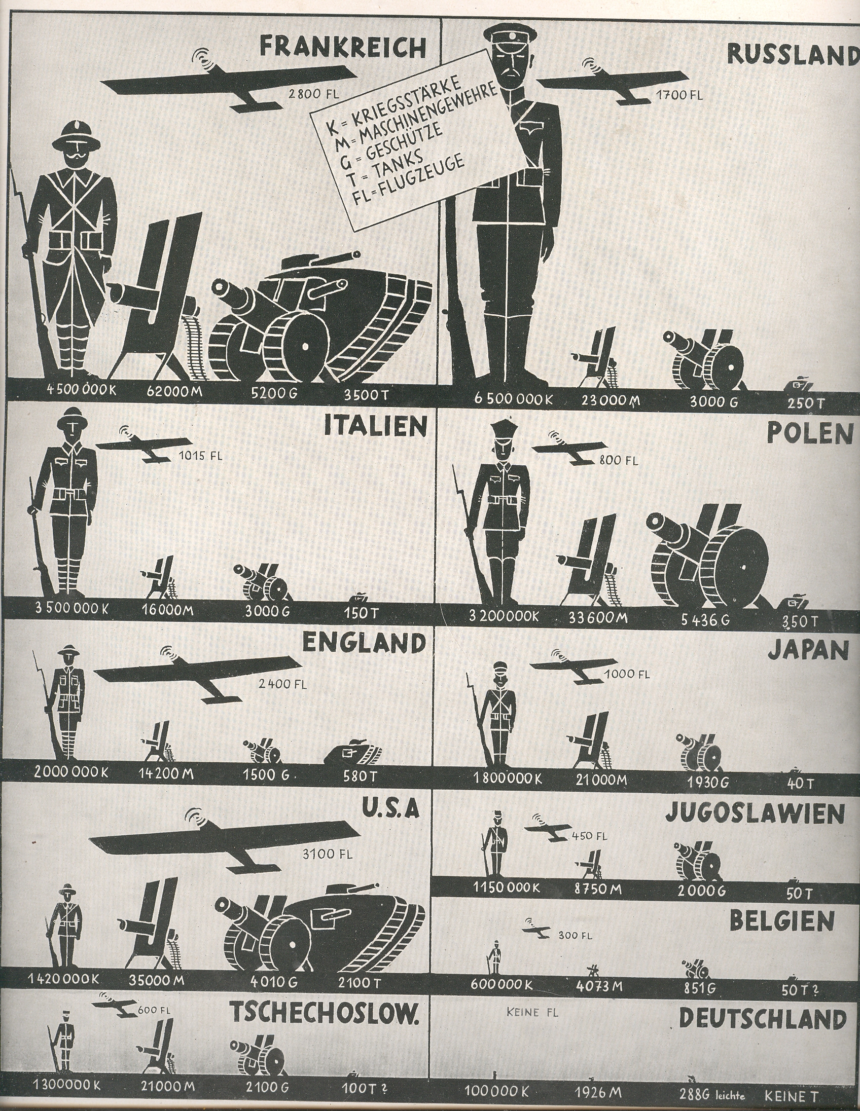
    This terrific 1933 pictorial display of quantitative data1
    showing the comparative military capacities of eleven countries—it will become progressively
    and aggressively more wrong in each passing year to the start of WWII.  In 1933 the military giant was, basically, France—the same country that would be quickly
    and completely overrun just seven years later by the country at the bottom of
    this display with the micro graphs, Germany.

     00=pict army

    The German military forces underwent staggering change after
    the end of WWI.  The Imperial Forces were
    completely done at the end of the war, limited to 100,000 men, left with no air
    force and no tanks.  There were wide
    changes during the Weimar
    Republic
    , the army seeing
    three iterations (not to mention the hundreds of Freikorps that were
    established with some of the disbanded remnant of the standing army) that
    ultimate resulted in the formation of the Reichswehr (in 1921) and which in
    turn would evolve into the Wehrmacht in 1935. 

    Germany
    barely registers, barely forms bumps in the flatlines of measurements in
    1934.  By 1939, six years after the
    election of Hitler, and fanned by xenophobic revenge and greedily speedy full-throttled
    hate, Nazi Germany  rushed at record
    speeds towards the rape of the future. The German Wehrmacht stood at 4.7 men.in 1939 
    (6.6 million in 1940; 8.1 in 1941; 9.5 in 1942; 11.2 in 1943, 12 in 1944, and 9
    in 1945), while the Luftwaffe was at 400,000 (growing to 1.7 million by 1943)  and had enormous growths in quantity and quality
    of armaments.   It was all astonishing, and almost all gone again in another six years. 

    This is an exclusive graphic of German nothingness, an accurate graphic in 1934 and again in 1945, but in the middle, it was totally incorrect.  Twelve years from nothing to nothing, with the disgust of Hell to pay in between.

    It is simply extraordinary to see the disparities of the
    Nazis displayed so

    Notes:

    1. Printed in Die Illustriete Zeitung, 1934.


  • The Healthy Coal Miner in the Pyramid of Life, or Death? 1912

    JF Ptak Science Books  Post 939

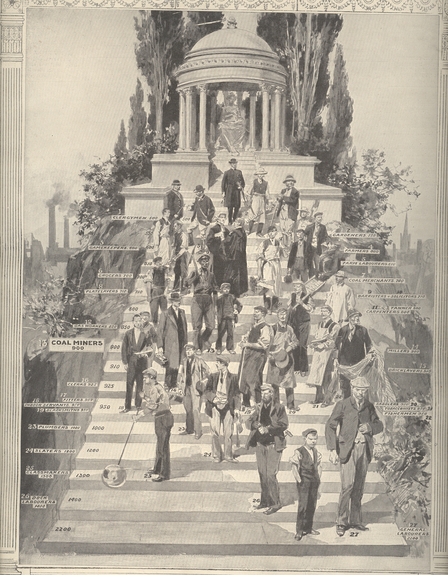
    This pictorial graph shows the places in the temple of Hygeia1 of various British workers, their places on the stairs showing the possibilities of long life, or not.

    2--llife death

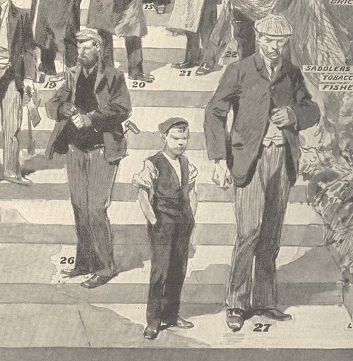
    At the bottom: general laborers, the backbone of the society, ranking well down beyond virtually everyone else save for dock laborers. Unfortunately the scale at left—listing the progression of health, somehow, from 500 at the top to 2200 at the bottom—lists these two groups at 2200 and 1900, respectively., then jumping at third layer from the bottom at 1300 (glassmakers).  That means that in the difference of 1700 between the top and the bottom that 90% of the classes represented were in the 500-1200 category (or a difference of 700 units) while the bottom two classes occupies the 1000 units; 80% of those represented occupy the first 500 units.   I do wish that I knew what these numbers represented. 

    2--death


    2--life
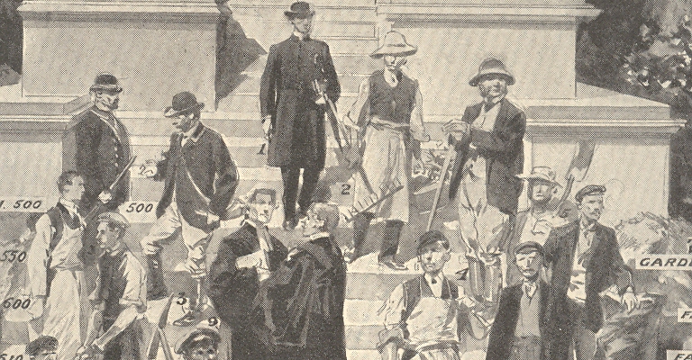
    At the top of the list of health comes the clergy, followed by gardeners, gamekeepers and farmers.  Next are grocers, farm laborers, platelayers, coal merchants and barristers and solicitors. Coming into the bottom steps of the health temple are tanners, carpenters, gas workers, coal miners, millers, clerks, bricklayers, fitters, indoor servants, blacksmiths, plumbers, saddlers, tobacconists, slaters, glassmakers, fishermen, dock laborers and general laborers.  

    It is interesting to note that in 1910 once a person in the U.K. or the U.S. reached the age of 60 their life expectancy was around 75; in 1850 this figure was 72.  Today the life expectancy for this same group is 83 or so. Considering the enormous advances in medicine and medtech since then–in pre-Lister 1850 days there was still no sanitization of surgical instruments, for example—83 seems hardly Kurzweilian. 

    Notes: 

    1.Hygeia was the goddess of good health, and the daughter and attendant of the god Asklepios, a sister of Panakeia (all cure) and Iaso (remedy) and a companion of the Aphrodite.


  • Blank and Missing Things: German Submarine Importance in Graphical Comparison, 1912.

    JF Ptak Science Books  Post 937

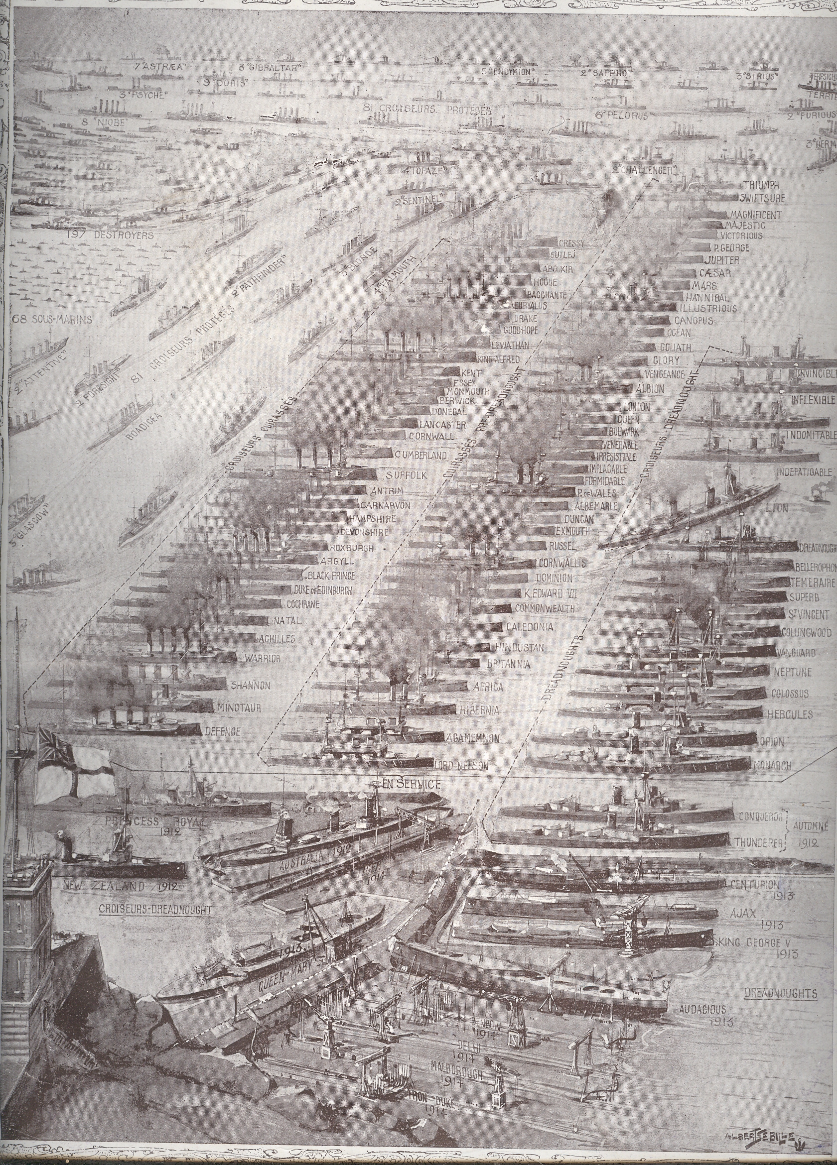
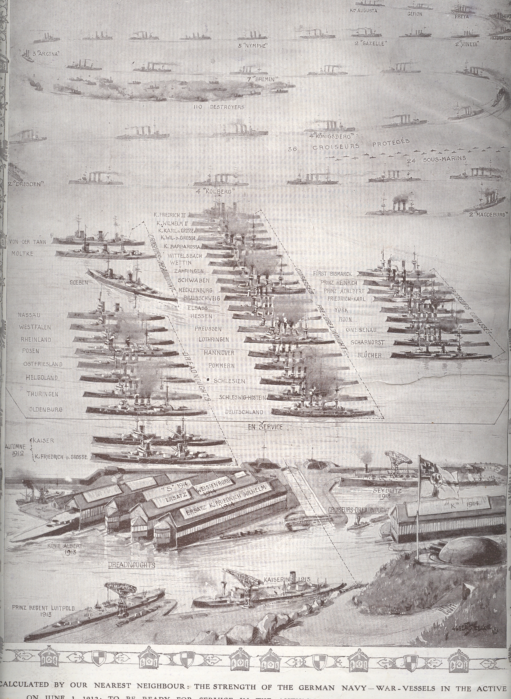
    In the midst of a massive building campaign by Germany and a building-response by England the French journal L’Illustration published these two side-by-side pictorial comparisons of their two navies, which wound up being reprinted in the Illustrated London News soon afterwards in June 1912.  [Royal Navy, left; German Navy right]

    2--brit navy big 2--brit navy germany


    2--brit navy big

    Germany began a rebuilding campaign in 1902 which by 1908/9 was seen by the British Admiralty as a “stab at the heart” of England’s military supremacy, and so the construction wars were undertaken.  It’s a complicated period and a complex race, which I just can’t get into in a short post, so let’s just say that the Brits wound up the winners of the competition  when these images were printed in June 1912.  

    The hidden element of some great importance, a trump card that would  played in just 750 days, would be the small dot-like drawings  labeled “sous marins”. These would be the submarines, and it would be the subs that would be perhaps the most significant aspect of the entire German navy.

    2--brit navy germany

    This was true in spite of what looks like an overwhelming preponderance of subs in favor of the Royal; Navy, where the count was 68 to Germany’s 24.  It was really a question the type of sub, and as it turns out there were only 8 or 9 of the English count that could’ve been considered for blue water ops.

    Germany began the war with 24 submarines in 1914; they recognized the ship’s importance and by war’s end ramped up production, winding up with 351 in total production and with 178 in action in 1918 alone. Of that overall number fully half (178) had been destroyed in combat, with another 11% sunk via other means.  There were more than 12 million tons of Allied shipping destroyed by the German sub forces from 1914-1918 (half of that in 1917). 

    So these two illustrations do portray an overwhelming Royal Navy, but they certainly do not give any hit whatsoever to the coming importance of the German submarine fleet.


  • Complex Medical Treatise on Horses: Illustrations, 1685

    JF Ptak Science Books  Post 926

    This is a simple image-only post relating the four wood engraved illustrations from the rare Spanish work by Conde (Pedro) Garcia, Verdadera Albeyteria, printed in Madrid in 1685.  They were beautiful works, if not exactly correct, or terribly useful–not in the great traditions of veterinary (& etc.) anatomists like Andres Laguna, Leonardo or Vesalius. Oddly enough, Garcia didn’t seem to draw on the very accomplished work of Carlos Ruini (b. ca. 1530-1598) whose earlier work, Anatomia del cavallo, infermit, et suoi rimedii, was a standard font of anatomical and medicinal information on the horse for 75 years.  But the illustrations are compelling, and beautiful–just not very helpful.

    “…This most noble beast is the most beautiful, the swiftest and of the highest courage of domesticated animals. His long mane and tail adorn and beautify him. He is of a fiery temperament, but good tempered, obedient, docile and well-mannered.”–Conde Garcia.

    All image sources via the Cervantes’ Virtual Library site, here:  http://www.cervantesvirtual.com/obra/verdadera-albeyteria/

    And the bleeding chart:


  • What 1.5 Billion Pounds Bought the Military in 1938: Finding a Gem Inside a Great Graphic

    JF Ptak Science Books LLC  Post 916Blog jan 22 Brit Mil overview

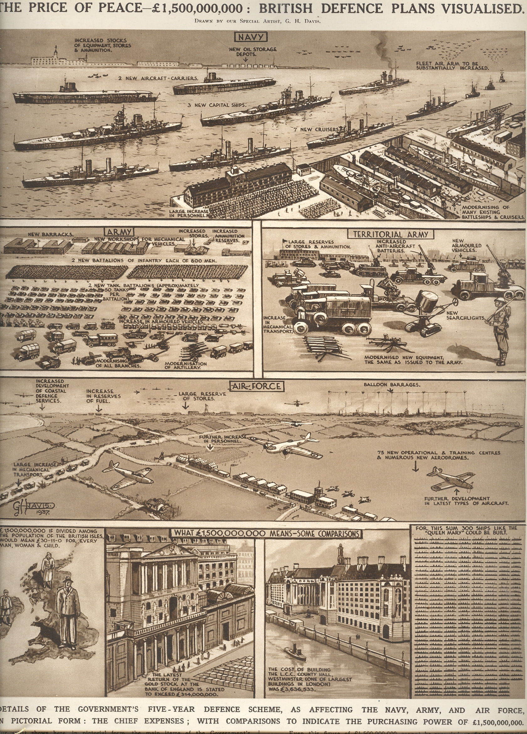
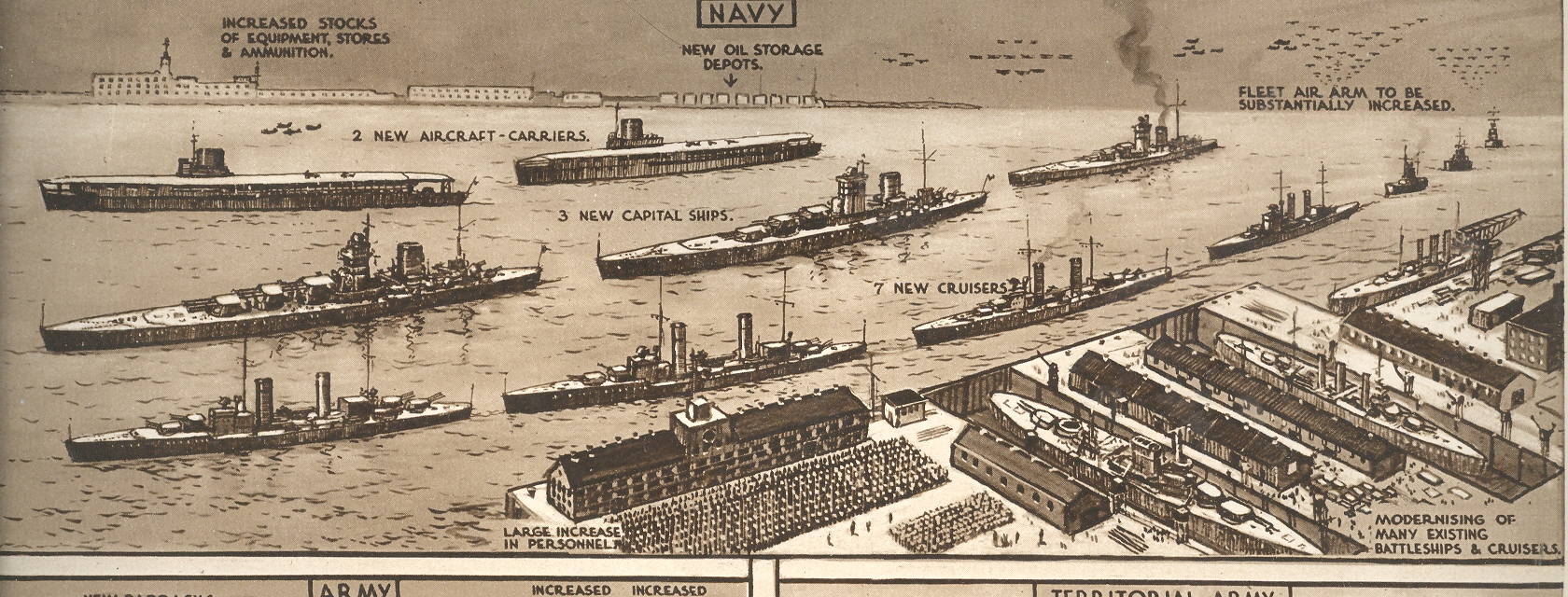
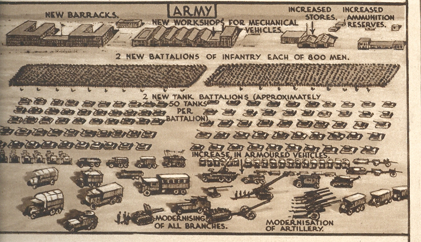
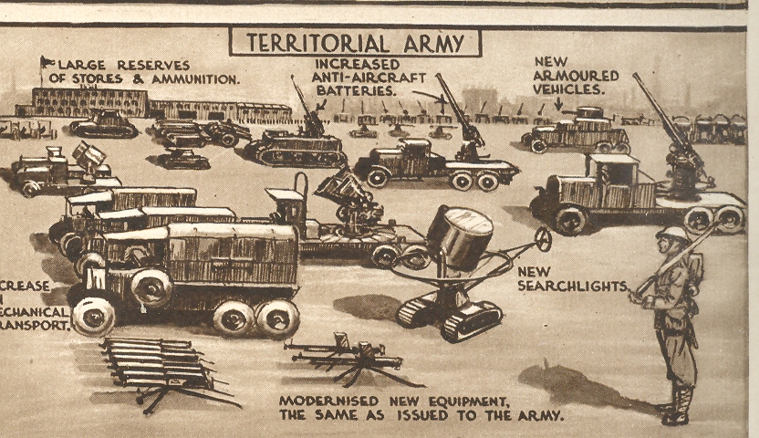
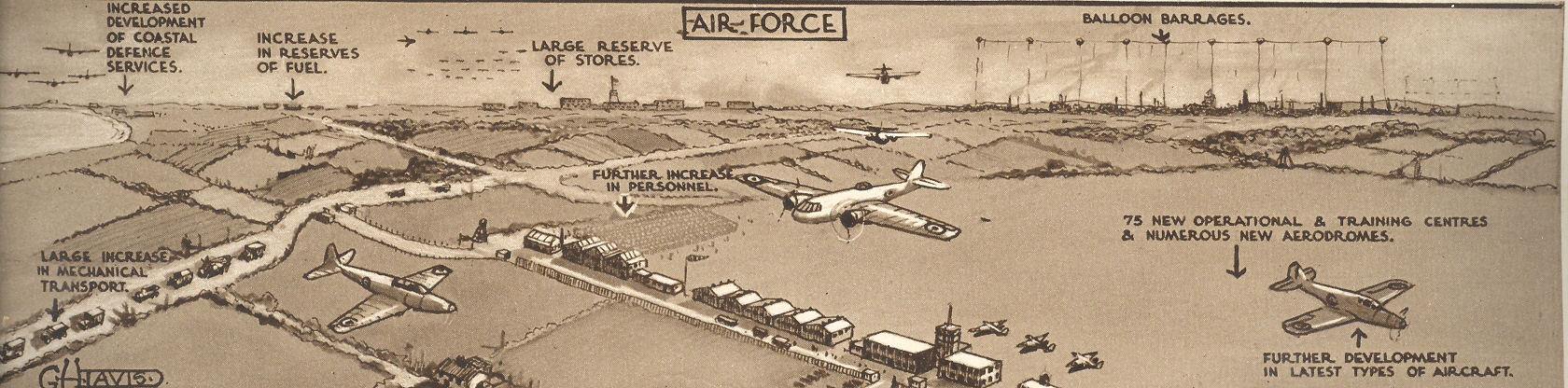
    The Illustrated London News for 27 February 1937 hosted a brilliantly designed graphic illustrating the ways in  which the British War department could/should spend 1.5 billion pounds (or about $100 billion in 2009 dollars, sort of) over a five-year period as the price of keeping the peace.  Of course they wouldn’t make it but a quarter of that distance as Austria fell to Czechoslovakia which fell to Poland and the end.  The full-page pictorial effort is to the right:

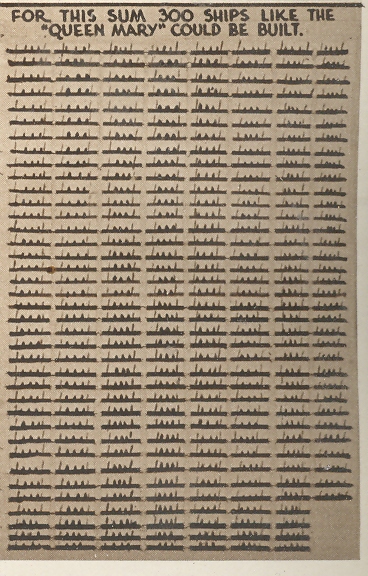
    Nestled in the corner of this page–at about 2×1 inches–is this lovely little graphic, showing that 1.5 bil could purchase 300 Queen Marys, which this delightful little design showed to great effect, and a hidden gem inside of a gem. First is a detail of this detail,

    Blog jan 22 Brit Mil bot right det 

    Followed by the full smidgen of the overall page of comparisons and analogies:

    Blog jan 22 Brit Mil bot right

    Then there’s the semi-standard presentation of what the Navy could purchase:

    Blog jan 22 Brit Mil top

    And then the Army:

    Blog jan 22 Brit Mil middle l

    And of course the Territorial Army:

    Blog jan 22 Brit Mil middle r

    And the Air Force (which if you look closely includes a balloon barrage  facility at upper right):

    Blog jan 22 Brit Mil middle bot

    By far the most interesting to me is the hidden gemoid of Queen Marys, all produced by the fabulous G.H. Davies, who did many hundreds of such images and sectional cutaways and plans and technical drawings for the ILN over a 25-year period.  M.r Davies may well be my favorite technical artist of this period.


  • A Mile-High Pile of Wood–Graphical Display of Quantitative Data.

    JF Ptak Science Books LLC  Post 913

    Continuing
    a long, developing thread on the graphical display of quantitative data–and
    especially that which uses man-made objects for comparison—is this interesting
    bit from a Romanian mining publication from 1933.

    The
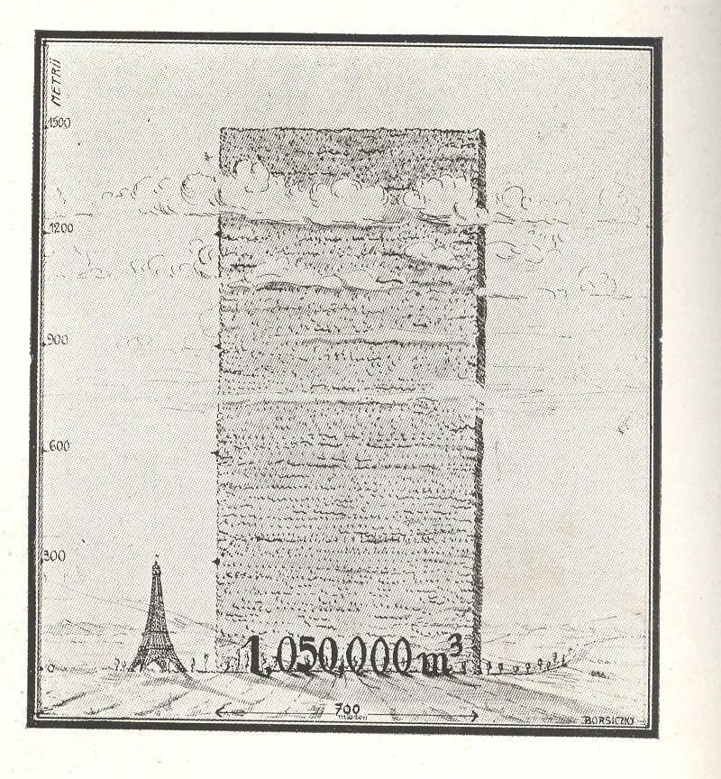
    huge mound next to the Eiffel Tower shows the consumption of wood in Romania over a
    ten year period, a stack of wood 700  metres long and 1500 metres high.  Evidently this wall has only the most rudimentary depth of a metre, as the legend reads that the volume of the woodpile is 1,050,000 metres cubed, which is the same as its square area.  So somebody missed something, here, though the artist did supply some nice shadowing.

    Blog jan 17 wood

    Just
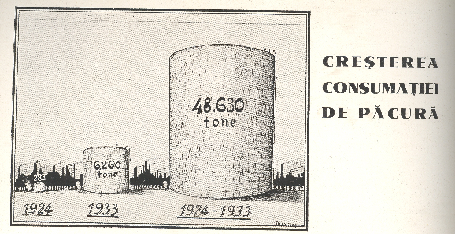
    above it appeared this comparison for the amount of oil consumed over the same
    ten year period

    Blog jan 17 oil

    I’m
    not sure why this comparison was being made. 
    This does come in the interwar period which saw a great expansion in
    Romanian territory and a vast modernization effort following the country’s devastating
    experience in WWI. Maybe it was illustrating modernization from wood-burning power/heating sources to oil-based. I really don’t know–I just liked the Eiffel Tower being dwarfed by a massively tall and impossibly skinny woodpile.


  • Quantifying Art: the Art-ematics of Roger de Piles and Emily Vanderpoel

    JF Ptak Science Books  Post 890


    “The central nervous system is nature’s Sistine Chapel, but we have to bear in mind that the world our senses present to us… is a ramshackle construct which our brains have devised to let us get on with the job of maintaining ourselves and reproducing our species. What we see is a highly conventionalized picture, a simple tourist guide to a very strange city…”J.G. Ballard “The Kindness of Women” 1992 Source:  Disinformation and the Analysis of Beauty.

     I was thinking about major change in art, looking around for periods of that sort of change came to that period just before the onset of Romanticism.  The critic Roger de Piles (October 7, 1635 – April 5, 1709) wrote about this, about the 18th century version of refusees that we’d meet again in a major way in the 1850-1920 period, as they tried to shake their way free of the long-entrenched boundaries of Classicism.  Along the way of his elegant argument, de Piles stops to consider the merits of the capacities of artists and painters (his delineation), establishing for himself rules of artistic interpretation o0f beauty and artfulness. Correctness.  De Piles judged the imitation of objects, of “la belle nature”, the “exquisite mixture of nature’s forms and colors”1, and did so along four elements of his logic of taste: composition, drawing, color and expression. 

    De Piles employed this methodology in his book Dialogue sur le coloris ( Dialogue upon Colour, 1673)  comparing 49 artists, the complete list transcribed here from Manlio Brusatin Histoire des couleurs (Paris: Flammarion, 1986, pp.103-104), and which is reproduced in Elisabeth G. Holt Literary Sources of Art History, (Princeton: Princeton University Press, 1947), pp.415-416)”, and this then taken in toto from the wikipedia article here. Taking the next but curiously-untaken step, I simply added the totals for each giving an overall “Piles Score”, finding an average of 41.87. (Curiously enough when I was adding this column in my head, column by column, I ended for no reason at Leyden to begin the second column; the sums for the two columns both ending at Leyden were 109.)  :

    Painter//  Composition   Drawing   Color   Expression  =  Piles Score

    Average Piles Score= 41.87  (I don’t really understand his comparisons, and the “zeros” don’t register at all.  I do see that Giovanni Bellini rats out at a 24, Durer at 36, Holbein at 38 and Girgione at 39, while Leonardo rates higher than average at 49.)

    Andrea del Sarto 12 16 9 8  =  45

    Federico Barocci 14 15 6 10 = 45

    Jacopo Bassano 6 8 17 0 = 31

    Giovanni Bellini 4 6 14 O = 24

    Sebastian Bourdon 10 8 8 4 = 30

    Charles Le Brun 16 16 8 16  = 56

    Carracci 15 17 13 13 = 58

    Cavalier D’Arpino 10 10 6 2 = 28

    Correggio 13 13 15 12 = 53

    Daniele da Volterra 12 15 5 8 = 40

    Abraham van Diepenbeeck 11 10 14 6 = 41

    Domenichino 15 17 9 17 = 58

    Albrecht Dürer 8 10 10 8 = 36

    Giorgione 8 9 18 4 = 39

    Giovanni da Udine 10 8 16 3 = 37

    Giulio Romano 15 16 4 14 = 49

    Guercino 18 10 10 4 = 42

    Guido Reni x 13 9 12 = 34

    Holbein 9 10 16 3 =38

    Jacob Jordaens 10 8 16 6 = 40

    Lucas Jordaens 13 12 9 6 =40

    Giovanni Lanfranco 14 13 10 5 =42

    Leonardo da Vinci 15 16 4 14 =49

    Lucas van Leyden 8 6 6 4 = 24

    Michelangelo 8 17 4 8 = 37

    Caravaggio 6 6 16 O = 28

    Murillo 6 8 15 4 =  33

    Otho Venius 13 14 10 10 = 47

    Palma il Vecchio 5 6 16 0 = 27

    Palma il Giovane 12 9 14 6 = 41

    Il Parmigianino 10 15 6 6 = 37

    Gianfrancesco Penni 0 15 8 0 = 23

    Perin del Vaga 15 16 7 6 = 44

    Sebastiano del Piombo 8 13 16 7 = 44

    Primaticcio 15 14 7 10 = 46

    Raphael 17 18 12 18 = 65

    Rembrandt 15 6 17 12 = 50

    Rubens 18 13 17 17 = 65

    Francesco Salviati 13 15 8 8 = 44

    Eustache Le Sueur 15 15 4 15 = 49

    Teniers 15 12 13 6 = 46

    Pietro Testa 11 15 0 6 = 32

    Tintoretto 15 14 16 4 = 49

    Titian 12 15 18 6 = 51

    Van Dyck 15 10 17 13 = 55

    Vanius 15 15 12 13 = 55

    Veronese 15 10 16 3 = 44

    Taddeo Zuccari 13 14 10 9 = 46

    Federico Zuccari 10 10 8 8 = 36

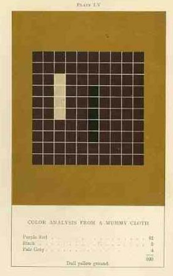
    The upper-deck-problematic Emily Vanderpoel looked deeply and arithmetically into art—she also produced a numerical grid of the artwork that she analyzed, going a step further to re-order the reality of the painting into a representative 10×10 square, distributing the color sense according to a secret algebra that I cannot identify.  She published the results of her work in 1901 and 1903, producing (in two editions) a gorgeous but mysterious book called Color Problems for the Layman, in which she sought not so much to analyze the components of color2 itself, but rather to quantify the overall interpretative effect of color on the imagination.  I know this sounds begging and vague, but I really haven’t been able to make much headway in her theory. 
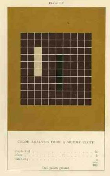
    Blog dec 28 vanderpoel By virtue of this effort, though, Vanderpoel had produced a strikingly illustrated book, with 118 color plates, all very intense, and beautiful, and in its way exceptional—unique perhaps.  Had the book been written thirty years or so hence we’d call it some sort of constructivist/constructionist artform.  But since the artwork in the book comes a decade before the first non-representational artwork in human history (or so), I don’t know exactly what to call it. 

    I really don’t know what it is, but I know that it is not entirely accidental, this pre-non-representational artform, because controlled geometrical color art is not accidental. 

    The net effect is glorious.  I just don’t know how she got there—which isn’t normally a consideration in art, except that this work is an instructional on how to understand color in art and nature, and the explanation of the procedure is ethereal.  Vanderpoel was and remains a respected author on porcelains and other applied and plastic arts.  In this work she looked at her fair share of porcelain, limogues, clay pots, burial urns, glass shards, and the like; she also analyzed clouds, mummy cloths (and casings), dew on morning grass, brocade, the eye of a blue jay, feathers, and another hundred or so poetic arrangements of the stuff of the world.  I still do not know what this book is trying to tell me, but I do know that it is remarkable.   
     Blog dec 28 hogarth

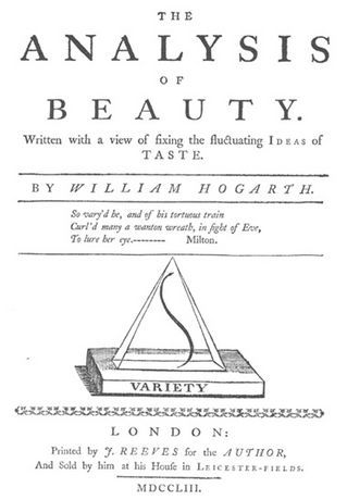
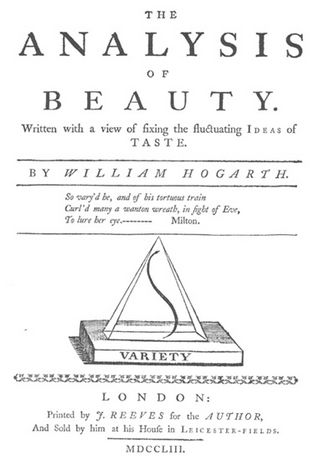
    On a much simpler note, the British artist William Hogarth  (1697-1764) perhaps pathologically induced the use and display of a curve, a single line (a “Line of Beauty and Grace” or “Serpentine Line”), that represented to him the most sublime (and correct) representation of artistic sense.3  It appears on the title page of his Analysis of Beauty (1753), situated within a triangle, and is embedded in a much more wide-ranging treatise on beauty in general (some of which makes sense, some not).  His argument for the line, though is very simple, and he chooses to explain his vision in images more than in words, and so reduces his own interpretation and reduction of artistic form and correctness to a single stroke.  And so if he were to look at Leonardo’s Vitruvian Man or Durer’s proportional man, he would have seen not the proportions as the elements of beauty, but the simple line of the exterior form. 

    NOTES

    1.Charles Abbe Batteux, Les beaux Arts reduits a un meme Principe, 1746.

    2. Color theory is old and pretty—as a matter of fact there is a very attractive gathering of color theory models (in black and white, though) displaying some two dozen or more color models from the last 400 years.  People like Della Porta (1593), our old friend and resident oddball polymath crank Kircher (1646), the smarter-than-you-could-believe Newton (1660), Waller (1686), Lambert (1772), the wide ranging and again polymathic Goethe (1792), Herschel (1817, who also ushered in our understanding of the other light-sensitive shape spacing medium of photography in 1840), the semi-forgotten Chevreul (1835), the beautiful Maxwell (1857), Wundt (1874, the early experimental psychologist who also looked for spirits/spiritmus and ghosts), von Bezold (1878), Rood (1879), Munsell (1918) Kandinsky (1914 and not decipherable by me) and Klee (1924), and so on towards the present, all tried to analyze the prospects of color.

    In trying to quantify the color images of the objects in her study, Vanderpoel establishes a 10×10 square grid, dividing all of the color in that object into individual units numbering to 100.  Then, somehow, she identifies the major colors and places them according to a system that I cannot understand within the grid.

    3. “The eye hath this sort of enjoyment in winding walks, and serpentine rivers, and all sorts of objects, whose forms, as we shall see hereafter, are composed principally of what I call the waving or serpentine lines… intricacy in form, therefore, I shall define to be that peculiarity in the lines, which compose it, that leads the eye a wanton kind of chance, and from the pleasure that gives the mind, intitles it to the name of beautiful”.—Hogarth, The Analysis of Beauty

    Elsewhere Hogarth writes that while the human body is beautiful not so much for its proportions, but “the more pleasing turns, and intertwinings of the lines, which compose its external form”. 



  • History of Dots (Circle Subcategory): Circles in Graphical Displays of Quantitative Data

    JF Ptak Science Books  Post 889

    I like bumping circles as modes of graphically conveying quantitative data—it is more unusual than most ways of portraying statistics and belongs mostly in the 19th century. 

    Blog dec 27 graphic circle

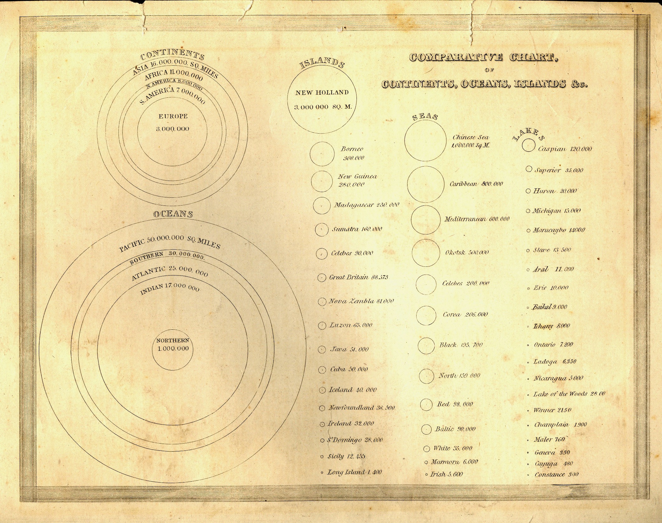
    The first example is relatively early, in the first class of this sort of information display, published in Thomas Bradford’s (1802-1887) superior Comprehensive Atlas Geographical, Historical and Commercial in Boston in 1835. Circles are the entire métier of this chart, showing the sizes of the continents and oceans, concentric circles nested inside each other, then branching out into three columns of progressively smaller circles showing the comparative sizes of islands, seas and lakes, all (interestingly) presented on
     the same scale.  It is a virtual one-stop, single-image display showing the graphical sizes of 59 geographical entities in relation to one another, making the understanding of their comparative sizes a simple, understandable, matter. 


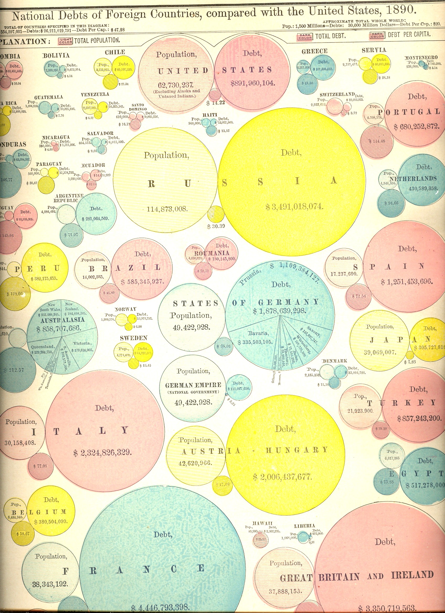
    Prettier but (initially) more difficult to use are the next two charts, the first showing the areas and populations of countries compared to that of the United States (in 1890), and the second showing the public debts of those same countries.  At first the display looks a little confusing. But once you settle in and get your eyes accustomed to the manner of presentation, the charts are actually very easy to use and very useful. 

    Moving over from circles to dots is this population map by Frère de Montizon Armand Joseph, Carte philosophique figurant la population de la France, published in 1830 (as the first of its kind).

    Blog dec 27 graphic bubble debt

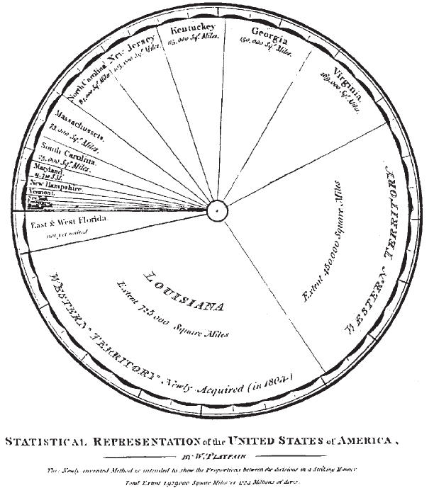
    The ubiquitous pie-chart only made its first appearance in 1801, the work of he gifted and possibly polymathic William Playfair.  He was an engineer (serving as apprentice to the inventor of the threshing machine, Andrew Meikle,  and personal assistant to James Watt) and economist, and occasional mathematician, who also invented  the line graph (1786),  bar chart (1801)and circlegraph(1801).  But for this and all of his other work, he died in poverty and not comfortable1.  


    NOTES

    1.Works by William Playfair include:

    • 1786. The Commercial and Political Atlas: Representing, by Means of Stained Copper-Plate Charts, the Progress of the Commerce, Revenues, Expenditure and Debts of England during the Whole of the Eighteenth Century.
    • 1801. Statistical Breviary; Shewing, on a Principle Entirely New, the Resources of Every State and Kingdom in Europe. London: Wallis.
    • 1805. A Statistical Account of the United States of America by D. F. Donnant. London: J. Whiting. William Playfair, Trans.
    • 1807. An Inquiry into the Permanent Causes of the Decline and Fall of Powerful and Wealthy Nations: Designed To Shew How The Prosperity Of The British Empire May Be Prolonged.


    Blog dec 27 playfair