A Daily History of Holes, Dots, Lines, Science, History, Math, Physics, Art, the Unintentional Absurd, Architecture, Maps, Data Visualization, Blank and Missing Things, and so on. |1.6 million words, 7500 images, 4.9 million hits| Press & appearances in The Times, Le Figaro, Mensa, The Economist, The Guardian, Discovery News, Slate, Le Monde, Sci American Blogs, Le Pont, and many other places… 5000+ total posts since 2008.

Category: Information, Quantitative Display of

  • Food and Not Having It: Visual Displays of Data, Britain and Germany, 1918

    JF Ptak Science Books    Post 1157

    00-blog--Oct 29 starvation germany953
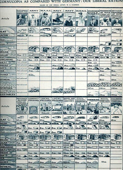
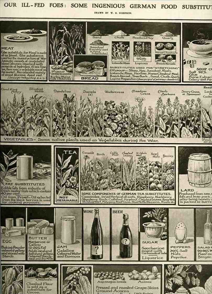
    The idea behind these three images was part of a hearts-and-minds home-front propaganda campaign by the British government to instill fortitude and a feeling of general good in the population, trying to get the message across that British citizens were far better off (in regards to food and staples at least) than their German counterparts.  Even though the situation wasn’t exactly standard in Great Britain in the last year of the First World War, the situation was far more dire in Germany–there was after all an embargo against ships going into Germany or its allies, making it a very difficult to receive food, whereas that problem did not exist in Britain, which pretty much controlled the seas at that point, and could therefore receive food and other material from the Colonies and allies.

    The first graphical display, appearing in The Illustrated London News on June 12, 1918 (and just four months from the end of the War), showed the “ample weekly rations for various classes of the population”.  18 classes, actually, that were enjoying more food than the Germans, the “U-Boat having failed to starve” them. In all of this what comes to my attention first are the allowances for male/female prisoners in England; each getting similar amounts of meat, bacon fish, margarine and fresh vegetables, though for some reason the women are given lesser shares of bread, rice and oatmeal.  The other bit is that the food allotted to the “childrens hospital” is less by far in all categories than everything else.  I’m hoping that this is due to size and consumption differences more than anything else.  I also notice that the officer prisoners of war are given more rations than the enlisted POWs.  Interned aliens are also given short rations, except for fish (Fresh and preserved)  and potatoes, when they get substantially more than anyone else. 

    Unfortunately we do not see what the Germans had to eat, though in the next graphic (same source, though 23 March 1918) we see the “ingenious” ways in which the German people got around not having certain foodstuffs.  The means look more desperate than anything else: meat/sausage for example is replaced by “War Sausage”, which was coagulated ox blood bleached with peroxide, and also by a “vegetable” meat, which was dyed glucose.                                                                                                                          

    00-blog-Oct 27 foes food part II937

    00-blog-Oct 27 ill fed foes 1918935


  • Nazi Propaganda to the French–Leave France Behind and Join Us

    JF Ptak Science Books   Post 1156
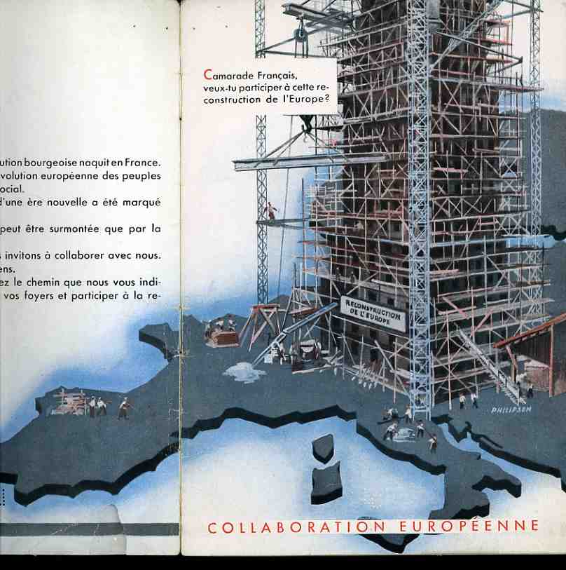
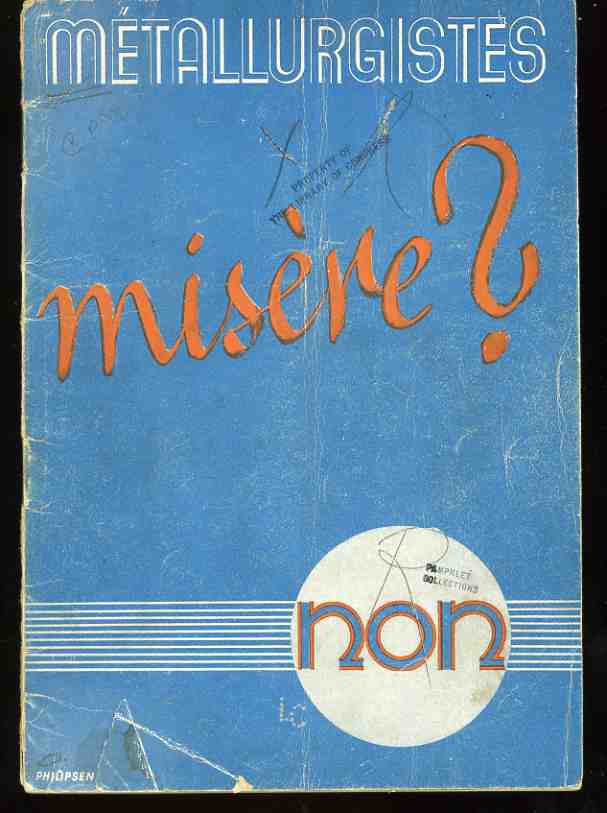
    0--blog-dec 9 vichy cvr220This appeal to practicing French metallurgists by the Nazi occupying force (Metallurgistes misere? Non 1943.) promised good wages, a clean place to sleep, and a livable future.  This included a life for professional metallurgists with a family, as well.  The Nazis were (blood) thirsty for practically-trained “help”, desperate for people with an expertise in occupied France to help contribute to their war effort, and this pamphlet was one means of trying to persuade (via propaganda) or purchase the tacit approval of these professionals.  The Nazis were promising a place to all of those who followed the call, a place in the resurrection of Europe, in the rebuilding of the European community under German/Nazi rule. 

    There was one very odd problem in this pamphlet.  The map shows the creation of this very large allegorical structure, which naturally centers on Germany;

    0--blog-dec 9 vichy cvr219

    but strangely enough, none of the structure seems to touch French
    soil–so much for the “New Europe”.  As a matter of fact it looks as though there is a table with
    three men standing around it at just about the exact place that Paris
    would be.  I’m not convinced that this was intentionally represented
    this way, showing the French reader that France was not going to be
    part of the rebirth–not having France as a part of this new empire
    would seem to be unthinkable–perhaps.  Maybe the issue was to show the inductees that should they decide to stay at home they and their family and the rest of the country will be part of a destitute agrarian Medieval future, that France would not be part of the New Europe, rather than someone screwing up in the Nazi propaganda offices. The screwup is possible though–they were, after all, only Nazis.

    Photos of the promised facilities:

    0--blog-dec 9 vichy clock222


  • A History of Blank, Empty and Missing Things: the Importance of Nothing

    JF Ptak  Science Books  Post 1145

    {This is one in a longish series on the the History of Blank, Empty and Missing Things]

    There is importance and elegance, grace, necessity in nothingness.  That nothing happens is exceptionally important in almost all areas:  the meaning of silences between notes and longer pauses in musical compositions, the essential aspect of timing in a comedic routine, the special place that one goes in meditation, the distinction of wide margins in a beautifully designed book (magic that hasn’t been remotely approached by Kindle & Co., though it said that they have their own hidden beauties), and sometimes just the place where ideas are born.  The places for the beauty of nothing are endless.

    The use of nothingness in art compositions an designs is of course essential–it is sometimes just a little odd to think of it as its own special, spatial element, as its own force of creation or design. 

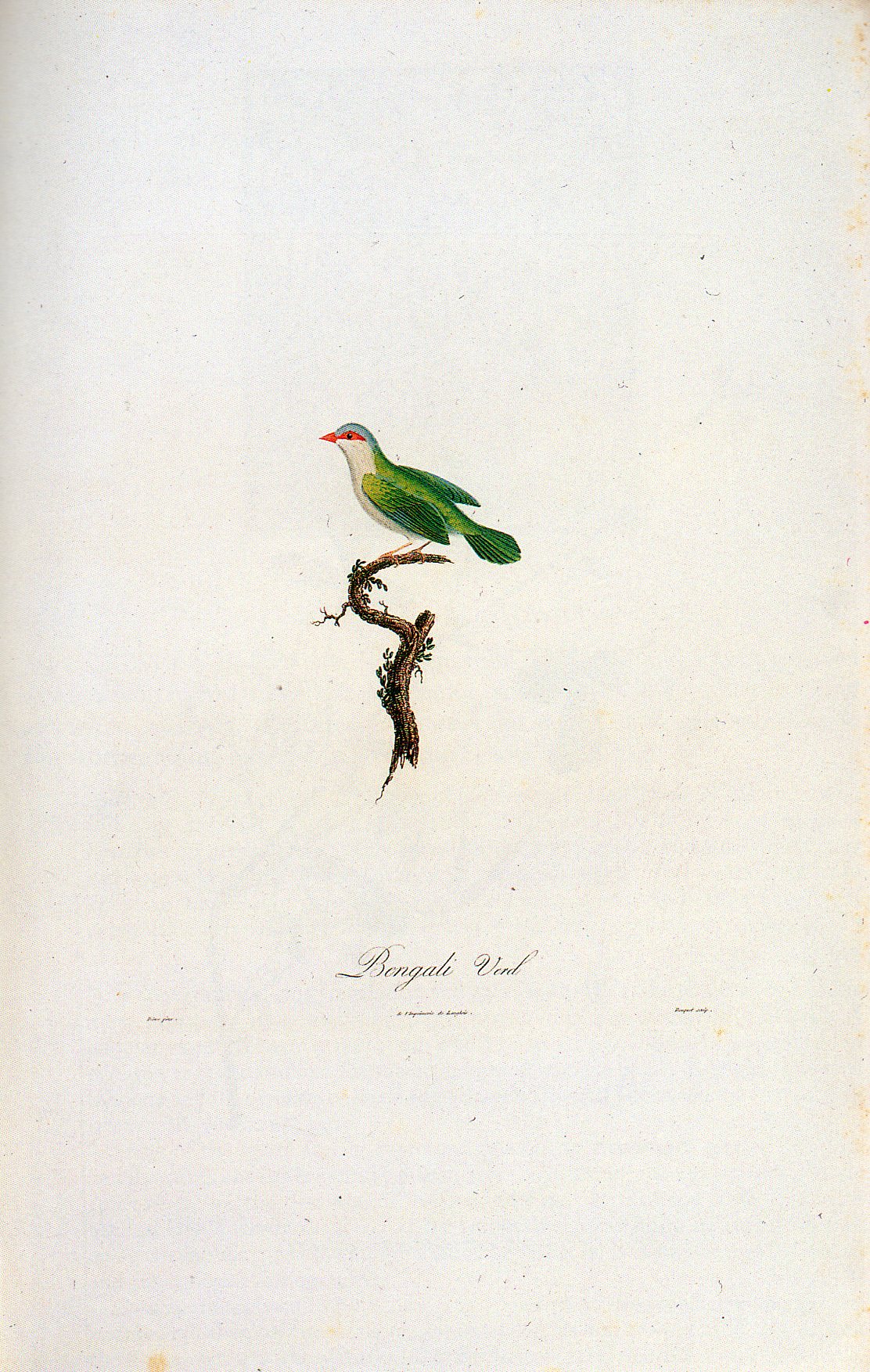
    Take for example this beautiful use of not filling up space by Louis Jean Pierre Vielliot in his 1805 work on natural history:

    Patti--WIWFY-Cover design Bird407

    It would be so easy to crop out these gorgeous margins, and so kill the power of this image–you’re left with the main ingredient of the effort, but without its necessity, or power.

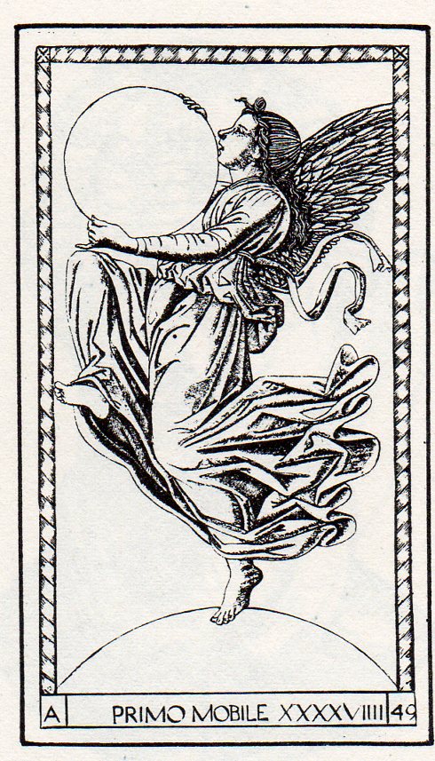
    Empty--tarocchi412 And of course there’s sometimes everything in nothing, seen here, with the universe in the hands of the Primum Mobile, (one image among 50 in a series known as the Mantegna Tarocchi,
    drawn and engraved by artists unknown ca. 1465, though it was once
    believed to be the  work of the great master Andrea Mantegna (and later
    the possible work of Bacci Baldini)). From my reading of this image, the universe is held  in the hands of the primum mobile,
    a spherical container of not-quite-nothing, waiting for the creator to
    breathe life into it.  The possibility of absolutely nothing was seen as
    an impossibility, a perfect vacuum, a space of certain nothingness, was
    a violation of theological belief.  That the sphere existed was a proof
    that–in the 15th century–you simply couldn’t have a container of
    nothingness. The very presence of the sphere confirming that there was
    something being contained by it.

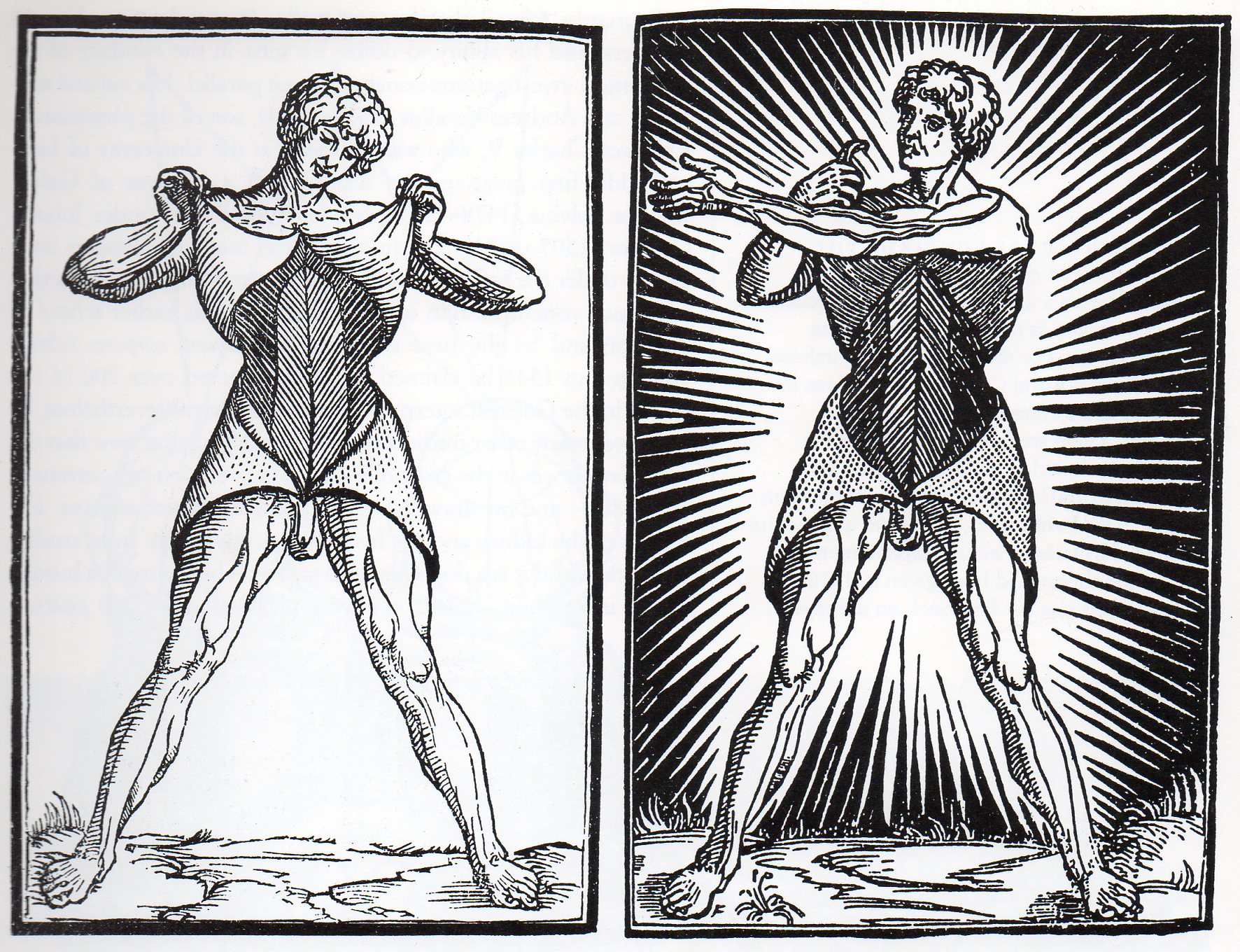
    Here’s an excellent example of the use of nothing as a design force (from Berengario da Carpi’s Commentaria siper Anatomia Mundini, published in Bologna in 1521), where we see what is basically the same exact dissection, except for changes in the internal shading and of course the lightning bolt background.  The simpler design is by far the superior.

    Empty--anatomy411

    It does take some confidence and courage sometimes to use big wide swaths of white, using complementary nothingness–and that’s a good thing.  Sometimes too much “something” isn’t nearly as useful or important as a little bit of “nothing”.


  • Mapping Humans, 1400-1759: Bloodletting, Moles, Bumps and the Stars

    JF Ptak Science Books   Post 1123

    The history of mapping the goods and ills, the past and present and the future on the human body must be about as old as writing, or older.  Ever since you could draw geometric proofs in the sand people have been mapping out the connections (or lack of) the parts of the human body, their relations to one another, the influences of the stars on them, the control of dermatological deformities on the health of the system, the lump and pits and dings on the cranium as an indicator of intelligence and prospects for the future, connecting the lines of electroshock results on facial contortions with the inner musings of the criminal brain, and on and on.  What brings my attention to this though are the overall full-body indexes, the general NYC subway map-like overlays on the entire body, and what they look like out of context. 

    For my purposes here, it really is just the out of context element, the found art, the pre-Absurdist, pre-Dadaist images that they maps create.  Granted the real stuff behind these images are by far more interesting, but I wanted to add these pictures to the blog’s alternative art category before their Duchampian attraction left me. 

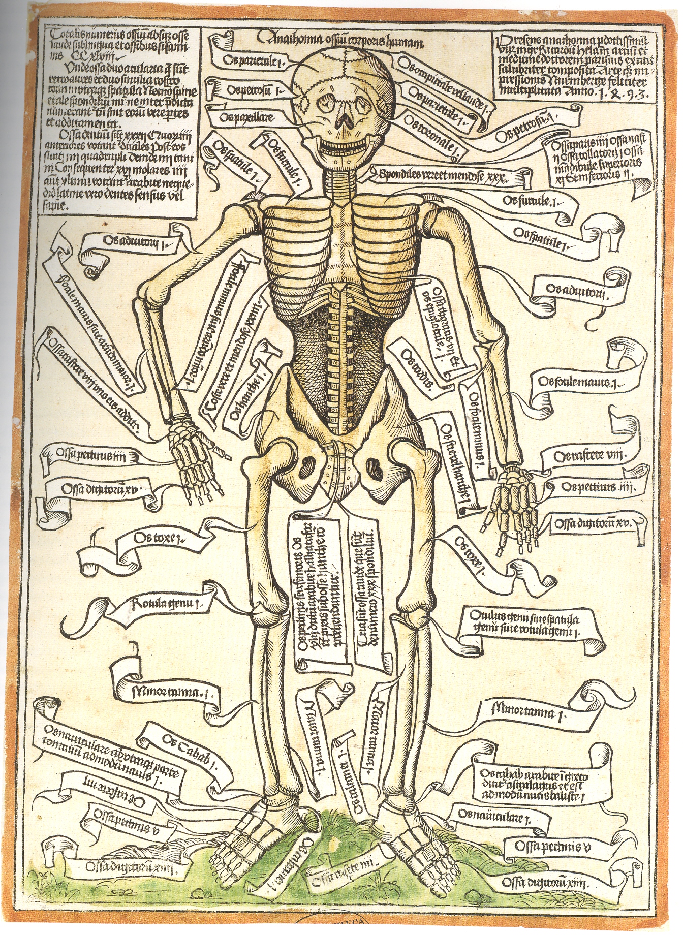
    To start with, for example, in this very breezy survey is the indexing of the very first illustration of a human skeleton. from Anathomia ossium corporis humani, printed the year after Columbus arrived in the Americas–this was the first revelation to the real world of science following a sleepytime of about 8oo years under the very heavy gaze of institutional religions. 

    Blog--may 5 skeleton

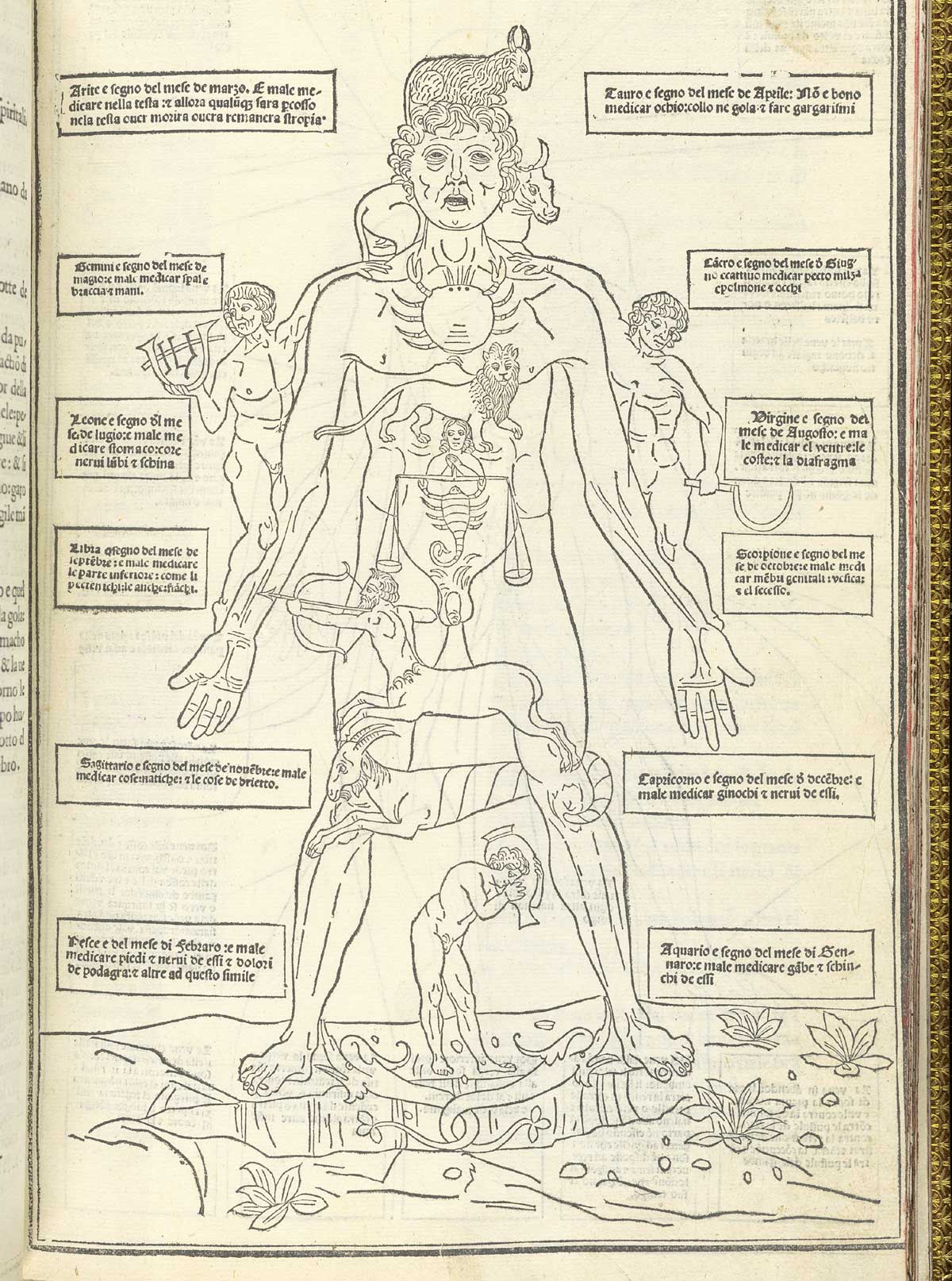
    Human map ketham_p15 In the same year that Columbus set sail for India came the anatomical publication of John de Ketham, with his overall map of astrological influences on the body, followed by a pretty-useful treatise on the treatment of war wounds, as well as the decidedly less-useful map of his locations for the best place to bleed a person of their bad humours. 

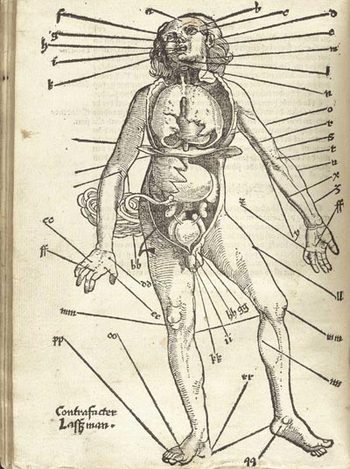
    Well, it really wasn’t like that, not how I mean by by snippy modernist viewpoint looking back on medical history with no contextual appreciation.  Bloodletting was an approach to healthfulness, as blood was seen as one of the four major elements (or “humours”) of the human body that needed to be kept in balance.  This was

    Gersdorffx400jpg_other_2accomplished via the application of leeches or by the more common (and quicker) practice of venesection, or opening a vein to allow the blood to come out. (Let’s reference Steve Reich’s magnificent “Bruise Blood” creation of 1966 at this point—I don’t think that I’ll ever have a better chance to drop a reference to this piece of revolutionary music in regards to venesection again.)  Thus this map was map for the practiconers of bloodletting—the physicians, and more probably the barbers and other assistants who would inherit this lesser procedure from the more-busy doctors.  In the history of maps of anatomy and the general practice of mapping the human condition, this woodcut x-ray of the best places to drain human blood would not survive close to the age of modernity, disappearing almost entirely by the 18th century, and becoming much more scarce well before that.

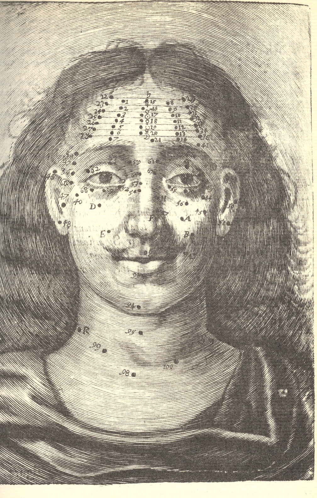
    Moving on to Richard Saunders (who I wrote about more fully here)continued a very ancient tradition into England, deep into modernity, by mapping the divine cosmos of moles and other facial extras for the purposes of health and prophecy:

    Blog--jun 11 circ mole


    Richard Saunders.  Physiognomie and Chiromancie, Metroscopie, the Symmetrical Proportions and Signal Moles of the Body, Fully and Accurately Explained; With Their Natural Predictive Significations Both to Men and Women (published in London, 1671, by Nathaniel Brook).in which he divines the psyche and the future with peoples’ moles. 

    [graphic]

    Visceral Anatomy From Reisch’s “margarita Philosophica,” Johann Schott, 1503

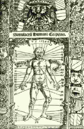
    Blogbloodletting_stoefflerI couldn’t let the above-mentioned  bloodletting image pass without reference to this excellent woodcut for Johann Stoeffler’s  Calendarium Romanum Magnum, printed in Oppenheym by the redoubtable  Jacob Koebel, (24 March) 1518.  It is a glorious display (entitled Simulcarum humani corporis) of seasonal (!) purgative and bloodletting locations on the body, meant to accompany a longish essay by Stoeffler on the practice in general.  The bulk of the book, however, had very little to do with this practice and was actually commissioned as a reform to the Julian calendar, provided with the impetus of the Lateran Council (1512-1517).  The result was a series of forty-one  propositions on the calendar and calendar-related practices, including work on eclipses, the zodiac, the occurrence of leap years, the Alexandrine and Roman calendars, the calculation of the occurrence of Easter, and so on, including the seasonal practices of bloodletting.

    I enjoyed this torso map by Salomon Alberti  in his Historia plerarumque partium humani corporis, in usum tyronum edita. Vitebergae (p1583, 8°; ibid., 1585, 8°; enlarged, ibid., 1601, 8°;(published from 1583 to 1630) for it simplicity.

    The rest of the images I’m going to have to show here as a simple Image Dump, at least for the time being:


  • Unfathomable Dots–324,198 Stars and Knowing the Structure of the Milky Way, 1873

    JF Ptak Science Books  Post 1107 (Appended April 27, 2015)
    [A continuation of our History of Dots  series.]

    Stars--vivible stars 2 det304


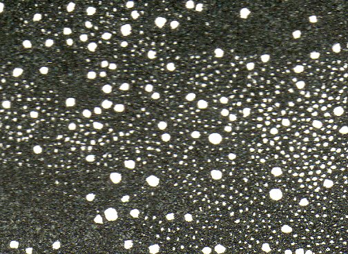
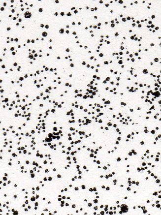
    The history of dots must have some fair share of its content filled with a very varied history of astronomy, which just goes to show that even within the seeming-sameness of microscopic investigations of dots that its subcategories could be so vast and differentiated. (The image above is a small detail from the following image, below.)

    Dots aren’t necessarily just dots–even in representing the stars, dots have a rich history. The first star-dots published in the West appear in 1482, taken from the work of the first century astronomer and philosopher Hyginius1, and is a book that contains maps of the constellations composed of such beautiful light-encrusted bits.  There wouldn’t be another work like this one, strangely, for another 75  years. Alessandro Piccolomini’s2 work of 1559 (which would be the first true star atlas), and again we see the familiar representation. 

    Galileo’s dots were very aggressive.  By 1610 he had produced his fifth and most powerful telescope, allowing things to be seen one thousand times closer, using it to make enormous discoveries–discoveries so big in fact that their towering significance is a but hard to understand today in the context of early 17th century knowledge. It was all published in his fantastic Sidereus Nuncius on March 4, 1610—the extraordinary  very title page3 of the book proclaiming some of the great discoveries of Galileo’s adventure.

    One monumental outcome of Galileo’s work was expanding the number of stars in the sky, which was basically mucking around with the perfect plan of the creator–formerly a cornerstone for the existence of a divine being.  With the exception of comets and eclipses the sky had remained immutable, a perfect score of the creator’s creation, until 1572, when Tycho Brahe noticed something new in Cassiopeia, something that was not a comet—a “something” that was a star. This was momentous because the night sky had been seen for centuries as being complete—a new star, the Nova of Brahe, contradicted this high belief, offering the possibilities of newness where there had not been one previously.  And so too with Kepler’s new star of 1602.

    One of the things that Galileo brought to the world was an entirely new sky, revealed to him through his telescope—so many stars that he could only guess (though he reckoned that there was an order of magnitude more stars than previously known “stars in myriads, which had never been seen before….and which surpasses the old, previously known, stars by ten times”).
       
    Which brings me to the images that I stumbled on today from “Statement of Views respecting the Sidereal Universe”4which was  the work of the astronomer and great popularizer,  Richard A. Proctor (“B.A. (Cambridge), Honorary Fellow of King’s College, London”).

    Proctor’s dots challenge all dots that have come before so far as theorizing on the structure (and extent) of the Milky Way is concerned.  Proctor refers to William Herschel’s5–the man who first gave the Milky Way its shape and who fixed our own sun in an inferior and not-particualrly-special place inside that map–statement that the extent and constitution of the Milky Way is “unfathomable”. 
     
    Proctor gets there by presenting a map of the night sky with stars visible to the naked eye:

      Stars--vivible stars 2303
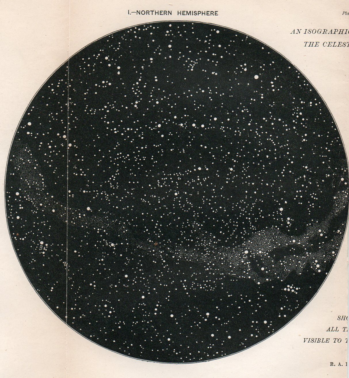
    And then the double hemisphere map of the northern and southern skies “We have here the first step towards just views of the constitution of the Milky Way, or rather the next step beyond the great, but little noticed, discovery of Sir W. Herschel’s, that the bright clouds of the Milky Way are for the most part spherical clusters of stars.”(Page 546.)

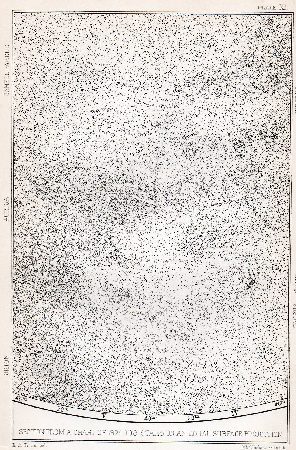
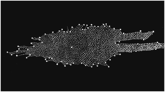
    Finally is the crux of the matter: two sections of an fantastic map displaying 324,198 stars visible via a 2.5 inch aperture telescope.

    Stars--324k300
    (The following being a small detail in the above section:)

    Stars--324k deyt301
    He comments:“I assert, without the slightest fear of contradiction by any possessing such knowledge, that the broad teaching of the equal-surface chart. 0/3 24,000 stars disposes finally of all theories of the constitution of the sidereal universe which had previously been enunciated. The chart does not definitively indicate a new theory—rather it suggests the idea that the constitution of the sidereal universe is too complex to be at present ascertained. But it completely negatives (i), the stratum theory (even in the modified form apparently retained by Sir W. Herschel) ; (ii), the flat-ring theory of Sir John Herschel ; and (iii) the infinitely extended stratum theory, with condensation towards the mean plane, which Struve adopted.” (Page 547)

    I think that for 1873 the verbose Mr. Proctor got his point across.     

    Notes

    1. Hyginius Mythographus (fl. 1st century A.D.). Poeticon astronomicon. Edited by Jacobus Sentinus and Johannes Lucilius Santritter. Venice: Erhard Ratdolt, 14th October 1482. The first star atlas per se, standing alone in its field for a century.

    2. Piccolomini, Alessandro.  De la Sfera del Mondo.  1559                              

    3.  Galilei, Galilei  Sidereus Nuncius (known in English as Starry Messenger), published 1610
    The title page reads: Great and very wonderful spectacles, and offering them to the consideration of every one, but especially of philosophers and astronomers; which have been observed by Galileo Galilei … by the assistance of a perspective glass lately invented by him; namely, in the face of the moon, in innumerable fixed stars in the milky-way, in nebulous stars, but especially in four planets which revolve round Jupiter at different intervals and periods with a wonderful celerity.

    4. Journal of the Royal Astronomical Society, Paper, Abstracts and Reports of the Proceedings of the Society from Niovember 1872 to June 1873, vol XXXIII, London, printed by John Strangeways, 1873.                    

    5. It seems that few people now remember Frederick William Herschel as a great discoverer of alternative existences, but, well, that’s pretty much what he did–and he did it during a time that must’ve made his astronomical discoveries seem like science fiction .For example, in 1785 Herschel published a revolutionary image of the “Stellar System” (the Milky Way), showing its irregular pattern and the off-center placement of our sun amidst a panoply of other stars.
    (His image was remarkably and substantially correct, with the most grievous error being the placement of the sun too close to the center of the galaxy.) It was an image which bought the concept of a not so humano-centric idea into popular philosophy, and that our sun was a star among stars in a sea of stars.

    Herschel


  • Action Alphabet and a Touch of Evil, 1879

    JF Ptak Science Books  Post 1105

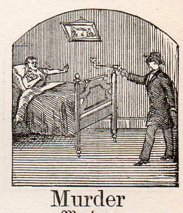
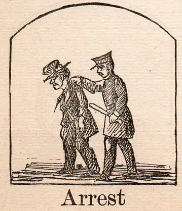
    Alphabet germ--murder298 Following yesterday’s two posts on Occupational Alphabets comes this “created” action-alphabet of late 19th century.  The source is Kantner’s Illustrated Book of Objects and Self-Educator in German and English, a self-teaching book for German vocabulary, published in Pennsylvania in 1879.  The woodcut images used to illustrate each word are fantastic, and occasionally stunning, sometimes unexpected illustrations of forgotten objects and actions.  All I’ve done is select some of the words for use as an Action Alphabet. (I failed though to provide a full alphabet, missing the letters i, u, v, x, y and z.) 

    The woodcuts appear here larger-than-life than their humble inch-square origins, and may take away a little from their mystery…or add to it.  They have an odd noir-ish, Wellesian feel to me, somehow, their tiny frames exciting a funny hankering for Kane or Macbeth or Touch of Evil, something I can’t quite understand.  Maybe it is just a happy confusion, looking too hard at too many small images, like discarded film clips on a cutting room floor, and imaging trademark deep focus bits from a famous filmmaker.  In any event, they do have their own style–perhaps tomorrow I’ll cull out the Dadaist Alphabet from their brethern.

    Alphabet germ--arrest297


  • Occupational Alphabet 2, ca. 1844

    JF Ptak Science Books   Post 1104

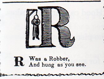
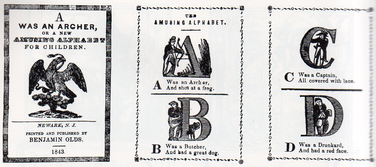
    Alphabet 2-robber280 Following yesterday’s “Occupational Alphabet” post comes A was an Archer, or a New Amusing Alphabet for Children, published in beautiful Newark, New Jersey, in 1844.  10 centimeters tall, this little 16-page pamphlet introduced children to associative memories of alphabets and occupations, accompanied by a rhyming couplet displaying a low quality of half the joined occupation. Thus, “Q” is for “Queen” but “of the lowest degree”. 

    And so:

    The Archer shot at a frog; the Captain was covered with lace, the Esquire had an insolent brow, the Gamester had ill luck, and so on.  It is interesting to note that the Robber was hanged for theft.

    Alphabet 2--a-c275


  • Pictographic Messages to the Year 12,010: the Medium is the Mess.

    JF Ptak Science Books  Post 1103

    Talking to the Future: a Note of Pity to Ourselves in 300 Generations
    Nuke waste--dead251

    In the history of words I’ll take a wild guess and say that fractions of 1% of everything communicated is directed at ourselves in the future–or at least it has the possibility of being directed to someone else when our deeds are long, long since forgotten. 

    And by writing to the future I don’t mean in an off-hand way, our words being read in 12,010 by chance, idea archaeologists looking at what people were talking about 10,000 years earlier; and I don’t mean via “reconstructing” our radio or tv broadcasts (in the not-right Jodie Foster Contact kinda way).  I mean intentional messages to be read a long time from today.   

    A more problematic entry would be images and symbols design to be read by future generations, in the deep future.  This is not a very deep category, though a famous (if not well designed) example being the one associated with Carl Sagan that was attached to the 1972 Pioneer 10 and 1973 Pioneer 11 spacecraft, which attempted to explain what humans were should either vehicle  in any eon come into contact with other-than-Earth life.
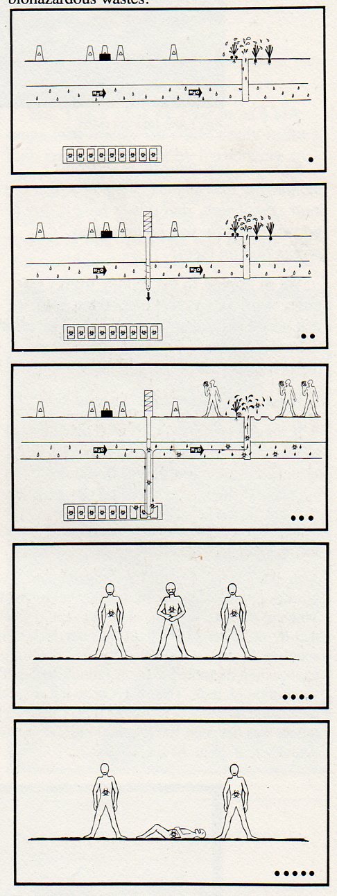
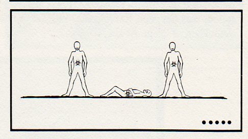
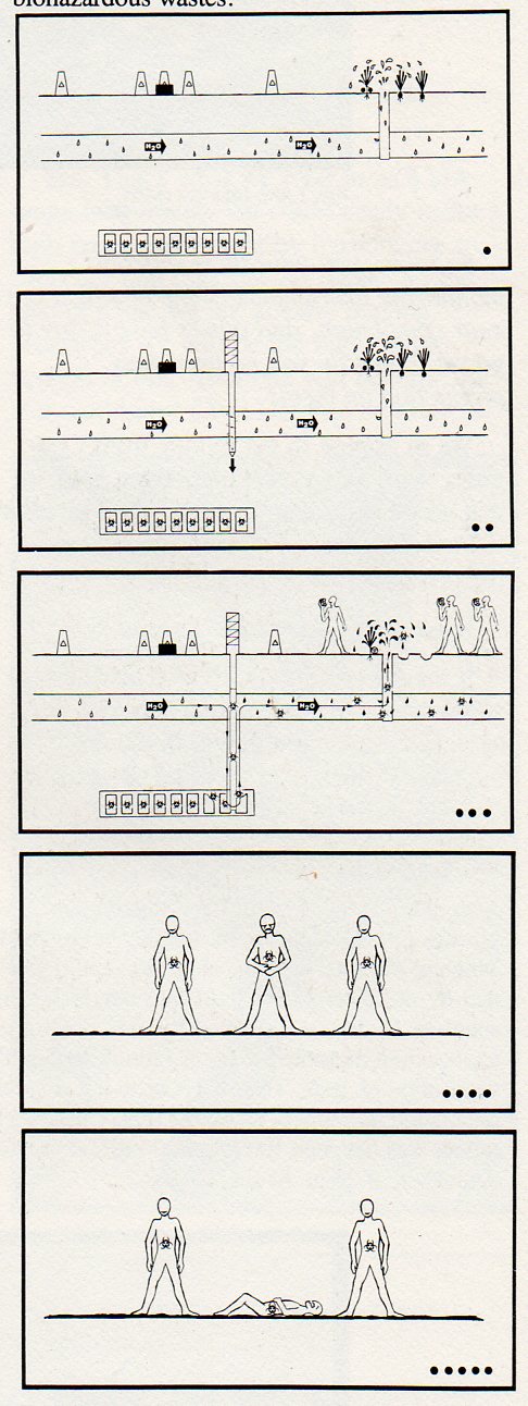
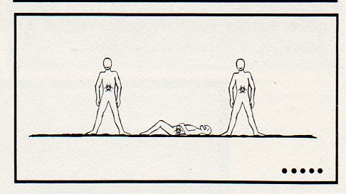
    Nuke waste--overall250 Another is the pictograph presented here, which appeared on page 117 of the ironically and extraordinarily-titled Reducing the Likelihood of Future Human Activities That Could Affect Geologic High-Level Waste Repositories1, the first half of which (bolded above) could make a nice departure for some other science fictiony type story.    But what these folks were talking about, plain and simple, was how to prevent future generations from digging into or other disturbing in any way buried masses of nuclear waste. 

    This pictograph is meant to be a non-linguisitc, universally-understood  warning to future generations that the ground they are standing on is above a nuclear waste storage site.  The plan was that nuke waste would be solidified and buried in rock hundreds of meters below the surface in an effort to keep in line with governmental policy of waste disposal2. The pictograph relates to the restricting of future human activities part of the title of the work in question–that is, folks in the future who might muck around, drilling, into the nuclear waste site.  This pictograph tells them why they shouldn’t do so, because of all of the terrifically lethal mojo underground. 

    As one might guess by the title, the report has its own communication problems–it is dense, turgid and not a particularly clear document.  It is a fine document illustrating the problems of communication, but not in the way it would have wanted to be, celebrating a reverse triumph in a Darwin Award/IgNobel type of way. And all of this in spite of/or because of a healthy slice of linguists, semioticians, logicians, artists, graphic designs, politicians,. sociologists and so on constructing the thing.

    The sign basically says that if you drill at this spot (to some unspecified depth) through aquifer or underground stream or water source or something that some point you may reach the biohazard nasty, which will then get into the water supply and into humans, which will then kill them.

    The sign was designed for 10,000 years hence, and depended upon pictures to convey the message rather than words (except for H20, and the biohazard symbol).  Of course the radioactive nastiness will be there for millions of years, which would be an entirely different story in terms of imaging.  Perhaps. 

    The one thing the design of the pictograph has in its favor is that it is read top to bottom–no language on Earth (so far as I know) is read bottom to top, though there are many differences in reading right-left/left-right.  Beyond that, the pictograph stumbles over itself–except for the last two images, which may or may not tell someone that something bad is happening. 

    There are plenty of time capsules and idea-vehicles to the future–I’m saddened that this was seen to be one of the essentials that we would pass on to our future selves.

    Notes:

    1. Reducing the Likelihood of Future Human Activities That Could Affect Geologic High-Level Waste Repositories (Technical Report prepared for Office of Nuclear Waste Isolation, Battelle Memorial Institute; BMI/ONWI-537; May 1984)

    2. “Present society’s responsibility is to dispose of radioactive wastes in a manner that is safe, is environmentally acceptable, and does not require long-term maintenance or surveillance. This ground rule is consistent with the objectives in the U.S. Department of Energy.”Reducing…, page 2.

    The pictograph, explained,  pp 115-116 from Reducing….

    The pictograph…was developed using the concepts and guidelines discussed by Givens (1981). The objective is to convey to the reader the sense that if the area below the markers is disturbed, toxic substances will enter the ground water and lead t o severe consequences. relies on several visual images acting in concert to relay the message.

    The ground surface exhibits peripheral markers and a central monument to denote relevance to the site where those markers and monument exist.

    The ground-water system is indicated by water-drop shapes and by the chemical symbol for water (the only departure from icons, used as a redundant measure).

    A repository far below the surface is depicted with the biohazardous symbol. The fact that the object portrayed below the surface is a repository may not be at all evident to a future reader from the first frame; however, the movement of the dark material from the repository through the aquifer and into the vegetables in the third frame, coupled with the movement of the biohazardous symbol, should imply the burial of biohazardous materials below the surface.

    The pictographic sequence exaggerates reality with regard to the rapidity of contaminant transport and uptake, and with regard to the severity of the consequences. However, exaggeration is necessary because both the clarity and the relevance of the message may suffer if.the pictograph attempts to indicate contaminant transport time of thousands of years. Similarly, the consequence portrayed, a painful death, over-exaggerates the cause-effect relationship and the rate of the individual’s demise (one out of three suffer death in the pictograph, whereas a
    to chance would be more representative).

  • The History of Rartity: Helium, Nutmeg, Breadfruit and Pepper

    JF Ptak Science Books   Post 1089

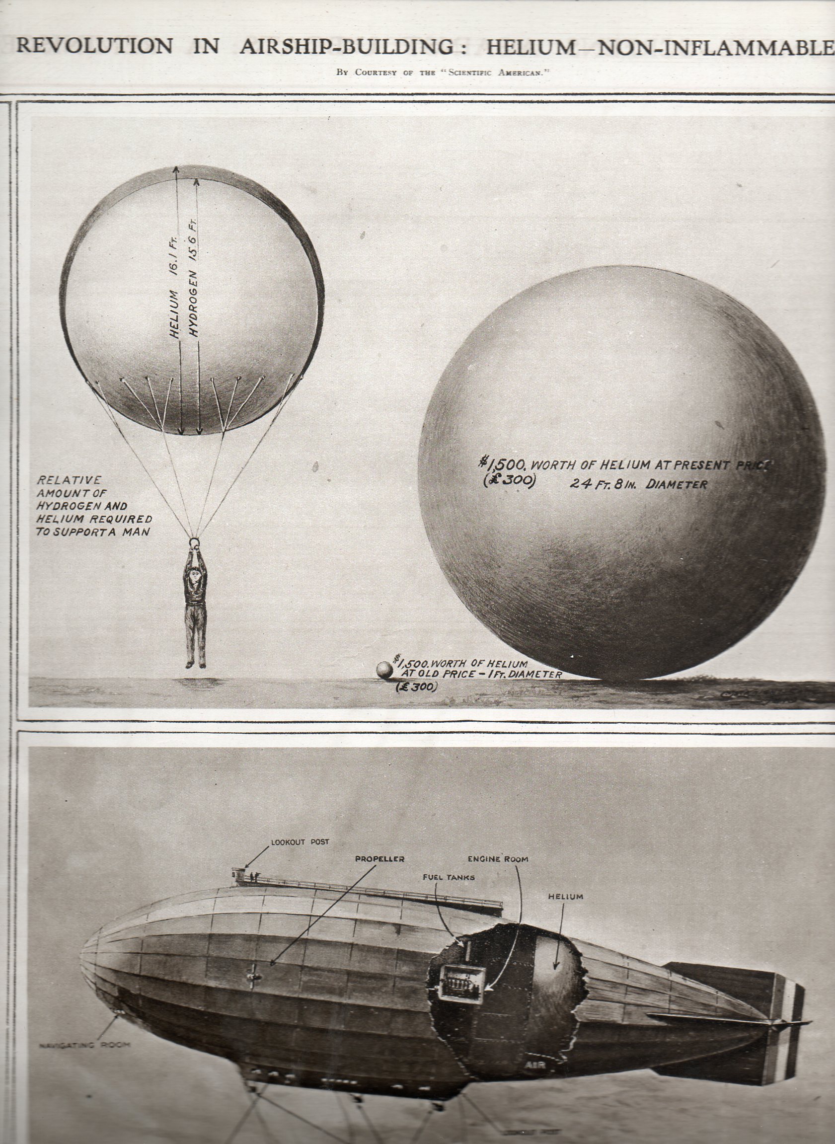
    Display info helium balloon212I guess we don’t think much of the rarity of some things.  Pepper and other spices were at one point quite rare, and the source of invention and exploration, and war.  Nutmeg, for example, a sought-after spice originating from the Banda Island group of Indonesia, once figured in a trade between Holland and England (the Treaty of Breda in 1667) that landed the Dutch the island of Run and control of the nutmeg trade, while the Brits got Manhattan.

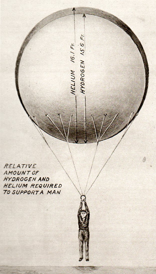
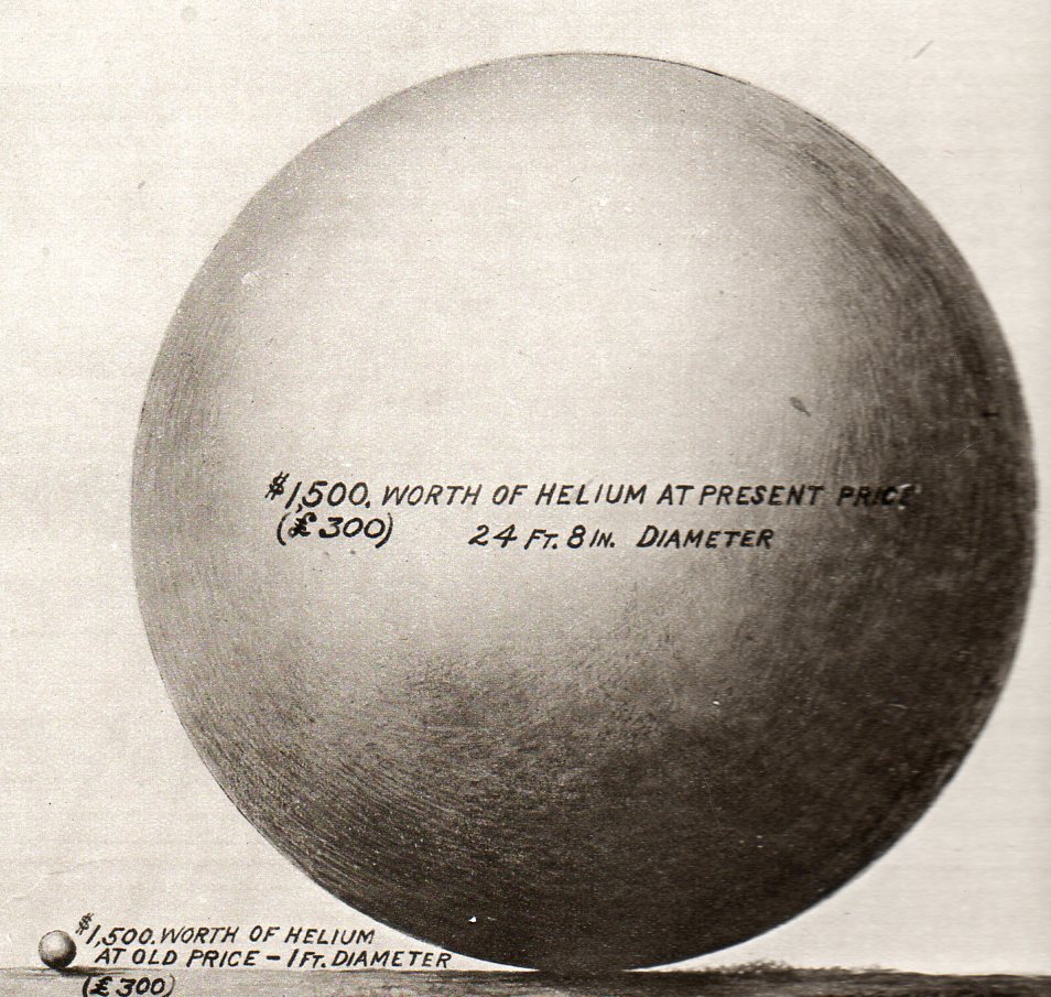
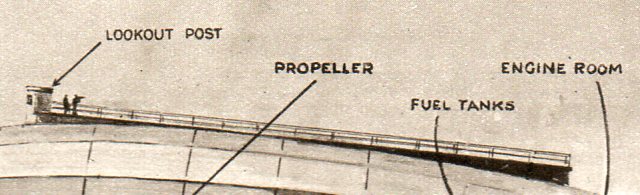
     Another great example is helium. When these images were produced for The Illustrated London News of 15 March 1919, rigid airships were filled with hydrogen, an explosive, not-happy gas that was the fuel of all manner of aerostatic accidents, everywhere.  Helium was still quite rare at this point, a year after the end of WWI and only 54 years after it was first observed1, and replacing hydrogen with helium was still yet a dream–basically because there wasn’t any, yet, to supply a dirigible2.

    Display info helium balloon man213

    The first helium-filled airship was still two years away at this point–the U.S. Navy’s great C-7, which made its maiden flight on 1 December 1921.  When the USS Shenandoah flew in 1923, it flew with most of the world’s entire supply of the noble gas helium. Its difficult today to think of pepper, nutmeg, sugar, helium and so on in terms of fabulousness and rarity, but it was so.  Remember, when Capt Bligh was jettisoned from the HMS Bounty, the ship’s precious cargo was also thrown overboard.  And the great treasure that sparked the Tahitian adventure that sparked the mutiny?  Breadfruit. 

    Display info helium balloon comparison214

    Notes
    1.  Observed for the first time by astronomer and early astrophysicist Pierre Janssen, in the spectrum of    the chromosphere of the sun, in 1868; separated for the first time on Earth in1895 by the British chemist Sir William Ramsay.   

    2.  By the way, “dirigible” is from the French, “diriger” (or “to direct “), meaning steerable, pilotable.  This differentiates the dirigible from the balloon, which was not by and large steerable. 

    Display info helium balloon dirigible215


  • Quantitative Display of Information: What was Left of the Japanese Navy, 1945

    JF Ptak Science Books  Post 1082

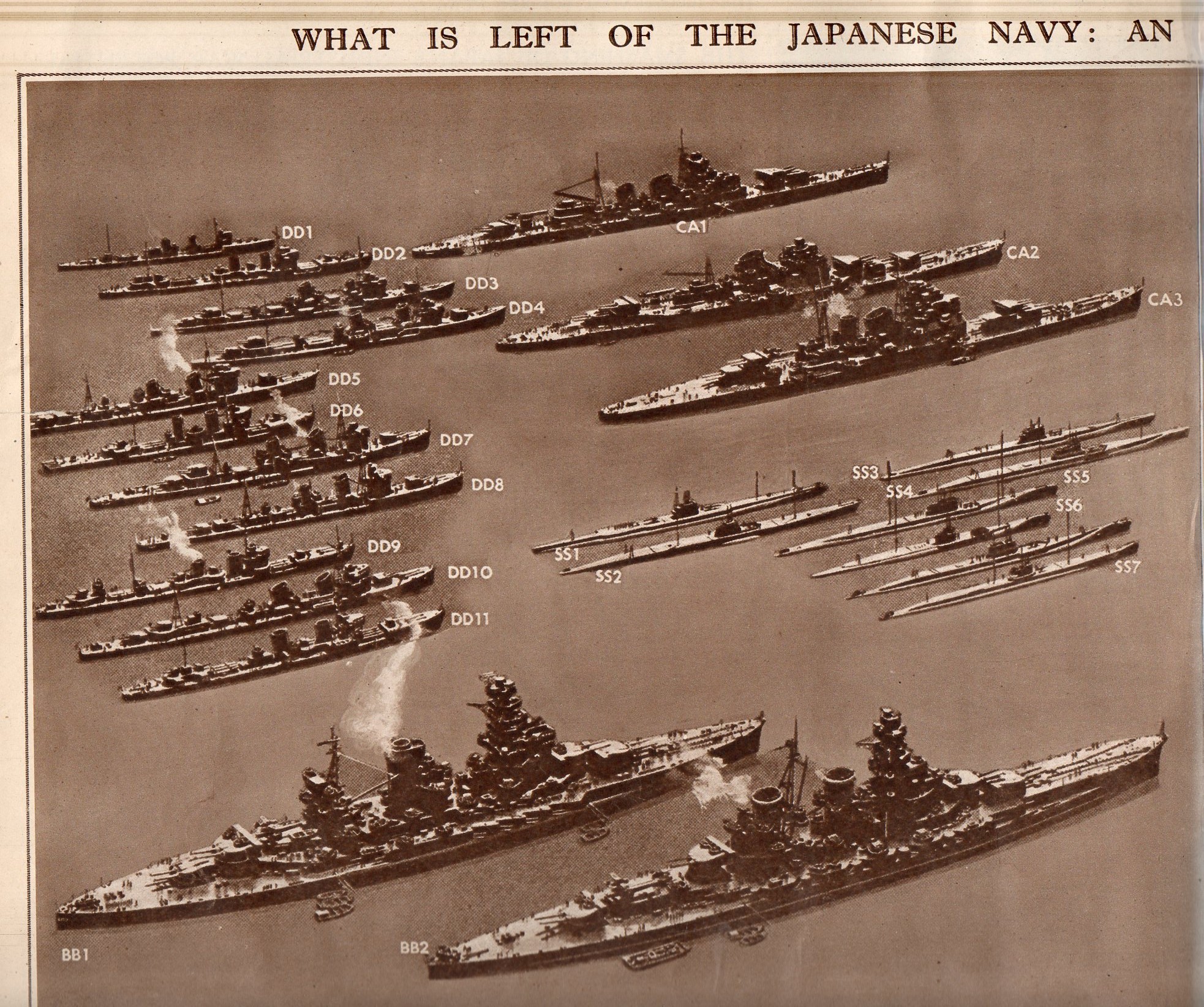
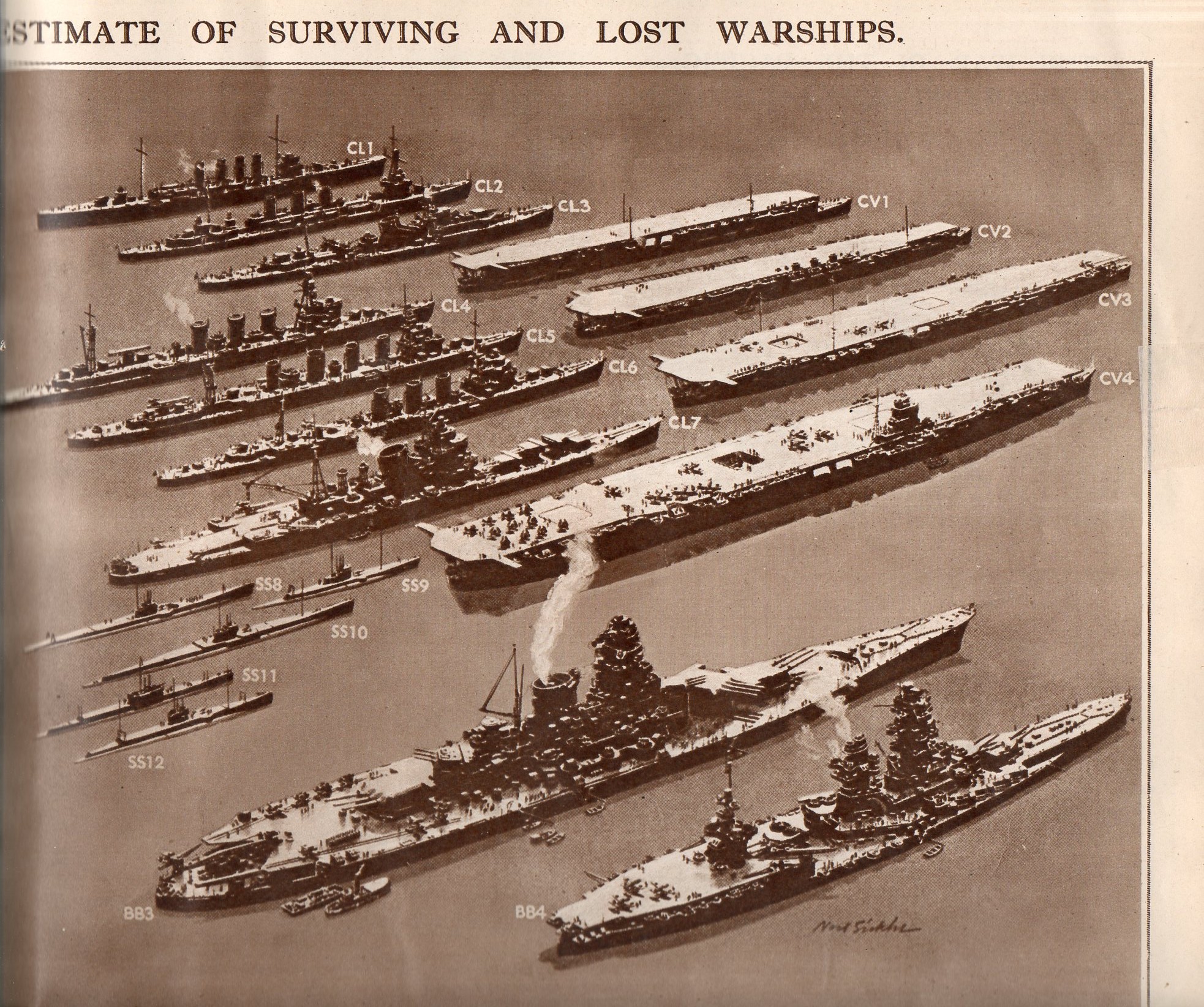
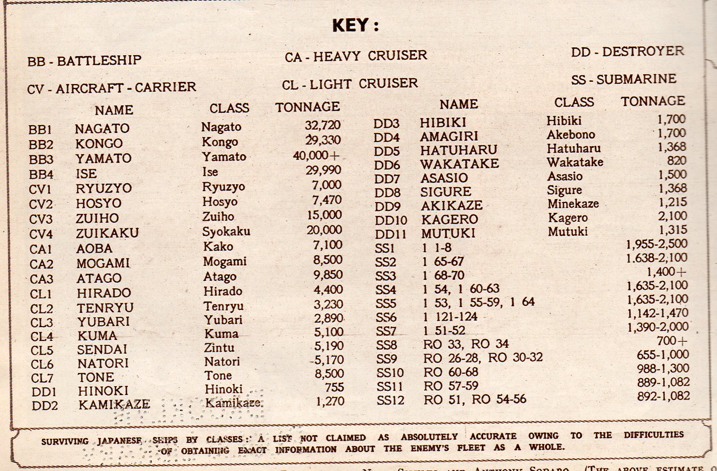
    This double-page spread in the Illustrated London News for 28 July 1945 displays what was left of the Japanese Navy.  Originally appearing in LIFE magazine a few weeks earlier, the image represents classes of Japanese naval ship, multiplied by the estimated number of ships in that class.  Even after all of the great  losses of 1942/3, the Japanese Navy was still the third largest afloat. 

    The navy consisted of an estimated 10 battleships, 6 carriers, 15-30 cruisers, 60-80 destroyers,and an not-estimated number of subs (though there were at this point use din patrol and to accompany the fleet.  

    This is an excellent display of a significant amount of historical data, made quickly understandable to even a quick reader, or even to a non-reader.  Two weeks from this date would find this information moot.

     Japanese Navy 1205 

    Japanese Navy 2206

    Japanese Navy 3207

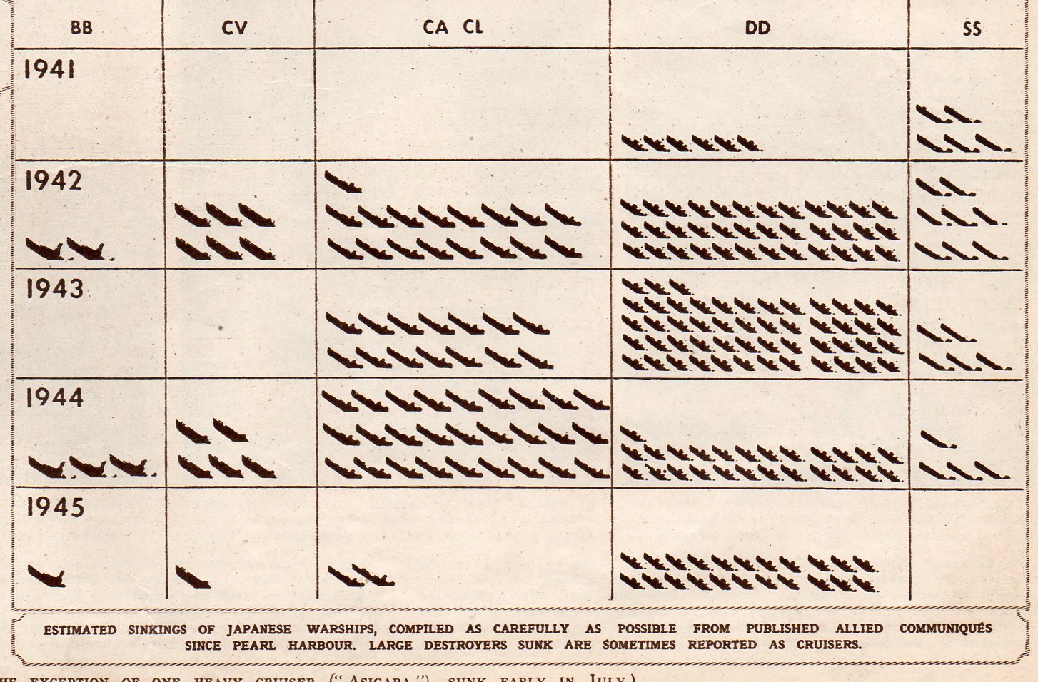
    This chart shows the numbers of each class of vessel sunk by year:

    Japanese Navy 4208