A Daily History of Holes, Dots, Lines, Science, History, Math, Physics, Art, the Unintentional Absurd, Architecture, Maps, Data Visualization, Blank and Missing Things, and so on. |1.6 million words, 7500 images, 4.9 million hits| Press & appearances in The Times, Le Figaro, Mensa, The Economist, The Guardian, Discovery News, Slate, Le Monde, Sci American Blogs, Le Pont, and many other places… 5000+ total posts since 2008.

Category: Information, Quantitative Display of

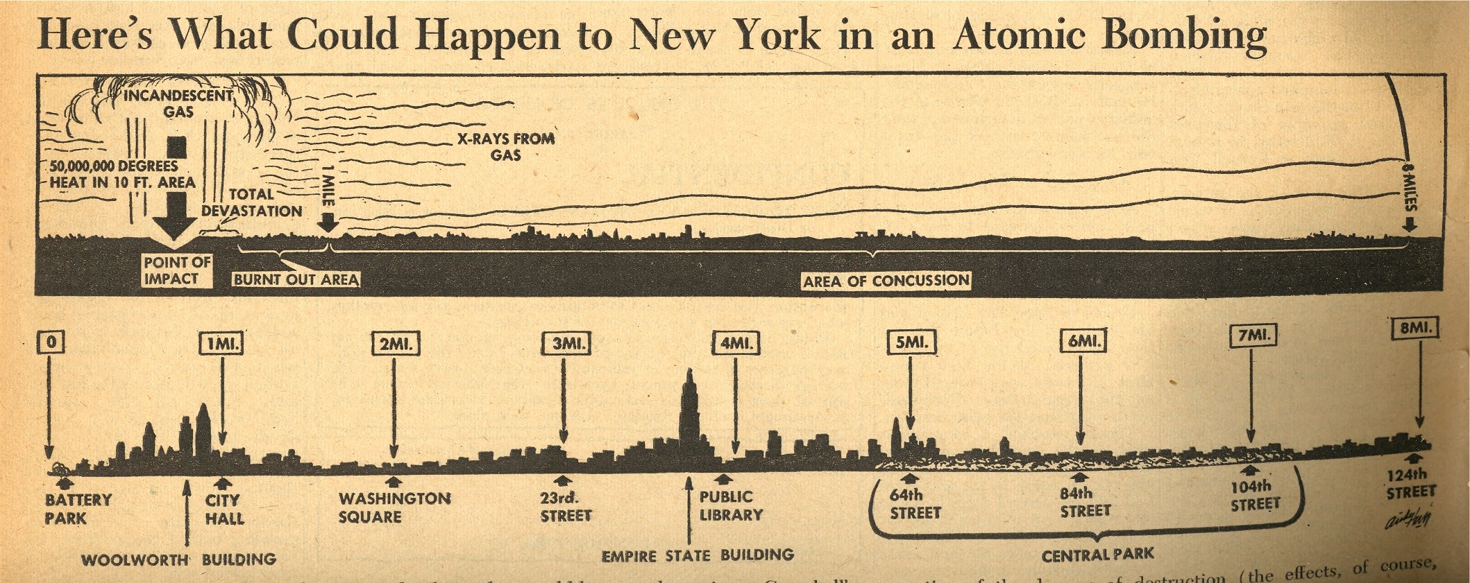
  • Reporting the Hiroshima Bomb the Day After, 7 August 1945. AND the First Graphic of NYC A-Bombed

    JF Ptak Science Books   Blog Bookstore  Post 1257 (continuing post 669)    Atomic and Nuclear Weapons Series

    ==Blog July 26=PM cvr bomb

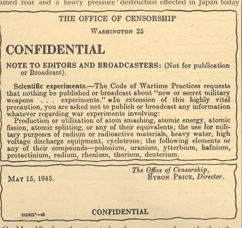
    The news coverage of the 6 August 1945 bombing of Hiroshima was covered in spectacular (all things and time considered) detail in the 7 August issue of the daily newspaper, PM.1  The entire issue of 12 pages (with no advertising2) was dedicated to the event—I have no idea, really, how they were able to put together this amount of good tough data so very quickly, nimbly and intelligently, as the bomb was detonated at Hiroshima only the day before. 

    It is odd how well the case is covered, and it is positively issued on the day after –it isn’t the case that it was issued for the week of 7 August and released on 13 August, which I thought was a possibility of explaining the deep coverage.  But there’s no mention of Nagasaki (which would come in two days), so I am certain that the coverage was all accomplished within 24 hours of the use of the weapon.  The newspaper distinguishes itself by not screaming something about the “Jap city” being wiped out (as so many other newspapers did), with its front page summarizing beyond the bomb.  (“It Will End all War—Or all Men” and “It Will Revolutionize Human Life” as sub-heads; the first being accurate, while the second being nearly so.) 

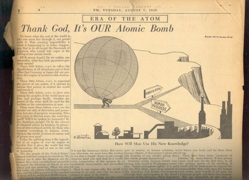
    The editorial, “Thank God its OUR Bomb”, by Irving Brant, is a lovely piece of thoughtful interpretation in the opening moments of the nuclear age. He writes: “America must join and lead in a worldwide renunciation of this worldwide renunciation and prevention of war”,and “What will happen to industry, to society, when the power of all the coal mined in a year is compressed into an exploding fistful of atoms?” And further:“There is no escape.  The split atom may shatter humanity, but not before then will it retreat into the physical void from which it came.  The dust of creation is in our hands.  We must master it.” Not bad stuff for having a few hours or so to think this  through. 
     

    ==Blog July 26=PM cvr bomb censor


    The other articles included “Bombs and Sabotage Stopped Nazi Experiment with Heavy Water”, “New Atomic Era Could Revolutionize Mankind’s Whole Manner of Life/Power Harnessed for Destruction Has Limitless Constructive Possibilities”, big two-page story “Stimson Reveals How Work on Bomb Was Organized”, “Bomb’s Death Range Believed to be 4 Miles”, “Four Scientists who Will Plan Postwar Uses of Atomic Energy”, “Harnessing of Atomic Power research Strengthens US Research”, “If a Piece of the Sun Were Placed on Earth”, “End Not Yet Truman Tells the Japanese”, and another 12 articles.
     ==Blog July 26=PM cvr bomb artoon

    There’s another baffling article “Steel Tower Vaporized in First Test”, discussing the shot at Alamagordo—it must have been the case that there was an enormous amount of material divulged by the government in the hours after the explosion at Hiroshima .  The work at Columbia is also chronicled, as is the personal life of the man in control, General Leslie Grove (and how completely in the dark his wife was, and so on). 

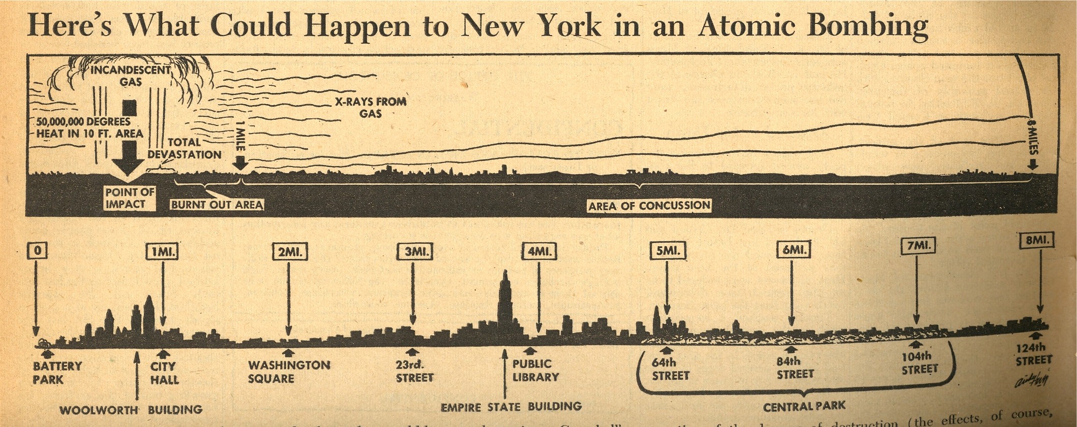
    One of the most interesting objects to me though is the small graphic on page 7 which shows what effect the Hiroshima atomic bomb would have if dropped on New York City—it was no doubt gigantically sobering to anyone who looked at it, and brought the power of the bomb and its destruction to a common, understandable point.  I’m not an historian of the first newspaper coverage of the bomb, but it strikes me that this may well be the first graphic to depict the effects of an atomic bomb exploded over NYC.
    ==Blog July 26=PM cvr bomb map
     

    In any event, the overall coverage of the event was stunning given the short amount of time to do the research, writing, and publication.  Truly a great effort. 

    Notes:

    1. PM (1940-1948) was a left-wing newspaper funded by Marshall Field III, and was home to excellent reporting.  See here for more details. Among the staff writers was I.F.Stone and staff photographers Margaret Bourke-White.  Other contributors included Heywood Hale Broun; James Thurber; (the great) Dorothy Parker; Ernest Hemingway; Eugene Lyons; Ben Stolberg; Malcolm Cowley; Tip O’Neill;and Ben Hecht.

    2. Actually, NO issue of PM had advertisements–it was entirely ad-free. (And even so it still came close to making money after 8 years.)

    PM‘s stated mission:

    PM is against people who push other people around.   PM accepts no advertising. PM belongs to no political party. PM is absolutely free and uncensored. PM’s sole source of income is its readers–to whom it alone is responsible.PM us one newspaper thayt can and dares to tell the truth.

    Theodore Geisel (Dr. Seuss) was a cartoonist for PM (see here for his War cartoons) as was the great Crockett Johnson.

  • Ships in the Skyline–Artistic Display of Quantitative Data

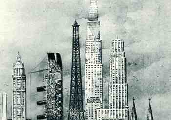
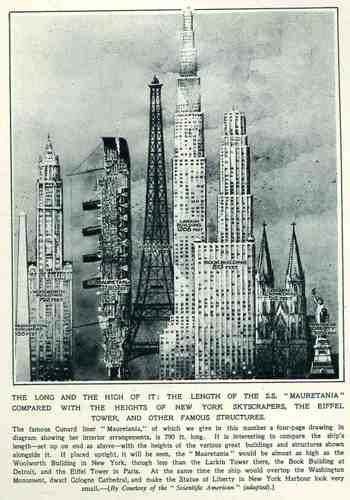
    This wonderful display (appearing in The Illustrated London News for 26 March 1927, page 518) of quantitative data isn’t quite as whimsical as it appears in detail, though I can think of onlyBlog1sept_16_ship_skyline_detail5_2 a few (antiquarian) times that I have seen a ship made part of a cosmopolitan vertical cityscape.  It is a great way of comparing two disparate, out-of-place equals, and certainly can get the idea of the size of something as stand-alone and solitary as a great ship to children (and adults, too) by comparing it to something as obvious as a tall building.,  This time its really just comparing the length of the SS Mauretania with the heights of some famous and notable buildings. (The Mauretania, 1906-1935, was a fabled, luxurious and fast ocean liner of the Cunard line; it was refitted for a resurgent oceanic service at about this time.)   In the larger, expanded second image we see the Mauretania stacked up against (from left to right) the Washington Monument (555′), the Woolworth Building (792′), the Mauretania  (790′), the Eiffel Tower (984′), the Larkin Building (proposed at 1208′), the Book Building (873′), the Koln Cathedral (512′) and the Statue of Liberty (305′).  The Larkin Building (not the F.L. Wright structure of the same name) was a proposed super-tall of 110 floors for 330 W. 42nd Street that was proposed in 1926 and not canceled until 1930, and which would’ve been the tallest building in the world. (For an interesting site on the cancellation of tall buildings, see HERE.)   In any event, this was a big ship–the largest in the world when it was launched as a matter of fact–and the drawing is wonderful.   Upon closer inspection, there is a terrific amount of detail in the cross section of the ship.)     (This original print is available at our blog bookstore.)                                             
    Blog1sept_16_ship_skyline564


  • The Compass of Music

    JF Ptak Science Books  Post 1252

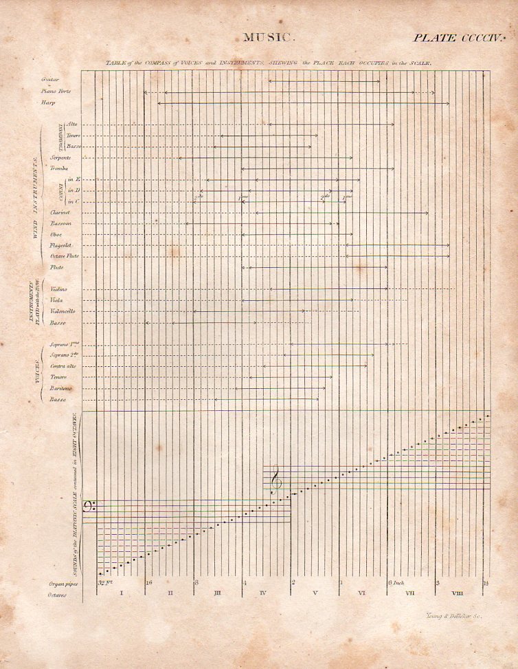
    This engraved plate from Abraham Rees’  Cyclopedia… is the wonderful invention of Alexandre Choron (1771-1834), and appeared (perhaps for the first time in an English press) in London in 1814.  It is a concise and interesting display of the comparisons of the reach of instruments along the eight octaves, and is a very strong example of clear and useful graphical display of quantitative data. 

    Music compass a949
    The full subtitle:  “Table of the Compass of Voices and Instruments, Shewing the Place Each Occupies in the Scale”.  (The original print is also available for purchase through our blog bookstore.)

    From Grove Music Online:

    Choron, Alexandre(-Etienne)

    (b Caen, 21 Oct 1771: d Paris, 29 June 1834). French writer on music, instructor, publisher and composer. While still a boy, he taught himself Hebrew and German and acquired a permanent interest in scientific experiment and a fascination for music theory and the techniques of composition. Although he reached the age of 16 before taking music lessons, he had already attained elementary skill on keyboard and other instruments. He greatly valued a friendship with Grétry which began in his 20th year and which suggests that he moved to Paris after his father’s death.


  • First Photograph of a Smell, Revisited

    JF Ptak Science Books

    It leaves me with such a cozy feeling to not find what I think is an obvious-but-odd phrase in Google.Dsc04716

     And that’s what happened with “the first photograph of a smell” (or “photograph of a smell” or odor, for that matter),  as shocking to the senses as it might be.

    There are long and interesting lists of firsts in photography: the first color photograph (Maxwell, 1867, but impermanent), the first photograph of a human face, the first photograph of the moon, the first photo of a planet, and so on, tirelessly, until we see how many derivations of “firsts” there are. (We can go from first photo of human to first photo of a human face to first photo of a human in motion to the first photo showing human hands to the old human recorded by photography tot eh first photo of a couple to the first photo of a human with a tool and on and on.) There is a shorter list of “first photographic non-photograph of a photograph” (?!) that I wrote about in an earlier (illustrated) post, but we won’t go there today.

    Here is a “first” though that I think hasn’t been dealt with too terribly much: the first photograph of an odor.

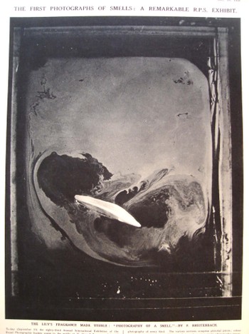
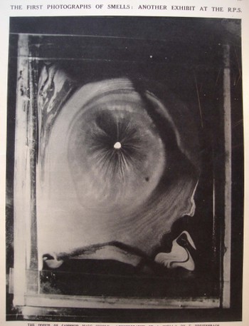
    These beautiful images appeared in the 10 September 1938 issue of The Illustrated London News and were exhibited at the 83rd Annual International Exhibition of the Royal Photographic Society, and were made by H. Devaux (who evidently, according to the snippet of an obituary that I can see from Science magazine, was a plant physiologist and “pioneer of surface physics“Dsc04717
    who died in 1956). The note accompanying the photographs read: “The emission of an odor involves volatillisation of material. If an odiferous material is enclosed in a cell a few millimeters above a clean mercury surface, it is possible to collect on the surface of the mercury a monomolecular layer of the volatillising or odoriferous substance. If the mercury surface initially is covered with talc powder, the gradual formation of the monomolecules layer may be observed as the talc is gradually pushed away from the point immediately below the specimen of material.”

    The photos are that of the odors of a lily and of camphor. I don’t know which is which, and a good story could be made up for either photo belonging to either item. Needless to say, these images are as gorgeous as they are unexpected, especially considering that they were made in 1938.

    {Both images are avaialble for purchase from our blog bookstore.]

    FOOTNOTE:

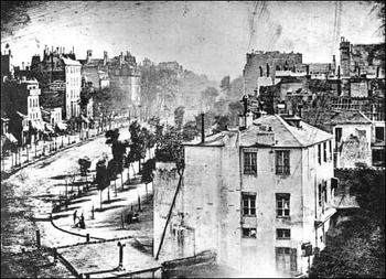
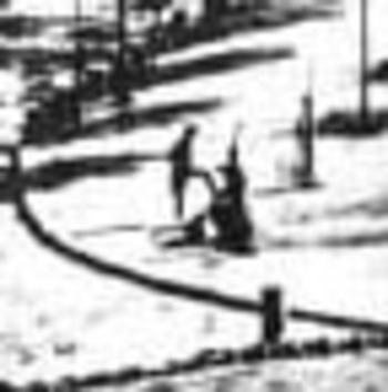
    I’d just like to add here the first photograph of a human being–well, actually, it is the first photograph that just happens to capture a human in the emulsion (discussed Blogoldest_human_photo_2 very nicely on the Doug’s Darkworld  blogsite.  Since the  exposure time was so terribly long for this image to be made, the moving people and horses and carriages on the street, all of the city-life bits, were necessarily spectral, invisible, to the photograph.  Only the stationary items were captured, and the only people captured here were two figures in the foreground, doing something or other that made them still for at least five minutes–long enough for their anonymous but famous photonic impressions to be captured.   Mr. Doug and others seem to think this is a man getting his boots shined–I agree.
    Blogoldest_human_photo_detail


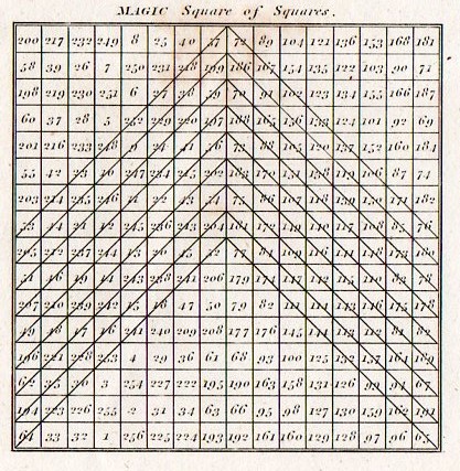
  • Logic Trees, Magic Squares, Magic Circles and Magic Square of Squares

    JF Ptak Science Books LLC  Post 1238

    [Associated posts: The Mother of all Renaissance Logical Graphs, The Knight’s Tour, Porphyry and Boethius and Census Art and the Display of Quantitative Data, 1860.]

    Magic square and circles det sq881
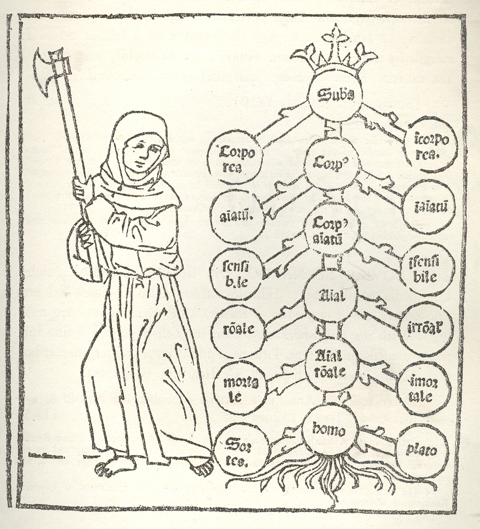
    Well now:  I don’t know what the provocation or inducement is here to hurtle this axe-swinging monk to attack Porphyry’s Tree1, though it would be interesting in a forensic sort of way to know what the tree’s section might reveal. The “tree” was a diagrammatic creation of a 3rd century Syrian mathematician/logician/philosopher named Porphyry who– much taken with Aristotle (and with the Categories in particular)– developed a systematic approach to the organization of thought in diagrammatic form.1--logic tree

    What’s inside a tree of logic and memory?  Is there a  xylem-y/phloem-y stuff besides a three-dimensional representation of the structure of organizational thinking?  Or is the 2-dimensional rip a fatal blow to other dimensions, and like Eddington’s Turtles, it’s a simple slice of Flatland all the way down?  

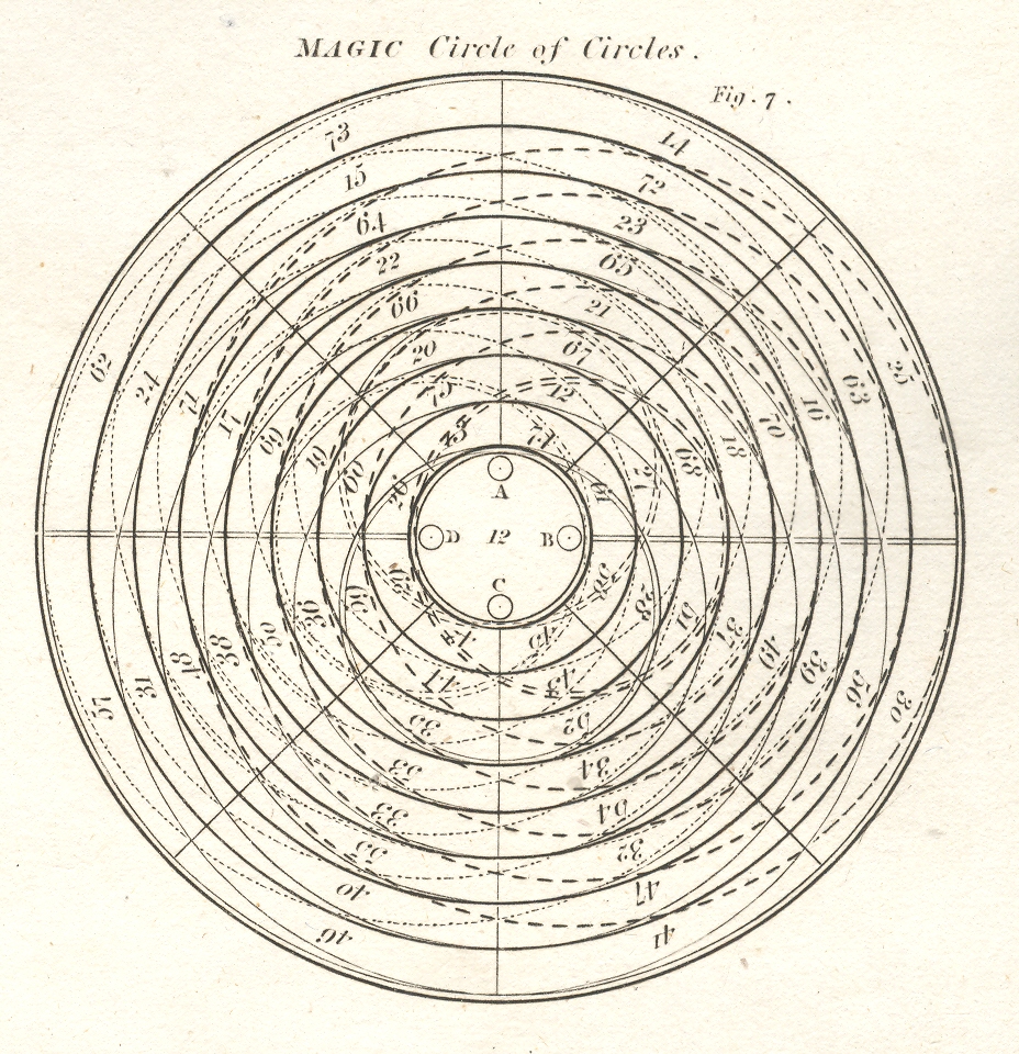
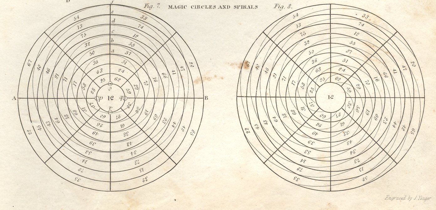
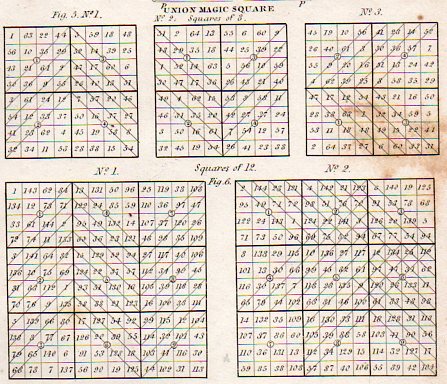
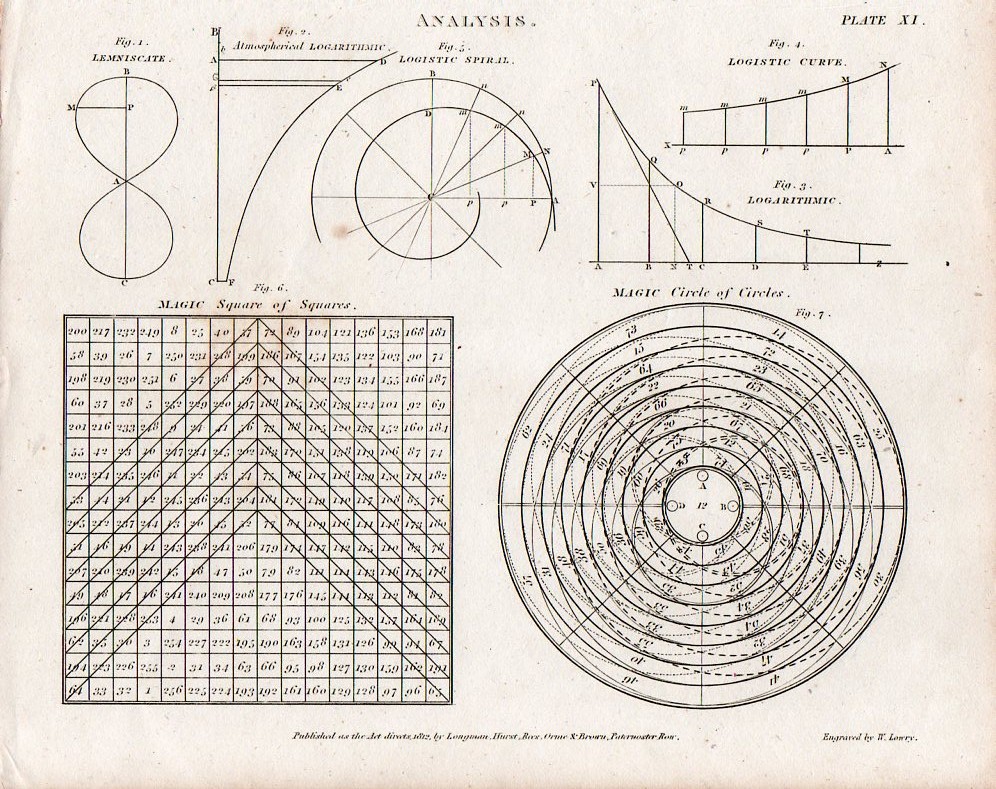
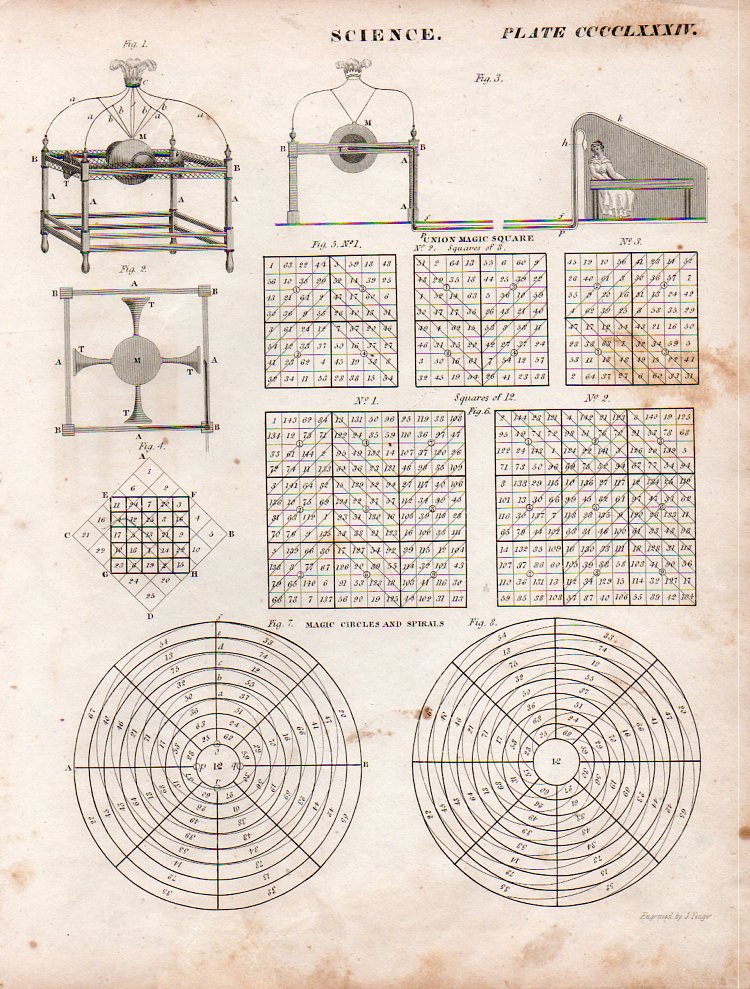
    Perhaps Porphyry’s tree rings would look like this, a magic circle or spiral, which would make some sense, and would bring to bear an associated use of turtles—or tortoises, I should say.  It turns out that perhaps the very first use of the magic circle, rolling back its origins through the Islamic world to India and to Persia and then to Japan,  and then finally to China where, in about 2000 BCE, the magic square appears in an image with the Emperor Yu,  inscribed on the back of a tortoise.

    1--logic tree magic circle 

    1--logic tree magic cricles

    [Magic circle source:  Abraham Rees Encyclopedic Dictionary , printed 1805-1815. The originals are available from our blog bookstore.]

    Magic squarezz and circles det883

    Magic square and circles880
    Magic squarezz and circles882

    Notes:

    1. This image appears in the rare Destructio sive eradicatio totius arboris Porphirii : magni philosophi ac sacrae theologiae doctoris eximii Augustini Anchonitani ordinis fratrum Heremitarum Sancti Augustini, cũ quadã decretali eiusde, published in 1503.


  • Motion and Change in Natural Sculpture–the Galileos of Clouds and Snowflakes

    JF Ptak Ptak Science Books   Post 1235

    Blogcloud_howard It is odd to think among the great classifiers of nature, including even the lofty-namer Aristotle, that clouds were not scientifically classified until the early 19th century.   Here they are, just about the biggest thing we have as earthlings that are gigantic and close to us, and nobody offered a good classifications scheme until 200-odd years ago—a pretty slim margin of time  in the terms of recorded human history. 
    Clouds are of course problematic, what with floating around and all—but if you didn’t already know the relative newness of their recognizable names isn’t it shocking to learn this bit of history? For the most part I think clouds must have been thought as being too transient, changeable, whimsical, wispy, to be given proper names.   The great scientist and classifier Lamarck tried to do so in his  Annuaire Méteorologique of 1802, and really is the first to try this, but his ideas weren’t terribly good (especially compared to the rest of his work), and it seems as though he left his best thinking effort on clouds at home.  For example, he gave us Hazy, dappled, massed, broom-like and grouped clouds as classifications (in French, respectively, en forme de voile, pommelés, attroupés,  en balayeurs and groupés).  They seem quite “French” to me, but largely outside the scope of being useful. 

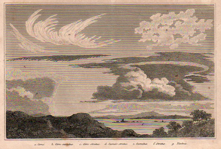
    It was the English pharmacist and chemist Luke Howard who in 1803 gave a greater bit of thought to structuring cloud names, classifying them according to size and shape and giving them Latin names—and this forms the basis of our naming clouds to this day.  Howard was perhaps the first, greatest, meteorologist, producing On the Modification of Clouds, (in which he describes his naming system, the “modification” part actually meaning classifying rather than changing),  The Climate of London, and the first textbook on weather,  Seven Lectures on Meteorology.  Howard’s system was expanded in 1887 by Abercromby and Hildebrandsson, who further classified clouds by height above ground as well as by appearance (and utilizing Howard’s naming system). 

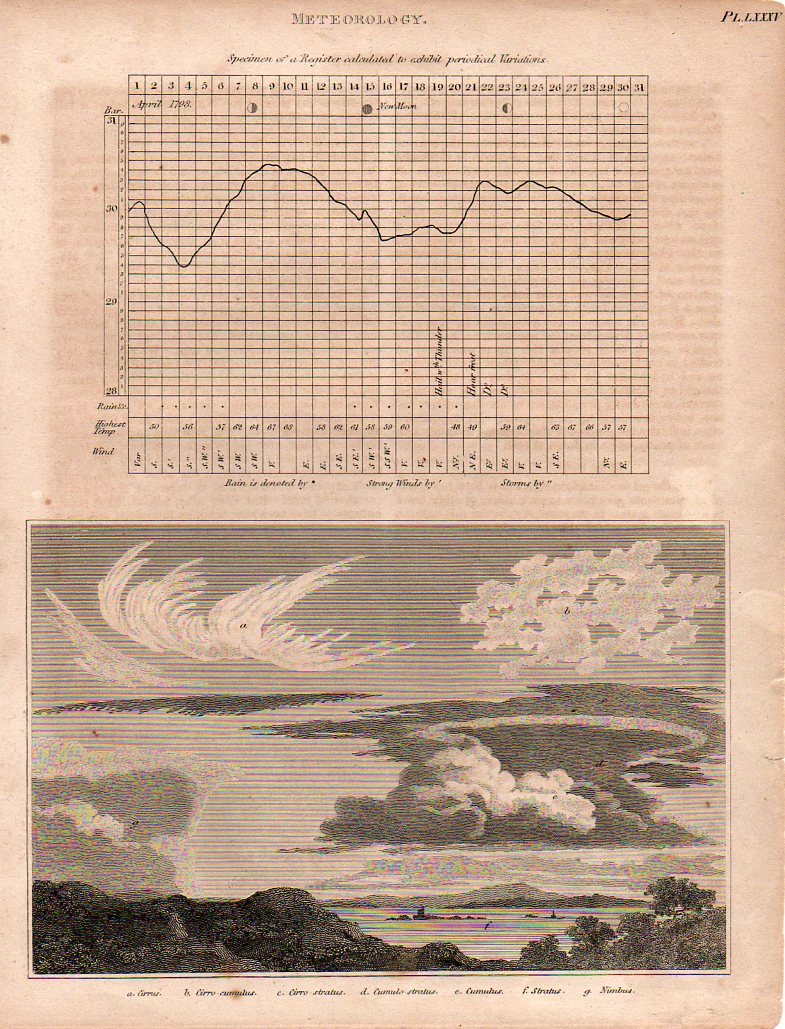
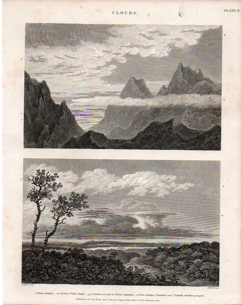
    Here (below) are two fine, early examples of cloud-naming for the scientifically-minded of the British elite, finding their way into print in the fabulous, ingenious and  mammoth (45-volume) Cyclopædia, or The New Cyclopaedia, or, Universal Dictionary of the Arts and Sciences, edited by Abraham Rees (1743-1825).  The work was published between 1802 and 1820, and was the resulting effort of 100 contributors who generally wrote monograph-length entries, contributing to a final tally of close to 40 million words.  I’ve particularly enjoyed the illustrations like those below—some of which have become iconic—and especially the fine and deep engraving of Wilson Lowry.

    {Both of these images below are available for purchase from our blog bookstore, here.]

    Clouds875

    Cloudsb876Howard began his system by identifying three basic shapes to clouds: heaps, layers, and curls.  Heaps of separated cloud  masses with flat bottoms and bulbous, splayed, tops, which he called cumulus, which is Latin for heap; the Latin stratus was applied to clouds in layers which were much wider than they were thick; and again to Latin for cirrus, which called out the wispy curls of clouds.  (Rain clouds were given the Latin nimbus, for rain, and so on.) 

      Cloudsbdet877

    It is interesting and romantic to think of Howard being moved in his love of clouds as many Brits and Europeans were in the Volcanic Year of 1783 by the enormous eruptions of the Eldeyjar (Iceland) and Asama Yama (Japan) volcanoes—the force of their eruptions caused enormous changes in the skies (especially in Europe), creating vast sky-borne tapestries (the “Great Fogg” in England) and for such extended periods of time that it would have beenBlogsnowflake_hooke impossible for the scientifically-minded Howard not to see them. 
    Blogsnowflake_bentley

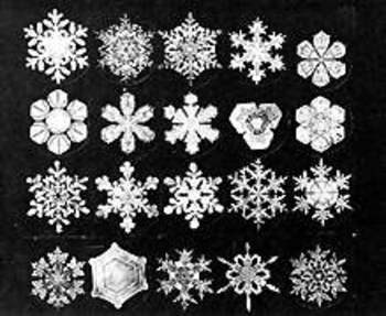
    Similar, in a way, to clouds is the snow crystal (snowflake)—they change forms in their lives from sky to ground, and may well disappear on contact with a warm surface.  Of course unlike clouds they may fall and be captured, kept even, though the ability to actually perform some sort of scientific something with them didn’t occur until 400 years ago, which means that snowflakes passed in and out of human existence being very simply named (in most languages) as a mass group, and not classified at all.

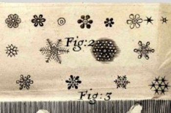
    Johannes Kepler thought very deeply in In 1611 publishing a short treatise called On the Six-Cornered Snowflake, thinking that perhaps their (mistaken) six-cornered symmetry revealed something much deeper about the basis of nature and the universe. The 26-year-old  Robert Hooke seems to be recognized as the first to throw the snowflake under a microscope, publishing drawings of them and just about everything else that he saw in his monumental (and tall, being 13-inches tall) Micrographia (1665)–the first truly scientific book of modern times.  The largest of the large images was saved for the flea, showing the unsuspecting public the great and beautiful nature of what seemed like a fantastical beast (under magnification).  Snowflakes appeared in the book, revealed in their intricate and seemingly-symmetrical nature.  Fantastic, unimagined images. This aside, he seems to have, um, borrowed these images from an earlier work, Thomas Bartholin’s  De Nivus usu Medico Observationes Varieae, 1661.  But so it goes. 
     

    The Galileo of the snowflake was Wilson Bentley (1865-1931), an autodidact Vermont farmer, seen by fellow hamlet-dwellers as odd and off, who figured out how to photographically and beautifully record the intricacies of the snow crystal world—no one had ever done this so dramatically, with such gorgeous results.  It really was as though he was able to record the heights of the mountains of the moon with a slender telescope in Pisa, 350 years earlier. The results of his decades of experience were published  in 1931 his book Snow Crystals, containing more than 2400 snow crystal images.  On the heals of Bentley’s accomplishments came the classically trained nuclear physicist Ukichiro Nakaya, who was truly the first person to apply a scientific classification to snowflakes, and who published his intrepidly-beautiful work in a 1954 book entitled Snow Crystals: Natural and Artificial.  His classification system of the various types of snowflakes would prove vastly more useful, interesting and appealing than that published by the 1951 the International Commission on Snow and Ice, and forms the basis of the discussion of snow crystals today—a classification system of a massively-occurring phenomenon that is younger than me. 


  • WWII Aircraft Cross Sections–the Schematics Work of G.H. Davis

    JF Ptak Science Books  Post 1130

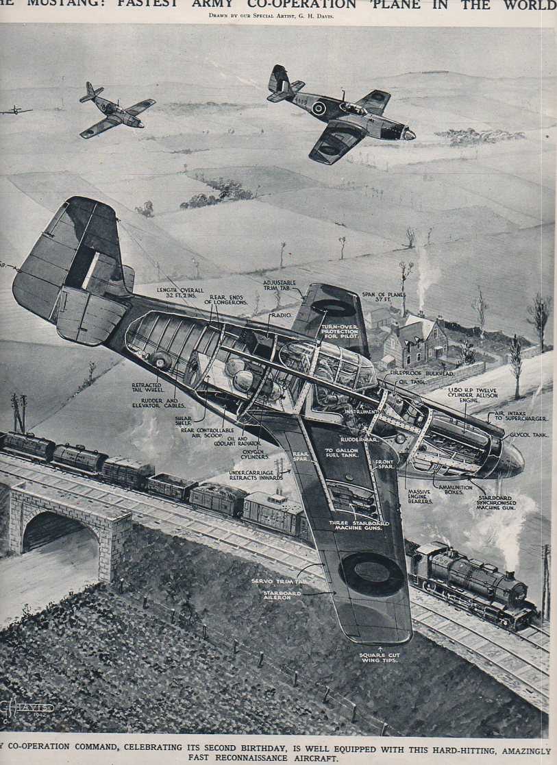
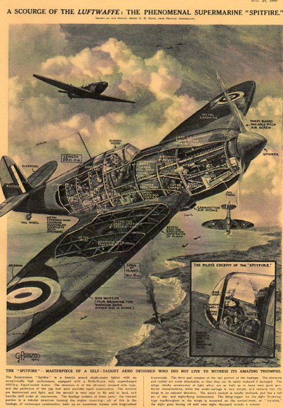
    sI’m sharing some of the collectrion here of the published work of George.H. Davis (1881-1963), the prolific and vastly accomplished artist for The Illustrated London News. His work with that magazine for the forty or so years that I am familiar with is superb, and his great strengths can be found in rendering technical cross sections and infographics.  He had a great sense of design and a very fine hand, and so far as I can tell he displayed an excellent control of his subject, thousands and thousands of times (2,500 times, according to Mr. Davis).

    Here are some fabulous examples of technological cross sections of WWII aircraft by Davis–the drawings are just superb, and you can easily get lost in them, following the geogrpahy of engineering detail from one logical place to the next.

    Blohm u. Voss BV141

    1ebay_sept_24_blohm_voss_141667

    This is the Blohm u. Voss “BV 141″a very unusual-looking aircraft, and it appeared in The Illustrated London News for 23 May 1942, and it gives an excellent view of what the editors called “a lop-sided freak”.  Perhaps the editors of the ILN wanted to educate its readers on the plane since it was supposed to be widely employed on the Russian Front, though it looks like only 38 were ever built (and none survive today). Actually, the plane, designed by Dr. Richard Vogt (1894-1979),  was a high-flying three-seater  surveillance aircraft capable of 220 mph at 17,000 feet, powered by a single 1000 hp Bramo Fafnir 9-cylinder radial engine.  The idea for the design was to give the pilot and co-pilot a very wide field of view–and by this, I’m guessing that the field of view most affected and aided by this would be straight down. The rear gunner also had an enormous field of view. 

    As it turns out Vogt survived the war and spent his Golden Years in the U.S., seven of them (1960-1966) with Boeing to evaluate hydrofoils and vertical liftoff systems:  he had built other odd planes during his career, and carried them with them into near-retirement, making this sort of design his metier.

    “The Mustang–Fastest Army Co-operation in the World“, appearing in The Illustrated London News for 12 December 1942. 

    Aircraft x section-mustang849

     The Spitfire:

    X-Sect  SPitfire507


  • A Paper Mirror and the History of Blank Things–Illusory (Sea) Power

    JF Ptak Science Books  Post 1228

    [This is a part of our History of Blank, Empty and Missing Things series.]

    Mirrors don’t necessarily have to reflect something to show  reflection–they merely need to offer you a picture of something that can show the difference of something real versus a false image of that same thing.  “Through a glass darkly” (1 Corinthians 13:12) isn’t necessarily a reflecting surface though it is a reflective one; neither is the painting in The Picture of Dorian Gray.  Harry Potter’s Erised mirror does act like a mirrorish mirror, and Narcissus does come to a bad and wasted end in front of his pondside reflection (the “perilous mirror”of the Romance of the Rose).  The queen’s mirror in the tale of Sleeping Beauty doesn’t reflect but does give advice, and Alice’s Adventures…  in 1871 begin with wondering what was on the other side of a mirror (“looking-glass”) above her mantel–in a similar vein Kurt Vonnegut introduces a mirror as a “leak” into another dimension rather than a reflection.   Sometimes you get a hand-held thing with glass, and sometimes you just get a piece of paper.

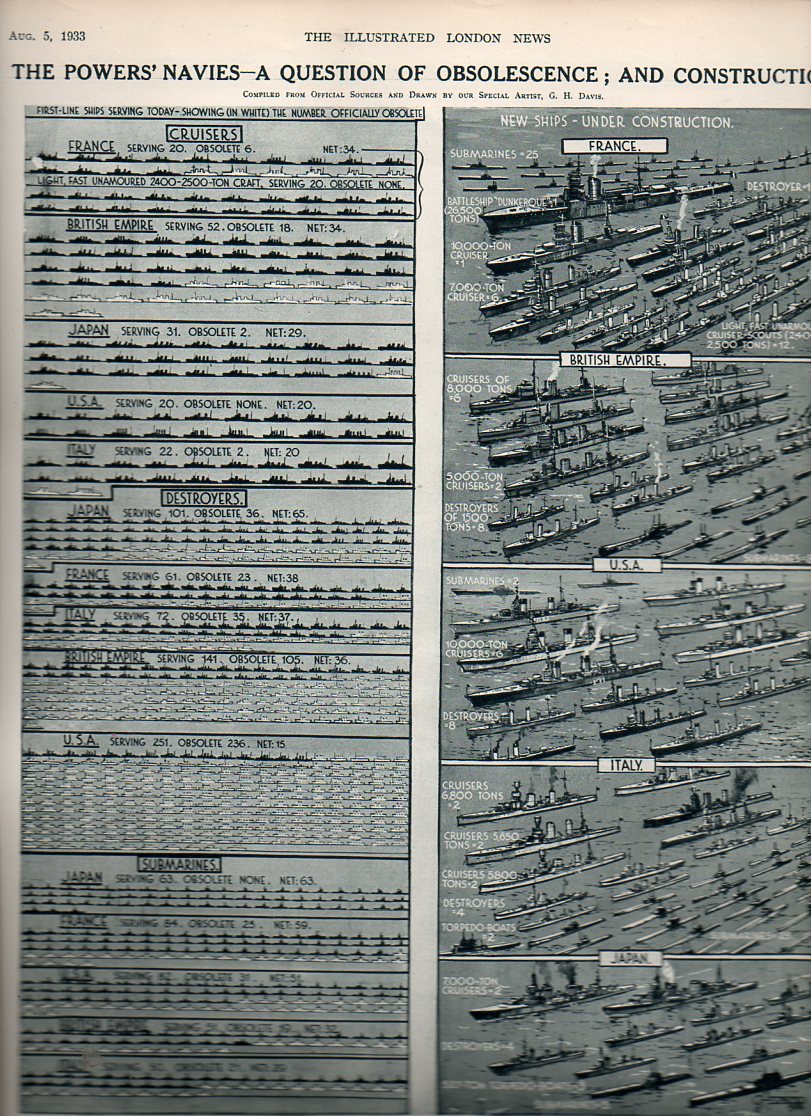
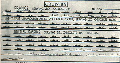
    Navy obsol818 This graphic from The Illustrated London News (5 August 1933, and available for purchase here) is an interesting case in point for a paper mirror.  It is interesting in how it presents a reported state of affairs and its actual condition.  In this case, the artwork shows the supposed/reported strength of the navies of the five major seafaring powers (France, British Empire, Japan, United States and Italy) and what those navies wpuld look like if the outmoded and obsollete ships were removed.  The modern and servicable ships are shown in black silhouette; the numbers of obsolete vessels were shown in white.  The dipiction of blank or empty of missing ships was a very convincing tool depicting the actual state of the major powers’ navies compared to a more romantic means of reporting naval strength. It must have been an excellent wake-up  to thopse with the capacity to see the truth, presented on one piece of paper, a mirror by any other name.

    Navy obsol cruisers819


  • 1 Inch=$370 Million: a Great Height of Graphical Representation of Quantitative Data

    JF Ptak Science Books  Post 1227

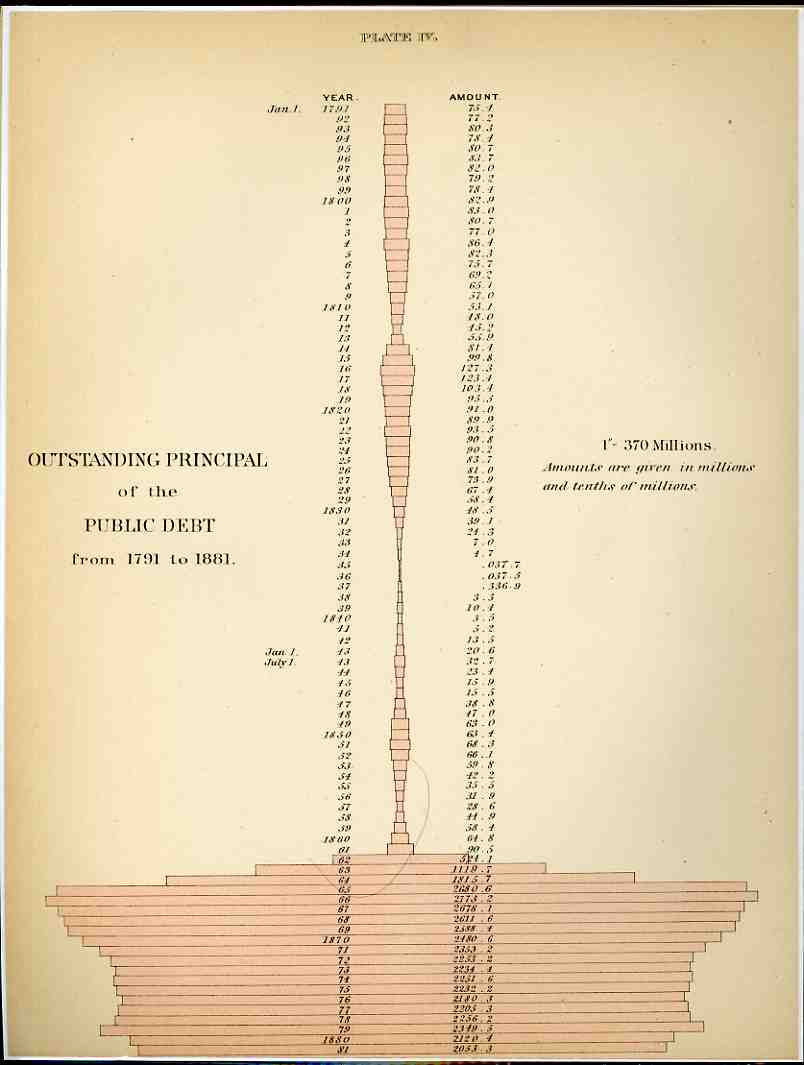
    0 ebay 13 graphs268[Click image to enlarge; both original images are available for purchase from our blog bookstore.]

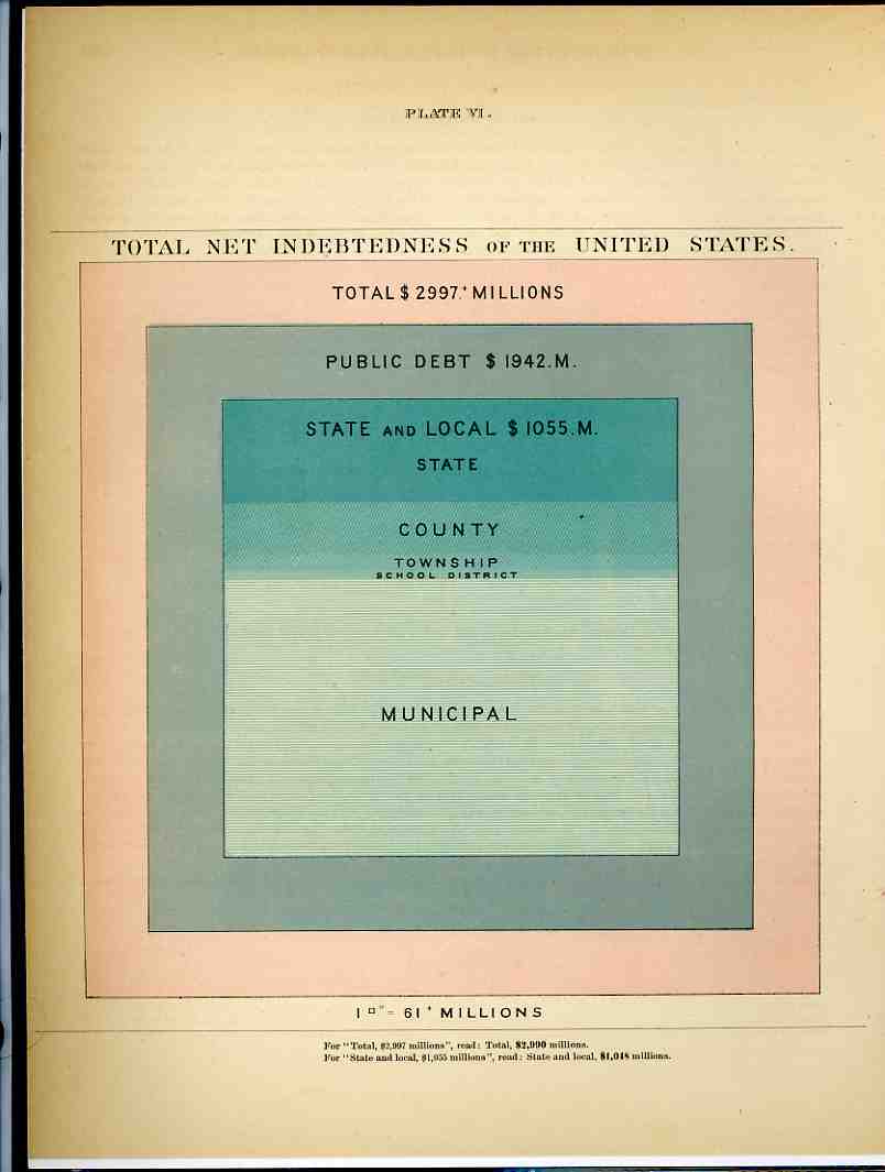
     It isn’t often that you see money represented by dry measure, but that’s what happened here in these two examples from the fantastic Walker Statistical Atlas ( Statistical Atlas of the United States based on the results of the tenth census 1880 with contributions from many eminent men of science and several departments of the government Comp. under the authority of Congress by Francis A. Walker, M. A., superintedent of the tenth census … and published in 1884).  What we see here is a history of American federal indebtedness from 1791 (when the public debt stood at 75.1 million dollars) to 1881 (about 2 billion).  Using the CPI (consumer price index) as a factor to translate that number in 2008 dollars (or so), the 2 bil grows to about $40 billion (a nickel then is about a dollar now). The interesting part of the legend–and what drew me to this graphic even before its somewhat unique shape–state “1”–370 millions”, that is one inch of pink horizontal bar stands for about $370,000,000, and the last bar on this graph is about 6 inches long, which, adjusted for inflation, would now be about 10 feet long. .That said, the really interesting part comes next–if we use this measure to graph a horizontal bar for the American debt as it stands in 2008, it would pink a pink bar that was about a HALF MILE long to express our 10(+) trillion dollars of debt.  OR, somehow, the old debt of 1881 would be about 1 story of a house, while the 2008 version would be up one side of the Empire State Building and down the other (and yes that includes the aerials).  I don’t know how to put this comparison in context, the differences are so staggering. 

    0 ebay 13 graphs269
    After having popped a neuron or two trying to get my head around that one, we’ll further confuse the situation with the second chart, which shows the total net indebtedness of the U.S. in 1881 in terms of square inches; or, at the bottom of it all, a 7×7 inch square represented the entirety of the $3 billion owed out.  49 square inches. Working backwards this time, our $10 trillion (or $10,000,000,000,000.00 writ large) adjusted back to a CPI value in 1881 would have covered about 88 PAGES of the atlas or 9,000 square inches.  Again, the numbers are just almost too big to mean anything. 

    We, as a country, owe one hell of a lot of money.

    And yes there are many different ways of trying to figure out what one 1881 dollar “means” in terms of 2008, but the CPI is the most simple to use and least argumentative and at least gives a pretty good idea of scale.  It would be more useful to try and establish the degree of difficulty  of turning the corner on the debt in 1881 compared to doing that today, but this is just a late-night post at the end of the week, and I don’t have a good clue about how to try and measure that bit simply.


  • Strange Things in the Sky Department: Aircraft, 1919

    JF Ptak Science Books   Post 1222

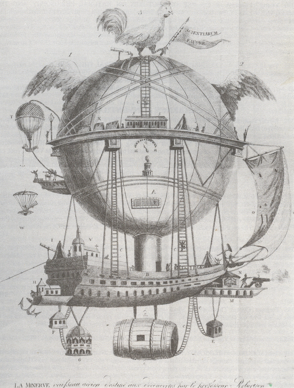
    Blog--May 20--minerveA

    I’ve written earlier in this blog about odd things found in the sky, some of which is imagined  (holes, extra Earths, blank Heavens, disembodied hands/feet/eyes/ears,proto-human empty aliens,  rat) and some of which were/are possibily real (like this fabulous aircraft with an escape pod for women, located here). [Both of these images are available from our blog bookstore, here.]

    These images present incredible, indelible ideas to us here in 2010, images of creations that look more like created steampunk for a retro-futurist novel than something real.  But they were actually state-of-the-art techno advances for their times, decent ideas, solutions for knotty problems that had no better answers than those presented. 

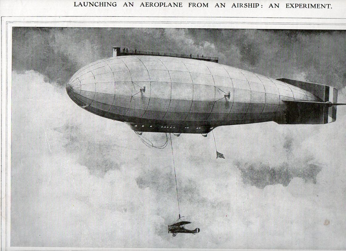
    Strange sky--launch plane839

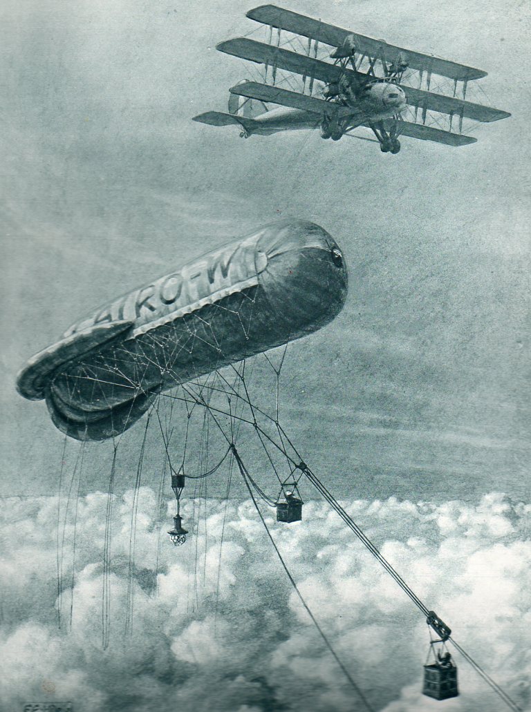
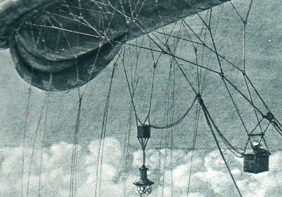
    The first is “The Clapham Junction of the Air, a Cloudland Signal-box”, seen in The Illustrated London News for 15 March 1919.  The idea was simple–cloud cover prevented aircraft from seeing their objective (lacking RADAR, which wouldn’t appear for another 23 years) and so something needed to be done to communicate with them above the clouds to relay data on ground conditions.  And so we have the tethered kite balloon with a mobile travelling car, the man in which would relate the necressary info to the waiting aricraft above.  (The description of the image notes that the aircraft is “one of a coming type”.)

    Strange sky--launch plane crowd det840

    Strange sky--launch plane det841

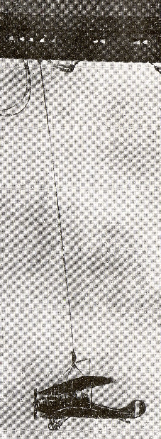
    The second image appears in The Illustrated London News for 1 March 1919 and is entitled “Launching an Aeroplane from an Airship, an Experiment”, and shows a helium-filled airship (“of the near future”) about to drop an aircraft.  The airship would have risen to some height with the aircraft already at tether, travelled a distance far beyond the normal range of the airplane-in-tow, and then release it–after a fall of a thousnad feet or so, the engines would start, and the plane would be operational.  that was one way of advancing air cover far beyond what woul dhave normally been feasible. 

    The set of problems encountered here woul de remedied in relatively short order, say with a few years of the publication of these pictures–but for teh time being, in 1919, this was the best that could be offered. 

    Strange sky--lmessages842
    Strange sky--lmessages det843