A Daily History of Holes, Dots, Lines, Science, History, Math, Physics, Art, the Unintentional Absurd, Architecture, Maps, Data Visualization, Blank and Missing Things, and so on. |1.6 million words, 7500 images, 4.9 million hits| Press & appearances in The Times, Le Figaro, Mensa, The Economist, The Guardian, Discovery News, Slate, Le Monde, Sci American Blogs, Le Pont, and many other places… 5000+ total posts since 2008.

Category: Information, Quantitative Display of

  • Found: Children’s Advice for Life, 1825

    JF Ptak Science Books   Post 1383

    Manuscript Vanity det151

    Manuscript Vanity det148

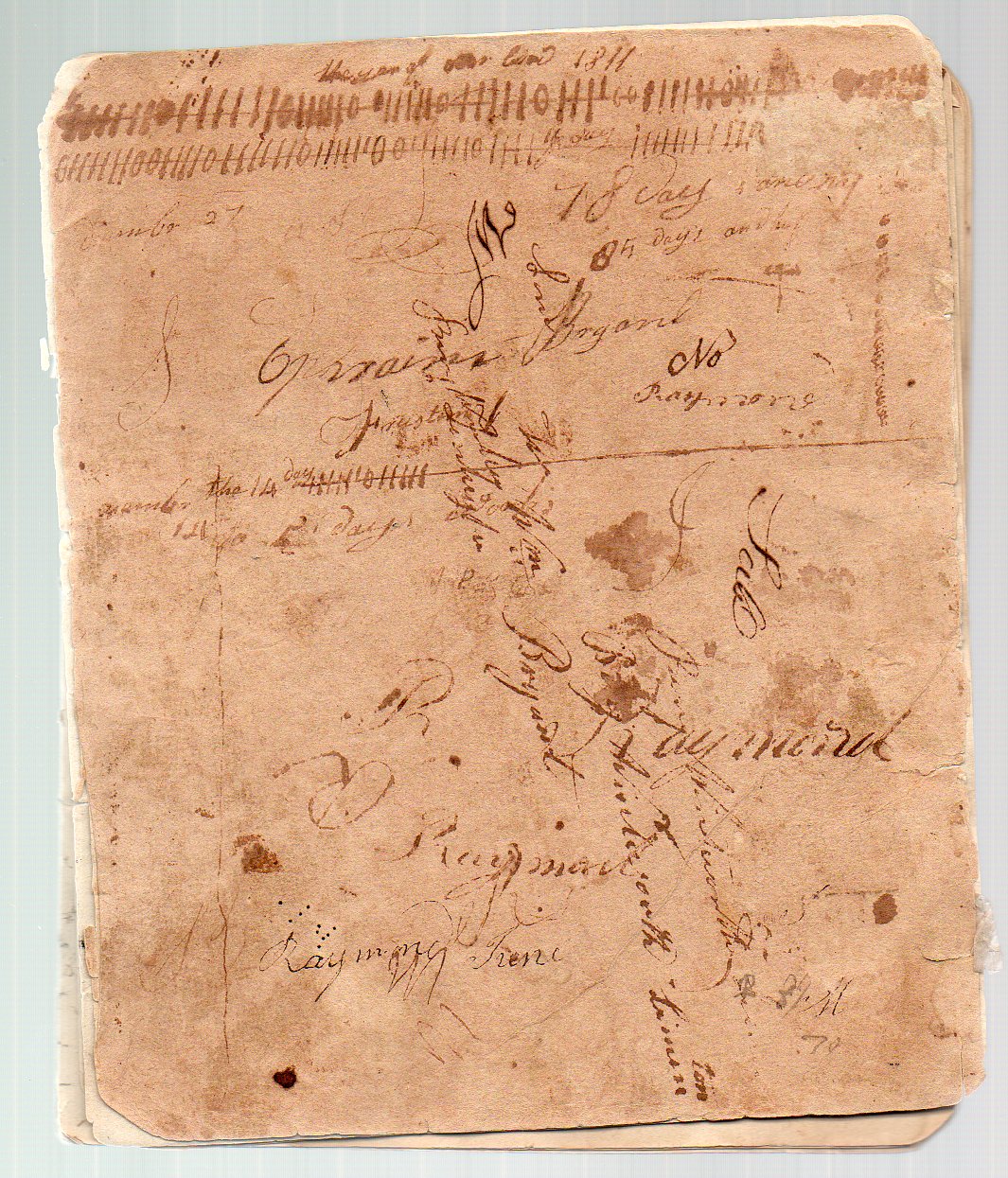
    I have a small collection of 18th and 19th century notebooks–ciphering books, tally books, keepsakes–kept by children and young adults.  These books are remarkable for their contents, empty scratchbooks filled with whatever was necessary, whatever was important, whatever was trivial.  There are notes about who-owes-what, provisions purchased, goods borrowed; mathematics problems, poesie, miniature observations, memorized bits.  Signatures made over and over again, looking exactly like what children do nowadays, practicing writing their names, perfecting a signature, identifying themselves to themselves in private.  These notebooks are far less formal say than a diary–they caught all sorts of ephemera of the day, stray information, all manner of stray bits. (This notebook is also available from our blog bookstore, here.)

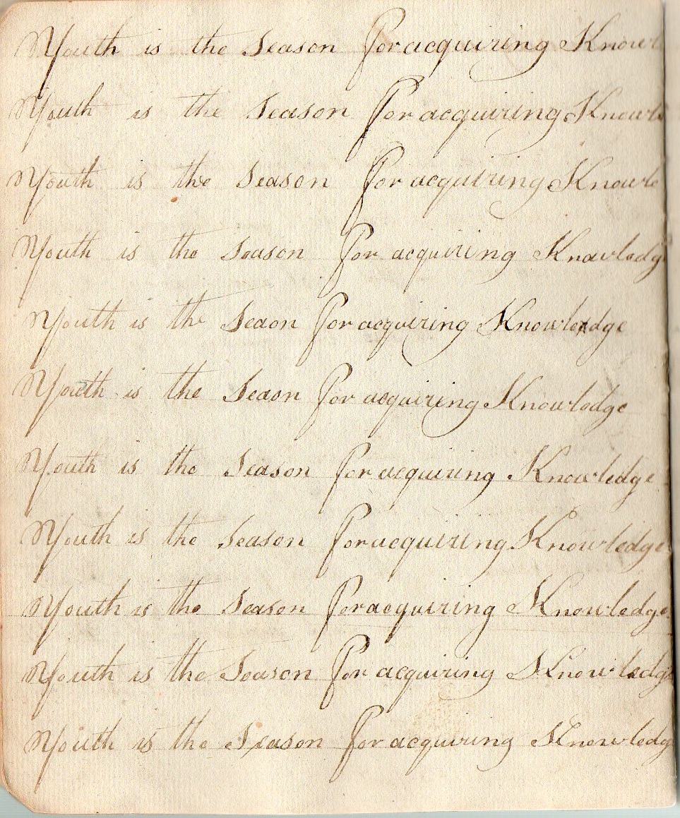
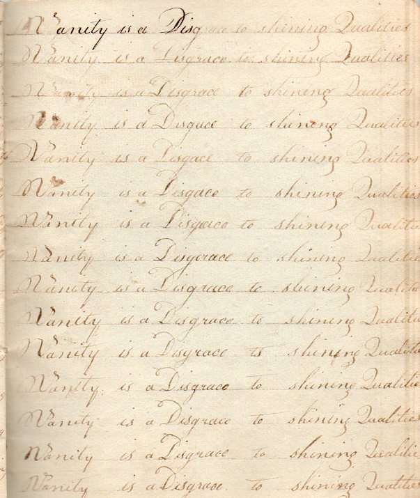
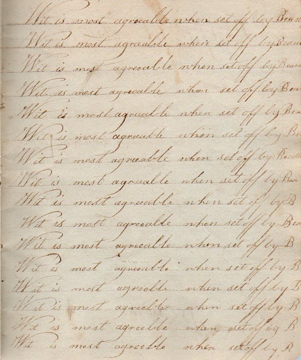
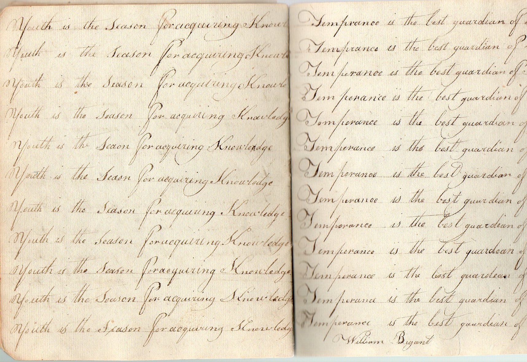
    In this notebook, used between 1811 and 1836, there are also repeated personal lessons and life’s aphorisms, generally one page each, written over and over,  practicing penmanship by repeating the advice, 

    “Youth is the season  for acquiring knowledge” and “Temperance is the last guardian of health”:

    Manuscript Vanity det149
    Manuscript Vanity det150

    I find it remarkable that this small item–about 8×5 inches, and having no more than 30 pages–survived in somewhat haphazard and occasionally directed use for more than 25 years.  Then again, paper wasn’t all that terribly common among the working poor in the United States at this time, so it is very understandable that this notebook would’ve been kept, and carefully so, as an important household object–and possibly a significant family-history document.  For those of us today this looks like disposable information, ephemeral knowledge–evidence would say that this was definitely not the case when this book was still being used. 

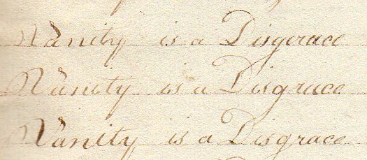
    “Vanity is a Disgrace to shining Qualities”:

    Manuscript Vanity147

    “Wit is most agreeable when set off by beauty”:

    Manuscript WIT146

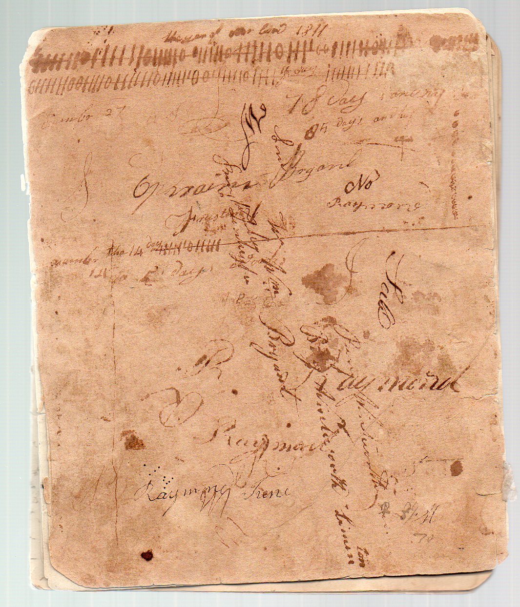
    And the cover:, which is a curious thing, as someone kept track of “days” on a number of occasions here, not the least of which ran across the top of the book:
    Manuscript Vanity det151

    The record of items purchased, of money charged for labor, allows us a peep into the daily working life during the first part of the 19th century:

    Purchases made included 2 pounds of butter (15 cents), six pounds and a half of veal ($2.00), a gallon of molasses (30 cents), “half a berril of flower” (3 dollars), a pound of wool (12 cents), plus pork, potatoes, tea, salt, corn, rye

    The labor is also of interest:  renting the services of two yoke of oxen for one day seems to have cost one dollar, “tapping in a pair of boots” (30 cents), “one day’s work on shaving hoops” (50 cents), and then many entries for “one days work a planting” and “a mowing” which seems to have been 50 cents; “hauling wood one day” was also 50 cents.  It seems as though you could exchange a day’s labor for two pounds of butter, a pound of wool, and two pounds of potatoes–at hose rates, I suspect that these people would’ve considered the veal to be a luxury meal. 


  • Engineering Art: Cross Sections of the HMS Olympic (1909) and Mauretania (1906)

    JF Ptak Science Books  Post 1382

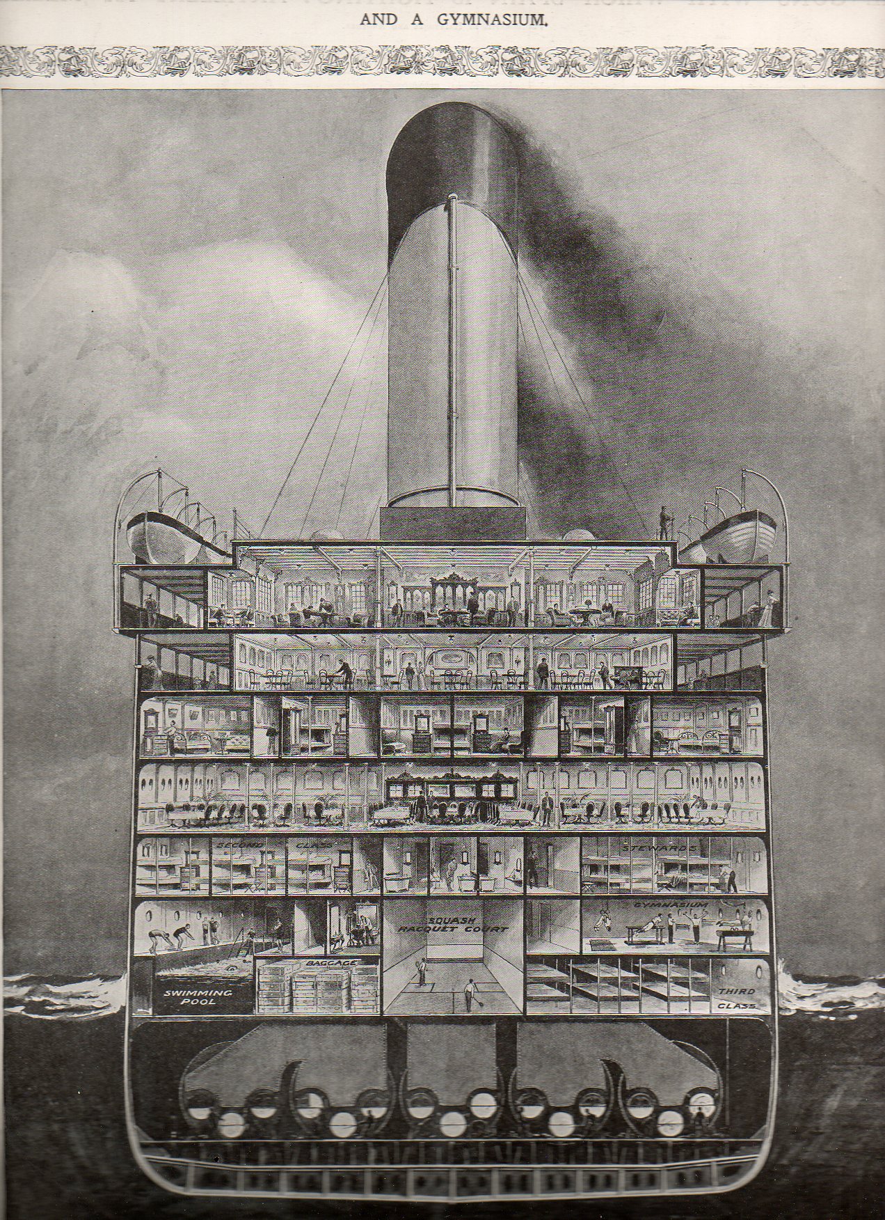
    “...And a Gymnasium.”

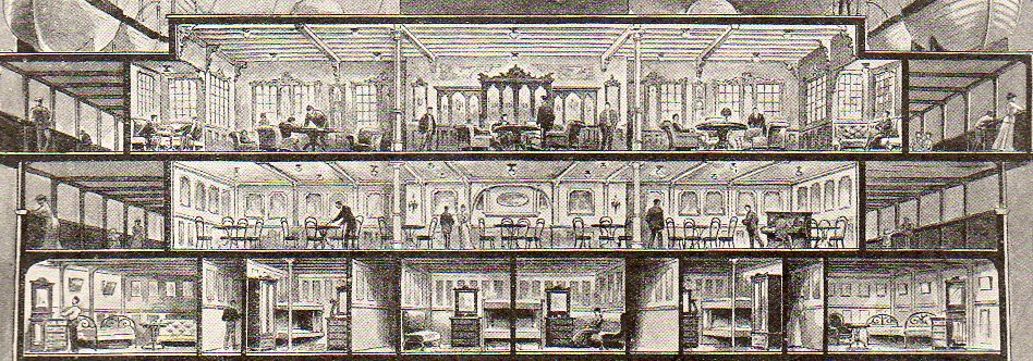
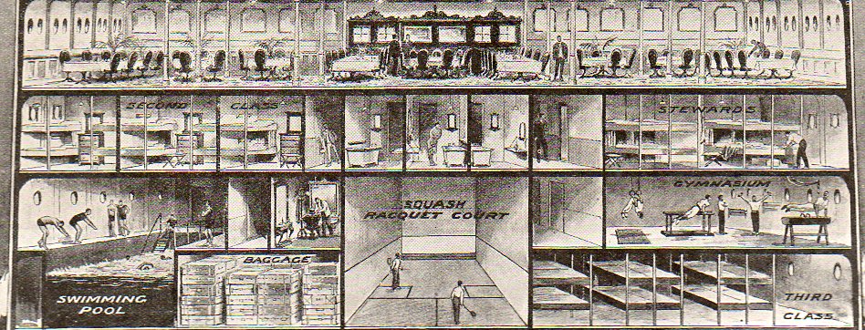
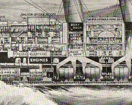
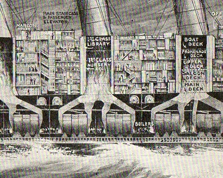
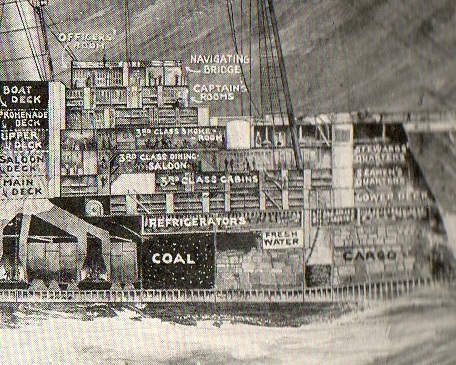
    Resting comfortably in-between this blog’s Cross Sections and Looking-At-Things-Straight-On series is this straight-on cross section of the midship section of the HMS Olympic.

    Cross-sectionship131
    This cross section appeared in the 14 August 1909 issue of The Illustrated London News, just six months or so after she was laid down. The Olympic was finished in 1911 and sailed through until 1935, a considerably much-longer career than her two sister ships, the Titanic and the Britannic.  The Titanic of course was launched in 1911 and went down on 12 April 1912; the Britannic lasted a little longer, though this ship never really had much of a career, launched just before the beginning of WWI and then used immediately as a hospital ship, striking and being sunk by a mine in 1916.  The three ships were beasts, about 882 feet long and about 53,000 tons displacement. The viewer certainly gets a good idea of the scope of the ship from this image.   [The original image of the Olympic and also of the Mauretania are available for purchase from our blog bookstore.]

    Cross-sectionship132
    Cross-sectionship133

    Third class looks pretty rustic, a no-bones approach to ocean travel, stuffed into the space next to the squash courts and under the gym. 

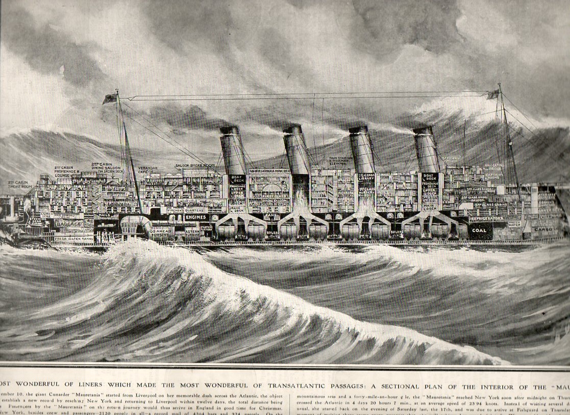
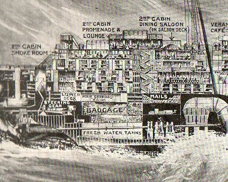
    Next comes the HMS Mauretania, again form The Illustrated London News right at the time of its record-setting speed attempt to cross the Atlantic in November 1907.  The ship was long (almost 800 feet) and about the fastest ocean-going ship in the world,. crossing and re-crossing the Atlantic in 12 days.

    Cross section mauretannia137

    Cross section mauretannia138
      Cross section mauretannia139
    Cross section mauretannia140

    Cross section mauretannia141


  • Using Children and Shoes as Metaphors for Naval Strength-the Display of Quantitative Information Series.

    JF Ptak Science Books  Post 1380

    Display Qunat Data126
    It is a hallmark in displaying ideas and information that brevity, design and clarity carry the day.  For this reason we have the Pie Chart (happily invented by a very ingenious and polymathic idea-experimenter in the form of William Playfair in 18011), and not the Enormous Cake Chart, which had been baked previously for hundreds of years in the ovens of Raymond Lull2 (and those he influenced) and then to a lesser degree by Giordano Bruno. The entwined, overlapping combinatorial diagrams that were initiated by these folks didn’t really start to get straightened out until the ideas were in the hands of Leibniz and Euler, and then prettily and usefully, finally, by Playfair.  It was through the 19th century that the pie chart began it great ascent in the hands of Guerry and Lalanne and Nigthengale, and then on to Jevons, and then on into modernity.  But the thing that made these contributions significant was the amount of information they were able to easily and cogently display.

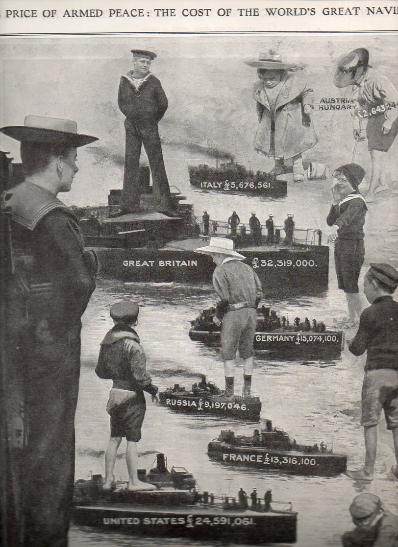
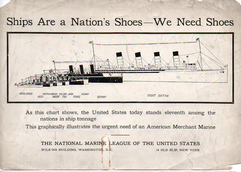
    The pie chart could definitely have been used in these two displays, below–the information was certainly simple enough, and the comparisons easy.  But there was a certain genius to displaying the data using children and shoes that enabled the information to ride along with its viewer deeper into the future than if it had simply been encrusted in circles.

    DIsplay QUnat Data127

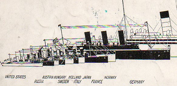
    For example, in the first image, a full-page illustration from The Illustrated London News for 21 August 1909, “The Price of Armed Peace, the Cost of the World’s Great Navies”, displays the size of expenditure on leading navies in terms of children’s toy boats.  I am positive that the lasting image here would’ve been the size of the German toy gunboat compared to the dreadnaught of Great Britain.  Likewise the ships/shoes comparison of the next image, published by the National Marine League of the United States,  a sort of PAC for the merchant marine.  They simply state that ships are the nation’s shoes, then interlace a graphic showing the paltry showing of American ship tonnage compared to 10 other leading maritime nations, and then simply state that “we need shoes”.  The graphical display shows vividly that the United States’ total ship tonnage was tiny–eleventh of eleven powers–but the bit that would no doubt stay in the heads of any readers was the shoe part, which would then be associated with the diagram, which on the face of it was a little muddled and not clear.  This was a smart sales job, delivering a brisk message that would not be befuddled by numbers–it wasn’t that the U.S. ranked 11th in total maritime tonnage against other leading powers, it was that we needed shoes. 

    DIsplay QUnat Data129


    Notes

    1.  Playfair wrote his Statistical Breviary in London in 1801. 

    2.  For example in his logic machines as seen in the Ars Magna.


  • A Note on Teaching Math, Unexpected Art, and Picturing Things Differently

    JF Ptak Science Books   Post  1427
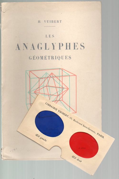
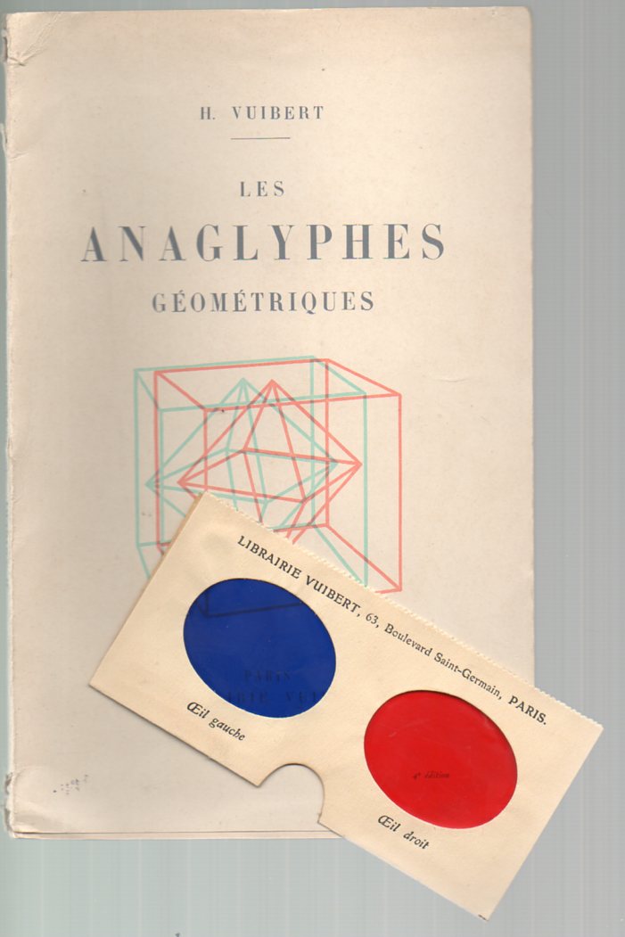
    Vuibert308 Stereo viewing geometrical figures may or may not be useful–I find it a little off-putting, creating a slight dizzying effect, though I’m sure it helps others (particularly children?) see complex geometrical figures a little more easily., especially when it comes to crystalography images. Education was certainly what Henry Vuibert , the author of Les Anaglyphes Geometriques had in mind when he published the work in 1912.  He had a long history in mathematics education, having founded the firm that bears his name back in 1877, a publishing house specializing in school texts in the maths, physics and general sciences.  (We offer the book for purchase at out blog bookstore.)

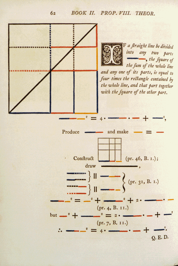
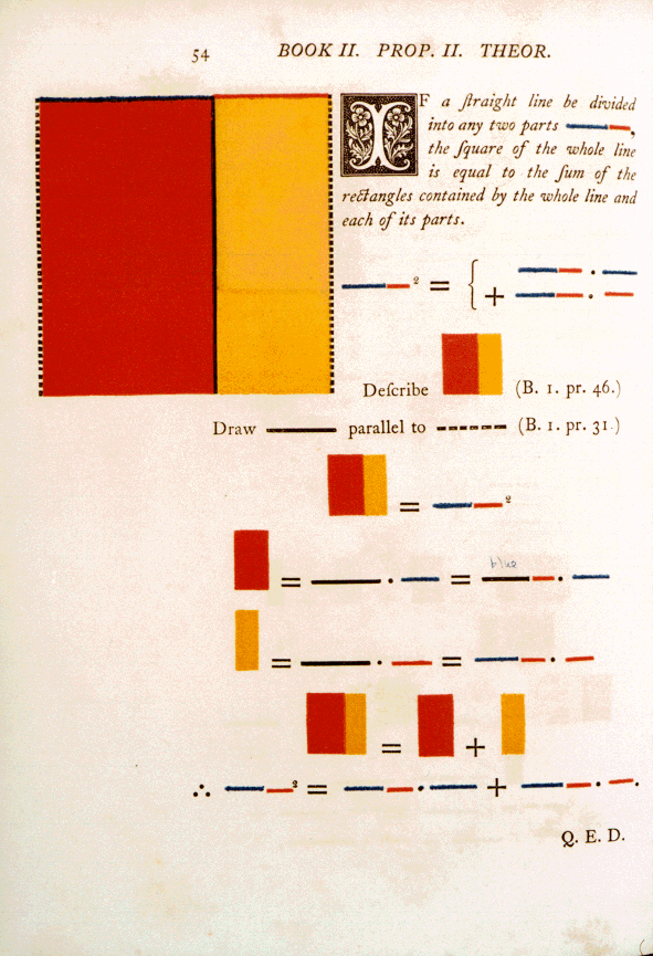
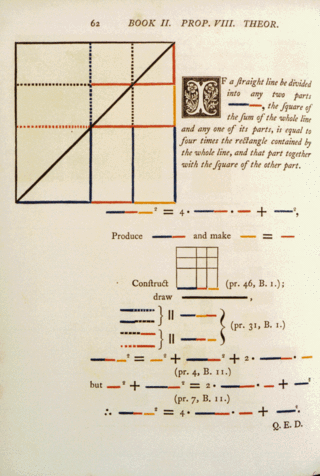
    Vuibert’s book is a very early example of the use of the anaglyphe–examples of the use of the method go back to the 1850’s, when d’Almeida used a version of the idea to punctuate lectures using a magic lantern; the (printing) process of the anaglyphe wasn’t patented until the 1890’s by L.D. DuHaron.  It does confuse me or remind me quite a bit of Oliver Byrne’s beautiful monster The First Six Books of Euclid in which coloured diagrams and symbols are used instead of letters for the greater ease of readers… printed at the Chiswick Press by C. Whittingham for William Pickering in 1847.  The book is, well, unusual and probably not at all usefu11.  Bryne replaced all of the algebraic notation, identifying letters and almost all of the descriptive text with color and color codes, leaving Euclid mysterious, hidden, awkward, impervious, and, yes, beautiful2. As a matter of opinion this work presages the cubists (and especially Piet Mondrian) by 60 years, and all by accident artwork. 
    Byrnes 11.8


    There are certainly much earlier works that tried to get at a fuller representation of geometrical objects, not the least of which was a 16th century Elements of Euclid in which the figures were cut-out paper, pasted into the book and attached to a string so that the reader could pull out the illustration and see it displayed in three dimensions. The elements of geometrie of the most auncient philosopher Euclide of Megara. Faithfully (now first translated into the Englishe toung…3, printed in London in 1570, was no doubt a great and exasperating labor of love, a complex “pop-up” book accomplished with sixteenth century technology.  (The photo below shows the Smithsonian Institution’s copy.)

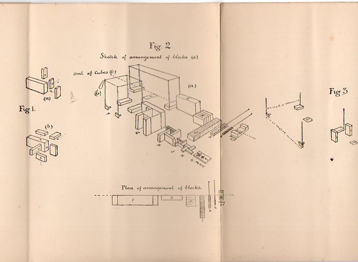
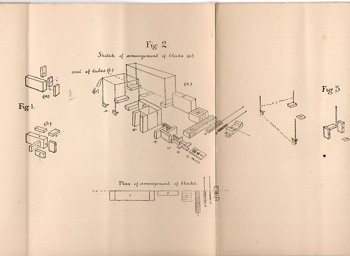
    Of course there’s the very old fashioned way of representing mathematical concepts, and that’s with sticks and stones and blocks and such.  For visceral memory and practical applications, the idea is hard to beat, unless of course, you really beat it , which is difficult to do.  But to me that’s just what Major G. Mackinlay did in his Realistic Arithmetic,  for Teaching Children the Elements of Arithmetic by Means of Special Blocks4, published in London in 1900–his ideas for the use of blocks was very sound and stable; his instructions (and in particular his illustrations) for what to do with the blocks was not.  I am reminded of inscrutable, badly translated and designed instructional manuals for tech stuff that need a manual for the manual. 

    Here’s one of the folding plates describing how to assemble the blocks:
    Math blockis309

    Then there are other sorts of wooden (and etc.) three-dimensional models, such as the (600+) gorgeous geometric designs housed in the Institute Henri Poincare, transferred there from the laboratory of geometry of the Faculty of Sciences of the University of Paris in 19285.  Most of these models were constructed around the time of vast change in mathematics and art (1900-1920), which means that many of them predate the revolutionary ascensions of  Cubism and non-representational art.

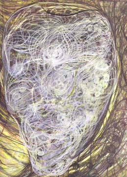
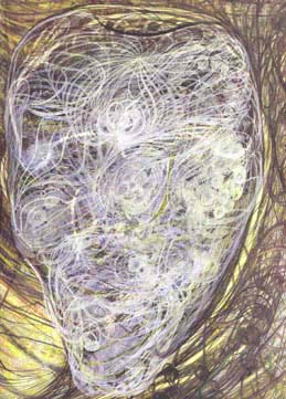
    And as long as were at the point of unintentional and under-recogniozed epochal works, I think that there is a broad book that could be done on exactly this topic, calling into play such examples as Georgina Houghton, Victor Higo, Emily Vanderpoel, and many others. 

    Georgina Houghton, for example, produced this non-representational painting in 1870 (or thereabouts):
    Georgiana

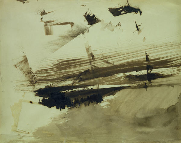
     And Victor Hugo, from the 1860’s

    Evocation of an island Painting  - Evocation of an island Fine Art Print

    And Emily Vanderpoel (1900 or so):

    Art-vanderpoel186
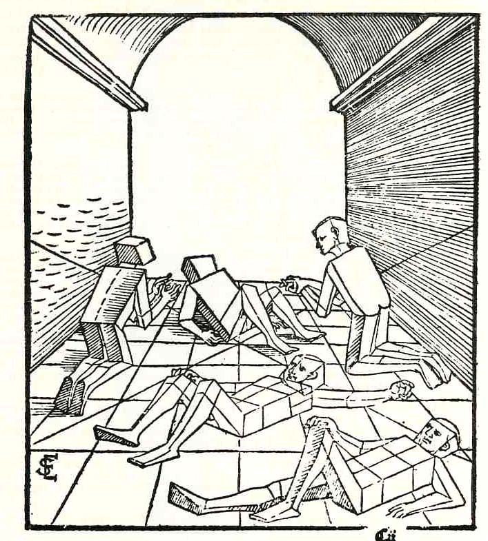
    In another, much earlier case of removing detail and adding abstraction for the sake of simplicity in representing an idea,  Erhard Schoen, in his Unnderweissung der proportzion und stellung der posssen liegent und dtehent, printed in Nurenberg  in 1538, presented these cubed figures (below).  He used simplified geometric form to stand in for the curvy humans, replacing them with proportional stacks of boxes which would more easily explain to the younger reader how to represent the human body in space and in proportion to other things. 
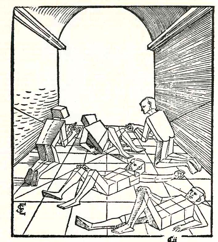
    Schoen

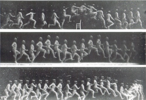
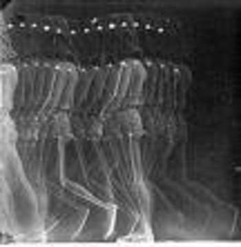
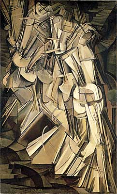
    I think that these were monumentally combative images showing humans in a radical, previously unknown way, much like the moving-through-space-and-time photographs of the somewhat forgotten Etienne Marey, who in the 1870’s created what was essentially the world’s first “slow motion” device. One iteration of Marey’s apparatus was basically a long series of ganged cameras recording a motion for a Marey12 simple task at a given time frame and presented on a continuous strip of photographic paper, sort of like a motion picture with the camera speed set at three frames per second. The resulting images were phenomenal and showed people for the first time the exactness of all manners of simple motions–motions that no longer looked so “simple” once all of its aspects could be studied from captured photographic evidence.  Even the act of hopping over a small stool or bending to pick up a bucket of water were enormously revealing in a way like Robert Hooke’s Micrographia displayed the great detail and complexity of the seemingly simple fly.  Perhaps the most famous of Marey’s series of images was that of a galloping horse, which also for the first time revealed what exactly the horse’s legs were doing and proving that almost every painter in the history of art represented the galloping horse incorrectly.  His series of photographs (as in this sample below) show a fairly close fit to the work of the futurists (like for example Duchamp) who would come into being after another four decades. 
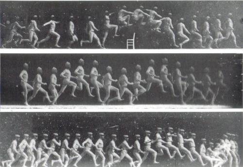
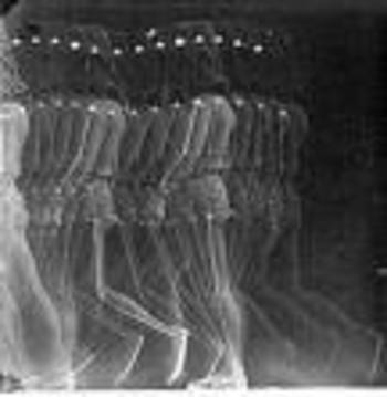
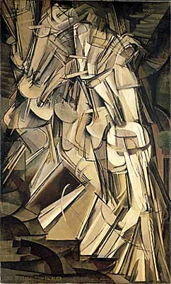
    Marey  And Duchamp’s Nude Descending (1912):

    Duchamp


    I do want to make it clear that this is just a simple note, a thinking-out-loud piece on how attempts to visualize things differently for the sake of explanation or education can come “unintentionally” close to what would become epochal works.  More later.

    Notes

    1. Augustus De Morgan, mathematician and logician, wrote a very highly critical book A Budget of Paradoxes in which he describes hubbub, fakirs, frauds, perpetual motion machines, squaring the circle efforts, millstones and other useless books in the maths, and in here he sniffily dismisses Byrne’s work. At best, to De Morgan, the Byrne book is “curious”. But useless and curious, as I have seen many thousands of times, does not mean that it can’t be attractive and beautiful, and the Byrne book is probably the leading candidate in the Bad & Beautiful category.

    2. In his Victorian Book Design McLean calls the Byrne book “…one of the oddest and most beautiful books of the whole century…a decided complication of Euclid, but a triumph for Charles Whittingham [the printer]”.

    3.  This is also the first appearance of Euclid in English.  The full title: The Elements of geometrie of the most auncient philosopher Euclide of Megara faithfully (now first) translated into the Englishe toung by H. Billingsley, citizen of London; whereunto are annexed certaine scholies, annotations, and inventions, of the best mathematiciens, both of time past and in this our age; with a very fruitfull praeface made by M.I. Dee, specifying the chief mathematicall scieces, what they are, and whereunto commodious; where, also are disclosed certaine new secrets mathematicall and mechanicall, untill these our daies, greatly missed. London, Imprinted by I. Daye, 1570.

    4.  From the Report of the Annual Meeting of the British Association for the Advancement of Science, 1906:


    5.  From the IHP website:  “Most of the models  were created by Martin Schilling in Leipzig between 1900 and 1920 and  a few of them  (in wood)  were made between 1912 and 1915 by J. Caron, Professor of Descriptive Geometry in charge of  the “graphic work” course at the ENS at the beginning of the century (between 1912 and 1915).”

    Also this:   “In the thirties, the surrealists, led by Max Ernst, were interested in these geometric objects. André Breton alludes to them in  “Crise de l’objet” , an article  in the magazine  Cahiers d’Art (May 1936, No. 1-2, p. 21-26.). Man Ray took photographs of the models, which where published in same issue. He would later use them to compose what he called  “Shakespearean Equations”. Many artists, painters, architects and sculptors drew inspiration from them.”
  • Technical Drawing: an Early, Convict-Powered, Revolving Turret Ship

    JF Ptak Science Books   Post 1364

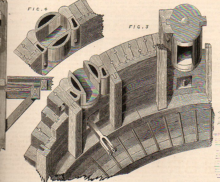
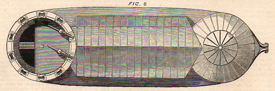
    Technical drwg--revovl turret circular540

    This image (from the The Engineer for 30 October 1874) shows a plan of the top floor of a revolving battery designed by M. Baltard in 1831 (and which is available at our blog bookstore).  This idea is probably ancient, though it really only had major technological legs by the 19th century. Even though Baltard is given some fair credit for the modern rediscovery of the revolving turret–and in this short article he is given premier status–there were earlier engineers at work before him.  For example, in the earliest part of the 19th century Col. John Stevens designed a saucer-shaped floating battery that was supposed to be able to fire in any direction; T.R. Timbly–slightly after Baltard–applied in the U.S. Patent Office in June 1843 for a device he called a “metallic revolving fort”.  Then came the great John Ericsson–very long on accomplishments but very short now in modern memory, he is also one of those memorialized men in marble in DC for whom people have almost no modern recognition–who in 1854 produced an “impregnable battery revolving cupola”, which led to his great innovation on the Monitor.  And as we recall, the Monitor’s defeat of the Merrimack in Hampton Roads in 1861spelled the coming end of the wooden ship of the line–metal ships with mounted revolving turrets fore and aft would prove entirely too far superior to the 19th century wooden ship.

    Technical drwg--revovl turret537

    What we are seeing in the first engraving is the top floor of a two-story fortification–roof removed–showing the floor plan of the battery.  The walls and roof were stationary; the floor was not.  The two cannons were located on a revolving floor and were moved by turning the floor (basically) to one of the open firing windows (embrasures) a detail of which is above. When the barrel of the canon was pulled out of this opening, it was turned closed to prevent any fire coming into the fort.

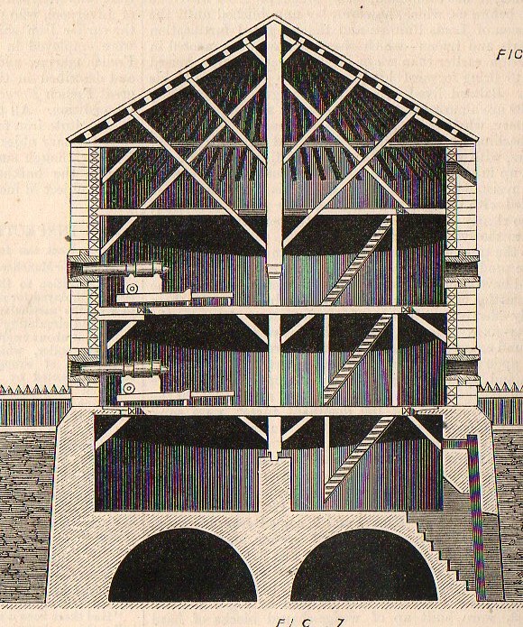
    The engraving below shows a cross-section of the two-turret land structure.

      Technical drwg--revovl turret535

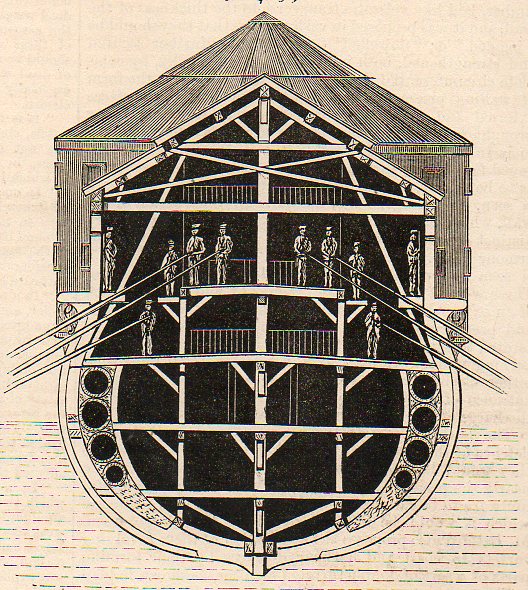
    The engraving below shows the idea of the land fortification shipboard, one revolving turret fore and aft. It turns out that the engine for the vessel was human, the engineer calling for “either” convicts (forcats) or soldiers to row to move and position the boat
      Technical drwg--revovl turret536

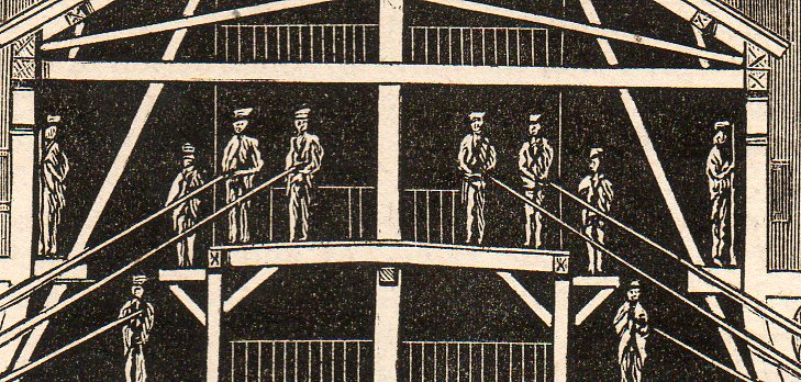
    And a detail we can clearly see the long sweep oars:

    Technical drwg--revovl turret big detail538

    And the turrets on the ship, the pre-Monitor-style ship:

    Technical drwg--revovl turret big detail539

    I assume that the boat was being used for coastal or harbor defense, or at least something very close to land, and was really more a floating, positioning battery than a boat.  Seems to me though that after everything was said and done, after all the work was accomplished and the boat built, that making the whole thing dependent on sticks of wood was a fatal flaw. 


  • Antique pre-Dada Ingredients of the Anatomy of the Senses

    JF Ptak Science Books  Post 1362

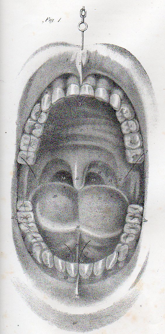
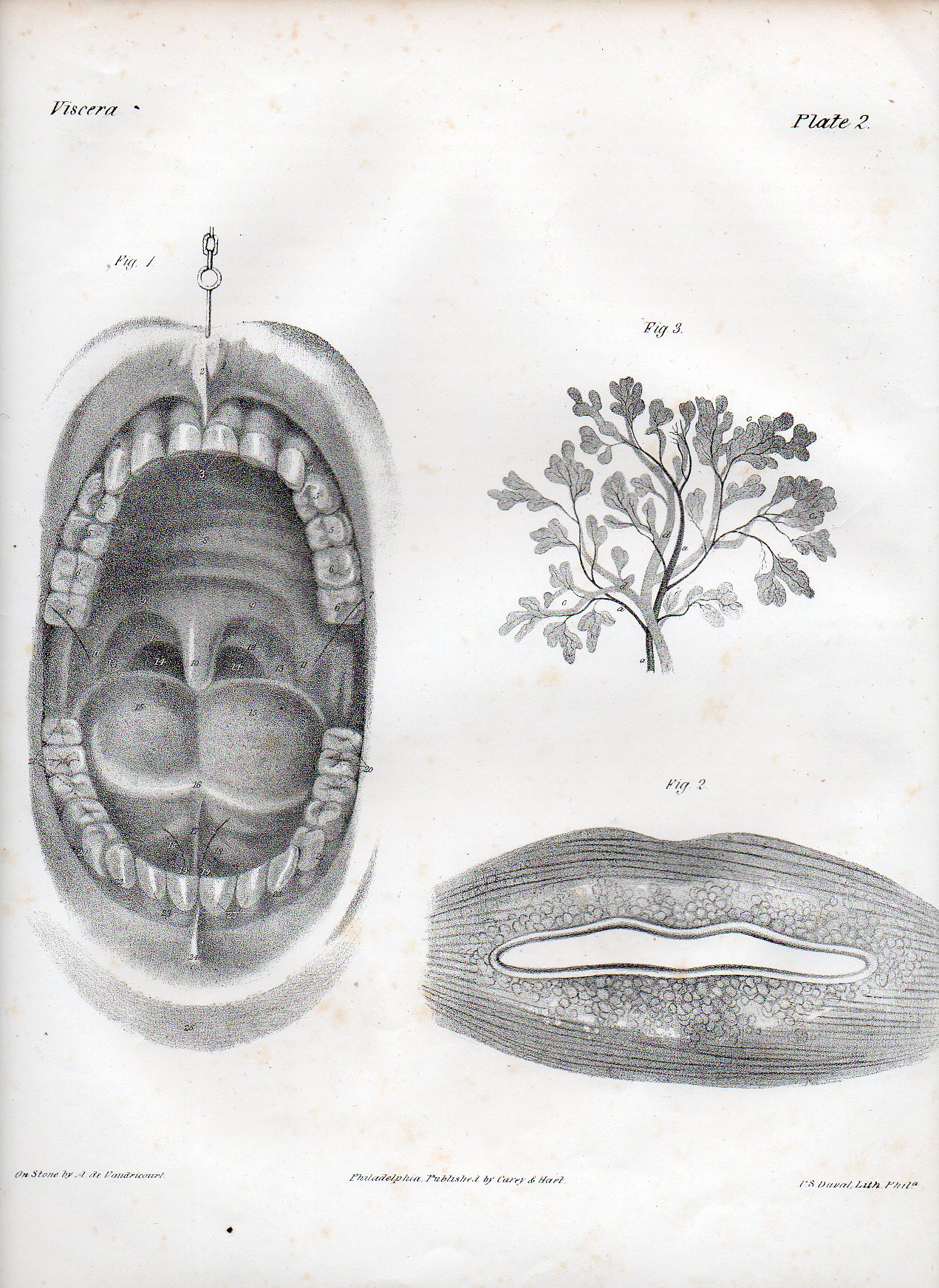
    Dadaist senses mouth det503

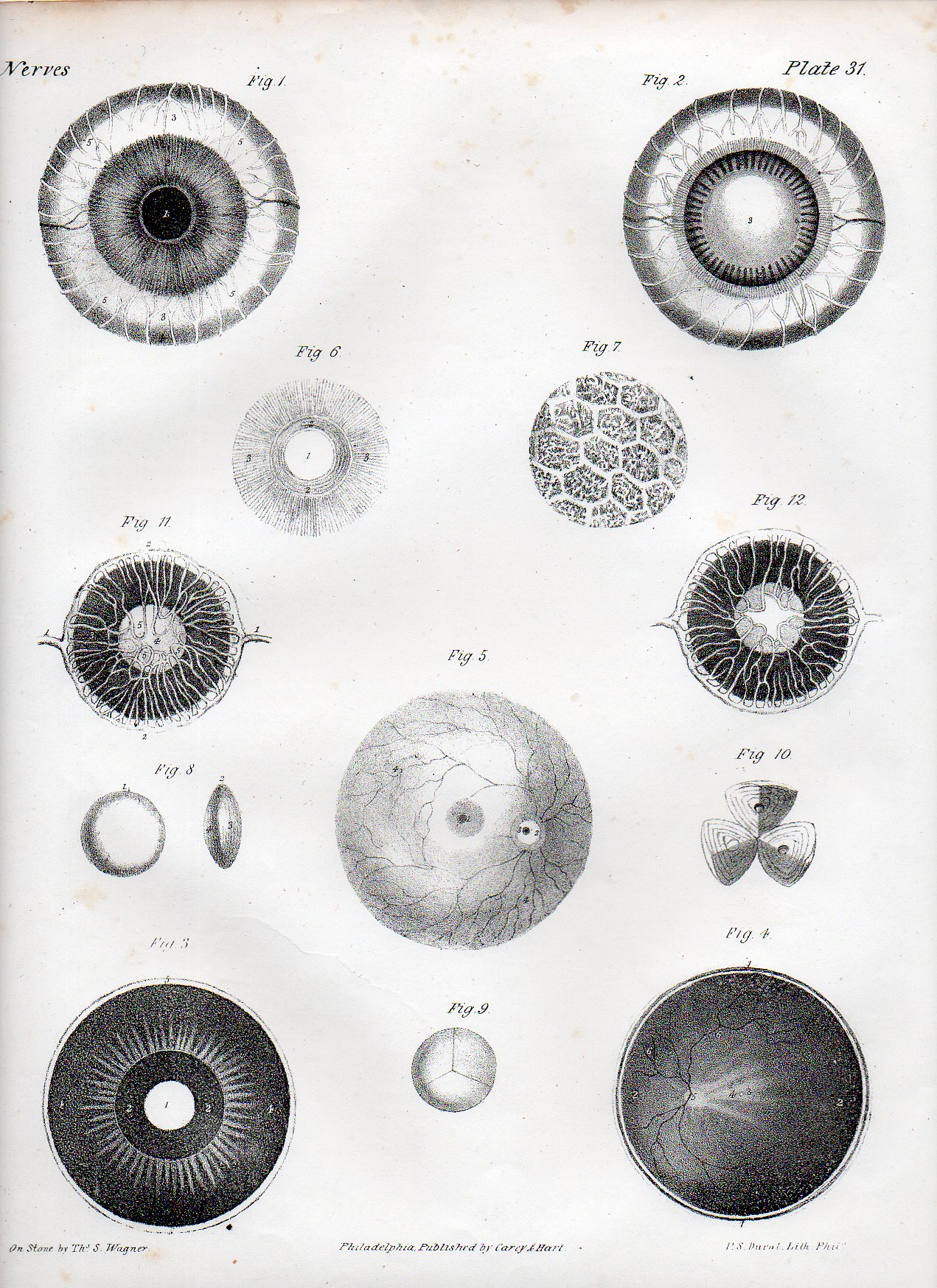
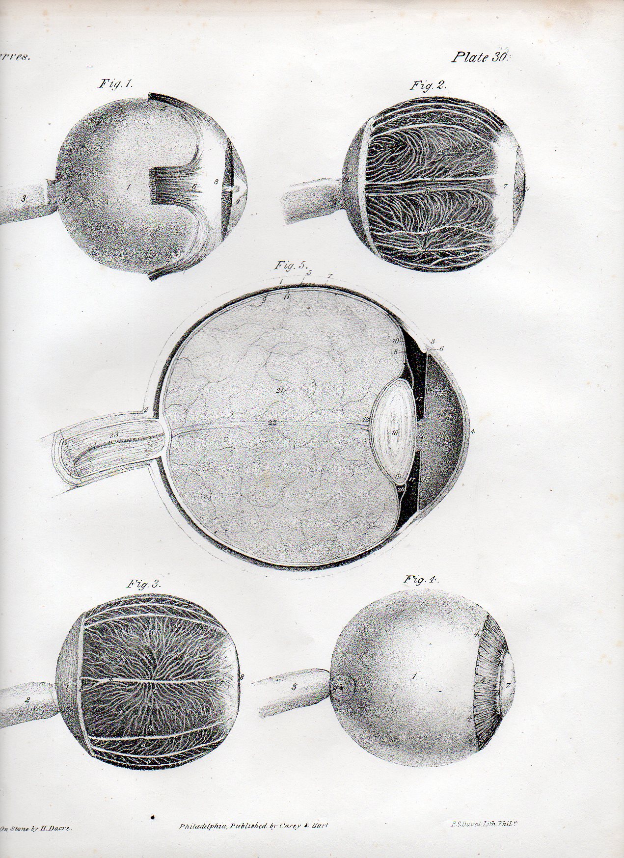
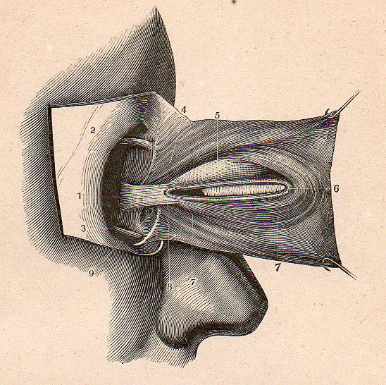
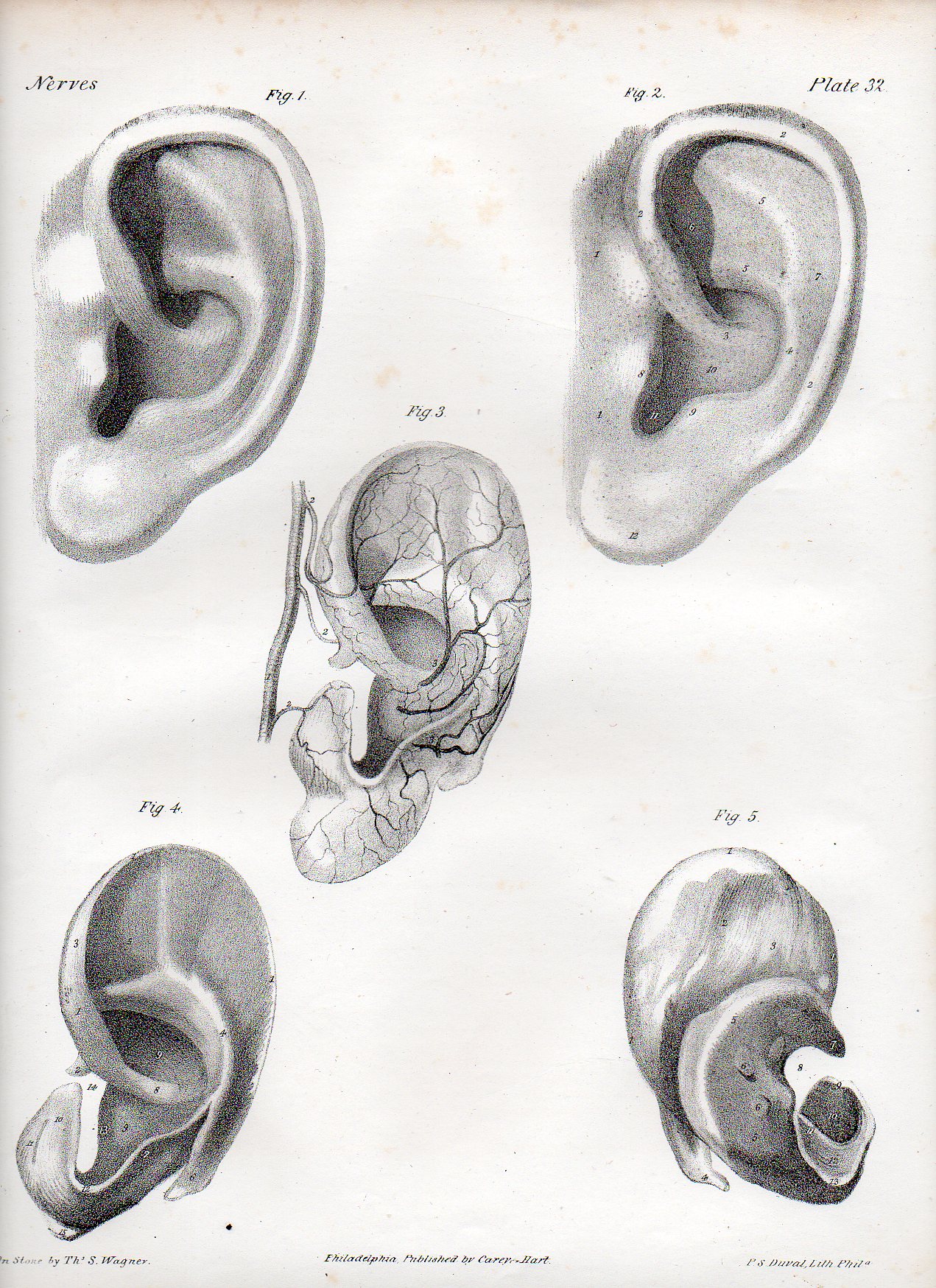
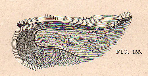
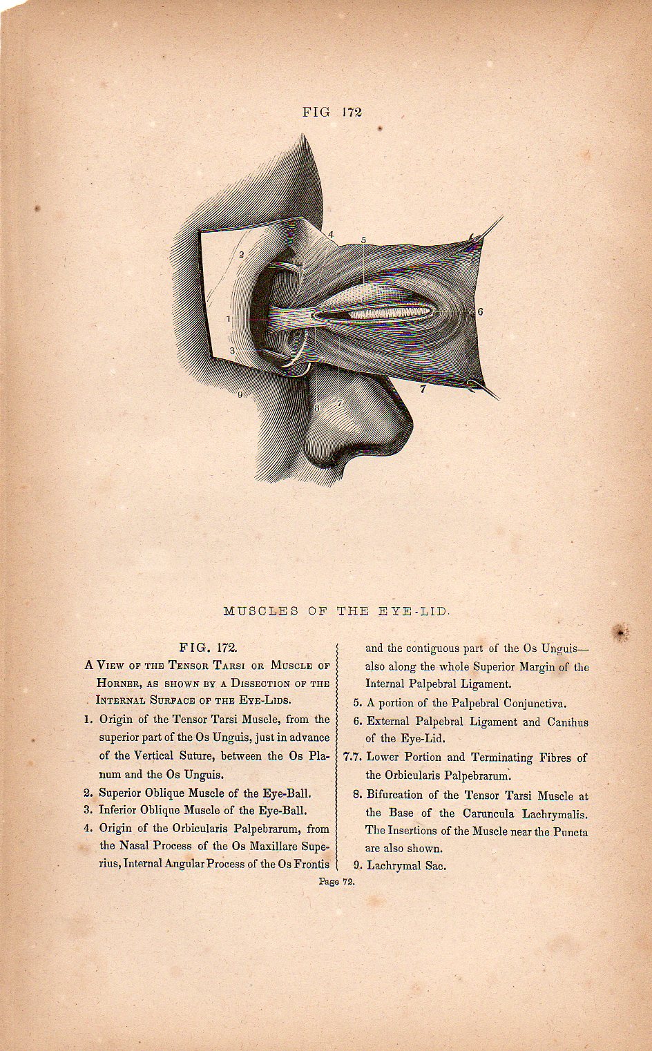
    Some of the strangest, occasionally least-of-their-time scientific illustration seems to come in the area of anatomical illustration–for me, anyway.  When taken out of context, some medical illustration looks positively modern, or post modern, as we can see with the following examples [all o fwhich are available from our blog bookstore].

    The first image is a detail from a series of images by the Irish-born Quain brothers:  Jones Quain (1796-1865),  an anatomist and professor of Anatomy and Physiology at the University of London; and Richard Quain (1800-1887), professor of anatomy in 1832 at the University of London, then surgeon at North London Hospital, and president of the Royal College of Surgeons. The illustrations are from a later and smaller printing of their beautiful 1844 work The Anatomy of the Arteries of the Human Body, with its Applications to Pathology and Operative Surgery, in Lithographic Drawings with Practical Commentaries.  Taken out of context, removed 80 years or so, taken to Germany, and they might be bits and pieces (or entire works for that matter) of a Dadaist exhibition in Berlin in 1925. 

    The full image of the image above is from:

    TASTE

    Dadaist senses mouth502

    SIGHT

    Dadaist senses eye 2507

    Dadaist senses eye506

    And this beautiful detail:

    Dadaist senses eye 4509

    Dadaist senses eye 3508

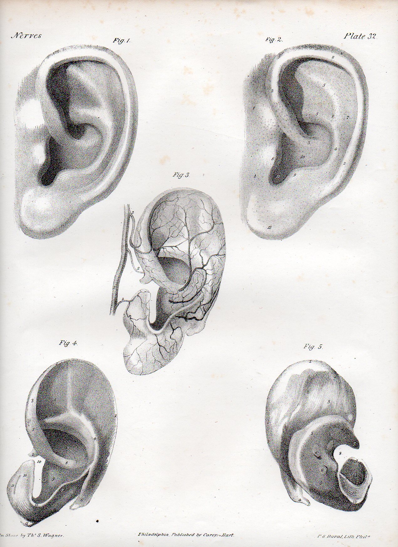
    SOUND

    Dadaist senses ear505


    TOUCH

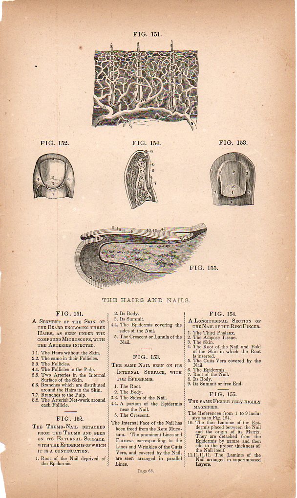
    This remarkable cross-section of the fingertip.

    Dadaist senses touch det501

    Which is a detail from:

    Dadaist senses touch500

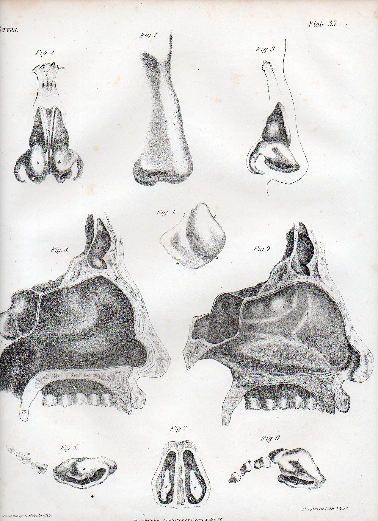
    SMELL

    Dadaist senses nose504

    HEARING

    Dadaist senses ear505


  • Unintentional Dadaist Anatomy: WIlliam Rimmer, 1877

     JF Ptak Science Books  Post 1360

    Blog==June 29--rimmer backdet

     
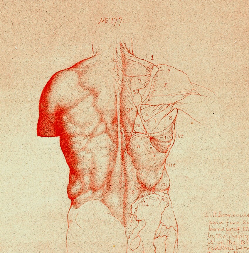
    Looking at old prints sometimes reveals more than just their own history, simple or not:  there are, from time to time, subtle bits of otherness that creeps into the image, if you allow yourself the time to see it.  And sometimes looking at images of the past reveal a little of the future, or the possibility of the future. A great example of this is William Rimmer’s (1816-1879) Art Anatomy, this edition published in 1877 (and about which I wrote earlier in this blog1).

    Blog==June 29--rimmer back

    Blog==June 29--rimmer pecs det

    The work reminds me of at least two touchpoints, one from art, the other literary.  First and foremost, the added elements, the humanist touches and flairs (and I mean Humanist as in the 16th century variety) , the mytholigizing elements, the little designs that are added to the anatomical details

    that run throughout the course of the work,  remind me of the work of the Dadaists that would come forty years later.  As will be seen below, there really isn’t much necessity for all of the added extras, the fabulous add-ons, that Rimmer incorporates in this work.  This part of the work definitely has an antiquarian flavor to it, the major anatomies of the 16th and even into te 17th century having a pronounced artistic flavor to them.

    In a more removed sense, I get a heavy dose of memory of Marcel Proust from the Rimmer images.  In a sense, Rimmer is trying to affect change, an instability, into the most common and stable presentations in art, human anatomy.  There is a strong his history of presenting anatomy in an artistic format–Vesalius is one famous example–where skeletons are posed reading books, or holding their skin or contemplating  a(nother) skull–but not so much past the late 17th century.  Though very few of the “decorated” anatomies have ever taken their artistic license quote so fabulously as Rimmer.  And Proust I think is a Great Destabilizer–he works very hard to push the center of gravity away from where it should be on just about everything.  He drags himself to the proposition at hand, to the memory, to the situation, and though all of his great personal destabilizers–his allegeries, his allegeries to the things that he loves, his allergies to his allergies, his vast catalog of physical complaints, his pale melancholia, his fits, his spectacular memory, his ability to see differently, and on and on, all seemed to coalescence into a colossal ability to see even the smallest detail outside of its small details.  Perhaps this is a stretch, but that is the literary sense-impression I have from Rimmer.

    Notes.

    1. For some reason I never included any of the images available for sale in my blog bookstore–though now I have.

    Rimmer496

    Rimmer495


  • Beautiful Technical Shadowing, 1880

    JF Ptak Science Books    Quick Post

    Techno art wheel488

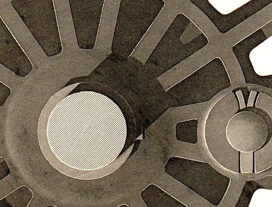
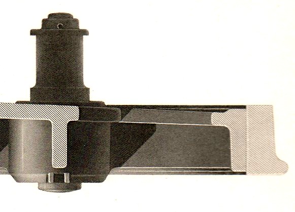
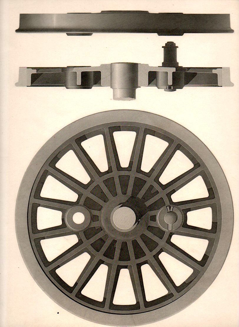
    This superb engraving, “Examples of Finished Shading, Locomotive Wheels” (source unknown) was engraved by J.W. Lowry after the original of C.J. Wallis, and published by Blackie & Son of Edinburgh and London around the year 1880.  The work is detailed yet spare, heavy yet elegrant, beautiful, and of course perfectly shadowed.  Splendid. The details (above and below) could be almost anything, but the first does have a certain pull of the 18th century masters of Fench visionary architects (Boullee, Leduc & co.) to it. The full engraving (which is available at our blog bookstore) is follows the following.

    Techno art wheel489
    And the full engraving: Techno art wheel487


  • Ghost March–Doughboys in London and Four Years of Mist, 1918

    JF Ptak Science Books   Post 1328

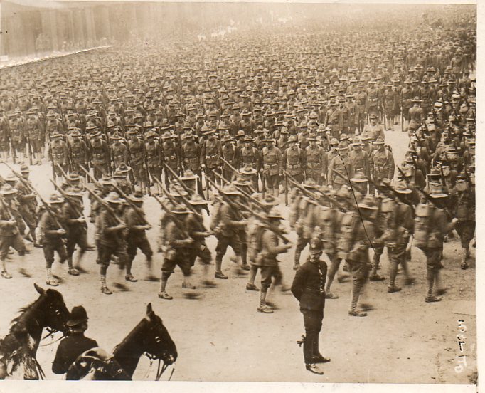
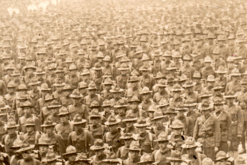
    .003%  That’s what I reckon this column of soldiers would represent of the total casualties of WWI.

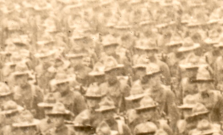
    Generally images like this are a virtual image-host for me, a bucket of ice cold water thrown onto a sizzling summer sidewalk, all sorts of ideas steaming from it.  But for photographs of Doughboys1 marching, especially assembling for parade, this one struck me a little more oddly than most, giving instant pause, making me concentrate on the haze, or dust, that allowed the columns of soldiers to blend into one another and fade, losing their boundaries with their mass receding into a dull blur. 

    Marching london 350

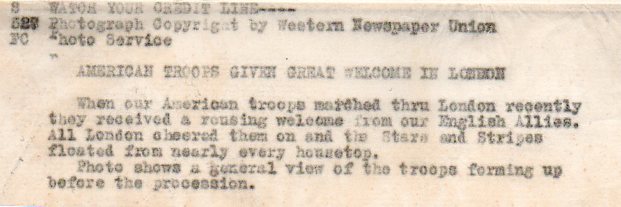
    The Western Newspaper Union was selling this image for insertion in newspaper or journal stories about the war, for a small use fee.  There were a few American organizations like Western Newspaper that were created to photographically cover the war, using pools of photographers who would distribute their work anonymously and which was available for common, general use for a small charge.  The photographs allowed out were certainly restricted and censored, though in my stash of these of objects (numbering about a thousand) I’d say that 10% of them look pretty edgy to my eyes.  Most of the action of war was not covered, but then again this aspect was still fairly technically difficult in 1918.  Images of pain were almost never allowed, and certainly not pain of Allied troops.  Aid stations were almost never covered as well, as were dead bodies, or at least those again of Americans or Brits or French or Canadian.  The imaging of the war was certainly under a fair amount of supervision and control. (The original is available for purchase through our blog bookstore. here.)

    Marching london det352

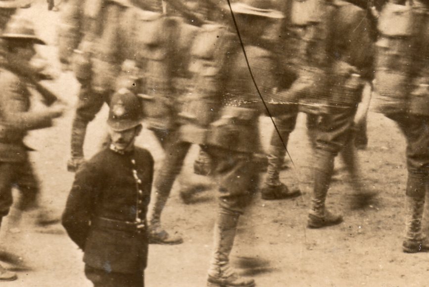
    The image shows American troops assembling for a parade through the streets of London before being deployed.  The mistiness of the composition looks like a statistic to me, these men standing for those who had come before and fallen.

    Marching london det353

     The U.S. lost .13%  of its population to casualties (125,000 killed and 205,000 wounded) during the war–a war which by the time America got here had already been visciously fought for three years, costing dozens of millions of lives.  The figures for everyone else weren’t nearly so “fortunate” as the U.S.:  New Zealand’s 18,000/41,312 killed/wounded amounted to 1.6% of its population.  The U.K. lost 2.19% (964,000/1,663,000), Italy was 3.48% (650,000/953,000 plus 650,000 civilian casualties), while France suffered a 4.29% (1.4 million/4.27 mil) blow of its total population to war.  Things were worse on the other side:  Germany 3.82% (2 mil/2.4 mil plus 426,000 civilian deaths, and the Ottoman Empire 12% (400,000/771,000 plus 2.1 million civilian deaths.   Worst of all was the Ally  Serbia, suffering a catastrophic 16% loss of its population to war, including 275,000/725,000 plus 426,000 civilian casualties.  As gruesome as the numbers were, the Americans felt only a small percentage of the total sting of war–by 11 November, more than 21 million soldiers would have been wounded, with 9.7 million soldiers and 6.8 million civilians killed.  It was an enormous price.

    And that’s what I see in the mist of what may be something like 10,000 soldiers on display n this photograph.  .003%  That’s two of these columns every day, twice a day, for the entire 1550 or so days of the war.   

    Marching london cop351

    Marching london txt354

    Notes

    1.  The origin of the term “Doughboy” is unclear, or varied, or rich, but it is at least pretty oldm beginning around the time of the Mexican American War in 1846-1848–evidently when the soldiers marched through dry, tough terrain they wound up being covered by earth with the color of dough.  Doughboy.


  • The Guts of Mathematics, Archimedes’ Dog, and the Greaseless Anatomy of Machines

     JF Ptak Science Books  Post 1326

    “…with his blood he confused the lines of his art”—On the death of Archimedes, in Valerius Maximus

    “….Bark, bark bark!”–Archimedes’ dog

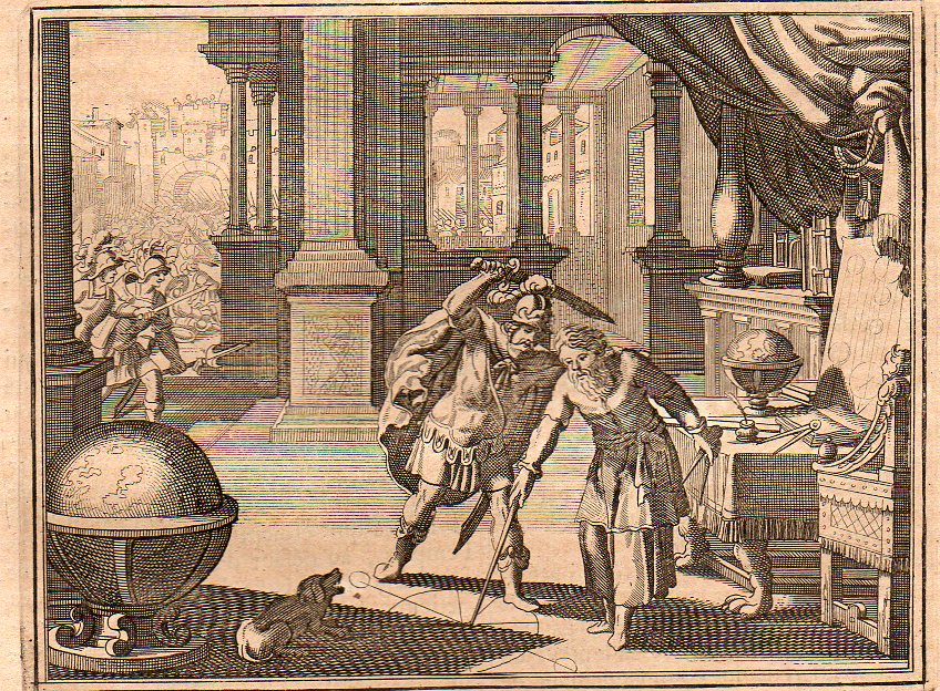
    I came across this unusual and not-web-reproduced image of an infamous scene in the history of mathematics, the murder of Archimedes.(The original is available for purchase from our blog bookstore.)  There have been a number of depictions of the event, a few dozen artists it seems–including Daumier and Delacroix and others whose name do not begin with “d”–who have chosen to try and capture the moment.  (The website at  NYU reproduces some of them;  Drexel also has a very good space devoted to Archimedes and is a great source for quotes dealing with the event.) This one comes from (I think) Histoire Universelle published by the ubiquitous Peter van der Aa in Amsterdam at the turn of the 18th century, and falls in line with many of its comrades in that it depicts the tragedy in the second before it occurred.  One thing it has that other scenes do not–a barking dog.  Maybe it belonged to Archimedes, maybe not.  But there was a dog depicted here, and it was barking at the scene, probably barking at the man about to stab the mathematician, which means it would’ve been the mathematician’s dog.  But Archimedes certainly didn’t hear the dog if he couldn’t be interrupted by the battle outside his door or the Roman who yelled at him to turn.  (I believe Roger Clemens when he says that he didn’t realize he was throwing that bat fragment at someone, saying he was in the zone.  It happens.)

    Archimedes 1705348
     Archimedes dog 1705349

    And a detail of the dog: shows him barking from a reclined position.  Jarred awake by the intruder, he sees the  action just before the critical motion–not quite awake, no time to stand, the dog (snarling with teeth barred) tries its best. (I am romanticizng the dog part of course. My own dog, Bluey, now 14 or so, simply stared at the people who walked into my house last night with their luggage, thinking that mine was the bed and breakfast where they had their reservations.  He sat and stared, and they stared at him.  Missing their destination by one house, how disappointed they must’ve been to think that their retreat was filled with an old dog, kid toys, a dead Christmas tree, and the rest of the jumble.)

    I’m not aware of any artist who steals the moment quite so graphically at Jost Ammon (below) does, though. He also makes no effort to remove the millenium-old event from his own Renaissance environment.

    ==blog==july 8==arch 2

       Seldom do we see a maxim so vividly depicted as with these lines from Valerius Maximus:  Archimedes trying to hold a thought in his head while a Roman soldier comes tugging at him, Archimedes pushing the soldier away to protect the geometrical work that he was scribbling in the sand, and then having his head full of thoughts spilled onto the drawing he was trying to protect.  What we see in the detail is almost exactly (or on the verge of being exactly) from the Valerius quote fragment  “…with his blood he confused the lines of his art”:  Archimedes has spoiled his geometry in the moment before his cleaved head releases the control of his muscles.  It is a nasty image, the pissed-off Roman soldier—who theoretically was just looking for spoils in the looted city of Syracuse—having had enough of the three-second hesitation by the old man and reacts badly, beheading him the hard way. (I’ve written about this pirnt earlier in this blog, here.)

     ==blog==july 8==arch This is definitely the great CSI moment in the history of mathematics, so far as Mr. Ammon is concerned.  There is no chance not to see that there is no heraldry to the moment, no faint-away moment, just blood in the sand. 
    And for some reason–except for the dog part–all I can really think about here is the anatomy of the machines that were shown by the great Precisionists of early 20th century art, the artists who depicted the modern industrial landscape and its tools with fantastic precision and modern-Gothic-y grace. 
    The artists who found modernity–a modernity found mostly in America–in massive factories, and shining metal, and spokes and gears and all of the other components of factories. There was of course the Marinetti manifesto preceding all of this, and the 1913 69th St Armory Show,  and the coming of the French (Duchamp and Picabia  & Co.) in 1915 and the Tzara/Huelsenbeck/Ball Dadaist 1916 movements and the rest….but what I’m reaching for is the slightly later work, the early ‘twenties, with Hartley and Stella and Sheeler And Demuth and Schamberg (and even the early O’Keefe).  This is where I think we see machine art, an oddly realistic semi-cubist something, depicting the power and form and grace of the machine itself rather than the expression of its dynamism. 
    But what happens (for me, anyway) is this–that when the guts of the machines are revealed, that when we see inside to the components, the very anatomy of modernity, we see a clean, rustless, oil-less, greaseless, world.  Big and heavy, massive things of terrific density, and they smell like nothing except their own immobility, which so far as I know smells like nothing.  As much as I find these artworks beautiful, I miss that their core wasn’t represented–I’d would’ve liked a little more mess.  This is antithetical I’m sure to the message, but it is the essence of the machine. 

    Zoom Image
    [Charles Sheeler, Stacks in Celebration, 1954.] And humans didn’t often make it into these images–as much as I like the artwork of Louis Lozowick, I like it more when he peoples-up his ultra-tech/urban images.  That’s another story.