A Daily History of Holes, Dots, Lines, Science, History, Math, Physics, Art, the Unintentional Absurd, Architecture, Maps, Data Visualization, Blank and Missing Things, and so on. |1.6 million words, 7500 images, 4.9 million hits| Press & appearances in The Times, Le Figaro, Mensa, The Economist, The Guardian, Discovery News, Slate, Le Monde, Sci American Blogs, Le Pont, and many other places… 5000+ total posts since 2008.

Category: Information, Quantitative Display of

  • Society of Consequences: the Value of Life and the Importance of Horse Manure, 1859

    JF Ptak Science Books    Post 1524

    In the epochal year of 1859 (Darwin’s Origin of Species is published) Philip P. Carpenter (1819-1877) contributed a very interesting article to The Canadian Naturalist and Geologist and the Proceedings of the Natural History Society of Montreal (the full article appearing here).  Among many things, the intriguing title “On the Value of Human Life in Different Parts of Canada” suggests something that might seem a translucent to the modern reader–that in the statistics, somewhere, is a Bell curve that might establish what the “average” person was.  The idea of the “average man”–a statistical impossibility at the time–was important in the sociological application of the statistical work of the early and very influential mathematician Adolphe Quetelet (1796-1874, fl. 1840’s), whose theorizing underneath his numbers was questionable and wincing, but Mr. Carpenter really doesn’t approach this–he has a much more current and applicable idea in mind.  He was interested in the positive and major consequences of relatively minor government investment in the health of the population and the upkeep of the basic infrastructure of a city.

    In collecting his data on birth/death/mortality rates in some major cities in Canada, Mr. Carpenter undertakes a cost-benefit analysis (of sorts) to show how much it would cost to prevent a certain percentage of those deaths, and that a very small investment in maintaining a city’s infrastructure would wind up saving lives and money as a result.  It is an elegant, interesting argument.

    He points to some statistics for the city of Munchen, establishing that the sewering and cleaning of 20 street there reduced the mortality  rate from 31 to 25  per  1000 (“that is, preventing 21 deaths and 588 cases of sickness in seven months”), saving the community the cost of caring for the ill and reducing the amount of time lost in the workplace.

    Basically, Carpenter establishes that adding sewers and just simply cleaning the streets–basic sanitary measures–is an economic benefit to the local community, arguing that “as the cost of sanitary measures is generally the greatest obstacle to their adoption, it may be well to inquire whether their neglect is not still more costly”.  And that it not only made a certain amount of intuitive sense to undertake these measures, Carpenter felt as though he had the numbers (later found to be very problematic) to display how much more “neglect” would cost.  For example:

    A key and simple element to defining health for Canadian cities was horse manure, which those cities seemed to be awash in  Carpenter makes a very simple case for simply using the manure for fertilizer rather than just throwing it into the river, and that the act of cleaning this waste not only was beneficial for the health of the community, but was also had value for cultivation..  This may seem trivial now, but in 1859, evidently, it wasn’t an obvious issue.  Carpenter concludes:

    This was a very satisfying read, and the author made a simple, solid and convincing economic case for “doing the right thing”.  It would turn out later in the 1860’s and 1870’s that Carpenter’s statistical methods were deeeply flawed, leading to him being abandoned by the association that he helped to create–a bitter pill, to be sure, since the overall conclusions about public health were correct, if not the numbers.  After all was said and done, Carpenter was out to save people (particularly the poor), more so than an actuarial table. 

    Notes:

    An interesting table showing the relative health of the cities in the countryside versus, say, the Gotham of Montreal:
  • A History Blank, Empty and Missing Things #76–the American Bison Extermination Map

    JF Ptak Science Books   Post 1512

    Part of this blog’s series on Blank, Empty and Missing Things.  (My thanks to Blanche McCallister for setting me on this path this morning.)

    “A disgrace to the American people in general, and of the government in particular.”  “The men who killed bison for their tongues and who shot them from railroad trains were murderers.”–William T. Hornaday, on the extermination of the American bison, particularly in the 1870’s.

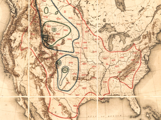
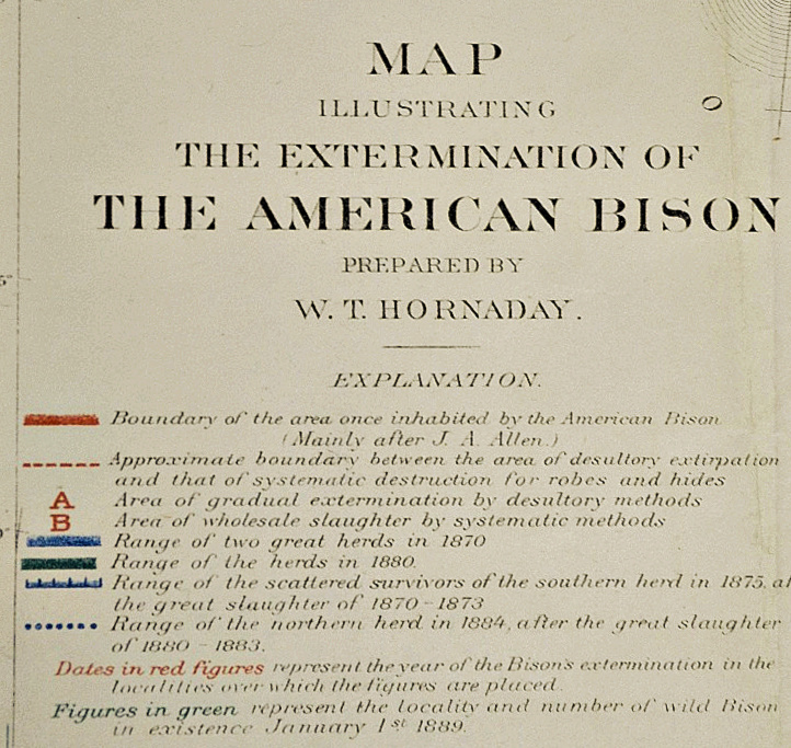
    William Temple Hornaday was an early–and probably a founding–member of the American conservation movement, and was also director of the National Zoological Park. He wrote a tremendously bitter and accurate report for the U.S. National Museum in 1894 on the extermination of the American bison, an absolute head-shaker, detailing the history of the bison in North America and its destruction at the hands of sportsmen, hunters, mindless dolts and many others who massacred tens of millions of the animal (“murdered” is the word Hornaday uses constantly).  To put the whole issue in perspective, Hornaday issued a famous map showing the shrinkage of the North American bison herd, setting out the enormity of the issue instantly on one piece of paper, a summary of hundreds of pages of bad stories and big numbers.

    Maps Hornaday


    Hornaday Map legend (1)

    And the legend

    [William T.Hornaday,  “Map Illustrating the Extermination of the American Bison”.  published in the 1886-1887 Report of the National Museum, Washington, D.C. entitled The Extermination of the American Bison, and printed by the ubiquitous Government Printing Office in 1894.  This full text version comes from the Library of Congress site.]

    The map certainly provides a real context to the numbers collected by Hornaday–numbers so big that it is hard to put them in any perspective.  For example, for the year 1873, the Atchison, Topeka and Santa Fe Railroad carried out 250,000 bison robes, 2.7 million pounds of bones and 1.6 million pounds of meat.  Generally the robe count was estimated at being about 1/6 of all the bison killed, so of the 1.2 million of taking this train ride in this one year (of aggravated annihilation) there was 1.6 million pounds of meat.  Now the refrigerated car was available at this time, so it was possible for meat to be transported to market, like 100 million pounds worth, but that was not of interest to anyone.  Not really.  Except of course for the bison tongue, which was sometimes the only thing removed froma  slaughter of thousands.  The tongue was a delicacy, and sold for 50 cents.  Just for the record, bison calf skins were sold for 50 cents, as well; adults were $1.25.  (Fifty cents in 1873 would be what the lowest-paid cowboy would be paid per day, half a dollar to the guy at the tail end of the cattle herd, the dust-eater.)  Over a three year period for the same railroad, 1872-4, there were 450,000 robes shipped, plus 2.2 million pounds of meat, and 16 million pounds of bones.  Again, this is about a pound-per-bison of meat, not even the weight of a tongue.

    Hornaday records the murder and murderers, repulsed at his findings–his revulsion comes through, as does the overwhelming lesson of carelessness and stupidity in dealing with the American landscape, and the creatures that lived on it. 

    The iconic photographs of bison skulls awaiting shipment are incredible, but I think it is the Hornaday map that gives the entire issue an overall correspondence to the magnitude of the destruction.


    And here’s a map of one of the last bison hunting expeditions, this undertaken for specimens for the National Museum, showing the enormous, continent-covering herds reduced now to individual dots on a large landscape.

    Image 192 of 208, The extermination of the American bison.    

  • An Alphabet of Fire–Night-time Telegraphy, 1800 vs. the 1991 Pen Ashtray

    JF Ptak Science Books     Post 1510

    Blog1sept_6_palpable514

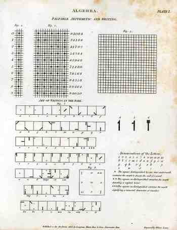
    This curious illustration appears in forty-five volume Cyclopedia of  Abraham Rees (published 1795-1820), displaying a system for communicating over distances at night.  When this part of the Cyclopedia was printed in 1808, the electrical telegraph as we now it was still 37 years away from coming into being–45 years from being somewhat well-used.  Before this time (visual) communications over long distances at night were limited to just these sorts of means–lighted semaphores, hand-held torches, that sort of thing.  Signaling at sea at night was somewhat different at this time and didn’t include anything remotely close to the alphabet.  So the rather complex system that we see at left is extremely uncommon–it seems also very cumbersome to put into effect. 

    Unfortunately I don’t have the text volume that would explain then entire system and implementation, so I’m going to guess that there was a large, powerful light source that was covered by a tight, black, covering tablet that would eliminate nearly all light leakage.  The symbols for each letter of the alphabet (and numerals) would be cut out from another tablet that would fit over the face of the light source, placed between the blank and the light.  To transmit a letter the user would then simply remove the blank covering tablet to reveal the light broadcast by the hole or slit in the tablet underneath.  The blank would then be placed back, a new tablet for a new letter placed underneath, and the process would begin again:  blank (dark); letter (light); blank (dark); letter (light), and so on to the end of the message.   I guess the distance at which these symbols could be seen would be dependent on light source, atmospheric conditions, ad so on.  The way that the letters are made into symbols seems to me very intelligent, so that you distinguish the differences from an appreciable distance.  I like it–its an elegant idea.  (Well, maybe it didn’t work in this manner, but it seems to make sense to me.)

    One can only imagine what the early 19th-century mind would think if they saw this sort of fire-writing device, and how the progress of the history of technology came to produce such a thing:


    Now, does someone look at the pen ashtray and think, “I NEED one of those!”, or what?   To me it represents one of those representatives in the Humans-are-as-Soft-as-Soup category.

    Here’s another sort of fire writing, more literal and of course much less applicable, unless you were recording the writing with a stop-action camera:


  • When 2-D LOVE is 3-D LUST: Picturing another Spatial Dimension is Easier if you are Homer Simpson

    JF Ptak Science Books   Post 15023-d521

    A note dragging together–against their will–the movie Hypercube, Homer Simpson, Marcel Duchamp, Jimmy  Neutron, Emile Jouffret, Filippo Marinetti, Paolo Uccello and Edwin Abbott.  Warning: this might not work.

    We saw a movie the other night, Cube 2, Hypercube, which I think is meant to be Cube2, but I honestly think that the title didn’t appear that way because not that many people (?!) would know how to “pronounce” the little superscript floaty “2”.  The movie was pretty interesting, telling the story of a group of people “imprisoned” in a large, sterile cube with a door on each face that opened into an identical cube, and on and on into a Borgesian infinity-hell.  At one point the people are theorizing on the nature of the Cube, winding up with someone saying that they might all be in a fourth spatial dimension. 

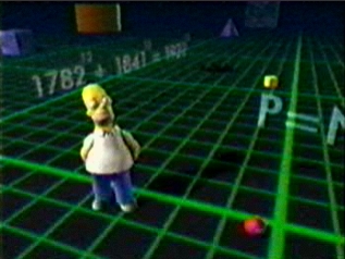
    3dHomer It brings up a pretty well-worn thought about visualizing a different dimension, and then it occurred to me that the only general-population folks who seemed to be most at ease with this idea were cartoon characters: and since I am a father of children, a Father of Children, I am very well familiar with recent cartoon history.  Homer Simpson, for example, slips from his two-dimensional world into what was supposed to a three dimensional world, and he seems perfectly comfortable.  (The equation in the background, 1782^12 + 1841^12 = 1922 ^12 is correct for the first nine digits, but not for the last thirty.  Plus, since the product of odds is odd, and the product of evens are even, the sum of even and odds is odd, so the answer must be wrong. But close.  And really, really good for little Homer.) Timmy Turner (Fairly Oddparents) and Jimmy Neutron (of the show bearing his name) switch worlds,one going 2-to-3 D and the other the other way ’round, with both being perfectly comfortable in their new space.

    3-d Of course the issue of imagining a three-dimensional shape in a two-dimensional world is pretty knotty if you are not having a cartoonist draw out your brain’s interpretations of the world.  The great classic of this is Edwin Abbott’s Flatland, an 1884 book about a two dimensional world of shapes that encounters a dot that grew concentrically and outwardly, a dot expanding and then contracting itself in a series of circles, morphing until it appeared as a new and revolutionary form rising from the plane of Flatland, evolving into a new thing, a Sphere.  The folks in Flatland had a hard time with it.

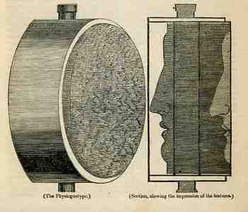
    Blogphysiog320Depicting a third dimension in a two-dimensional space is tough, the whole deal being rediscovered in perspective only relatively recently in the history of human thought, being only about 600+ years old. (In quasi order perspective is brought to the West by Cimabue, the Isaac Master, Giotto, Duccio, Maso, Avanzo, Lorenzetti, Donatello, Ghiberti, Fra Angelico, and so on, not the least of whom would include our beautiful Paolo Uccello.)  Giving real “flavor” to the extra dimension was still quite difficult, even in the 19th century.  In the “Spirit of Discovery” section of the British weekly magazine The Mirrour of Literature, Amusement, and Instruction for 22 October 1836 there is a short notice on the “physiognotype”, “a machine for taking casts, lately invented by a gentleman in Paris”.  We’re accustomed to these devices now as they’ve been for sale in toy shops for decades—but in 1836 it was a real breakthrough for making instantaneous three-dimensional models of small things.  In 1836 there really wasn’t any simple way of producing a direct, proportional model like this in 3-D except for encasing it in plaster and then casting from that mold.  Two-dimensional modeling was easier, and there were numerous devices constructed for this purpose as people pursued the still-hot rage of physiognomic forecasting, with simpler means (like shadow portraits) being hundreds of years earlier.  (Photography remember is still three years away from being announced and another few years from being sort o3-d519f accessible to middle-class folks.)
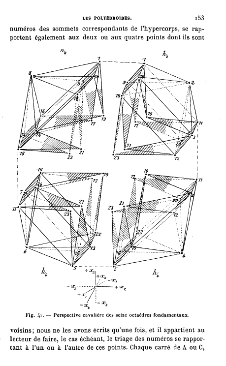
    Imaging the fourth dimension was more a product of mathematics than of art, with people like Emile Jouffret1 getting to it a little before Marinetti and Duchamp and the squirrely Picasso did. (Thinking on the fourth dimension goes back as far as Kant, at least, and the real work begins in the first half of the 19th century2.)

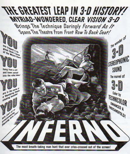
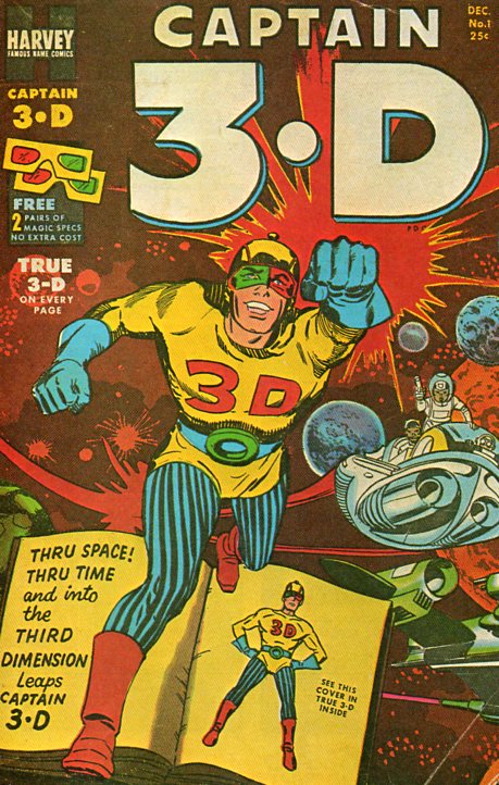
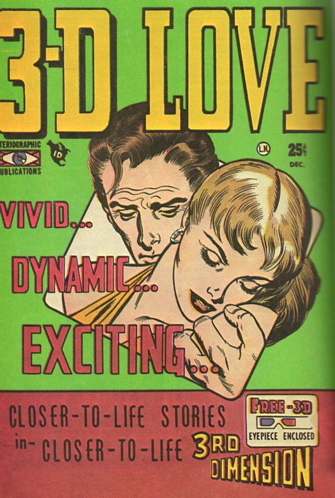
      But it seems as though the cartoon (like Homer, above) and comic book characters have a much easier time with this added-dimension issue, using it to full advantage without muss or fuss, and certainly without any philosophical commentary.  Their reach across the aisles of the 1952 Rexalls and other general merchandise emporia  with enough floor space for a revolving magazine 3-d520 stand was straight into the heart of the common reader, filling them with the hope/fear of their two-dimensional explorations into what they called their 3-D  3D  3.D  Three Dee world, selling “closer-to-life stories in closer-to-life 3rd Dimension”. 

    It seems that the same might be true for 3-D movies as well, the characters busting out into a new dimension (sometime fully aware of it) without a care or riddle, the main effect of finding the new spatial dimension sitting squarely in the minds of the observers, who are already in that dimension and reacting to somethingf with a surprising surprise of seeing a familiar thing in its proper context.

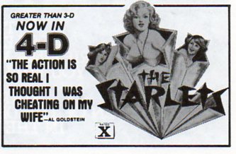
    I’d love to know what that fourth spatial dimension looks like, as promised by The Starlets…or maybe not.

    3-d524

    Notes:

    1. Jouffret, E.  Traite Elementaire de Geometrie a Quartre Dimensions et Introduction a la Geometrie a n-Dimensions. Paris:  Gauthier-Villars,  1903.  1st edition. ! 215pp. and   Jouffret. Melanges de Geometrie a Quatre Dimensions.   220pp. Paris:  Gauthier-Villars,  1906.  1st edition. (Perhaps one of the most classic works of the late 19th and early 20th c on imaging the fourth dimension–certainly well known to the Cubists and Futurists, I’m certain that it sparked any number of ideas in the art world.)

    2. The first major work arrives with Hermann Grassmann’s “Die Lineale Ausdehnungdlehre” (Theory of Linear Extensions) in 1844 (and the subsequent translations of the work as well as original work by Arthur Cayley); followed by Ludwig Shclafli (1814-1895) “Theorie der vier flachen….” (Theory of Continuous Manifolds, 1852 but not published until 1906), Riemann’s 1854 speech (which was not published until 1867 and which appeared translated by William Kingdom Clifford in Nature in 1873, G.F. Rodwells “On Space of Four Dimensions” (Nature, May 1873),  Dodgson/Carroll‘s  Through the Looking Glass (1872) deep references, Zollner “On Space of Four Dimensions”


  • Searching for Structure: Triangles and Trees

    JF Ptak Science Books  Post 1494

    Structure512

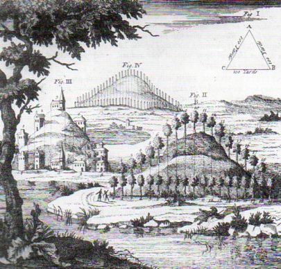
    It was this lovely engraving from Richard Bradley’s A General Treatise of  Husbandry and Gardening..., printed in London in 1721/2, that brought up the issue of structure in creation, and how that issue was in one way approached by the new tool in the scientific toolchest, the microscope. 

    “…the Contrivances of the Almighty Creator is as visible in the meanest Insect of Plant, as in the greatest Leviathan or the strongest Oak.  To touch upon all the Wonders this Instrument shews us would be infinite”–William Molyneux, on the microscope, in his A Treatise of Dioptricks in Two Parts (1692, quotation fro the second edition of 1709 via Marjorie Nicholson’s Science and  Imagination, Cornell, 1956.

    The question that the microscope—newly introduced and popularized by Robert Hooke in 1665 and Anton van Leeuwenhoek in 1674–was so able to address at this time was the question of the structure of things, and whether the Almighty Creator allowed for unrestrained creativeness or if the cosmos was subject to patterns and forms.  The microscope was so tremendously nimble that it allowed its observers the luxury of finding “correct” answers on either/both sides of the issue, that arguments could be well made and sustained for variety and regularity. But of course all found the reason for either end of the argument deeply seated in the e hands of god, as seen in the lovely quote below by the great early microscopical popularizer, Henry Baker1. 

    But this is just the tiniest bit of a nod at the question of structure in the history of science, a search for the relationships between, well, things small and large:  atomic, molecular, cellular, organism, population, ecosystem,solar system, universe.  The issue of structure may be the only issue–perhaps if you were made to select one question to have answered, automatically, an answer for everything, it might be this issue of how things stand in relations to one another.

    Which gets us to this 1721 engraving of a tree-covered hill, following the designs of a human creator, a re-animator of the natural landscape according to a theory of beauty, part of which hangs in the form of a triangle  in the right-hand upper corner.  A three-sided strategy of the relationships in nature, provided by a human vision. A very small  appreciation of an attempt to recognize the relationships between things, and in this case, the beauty of trees and hills. 

    Notes:

    1.  “The first Part of this Treatise discovers in the Particles of Matter composing Salts and saline Substances, Properties whose amazing Effects would surpass all human Belief or Conception, were we not convinced of their Truth by the strongest ocular Demonstration. That beautiful Order in which they arrange themselves and come together under the Eye, after being separated and set at Liberty by Dissolution, is here described and composed but one kind of figure, however simple, with Constancy and Regularity, we should declare it wonderful: What must we then fay, when we see every Species working as it were on a different Plan, producing Cubes, Rhombs, Pyramids, Pentagons, Hexagons, Octagons, or some other curious Figures peculiar to itself; or composing a Variety of Ramifications, Lines, and Angles, with a greater Mathematical Exactness than the most skilful Hand could . draw them?”

    “Sensible of my own Ignorance, I pretend not to account how this is done: all I know is, that Chance or Accident cannot possibly produce Constancy and Order, nor inert Matter give Activity and Direction to itself. When therefore these Particles of Salts are seen to move in Rank and File, obedient to unalterable Laws, and compose regular and determined Figures, we must recur to that Almighty Wisdom and Power which planned out the System of Nature, directs the Courses of the Heavens and governs the whole Universe.”  — Original, shorter quote of Henry Baker in his Employment of the Microscope (1753) found in Nicholson’s book; the above, longer version is from the 1764 (and second) edition, found here.


  • Spaghetti Map of the Army-McCarthy Hearings, 1954

    JF Ptak Science Books   Post 1489

    Some things are complex, and complicated and pretty–you don’t realize that they are this involved, exactly, because of the elegant way in which they are presented.  An anti-gravity undertaking by Brunelleschi, in creating his dome, was an enormous challenge,  solved with circles within circles, a series of nine of them enclosed in a polygon, the result being one of the most beautiful and iconic achievements in the history of architecture (and engineering).

    And then sometimes things are complicated and complex and look and behave that way, their messiness outdistancing their own necessities.

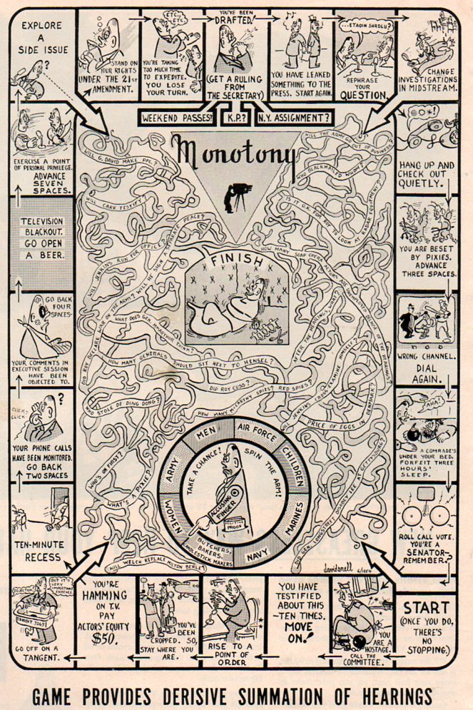
    Which gets us now to this game, a mass of entwined spaghetti, which was a tongue-in-cheek poke at the Army-McCarthy Hearings of the spring of 1954, a popular review in the tradition of Thomas Nast that is very effective.. The “Army” was the U.S. Army, and the “McCarthy” was Senator Joesph McCarthy, of Appleton, Wisconsin, a man who was about at the end of a short, meteoric career of vast unsubstantiated accusation, discord, lies and fraud. The hearings were supposed to sniff out Communists in the Army and the defense industry, because that’s what McCarthy did, being a rabid impersonator of a man with a decent mission. The hearings were long, involved, and traveled nowhere fast although much ground was covered.

     The bottom line to the whole affair was that as the first televised Senate hearings, McCarthy drew a huge audience, estimated at some 80 million people over the course of the event. And what happened was that “Tail-Gunner Joe” (an appellation he gave to himself that among many other things in his personal and public life were exaggerations) found out that he was seen better int eh minds of Americans when he was not being televised. In short, he was outed for many as a crude, threatening liar, and his career of ruining people in his quixotic quest for deeply-rooted Commies was about over when the last lights in the hearing room went out.

     Joe McCarthy would be dead in about three years, his liver failed, evidently (as his biographers say) from too much drink. He was a dangerous and divisive man, but one who had many friends and supporters to keep him re-elected and in power. (He was a darling of the Kennedys, being a favorite of Joe Kennedy, the godfather of Robert Kennedy’s first child, and one who dated two of the JFK’s sisters. Being Catholic and a vehement Commie-hunter went a long way with Joseph Kennedy, who had his own set of issues with power and rule.)

    McCarthy hearings495

    [Image source:  LIFE magazine, 21 July 1954, page 42.]


  • Graphical Display of Information: Identifying Ships from the Air, 1942

    JF Ptak Science Books  Quick Post

    Aircraft regonition494

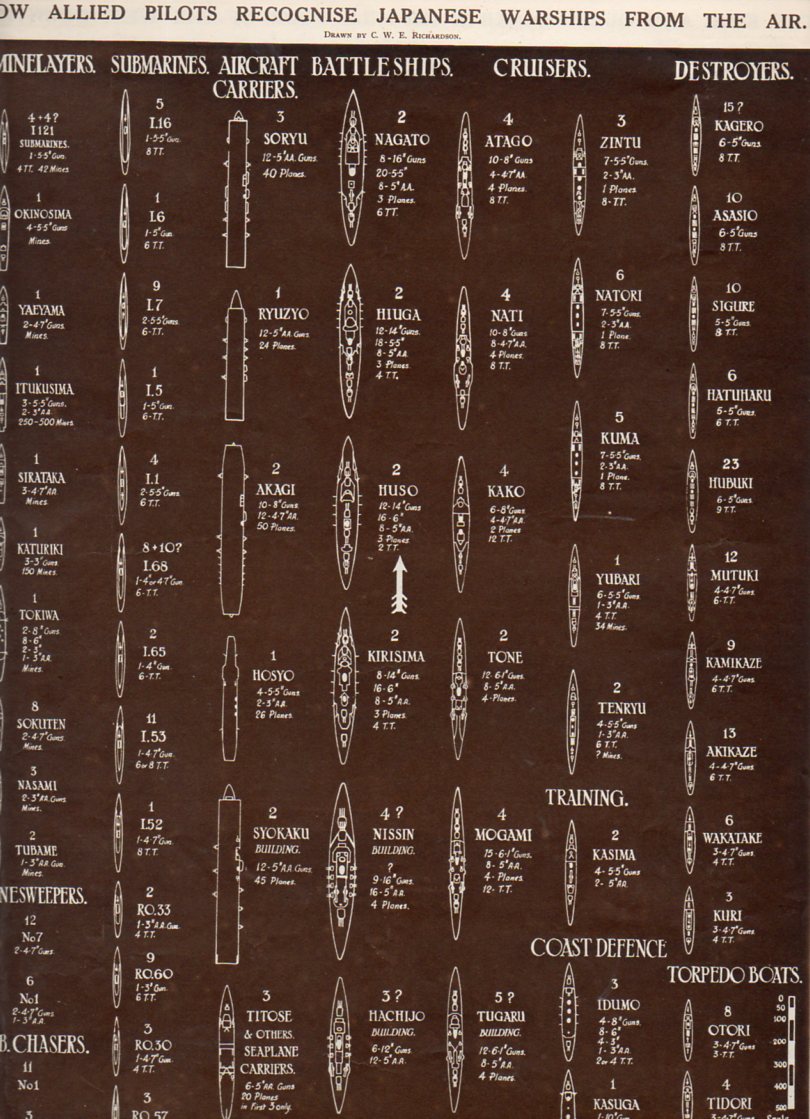
    “How Allied Pilots Recognize Japanese Warships from the Air”, a graphic that appeared in The Illustrated London News on 16 May 1942, displayed in silhouette the different sorts of Japanese warships that might be targets of allied planes.  There’s a lot of data on this one long sheet of paper, showing minelayers, submarines, aircraft carriers, battleships, cruisers, destroyers, subchasers, torpedo boats, training vessels and coastal defense ships–65 in all.  It is a great display, presenting a great amount of data in limited space, clearly and concisely, and very easy to distinguish and read. 


  • An Alphabet of Anatomical Emotions and Feelings–Installment 1

    JF Ptak Science Books   Post 1488

    In a developing thread on oddly-represented alphabets on this blog, this one is a little harder to fill than it seems.  The rules are that all images must be some level of dissection (with the exception of the anatomical Durer), and not a simple artistic study of emotion, and that the images be at least 200 years old.  Part I of this alphabet of emotion and feelings includes awe, burdensome, contempt, disappointment, empathetic, fear, guilt, hope, intrigue, joy, lonesome, majesty, pride, resentment, surprise, trust, vulnerability and wonder.

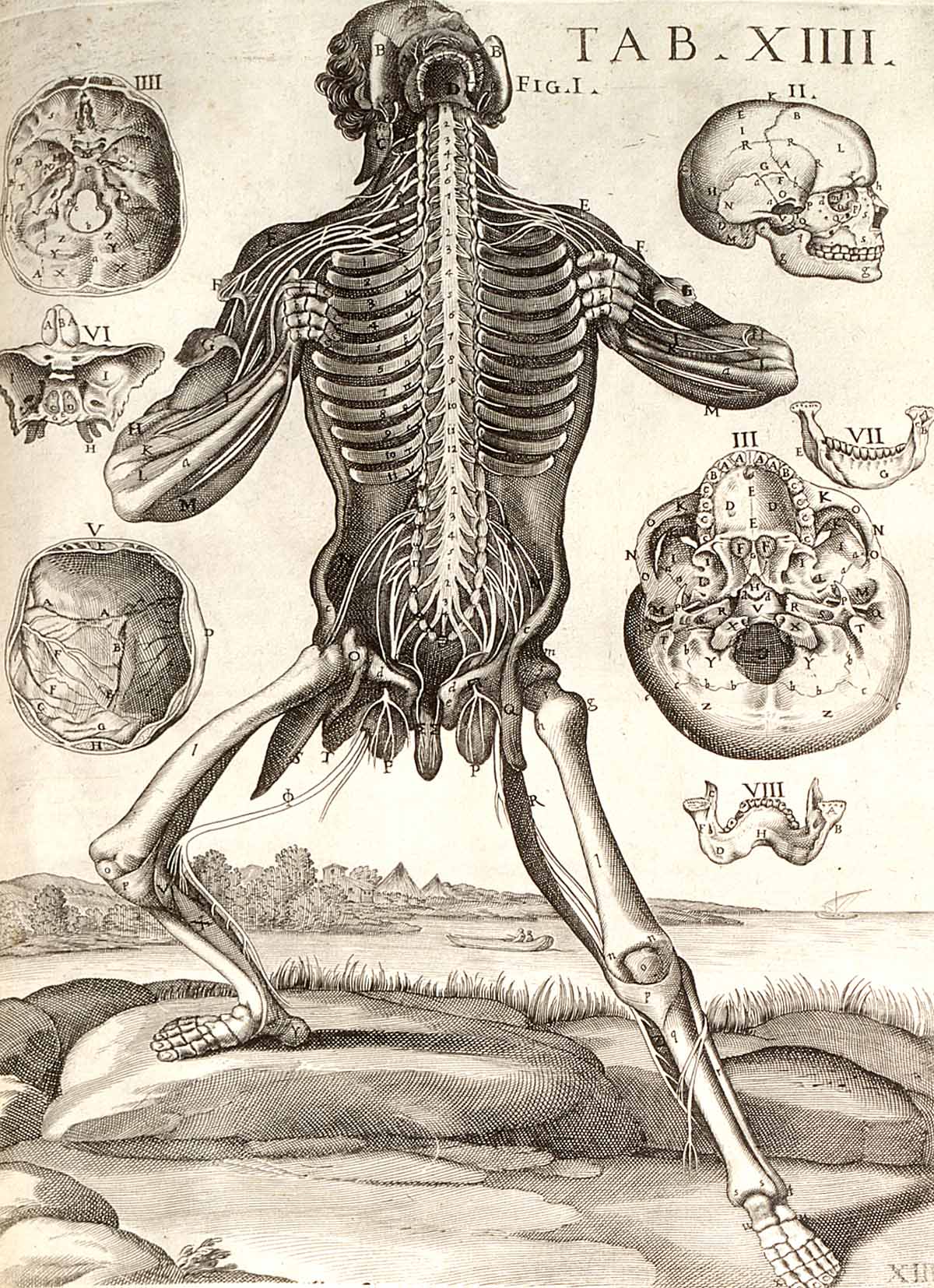
    Awe

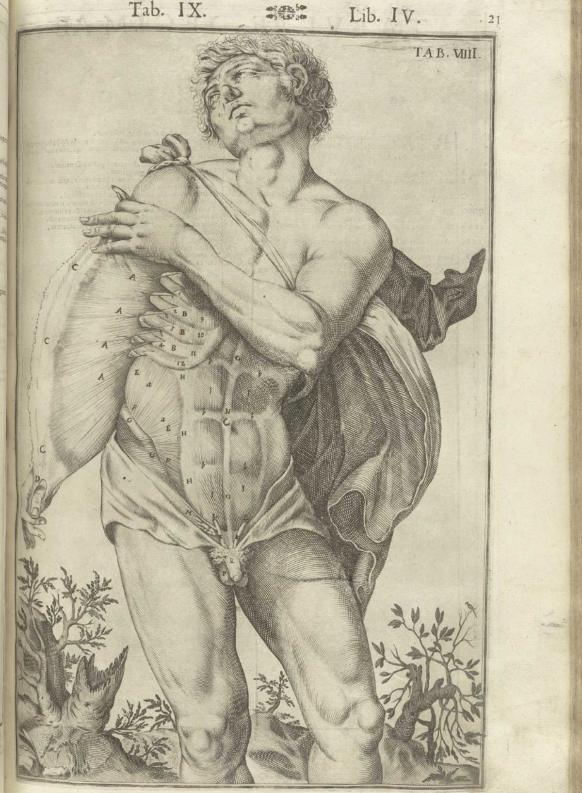
    Tabulae Anatomicae... by Giulio Casserio and Odoardo Fialetti

    Giulio Casserio (ca. 1552-1616, anatomist) and Odoardo Fialetti (artist), Tabulae Anatomicae, published in Venice in 1627.

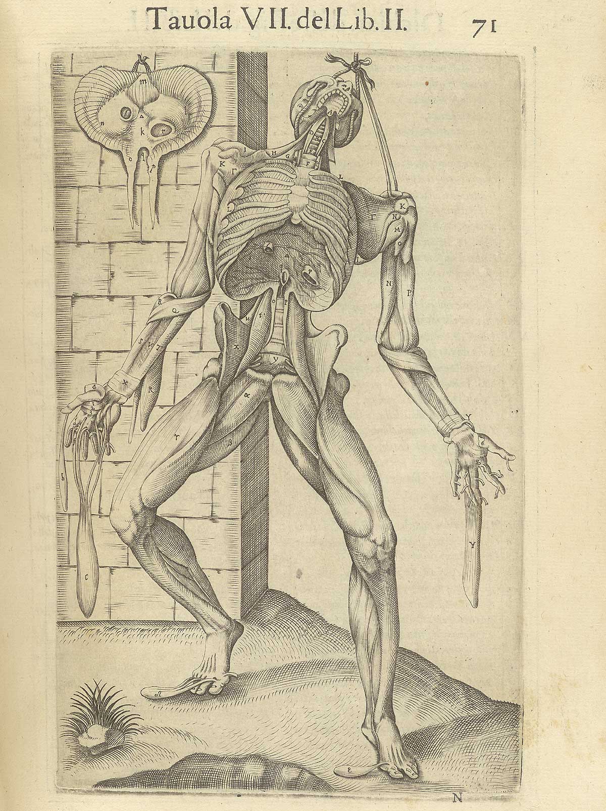
    Burdensome

    http://www.nlm.nih.gov/exhibition/historicalanatomies/Images/1200_pixels/valverde_p71.jpg

    Juan Valverde de Amusci (ca. 1525-ca. 1588), Anatomia del corpo humano, printed in Rome in 1560. 


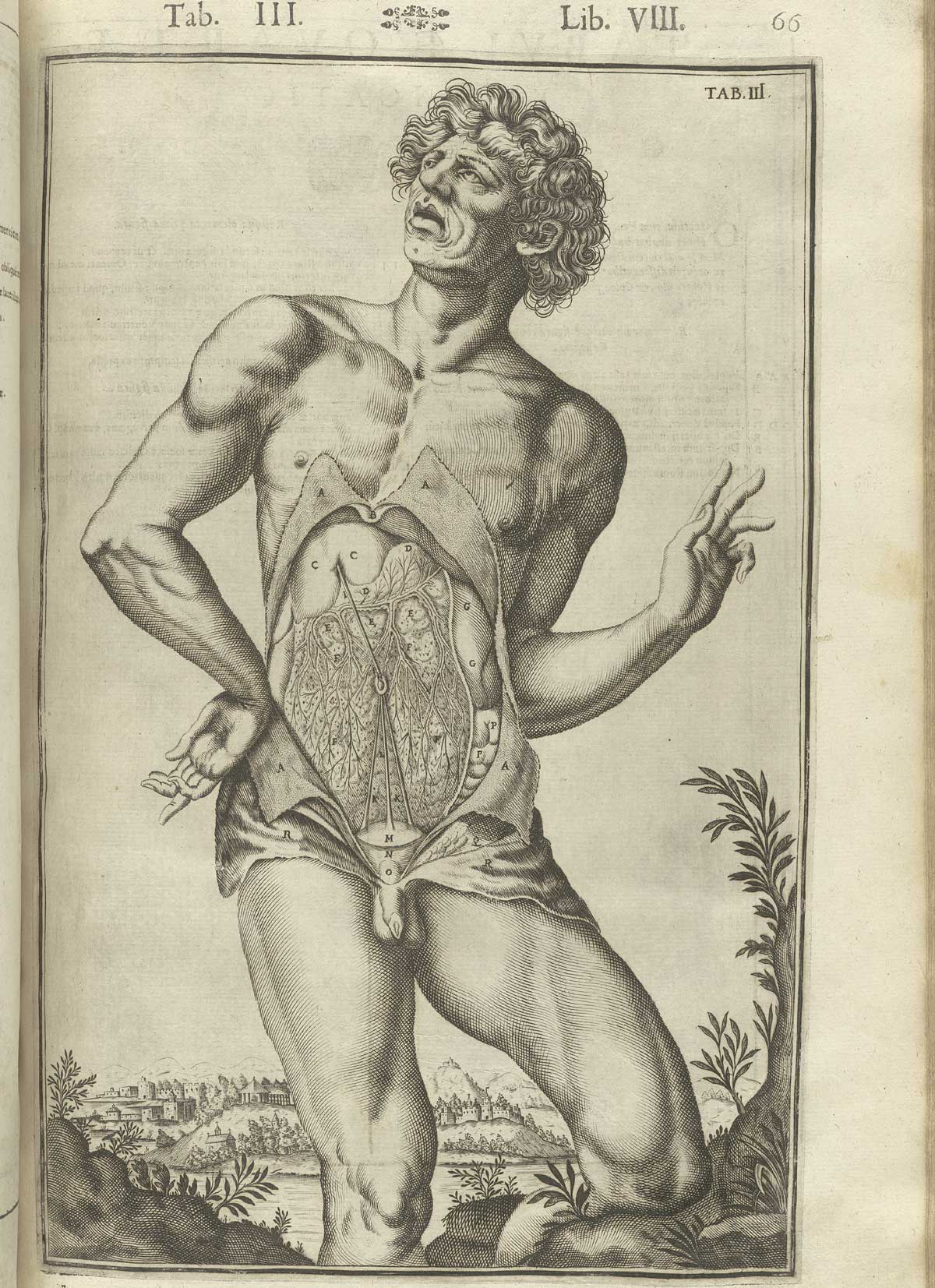
    Contempt

    Casseri_p66  dandy

     Giulio Casserio (ca. 1552-1616, anatomist) and Odoardo Fialetti (artist), Tabulae Anatomicae, published in Venice in 1627

    Disappointment 

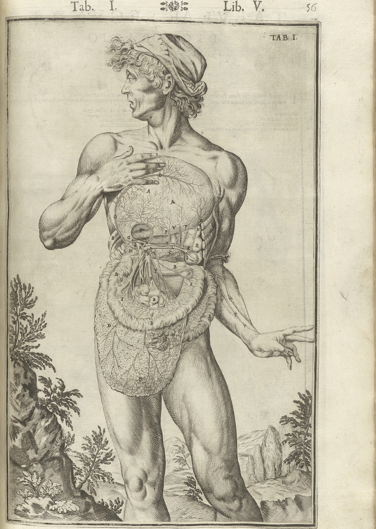
    Casseri_p56 surprise

    Giulio Casserio (ca. 1552-1616, anatomist) and Odoardo Fialetti (artist), Tabulae Anatomicae, published in Venice in 1627.

    Empathetic

    Missing skin c
    Juan Valverde de Amusci (ca. 1525-ca. 1588), Anatomia del corpo humano, printed in Rome in 1560.

    Fear

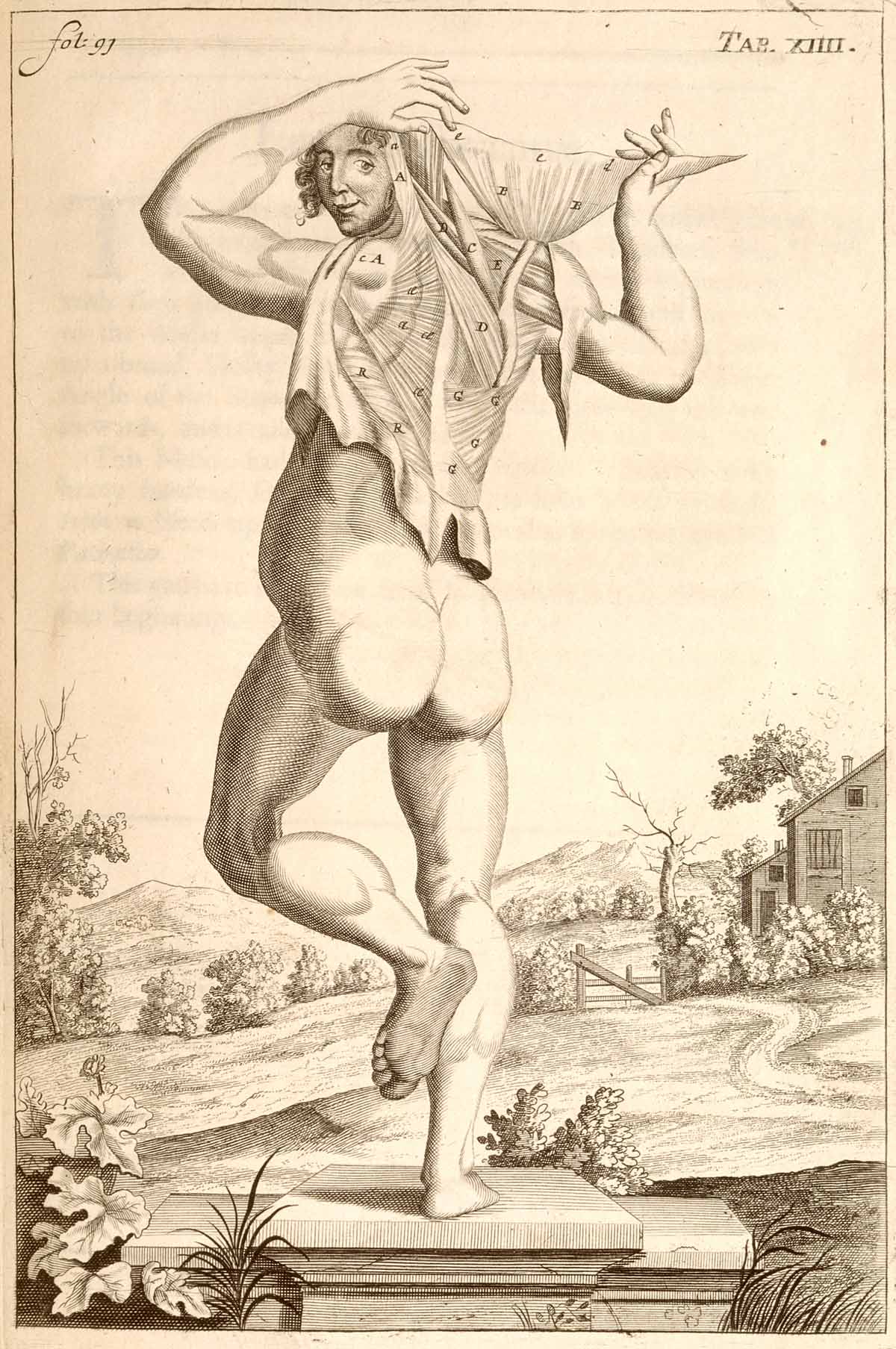
    Gamelin1_t02 Jacques Gamelin (1736-1803), Nouveau receuil d’ostéologie et de myologie, published in Toulouse in 1779.

    Guilt

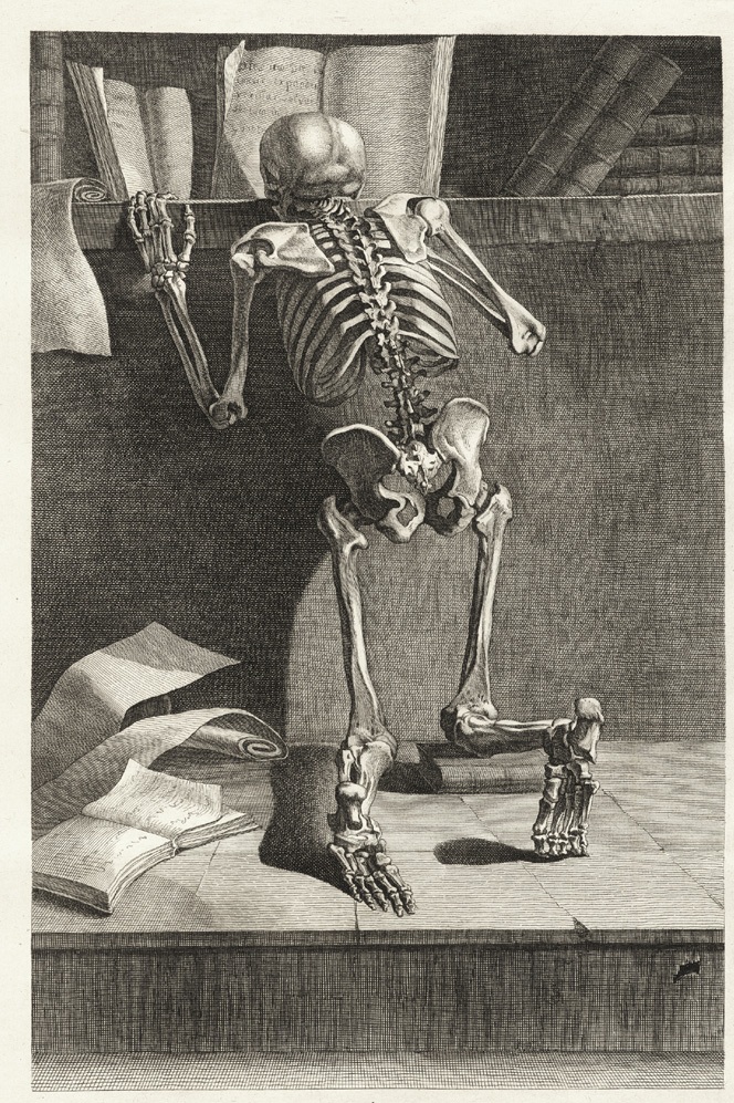
    Gamelin1_t11
    Jacques Gamelin (1736-1803), Nouveau receuil d’ostéologie et de myologie, published in Toulouse in 1779.

    Hope

    http://www.nlm.nih.gov/exhibition/historicalanatomies/Images/1200_pixels/gersdorff_p21v.jpg

    Hans von Gersdorff (d. 1529),  Feldtbůch der Wundartzney : newlich getruckt und gebesser, published in Strassburg in 1528.  

    Intrigue

    Casseri_p21 bored

    Giulio Casserio (ca. 1552-1616, anatomist) and Odoardo Fialetti (artist), Tabulae Anatomicae, published in Venice in 1627

    Joy

      Anatomy john brown dancing

    Lonesome

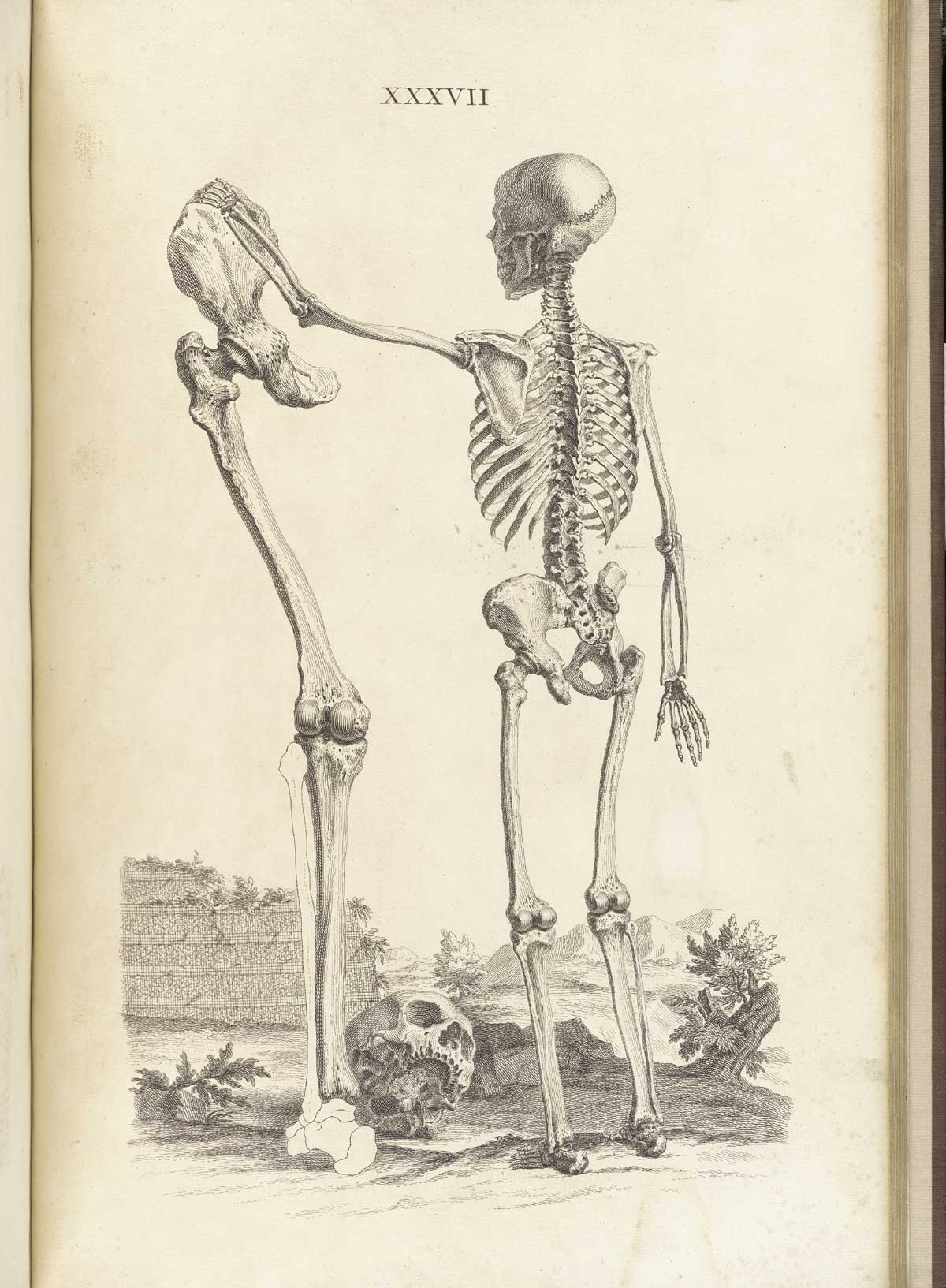
    http://www.nlm.nih.gov/exhibition/historicalanatomies/Images/1200_pixels/cheselden_t37.jpg

    William Cheselden (1688-1752), Osteographia, or the Anatomy of Bones, published in London in 1733.

    Majesterial

    http://www.nlm.nih.gov/exhibition/historicalanatomies/Images/1200_pixels/Eustachi_t39.jpg

    Bartholomeo Eustachi (d. 1574), from Tabulae anatomicae, printed in Rome in 1783.

    Pride


    Anatomy performers

    In the category of “Holy Crap!” anatomical illustration surely Pietro Berrettini da Cortona (1596-1669) must be among its patron saints.  His images are incredible, yelling and screaming for attention as they demand their space onthe printed page.  Further, the man actually accomplished all o fthis in the early 17th century, his work no tbeing published for another 130 years or so. [Source:  Tabulae anatomicae..., Rome 1741.]

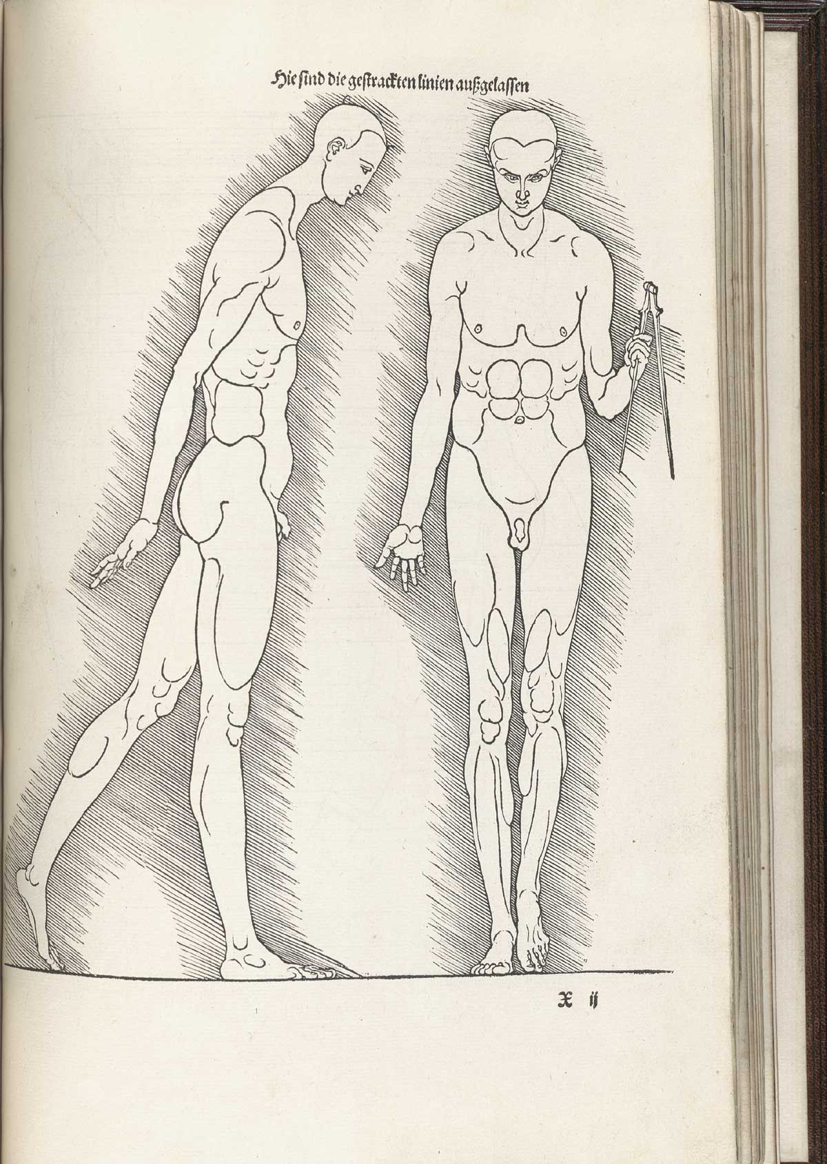
    Resentment

    http://www.nlm.nih.gov/exhibition/historicalanatomies/Images/1200_pixels/durer_pg-233.jpg

    Albrecht Durer (1471-1528), Vier Bücher von menschlicher Proportion, published in Nuremberg in 1528.


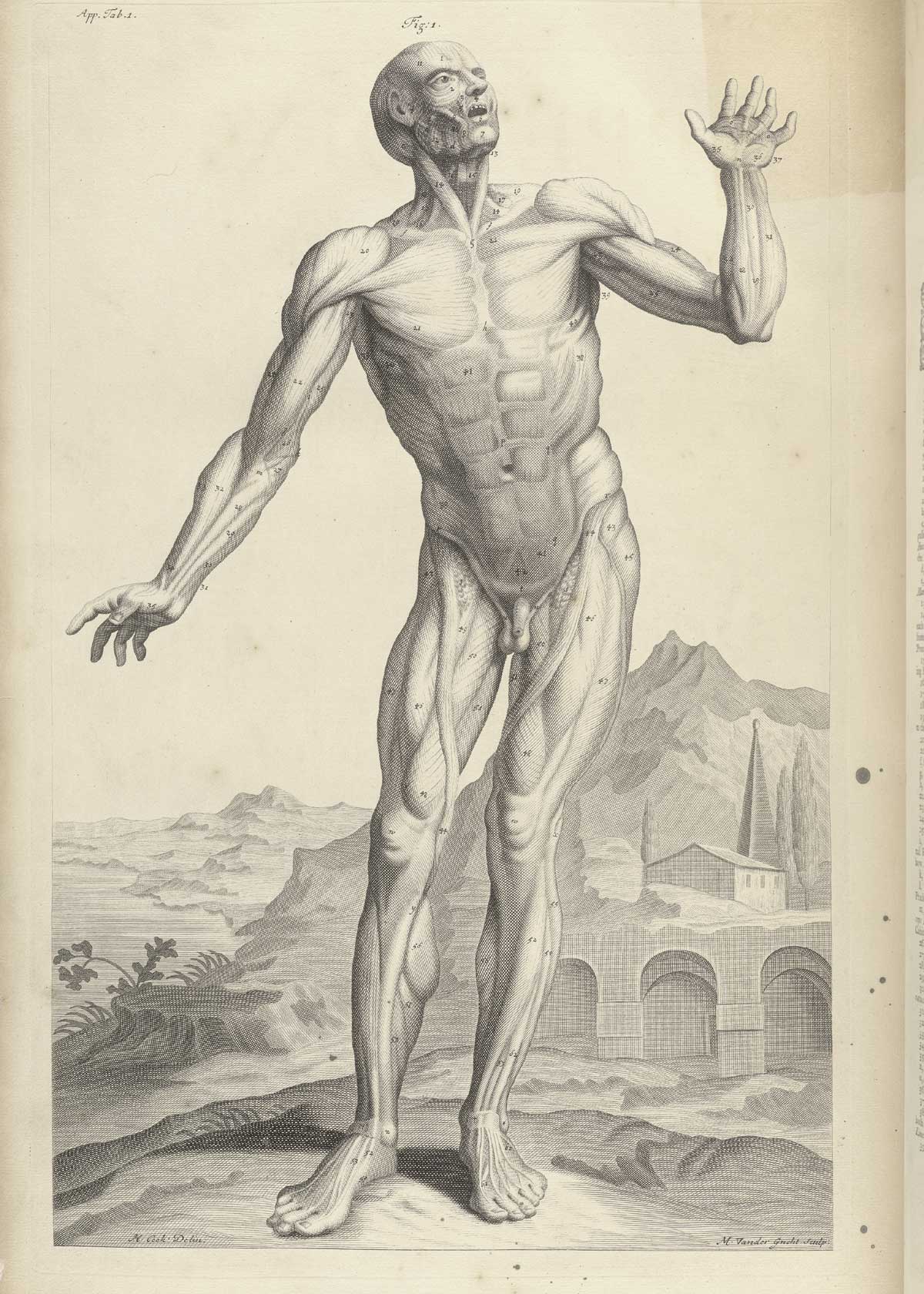
    Surprise
    http://www.nlm.nih.gov/exhibition/historicalanatomies/Images/1200_pixels/cowper_t01.jpg

    William Cowper, The anatomy of humane bodies, printed in Oxford in 1698.


    Trust


    http://www.nlm.nih.gov/exhibition/historicalanatomies/Images/1200_pixels/cheselden_t36.jpg

    William Cheselden (1688-1752), Osteographia, or the Anatomy of Bones, published in London in 1733.

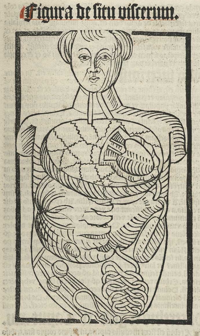
    Vulnerable

    Hundt_p119

    Magnus Hundt (1449-1519),  Antropologium de hominis dignitate…, printed in Leipzig in 1501 by Wolfgang Stoeckel. 

    Wonder

    http://www.nlm.nih.gov/exhibition/historicalanatomies/Images/1200_pixels/Estienne_p043.jpg

    Charles Estienne (ca. 1504-1564), De dissectione partium corporis humani libri tres, published in Paris and printed by Simon Colinaeus in 1545.


  • Species of Explosions: Human Anatomy, Explained

    JF Ptak Science Books   Post 1479

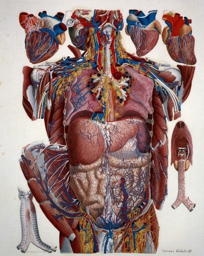
    Anatomia universale... by Paolo Mascagni and Antonio Serantoni

    Species of explosions come in all sorts of shapes and sizes, and basically release some sort of energy (chemical, nuclear, mechanical and so on), but in the cases we’ll look at here they are none-of-the-above.  The energy released in these explosions are in the form of potential, a knowledge-driven, controlled and reversibly ordered demolition, a deconstruction in slow motion.  The medical “explosion view” for the study of anatomy is a remarkable thing, especially when you considered not only the pre-Cat and pre-MRI times, but also the pre-Xray (1895) days of imaging the inside of the body–the images not only show you the bits and pieces alone but also in relation to the other bits around them.  The body becomes an archaeological dig, each level preserved so that a viewer could easily see the dependencies and relations between one thing and another. 

    Take for example Paolo Mascagni’s (1755-1815) beautiful Anatomia universale (an example seen above), which was printed in Florence in 1833 and has the look and sensibility of something much later.  Mascagni is able to achieve this depth not only from the exploded view, but also for the (somewhat exaggerated) coloring setting the specimen on top of a blank background the combination of the color and the background giving the whole thing a 3-D-ish feel–and if not that, then certainly a living image in which there is some fair amount of depth. 

    Anatomy exploded
    Another version of the exploded view which is also quite effective from the same work by Mascagni is his “exploded thorax”, showing a more limited display of the more closely-aligned organs. 

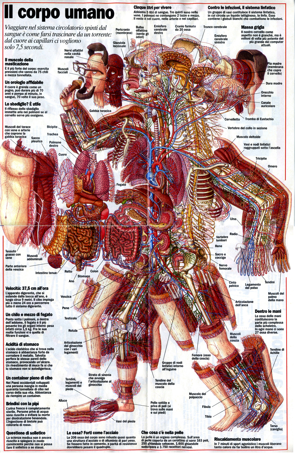
    When these views appear today–which is generally much more uncommon given the other technical ways of envisioning multiple layers of complex associated items–they have more of a sense of the antiquarian, retro feel to them, though they are no less useful for it.  As a matter of fact  I still prefer these views for understanding technical and engineering  and architectural complexes than anything else. And the modern master of this genre for me is Stephen Beisty, who performs his magic mostly in the tech and engineering fields, but who occasionally dips into the messy wet stuff of biology, as we can see in this fabulous exploded view:

    Anatom exploded beisty

    There are of course many other examples of (drawn) exploded views in the history of anatomical illustration, but I think these will do for now as good examples of the art.


  • Blank and Missing Things Series–Antiquarian Anatomical Skin (Appended)

    JF Ptak Science Books   Post 1476  -part of the Blank, Missing and Empty Things series.

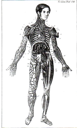
    Carl Ernst Bock (1809-1874) was a physician and anatomist (and son of the anatomist August Carl Bock of Leipzig, 1782-1833), whose many publications include the very popular  Hand-Atlas der Anatomie des Menschen  nebst einem tabellarischen Handbuche der Anatomie.(first printed in 1841).  This is a good example of his reaching out across the social strata to publish something that was accessible to the public-at-large, making him a pioneer in the distribution of medical information.

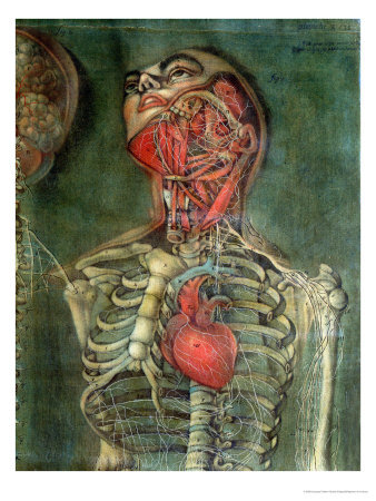
    I’m sorry to say that in all of this man’s beautiful work I  focused on this superior full-body anatomical–the odd thing here is that the only skin remaining on the body is on the head, where we see a  face and full head of hair.  To my experience this is a very highly unusual visualization.

    Anatomy bock482

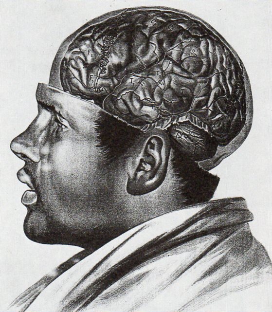
    In an almost-the-opposite approach (which is much more common) Albert Adamkiewwicz (in his Taflen zir Orientierung an der Gehirnoberflaeche des lebenden Menschen...(printed in 1894, in Vienna) offers the following:

    Anatomy adamkiewicz484

    As with the other image above I only have a second generation image of this, and only in black and white–the color original is truly remarkable. 

    Another excellent example of an anatomical dissection leaving the face intact occurs several times in the massively interesting work of Jacques Gauthier Dagoty, whose work I remembered but whose name I forgot, making it fairly difficult to find the illustrations.  But here they are, from Anatomie des parties de la generation de l’homme et de le femme, published in Paris, in 1773, with Dagoty (1717-1785)  acting in multiple roles of author/designer/anatomist/painter, who produced these magnificent painterly dissection studies of great detail and warmth.

    Anatomie des parties by Gautier D’Agoty and Duverney

    And this:

    Missing skin b
    There are many other studies in the volume, but few retain the face.

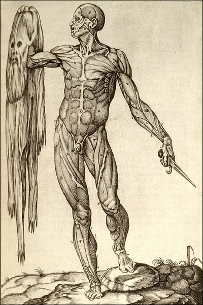
    Then there’s this, the other end of the spectrum, where we see the flayed anatomical specimen and its skin though not in contact with one another, which is a special category indeedy:

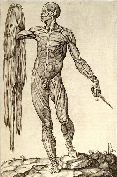
    Missing skin c

    This copperplate engraving comes from Juan Valverde de Amusco (Valverde) (1525-1588 or thereabouts), Anatomia del corpo humano… (printed in Rome in 1559), and stands quite apart (though not alone) from the rest of the anatomical oeuvre of the 1550-1750 period.  

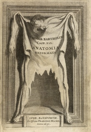
     And let’s not forget Thomas Bartholin’s frontspiece for his Anatomoa, published by F. Hackis in Leyden in 1651, which is similar to the Valverde:

    Anatomy skin bartholoiin