A Daily History of Holes, Dots, Lines, Science, History, Math, Physics, Art, the Unintentional Absurd, Architecture, Maps, Data Visualization, Blank and Missing Things, and so on. |1.6 million words, 7500 images, 4.9 million hits| Press & appearances in The Times, Le Figaro, Mensa, The Economist, The Guardian, Discovery News, Slate, Le Monde, Sci American Blogs, Le Pont, and many other places… 5000+ total posts since 2008.

Category: Information, Quantitative Display of

  • An Episode in the History of Bread Photography: Monumental Bread and Infographics, 1914

    JF Ptak Science Books   Post 1662

    Infographic999
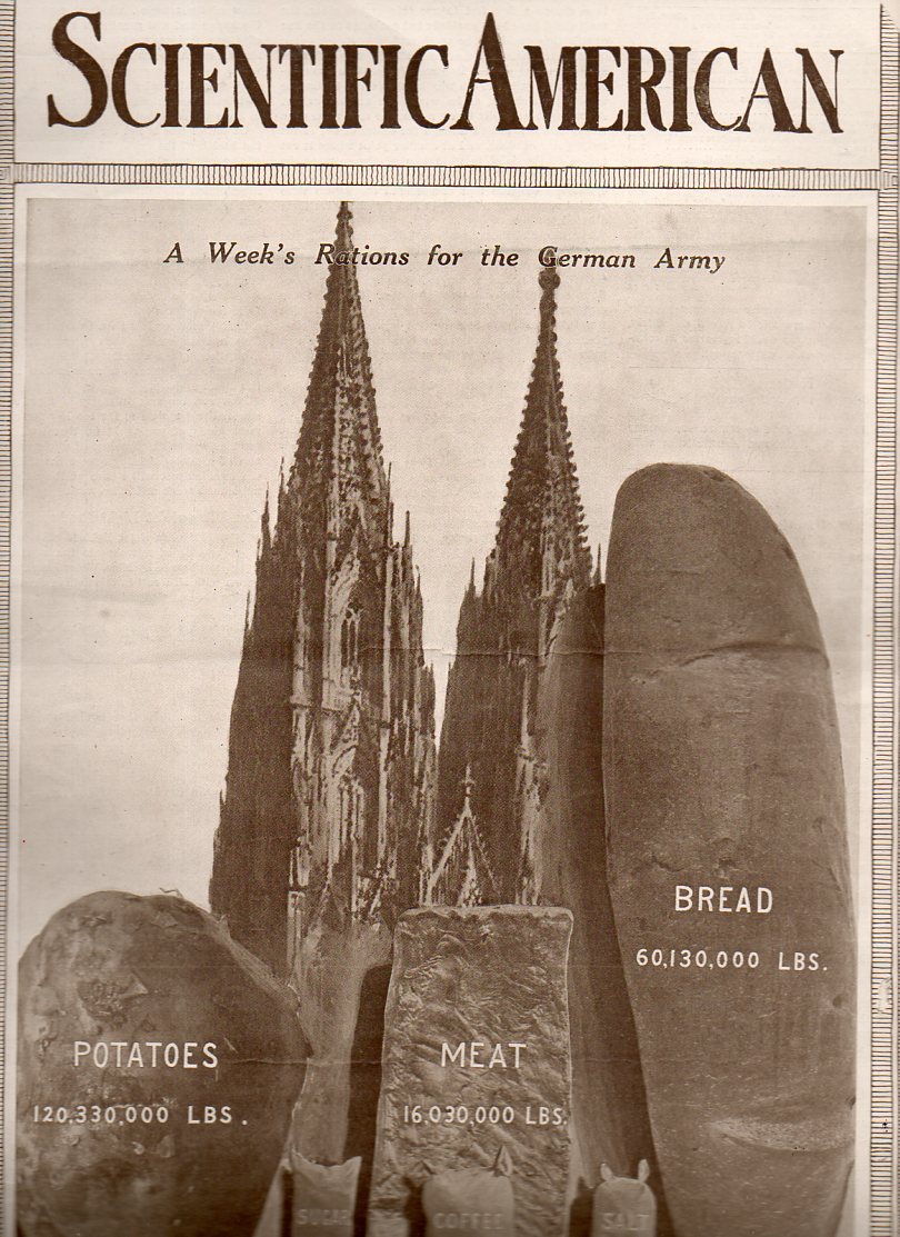
    In the history of pictures of bread, this loaf seems to be about the biggest.  The 60-million-pound loaf is meant to represent a week’s ration for teh newly-fighting German army.  The war, the Great War, WWI, was just beginning when this article hit the newsstands on 22 August 1914.  There wasn’t much yet printed in the Scientific American regarding the war, and it seems as though this was the first cover of the magazine to deal with the new world-ender.  But in the blazes of the guns of August (B Tuchman) the end of the conflict might’ve looked a little close at hand.  I doubt that many would’ve seen the 100,000,000 dead and wounded that would come as a result of the war, at this point just finishing its first month.

    I am not sure why, but the editors of SA chose to think about supply for their first stab at making a cover-comment about the war.  It does give some idea of the sheer numbers of people involved, at least on the German side.  Hoiw this is iterated by a 400-foot-tall loaf of bread, I can’t exactly say.

    (Are potatoes one tenth the density of :”meat”?  The potato sack and the meat chunk look to be about the same size, though the meat bit is less than a tenth of the weight of the potatoes.) 

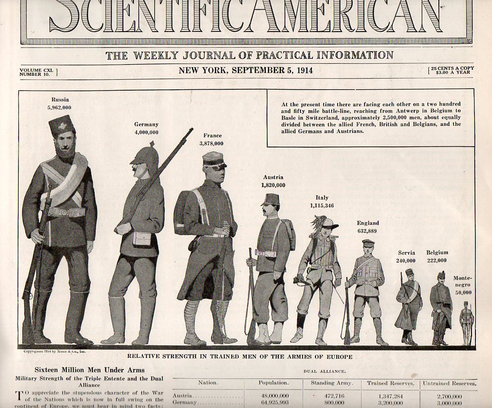
    Two issues later–5 September 1914–we see the following artistic display of quantitative data, a much more effective way of generating understanding on the differences in troop strengths among the waring countries:

    Infographic army size001


    The United States would not get involved in WWI until 1917, and so American statistics were not included in this image.  But if they were, the U.S. Army’s size would be somewhat larger than little Montenegro there at the far right.  Given the American population of 92,000,000, the army was quite small, with barely 98,000 soldiers under arms (half of whom served overseas). (Montenegro’s force of 50,000 was somehow pulled out of a population of 350,000 people–Belgium, with a population of 7 million, had an army more than double the size of that of the U.S.)  Of course this was a peacetime, hands-off army for the United States, and by the end of 1914 President Wilson expanded the standing army to 140,000; by 1918, when the newly-instituted draft1 really kicked in, more than 4,000,000 people would be in the armed services, half of whom would serve overseas. 

    Notes

    1. Beginning in 1917 all males between the ages of 21 and 30 were required to register for the draft/military service, and by September 1918 more than 23,000,000 men had done so.  This was an extraordinary leap from the Army totals for 1914.   


  • Visualizing Depth: Thinking Deep on the Depths of the Oceans in Units of St. Paul’s Cathedral

    JF Ptak Science Books   Post 1660

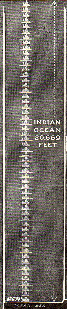
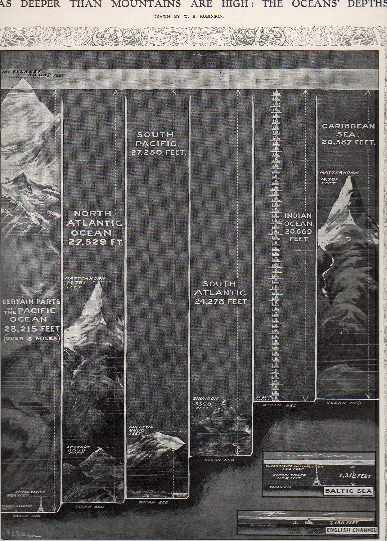
    Although maps showing the depths of the oceans existed from about the mid-19th century (through the pioneering work of the American father of oceanography, Virginia’s Matthew Fontaine Maury1) few casual readers would have ever seen a more approachable representation of information than what appeared in the Illustrated London News for 8 October 1910. Although Maury’s maps are elegant, they didn’t receive nearly as wide a distribution as this ILN image–also they weren’t nearly quite as relational as the 1910 version.

    Sea depths533

    Granted, the 1910 comparison chart only displays one statistic–the supposed greatest dept of five oceans, two seas and the English channel–it does so in such a way as to make those numbers immediately approachable to any reader, which is always an issue in relating scientific information to the general reader.

    Sea depths ist pauls537 {One of the standard unit of measurement for the purpose of this display was St. Paul’s Cathedral.]


     What W.B. Robinson presented was a way of looking at an invisible entity through very visible means–comparing depth to the heights of things that everybody in 1910 knew: the Eiffel Tower (relatively newly constructed out of 18,000 prefabricated highly-engineered pieces) and St. Paul’s Cathedral. So rather than stating that the Pacific Ocean is 28,000 feet deep, Robinson chose to replace feet with Nelson’s Column–174 of them. Or 29 Eiffel Towers. The 20,000-foot deep Indian Ocean was actually 56 St. Paul’s deep, while the Baltic Sea was deep enough to not quite cover one Eiffel Tower with one Westminster Bell Tower on top (ha!); and the English Channel at its deepest wouldn’t quite cover St. Paul’s.

    This is really the way to display data in my book, especially to kids.  This is one of the few ways of making the information accessible and understandable across almost all age ranges. 

    Notes:
    1.  Actually the work goes back a century before Maury with Buache, who produced this map of the English Channel in 1737–the data points are veyr numerous, but this is the very first time that such information was available on a map.

    Sea depths idouth pacific536 Sea depths indian535


    NOAA Photo Library Image - map00004

    And Maury again with this first map of an oceanic basin, published in 1853:

    NOAA Photo Library Image - map00001

     And in 1752, Philippe Buache produced this fantastic and first-of-its-kind map for the depths of the English Channel:

    NOAA Photo Library Image - map00186

    Here’s an extraordinary cross sectrion of a part of the ocean floor produced in 1857 by the HMS Cyclops in preparation for laying the Atlantic Cable:

    NOAA Photo Library Image - map00010


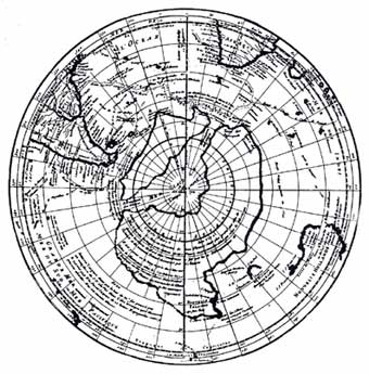
    Its also interesting to note here Buache’s work on this map of Antarctica, published in 1737.  Buache put together all of the known (to him) information about the mass in the South, bits taken from other maps, and accumulated them into what was the best-possible guess on what was down there in the Antiopode.  Pretty good detective work given the amount of material that he could work with.


  • Infographic Display of the Dead with the Living–1912 Aviation Losses

    JF Ptak Science Books Quick Post

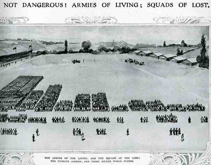
    Even though masses of people had been used in panoramic photography for some years (thousands of people, usually soldiers, gathered to form a living liberty bell, or portrait of George Washington, or some such thing) , I cannot recall the use of humans as a direct statistical aid as in this bio-bar graph, found in the pages of The Illustrated London News for 1912 (page 357). 

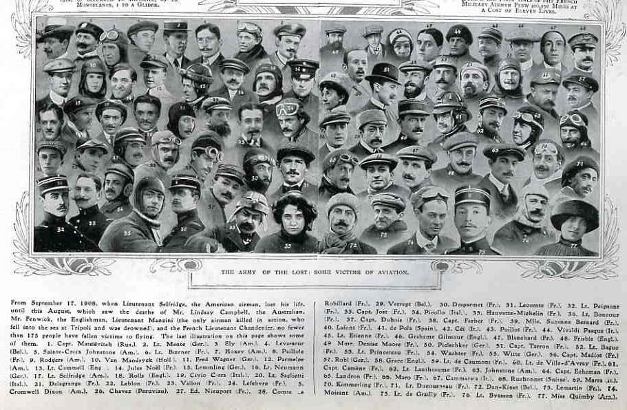
    000-ebay--Nov 7 air death005

    The article asks the question of whether air travel (and flight in general) was “safe”, and responded by graphing its “yes” response with this image. The larger groups in the top half of the image represent the number of flyers flying for that particular country; the small groups below show the number of aviators killed.  (There is no date of reference in particular but it seems to me that these are total deaths since flying began in Europe in earnest in 1905.) The photo montage below shows a selection of some of the most famous dead aviators. The number of deaths as a percentage of those flying seemed quite acceptable in the year of publication (1912) ; however if these figures were iterated forward to 2011 the death rate would be staggering, sending many thousands of aviators (and crew and passengers) to their deaths each year.  In the United States we save that safety failure for deaths in automobile accidents, which still kill about the same number of Americans each year as were U.S. soldiers lost for the entire war in Vietnam.  In spite of this the odds for survival looked pretty good in 1912. 

    000-ebay--Nov 7 air death portrait006


  • Big Numbers and WWII Aircraft–Artistic Displays of Quantitative Data

    JF Ptak Science Bools  Quick Post

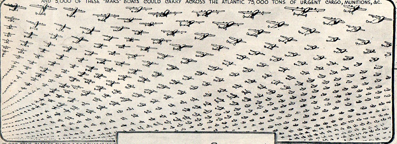
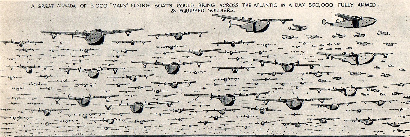
    This post continues an earlier series on the artistic display of quantitative data–putting a face on big numbers. In particular it extends a collection of images of Second World War airplanes, “A Big Sea of Planes:  Quantitative Display of World War II  Bombers. The images below appear in the 17 October 1942 issue of the Illustrated London News in an article about the possibility of replacing seaborne troop and materiel transport across the Atlantic from America with the big Martin JRM Mars aircraft, getting the troops there faster and safer and releasing at least part of the naval force for wartime activities.  The images are pretty compelling:

    Airport987

     The caption states that 5000 Mars planes could get 500,000 soldiers to Europe.

    Airport988

     These were big planes1 (200′ wingspan, 117′ long, 38′ high, more below) and could haul 130+ troops.  By the time though that the powers-that-be were figuring out who the main contractor would be for production (and those production numbers in early 1942 were about 500 per year, at that point, anyway) the Battle of the Atlantic was already–in 1943–fairly well decided.  The U-Boot problem was solved enough for a continuous flow of soldiers and supplies, though not without a high cost in the first half of the Atlantic campaign.  (Overall, from 1939 to 1945, some 3,500 Allied merchant ships  and 175 Allied warships were sunk, costing the lives of 72,200 Allied sailors and merchant seamen.  The Germans lost more than 780 submarines along with fully three-quarters of all sailors in the U-Boot fleet, making some 30,000 men.)

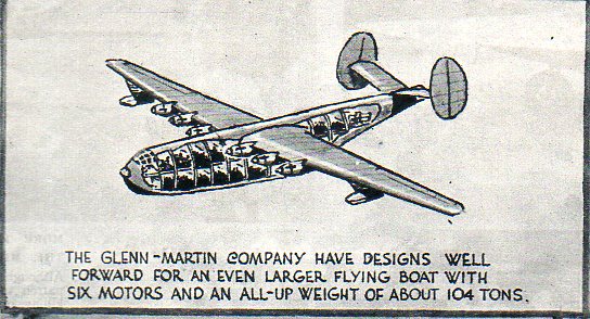
     Below, a cutaway for the Mars:

    Airport989

    Stats and Technical data on the Glenn-Martin(from Jane’s Fighting Aircraft of World War II, (1945):


  • Songs of the Streets, in Two Parts (and an Obscure Reference to an Important Anti-Darwinist)

    JF Ptak Science Books  Post 1600  {Appropriate musical accompaniment that can be listened to under the reading of this post, Carl Orff’s Gassenhauer, can be found here and minimized.]


    I found these two interesting images over the course of a hundred pages or so in the profusely illustrated weekly magazine, Punch, or the London Charivari, for early 1865.  The first image, published 18 March 1865, “A Song of the Streets”, drawn by “C.H.D.” (Charles Henry Bennett, 1828-1867), displays the general thoroughfare of sidewalk life in a place like London, people being blown about by late winds and snow.

    It is in the upper right-hand corner of the engraving that we find our “important Anti-Darwinist”, which seems like an illogical statement, except that it isn’t  The man in question is the fellow with the bellows, who seems to be the one instigating the weather, blowing so had and cold that it moves people off their feet and off the page.  The bellows is labelled “Fitzroy”, and the likeness is that of the man with the same name, Vice-Admiral Robert Fitzroy (b. 1800), who at this time was serving as the chief of a weather department for the Royal Society, the Meteorological Statist to the Board of Trade, appointed by the president of the society, and was basically a meteorologist, except that the title had yet been invented.  (It is also interesting that Fitzroy is depicted in captain’s (?) uniform, and surrounded by a floating telescope, book, thermometer and self-registering drum.) So even then, even with the first person in this position of authority, complaints for foul weather were being launched at the person “in charge”, even though that person created an extraordinary new tool for detailing the possible changes in weather.1

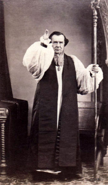
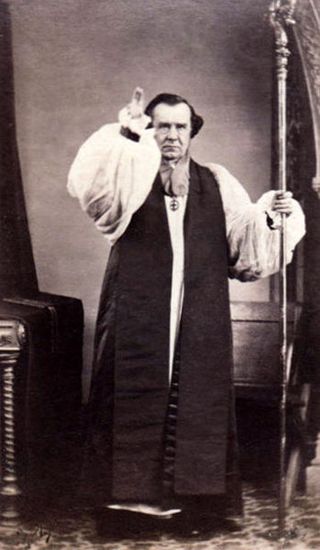
    It happens that this is the same Robert Fitzroy who was the captain of the HMS Beagle on its second voyage (1831-1836), when he approved of the addition of an added gentleman to help keep his sanity on the long adventure, a naturalist named Charles Darwin.  It was also Fitzroy who gave Darwin a copy of the first volume of Lyell’s Principles of Geology, a book integral to Darwin’s development into Charles Darwin.  The voyage was personally rocky for the two men, but ultimately highly successful.  Years later, Fitzroy was shocked and  dismayed with the result of young Darwin’s adventures–with the publication of On the Origin of Species…, Fitzroy felt a sense of personal guilt for Darwin’s theory, and felt shame and bitterness towards it, as in his mind the theory went against his bible and his religious beliefs.   Fitzroy and the Rev. Samuel Wilberforce were at the evolution debate meeting of the British Association for the Advancement of Science (1860) in which Rev. Soapy Sam challenged Darwin’s theory on “scientific” grounds, and against which Thomas Huxley (and other Darwin supporters) made his well-remembered defence2.  In the middle Samuel_Wilberforce_by_Mowbray_of_Oxfordof all of this was Robert Fitzroy, who cried for the crowd of onlookers–with his Bible held aloft–to reject man’s interpretation of nature and stay with that of God.   He was booed down.  Darwin was not in attenddance. [Image: Wilberforce, threatening.]
    So, in a way, Fitzroy proved to be important in the formation of the theory of evolution but also turned out to be an anti-Evolutionist, though not an important one.  Oddly enough this may be the last published image of Fitzroy during his lifetime, as he would die 42 days after the appearance of this issue.

    In the second image of the streets the view from the pages of Punch (for 27 May 1865), “The Banishment of the Beggars, a New Tramp Chorus”, we see a different type of street “cleaning”.  In this case, it. Charles Villiers (1802-1898, and for 63 years a sitting MP) and his Homeless Poor Bill of 1865 sweeping the “sham poor” from the city streets, the legislation designating that the capable poor actually be put to work and removed from their begging positions on the streets.  The complaints in the chorus against the highly visible poor of Metropolitania were considerable,


    finding among the beggars (“who disturb our peace”) a litany of fakes, many of who are featured in the illustration:

    “sham injured workmen (who display their wounds from door to door)”, the lame (who clap their crutches on our toes), the blind, sham paralytics, sham widows (with hired babies and brats), “artistic tramps” (who will no longer chalk on the sidewalk “I am Starving”), and the fake veterans of wars. 

    The way to salvation for these people was “the Mill”, provided by the Villiers bill, and a compulsory spot in a workhouse (work-house) where labor is exchanged for room and board. 

    London-Workhouse.jpg


    Notes

    1. Fitzroy was actually the person who coined the term “weather forecast”, or at least he was the first to use it who had any real chance of being correct or accurate, given how much data he was able to assemble and interpret. He was really a very important person in this regard, as well. 

    2. This is not the place to debate whether Huxley’s famous remarks were famnous at teh time.  In a letter to Darwin J.D. Hooker wrote this of the exchange: 

    “Well, Sam Oxon got up and spouted for half an hour with inimitable spirit, ugliness and emptiness and unfairness … Huxley answered admirably and turned the tables, but he could not throw his voice over so large an assembly nor command the audience … he did not allude to Sam’s weak points nor put the matter in a form or way that carried the audience”. ^ “Letter 2852 — Hooker, J. D. to Darwin, C. R., 2 July 1860”. Darwin Correspondence Project 

    On the other hand, another cotemporary of the exchange between WIlberforce and Huxley wrote:

    Alfred Newton wrote:

    In the Nat. Hist. Section we had another hot Darwinian debate… After [lengthy preliminaries] Huxley was called upon by Henslow to state his views at greater length, and this brought up the Bp. of Oxford… Referring to what Huxley had said two days before, about after all its not signifying to him whether he was descended from a Gorilla or not, the Bp. chafed him and asked whether he had a preference for the descent being on the father’s side or the mother’s side? This gave Huxley the opportunity of saying that he would sooner claim kindred with an Ape than with a man like the Bp. who made so ill a use of his wonderful speaking powers to try and burke, by a display of authority, a free discussion on what was, or was not, a matter of truth, and reminded him that on questions of physical science ‘authority’ had always been bowled out by investigation, as witness astronomy and geology.

    A lot of people afterwards spoke… the feeling of the meeting was very much against the Bp.” _Wiki on the 1860 debate.
  • History of Lines–Measuring Things with People, 1522

    JF Ptak Science Books  Quick Post (Edited-and-added version of Post 1019)

      0 blog feb 20 line611det

     “My car gets forty rods to the hogshead, and that’s the way I likes it!”–Grandpa (Abe) Simpson, from The Simpsons  (That’s about 500 gallons to the mile.)

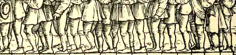
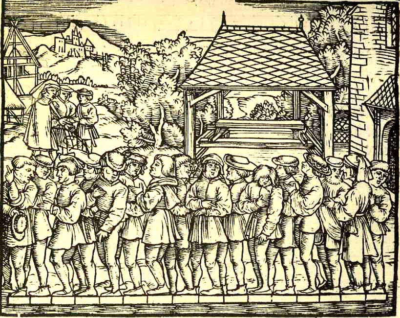
    A line, a connection of two points in space, is about as basic an imaginary thing as we have here on earth.  Humans have used these creations to build all sorts of straight things, from roads to building to ships to literature to mathematics and on and on.  What doesn’t happen very often, at least not in Western art in the last 500 years or so, is for people to be represented in art in a straight line that is not a processional (including military, religious, political venues), or that is not along a bench next to a table, or not supported by another artificial structure like a fortress wall (to give their waiting or standing a form to accommodate).   That weakens the line field considerably–after all, what else is there to line up for?  They’re not queuing up for a sale at Gimbels, and they’re not waiting patiently for a place on the bus.  There’s just not that much to form a line for, evidently. 

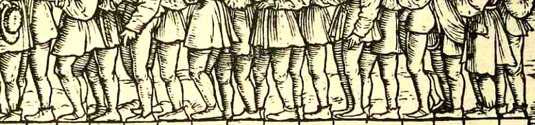
    0 blog feb 20 line611 There is, on the other hand, this (above and below), what I take to be rare representation of my odd requirements:  a delightful woodcut from Jacob Koebel’s 1522 Von Ursprung der Teilung, Mass und Messung dess Ertrichs, der Ecker, Wyngarten, Krautgarten und anderer Velder…, an early surveying handbook (probably the first ever printed in Germany) that could be used to measure and set out (as stated in its title) herb gardens, vineyards, farms and the like.

    I’m not 100% sure of this, but I think what is going oin in this image is the measruing of a rod (or “rute” in German), which is about 5.5 meters or 16 feet; and what we have in the picture is 16 men being positioned over a measuring device and beign overseen by the powers that be, at rear. On the other hand, maybe not:  the English rod was 16.5 feet, while the rod measurement for Saxony, Rhineland, Bavaria and Baden were different as well; Sweden also came in at 16 feet to the rod.  The other big question was:  how long was a “foot”? Since that measure also chnaged (varing between 23.51 cm in Wesel and 40.83 cm in Trier and  31.387 cm up north in the Rhineland)  the measurement of anything with variable units of measure seems to have been problematic, or at least in a post-facto measure.  [The whole issue of “absolute” units of measurement is another post for another time (and a much bigger and moire compelx story).] For right now I’m content to have found this pretty image, which in the end was probably the work of the author Koebel (1470-1533), who seems to have been a jack-of-all-trades; and while he was concerned with property and measurement, he also showed his flair with charm, as this group of men atest. 


  • History of Lines (Note)–Getting There for the Common Reader. Sebastian Munster, 1551

    JF Ptak Science Books   Quick Post for the History of Lines*series

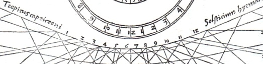
    Lines munster636  det c

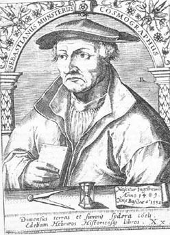
    Sebastian Münster

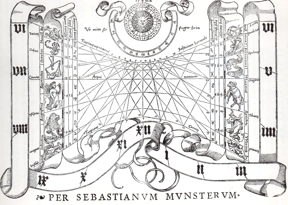
    Sebastian Munster (1488-1552) did not contribute a great or even an original work in the history of mathematics, or even in surveying, or map making.  What makes his Cosmographia  important, and what made it so very successful (entering 24 editions over a hundred years), was that he was among the first scholars of the time to put all of this disparate material together, and to give credit where credit was due, and to present an accumulation of important information in a scholarly, reasoned way.  He also made all of this accessible to the general reader, so that the information and methodology could be spread very wide.  It was in fact the first time that the stuff of the world in general was described in German–that of course is very important; but the fact of the matter is that the presentation and scholarship that resulted in this work was in itself ground-breaking.

    I’ve chosen an image from another of Munster’s works, his Rudimenta mathematica1, which was a practical work on time reckoning, and another work of celebrated importance.

    1. Rudimenta mathematica : haec in duos digeruntur libros, quorum prior geometriae tradit principia seu prima elementa, unà cum rerum et uariarum figuraru[m] dimensionibus, posterior uerò omnigenum horologiorum docet delineationes, 1551. 

    And the full image, one of the woodcuts illustrating the section on the construction of sun dials:


    Lines munster636

    Contents of the 16th century editions of the Cosmographia.
    1. Book I – Astronomy, Mathematics, Physical Geography, Cartography
    2. Book II – England, Scotland, Ireland, Spain, France, Belgium, The Netherlands, Luxembourg, Savoy, Trier, Italy
    3. Book III – Germany, Alsace, Switzerland, Austria, Carniola, Istria, Bohemia, Moravia, Silesia, Pomerania, Prussia, Livland
    4. Book IV – Denmark, Norway, Sweden, Finland, Iceland, Hungary, Poland, Lithuania, Russia, Walachia, Bosnia, Bulgaria, Greece, Turkey
    5. Book V – Asia Minor, Cyprus, Armenia, Palestine, Arabia, Persia, Central Asia, Afghanistan, Scythia, Tartary, India, Ceylon, Burma, China, East Indies, Madagascar, Zanzibar, America
    6. Book VI – Mauritania, Tunisia, Libya, Egypt, Senegal, Gambia, Mali, South Africa, East Africa

    Note on introducing line fragments for the History of Lones series:

    * I think that if I had a sense for design and some artistic talent that I could perhaps make something interesting out of bits and pieces of the details of a hundred famous lines.  Or two hundred.  Unfortunately, I don’t possess those talents, so I’ll just have to write about it as though it has been done, already.  If we could whisk ourselves away 50 years into the past to the great world of early broadcast television, back into the days of glorious black and white, it would be interesting to present the details singly and first on a game show like the lovable “What’s My Line” show. (Another guest, another one of the hundred or two that could appear, can be seen below*, though I think this one is a dead giveaway.)


  • Aerial Bombing Accuracy Calculator, WWII

    JF Ptak Science Books  Post 1545

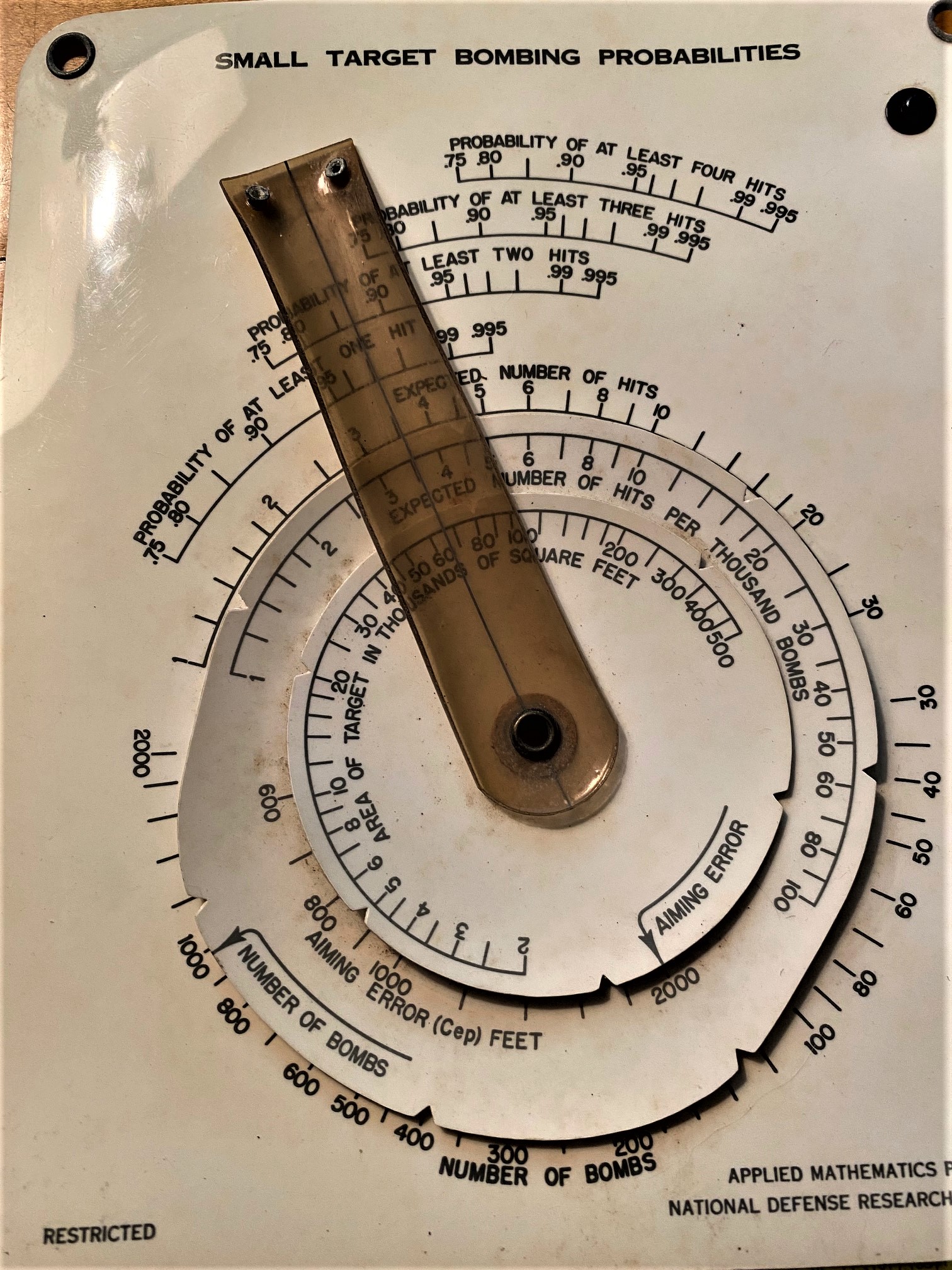
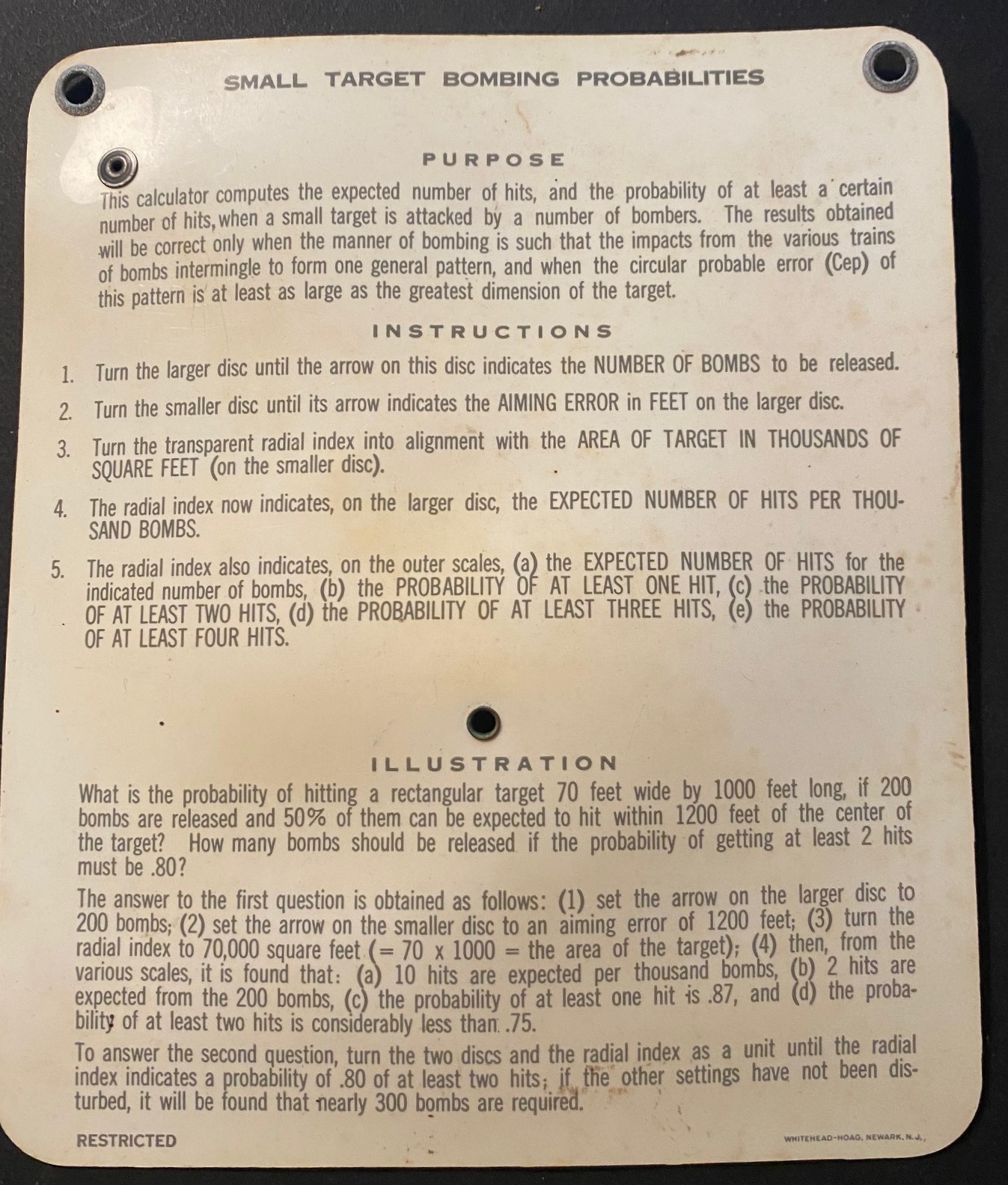
    IMG_5402I found this object in my paper-calculators box (moveable disk calculators made of paper, two going back to A. Kircher in the 1660’s)—I’m not sure why it was there as it is not paper, though it is an interesting calculator.

    [Images are greatly expanded in click mode.]

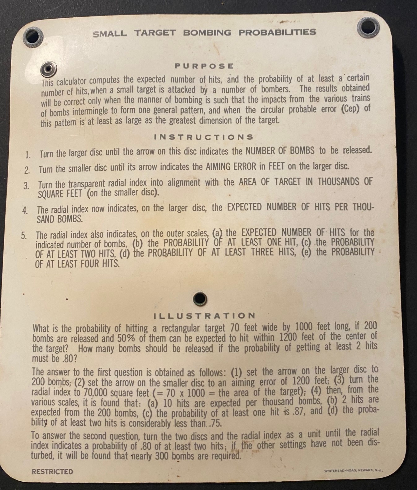
    I learned a big lesson from it.   The “Small Target Bombing Probabilities” calculator was issued by the little-known (in the popular sense) Applied Mathematics Panel of the National Defense Research Council (NDRC)1 in the early 1940’s during WWII. 


    IMG_5403Marked “Restricted”, it calculated the number of bombs that would successfully be delivered given (1) the number of bombs, (2) the “aiming error”, and (3) target size. It would then generate results for “(a) the expected number of hits for the indicated number of bombs”, (b-e) the probability of at least one hit to four hits.

    What is a little surprising to me was the number of bombs that didn’t find their target. For example, a 65,000 square foot target bombed with 1000 bombs and an aiming error factor of 2000 feet could expect to land 3-4 bombs on the target, with an 88% chance of landing at least two hits, 75% chance of landing three hits, and about 50% of landing at least four hits.  And so the necessity of large numbers of planes dropping a large number of bombs.  

    Notes

    1. The establishment of the NDRC was announced so: “It is announced by Science Service that the following committee has been appointed in the United States to correlate “scientific research on the mechanisms and devices of warfare”: — Nature 146, 191-191 (10 August 1940).

    “Members included: Dr. Vannevar Bush (chairman), president of the Carnegie Institution of Washington, formerly dean of the faculty of engineering at the Massachusetts Institute of Technology; Prof. Richard C. Tolman (vice-chairman), dean of the graduate school and professor of physical chemistry and mathematical physics at the California Institute of Technology; . Dr. Irvin Stewart (secretary), formerly Federal Commissioner for Communications and chairman of the Committee on Scientific Aids to Learning; Rear Admiral Harold G. Bowen, director of the Naval Research Laboratory, Anacostia, D.C.; Conwiy P. Coe, U.S. Commissioner of Patents; Dr. Karl T. Compton, president of the Massachusetts Institute of Technology, formerly professor of physics at Princeton University; Dr. James B. Conant, president, formerly professor of organic chemistry, Harvard University; Dr. Frank B. Jewett, president of the Bell Telephone Laboratories; Brigadier General G. V. Strong, assistant chief of staff, U.S.”


  • Hearing Patterns in Gases, 1894

    JF Ptak Science Books   Post 1530

    I was about to start a new series of posts on the History of Lines , something left out of this blog, oddly, given the different posts on the History of Dots and the History of Holes (and the History of Blank and Empty Things).  A lot of that–the History of Lines business–has to do with the interpretation of things on paper:  heart rate, “brain waves”, the motion of a bumble bee, navigation, and of course, words.  (The great Kickapoo tracker Famous Shoes  in Larry McMurtry’s Streets of Laredo, one of the Lonesome Dove tetralogy, found that the one thing he couldn’t track in this world were the marks on the pages of a book.)

    But I was distracted by the idea of seeing something in a different context, of associating something with a sense experience far beyond its origin, and so the History of Lines will wait just a little–something just a little beyond seeing some electrical function of the brain inscribed as a long line on a skinny piece of paper.  What I found was this–the invention of Mr. E. Hardy, whose “Formenephone” detected the presence of combustible fire-damp or any other gas in mines, and which would then emit sounds on the accompanying (small) organ pipe.  The apparatus would actually vibrate more rapidly as the gas content of the air increased.  At the time (the notice of the invention appearing in the Scientific American Supplement #945 for 10 February 1894) the only other means of detecting these gases was by the change of the glow of a candle. 

    Perhaps this is in a way like the application of musical notes to the numbers pi or tau, though actually useful.

    I’ll return to the History of Lines tomorrow.

    Notes:

    Formene, or marsh gas, is a “hydrocarbon which produces chloroform when the hydrogen in it is replaced with chlorine, loses hydrogen and yields anthracene”.


  • A Great Graphic Fumbled–What 300,000 Army Trucks Almost Looked Like, 1944

    JF Ptak Science Books   Post 1529

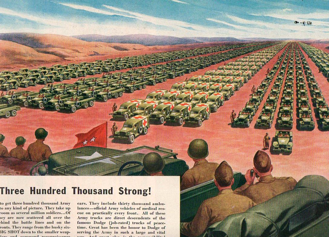
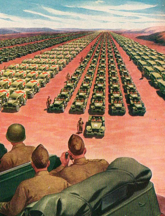
    If each of the 2,000 trucks pictured below carried $100,000,000 dollars in hundred dollar bills, how many trucks would it take to carry away the national debt?  Every one of them–this entire scene.  70 times.  Twenty miles of this convey, each truck carrying $100,000,000, would carrying off the debt.  Actually it would take 40 trucks (each with 100 million) to cart away the amount of debt accrued in daily interest on the national debt of 14 trillion dollars.

    Massive graphic548
    This Life magazine ad for the Chrysler Corporation–makers of Dodge–took the form of a public service announcement and a push to buy more ear bonds, though it really was an advertisement for itself and its wartime efforts.  What it proposed to graphically portray were the 300,000 trucks that it manufactured (to that point) for the U.S. Army–and the image that they use to get the point across is arresting, but it doesn’t come close to doing the job.

    It seems to me that the visible trucks here number about 2000 for the five columns; and I calculate that each of what we can see of the columns to be about 1500 feet long.  In order to show 300,000 trucks we’d need to show this page 150 times; or what Chrysler is showing is 1/150th of their total wartime production of trucks.  To show them all would take a lot of time for the two-star to review, hours, in fact.  I reckon that the five-column-wide display for the 300k trucks would be about 150 miles long. 

    Massive graphic549

    So even though this image is very persuasive and impressive, it doesn’t come close to the magnitude of the number’s display.

    Similar to the Chrysler ad is this:

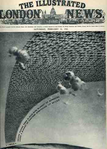
    1ebay_sept_30185000_planes695This arresting cover image for The Illustrated London News of 21 February 1942 illustrates the (new) American production program for planes and tanks for 1942 and 1943  The caption reads: “185,000 planes form a mile-wide blanket of bombers under a blanket of fighters stretching 117 miles” which is actually a double blanket of planes–if they were thinned out to form one layer it would stretch one mile wide from Washington D.C. to New York City, which is quite an unimaginable ribbon.
    The numbers and depiction are in some aspects similar, though it is still very difficult to get the point across of how massive these numbers really are.

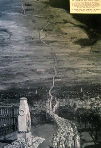
    The Chrysler ad says that the depiction of the trucks would “take up as much room as several million soldiers”, though it seems to me that any of the columns alone would do so. A while ago in this blog appeared a short piece on what 1,100,000 British war dead would look like, as presented by the Illustrated London News:

    Blogmarch

    The image (printed in 1933) shows the column stretching from London to Durham–London through Hitchin, through Bedford and Peterborough and Grantham, past Sheffield and Leeds and York, and then on to Durham–a distance of 269 miles or so.  Four across, a 269-mile column of dead soldiers.  That makes a pretty big point on an extraordinary sacrifice. 

    So the short end of the story is that back there during 1944, the Chrysler Corporation somehow managed to vastly underplay their war effort in an advertisement to themselves.