A Daily History of Holes, Dots, Lines, Science, History, Math, Physics, Art, the Unintentional Absurd, Architecture, Maps, Data Visualization, Blank and Missing Things, and so on. |1.6 million words, 7500 images, 4.9 million hits| Press & appearances in The Times, Le Figaro, Mensa, The Economist, The Guardian, Discovery News, Slate, Le Monde, Sci American Blogs, Le Pont, and many other places… 5000+ total posts since 2008.

Category: Information, Quantitative Display of

  • Visualizing the Normally-Unseen: Roentgen, Marey, Malevich

    JF Ptak Science Books  Post 1775

    Pleasant_1bertha The 1895/1896 issues of Nature magazine are compliantly normal until the first weeks of 1896 when the first of a flood of articles is published about the astonishing discovery of 50-year-old Wilhelm Conrad Röntgen. The English-language popular science journal announcement of his December 28, 1895  “Ueber eine neue Art von Strahlen” (“On a New Type of Ray”), appearing 16 January 1896, began the introduction of a new state of human experience.  His experiments—built upon the work of J. Plucker (1801-1868), J. W. Hittorf (1824-1914), C. F. Varley (1828-1883), E. Goldstein (1850-1931), Sir William Crookes (1832-1919), H. Hertz (1857-1894) and the odious Phil Lenard (1862-1947 and who didn’t die soon enough)—revealed as much to humans as did the experiments and inventions of Hooke and Leeuwenhoek on the invisible worlds revealed by the microscope.  There are more than 150 articles on the Roentgen (and soon to be “X-“) Ray, all published within 12 months of the original announcement, almost all excitedly, trying to comprehend, elucidate, expand, verify, this new world. 
    Blogxraybigads_2 [The news of the discovery is first and most popularly reported in the January 6, 1896 London Standard:  “The noise of war’s alarm should not distract attention from the marvelous triumph of science which is reported from Vienna. It is announced that Professor Routgen (sic) of the Wurzburg University has discovered a light which for the purposeBlogxrayad of photography will penetrate wood, flesh, cloth, and most other organic substances. The Professor has succeeded in photographing metal weights which were in a closed wooden case, also a man’s hand which showed only the bones, the flesh being invisible”. By the end of the month the news was completely absorbed, worldwide.]
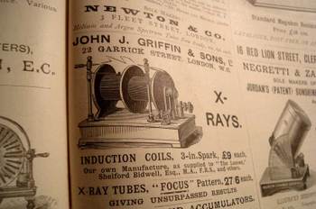
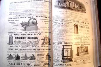
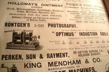
    I looked at the advertising in these issues (my copies of Nature for these decades generally have the original paper wrappers for the weeklies, complete with ad copy), looking for the first time that a Roentgen machine was offered for sale to the general public.  As it turns out, they popped up 12 March 1896 (once), 19 March (twice), and then about once a week for the rest of the year.  A little surprising, I think, a little light to my Monday-morning quarterback’s eye—I expected more; bigger, more, splashier.  But the ads are small and sedate, hardly similar to the discovery they represent. 
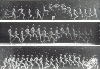
    Blogfeb_22marey The rest of the world, the rest of the advertising world, stayed the same–the Roentgen discovery and the enormous possibilities and promises of his “new photography” lived in their own unique sphere, unencumbered by their sassy new brother.   This mild response seems dimmer still when you compare it to that which greeted other (relatively) simple but still major advancements in the world of photography.  Take for example Etienne Marey, who was a technoid and physician who was able to capture motion of all sorts–he was able to develop a picture so to speak of the movement of blood in the body via his instrument to calculate blood pressure, and he also created a shotgun-style camera that made the Blog_feb_22_nude world’s first high-speed photographs of movement.  And so it cane to pass that in the late 1870’s and early 1880’s people were instantly able to see what a horse looked like when it galloped or what the body did *exactly* when jumping over a chair.  When you couple this with fourth-dimension material one wonders why it took several more decades to bump into these images in the art of 1907+. 
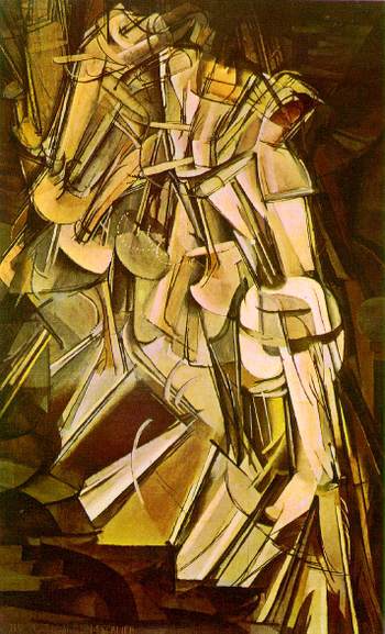
    (Duchamp Nude Descending series, 1915; above, Marey, 1881)

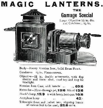
    And what indeed was normal in these pages?  Magic lanterns
    and magi lantern slides appearMagiclantern at all levels; the gorgeous Wimshurst machine gets heavily advertised; the redoubtable Negretti & Zambra advertised all manner of excellent scientific instruments (biographs, thermogrphs.  Nadeer Bros. advertised a pretty standard cell, and the ancient Crossley displayed their “new” oil engines, “suitable for all classes of agricultural work”.  J.H. Stewart was selling their semi-automatic electric arc lamp, while across the page was Newton & Company’s “Newtonian” arc lamps for lanterns (“self feeding and focus keeping”).  Microscopes and prepared slides abound, and Thomas Bolton advertises discretely and effectively for their “living specimens for the microscope”. 
    The Physical Review, the American upstart in the science world advertises that its third volume was available, while its distant cousin, the Psychological Review, advertised its own third volume.  Booksellers seem to take the most space, thank goodness. 
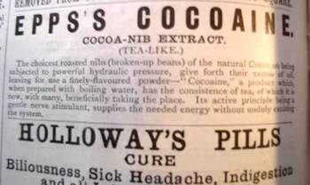
    Blogxrayepps There are a few medical throwbacks:  Epp’s Cocaine takes out occasional tenth-page ads for their “cocoa-nib extract, tea-like” selling its ‘gentile nerve stimulant”.  Right underneath is “Holloway’s Pills”, promising to cure biliousness, sick headache, indigestion, and all (?!) internal complaints.   These are brilliant simple samples of the skeleton of science in world-dominant Great Britain, in a world dominated at that time by H.A, Lorentz, Ernst Mach , Roentgen, Korteweg, de Vries, Bateson, Jean-Baptiste Perrin, Pierre Curie, Zeeman, Becquerel, Joseph Thomson,  Ernest Rutherford, Marconi, Ramsay, Fitzgerald.  And so on. 

    Nothing offered for sale here offered any significant clue to the pregnant world of modernity that was nearlyBlogxray3 there—the world would become ‘modern” almost immediately following Roentgen, with revolutionary, epochal changes in art (in non-representational form more so than Impressionism), theater, literature, music.  Just about everything changed (except politics).  But there is no hint to paradigm shift hidden in the ads, just as they were with the machines selling the promise of Roentgen’s “new photography.  There’s something about the fine glass, superb turning of the screw, and a perfectly oiled gear though that makes this sort of perfection seem so lonely in the world of larger change.  Bertha, Roentgen’s wife, sat for 15 minutes while her husband passed his rays through her hand; she ran from the room once she saw the results, revealing her very bones and no doubt a strong sense of the Blog_feb_22_malevich
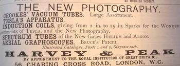

    fragility of life, and the strong presence of death.  Many had the same reaction to the Kandinsky’sBlogxrayad2 shapes and Malevich’s white circles and red rectangles and Ibsen’s drama and Einstein’s dancing dust and the rogue syncopation of jazz.  It is probably a very natural reaction to try and protect established memory—but memory should be more flexible than that, I think, to keep a healthy mind.
  • On Words: Fining (and Refining), 1683

    JF Ptak Science Books   Quick Post

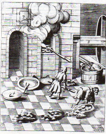
    We hear daily reports referring to refining, but there are very few about fining.. But there the word was, (appropriately) stick in the title of John Petrus’ translation of Lazarus Ercker’s classic work, Fleta minor: the laws of art and nature, in knowing, judging, assaying, fining, refining, and inlarging the bodies of confin’d metals. In two parts / the first contains assays of Lazarus Erckern … in V books : originally written by him in the Teutonick language, and now translated into English ; the second contains essays on metallick words, as a dictionary to many pleasing discourses, by Sir John Pettus … Knight .  (See the Richard Westfall entry at the  Galileo Project on Erker, especially on how he was able to support himself.  The book itself is an engineer’s delight, with applications of practical experience on all aspects of mines, mining and working with mined products.  It turns out that the original work by Ercker was so useful and popular that it was still around more than a century after Ercker’s death.  Oh yes–the original German editions were also among the first technical books to be supplemented by illustrations of the topics.)

    Fining425
    The story of iron is very old in Europe–and much older in China, older by more than another thousand years or so.  In Europe, though, iron from a blast furnace that has a high carbon content and a low melting point is called cast iron, and is quite brittle and cannot be worked by a smithy; fining is the process of cooking that cast iron up to its boiling point and skimming away the carbon, thereby giving the iron a higher melting point and a great capacity to be worked by a smith.  This product is called wrought iron, and it was a major step forward. 

    Which really does have something to do with a more popular definition of “fining”, which for the sake of simplicity would mean just to make something, well, “finer”.  I can imagine an eight-year-old figuring that out when aged six. A good, no-nonsense, perhaps 400-year-old word. 


  • A Temple of Texts–Steampunk Victorian Printing Cathedral

    JF Ptak Science Books  Quick Post

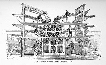
    This is what printing looked like, once upon a time, a great and giant mass, tended by works, massive sheets of paper flying this way and that, smoke from a steam engine drive (somewhere)–heavy, loud. Accurate.  A temple of texts (apologies to William Gass).  The illustration is from Robert Hoe’s A Short History of the Printing Press and of Improvements in Printing Machinery from the Time of Gutenberg up to the Present Day (1902) and exhibits a ten cylinder rotary type-revolving press

    Pritning machine[Source: Harry Ransome Center, here.]

    In addition to being a state-of-the-art (and above that, really) printing press it is in image a generator of metaphors–there’s certainly plenty to go around, even on just a surface investigation of the woodcut.  You can easily see a feeding-the-beast scenario in there–for news or for technology or steam or motion or whatever else), as well as darker interpretations, making the printing press into a spider as well; also, there’s humans being subservient to the god of technology from whom all good things come, and so on.  I’d really just like to feel one of those gigantic newspapers in my hands, fresh off the press…


  • Travel Time in the Young Republic, 1800-1857

    JF Ptak Science Books   Post 1738    [Part of a series on the Display of Quantitative Information]

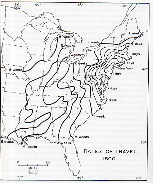
    I wanted to pass along these very interesting maps that appear in Allan R. Pred Urban Growth and the Circulation of Information, 1790-1840 (Harvard, 1973) because they give a quick and elegant view of how long it took to get to various parts of the country in the first part of the 19th century. 

    First, Rates of Travel, 1800:

    Travel time 1317
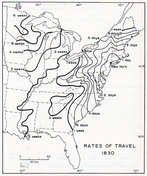
    and its complement, Rates of Travel 1830:

    Travel time 2316[Note:  all travel time based on starting  point in New York City.]

    Its interesting to see with just improvements in travel excluding the introduction of railroads and (for the most part) canals that travel time was basically cut in half in about thirty years’ time.  For example, in 1800 it would take roughly four weeks to get to New Orleans, and then six weeks to arrive in Iowa and the Upper Peninsula.  By 1830, that time was two weeks to NO, and three for the other two locations.  In 1800, it was a five day trip to the northern Outer Banks in North Carolina; that would be cut to two days by 1830.  The trip in 1800 to the vicinity of Savannah and the northern part of Florida was a two week ordeal; by 1830, that time had fallen to 6/7 days.  The Mississippi was reachable in five weeks in 1800; in 1830, that time was cut to two weeks.  This as I said would all change drastically over the next three decades, once the railroad system became slightly mature.

    And here, expanded to 1857:

    By 1857 one day’s travel time has been blasted to a ring encompassing the southern half of Maine, partially into Ohio and south into the northern part of North Carolina.  Two days of travel will get the traveller deep into Michigan and parts of Wisconsin, and half-way through North Carolina and South Carolina (excluding the mountain region in Western NC).  Three days will now get us to northern Florida, halfway through Georgia and Tennessee, and into the Midwest, past the Mississippi River. Beyond the basic reach of the railroad at this point is the rest of the country, and harder going, though one week of travel will get you deep into the central part of the country, where with some difficulty you would be able to find your way to southern California in three weeks, and the Pacific regions of Washington Territory in six weeks–basically, an entirely new world of travel and the spread of goods, service and information, not the least of which was aided by the spread of the railroads, which increased from 3,000 miles of track in 1840 to more than 30,000 in 1860.

    Again, I really just wanted to share this display of information because I have found them to be useful in the past, and the info doesn’t seem to be all that wide-spread. 

     My source for the maps has been varied from web sources, but the original work seems to have been published in Charles O. Paullin and John Wright, Atlas of the Historical Geography of the U.S., published by the Carnegie Institute of Washington, D.C. (1932), pages 138a, 138b, 138c, 138d.


  • On the Center of Everything (continued)

    JF Science Book

    Continuation of  Visual Chronology of Cosmology Part 1 and Visual Chronology of Cosmology Part II,.

    I started out in this post to write about the scholar pictured in Andrew Borde’s book, The Breuiary of Healthe, for all maner of syckenesses and diseaes, Expressynge the obscure terms of Greke, Araby, Latyn, and Barbary, in Engluish concernying Phisicke and Chierurgerie…., which was printed in London in 1556.  Underneath this rather long title is perhaps the earliest “modern” work on hygiene–or at least (in a real test of qualifications) it was the first book written by a medical man on hygiene that was originally written and published in English.  In its way it is a wonderful book, being a compendium, really, of 384 short chapters on the this-and-that of medicine, all alphabetically arranged, which made it a simpler book to compose than a full treatise on the subject arranged in a medically-logical way.  But what I liked in it was the contrasting image of the scholar, which to me is the very picture of ennui, laid side-by-side with the chief element by which this book is probably best remembered, which is “Myrth is one of the chiefest thygnes in physicke” (or “humor is the best medicine”).  Borde’s scholar may not be taking his own medicine, here.   

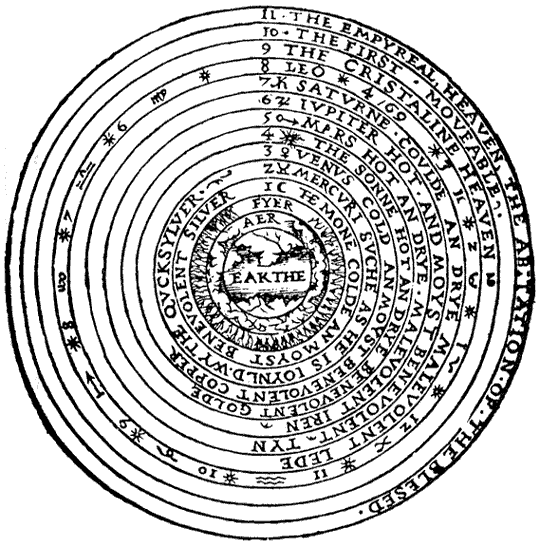
    In looking for the text for this fine book I came across something else, Borde’s Aristotelian celestial spheres in his  The First Book of the Introduction of Knowledge, printed in 1542, the year before the publication of Copernicus‘ De Revolutionibus. It is a magnificent woodcut, and tells the story of a vision of mankind that would soon come to vast change. 

    Ptolemaic Universe
    Source:  the Luminarium, here.

    The image shows us the geocentric universe, the creation, and eleven-sphere unit that follows the Earth at center and the four subluminaries (earth wind air fire), followed by the orbit of the Moon and Mercury and Venus, after which comes the Sun, followed by the rest of the planets.  These spheres are followed by the fixed stars/the starry firmament), and ultimately by the Primum Mobile, divided into the crystalline heaven, the first mover, and the Empyrean.  Its a beautiful image. 

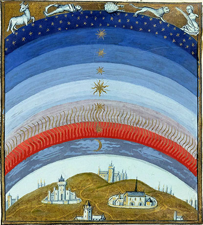
    The following is in a sense a cross-section of the Borde image, which shows pretty much the same information (with the Sun being in the fourth sphere).  This is manuscript is more than a hundred years earlier than the Borde, and accurately represents the elements of cosmology of the time.

    Image source:  Luminarium, here; From Les Echecs amoureux (“Amorous Chess”) Manuscript made for Louise of Savoy, 15th c.  Bibliothèque nationale de France, département des Manuscrits; Mss.fr.143, fo 20.

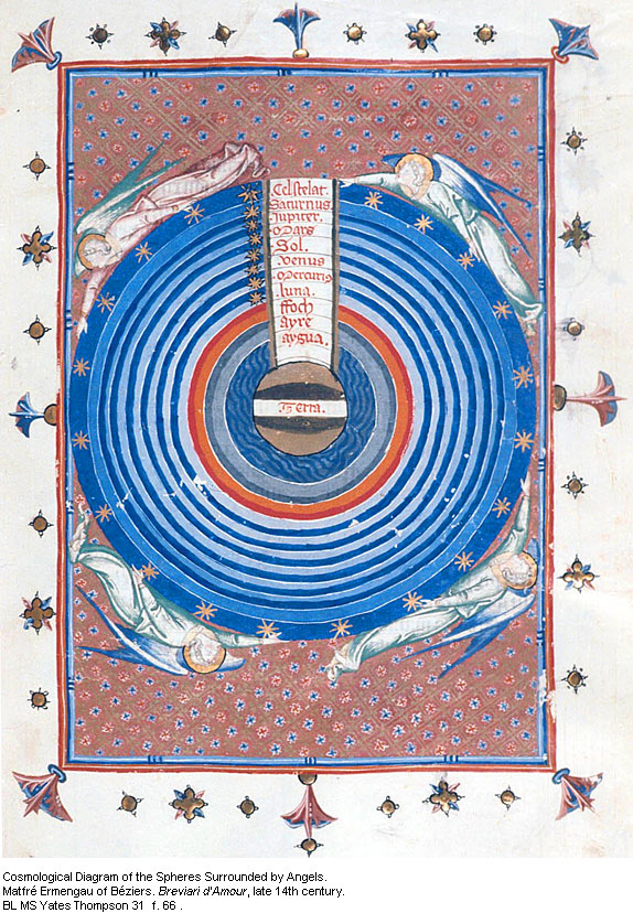
    An even earlier version of this more-or-less static image, the perfect image of the perfect creation in which all of the stars in the visible sky were always there, in some perfect number, in the configurations for all time. (This idea of course would be one of the greatest disfigurers of ancient thought that the telescope of Galileo  would provide.)

    Spheres of angels
    Source:  Spheres Surrounded by Angels, Brevari d’amour, late 14th c

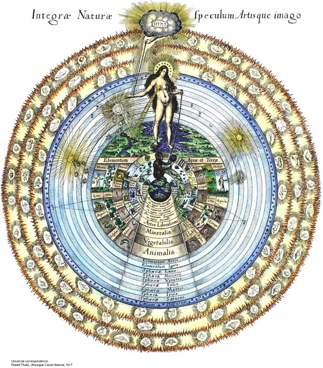
    Robert  Fludd, a visionary of a different sort, as his celestial sphere will show:

    Spheres--robert fludd
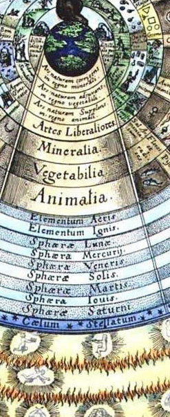
    And here in detail:

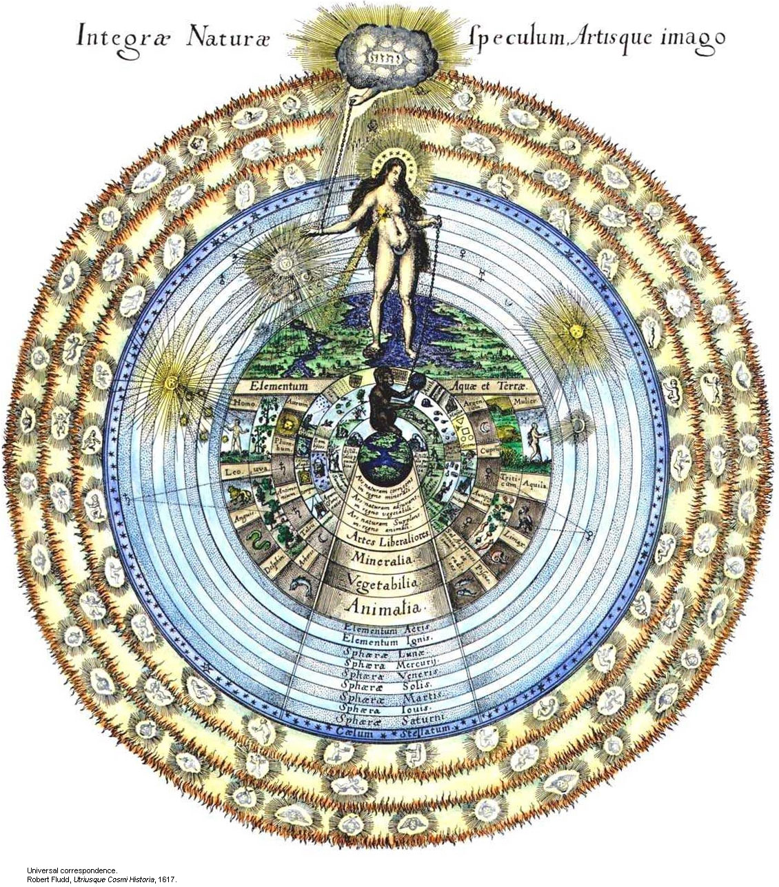
    Universal Correspondence from Fludd’s Utriusque Cosmi Historia, 1617.Rob

    Spheres--robert fludd det

    Fludd’s (1574-1637)  features a complicated astrological existence well beyond the point of Copernicus.  In addition to everything else, real and imagined, Rosicrucianism and astrology and puffy-birds, Fludd, who was  an English physician, delved deeply into the real stuff of the world in this book in addition to all of the other make-believe–optics, the musical intervals, perspective drawing, hydraulic engineering, construction of lifting machines, military engineering and many other interesting, physical science topics.  But this drawing, right there on the title page, reveals Fludd’s real interests and shows what governs what he does.  Everything else, the math and and the physics, services this need.  Of course the image is beautiful, which is why it is here, but it is also a deeply personal, exploitative, cover-all for the things that Fludd *wanted* to find.


  • The History of Lines series: the String of Empire, 1908

    JF Ptak Science Books     Post 1733

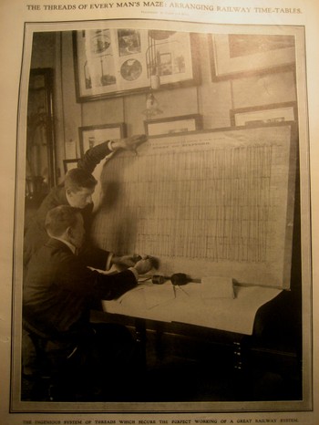
    String_big_board It is astonishing sometimes to think about how much was accomplished with so little.  This photograph, found in the 6 June 1908 issue of the Illustrated London News, entitled “The Threads of Every Man’s Maze:  Arranging Railway Time-Tables” (sub-titled “the ingenious system of threads which secure the perfect working of a great railway system”) is just such a case in point of wonder.  Each section of the board represents one hour, top to bottom; these are further subdivided by thinner lines representing 5-minute intervals; the horizontal lines representing the distances between stations.  And the guys in the foreground are keeping the whole thing up-to-minute, using string and tacks. 
    This was the British Empire at about its loftiest heights, with a spectacular internal railroading system, kept all in line and on time and correct with the help of heavy thumbs.  Can you think of a better way to display all of this complex data (with 1910 technology)  in real-time so that it is all intelligible–and to be so instantly?  I can’t.  This was just sheer, simple, brilliance.

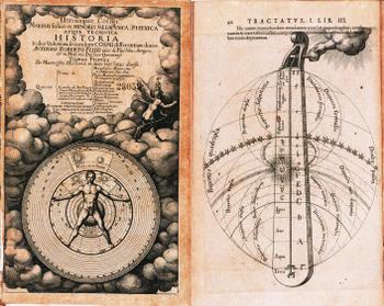
    I know, I know, this is actually “thread”, but so it goes.  If you elongated and strengthened this concept just a bit you’d come up with rope and wire, and chains–the most simple metallic form of which was used by surveyors for hundreds of years to help map our earth.  And I won’t even get close to the String Theory stuff here, or stringed instruments–but if I did, I would want to talk a little about perhaps the ultimate string/cosmology image in the history of science, which would be Robert Fludd and his fantastical thought-experiment  called “Monochordum mundi”. from his Utriusque cosmi maioris scilicet et minoris metaphysica, physica atque technica historia, printed in 1617.

    Robert_flood Fludd makes an elaborate and beautiful stab at understanding the deepest aspects of an imagined supramusical relationship between the order and rationality and mathematical aspects of music and the functioning of the universe—based on sound itself.  These ideas come up time and time again, most visually pleasing in Fludd, but most dramatically argued by Johannes (Harmonicae Mundi, “Music of the Spheres”) Kepler.  But Fludd trumps with god’s graphical intervention.
    The hand of god makes an appearance here as it adjusts the magic monochord of creation–a Pythagorean monochord of two octaves which are then divided into harmonic intervals.  But god’s hand is definitely there, doing some sort of adjustment (or perhaps even holding the slipping peg in place?), which is actually a little bit late in the history of the mechanical universe being turned by the hand of the creator, with the hand actually depicted doing the job.  In general the hand stopped making appearances by this point in the history of science, but did manage to linger on in the work of Fludd.


  • Complicated Simplicity: A Marconi Wireless Graph of Connections at Sea, 1907

    JF Ptak Science Books  Quick Post

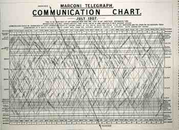
    This is an illustration of the approximate times and places that ships at sea could expect to be able to communication with each other by the relatively new invention of wireless telegraphy. (We’re talking about Marconi here and just very briefly; this is not the place for the discussion of what he did or didn’t “borrow” from his predecessors and contemporaries such as Heinrich Hertz, Oliver Lodge and Nikolai Tesla.  He at the very least however owed all of them at least an enormous helping of gratitude, and probably more.  Then there’s Marconi’s very conservative technical continuation in the field which is confusing and interesting.  And finally but not the least of all of the stuff about Marconi is his comfort and support of the Fascist regime in Italy, where Marconi became a member in 1923, escalating in his fame through the party ranks to have none other than Benito Mussolini serve as the best man in his second wedding.  But as I said that’s all for another day.) It appeared in The Illustrated London News for 7 September 1907,surrounded by an article on Obelia in the “Science Jottings” section of the magazine.  This chart isn’t
    1blog_oct_13marconi_at_sea816

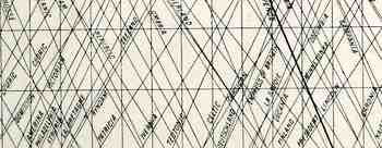
    quite as complicated as it seems, really: all you need to do is follow one line from the top to the bottom.  Simply put, each diagonal line represents a specific ship (all of which are named) and their positions as they make their ways across the North Atlantic ocean; each intersection represents the time and place that two ships can communicate via wireless with one another.  So, for example, the Empress of Britain will on its six-day voyage be able to communicate at least 26 times with other ships for news and information.

    What this seems to me to be is the supplemental efforts of the ocean-going ships

    1blog_oct_13marconi_at_sea817

    to the newly established trans-Atlantic radio-telegraphic company and installation opened by Marconi in October 1907.  Even though the first transatlantic communication is celebrated as having taken place in 1901, the performance, even in 1907, was still spotty.

    Again, I’m just after this for the image 


  • Imaginative Display of Quantitative Data: the Diminishing French Navy

    JF Ptak Science Books    Quick Post   [Part of the series on the Quantitative Display of Information.]

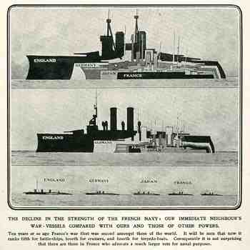
    The size of the French Navy was displayed in carnivorous detail in this 1905 graphical display of data, found in the Illustrated London News.  To have your navy devoured by the Germans, Japanese, British and American navies, seen in relentless relief.  I’m sure that the illustration put across its message rather well. 
    Blog1sept_16ship_france569


  • One Inch=$370 Million: Unusual Displays of Quantitative Data and the Height of American Public Debt

    JF Ptak Science Books  Post 1721

    0 ebay 13 graphs268

    [Click image to enlarge]

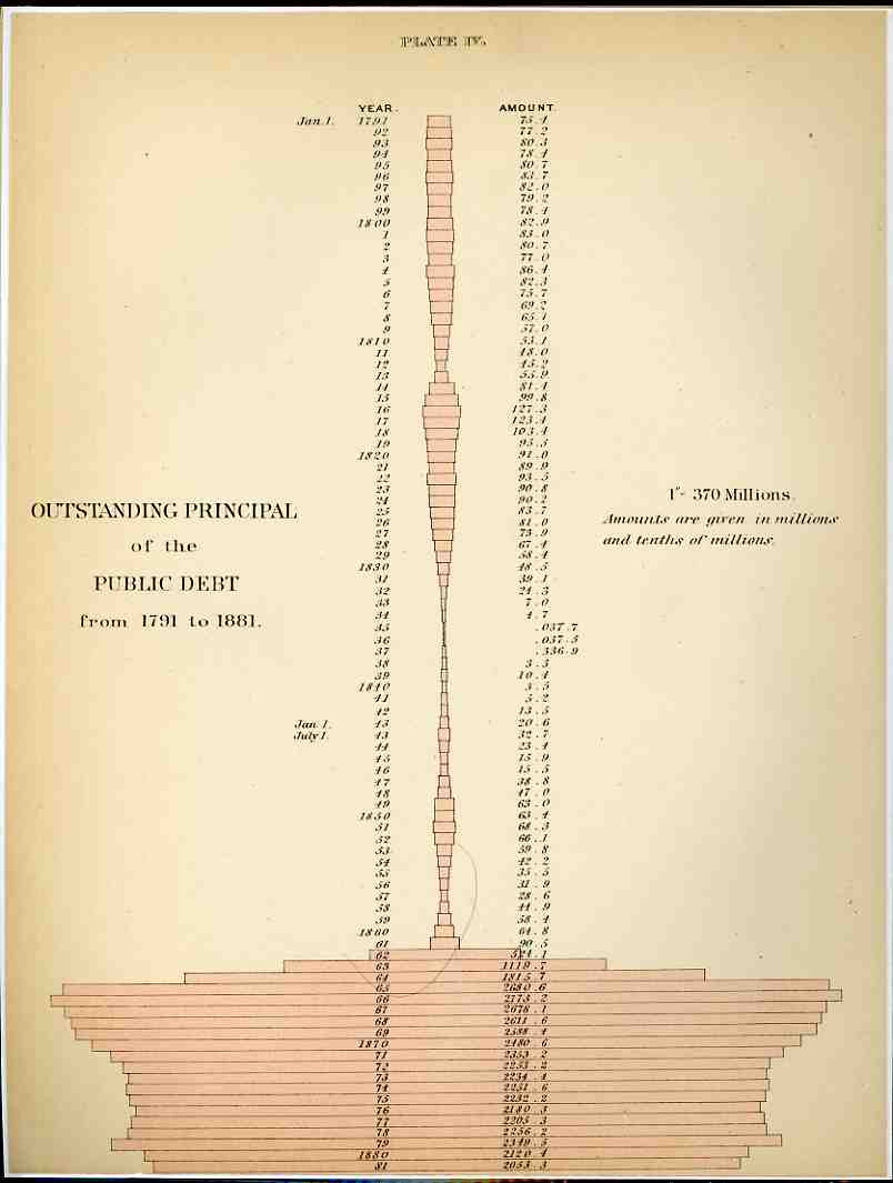
     It isn’t often that you see money represented by dry measure, but that’s what happened here in these two examples from the fantastic Walker Statistical Atlas ( Statistical Atlas of the United States based on the results of the tenth census 1880 with contributions from many eminent men of science and several departments of the government Comp. under the authority of Congress by Francis A. Walker, M. A., superintendent of the tenth census … and published in 1884).  What we see here is a history of American federal indebtedness from 1791 (when the public debt stood at 75.1 million dollars) to 1881 (about 2 billion).  Using the CPI (consumer price index) as a factor to translate that number in 2008 dollars (or so), the 2 bil grows to about $40 billion (a nickel then is about a dollar now). The interesting part of the legend–and what drew me to this graphic even before its somewhat unique shape–state “1”–370 millions”, that is one inch of pink horizontal bar stands for about $370,000,000, and the last bar on this graph is about 6 inches long, which, adjusted for inflation, would now be about 10 feet long. .That said, the really interesting part comes next–if we use this measure to graph a horizontal bar for the American debt as it stands in 2008, it would pink a pink bar that was about a HALF MILE long to express our 10(+) trillion dollars of debt.  OR, somehow, the old debt of 1881 would be about 1 story of a house, while the 2008 version would be up one side of the Empire State Building and down the other (and yes that includes the aerials).  I don’t know how to put this comparison in context, the differences are so staggering. 

    0 ebay 13 graphs269
    After having popped a neuron or two trying to get my head around that one, we’ll further confuse the situation with the second chart, which shows the total net indebtedness of the U.S. in 1881 in terms of square inches; or, at the bottom of it all, a 7×7 inch square represented the entirety of the $3 billion owed out.  49 square inches. Working backwards this time, our $10 trillion (or $10,000,000,000,000.00 writ large) adjusted back to a CPI value in 1881 would have covered about 88 PAGES of the atlas or 9,000 square inches.  Again, the numbers are just almost too big to mean anything. 

    We, as a country, owe one hell of a lot of money.

    And yes there are many different ways of trying to figure out what one 1881 dollar “means” in terms of 2008 dollars, but the CPI is the most simple to use and least argumentative and at least gives a pretty good idea of scale.  It would be more useful to try and establish the degree of difficulty  of turning the corner on the debt in 1881 compared to doing that today, but this is just a late-night post at the end of the week, and I don’t have a good clue about how to try and measure that bit simply.


  • “Writing of the Insane”, 1876: Very Early Art Brute Images?

    JF Ptak Science Books   Post 1712

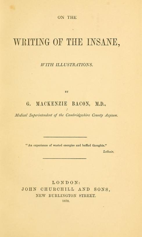
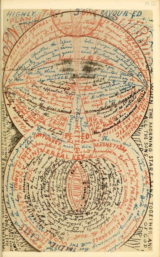
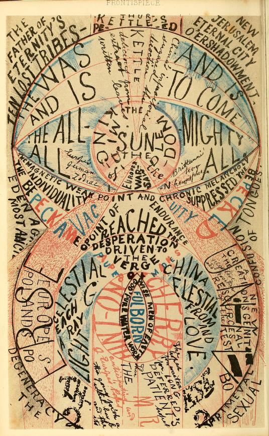
    Insane art 3 titke pageThis book–The Writing of the Insane, by George Mackenzie Brown, 1876– seems remarkable to me for the attention paid to the creative products of the insane. I am not sure when the first of these efforts occurred, but it seems to my experience that 1876 is an early production date for such an undertaking. It also seems to be a very early identification of the “special talents” of some of the observed individuals, including in the text of the book two remarkable (and remarkably “modern” looking) pieces of what today might be considered Art Brut/Outsider Art.

    The author is George Mackenzie Bacon (1836-1883), a doctor who took classes at Guys Hosptial and who had membership in the College of Surgeons in 1858.1 Bacon was the author of Primary Cancer of the Brain (1865) as well as an editing contributor of at least a dozen annual reports of the Committee of Visitors of the Cambridgeshire, Isle of Ely and Borough of Cambridge Pauper Lunatic Asylum (from 1869-1883 ro so). He definitely made improvements to the conditions of the inmates when he worked at Cambridegshire County Asylum (also known as Fulbourn Hospital, 1858-1992), where he provided those living there with more personal living space and patient-built work areas. This was certainly an interesting approach to take for the mentally ill, especially given the time and place.

    But in his (scant) published works it seems that the Writing of the Insane must be his masterwork for at least being among the earliest books to serve as an archaeology of deeply-different and illustrated thought:

    Insane art
    And this remarkable effort:

    Insane art 2

    [Source and full text, here.]

    This is certainly not a “celebration” of talent, but there are moments of recognition of such in the Writing of the Insane, which at the very least is a very early expose of the topic.  One of the earliest books written by someone who was admittedly “insane” (and this is very different from the many books written by insane, or brilliant, or misunderstood, or “complex”, or “different” author) came to us in 1846 by Green Grimes. thirty years before the Bacon work.  In  A Treatise on the Most Important Subject in the World: Simply to Say, Insanity…2 Grimes recounted his life at the Tennessee Hospital for the Insane, about which the blog Canton Asylum for Insane Indians writes:  “There are other Medical books which treat on Insanity, but comparatively few to the population, and none written by an Insane man,”

    Notes:

    1. There is scant personal information on Bacon available online. This data comes from the British Medical Journal, 3 March 1883, in an obituary on Bacon. 

    2. The full title is pretty full: A treatise on the most important subject in the world: simply to say, insanity: The only work of the kind in the United States, or, perhaps, in the known world, founded on general observation and truth. There are other medical books which treat on insanity, but comparatively few on the population, and none written by an insane man. This contains a short history of the author’s case, giving the general causes which produced the disease on him individually, manner of treatment and termination. Giving the only treatment by which a cure may be effected, the manner of detecting the disease, and the duties of sane parents towards the insane offspring of their bodies; with some general remarks upon idiotism, the jurisprudence of insanity, suicide, &c   

    The American Journal of Insanity simply states that the 94-page book is “very curious”.