A Daily History of Holes, Dots, Lines, Science, History, Math, Physics, Art, the Unintentional Absurd, Architecture, Maps, Data Visualization, Blank and Missing Things, and so on. |1.6 million words, 7500 images, 4.9 million hits| Press & appearances in The Times, Le Figaro, Mensa, The Economist, The Guardian, Discovery News, Slate, Le Monde, Sci American Blogs, Le Pont, and many other places… 5000+ total posts since 2008.

Category: Information, Quantitative Display of

  • Color Angels, Synesthesia and Body Building: Outsider Logic and Art, 1630-1925

    JF Ptak Science Books   Post 1829

    Vision from the inside out, or from another version of the outside-in, from the very Outside, can be very fruitful things, idea-engineers, inspirations.  They might have real insight of lasting applied value, or imaginary insight into the unexpected and imagined, with nothing of immediate or future values save for sense impressions  that might trigger thinking in unexpected ways or areas.

    There are occasionally great finds in mounds of experimental thinking that find a foothold in the outside world, such as in the case (further) below of Robert Fludd.  Fludd (1574-1637) was a Welsh-born, London-based (and Oxford- and Padua-educated)  astrologer, Paracelsian physician, occultist, Qabalist, hermeticist, semi-cosmologist and energetic thinker who found inspiration and solution in many ususual areas, some of which didn’t really exist. 

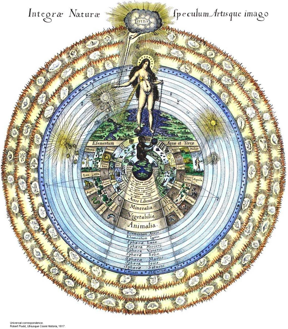
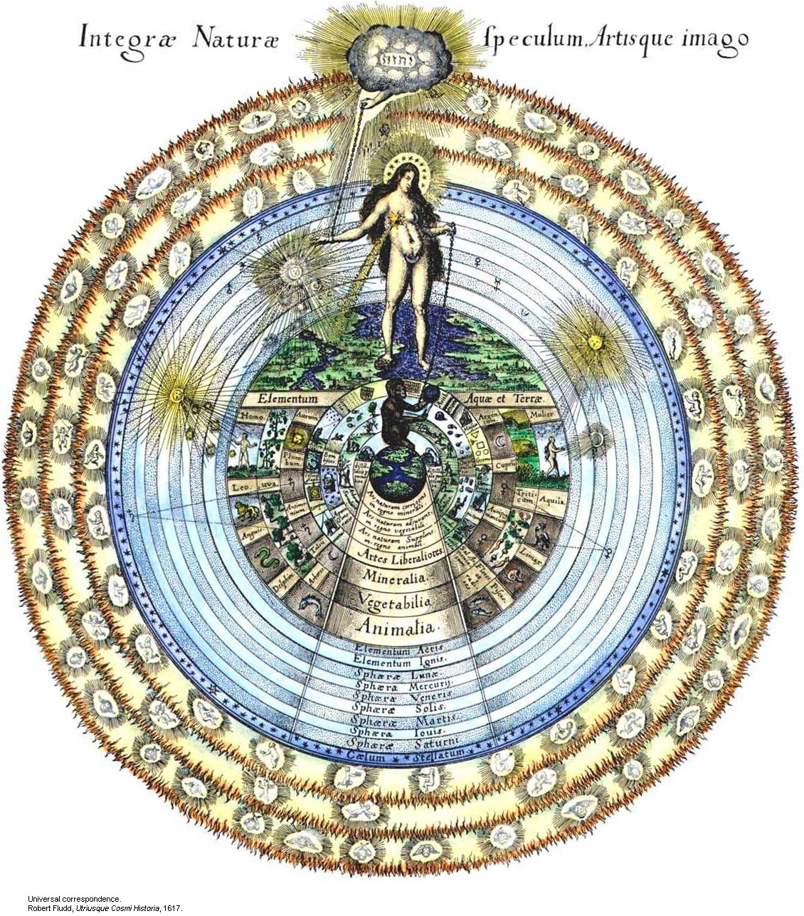
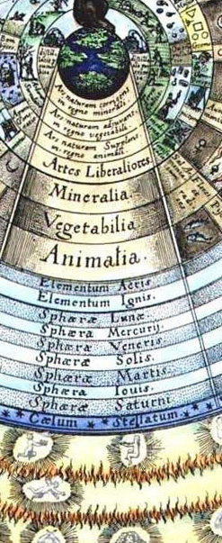
    For example,  a visionary of a different sort, as his celestial sphere will show:
    Spheres--robert fludd
    And here in detail:

    Universal Correspondence from Fludd’s Utriusque Cosmi Historia, 1617.Rob
    Spheres--robert fludd det

    Fludd’s (1574-1637)  features a complicated astrological existence well beyond the point of Copernicus.  In addition to everything else, real and imagined, Rosicrucianism and astrology and puffy-birds, Fludd looked deeply into the real stuff of the world in this book in addition to all of the other make-believe–optics, the musical intervals, perspective drawing, hydraulic engineering, construction of lifting machines, military engineering and many other interesting, physical science topics.  But this drawing, right there on the title page, reveals Fludd’s real interests and shows what governs what he does.  Everything else, the math and and the physics, services this need.  Of course the image is beautiful, which is why it is here, but it is also a deeply personal, exploitative, cover-all for the things that Fludd *wanted* to find.

    So in the middle of all of this, Fludd wrote  his Pulsus seu nova et ARcana Pulsuum Historia e Sacro Fonte Radicaliter Extrata…(Published in Frankfurt in 1630), which was a tall but realtively skinny work on what at the time was a skinny topic:  the pulse.  In addition to discussing an listing all manner of data and observations ancient and modern on the subject, Fludd visits the newish and vastly important work of William Harvey, De Motu Cordis (1629), and gives it the first published favorable review.  This was a big deal at the time as Harvey’s epochal work was still feeling its way around for support.  And here it was, in an unlikely place, a book filled with useful and not information, its writer claiming a certain association with mystical medicine and universal knowledge and getting the whole deal with Harvey right. 
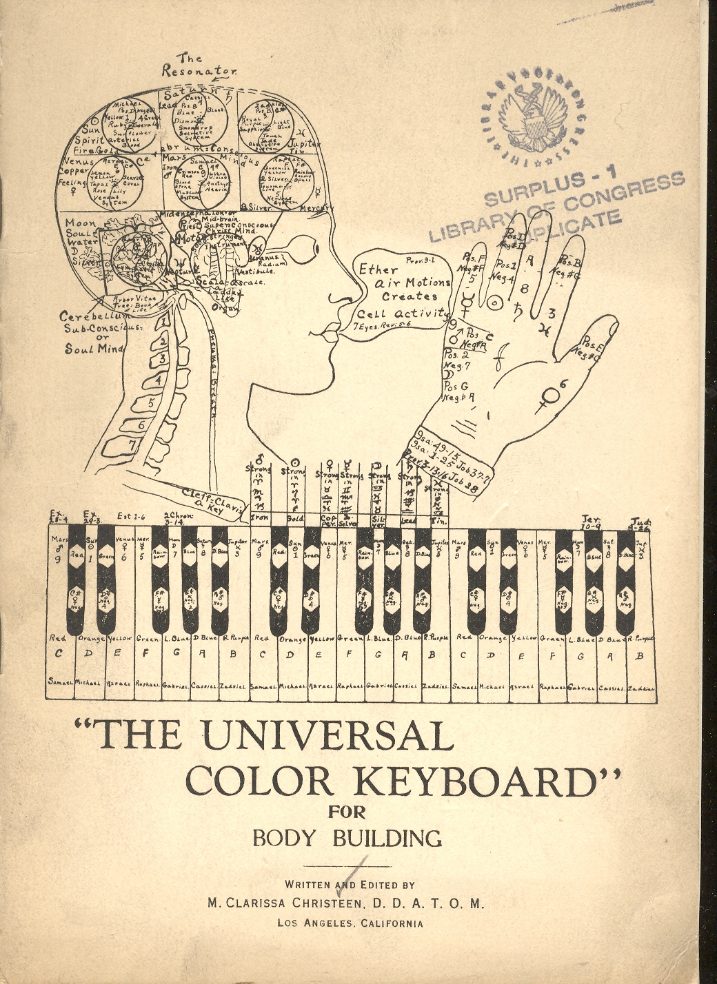
    +()+outsider coverThere are some other more recent contributions in our Outsider Logic collection that reach the limits of outside, reaching far into the aspects of knowledge that lies more or less completely hidden and inaccessible to the vast majority of readers.  Sometimes bumping into outré thinking like this is very useful because it is just so very different; and sometimes this thought process is just and only that: very different.

     This is last bit is probably the case for W. Clarissa Christeen’s  (“D.D.A.T.O.M.”)The Universal Color Keyboard for Body Building. But what Ms. Christeen absolutely does have going for her is her artwork, which is, in its own special way, quite sensational—I’m really sorry that the pamphlet is limited to only two pieces of her work, as I’d really like to see more.  +()+outsider cover det
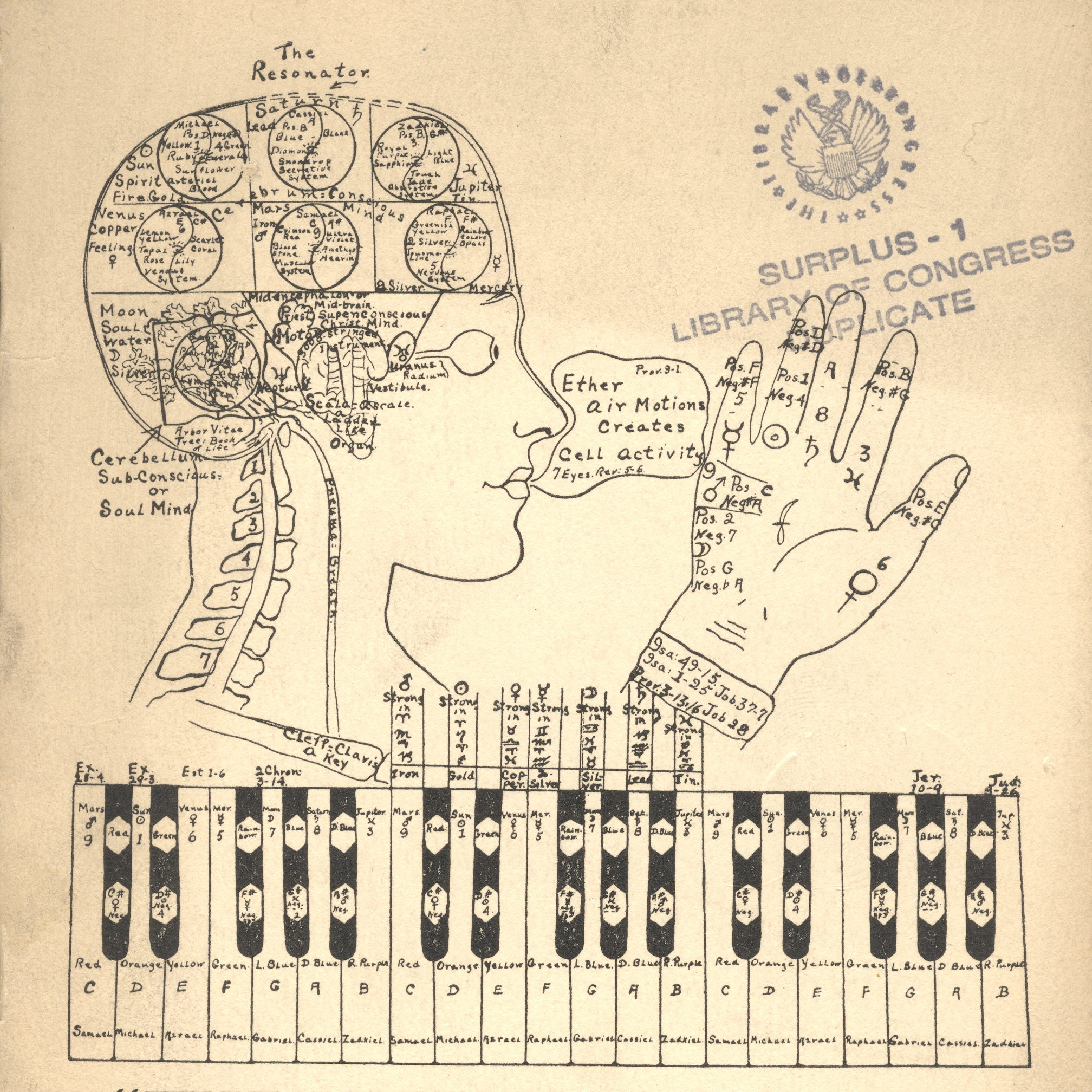
    Her philosophy is at the very least odd, though it may spring from a synesthesia.  Or not. 

    “Syn” (Greek, “together” and “Aisthesis” (“sensation”) combine to form this very interesting word and ability, being an automatic response to a stimulus by one sense when that stimulus is usually associated with another sense.  For example, there are “synesthetes” who perceive color as an auditory input, basically hearing yellow and so on; more famously are the musicians composing tone poems associating sound with color.  There are letter-color and number-color associatons, as well as taste-senses from colors and sounds and so and on.  For example in Kandinsky’s On the Spiritual in Art there is an attempt to relate color theory to touch and smell; Franz Liszt wrote color music; Isaac Newton attempted to establish the common distribution and association between color and tone frequencies; Rameau constructed a clavencin oculaire while Rimington made a color organ; Richard Feynman spoke of colored equations, and Nabokov recorded  (Speak, Memory) letter/color visions.  THese are just a few examples of some of the more well-known practicing synesthetes. 

    In any event Ms. Christeen may be of that mold, and is attempting the universal perfection of mind and body through the combination of color and music (and scent), which “is valuable in building body-tissues of a harmonized order…the music chosen for social functions, the key notes being for the planet ruling or governing the day or the hours etc..  This brings celestial and terrestrial vibrations in direct contact, without interrupted angles which produce in harmony; in other words the creative powers which produce these various waves f light and sound or color or tone, acts upon the lower octave, matter or material manifestations recreating it, transforming it, and raising the vibrations of the said matter or material manifestations, thus, refining the temperature and quality of germ or tissue, etc.”

    This is a long passage, but I include it because, well, I just had no idea when an abrupt turn was going to be made in the discourse; nor did I have any idea of what the principles were of what was being discussed.  And this is still all on page one.  Sometimes passages like these are breathtaking, as in leaving you without breath, because their foundation for understanding is so elusive.  All you’re left with, sometimes, is a “wow!” reaction, like appreciating a pitcher who has just struck you out on three roughed-up-greasy-spit-laden nastiness pitches that were invisible and illegal, and didn’t matter at all.(What the figure in the cover illustration is saying. by the way, is “Ether air motions creates cell activity”, with a couple of Biblical references, somehow.)
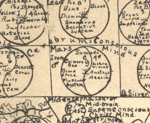
    +()+outsider cover ultra det


    +()+outsider inside I do know that the major divulged secret is the Universal keynote (and “keyboard”) and its control through music and fragrance of all that is, “each individual is to harmonize his or her astral colors to the universal keynote that he or she may be surrounded by a correcting aura, which sends out its streamers of light rays into the cosmos”.  Things get more deeply possessed after this, stretching into the Old Testament and astrology, which we don’t need to get into here. 
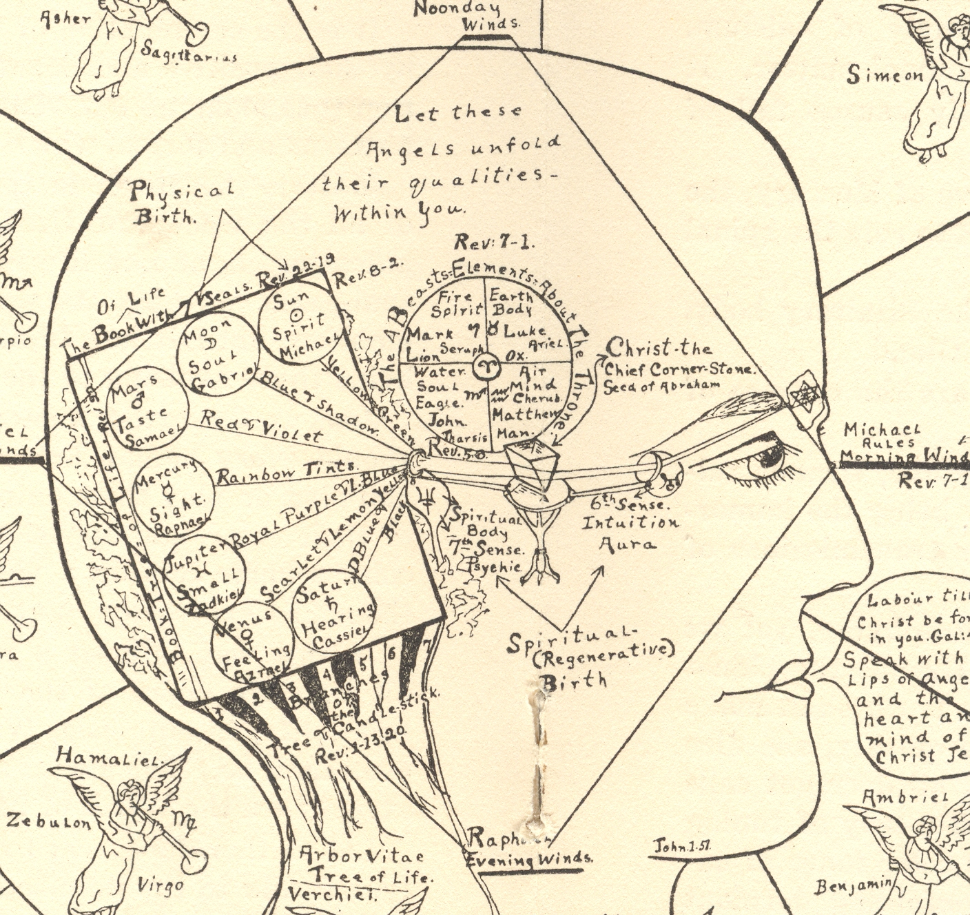
    +()+outsider insidedet As I said, perhaps Ms. Christeen was a synesthete, and perhaps multiply so.  In 1925, when this book was written, there mayn’t’ve been a place for people to go who had advanced sensibility of seeing colors in music, and perhaps colors in fragrance. Perhaps Ms. Christeen was working out there in Los Angeles completely alone, trying to figure out just what her special and very different gift actually was.  Perhaps her life was greatly enlivened by her synesthesia, and sent herself out on a mission to the world to have other people experience it, too,, with the help of her color-relational charts.  I do feel for her, though I have absolutely no connection to what she was trying to explain.  I do find the artwork fascinating—a true “outsider” contribution. 

    (By the way, I don’t think that we ever got to the “body building” part in this work.  Also, I think the “DDATOM” after Ms. Christeen’s name meant something like “Doctor of Divinity of the Atom” or something like that–it wasn’t mentioned in the text.)

     And so there you have it.  I think that I’m just making the point that the outcome of some of this very provocative work doesn’t necessarily come into play in its ultimate evaluation, and that it should all be judged by what short of thinking that it excites in its reader. 


  • History of Holes: Making 1=2 or 3, or More (ca. 1700)

    JF Ptak Science Books   Post 1830  Part of the series on the History of Holes. (Apologies for no-para spacing–Typepad is buggy again.)

    A beautiful and inventive way of addressing issues of perspective and un-reality in the centuries before the introduction of electricity was more able to suspend belief in the existing/obvious was via the catopticum1. This object (an example of which is pictured below, taken from the oddball/genius/problematic polymath Athanasius Kircher in his book Ars Magna Lucis et Umbrae…2 printed in 1676), and the name of which is taken from the Greek katoptron, mirror) was an advanced parlor toy and artwork, a sort-of primitive free-standing theatre of multiplied objects, a box that contained things that were seemingly larger than their container. 

    The catoptric theater. From Ars Magna Lucis et Umbrae (1671 ed.), p. 776

    Source:  Kircher at Stanford University, here.

    This image makes the “image engine” a little clearer:

    Primeira PáginaPágina AnteriorDiminuir imagemImagem a 100%Aumentar imagemPróxima PáginaÚltima Página
    desd [757 KB]
    Source:  Tratado da Catoptrica, (manuscript, 1716);  from the Biblioteca Nacional Digital, here.
    It’s a romance of images machine,  a box of antique wonder, a peepshow of centuries before, putting more things into a space than could exist.  It was a relatively simple machine of great ingenuity:  the interior of the free-standing box with rows of holes along its top edge perpendicular to the ground, and was lined with mirrors (as shown above in the Spanish document), with some mirrors set of at 45% angles; when objects were placed within the imaging-area of the angled mirrors, the object was multiplied, and then multiplied over and over as a result of the surrounding mirrors, creating in effect a “hall of mirrors”, leaving the observer with a sense impression of many dozens of objects that were contained within a container that was impossibly too small for what was being seen. 
    This of course is a property of some holes–they tend to make things larger than they could previously possibly “be”. 
    In this case, the viewer would look through a hole into a Borgesian box which would contain a multitude of its possible interiors.  Looking through a hole in the end of a glass and mirror-ended tube and pointing it at the sky at night would reveal an enormous multiplication of a small part of that sky.  In the early case of Galileo, what  was first seen with the telescope was the multiplication of what was believed to be a finite and god-granted sky of perfection–he was seeing into some other sky, into a new vault of heaven, something never before seen, above-and-beyond what was known to exist.  Hooke and Louwenhoeck had a similar experience with their (second generation) microscopes, seeing details and life never before encountered, entire worlds in a place no bigger than the head of a pin. 
    Sometimes a hole is just a dark thing; but more often than not, it isn’t. 
    Notes:

    1.  From the Greek, katoptron, mirror  or pertaining to a reflected image or reflected light, such as from a mirror.  There is another sort of catoptric that has been sort of widely used in antiquarian painting and parlor entertainments, which involves a canonical mirror reflecting a wide-field and distorted image into its proper perspective, which is known as catoptric anamorphosis.  Another version of this sort of optic imaging is optical anamorphosis, which requires the viewer to stand at a particular (usually sharp) angle to a painting containing a semi-hidden image whose proper perspective is revealed only at a particular angle of viewing.

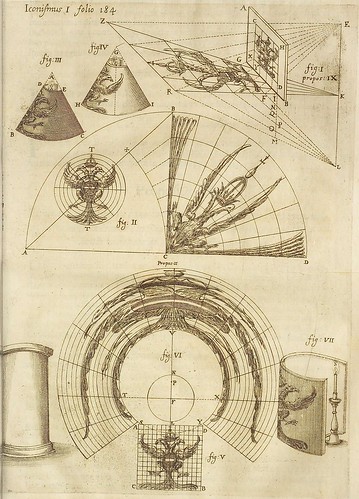
    An example of catoptric anamorphosis, from the Kircher mentioned above:
    anamorphosis - eagle

    See here:  http://hyperphysics.phy-astr.gsu.edu/hbase/geoopt/catoptric.html
    2.  Ars Magna Lucis Et Umbrae In X. Libros digesta. Quibus Admirandae Lucis & Umbrae in mundo, atque adeo universa natura, vires effectusque uti nova, ita varia novorum reconditiorumque speciminum exhibitione, ad varios mortalium usus, panduntur. Editio altera priori multo auctior. The work is presented at Bibliodyssey, here.
    Mr. P.K.hauls out a great quote and summarization of the work of Kircher by Robert Moray in his letter to the great guiding post of the Royal Society, Henry Cavendish, which really captures the spirit of the very busy/very curious and curious old man:
    “Whatsoever Mr. Huygens & others say of Kircher, I assure you I am one of those that think the Commonwealth of learning is much beholding to him, though there wants not chaff in his heap of stuff composted in his severall peaces, yet there is wheat to be found almost every where in them. And though he doth not handle most things fully, nor accurately, yet yt furnishes matter to others to do it. I reckon him as usefull Quarries in philosophy and good literature. Curious workmen may finish what hee but blocks and rough hewes. Hee meddles with too many things to do any exquisitely, yet in some that I can name I know none goes beyond him, at least as to grasping of variety: and even that is not onely often pleasure but usefull.”  (My bold.)
    [Sir Robert Moray in a letter to Henry Oldenburg, 1665]  

  • Help Struggling Poland, 1915

    JF Ptak Science Books   Quick Post

    Poland574

    Between 1914 and 1918 when many of the nations of the world were at war, Poland as a nation did not exist, though its nationalities and spirit and idea certainly did; and though it didn’t exist as a country on the map Poland was the home to numerous battles of the Eastern Front, fought on Polish soil. Having been partitioned by the Germans, Russians and Austro-Hungarians, and having Germany and Austria-Hungary pitted against the Russia during the war meant particular hardships and brutalities as the Central Powers and Axis fought for land and the heart of minds of the people who lived on it. 

    This ad, which appeared in the Illustrated London News for 2 October 1915, was a display of combined sympathy and support for the Polish people in a particularly bad year, when it was occupied by Germany and retreated through by the once-friendly-notion of Russia (the retreat costing the country a lot in the process).

    Poland573
    The advertisement–a public service announcement–was about 10.5 inches by 5 inches, and appeared a number of times in the magazine during 1915 and 1916.  The ads seemed to disappear after that, though the usually-accompaniment of “Holricks Malted Milk” ads pressed on, unabated.


  • Imaging Science: Very Populated but not-Crowded Images, 1728

    JF Ptak Science Books      Post 1821

    Image at museum

    Rene Magritte says that this is not a pipe.  And of course he is correct–it isn’t a pipe; it is a painting of a pipe.  And so the Surrealist (or the man who was a painter who painted in a style known as Surrealisme) establishes a bit of character in the history of images in a painting known as The Treachery of Images. 

    [page image]

    I am very attracted to non-treacherous displays of scientific evidence and thinking, particularly those illustrations for encyclopediae and large works on large things, universal assemblies of the state of knowledge in some past century, the engraved page holding dozens of pieces of data.  It is a beautiful thing when the page gets very populated but not crowded, when there is room enough for not one more image but plenty of room for what is there.  There is a great elegance to this sort of display, and it is one that escapes me almost completely.

    I recently found that the great encyclopedia established by Ephraim Chambers (and associates and related contributors and many others) called, at great-but-acceptable length, Cyclopædia, or, An universal dictionary of arts and sciences : containing the definitions of the terms, and accounts of the things signify’d thereby, in the several arts, both liberal and mechanical, and the several sciences, human and divine : the figures, kinds, properties, productions, preparations, and uses, of things natural and artificial : the rise, progress, and state of things ecclesiastical, civil, military, and commercial : with the several systems, sects, opinions, &c : among philosophers, divines, mathematicians, physicians, antiquaries, criticks, &c : the whole intended as a course of antient and modern learning, and printed in 1728, was available online in searchable form.  (Source, here.) It is a wonderful and magnificent thing, this book, which was a collection of virtually everything that needed to be known in the early 18th century and included in two tall (41 cm) volumes. 

    It was pretty popular, too, going into a second edition in 1738, and then five more between 1739-1751/2.  It went into a final edition, expanded by five more volumes, after the death of Chambers, and continued to reach and educate people in a new fashion long after his death. 

    The Chambers work is one of those whose illustrations are very full and uncrowded, a fine display of sense-of-place and placement and of good design.  Here’s a selection of the images, including the following outlines of nature (A general table of fossils; Botany tab 1 Herbs and trees; Botany tab 2 Distinctions of the leaves, flowers, and cups of plants; Botany tab 3 The genera of mosses; Quadrupeds and serpents; The more scarce and curious birds; The most scarce and remarkable fishes; Insects; Testaceous and crustaceous animals; A general table of shells; Microscopical objects and discoveries):


    [page image]

  • A Fine Graphic: “A Table of the Cheifest Cities and Towns in England”, 1600

    JF Ptak Science Books   Quick Post

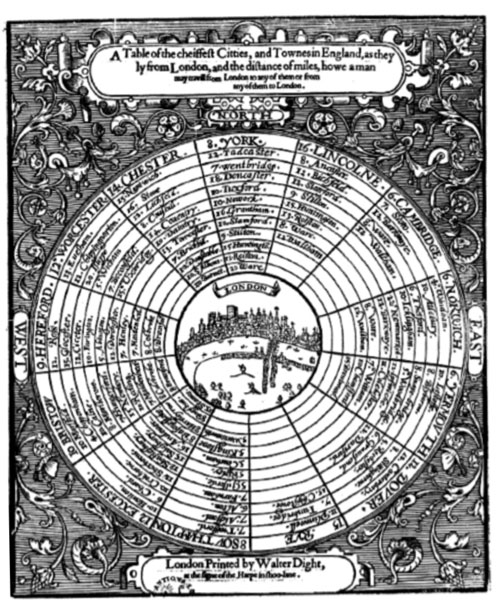
    Here’s a rather remarkable and ingenious display of information and distance usually reserved to show the structure of the solar system.  A Table of the Cheifest Cities and Towns in England, printed in London in 1600, the work of an anonymous thinker, utilized the standard and generally universal salient for the planets to show distances of cities and towns from the center of the British universe, London.  

    Source: Doug Eskew, “Coriolanus and the Paradox of Place”, here.


  • An Interesting Concentric Graphic and the Number 12 (Twelve XII 2^3X3)

    JF Ptak Science Books   Post 1819

    Oh TIme, thou must untangle this, not I; it is too hard a knot for me t’untie! — Twelfth Night. 2.2.40-41

    Graphic bouvelles
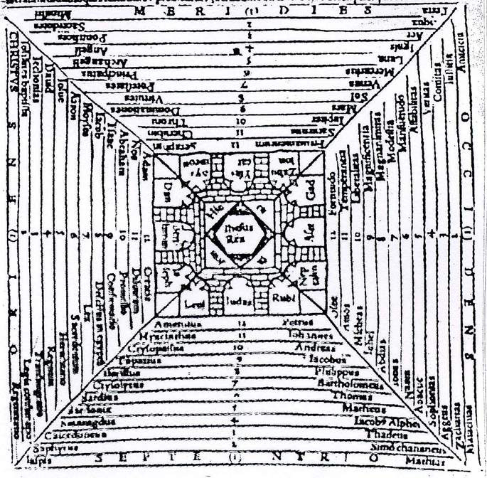
    I really should have included this in yesterday’s post about a terrific and creative image of concentric circles used early-on to display concepts of terrestrial distance and importance (A Table of the Cheifest Cities and Towns in England, printed in London in 1600,  ), as they both use this organizing concept in a bit of an uncommon way.  This image appears in  Charles de Bouelles’ beautifully titled Que hoc volumine continuentur; Liber de intellectu; Liber de sensu; Liber de Nichilo; Ars oppositorum; Liber de generatione; Liber de sapiente; Liber de duodecim numeris; Epistole complures, and printed in 1510 in Paris (from which also appears another interesting image on the “evolution” of the rock from being to thinking to being again, here), and maps the importance of the city of Jerusalem, but more importantly places its significance in the histories of the number twelve, centering on the city itself and the twelve tribes of Iraeli, and then branching out in more creative listable ways.

    Besides the twelve tribes, there are the twelve constellations of the ecliptic, Apostles, knights of the Round Table, trials of Hercules, Olympians, sons of Odin, books of Paradise Lost and the Aeneid, hues of the color wheel, inches, months, dozen, virtues, Olympians, half unit of the day, and on and on. 

    There are twelves enough to carry out just about any iconographic need, and that limited to just occidental resources.

    Source:  Les Pierres du Songe, Etudes sur les graffiti medievans, here.


  • The Ship of Fools, In Praise of Folly, and Intelligent Dischord: Brant, Erasmus, and Geiler, 1497-1515

    JF Ptak Science Books  Post 1788
    Bloggeilership186
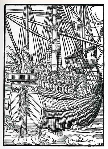
    Johann Geiler von Kayserberg’s Navicula Penitentie (Augsurg, printed by Johann Ottmar, and printed in 1511) is a remarkable book in many ways, but what I’m concerned with here is the fantastic woodcut illustrating the title page.  The book itself is a collection of penitential sermons against moral corruption in his Strassburg community—the sermons won him wide respect and some considerable fame as an orator, writer and theologian—but it is the woodcut of the ship (I’m sorry to reveal) that distracts me more.  It is evidently the earliest depiction of a fully-rigged and outfitted ship, with great and accurate detail, far beyond what had been published in the previous 50 or so years of movable type printing.  Presumably what we are seeing is Geiler preaching to ship full of what seem to be clerical/clergy folks rather than sailor—clearly Geiler is approaching the upper class here in the ship and not the working man. 

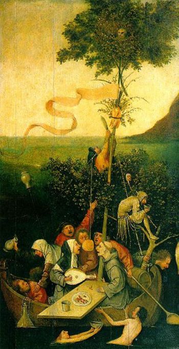
    I think that Geiler had Sebastian Brant’s 1494 Ship of Fools in mind when the great Hans Burgkmair (the “H.B” who signed this work of art) produced this seafaring image for him.  Also Geiler’s publication date of 1511 is shared with Erasmus’ fantastically influential (and leading-to-the-Protestant-Reformation) book The Praise of Folly. (It was written very quickly, in about a week, and centered around conversations he had with his good friend Sir Thomas More; the Latin title of the book is a bit of a wink and a nod to More, Moriae Encomium.)  The Fool, the Feast of the Fool, the Feast of the Beasts and so on were all very old institutions that allowed and tolerated the caricature and criticism of church and power structure officials—and this at a time in the Middle ages and Renaissance when such free speech by non-Fool types was strictly unacceptable.
    Brant_books
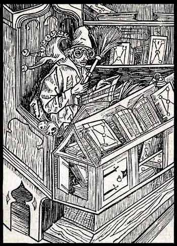
    In the same work by Brant (“Of Useless Books”, thankfully found with all 117 of the images from the work at the University of Houston library  ) we find the following image of the sage Fool.shorn of his headdress, sitting in the library, wearing glasses, and reading, surrounded by disheveled books that were clearly being used and consumed by the supposed clown. To me it shows the substantiation of the wisdom of the free-thought folly speech of the Fool, who, although clothed ridiculously, was a thoughtful, careful, well-read individual whose message much resembled the messenger. 

    The images in Brant’s book are so singular and many of the titles so captivating I’ve included many from the list from Houston’s table of contents, below: 


    Of Useless Books the Haintz-Nar-Meister
    Of Beggars Albrecht Dürer
    Of Good Counselors the Haintz-Nar-Meister
    Of Bad Women Albrecht Dürer
    Of Greed the Gnad-Her-Meister
    Power of Fatuity Artist unknown
    Of Newfangled Ways the Haintz-Nar-Meister
    Of Star-Gazing Albrecht Dürer
    Of Old Fools the Haintz-Nar-Meister
    Wanting to Know All Regions the Gnad-Her-Meister
    Of Training Children Albrecht Dürer
    Not Wanting to be a Fool Albrecht Dürer
    Of Trouble-Making Albrecht Dürer
    Not Understanding Raillery Albrecht Dürer
    Not Following Good Advice Albrecht Dürer
    Wanting to Escape Consequences of Evil Albrecht Dürer
    Of Bad Manners Artist unknown
    Not Providing in Advance Albrecht Dürer 
    Of True Frienship Albrecht Dürer
    Ship_of_fools_bosh_2
    Quarreling and Going to Court Albrecht Dürer
    Disdain of the Holy Scriptures the Gnad-Her-Meister
    Of Crude Fools Albrecht Dürer 12 Of Hasty Fools Artist unknown
    Of Becoming a Cleric Albrecht Dürer
    Of Wooing Albrecht Dürer
    Of Great Boasting the Haintz-Nar-Meister
    Of Arrogance Toward God Albrecht Dürer
    Of Gamblers the Haintz-Nar-Meister
    Of Foolish Plans Albrecht Dürer
    Of Oppressed Fools Albrecht Dürer
    Of Gluttony and Rebelling Albrecht Dürer
    Highwaymen and Lawyers Albrecht Dürer
    Of Useless Death the Haintz-Nar-Meister
    Foolish Messengers Artist unknown
    Of Serving Two Masters the Haintz-Nar-Meister
    Of Cooks and Waiters Albrecht Dürer
    Of Much Babbling the Haintz-Nar-Meister
    Of Peasants’ Squandering Albrecht Dürer 2
    Of Finding Treasure Albrecht Dürer 7
    Contempt of poverty Artist unknown
    Not Practicing What You Preach the Haintz-Nar-Meister
    Of Persisting in Good Albrecht Dürer
    The Teaching of Wisdom Albrecht Dürer
    Not Preparing For Death Albrecht Dürer
    Of Overestimating One’s Fortune
    Of Too Much Care the Haintz-Nar-Meister r
    Of God’s Plagues and Punishments Albrecht Dürer
    Of Unnecessary Wishes the Haintz-Nar-Meister
    Of Foolish Trading Albrecht Dürer
    Of Useless Studying Albrecht Dürer
    Of Jabbering in the Choir Albrecht Dürer
    He Who Judges Others Albrecht Dürer
    Of Overbearing Pride Albrecht Dürer
    Of Seeking Postponement Albrecht Dürer
    Expecting Inheritance Albrecht Dürer
    Of Guarding Wives Albrecht Dürer
    Giving and Regretting It Albrecht Dürer
    Fools, Far, Near, and Forever Albrecht Dürer


  • A Picture of the Speed of Light

    JF Ptak Science Books    Post 1787     History of Dots Series

    Ring the bells that still can ring
    Forget your perfect offering
    There is a crack, a crack in everything
    That’s how the light gets in.
    –Leonard Cohen

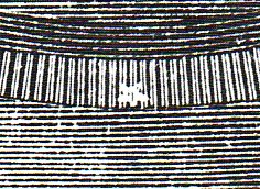
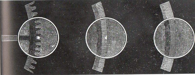
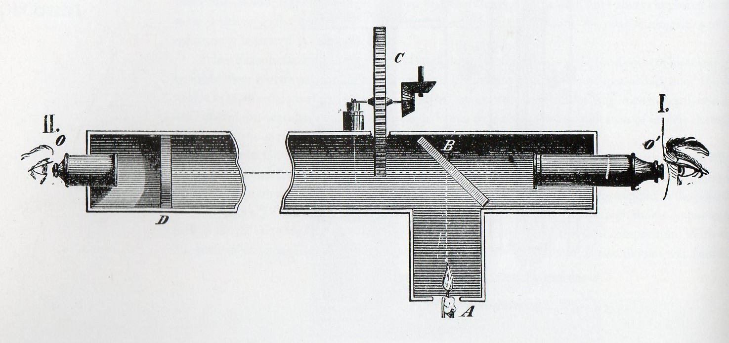
    I meant this title toAaa-light fiz gears det159 this post quite literally—among the earliest mostly-accurate estimation for the speed of light (“c”) was made by Fizeau in 1849, and he not-literally made an image of what the speed of light “looked like”, the last dot in a crack that let the light in. It followed several hundred years of thinking on the speed of light including experiments employing lanterns (Galileo),  the Moons of Jupiter (Ole Roemer), rain and starlight (James Bradley), and which in turn followed thought experiments by Empedocles, Aristotle and Descartes, who reckoned the speed of light to be instantaneous.  The Parisian physicist Armand Hippolyte Louis Fizeau (September 23, 1819 – September 18, 1896) acted on a beautiful idea and constructed an elegant apparatus (again using lanterns) to make the first modern estimate of c.  And, basically, as soon as he was finished and published the results in the Comptes Rendus in 1849, Leon Foucault—with whom Fizeau worked on many occasions—improved the apparatus and made an even closer approximation.

    Aaa-light fiz gears158

     The way the apparatus worked was simple and powerful:  Fizeau observed a light through an optical apparatus with a rotating toothed gear between observer and the entry of the light source; a mirror that was more than 5 miles away reflected that beam back through those same geared teeth of the disk.  The disk could be made to rotate at specific speeds, the object being to calibrate the disk to prevent the light from going through the teeth of the gear to the mirror and then back again through the same gap.  The point at which the dot o flight disappeared could be easily calculated and the speed of light extrapolated from there–which Fizeau estimated to be 313,300 Km/s or 194,410 miles/second. (In 1850 Foucault replaced the toothed gear with a mirror and produced a more accurate estimate of 185,093 miles/second, which in fact turns out to be very close to c. 

    Aaa-light fiz apparatus160

    Historical Estimates of c in Km/s


  • From Blood Flow to Little Nemo–Sequential Illustrations of Ideas and Stories

    JF Ptak Science Books  Post 1786

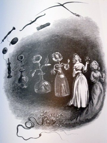
    It is intriguing to see ideas are communicated when drawn as a series of events on a single piece of paper–a single-panel, progressive illustration showing the sequential development of an idea.  This thought struck me while looking at some of the work of J.J. Grandville (above, “Les Metamorphoses du sommeil”, from his book Un Autre Monde, a proto-surrealist work printed in 1844) ) and caused me to think about how old this idea might be, how far back it stretched into the sciences and literature.  And right now, I really don’t have the answer.

    Again, what I’m thinking about is a single-sheet describing an action or thought–not like what might be the earliest example of the “comic book” the Histoire de M. Vieux Bois (1827) by Rodolphe Toepffer (Geneva, 1799–1846) but more like Little Nemo in Slumberland, by Winsor McKay (the following example from 1905).  The difference between the two in composition is simply that McKay in his Sunday comics efforts would develop the story on a single sheet of paper, so that you are in a way watching the story unfold as a motion picture would; and in the case of Toepffer, the story is told more in a conventional graphic novel way–in a book over dozens or hundreds of pages, with one illustration per page.  (I wonder about including Egyptian and Mixtec hieroglyphics, but I don’t think that they apply.)

    File:Little Nemo moon.jpg

    What seems like an early ready-made example of the sequential imaging of an idea on one piece of paper might be from the great William Harvey’s  De Motu Cordis et Sanguinis in Animalibus (On the Movement of the Heart and Blood in Animals), which was printed in 1628, and which in an iconic display shows Harvey’s demonstration of blood operating in a closed system, and circulated by the heart, and undergoing a “a motion in a circle”.

    Image from Exercitationes Anatomicae

    [Source:  this image from Exercitationes Anatomicae, De Motu Cordis & Sanguinis Circulatione.. Rotterdam: Arnoldus Leers, 1660..]


  • A Series of Fortuante and Unfortunate Events

    JF Ptak Science Books   Quick Post  Part of the series on the History of Blank, Empty and Missing Things.

     V. Klobassa produced a very pleasing design for this Centennial game, though it seems to me from a  reading of the patent for the board that the details of the empty years were left, well, empty.  I guess it was left to the players to add the details to the blank years, that way adding to the memorization part of the game experience.  It is unusual I think that Klobassa used white and dark stars to differentiate “good” from “bad” events, just to make sure that there was no doubt which was which.