A Daily History of Holes, Dots, Lines, Science, History, Math, Physics, Art, the Unintentional Absurd, Architecture, Maps, Data Visualization, Blank and Missing Things, and so on. |1.6 million words, 7500 images, 4.9 million hits| Press & appearances in The Times, Le Figaro, Mensa, The Economist, The Guardian, Discovery News, Slate, Le Monde, Sci American Blogs, Le Pont, and many other places… 5000+ total posts since 2008.

Category: Information, Quantitative Display of

  • On Teaching the Concept of What a Number “Is”–1929 vs. 2012

    JF Ptak Science Books   Quick Post

    At first glance this math teaching tool looks a little on the obvious/antique/useless side, but I think that there are some good points to it in helping small children understand the concept of what a number “is” and relating the processes of addition and subtraction to the relationship of “numbers” to “things”.

    And as the inventor points out

    and so on…

    This certainly seems more beneficial and utilizable than the current practice in my daughter’s third grade class, where a simple subtraction problem is turned into a double addition problem employing a number line, all in the name of teaching the children the concept of “number” and doing away with algorithms.  I think that by the third grade, the concept of “number” has been established, though the board of edu-selection might be trying  to re-visit a lost point of development somehow.

    So with my daughter’s class,take  the problem 456-345=    ______

    This is made intoan addition problem,  345+ ____= 456.

    The addition problem is turned into a number line, with 345 on the left far end and 456 on the right. 

    The children are told to add the requisite bits to 345 to get to a “zero unit” for each place value, and then add those for the solution to the problem. 

    So:  345+5= 350, 350+50=400; 400=50=450; 450+6+456.  Add the 5+50+50+6= 111.

    In this confusion a stab at the heart of understanding the concept of “number” has beenb made. 

    A step back from this would be a wise move to make.


  • Drowning in Numbers–Arithmetical Harvesting by Monroe and Texas Instruments

    JF Ptak Science Books  Post 1704

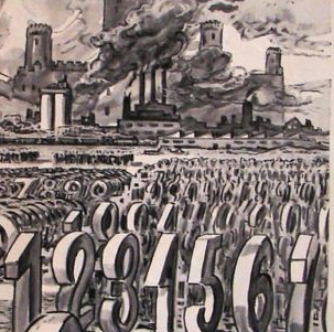
    Monroe numbers lost detail
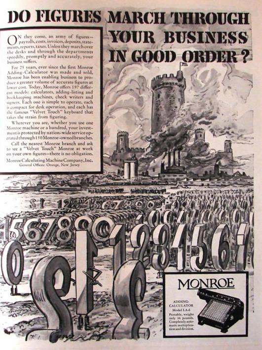
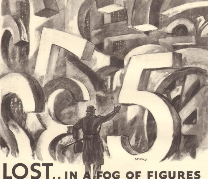
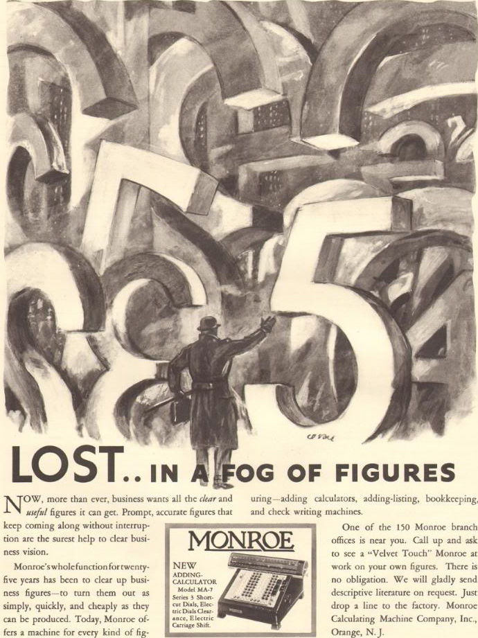
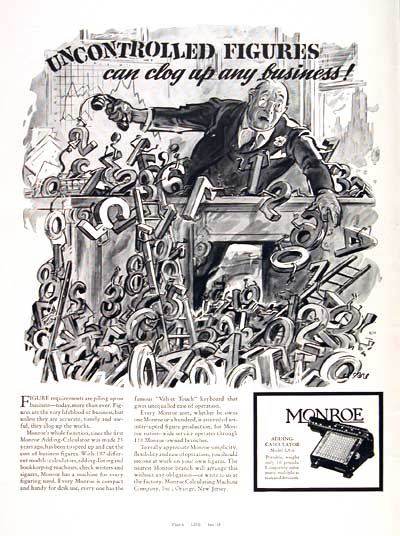
    Monroe numbers lostThe Monroe calculator must have seemed the same sort of inspired salvation to the 1930’s generation as the hand-held Texas Instruments calculator (with paper feed!) that I saw displayed in a glass-domed pedestal at Barnes and Noble in Manhattan in 1973.  Small, compact, and with fantastic calculatign capacity–and expensive.  It was in a very real sense a glimpse into the future.  For the general, garden-variety Monroe, it certainly offered its users a much smaller, tidier machine than some of the brutes of the decade or two preceding it–make no mistake, there were some big bruising accounting Monroes that were truck busters.

    But the Monroes that appeared in these ads from LIFE magazine in the late 1930’s Monroe calculatorwere certainly populist, and easily transportable.  And they cost about as much (with some smoke/mirrors adjusting for inflation and etc) in 1937 as the $450 TI  cost in 1973. (The TI machine was produced just seven years or so after its first hand-held was introduced–I’m unsure of the 450 price tag, though I think it about correct.  The TI SR-50 without a paper trail cost about $150 in 1974.)

    Monroe is an old company (begun in 1912) company that produced hand-cranked and electromechanical calculating devices.  The Monroe salesman’s handbook that I have here from 1929 shows versions of their machine that were lightweight and versatile (at 38 pounds) to behemoths for insurance companies that were truck-haulable.  Monroe became part of Litton before reappearing again on its own, trying to compete in the hand-held market with its own electronic display calculator–a device that cost $269 in 1972.  Monroe was basically “done” by the 1960’s.

    Monroe numbers marching det
    I think that for most people Texas Instruments is produced hand-held calculating devices–it is of course a vast concern, with a long history that gets catapulted during WWII when the formerly geology-based company gets involved in military electronics.  Fast forward, TI created FLIR and MERA, laser-guided control systems for PGMs (laser-guided bombs/precision-guided munitions), launch and leave glide missiles, and so on. IT was also involved in the earliest work in microminiaturization, producing (by Gordon Teal) the first commercial silicon transistor (1954) and the first integrated circuit (by Jack Kilby) in 1958. And so on.  Its a big, old company.

    And as much as each company was offering a similar god-send to their generationally-distanced mathematician/number cruncher, TI simply didn’t have ads like Monroe.  And I’ve always iked to see numbers-on-the-move.

    Monroe numbers marching


  • How Much Was 50 Cents Worth in 1876?

    JF Ptak Science Books    Post 1697

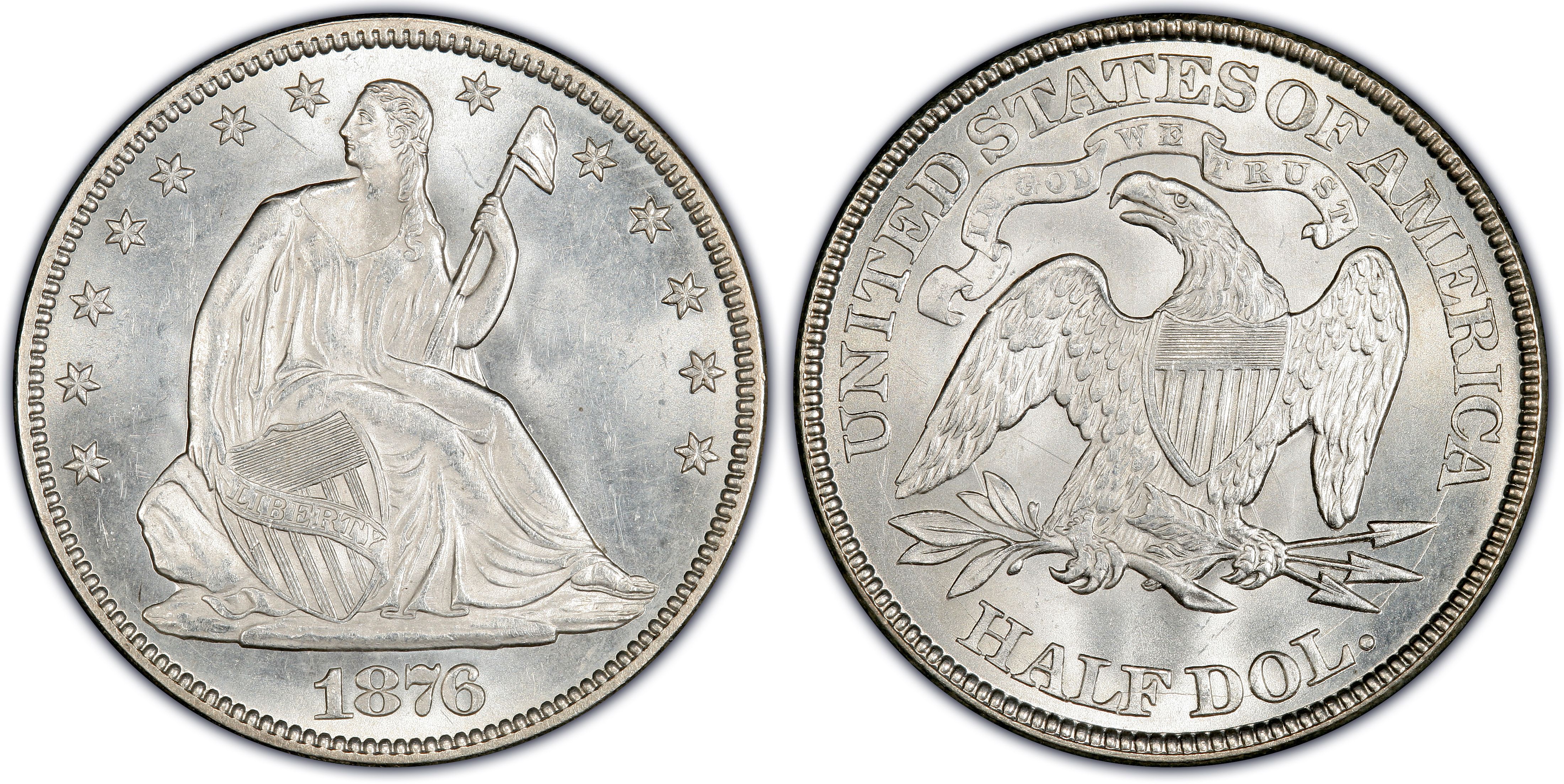
    Continuing a new series of posts on big, underwritten hidden segments of the history of the American West in my current reading of Larry McMurtry’s Lonesome Dove, I come to wonder about what it meant–what was the value–for one of the cowboys to spend 50 cents.  (The sum comes up here and there.) What did 50 cents mean in a working person’s life at the time this novel takes place, in 1876?   

    One way to look at the value of a half-dollar then is to see what portion of a week’s pay it represented.  That, and of course to compare what things cost in general, compared to how much it cost to make the money needed to purchase the thing. 

    For example, a songsheet as advertised in Spirit of the Time, 1877) cost 30 cents. Coffee (“Gillies Old Plantation”) cost 25 cents per pound.  After enjoying the coffee,  a guy could get a shave for 10-25 cents, or get a pair of shoes (“Harman’s Hand Made Shoes”) for $3; a decent hotel room in a modest city could cost $1-2 per night, and a half-barrel of flour would set you back $2.50.    A W + C Scott & Sons double action .45 calibre revolver would put you back $20 (according to the Spirit of the Times) in 1877, while a Remington sporting rifle #1 model (30″) would run $30.  A simple-ish hat could cost $3 dollars, but a good hat for the trail would be considerably more, ranging from 5-25 dollars. (See more examples below.)

    But what did 50 cents mean in terms of a paid salary to a cowboy?  I think it is relatively safe to say that at this time the “average” cowboy made about $30 a month.  Wranglers would pull down $20-$30; top hands, $50-$75, and the trail boss, say about $100.  So, spending a half-dollar would be equal to about a half-day’s wages. 

    So we can see that if you made $30 a month, spending 50 cents was something. 

    Most workers made more than cowboys—farm hands (with board) made $35-$45 a month; store clerks made $45-$95; “superior clerks and bookkeepers” made $100-$150 monthly; “female cooks and servants” received $25-$35; carpenters ($75 and up) and masons ($75+) made more.  Railroad workers building the first Texas railroad actually received a pay decrease from $2.75 to $2.00 a day. They worked 6 days a week from 7am to 6 pm, and were allowed to fish in the Pecos and Rio Grande Rivers with dynamite, “Italians on the one side and Germans on the other.”. (More examples below.)


  • The Porcineographic Map of the United States, ca. 1876

    JF Ptak Science Books   Quick Post

    This porcineograph

    This semi-magnificent map, The Porcineograph, produced by the Forbes Lithographic Manufacturing Company of Boston in 1876 or so, defines the states and territories of the U.S. in terms of their regional foods.  Being a vegetarian of twenty years or so, very little appeals to me, though the foods do at least sound interesting.  The again, somne of it sounds fantastically bad, like the selections for Wisconsin (Boiled Hog’s Heads, Hulled Barley and Blood Pudding).

    Arizona: Jerked Beef and Greasy Doings; California: Bear Steaks, Grapes and Ham Sandwich; Connecticut:  Shad, Hog’s Head Cheese and Gingerbread;  Florida: Turtle Soup, Oranges and Pickled Trotters; Kansas: Buffalo Tongues, Paw-Paw and Ham; Maine: Lobsters, Cunners, Pork-Apple-Pie and Baked Indian; Louisiana😛 Gumbo Soup, Poussoneau and Larded Beef; Minnesota: Gopher, Stewed Pork and Molasses; Mississippi: Persimmon, Bacon and Hoe Cake;  New Jersey, Pork Pie, Peaches and Pigeons; New York, Roast Pig, Fried Oysters, Strawberry Shortcake & Uninvestigated Drinks; Ohio: Sugar-cured Ham, Cream Cheese and Catawba Grapes; Tennessee: “Uncle Ned”, Bacon Roasting Ears and Corn Cake; Texas: Wild Steer and Corn Dodgers wobbled in Pork Fat; Vermont: Hasty Pudding, Maple Syrup, Succotash and Pork; Wisconsin: Boiled Hog’s Heads, Hulled Barley and Blood Pudding.

    [Map source:  the Library of Congress.]


  • Beauty in Shades of Gray of Stellar Spectra, 1863

    JF Ptak Science Books  Quick Post

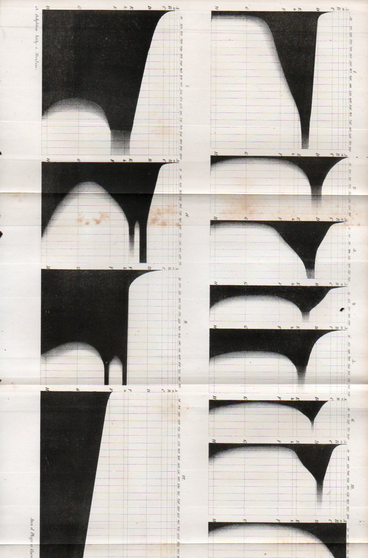
    This very quick posting is made in relation to a book just posted to the blog’s bookstore (Gustav Kirchhoff’s  “Zur Geschichte der Spectral-Analyse under der Analyse der Sonnenatmosphaere”(On the history of spectral analysis and the analysis of the solar atmosphere)–or at least in relation to another object in the 1863 Annalen der Physik volume.  And that other object is this, this beautiful series of diagrams illustrating “Ueber das Verhalten einiger Farbstoffe im Sonnenspectrum” by J. Haerlin, on elements in the spectrum of the Sun that appeared in teh same volume, tucked away at the end of the journal–art in science.

    Grayscale133


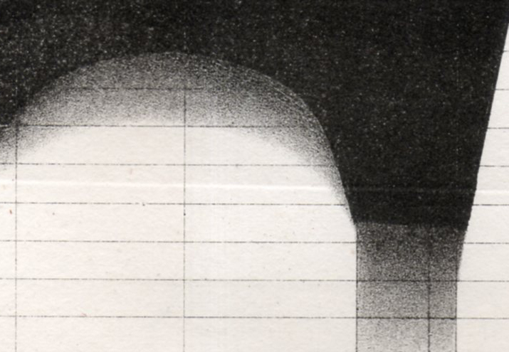
    And this, a bit of detail into the grays:

    Grayscale134


  • Map of Nazi Invasion from Uruguay

    JF Ptak Science Books   Quick Post

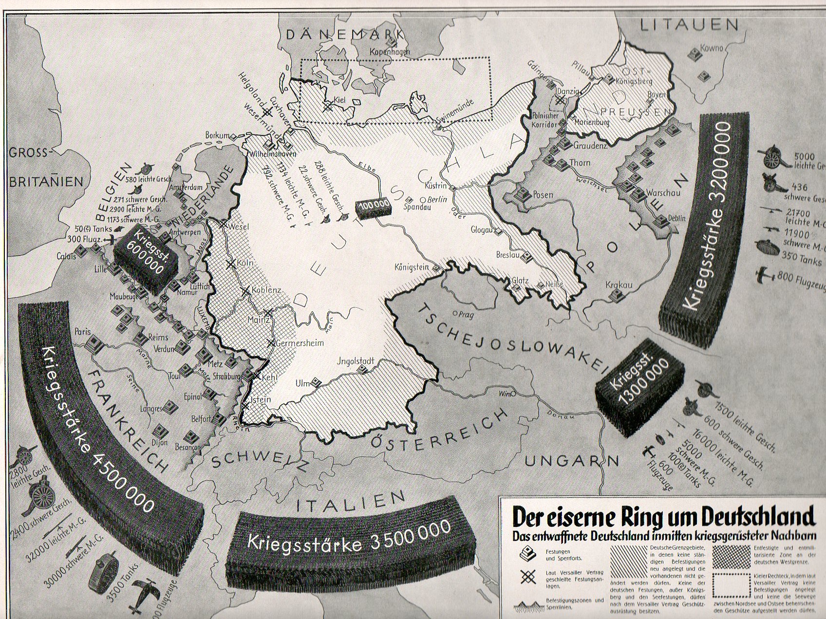
    I’ve post a number of thing son this blog relating to Nazi invasion routes to America and the potential threat of Poland to Nazi Germany, all stories more vividly enhanced (whether true or not) by maps–as a matter of fact, maps seem to be validity enhancers to just about any story, for it seems that maps represent a will of some sort, and where there’s a will, there’s a way, and so there must’ve been a good Nazi plan for attacking South America via Uruguay.  Except that there wasn’t.  But the map looked good, and certainly it made people think.


    [Map source from the Bahia Sin Fondo blog, here.]

    For example, see the posts Invasion Routes to America:  Nazi Invasion Scenarios of the U.S. and Germany Surrounded (map below).

    Nazi Prop surrounded538

    http://sm.headweb.com/factualtv/title_pix/Why_We_Fight_The_Battle_of_Britain.jpg

    [Source:  Why We Fight, the Battle of Britain.]


  • The Eiffel Tower as a Unit of Measurement

    JF Ptak Science Books   Post 1673

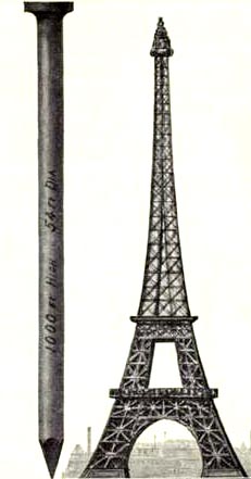
    The Eiffel Tower is iconic; and being iconic makes it susceptible to be used as a standard of measure, at least so far as graphical displays of information is concerned.  Here are four examples of Large Quantities of Things Being Explained in Terms of Eiffel Towers.

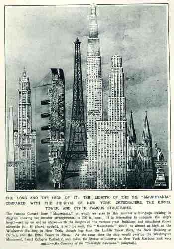
    This wonderful display (appearing in The Illustrated London News for 26 March 1927, page 518) of quantitative data isn’t quite as whimsical as it appears in detail, though I can think of only a few (antiquarian) times that I have seen a ship made part of a cosmopolitan vertical cityscape.  It is a great way of comparing two disparate, out-of-place equals, and certainly can get the idea of the size of something as stand-alone and solitary as a great ship to children (and adults, too) by comparing it to something as obvious as a tall building.,  This time its really just comparing the length of the SS Mauretania with the heights of some famous and notable buildings. (The Mauretania, 1906-1935, was a fabled, luxurious and fast ocean liner of the Cunard line; it was refitted for a resurgent oceanic service at about this time.)   In the larger, expanded second image we see the Mauretania stacked up against (from left to right) the Washington Monument (555′), the Woolworth Building (792′), the Mauretania  (790′), the Eiffel Tower (984′), the Larkin Building (proposed at 1208′), the Book Building (873′), the Koln Cathedral (512′) and the Statue of Liberty (305′).  The Larkin Building (not the F.L. Wright structure of the same name) was a proposed super-tall of 110 floors for 330 W. 42nd Street that was proposed in 1926 and not canceled until 1930, and which would’ve been the tallest building in the world. (For an interesting site on the cancellation of tall buildings, see HERE.)   In any event, this was a big ship–the largest in the world when it was launched as a matter of fact–and the drawing is wonderful.   Upon closer inspection, there is a terrific amount of detail in the cross section of the ship.)     (This original print is available at our blog bookstore.)                                             

    Blog1sept_16_ship_skyline564

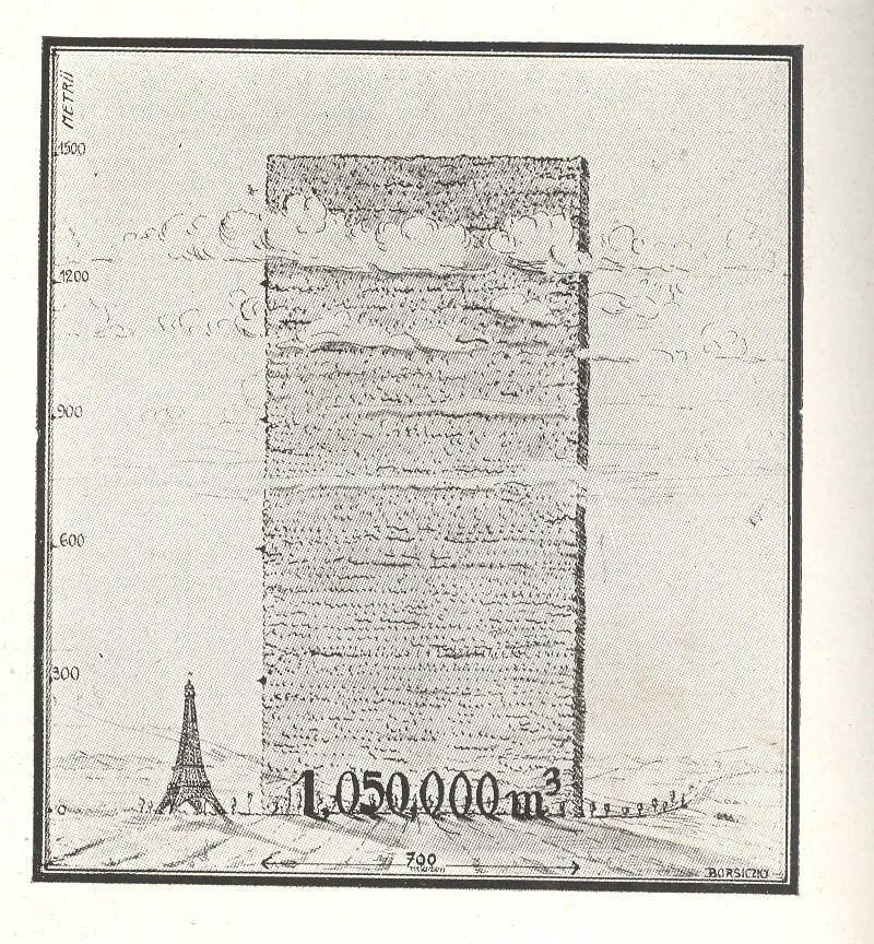
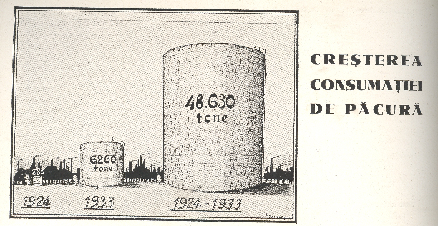
    Continuing a long, developing thread on the graphical display of quantitative data–and especially that which uses man-made objects for comparison—is this interesting bit from a Romanian mining publication from 1933.

    https://historyofideasblog.com/a/6a00d83542d51e69e20120a57d97c3970c-pi

    This image and data is from the generally useful data and interesting if not useless info Scientific American Reference Book. A Manual for the Office, Household and Shop, by Albert A. Hopkins, and published in 1903. It gloriously depicts the annual American finish nail production in terms of Eiffel Towers:  there were evidently 10-million 100-pound kegs of these nails made in 1902; if they were made into one big nail, it would be this one–52′ in diameter and 1000 feet tall.  I guess another useful visual bit would be the representation of the number of new houses built/kegs of nails, which would make this image a little more meaningful; though, perhaps, we may not be going for meaning, here, necessarily.


    The huge mound next to the Eiffel Tower shows the consumption of wood in Romania over a ten year period, a stack of wood 700  metres long and 1500 metres high.  Evidently this wall has only the most rudimentary depth of a metre, as the legend reads that the volume of the woodpile is 1,050,000 metres cubed, which is the same as its square area.  So somebody missed something, here, though the artist did supply some nice shadowing.

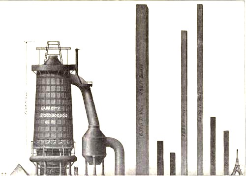
    Just above it appeared this comparison for the amount of oil consumed over the same ten year period

    https://historyofideasblog.com/a/6a00d83542d51e69e20120a7e3c6c7970b-pi

    I’m not sure why this comparison was being made.  This does come in the interwar period which saw a great expansion in Romanian territory and a vast modernization effort following the country’s devastating experience in WWI. Maybe it was illustrating modernization from wood-burning power/heating sources to oil-based. I really don’t know–I just liked the Eiffel Tower being dwarfed by a massively tall and impossibly skinny woodpile.

    Diagram steel eiffel 

    I love comparison like this, representing big, hard-to-associate  numbers of something against another quantity that can be instantly understood–the relationship between the two might be tenuous and complex, but at least it can give you some sort of handle on what would normally be an inaccessible, stand-alone number. Plus, any time that you can show what an ungraspable concept might “look like” and be explainable to a 10-year-old, well, you’ve got something. 


  • Comparative Displays of the Heights of Things: Centennial Tower, 1876

    JF Ptak Science Books    Post 1675

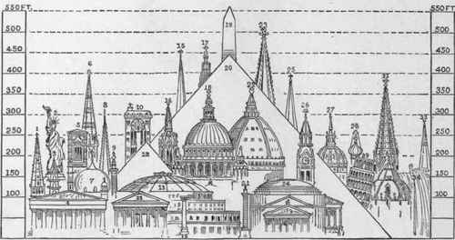
    The 1876 U.S. Centennial Exposition (formally called the “International Exhibition of Arts, Manufactures, and products of the Soil and Mines) in Philadelphia was a grand and fabulous showing of all things American, celebrating the hundreth anniversary of the signing of the Declaration of Independence.  One of the crowning objects of the fair was to be the never-built 300-metre tall Centenniel Tower, pictured here in the 24 January 1874 issue of Scientific American.  The structure appeared in relief against the background of other tall things built by humans, show in a relatively new fashion for displaying quantitative data comparisons in the same scale.

    http://upload.wikimedia.org/wikipedia/commons/9/93/The_Centennial_Tower_Philadelphia_1876.jpeg

     The practice of showing, say, the comparative heights of mountains and lengths of rivers by loading up all of the samples on one piece of paper for the ease of recognition was begun in the 18th century, but only rare; it began with some fits and starts in the 1820’s again and then much more widely around mid-century, and seeming to peak at the end of the century before going somewhat dormant for the next few decades or so.

    Another nice example of comparative heights of buildings:
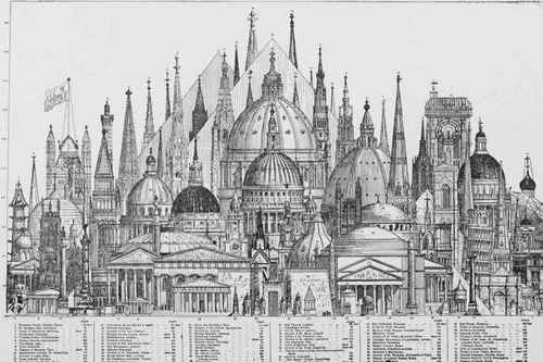
    COMPARATIVE HEIGHTS OF SOME OF THE PRINCIPAL BUILDINGS OF THE WORLD


    And this as well:

    Comparative Diagram Showing Highest Buildings And  396

    [Source with key to the images found here, at Chestofbooks.com]

    The excellent Bibliodyssey blog contributed a good healthy post on the subject of comparative heights of mountains map (here) with many fine examples of the art.  Its a curious thing to me that the  business of using same-scale comparisons in architecture is relatively new, coming (I think) as an invention of Etienne Durand in the 1840’s.)

    Here is one such example:
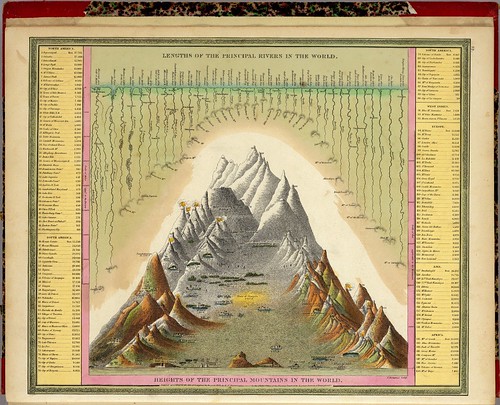
    Heights Of The Principal Mountains In The World (Mitchell) 1846

    But getting back to the tower itself and it unbuiltedness, here’s another example of an unbuilt tower–taller and bigger than the Centennial–which was proposed by Eugene Freyssinet (and which I wrote about earlier in this blog here):
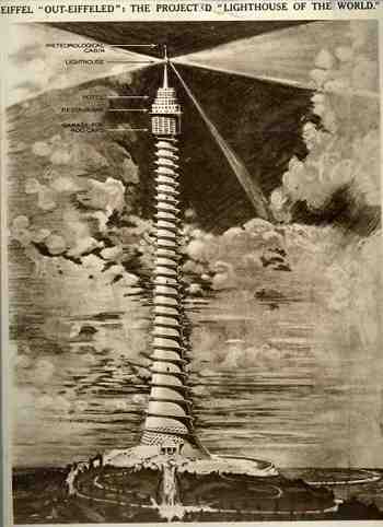
    Big_archout_eiffeled140


    Another in what is a long line of unbuilt towers would be this contribution by Vinnie Ream Hoxie (ca. 1874-6)  which was his response to the finishing of the not-completed Washington Monument.  Congressional sympathies towards spending money to complete the Washington Monument dried up to nothingness in 1856, just eight years after construction on the monument was begun.  The consequence was that the monument was only a nubbin for several decades, standing about a third complete–it was Hoxie’s idea no doubt to provide a sort of quick-and-dirty approach to finishing the project.  Of course this looked like exactly what it was, and the idea died its own lonely death, thank goodness. 

    http://www.nationalbuildingmuseum.net/Large%20Images/unbuilt/4._Washington_Monument_Sheet_2_web.jpg

    It had little appeal, at least to me.  It is somewhat reminiscent of the exhibition of the completed forearm of the American Statue of Liberty, which as it turns out was also exhibited at Phildelphia in 1876, years before the completion of the rest of the statue.  Short and stubby.


    File:Collossal hand and torch. Bartholdi's statue of "Liberty.", from Robert N. Dennis collection of stereoscopic views.jpg

    There are many other entries in the history of unbuilt towers, but their day will have to wait (for this blog, anyway).
  • Aeroplanes & Airships: Artistic Displays of Quantitative Data, 1914

    JF Ptak Science Books 

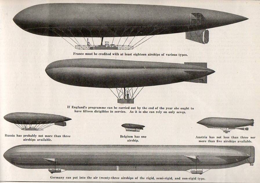
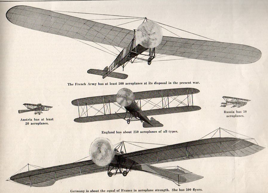
    In another adventure in infographics and the artistic display of quantitative data we find this pair of very distinctive images that seems to work, a little:

    Infographic  airship002

    Infographic  airplane003

    [Image source:  5 September 1914, vol 112, #10,  Scientific American.]

    The graphics are mostly good if not a little clunky–they can be viewed as “scary”.  Mostly, though, these images are reproduced today because I find it hard to pass up an interesting airship illustration, though they do present their case more clearly than a slightly earlier attempt at data display seen last week on this blog.

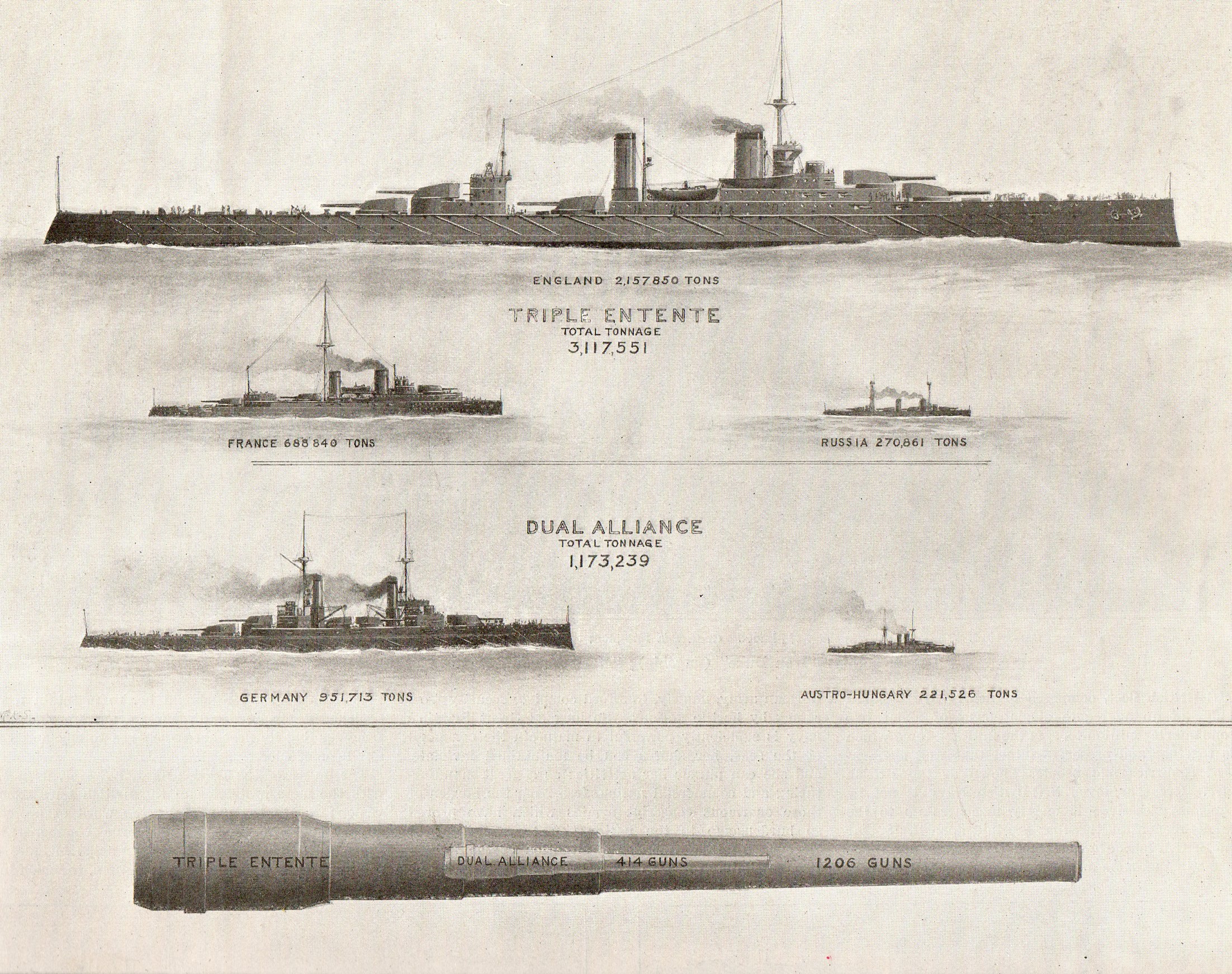
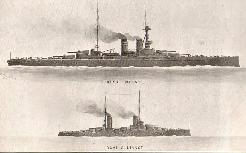
    The images for the distribution of naval power are very defined:

    Inographic ships018
    (I especially enjoyed the comparison of naval guns, with the cannon-within-a-cannon.)

    Inographic ships020


  • War Rations–Iron and Bread

    JF Ptak Science Books   Quick Post

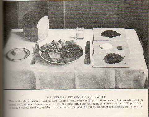
    Food german pows004
    Continuing yesterday’s post #1662 (A Short Episode in the History of Bread Photography…): my friend Jeff Donlan pointed out that if 60 million pounds of bread were served weekly to the 4,000,000 members of the German Army, then each soldier must be eating about 2 pounds of bread a day.  And that’s not eating a loaf or whatever of “Wonder Bread” (its a wonder its bread–watch that trademark!) or any other white bread where you could ball up two slices and pop them whole into your mouth.  As Jeff points out, if this was a dark or rye or Napoleon’s-solder’s-like black bread or some some thing, it would be thick and dense.  And so, two pounds of this sort of bread is a lot, especially if the average soldier was running around and weighing in at 150 pounds or so–eating two pounds of bread plus four pounds of potatoes would mean that each soldier was eating about 5% of their body weight in just those two foods per day.

    This all sounded like a lot of food to me–until I stumbled on the following article in a journal I had never encountered before.  It was in Illustrated World, a Popular Mechanics-lite sort of publication, for November 1916, in an article “From Trench and Barrack” that I found these two photographs.  I was astonished first of all to find a bread-consumption reference within 15 minutes of wondering about such a thing for the first time ever–but there it was.  A big slab of fork+-high bread in a picture made to depict the daily rations of a German POW in the hands of the British.  The prisoner was alloted 1.5 pounds of bread.  Plus a half-pound of (cooked) meat, 8 ounces of vegetables, one ounce of coffee or ta, and the other stuff as can e seen in the photo’s caption. 

    And there you have it.  If the prisoner is getting 1.5 pounds of bread, then it makes sense for the active soldier to be eating two pounds.  At least it all makes sense in 1916.

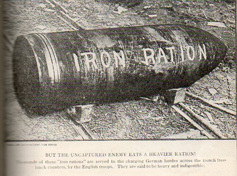
    The thrust of the article in Illustrated World though was the other sort of ration that Great Britain would be shelling out–shells.  This would be the iron ration that–after two years of a terrible and monumentally destructive war–would be the most common form of ration exchanged during the conflict.

    Food german pows005