JF Ptak Science Books Post 1673
The Eiffel Tower is iconic; and being iconic makes it susceptible to be used as a standard of measure, at least so far as graphical displays of information is concerned. Here are four examples of Large Quantities of Things Being Explained in Terms of Eiffel Towers.
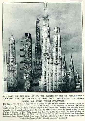
This wonderful display (appearing in The Illustrated London News for 26 March 1927, page 518) of quantitative data isn’t quite as whimsical as it appears in detail, though I can think of only a few (antiquarian) times that I have seen a ship made part of a cosmopolitan vertical cityscape. It is a great way of comparing two disparate, out-of-place equals, and certainly can get the idea of the size of something as stand-alone and solitary as a great ship to children (and adults, too) by comparing it to something as obvious as a tall building., This time its really just comparing the length of the SS Mauretania with the heights of some famous and notable buildings. (The Mauretania, 1906-1935, was a fabled, luxurious and fast ocean liner of the Cunard line; it was refitted for a resurgent oceanic service at about this time.) In the larger, expanded second image we see the Mauretania stacked up against (from left to right) the Washington Monument (555′), the Woolworth Building (792′), the Mauretania (790′), the Eiffel Tower (984′), the Larkin Building (proposed at 1208′), the Book Building (873′), the Koln Cathedral (512′) and the Statue of Liberty (305′). The Larkin Building (not the F.L. Wright structure of the same name) was a proposed super-tall of 110 floors for 330 W. 42nd Street that was proposed in 1926 and not canceled until 1930, and which would’ve been the tallest building in the world. (For an interesting site on the cancellation of tall buildings, see HERE.) In any event, this was a big ship–the largest in the world when it was launched as a matter of fact–and the drawing is wonderful. Upon closer inspection, there is a terrific amount of detail in the cross section of the ship.) (This original print is available at our blog bookstore.)
Continuing a long, developing thread on the graphical display of quantitative data–and especially that which uses man-made objects for comparison—is this interesting bit from a Romanian mining publication from 1933.
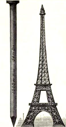
This image and data is from the generally useful data and interesting if not useless info Scientific American Reference Book. A Manual for the Office, Household and Shop, by Albert A. Hopkins, and published in 1903. It gloriously depicts the annual American finish nail production in terms of Eiffel Towers: there were evidently 10-million 100-pound kegs of these nails made in 1902; if they were made into one big nail, it would be this one–52′ in diameter and 1000 feet tall. I guess another useful visual bit would be the representation of the number of new houses built/kegs of nails, which would make this image a little more meaningful; though, perhaps, we may not be going for meaning, here, necessarily.
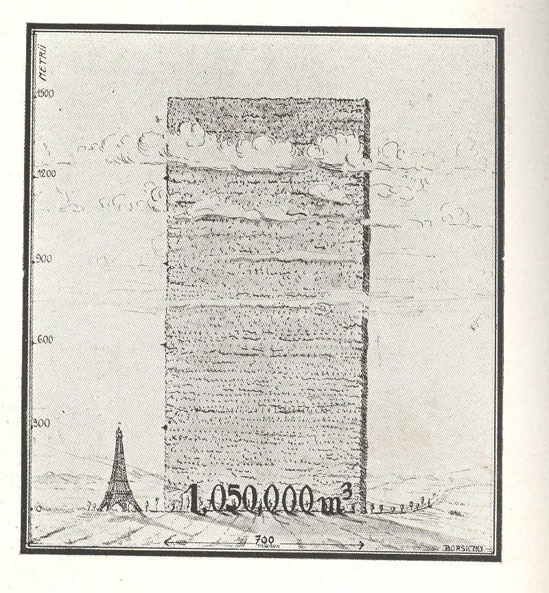
The huge mound next to the Eiffel Tower shows the consumption of wood in Romania over a ten year period, a stack of wood 700 metres long and 1500 metres high. Evidently this wall has only the most rudimentary depth of a metre, as the legend reads that the volume of the woodpile is 1,050,000 metres cubed, which is the same as its square area. So somebody missed something, here, though the artist did supply some nice shadowing.
Just above it appeared this comparison for the amount of oil consumed over the same ten year period
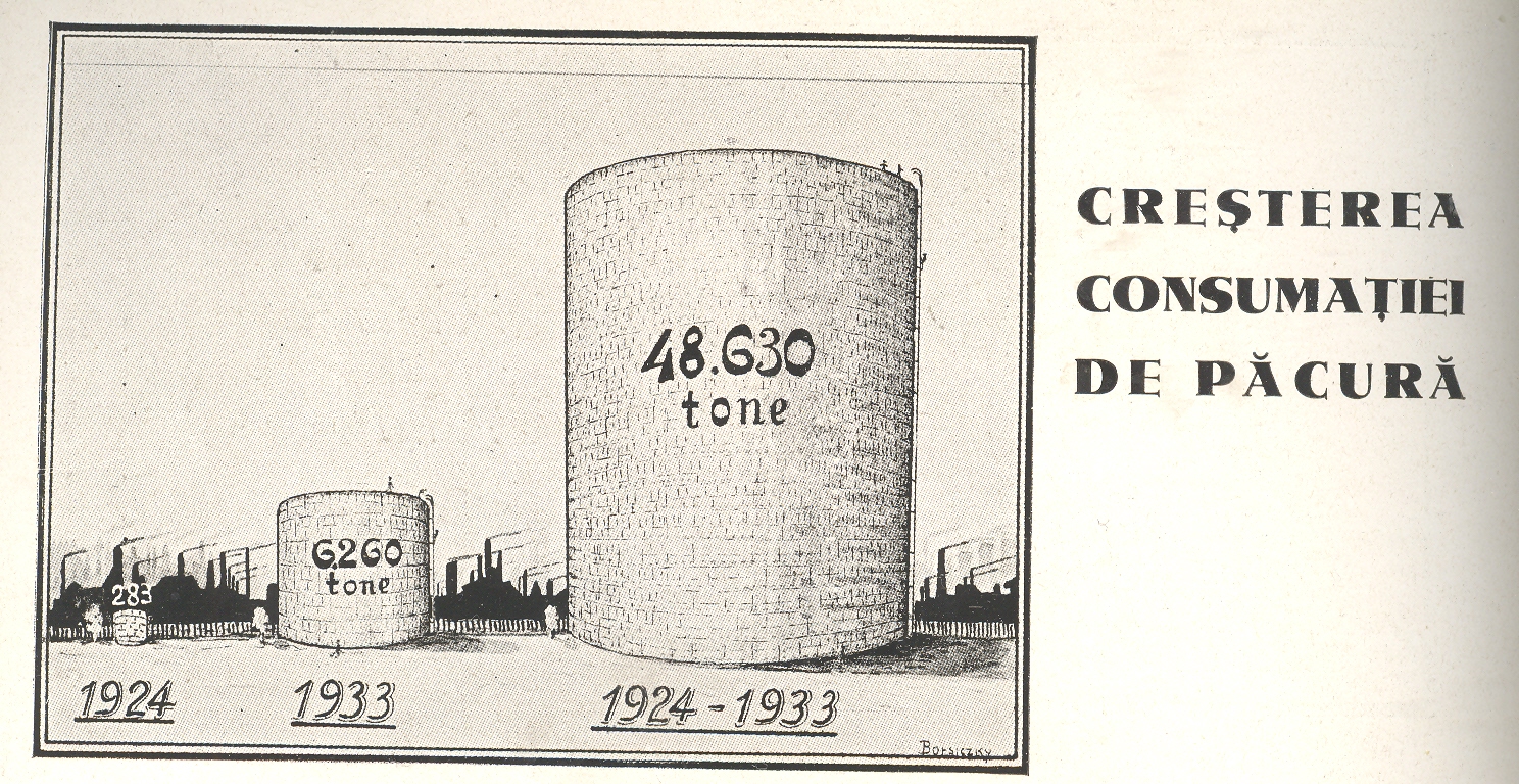
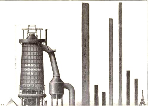
I love comparison like this, representing big, hard-to-associate numbers of something against another quantity that can be instantly understood–the relationship between the two might be tenuous and complex, but at least it can give you some sort of handle on what would normally be an inaccessible, stand-alone number. Plus, any time that you can show what an ungraspable concept might “look like” and be explainable to a 10-year-old, well, you’ve got something.