JF Ptak Science Books
In another adventure in infographics and the artistic display of quantitative data we find this pair of very distinctive images that seems to work, a little:
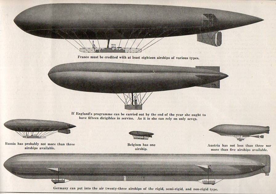
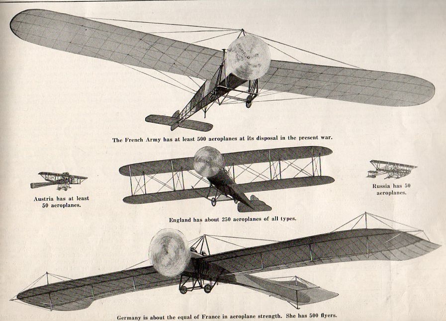
[Image source: 5 September 1914, vol 112, #10, Scientific American.]
The graphics are mostly good if not a little clunky–they can be viewed as “scary”. Mostly, though, these images are reproduced today because I find it hard to pass up an interesting airship illustration, though they do present their case more clearly than a slightly earlier attempt at data display seen last week on this blog.
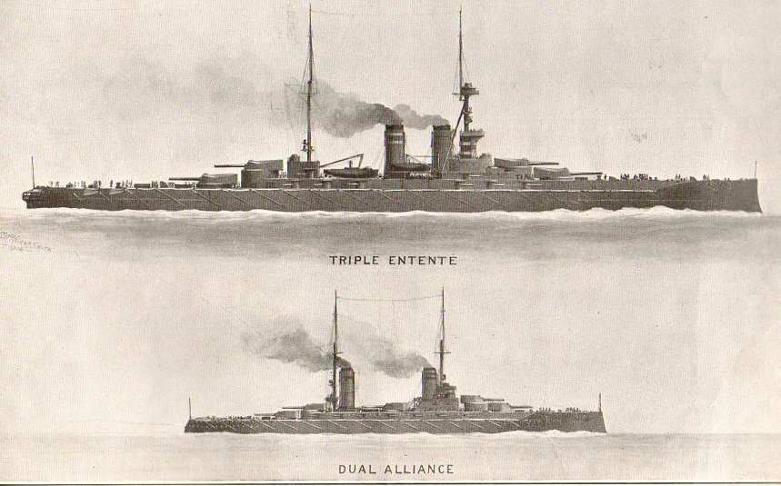
The images for the distribution of naval power are very defined:
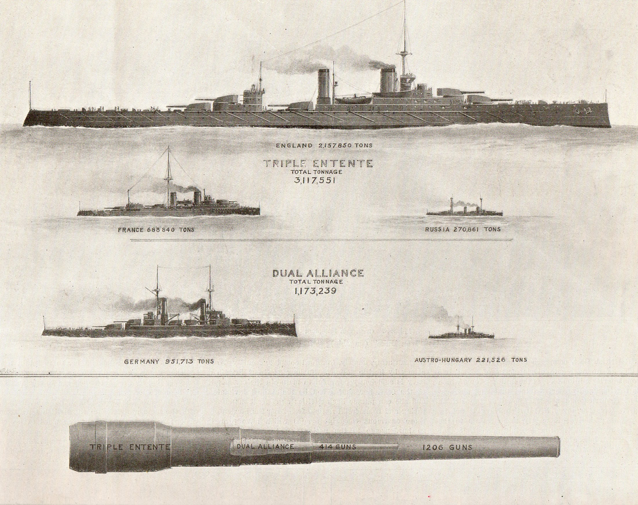
(I especially enjoyed the comparison of naval guns, with the cannon-within-a-cannon.)