A Daily History of Holes, Dots, Lines, Science, History, Math, Physics, Art, the Unintentional Absurd, Architecture, Maps, Data Visualization, Blank and Missing Things, and so on. |1.6 million words, 7500 images, 4.9 million hits| Press & appearances in The Times, Le Figaro, Mensa, The Economist, The Guardian, Discovery News, Slate, Le Monde, Sci American Blogs, Le Pont, and many other places… 5000+ total posts since 2008.

Category: Information, Quantitative Display of

  • Classic in the History of Surgery (1833) and its Reviewer Who Hated Surgical Tools

    JF Ptak Science Books LLC Post 211
    Blogaugust_22_blasiusdet425

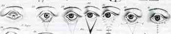
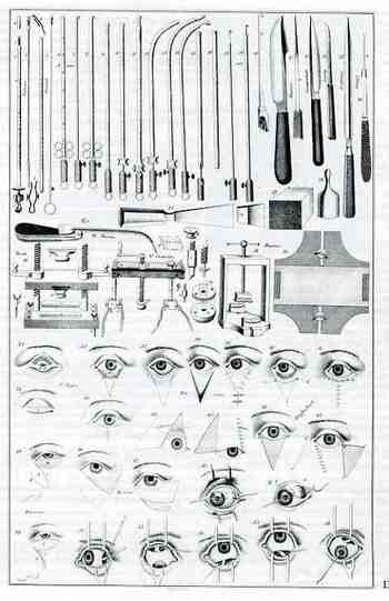
    The medical doctor and 19th century hero of modern plastic surgery, Dr. Ernst Blasius, published a remarkable work in 1833. Ajnurgische Abbildungen oder Darstettung der Blutlgen Chirurgischen Operationem, u. a. w. Akiurgicol Figures, (or Representations of the Bloody Surgical Operations, and the Instruments devised for their performance, with Illustrative Text.) was a careful, historically grounded, masterful textbook, illustrated with 50 engravings of procedures and—perhaps most famously—surgical instruments. It is considered a foundation work of the 19th century, especially in regarding to procedures to the eye, and especially for the development of modern plastic and reconstructive surgery.
    Blogaugust_22_blasius424

    As important as this book was, it received a very singular, peculiar and anonymous  review in the Edinburgh Medical and Surgical Journal, Exhibiting a Concise View of the Latest and Most important Discoveries in Medicine, Surgery, and Pharmacy (1836, volume 44, pp 539-544).  The reviewer (somehow, in ways that I cannot know or understand) found the illustrations of the instruments to be an abomination.

    Recounting that the surgeon’s “art” is a simple response to the inability to actually cure something with medical treatment—the reviewer states that the surgeon simply cuts things out.   He then makes a statement that I think is unique to my experience, saying that the gorgeous and painstaking illustrations of surgical instruments were calculated to repel the student “with an appearance both formidable and something repulsive.”  He continues: “If, however, this publication, by exhibiting instrumental surgery in its most complicated, formidable, and repulsive character, may damp the ardour of the surgical aspirant, it is also, by presenting all the various forms with which instruments have been endowed, useful in showing the surgeon the very height of the evil which he has to encounter. By placing before him such numbers and varieties of instruments, it may enable him to choose that which, upon mature consideration, seems best calculated for the proposed purpose.”   The unnamed reviewer does acknowledge the great understanding and historical grounding and command of deep literature, as well as the surgical techniques that Balsius presents in the book, and even goes so far as to describe them as “unrivaled”.  But he keeps returning to the illustrations, and particularly the images of the instruments, which he just simply cannot tolerate.  He ends the review saying that it would be a huge benefit to republish and translate the Balsius in English, and, given that opportunity, a great many of the instrument illustrations should be left out. “The explanatory descriptions, by which these illustrations are accompanied, show extensive and accurate knowledge of the literary history of operative surgery. All the operative methods and their peculiarities are carefully explained; and whoever studies this work cannot fail to understand thoroughly the merit of the different methods proposed for accomplishing each operation. This leads us to think that a republication in this country,! with a translation of the explanatory details, would be extremely useful ; and, in such circumstances, the number and variety of the instruments represented might be greatly diminished, while the anatomical figures and the views of operative processes might be retained.”

    The hatred of the surgical tools images is almost incoherent—especially since they were of such high importance, and that the book was being reviewed by a doctor for doctors and in a medical journal

    .


  • The Mother of all Renaisance Logical Graphs, The Knight’s Tour, Porphyry and Boethius

    JF Ptak Science Books LLC  Post 179
    Graphcontradictory_tree
    Following up on a post from 21 July about an early graph showing difference over time (state populations,
    1790-1860, US Census), I’m thinking that the claim may still be basically true
    in it most restricted sense. Doing some
    more thinking on how information has been represented and the history of graphs
    in general, I think that this is still the case even though there may be some
    close associates that reach back hundreds of years into the past.

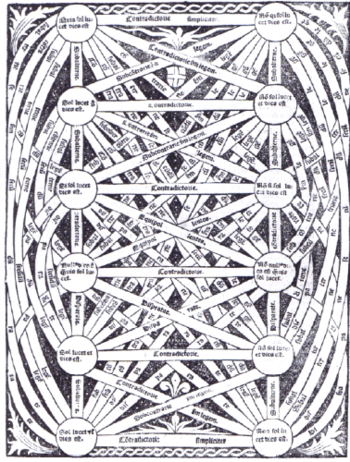
    Something that seems similar but really isn’t is this
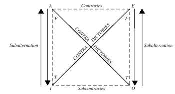
    advanced, morphed, untranquilized version of the square of opposition. A general, basic square of opposition begins
    with the four Aristotelian propositions: universal affirmative (symbolized as A,  “Omne S est P”.  or “Every S is P All S is P”;  universal negative (symbolized as E, “Nullum S
    est P” or  “No S is P All S is not P”; particular
    affirmative (symbolized as  I,  “Quoddam S est P” or Some S is P Some S is Pl
    and  particular negative (symbolized as O,
    “Quoddam S non est P” or Some S is not P
    Some S is not P.  The parent graph of this inherently perplexing and beautiful logical relations table is below, taken from the Murray State site (and if you follow the link you’ll have a concise and clear explanation of how this works):Traditionalsquare

    The square of opposition does in a way resemble another interesting graph-like description of an old-school (ancient) mathematical problem:  the Knight’s Tour.  This is a problem setting forward a chess piece knight on a trip across the chessboard (8×8 square) during which he must touch every square and touch every square but once.  (Here’s a way-above interesting [read “obsessive” and lovely] site that gets the issue across  in a big, mathematical, artistic manner.)
    One solution for the Knight’s Tour as follows (from here)…yes, I know it has nothing to do with what we’re talking about, but it does bear a resemblance to the logical decision maps, which I think is uncommon.       
    Knights_tour

    For a wonderful summation of the visualization of data and bearing heavily upon the Renaissance see James Franklin’s Diagrammatic reasoning and modelling in the imagination:the secret weapons of the Scientific Revolution and his website.
    Porphyrys
     

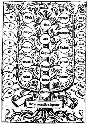
    Wandering off the path a little more leads us to the decision scheme known as Porphyrys Tree, a hierarchial organizer based upon the then Aristotlean categories (substance, quantity, relation, quality, doing, undergoing, place where, time when, position and having).  These would really form the roots of the Porphyryn Tree, and which, “if they were worked out fully, would contain all the species of the things what are in the world” (from Eleonore Stump Boethius, Cornell; Boethius was the “Last of the Romans”, killed in ca. 526, but whose writings and influence lived on to make him perhaps the greatest tutor of the Middle Ages).


  • Census Art and the Display of Quantitative Data, 1860

    JF Ptak Science Books  LLC Post 176

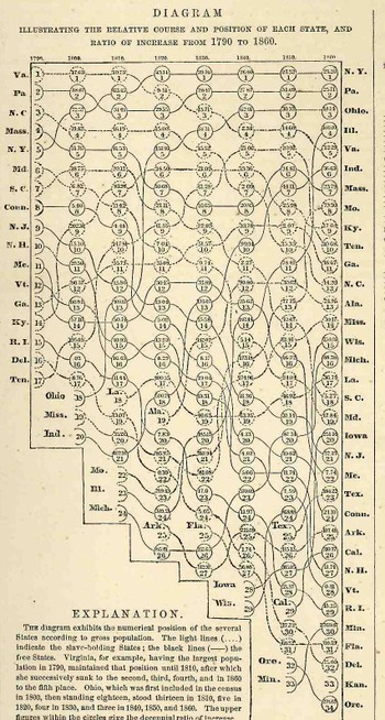
    Blogjuly_19census353_2                                                          This data set is from the Johnson’s Family Atlas for 1863 in the “Historical And Statistical View of the United States” section, printed on the back of the Tennessee and Kentucky map, and which was derived from the Eight Census of the United States  (1860).  It displays the changes in the states’ populations relative to each other, placing them in a populace order (highest to lowest), for a seventy year period, from 1790 to 1860, following the changes in the 17 states of 1790 to the 34 states in 1860.     So far as I can determine this is a very early graphical display revealing these sorts of comparisons of, well, anything.  It is  a little tenuous and twisted, but the ride it offers is determined and it is revealing–it just doesn’t enter the form in which the data could be more usefully (and quickly) displayed.  If you set your mind to it you can follow the languid changes in increases and decreases in a state’s population relative to the other states in the Union–for example, it is easy to follow the fortunes of New York and Virginia, as the changes each experiences over these seventy years is relatively marginal. Drastic changes are another story, and following the lines of their evolutions not easy:  the mercurial climbing chnanes in Ohio and Illinois are a bit hard to figure, though the longish but large changes (like that of South Carolina) prove a bit less tenacious to see.      
    There would be many more of these displays to come–particularly in the very large, double-page, fabulously colored lithograph that appeared in the atlas folio of the famous 11th census–but this was one of the very earliest attempts to display changes over time, and it worked out beautifully.


  • Nazi’s and the(ir) Display of Quantitative Information: Displays of the Big Lie, 1928-1940

    JF Ptak Science Books LLC  Post 168

    Bloggermany_surrounded328

    These two displays come at different ends of the beginning of WWII and, in a way,
    couldn’t be further away from themselves in the stories they were trying to tell
    (some truth, some fiction), and were separated in time by  11 years or so.   The
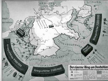
    first “Der eiserne Ring um Deutschland” (“The Iron Ring and Germany”) shows Germany surrounded by imaginarily aggressive (and aggressively-portrayed) neighbors nine years after the end of WWI.  They both display subsets of the Big Lie superset described by Hitler in 1925 in Mein Kampf (actually, sort of better described by the German term Lügenfabrik, or “lie factory”, used by Goebbels in his descriptions of the British).  The “Big Lie” was basically a lie so big and so preposterous, so outrageous, so impossible, that it was believed.) 

    This representation depicts the threat posed to Germany-making an iron ring-by the
    potentially hostile French, Italians, Belgians, Czechs and  Poles.  It shows the
    ring composed of a combined army of 13.1 million men versus the standing army of
    Germany, which in 1928 was given as 100,000, and listing virtually no heavy weapons
    and no air force whatsoever.. (The interesting bit here is that neither the Soviet
    Union nor Great Britain is included in these aggressive forces, the Soviets less-so
    than the English.)   The designer goes so far as to shade in areas of Germany that
    were under immediate threat, extending from the Donau to the Rhine, to a
    50-mile-wide area all around the country, with East Prussia almost entirely
    consumed.  (Certainly the Treaty of Versailles was a very troubling document closing the end of the war and, it cam be argued, opening the door for the next one.  It took six months to sign the peace treaty following the cessation of hostilities in November 1918, and the troubled negotiations produced a troubled treaty, ripping Germany up and saddling it with unrealistic retributions that began to wither in only four years, with the treaty virtually dissolved by 1935.)

    Blognazi_brit_aircraft325

    It is no wonder when looking at propaganda such as this that Germany was immured
    with fear of national collapse at the hands of land-hungry neighbors, and that there
    was a huge need to re-instate the army and a system of “self protection”.    (By
    1936, only 8 years later, it was beyond question about what Germany was up to-I can
    say that after having at least breezed through every page of the Illustrirte Zeitung
    (Leipzig)  from 1930-1940, that even a very casual reader could’ve tracked,
    graphically, the interest in military reporting and militarism in the page’s of what
    would’ve been the German equivalent of LIFE magazine.  By 1935 there was so much
    glorification of weapons and the Nazi manifesto that it should’ve been a surprise to
    no one when the Germans moved into their neighboring countries.)  This was by no means the earliest depiction of this rampant sale of fear or fear mongering (a design which has existed for thousands of years and not at all a creation of the present republican administration), but it is a very big and bald one, a somewhat staggering one, a bright shining lie.  (A Bright Shining Lie by John Paul Vann is by the way a great book on American involvement in Vietnam.) 

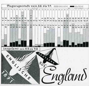
    The second image, a graph showing the successes of and very limited damage to the
    German Luftwaffe at the beginning stages of WWII, in August 1940.  This was a bad
    time for the Allies, this part of the war coined by Winston Churchill in 18 June
    1940 in the House of Commons by:  “The Battle of France is over. I expect the Battle
    of Britain is about to begin”.  Hitler’s Luftschlacht um England would start by air,
    where the Brits were far less the equal in military capacity, rather than by a
    land/sea assault, which would’ve tested the British at their strengths.  This
    second part of the assault on England was Unternehmen Seelöwe, or “Operation Sea
    Lion”, which would’ve begun the land assault following the victorious air campaign. 
    The graph shows aircraft losses from 9 July to 8 August, 1940, the German losses in
    black, and the British in gray.  As you can see, it was a pretty lopsided affair,
    made even more dramatic by the fictitious number of English planes being destroyed..
    This would all change, of course, with the Germans losing this battle, in a big
    way, with a resulting decisive victory for the Brits. (Who would of course muscle
    their way through the war another seven months before the U.S. was attacked and
    entered the war.) . It would coming to a screeching and collapsing reverse for the
    Germans by May 1941.  The results of the battle, in terms of aircraft and humans,
    were,  for England: 1,023 fighters: 376 bombers, 148 coastal command aircraft  for a
    total of 1,547 aircraft and  544 pilots and aircrew killed.  There were also 27,450
    civilians killed and 32,138 wounded.  The Germans lost 873 fighters and 1,014
    bombers for a total of 1,887 aircraft and  2,500 pilots

    I could find no graph of course showing the results of the endgame in the Zeitung.


  • The Big Question: How Long Will Oil Last? (1919)

    JF Ptak Science Books LLC   Post 167
    Blogoil326
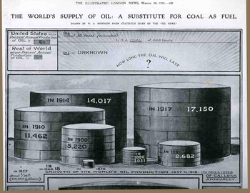
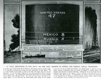
    In 1919, at the end of WWI, The Illustrated London News asked (and answered) the vital question of the day in the coal v. oil dispute and the feeding of its navy:  which power source will last longer?  The graphic designer displayed the answer right there at the top:  American oil would last about 30 years, while its coal reserves would go for another 4,000 years.  The bigger question though was about the oil production and futures for the rest of the world, which was left unanswered (and unanswerable, smartly).  Its easy to second guess these guys and have a stab and a poke at their predictive power, but we’ve been getting the answers to these questions wrong every decade since then.  Suffice to say that the Brits were doing some strategic thinking on the issue of power supply, which of course is probably the greatest issue in fielding an army of navy (just ask Rommel).
    Blogoil_btm327

    It is interesting to note that the British government was busily looking for oil in Derbyshire (oops) and other places. And as an end-note it is stated that the government had already invested about 2 million pounds in the Anglo-Persian Oil Company (which would become British Petroleum in 1957, known today as BP),  which, beginning around 1908, was the first time that a company harvested the oil reserves of the Middle East.  All of it was nationalized during the Iranian coup d’etat in 1953

    .


  • The Tree of Life and Coal’s Phylogeny–a decent Diagram but a Bad Idea

    JF Ptak Science Books LLC  Post 165
    Blogcoal_tree318

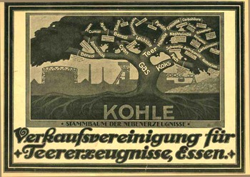
    Even though this is a simple classification scheme, and a
    very-well designed graphic at that, the use of the tree describing the genealogy
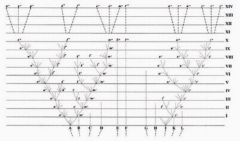
    of coal by-products just seems, well, wrong. The use of the tree in defining a visual phylogenic interrelatedness of
    living things appears pretty much for the first time in the first edition of the
    Origin of Species in 1859, and it is the only diagram that appears in the
    book. (And by this I mean the use of the tree-scheme for scientific purposes:  the tree of life of course has been used for many, many centuries, the philosophical design woven into the fabrics and incised into the stone of many cultures.  It sort of appears in print in classification usage at least by the wily and polymathic Athansius Kircher, who used it to display the elements in a Kabbalistic Tree of Life some 350 years ago.)
    The Verkaufsvereinigung fuer
    Teererzeugnisse (of Essen) used this idea in
    1922, publishing the ad for their company in the Illusrtriete Zeitung (Leipzig). The great tree spring from a bed of coal (“kohle”)
    exhibiting the “stammbaum der nebenerzeugnisse” (roughly the “pedigree of our
    product”), with the trunk being gas, branching out into tar, coke and cyan and
    so on.  Even though it’s the lifeblood of
    the continuing industrial revolution, and even though we’re hundreds of years into
    a deep need with the products, the use of the tree just seems antithetical to it
    all on all levels of recognition, especially now. 

    (The Darwin tree of life is below.)Darwintreeoflife


  • The Earliest, Instantenous, 3-D Modelling Device? A Primitive, Metallic “Polaroid” Portrait in 1836.

    JF Ptak Science Books LLC Post 165
    Blogphysiog320
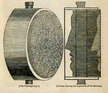
    In the “Spirit of Discovery” section of the British weekly magazine The Mirrour of Literature, Amusement, and Instruction for 22 October 1836 is a short notice on the “physiognotype”, “a machine for taking casts, lately invented by a gentleman in Paris”.  We’re accustomed to these devices now as they’ve been for sale in toy shops for decades—but in 1836 it was a real breakthrough for making instantaneous three-dimensional models of small things.  In 1836 there really wasn’t any simple way of producing a direct, proportional model like this in 3-D except for encasing it in plaster and then casting from that mold.  Two-dimensional modeling was easier, and there were numerous devices constructed for this purpose as people pursued the still-hot rage of physiognomic forecasting, with simpler means (like shadow portraits) being hundreds of years earlier.  (Photography remember is still three years away from being announced and another few years from being sort of accessible to middle-class folks.) 

    This device was simple and cool, and it worked.  It was basically a board with a mesh of tiny holes drilled into it through which were placed knitting needles (it looks as though it was 12” around or so and four inches deep), bound in wood, with the enclosure encased by a bladder of warm water (“to ensure that the needles moved with the greatest facility”)—this last bit was really a good idea.  You were left with a “brush of needles”, very densely packed, and very easily disturbed.  The author writes that the process took about two seconds, didn’t hurt at all, and caused “a sensation that cannot well be described”.  (Though he did state that if the instrument wasn’t warmed by the water the process would’ve felt like putting your face in the snow…does that mean it felt like putting your face in warm snow?) 

    I’ve tried, briefly, to see where this invention went, but it seems not to have advanced far beyond the reach of quack medical practioners and magicians.  It seems as though something like this could’ve been useful in the machine shop for modeling (replacement) parts without having to take the machine itself apart to do it.  I guess that it could’ve been used by haberdashers, cobblers, and all sorts of other craftspeople and small manufacturers, but it seems as though it actually wasn’t.  It looks like a dandy piece of thinking, to me. 


  • The Display of Quantitative Data–a Pretty but Wanting Example; British Weather

    JF Ptak Science Books  Post 158 (2008)
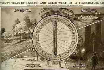
     This interesting presentation looks to be a lot more useful than it really is—an example of a lovely graphic display of quantitative data in which the information displayed really doesn’t live up to the effort that went into its display.  It is pretty, though.

    Blogweather_chart276

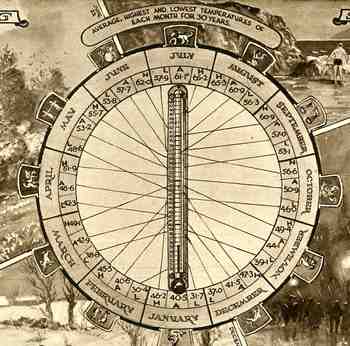
    What the chart displays is the average, highest and lowest temperatures for each month over thirty years (1918-1948)—it would’ve been much more effective, and easier, to use even a simple list to display this data.  It is nice, however, that you can scale up and down the thermometer to find your months, though the results would be surprising to almost no one.

    Blogweather_chart_detail277 
    The descriptive text on the bottom of this page (appearing in the Illustrated London News for 8 January 1949, describes the climate of Britain  “though variable. To be one of the most salubrious in the world”, which is a description for the island that you don’t often see. 

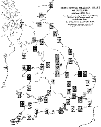
    Given the amount and distribution of weather data it is of course a highly problematic issue in displaying it all—Francis Galton (the man for all seasons’ chart is below) tried this in 1881 (the same year that he published what is recognized as the first paper on synesthesia) with  mixed results.  There are earlier efforts that deal with world and continental weather types but these maps gave a broad view of global weather types.  Don’t get me wrong, looking at a world weather map in 1861 was still a very big deal in the control and display of data.

    Galtonweathercharts2


  • Simple Sublimity: Images of Disappeared Common Objects. Traffic Lights, 1936

    JF Ptak Science Books LLC  Post 154
    Blogtraffic262

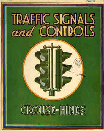
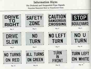
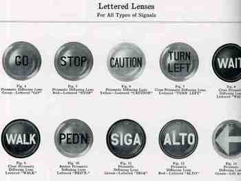
    These images are about as basic as it gets for the common, everyday, overlooked objects from the disappeared past.  They come from the Course-Linds manufacturer’s catalog for traffic lights and other control systems called, yes, Traffic Signals and Controls, published in Syracuse (NY) in 1936. It is a beautifully designed catalog—excellent illustrations laid out perfectly on their pages, with all of the data you’d ever need to order these things for your municipality. 
    Blogtraffic263

    What I find so fascinating about the images here is that they depict ubiquitous objects that today would today—given their ephemeral nature—be exceptionally difficult to find. 
    Given this catalog, today they are not.


    Blogtraffic260

    Blogtraffic259_2


  • Nails and Screws: Beautiful and Well-Designed Simplicity

    JF Ptak Science Books  Post #148

    Here we have two glorious, lovely examples of craftsmanship of simple things. The first is The Republic Steel Corporation (Chicago) manufacturer’s catalog for their production of nails and other wire goods.  It is about fifty pages long, and a third or so of it is devoted to the history of nail and nail-making as well as the history of the company.  The rest is all about the product.  And mostly about nails.  All sorts.  It is just fantastic!  I must say in all the years of my own nail consumption I didn’t know that there were so many different sorts of nail POINTS (diamond, blunt, chisel, needle, duck bill, side, and so on) ion addition to the various widths and lengths and special uses.  The points just never entered into the equation to me, but, of course, it is very important. 

    Blognails_cover225

    And speaking of special uses, there are a number of interesting specified nails in this catalog that, I think, are long gone from modern hardware store  shelves, as the needs they addressed are gone:  beer case strap nails (oh my god I love the sound of that) AND beer case hinge/lock/latch nails AND beer case cleat nails, basket nails, shade roller pins, pole marking and dating (!) nails, barbed berry box nails, and egg case fasteners are among what I imagine to be extinct nails. 

    Blognails_barre227

    Then there’s the beautifully designed Southington Hardware Manufacturing Company’s screw catalog, called, wonderfully, Screws, (Wood, Sheet Metal, Phillips Head, Slotted Head), catalog 41 (with prices) for 1935.  There’s page after page (actually, forty-five pages) of very detailed specifications (dimensions of heads, diameter, thread and tolerance, each description accompanied by two (or more) engineering drawings of the screw itself. 
    Now THIS is a way to describe a product.

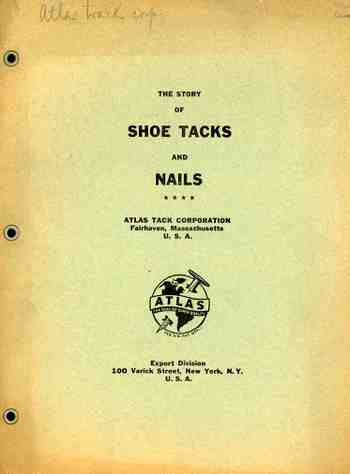
    This is followed up by a concise, nine-page (3,500 word) pamphlet published by the Atlas Tack Company (Varick St, NYC) on the history of shoe tacks and nails, bound, I’m happy to say, with metallic eyelets.  It contains pretty much all you need to  know on the history of shoe tacks, and I’m 100% behind the publication of odd-obscure histories such as this.  (I own perhaps a hundred “different” histories like this, including the massive non-classic “The History of Refrigerated Nuts”.) 

    Blognails_screws231