A Daily History of Holes, Dots, Lines, Science, History, Math, Physics, Art, the Unintentional Absurd, Architecture, Maps, Data Visualization, Blank and Missing Things, and so on. |1.6 million words, 7500 images, 4.9 million hits| Press & appearances in The Times, Le Figaro, Mensa, The Economist, The Guardian, Discovery News, Slate, Le Monde, Sci American Blogs, Le Pont, and many other places… 5000+ total posts since 2008.

Category: Information, Quantitative Display of

  • A Note on Graphical Display and a Mechanical Heart, 1876

    JF Ptak Science Books  (Expanded version of an earlier post)
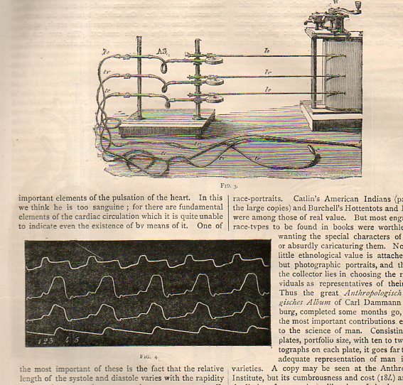
    Marey heart _2_This quick note comes as the result of a short chase on the detection of the pulse and the ability to determine death–as far back and even before Pliny life was determined by the audible heartbeat, which is where the trouble began, because one can still be very alive with a faint heartbeat. This was a major concern when dealing with folks who were thought to have expired, because in the mid-19th century and before the instruments necessary to make a careful and accurate appraisal of whether the heart was still working were yet finely developed.  Laennec’s stethoscope appeared around 1816, but as much of an improvement as it was this instrument awaited considerable refinements before a truly solid identification of a non-working heart could be established. The gaps in the determination of the arrival of death led to mortuaries where the supposed-dead were left to themselves at room temperature for three days, awaiting the ultimate determination of death which was putrefaction (as in the Munich and Frankfurt Leichenhaus and the Vienna  Zentralfriedhof). Earlier in the history of the determination of death methods were quicker and more brutal (if the patient was still alive) involving bellows-driven tobacco-smoke enema,  as well as tongue pulling and nipple twisting. 
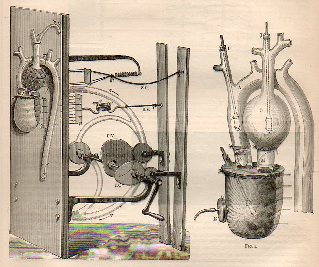
     

    Marey heart _3_This led to Etienne Marey (1830-1904), a versatile experimenter and premier instrumentalist who was a scientist, physiologist, and motion-picture/chronographer pioneer, who in the 1880’s created what was essentially the world’s first moving-photographic “slow motion” device. One iteration of Marey’s apparatus was basically a long series of ganged cameras recording a motion for a  simple task at a given time frame and presented on a continuous strip of photographic paper, sort of like a motion picture with the camera speed set at three frames per second. The resulting images were phenomenal and showed people for the first time the exactness of all manners of simple motions–motions that no longer looked so “simple” once all of its aspects could be studied from captured photographic evidence.  Even the act of hopping over a small stool or bending to pick up a bucket of water were enormously revealing in a way like Robert Hooke’s Micrographia displayed the great detail and complexity of the seemingly simple fly.

    Aside from being one of the founders of cinematography, the other aspect of Marey’s interest in capturing and manipulating time was in medicine, where by the time this article of interest in this post was published in 1876 he had already established himself as one of the greatest cardiovascular physiologists.  What we find in this review in Nature (Thursday, January 6, 1876) of Marey’s Physiologie Experimentale  (Paris, 1876) was the editor’s keen interest in the mechanical heart Marey had constructed to show the actions and functions of the heart–the first time, the article notes, that all aspects of the action of the heart were exhibited correctly in one model. 

      Of particular interest was the recording device for the pulse of the heart, which was one in a series of devices such as that improved upon, something Marey himself had done with the first-introduced sphygmograph (“pulse wrtier”) of Karl von Vierdodt in 1854.  The 1875/6 Marey instrument made major advancements in continuous graphical registration in instruments of continuous noninvasive arterial responses.
  • .0000015% of All of the Artillery Shells Fired in WWI (1918)

    JF Ptak Science Books  Quick Post

    This is another in a series of quick posts on images from my WWI photo collection. Photographs were made by pools of photographers working for several different photographic news agencies, with the content of the images generally secured and approved by the Committee for Public Information (CPI), which came into existence by executive order under President Woodrow Wilson on April 13, 1917, and which was charged with the task of wining the hearts and minds of the people of the U.S. to gain public support for the war and for American participation.   The way that many newspapers obtained the war images that they published in their papers was via a semi-centralized pool of war images.  The newspaper would request, say, a photo of German prisoners, and would contact one of these photographic agencies—for example, say, the Central News Photo Service of 26-28 Beaver Street, NYC—and purchase the rights for republication, and then print it in the newspaper along with the story.  In almost every case the photo would be accompanied by a caption mimeographed onto an attached piece of cheap paper, or have the information stamped on the reverse.

    WWI Shells 1918 _3_


    WWI Shells 1918 _3_

    WWI Shells 1918 _3_

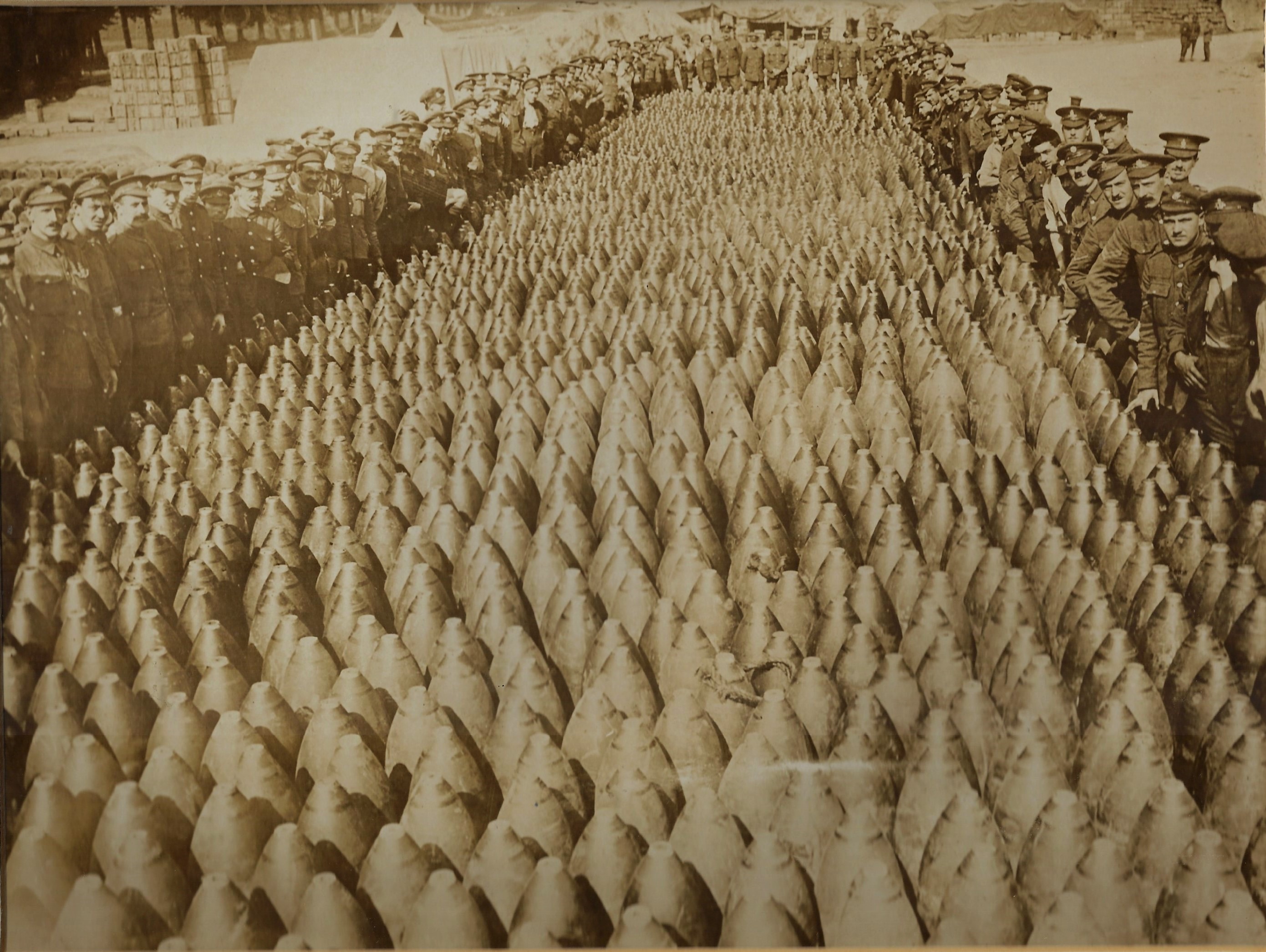
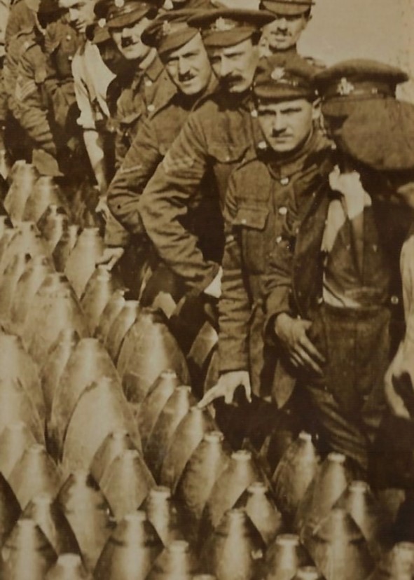
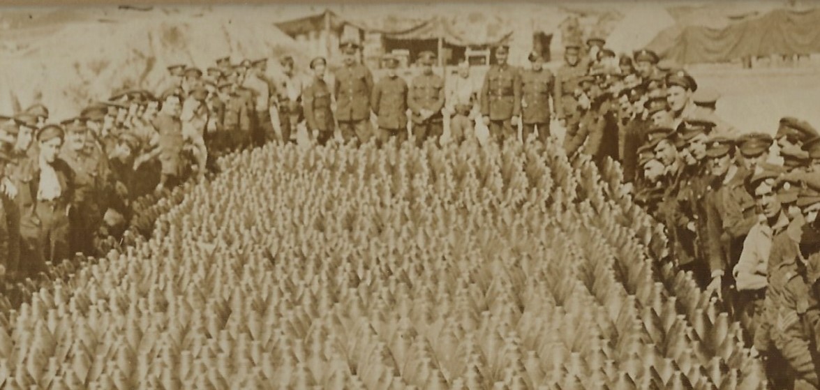
    In this photo I’m struck by the depth and breadth of the shells, and that they would represent a not very long salvo by a battery of 25 cannon.  I don’t know artillery, though it seems to me that these look like they are in the 200-300mm range. My guess is that we’re looking at 1500 or thereabouts rounds, which distributed to just 25 cannon would be 60 each which means that these shells could be used up in an hour or two of firing.  

    I’m guessing that something like 1 billion artillery shells were fired during WWI (this would be on the low end of estimates, I think) which means  that what you’re seeing here is .0000015% of the total.  For comparison .0000015% of the population of the U.S. would be 525 people. 

    The other noticeable thing is that of this group of soldiers (I reckon there’s a hundred or so who are directly lined up against the shells) there are only 5 or 6 who are touching the shells.  

    Estimating that the standing shells occupied 500,000,000 sq ft on base they would fill the floor space of 344 Pentagon Buildings. 


  • A Canonical Conical Hill (1856)

    JF Ptak Science Books  Quick Post

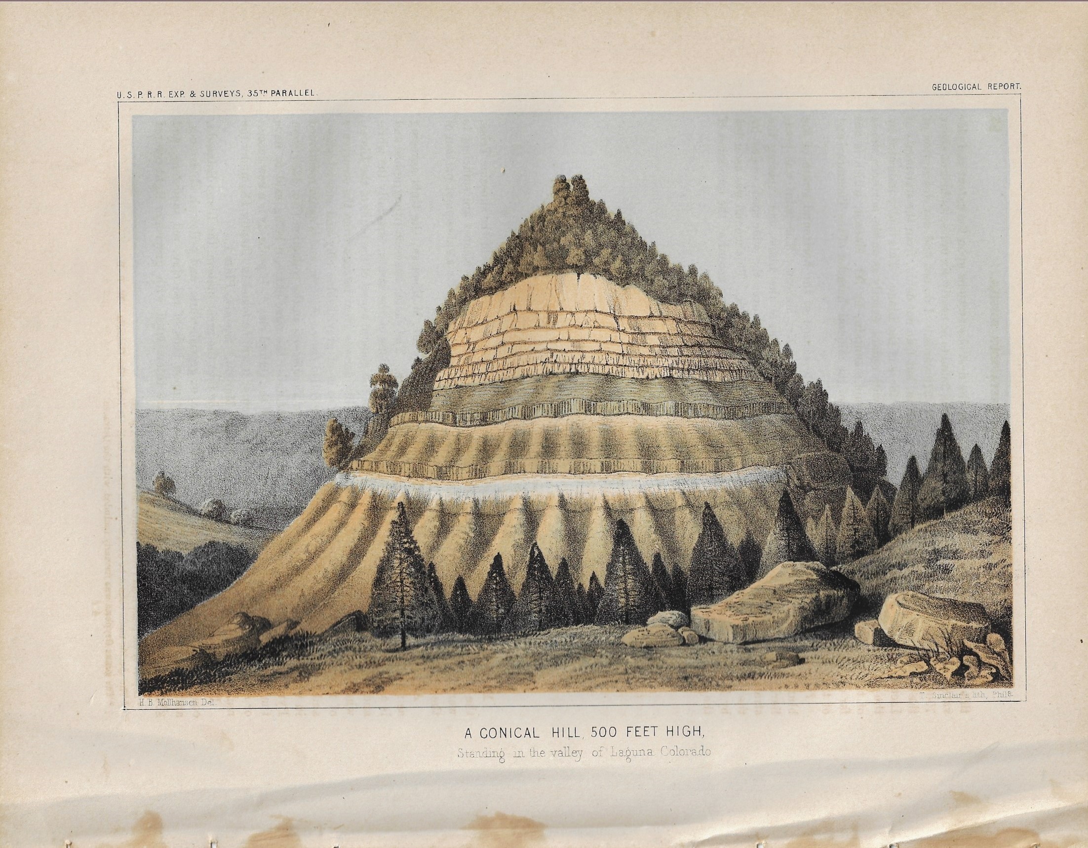
    Well, this isn’t technically “canonical”, but it was close to the word “conical” that is in the title to this image, so I went with it. In any event what we are seeing here is  classic exemplar of a large hill with exposed strata. The image appears in the Reports of Explorations and Surveys…to ascertain…the Route for a Railroad from the Mississippi River to the Pacific Ocean, a massive 13-volume work that is more commonly referred to as the USPRR. The chromolithograph appears in volume III of the work, and was published in 1856.  The accompanying text explains the image.

    USPRR Conical Hill


  • The First Meteorological Map (Created by Edmund Halley) 1686/7

    JF Ptak Science Books   Post 2831  History of Lines series

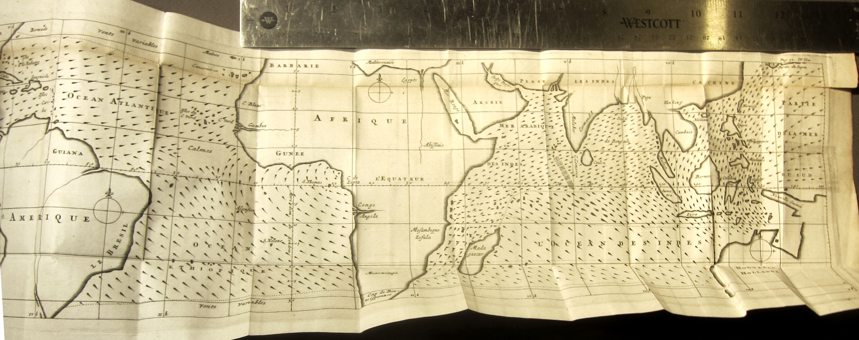
    Fresh on the heals of a post a few days ago on Athanasius Kircher’s great map on ocean currents is this famous 1687 map by Edmund Halley1–it is recognized as the first meteorological map ever printed, and depicts the trade winds:

    Halley _4_

    This is the French translation of Halley’s “An Historical Account of the Trade Winds, and Monsoons, Observable in the Seas between and near the Tropicks, with an Attempt to Assign the Phisical Cause of the Said Wind,” that appeared several months earlier in the Philosophical Transactions of the Royal Society (1686, in issue no. 183).

    Here is a summary of the map from the Princeton University site dedicated to thematic maps:


  • Measuring Civilization by Height (1919)

    JF Ptak Science Books  Quick Post

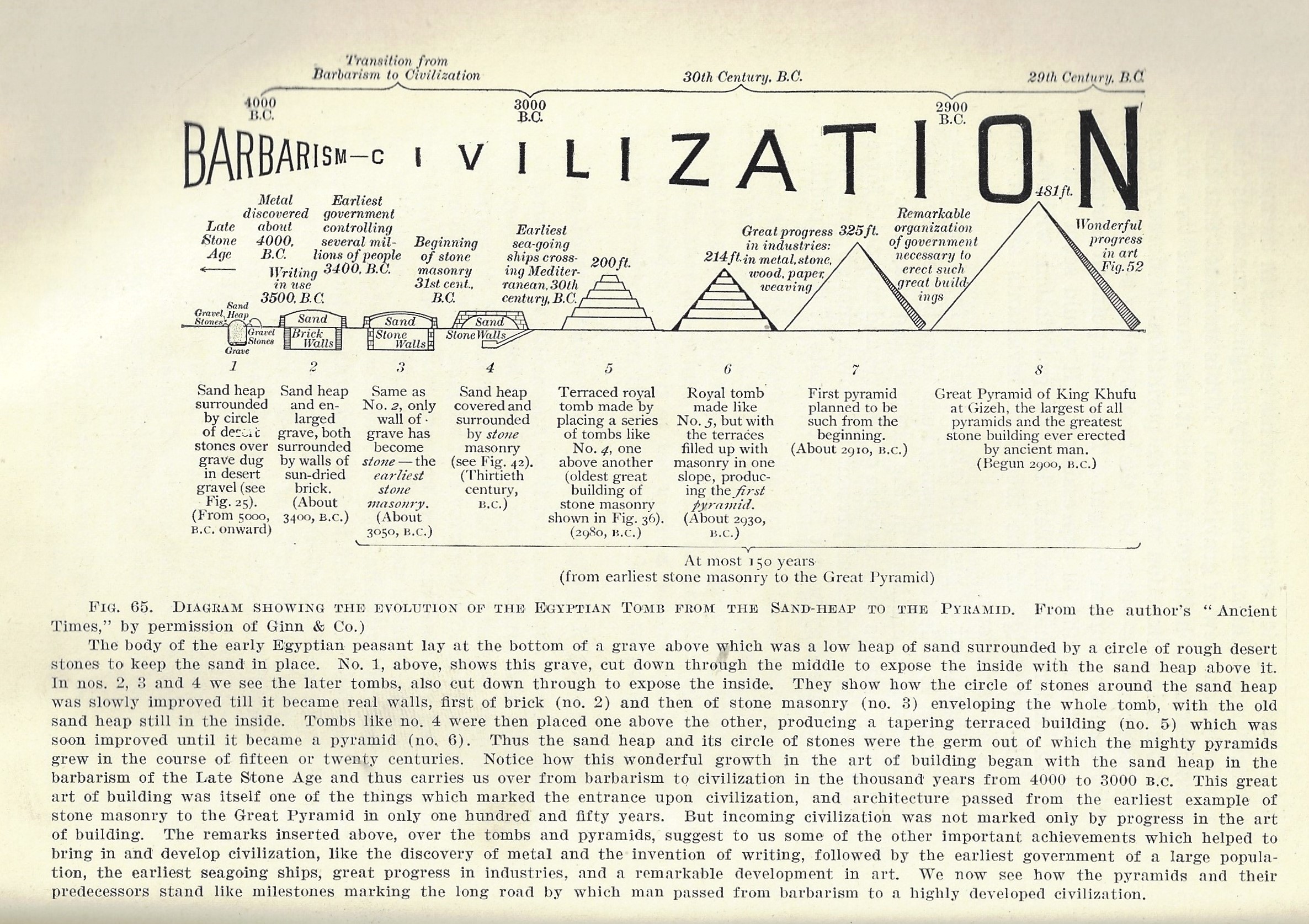
    Sharing space in the January 1920 issue of The Scientific Monthly with two significant papers is an unusual data visualization in James Breasted’s article “The Origins of Civilization”.  Leading the issue off is the wonderfully-presented and important paper (“Defects Found in Drafted Men”) by C.B. Davenport and A.G. Love, which is a remarkable display of an enormous amount of data on the health of young men in the U.S. presented in a graphical display, the results of medical examinations of millions entering military service during WWI. Following this is a report by Sir Joseph Thompson (“The Deflection of Light by Gravitation and the Einstein Theory of Relativity”) on the gravity/eclipse/relativity experiment in May 1919, which he referred to as  “the greatest achievement in the history of human thought”. And then comes the Barbarism/Civilization dataviz of the Breasted article.  I’m having a bit of fun with this at Breasted’s expense, as it looks as though he is measuring the progress of Barbarism to Civilization and the subsequent increases in culture to the depths/heights of monuments for the dead, from sand pit to pyramid, 4000-2800 BCE:

    Dataviz civilization

    [The text here becomes clearer when expanded.]

    It is an arresting image, to be sure, but the direction it takes seems a little suspect to me. In any event, I reproduce it here for general enjoyment.


  • Rhymes on the Value of Pi (1905)

    JF Ptak Science Books   Quick Post


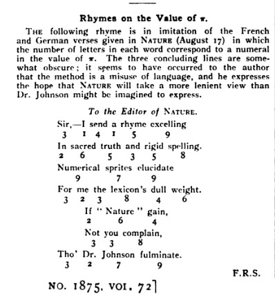
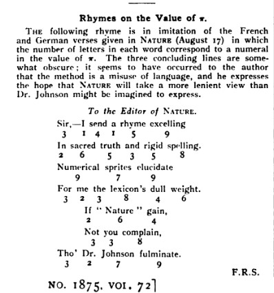
    Nature 1905 Pi rhymesHere’s an interesting little aside from the 1905 issue of Nature–the notice is a great example of what made this one of the most interesting science journals in the modern period, as they were not adverse to including some lighthearted and thoughtful pieces along with their very concise and exacting coverage of science news and discovery.  Here we see a reader contributing a poem based on the value of pi: they used the number of letters in the poem corresponding to the number in pi: so, 3.1415 meant that part of the first line had words of 3 then 1 then 4 the 1 letters/word. This is a little more difficult than it looks, and harder still I think to have something decent come of it as Haiku.


  • High Realism in Anatomical Art: the Skull (1872)

    JF Ptak Science Books   Quick Post

     Anatomy--braun--

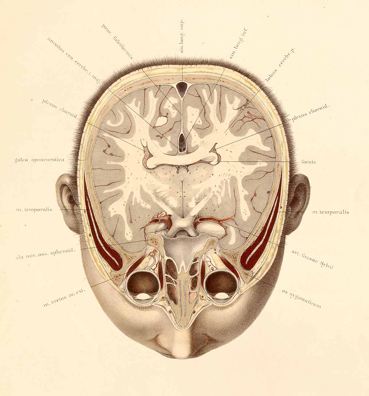
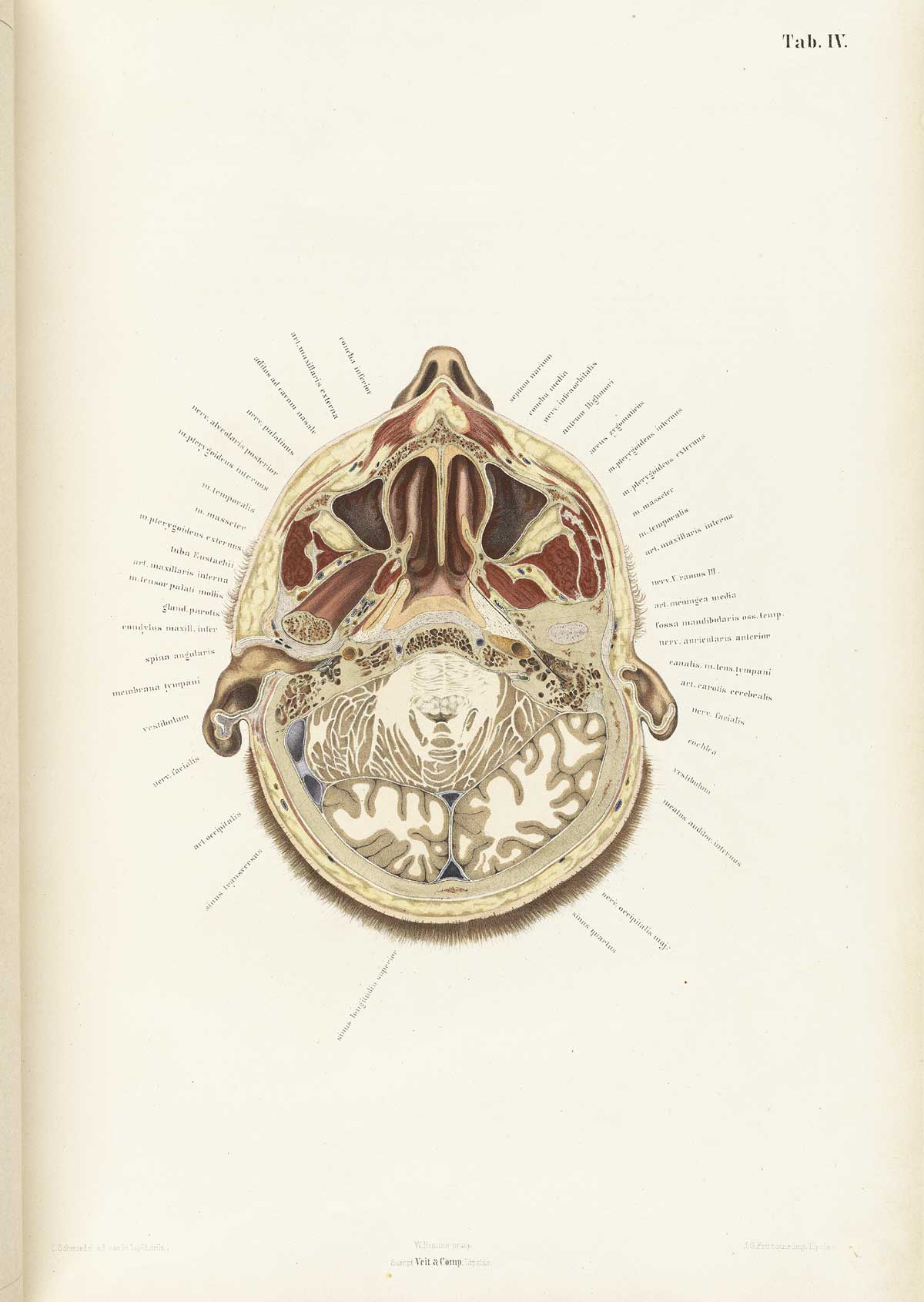
    The collaborative work of anatomist Wilhelm Braune (1831-1892) and artist C. Schmiedel (fl. mid-1800s) produced a singular work,  Topographisch-anatomischer atlas nach durchschnitten an gefrorenen cadavern…(published in Leipzig in 1872), which was an outstanding example of high-realism in the art of anatomy. This book is pretty much right-to-business, with no extraneous bits as had appeared in anatomies for centuries. And even though these practices had pretty much expired by the first quarter of the 19th century, Braune/Schmiedel was ever more so detailed and simple–their design was fabulous, and their detail light and exceptional. 


    Anatomy braune04[Source: National Library of Medicine.]

    They also made use of sliced frozen sections of cadavers, which seems to give their work that crystalline touch.  The first image looks at the brain from top-to-bottom, while the second reverses the view, which is in itself somewhat unusual, even in 1872. 


  • Measuring Things With Large Gangs of Trains (1900 and 1906): Motive Power of Ocean Liners AND What a Year’s Worth of Mail Delivery Looks Like.

    JF Ptak Science Books  Quick Post  Series on the Depiction of Quantitative Data

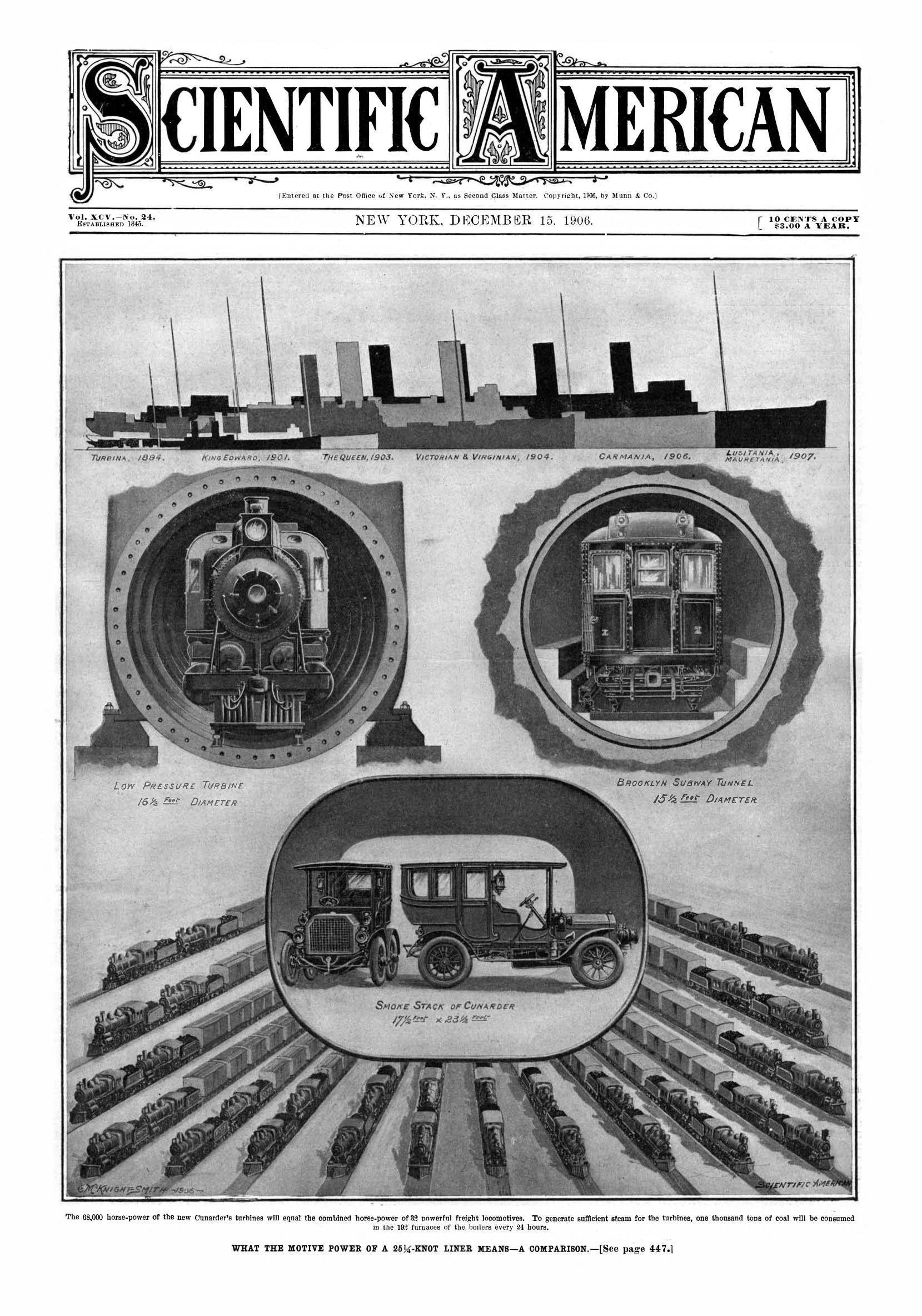
    There are a number of entries on this blog on graphical representations using popular and familiar objects to measure some other mostly-unknown object or idea against. For example, the amount of dirt excavated for the Panama canal was measured and depicted in one article in terms of how many Great Pyramids it would fill; the dept of oceans was measured in terms of Eiffel Towers, and the heights of buildings measured with ocean liners. Trinity Church has been used quite a few times, as has the Woolworth and Empire State buildings. In today’s example there are two examples of measuring things in terms of large groups of trains. The first is a visualization of data depicting the energy generated by the power plant of an ocean liner, found in the pages of the great Scientific American for December 15, 1906; the second uses a vast line of trains to depict the amount of mail delivered in the U.S. over the course of one year.  Enjoy!

    Sci AM 1906 what motive power of cunarder means


  • A Very Early Quantitative Scale for Classifying Smoke (1899)

    JF Ptak Science Books   Quick Post

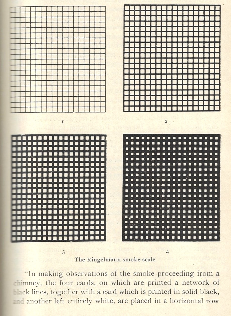
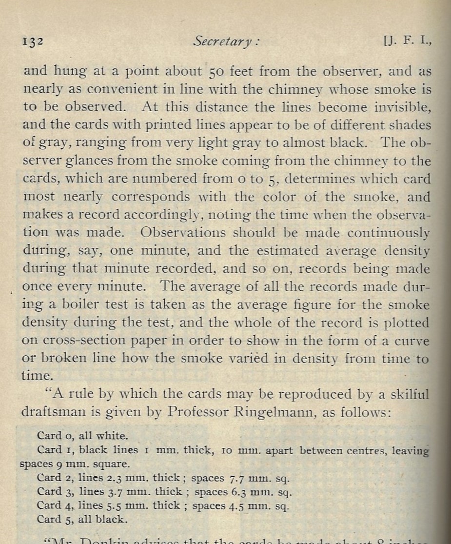
    This is one of those things that you’d probably not properly think about until you had to do so–a quantitative measuring device to classify smoke (or visible emissions). In a way it reminds me of Mr. Howard who was the first to classify clouds in a scientific way in 1803–surely you’d think that the great classifiers like Aristotle & Co. would have done this over the centuries, but evidently the moving floating mountains escaped scientific classification until relatively recently. Is the same true of the cloud’s distant cousin, smoke?  And what about classifying fog? I don’t have the answers to this tonight as its too late to figure it out right now, but I’ll return with the answers and correctly update this post. In the meantime, please find below the last part of a two-part article that appeared in the Journal of the Franklin Institute1 in which the organization and classification of smoke by Max Ringlemann is discussed and explained. It seems as though there is a slightly earlier publication of the scale in Engineering News in 1897, though I haven’t yet (again!) found the original article by Ringlemann himself.  (“In 1897 architectural engineer Maximilien Ringelmann developed smoke charts to allow observers to contextualize observable smoke into a scale of known gray. Lighter smoke indicated fewer particulates and more water, while the darkest of smoke was of grave concern. The charts were posted outside of factories, providing a very public method of environmental monitoring and awareness.”–Science History Institute, https://www.sciencehistory.org/ringelmann-smoke-charts.)

    It is interesting to note that a paper published by the Bureau of Mines of the U.S. Department of the Interior in 1967 employed the Ringlemann scale pretty much as we see it below.

    There is also an interesting article that addresses the use of the Ringlemann scale in regards to discussion of air pollution: 

    • “ Dark smoke – an introduction to air pollution control (smoke) regulations “(PDF). Hong Kong: Environment protection department, Hong Kong. Retrieved 31 August 2018.

    JFI 1899 Ringelmann smoke scale _2_


    JFI 1899 Ringelmann smoke scale _2_

    Notes:

    1. William H. Thorne, “The Smoke Nuisance and its Regulation…”, JFI, February 1898, vol 145, pp 401-442 and pp 17-59 (same volume, different number).  


  • History of Lines Department: Weather Lines (1851)

    JF Ptak Science Books   Post 2794

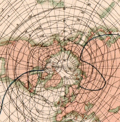
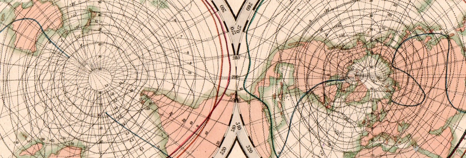
    This beautiful network of lines tells the early story of weather in cartographic form. They appear on Karte der Isothermen, Isoklinen, Isogonen und Isodynamen mit der Magnetischen Meridianen, and was published in the atlas to accompany the best-selling encyclopedic presentation of the natural history knowledge of the world to that time, Baron Alexander von Humboldt’s Kosmos, which was published over a period of several from 1845-1862. The map demonstrates and visualizes climatic information showing isothermes, isoclines, isogones and isodynamics, with the magnetic meridian.

    Map visualization isotherm653

    [This is a detail of the Northern Hemisphere section of the double-hemisphere map, which is reproduced below.]

    Map visualization isotherm654

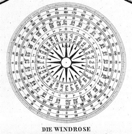
    At bottom there is also a beautiful 32-point wind rose:

    Map visualization isotherm651