A Daily History of Holes, Dots, Lines, Science, History, Math, Physics, Art, the Unintentional Absurd, Architecture, Maps, Data Visualization, Blank and Missing Things, and so on. |1.6 million words, 7500 images, 4.9 million hits| Press & appearances in The Times, Le Figaro, Mensa, The Economist, The Guardian, Discovery News, Slate, Le Monde, Sci American Blogs, Le Pont, and many other places… 5000+ total posts since 2008.

Category: Information, Quantitative Display of

  • Artistic Display of Information: an Uncommon Display of Lengths of Rivers (1874)

    JF Ptak Science Books  Quick Post

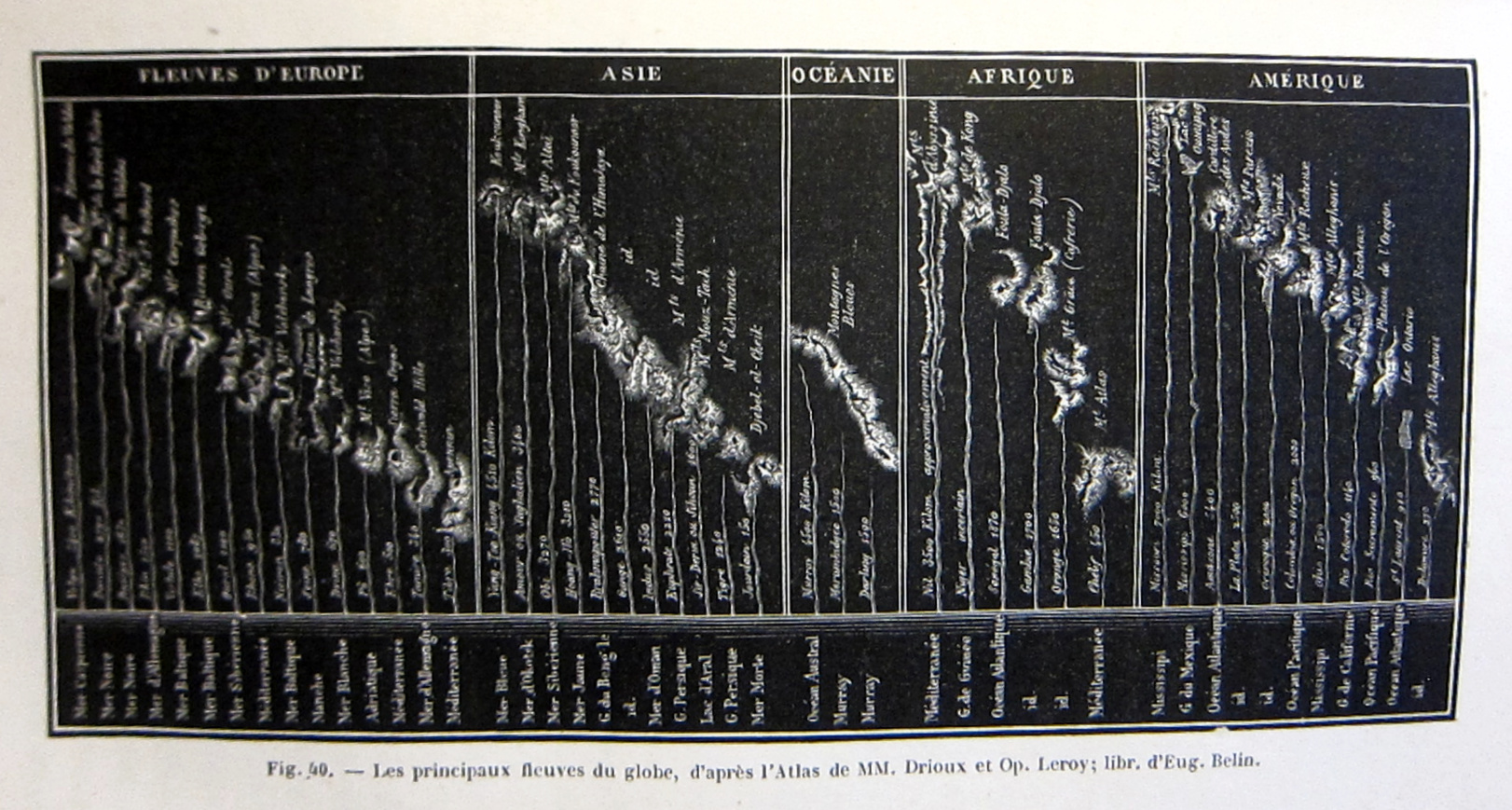
    There have been a number of posts on this blog showing the comparative lengths of rivers and heights of mountain very artistically displayed–beautifully so, sometimes. I found this unusual example in an unexpected place–Rambosson’s Histoire des Astres… (Paris 1874) in its section on the Earth. I’ve never noticed it before, though the caption tells us that its source is from a relatively common-ish atlas by Drioux and Leroy, Atlas Universel de Geographie, which went through many editions. In any  event, I thought I’d share it here, as I can’t seem to locate it in the original:

    Rivers of the world


  • The Mega Mother of all Gas Tanks (1907)

    JF Ptak Science Books   Quick Post  [Series on the Artistic Display of Data]

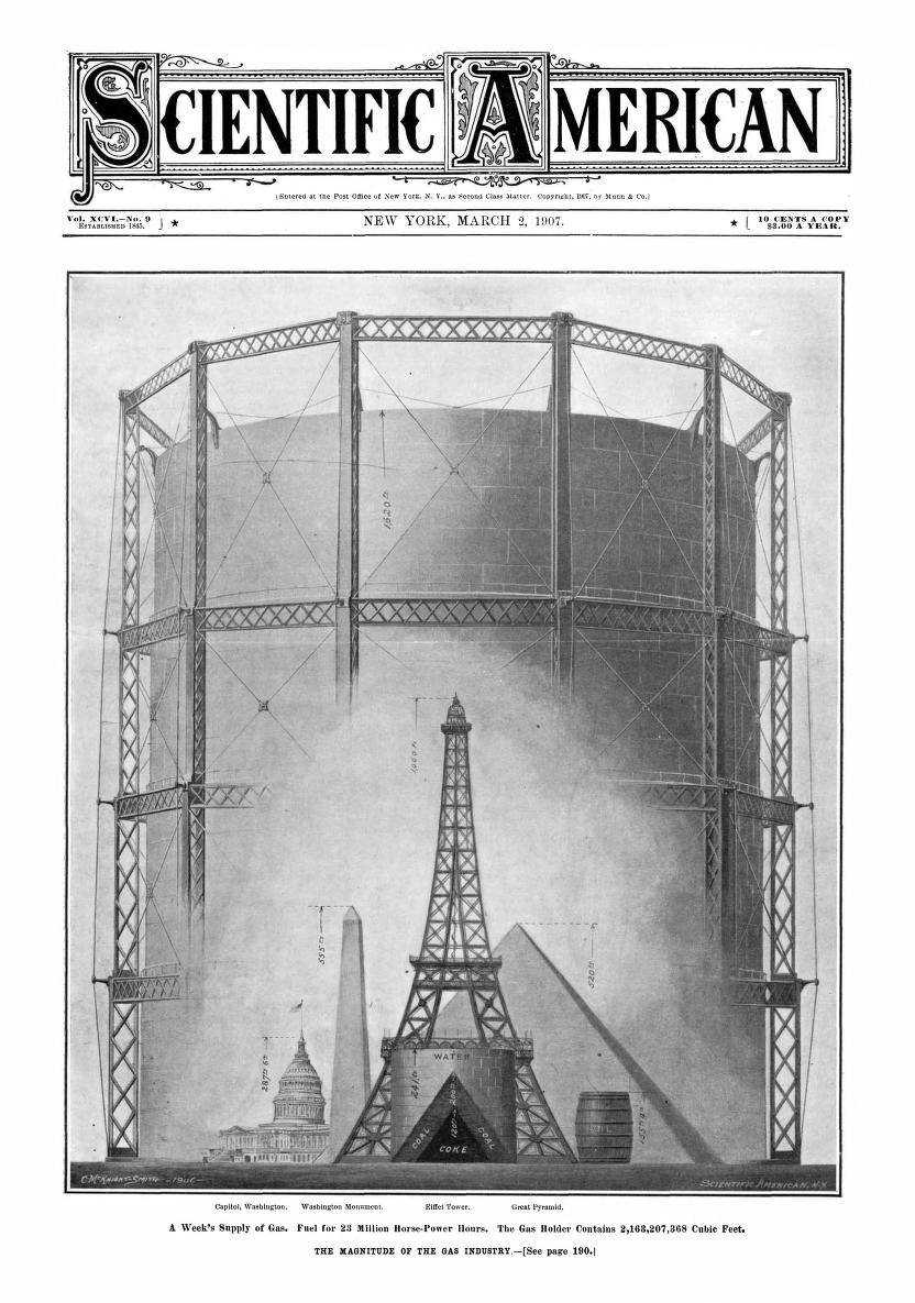
    This striking  comparative visual display of data appears on the front cover of Scientific American for 2 March, 1907, and relates the weekly consumption of gas in the U.S. in an enormous imaginary storage facility measured against several iconic structures.  (I think it would’ve been interesting to have an inset showing the yearly consumption…)  People would not doubt immediately forget the actual numbers of consumption, though they’d be hard-pressed to forget the comparative imagery of the number. 

    Sci AM 1907 Gas Consumption in the Skyline“A comparison of the yearly production of gas is unwieldy, owing to the lack- of objects with which to compare.

    The Eiffel Tower would look lost compared with a gasometer 4,556 feet -high, so we have taken a week’s supply,
    which amounts to 2,163,207,368 cubic feet. This enormous bulk is shown in our engraving stored in a huge gasometer
    1,620 feet high and 1,350 feet in diameter. The water is contained in a tank 241 feet high and 268 feet in diameter.
    The raw materials are also of a bulky nature. The coal
    would form a cone 268 feet across at the base and 200 feet high.
    The coke also forms a cone 120 feet
    high and 160 feet across the base. The oil would fill a barrel 155 feet high and
    122 feet in diameter.”–Scientific American, 2 March 1907


  • Comparative Naval Strength in an Infographic, 1905

    JF Ptak Science Books   Quick Post  (Quantitative Display of Information Series)

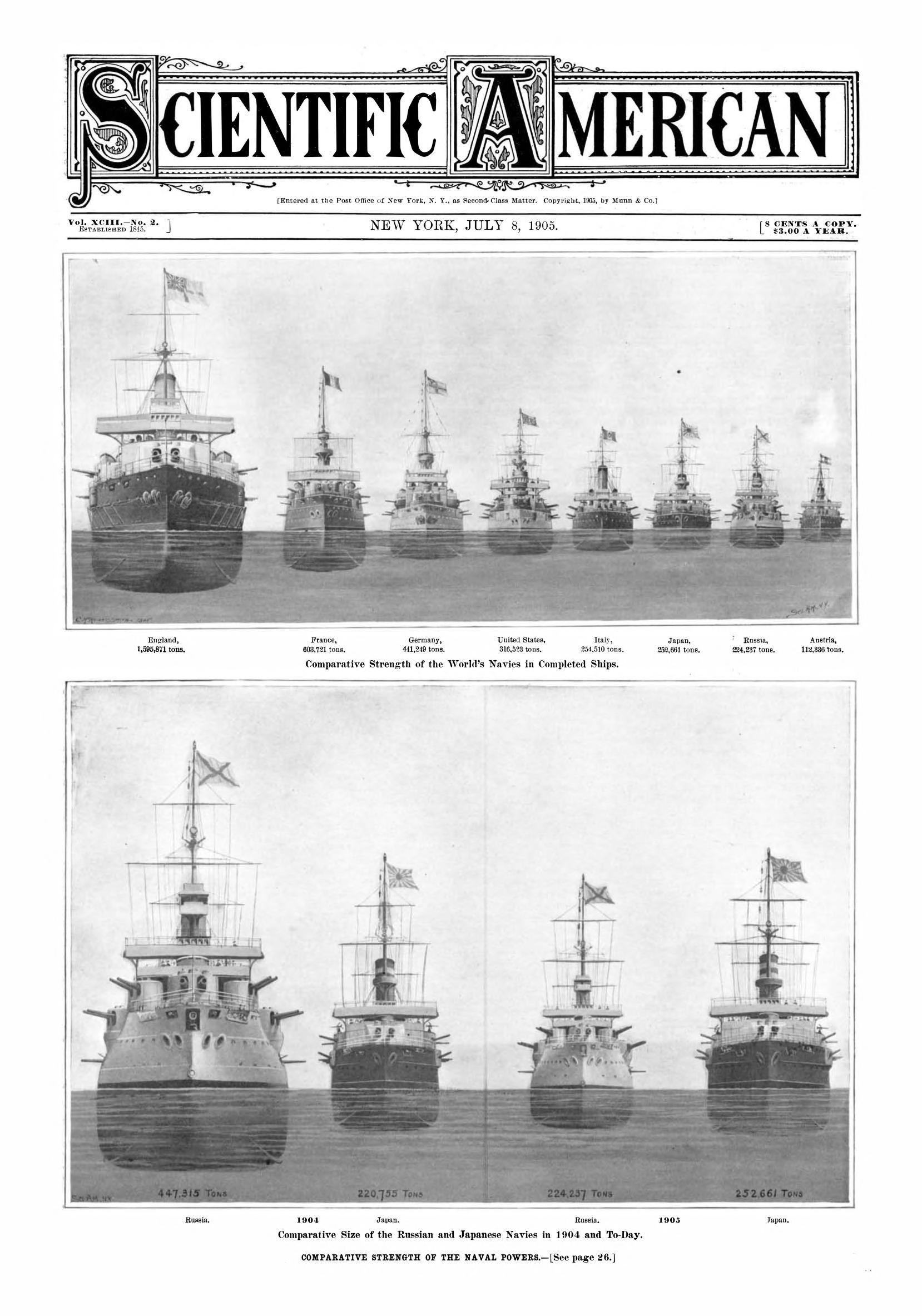
    Here’s another in a long series of Quick Posts on the artistic display of data: this one shows comparative naval strengths just after the turn of the century around the time of the First Moroccan Crisis, and appears in the 5 July 1905 issue of the Scientific American, home to a great number of these examples of popular numerical presentation.  Rule Britannia:
    Sci Am 1905 comparative naval strength


  • Giant Bottles in the Skyline, Part 8 (1909)

    JF Ptak Science Books  Quick Post

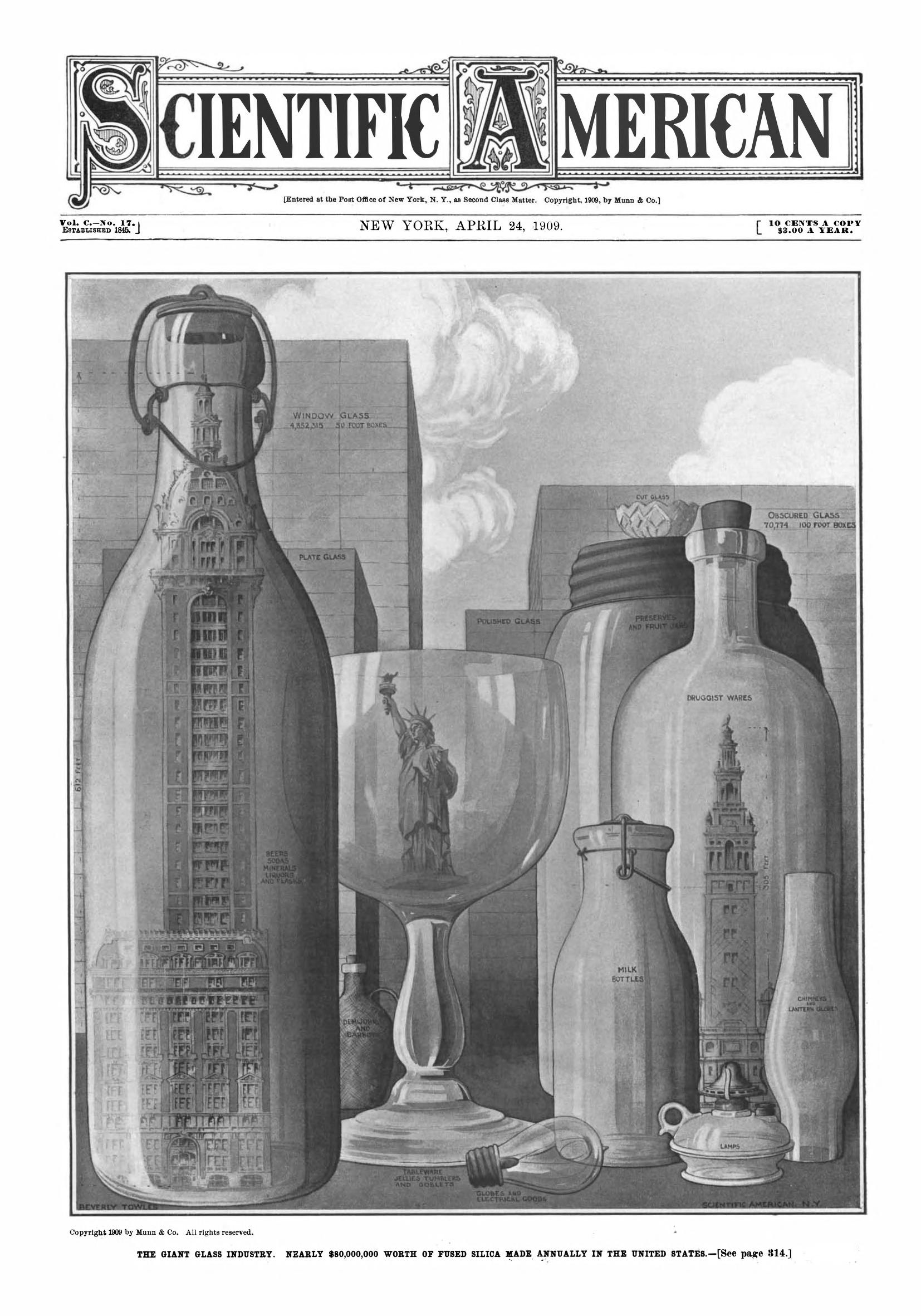
    This I believe is the eighth installment of a series of posts on articles using infographics comparing objects to buildings and skylines. Ships are often seen this way–comparing the newest/largest to some well-known building in, usually, the NYC skyline. There are variations: for example, nail and salt production are depicted as enormous single objects showing that if you combined all nails made in the U.S. into one 100′ diameter nail, it would be as big as the Singer Building, or some such. The current example is the first I’ve found where the gigantic production item encloses the building against which it is being compared, showing the  size of famous structures relative to all of the glass of a particular sort had they been manufactured and produced as one single unit. This makes for a striking non-sequitur object, and gets the intended point across of how large the various glass manufacturing industries are

    Sci Am 1909 stuff in skyline


  • Washington D.C. Smothered in Salt (1908)

    JF Ptak Science Books  Quick Post

    SAlt

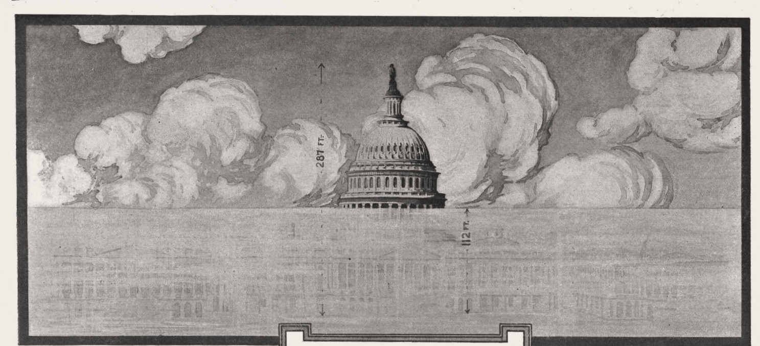
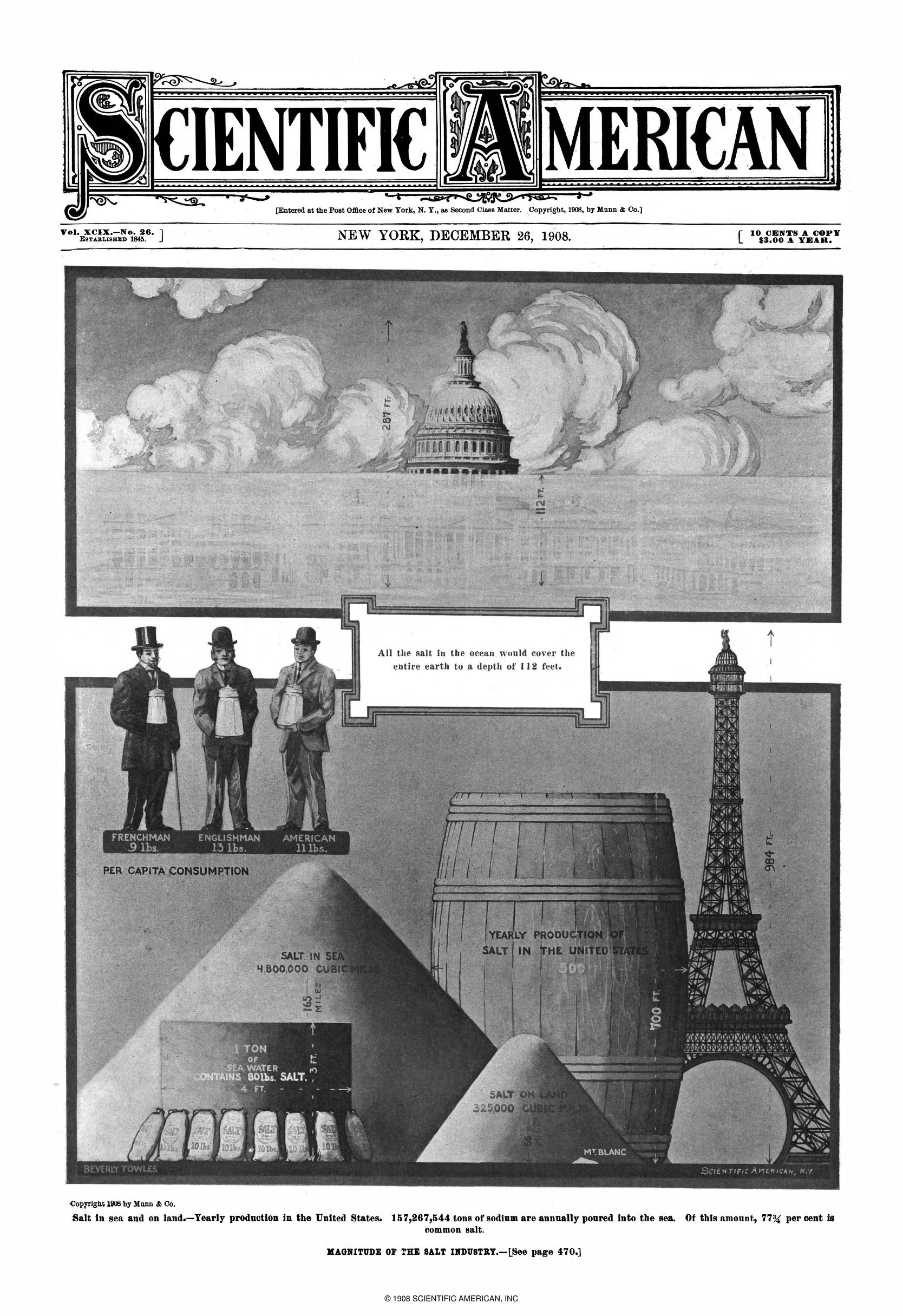
    This is a simple integrative and comparative display of information that has a decided and unexpected twist to it. The graphic is on salt and salt production, and appears in the Scientific American in December 1908, and it is in the top frame that I find the extracurricular attraction. Here we see the representation of what one part of the world–Capitol Hill in Washington D.C.–would look like it if all the oceans in the world were dehydrated:  the globe would be covered by 112 feet of salt. When I think of salt I can come up with the curative and ceremonial uses of it, plus as a wound disinfectant, an exchange unit, being the “salt of the earth”, and so on. But when I see the dome of the Capitol building being smothered by salt it becomes very Old Testament-y to me: Lot’s wife, putting salt in a wound, and of course the big one, salting your defeated enemy’s  lands to ruin their soil and force them to move on.  Anyway, that’s just me–the image puts me in a very J.G. Ballard/Drowned World  frame of mind. The rest of the graphic is pretty good, measuring salt production with an Eiffel-towered-sized barrel; but it is the D.C. image that is the most striking thing about this think-piece. Sci Am 1908  Salt in the sky


  • The Metropolitan Life Tower as a Unit of Measurement: (Air)Ships and 1700′-Tall Corn Cobs in the Skyline, Part 7 (1909)

    JF Ptak Science Books  Quick Post

    • This is a slight deviation from the Ships in the Skyline series: the first difference is that the “ship” is an airship; the second is that in the next example there is no “ship” at all, though the enormous sacks of agricultural goods pictured there are measured against the Metropolitan Life Tower, the standard of measurement used in the first example.

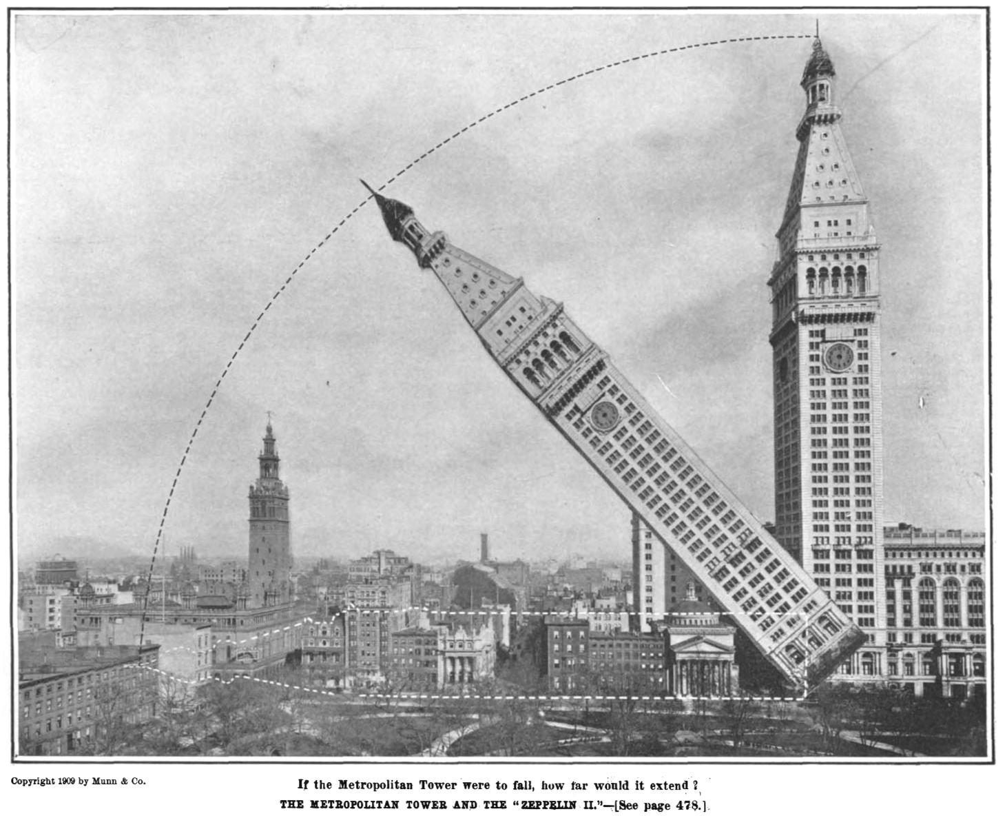
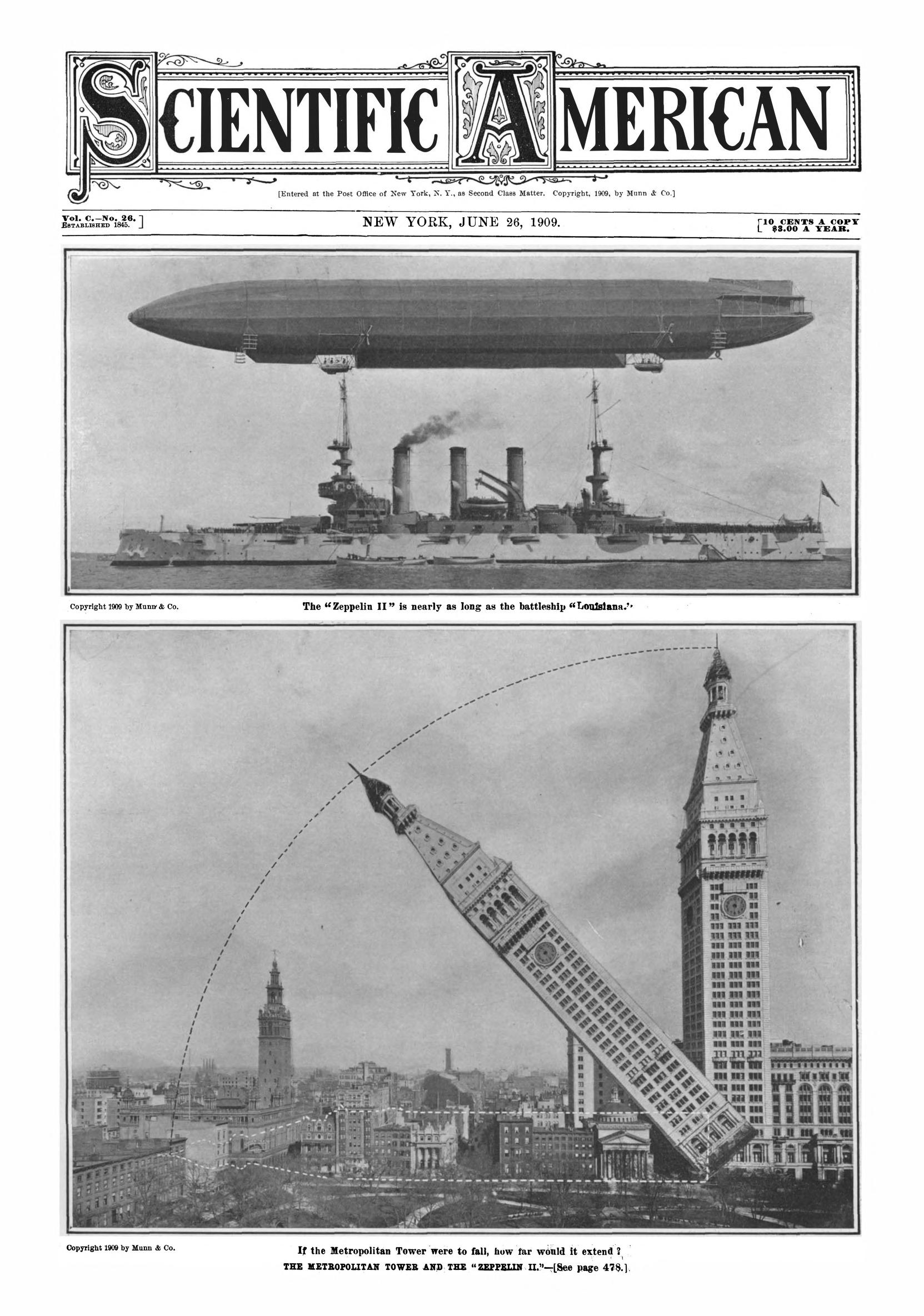
    This is another segment in the series of measuring newly-constructed monster ships against familiar architectural objects–like the Woolworth Building, Eiffel Tower, the Hoover Dam, and such–to use for a sense of perspective in judging the size of the naval wonders.  In this example, found in Scientific American (June 26, 1909) reckons another sort of ship–an airship–and in this case, it is the Zeppelin ZII being measured against the newly familiar Metropolitan Life Tower, which was just finished that year. (Unfortunately, the Zeppelin met with disaster, crashing jus tweeks prior to the publication of this image.) The Met Life building stood 700′ feet tall and was the world’s tallest from 1909-1913, when it was superseded  by the Woolworth Building. (Interestingly the Met Life was patterned after the companie of St. Mark’s Basilica in Venice (323′) which at about a thousand years old was patterned after the older-still St. Mercuriale.) The Zeppelin was 436′ long, which was an enormous flying machine in 1909, and more than 60% of the length of the laid-down tallest skyscraper.

    Here’s a variation on this measured comparison, an image category that I’m pretty sure I’ve not seen before–laying down a tall building:

    Sci Am 1909 Zepp in the skyline

    This is a detail from the front page:

    Sci Am 1909 Zepp in the skylineIn any event, this is a terrific image. 

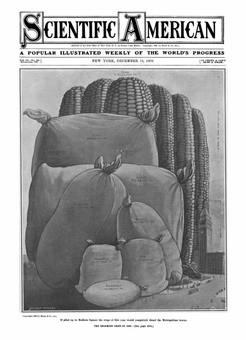
    And as long as we’re at it, here’s another data visualization from the same year of Scientific American, this one again using the Met Tower to compare the amount of barley, flaxseed, rye, buckwheat, potatoes, wheat, oats, and corn produced in the U.S., the output collected in gargantuan city-crushing burlap sacks and 1700′-tall corn cobs: 

    Sci Am 1909 MEauring Things

    The image was irresistible!


  • On a Chart of the Evolution of all Things and the Nature of the Nebulae (1925)

    JF Ptak Science Books  Quick Post

    Here’s and interesting and swerve-y chart of all of history, featured in the pages of the Scientific American for October, 1925 (pg 235). It has that certain attractiveness that is so welcomed in the artistic display of information–and it also features an old word used (I think) in both it older and newer ways. That word is “nebula”, and it appears to have been used in English1 as far back as Edmund Halley in 1718 in the sense of  “…an indistinct cloud-like, luminous object seen in the night sky, such as a cluster of distant stars, a galaxy, or a cloud of gas or dust”, the star clouds all bound within our own galaxy which was seen (until just a few years before this article) as the entire universe. Things began to shift to the impossibly large in the Great Debate (1920-1923) period (between Shapley and Curtis) on whether the nebulae were “local” (Shapley) or extragalactic2 (Curtis). There were early people who believed in the nebulae being outside our galaxy (like Kant) but the empirical evidence didn’t present until the 20’s, mostly in the work of Edwin Hubble. He would find that variable stars in Andromeda were an order of magnitude further away than the greatest dist ant of the furthest star in the Milky Way, and so determined that Andromedia was a galaxy unto itself, and not within our own. (His results on these investigations were published popularly though they were printed in a professional journal until 19293.) Hubble did publish on the great new vastness in another paper in 19294. 

    And so “nebula” in this Sci Am article seems to have a foot in both “worlds” (sorry!) so to speak.  And that’s interesting. 

    Evolution chart

    Notes:

    1.  From the Oxford English Dictionary, defining “nebula”:

    • “Originally: an indistinct cloud-like, luminous object seen in the night sky, such as a cluster of distant stars, a galaxy, or a cloud of gas or dust. Now (usually): spec. a mass of gas or dust within a galaxy, typically visible either as a luminous patch or as a dark silhouette against a brighter background. Cf. nubecula n. 1b.dumb-bell, emission, planetary, reflection, ring, spiral nebula: see the first element.”
    • 1718   E. Halley in Philos. Trans. 1717–19 (Royal Soc.) 30 723   The slowness of its motion made us at that time conclude that it had none, and that it was rather a Nebula than a Comet
    • 1781   Gentleman’s Mag. 51 526   This..nebula was discovered March 23, 1779.
    • 1802   W. Herschel in Philos. Trans. (Royal Soc.) 92 499   A stellar nebula..may be a real cluster of stars.
    • 1841   D. Brewster Martyrs of Sci. i. ii. 31   Upon directing his telescope to nebulæ and clusters of stars.
    • 1873   J. W. Dawson Story Earth & Man i. 8   The spectroscope has..shown that some nebulæ are actually gaseous.
    • 1891   Internat. Ann. Anthonys Photogr. Bull. 363   His primary object was to use it for nebula photography.
    • 1924   H. Dingle Mod. Astrophysics xvi. 302   A dark nebula is really dark, and not merely too faint for its light to be seen on account of its great distance from us.
    • 1930   R. H. Baker Astron. xi. 465   Modern investigations have shown that nebulae, as distinguished from ordinary star-clusters, fall into two classes having entirely different characteristics, namely, the galactic nebulae and the extra-galactic nebulae.
    • 1971   D. W. Sciama Mod. Cosmol. iii. 39   In this way he [sc. E. P. Hubble] obtained a distance of 800,000 light-years for the Andromeda nebula, and similar values for other spiral nebulae. Now that these nebulae are well established as stellar systems outside our own, we shall henceforth call them galaxies.

    2. Again, the definition of “extra-galactic” from the OED: “extra-gaˈlactic adj. Astronomy outside the galaxy or Milky-way.

    • 1851   J. P. Nichol Archit. Heavens (ed. 9) 110   An extra-galactic phenomenon.
    • 1870   R. A. Proctor Other Worlds than Ours xi. 264   The scattered stars of very low magnitudes in the extragalactic heavens.

    3.  Hubble, Edwin, “A spiral nebula as a stellar system, Messier 31”. The Astrophysical Journal. 69: 103, 1929. This is the same year of his revolutionary red shift paper, “A relation between distance and radial velocity among extra-galactic nebulae”. PNAS. 15 (3): 168–173. 

    4. Hubble, Edwin (December 1926). “Extragalactic nebulae”. Astrophysical Journal. 64 (64): 321–369.


  • On Measuring a Ship with a Skyline (Part VI)

    JF Ptak Science Books   Quick Post

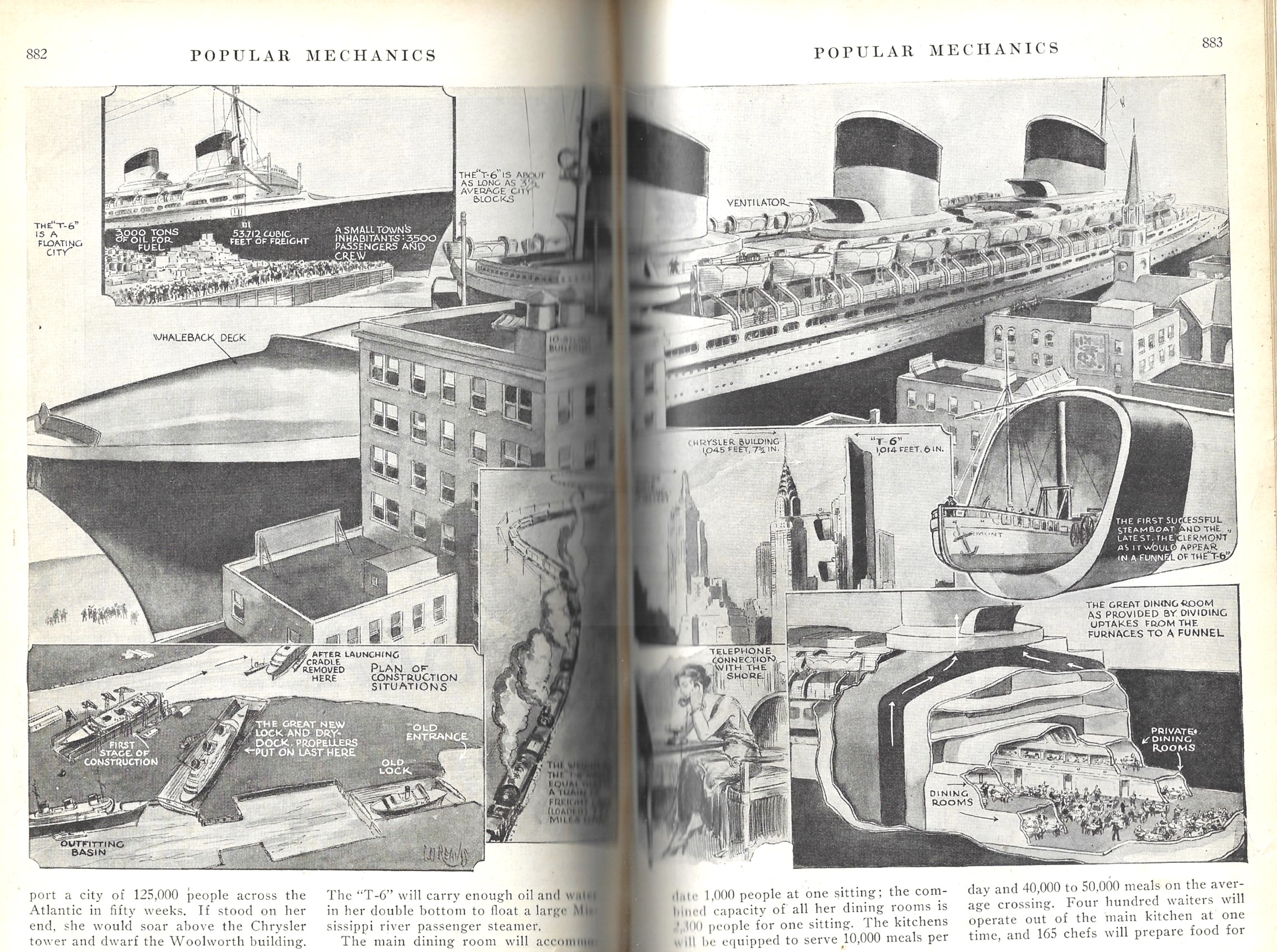
    There are a number of posts on this blog looking at how data is visualized, some of which use ships and skylines and waterfalls and pyramids to compare their relative sizes. This article (“T-6 The Latest Giant of the Sea” by D.N. Glass in Popular Mechanics, December 1932)  uses illustrative means to display the statistics of the luxury liner Normandie (at the time known as the T-6) one of which employs the comparison of the ship to a skyscraper–actually, the comparison uses two skyscrapers, the Empire State Building and the Chrysler Building. 

    Pop Mech 1932 comparative data Normandie

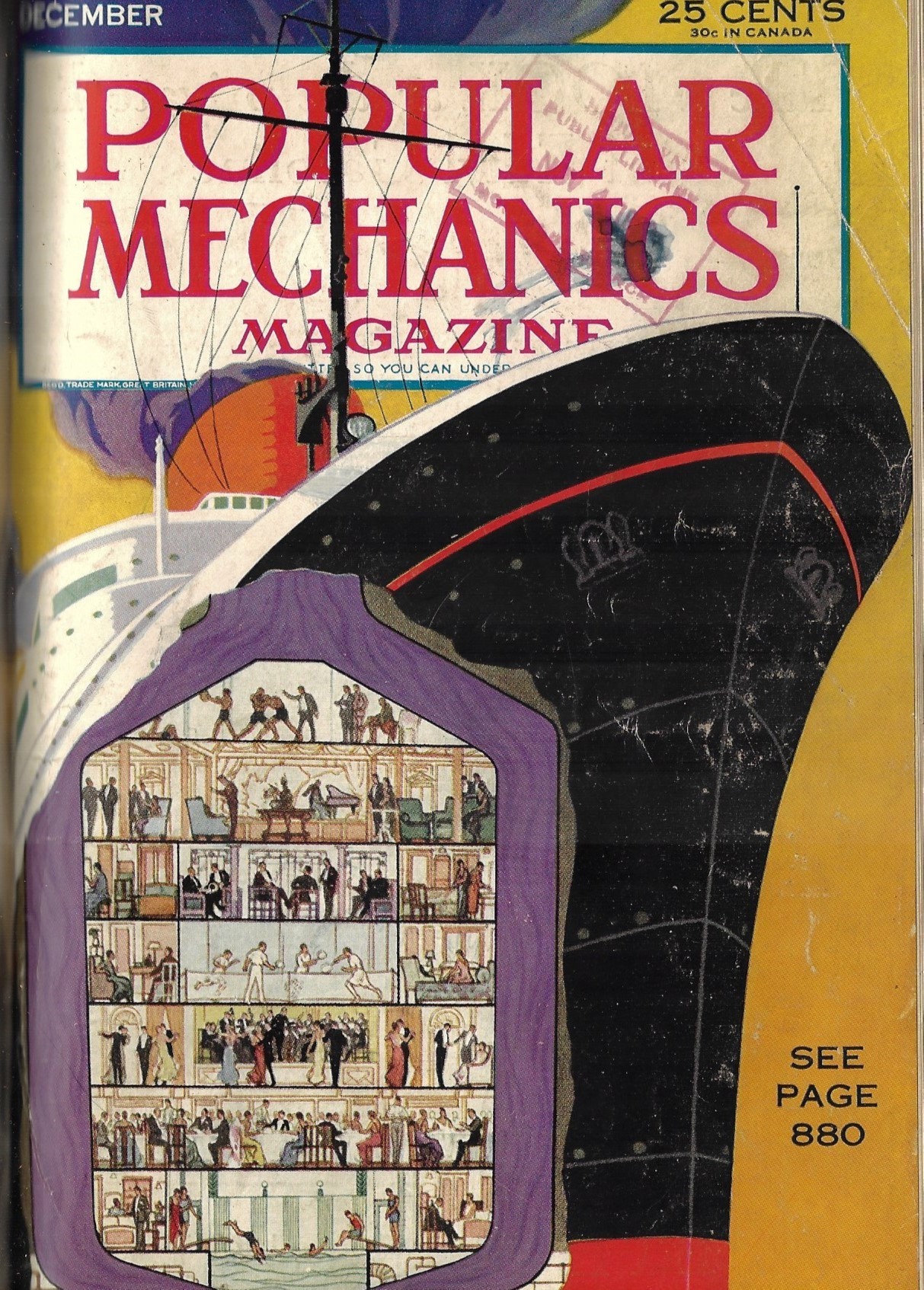
    The cover of this issue uncommonly features a cross section:

    Pop Mech 1932 Normandie cross section


  • On the Great Beauty and Importance of Graph Paper (1874)

    JF Ptak Science Books  Post 2766

    It is difficult sometimes to be appreciative of the smaller things when we are so used to the bigger ones–like in the writing life life, complaining of occasional slow bits in connectivity that will allow you to 

    In the old days if it used to be necessary to go to the library, use reference tools, locate the journal, locate the article, put in a request to see the volume, wait for the deliveries,  and then perhaps one of them will actually be what you’re looking for–and this is just the first step after you’ve done the initial reading and research, the digging through footnotes and etc. for what led or inspired people in their thinking had just begun. Then there’s the driving to the library, and finding a spot of park (in my case that was for the LC and parking was no easy matter), and then came the distraction of the greasy spoon on PA Ave and the drive home, all of which could take part or most of the day. That was all fine, because in my case, one of the world’s greatest libraries was a half-hour away–much less depending upon traffic. In the older days, well, if you weren’t in a large city you would not have had access to what you needed, which meant correspondence to acquire the materials and so on, turning the process I experienced in a day into weeks, or longer. IT all gets more complicated the further back you go, and once you get to the point preceding a general postal system, stuff gets hard. Also, someone like I would be out pulling potatoes out of the ground instead of researching who-cares-about-THAT stuff in the library. 

    I try to remember that when I complain that my connectivity is slower than it usually is. 

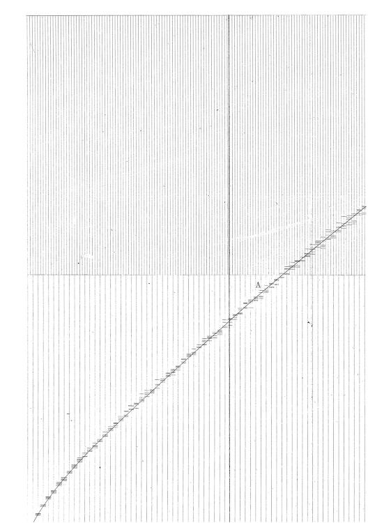
    All of this came to mind seeing these paragraphs (literally and figuratively!)  by the one of my favorite figures of the 19th century, the  polymathic W. Stanley Jevons1 (1835-1882), who wrote on how to use graph paper.  

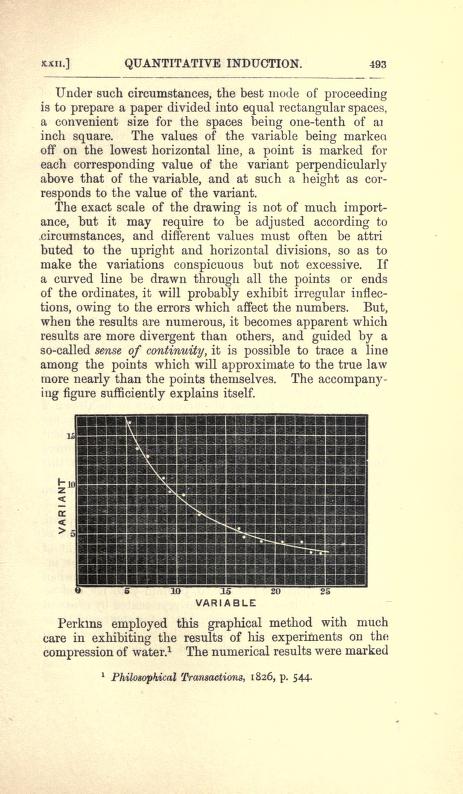
    The creation of graph paper came decades after the creation of the bar graph (William Playfair in 1786), monuments in the history of the visual display of information.  It was a great and very highly useful creation–or creations, I should say, for the idea of the graph and for the paper. Jevons did not invent graph paper, though he may be the first to write about it as a tool.  He give credit to an earlier writer for using graph paper for the first time:  J. Perkins’  “On the Progressive Compression of Water by High Degrees of Force, with Some Trials of Its Effects on Other Fluids” in the Philosophical Transactions for 1826,  (p 544, see below for one of the images from the paper).   

    Source: William Stanley Jevons, The Principles of Science, a Treatise on Logic and Scientific Method, 1874,  the chapter “Graphical Methods”.  See:  https://archive.org/details/theprinciplesof00jevoiala/page/492 

    Graphic Jevons graph paper


  • An Uncommon “First” in the History of Data Visualization and Cartography (1874)

    JF Ptak Science Books   Post 2765

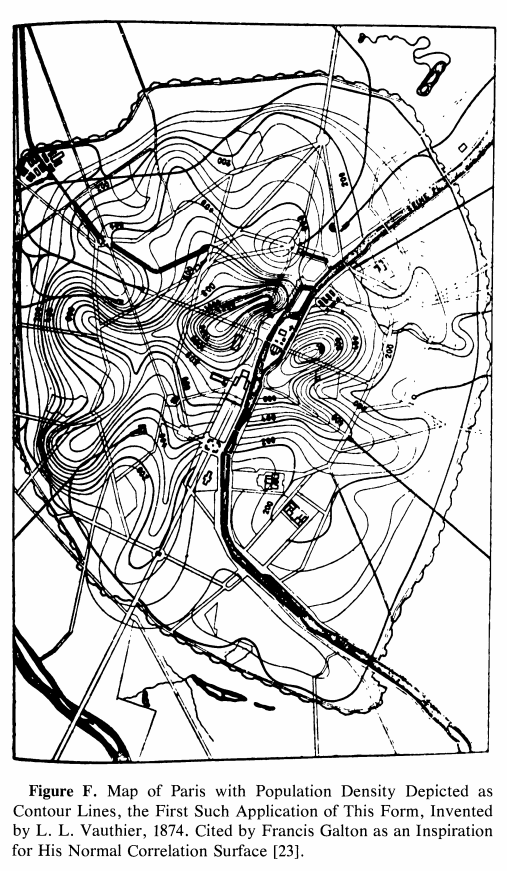
    So this is a loose-and-pulled-thread post–I bumped into something that led me somewhere coming face-to-face with an interesting reference to an unusual “first” in the history of cartography. I found the map and (correct) reference and tracked it down to the great Comptes Rendus. The map is the first one to use contours to convey statistical information. It was a short article and I was very curious to see the illustration of the map–I discovered that the paper written on an significant innovation on the display of information did not display the information. No image! This is one of those scarce article describing a breakthrough in the visual representation of data that doesn’t use an illustration of the pioneering work. After I figured it out that the description of the map was for the breakthrough map in question and satisfied with my read and translation of it, I went ahead and wrote a description for its sale on my blog bookstore.  I was about to upload it but stopped to check out the mass database for booksellers called Addall dot com and found somebody had a loose issue of the document offered for sale at eight bucks! That was a disappointing end to an hour+ of research. The person selling the paper for $8 did not know what the article was all about, I reckon, since I thought it was slightly valuable…still, it was a damp blanket to shoulder on a wet and stormy night. Lastly, I should note that I haven’t yet found the original source for the map’s image that I was able to display here–I’ll hopefully do that in due course. 
    Map Vauthier

    The paper was by the lyrically-named Louis Leger Vauthier (1815-1901) and titled “Note sur une carte statistique figurant la rapartition de la population de Paris” (found in the Comptes Rendus des Seaances de L’Academie des Sciences, 1874, vol 78, pp 264-267). It is evidently the “first statistical use of a contour map” according to  https://infovis.info/ In a more expanded and restrictive description from Wikipedia, we see that Vauthier “…is credited with one of the earliest (if not the first) thematic map to use contour lines to display a non-geographic variable on map— a contour map of the population of Paris in 1874”. This is probably the more accurate and definitely more qualified description. 

    In any event the map as I said is described, but not pictured, which is pretty unusual to my experience. I did find a picture of the map here: James R. Beniger and Dorothy L. Robyn, “Quantitative Graphics in Statistics: A Brief History”, in The American Statistician, vol. 32, no. 1, pp. 1–11, 1978

    And: https://www.sci.utah.edu/~kpotter/Library/Papers/beniger:1978:QGSH/index.html

    The Vauthier article starts out with a simple statement about the map adopting the use of the terrain relief  and using it to show the distribution of the population of Paris, using terms and descriptions that were already established and “quite familiar”:

    • “Cette carte a pour objet de figurer, au moyen du procédé graphique  généralement adopté aujourd’hui pour représenter le relief du terrain, la manière dont la population de Paris est répartie.  En topographie, le relief s’acccuse par des courbes de niveau, s’échelonnant à diverses hauteurs au-dessus ou au-dessous du plan de comparaison adopté. Les plans, ou, plus généralement, les surfaces de niveau contenant ces courbes sont, d’habitude, pour la facilité de l’interprétation, conçus équidistanis, et l’on complète la description en inscrivant sur chaque combe la distance au plan de comparaison.”
    • “La carte de la popidation procède de notions tout à fait analogues. Les courbes sinueuses qui y sont tracées passent chacune par des points ou la population est la même: ce sont, quant à la population, de véritables courbes de niveau. Elles sont équidistantes, en ce sens qu’elles s’échelonnent par degrés égaux de variations de la population ; quant  aux nombres inscrits sur chaque courbe, ils représentent le nombre d’habitants à l’hectare. Ces brèves indications nous paraissent suffisantes pour que toute personne habituée à la lecture des cartes topographiques lise la nôtre sans difficulté. 11 nous reste à expliquer ce qu’est la surlace que nous avons représentée, quelle est sa génération et comment, en dehors des courbes de niveau qui y sont tracées, elle doit être conçue dans l’espace.”

    The article continues in depth in the description of the data and how it was collected.