A Daily History of Holes, Dots, Lines, Science, History, Math, Physics, Art, the Unintentional Absurd, Architecture, Maps, Data Visualization, Blank and Missing Things, and so on. |1.6 million words, 7500 images, 4.9 million hits| Press & appearances in The Times, Le Figaro, Mensa, The Economist, The Guardian, Discovery News, Slate, Le Monde, Sci American Blogs, Le Pont, and many other places… 5000+ total posts since 2008.

Category: Information, Quantitative Display of

  • Found-Art in Scientific Journals–Lonely Little Light (1926)

    JF Ptak Science Books  Quick Post

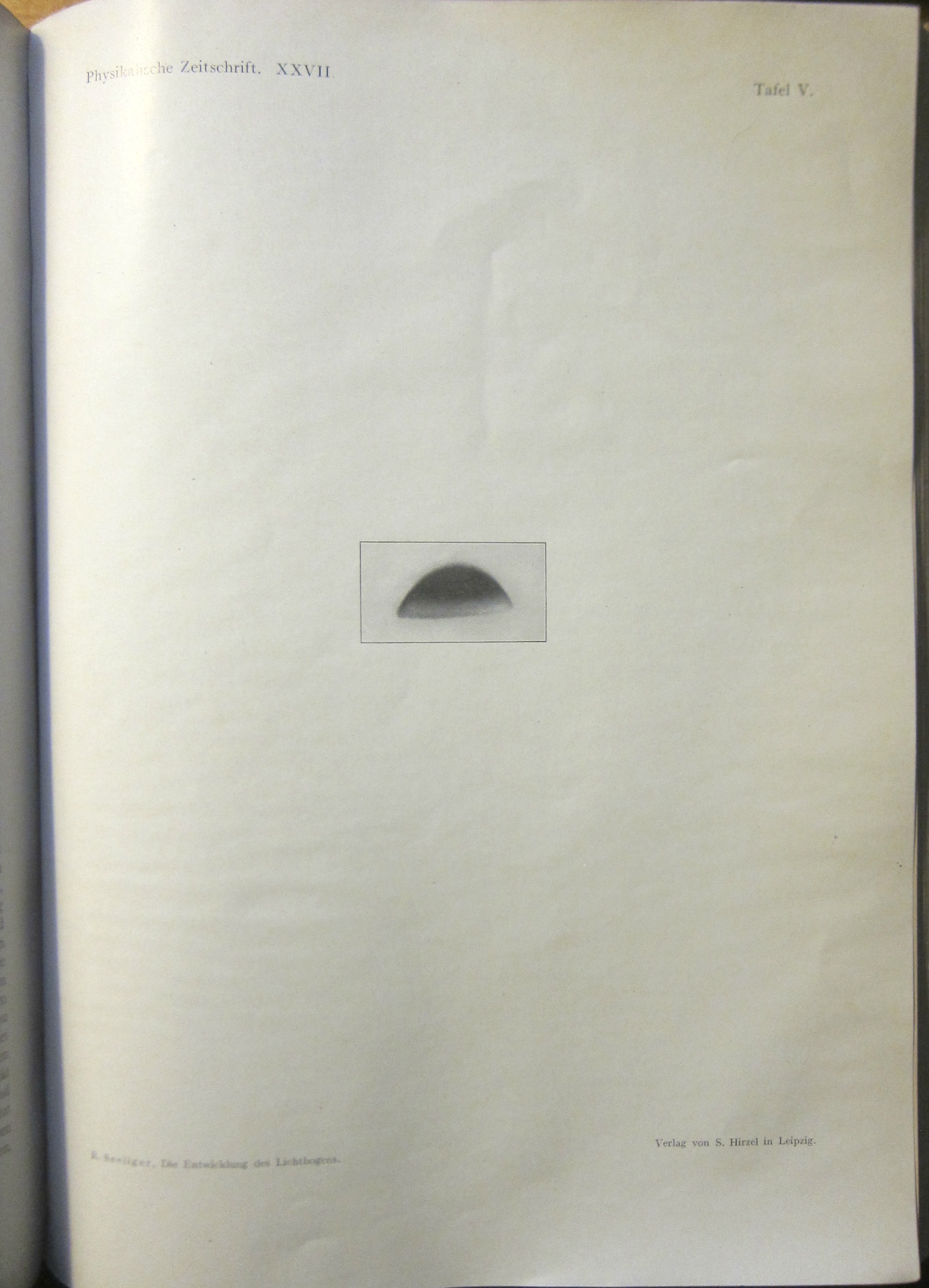
    There haven’t been that many entries in the scientific journal found-art category on this site, and it seems that mainly the artworks found/noticed have occurred in the Annalen der Physik, Scientific American,  and Nature. Hunting for something else (as is usually the case) I found this lovely bit of design in Physikalische Zeitschrift, volume 26, 1926 (page 731, plate 5), illustrating an article by R. Seeliger on the electric arc, “Die Entwocklung des Lichtbogen”. It isn’t so much that the image itself is interesting for the sake of found-art–rather it is its placement, and the lack of almost anything else, and the pleasure of it being surrounded by pretty much nothing that makes this image so artful (or at least noticeable) to me. 

    Phyz Zeit 1926 arc

    There is a bit of an unusual history about the priority of discovery of the electric arc, though that notice usually goes to Humphrey Davy in 1802 and 1809. There was earlier work in 1802 by Vasily Petrov (d. 1834), but even at the time his experimentation was obscure and not much shared. I only mention this because of the line that leapt from the “page” of the Wiki entry for him, saying  “…soon after his death he fell into oblivion in Russia”, which seems pretty harsh to me, however true it may be.


  • Data Visualization of Comparative Naval Strengths, 1929

    JF Ptak Science Books  Quick Post

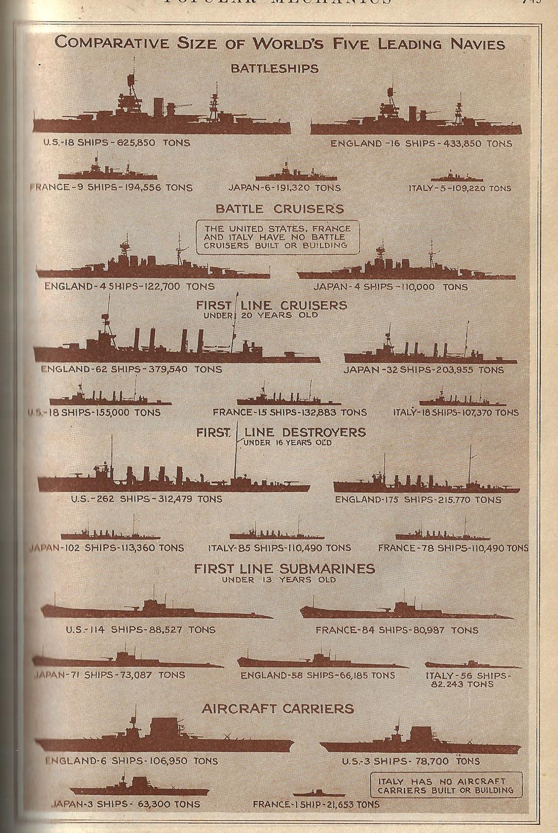
    There are many more complex, complicated, and data-rich displays like this one presented on this blog (just access the “Display of Quantitative Info” section), but there is a certain attraction with this simple-ish one. It is the design of W.R. Robinson–an artist with a fine touch, which is on display here more for the employment of empty space than lines–and gets across the information pretty easily and quickly. In any event, here it is, displaying the relative strengths of the world’s navies ten years after the end of WWI, which at that point was still the great War, “World War I” waiting to be invented in another ten years when there was a needed distinction between that world war and the newest world war.  

    Pop Mech 1929 dataviz navy strength

    [Image source: Popular Mechanics, June, 1929.]


  • Data Visualization and Enormity–the Cost of War in Terms of Iconic Buildings (1917 and 2017)

    JF Ptak Science Books  Post 2733

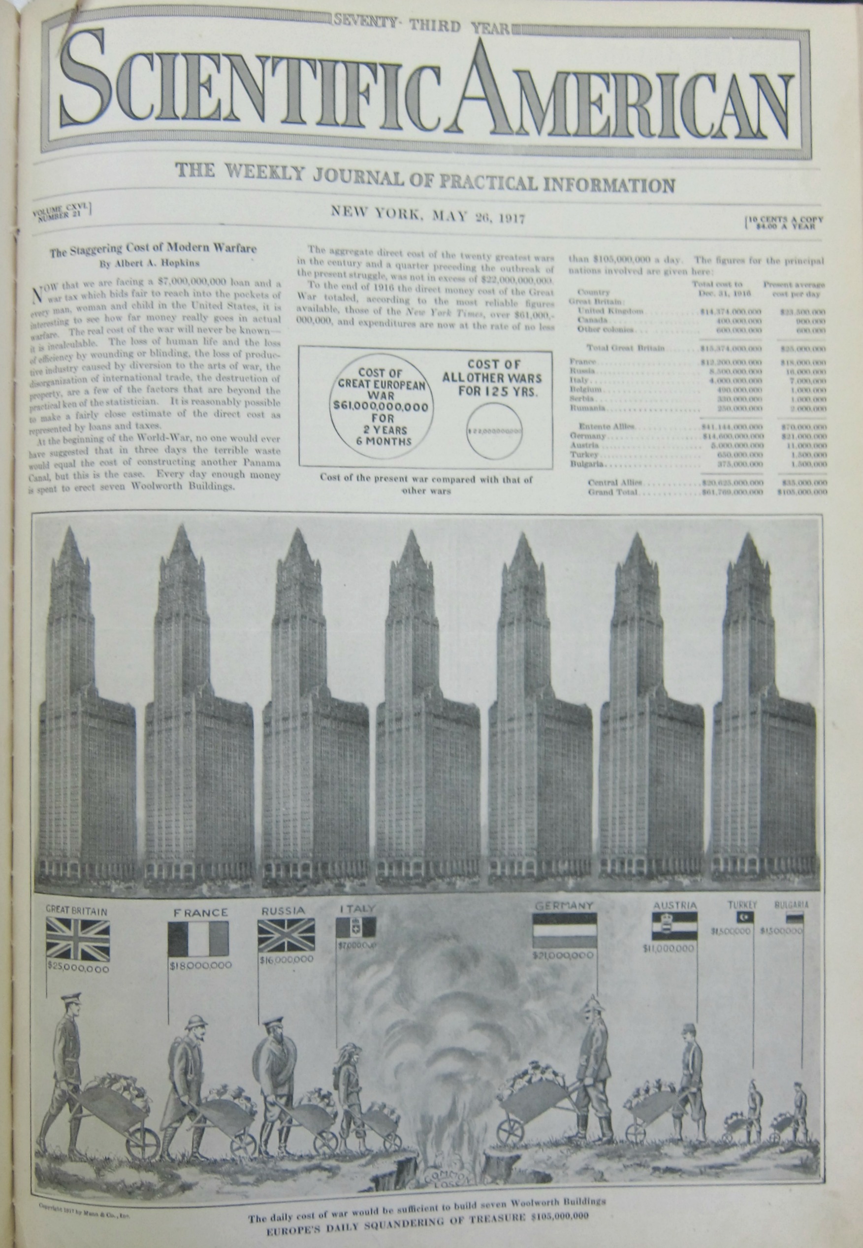
    The first thing that a reader in the U.S. will probably notice in this graphic is that there is no “United States” entry–that is because the U.S. had only entered the war seven weeks before this image was made after having been steadfastly neutral for the war’s first 2.5 years.  That said the daily cost of war was made accessible and understandable to the readership of the Scientific American by putting costs in terms of the construction of the then-tallest building in the world, the Woolworth Building (the world record holder for height from 1911-1930). 

    Overall, for the eight major combatants, the total daily cost of the war was the equivalent of the cost for building eight Woolworth Buildings, every day.  At the end of the war that would have been a stack of Woolworth Buildings that was 30 x 30 Woolworths square and 100 Woolworths tall.  

    And just for perspective, the daily cost for Great Britain was 25 million pounds in 1917, which using the B of E calculator for inflation, would be about 1.2 billion pounds today (per day).  This is roughly in league wit the cost of U.S. involvement in the 2003 Iraq war at about 700 million dollars a day (since 2003). 

    It is difficult to “translate” what $61 billion in 1917 is related to in 2017 dollars. The Bureau of Labor statistics says it is something on the order of  $1.3 trillion, so it must be in there, within or so of an order of magnitude. And now it looks like the “total” cost of the U.S. wars in Iraq and Afghanistan will probably be $10 trillion when all is said and done. That would be equal to the cost of about 2,000 2 World Trade Centers. Given that the costs for WWI still had another year and a half to go, they may have accumulated costs doubling up on the 900+ Woolworth Buildings to 1,800 or 2,000–anyway something pretty similar to 2 World Trade Center measurements, which is pretty odd. 

    There are many ways of looking at this data, though the Scientific American wanted to approach the expenditure in terms of gigantic piles of waste, given that people are pouring money from wheel barrows into a hole.

    • See also an earlier post here on data visualization and the measuring of things with the Woolworth Building:  https://historyofideasblog.com/thesciencebookstore/2016/06/data-vizualization-automobiles.html

    Dataviz WWI war expenses full

    [Source: Scientific American, May 26, 1917.]


  • The Progression of Construction of a Hawker “Hart” R.A.F. Day Bomber (1934)

    JF Ptak Science Books  Quick Post

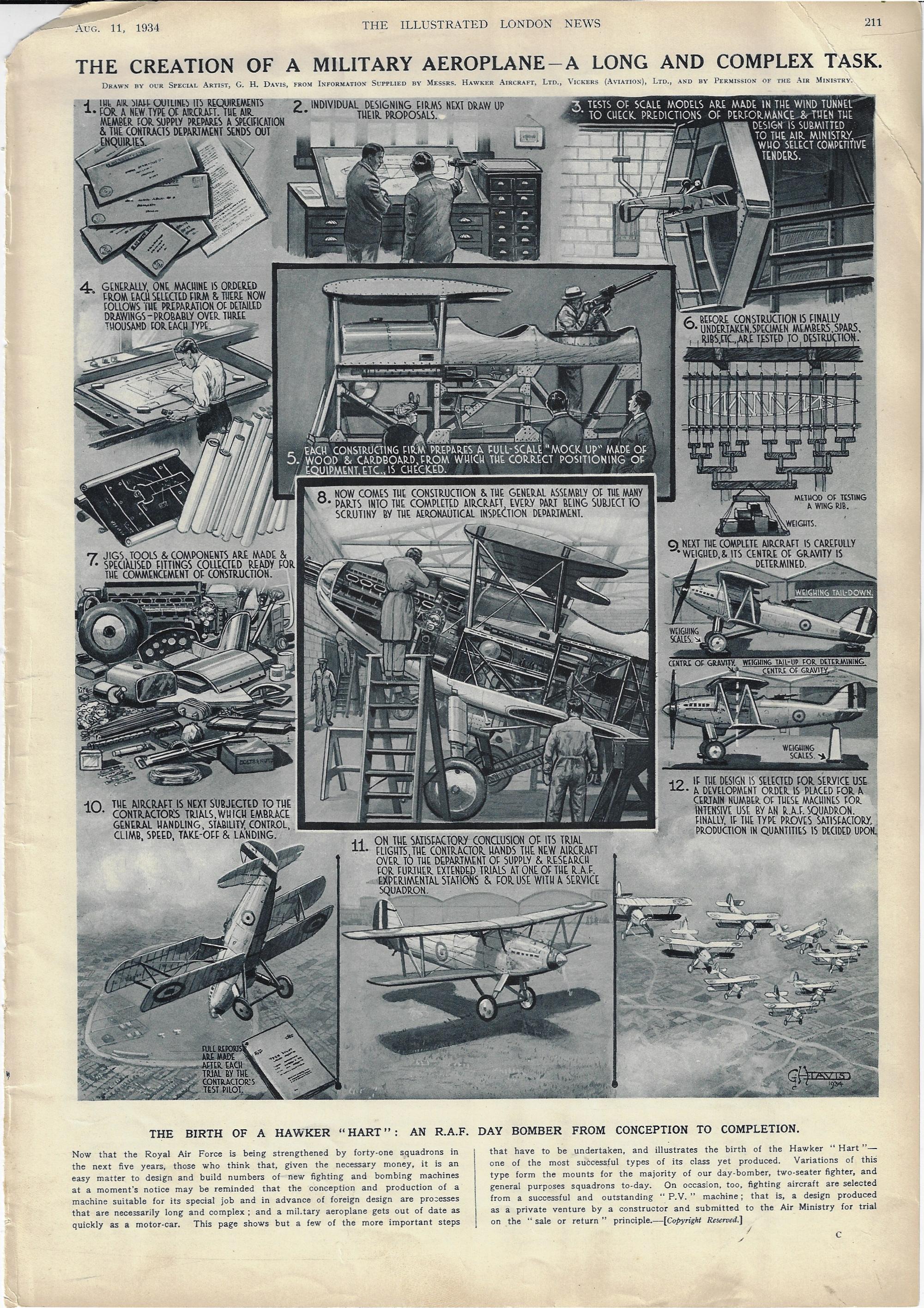
    I enjoy stages-of-construction series of illustrations, showing how cars are made, or boxes, or trenches, and so on.  Sometimes the object being constructed is relatively simple enough and the components few enough that the thing could actually be built from the series of pictures–most of the time, this is not the case, though they do give a good idea of the procedure of construction and the background to it. “The Creation of a Military Aeroplane–a Long and Complex Task” by the prolific and highly detailed G.H. Davis for the Illustrated London News (August 11, 1934) is a good one-page example of this process:

    Dataviz Hawker HArt aircraft 1934


  • The Long Range Guns at Calais Take Aim at England (1929)

    JF Ptak Science Books   Post 2734

    I have posted numerous times on German propaganda pamphlets illustrated with maps showing Germany besieged (1925-1935): hordes of planes, hundreds of thousands of troops, legions of tanks, mountains of artillery pieces, and so on, all graphically displayed quite well enough to strike some fear into the heart of a reader even with just  a casual glance seeing their red-hot rolling menace to the Fatherland. (To see some of those posts, just search “German propaganda” in the google box at right.) 

    It seems to me that I have seen dozens of such illustrations of maps showing Germany surrounded, graphs of military capacity, data visualizations of naval strength, men under arms, and so forth, showing the imminent demise of the spent, Versailled, and used-up but potentially recovering Germany.

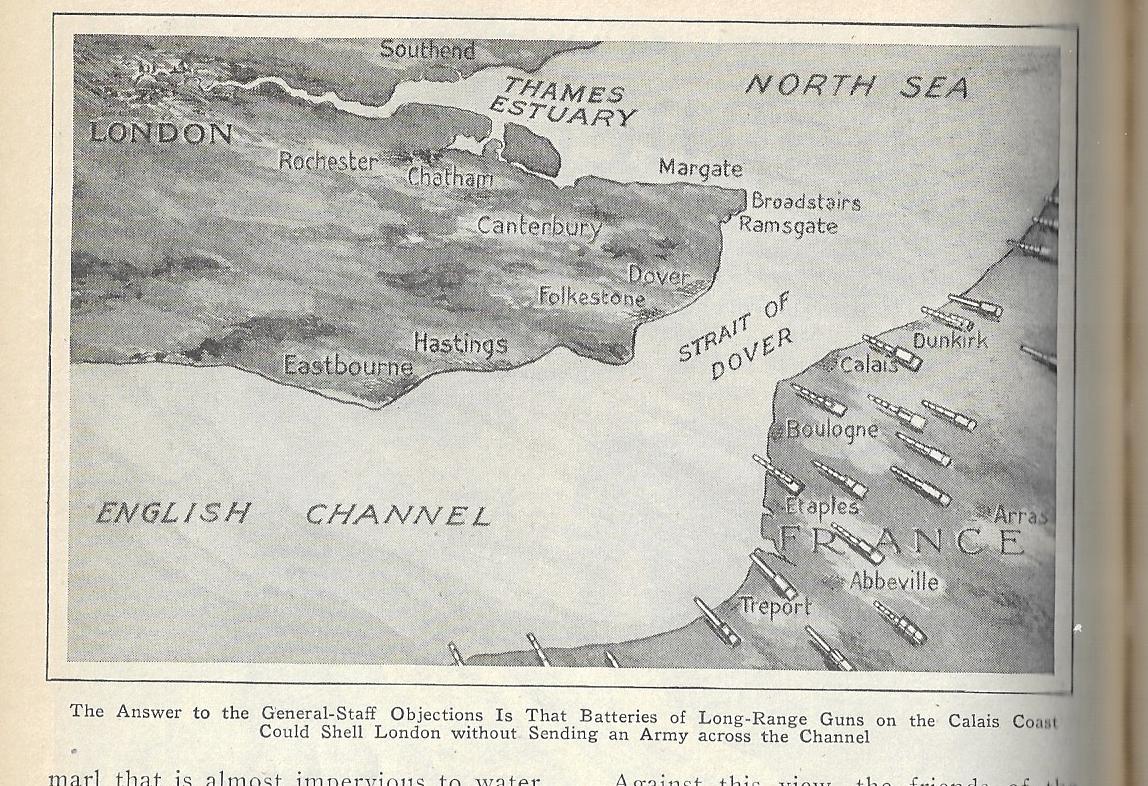
    During that time I’m hard pressed to recall one example of these displays for Great Britain, though I think there was a map in the mid-1930’s in the Illustrated London News that showed the history and possible future invasion routes the island.  Perhaps I’ve just missed these displays, as I don’t actually pursue this as an interest though because of my work I have a lot of exposure to such stuff and am well situated to take advantage of a chance find–and this is what happened today, with the following map happily appeared in my hands as if by magic:
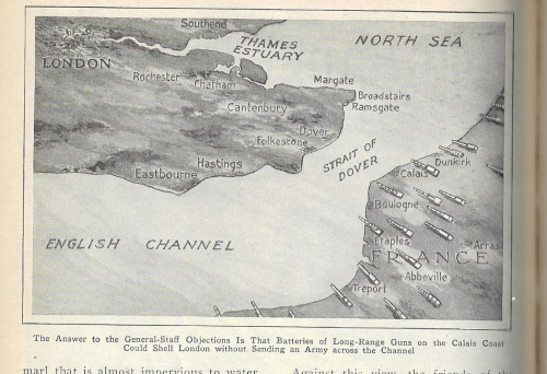
    Pop Mech 1929 England attacked

    The map appears in the May 1929 issue of Popular Mechanics, tailing out an article on the possibilities and the complaints of constructing a channel tunnel. For some reason this bird’s-eye view is included with the article though appears to be utterly unrelated except that it does involve the English Channel. (The article points out another sort of invasion, the tunnel having the potential to admit any number of “more or less undesirable people, who would introduce foreign customs,. deface the countryside and otherwise corrupt English habits of living”.)

    And so, behold! The potential enemies of Great Britain, 1929. It might be conceivable that it is France and France alone setting up those “long-range guns”, what with the long history between the two countries and all, though it seems as recent allies this would not be the case. The enemy could be the feared invasion of visitors from the Continent coming through a tunnel that was far from being an actual project.  Or it could he someone else advancing through France to the coast to threaten the Brits, Calais being the closest point bewtween he two countries across the channel, and the spot where much of the German high command (excluding Rommel) thought that the D-Day invasion would come, even after the invasion had begun. Unfortunately we don’t know what the purpose of this drawing was…except that it would come close to being true in another 11 years.  

  • Another Ship in the Skyline (1904)

    JF Ptak Science Books  Quick Post

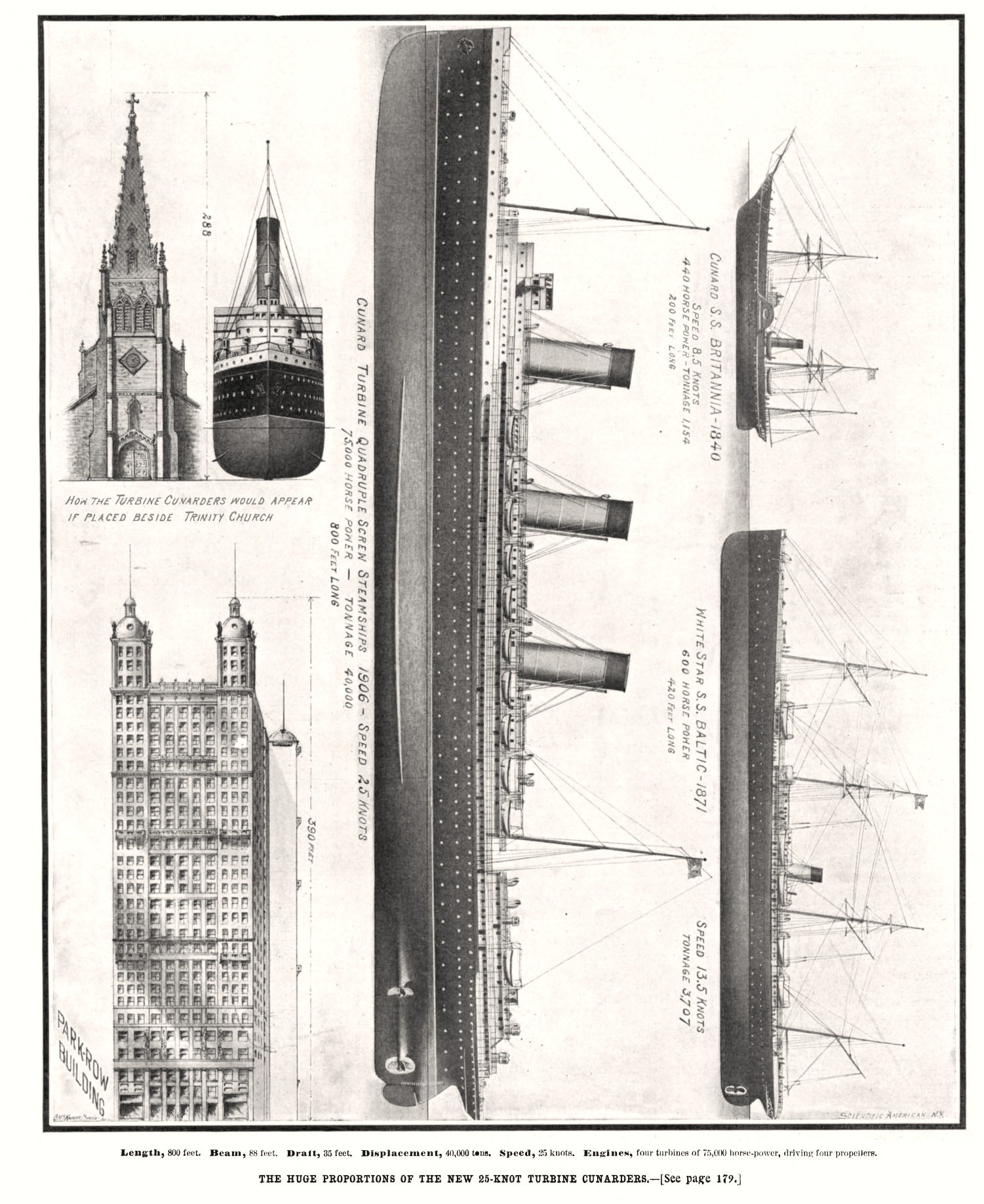
    And here we have another in the short but interesting series, “Ships in the Skyline”, a data visualization and creative display of information of high order and somewhat cross-species order. (Others in this series can be found by searching the title in the Google search box at right.)  This example appears in Scientific American on September 19, 1904, and shows the newest (yet to be named) Cunard Steamship Company fleet addition, a monster 800′ long and with 75,000 horsepower. It is placed side-by-side to Trinity Church, which was the tallest structure in Manhattan for decades, and nearly rises to that height; in the center panel the new ship (is this to be the Lusitania?) is place on end next to and dwarfing the Park Row Building, which was the world’s largest office building in 1904.  The images do press and get their point across very well, I think, in trying have the general reader understand the enormous size of the new “Cunarder” in terms of something that is known, making the stand-alone mass of the new ship more understandable in terms measurement of some other well known thing.

    Sci Am 1904 Ship skyline

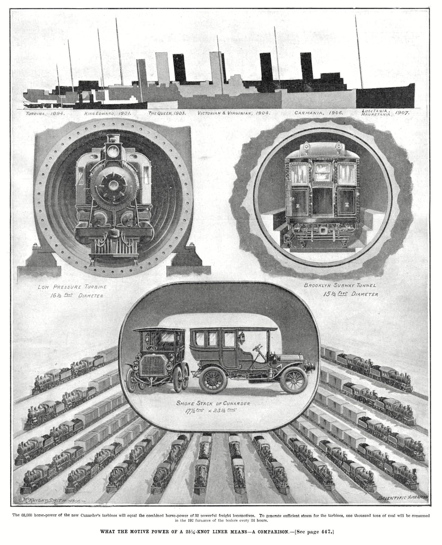
    And other issue celebrating the massive power of the new Cunard ships, this from December 15, 1906 Scientific American front cover, about two years later:

    Sci Am 1906 ships comparative


  • A Map of Drunken England (1908)

    JF Ptak Science Books  Quick Post

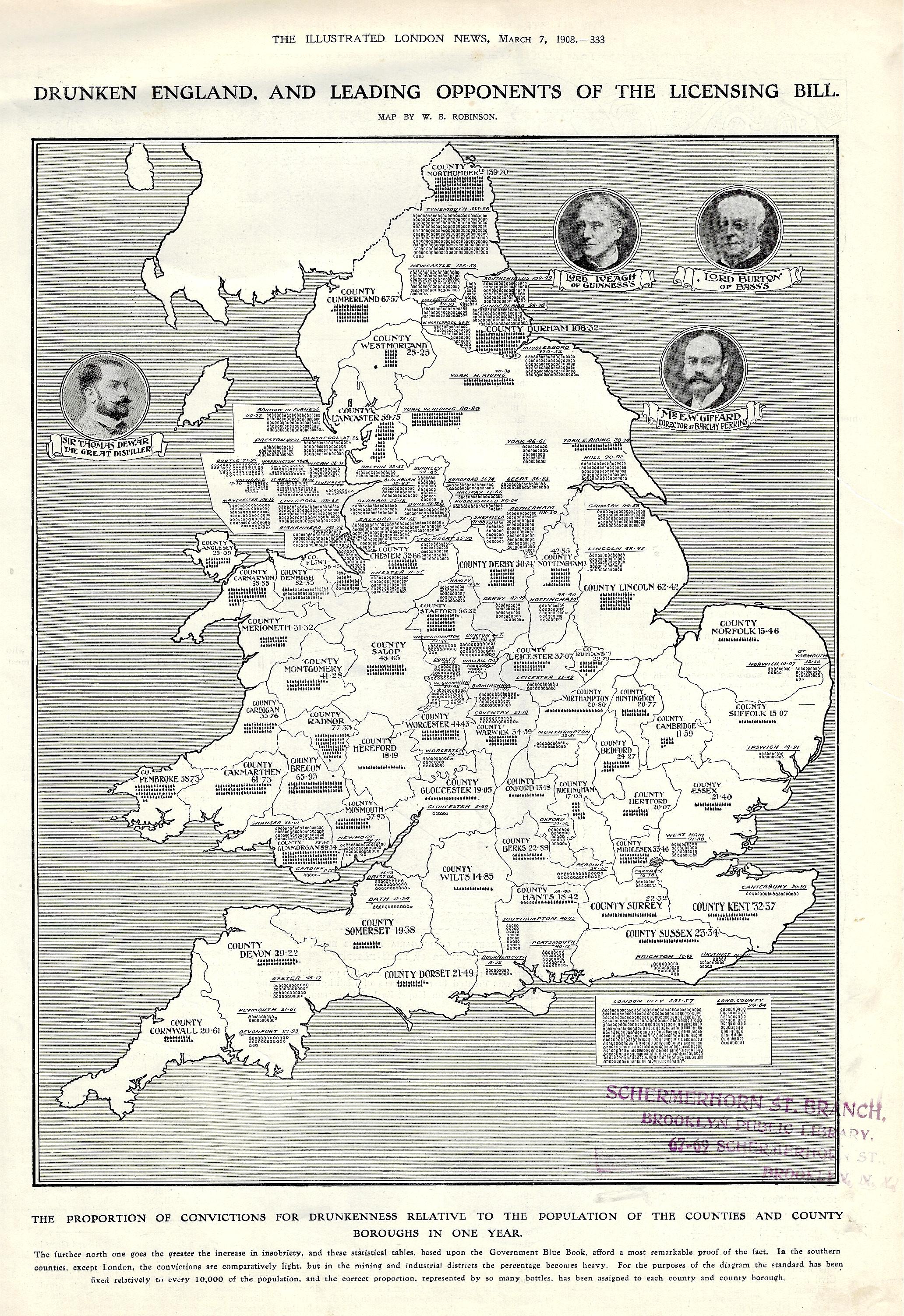
    And so, here we are, my first ever encounter with a map of drunken England, printed in the Illustrated London News om March 7, 1908.  As a data visualization element in a pretty buttoned-up periodical printed during a pretty buttoned-up period, it carries a provocative title using “Drunken” and “England”.  

    The subtitle reads: “the proportion of convictions for drunkenness relative to the population of the counties and county boroughs in one year”. It continues: “the further north one goes the greater the increase in insobriety, and these statistical tables, based upon the Government Blue Book, afford a most remarkable proof of the fact. In the southern counties, except London, the convictions are comparatively light, but in the mining and industrial districts the percentage becomes heavy. For the purposes of the diagram the standard has been fixed relatively to every 10,000 of the population, and the correct proportion, represented by so many bottles…”  

    Maps Drunken England and Wales


  • How High is Blue? (1851)

    JF Ptak Science Books   Quick Post

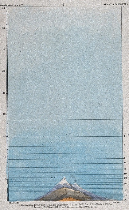
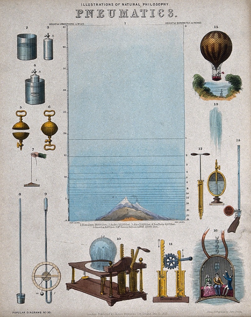
    What struck me in this technical illustration is the cross-section of the ocean of air, and the attempt to depict the characteristics of the atmosphere in receding qualities of blueness. This seems a natural thing to attempt, but I can’t really remember seeing anything quite like this from the mid-19th century–sure there there are images showing the height of the atmosphere, but I just can’t recall the point being made in shades of blue. The image itself is a large detail from “Illustrations of Natural Philosophy, Pneumatics”, a colored lithograph by John Philipps Emslie, and made in 1851.  This copy is from the Wellcome Collection, London, and try as I might I have not yet been able to find out in what book (if any) in which this work was published. Emslie was very active, and composed a number of complicated technical and data visualization efforts like this one, but I can’t yet find publication details.  In the meantime, I’m posting this, concentrating on the atmosphere.

    So far as the heights go in this image, we get through the troposphere and stratosphere, and most of the way through the mesosphere, and so far as the oxygen content goes at the various altitudes, the faded blueness for the relative ease of breathing air is fairly not-so-correct, but that’s not what the intention of the graphic was supposed to show…I was just trying to match-up the blueness with something besides height. The practical experience of humans in 1851 was extremely limited, the record ascension in a balloon at this point still stood at about 27,000′ and was made in 1837–the next big step would be in 1862 when the record was set at 39,000′, which was about 10,000′ higher than any mountain on Earth, the flight subjecting the aeronauts to the thrills of extremely low air pressure and cold. Anyway, the print does get its point across. 

    Emslie pneumatics detail

    Source: the Wellcome Collection, https://wellcomecollection.org/works?query=John+Philipps+emslie#zpyyeaut

    The full image: 

    Emslie pneumatics


  • Graphic Design in “PM” Newspaper, September 1944

    JF Ptak Science Books   Quick Post

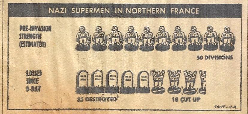
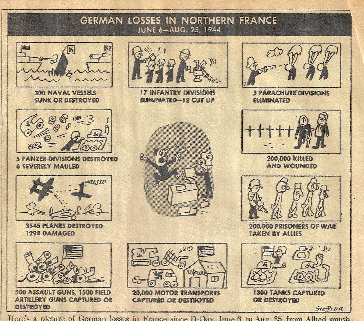
    Here’s another noteworthy, unusual, and most likely very seldom seen display of data from the excellent PM newspaper, this published September 1, 1944. (I’ve made numerous posts to this blog on PM–for more information, just search the name of the newspaper in the Google search box at right.)  The larger image below measures about 5″x5″ in the original; the “Nazi supermen” image directly below is only about 1.5’x3″, and really does make a strong graphical point about the demise of the German army in northern France. This is reporting good news to the readers, though it was hardly the true end of the story in that region–three months later, on 16 December, the Germans would begin Unternehmen Wacht am Rhein (“Operation Watch on the Rhine”), their last push against the Allied forces in the West. To the Allies this attack was known as the Ardennes Counteroffensive, and would last until 25 January, ending in disaster for the German forces. 

    Bottom line here is that the design is very compelling. 

    PM 1944 Carton Nazio losses _2_

    And another, larger image:

    PM 1944 Cartoon Nazi losses _1_


  • Measuring Things with the Hindenburg (1936)

    JF Ptak Science Books   Quick Post

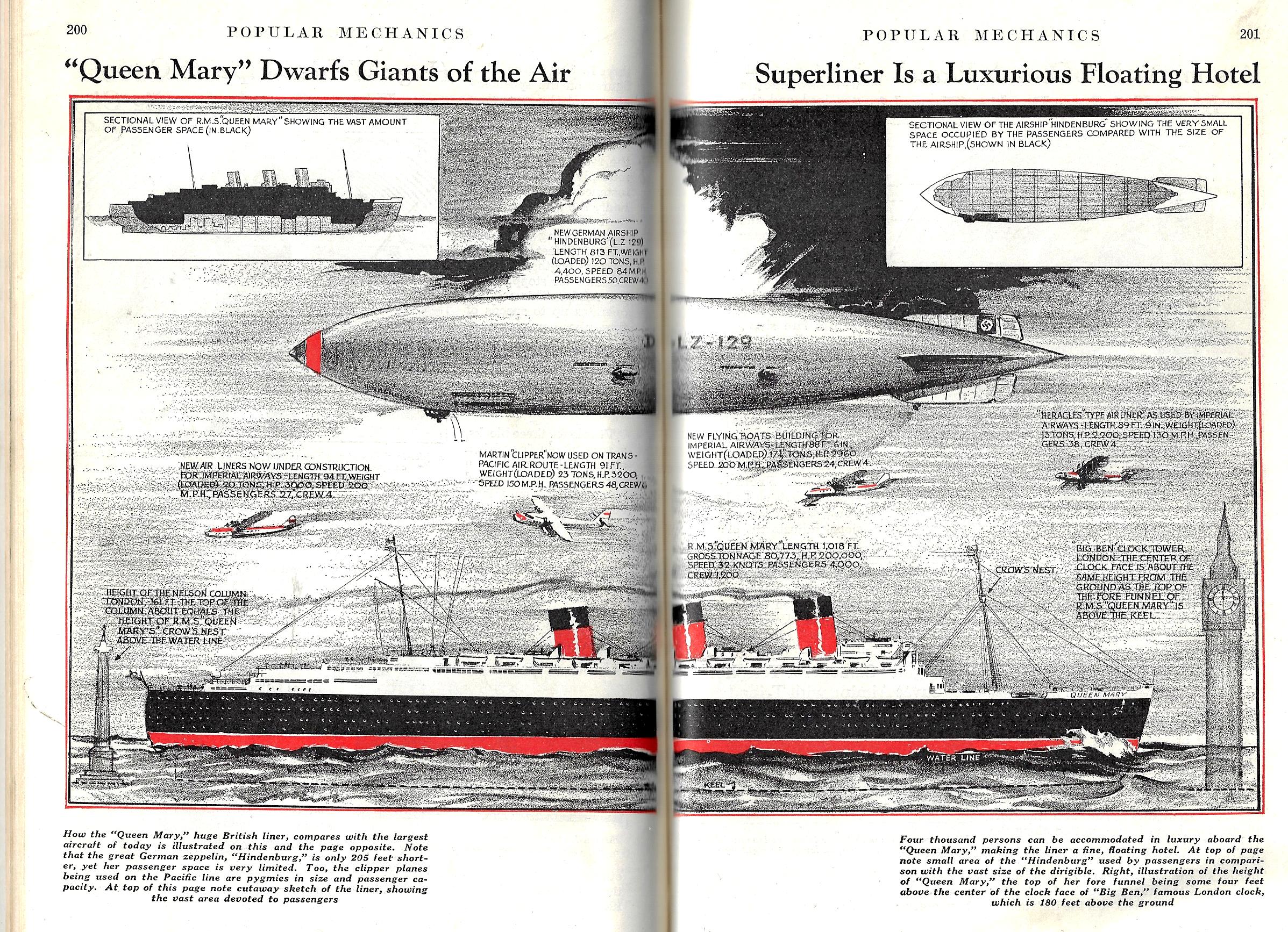
    There have been a number of posts to this blog on “Measuring Stuff With Unexpected Things” (a collection that never became its own category and which is basically folded into the “Display of Information” series) where there are graphic displays of objects being unexpectedly measured with known but unusual units of measure. The Eiffel Tower seems to be a favorite (seeing a stacked column of them showing how deep the Atlantic Ocean is, for example); there is also occasional use of the Great Pyramid, the Woolworth Building, the Titanic (up to a certain point), the Hoover Dam, rows of the Great Pyramid filled with Dirt (!), and so on. It is actually a useful tool, even though I’m having a bit of fun with the idea right now–people might not be able to comprehend how much xxx-tons of dirt is that was excavated from the Panama Canal, but if you put it in terms of filling the Great Pyramid and having a row of them going from one end of Manhattan to the other, then there is some sense made of a big number. 

    Tonight’s example is much simpler than most of the other entries, as we’re simply measuring the new ship Queen Mary against the Hindenburg had newly burst onto the fame stage, and became an instant well-known entity, a manufactured mountain in the sky, an impressive sight to everyone–and so when it is compared to the Queen Mary and found to be smaller, everyone knew instantly how big the ship must be–making this mode of comparison a useful tool.

    The Hindenburg had been first launched just months before it appeared in this piece in the August 1936 issue of Popular Mechanics; it would famously crash just seven months later.

    The other reason I decided to share this image is that it is simply a wonderful design, something that would look fantastic enlarged to 4’x8′.  

    Pop Mech 1936 Queen MAry Graf Zep