JF Ptak Science Books Quick Post
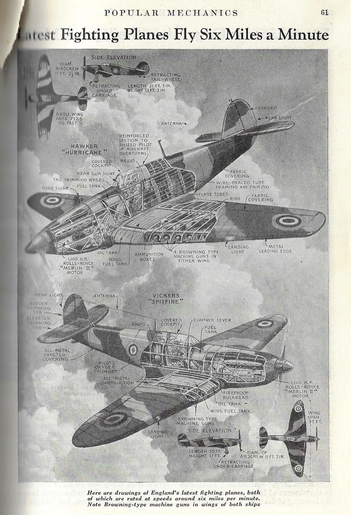
Here’s an interesting and artistic cutaway of two of the great planes of the R.A.F., the Hawker “Hurricane” and the Vickers “Spitfire” (appearing in Popular Mechanics, 1939):
A Daily History of Holes, Dots, Lines, Science, History, Math, Physics, Art, the Unintentional Absurd, Architecture, Maps, Data Visualization, Blank and Missing Things, and so on. |1.6 million words, 7500 images, 4.9 million hits| Press & appearances in The Times, Le Figaro, Mensa, The Economist, The Guardian, Discovery News, Slate, Le Monde, Sci American Blogs, Le Pont, and many other places… 5000+ total posts since 2008.
Contact johnfptak at gmail dot com
JF Ptak Science Books Quick Post
Here’s an interesting and artistic cutaway of two of the great planes of the R.A.F., the Hawker “Hurricane” and the Vickers “Spitfire” (appearing in Popular Mechanics, 1939):
·Posted by :
·in:
JF Ptak Science Books Post 2678
“Hee beganne to stande in great ambiguitee of his saftie.”–P. Vergil Eng. Hist (1846) I. 160, ca. 1560
“Shall I make spirits fetch me what I please, Resolue me of all ambiguities”– Marlowe Tragicall Hist. Faustus (1604) [Both quotations via the OED]
Humans do not normally see one thing two different ways at the same time, unless they are confronted with something that Louis Necker thought up 15 decades ago. I am referring to the wide swath of humanity mostly here in the West with a mostly hard pull to binary interpretations, and not so much so for other belief systems that are more accommodating to multi-dimensional interpretations, like say the clarity/ambiguity inherent in Taoism (though the definition of “Taoism” is usually ambiguous in itself). Also I’m speaking more physiologically/psychologically than anything else more so than yin-yang metaphysics.
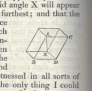
Buried in an interesting (and illustrated) article in this Philosophical Magazine1 of 1832 is the first appearance of one of the most famous optical illusion images of all time–the Necker Cube. this construction–named for Louis Necker–has now been used for many years in tests on human perception (and in some areas for psychological interpretation, depending on who sees what and when). In its original appearance the cube is mostly given a textual description but it does appear once as a tiny rhomboid–tiny or not, it really does do the trick. (“He shows that you may see the Necker cube in either perspective, but that you practically can not see it as a flat geometrical design in the plane of the paper.”–Science 8 Jan. 37/2 . “He did not experience the usual spontaneous depth-reversals of the Necker cube—which appeared to him flat.”–Oxford Companion to the Mind, 96/1, 1987. “The reason an optical illusion such as the Necker cube outline..works is that, in some deep biological sense, you are of two minds on the question of what to see.”–Scientific American, Jan. 18/1, 2001. “It is a simple wire frame drawing of a cube with no visual cues as to its orientation, so it can be interpreted to have either the lower-left or the upper-right square as its front side…”–Wiki)
According to the Oxford English Dictionary it turns out “Necker Cube” doesn’t make its first appearance as a phrase for another nearly 70 years, surfacing in 1901 in an article by the psychologist E. B. Titchener in Experimental Psychology (I. ii. ix. 309): “The Instructor should have a few prepared as large wall-diagrams:..Schröder’s stair-figure, Necker’s cube,..the Müller-Lyer figure.” In any event, so far as I can determine, this is the first appearance of that famous construction.
JF Ptak Science Books Post 2677
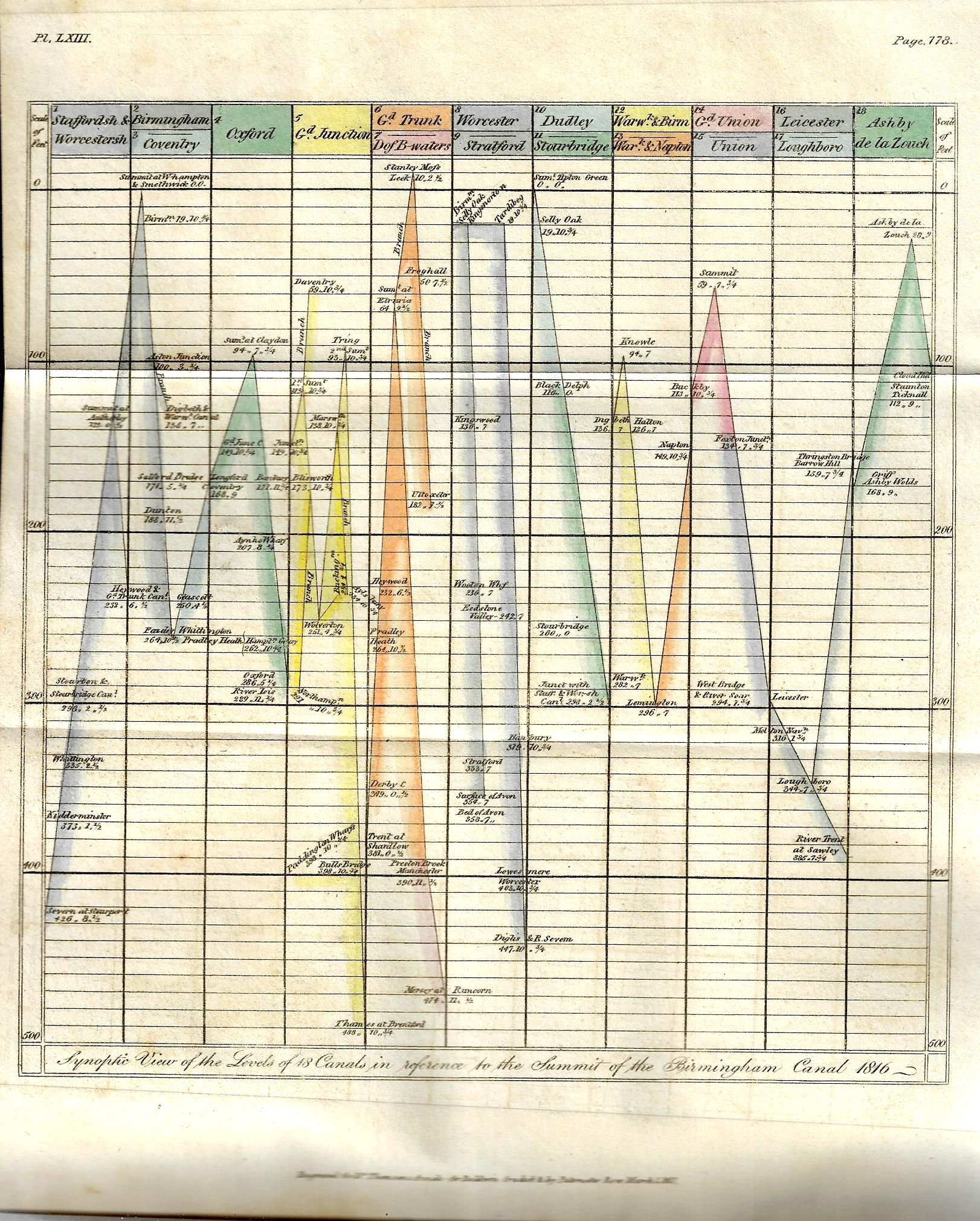
There have been perhaps 150 posts on this blog relating to data visualization and the elegant display of information–this one, found by chance yesterday while browsing, is really pretty early for its type of accomplishment. The image relates heights of canals in the Midlands, and is one of three illustrations for Samuel Galton’s “On Canal Levels” which appeared in Thomas Thomson’s Annals of Philosophy; or, Magazine of Chemistry, Mineralogy, Mechanics, Natural History, Agriculture, and the Arts1 in the first half of 1817. The article is illustrated with three plates, including a curiously interesting graph of canal lengths, a cross section of “the line of canal from the river Mersey at Runcorn Gap to the River Thames at Brenford, with the Branch to Paddington Wharfs”, and finally a glorious hand-colored plate (“Synoptic View of 18 Canals in reference to the summit of the Birmingham Canal, 1816”).
Galton (1753-1832, of Birmingham) was Quaker arms manufacturer (a not-uncommon occurrence in my experience) and the grandfather of the polymath Francis Galton, a successful industrial who was active in the Lunar Society. This short paper is basically a collection of data, and he presents it in an interesting and provocative way–this in relation to the cross section and graph, which are early means for the time in expressing quantitative data in a more easily-managed and comparable form. (Galton wrote: “It occurred to me several years ago that the lockage of canals and their plans and sections would afford the means of ascertaining with a considerable degree of comparative precision the relative height or level of all the places immediately situated upon those canals which communicate with one another and that in consequence a number of fixed points would be obtained from which the relative level of any objects in the vicinity of those canals might be more conveniently measured…”)
JF Ptak Science Books Quick Post
That snarky little title simply references this fine collection of shapes for the schoolroom, objects for their own sake, to help kids understand form and its relationships. The were actually 200 wooden of them in a 6’x4′ display case sold as a teacher’s aid by the Canadian Charles Baillairges:
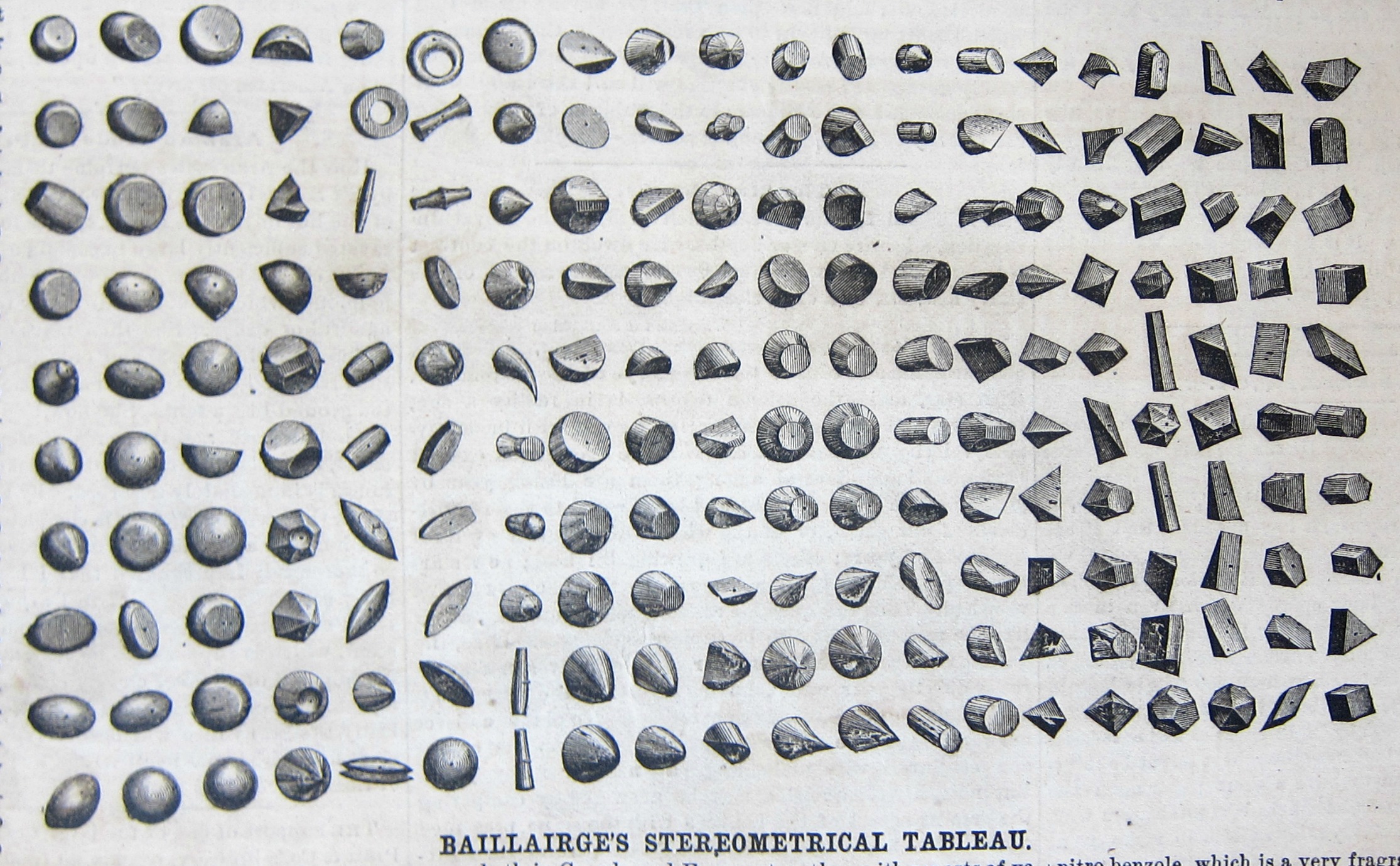
We read in the promotional/instructional that comes with the blocks:
“In a large number of schools in Germany the pupils are taught from the time they commence the alphabet to judge of color and geometrical form by the regular use and comparison of colored slips and small blocks of wood representing the elementary principles which will in after years be called into study. The advantages of this early manifest all of the superiority of this…” The blocks “comprising so to say all the elementary forms their segments and sections and numerous other solids both simple and compound” and that “the instruction conveyed by this tableau appealing as it does to the uneducated eye and mind is the inventor thinks destined to be of great use in developing the intelligence of the beginner and the untaught masses of mankind.”
I found this image and nearly-identical text (without attribution) in the Scientific American for June 7, 1872.
JF Ptak Science Books Quick Post
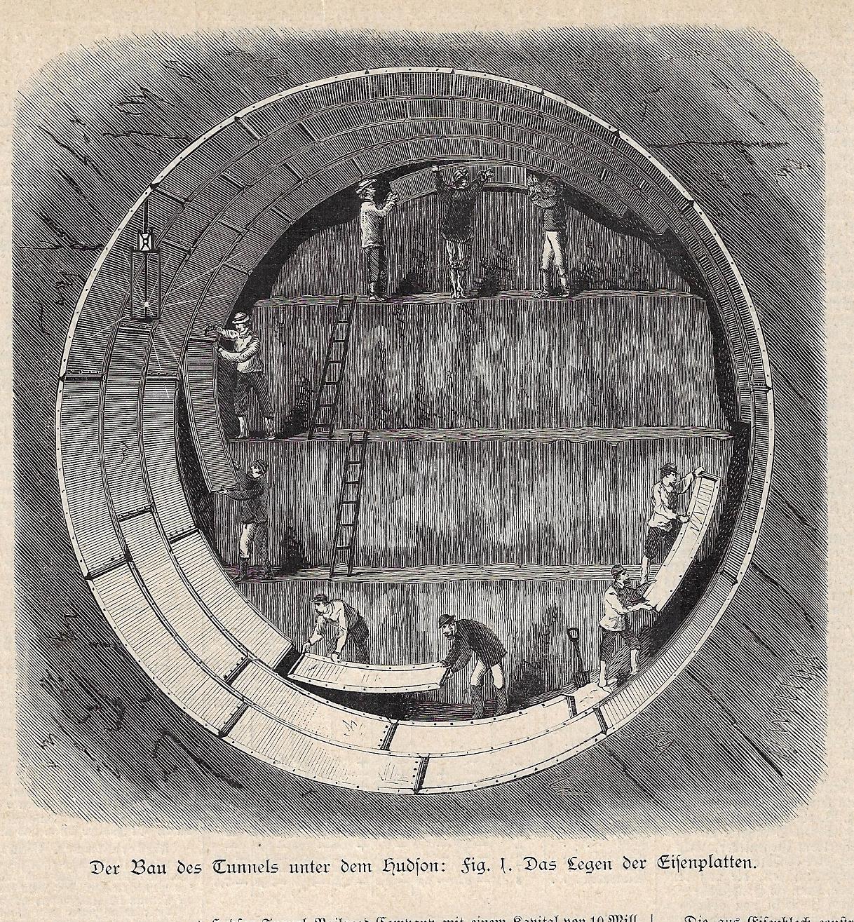
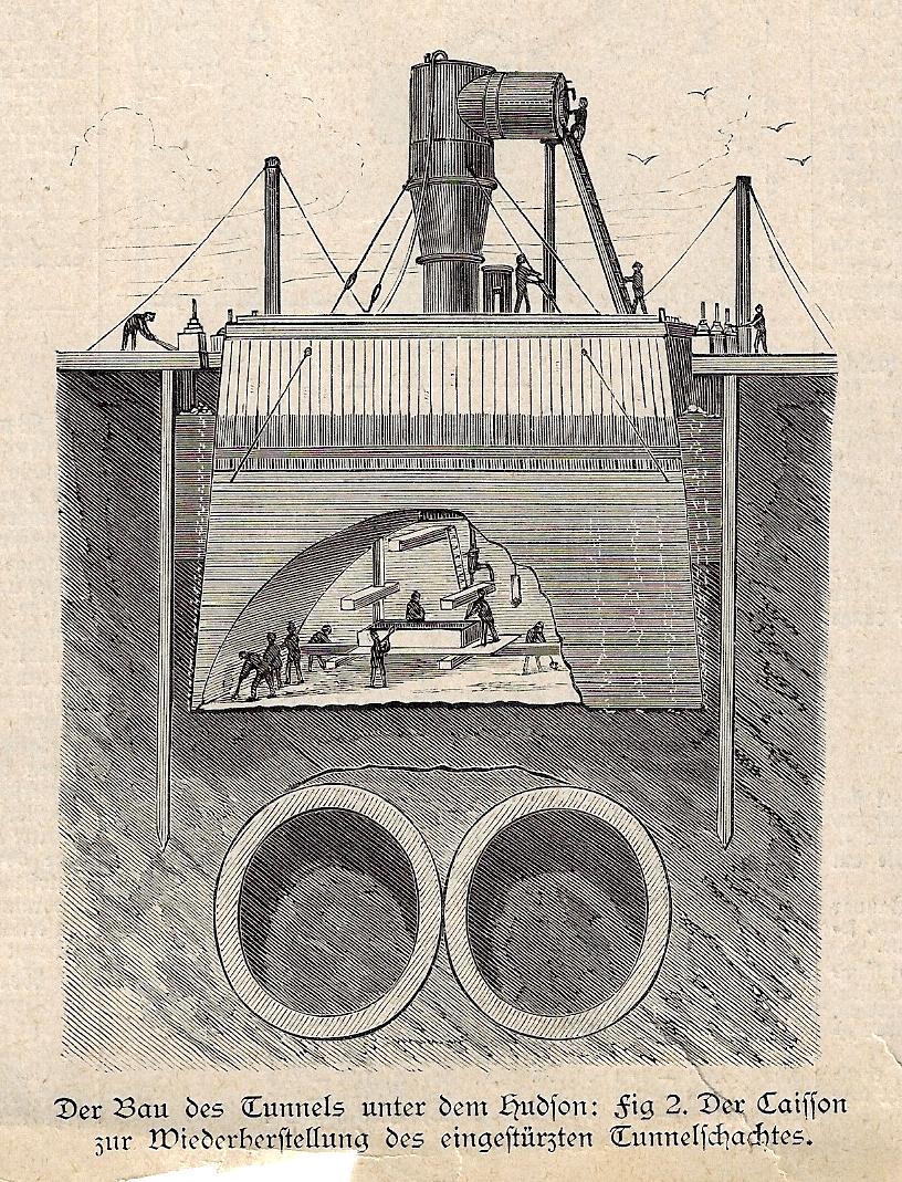
This is an interesting addition to the collection (though not designated as a category) of several dozen cross section/tomographic/cutaway technical and medical illustration posts to this blog, though this one has a more complicated and perhaps more tragic history than most. It depicts work being done on the ill-fated Hudson River tubes, which began life as a project in 1874 with construction starting in 1878; unfortunately there were at least three different companies that undertook the difficult project before going bust, and there was also one major disaster in 1883 in which more than 20 workers were killed. The project got underway for the final time in 1899, and was opened to traffic in 1908. In the top image workmen are installing a shielding that would later be abandoned, working I think via one electric spark lamp at upper left; below we see a casson in which a number of laborers were, that being sunk lower and lower as the excavations proceed.
These two images are about-life size from when they appeared in Illustrirte Zeitung (Leipzig), on 29 January 1881–though they no doubt appeared a few months earlier in Harper’s Weekly or Scientific American or some such.
·Posted by :
·in:
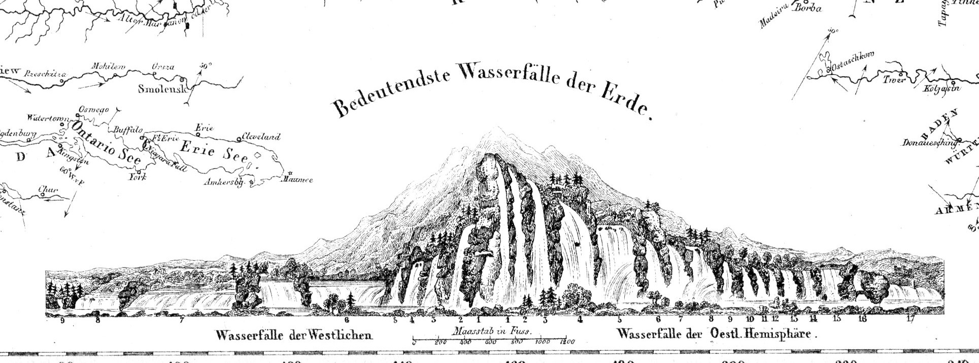
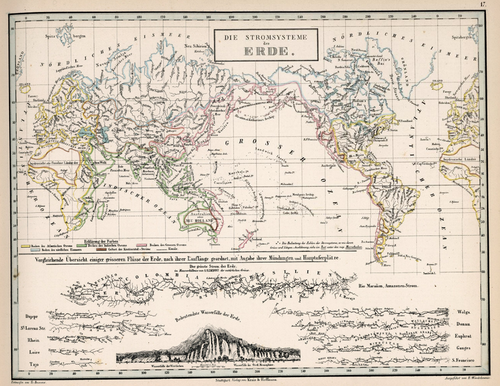
Before the Neil deGrasse Tyson version and update of Carl Sagan’s landmark television series, Cosmos, there was Alexander von Humboldt and his enormously influential book of the same title, printed in 1845-1862. Well, von Humboldt’s (1769-18591) book was actually Kosmos when published in German, which is where it started its life (and which von Humboldt suffered mightily for in it English translation), and in which this map appears. Von Humboldt was enormously studied and educated and of a high scientific mind over many subjects, one of those 19th century figures who seemed as though they could know everything, a polymath of high order (along the lines of Goethe and von Helmholtz and Thomas Young and others). He was a meteorologist and biogeographer before those sciences existed; a naturalist, geographer, archaeologist, and explorer, a natural philosopher of magnitudes.
Kosmos reflected his lifelong interest in order, and what he did was astonishing–he attempted to unifying the complexities of nature in one book (of five volumes), binding the various branches of science together in a cohesive whole, attempting to show how the laws of the universe acted here on Earth. It was a very influential work, very progressive, a masterwork of scientific method. Kosmos.
·Posted by :
·in:
JF Ptak Science Books Quick Post
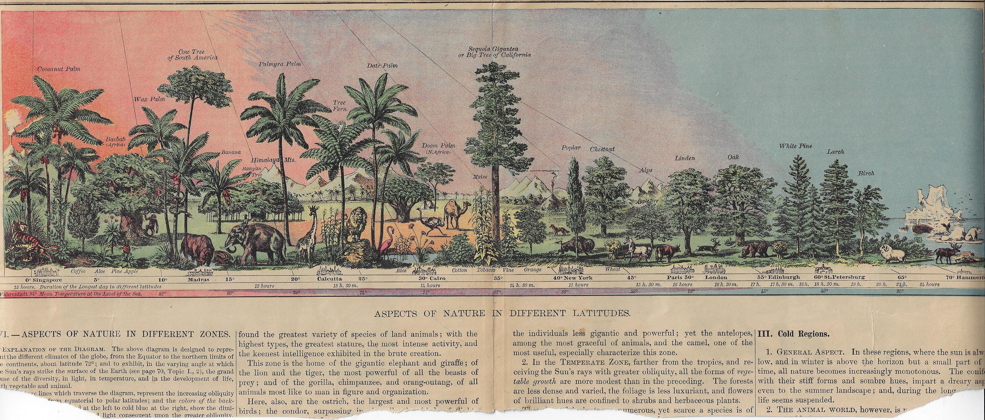
This lovely image displays the natural history of limited flora and fauna at different latitudes, centering on the “Big Trees of California”. The original is about 17″ long and almost fits exactly on the big scanner, though some of the edges are left off–no matter, I think, as most of the image is available. Its source is a grade school textbook (probably seen as fairly advanced by modern standards) by Arnold Guyot, Physical Geography, and published ca. 1876–the image (or something very much like it) may have appeared in other contemporary texts, like Cornell’s Geography, though I’m not sure. At any rate it is very nicely designed, and I enjoy the gradient of the sky.
[Click on the image for a good expanded view.]
·Posted by :
·in:
JF Ptak Science Books Quick Post
This print is a part of The Growth of Industrial Art collection edited by Benjamin Butterworth (1837-1898) in 1888 (with a second edition published shortly afterwards in the Columbian year 1892). Butterworth compiled the work in his capacity as the Commissioner of Patents (he was also a former three-term Congressman), and he produced an encyclopedic and charming review of American industry and displays it in a series of 200 very busy but well-design images wood engravings. The many industrial product s depicted in this book include harrows, lawnmower, horse rakes, plows, baskets, screws, nails, telephones, gas engines, advertising implements, mining equipment,ice elevators, projectiles, bale tighteners, musical instruments, cigars, bicycles, egg carriers, and many others, with many of the industries now lost to modernity or cheaper overseas labor. My favorites in the collection, I think, are the nails and screws (shown below), mostly for their design and placement as well as their variety.
There is a very appealing display of the full text available at Smithsonian Institution, here: http://library.si.edu/digital-library/book/growthindustria00unit
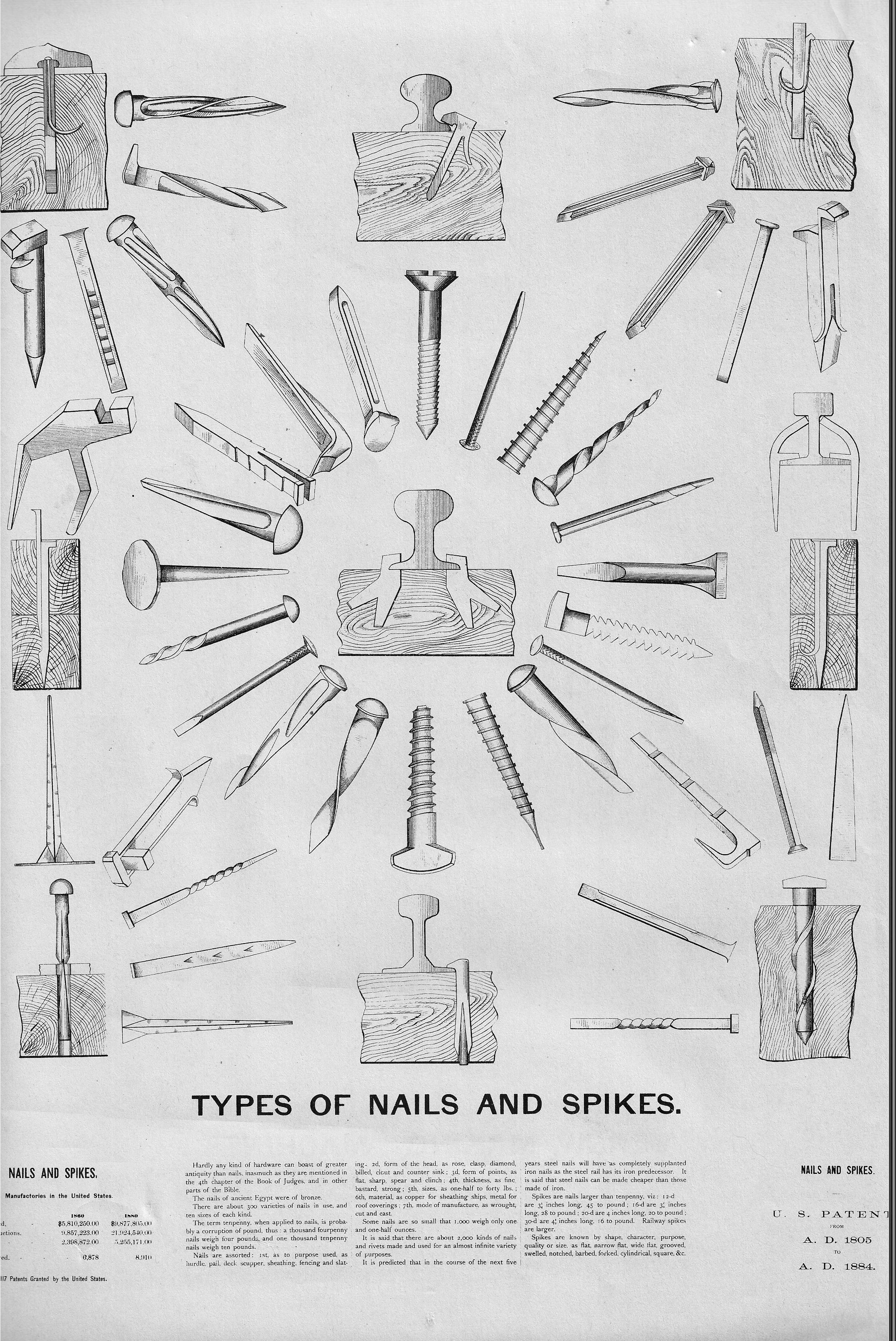
And of course:
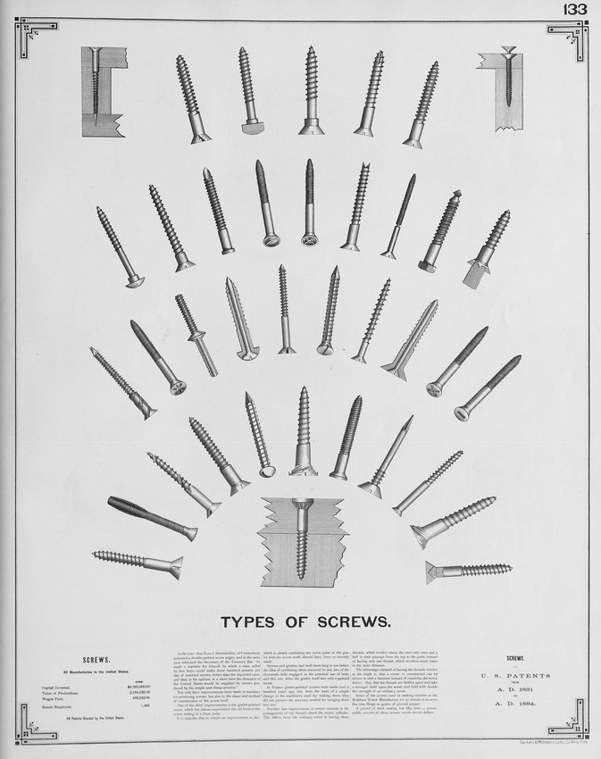
JF Ptak Science Books Post 1952 from 2013, expanded
It seems so unlikely that the Venn diagrams took so long to appear, that it hadn’t been Aristotle’s Diagrams, or Cartesian Diagrams; rather, these elegant creations–about a different way to represent propositions by diagrams– belong to Mr. Venn’s invention in 1880. Mostly. It was in that year that these famous more fully-developed diagrams first appeared in a paper entitled “On the Diagrammatic and Mechanical Representation of Propositions and Reasonings“ in the Philosophical Magazine and Journal of Science. They seem so beautiful, and so simple, and so powerful, and so elegant. So necessary. And so why-did-they-take-so-long-to-appear, so obvious. In a way, they are in that category of The Great Obvious Invention, in a similar vein to Mr. Luke Howard first classifying the names of clouds in 1803. Sometimes things are not obvious until they are.
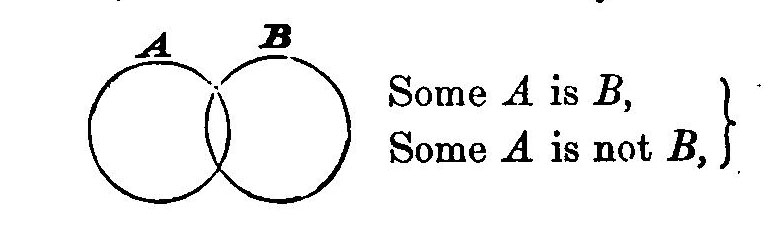
[Source: Internet Archives, John Venn, Symbolic Logic, 1881]
Well, almost. The diagrams did mostly make an appearance earlier–though not in the Venn form–in the work of Christian Weise (d. 1708) and then in that of Leonhard Euler (1707-1783), that according to the great William Rowan Hamilton, explained in his work Metaphysics and Logic (1858-1860). But the final form seems to be that of Venn.
Hamilton’s work appears so:
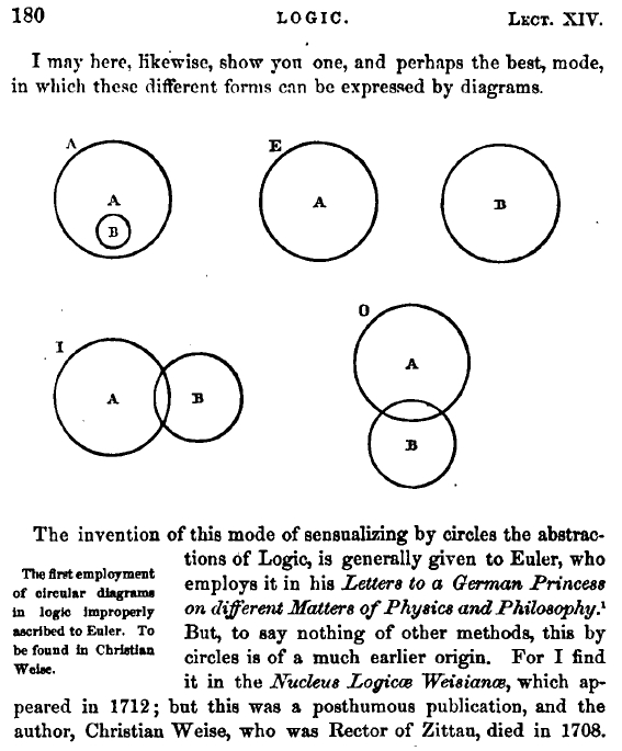
They also appeared in the Proceedings of the Cambridge Philosophical Society, volume 4, 1880, in his article “On the employment of geometrical diagrams for the sensible representation of logical propositions” in which he discusses the history of the diagrams, including the Hamilton history. Venn also includes this beautiful logic template of Bolzano:
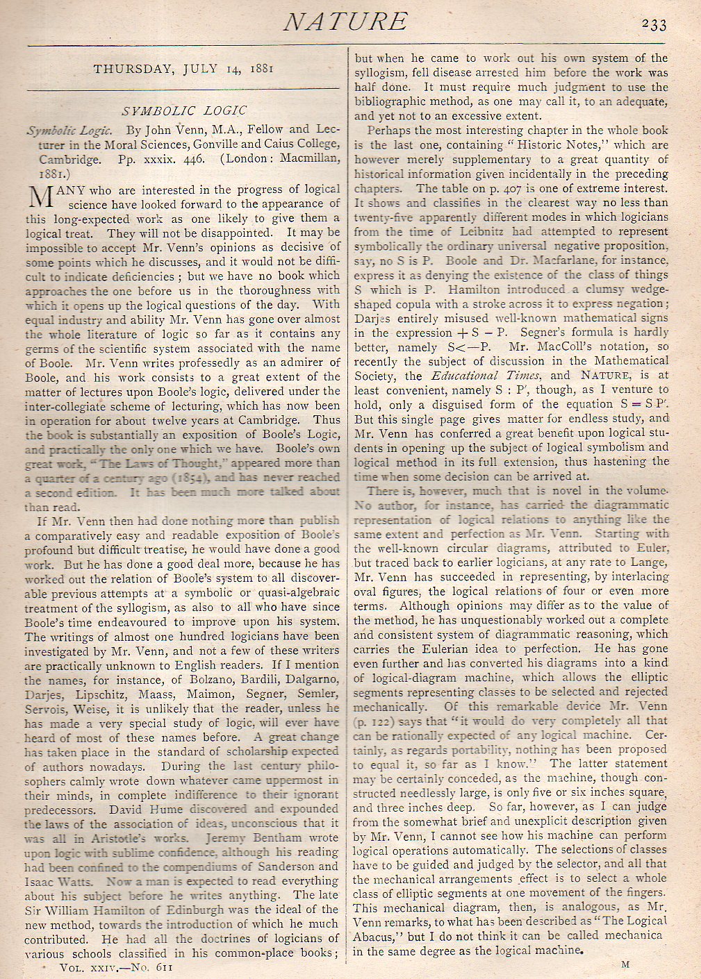
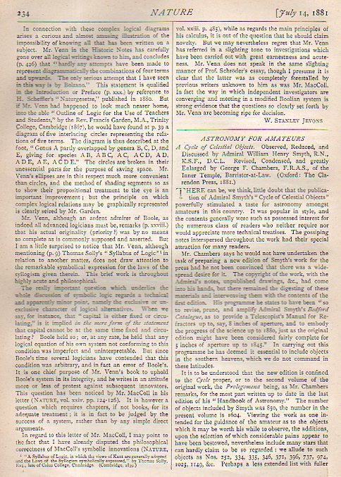
All of this brings us back to where I silently started, finding a wonderful book review of the 1880 Venn Symbolic Logic, and that appeared the following year in the journal Nature on 14 July 1881. The review is by one of my favorite 19th century figures, the inimitable W. Stanley Jevons, and is reproduced below.
JF Ptak Science Books Post 2656
There are many instances of assembly-line manufacturing before Henry Ford, but none were nearly as complete and extensive and done on such a large scale as the principle and practice he established in 1913. The idea became generalized and (to a degree) fashionable, and the practice started being implemented in many other business wide and narrow. To a certain extent that applies to this parking garage proposal that appeared in Popular Mechanics in December 1921. the effect of this idea here is the introduction of the building-as-robot, though the idea in this form didn’t yet exist, nor did the term “robot”. In any event the building took care of the customer’s car once the car had been driven in–attendants would drive the car to an access point for a conveyor and perhaps an elevator, and deliver the car to its designated slot, much in the same ways some libraries operate in storing some of their more obscure books.
I guess that “Taylorism” works its way in there, too. Frederick Winslow Taylor (born in 1856 but dead already at this point by six years) introduced a study of business in his Principles of Scientific Management, and that was a synthesis of humans with their environment and tasks to produce a more business-harmonious utilization by increasing the workers’ productivity via time/use studies, making the worker more a part of the business machine, and in a sense a Borg-like part of a techno-human robotic industry. Among other things Taylor discovered to the hatred of hundreds of thousands of laborers that the short-handled shovel (villainized in the Song “Big Rock Candy Mountain”) was the better tool to use in many shoveling tasks even though the thing itself is a back-breaker that no worker would choose to use. Anyway, int eh history of robots, both of these bits deserve some attention.
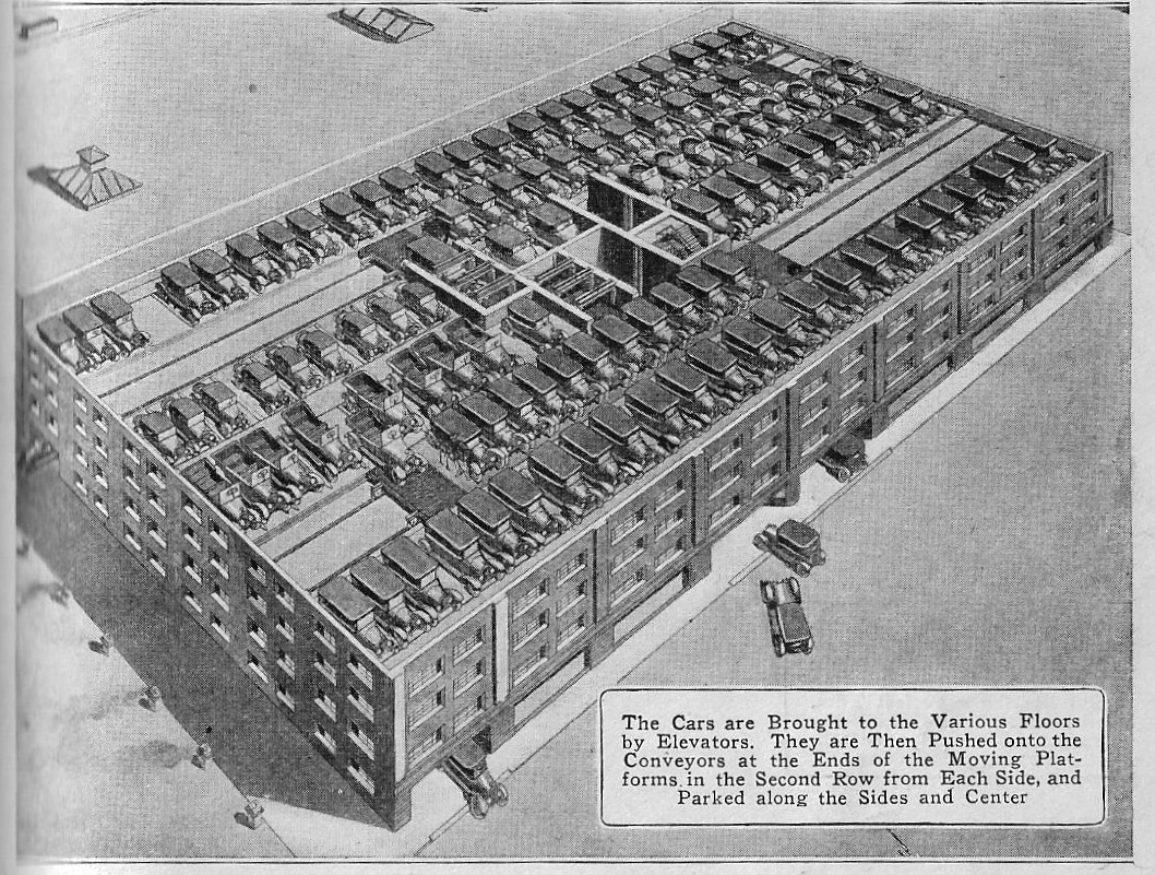
[Source, Popular Mechanics, December 1921, vol 36, p 751.]
·Posted by :
·in: