A Daily History of Holes, Dots, Lines, Science, History, Math, Physics, Art, the Unintentional Absurd, Architecture, Maps, Data Visualization, Blank and Missing Things, and so on. |1.6 million words, 7500 images, 4.9 million hits| Press & appearances in The Times, Le Figaro, Mensa, The Economist, The Guardian, Discovery News, Slate, Le Monde, Sci American Blogs, Le Pont, and many other places… 5000+ total posts since 2008.

Category: Information, Quantitative Display of

  • A Submarine Research Platform, 1873

    JF Ptak Science Books  Quick Post

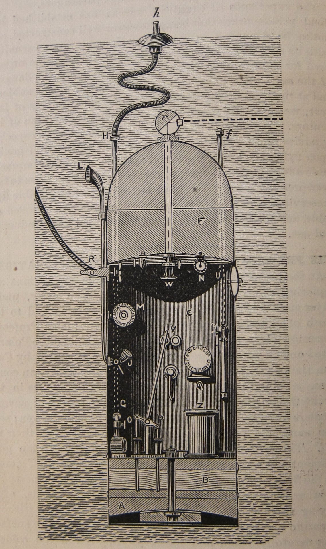
    In the same year as the British and American first appearances of Jules Verne’s Twenty Thousand Leagues Under the Sea there appeared in the pages of Scientific American this short article on a not-very-Victorian submarine exploring platform. Published in the April 19, 1873 issue was an illustrated (by cross-section) note on a  type of diving bell created by M. de Toselli:

    Sci Am 1873 diving bell. 

    It is explained to us that the living compartment (C) holds a number of instruments and machines: there is a pump (P) for drawing and evacuating water (in compartment B) for the raising and lowering of the craft (there is also a layer of lead in compartment A for weighing down the vehicle); there are also two manometers (M and N), a telegraph (Q), and of course, a seat (Z); the top section (F) is for storing breathable air; (U) is a hatch for entering and exiting; and (R) is a rope/cable that connects the thing to a ship, and which also contains the telegraph cable. The text said that there are “small windows” but I can’t find them.  In any event this was intended as a scientific platform for research, including photography.  


  • What Things Cost in the U.S. in 1836–How Much WAS a One Pound Bladder of Snuff?

    JF Ptak Science Books     Quick Post

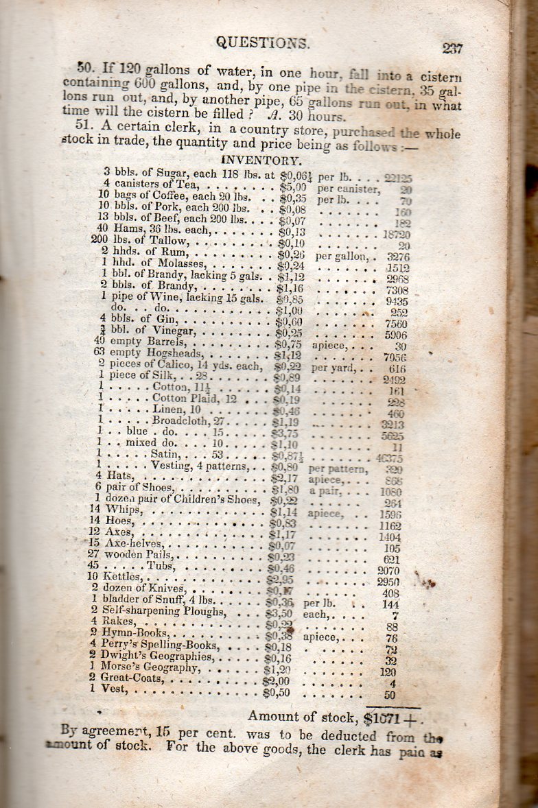
    In case you’ve wondered how much four barrels of gin cost in the U.S. in 1836 I have provided the following list of What Stuff Cost, found tucked away in a book-keeping section of a very well used pocket-sized copy of Roswell C. Smith’s Practical and Mental Arithmetic on a New Plan..., which was published in Hartford in 1836.  The answer to the gin question is $75, and if a barrel meant 42 gallons back then as it does now then the gin would cost about 60 cents a gallon. That of course sounds like a tiny price, but compared to what? That 60 cents would be about two-thirds of a day’s wages for the average non-farm white male worker (actually between 50 cents and $1.00), while girl/women textile workers in Lowell Mass worked for about $3-4 per six day week. So if you considered working for most of the day in exchange for a bottle of (average, nothing special) gin, then it would seem a little on the expensive side.  Or consider the prices of stuff as expensive or not based on a yearly salary of $300 or so and getting by on about a dollar a day. Naturally many standard cost of living bits are not present in 1836, but still there’s not a lot of wiggle room on a salary like that.  

    What is also a very attractive insight was that these items were considered to be at least more-or-less obvious object to have in a store or in trade, which might say a lot about what sorts of things were available for purchase in general at that time.  

    In any event, the list (which is tiny in real life, about 3.5×3″ total) which for some reason did not make use of the decimal point: 

    Math inventory 1836817


  • Beautiful Data Circles (1898)

    JF Ptak Science Books  Post 2646

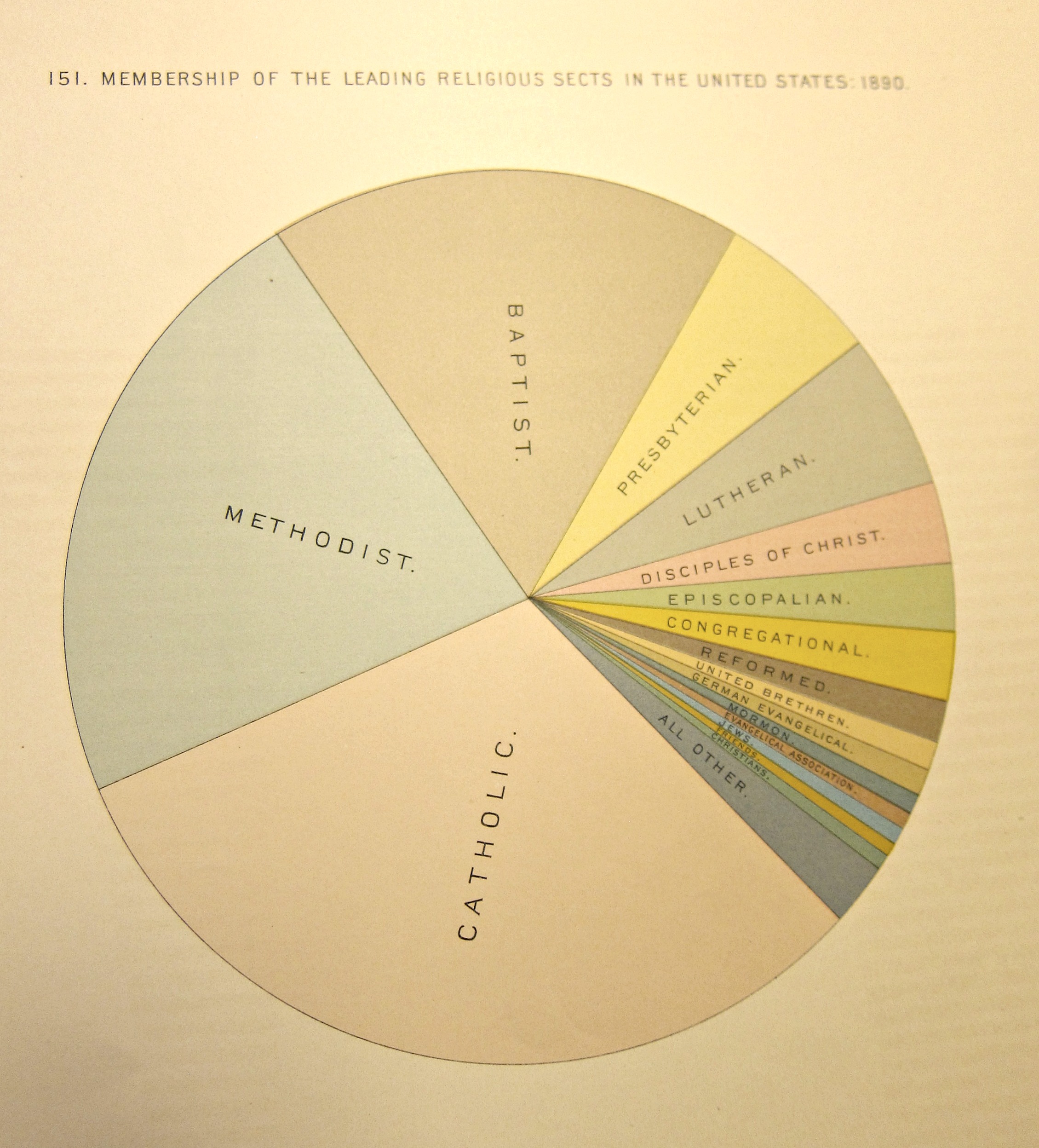
    Displayed below is one of the many dozens of graphs/charts/maps created with the data collected for the 1890 and tabulated by William Hollerith’s glorious machines. It was the first use of the machines for the U.S. census and they offered a far-reaching and increased ability to tabulate and organize the data.  The 1880 census had cost about $6 million and took 9 years to tabulate; the 1890 census using the Hollerith machines cost $10 million and took seven years.  The main focus of many in government was the cost differential—not the incredible amounts of new controllable information.  The rent of the Hollerith machines was only $750,000 for the conduct of the entire census, so the differential must’ve been in the extra utility costs (for electricity, for example, which was used for the first time to run the tabulators) and for the small army of statisticians and data entry people.  Be that as it may, the government was not amused, particularly when Hollerith figured that he had actually saved the government $5 million.    The two parties left each other grumbling, though the roar of the trickle down from the Hollerith success drowned it out.  The tabulating system was quickly exported, and large private concerns in the U.S. saw a savior in the system that would soon rescue them from the sea of paper in which they were beginning to drown.   The Hollerith company did very, very well for itself, and soon merged with three other companies (in 1911) to ease the burden of success.  The resulting company was called the Computing-Tabulating-Research Company (CTR), which after a short while became the International Business Machine Corporation (IBM).  

    The beautiful circle appears on page one and occupies the full 20-inch tall sheet.  This could have been more complex, but as it stands it is a very fine piece of the artfully-enhanced representation of data.  (As a pie chart the image isn’t very old, though the genre is a little uncommon in the 19th century.  Pie charts appear at least as early as  William Playfair’s Statistical Breviary in 1801 and then probably more famously in the work of Charles Minard and Florence Nightengale in the 1850’s–this work to me seems cleaner and brighter, and definitely “modern”.)

    DATAviz 1890 census leading religious sects


  • The Geologic Clock (1920)

    JF Ptak Science Books   Quick Post

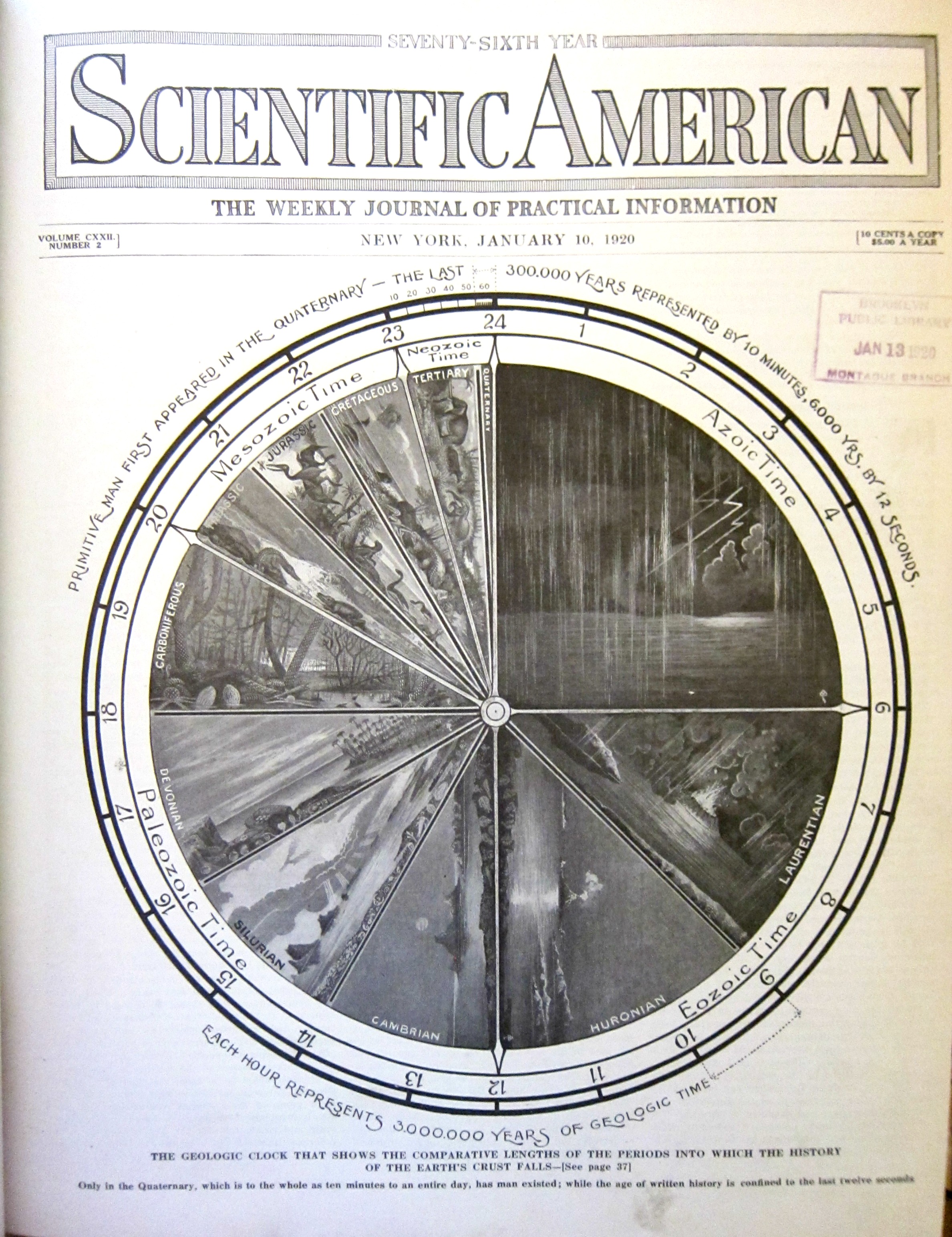
    Here’s another found bit whilst looking for an article in the 1920 Scientific American by Robert Goddard–no Goddard though I did find this fine “geologic clock” in the January 10 issue for that year.  As you can see if you look a little closely, the Quaternary is about the last 10 minutes of the 24-hour clock of existence on Earth, with the last 6000 years occupying the last 12 seconds.  In any event,it is an artistic and informative representation of data, created nearly 100 years ago.  (It would be interesting to know when the first graphical representation of geologic time as a clock face appeared–offhand, I do not have that answer.)

    Dataviz geological time


  • Measuring Things with Mt. Everest (and the Empire State Building), 1933

    JF Ptak Science Books  Post 2465

    I was just looking for a good link for the full text of Donald Knuth’s 1965 paper on “Very Magic Squares” when instead I found mention of his earliest publication, a playful paper that was published in MAD magazine in issue #33 for June 1957.  The work by the 19-year-old Knuth, “The potrzebie system of weights and measures”, suggested that, among other things, the “potrzebie” as a standard unit of measure–and that was equal to the width of the issue #33 or  2.263348517438173216473. There were more fanciful measures for Knuth, which suggests that these “standard” units are infinite, one measure of infinite being the length of the finite over its negative.  
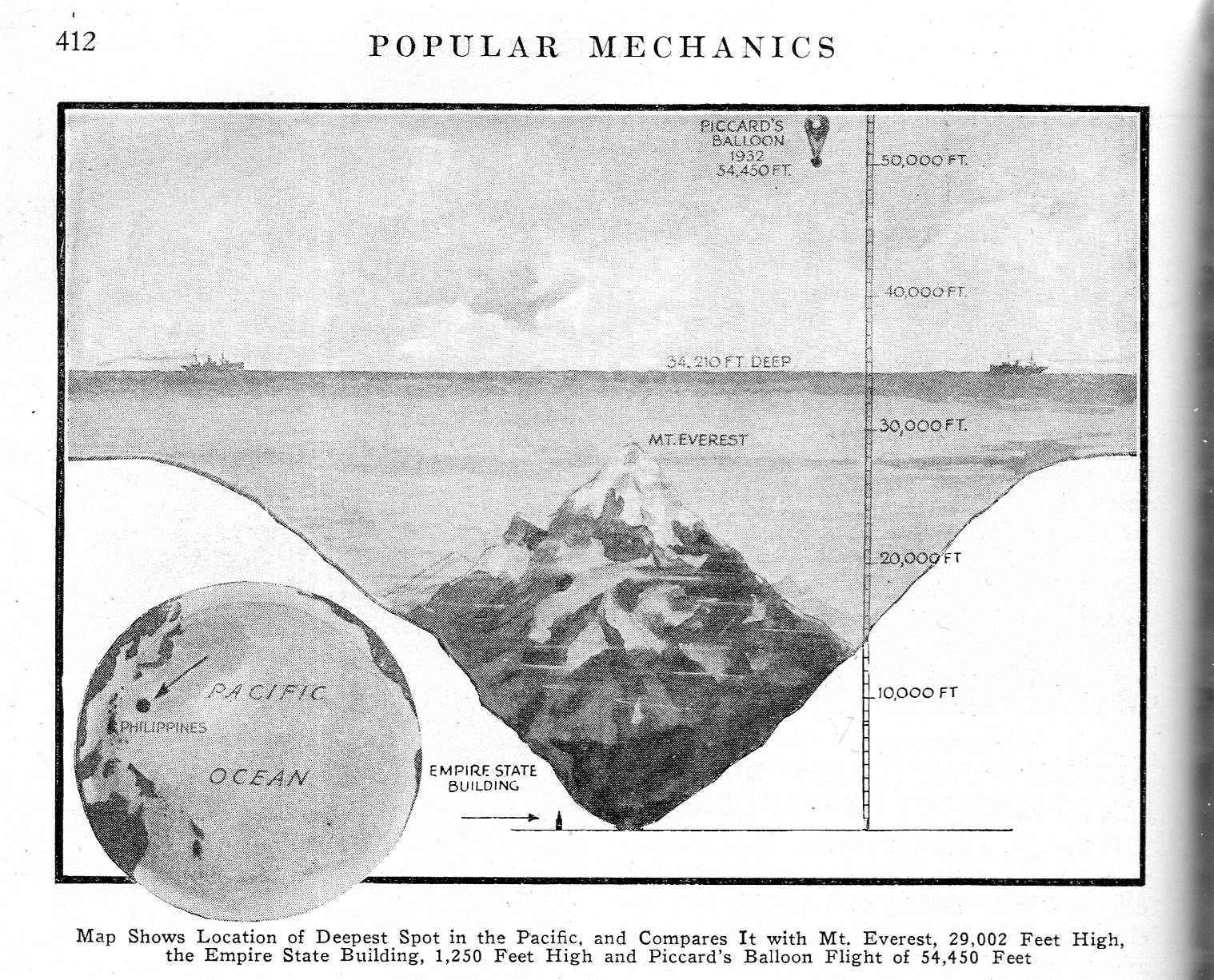
    Dataviz Measuring with Mt  Everest787

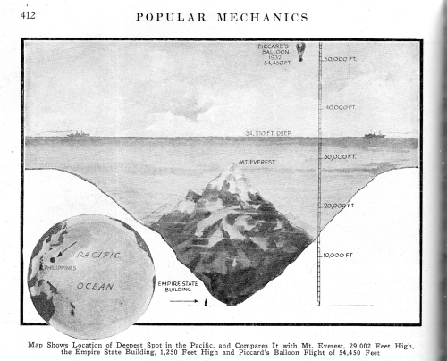
    This brings us to measuring things in terms of units of Mt. Everests found in this short notice in Popular Mechancis for September 1933. Truthfully this is a simple dataviz tool, comparing the depth of one unknown and not visualized entity–in this case, the “deepest spot in the Pacific”–with another that is known and highly visible (after a fashion), and so we get to appreicate the great depth  by comparing it to Mt. Everest.  There are no stackings of Everests in this image though I can see a future use for the visual–I have after all posted many unusual pieces to this blog where heights/depths are measured in terms of stacks of Eiffel Towers, or mammoth bread, or gigantic piles of wood, or nails, and uprighted ships, and of course numerous Great Pyramids filled with excavated dirt from the digging of the Panama Canal and stretched over the island of Manhattan.  Those are more involved, while the present unit of measure is just suggesting itself for future use.

    On the other hand it might be more beneficial to use stacks of the Empire State Building to convey the sense of deep depth.  In 1933 it was just two years old and a world-wide sensation as an icon art deco building and the tallest building in the world, so if you said that the deepest depth could absorb 32 Empire State Buildings one on top of the other, there may have been a greater understanding of the consequences of that much depth.  In any event, I like that more as a unit of measure.  

    Notes:

    Knuth. Selected Papers on Fun and Games, http://www-cs-faculty.stanford.edu/~uno/fg.html  (From the website: “I’ve never been able to see any boundary between scientific research and game-playing. … The topics treated here were often inspired by patterns that are visually compelling, or by paradoxical truths that are logically compelling, or by combinations of numbers and/or symbols that fit together just right. These were papers that I couldn’t not write.)

    Knith’s c.v. http://www-cs-faculty.stanford.edu/~uno/vita.html

  • What Does Manhattan Look Like With 63 Great Pyramids Filled With Panama Canal Dirt? (1912)

    JF Ptak Science Books   Post 2641

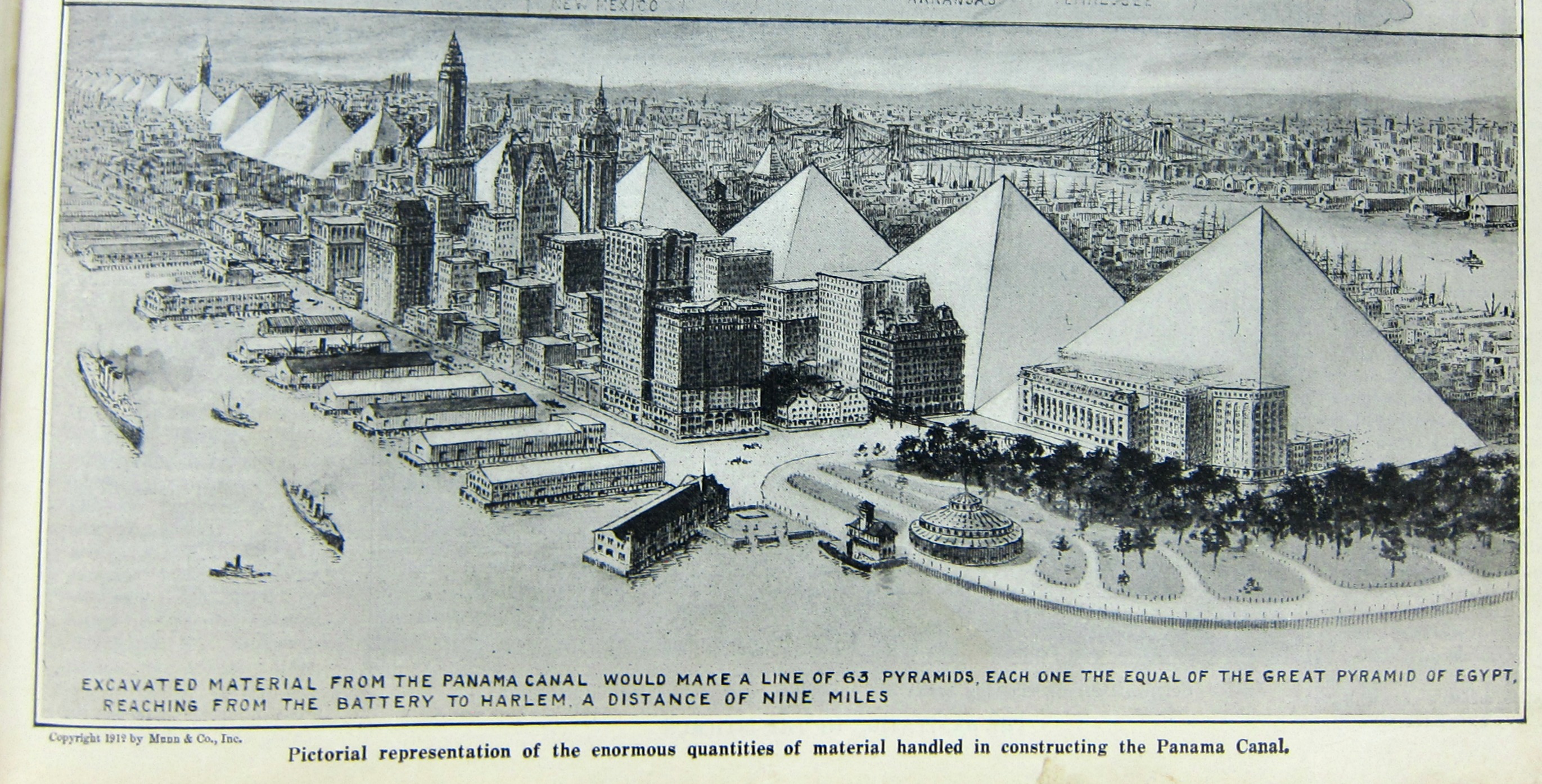
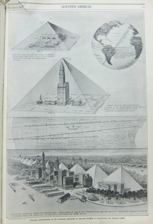
    There are many posts on this blog about comparisons–the height of buildings in terms of units of the Titanic, the depths of oceans in terms of Eiffel Towers, and many others, all findable in the Display of Information series (located in the column of categories at right).  Today’s episode is an unusual double-display, as it depicts the amount of earth moved in constructing the Panama Canal in terms of how many Great Pyramids of Eygpt the earth would fill and how those pyramids would look if displayed in Manhattan.  This wonderful insight comes to us via the Scientific American for September 12, 1912, and shows the beginning of the line of 63 pyramids’ worth of excavated Panama Canal soil reaching from The Battery to Harlem. Bravo! (Just so you know that amount of dirt would also fill up about 1.1. billion donald trumps. And: if workers removed the Panama Canal dirt the way that the prisoners removed dirt from their escape tunnel in The Great Escape that it would take approximately 5 billion trips from the site to somewhere else to dump the dirt; even if you have 100,000 people working at the project a la John Sturges’ actors, it would still take 60,000 trips each.)

    NYC pyramids Sci American detail

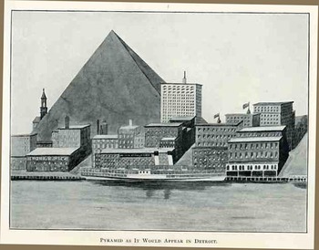
     I should point out that this is not the first time that a Great-Pyramid-in-a-U.S.-city image has appeared in this blog, this one being an illustration for building the structure in Detroit in 1908

    Pyramid in Detroit

    And the rest of the delightful put-it-into-perspective-with-an-uncommon-object:

    NYC pyramids Sci American


  • The Symmetry of Oil (1927)

    JF Ptak Science Books   Quick Post   Quantitative Display of Information series

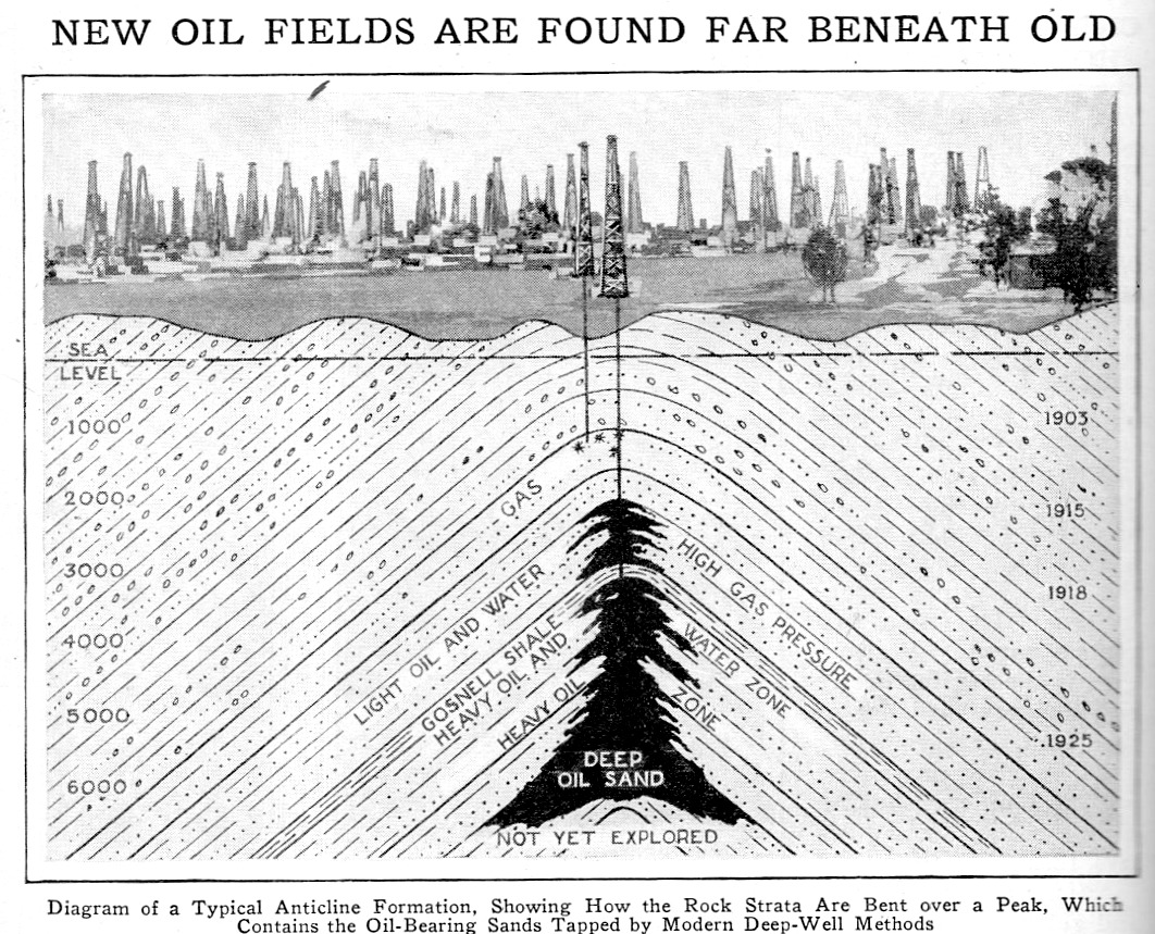
    Continuing a read of the January-June 1927 volume of Popular Mechanics I found this lovely little data visualization–it has a certain irresistible quality to it, perhaps owing to its symmetry. In any event, I just wanted to post it here, before I closed the book and lost the image to memory:

    Oil fiekd cross section657


  • Timelines in the History of Science from Thomas Young, 1807

    JF Ptak Science Books  Quick Post

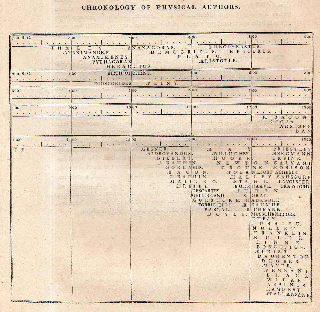
    I’ve always liked these timelines as they graphically display the lifespans of scientists/mathematicians/etc against one another, making it a little easier to see a selected period and who was active within it.  

    The work is by Thomas Young (1773-1829), a polymath remembered mostly for his work in optics and his very early translations of Egyptian hieroglyphics, and is found in his classic book A course of lectures on natural philosophy and the mechanical arts, published 1807.

    Full text: https://archive.org/details/lecturescourseof02younrich

    Young chronology physics644


  • Infographic on the Invasions of Great Britain and Ireland (1914)

    JF Ptak Science Books  Quick Post

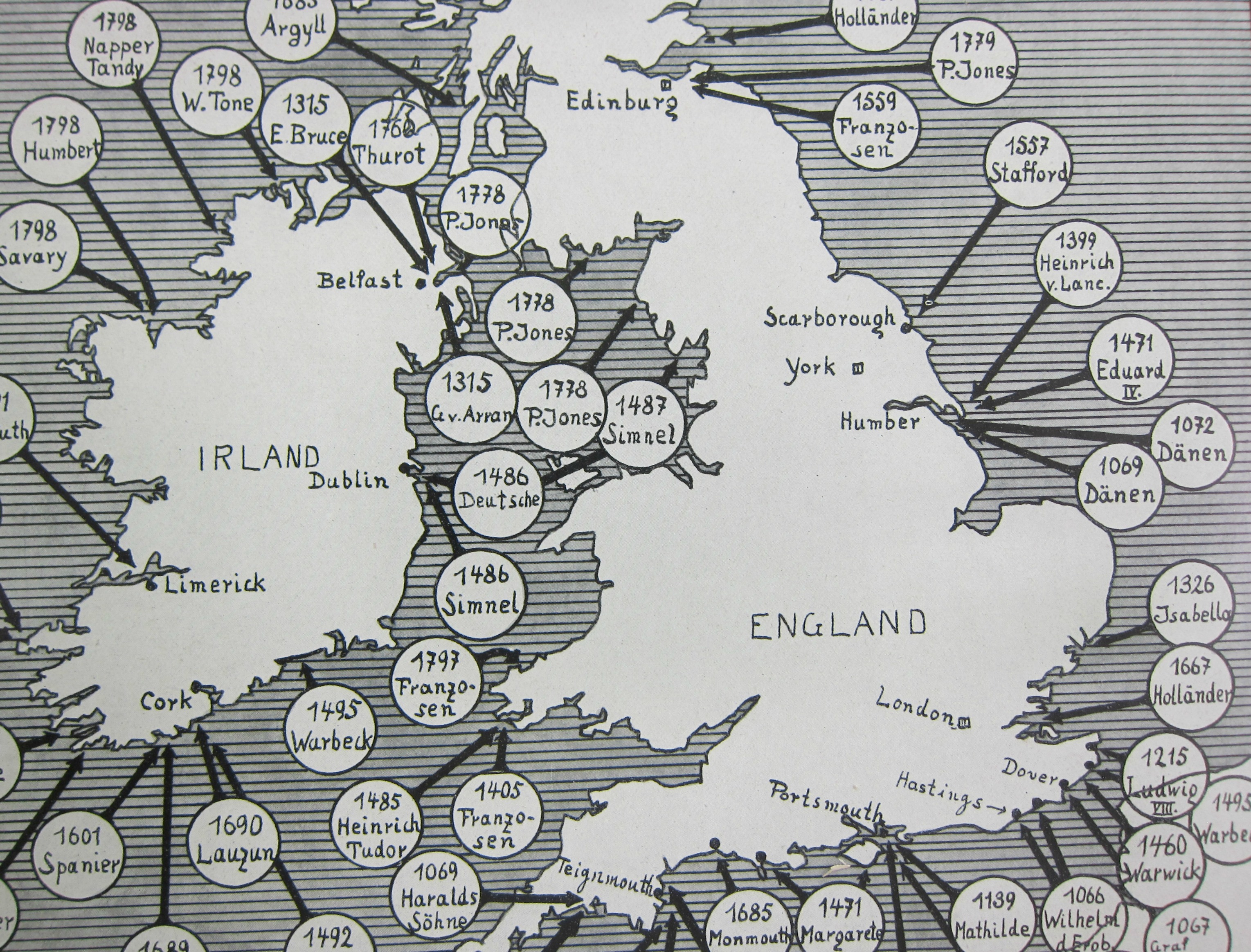
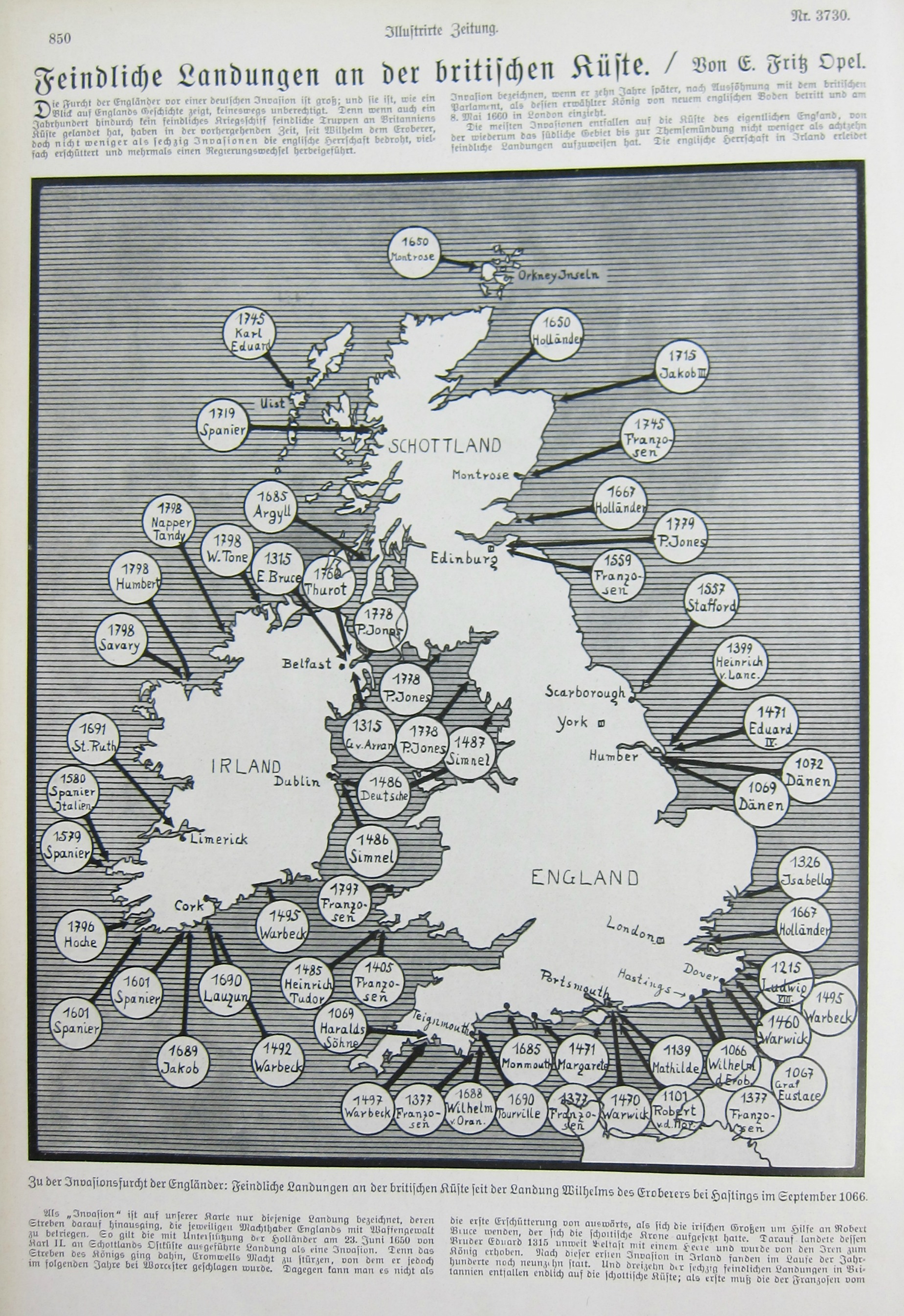
    This piece of cartographic propaganda appeared in the fifth month of the war in the Illustrirte Zeitung (Leipzig) on Christmas Eve, 1914–it was in its way a vision of hope for the popular audience that this German equivalent of Life magazine reached. Perhaps it was a comfort to read that Great Britain and Ireland had been invaded before–many times–and that it might happen yet again; perhaps it was a comfort at a time when  the realization dawning on tens of millions of people that This War would be over by Christmas, but it had really just only begun.  Not much comfort though can be had in a piece of paper. 

    A detail:

    Map Invasions England detail

     And the full image:

    Map Invasions England


  • A City on a Mis-named Martian Moon, 1927.

    JF Ptak Science Books  Quick Post

    Ganymeade detail

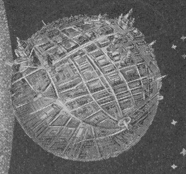
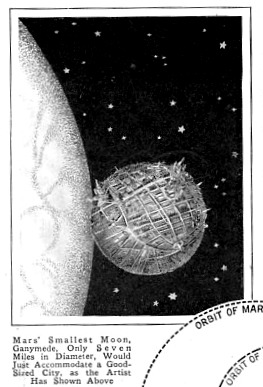
    This fine image from Popular Mechanics (January 1927) imagines the Martian moon “Ganymeade”, mentioning that it is only 7 miles around, and could hardly host a large city, which the artist imagined in this free-for-all concept piece.  I like the idea of putting the size of the moon in perspective like this–I must say that I’ve never seen one quite like this. But first, the magazine identifies the Martian moon as “Ganymede”, which is actually a Jovian moon. The moons of Mars are Phobos and Deimos (the names meaning panic/terror and terror/dread), and they are 13.8 miles and 7.8 miles, respectively. They were discovered in 1877 by Asaph Hall at the National Observatory, and there wasn’t a “Ganymede” between them–weirdly and wonderfully, though, their existence was imagined by non other than Jonathan Swift, who had his Laputan astronomers discover two moons in Gulliver’s Travels in 1726. But no  Ganymede.   As it turns out, Ganymede is the largest moon in the solar system, and is nearly the size of Mars, so maybe that is where the confusion started.  

    Anyway, this is a great image: 

    Mars city516