JF Ptak Science Books Post 2694
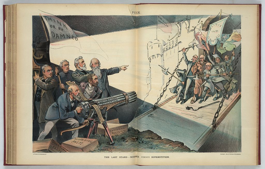
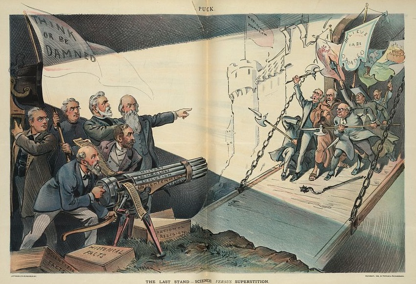
This work—“The Last Stand, Science versus Superstition”, a chromolithograph by Udo J. Keppler (close!)–appears in Puck in the issue of July 19, 1899. It is a very strong statement and also one that I’ve never seen it before (my thanks to Thony Christie of Renaissance Mathematicus and Whewell’s Ghost for surfacing it), and appears to me on the day of the global marches in support of scientific thought against tyrannies of illogical and sodden belief.
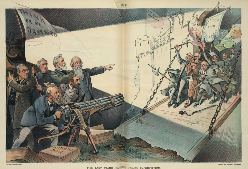
[Image: Library of Congress, http://www.loc.gov/pictures/item/2012647443/]
I guess the greatest aspect of this print is the flag “Think or be Damned” that flutters in the background of The Fact Men as they prepare to defend themselves against the “Believe or be Damned” crowd, “Medieval Dogmatism”, just advancing. It is a voracious print, and leaves nothing to spare in the choice of science and facts and inquiry against not-so. Interestingly, the men fighting this battle aren’t scientists, but theologians.
The “Think” group is identified by the LC as (Richard Heber) Newton (1840-1914, an Episcopal theologian and forward thinker; (Lyman) Abbott (1835-1922, American Congregationalist theologian); (Charles A.) Briggs (1841-1913, Presbyterian scholar and theologian); (Minot J. ) Savage (1841-1918, Unitarian), and (Felix) Adler (1851-1933, professor of political and social ethics, rationalist). They are surrounded by cartridge boxes for their Gatling gun labeled “Scientific Facts”, “Historical Facts”, and “Rational religion”, theologians prepared for the fight of rationalism against obedient belief.
It wasn’t the “Last Stand”, as I think there is always a stand to be made, especially in times like these where preposterous and Bie Lie-sized ideas are formed at the extreme head of state. Who would have thought it possible that a stand must be made against “alternative facts”, climate change denial, manipulation of the scientific record, “FAKE ______”, and so on? Images like this from Puck from 118 years ago show that there is a history of “last stands” of coherent and inquisitive thought against feeble sloppiness of such sugary mindless dogmatisms, and that there will be a future to them, as well.
________
The image above appears in a fine post by Peter Harrison on the conflict between science and religion here: https://sciencereligionspectrum.org/blog-posts/science-and-religion-conflict-for-non-religious-britons-and-canadians/ I just wanted to add some information on the print itself.


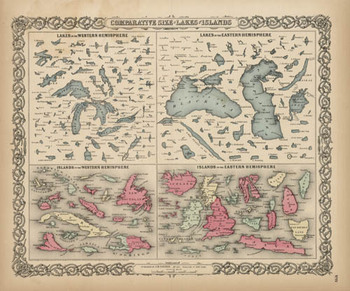 SO, 18561 may have been tone of the earliest times that these 150+ lakes and islands of the Western and Eastern Hemisphere were ever been printed on the same page and in the same scale exclusive of their associative land masses and placed contiguously, side-by-side. They were, of course, seen in a common perspective before on any world map, but I think that this is the first year in which the islands and lakes of the world were displayed without oceans and land masses, and the effect is a little odd. If you take away the color and the text the image takes on a very definite biological flavor (I keep thinking of that tiny bone in the ear for the small lakes…) In any event it is far easier to compare these features without the distractions of the non-lakes and non-islands clouding and confusing our perspective fields.