A Daily History of Holes, Dots, Lines, Science, History, Math, Physics, Art, the Unintentional Absurd, Architecture, Maps, Data Visualization, Blank and Missing Things, and so on. |1.6 million words, 7500 images, 4.9 million hits| Press & appearances in The Times, Le Figaro, Mensa, The Economist, The Guardian, Discovery News, Slate, Le Monde, Sci American Blogs, Le Pont, and many other places… 5000+ total posts since 2008.

Category: Information, Quantitative Display of

  • Understating an Understatement: One Week Over Germany, March/April, 1945

    JF Ptak Science Books   Post 2622 Leafletone week of bombing469

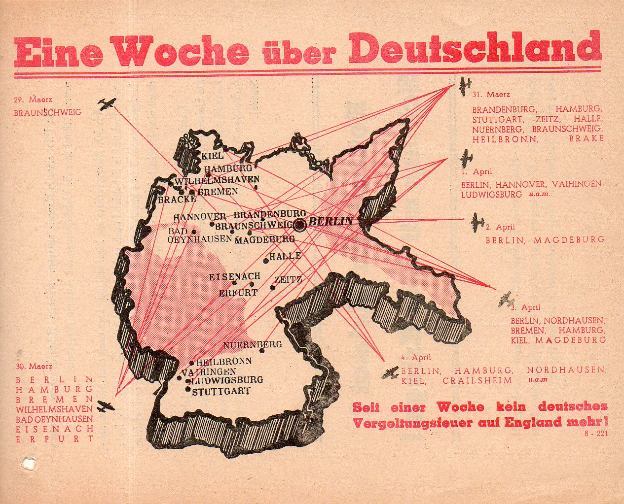
    Here’s a map the meaning of which was destined to be understood by even the most casual observer. It appeared on a propaganda leaflet distributed by the U.S. 8th Army and shows the Allied bombing campaign against Germany from 29 March to 4 April, 1945.  (Most of the action depicted here looks to be the U.S.A.A.F., though I haven’t gone through each and every bombing location.  I do know that in the last two weeks of the war that the Soviets used about as much bomb tonnage on Germany as was used by the Allies over the preceding two years.) The red lines show the destination of bombing raids, of which there are many for a seven day period, and for my reckoning this is not a complete listing.

    Perhaps this leaflet would have been even more provocative if it represented the number of planes on average that would participate in one of these missions, which would of course would be in general hundreds of aircraft. For example, for the raid on Hamburg on March 30 there were over 530 aircraft involved; and for the same location on the next day, another 469. Also there were another five raids on Hamburg over the week following this one depicted, including one on April 8/9 with 440 aircraft.  Also this week of raids takes place right after and before other series of massive raids, including a mission over Berlin on February 3 1945 involving 1000 B-17s and 575 Mustangs, followed 11 days later by the bombing of Dresden, which was followed three weeks later by incredible bombing of Tokyo. And later, on April 14, more than 2200 aircraft would take to the air.  As impressive and scary as this leaflet looks, it doesn’t really begin to approximate the amount of damage inflicted on Germany from the air. (One last example–the large raid on Crailsheim, where I happen to have been born, destroyed about 80% of the small city.)

    The title Eine Woch ueber Deutschland (“One Week Over Germany”) must have been disturbing for a soldier to read–particularly with the corollary at bottom, which stated that there was no German response so far as bombing England in retaliation was concerned.  By this point, the German soldier knew the situation was FUBAR, though I do not know if there is a good German translation for that.  


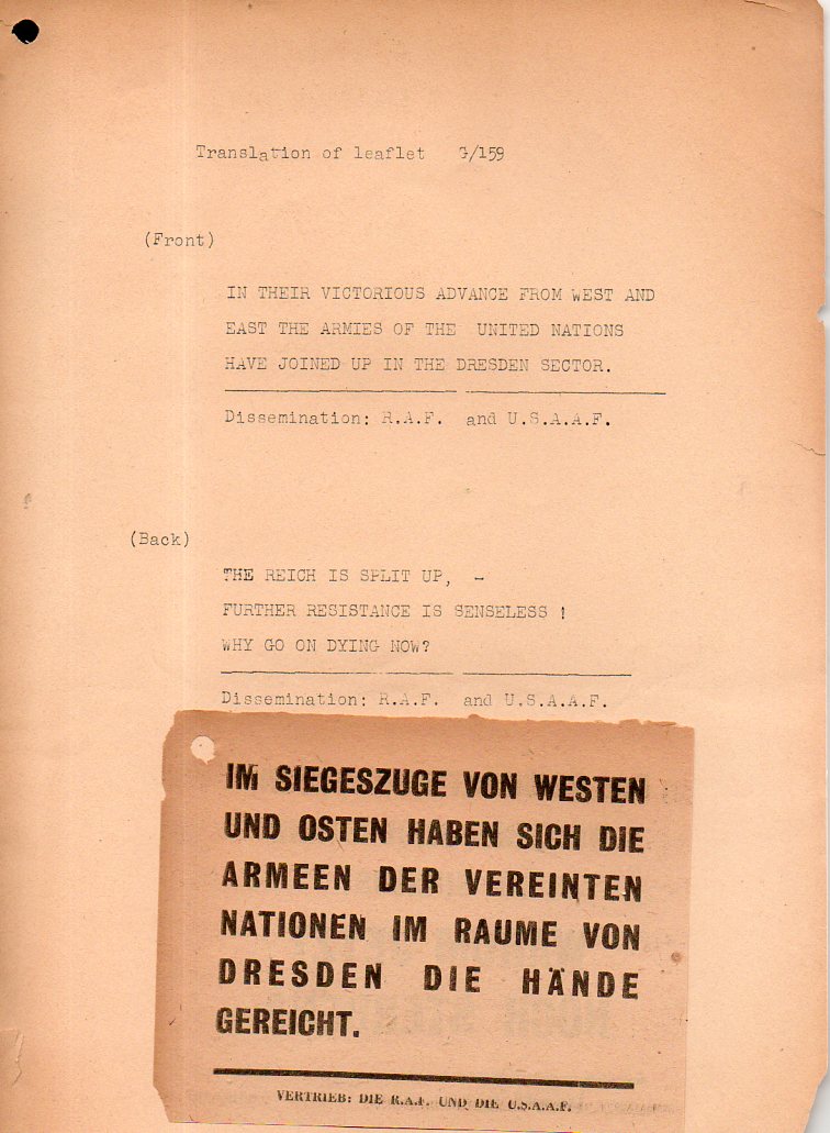
  • “The Reich is Split Up/Further Resistance is Senseless” 1945

    JF Ptak Science Books   Quick Post

    I’d hate to have been in some Wehrmacht hellhole foxhole in March 1945 and have this fall on me from the sky–I imagine there was little doubt that even the lowest ranking soldier knew that they were in the grip of some enormous vise.  

    Leaflet reich is split up467


  • Very Early Spotter’s Guide for Enemy Aircraft, London, February 1915

    JF Ptak Science Books  Quick Post

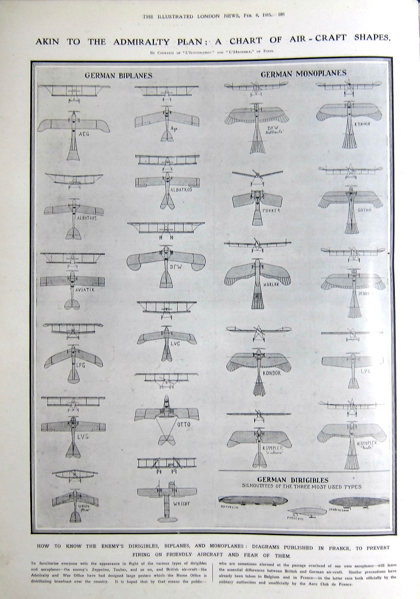
    It seems to me that this is the first time that a spotter’s guide to enemy aircraft appeared in The Illustrated London News for WWI–ditto the Illustrirte Zeitung.  I luckily own both journals covering the war years, and I’ve been through every page of coverage, and I do believe that this is probably a very early display of German aircraft identification for popular use.  Of course it couldn’t really get that much earlier, as the war was on for 150 days or so. And the “air forces” in general were very new–the German army received their first aircraft in 1910 for what would eventually become the  (for France it was 1911), so the concept of a unified fighting force of the air was still very new.  In another 1111 days or so, the aircraft losses for the Entente and the Central Powers would be about 110,000, or about 5,500 of these pages showing destroyed aircraft.  

    WWI Aviation German spotters guide


  • DIY Tank Model, 1917 (Full Text)

    JF Ptak Science Books   Quick Post

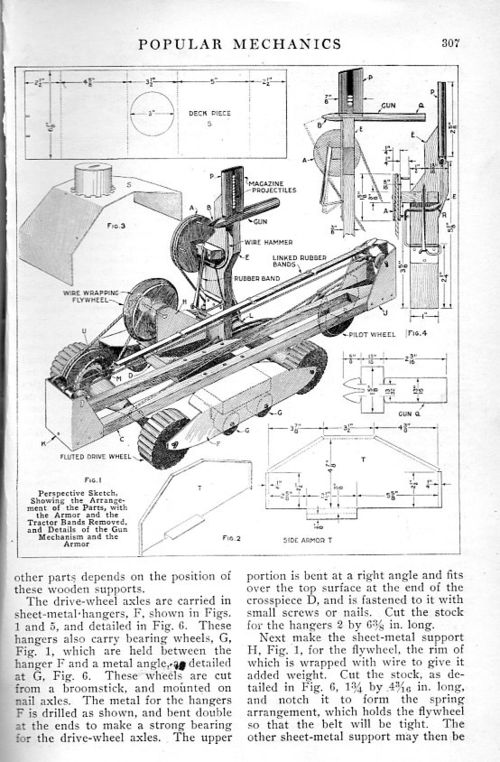
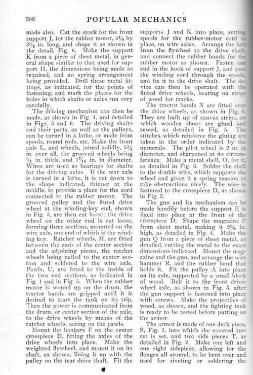
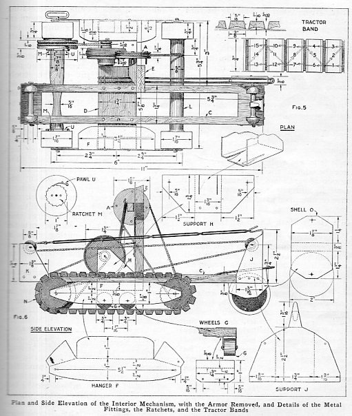
     In the last day or so I’ve been checking through some of my popular journals looking for references of the first usage of a tank in combat in WWI (which occurred in April, 1917). Popular Mechanics had a quick reference in their monthly issue for Map 1917, though now that I am into September 1917 for Scientific American I haven’t found anything on the tank in its pages. (Still to come is the Illustrated London News which I do recall having a large piece on the tank in April, 1917; and also the Illustrirte Zeitung, which I also recall having something on the tank in their place quite quickly following the tank’s appearance, which was an introduction to a new form of warfare that caught Germany very much by surprise.  

    Tank model 1917444

    [Popular Mechanics, August, 1917, pg 307]

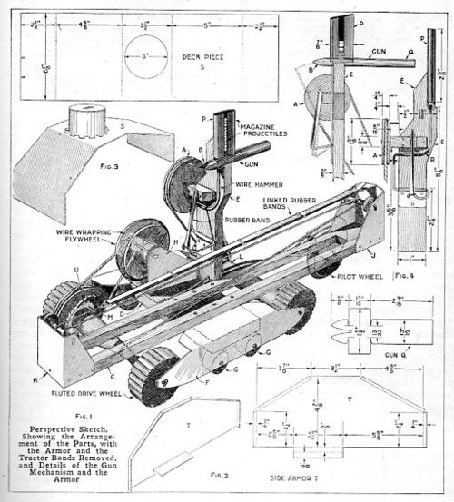
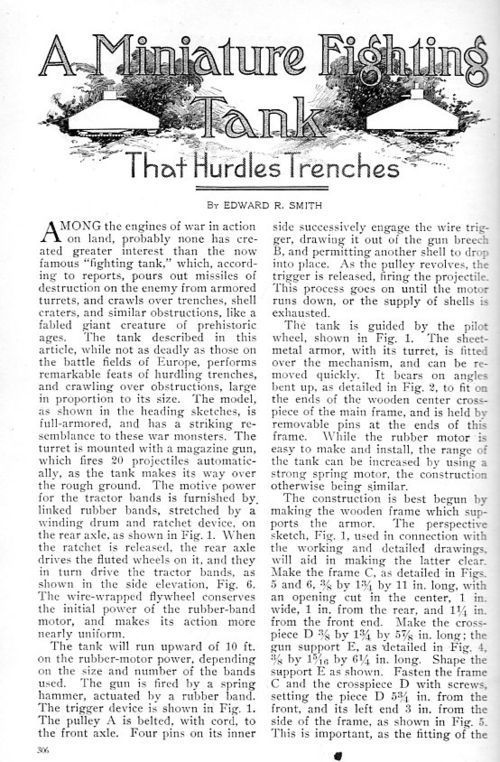
    It will no doubt be of interest to many that in August 1917, just four months after the first use of the tank that Popular Mechanics had a fairly detailed article for children of all ages on constructing a toy tank. Almost as quickly as a monthly magazine can report on an event, Popular Mechanics did so and then very quickly thereafter had a DIY project in its pages of the new innovation. I reprint the four-page article in full:

    “A Miniature Fighting Tank that Hurdles Trenches”

    Tank model 1917447


    Tank model 1917448

    Tank model 1917446

    Tank model 1917445


  • Visualizing Data: the Texas Newspaper Frontier in 1880

    JF Ptak Science Books 

    Dataviz texas newspaper  detail


    Dataviz texas newspaper  tail

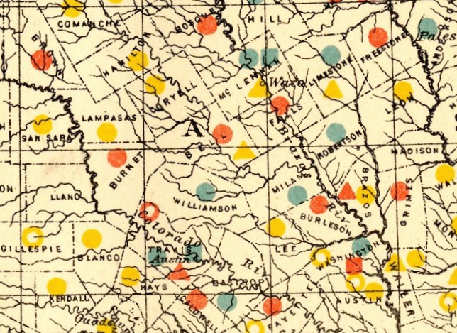
    [This expandable image is from the blog’s copy of the publication–full text can be found at the Internet Archive, here: https://archive.org/details/cu31924083814453]

    The idea of the frontier in American history has been around for quite some time, made famous and mostly-invented (and closed) by Frederick Jackson Turner in 1893, and expanded, imagined, enticed, magnified, micro-analyzed, and  generally messed with ever since.  There have been all sorts of frontiers introduced into the study of the birth, expansion and filling-up of this country, from the very earliest colonial periods of Indian frontiers, “far-western” river frontiers of the Connecticut, Delaware, Hudson (!) and Susquehanna, to the Appalachian frontier of the early western reaches of the colonies, to the transportation frontier, the slavery frontier, the gold and mining frontier, the gun frontier, and so on.  

    Here’s another bit to add:  the newspaper frontier.  

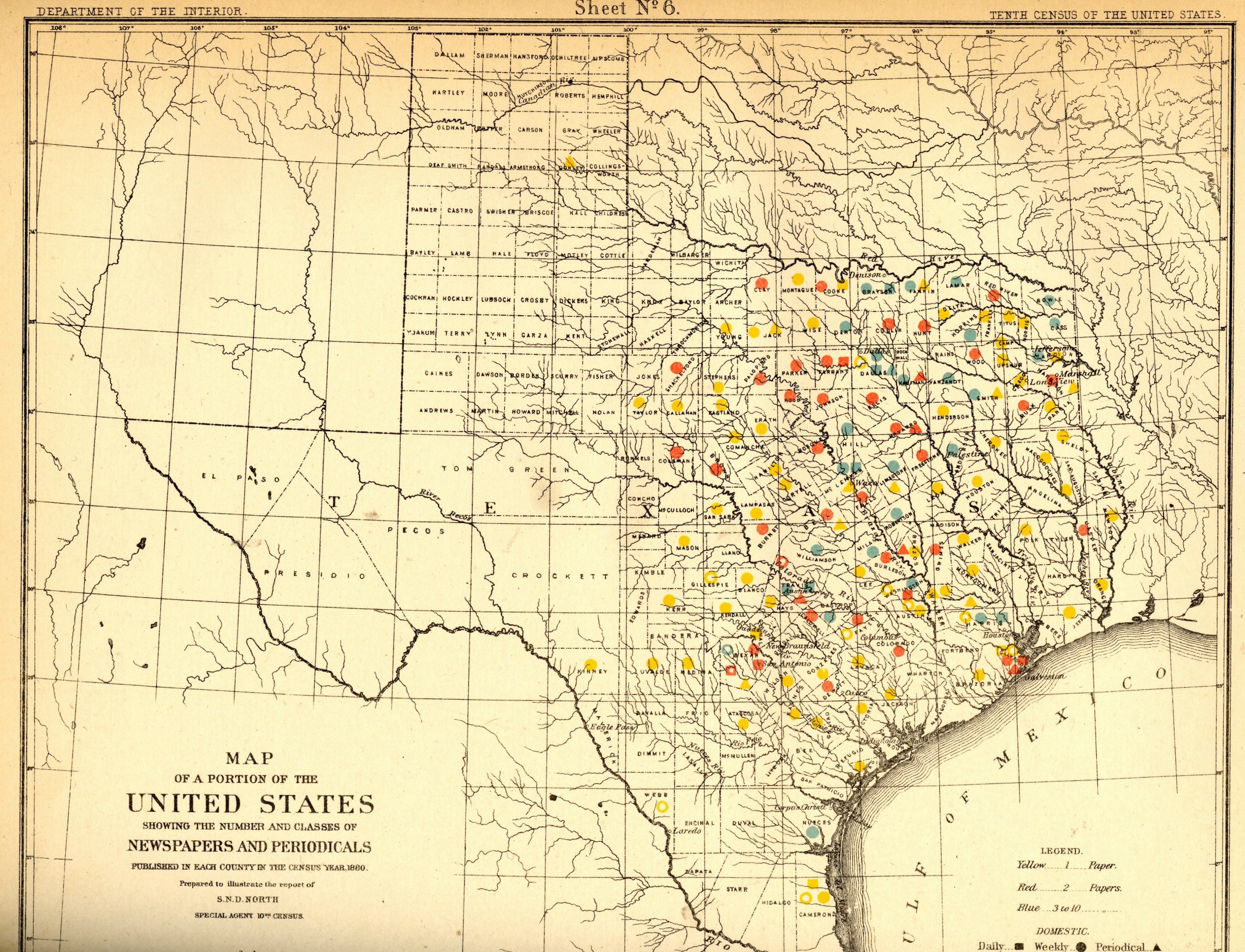
    I just happened upon a volume of the US Census of 1880, with a special report by S.N.D. North entitled History and Present Condition of the Newspaper and Periodical Press of the United States…and published in 1882.  What provoked me was the map of Texas newspapers for 1880.  It very clearly, and like no other map of its kind, delineates a fantastic line/frontier between the Texas with newspapers and the Texas without newspapers. We see very clearly that the frontier of the newspaper stops fairly abruptly (and wonderfully) at the 100th meridian, with only two newspapers in all of the rest of Texas found beyond that point (and those just barely beyond the 100th.  And it’s the 100th meridian that mostly marks the vertical middle of the country, running through North and South Dakota, Kansas, Nebraska, the Texas/Oklahoma borders, and so into Texas—if you folded this map vertically in half it folds virtually on the 100th meridian.  An odd bit, it is, half of the country and then approaching half of Texas. 

    I should report that the newspapers west of the 100th meridian were in Kinney County (population 4,440) with the Fort Clark News (established in 1880, at exactly the year of census) and Donley County (population 160, with the monthlyClarendon News and a 50-cent annual subscription rate).  The newspaper development also sort of followed the frontier fort development, almos tall of which (but four) were east of the 100th. 

    Of course the population and easier-natural-resources are located east of this point, I know, but it is still quite a jolt to see the line of newspapers get drawn in the sand so vividly.  There isn’t anything else quite like this so far as the newspapers go, except, a little, for Florida, where the line gets drawn north and south, splitting the peninsula roughly in half, the southern part holding only five counties at this point..  But it is a much more robust image for Texas given the number of newspapers that were being published—280 periodicals and newspapers for Texas versus 45 for Florida, with 11,374 in the entire country*—so that the difference between the have-newspapers and haven’t-newspapers in Texas is that much more vivid. 

    Texas needed more papers:  there were 1.5 million people living in the massive state in 1880, almost twice as many as there were in 1870, and almost half of what there would be there in 1900. That was another story, entirely—even in 1880, which is only 130 years ago, there were only 270,000 people living in the entire state, not even close to half of the county population of Pinelas today.I’m just enjoying the surprise of the straight-edge frontier in Texas. 

    The deal too was that Texas wasn’t at the top of the lisst for average area for each publication per square mile, with each periodical providing coverage for 936 miles. But that again is for Texas east of the 100th meridian–throw in the rest of the state, and that number skyrockets. (There were 13 states with a higher mileage distribution than Texas, topped by Indian Territory,m with basically nothing, with each paper servicing an area of 21,000 square miles.  

    Also, Texas’ 225 counties had 119 counties publishing newspapers and/or peridoicals, compared to the national figures, which were 2,605 counties and 2,073 publishing papers.  

     *Just for the sake of comparison, the number of newspapers and periodicals per state for 1880 was as follows: Illinois, 1017; New York, 1411; Pennsylvania, 973; Ohio,  774; New Jersey 215.  Also, oddly, the average circulation of the Florida and Texaspapers was roughly the same: 1,282 for Texas and 1306 for Florida (with an average for the country at 4137). 

  • Data Visualization of U.S. Territorial Populations

    JF Ptak Science Books  Quick Post

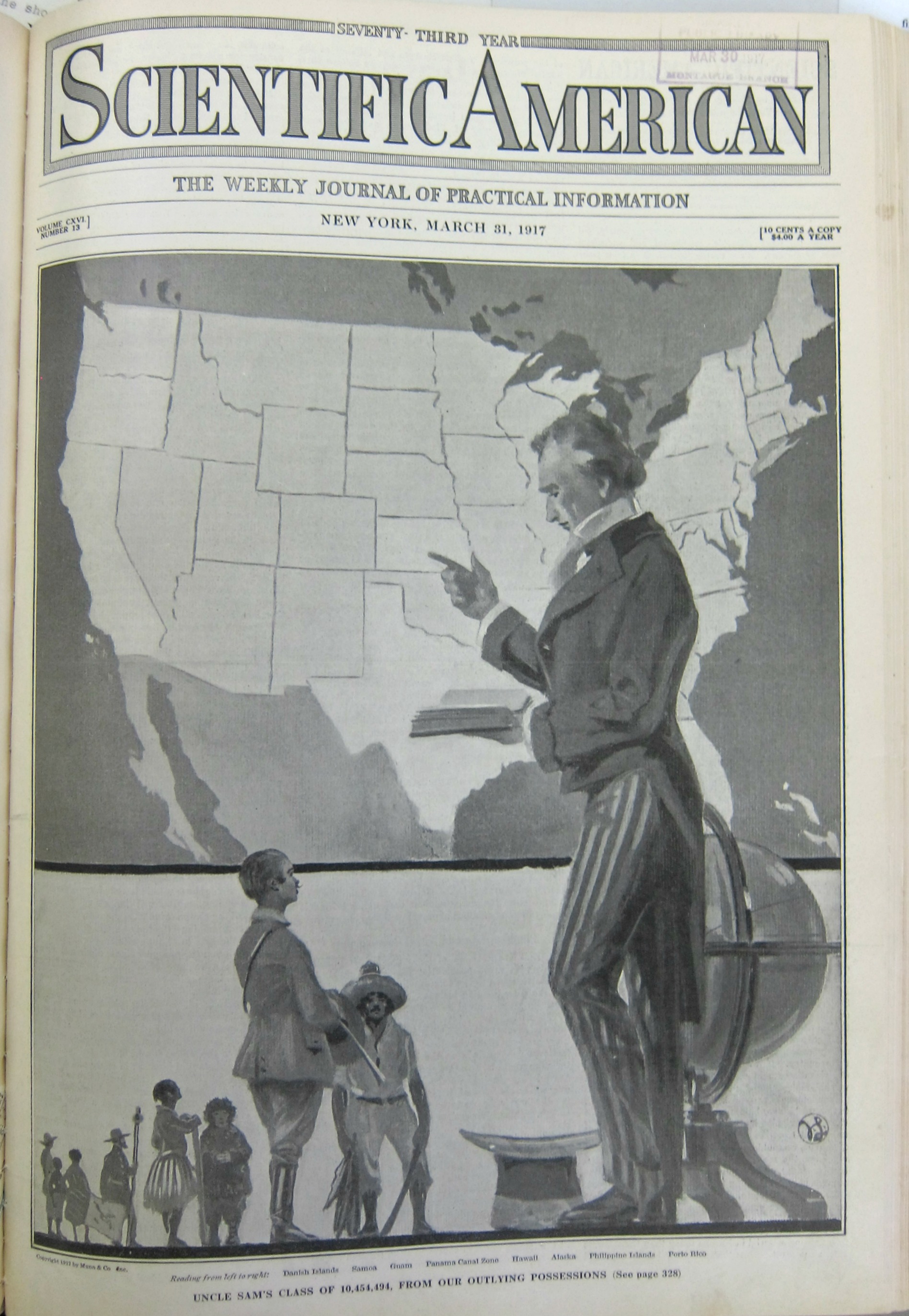
    The following is a relatively prefunctory visualization of data, found in the Scientific American for March 31, 1917. It displays the populations of eight U.S. territories in relation to that of the United States, standing here as a professorial Uncle Sam to somewhat wincing representatives from the territories (including Puerto Rico, the Philippines, Alaska, Hawaii, Panama, Guam, Samoa, and the Danish Islands). 

    Dataviz U.S. pop territories

    [Source: Scientific American for March 31, 1917]


  • An Ad Using a Visual Display of the Effect of Work on Longevity (1916)

    JF Ptak Science Books  Quick Post

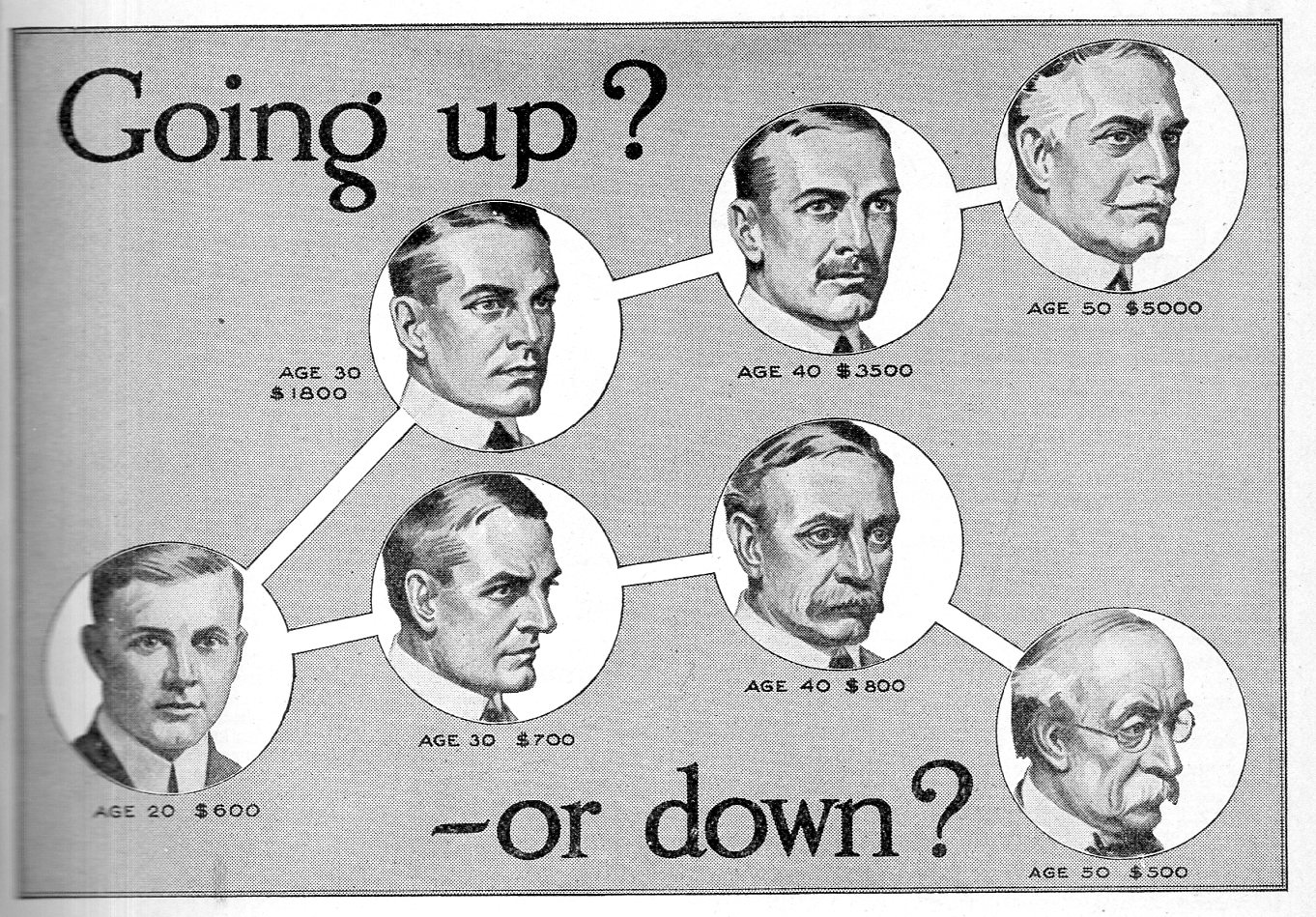
    Earlier in this blog I made a quick post for an interesting graphic for the American School of Correspondence–here we have another design intimating a medico-sociological structure based upon income. It probably isn’t that far from the truth, though I  seldom see it displayed in such a fashion.  No doubt the difference in facial appearances and their associated income has to do with the level of work and the draining effect of long-term physical work.  This image was published in Illustrated World in February, 1916–at this point, life expectation for males was about 50 and females about 54

    Going up or down441


  • Interesting Graphical Details in a 1936 Radio Marketing Pamphlet

    JF Ptak Science Books  Quick Post

    Radio graphics NBC detail 436

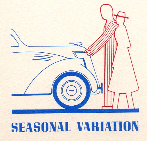
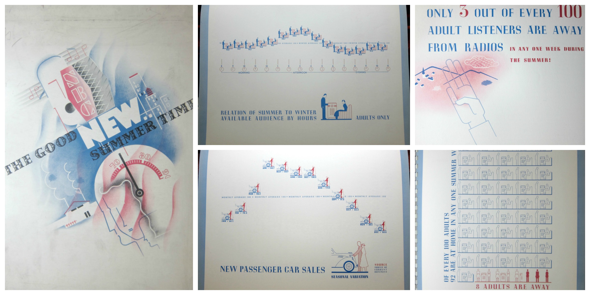
    No doubt there exist many opportunities to mine the radio broadcasting past with the statistics in this publication, though for my purposes now, I’m just reproducing a few of its very engaging graphic displays of information.  The document, The Good New Summer Time, a Probe of the Summertime Listening Audience of Today, published by the National Broadcasting Company, and printed in 1936, contains useful information regarding programming and advertising for the relatively new medium of radio.  The standards for the graphics are both light and a little complex–for example, in the display immediately below/center in the montage, we see a comparison between summer and winter adult audiences, the data points plotted in units of a standing man and seated woman listening to the radio.  

    Radio graphics NBC detail  auto437

    There really wasn’t that much data to be displayed, though the designers managed to fill the page in a pleasing way. It seems, overall, that this was an uncommon effort to display a small amount of highly useful limited-distribution data in an engaging manner.  

    Dataviz radio montage


  • Data Visualization and Enormity (1917)

    JF Ptak Science Books Quick Post

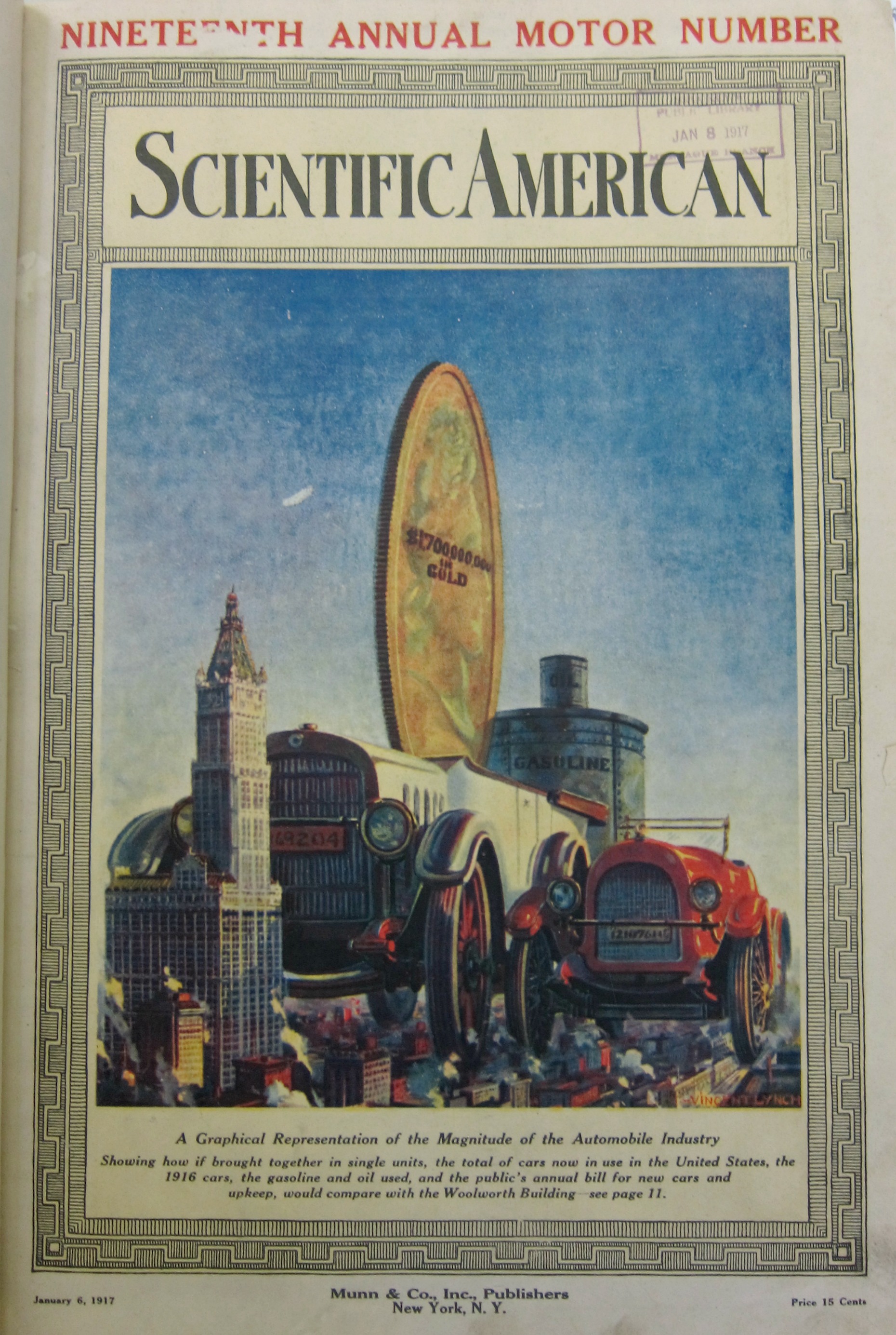
    Continuing what has become a series of posts from 1917 (all this prompted by looking for early mentions of the first use of a tank in battle during WWI) we come to The Enormity section. There are others to come, but there is something extra here in measuring production in terms of tall buildings–in this case, the Woolworth Building. In 1917 this was the world’s tallest building, and was so from 1911-1930, with 53 floors and 792′ high, its neo-Gothic greatness replaced by the Bank of Manhattan (928′) and then by the Chrysler Building, followed by the Empire State Building, and then the World Trade Center, and so on, which I mention just to put the Woolworth into perspective as a famous building capable of being used as a standard of measure.  What our graphic from the Scientific American (January 6, 1917) as to show is the enormity of the newish American automobile industry. The large car is supposed to represent the amalgamation of all cars built in the U.S.–the striking thing about the graphic for me is the second car, which is the production for only the year 1916.  In the background we see an enormous gold coin for the annual expenses of the car industry, and further back still the enormous cans of gas and oil used annually (which I guess were configured in terms of volume of the Woolworth Building). All-in-all, the visualization got its point across pretty effectively.  

    Dataviz automobiles 1917


  • Forty Trips to the Moon and Back (in Wire), 1917

    JF Ptak Science Books   Quick Post

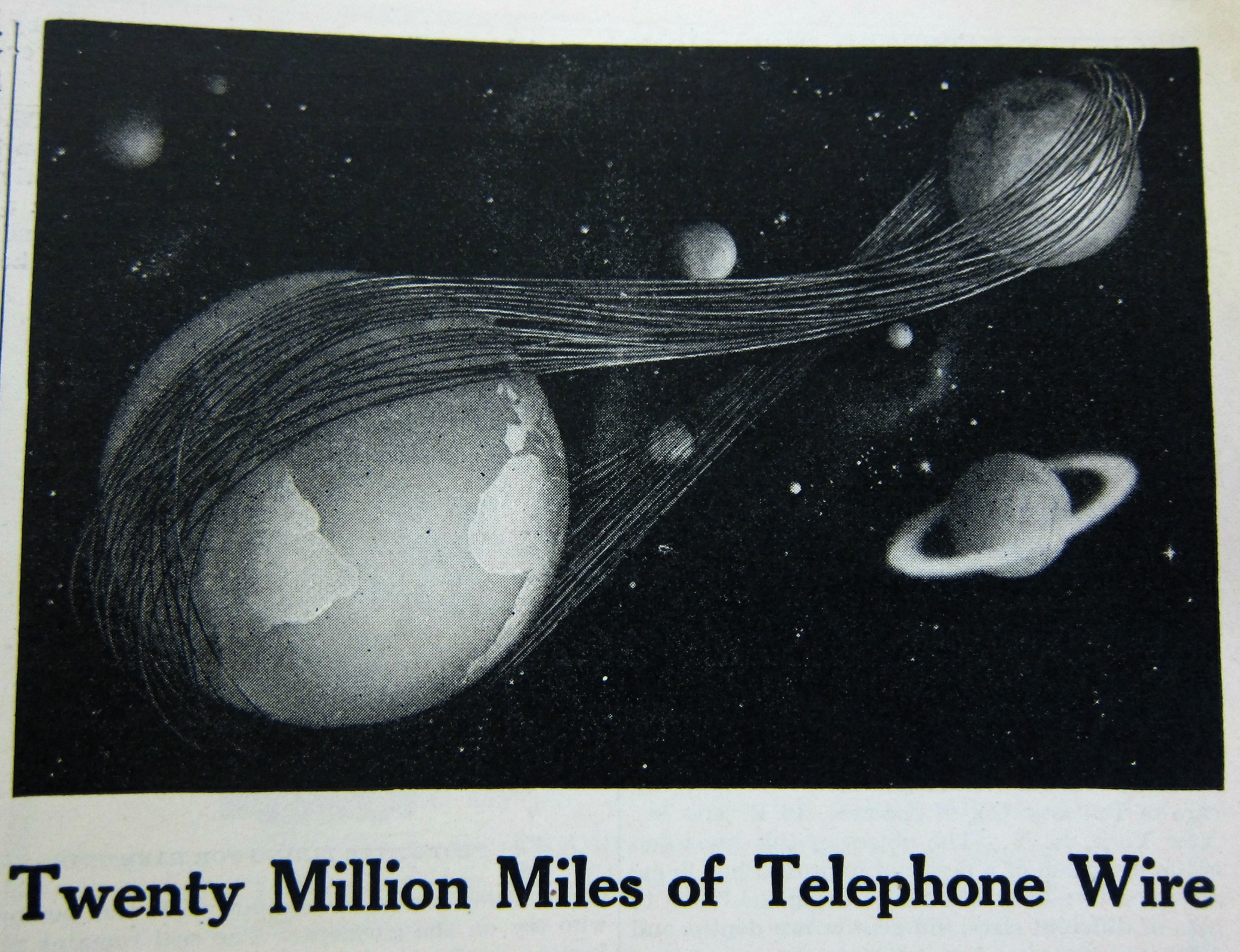
    While looking through a volume of Scientific American (January-July 1917) for a technical reference on the newly battlefield-introduced tank ( I could find none) I stumbled upon this intriguing info-graphic for American Telephone and Telegraph.  This of course is from at least seven decades before the concept of “wire” started to lose its shine in communications, and decades after the second “T”–for “telegraph”– in “A.T.&T.” lost most if not all of its meaning.  This interesting half-page ad displays the total amount of telephone and telegraph wire and cable in the A.T.&T. system–enough to reach from the Earth to the Moon and back again, 40 times (which is about correct calculating from the perigee). 

    Dataviz  telephone cables


    [Source: Scientific American, June 23 weekly issue.]