JF Ptak Science Books Quick Post
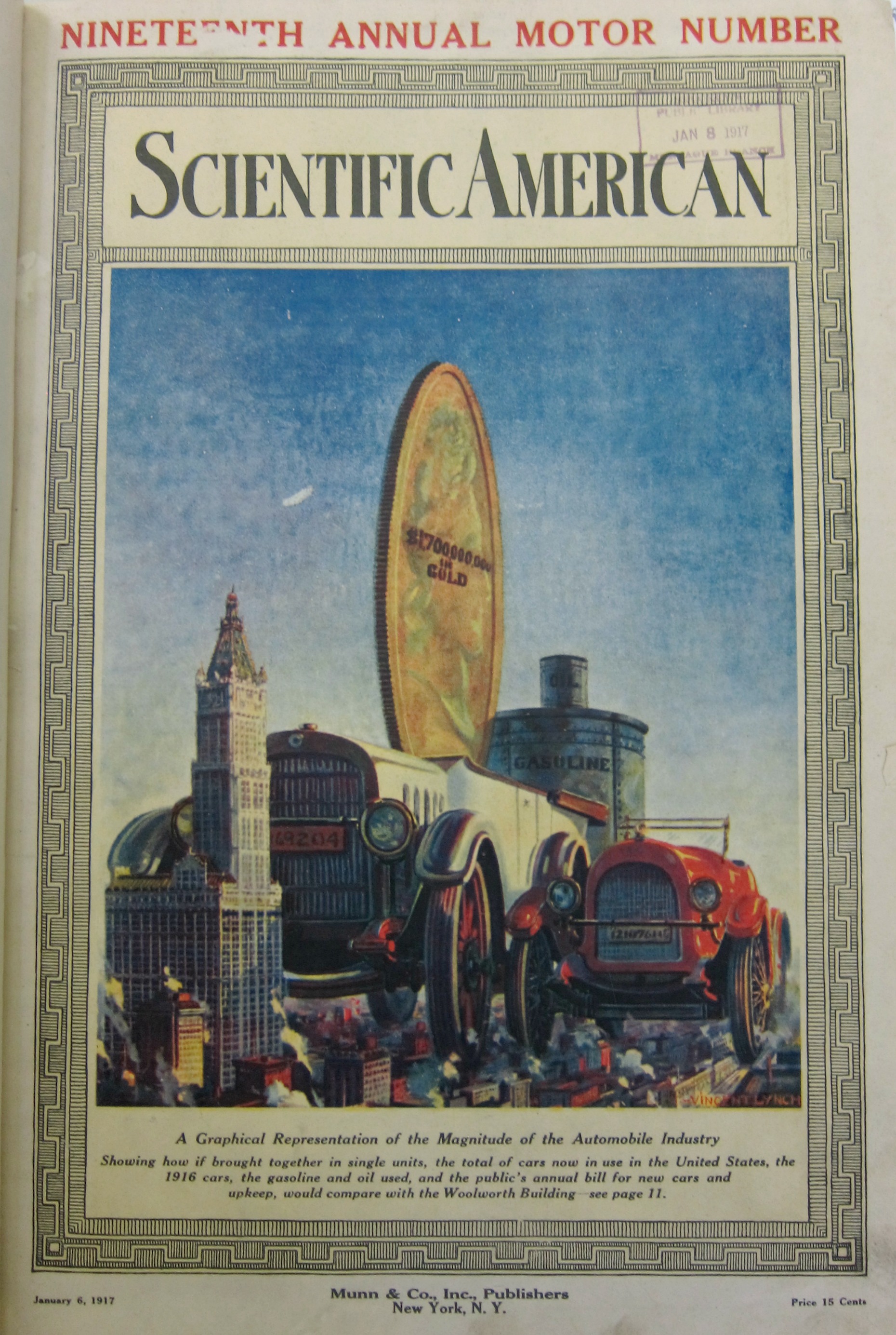
Continuing what has become a series of posts from 1917 (all this prompted by looking for early mentions of the first use of a tank in battle during WWI) we come to The Enormity section. There are others to come, but there is something extra here in measuring production in terms of tall buildings–in this case, the Woolworth Building. In 1917 this was the world’s tallest building, and was so from 1911-1930, with 53 floors and 792′ high, its neo-Gothic greatness replaced by the Bank of Manhattan (928′) and then by the Chrysler Building, followed by the Empire State Building, and then the World Trade Center, and so on, which I mention just to put the Woolworth into perspective as a famous building capable of being used as a standard of measure. What our graphic from the Scientific American (January 6, 1917) as to show is the enormity of the newish American automobile industry. The large car is supposed to represent the amalgamation of all cars built in the U.S.–the striking thing about the graphic for me is the second car, which is the production for only the year 1916. In the background we see an enormous gold coin for the annual expenses of the car industry, and further back still the enormous cans of gas and oil used annually (which I guess were configured in terms of volume of the Woolworth Building). All-in-all, the visualization got its point across pretty effectively.