A Daily History of Holes, Dots, Lines, Science, History, Math, Physics, Art, the Unintentional Absurd, Architecture, Maps, Data Visualization, Blank and Missing Things, and so on. |1.6 million words, 7500 images, 4.9 million hits| Press & appearances in The Times, Le Figaro, Mensa, The Economist, The Guardian, Discovery News, Slate, Le Monde, Sci American Blogs, Le Pont, and many other places… 5000+ total posts since 2008.

Category: Information, Quantitative Display of

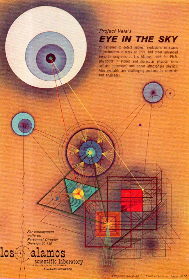
  • Artwork for Detecting Nuclear Explosions in Outer Space (1960)

    JF Ptak Science Books   Quick Post

    I do not have the source for this though I believe it is from Science Magazine from 1960.  The ad was placed LANL looking for new hires, and employed the artwork of Emil Bisttram (Taos, New Mexico), representing the new ARPA (pre-DARPA) work for the detection of nuclear explosion tests conducted in outer space, Project VELA.  (“In a continuation of presidentially directed programs, Eisenhower assigned ARPA in the summer of 1959 the task of developing the technologies necessary for the detection of nuclear tests, what would become Project VELA (Vela means watchman in Spanish). This program would examine technologies for detection space and atmospheric tests by satellites (VELA , undertaken by the High Altitude Detection panel (the Panofsky panel) of PSAC, which recommended that a satellite system be employed to detect atmospheric or space nuclear tests as part of a verification system for a possible nuclear test ban treaty.”–“DARPA Space History”, here: http://qnet.me/legal/DARPA%20-%20Background.pdf

    Ads  VELA371


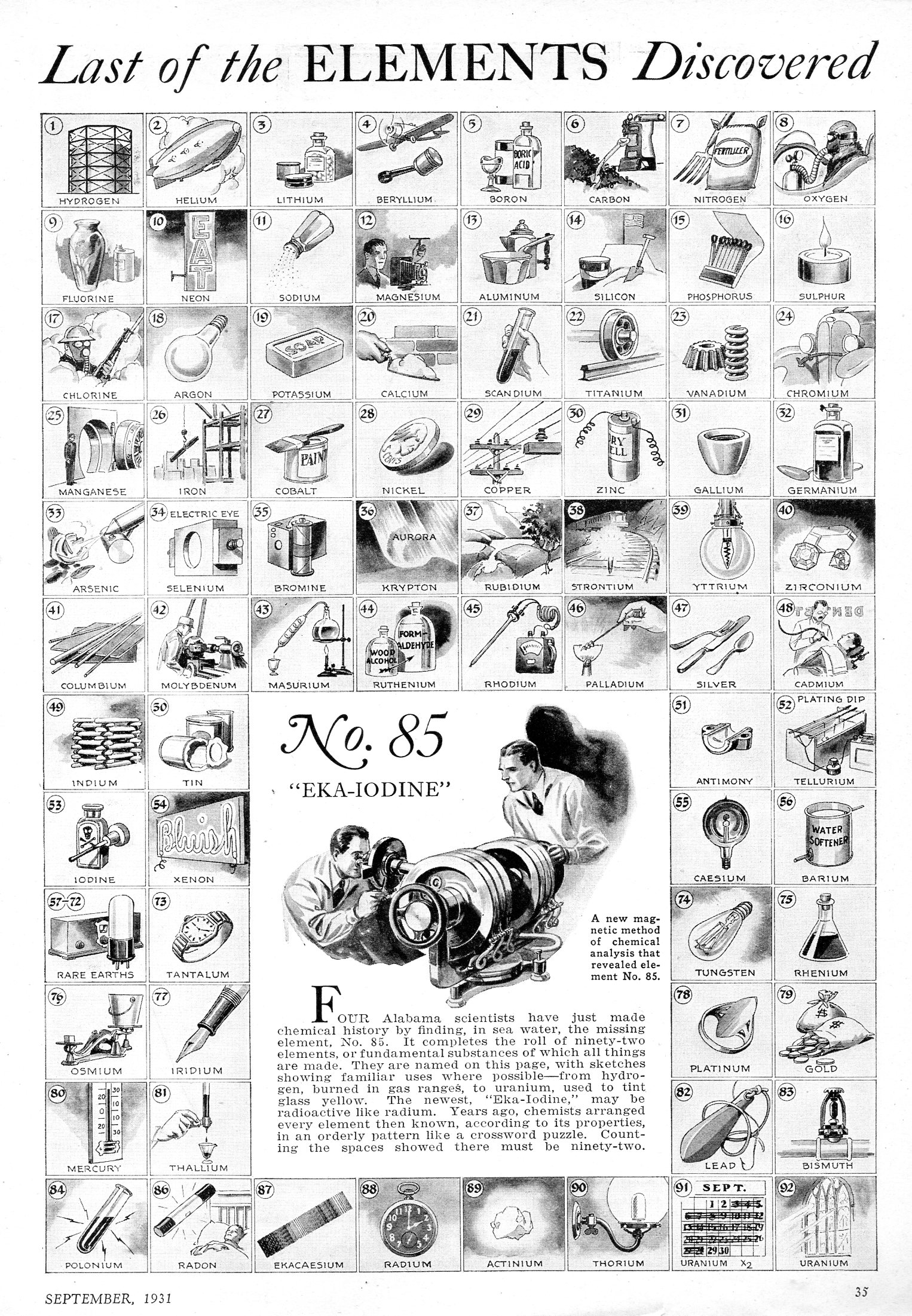
  • Last of the Elements Discovered: Periodic Table and Element Use (1951)

    JF Ptak Science Books   Quick Post

    I found this down in the warehouse this morning, published in Popular Science Monthly, September 1951.  It sin’t every day that you see a periodic table with drawings showing the employment of the elements, especially the stained glass windows for the element with the atomic number 92.  Actually uranium glass was a “thing” once upon a time,, at least until the Cold War kicked in, putting a crimp in the supplies of uranium for glass plates and beads and that sort of thing.  

    Periodic table369


  • Infographic of the RMS “Queen Mary” When it was the Cunnard “534” (1932)

    JF Ptak Science Books   Quick Post

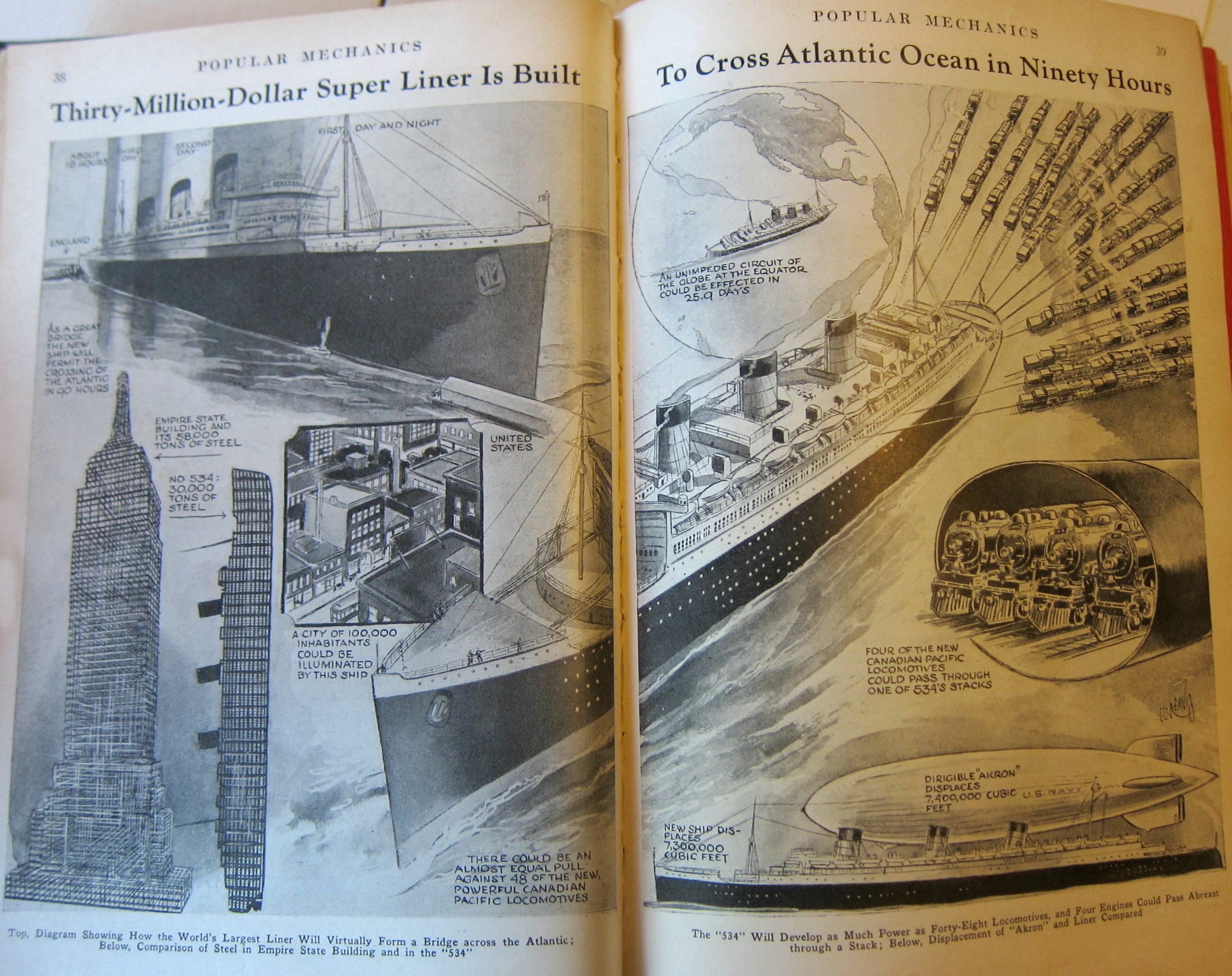
    The fine infographic below displays the size and might of the Cunnard line’s newest ship, “534”, which would be christened the RMS Queen Mary two years from when this image was published (in Popular Mechanics, January 1932).  It was a beast, a thousand feet long with a crew of a thousand, it shuttled 2,100 passengers across the Atlantic for 33 years, and for a number of those years held the record for the quickest crossing.  I particularly like it standing next to the newly-completed Empire State building.  

    (Note: this image becomes clearer when enlarged)

    Empire state building measuring

     The launching of the Queen Mary


  • How Fast Stuff Is: Thought (1870)

    JF Ptak Science Books   Quick Post

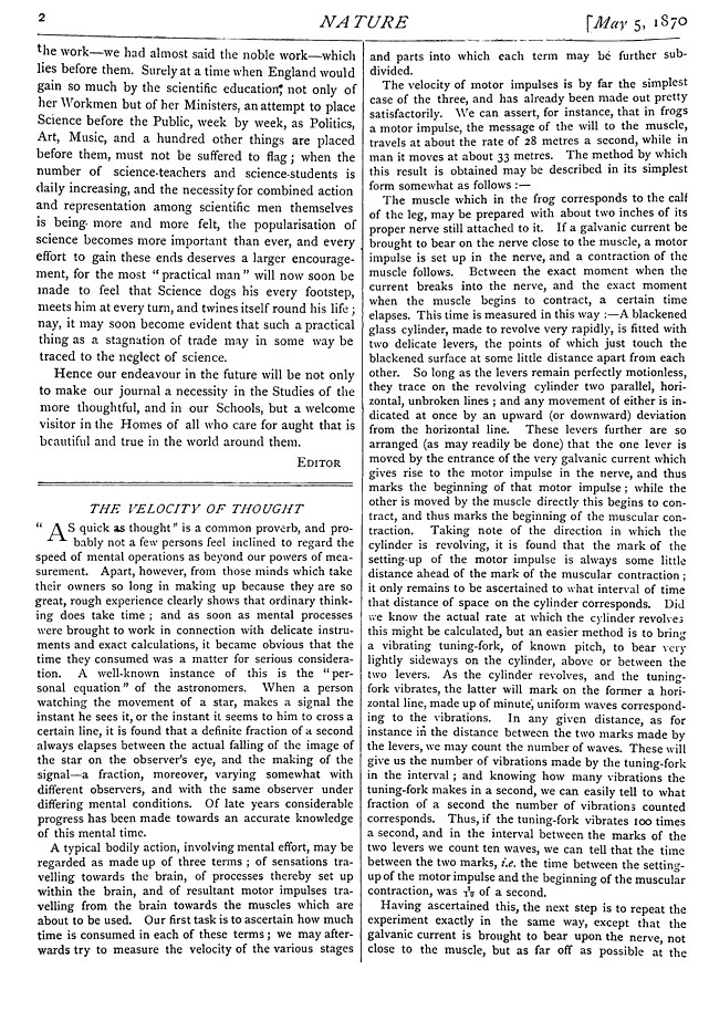
    There is probably a more elegant way of asking this question and still be catchy/popular, like “Speed of Stuff” or “On the Speed of Stuff” or some such–fact is though I should have begun a series by this (sort of) name years ago. It is a nice catch-all for mostly unrelated stuff, except for the “speed” part, which would be a nice thread.  In any event, I came upon this article today while looking for the beautifully-named Fleeming Jenkin article on a very unusual telegraph. It appeared in the May 5, 1870 issue of Nature, which is actually the first series in volume II of the then brand-new journal, and this was just issue #27. But right up front in this issue was a great-looking paper by a “M. Foster” called “The Velocity of Thought”. (This was not by a wonderful Mr. Foster from high school who warned us kinds in 1970 that we will one day be fighting in Afghanistan, “you mark my words,boys”–a bold position given that we still had a few years to go in Vietnam at that point.) I think that this “M. Foster” is Professor Michael Foster, who in time would add (if he hadn’t already) an M.D. and then a F.R.S. to his surname.  In any event I append the entire article below, which I found online at the University of Wisconsin.

    Thought velocity of by Foster

    (I should add that there is a nice book review by the great W. Stanley Jevons in this issue as well–anyone interested in purchasing the original issue cane write me at the addy found in the “About” section of this blog.)

    [Article image source:  http://digicoll.library.wisc.edu/cgi-bin/HistSciTech/HistSciTech-idx?type=turn&entity=HistSciTech.Nature18700505.p0004&id=HistSciTech.Nature18700505&isize=M]


  • A Paper Internet of 1932

    JF Ptak Science Books   Post 2605 

    Paper interrnet145Before the internet the idea to the idea of the internet existed to some extent in the head of a great unsung hero of the U.S. WWII figure, Vannevar Bush, a person who may well have invented the notion of hypertext.  Vannevar (pronounced “van ee var”) was a flinty no-nonsense New Englander who was an organizational and mechanical genius who as a professor at MIT developed a remarkable analog computer that greatly advance computation capacities for solving differential equations.  This was in the 1930’s, and even after creating an improved electromechanical version of the machine still chose the wrong way to go in the soon-to-materialize digital computer revolution. During WWII Bush was one of the most important Americans in the war effort, overseeing the entire scientific effort of the U.S.—an enormous effort dispatched beautifully (and successfully).  His importance in this regard is difficult to overstate. He also published a short paper on the hypertext idea in an article in The Atlantic in 1945.

     The article, “As We May Think”, outlined his idea for a device he called the MEMEX (“memory” and  “index”), which compressed and organized all that its user could remember and whatever information would be obtained in the future via electromechanical apparatuses, and available with associative tracking between the microtext frames.  So all manner of book and papers and reports and newspapers and images would be microphotographed and stored in a beautifully-indexed mechanical retrieval system where it would live with the information of others.  There was also the possibility of real-time textual additions to whatever it was that was retrieved, the genetic precursor of hypertext.  Bush’s thinking has been deeply recognized (and also by the creators of the internet) as the intellectual grandparent of the modern internet. 

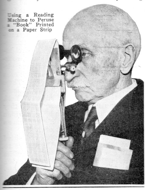
    And so I had a mostly-comical response to the image that I found (left) in the pages of the March 1932 issue of Popular Mechanics–it was actually on the back of the page that I was looking for (on passenger rocket travel across the Atlantic).  With Bush in mind, this image of a man reading a miniaturized book using the system of Rear Admiral Bradley A. Fiske (1854-1942), and the photo shows the reader with the equivalent of a 100,000-word novel.  The article only mentions this one book, and doesn’t venture out into imagining anyone carrying a library with them, nor does it mention searches of organizing systems, but it does bring to bear the possible power of having access to a vast amount of info held on a strip of paper about the size of a newspaper column.  And for 1932, that was a strong idea.  


  • A Small Picture of a Big Number: Imagining the Casualties of WWI (1918)

    JF Ptak Science Books  

    .003% 

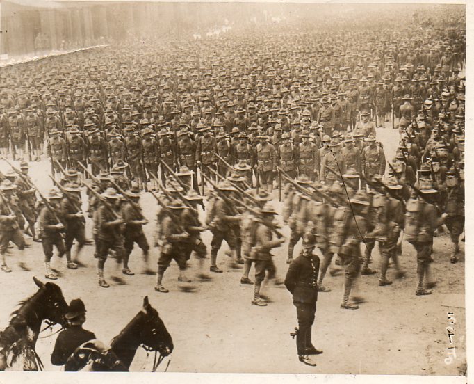
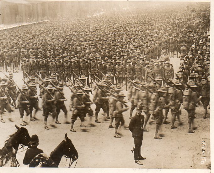
    That’s what I reckon this column of soldiers would represent of the total casualties of WWI.

    Generally images like this are a virtual image-host for me, a bucket of ice cold water thrown onto a sizzling summer sidewalk, all sorts of ideas steaming from it.  But for photographs of Doughboys1 marching, especially assembling for parade, this one struck me a little more oddly than most, giving instant pause, making me concentrate on the haze, or dust, that allowed the columns of soldiers to blend into one another and fade, losing their boundaries with their mass receding into a dull blur. 
    Marching london 350

    The Western Newspaper Union was selling this image for insertion in newspaper or journal stories about the war, for a small use fee.  There were a few American organizations like Western Newspaper that were created to photographically cover the war, using pools of photographers who would distribute their work anonymously and which was available for common, general use for a small charge.  The photographs allowed out were certainly restricted and censored, though in my stash of these of objects (numbering about a thousand) I’d say that 10% of them look pretty edgy to my eyes.  Most of the action of war was not covered, but then again this aspect was still fairly technically difficult in 1918.  Images of pain were almost never allowed, and certainly not pain of Allied troops.  Aid stations were almost never covered as well, as were dead bodies, or at least those again of Americans or Brits or French or Canadian.  The imaging of the war was certainly under a fair amount of supervision and control. (The original is available for purchase through our blog bookstore. here.)
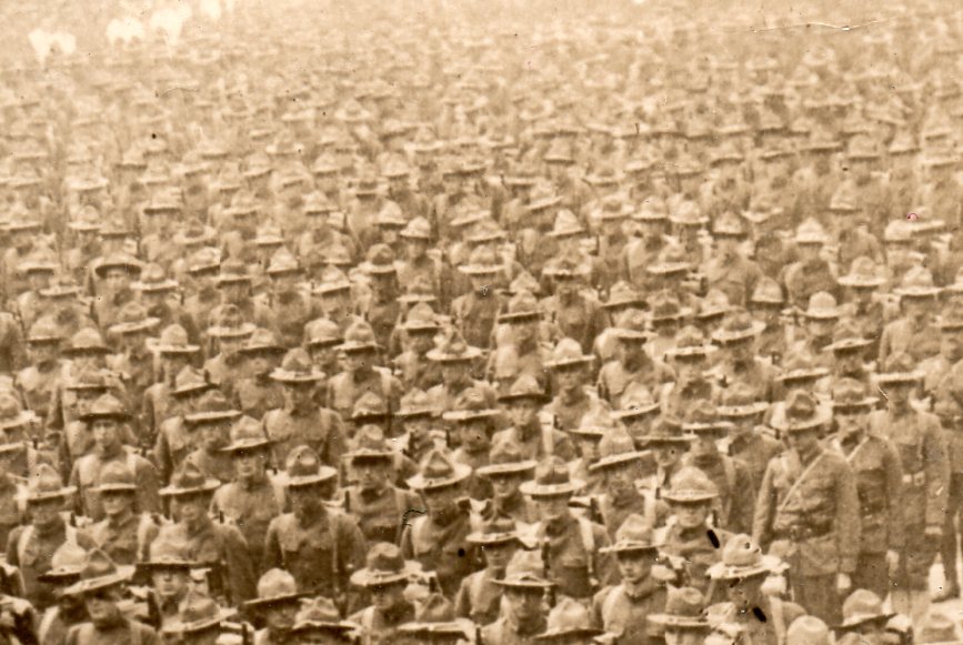
    Marching london det352

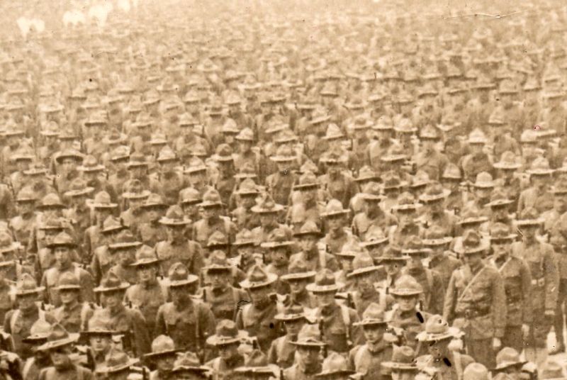
    The image shows American troops assembling for a parade through the streets of London before being deployed.  The mistiness of the composition looks like a statistic to me, these men standing for those who had come before and fallen.
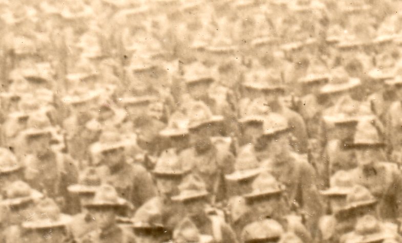
    Marching london det353

     The U.S. lost .13%  of its population to casualties (125,000 killed and 205,000 wounded) during the war–a war which by the time America got here had already been visciously fought for three years, costing dozens of millions of lives.  The figures for everyone else weren’t nearly so “fortunate” as the U.S.:  New Zealand’s 18,000/41,312 killed/wounded amounted to 1.6% of its population.  The U.K. lost 2.19% (964,000/1,663,000), Italy was 3.48% (650,000/953,000 plus 650,000 civilian casualties), while France suffered a 4.29% (1.4 million/4.27 mil) blow of its total population to war.  Things were worse on the other side:  Germany 3.82% (2 mil/2.4 mil plus 426,000 civilian deaths, and the Ottoman Empire 12% (400,000/771,000 plus 2.1 million civilian deaths.   Worst of all was the Ally  Serbia, suffering a catastrophic 16% loss of its population to war, including 275,000/725,000 plus 426,000 civilian casualties.  As gruesome as the numbers were, the Americans felt only a small percentage of the total sting of war–by 11 November, more than 21 million soldiers would have been wounded, with 9.7 million soldiers and 6.8 million civilians killed.  It was an enormous price.

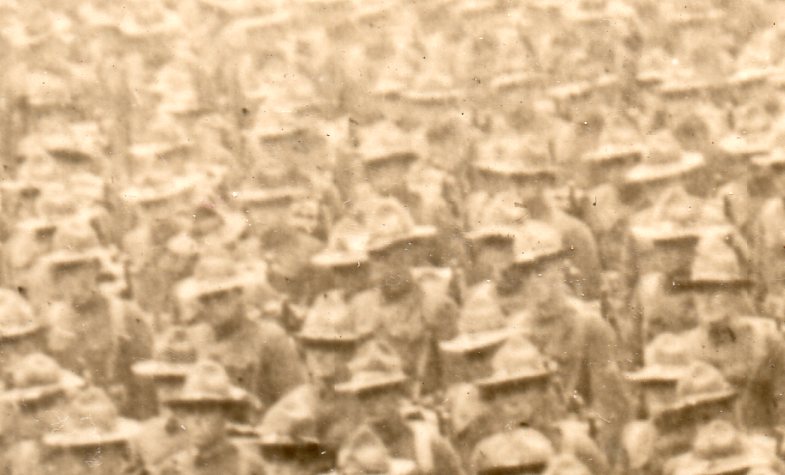
    And that’s what I see in the mist of what may be something like 10,000 soldiers on display in this photograph.  .003%  That’s two of these columns every day, twice a day, for the entire 1550 or so days of the war.   

    Notes:

    1.  The origin of the term “Doughboy” is unclear, or varied, or rich, but it is at least pretty oldm beginning around the time of the Mexican American War in 1846-1848–evidently when the soldiers marched through dry, tough terrain they wound up being covered by earth with the color of dough.  Doughboy.

    • This item is actually for sale from the blog’s bookstore:  Western Newspaper Union original photograph.  5/25 x 7 inches.  Includes the attached printed description on a separate piece of paper, affixed at image bottom.  Fine copy.  $300.00


  • An Imaginary Skyline: Comparative Chart of the World’s Tallest Structures, 1852

    JF Ptak Science Books  Quick Post

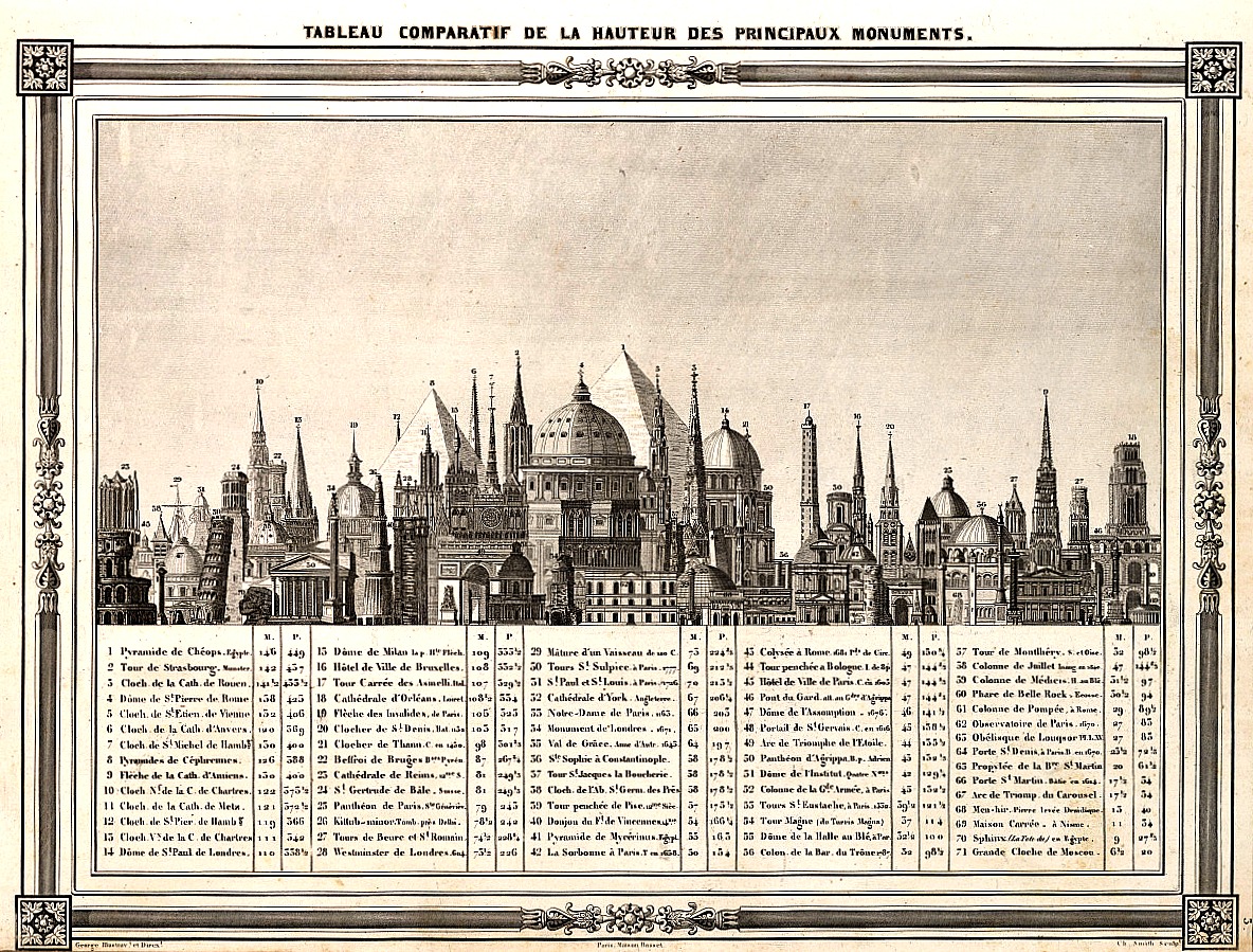
    I came upon this table of the heights of structures while looking for another chart showing the heights of mountains and the lengths of rivers, with the lengths of rivers nestled between the mountains in an upside-down pyramidal mountain form in the sky–yes, it is a striking design. In the attempt of not finding a good copy that could be downloaded and shared there was however success in the serendipitous find of the following print:  

      Comparative building heights

    SOURCE: I was happy to find this at the tumblr account of Atlas of Affinities:  http://atlasofaffinities.tumblr.com/image/76306197926  Barbie du Bocage, “Tableau Comparatif de la Hauteur des Principaux Monuments”, 1852.

    The color isn’t quite right but that came as a result of manipulating the sharpness and clarity (and contrast) to make the legend somewhat more legible than in the original, which wasn’t a very chunky scan. In any event there is a clearer image if you click on this, and I’m pretty sure that all of the numbers and structures are reasonably legible.  


  • A Good Astronomical Bull’s-Eye (ca. 1850)

    JF Ptak Science Books  Quick Post

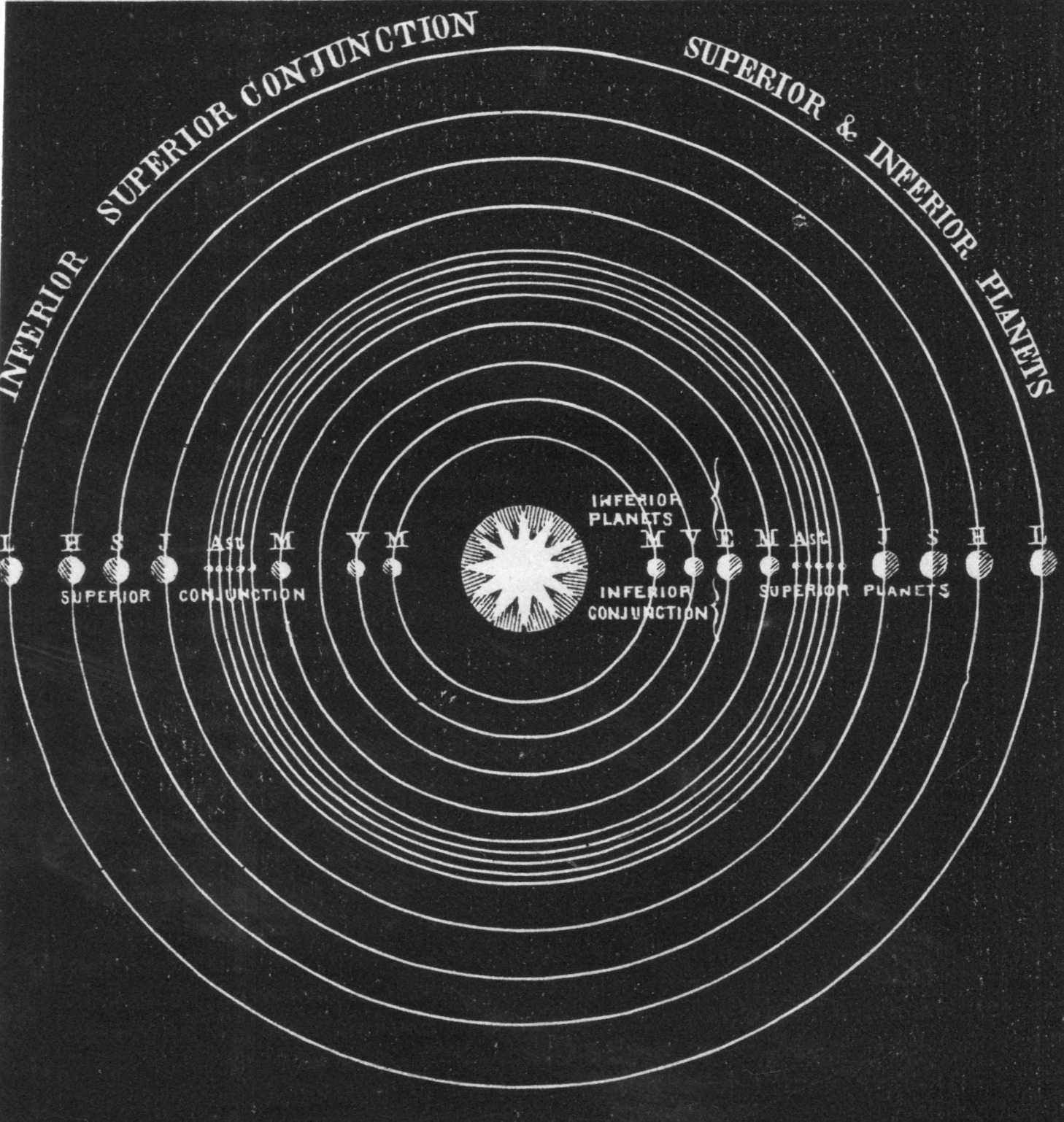
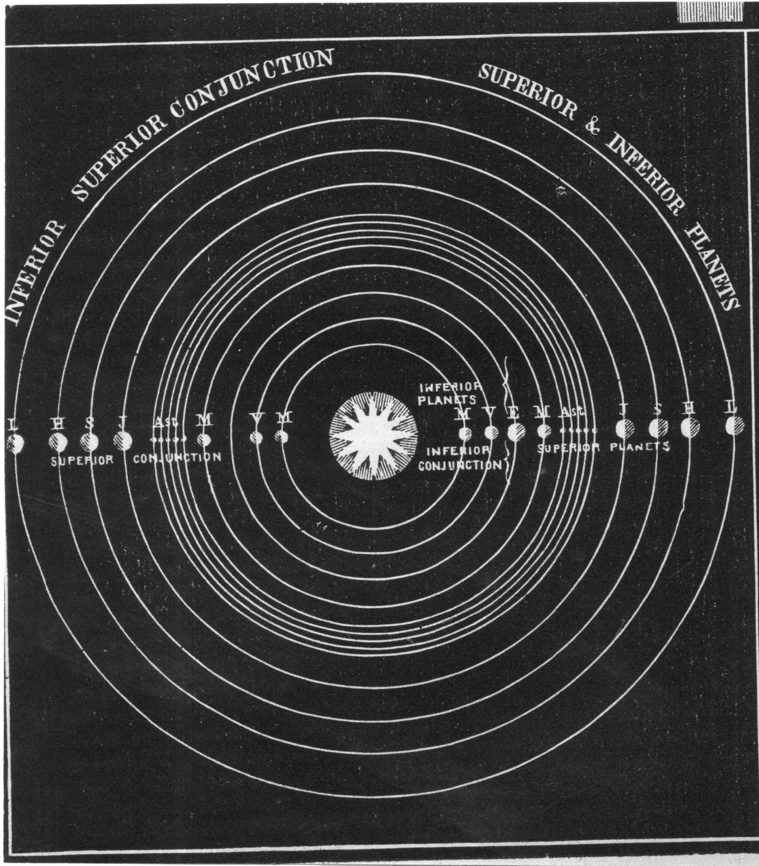
    I was looking through some of the astronomical prints here and came upon this lovely piece of frammento, a bit detached from its source.  I think it may be from Elijah Burritt’s astronomical atlas, but probably not. From what I can tell my guess for the source is the U.S., mid 19th century–or at least after 1846 when Urbain Le Vernier brought its mathematically-suspected existence into the world, and as we can see in the chart Neptune is clearly included in the realm of the planets.  In any event the image is very striking, and it does its job.  


    Solar system a129


  • A Fine and Deep Brightness in Soil and the Beauty of Yellow (1936)

    JF Ptak Science Books   Quick Post

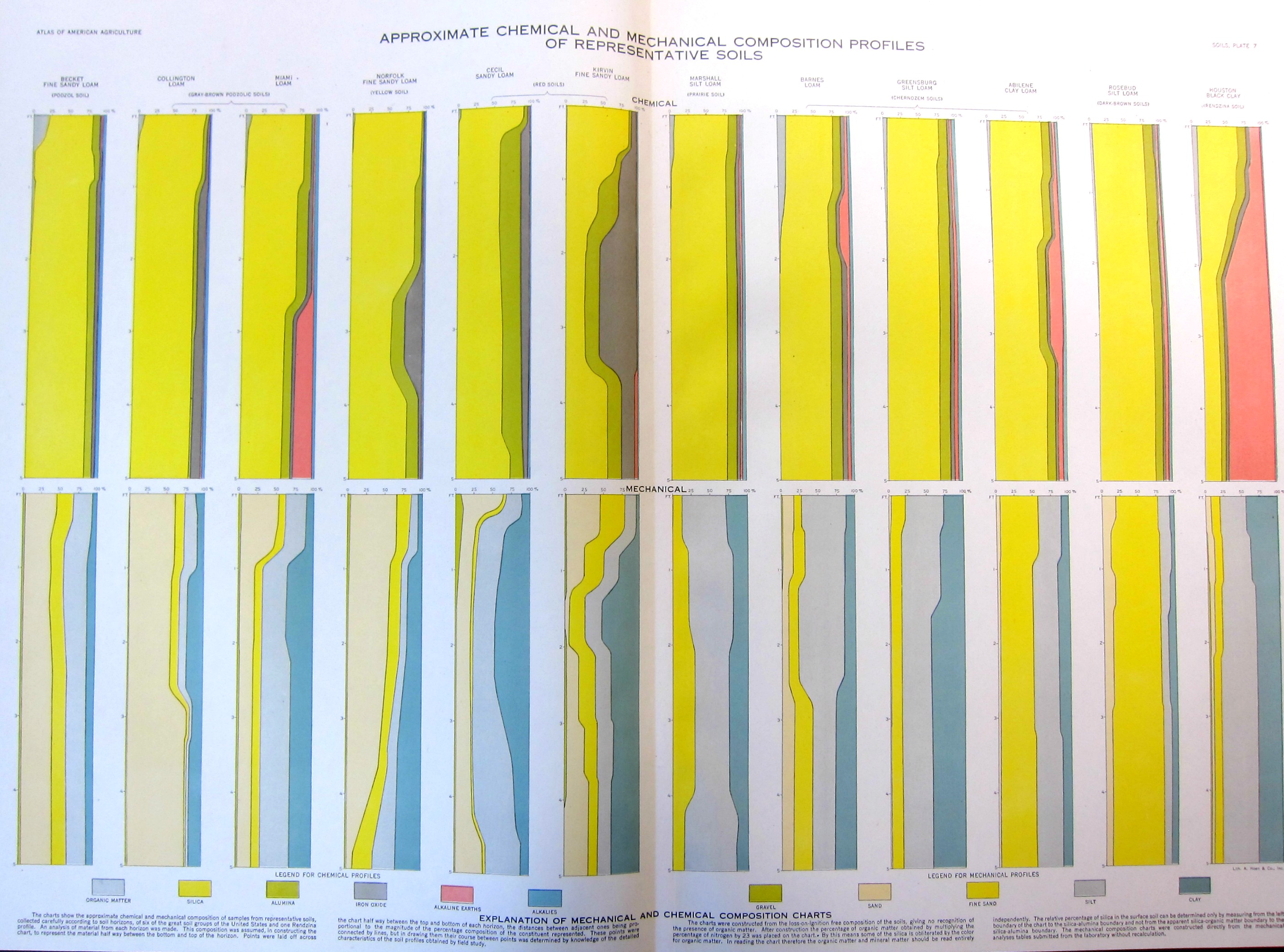
    This yellow is similar to the cover of Dr. Seuss’ One Fish, Two Fish…, the color yellow symbolizing courage/nobility in Japan, wisdom in Islam, and a deity-color in Hinduism; the color so fond of many great writers like London and Doyle, and Harte and Stevenson that they employed in in titles of the books.  The favorite color of Van Gogh1, and perhaps not-so-favorite of Shakespeare (appearing in references to bile and melancholy and falling leaves), it is usually a positive color–except that it also can signify cowardice, ego, caution, and illness (malaria, jaundice). 

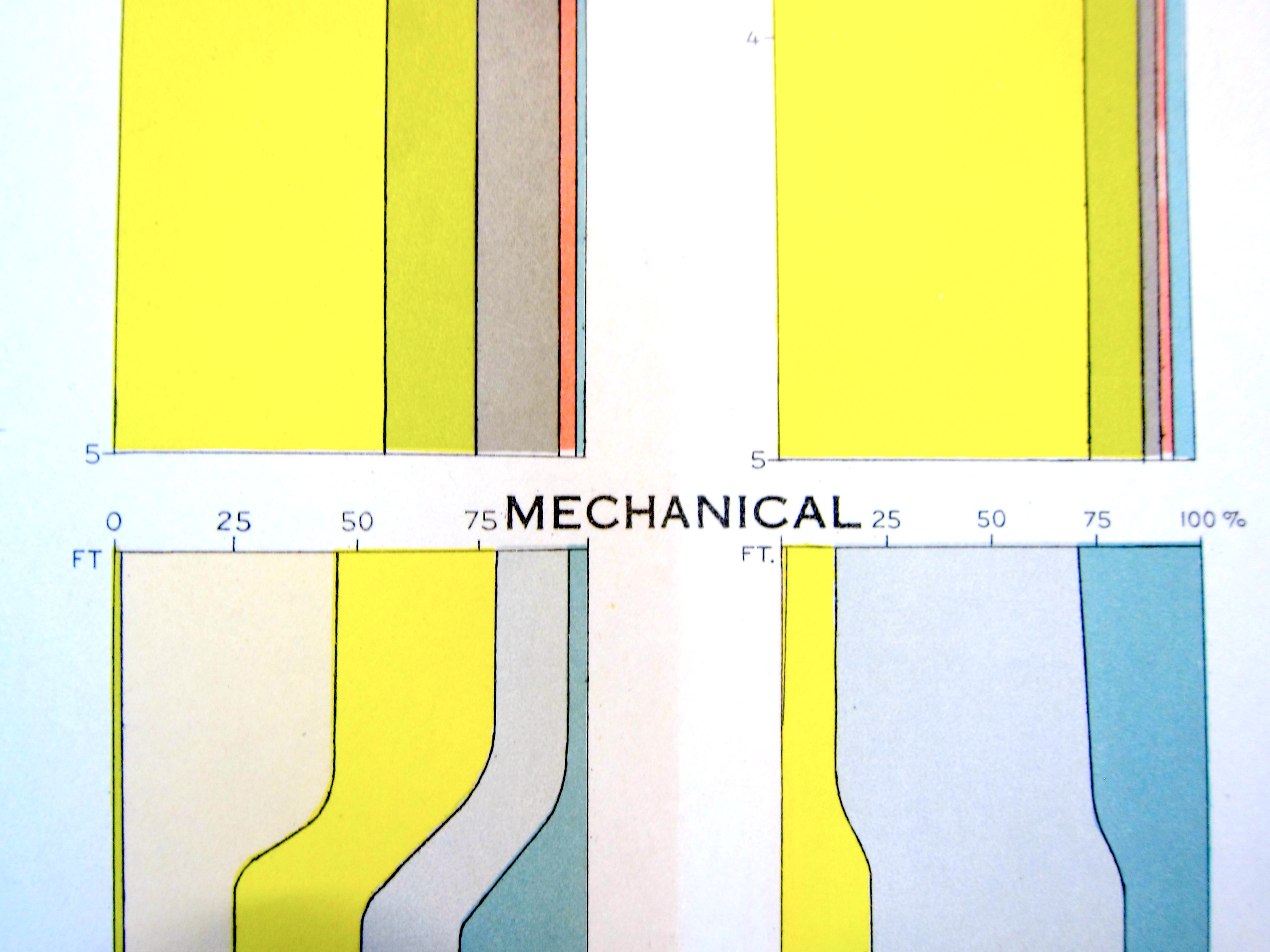
    And so, yellow. The yellow here is a color of soil, and a beautiful yellow it is, the chart a piece of found-art in itself, a found-Abstraction.  It actually was published in the Atlas of American Agriculture, lithographed by A. Hoen, and published in 1936–a particularly bad year for U.S. western soils. 


    Mechanical color b

    And a detail:

    Mechanical color


    Notes:

    1. The Van Gogh museum’s “Van Gogh Letters” is a must-visit if you are interested in his correspondence. http://vangoghletters.org/vg/  Actually the word “green” pops up about 15% more often than “yellow” as the most often mentioned color in the correspondence, though I think that the scholars say that his favorite color hands-down was yellow.  


  • The Found-Abstract Art of Comets, 1867

    JF Ptak Science Books    Quick Post

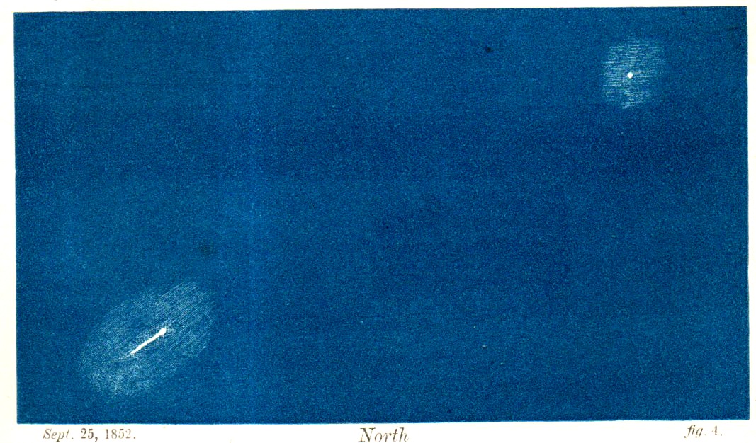
    Some of the most interesting Found-Art images in the history of science belong to astronomy, and within that, some of the most expressive and least-populated images of great appeal and haunting beauty are for early images of comets.  And so it goes for this (“tinted”) engraving of Biela’s Comet, which illustrated an article by London-born W.T. Lynn (at the time with the Royal Observatory, Greenwich) which was published in the April, 1867 issue of The Intellectual Observer.  The comet was named for Wilhelm von Biela who discovered the periodic nature of the comet (6.6 years, it had been identified as early as 1772), and had disappeared by the 1850’s, but not before breaking up into at least two large pieces, which is what we are looking at below:

    Bielas comet100

    And the full image: