JF Ptak Science Books Quick Post
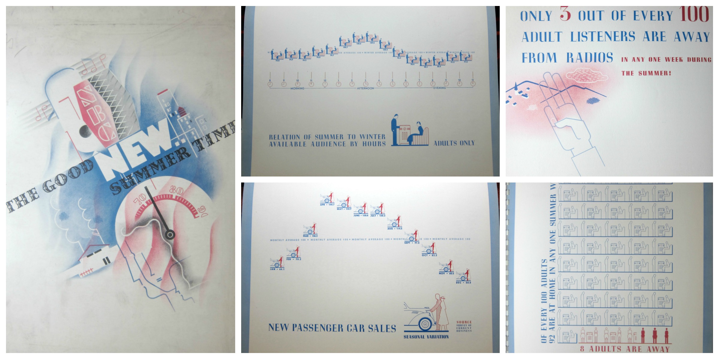
No doubt there exist many opportunities to mine the radio broadcasting past with the statistics in this publication, though for my purposes now, I’m just reproducing a few of its very engaging graphic displays of information. The document, The Good New Summer Time, a Probe of the Summertime Listening Audience of Today, published by the National Broadcasting Company, and printed in 1936, contains useful information regarding programming and advertising for the relatively new medium of radio. The standards for the graphics are both light and a little complex–for example, in the display immediately below/center in the montage, we see a comparison between summer and winter adult audiences, the data points plotted in units of a standing man and seated woman listening to the radio.
There really wasn’t that much data to be displayed, though the designers managed to fill the page in a pleasing way. It seems, overall, that this was an uncommon effort to display a small amount of highly useful limited-distribution data in an engaging manner.