A Daily History of Holes, Dots, Lines, Science, History, Math, Physics, Art, the Unintentional Absurd, Architecture, Maps, Data Visualization, Blank and Missing Things, and so on. |1.6 million words, 7500 images, 4.9 million hits| Press & appearances in The Times, Le Figaro, Mensa, The Economist, The Guardian, Discovery News, Slate, Le Monde, Sci American Blogs, Le Pont, and many other places… 5000+ total posts since 2008.

  • The Heavy Number Crunchers: Table-Top Edition

    JF Ptak Science Books  Quick Post

    Bollee

    This was a surprise, finding M. Bollee’s article (Sur une nouvelle machine a calculer) in the issue of an 1889 Comptes Rendus spread out in front of me, pecking around in that big 10-pound volume looking for something else not Bollee.  It was very easy to miss this article if you weren’t looking for it, just a few pages long in a 1000-page book.  But there it was, nestled comfortably in pp 737-739.  It these few pages Bollee describes his machine and with particular reference to his innovative approach to direct multipilication–a fine addition (ha!) to the long line of contributions by Babbage and Clement, Scheutz, Wiberg and Grant and Hamann. 

    Notes:

    Léon Bollée: “Sur une nouvelle machine a calculer”, in Comptes Rendus de l’Academie Sciences (Paris), volume 109, 1889, pp. 737-9.  Offered in the original printed wrappers, removed from a larger bound volume.  

    An image of the machine from The Manufacturer and Builder:

    Bollee

    ·Posted by :

    ·in:

  • Exceeding Excess–on Lots of Detail in Maps (1891)

    JF Ptak Science Books    Post 2275

    One of my favorite atlases of all-time is Adolf Stieler’s Hand-Atlas (Hand-Atlas über alle Theile der Erde und über das Weltgebäude, published in Gotha, Germany, by Justus Perthes) and edited by August Petermann.  I love this series (there were eight editions and a number of intervening printings to 1891) because the maps seemed so impossibly detailed for their scale.  They have so much detail and such great relief that in some very odd way they almost do not look like maps.  The sheets have massive amounts of info, particularly so with areas in which you do not expect it.

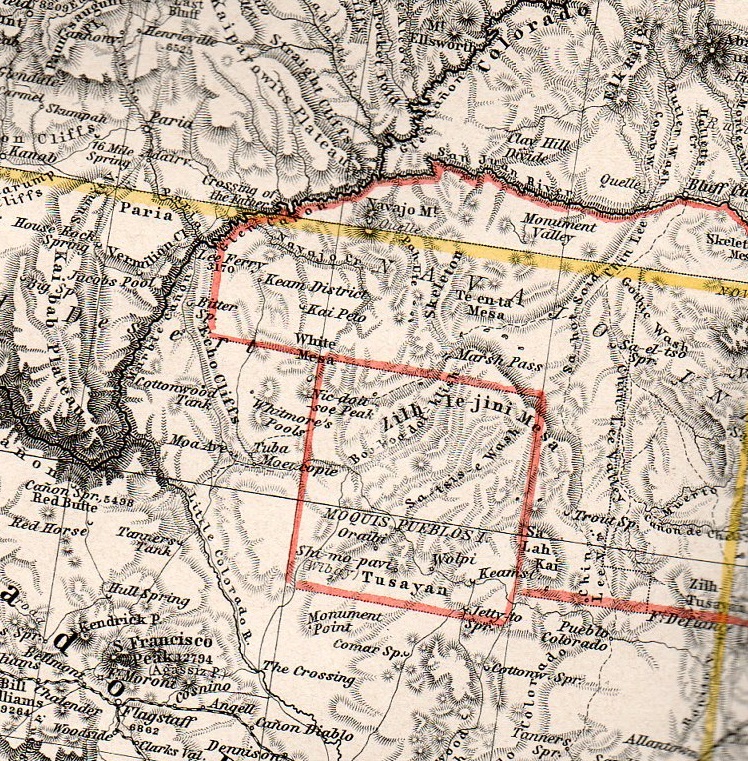
    This post came to be because I bumped into an old Stieler-friend–the six-sheet map of the United States.  I have four different flavors of the map, but the one I like the most is from 1891.  The sheets are all produced to be pieced together contiguously, so that they form a map 28″x52″–and there is so much detail the work looks a little like carto-graffiti, except of course that it isn’t, and that all of the extremely small and fine engraving piles one next to the other make for a very accurate and full map of the country.  

    Take, for example, the Four Corners region, mainly for north-east Arizona:

    Stieler189
    This is about 50% larger than the original, about a 2″x3″ section of one 15″x18″ section of the six-section map, and it is just packed with detail.

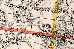
    And here, a smaller detail, of about a one square inch section of map, concentrating on the Canyon de Chelly.  Now I know this area a little, and about the history of its cartography (somewhat), and I can safely say that this is just tremendously detailed given the scope of the map.  The remarkable thing about the Stieler atlas is that all of the maps are like this.  Extraordinary–not particularly beautiful in the traditional over-the-fireplace sense f beautiful, but fantastic as, well, maps (of particular and perhaps peculiar scientific loveliness).   

    Stielerdet190

  • High Realism in Anatomical Art, 1690 & 1872

    JF Ptak Science Books      Post 2276

     Anatomy--braun--

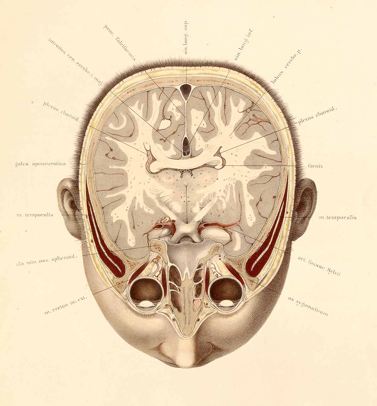
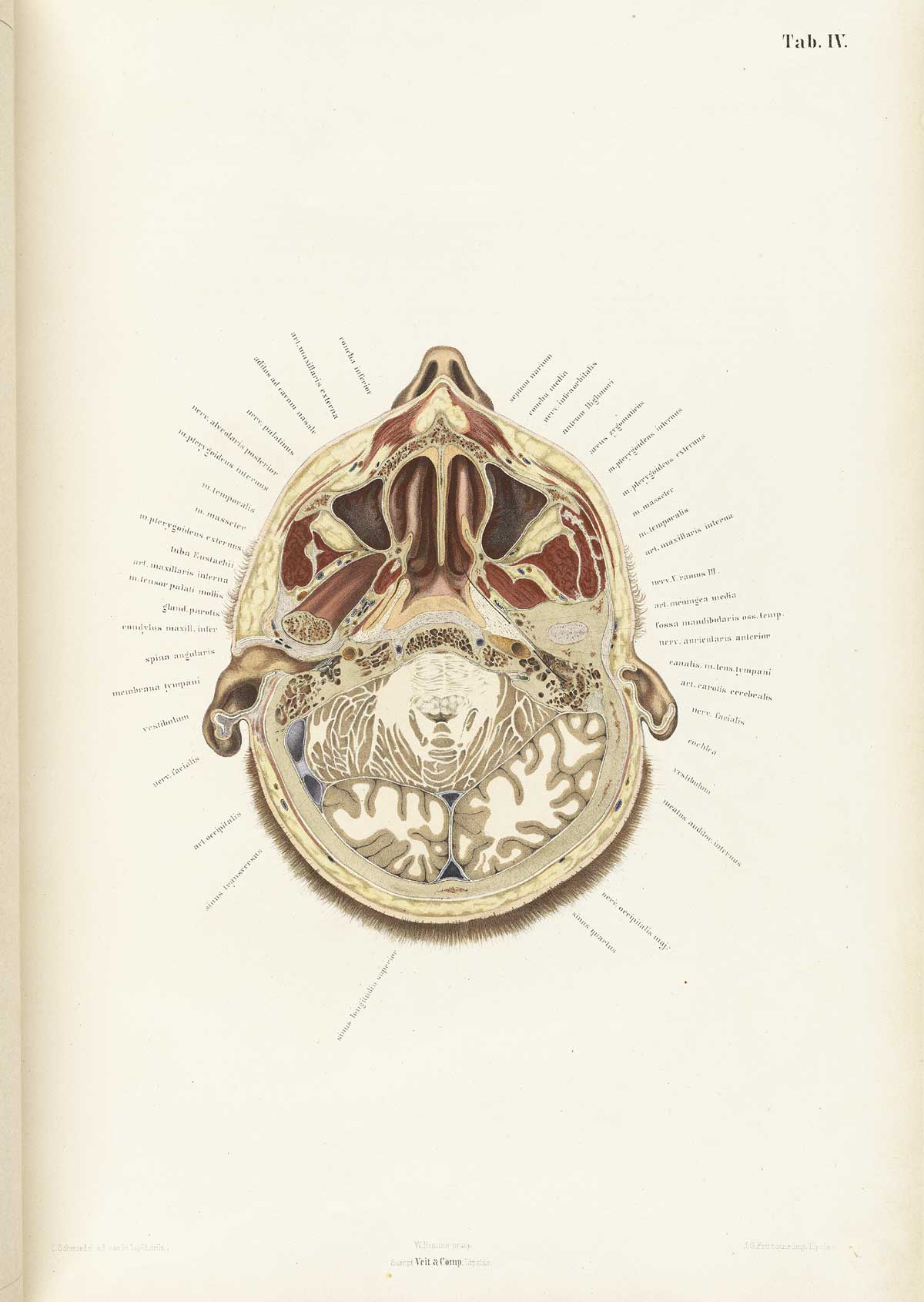
    The collaborative work of anatomist Wilhelm Braune (1831-1892) and artist C. Schmiedel (fl. mid-1800s) produced a singular work,  Topographisch-anatomischer atlas nach durchschnitten an gefrorenen cadavern…(published in Leipzig in 1872), which was an oustanding example of high-realism in the art of anatomy. This book is pretty much right-to-business, with no extraneous bits as had appeared in anatomies fo rcenturies. And even though these practices had pretty much expired by the first quarter of the 19th century, Braune/Schmiedel was ever more so detailed and simple–their design was fabulous, and their detail light and exceptional. 

    Anatomy braune04[Source: National Library of Medicine.]

    They also made use of sliced frozen sections of cadavers, which seems to give their work that crystalline touch.  The first image looks at the brain from top-to-bottom, while the second reverses the view, which is in itself somewhat unusual, even in 1872. 

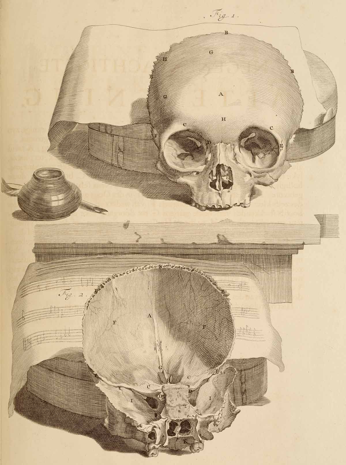
    Looking into a very finely-produced skull from an earlier period in the work of the anatomist Govard Bidloo (1649-1713) and the artist Gérard de Lairesse (1640-1711) in their Ontleding des menschelyken lichaams, (which was printed in Amsterdam in 1690) we find a bit of a different story.

    Anatomy skull[Source: National Library of Medicine.]

    One interesting aspect of Bidloo is that he can be extraordinarily detailed and still lend a rather baroque still life to engage his subject–like the skull with musical score, above.  There’s no reason for the added bit of scenery, its just a luxurious background for the anatomy. And then there are examples like this incredible facial/neck dissection below, which is very hard-core realistic, just as what you might find on any dissecting table, which most assuredly did not come equipped with pen/ink/music score.  Bidloo here is ultra-real, more so than the greater majority of anatomist/illustrators. [Ontleding des menschelyken lichaams...printed in Amsterdam, 1690, as a copperplate engraving with etching. Source: National Library of Medicine.]


  • First Printed & Illustrated Medical Book (1500)

    JF Ptak Science Books   Post 2277
    Ketham_p37 det
    “For my part I deem those blessed to whom, by favour of the gods, it has been granted either to do what is worth writing of, or to write what is worth reading; above measure blessed those on whom both gifts have been conferred”–Pliny the Elder

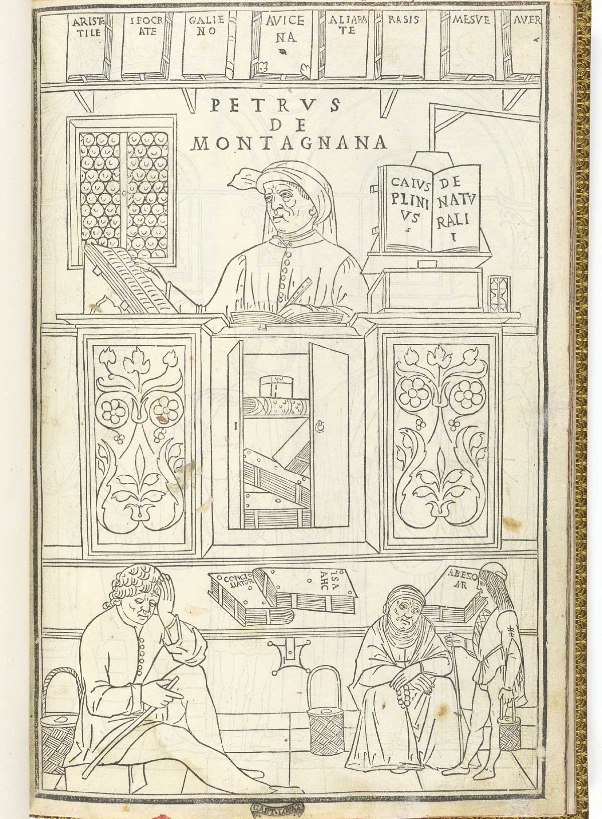
    Johannes de Kehtam’s Fasciculus Medicine (printed in Venice in 1500) was the first anatomy to be printed with illustrations. Ketham was described as a German doctor living in Italy and may well have been Johann von Kerchheim, a German practicing surgery and medicine in Venice during he 1470′), and who wrote a series of tracts on various aspects of medicine which were then collected into this single bound volume.  The illustrations are spectacular and to me have a very modern sensibility in their mid-Renaissance woodcut legacy–the look very clear and concise, are well proportioned, nicely labeled, and give plenty of free rein to open and blank spaces on the woodblock.  The only time these images really “fail” is when they appear in color–a process that would’ve been undertaken privately, by the purchaser of the book, who would have contracted with an artisan to color the book. The images in almost all of the cases of coloring that I have seen just do not match the elegance and brilliance of the original with no color. 

    [Source for all images: NATIONAL LIBRARY OF MEDICINE, here.]

    Ketham_p01

    Its interesting to make a quick note on the books on display on the bookshelf behind the seated figure of Petrus de Montagnan (who is consulting classic texts in medicine as his three patients awaits his attention): the books  include Aristotle, Hippocrates (“ippocrate”), Galieno (Galen), Avicenna (980-1037), Rasis (Ibn Sina, Rasis, Razi, Al-Razi, c.865-925), Mesue, Yuhanna bin Masawayh (c.777-857), and Averroes (1126-98), Abu el-Walid ibn Ruchd, Abu el-Walid ibn Ruchd. On the shelf to the right we see a copy of Naturalis Historia by Cais de Plnii (Gaius Plinius Seocndus, also known as  Pliny the Elder, who lived from 23-79 A.C.E and who held forth on all knowledge from everywhere during the first century).

    It is the anatomical illustration where the un-named artist is most brilliant–the lines are sharp and crisp, the spacing elegant, and the imagery very clear.  It is just lovely work:

  • An Underground USS “Monitor”, 1878

    JF Ptak Science Books   Quick Post

    Doing work underground has long fascinated me: tunnels, mining, sapper military ops, though almost entirely human-made, not so much for natural formations like caverns and such.  Particularly interesting are the big machine brought down/assembled to do some big cutting or drilling or pounding job.  Case in point: this sharp-toothed whale:

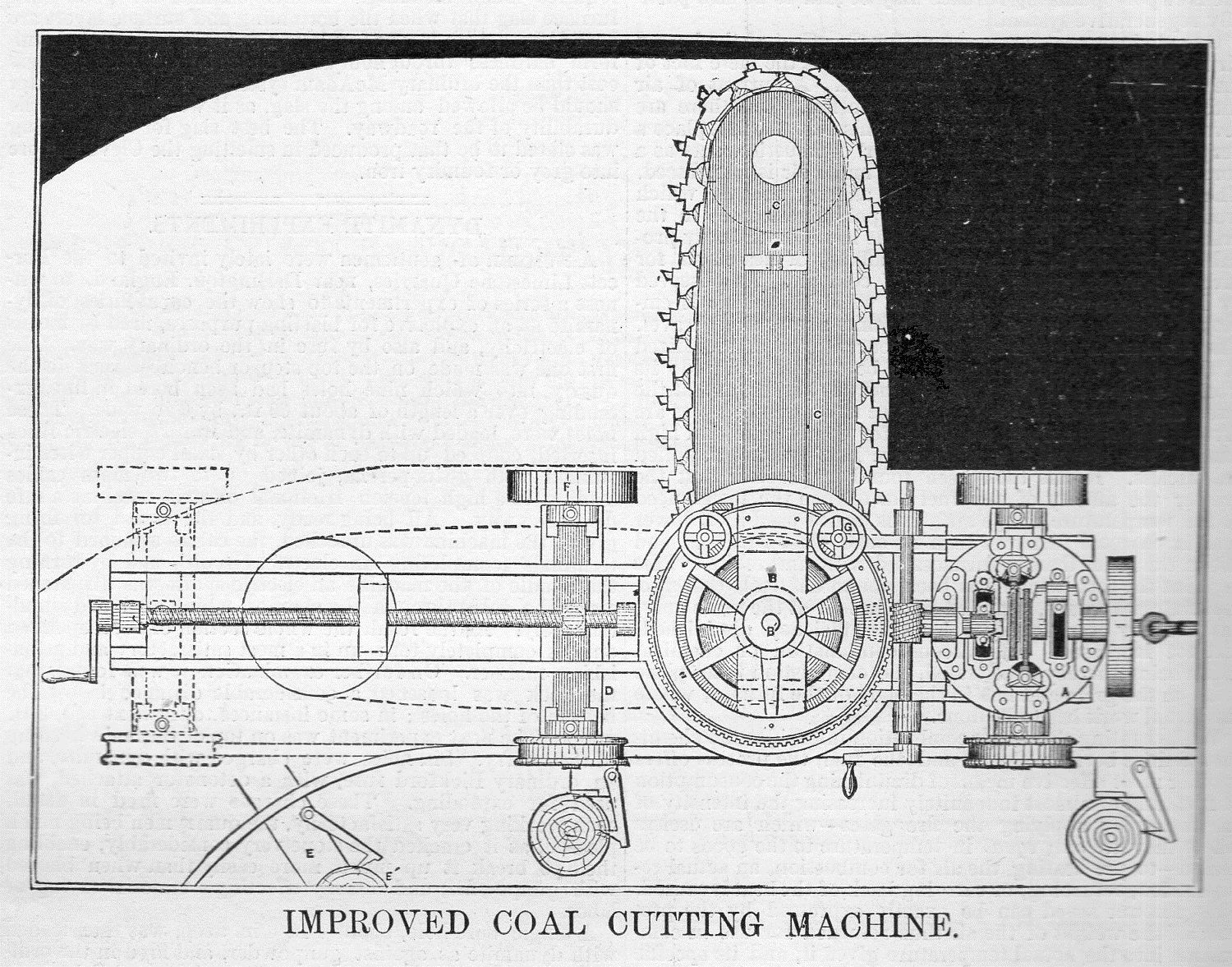
    COal cutting machine194

    The beautiful diagram for this beast appeared in Scientific American Supplement No 107, January 19, 1878, and is a cut of the machine looking straight down.  This was a monster for its time, weighing in at 3,800 pounds, and could make a clear cut into a vein of coal that was 4′ long and 2.5′ deep, and could move along a face of coal 60′ long in one hour.  It no doubt was a tremendous boon for the men who would have been in there working the coal by hand.  This was the invention of Horace Brown, and was called the Monitor Coal Cutter, no doubt because it was long and low, looking as though it wasn’t 4′ high, giving it a silhouette similar to the Civil War ironclad warship (designed by the very busy John Ericsson).

    And for all of its weight and force and potential the machine moved along a railtrack that was only 29″ wide.  

    ·Posted by :

    ·in:

  • What a Sphere of all of the Earth’s Water Looks like

    JF Ptak Science Books   Post 2277

    Global-water-volume-fresh-large detail

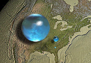
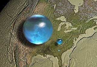
    If you haven’t thought of this statement before, if you haven’t tried to visualize all of the Earth’s sources of water all drawn out and up and somehow gathered into a Superman-controlled sphere of no structure, then this image would be very surprising–it was to me.

    The image comes from the United States Geological Survey website1, and shows three spheres on an Earth emptied of its oceans and lakes and rivers and ponds and creeks and everything, all sources of water, and depicts in descending order a sphere containing all of that water, followed by the Earth’s liquid fresh water, and lastly in the tiny sphere all of the water in lakes and rivers.  

    Global-water-volume-fresh-large

    The first and largest sphere is actually enormous, though it doesn’t look so when compared to the size of the Earth–it is 860 miles in diameter and holds 332 million cubic miles of water, or about 35×1019 gallons.  I do not now if the living beings in the water were figured into these calculations or what that might have looked like.  (“The sphere includes all the water in the oceans, ice caps, lakes, and rivers, as well as groundwater, atmospheric water, and even the water in you, your dog, and your tomato plant.”)

    The next sphere is a deeper wake-up call–it represents all of our liquid fresh water (“groundwater, lakes, swamp water, and rivers”), and forms a magical sphere of about 2.5 million cubic miles, about 170 miles in diameter, or about 1% of the total volume of the great sphere. 

    The last sphere–the tiny blue dot just south of Sphere Two–is the “one represents fresh water in all the lakes and rivers on the planet, and most of the water people and life of earth need every day comes from these surface-water sources”, with a volume of 22,339 cubic miles, and a diameter of about 35 miles, or the distance from D.C. to Baltimore. 

    I’ve never seen this image before, and I find it remarkable.

    If you follow the link to the USGS website, you can also see a breakdown of all of these numbers, as well as a final sphere with ALL of the water on Earth, though I don’t think you can really tell the difference between the first spehere and the super sphere.  

    Notes

    1. And full credit where credit is due: “Howard Perlman, USGS; globe illustration by Jack Cook, Woods Hole Oceanographic Institution (©); Adam Nieman. 
    Data source: Igor Shiklomanov’s chapter “World fresh water resources” in Peter H. Gleick (editor), 1993, Water in Crisis: A Guide to the World’s Fresh Water Resources (Oxford University Press, New York).”
  • WWI Photographs–Women, Soldiers, Hair (1918)

    JF Ptak Science Books   Quick Post

    WWI Photo  Lice197

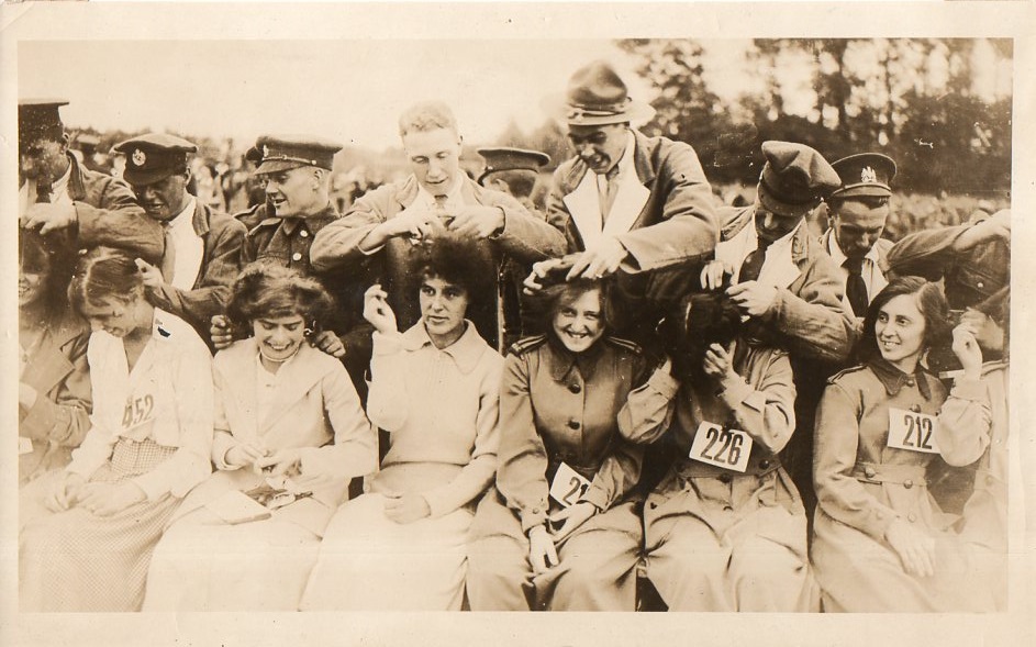
    I’m not sure that I understand this photograph and what is going on in it.  I do know that it was made in 1918, and that the back is stamped “Photo by/Central News Photo Service/26-28 Beaver St., N.Y….”, a product of not-very-discrete control of war images.  The vast majority of photographic efforts of WWI were very deeply controlled, with little left to chance and uncontrolled.  This lively image may be Doughboys inspecting female volunteers for lice–perhaps that was a job performed by these volunteers.  Or something else, though I  can’t see what–the soldiers aren’t using clippers, and they seem to be separating the hair….  So the subject matter isn’t scrumptious, but the faces are–a break in the not-routine routine business of war.  

    [Doughboy:  The origin of the term “Doughboy” is unclear, or varied, or rich, but it is at least pretty oldm beginning around the time of the Mexican American War in 1846-1848–evidently when the soldiers marched through dry, tough terrain they wound up being covered by earth with the color of dough.  Doughboy.]

    ·Posted by :

    ·in:

    —
  • Superb Cover Design–WWII Underground Warfare, 1943

    JF Ptak Science Books   Post 2280

    “There are no news-cameras clicking where the underground war wages. It is a war of iron nerves against an iron machine, of indomitable men and women defying the Nazi monster, of sudden swift strokes out of the dark, of blows that fall where least expected, hampering, slowing, wrecking the Nazi war machine…” 

    WWII  Underground War196

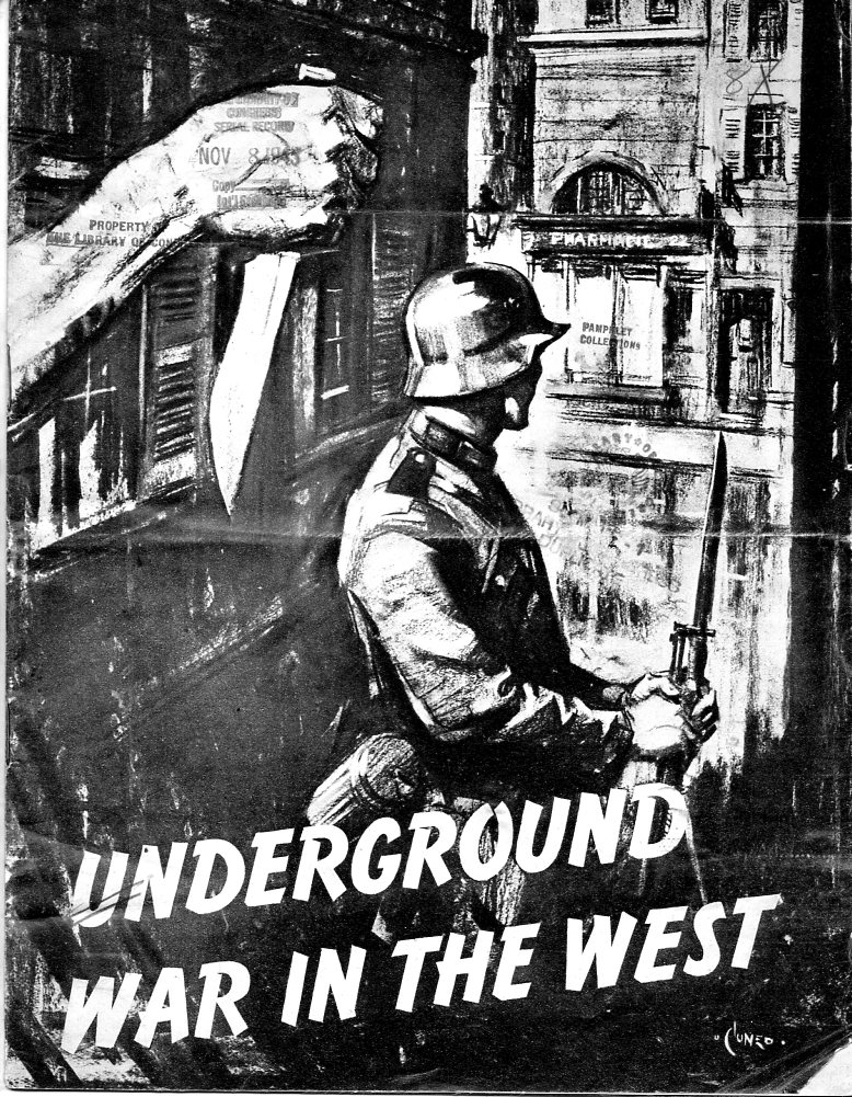
    Underground War in the West has one of he most dyunamic covers I’ve seen in quite some time–not to say that there are absolute “best” designs, but it is certainly a top-tier design, a fine effort, grabbing the attention of even a casual browser, and suggesting action, even without a read. 

    This pamphlet really seemed like a tiger in a cage—looking through some of the collection here relating to WWII literature on activities in occupied countries, the startling cover graphic of Underground War in the West (printed at some time in 1943, and not before or after) really rattled its cage.  Its contents were non-too tame, either—while being reasonably polite (as was the fashion) it still invoked some very difficult ideas and images.  

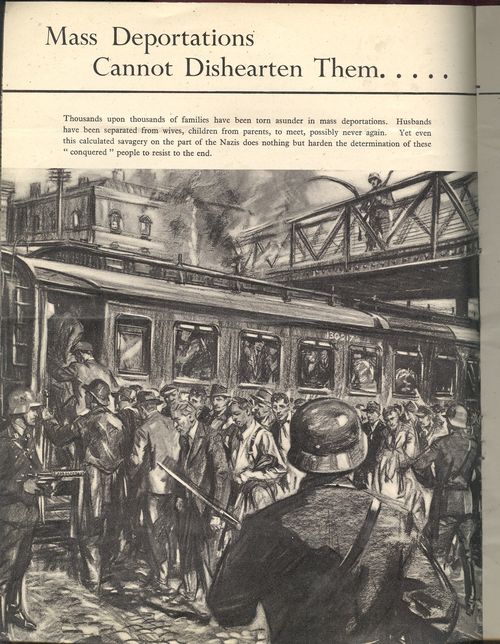
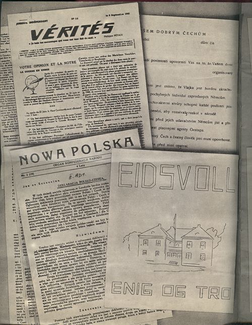
    This was a terrific, mass appeal pamphlet on the underground actions of occupied Europe illustrated with pencil and charcoal drawings by Cuneo, with each page depicting a  resistance activity—including the underground press, medical aid, sabotage, and general murderous nuisance-making and in general pamphlet praises and celebrates the heroism in occupied countries such as Czechoslovakia (with a drawing showing the assassination of Heydrich), Holland (showing the Dutch caring for a wounded RAF pilot), Belgium, France, Greece. Norway, Poland, Yugoslavia and Luxembourg.

    Blog jan 7 undergrd deport

    There are full-page drawings relating to the strength of occupied people in the face of “Mass Deportation (cannot dishearten them, thousands and thousands of families have been torn asunder in mass deportations…”) and “Firing Squads…thin the patriot ranks yet ever more step into their places” . The section on “Facts from the Occupied Countries” list activities in 9 occupied countries;  under “Poland”, we read that “Germany has drawn a veil of silence around Poland…it is estimated that 2,500,000 Poles have died in concentration camps or by execution up to December 31, 1942. There are 54 concentration camps in Poland…and the average life span in the camps is nine months…”  Nowhere in the pamphlet however is there any singular mention of deportation or murder of the Jewish people—there were hundreds of articles printed in American newspapers up  until this time on the beginning of the (yet named) Holocaust, though acknowledgment of a fact doesn’t necessarily make it widely known in spite of its incredible and massive significance.  This pamphlet, while extraordinary in mentioning the millions of deaths in the concentration camps and “deportations”, was rather ordinary in its coverage of who it was that was being murdered in the camps.  

    There is also a two-page spread exhibiting examples of underground newspapers:

     
    Blog jan 7 undergrd newspars 001

    Only six copies are located in libraries around the world, and those are pretty high-calibre institutions:  Hoover Institute on War, Holocaust Library, Harvard University Law Library, London Metropolitan, National Library of Scotland, Oxford University.  

  • Episodes in the Battle of Clutter over Thinking Space

    JF Ptak Science Books   Post 2281

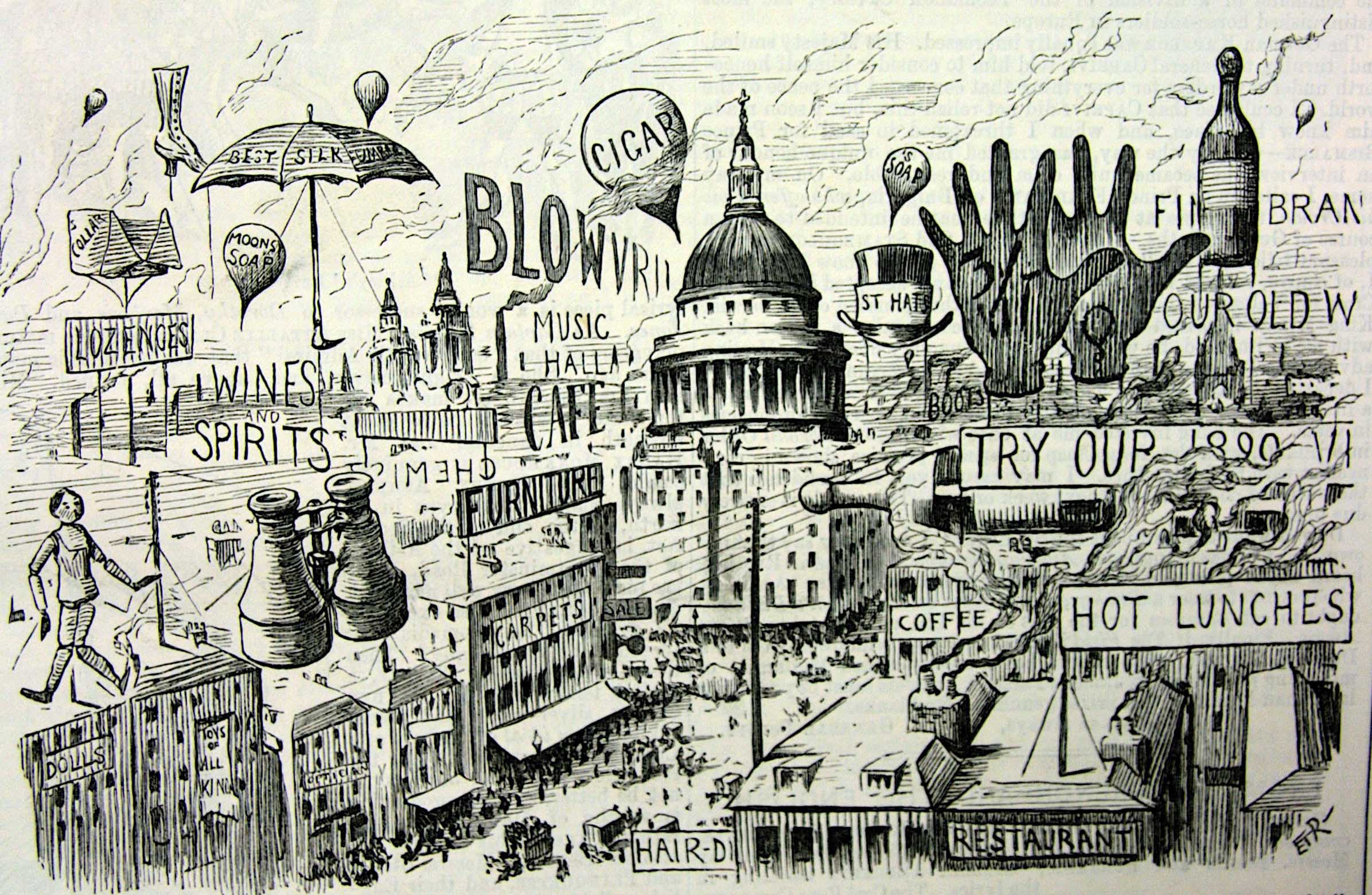
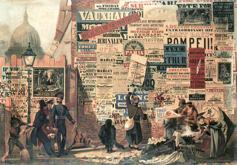
    The way of the new world, the spread of commercialism and of consumerism, the increase in the size of a middle class that was actually approaching what we today would think of as a middle class, the wanting rise of places for disposable income to go from millions of new people with spare money to spend, led the sellers of stuff-immemorial to start advertising their bits on the side of out-of-doors everything. The fight for the attention span of the new consumer went from the newspapers and magazines to the side of buildings and then, as the motor car began to proliferate, to thousands and hundreds of thousands of miles of roadway.

    Billboards to buildings, and buildings as billboards, and more–as some of the early branders might’ve seen it, the sky was the limit, or at least so for this caricature of the impending future, as seen in Punch, or the London Chiarivari  (‘Picturesque London – or, sky-signs of the times’, 6 September 1890, p. 119.)

    Advert posters London 1890

    That of course was a view to the near-future–the reality of the situation was more like what was portrayed by a watercolor by Orlando Parry, ‘A London street scene’, in 1834, so imaging a step-beyond may not have been too difficult a thing to portray:

    Ad posters

    [Image Source:  Ragpickinghistory  http://ragpickinghistory.co.uk/tag/london/]

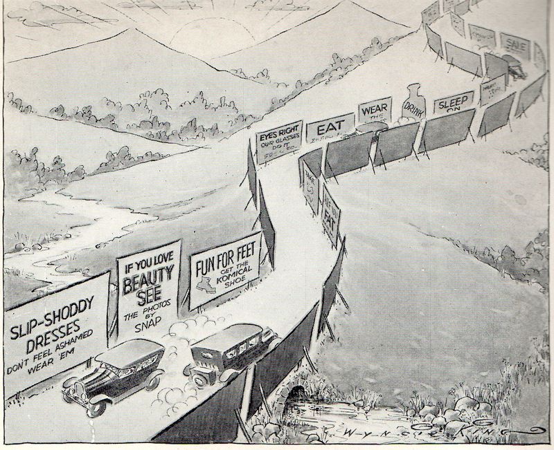
    A more recent example of the threat of rampant billboardism and the struggle for the pocket and attention of teh consumer is seen in this 1931 illustration that was tucked inside this almost-provocatively-named pamphlet, Billboards ad Aesthetic Legislation, New Applications of Police Power (published by the St. Louis Public Library). It is astonishing to think of the vast changes that took place in the remaining American frontier, taking place so quickly–two generations separated the last of the great cattle drives to billboard legislations along auto routes in the western states. 

    00--billboards036

    Fighting for the pennies in the pocket bottoms of the working poor and the middle class is getting to be Old Stuff, an interesting chapter in the History of the Assault on the Attention Span of Human Beings.   

    ·Posted by :

    ·in:

  • Illuminated Night-time Aerial Bombing (1918)

    JF Ptak Science Books  Post 2282

    WWI airwar Italian night bombing

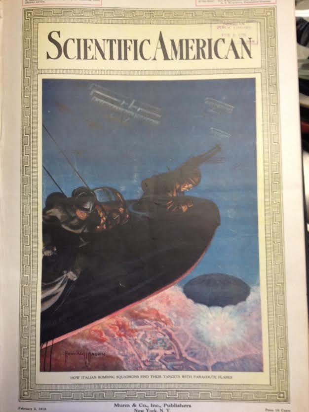
    As I assemble the WWI stuff here for a possible anniversary blog of interesting war and homefront images (nothing like planning and foresight for these things) I was putting together the war years for some of the journals, including the magnificent Scientific American.  Flipping open the top volume (1918) revealed a big blue/dark print that was entirely unexpected–an Italian bomber carrying out a mission at night using flares to illuminate the target area.  

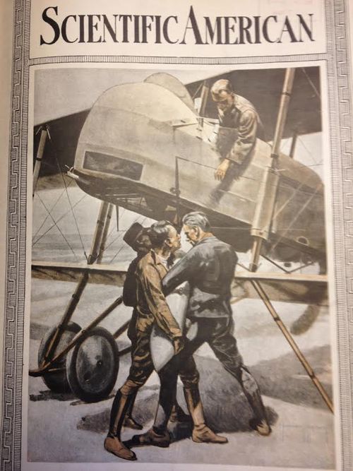
    At first I had an irrational serendipitous memory of Santa Claus using a lantern to find his way, but, well, as I said it was an irrational association.  (There’s another odd memory of a picture of Santa in 1917/18 delivery his presents on a flying tank, but that’s another story…)

    I had only once before seen a portrayal of an aerial night attack, depicting a futuristic flying machine–a dirigible in this case–using electric lights to target fleeing villagers and warriors of an African town.  My memory is not working on this one, so unfortunately I cannot date and reference it, though I do believe it appeared in the Illustrated London News around 1907 or so, just a few years before someone started dropping explosives from planes for real.  

    But this image (appearing in the February 2 1918 issue)  is for something quite real, though its effectiveness (to me, as a non-historian of this field) seems highly suspect.  What we see are three airmen in an Italian Caproni1 releasing flares above what they assumed to be a target.  The gunner at front watches closely as the co-pilot (there are two men in that cockpit, one being mostly obscured) readies another flare.  

    By the way, here’s one way of loading the payload (from a few issues later):

    WWI Airwar 1918 bomb load

    The general characteristics of the Caproni (3) aircraft, via Wikipedia:

    ·Posted by :

    ·in:

    —
  • Looking at the Year 2440 in 1771

    JF Ptak Science Books    Post 2283

    “To the last syllable of recorded time;
    And all our yesterdays have lighted fools
    The way to dusty death…” Shakespeare, Macbeth, Act 5 Scene 51

    One way of managing parts of the present and the past is by thinking about the prospects of the future.  The universal monochord of prescription, of description, of a possibility of the future, has been an attempt at the hands of a number of people,  though it has not been often, and it really is basically a modern invention.  And what I mean is more of the science or science fiction development part of looking into the future, and not so much the Platonic development of the ideal state of being, or promises of eternal afterlife in the presence of the creator of the universe tucked away in some ideal somewhere in folded pieces of time.

    One of the very earliest of the science fiction adventures into the future belongs to Louis-Sébastien Mercier (6 June 1740 – 25 April 1814, a successful and prolific dramatist) in  L’An 2440, rêve s’il en fut jamais (1771, “The Year 2440: A Dream If Ever There Was One”).  One aspect of it may or may not have gotten rid of the quote leading this quick post, as different aspects of literature (useless and immoral and whatever) has been eliminated out there in the 25th century.  Bad and unwanted lit is gone, along with what used to be the criminal justice system and the idea of “public space”, plus taxes, armed forces, slavery, prostitution, beggars (though not necessary the idea of being poor or rich), foreign trade, guilds, individual excesses in dress, and a bunch of other things,  plus priests and monks and other religious bits. It was visionary and subversive and published to wild acclaim, one of the best-selling works of the 18th century, which was also banned in France and Spain.  IT was the first Utopian work to be set in the future (according to Paul Alken in his Origins of Futuristic Fiction, in a notice in Science Fiction Studies, “Revisiting Mercier…:, volume 30/1, Mach 2003, pp 130-2). 

Recent Posts

Archives

Categories