A Daily History of Holes, Dots, Lines, Science, History, Math, Physics, Art, the Unintentional Absurd, Architecture, Maps, Data Visualization, Blank and Missing Things, and so on. |1.6 million words, 7500 images, 4.9 million hits| Press & appearances in The Times, Le Figaro, Mensa, The Economist, The Guardian, Discovery News, Slate, Le Monde, Sci American Blogs, Le Pont, and many other places… 5000+ total posts since 2008.

  • Elaborate Camps for Ambulance Dogs, 1917

    JF Ptak Science Books  Quick Post

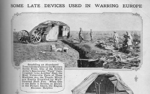
    This is a striking image of a bright and reaching idea–the use of dogs to find, identify, and alert the presence of a wounded soldier on the battlefield. The dog would be sent out onto the battlefield, where it would find wounded soldiers, after which the dog would retrieve a possession of the soldier’s and return to the trenches, and then lead a squad to retrieve the wounded man. That, or the dog would stay and stand guard, barking to alert stretcher bearers the location of the soldier.  The dog houses are of a massive construction, like fortified dugouts–I suspect that the camp was far enough front to be subject to bombardment.  I’m not sure of the breeds there, but perhaps these are Bouvier des Flandres, or Briard?  I can’t tell. 

    [Image greatly expandable.]

    Wwi project ambulance dogs432

    [Popular Mechanics, May, 1917, pg. 682.]

    ·Posted by :

    ·in:

    —
  • The Appearance of the Landship in WWI–Welcome the “Tank”, May 1917

    JF Ptak Science Books  Post 2623

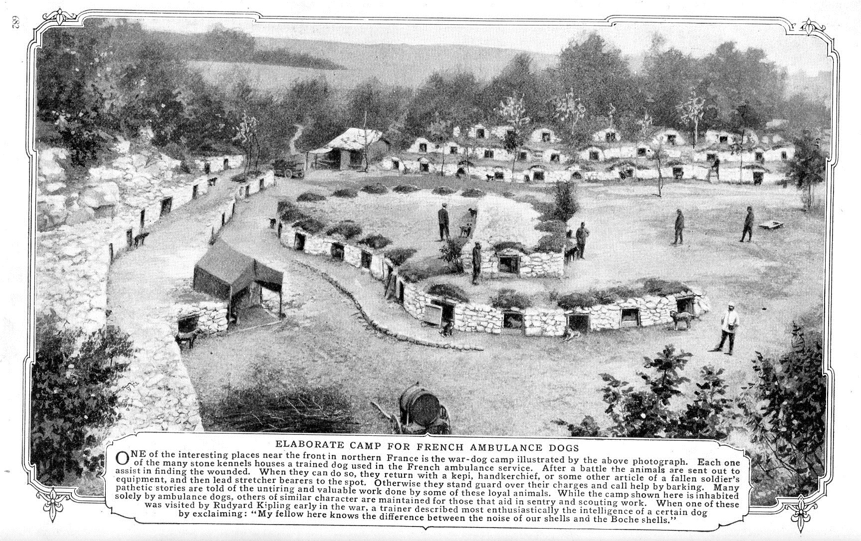
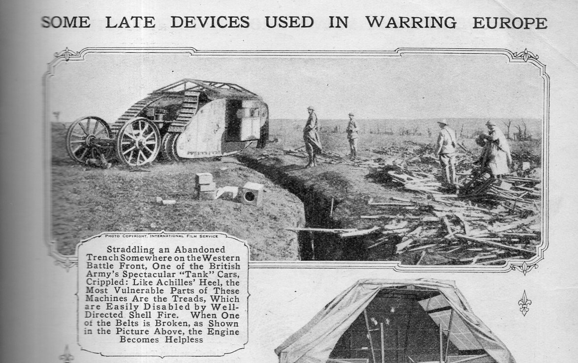
    I wasn’t looking for this–or anything else in particular–while browsing the year 1917 in Popular Mechanics, though when I came across it  and noticed that tank was in parenthesis, it occurred to me that there was good reason for that. The “tank” was brand new on the battlefield when this issue of the magazine came out in May, 1917.  The tank had made its first showing just weeks earlier in April, and had really only just come into its abbreviated name.  The committee formed in February 1915 to spearhead the development of a new armored fighting vehicle was called the Landships Committee, and as one story goes, the vehicle was called a “tank” because of its resemblance to a water tank–also, it was intended to misdirect any information going the wrong way by not referring to it as a “landship”, which would give away some of the secrecy. It should be noted too that it was the First Lord of the Admiralty, Winston Churchill, who established the committee.  So what we see here on page 683 of the May 1917 issue of Popular Mechanics is a very early photograph of the tank in a mass distribution magazine.
     

    Wwi project  tanks may 1917434

    The tank hit the battlefield pretty hard, and it evidently took the Germans by surprise–they certainly captured many more tanks than they produced, by far. During the war, from 1916-18, Germany produced only 20 tanks.  In that same period, the U.S. produced 84, while the French constructed nearly 5,000 and Great Britain 3,800 or so.  Germany was completely unprepared for heavy armored mobile combat–that would be a completely different story by 1939.  

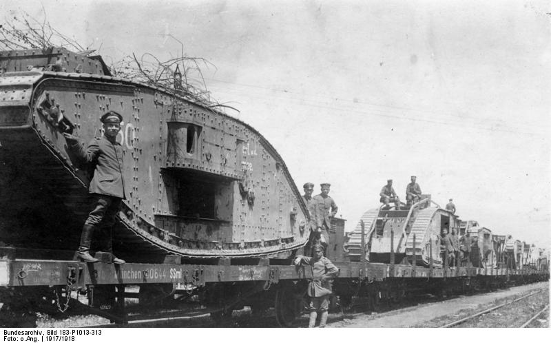
    I’ve attached a photo of German soldiers with captured British tanks being hauled away on railroad flatbeds–no doubt these were photographic postcards.  Seems to me highly plausible that Germany would employ more captured British tanks on the battlefield than they would German-made tanks. 

    Wwi project tanks captured
    [Source: wiki source– https://en.wikipedia.org/wiki/Tanks_in_World_War_I#/media/File:Bundesarchiv_Bild_183-P1013-313,_Westfront,_erbeutete_englische_Tanks.jpg]
     
    Notes
     
    See this interesting table on tank production for WWI: http://landships.activeboard.com/t35439129/total-number-of-tanks-usedproduced-per-nation-1916-1918/
    ·Posted by :

    ·in:

    —
  • Being Seen in ’17!

    JF Ptak Science Books   Quick Post

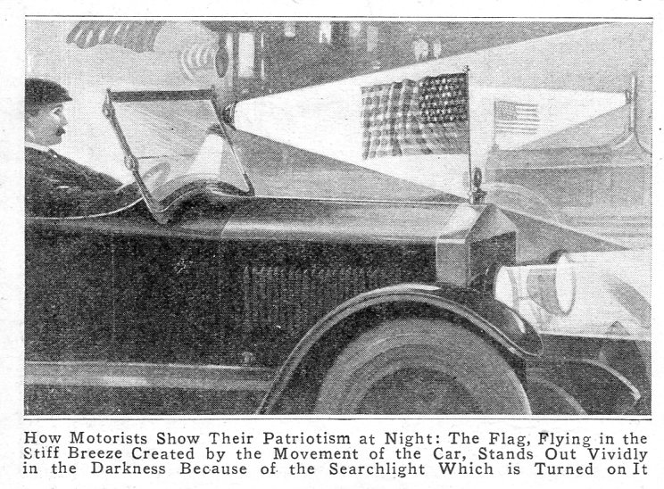
    What is the point of being patriotic in the dark when no one can see you?  Now there’s

    New and Improved Patriotism!

    where you can be seen to be patriotic, in the dark!

    Q: What more patriotic proof is needed when you can display your flag waving in the dark?

    A: Precisely! 

    Patriotic at night435

    [Source: Popular Mechanics, May, 1917, pg 802]


    ·Posted by :

    ·in:

  • Zeppelin Barometers, 1917

    JF Ptak Science Books  Quick Post

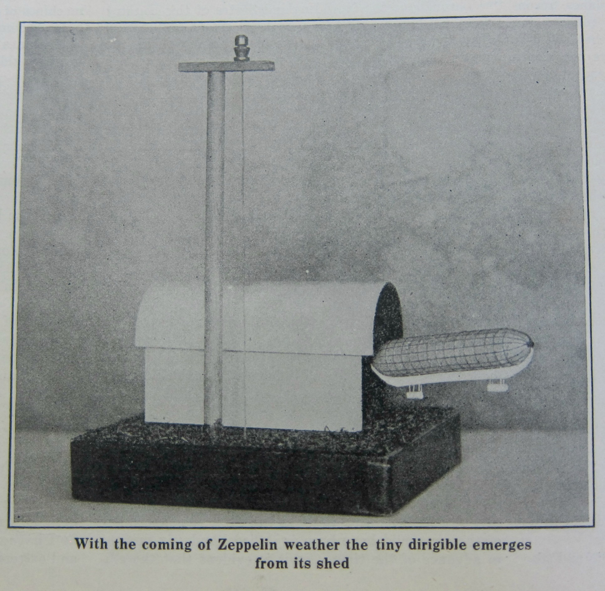
    And so it came to pass that in looking in the Scientific American for the earliest mention of battlefield tanks in WWI (appearing in April 1917) that I came upon these fine airship-related barometers.  I’ve written a short bit on the first appearance of the tank in Popular Mechanics just weeks after its battlefield inauguration and so I thought to look around a bit in some of the other popular places that this coverage should be found–Illustrated London News, Illustrirte Zeitung, and Scientific American.  I made it through the end of July of the weekly Sci Am without a peep on the “landship”, but then got completely distracted by several other items of great interest along the way, and so I need to stop and report.

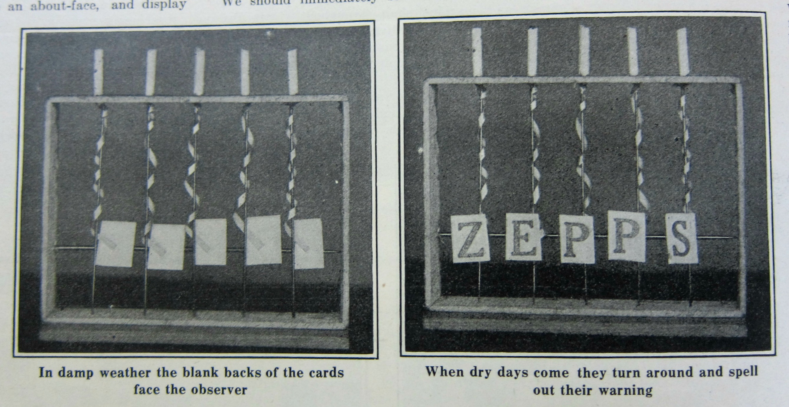
    And so from”landship” to “airship”–no tanks, but there was this fine, simple, and ingenious construction to alert the civilian that a change in the atmospheric pressure could be favorable to zeppelin attacks.  This simple apparatus is made of twisted jewelers (gold?) foil, one side of which is treated with varnish; the strips are so cut that when there is a change in the weather from damp to dry that the torsion would twist the foil a half turn, revealing the “ZEPPS”.  Pretty neat.

    WWI Project zepp barometer 1917

    [Source: Scientific American, May 12, 1917, p. 472.]


    There was a second instrument in that same short article that was a little more contrived and inventive, though I am particularly drawn to the simple ZEPPS above. 

    I am certain that the airship folks will like these…

    WWI Project Zeppelin barometer

    ·Posted by :

    ·in:

    — —
  • Forty Trips to the Moon and Back (in Wire), 1917

    JF Ptak Science Books   Quick Post

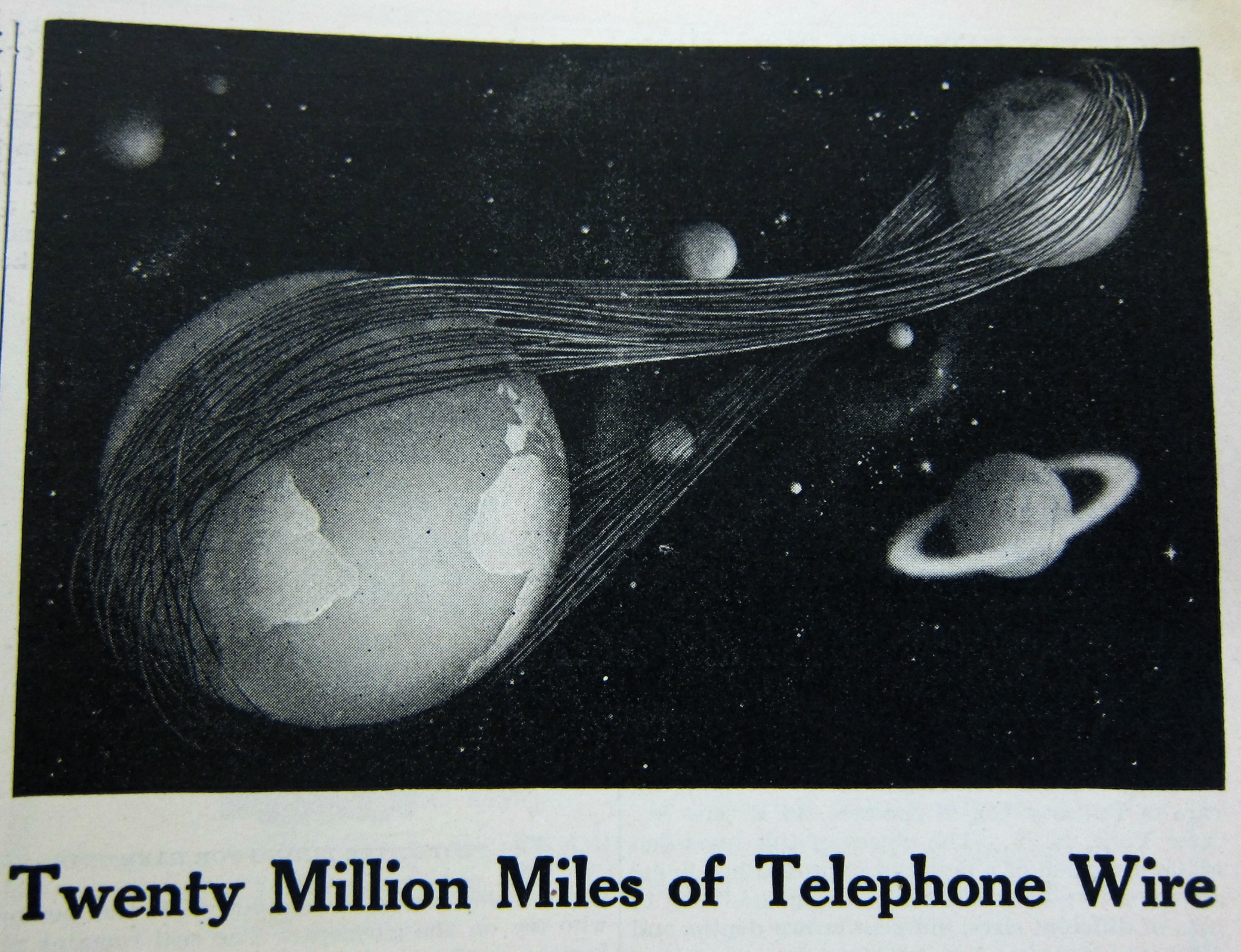
    While looking through a volume of Scientific American (January-July 1917) for a technical reference on the newly battlefield-introduced tank ( I could find none) I stumbled upon this intriguing info-graphic for American Telephone and Telegraph.  This of course is from at least seven decades before the concept of “wire” started to lose its shine in communications, and decades after the second “T”–for “telegraph”– in “A.T.&T.” lost most if not all of its meaning.  This interesting half-page ad displays the total amount of telephone and telegraph wire and cable in the A.T.&T. system–enough to reach from the Earth to the Moon and back again, 40 times (which is about correct calculating from the perigee). 

    Dataviz  telephone cables


    [Source: Scientific American, June 23 weekly issue.]

  • Data Visualization and Enormity (1917)

    JF Ptak Science Books Quick Post

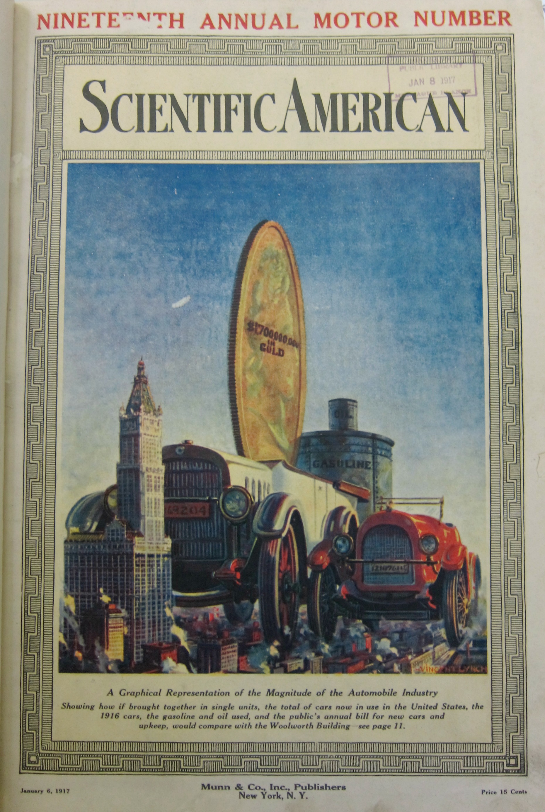
    Continuing what has become a series of posts from 1917 (all this prompted by looking for early mentions of the first use of a tank in battle during WWI) we come to The Enormity section. There are others to come, but there is something extra here in measuring production in terms of tall buildings–in this case, the Woolworth Building. In 1917 this was the world’s tallest building, and was so from 1911-1930, with 53 floors and 792′ high, its neo-Gothic greatness replaced by the Bank of Manhattan (928′) and then by the Chrysler Building, followed by the Empire State Building, and then the World Trade Center, and so on, which I mention just to put the Woolworth into perspective as a famous building capable of being used as a standard of measure.  What our graphic from the Scientific American (January 6, 1917) as to show is the enormity of the newish American automobile industry. The large car is supposed to represent the amalgamation of all cars built in the U.S.–the striking thing about the graphic for me is the second car, which is the production for only the year 1916.  In the background we see an enormous gold coin for the annual expenses of the car industry, and further back still the enormous cans of gas and oil used annually (which I guess were configured in terms of volume of the Woolworth Building). All-in-all, the visualization got its point across pretty effectively.  

    Dataviz automobiles 1917

  • Data Visualization and Enormity: the Daily Cost of War, 1917

    JF Ptak Science Books   Quick Post

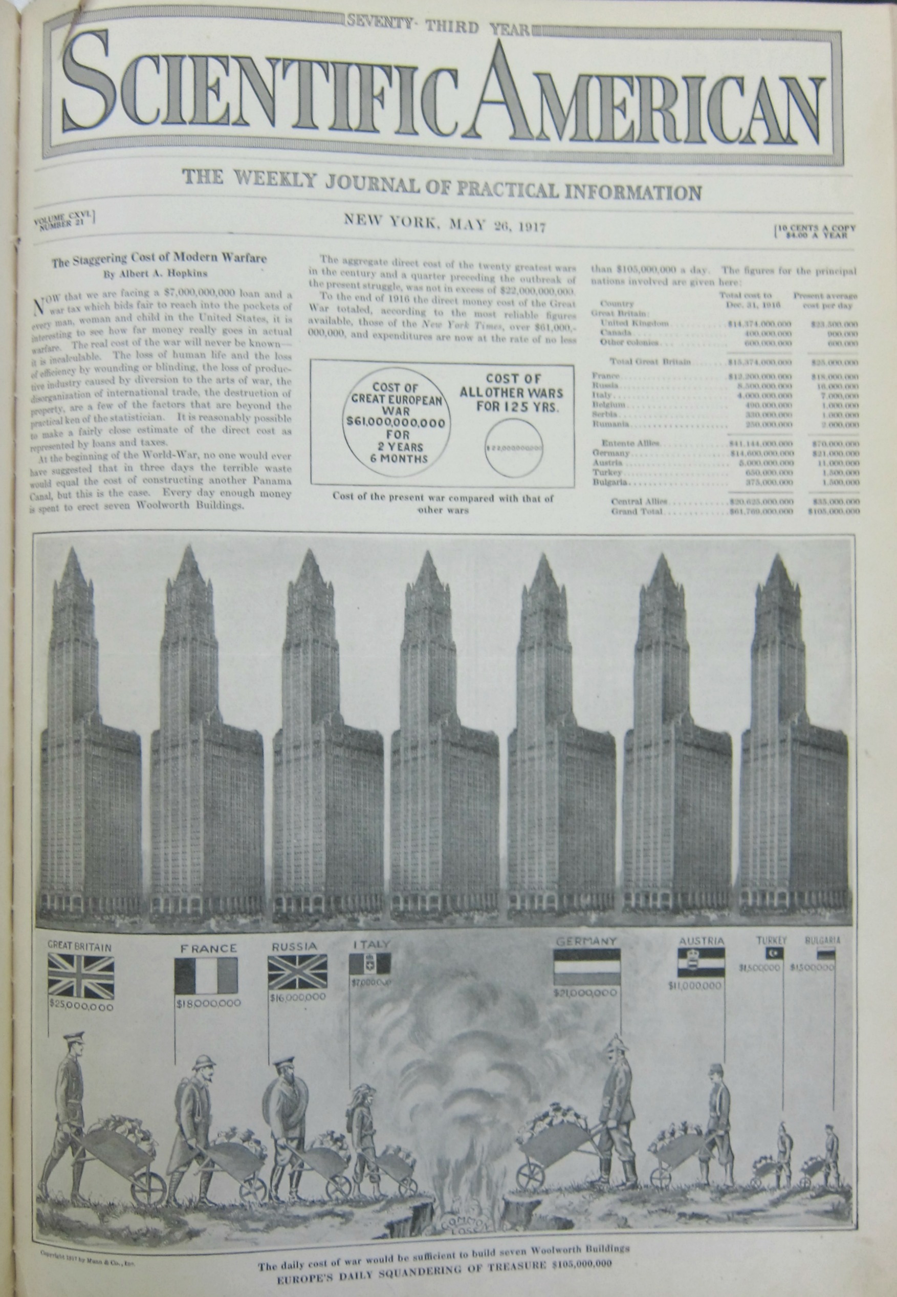
    The first thing that a reader in the U.S. will probably notice in this graphic is that there is no “United States” entry–that is because the U,S, had only entered the war seven weeks before this image was made after having been steadfastly neutral for the war’s first 2.5 years.  That said the daily cost of war was made accessible and understandable to the readership of the Scientific American by putting costs in terms of the construction of the then-tallest building in the world, the Woolworth Building (the world record holder for height from 1911-1930). 

    Overall, for the eight major combatants, the total daily cost of the war was the equivalent of the cost for building eight Woolworth Buildings, every day.  At the end of the war that would have been a stack of Woolworth Buildings that was 30 x 30 Woolworths by 150 Woolworths tall.  

    And just for perspective, the daily cost for Great Britain was 25 million pounds in 1917, which using the B of E calculator for inflation, would be about 1.2 billion pounds today (per day).  This is roughly in league wit the cost of U.S. involvement in the 2003 Iraq war at about 700 million dollars a day (since 2003). 

    There are many ways of looking at this data, though the Scientific American wanted to approach the expenditure in terms of gigantic piles of waste.  

    • See also an earlier post here on data visualization and the measuring of things with the Woolworth Building:  https://historyofideasblog.com/thesciencebookstore/2016/06/data-vizualization-automobiles.html

    Dataviz WWI war expenses full

    [Source: Scientific American, May 26, 1917.]

    ·Posted by :

    ·in:

  • Interesting Graphical Details in a 1936 Radio Marketing Pamphlet

    JF Ptak Science Books  Quick Post

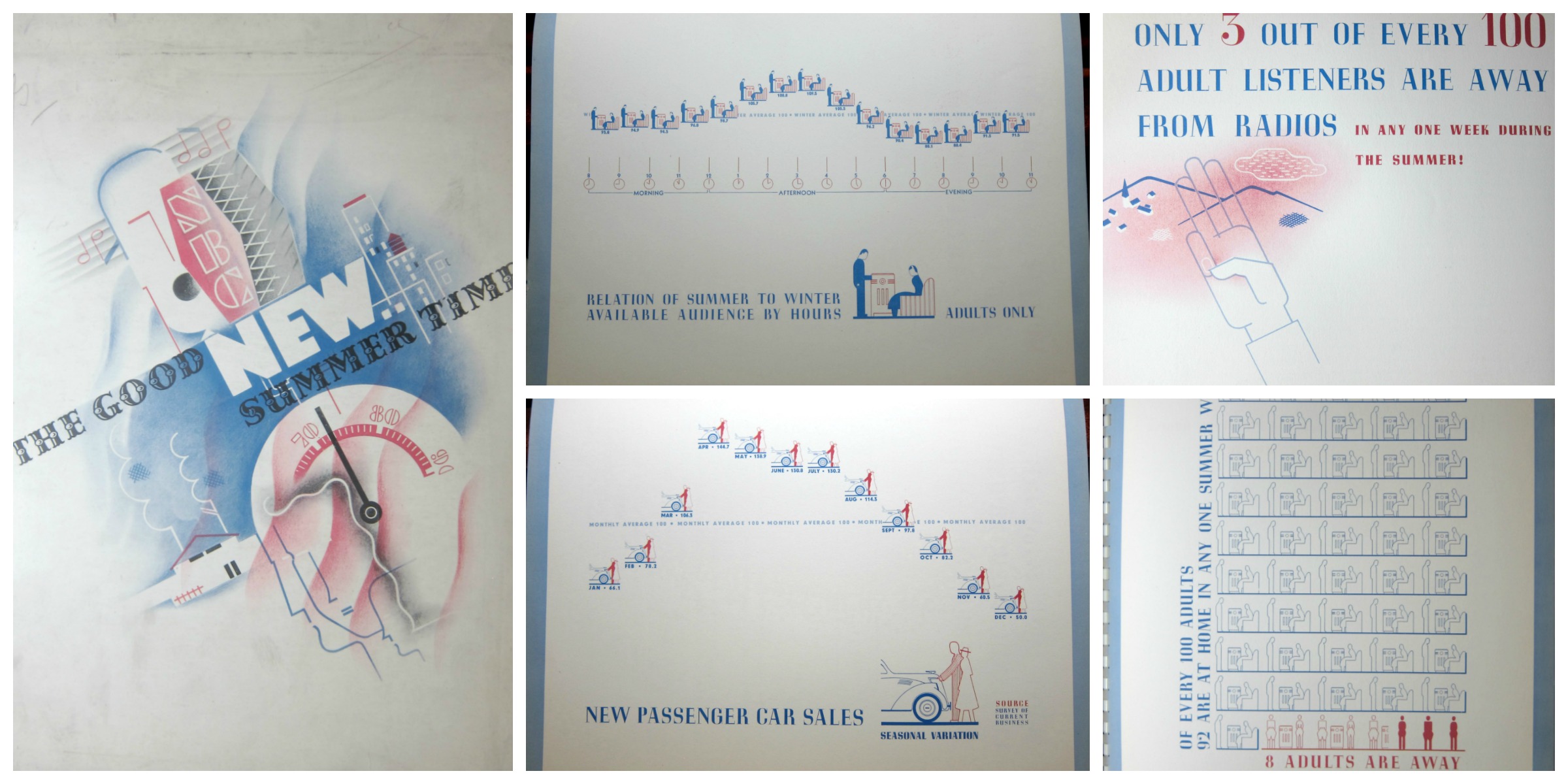
    Radio graphics NBC detail 436

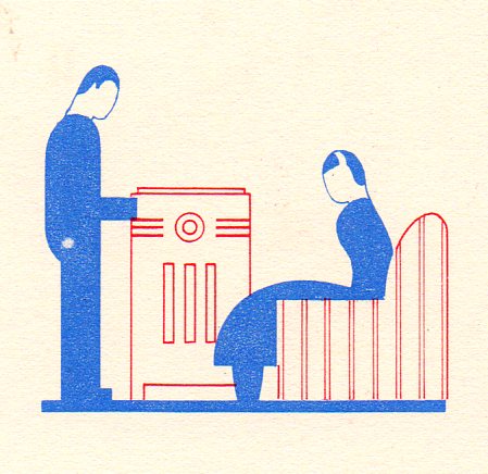
    No doubt there exist many opportunities to mine the radio broadcasting past with the statistics in this publication, though for my purposes now, I’m just reproducing a few of its very engaging graphic displays of information.  The document, The Good New Summer Time, a Probe of the Summertime Listening Audience of Today, published by the National Broadcasting Company, and printed in 1936, contains useful information regarding programming and advertising for the relatively new medium of radio.  The standards for the graphics are both light and a little complex–for example, in the display immediately below/center in the montage, we see a comparison between summer and winter adult audiences, the data points plotted in units of a standing man and seated woman listening to the radio.  

    Radio graphics NBC detail  auto437

    There really wasn’t that much data to be displayed, though the designers managed to fill the page in a pleasing way. It seems, overall, that this was an uncommon effort to display a small amount of highly useful limited-distribution data in an engaging manner.  

    Dataviz radio montage


  • Under That Heel

    JF Ptak Science Books  Quick Post

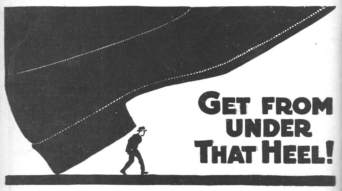
    This interesting design comes from the American School of Correspondence of Chicago Illinois, and although it is initially intimated that the heel in question was “Capitalism”, it was the individual who kept them heel on themselves.  A little correspondence school here and there would help the progress of “Labor” and advancement–also interesting to note that both labor and capital have capitalized first letters.  

    Button under heal438

    [Source: Illustrated World, June 1916]

    ·Posted by :

    ·in:

  • An Ad Using a Visual Display of the Effect of Work on Longevity (1916)

    JF Ptak Science Books  Quick Post

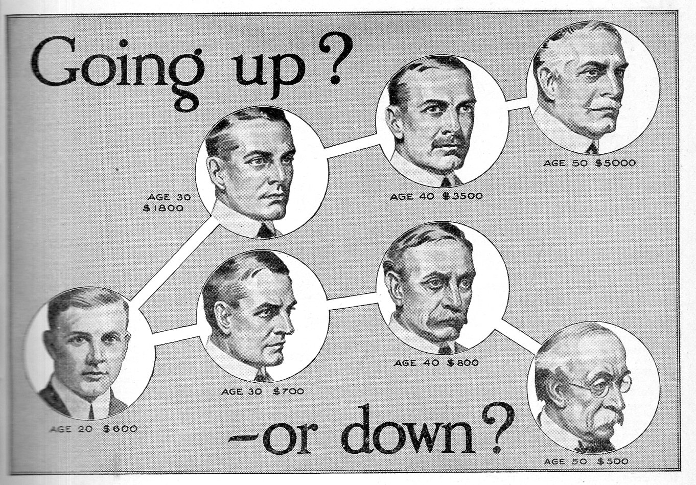
    Earlier in this blog I made a quick post for an interesting graphic for the American School of Correspondence–here we have another design intimating a medico-sociological structure based upon income. It probably isn’t that far from the truth, though I  seldom see it displayed in such a fashion.  No doubt the difference in facial appearances and their associated income has to do with the level of work and the draining effect of long-term physical work.  This image was published in Illustrated World in February, 1916–at this point, life expectation for males was about 50 and females about 54

    Going up or down441

  • Data Visualization of U.S. Territorial Populations

    JF Ptak Science Books  Quick Post

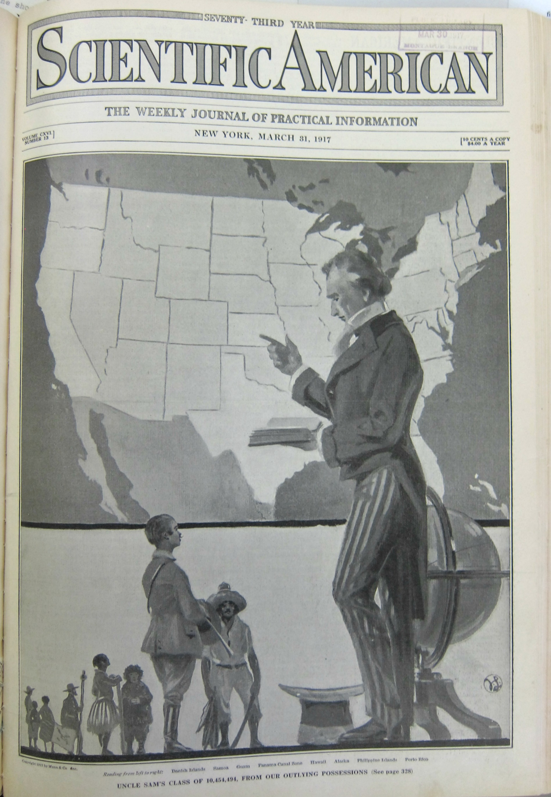
    The following is a relatively prefunctory visualization of data, found in the Scientific American for March 31, 1917. It displays the populations of eight U.S. territories in relation to that of the United States, standing here as a professorial Uncle Sam to somewhat wincing representatives from the territories (including Puerto Rico, the Philippines, Alaska, Hawaii, Panama, Guam, Samoa, and the Danish Islands). 

    Dataviz U.S. pop territories

    [Source: Scientific American for March 31, 1917]

Recent Posts

Archives

Categories