A Daily History of Holes, Dots, Lines, Science, History, Math, Physics, Art, the Unintentional Absurd, Architecture, Maps, Data Visualization, Blank and Missing Things, and so on. |1.6 million words, 7500 images, 4.9 million hits| Press & appearances in The Times, Le Figaro, Mensa, The Economist, The Guardian, Discovery News, Slate, Le Monde, Sci American Blogs, Le Pont, and many other places… 5000+ total posts since 2008.

  • Graphical Representation of Data #1–England Invaded, 1908

    Blogaeroplane_2


    Some of the most striking things in my collection/store/accumulation are the hundreds of images that portray data for display purposes–even more so, those that use a vernacular setting to bring closer to home an understanding of a statistic or finding.

    (One of the most popular books on this subject is The Visual Display of Quantitative Information by Edward Tufte, which uses a number of interesting images (good and bad) for the purposes of his book. Another, by fellow Asheville resident Peter Turchi (director of the MFA program for writers at Warren Wilson College) is Maps of the Imagination, the Writer as Cartographer,  which hosts a large number of interesting images the stories of which are richly and elegantly woven–this is a real piece of craftsman, and pretty, and useful, too.)

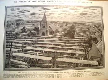
    The print that we’re looking at here appeared in the 19 December 1908  issue of The Illustrated London News and is entitled “The Futility of Herr Rudolf Martin’s Plan of Invasion by Aeroplane”. This fantastic piece of annonymous artwork graphically depicts what the author maintained was the impossibility of Germany to invade England by landing 50,000 flying machines and 100,000 men on the Kentish coast of England–impossible (quantly though realistically) because “of the impossibility of finding landing-room (for the planes) and cover for an army on aeroplanes”. The artist depicts a small town and what I guesstimate to be 60 planes in the air and 75 or so on the ground, leaving it to the imagination of the reader where the other 49, 875 might go. He DOES make a point, and very vividly.
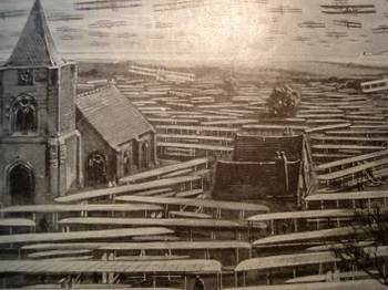
    Blogaerooplanedetail “Nothing could show better the futility of Government Councillor Rudolf Martin’s idea that Germany could construct 50,000 flying machines for 50-million pounds…and land 100,000 men on the Kentish coast from Calais within half an hour.” Evidently Mr. Martin was very concerned with the invasion of England by Germany via airplane, and it was the editor’s job at the ILN to show him
    misguided. I would imagine that this illustration drove the point home
    to the folks who didn’t actually bother to read anything about the
    Martin defense plan. (It was in a similar way that Thomas Nast was able
    to control public opinion and sway political refuge and protection away
    from Boss Tweed. Tweed famously boasted that he didn’t care what the
    newspapers said about him because his power base didn’t read–he
    might’ve been and probably was correct here, so Nast took after Tweed
    via the political cartoon, and big too, and frequently; and the
    cartoons, even if the people looking at them couldn’t read, told the
    whole story graphically, and it was this that brought an end to Tweed
    more than anything else.)

    Martin fueled vast public concern with his procurement. Again in 1908 he granted an interview to the Daily Mail in which he outlined another plan by which he felt Germany could launch 3,500 “specially design” airships (I’m guessing dirigibles) and land 350,000 (!) men in England in, again, that half-hour time period. (I have no idea how you would do this, even today.) His speculations were well-discussed in the British press, and then found their way to Germany and Berlin,     where Rudolf’s plans against such an incredible non-existent attack by the Germans was ruefully considered. (The ILN was making the point by addressing Mr. Martin as “Herr” Martin that he was doing more harm than good in his yellowpapers.)  This evidently whipped itself into a frothy aeroplanitis in 1909, despite such efforts as this graphical reasoning by the ILN to dispense with the unreasonable fears.

    The airplane flown by the Wrights, the first powered heavier-than-air flight, occurred barely six years prior to these frantic events–the invention was still fresh (and basically “foreign”, as the Brits lagged well behind the other major powers in flight until WWI)–and understandable in a way that the fears were not understandable, not really, because of the newness and exotic aspect of the threatening invention.
    For a tour of the chronological history of the graphical representation of quantitative data as well as innovations in statistical and representational cartography, please have a look at Michael Friendly’s  magnificent site--it is an historical site the way it should be done, complete with all the trimmings, as well as the usually-absent but very important citations to the orginal articles used in the chronology. 

    ·Posted by :

    ·in:

  • Graphical Representation of Data 2—What a Million Dead People Looks Like

    JF Ptak Science Books LLC

    Blogmarch

    The Illustrated London News
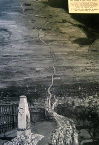
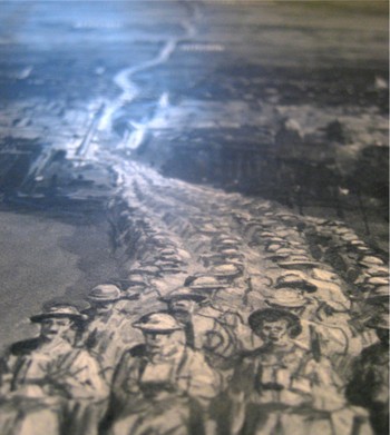
    published this very sobering image showing the general reader in London in 1933.  It is entitled “In Memory of the 1,104,890 British Dead of the Great War”, and was drawn by D. Macpherson.  It very graphically represents all of the war dead of the British Empire of 1914-1918, depicted as a line of men, four across, extending from London to Durhham.  The column passes from London through Hitchin, through Bedford and Peterborough and Grantham, past Sheffield and Leeds and York, and then on to Durham.  An extraordinary column of the war dead: 900,000 of the dead were not soldiers at the beginning of the war, but they sure died that way, and this map shows them all in a line, marching from  a point 269 miles distant.

    Blogmarching_2

    ·Posted by :

    ·in:

  • Graphical Representation of Data: Slavery in the U.S. 1854

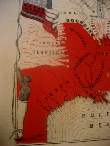
    Blogslavery_detailThis incredible, indelible image is another from our collection of graphical representations of data and ideas.  This map, is entitled Moral Map of North America, 1854; the Slave States are coloued Red, the blighted influence of Slavery is also deeply felt in those parts more slightly streaked with Red€.  I can find no record of this map, printed obviously by our Bretheren across the ocean–€”that and the fact that it was printed in 1854 is all the publishing data that I can find. 
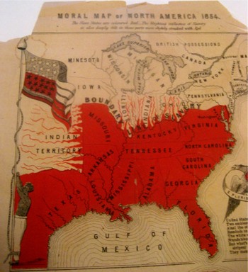
    The poem at bottom reads:
    United States! Your banner wears
    Two Emblem €”one of Fame;
    Alas! The other it bars
    Reminds us of your shame.
    The white man’s liberty in types
    Stands blazoned by your stars;
    But what’s the meaning of your stripes;
    They mean your Negro-scars.

    Blogslavery

    Reciting this poem by Thomas Campbell before an abolitionist convention in 6 March 1851, William Wells Brown continued (as was reported in the National Anti-Slavery Standard) “The name of the United States is becoming a hissing and bye-word in the mouths of the inhabitants of every clime. My country is indeed the land of oppression. There is not a rood of territory over which the Stars and Stripes€ fly, on which William and Ellen Craft or myself could be protected by law. Wherever the American flag is seen flying on the continent of the New World it points us out as slaves; and we enjoy to-night a degree of freedom in your town that we could not if we were in the land of our birth. I often speak of America as my country, but in point of fact I have no country. In the language of one of the noblest of the Negro’s champions in the United States.  €œMy country is the wide, wide world; My countrymen are all mankind.”€

    Brown should know:  his mother was a slave and his father the plantation owner who later granted him his freedom.  Brown then worked the underground railroad and much, much more, working with William Lloyd Garrison and Wendell Phillips.  Among his published works included the incredible  Clotel, (1853), which was one of the first novels published by an African-American in the U.S.,  and which discusses in great detail the relationship between Thomas Jefferson and his slave/lover/mistress Sally Hemings.

    The map is definitely a tale of morality, showing a definite margin of slavery but also depicting slavery leeching its way through the border states. It is interesting to note that Washington D.C. is represented in red as it was indeed a slave-holding district, with a slave pen right on the Mall in the 1830’s. 

    The most striking feature to me of course is the slave who is lashed hand-and-foot to the flagpole on which the American flag is flying—this is the only time that I have seen the slave and the flag portrayed as a unit, together, the slave being tortured by the standard of our country. 

  • Titanic Understatement at the Alpha & the Omega–Two Big Bangs

    Blogalphaomega023
    The soft-sell of the generally recognized and understood
    propositions, stepping well around the main, central, controlling issue,
    hinting broadly along its perimeters, defining the emptiness by its shell, left
    to an undistinguished recognition, is what we’re hunting here.

    I have two examples of extreme examples of understatement occurring
    at the beginning and end of things—all things.

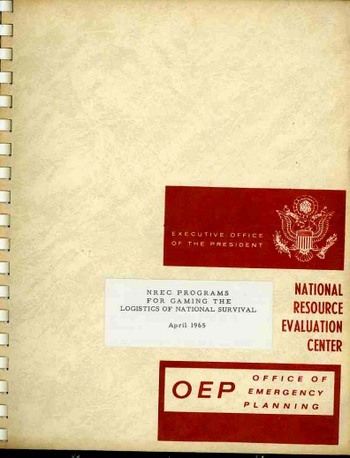
    The first occurs at the end of all things. Written by Joseph Coker, Chief of the
    National Resource Evaluation Center in the Office of Emergency Planning in
    Washington, D.C. in April 1965 (100 years to the month after the end of the
    U.S. Civil War), “NREC Programs for Gaming the Logistics of National Survival”
    is by its very title and appearance a startling looking and sounding
    document. Coker and his NREC worked
    within the Executive Office of the President (LBJ at the time), and his paper concentrated on a succinct appraisal of
    the existing gaming programs looking at survival of all aspects of the national
    life in the days following nuclear end-game.

    Blogalphaomega_2025
     

    In general the document is as dry and cardinal as bagel
    toast—it warms quickly and invisibly, however, and that bagel toast becomes a
    burnt and invisible cinder via Coker’s prose.

    The document wastes no time in getting directly to vast
    understatement, and stays there. In
    chapter one “Logistics of National Survival”, the second chapter opens:

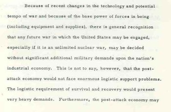
    “Because of recent changes in the technology and potential
    tempo of war and because of the base power of force is in being (including equipment
    and supplies), there is general recognition that any future war in which the
    United States is engaged, especially if it is an unlimited nuclear war, may be
    decided without significant additional military demands upon the nation’s
    industrial economy.” Hmm. He continues: “That is not to say, however,
    that the post-attack economy would not face enormous logistical support
    problems.” There is no human element of this equation. “The logistic requirements of survival and
    recovery would present very heavy demands.”

    Blogalphaomega_3_2026

    “Very heavy demands” reaches a very great height of
    understatement. How high is high? I don’t know. Remember: Mr. Coker was Chief of
    this division and working within the Executive Office. This was thinking at a very high level.

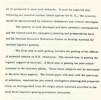
    He continues in this same paragraph: “Furthermore, the
    post-attack economy may be ill-prepared to meet such demands”. The paragraph ends in a tremendous horizontal soar: “It may be expected that following any
    massive nuclear attack against the U.S., the economy would be characterized by resource imbalances and
    critical shortages
    (italics our’s). 

    Coker’s papers meant to remedy the approaches to these “imbalances”. The NREC was up and running with ideas and
    computing fire—in the form of the CD 3600 computer and FORTRAN—to develop a “damage
    assessment system” called READY that would replace the existing programs named,
    with no evident imagination, JUMBO, STREAK and DART.

    Throughout this entire document there is no mention of overwhelming,
    catastrophic death and/or obliteration of the social structure, except that it
    must be implied that there must be “someone” to operate the essential
    industries that must be brought back on line.

    Curiously there is a discussion about the survivability of
    the Federal Reserve and the banking system. My guess is that in the ensuing giga-tons of holocaust of flame that
    paper money didn’t burn along with its human holders.

    Bloghubble
    The second understatement that we will look at here belongs
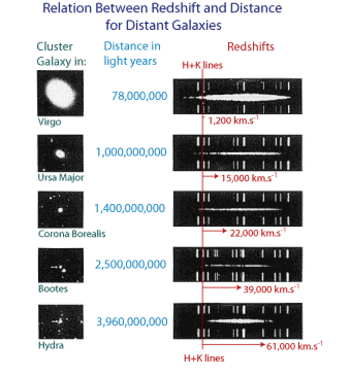
    in the last paragraph of the seminal paper by Edwin Hubble and Milton Humason,
    writing on the “discovery” of the Big Bang as they defined the Red Shift, which
    was actually a roughly proportional increase of distance traveled to red
    shift. They plotted a trend line for 46
    galaxies and in 1929 formulated the empirical Redshift Distance Law of
    galaxies, which is today known as Hubble’s Law, which was consistent with the
    solutions of equations of GRT.

     It is in a further report on their studies in The Velocity-Distance Relation Among
    Extra-Galactic Nebulae
      (Mount Wilson Observatory,  1931) ,
    that Hubble and Humason make their stupendous understatement: regarding their understanding of the phenomena
    and the expanding universe, they take many steps back, and say in the
    concluding paragraph “the writers are constrained to describe the apparent
    velocity-distance displacements without venturing on the interpretation and its
    cosmological significance”. They
    basically lay out the functioning of the universe and the best understanding of
    how we got to where we are in the cosmos (Vesto Slipher notwithstanding), and
    how according to their understanding that the universe is expanding and is consistent
    with all known laws, that they decide to not say anything, um,
    philosophical.

    And so, in the last paragraph of this paper discussing the Great
    Omega, the authors decided, in their modest and terrifically understated Bartlebian way, to not comment.

    Bloghubble_redshifts

    The plot of the Hubble redshift findings is taken from the Australia Telescope Outreach and Education site, HERE.

    ·Posted by :

    ·in:

  • Beautiful Title Pages 1—Oswald Croll’s Chemistry, 1611

    Web_blogcroll3_2027_2

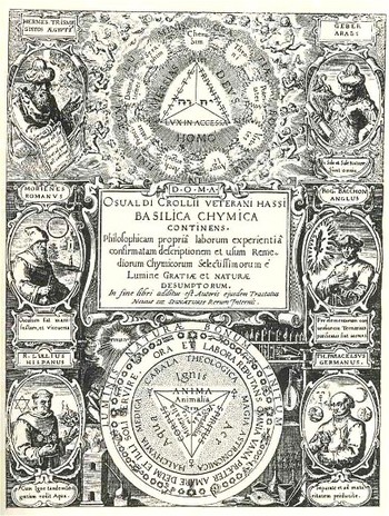
    Oswald Croll is a big name in the history of chemistry.  At a time where so many other Big Names were writing books about chemistry as a science, Croll wrote a scientific book of chemistry.  Paracellus, one of the greatest of these big names, wrote rather vaguely and in a sense secretively about his preparations and compositions, as well as their use and applications; Croll on the other hand writes in great and exhaustive detail about just such things that Paracelsus leaves out. 

    The title page to his Croll, Oswald. BASILICA CHYMICA. Continens Philosophicam propriam laborum experientiam confirmatam descriptionem et usum Remediorum Chymicorum Selectissimorum e Lumine Gratiae et Naturae desumptorum. In fine libri additus est Auctoris ejusdem Tractatus Novus De Signaturis Rerum Internis, was printed in 1611—probably two years after Croll’s death—and is a gorgeous display of allegorical and historical images. The allegorical parts are a bit out of my range, but the historical figures are easy enough (being identified!), and include Hermes Trismegistrus, Geber, Morienes, (the great) Roger Bacon, (the magnificent) Ramon Lull and Paracelsus.

    I like the Croll as the beginning of a series of images of beautiful title pages in the history of science.

  • Emblems of Featureless Faces–Philibert de l’Orme’s Architecture, 1568

    Web_blogbad_builder028
    Philibert de l’Orme’s book, Le Premier Tome de l’Architecture,
    printed in Paris in 1568, contains a singular illustration. L’Orme (who lived ca. 1515-1570), was perhaps one of the first modern
    architects, not only because of his superior engineering skills, but also because
    he was a superb organizer—a superior architectural tactician.

     He worked for Henry II and Charles IX, supervising the construction
    of Fontainebleau, Saint-Germain-en-Laye—where he built the
    Château Neuf, and the other royal buildings. As well as the Tuileries,
    in collaboration with Jean Bullant.

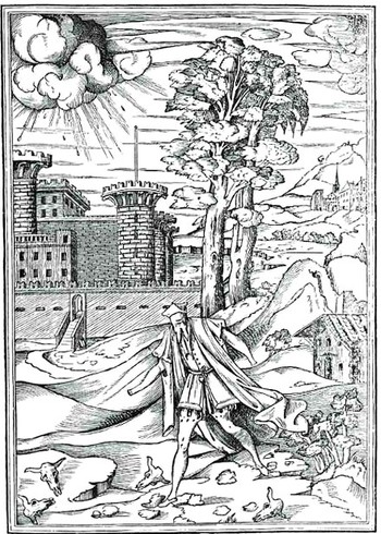
    The text explaining the illustration reads something like “to
    guard against persons who can do nothing right, cannot see what is to be done
    well, cannot hear what should be understood…” Perhaps l’Orme was talking about people in general; or, perhaps, as I
    suspect, he was referring to someone in his own profession, a builder, an
    engineer, an architect? In any event,
    this singular image is one of the few that I can recall in which a person is
    allegorically represented without  hands,
    eyes, ears or, perhaps a nose.

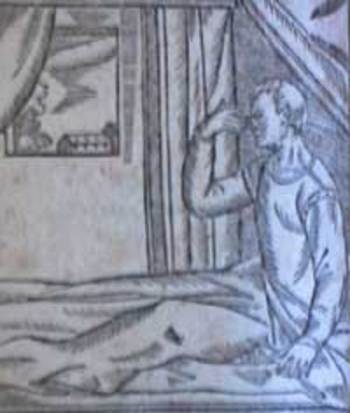
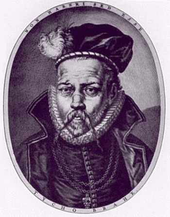
    There’s quite a bit of imagery showing unusually-featured faces–and I’m talking about emblemata rather than monsters or mythological/hypothetical beings meant to go creaking into the night. I’m also excluding medical images Blogorme
    (like this for an early form of rhinoplasty) and people who have suffered injury or are differentially abled (as in this image of the great Tyhco Brahe and his silver nose).  I’m Tycho_brahe
    hard put to think of other examples of representational humans with such features existing in the technical or scientific world, though–I think that l’Orme’s designer/engineer here is a very scarce creation. 


  • History of the Future 1: Caricature of the Future, J.J. Grandville and the Bridge Across Saturn, 1844

    BlogfuturegrandvilleJF Ptak Science Books LLC  Post #52

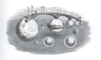
    Admittedly, J.I.I Grandville (1803-1847) didn’t conceive of this series of bridges as a plausible means of interplanetary travel and is in all probability an allegorical creation, but the image does–in an odd way–allow a dialogue on the idea of moving from planet to planet, which was still pretty solitary thinking in the mid-19th century. Although this didn’t have a direct effect on the perception of man’s place in the solar system, it did have a great and direct impact upon a vast number of illustrators and cartoonists who followed in his considerable wake.
    This image comes from Grandville’s Un Autre Monde, published in 1844.

    In addition to an interplanetary bridge that there is another singular creation here in Grandville’s cosmos–a balcony constructed of the rings of Saturn (if indeed this was supposed to be Saturn–it is as advantageous as not to think of it in this way) and if we think of a balcony being a place to watch and observe, then we are brought instantly to W.G. Sebald’s Rings of Saturn, which is a textural masterpiece, and mostly I guess a novel about everything that Sebald observed in his walk through Suffolk.  (Another Saturn-related work of fiction is Sirens of Titan, by Kurt Vonnegut,  a very mature and insightful 1959 novel which really has nothing to do with anything here; I just needed to throw that in, what with him being a master storyteller, crank and human-caricaturist-observer and all…)  And so by 1844 it comes to pass that one French caricaturist/imaginist comes to draw an extraordinary and impossible land/space bridge between the planets only 234 years after Galileo Blogsaturn first glimpsed Saturn’s “handles”.  It would take another 65 years and accumulations of observations by some of the greatest names in the history of astronomy (Galileo, Casini, Hevelius, Huygens) to show that the disk (singular) on Saturn was actually a series of tings The first photograph of Saturn’s rings is not made until 1883.
    Grandville (Grandville ‘Gerard, Jean Ignace Isidore, born in Nancy, 1803 -1847) I see as more like a caricaturist of the future, seeing what might be possible, plausible, imaginable, and also see the grotesque royalness of it all as well.  In as much as thinking of such an image as interplanetary land bridges might seem, Grandville shows at the same time their innocent, clinging wrongness. 

  • The History of the Future 2: Henard touches on the Future’s Future Plan, 1911

    Bloghenard029JF Ptak Science Books LLC  Post #51

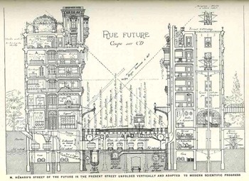
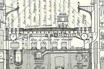
    This  cross section illustration (“Rue Future”/Future Street) is from E. Henard’s (1849-1923) article, “The Cities of the Future”,
    from American City, Volume 4, January, 1911. In this article Henard (architect of the city of Paris and from 1880 a life-long employee and advocate of public works in that city) looks into the future
    and sees the movement towards underground (or enclosed) vehicular traffic,
    “smart” buildings, pneumatic tubing for vacuum cleaners (“almost
    sure to come into general use”), an improvement in the system for water
    delivery and removal, replacing coal with natural gas, and more. He lays out a
    plan to implement his idea that, if implemented int he city of

    Bloghenard029_detail

    Paris, would cost $420,000,000 (or
    approximately $15 billion in 2006 money) over 100 years. [This part seems a
    little off given that the area for public roads alone in Paris at this time was 3,700 acres–nevertheless this was an interesting appearing plan, a significant
    portion of which has found its way into building and community planning albeit
    on a far smaller scale].

    Henard was also acutely interested in the future traffic problems of Paris and other major cities, proposing revolutionary radial traffic patterns for moving cars around major metropolitan areas–which was really quite visionary as the mass production of automobiles had not yet really taken place–certainly automobiles were far more common by 1911 than 1905, but their numbers would be vaulted higher int he next decade with the first true approach to assembly line production of automobiles, making them affordable to the millions.  His plan for a ring-lime system around the city of Paris was influential to some of the ideas in the early
    American planning reports for San Francisco and Chicago by the great Daniel Burnham.

    What is particularly interesting for me in the Henerad plan is the room that he left for his future’s future–he attempted to make his plan adaptable for the time when the future he was writing about was becoming the past.  And so he was leaving room in his underground plans (in particular) to accommodate some of what the future might hold in store for his city, leaving unused spaces and tunnels, so that the city planners in the future would not have to go through the enormous expense of putting these things in for themselves.  Now that is future-forward thinking. 


    For a good, long article on the plan see http://www.library.cornell.edu/Reps/DOCS/henard.htm


  • Typewriter and Anti-typewriter: Writing Systems of von Knauss, della Porta, Trithemius, Schotti

    JF Ptak Science Books Post #53

    Blogtypewriter_unwriter_2035

    Sometimes order brings disorder; and disorder, order, as in the following two examples of early versions of modern technology.    Take the typewriter—it has a curious display of the alphabet, designed to impede, while numbers are displayed along the tip, in order.  (The qwerty system may well have been put into place as the earliest typewriters, beginning even with Glidden and Sholes machine, could not absorb very fast typing due to their technical limitations, and so came the qwerty arrangement.)  So from this non-random arrangement we are able to direct all of our thoughts and intentions.

    Blogtypewriter_unwriter033_3

    (An interesting aside is this magnificent non-qwerty machine, found in F. von Knauss’ Selbstschreibende Wundermaschinen… (1780), a magnificent work on “wonder machines”, and which is recognized as the first “typewriter”.)

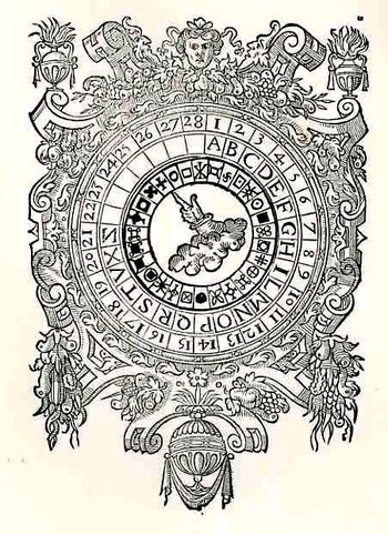
    The other elegant machine is the cipher. In the beginning of its use the alphabet is usually properly arranged, and placement of letters and numerals is very clear and precise.  The result however is anything but—the product being a beautiful randomness and a secure, secret language.   

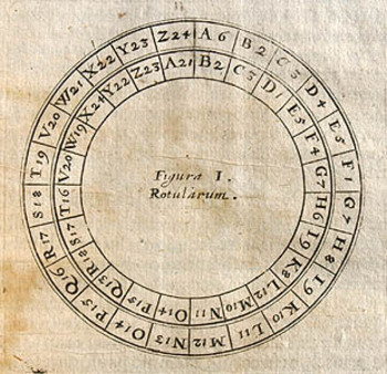
    Cryptodiskscholarotularum

    This illustration features a lovely volvelle (two or more pieces of paper arranged so that they may be turned one on top of the other) from Giambattista Della Porta’s De furitvis literarum notis vulgo…, printed in Naples in 1591.  The volvelle was one part of the book which explained the art of steganogrpahy—the art of writing incomprehensibly except to those who possess the key—and was one of the most important works on the subject after the Polygraphia of Johannes Trithemius (This book was written in 1599, published in 1606 and condemned in 1609—ostensibly because the book was thought to be about the dark arts and black magic, though the offending volume, the third and last,  was really a deeper work continuing on cryptography.)   

    This is another interesting paper volvelle device, called a rotularum, and can be found in P. Gasparis Schotti’s Schola Steganographia, and printed in 1680.

    Strip_cipher


    Closer yet to the order/disorder idea is the strip cipher, which begins the process of encoding with numerous aligned alphabets which are then put out-of-order to secure a deeper discontinuity between the original message and its encoded version. 

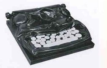
    A modern and imaginative version of a typewriter version of a cipher may be seen in Claes Oldenburg’s 1963 “Soft typewriter”–well, not really, but this may be the only time that I have a chance to use this illustration.

    Blogtypewriter_nwrriter_soft036_2  


  • Beautiful Title Pages 2—Living Skeletons and Anthropomorphic Shells

    Blogunusual_design_elements0322
    JF Ptak Science Books LLC
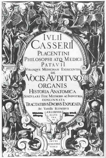
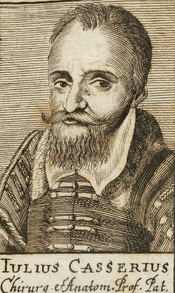
    The first title page here belongs to Guillio Casserio (c.1552-1616), De Vocis Auditusque Organis historia anatomica singulari fide methodo…, 1600-1601, an absolutely gorgeous illustrated monograph on the vocal organs and organs of hearing in man and animals. Casserio, a superb anatomist (and who was also signatory to William Harvey’s doctoral diploma from Padua in 1602), set the standard for accuracy and beauty in copperplate anatomical illustration just as Vesalius had set the standard for woodcut illustration.

    Casserio_1
    I cannot recall a title page illustrated with so many skeletons, especially so beautifully arranged, and posed in common, breathing, living situations.  Their placement is excellent, along with the other skull and bones—it seems to me as though they could not be re-arranged into a better assortment more pleasing to the eye, much like rearranging Joseph Cornell construction…it just cannot be done. 

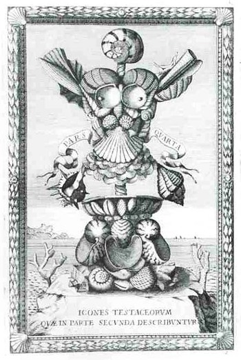
    Another fine example of title page design is Filippo Buonanni’s Museum Kircherianum sive Museaeum A.P. Athanasio Kirchero…printed in Rome in 1709, and it  belongs to the first published effort to catalog the scientific and miscellaneous
    Blogunusual_design_elements031_3

    collection of the vast 17th century polymath, Athanasius Kircher; the collection assembled in the Jesuit Collegio Roman, and assembled by Alfonso Donnimo.  Buonanni  was a student  of and successor  to Kircher at the Collegio  and catalogued the specimens of natural history, scientific instruments, geological items, Egyptian antiquities, and other items brought back to the school via networks of Jesuit missionaries.  His particular strength in study was conchology, and he displayed his knowledge in this intricate arrangement of shells from the collection in the title page.

    Arcimboldovertemnus_3I cannot help but think that his artistic vision may have been  influenced by the extraordinary Giuseppe Arcimboldo (also spelled Arcimboldi; 1527-1593), who, one hundred or so years earlier, painted (in his non-conventional works) fantastic portraits and images using fruits, vegetables and other natural objects as the sole source of representation.  On the other hand his influence may not have been so very well known, as many of his works were stolen during war time in the mid-17th century, and he fell rather deeply into obscurity until being revived and resurrected by the Surrealists in the 20th century.  His work was so extraordinary–and this is true at any time in history but especially so during the time that he lived–that it would be impossible not to mention this unique talent in connection with Buonanni.
  • Beautiful Title Pages 3–Roger Bacon’s “Novum Organum” and the Voyage of Discovery, 1620

    Blogbacon038JF Ptak Science Books LLC

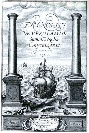
    This sweepingly metaphorical title page belongs to Francis Bacon’s (1561-1626) superb Instauratio Magna, printed in 1620.  Bacon, the privileged and brilliant son of Nicolas Bacon, the Lord Keeper of the Seal of Elisabeth, entered Cambridge at the age of 12 and never looked back, becoming one of the leading thinkers of the English Renaissance. 

    The Instauratio contains his Novum Organum  (The New Oganon [New Instrument], or true Directions Concerning the Interpretation of Nature) a monumental pronouncement and a new way of looking at scientific thought, looking to break away from the established Aristotlean methods that had been in place in England and Europe for centuries. The “new instrument” part directly relates to Aristotle’s own work called Organon, which in short was a work of inquiry and a treatise on logic and syllogism—Bacon would present his own new instrument of logic base upon a simpler process of reduction. (Bacon famously begins this work “Those who have taken upon them to lay down the law of nature as a thing already searched out and understood, whether they have spoken in simple assurance or professional affectation, have therein done philosophy and the sciences great injury. For as they have been successful in inducing belief, so they have been effective in quenching and stopping inquiry; and have done more harm by spoiling and putting an end to other men’s efforts than good by their own.”  He continues in this vein, getting to the real crux of the biscuit, and broadly states in the second paragraph “Now my method, though hard to practice, is easy to explain; and it is this. I propose to establish progressive stages of certainty. The evidence of the sense, helped and guarded by a certain process of correction, I retain. But the mental operation
    which follows the act of sense I for the most part reject; and instead of it I open and lay out a new and certain path for the mind to proceed in, starting directly from the simple sensuous perception…”  And how!) This new approach to knowledge was foremost in the mind of the designer and artist who produced this title page, which is deeply indebted to the analogy between the (very deeply ingrained and mature) age of exploration and that of intellectual discovery.
    Blogbacon_bits

    The ship in this scene is passing through the Pillars of Hercules, exiting the relatively safe waters of the western Mediterranean and heading out to sea—-to accent this point we see two sea monsters at either side of the ship right at the beginning of this new-world trip, just feet beyond the established safe perimeter.  The pillars had long since been recognized as the western end of the world, as recognized by Dante in the Inferno, observing the voyage of Ulysses past the pillars, endangering the lives of his sailors in the justifiable

    Blogbaconplus_ultra
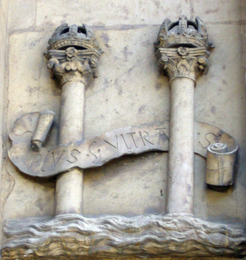
    search for knowledge of the unknown.  The Pillars appear in the coat of arms of Spain, originating with Charles V (the Holy Roman Emperor and also the King of Spain), with motto plus ultra (“further, beyond”) The plus
    ultra part fits nicely with the Bacon, even though the words are not there in the image, they really should be, emblazoned across the stern of the ship of Bacon’s imagination and intellectual enterprise.(The great voyage of discovery analogy and the  great new discovery in thought is probably painfully clear already.)

    Blogbacon_bits_latinThe image is captioned and summarized with the Latin phrase “Multi pertransibunt et augebitur scientia”, wrenched from the triumphantly problematic and slightly insane Book of Daniel (chapter 12, verse 4).  It is translated loosely as “many shall run to and fro, and knowledge shall be increased” or more elegantly “many will pass through and knowledge will be increased”—either way, whether by direct adventure and exploration or frenetic activity, the act of a new effort will be rewarded with a new knowledge.

    The image below is from the Tabula Peutinger–basically a roman-era road map of the extent of Empire–and shows the location of the pillars.  They were mountainous metaphors existing at Gibraltar and Morocco, but folks were only too happy to relieve them in marble.

    Blogbaconpillars_2

    ·Posted by :

    ·in:

Recent Posts

Archives

Categories